1. Sunlit Oval Orchid Bouquet on Yellow Gingham
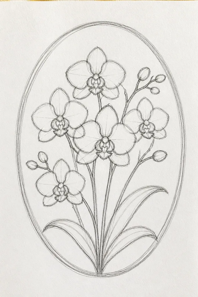
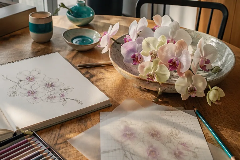
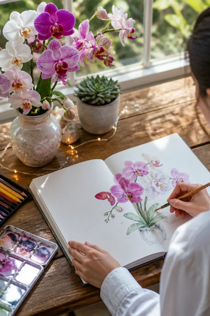
Start by sketching an oval guide on the page, then block three orchids inside it with simple teardrop petal shapes. Draw the lip shape first for each orchid, then add side petals and the top petal around it. Color the background gingham with light yellow and pale gray lines, leaving the orchid petals untouched at first. Then shade petal folds with soft lavender or warm gray, finish with a dark throat stripe, and add a thin shadow line beneath the oval. Use a white gel pen for highlight edges on each petal curve.
This setup makes orchids look cheerful because the gingham grid gives you instant structure behind the petals. Draw the bouquet as a tight oval so the flowers read as one group, not scattered stems. Use bright yellow in the background and keep the orchid petals mostly white or pale lavender with a darker throat — the contrast pops in photos. Add one thin shadow under the bouquet to ground it. It suits beginners because the background pattern tells you where to place space, and it suits posting because it photographs cleanly.
Common mistakeDon’t color the whole orchid in one flat tone — you need a darker throat and fold lines.
Good to knowTape the paper flat and rule your gingham lines with a ruler so the grid looks crisp in photos.
2. Diagonal Cascade Orchids with Teal Paper Cutout Stripes
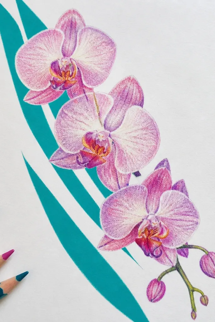
A diagonal cascade makes orchids feel like motion, and teal stripes give you a cool, modern look. The trick is to repeat the cascade rhythm: one orchid higher, two stepping down, then a final smaller bloom near the bottom edge. Keep your strokes confident and let some petals overlap so the bouquet reads as a layered arrangement. This idea works best when you use thick paper or watercolor paper so the colored stripes stay sharp and the orchid details don’t bleed. It’s also a great choice if you want your drawing to look “designed” even with minimal background.
Cut or draw three diagonal stripe bands across your page, spacing them about 1 cm apart, and keep them behind where orchids will sit. Sketch a diagonal line from upper left to lower right, then place orchids along that line with stems that angle the same direction. For each orchid, map the lip first, then draw the top petal and side petals so they follow the cascade angle. Color the stripes in teal and turquoise, then shade orchid folds with mid-tone gray-lavender. Finish by darkening the throat area and adding white highlight lines on the petal edges.
Use a kneaded eraser to lift stray pencil marks before you ink or color the stripes.
Avoid stripes that run through the orchid petals — the background should frame, not fight.
3. Round Cluster Orchids in a White Vase Outline
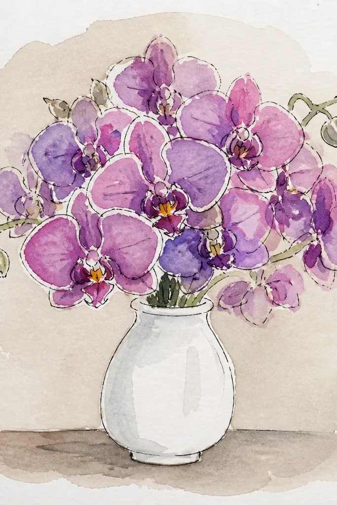
Draw a simple vase shape near the bottom third of the page — a slightly wider top than bottom. Inside the vase, sketch a circle guide and place 5-7 orchids around the circle so they touch or overlap lightly. Draw the lip shape first on each orchid, then add side petals and top petals to build volume upward. Color petals in pale pink-lavender tones, shade folds with warm gray, and add a dark center stripe or dots. Finally, outline the vase in a darker pencil or fineliner and add a soft shadow under the vase edge.
This one gives you a clean, gallery-style look because the vase outline creates a focal boundary. A round cluster is the easiest bouquet shape to make look full without drawing too many petals. Keep the vase line simple and thin, then let the orchids do the work with layered petals and throat patterns. Add a soft gray shadow on one side of the vase for depth. This is a strong “safe” idea if you’re short on time but still want a photo-ready result.
Common mistakeDon’t skip the vase shadow; it’s what makes the bouquet feel anchored.
Good to knowLimit your orchid colors to two shades plus one throat dark color — the cluster looks cohesive in photos.
4. Ribbon Drape Orchids with Soft Pastel Gradient Background
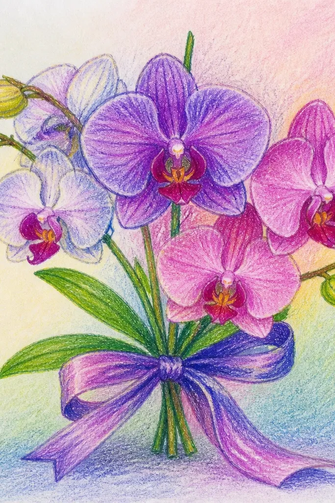
Ribbon drape setups look romantic and intentional, and the pastel gradient makes the orchids feel airy. Draw ribbon as flowing bands that wrap around stems, then place orchids where the ribbon crosses for a layered look. Keep the orchids slightly lighter than the ribbon so they read as the main subject. This idea is photogenic because gradients create smooth color behind detailed petals. It also gives you an easy structure for composition: ribbon leads the eye toward the orchid centers.
Lightly pencil a ribbon S-curve across the page, then sketch orchid positions at three bend points. Create a pastel gradient background using three colors — pale peach at one corner, soft pink near the center, and light lilac toward the opposite edge. Draw orchids using the lip-first method, then shade petal folds with a slightly darker pastel pencil. Add ribbon color with a mid-tone pastel and draw gentle fold lines. Finish by adding white highlights on orchid petal edges and a thin darker line along ribbon folds.
Blend the gradient with a tissue or blending stump, but keep the orchid area cleaner for sharper lines.
Avoid over-darkening the gradient; it should support the orchid, not compete.
5. Black Ink Orchid Bouquet with Neon Gel Highlights
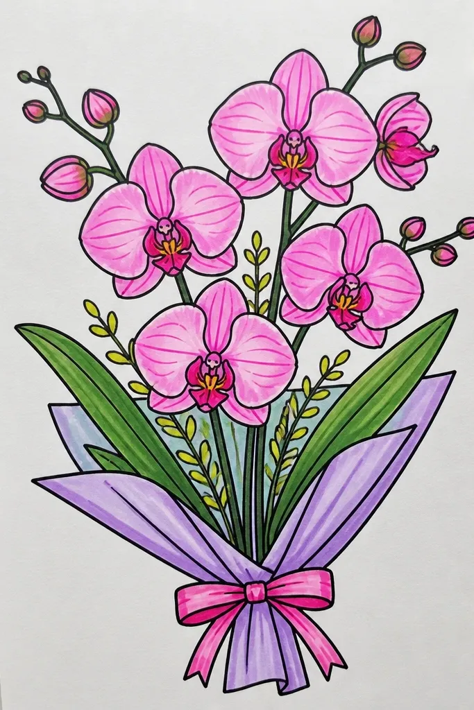
Draw your bouquet as a simple oval cluster in pencil, then ink petal outlines with a fine black pen. Shade lightly with black pencil or diluted watercolor, keeping most petals clean. Add throat details with deep purple or black, then place neon gel highlights only on the upper petal edge and a few lip curves. Add a few neon “spark” dots around the bouquet for extra brightness. Photograph on a dark or neutral background so the neon reads clearly.
If you want bright, this is the most direct route: black ink for crisp petal outlines and neon gel highlights for pop. The orchid throat can be black or deep purple, while the highlights are neon pink and neon lime. This setup makes the drawing look bold even with minimal background. It’s also a great way to make your orchid lip details readable in a photo, because neon highlights catch light instantly.
Common mistakeDon’t flood the whole petal with neon — keep it to highlight lines and small accents.
Good to knowUse gel pens on dry ink only; wet ink smears fast.
6. Orchids in a Window Frame Grid with Warm Light
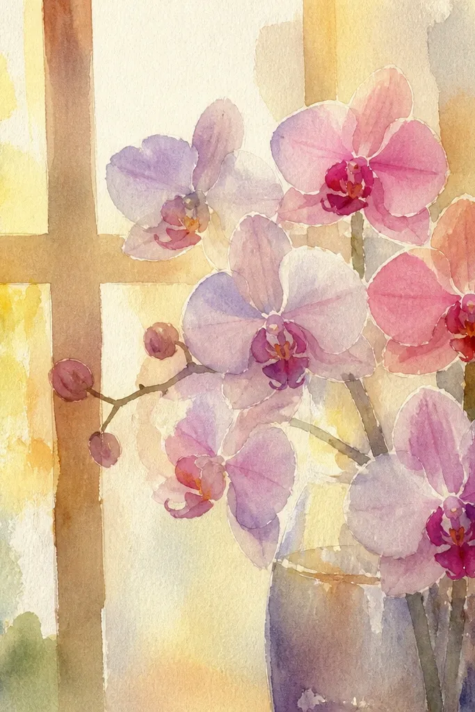
A window grid gives you instant depth cues and makes the bouquet feel staged rather than floating. Warm light behind the orchids makes petals look glossy, especially if you add a pale highlight stripe on each petal. Keep the vase or stem simple so the grid stays the background story. This is a good pick if your drawings tend to look flat because the frame lines guide perspective and spacing.
Draw a rectangular frame on the page, then add a grid inside it with thin lines. Sketch an orchid bouquet centered in the middle grid square, using overlapping petals so it reads as one cluster. Color the background warm — use pale orange or golden yellow washes in the grid cells, leaving thin line gaps visible. Shade orchids with light lavender and warm gray for petals, then deepen the throat with a darker purple. Add white gel highlights along the petal curves and a soft shadow where stems meet the bottom.
Keep grid lines lighter than the orchid outlines so the bouquet stays dominant in the photo.
Avoid thick black frame lines; they overpower the delicate petal shapes.
7. Monochrome Orchid Bouquet with One Color Accent
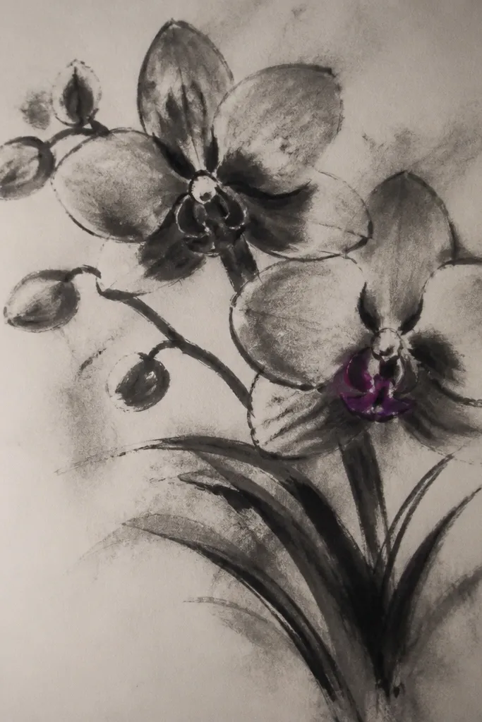
This idea makes your orchid look designed without turning the page into chaos. Everything is grayscale except one accent color — usually magenta or cobalt — placed only in the lip and a couple of throat stripes. The contrast makes the orchids feel crisp and “bright” even when the rest of the page is calm. It’s a smart choice if you struggle with color mixing because you only commit to one strong hue.
Sketch a tight bouquet oval and draw 4-6 orchids inside it, using the lip-first method for each. Shade petals in soft gray pencil layers, leaving a small highlight gap uncolored. Color the lip area and throat stripe with one accent color — magenta or cobalt — then add a tiny dot pattern in that same accent. Add a faint gray shadow under the bouquet and a few darker fold lines on the petals for dimension. Finish with white gel highlights on petal edges.
Use a limited palette: gray + one accent + white highlights. It reads clean every time.
Don’t add the accent color across every petal; it kills the focal point.
8. Peach Paper Texture Orchid Bouquet with Dry Brush Veins
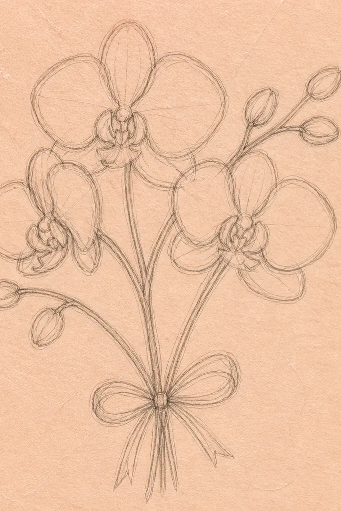
Texture makes orchids look more realistic and more photogenic without you drawing extra details everywhere. A peach background with subtle speckle gives your petals something to glow against. For the orchid leaves and petals, add vein lines using dry brush strokes so the lines look feathery. This setup is ideal for watercolor or gouache because the texture catches pigment and makes the bouquet feel alive.
Use watercolor paper or a textured cardstock, then lightly wash a peach tone across the sheet. Sketch 3 orchids and 2 leaves around them, keeping stems simple. For vein lines, load a small brush with a darker peach or warm gray, then wipe most paint off the brush before dragging thin lines on petals and leaves. Shade petal folds with a diluted lavender wash and add a darker throat stripe with a stronger purple. Finish with white gel highlights and a few extra leaf vein marks.
Dry brush works best when your brush is mostly clean — wipe it until it feels almost dry.
Avoid fully wet paint for veins; they blur and look muddy.
9. Confetti Background Orchid Bouquet with Circular Bubbles
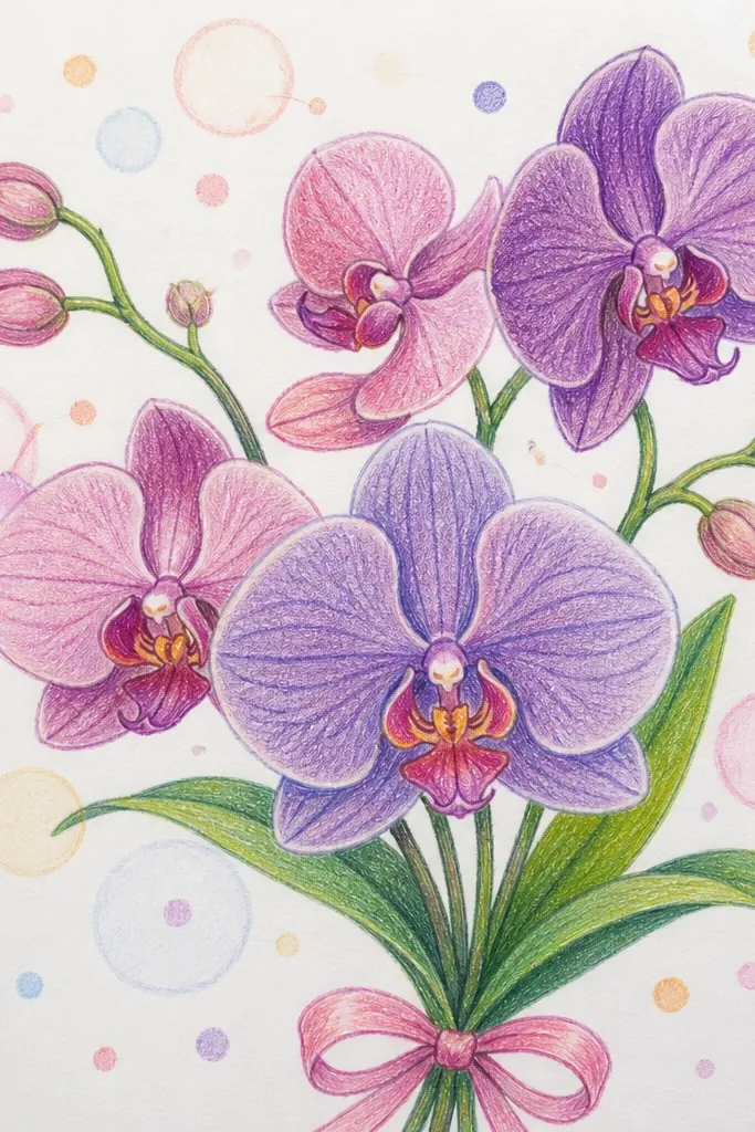
Sketch an oval bouquet area in pencil and block in orchid shapes inside it. Draw 10-20 confetti dots around the bouquet edges, plus 5-7 larger circles at random sizes. Color dots with markers or colored pencil, using coral, turquoise, and yellow. Shade orchids in pale lavender and warm gray, then deepen the throat with dark purple or black. Add white highlight lines on petal edges and a thin shadow under the bouquet boundary.
Confetti bubbles behind orchids make the whole page feel festive while still giving the eye a clear focus. The key is to keep the confetti out of the orchid petals, then add a few larger circles that echo the bouquet curve. Use bright dot colors like coral, turquoise, and sunshine yellow, but only in the background. This is a strong choice for holiday uploads in spring because it reads “bright” even with simple orchid shading.
Common mistakeDon’t put dots inside the bouquet oval; that makes petals harder to read.
Good to knowVary dot sizes — mix tiny specks with a few bigger circles so it looks intentional, not messy.
10. Orchid Bouquet in a Chalkboard Frame with White Flowers
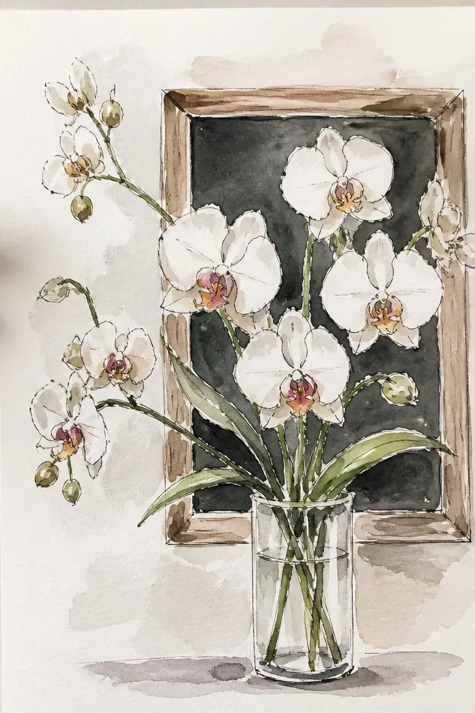
Fill the page with a dark gray or black background using charcoal, soft pastel, or craft paint. Draw a lighter border frame around the edges. Sketch your orchid bouquet in pencil, then reinforce outlines with a white gel pen or white paint marker. Shade petals lightly with diluted purple-gray, then add a dark throat stripe. Add leaf shapes in muted green-gray and finish with extra white highlight curves on petals.
A dark chalkboard frame makes orchids pop fast because white petals and purple throats look high-contrast. You can keep the background simple — just a dark rectangle with a hand-drawn border — and still get a dramatic look. This setup is also forgiving for line errors because chalk-like textures hide pencil marks. The result photographs like a sign or menu board, which looks great on social media.
Common mistakeDon’t use bright neon on a dark background — it looks harsh next to chalk texture.
Good to knowUse a soft brush to blend the dark background so it looks chalky instead of streaky.
11. Vintage Postcard Orchid Bouquet with Faux Sepia Wash
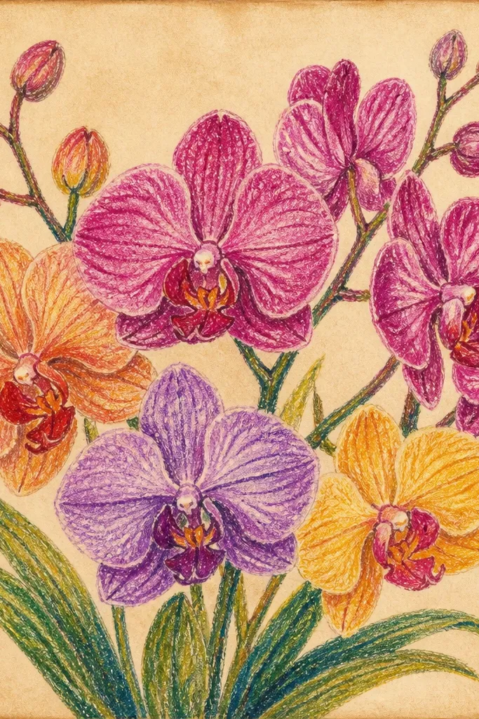
Wash the page with a light sepia tone, then draw a thin postcard border rectangle around the edges. Sketch a bouquet of 4 orchids near the center, keeping stems and leaves minimal. Color petals with pale peach-lavender, then shade folds with warm gray-brown pencil. Add throat stripes or dots in plum, and reinforce petal edges with a slightly darker pencil line. Finish by adding a corner stamp shape and a few faint postcard speckles.
This idea looks aesthetic without needing complex coloring. A sepia wash background makes orchids feel like a printed postcard, and the orchid lip details look extra defined against the warm tone. Add a simple stamp-like mark in one corner and a faint border line like a postcard edge. Keep your orchid colors limited: pale peach-lavender petals and a deeper plum throat. It’s photogenic because it has a clear frame and a warm, consistent palette.
Common mistakeDon’t go too dark on the sepia wash; orchids need contrast to stay readable.
Good to knowUse a dry brush to add tiny speckles — it makes the sepia background look printed.
12. Lemon and Orchid Combo Bouquet with Yellow Leaf Accents
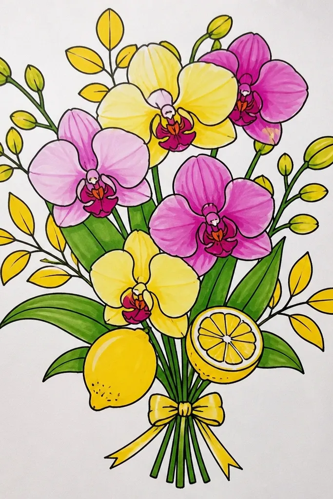
Pairing orchids with yellow leaf accents makes the whole bouquet look brighter without adding more orchid complexity. Draw lemony leaves or small citrus-like shapes behind the orchids so they frame the petals. Use pale orchids with magenta throats, then add yellow-green leaf shapes to bring color energy. This setup is great for spring and holiday tables because it looks fresh and slightly playful. It’s also easier than a full background because the accents do the job of decoration.
Sketch your bouquet oval first, then place 5-6 orchids inside with lip-first detail. Add 3-4 leaf shapes behind and around the orchids, angled outward like a fan. Color petals in pale lavender and shade folds with warm gray, then add magenta throat stripes. Color leaves in yellow-green and add a few vein lines with a darker green pencil. Finish with white highlights on petals and a small cluster of tiny lemon-like circles near the corners.
Keep the leaves slightly out of focus visually by using lighter pressure on leaf outlines.
Don’t color leaves as dark as the orchid throat; it steals the center.
13. Blue Ombre Background Orchid Bouquet with Wet-on-Dry Petal Edges
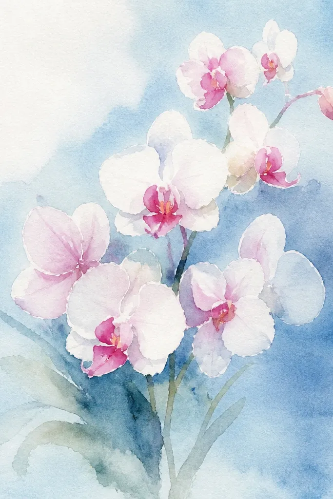
A blue ombre background looks like soft ocean light, and orchids love that kind of cool glow. The best part is how the petal edges can look crisp and slightly wet if you use wet-on-dry technique with watercolor. This setup is photogenic because you get a smooth background gradient plus sharp orchid lines. It’s a good middle-level project if you already know basic watercolor and want a clean, modern aesthetic.
Wet the top half of the page with clean water, then apply diluted blue wash that fades toward the center. Let it dry slightly so you can draw orchids without bleeding. Sketch orchids and stems, then paint petals using wet-on-dry: paint one petal edge first, then add slightly darker color along the fold line while the petal is still damp. Add a deeper purple throat stripe and a few throat dots. Outline stems and leaves in a darker blue-gray pencil or pen for crispness.
Use a small round brush and keep water control tight so petals don’t spread into the background.
Avoid painting the throat stripe too early; it lifts and smears if the petal is still too wet.
14. Pink Confetti Frame Orchid Bouquet with Thick Border
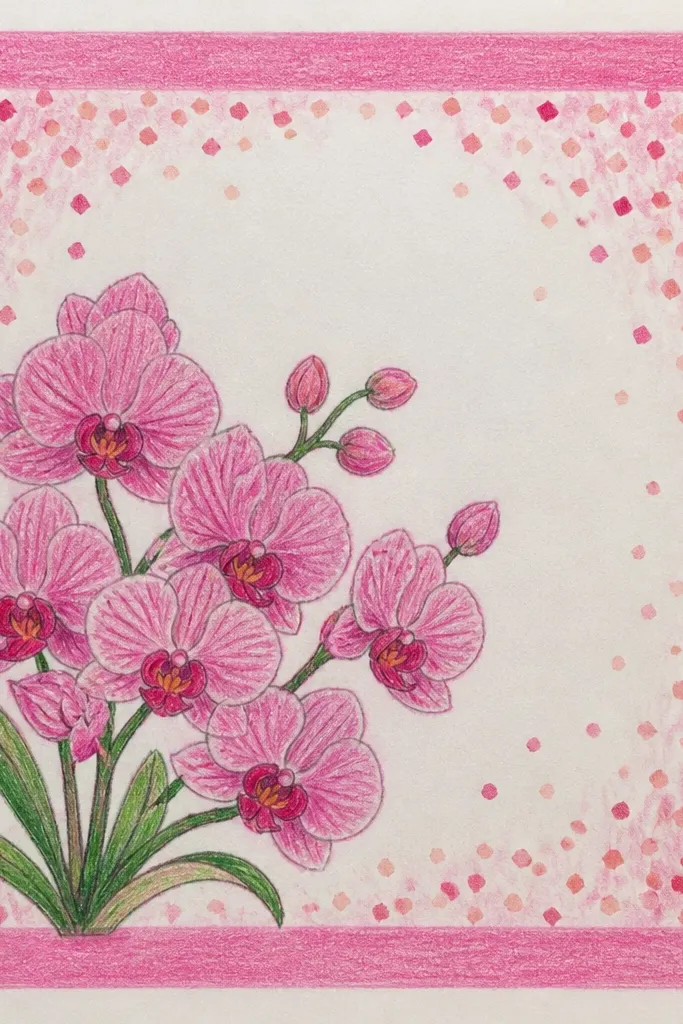
Draw a thick border rectangle about 2 cm in from the page edges. Inside the border, sketch an oval bouquet and draw 4-5 orchids with lip-first detail. Color the border with bright pink and add small confetti dots in pale peach and light coral around the border area. Shade orchids with pale pink-lavender and warm gray fold lines, then add a deep purple throat stripe. Finish with white gel highlights on petal edges and a thin shadow under the bouquet.
A thick border instantly makes your drawing look like a finished card, and confetti dots add brightness without extra work inside the bouquet. Put orchids in the center so the frame does the heavy lifting for composition. Use pink border and pale peach confetti dots for a soft, springy vibe. The orchid petals stay the hero, especially if you use a darker throat stripe and white highlight edges. This is excellent for holiday cards and social posts where cropping matters.
Common mistakeDon’t add confetti inside the oval bouquet; keep it in the frame area only.
Good to knowKeep the border lines smooth by using a ruler and one confident pass with your pen.
15. Orchid Bouquet with Gold Foil Leaf Highlights
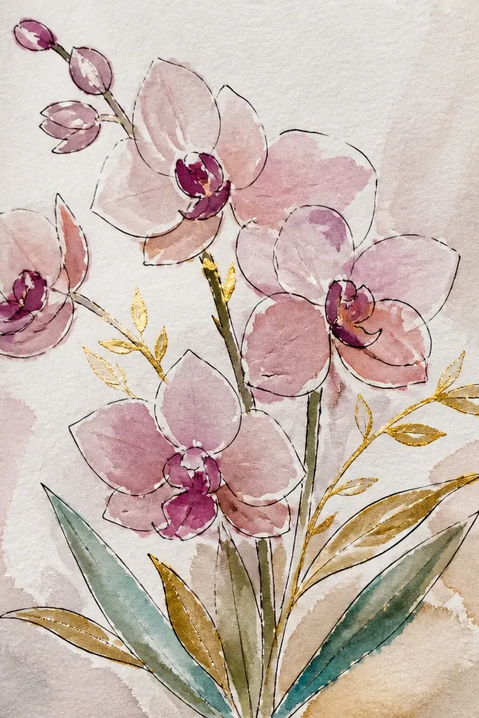
Sketch a bouquet oval with 4 orchids and a few leaves spreading outward. Color petals in pale lavender or soft white, then shade folds with warm gray. Paint or draw stems and leaf edges with a thin gold adhesive or gold pen line, then press small foil flakes onto the adhesive areas. Add a deep purple throat stripe and white highlight lines on petal edges. Finally, add a faint gray shadow under the bouquet to keep it grounded.
Gold foil accents make orchids look expensive fast, and they photograph with a real sparkle even if your background is simple. Use gold only on leaves, stems, and a couple of orchid highlight lines, not across every petal. The contrast of metallic gold against pale petals creates instant “bright and creative” energy. This setup is great if you want a holiday-ready look without drawing a complicated scene. It’s also forgiving: even imperfect gold placement looks intentional.
Common mistakeDon’t foil the whole page; metallic areas should be limited to avoid glare in photos.
Good to knowUse small foil pieces and press them with tweezers — large chunks look messy on paper.
16. Orchid Bouquet on a Pastel Sheet with Tape-Mask Edges
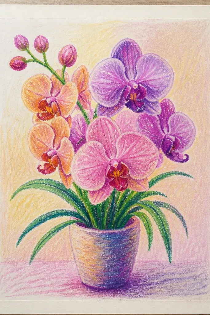
Tape-mask edges make your drawing look crisp and styled like a collage, even if you’re using simple markers or watercolor. The clean border around the bouquet area gives photos a sharp focal shape. You’ll get a bright, modern look from pastel background colors and the sealed tape edges. Orchids stay the star because the mask keeps the background from bleeding into petal shapes. This is a great choice if your biggest frustration is messy edges and smudges.
Tape off a rectangle or rounded-rectangle area on your paper where the bouquet will sit. Color the surrounding background with a pastel wash — mint, peach, or pale lavender — then let it dry fully. Remove the tape to reveal clean edges. Sketch orchids inside the masked area, using lip-first detail and simple stems. Color petals with pale tones, shade folds, then add throat stripes and white highlights. Optionally add a thin pen outline around the taped edge for extra definition.
Remove tape while the paint is still slightly damp for the cleanest edge.
Don’t tape over wet paper; it can tear the surface when you pull it off.
17. Orchid Bouquet with Botanical Leaf Silhouettes and Soft Vignettes
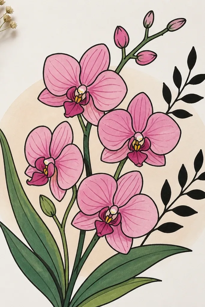
Shade the background with a light wash in the center and gradually darken toward the edges using a gray-lavender or muted green. Sketch the bouquet oval in the middle, then add 3-4 leaf silhouette shapes behind the orchids using pencil first. Fill silhouettes with a dark color and leave the orchid area untouched. Draw orchids with lip-first detail, then shade petal folds with mid-tone gray-lavender. Add throat stripe dots and white highlight edges on petals, then keep the silhouettes slightly darker than the orchids so the center stays bright.
Leaf silhouettes behind orchids add depth fast because they create a “stage” without cluttering the center. A soft vignette background — darker at the edges, lighter in the middle — makes the orchids feel lit. Keep silhouettes simple: a few broad leaf shapes, one fern-like curve, and a couple of stems. This is a good option if you want a more grown-up, aesthetic look while still keeping the orchid details sharp and readable. It also helps your petals stand out because the background is darker near the edges.
Common mistakeAvoid detailed leaf silhouettes; blobs and simple shapes photograph better.
Good to knowPlan silhouette placement so no silhouette crosses the orchid lips; keep the center clean.
18. Orchid Bouquet with Hanging Raindrop Bokeh Dots
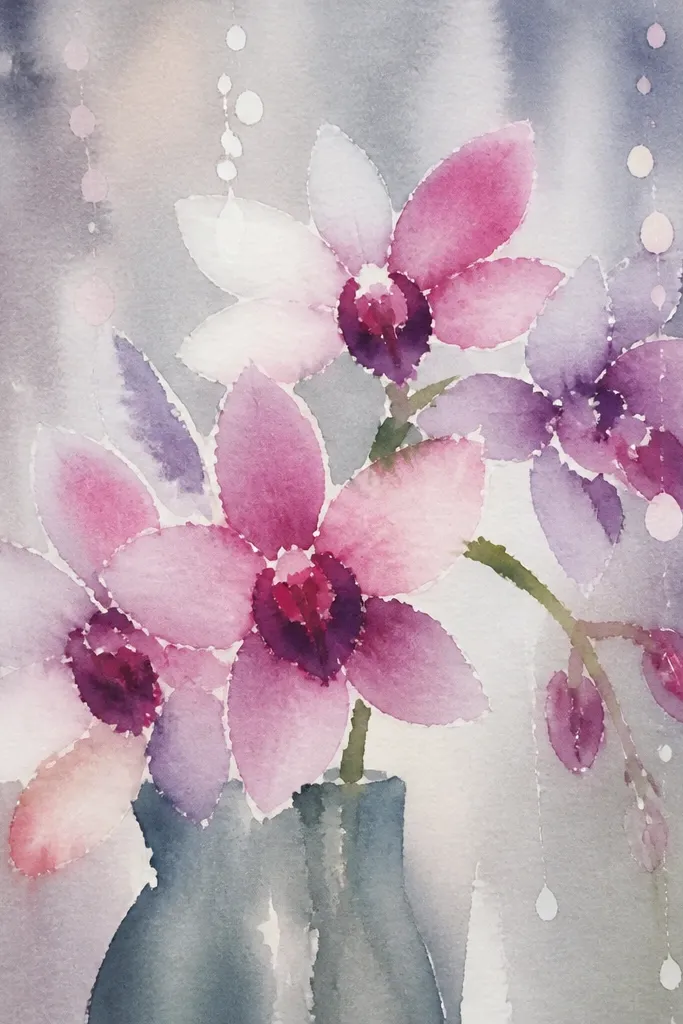
Raindrop bokeh makes orchids look dreamy and bright at the same time. The bouquet sits crisp in the center, while the background has soft circles and vertical dot lines that suggest rain. This setup is visually striking without requiring a full landscape. Orchids look extra luminous when you add white highlights and keep the throat details dark. It fits seasonal themes for spring showers, and it’s a strong choice when you want a “mood” drawing that still reads clear in a photo.
Sketch your bouquet oval in the center and draw stems that stay mostly vertical. Add bokeh circles across the top half — 8-12 circles of varying sizes — then draw vertical raindrop lines from those circles down toward the bouquet edges. Color bokeh circles in pale blue, mint, and light lavender, leaving tiny white gaps inside each circle. Shade orchid petals with pale lavender and warm gray fold lines, then add a deep purple throat stripe. Finish with white gel highlights on petal edges and a few tiny white dots to mimic droplets.
Use a light hand for bokeh so the circles look soft instead of outlined.
Don’t draw raindrops through the orchids; keep them behind the petals.
19. Orchid Bouquet with Geometric Hexagon Background
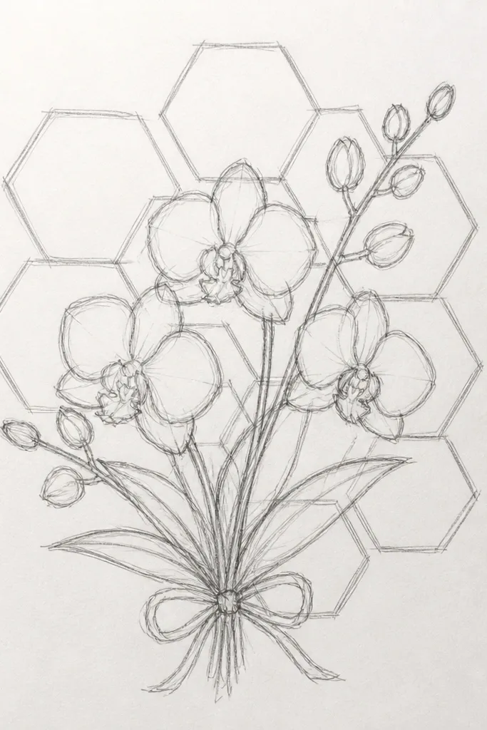
Draw a hexagon grid behind your bouquet using a ruler: start with one large hexagon centered, then add 5-10 surrounding hexagons. Fill alternating hexagons with pale color washes like peach, mint, and pale blue. Sketch 4-6 orchids in an oval cluster in the center of the grid, using the lip-first method. Shade petal folds with a mid-tone lavender and warm gray, then deepen the throat stripe. Add white highlight lines on petal edges and a thin shadow under the bouquet boundary.
Hexagon geometry makes the bouquet look modern and graphic, which is exactly what reads well in photos. The trick is to keep the hexagon lines thin and use pastel fills so the orchids remain the focal point. Draw orchids with clean petal outlines and a darker throat stripe so they pop against the pattern. This idea is great if you want bright color without a busy scene. It also helps your composition because the repeating shapes naturally frame the bouquet.
Common mistakeAvoid dark outlines on the hexagons; they turn into a competing pattern.
Good to knowUse pencil first for the grid, then erase lightly before coloring so hex lines don’t muddy the petals.
20. Orchid Bouquet with Citrus Slice Confetti and Leafy Sprigs
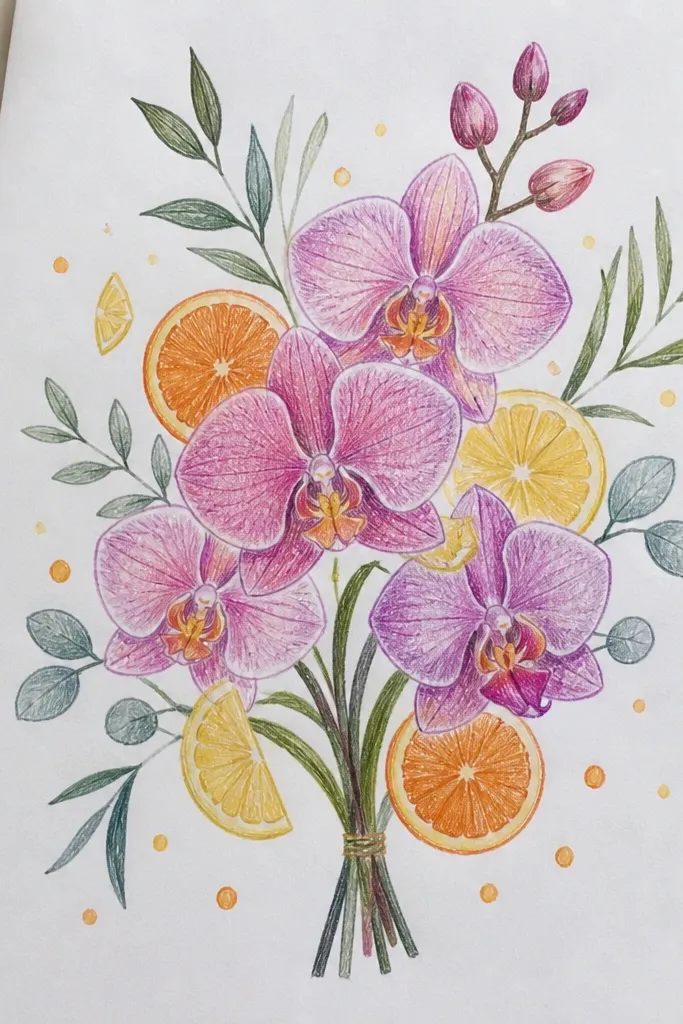
Citrus slice confetti makes orchids look bright and playful, and it adds color variety without forcing you to draw a full background. The slices also create natural curved shapes that echo orchid petal curves. Use pale orange and yellow slices with a light center, then keep the orchid palette controlled so it doesn’t look random. This setup is perfect for spring and holiday tables because it feels festive and fresh. It’s also easy to scale: you can do a few slices around the bouquet and still get impact.
Sketch your bouquet oval in pencil and place 3-5 orchids inside with lip-first detail. Add 12-16 small citrus slices around the outside of the oval — tiny semicircles are enough — and draw a simple leafy sprig shape in two corners. Color citrus slices with pale yellow and a soft orange ring, then shade the ring with a darker orange pencil. Shade orchid petals with pale lavender and warm gray folds, add deep purple throat stripes, and finish with white gel highlights. Add a thin shadow under the bouquet to separate it from the confetti.
Keep citrus slices smaller than the orchids so the orchid lip stays the eye-catcher.
Don’t over-detail citrus segments; simple rings read better in photos.