1. Diagonal Lavender Bouquet in a Low Glass Bottle
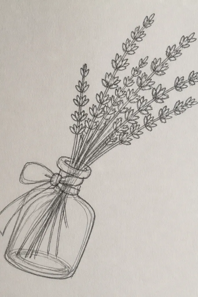
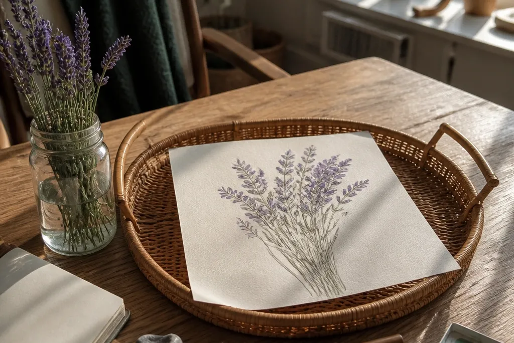
This composition looks polished because the diagonal line gives your page motion, and the low bottle keeps everything grounded and cozy. Draw the bottle with a simple oval opening and a few thin highlights, then let the lavender spikes climb upward in a controlled fan. The spikes are the star here — vary their length by a few millimeters so it looks hand-tied, not stamped. It’s a renter-friendly “page hero” because you’re creating depth with line weight and a couple of soft shadows, not heavy coloring.
Good to knowUse a kneaded eraser to lift tiny “glass highlight” streaks before you add the bottle shadow.
Start by sketching a low bottle silhouette: a tall oval mouth, a wider base, and gentle side curves. Then draw 8-12 lavender spikes that all lean in the same direction, with tiny repeated marks along each spike. Add a shadow under the bottle and one soft shadow on the inside edge of the glass, then finish with a fineliner outline for the bottle and stems.
Common mistakeDon’t outline every glass edge with heavy black — keep the bottle lines lighter than the lavender spikes.
2. Lavender Bundle Wrapped in Brown Paper with Twine
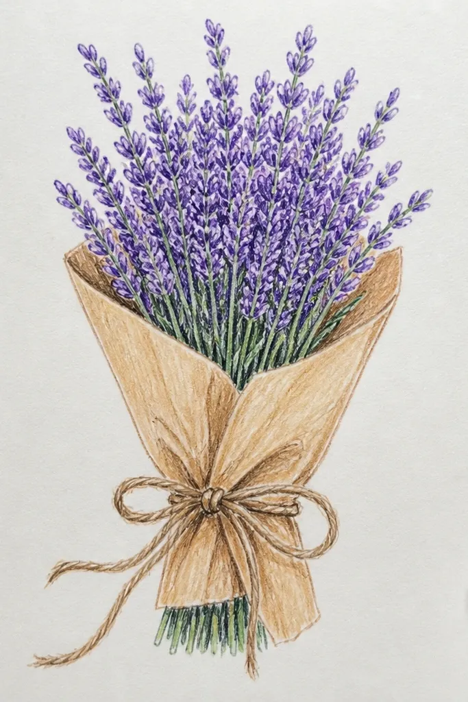
Wrapped bundles read cozy instantly because brown paper textures and twine give you lots of drawing opportunities beyond the flowers. Keep the lavender spikes clustered in the top half, then let the wrap folds angle downward so the bouquet looks dimensional. This is one of the best “aesthetic” sketches for seasonal pages because the warm wrap color contrasts with the cool lavender tone. It’s also forgiving: even if your spike marks aren’t perfect, the wrap folds cover small inconsistencies.
Good to knowShade the brown wrap with light crosshatching, then blend just the darkest crease so it looks like paper grain.
Draw the bouquet first as a teardrop mass, then place lavender spikes along the top edge like a crown. Next, add brown paper wrap lines: a few diagonal fold creases and a rough wrap edge that overlaps the stems. Finally, draw twine as two or three looping lines around the bundle and darken the wrap shadow underneath.
Common mistakeAvoid drawing twine as a single straight line — loops make it look real and intentional.
3. Lavender and Cotton Stems in a Pantry Jar
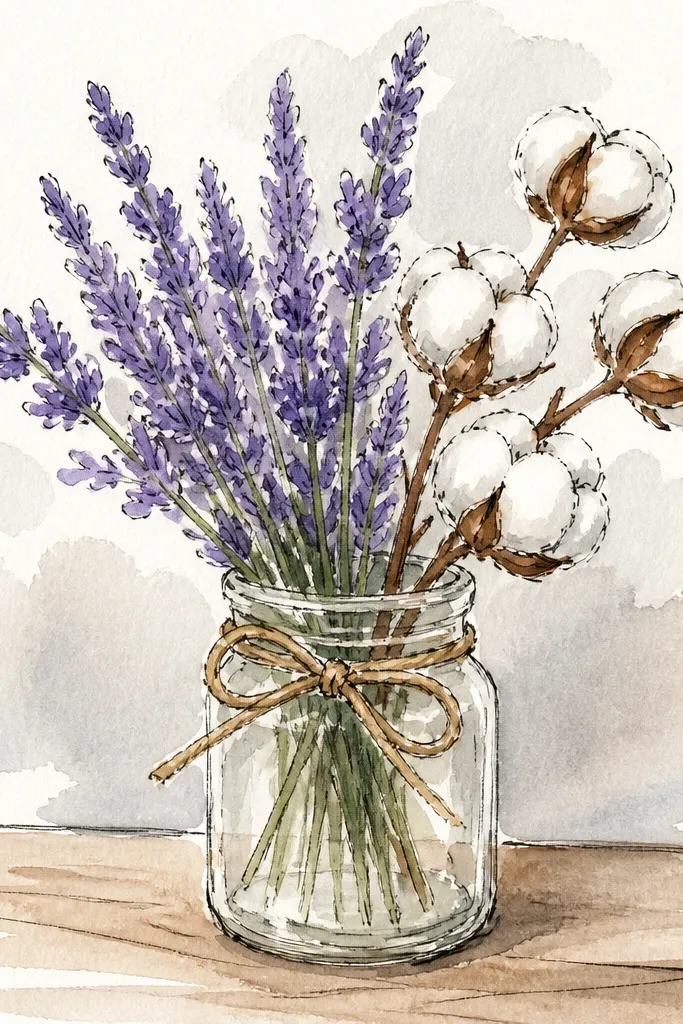
This idea feels cozy because it mixes lavender spikes with soft, cloud-like cotton puffs. The cotton shapes give you big, gentle areas to shade, which makes your lavender stand out without fighting for attention. Use a jar shape with simple seams or a label rectangle, and you’ll get a clean, photo-ready still life. It’s great for renters because you can keep the jar label blank, or write a short word in a neat block font for a holiday touch.
Sketch a jar with a cylindrical body and a slightly thicker rim. Add lavender spikes in the back half and cotton puffs in the front — keep the puffs smaller near the rim so they look layered. Shade the jar using a curved gradient: darkest near the inside edge, lighter toward the center, then outline the cotton puffs with a thin line.
For cotton, use small circle clusters instead of one big blob; it adds texture without extra time.
Don’t shade the cotton too dark — it should stay airy so the lavender doesn’t look flat.
4. Lavender Bouquet in a White Enamel Mug
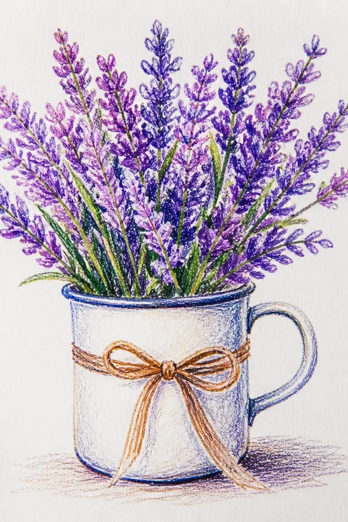
Enamel mugs look cozy and domestic, and the handle gives you a clear framing shape for the bouquet. The mug also helps you practice line weight: outline the mug handle and lip a bit darker, then keep lavender outlines slightly lighter. This sketch is photogenic because the negative space inside the mug makes the spikes look crisp. It works well for apartment corners and small desk scenes since the mug silhouette is simple and doesn’t require a complex background.
Draw the mug first: an oval opening, curved sides, and the handle as a smooth C-shape. Then place lavender spikes rising out of the mug, with most spikes clustered near the center and a few leaning outward. Add a soft cast shadow on the surface beneath the mug and a thin highlight line along the mug rim.
Use a 0.3 fineliner for the mug edges so the handle reads clearly in photos.
Skip heavy shading on the mug body — enamel looks best with minimal, soft shadows.
5. Lavender Bouquet with a Soft Watercolor Wash Background
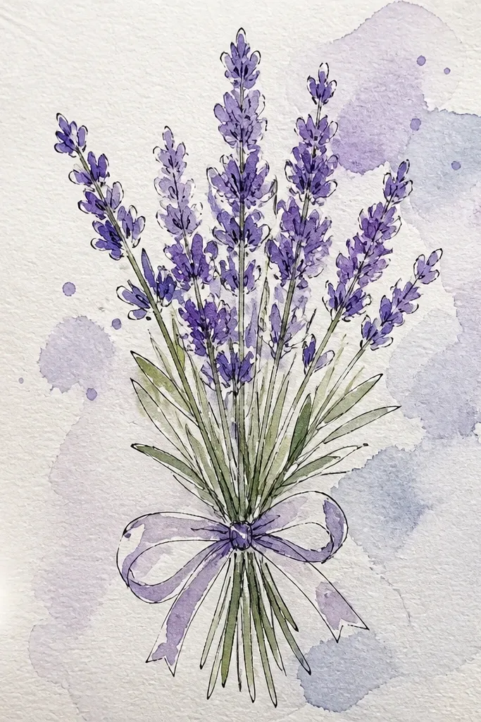
A wash background makes your bouquet look like a finished card without doing a full color painting. Keep the lavender spikes mostly line-based, then add a pale lavender wash only inside the spike tips. The background should be a single gentle gradient, like misty lilac fading to white, so the bouquet stays readable. This is the best option when you want the “cozy sketch” look that still photographs cleanly.
Outline the bouquet with pencil first, then ink it with a fineliner once you like the shape. Mix a very light lavender wash and brush it behind the bouquet, leaving the flower area mostly unpainted. Finish by adding a tiny wash on the spike tips only, then let it dry flat so you don’t get paper buckling.
Test your wash on scrap paper — you want it translucent, not opaque.
Don’t paint over your ink lines with a heavy wash; it makes edges bleed.
6. Lavender Bouquet as a Minimal Line Drawing in a Frame
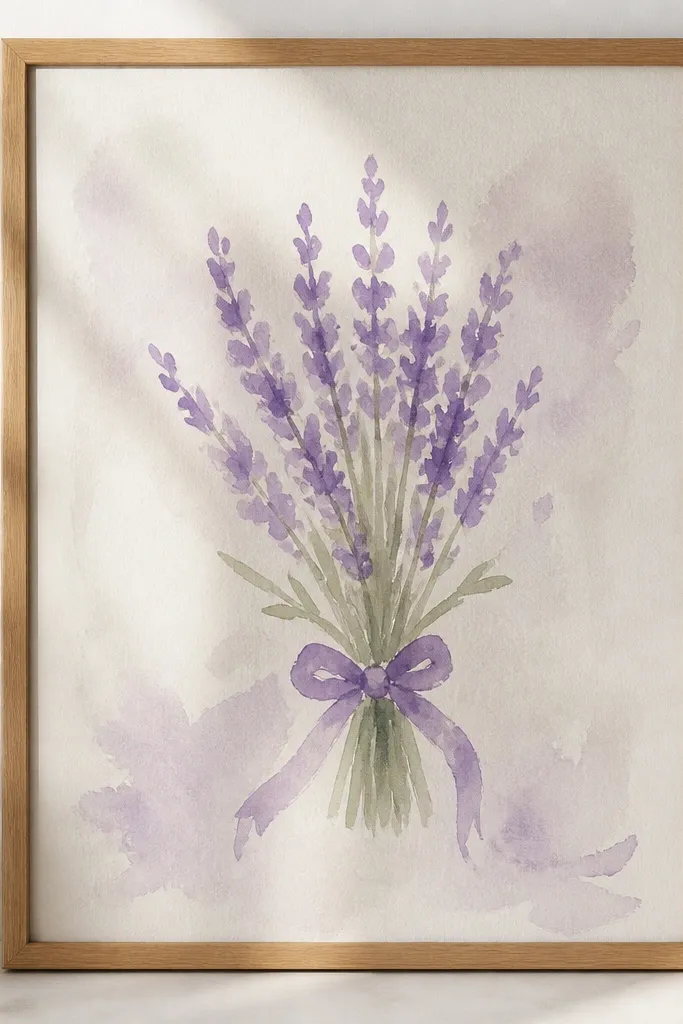
This one is clean, renter-proof, and looks great on a printed page or phone wallpaper. A minimal line approach keeps the lavender recognizable through silhouette alone: tall spikes, a few curved stems, and a small cluster at the top. Add a simple frame border and a light shadow strip, and the whole sketch reads like a wall print. It’s also a good choice if you want to use your sketch as a future holiday card template.
Draw a rectangle border around your page with a thin pencil line, leaving a margin of about 1 cm. Inside, sketch 10-14 lavender spikes with consistent spacing and thin stem lines, then erase the light construction lines. Ink the final lines, then add a faint gray shadow under the border to make it feel like a framed print.
Keep spike tips small and pointed; larger tips make minimal drawings look messy.
Don’t add extra leaves — lavender reads best with mostly spikes and stems.
7. Lavender Bouquet with a Faux Embroidery Border
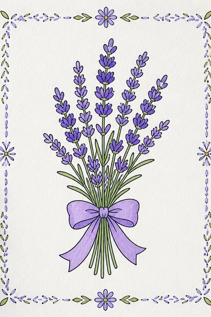
This is for the cozy, handmade vibe. The embroidery-style border frames the bouquet so it looks finished even if the bouquet itself is a simple line-and-wash. Use lavender for the spikes, then add small stitched marks around the page edge in a warm cream and muted purple. It’s photogenic because the border creates a clear “design” area for photos, and it hides uneven paper texture. Renters love it because you’re not gluing fabric; it’s all drawn.
Sketch the bouquet in the center with pencil, then ink only the stems and spike outlines. Lightly color the lavender tips with colored pencil or a very light wash. Next, draw a border around the page and add stitch marks: short curved loops repeating along the border, then darken the loops with a fineliner.
Use a ruler for the outer frame line, then freehand the stitch loops so they look human.
Don’t make the border too thick — it should frame, not steal focus from the lavender.
8. Lavender Bouquet on a Woven Tablecloth Pattern
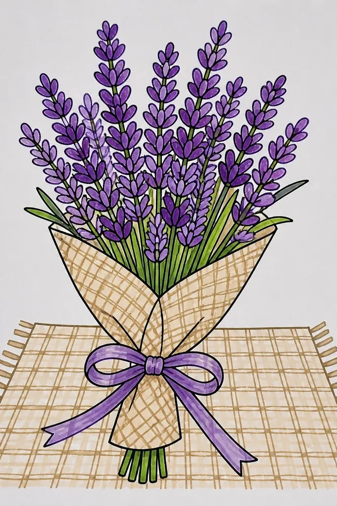
A tablecloth pattern turns a simple bouquet into a full scene. Woven lines give you texture for the background, and you can keep the bouquet crisp with darker outlines and lighter coloring. The best part is you can control the mood by choosing the pattern spacing: tight weave looks cozy and detailed, while wider spacing looks airy. This works great for renters because you can do the “cloth” with pencil and light shading without needing any real fabric.
Good to knowMake the weave lines lighter than the bouquet outline so the flowers stay readable.
Draw a cloth surface as a trapezoid or rectangle with soft perspective lines. Then add a lavender bouquet on top, keeping spike marks clear against the background. Shade the weave using alternating diagonal pencil strokes and a light gray under-shadow around the bouquet base.
Common mistakeDon’t fill the entire page with pattern — leave breathing space around the bouquet.
9. Lavender Bouquet with Hanging Tag and Small Handwritten Note
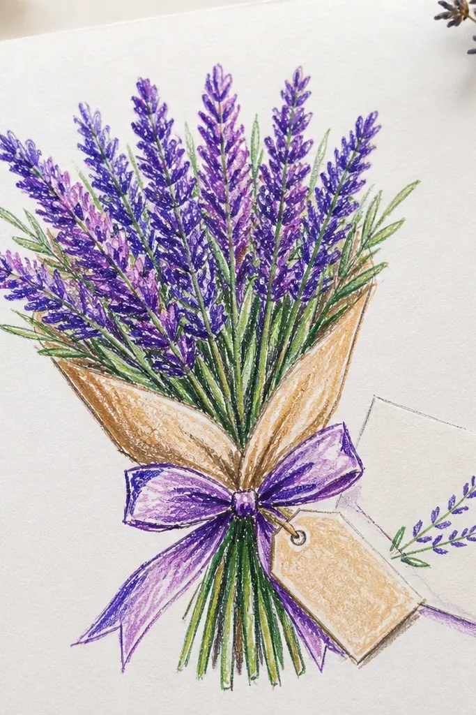
A hanging tag makes the bouquet feel like a gift, and gifts photograph well. The tag gives you a small storytelling element without turning the page into clutter. Draw the tag as a simple rectangle with rounded corners, then add a string that loops into the bouquet wrap. Keep the handwritten note short — one or two words — and use neat block letters so it stays legible in photos.
Sketch the bouquet and wrap first, then place the tag at a diagonal in the lower half. Add string lines connecting the tag to the wrap, then ink everything except the tag text area. Lightly color the lavender tips, then write the note in pencil first and ink only the darkest strokes so the letters stay clean.
If your handwriting gets messy, use a simple all-caps style and keep the letters tall.
Avoid long messages; tiny text becomes unreadable in small photos.
10. Lavender Bouquet with Candlelight Glow
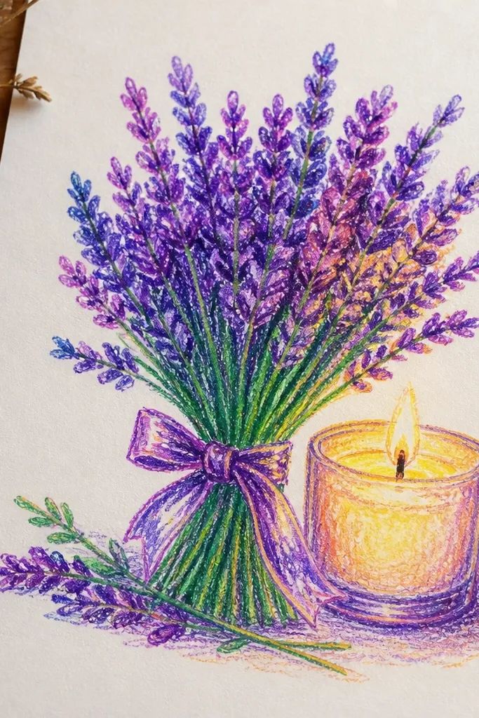
Candlelight shading makes lavender look extra cozy because warm light contrasts with cool purple. This sketch is all about controlled gradients: keep the lavender as cool tones, then add a warm halo behind it. Add a small candle silhouette — even just a wax shape and wick — for context. It’s photogenic because the glow gives you a focal center and makes shadows look intentional.
Draw the candle first on one side with a simple wax rectangle and a tiny wick dot. Place the lavender bouquet on the opposite side, then outline spikes with fineliner. Add warm glow behind the bouquet using a light amber wash or colored pencil, then blend only the glow area and keep the lavender edges crisp.
Blend the glow outward with a soft pencil, not into the lavender spike tips.
Don’t darken the entire background — the glow should be a halo, not a full wash.
11. Lavender Bouquet in a Vintage Tin with a Patterned Label
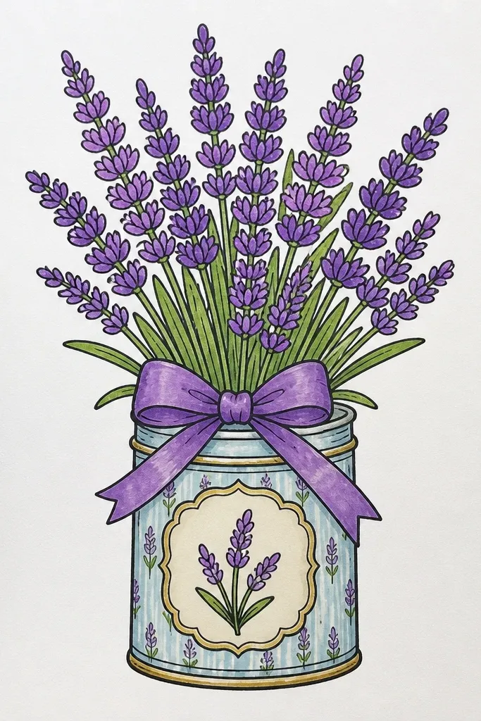
Tin cans feel sturdy and seasonal, and the label gives you a place to add a pattern that looks great on camera. Draw the tin with a slightly dented cylinder look: subtle vertical curves and a top rim. Then create a label rectangle with tiny dots or a simple stripe pattern, and let lavender spikes peek out above it. This is a strong choice if you want your sketch to look like a finished print, not a quick doodle.
Sketch the tin can as a tall cylinder with a top rim and a slightly narrower base. Add a label rectangle across the center, then draw lavender spikes emerging from the tin opening. Pattern the label with evenly spaced dots or stripes, and shade the tin using vertical pencil strokes so it looks metallic.
Use a lighter gray for tin shading and reserve darker tones for the label edges and shadow under the tin.
Avoid cluttering the label with too many patterns — one simple motif reads best.
12. Lavender Bouquet with a Polaroid-Style Photo Frame
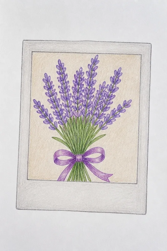
This one is designed for renters who want instant “postable” art. A polaroid-style frame makes the sketch look like a photo memory, and lavender looks sweet inside that white border. Keep the bouquet centered with a slightly imperfect, hand-tied feel so it looks human, then add a tiny caption line at the bottom of the frame. It’s photogenic because the frame creates a clean edge and gives your photo a clear composition.
Draw a polaroid frame: a rectangle with a thicker white border and a small caption area at the bottom. Inside, sketch lavender spikes and a simple wrap or ribbon, then ink the bouquet lines. Add light lavender coloring to the spike tips and keep the background plain white, then shade a faint shadow under the polaroid border.
Angle the polaroid frame slightly off-center for a more natural look in photos.
Don’t over-color the background; the white border is what makes the bouquet pop.
13. Lavender Bouquet with a Dark Background and Soft Highlights
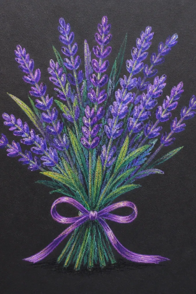
Dark background sketches look cozy and dramatic without needing lots of color. The trick is to keep your lavender lines lighter and use highlights to shape the spikes. If you use a dark paper or tone the page with charcoal or a dark wash, lavender spikes instantly look like they’re glowing. This is perfect for holiday pages where you want contrast and a “night window” mood.
Start by darkening the background with a charcoal layer or a very light-to-medium gray wash, then let it dry fully. Draw the bouquet with a lighter pencil first, then ink lightly or skip ink and just use pencil for the spikes. Add highlights by erasing tiny streaks and edges, then deepen shadows under the bouquet base with a soft pencil.
Use a kneaded eraser to create multiple thin highlight lines along spike edges.
Avoid using heavy black outlines on the lavender — keep outlines softer so the glow effect stays.
14. Lavender Bouquet as a Top-Down Flat Lay
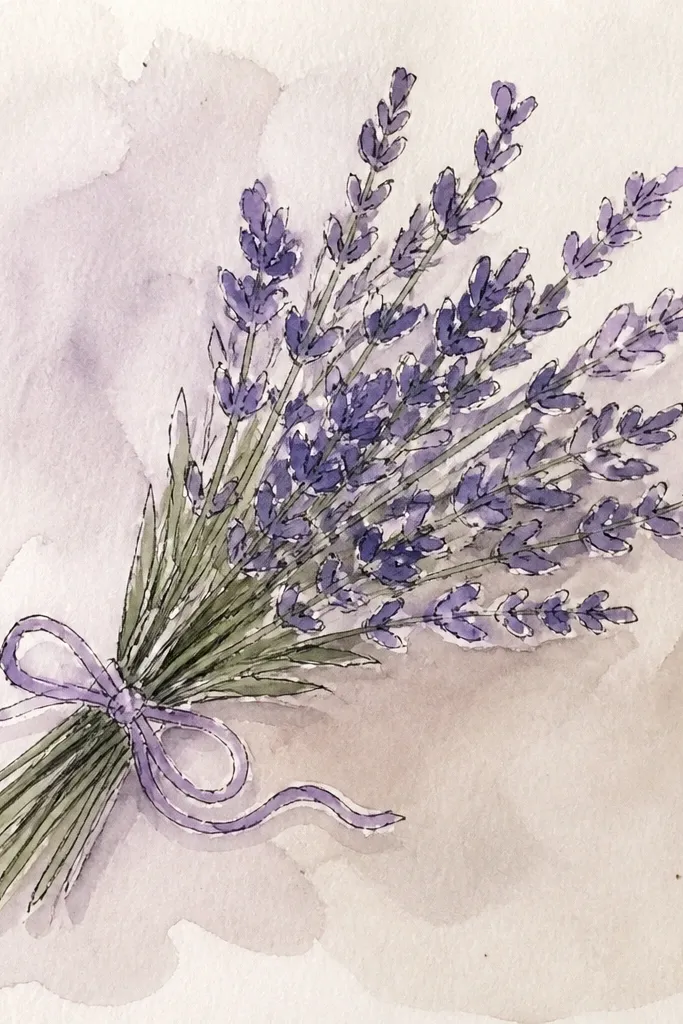
Flat lays photograph cleanly because everything is visible and the composition reads instantly. For lavender, that means drawing spikes fanning outward from the bundle center and keeping the stems layered in a neat bundle. Add a simple background like kraft paper texture or a pale linen wash, then drop a soft shadow under the bouquet to anchor it. This is a strong choice for renters because it’s easy to fit on a page and you don’t need a complex vase.
Good to knowDraw the spikes slightly curved, not straight — curved spikes look more natural and handmade.
Draw the bundle center as a small oval where stems meet. Then fan 12-16 lavender spikes outward, keeping the tips mostly in one direction for a tidy look. Add a few stem lines that overlap the bundle, then shade a soft shadow around the bundle edges with a light gray pencil.
Common mistakeDon’t place the bundle too close to the page edge; leave margin for a clean photo.
15. Lavender Bouquet with Hanging Ribbon Across the Page
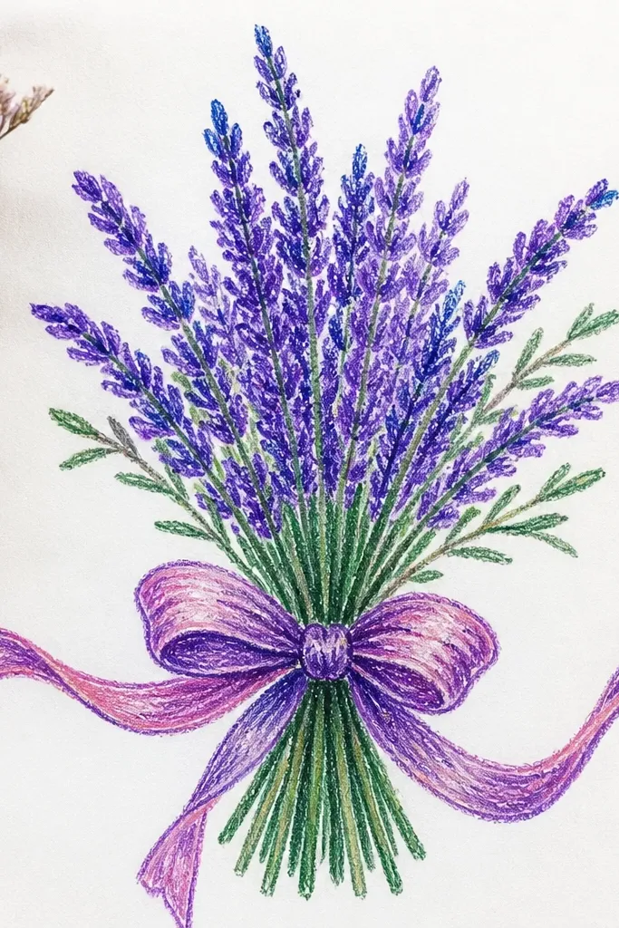
A hanging ribbon adds movement, and movement is what makes a sketch look lively in photos. This idea uses lavender as the vertical anchor and the ribbon as the sweeping horizontal line, so your eye has something to travel across the page. Draw the ribbon in two layers: one lighter fold line and one darker shadow line. It’s also a great renter project because you can keep the background simple and still get a high-end look.
Sketch the bouquet first with a tight cluster of lavender spikes and a few stems that disappear behind the wrap. Then add a ribbon ribbon strip across the page with two or three folds indicated by curved lines. Ink the ribbon folds and outline the bouquet, then add a soft shadow under the ribbon on the paper background.
Use one consistent ribbon color for shading: light lavender or muted purple, then darken only the fold shadows.
Don’t draw ribbon folds as straight segments; curved folds make it look draped.