1. Dusky Peony Cluster on Warm Linen Wash
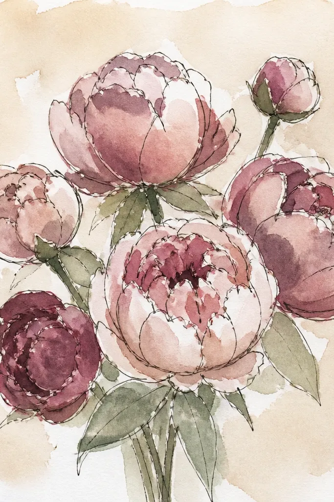
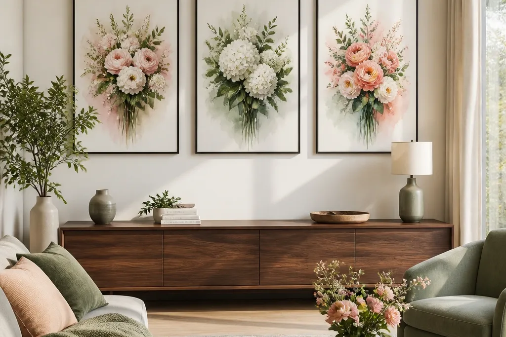
This is the “calm but pretty” bouquet that reads modern because the background is warm and simple. The peonies stay slightly translucent, so you get that watercolor softness without losing shape. Keep the leaves a muted sage and let the petals carry most of the color. When printed on textured paper, the warm wash makes the bouquet feel like it’s sitting on linen, not floating in empty white space. It works great for spring and Mother’s Day, especially if you want a cozy wall that still looks clean.
Start by painting a pale warm-beige wash across the page, leaving a lighter halo around where the bouquet will sit. Sketch a loose peony cluster and block in mid-tone pink petals, then add darker pink at petal bases and folds. Finish with thin, darker green lines for stems and a few leaf veins, keeping the corners mostly blank. Let it dry fully before scanning or photographing for printing.
Good to knowUse a round brush for petals and switch to a smaller liner brush for just 5-8 stem lines — that tiny detail makes it look finished.
Common mistakeDon’t shade every petal equally; leave some petals lighter so the bouquet has depth.
2. Tall Tulip Bouquet with Sky-Blue Mist Background
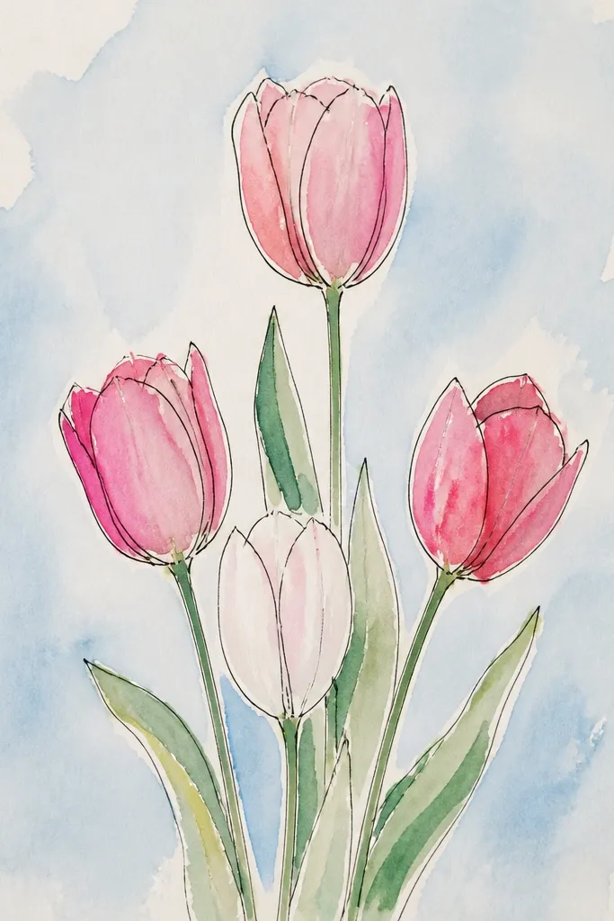
Tall tulips look modern because the silhouette is vertical and structured, even when the paint is loose. The sky-blue mist background adds a cool, airy feel that frames the blooms without competing with them. Choose two tulip colors max — coral and pale pink — and repeat those tones across the petals for cohesion. Add a few darker stem marks to anchor the composition. This print looks great in entryways and hallways because it pulls the eye upward and feels tidy.
Wet the paper lightly at the top third and pull a sky-blue wash downward, leaving the middle bouquet area slightly clearer. Sketch 5-7 tulips with long stems and paint the lightest petal color first, then drop in coral along one side of each bloom. Add tiny leaf shapes as simple strokes, then outline a few stems with a darker green-gray. Keep the bottom edge lighter so the bouquet doesn’t feel boxed in.
Good to knowPaint tulip petals with a “C” shape stroke, then rinse the brush and soften one edge so each bloom looks airy.
Common mistakeSkip heavy outlines around tulips; watercolor needs soft edges to stay flattering.
3. Wildflower Hand-Tied Bundle with Sage Sprigs
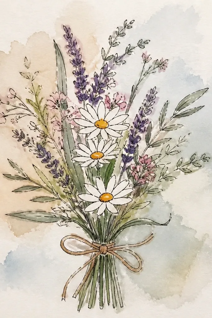
Hand-tied bundles are modern when they look intentionally messy — not chaotic. This one uses a small set of wildflower shapes: daisies, tiny blossoms, and wispy sage sprigs. The off-white background gives the flowers space, and the sage color ties everything together so it feels cohesive. Tie the bundle with a thin ribbon-like strip so the viewer reads it as one bouquet, not scattered flowers. It’s perfect for summer and outdoor-themed walls.
Lay down a very light off-white wash (almost paper color) and keep it thin so texture shows through. Paint a small cluster of daisies first, then add tiny dot flowers and a few longer petals around the edges. Create sage sprigs with quick, curved strokes and a slightly darker green at the base. Finish by painting a thin ribbon band across the lower third and adding a couple of stem lines to connect the bundle.
If your sprigs look flat, add one darker stroke at the base of each sprig to suggest depth.
Don’t add too many flower types; stick to three flower shapes max.
4. Creamy Rose Bouquet with Blurred Watercolor Edges
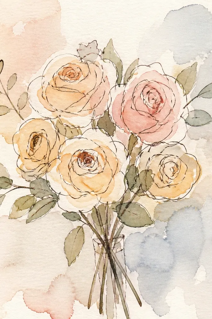
Roses can go romantic fast, but this look stays modern by keeping the palette creamy and the edges softly blurred. Use a pale gray background wash so the blush roses pop without feeling loud. The key is controlled softness: petals have a clean internal shape, but the outer edge melts a bit like wet-on-wet watercolor. That gives the print a dreamy feel that still reads crisp when printed large. Great for bedrooms, reading nooks, and any gallery wall where you want gentle color.
Paint a pale gray wash across the page, then let it settle until it’s tacky, not dripping. Sketch 6-8 roses as overlapping circles and spirals, then fill the petals with cream and blush mid-tones. While petals are still slightly damp, soften the outer edges with clean water and gentle brush taps. Add a few darker rose centers and a minimal set of leaves using thin strokes.
Good to knowKeep roses grouped; one rose with lots of negative space looks lonely on paper prints.
Common mistakeDon’t overwork dry paper; repeated passes turn watercolor dull and muddy.
5. Peach + Terracotta Mixed Blooms with Color-Drip Ground
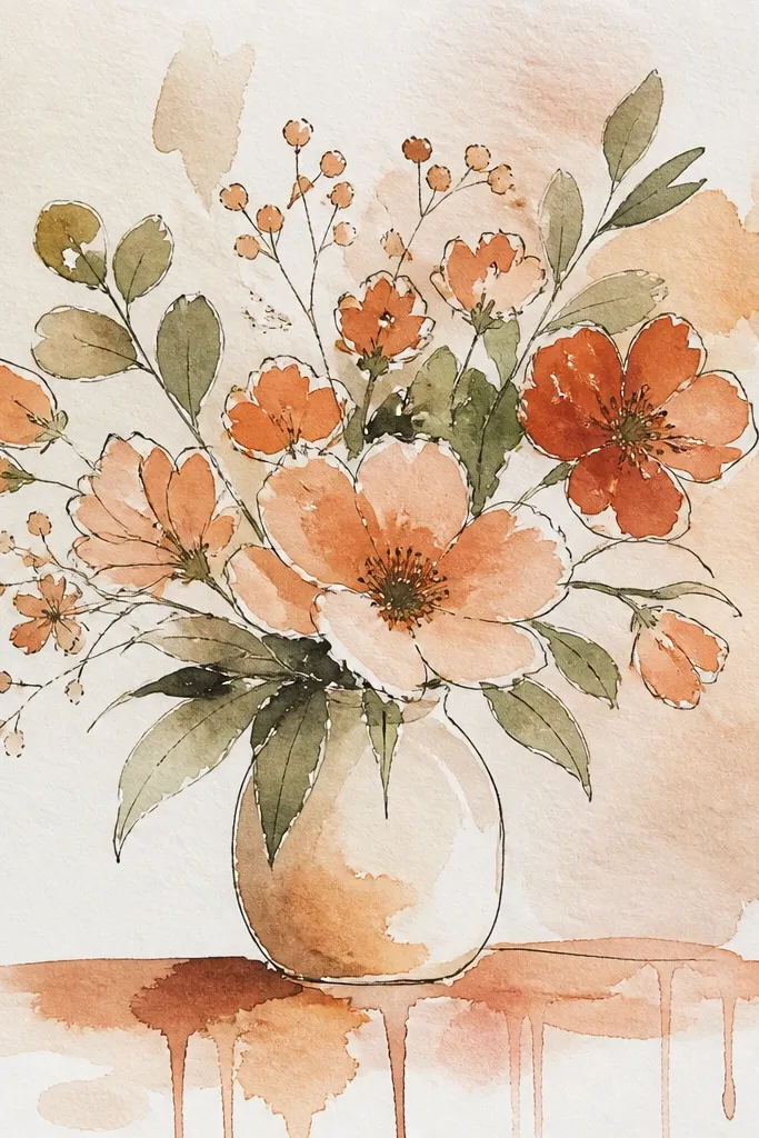
This print looks modern because it adds texture without clutter: a gentle watercolor drip ground behind the bouquet. The drips are faint and tapered, like paint pulling downward, so the bouquet stays the main event. Use peach and terracotta for most petals, then drop in sage leaves to cool the palette. The contrast between soft blooms and slightly streaky background makes the whole piece feel contemporary. It’s a strong choice for fall transitions when you want warmth without heavy autumn leaves.
Start with a very light warm background wash and keep it thin. Before it dries fully, add a few controlled pigment drips behind where the bouquet will sit, using a loaded brush and letting gravity do the streaking. Paint the bouquet on top with peach petals first, then terracotta shadows at petal bases. Finish with sage leaf strokes and a couple of darker stems to keep the bouquet from floating.
Test drip placement on scrap paper — aim for 6-10 tiny streaks, not long lines.
Don’t let drips cross into the bouquet center; keep them behind the flowers.
6. Monochrome Black Ink Bouquet with Watercolor Tint
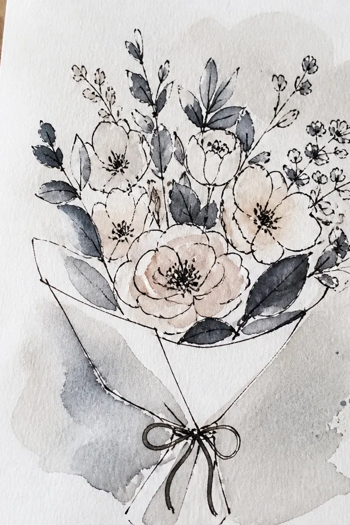
This is the modern minimal bouquet for people who don’t want color to do all the work. The black ink line gives structure and crisp readability, while watercolor tint adds softness inside the outlines. Keep the tint limited to blush for petals and sage for leaves so it still feels like watercolor, not a coloring page. When printed, the ink lines make it look graphic and gallery-ready. It’s ideal for small frames, tight gallery walls, and anyone who likes clean design.
Draw the bouquet with black waterproof ink using thin lines for stems and slightly thicker lines for flower bases. Add watercolor tint lightly inside a few petal shapes, leaving most of the ink-only areas untouched. Wash the background with a near-white watercolor so the paper texture still shows. Let everything dry, then scan or photograph with good lighting to preserve the line sharpness.
Good to knowUse waterproof ink so your watercolor wash doesn’t smear the lines.
Common mistakeAvoid heavy shading inside petals; tint should stay light so the ink remains the anchor.
7. Blue Hydrangea Dome with Soft Pink Highlights
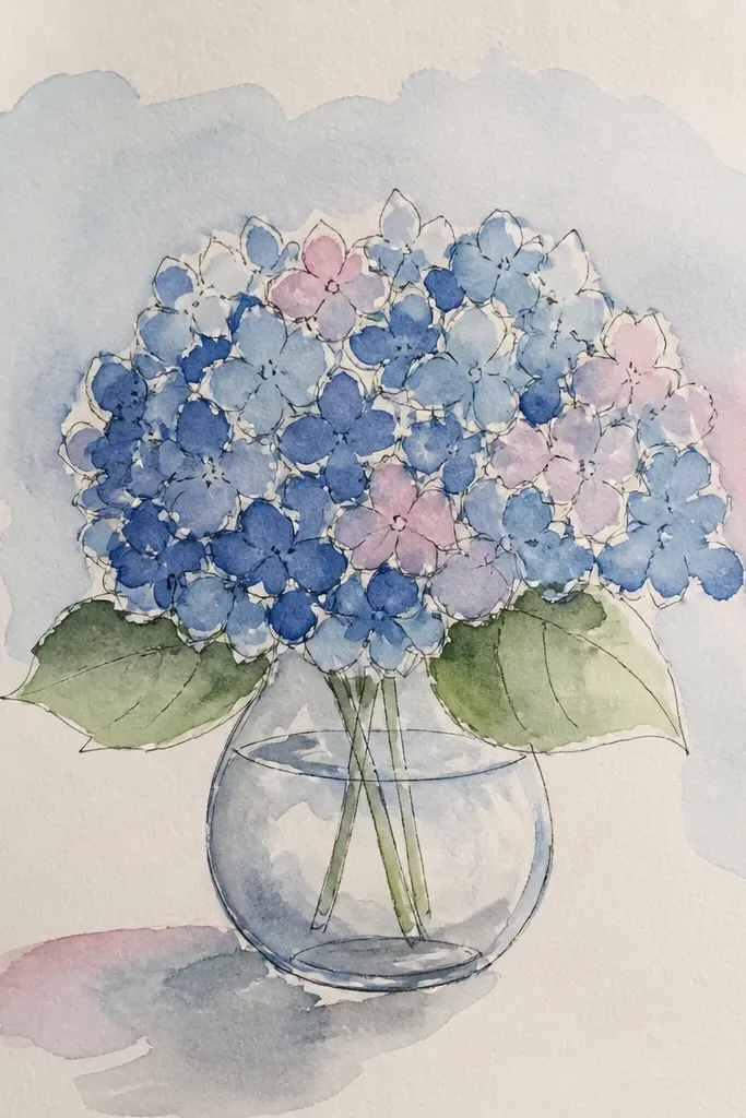
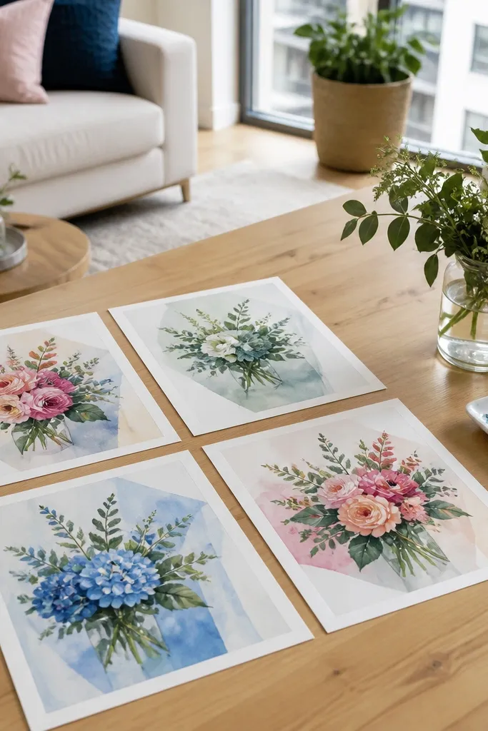
Hydrangeas look gorgeous in watercolor because the cluster naturally creates texture. This one stays modern by using a single hydrangea dome shape and repeating a limited color family: blue with soft pink highlights. The leaves should be pale mint, kept simple so they don’t steal attention from the flower mass. That dome silhouette reads instantly from across a room. Print this for a kitchen or dining area where you want something that feels lush but still tidy.
Sketch a dome shape and lightly map a few internal zones so you don’t paint one flat blob. Paint the hydrangea mass in watery blues, then add darker blue at the edges of each cluster using a dry brush technique. Drop tiny pink touches only in a few spots so it looks natural, not evenly distributed. Keep leaves as two or three strokes in pale mint, then add a thin stem line to connect the composition.
Good to knowFor dry brush texture, barely load your brush and use short flicks — it creates that hydrangea speckle.
Common mistakeDon’t outline every petal inside the dome; hydrangea texture comes from color variation.
8. Lily-of-the-Valley with Dewy Green Wash
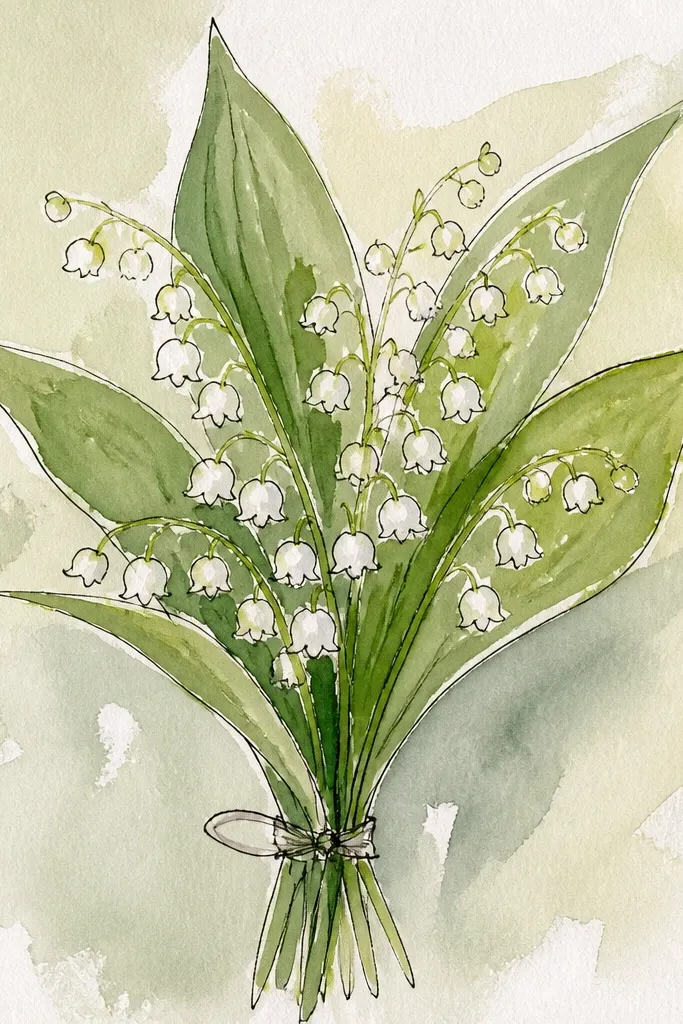
Lily-of-the-valley looks elegant without being fussy, and the bells give you a clear pattern that prints well. A dewy green wash behind the stems adds freshness and makes the white blooms read bright. The trick is to keep the bells simple: tiny ovals with one darker line inside each bloom. Add just a few small buds for depth. This works beautifully for spring and also feels surprisingly good in bathrooms because it’s light, clean, and not too floral-sweet.
Wash a pale dewy green background and leave it lighter around the bouquet center. Sketch one main stem curve and add short side stems. Paint bells as small white ovals, leaving the paper unpainted for highlights if you’re working on watercolor paper, then add a thin gray-green line inside each bell. Finish with darker green stems and a couple of tiny leaf strokes.
Use the tip of a small round brush for bell interiors; it keeps the lines crisp.
Don’t paint bells too large; lily-of-the-valley looks best when the pattern is delicate.
9. Autumn Leaves + Dahlia Bouquet with Soft Sepia Frame Wash
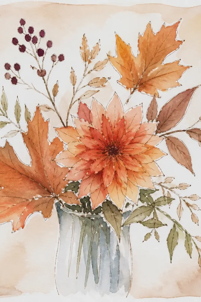
This bouquet brings fall warmth while still looking modern because the background is controlled and the leaves are minimal. Dahlia petals give you bold shape, but you keep the overall palette to rust, warm pink, and sepia-toned neutrals. The “frame wash” idea means you tint the background slightly darker near the edges, so the bouquet sits inside a gentle vignette. It prints beautifully in a light wood frame. Great for fall mantels and dining tables where you want seasonal color without heavy prints.
Paint a light sepia wash on the page, then deepen the edges with a slightly darker sepia using a bigger brush. Sketch a dahlia cluster and block in the largest petals first with warm pink, then add rust shadows in the folds. Add a few small leaf strokes only at the sides, not across the center. Finish with thin stem lines and let the vignette do the framing.
Good to knowKeep the vignette subtle — if the edges go too dark, it starts looking like an old postcard.
Common mistakeDon’t add too many leaf shapes; fewer leaves make the dahlia look more intentional.
10. Satin Ribbon Bouquet with Pastel Blooms and Clean Negative Space
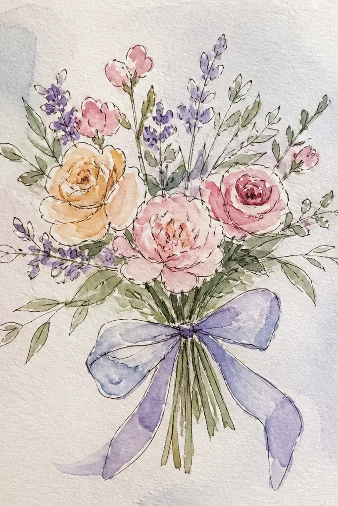
This look is modern because it uses negative space like design, not as an accident. Pastel blooms stay light and airy, and the ribbon gives a clear, graphic element. Keep the background almost paper-white, then use watercolor just enough to tint the flowers and a few leaves. The ribbon should be painted as a soft band with slightly darker folds at the edges. This is a great choice for spring celebrations and prints that will hang in bright rooms where white walls dominate.
Leave the background mostly blank and paint only a faint wash behind the ribbon area. Sketch a bouquet shape and paint pastel petals in layers, starting with the lightest tint and adding soft shadows along petal folds. Create the ribbon as a curved band across the lower third, with one darker fold line on each side. Add a few thin stems and stop — no extra decorations.
If your petals look too pale, add one darker shadow color to each bloom, not across the whole page.
Avoid painting a full background wash; it kills the modern airy look.
11. Roses in a Glass Vase Outline with Watercolor Washes
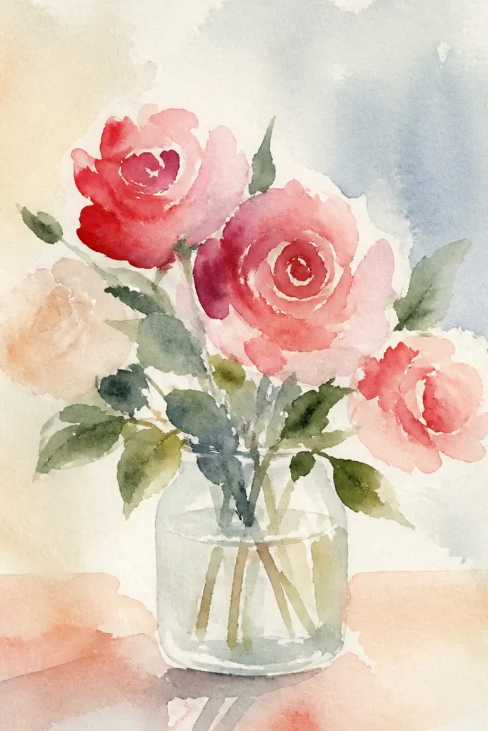
A vase outline makes the bouquet feel composed and modern, especially when you keep the vase minimal. Paint the vase as a clean outline with a few transparent wash hints, then let the roses be the soft watercolor mass. This style looks great for prints that will be framed under glass because the vase lines give a crisp boundary. Use blush roses, muted green leaves, and a pale background wash. It’s also a good “starter” bouquet because the vase structure helps the composition stay balanced.
Draw a simple vase shape with a light pencil guide and then outline it with thin paint or ink. Paint the background wash first, keeping it pale so the vase outline stays visible. Paint roses as clustered spirals in blush tones, then add leaf strokes in muted green around the base of the bouquet. Add a slightly darker wash inside the vase for depth and let the rest stay light.
Use a ruler for the vase rim line so the print feels sharp and modern.
Don’t over-detail the vase; focus on roses and keep the vase graphic.
12. Garden Bouquet with Lemon Yellow Centers and Soft Lilac Petals
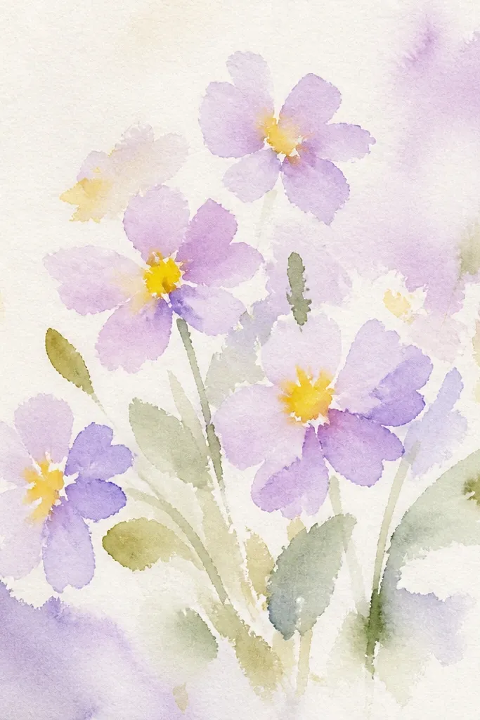
This bouquet pops without screaming because the contrast is controlled: lemon yellow centers against soft lilac petals. The result is cheerful but still modern, especially with a pale lavender wash behind. Keep the centers small and bright, then let petals blend outward in watercolor gradients. Add a few thin green stems so the bouquet reads as fresh, not flat. This print is perfect for spring and early summer and looks great in frames with white or light gray mats.
Wash a pale lavender background and keep it thin. Paint flower petals in lilac tones using wet-on-wet for gentle gradients, then dot lemon yellow centers into the darkest petal areas. Add a few simple green stems and tiny leaf dashes at the sides. Finish with one or two darker lilac shadows under each flower to anchor them.
Good to knowUse a separate brush or rinse well before yellow; mixed pigment turns centers dirty fast.
Common mistakeAvoid spreading yellow too widely; keep it concentrated in centers.
13. Peony + Eucalyptus Mix with Fresh Green Underpainting
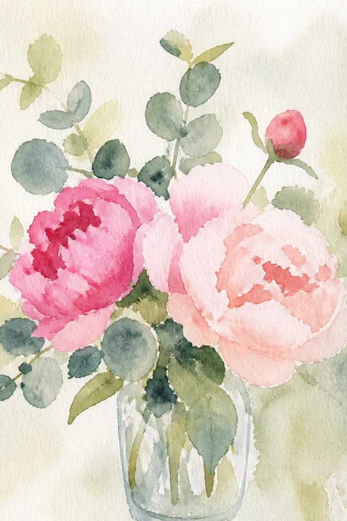
Eucalyptus leaves make bouquets look modern because they add long, graphic shapes. Here, the green underpainting is the secret: you tint the background lightly green so the peonies feel grounded. Peonies stay soft and dimensional, but the eucalyptus lines keep the composition crisp. This print looks great for modern farmhouse rooms and also works in offices because it’s not too sweet. The palette is peony pink, fresh green, and a neutral wash that keeps everything clean.
Start by tinting the background with a very light green wash, concentrated behind where leaves will go. Paint peonies in pink mid-tones, then add darker pink at petal bases and a few highlight areas by leaving paper lighter. Add eucalyptus leaves as long oval strokes with slightly darker edges, then connect everything with thin stems. Finish with a minimal shadow wash under the bouquet center so it feels placed.
Paint eucalyptus leaves with one confident stroke each; multiple passes make them look messy.
Don’t clutter the background with extra greenery; the underpainting should stay subtle.
14. Winter White Bouquet with Pale Blue Snow Wash
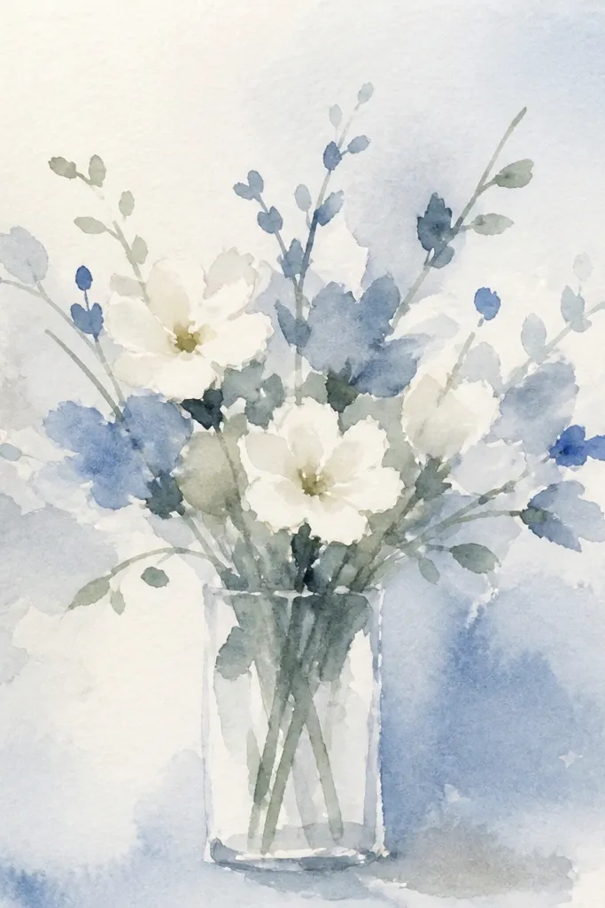
Winter white bouquets look striking in modern interiors because they read clean and calm. Use mostly white and very pale gray-blue for shadows, with almost no bright color. The snow wash background should be cool and light, like a fogged sky. Add a few darker stems so the composition stays readable on paper prints. This style works for holiday-season walls, but it doesn’t look like Christmas — it looks like winter design.
Wet the background lightly and pull a pale blue wash across the top, fading it downward. Sketch 5-7 blooms and paint them in white by leaving the paper unpainted where highlights should be. Add pale blue-gray shadows under petals and along the inside of each bloom. Finish with thin charcoal-like stems and a few small leaves, keeping everything airy and sparse.
Good to knowUse a light touch for shadows; if you go too dark, it turns into a gloomy monochrome print.
Common mistakeDon’t add colored accents like red or gold; they break the winter-white mood.
15. Spring Bouquet in a Minimal Oval Frame Wash
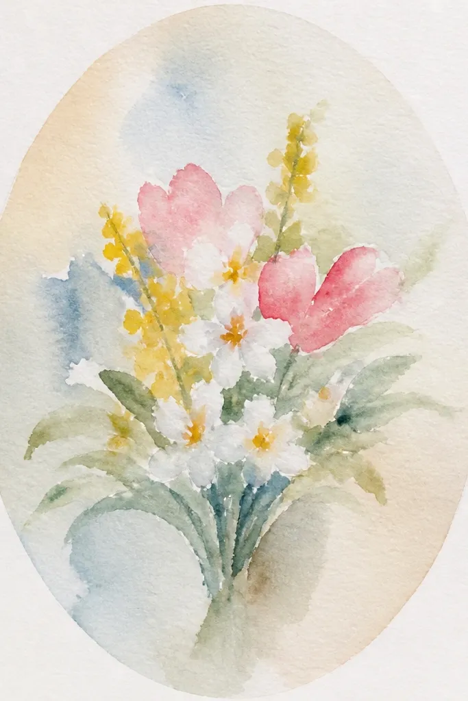
This idea looks modern because it has a built-in “frame” without using actual borders. You paint a soft oval wash behind the bouquet, then keep the outer page mostly white. The bouquet sits inside that oval like a vignette, which makes prints look intentional even if you use a simple frame. Choose spring flowers in two pastel tones plus muted green, then keep stems clean and light. It’s a strong option for small wall spaces because it reads as one composed artwork.
Paint a soft oval wash in the center of the page, leaving a generous white margin around it. Sketch the bouquet so the top blooms don’t touch the oval edge. Paint the flowers in layers using two pastel colors and muted green stems, then add tiny darker accents only at petal folds. Let the oval wash dry completely, then scan and print with a white mat if you want that gallery look.
Good to knowKeep the oval edges feathered by loading less pigment as you reach the boundary.
Common mistakeDon’t make the oval too dark; a dim vignette makes the whole piece look heavy.
16. Tropical-ish Bouquet with Coral Flowers and Teal Leaves
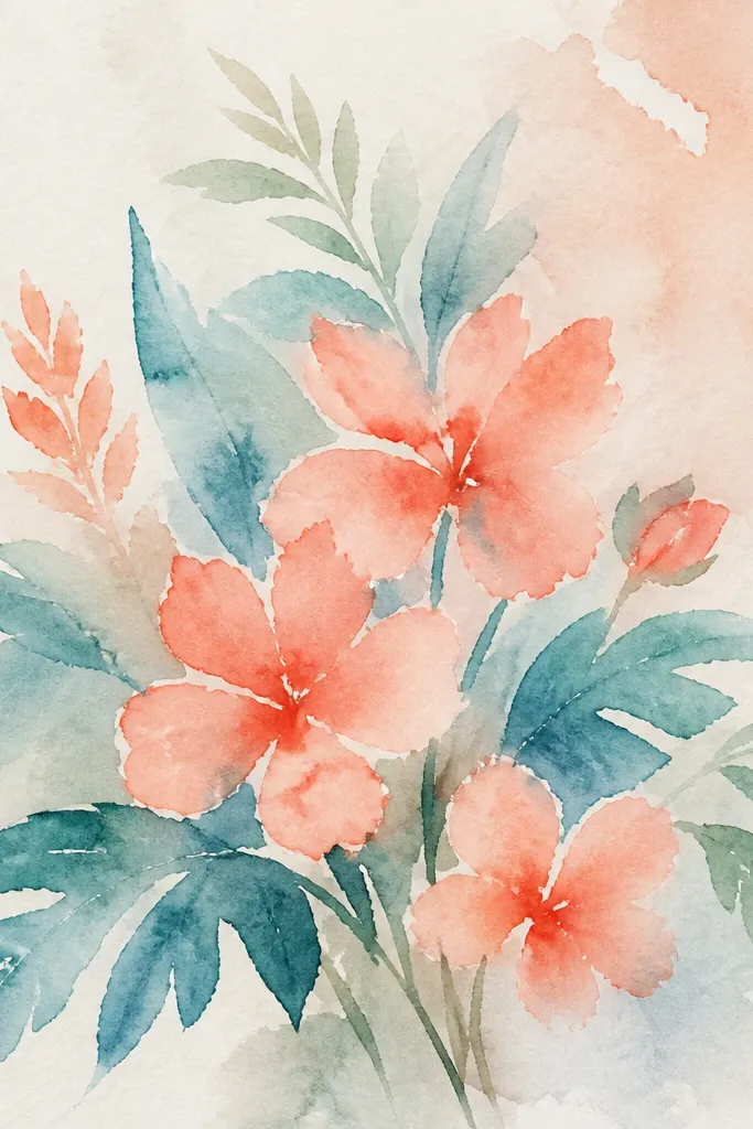
Teal leaves and coral blooms create a modern, slightly tropical palette that still feels clean. This bouquet looks good in contemporary frames because the contrast is crisp even when the paint is loose. Keep the flowers coral in simple shapes, then use teal leaves as long brush strokes that angle in different directions. Add a pale warm wash behind so the colors don’t look flat. It’s a great summer print for a living room or a bright kitchen wall.
Wash a pale warm background first — think peachy cream, not saturated orange. Paint coral flowers with simple petal shapes and light gradients, keeping the center slightly darker. Add teal leaves as long angled strokes, then deepen some leaf edges with a darker teal. Finish with a few thin stems in a muted green-gray so the bouquet doesn’t look too neon.
Good to knowMix a gray-green for stems by adding a touch of the leaf teal to a tiny amount of brown or black — it keeps it modern.
Common mistakeAvoid using pure teal everywhere; it can look harsh in print.
17. Monochrome Sage Bouquet with Soft Lavender Background
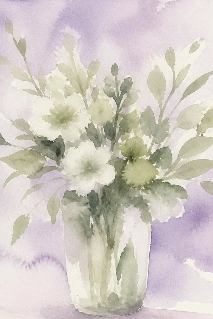
This is a modern “grown-up” bouquet because it uses near-monochrome color. Sage blossoms stay muted, and a soft lavender background gives just enough contrast to make the flowers visible. You’ll need to rely on value differences — light sage petals and darker sage centers — instead of bright colors. The result feels expensive and calm, especially in neutral homes. Print this when you want floral art that doesn’t fight your furniture colors.
Paint a soft lavender wash behind the bouquet and keep it light. Sketch a bouquet cluster and paint petals in light sage, then add darker sage centers and a few shadow strokes at petal bases. Keep leaves simple and mostly the same value range as petals, with occasional slightly darker veins for shape. Add a thin stem line and stop — no extra decoration in the negative space.
To make sage look dimensional, add tiny darker dots at centers rather than full heavy shading.
Don’t add bright accents; the look depends on value, not color variety.
18. Roses with Gold-Like Sparkle Wash on Edges
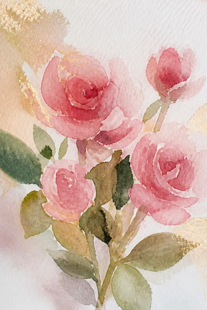
This bouquet reads modern because the shimmer is controlled. Instead of glittering the whole page, you add a gold-like sparkle wash only along selected edges of petals and a few leaf tips. The blush roses stay watercolor-soft, while the shimmer catches light just enough to feel special. It’s a great seasonal print for late fall and winter, and it looks amazing in frames with a warm mat. The key is restraint: sparkle should be an accent, not a coating.
Paint a light neutral background wash and let it dry fully. Paint blush roses with standard watercolor layers, leaving petal edges slightly darker where you want shimmer to land. Mix a tiny amount of shimmer medium or dilute metallic watercolor and apply only to 10-15 petal edge lines and a couple leaf tips. Let it dry completely before scanning or photographing so the shimmer doesn’t smear.
Use a very small brush for shimmer and wipe the brush on a paper towel first so you don’t get blobs.
Avoid metallic wash across the whole bouquet; it turns into a craft-looking finish.
19. Peach Ranunculus with Blended Background Halo
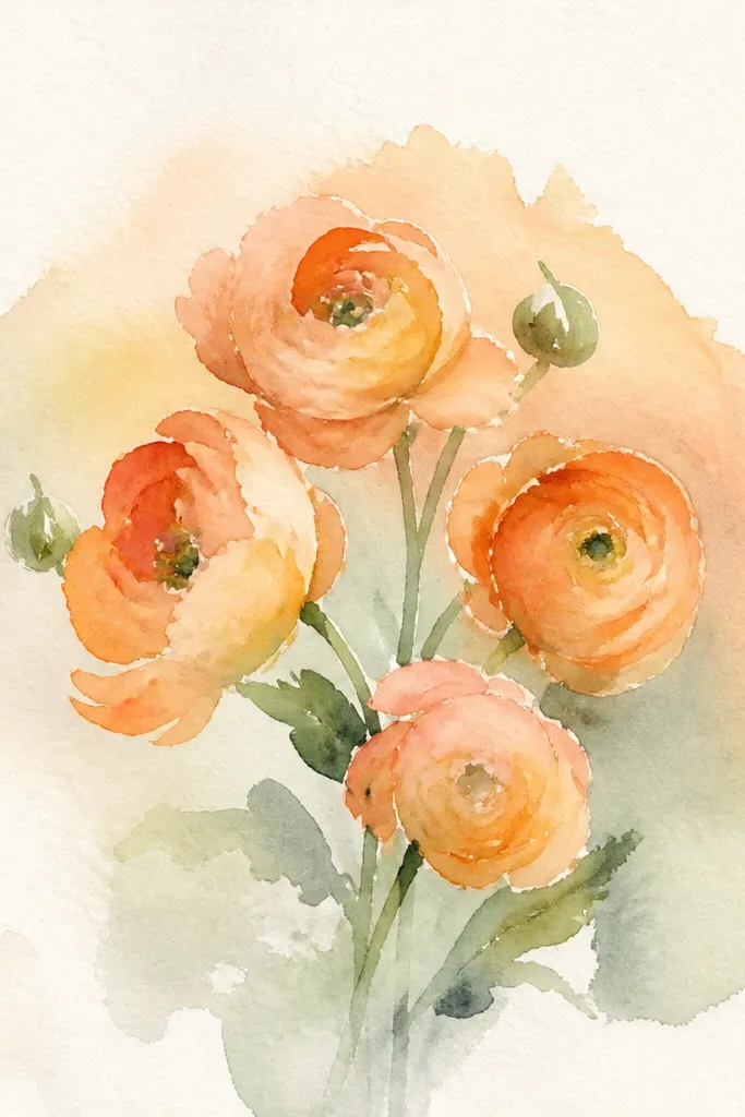
Ranunculus gives you a layered petal look that prints beautifully when you keep the palette tight. The blended halo background makes it feel like the bouquet is lit from behind, which is a very modern trick. Use peach petals with soft peach shadows, then add a tiny bit of warm cream at the highlights. Keep the leaves minimal and let the halo do the composition work. This print is a great pick for spring and also looks good in nurseries because it’s warm and not overly saturated.
Paint a light peach wash in a circular area behind where the ranunculus cluster will sit, then blend outward into the white using clean water. Sketch 3-5 ranunculus blooms and paint them with layered peach tones, starting light and adding shadow rings in deeper peach. Add tiny highlight touches by leaving paper lighter at petal folds. Finish with a few thin stems and one muted green leaf stroke.
Good to knowBlend the halo with clean water only, not more pigment — that prevents muddy edges.
Common mistakeDon’t over-darken the halo; if it’s too strong, the bouquet looks washed out.
20. Garden Bouquet with Red Berry Sprigs and Dusty Green
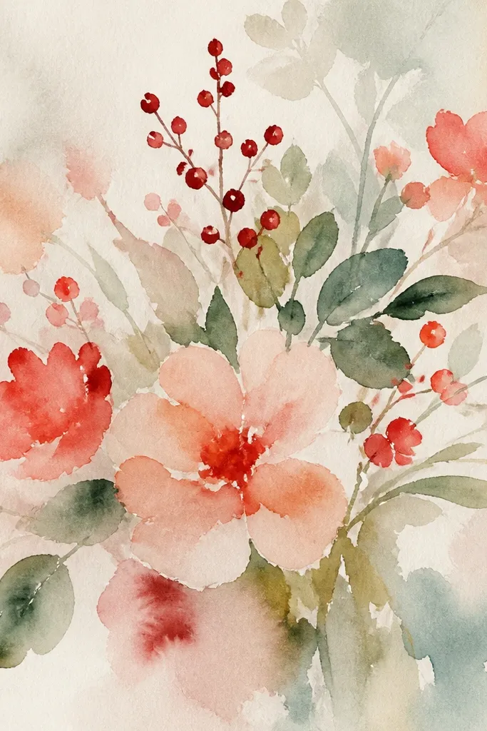
Berries make bouquets feel seasonal without needing heavy holiday symbols. This one uses dusty green foliage, pale pink blossoms, and small red berry dots placed like punctuation. The modern look comes from spacing: berries sit in clusters, not scattered across the entire page. Keep the background light so the red reads clean and bright. It’s perfect for early winter and holiday-adjacent decorating when you want color that still feels floral.
Wash a light background and keep it thin. Paint a simple bouquet cluster with pale pink blossoms and dusty green leaves, focusing foliage around the sides and bottom. Add red berries as small round dots with one darker red at each dot’s base, then connect berries to stems with a few thin lines. Finish with minimal stem lines so the composition stays crisp.
When placing berry dots, leave at least one empty area between clusters — it keeps the design from looking busy.
Don’t draw berries as large circles; small dots make the print feel delicate and modern.