1. Tea-Stamped Daisy Bouquet in a Mason Jar
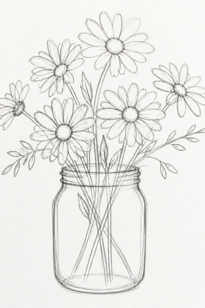
This is the cozy, seasonal holiday look that photographs well because it mixes crisp flowers with a gentle, imperfect background. Draw a simple mason jar outline, then cluster 6-10 daisies across the jar opening so the bouquet feels abundant without crowding. The “tea-stamped” feel comes from a light, mottled wash behind the jar, which makes the white petals look brighter even on plain paper. Keep the jar lines darker than the flowers so your eyes land on the bouquet first. The result is card-ready and looks intentional even if your centers aren’t perfectly even.
Start by sketching a jar shape 2.5-3 inches wide with a slightly curved rim and a narrow neck. Then draw daisies inside the jar opening using 5 petal arcs around a scribbled center; overlap petals lightly where flowers overlap. Finally, add a pale wash behind the jar using diluted brown/gray (tea color) and tap it with a brush for soft blotches; let it dry before adding final stem lines.
Use a ruler lightly for the jar sides, then freehand the petals so it still feels handmade.
Don’t outline every background speck in dark ink or the daisies lose their contrast.
2. Wreath-Style Daisy Ring with a Single Red Ribbon Bow
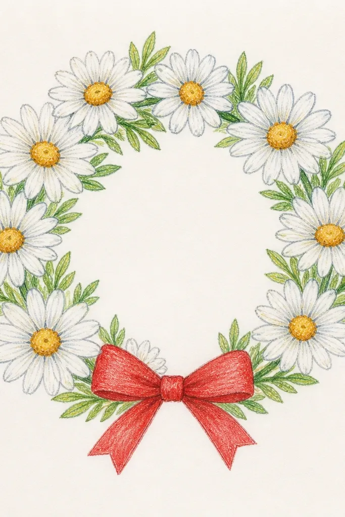
A wreath ring is an instant holiday-friendly shape because it reads as “decoration,” not just a bouquet. Place daisies in a circle with consistent spacing, then add one ribbon bow that acts like the focal point. The trick is to keep the daisies slightly varied: some face forward, some tilt a bit, and only the front layer gets full petal detail. Add a few long stems crossing behind the ring to make it look woven. This idea is great for wall art, door tags, and printable card fronts.
Draw a large circle, then mark 12 small tick points around it where daisies will go. At each tick, draw one daisy with 5 petal arcs and a scribbled center, keeping the petals similar length for a tidy ring. Add a ribbon bow at the top: two loops and two tails, then connect it to the wreath with a couple short stem lines. Finish by lightly shading stems behind the ring with a gray pencil so the foreground daisies pop.
Make the bow slightly bigger than you think — it balances the circle and improves photo framing.
Don’t crowd the ribbon with extra bows; one accent reads cleaner on paper.
3. Side-Profile Daisy Bouquet with Flowing Stems and Loose Petals
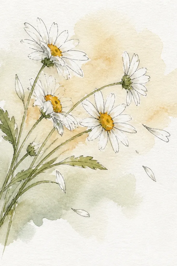
Side-profile bouquets look airy and feel “cozy” because the stems act like a natural flow line for the eye. You’ll draw fewer daisies than a front-facing bouquet, but it still looks full thanks to the stem sweep and some intentionally loose petal shapes. This one is forgiving: if petals aren’t identical, the asymmetry looks charming instead of messy. Keep the largest daisy near the front and place smaller ones along the stem curve. It’s perfect for bookmarks, slim card layouts, and journal pages.
Sketch a sweeping stem curve from bottom left to mid right, then add 4-7 daisy heads along the curve. For each daisy, draw 5 petal arcs that slightly lean in the direction of the stem, then fill the center with short scribble strokes. Add a few leaf shapes as simple ovals with a pointed tip and place them only where they support the flow. Finish by drawing a light shadow under the front daisy using a soft pencil smudge, staying subtle.
Keep leaf count low — 3-5 leaves is enough to make the bouquet look intentional.
Avoid drawing a second stem in the opposite direction; it breaks the flow and flattens the composition.
4. Daisy Bouquet in a Wrapped Gift Box (Ribbon Crisscross)
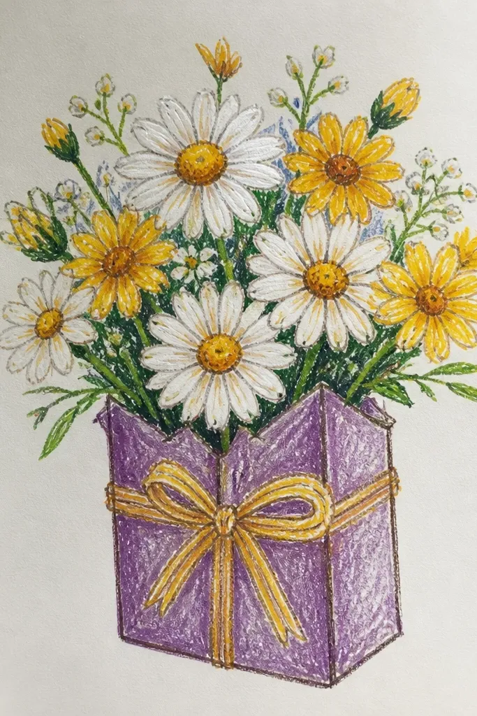
This idea turns the bouquet into a holiday moment by using a wrapped box shape and a crisscross ribbon. It’s visually satisfying because the box edges create structure while the daisies bring softness. Draw 5-8 daisies emerging from the top center, then echo the ribbon lines with a few stems to tie everything together. The best look is when the ribbon is darker and the bouquet is slightly lighter in line weight. It reads clearly even in a small thumbnail, which matters for social posts and printables.
Draw the gift box as a simple rectangle with a top flap and folded corners; keep proportions clean (about 4:3 width to height). Add a crisscross ribbon: two diagonal bands and a small knot at the top center. Place daisies on top of the box opening, with petals extending slightly beyond the rim so they feel like they’re popping out. Finish with tight centers and a few short leaf lines under the ribbon knot so the bouquet looks anchored.
Use two ribbon colors only if you’re coloring: one deep red-brown and one muted cream, no extra shades.
Don’t shade the entire box with heavy gray; keep shading light so the ribbon stays the hero.
5. Daisy Bouquet with Watercolor Wash Background and Ink Petals
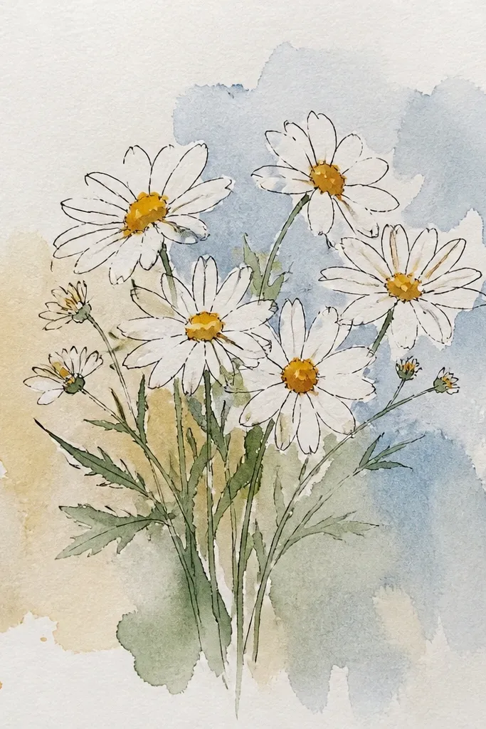
This is the cleanest “aesthetic” combo for daisies because ink lines give crisp petals while watercolor backgrounds add warmth. You’ll get that cozy holiday vibe without overworking tiny details. Draw the bouquet in fine liner first, then add color only to the centers and a pale green for leaves. The background wash should stay lighter than the flowers so the bouquet remains readable. This works for greeting cards and printable art because the contrast is strong and forgiving.
Good to knowColor the centers with a warm yellow-orange, not bright lemon — it looks more vintage and cozy.
Sketch your triangle bouquet layout lightly, then ink the daisies with a fine liner: 5 petal arcs, then a scribbled center. Add stems and leaves in pencil first, then ink only after you like the spacing. Apply a watercolor wash behind the bouquet using diluted yellow-gray or warm light peach; keep it out of the petals by using dry brush edges. Let it dry fully, then add a second tiny pass of ink on petal edges if any lines got softened.
Common mistakeDon’t paint the background too dark; if it competes with the petals, the whole bouquet looks muddy.
6. Pencil-Only Daisy Bouquet with Smudged Center Texture
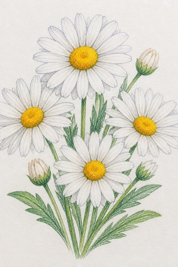
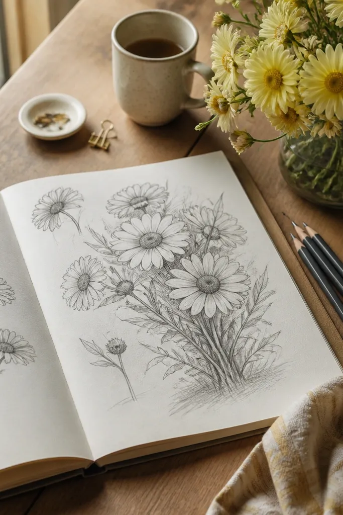
If you want a drawing that looks good even without pens or markers, pencil-only can still be photogenic. The secret is texture: instead of crisp dot centers, use short scribbles and then smudge just the center area slightly. Keep petals as light, confident strokes so they look airy. Add a gentle shadow under the bouquet using a single soft gray tone, not lots of separate shadows. This is great for sketchbook pages, cheap paper, and anyone who wants a “soft” holiday mood without color.
Good to knowUse a kneaded eraser to carve highlights in a few petals so the daisies look brighter on camera.
Start by lightly mapping the bouquet triangle with a 2B pencil, keeping flower sizes consistent in the front layer. Draw each daisy with 5 petal arcs and a scribbled center; press a bit harder only in the center. Smudge only the center with a fingertip or blending stump, then lift any accidental smears with a kneaded eraser. Finish with stem shading: one side darker, one side lighter, using a single pencil pass.
Common mistakeDon’t go full dark on every petal edge — it flattens the airy look.
7. Daisy Bouquet in a Ceramic Pitcher with Speckled Highlights
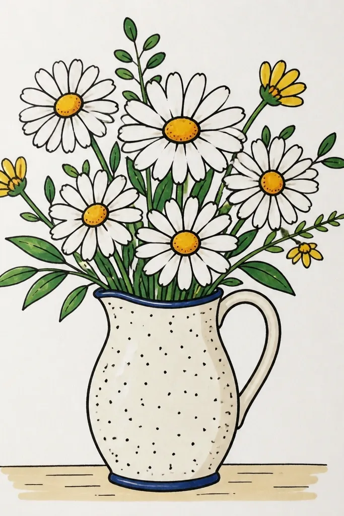
A ceramic pitcher gives the bouquet a grounded, cozy feel that reads like home decor. Speckled highlights make the drawing look more tactile and “finished” without adding lots of detail to each daisy. Draw 7-12 daisies clustered around the pitcher opening, then keep the pitcher texture simple: a few scattered dots and light line dents. This idea is especially good for holiday because the pitcher shape makes the scene feel warm and contained. It also photographs well because the speckles create texture in the shadow areas.
Good to knowLet the pitcher dry before adding white speckles; blot once with scrap paper to avoid blobs.
Sketch the pitcher with a rounded body, a small spout, and a handle; keep the outline clean and slightly thicker than the daisy lines. Add daisies starting with 3 front flowers, then fill in the sides with smaller ones; keep petals consistent in style. For texture, add speckled highlights on the pitcher using a white gel pen or a light paint pen dot pattern. Finally, draw a few leaf lines near the pitcher opening so the flowers look rooted in the container.
Common mistakeDon’t over-texture the daisies; keep texture mostly on the pitcher so the bouquet stays readable.
8. Daisy and Holly Pair Bouquet with Winter Green Accents
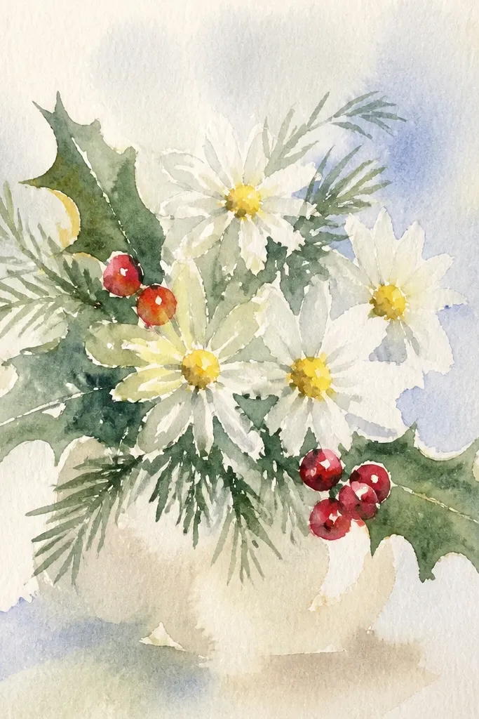
This one mixes daisies with simple holly-style leaves so the bouquet feels holiday-ready without turning into a full Christmas illustration. The contrast is what makes it pop: white daisy petals against dark green leaf shapes, plus tiny berry dots. You’ll still draw daisies as the main structure, but you add 3-6 holly elements around the edges to frame the bouquet. It looks festive in a way that stays classy and not overly busy. Great for ornaments, gift tags, and winter stationery.
Draw the daisy triangle bouquet first with 6-10 daisies, then leave small empty spaces around the perimeter for holly accents. Add holly leaves as pointed ovals with a few short notches along the edges, placed only on the outer third of the bouquet. Add berries as small circles or tiny dots in a deep red, 3-5 total. Finish by drawing stems that connect leaves to the bouquet base so the holly doesn’t look pasted on.
Use fewer holly leaves than you think; 4-6 shapes is enough to create a winter frame.
Avoid drawing holly berries inside the main daisy cluster; they steal attention from the petals.
9. Single Daisy Bouquet Study with Big Negative Space
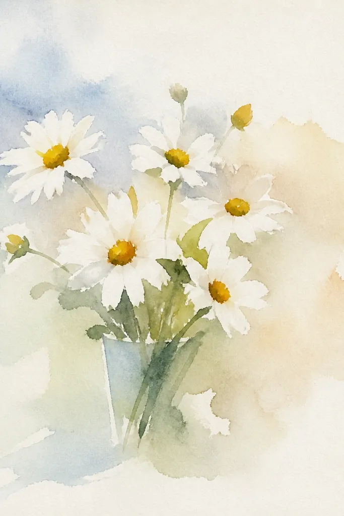
Not every aesthetic bouquet needs a dozen flowers. This layout uses one big daisy as the hero, with 2-4 tiny daisies tucked behind so the page feels calm and cozy. Big negative space makes the drawing look intentional and modern, even for holiday crafts. Keep the stems light and the leaves minimal so the composition doesn’t get cluttered. This is the easiest way to make your drawing look “designed” and not like a practice sketch.
Good to knowUse a lighter pencil for the back daisies so they read as background, not competing foreground.
Place one daisy slightly off-center and draw it larger than life, with 5 petal arcs and a dense scribble center. Add two small daisies behind it, smaller by about half, and keep them partially blocked by the front petals. Draw a short stem bundle that connects all flowers with 2-3 thin lines. Leave a wide border around everything and add only one faint shadow line under the main daisy.
Common mistakeDon’t fill the whole page with stems; negative space is part of the look.
10. Daisy Bouquet with Polka Dot Wrapping Paper Background
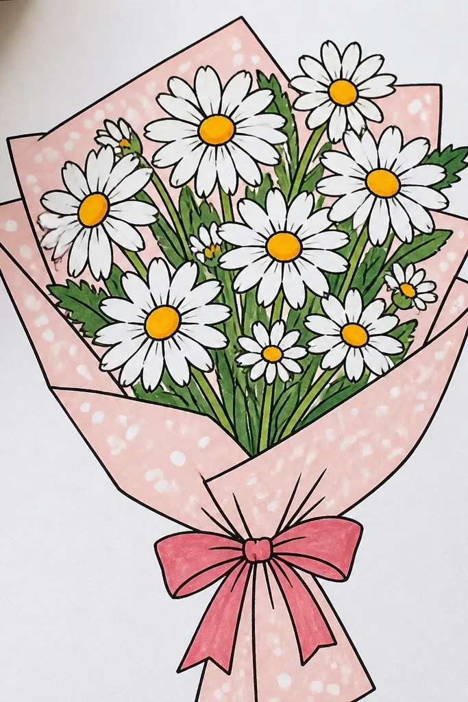
Polka dots instantly make a bouquet feel gift-like, which is exactly what you want for Seasonal & Holiday. Instead of drawing a detailed background scene, you use a simple wrapping-paper pattern so the daisies stay the focus. Draw the bouquet on top with crisp petals, then keep the dots behind it lighter so they don’t compete. The result looks playful, cozy, and very “printable card front” friendly. It also hides uneven coloring because the dot pattern masks minor streaks.
Lightly sketch the bouquet triangle, then ink the flowers and stems with a fine liner. Choose a dot spacing you can repeat: mark tiny circles about 0.2-0.25 inches apart across the background area only. Color the dots with a warm gray or muted brown, leaving the center of each dot slightly lighter for a softer look. Keep the dots behind the bouquet edges by stopping the dot pattern where flowers start.
If your dots look shaky, use a small stamp or the tip of a gel pen to keep spacing consistent.
Don’t make the dots dark black; warm gray reads better and keeps the daisies bright.
11. Daisy Bouquet in a Knit Sweater Shape Frame
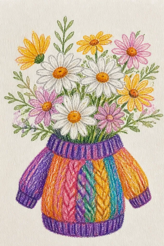
A knit sweater frame turns daisies into a winter drawing without needing fancy coloring. You outline a sweater silhouette around the bouquet, then add a few stitch rows so the frame feels textured. Keep the daisies simple and crisp inside, and let the frame do the heavy aesthetic lifting. This is great for cozy wall prints, holiday tags, and handmade stickers because the sweater border makes it instantly seasonal. The drawing looks cute even if your petal centers are slightly uneven.
Good to knowUse a slightly thicker pen on the sweater outline than on the daisies for a clear separation.
Draw a sweater outline around your bouquet area, including a crew neck and a simple hem curve; keep it clean and bold. Add 3-5 horizontal stitch lines across the sweater body using a light pencil or fine liner. Inside the sweater, draw 7-10 daisies in a triangle layout, keeping stems inside the sweater boundary. Finish by adding small leaf accents only at the bottom edge so the bouquet stays centered.
Common mistakeDon’t add too many stitch lines; 3-5 is enough to read as knit.
12. Daisy Bouquet with Candle Smoke Swirls for a Cozy Night Mood
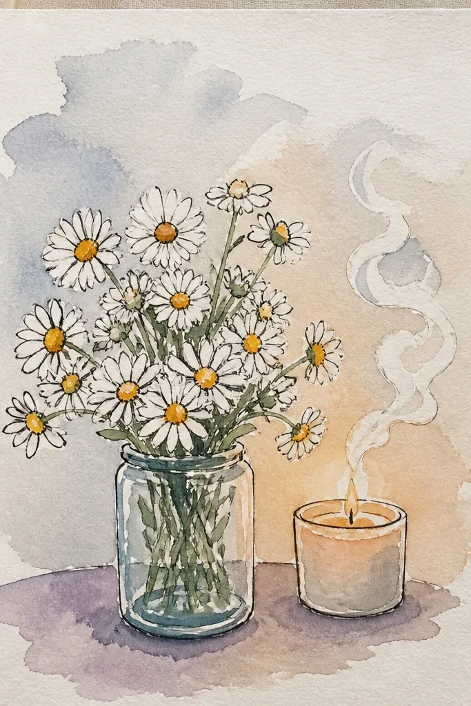
Smoke swirls make a bouquet feel like a cozy night moment, and they’re easy to draw without adding clutter. Place the daisies at the bottom half of the page, then add two or three soft swirl lines rising upward from behind the bouquet. You can keep the swirls pale gray so they don’t compete with the petals. This is a strong aesthetic trick because it adds motion and atmosphere while you still focus on the daisy shapes. It works for holiday cards when you want something different from ornaments and wreaths.
Sketch a bouquet triangle in the lower half with 6-9 daisies, keeping stems grouped so the base looks stable. Draw candle smoke swirls behind the top cluster: thin, curved lines that loop and fade as they rise. Add light shading to the swirls using a gray pencil, then blend gently with a tissue. Finish by darkening daisy centers and adding a few leaf lines so the bouquet stays crisp against the soft background.
Fade the swirl lines as they go up by lifting your pressure — it looks atmospheric without extra shading.
Don’t draw smoke swirls in front of the petals; it makes the bouquet look messy.
13. Daisy Bouquet with Gold-Accent Centers and Warm Brown Leaves
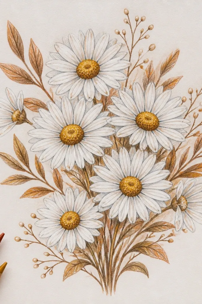
Gold-accent centers instantly make daisies look more special for holiday, even if the rest stays simple. The key is restraint: only the centers get the gold look, while stems and leaves stay warm brown or muted green. Draw each daisy the same way, then add a tiny gold highlight streak inside the center scribble. That small detail reads as “sparkle” in photos. You get a cozy, slightly vintage vibe without coloring every petal.
Good to knowTest the metallic pen on scrap paper first; metallic ink can pool if your paper is slick.
Draw your bouquet triangle with 8-12 daisies using a fine liner or gel pen for petals. Fill each center with dense scribble in pencil or brown, then add a narrow gold highlight using a metallic gel pen or gold paint marker. Color stems and leaves with warm brown pencil or watered-down brown ink, keeping leaf shapes simple and consistent. Finish by adding one light shadow under the front daisies with a soft gray pencil.
Common mistakeDon’t put gold on petals; it spreads attention and makes the bouquet look busy.
14. Daisy Bouquet Border Frame with Tiny Corner Daisies
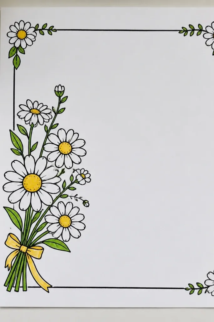
Frames make drawings look finished fast, and corner daisies keep your composition balanced. Put the main bouquet in the center as your focal cluster, then add 1-2 tiny daisies in each corner to create a consistent holiday pattern. This idea works especially well for card fronts because the border gives the viewer a clear “where to look” path. Keep corner daisies smaller and simpler: fewer petal arcs and lighter centers. The result is neat, aesthetic, and very readable.
Good to knowUse the same petal arc size for both center and corner daisies, just scale down the corner flowers.
Draw a rectangular border around your page area, leaving a 0.75-1 inch margin from the edges. Sketch the center bouquet triangle with 7-10 daisies and ink them first. Add corner daisies: tiny petals (3-5 arcs) and small scribble centers in each corner, oriented toward the center. Finish by adding a few short stems or leaf curls along the border to connect corners to the center.
Common mistakeDon’t make the corner daisies as detailed as the center, or the focal point disappears.
15. Daisy Bouquet in a Teacup with Side Handle and Steam Lines
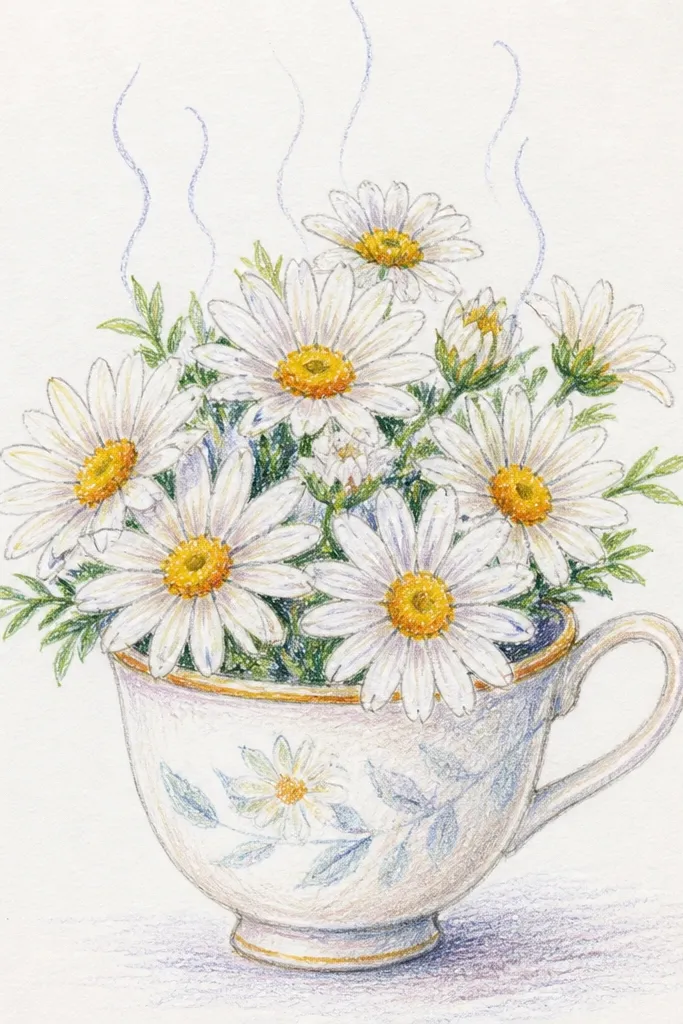
A teacup bouquet is the coziest holiday drawing because it mixes comfort (tea) with flowers. The steam lines add vertical movement and help the bouquet fill the page nicely without extra flowers. Draw daisies tucked into the teacup opening, then keep the stems short so the flowers look like they’re arranged in a small space. Steam lines should be light and wispy, not bold. This is perfect for kitchen wall art, gift tags, and cozy journaling spreads.
Sketch a teacup with a wide opening, a small handle on one side, and a thin saucer line under it. Draw 6-9 daisies inside the cup, with the largest one placed near the front edge of the opening. Add steam lines above the cup using 3-4 curved strokes that taper as they rise. Finish by coloring centers and lightly shading the cup interior with a warm gray or diluted brown wash.
Keep steam lines thinner than the daisy petals so the flowers stay the main subject.
Don’t overfill the cup; 6-9 daisies is enough for a clean, balanced look.