1. Two-Tone Pink Carnation Hand-Tied Bouquet
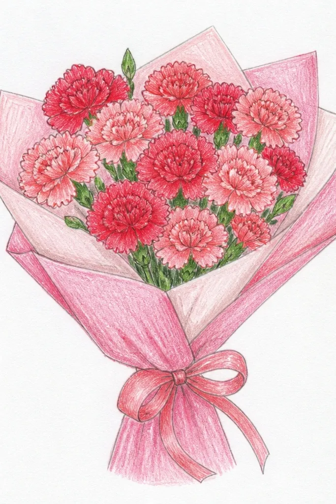
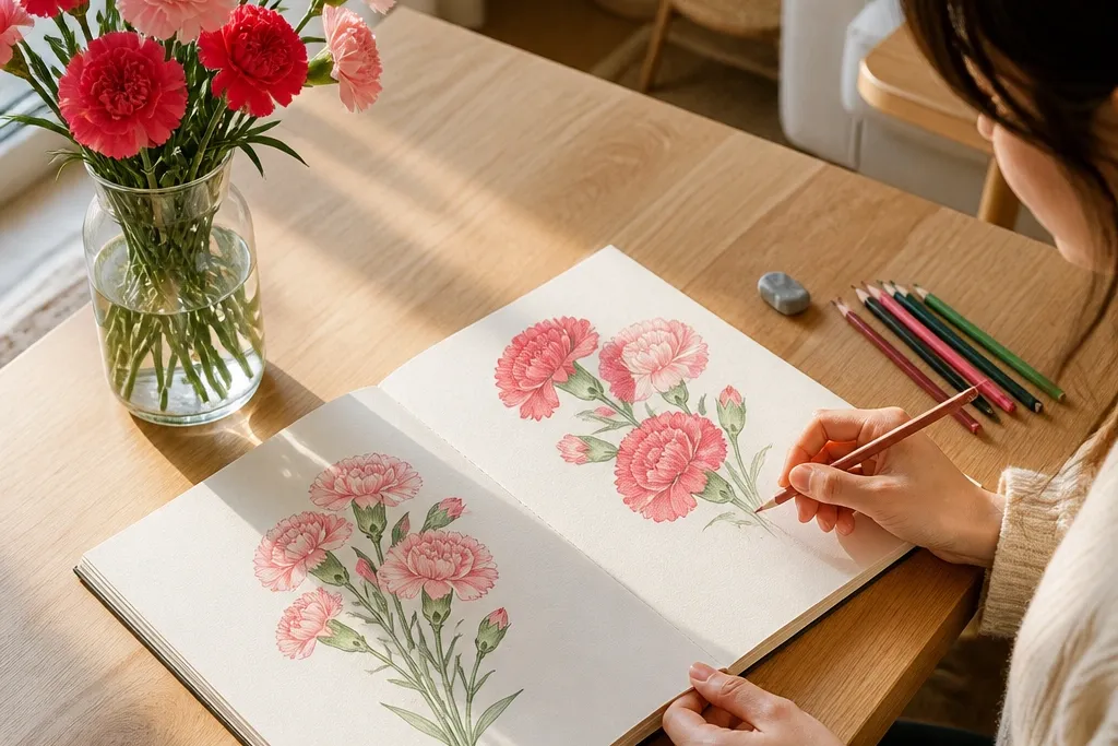
Start by drawing a curved stem bundle that narrows at the top where the flowers cluster. Sketch 6-8 carnations using three petal sizes: small at the center, medium around, and larger outer petals with wavy edges. Add a ribbon loop across the lower third, then color the petals with light pink and add rose stripes only along the petal creases. Finally, darken the stem lines and add a few leaf shadows under the blooms.
This one is a crowd-pleaser because it reads as a bouquet instantly: you get a soft cluster shape, clear petal layering, and a ribbon band that gives the drawing a focal point. Use two pink tones so each carnation has depth without messy coloring. The darker rose creases go on the inner half of each petal, so the blooms look textured instead of flat. It’s easy to scale up or down, and it looks great on plain white paper with a simple pencil sketch plus light color.
Common mistakeDon’t color every petal edge the same dark tone — that kills the 3D look.
Good to knowLeave tiny gaps of paper white at the top edge of petals for the highlight that makes it look polished.
2. Red Carnations with Center Glow Bloom
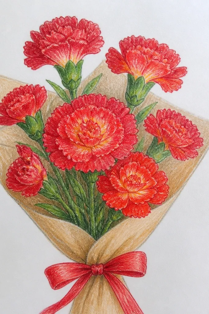
Draw a diagonal bouquet with stems rising from the bottom left toward the top right. Place 7 carnations along the diagonal, spacing them so you can see overlaps. For each carnation, outline the petal ring, then add a lighter red “inner halo” near the center and darker red on the outer petal edges. Shade creases with a thin darker line, then add a few dark leaf veins for structure.
This drawing looks dramatic because the carnation centers glow while the outer petals stay deeper. The result is a bouquet that feels richer without needing heavy shading. The center glow is simply a lighter red or pink shape inside the petal ring, so your carnations look layered and alive. It works well for holiday cards because red is high-impact and the contrast reads clearly even in small images.
Common mistakeAvoid flat, solid circles for centers — the glow needs a petal ring to frame it.
Good to knowIf your red looks muddy, use a lighter red pencil first, then only add dark edges on top.
3. White Carnations with Soft Gray Crease Shading
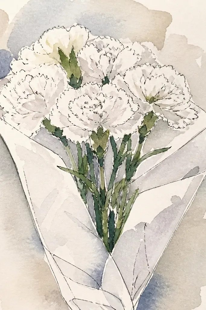
Sketch a front-facing bouquet shape with a rounded top and slightly thicker stem base at the bottom. Draw 8 carnations using light pencil lines, keeping petals thin and wavy. Color the stems pale green, then shade each petal crease with soft gray using light pressure. Darken only the stem intersections and the overlap areas between blooms.
White carnations look clean and modern, and they’re surprisingly easy because you’re not fighting strong color. The trick is using gray creases instead of heavy outlines — it keeps the petals delicate and airy. Add a pale green stem and minimal leaf hints so the bouquet still feels like flowers, not just outlines. This is perfect for minimalist seasonal prints and looks great when you scan or photograph in daylight.
Common mistakeDon’t outline every petal edge in dark pencil — white blooms should feel light.
Good to knowUse an eraser to pull back highlights on a few petals — it instantly makes white flowers feel dimensional.
4. Yellow Carnation Bouquet with Butter-Cream Centers
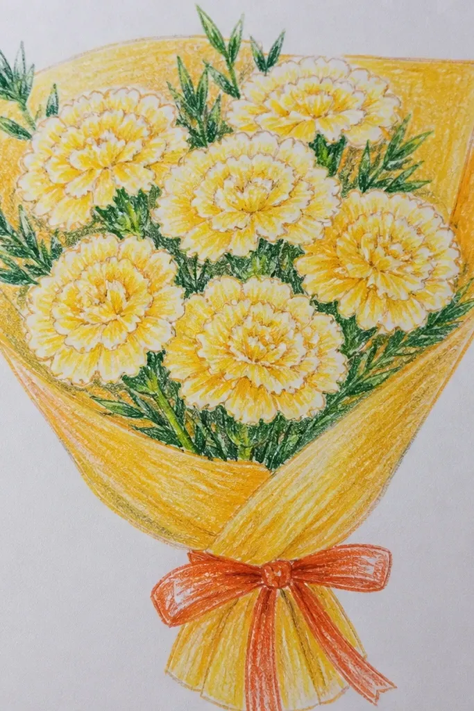
Draw stems in a shallow “S” curve so the bouquet feels lively, then place 9 carnations along the top curve. For each carnation, sketch the petal ring and add a cream-toned center shape that follows the inner petal edges. Color outer petals warm yellow, then add golden shading at each petal base with light pressure. Add a few simple leaves behind the blooms to create depth.
Yellow carnations bring instant warmth, and the butter-cream center makes the blooms look dimensional. This idea is also forgiving if your coloring isn’t perfect because the lighter center hides uneven pigment. Keep the outer petals a warm yellow and add a slightly deeper golden tone near the petal base. The bouquet looks bright without needing complicated backgrounds.
Common mistakeDon’t make the center too large — the glow should sit inside the petal ring.
Good to knowColor the centers first, then build outward — it prevents smudging the cream into the yellow.
5. Lavender Carnation Bouquet with Cool Purple Petal Lines
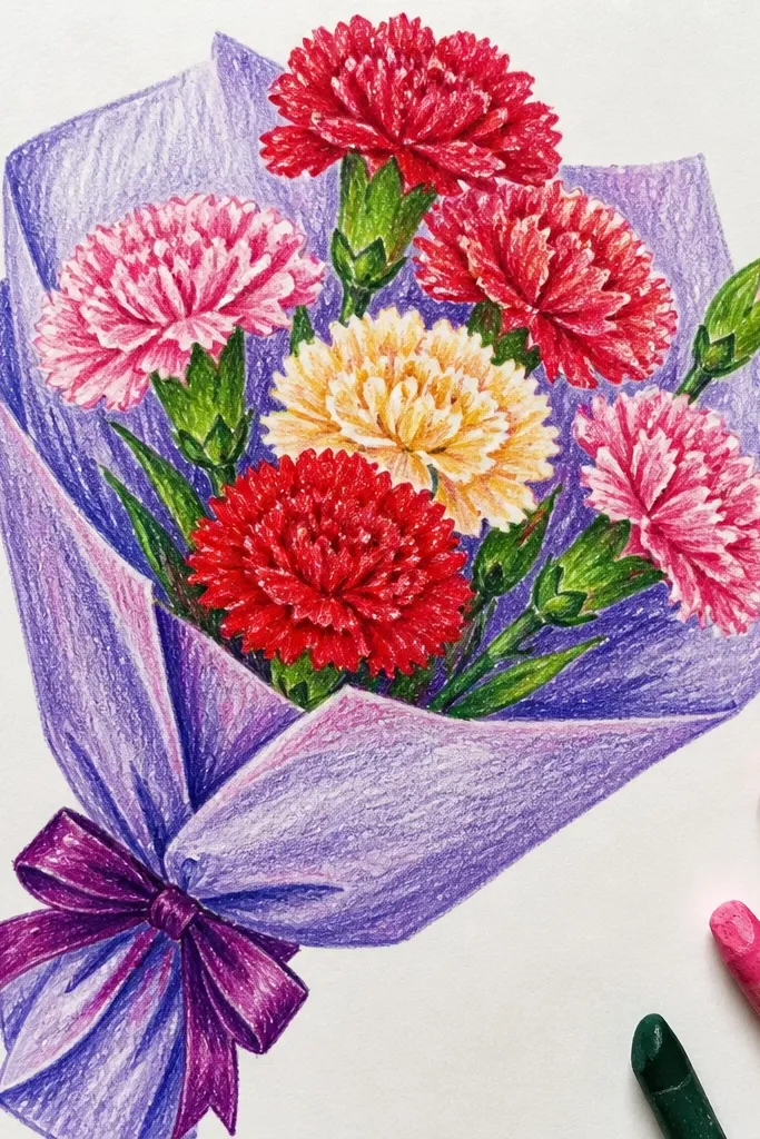
Sketch a bouquet with a slight curve and about 7-10 blooms clustered at the top. Draw carnations with wavy outer petals and a tighter center ring. Color petals lavender, then add thin cool purple lines along creases and near the petal base. Finish with small leaf shapes in pale green and a few darker green veins under the blooms.
Lavender gives you that soft holiday feel without looking wintery or heavy. Cool purple lines inside each petal create the texture that makes carnations recognizable. This is a great option if you want your drawing to feel more “aesthetic print” than basic coloring — the color plan is simple but the effect is polished. It also photographs well because lavender has enough contrast against white paper when you keep the outlines light.
Common mistakeDon’t darken the entire petal — the crease lines are what create the carnation look.
Good to knowUse a lighter touch for the lavender fill and save the purple for creases only.
6. Pastel Peach Carnations with Ribbon Bow
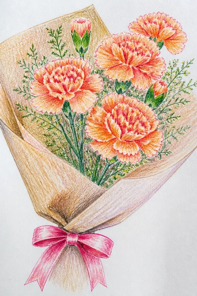
Draw a bouquet base with stems meeting at one point, then add a ribbon bow centered under the blooms. Sketch 8 carnations, spacing them so the ribbon isn’t blocked. Color petals with peach, then add lighter peach highlights on the top half of each petal. Shade the ribbon edges with a slightly darker peach or soft brown, then darken the stem crossings and add leaf shapes tucked behind the flowers.
Peach carnations look sweet and holiday-friendly, and the ribbon bow makes the bouquet feel gift-ready. You get a soft color gradient effect by using peach plus a lighter highlight tone. The ribbon also gives you an easy chance to add a shadow under the knot, which makes the drawing feel more finished. Keep the background blank or add a light wash behind the stems for a clean, pretty look.
Common mistakeAvoid drawing the bow too large; it should frame the bouquet, not compete with it.
Good to knowFor the ribbon, shade one side only — it keeps the bow crisp.
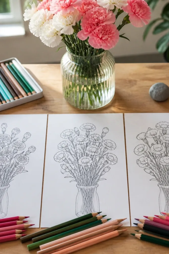
7. Monochrome Black Outline Carnation Bouquet
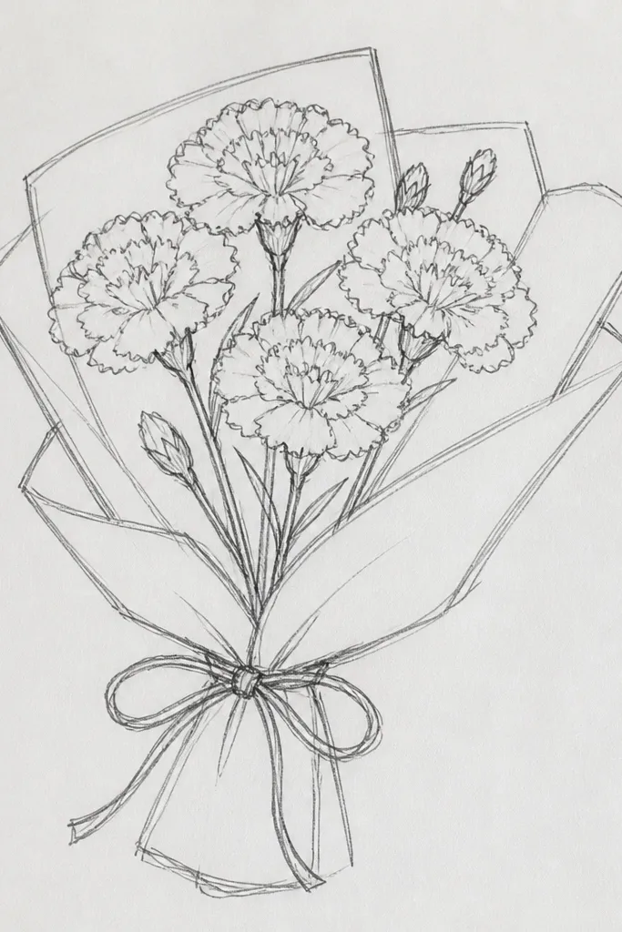
Use a fine liner to sketch stems first in a loose bundle, then place 10 carnations along the top. Draw each carnation with a petal ring and add a few inner creases using short curved lines. Keep outlines consistent thickness: thicker on the outer edges, thinner inside. Add leaf outlines and a couple of short stem shadow marks, then erase any pencil guide lines.
If you want the cleanest, most photogenic look, go monochrome. Bold outlines make carnations instantly readable, even if the drawing is small. Add just a few interior crease lines and stem shadows so the flowers have structure without getting messy. This style is also great for holiday line-art cards because it prints sharply and you can color it later.
Common mistakeAvoid random scribbles inside petals; creases should follow the petal direction.
Good to knowOutline the outer petal edge, then add creases — don’t fill in heavy black areas.
8. Red-Orange Carnations with Warm Gradient Petals
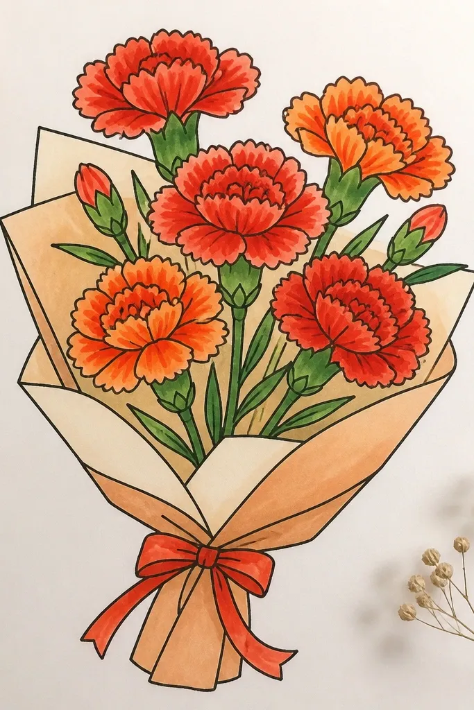
Draw a diagonal bouquet with stems sweeping upward and slightly outward. Sketch 9 carnations with petal rings, keeping outer petals a little larger on the outer side of the bouquet. Color the inner half of each petal a deeper red-orange, then blend to a lighter orange on the outer edge using light pressure. Add leaf shapes in dark green and shade veins with a lighter green pencil.
This drawing looks warm and festive because the petals shift color from a deeper center to a brighter outer edge. You get a strong bouquet look even with simple shading because the gradient follows the petal shape. It’s a good choice if your drawings usually look flat — the center-to-edge shift creates depth fast. Pair it with dark green leaves so the warm petals pop.
Common mistakeDon’t overblend until the colors turn brown — keep the gradient distinct.
Good to knowBlend by lightly dragging the pencil toward the outer edge, not back and forth.
9. Rose Carnation Bouquet in a Simple Vase Frame
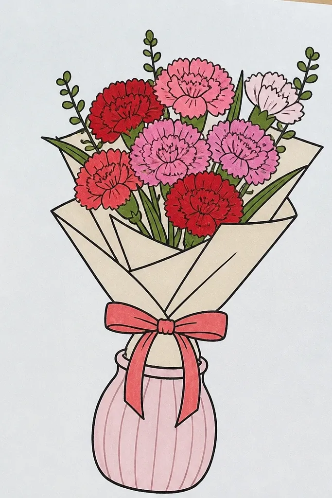
Draw a rectangular frame lightly, then sketch a simple vase shape at the bottom center. Add stems rising from inside the vase, then place 8 carnations around the top edge of the vase. Color petals rose pink, add darker rose creases along each petal, and leave tiny highlights near the top. Add a few leaves tucked behind carnations and darken the vase rim and stem intersections.
Putting the bouquet in a vase frame instantly makes the drawing look like a finished seasonal illustration. The vase gives you a stable base so the bouquet doesn’t float, and the rectangle frame makes it easy to crop for pins. This idea keeps carnations as the main focus, with minimal background distractions. It’s also great if you want a consistent look across multiple drawings in a series.
Common mistakeDon’t add a busy background; the frame should stay clean so the bouquet reads first.
Good to knowOutline the vase rim a little darker than the stems — it anchors the whole piece.
10. Cottagecore Carnation Bouquet with Sprigs and Small Blooms
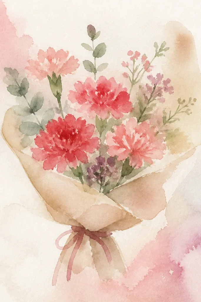
Start with a main stem bundle and add 7-9 carnation blooms at the top half. Draw 5-8 tiny buds using simple teardrop shapes and add thin sprigs that arc outward from the stems. Color carnations pink with darker creases, then color sprigs pale green with a darker green outline. Shade lightly under overlapping leaves so the layers separate.
This bouquet looks artsy because it mixes the carnation hero blooms with small supporting sprigs. Those tiny buds and leaf clusters fill gaps so the drawing feels full, not sparse. Keep the carnations as the biggest shapes and let the sprigs fill negative space between them. The aesthetic comes from layering: some leaves overlap flowers, and a few sprigs trail downward.
Common mistakeAvoid making tiny buds the same size as carnations; they should support, not compete.
Good to knowUse thinner lines for sprigs than for carnation petals so the flowers stay the focal point.
11. Crisp Blue Outline Carnation Bouquet with White Highlights
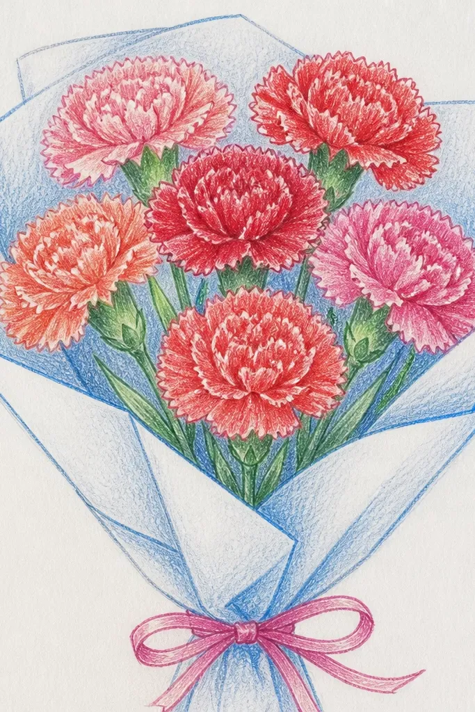
Sketch stems in pencil, then trace the outer petal edges with a blue pen or colored pencil. Draw 8 carnations with wavy outer petals and add short blue crease lines inside each petal. Keep petal fill minimal: lightly tint with pale pink or leave mostly white, then add only a few blue shadows near overlaps. Finish with pale green stems and tiny leaf outlines.
Blue outlines give carnations a clean, modern look, and keeping the inside light keeps it airy. This idea is great for holiday prints because it feels “fresh” without needing fancy shading. Add white highlights by leaving paper uncolored along the top of petals, then add blue crease lines for structure. The result looks like a finished design, not a rough sketch.
Common mistakeDon’t fill the whole petal blue; highlights should stay white.
Good to knowIf you use a pen, outline first, then color — otherwise you’ll smear ink.
12. Single Carnation Centerpiece with Wrapped Stem
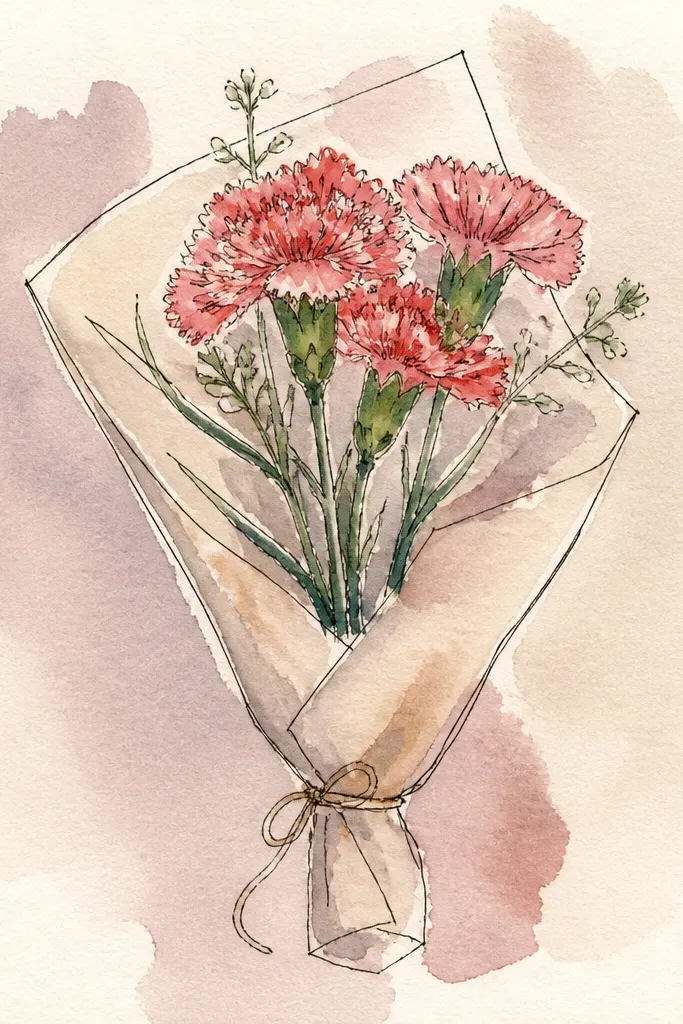
Draw a vertical stem line and add a small ribbon wrap around the lower third. Sketch one carnation with a tight center ring and larger wavy outer petals. Color petals pink or red, then add darker creases along each petal and a lighter highlight near the top. Add a soft gray shadow on the paper under the base of the ribbon, then darken the stem line and ribbon fold lines.
A single-carnation drawing can still look like a bouquet because the shape is strong and the wrapped stem adds storytelling. This one is perfect if you struggle with spacing — you only need to nail one flower. The wrapped stem ribbon gives you a secondary focal point, and a simple shadow under the flower makes it look grounded. It’s also easier to color neatly and still looks “designed.”
Common mistakeDon’t tilt the flower randomly; keep the head slightly angled for a clean silhouette.
Good to knowWrap the ribbon in 2-3 bands, not full solid color — folds read better that way.
13. Carnation Bouquet with Polka Dot Paper Background Spots
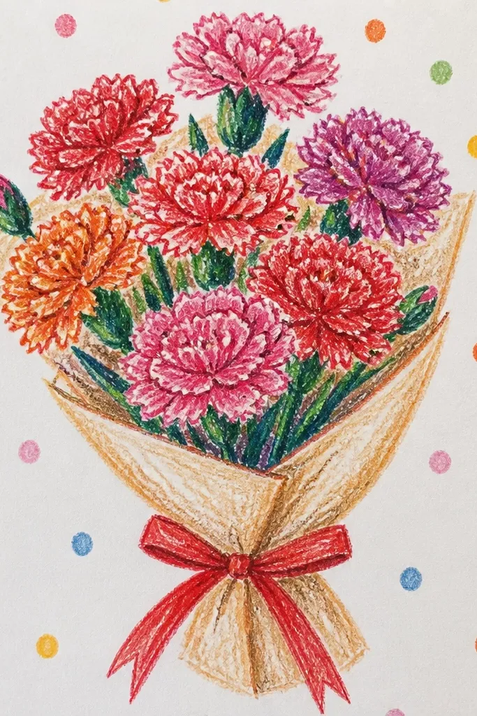
Sketch stems and place 8-10 carnations using your three-size petal method. Lightly mark a few dot spots around the bouquet area, then add polka dots in very light pencil or diluted paint. Color carnations with pink plus darker rose creases, leaving highlights uncolored. Shade stems and leaves lightly so the dots stay visible but not distracting.
Background dots make the bouquet pop immediately, especially for seasonal pins where the drawing is small. The key is to keep dots light and scattered so the flowers remain the main focus. Add dots behind the stems and between blooms, not inside the petals. This idea is still easy because carnations are the same petal pattern, and the background work is just a few consistent dots.
Common mistakeDon’t add dots behind the darkest petal creases; it makes the shape muddy.
Good to knowUse one dot size for most spots and make only a few slightly smaller for natural spacing.
14. Green-and-Red Holiday Carnation Bouquet with Pine Sprigs
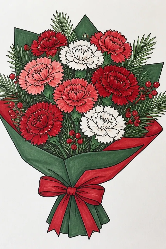
Draw stems in a bundle and sketch 7-8 red carnations at the top. Add pine sprigs by drawing short diagonal lines from a main sprig line, then add tiny leaf clusters along them. Color carnations red with darker red creases and small lighter highlights, then color pine sprigs dark green with a slightly lighter green on the edges. Add a few leaf shadows behind blooms and darken stem intersections.
This is the most holiday-coded bouquet on the list because pine sprigs frame the carnations and create a wintery silhouette. The red petals plus deep green sprigs give you instant seasonal contrast. You don’t need snow effects or heavy backgrounds — just keep the evergreen shapes crisp and let them overlap the carnation blooms. It looks festive even on plain paper and is easy to copy for multiple colorways.
Common mistakeAvoid outlining every pine needle; simple sprig shapes look cleaner.
Good to knowKeep pine sprig branches short and angled; long branches look messy fast.
15. Carnation Bouquet in a Mason Jar with Bold Lid
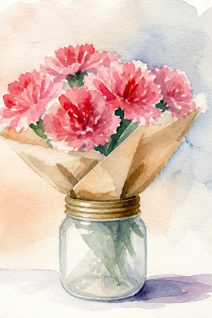
Sketch a mason jar with a simple cylindrical body and a lid ring near the top. Add stems rising from inside the jar and place 9 carnations clustered around the jar opening. Color petals with your chosen carnation palette, then add crease shading only on the petal inner halves. Shade the jar with light gray under the lid and along one side to show shape, then add leaf silhouettes behind a few blooms.
A mason jar makes the bouquet look like a real holiday craft project without extra effort. The jar outline gives you strong geometry, while carnations give you soft organic petals. This style is photogenic because you can crop the jar and keep the flowers centered. It also helps you control spacing since stems need to originate from the jar opening.
Common mistakeDon’t add too much jar detail; the carnations should still be the main texture.
Good to knowShade the jar side consistently from one direction so it doesn’t look flat.
16. Pastel Rainbow Carnation Bouquet with Limited Tonal Steps
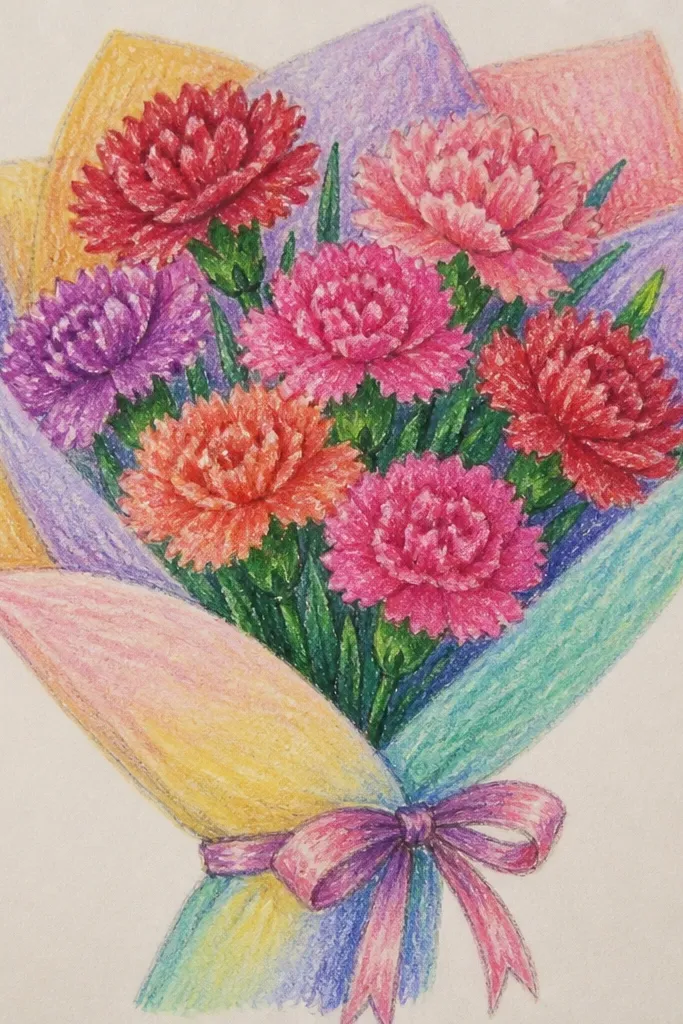
Draw a bouquet bundle with 10 carnations spaced evenly around the top curve. Assign colors by position: pink left, peach center-left, yellow center, lavender center-right, and light orange right. For each carnation, color petals with the light pastel, then add deeper crease lines and a tiny deeper base at each petal inner edge. Finish with pale green stems and leaves, then darken stem lines to separate layers.
Rainbow bouquets can look chaotic, but you can make them aesthetic by limiting each carnation to two tones: a light pastel fill and a slightly deeper crease color. This idea looks playful while staying organized. Put different colors in different positions so the bouquet doesn’t become a single multicolor blob. The creases unify everything — same shading method across every flower.
Common mistakeDon’t add extra colors to leaves; keep leaves neutral so petals stay readable.
Good to knowUse the same depth of crease color for every flower — consistency is what makes rainbow look clean.
17. Carnation Bouquet with Watercolor Wash Edges and Pencil Petal Lines
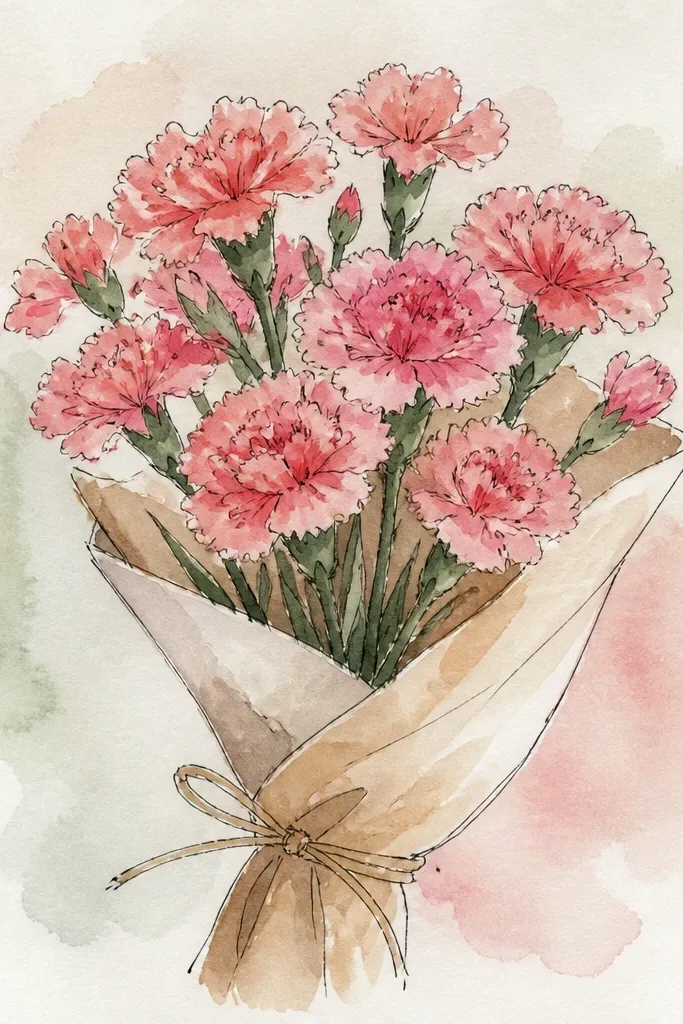
Sketch stems and carnations lightly with pencil first, then choose 6-8 carnations as your main blooms. Wet the outer petal edges lightly with clean water and add a thin watercolor wash, letting it bleed slightly at the edges. Keep the inner petal creases pencil-drawn and add a deeper watercolor line only where petals overlap. Color stems pale green with a very light wash and let it dry flat.
This one looks like a finished print because the petals have soft watercolor edges but still keep crisp carnation structure from pencil lines. You get a “painted” vibe without needing heavy painting skills. The trick is to keep the wash light and only wash the outer petal areas, leaving the crease lines to pencil. That contrast between soft color and sharp lines is what makes it look aesthetic.
Common mistakeDon’t paint over your crease lines; keep structure crisp and let color stay soft.
Good to knowTest your watercolor strength on scrap paper — a too-dark wash ruins the delicate look.
18. Red Carnations with Gold Outline Ribbon Accent
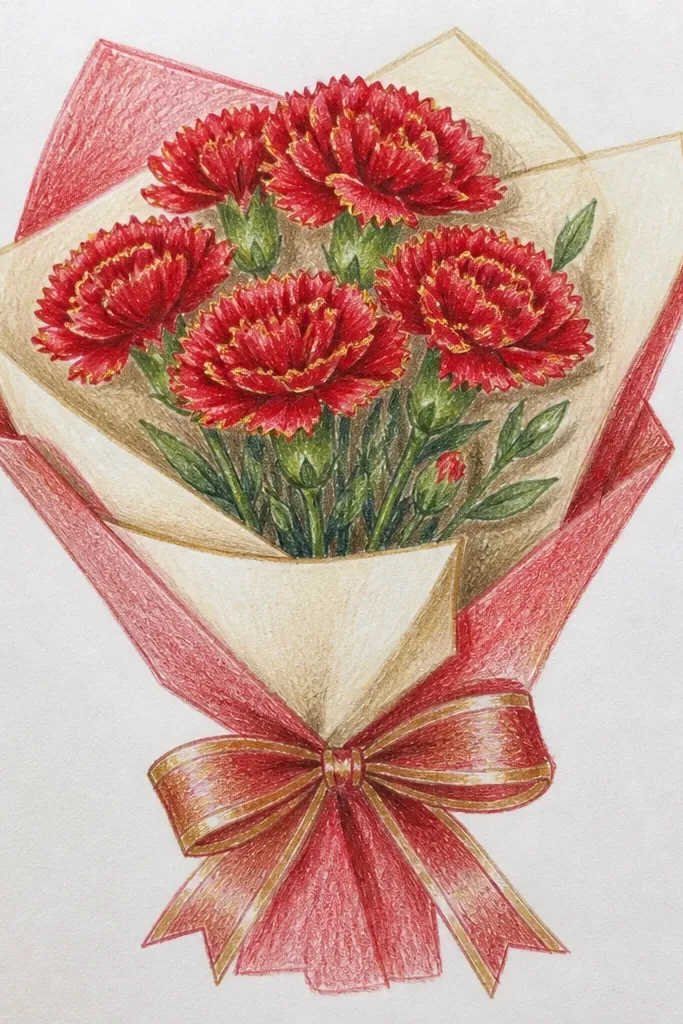
Draw a bouquet bundle with 8-9 red carnations and a ribbon across the lower third. Sketch the ribbon fold lines in pencil, then color petals red with darker red creases. Outline the ribbon outer edge with gold gel pen or gold colored pencil, then lightly shade ribbon folds with a muted brown-red. Darken stem lines and add a few leaf shadows beneath the ribbon so the gold looks intentional.
Gold ribbon accents make a simple bouquet look instantly festive. It’s a smart way to add “holiday sparkle” without adding glitter everywhere. Keep the ribbon outline thin and use it only on the outer edge so it doesn’t overpower the petals. The red carnations stay the hero, with darker creases providing texture and the gold acting like a clean frame.
Common mistakeAvoid thick gold lines — thin outlines look designed, thick ones look messy.
Good to knowLet the ribbon outline dry fully before coloring nearby areas to avoid streaks.
19. Carnation Bouquet in a Diagonal Paper Sleeve Frame
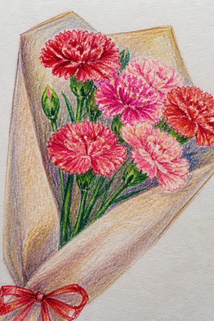
Sketch a diagonal rectangle sleeve with folded sides, leaving an opening near the center. Add stems rising out of the sleeve opening and place 8 carnations so they sit just above the sleeve top edge. Color petals with your chosen palette and shade creases with a darker tone. Add a few leaves tucked behind the sleeve and darken the sleeve folds with light gray or soft brown.
A paper sleeve frame makes the bouquet look like wrapped flowers from a shop, but you can draw it in minutes. The diagonal sleeve creates motion, so even simple carnations look more interesting. Use fold lines to show the sleeve shape and keep the bouquet placed above the sleeve opening. This is a great option for seasonal posting because the diagonal composition fills the screen nicely.
Common mistakeDon’t hide all flowers behind the sleeve — leave enough bloom visible for the bouquet read.
Good to knowKeep the sleeve folds to 3 lines maximum; too many folds clutter the drawing.
20. 20 Carnation Bouquet Easy Line-Art Grid with Pop-Color Centers
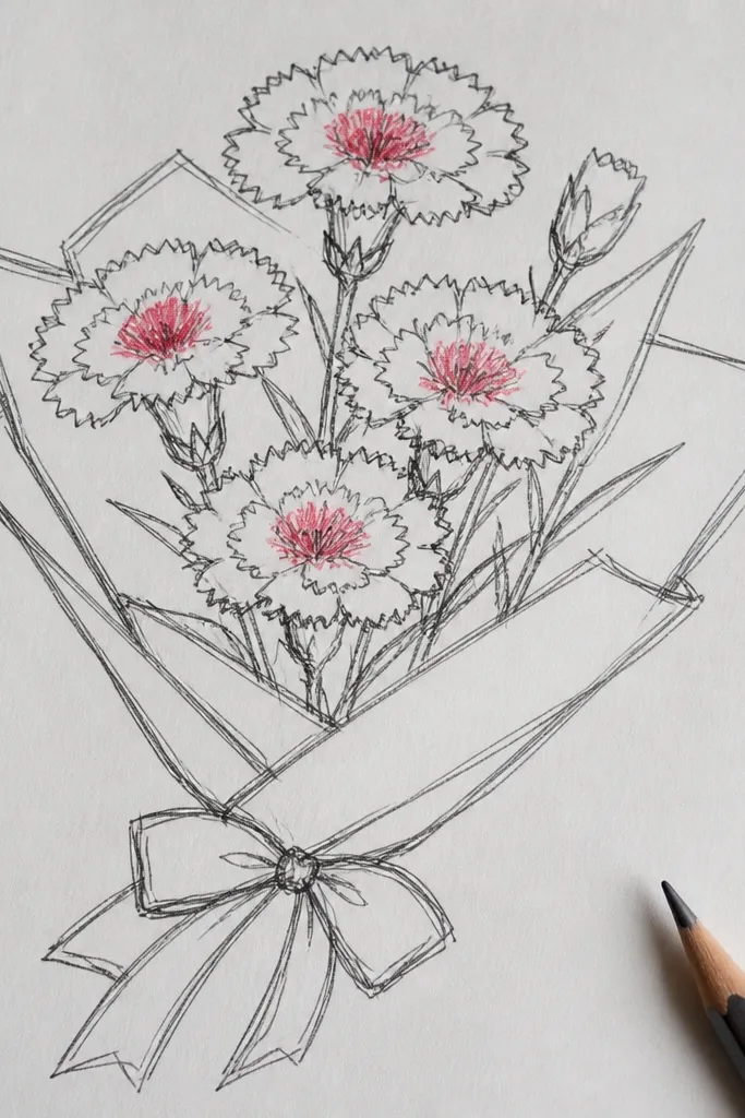
This one is for the “I want 20 easy drawings that still look intentional” problem. A tight grid keeps every carnation the same size, so you can crank out 20 without the flowers turning lopsided. The trick is simple line art for petals, then pop-color only in the centers so the whole page reads clean and graphic. Use a limited palette and one highlight color so it looks designed, not messy. This is beginner-friendly and fast — plan on about 45-70 minutes for the full page, and it looks great framed or used as a printable gift card insert.
Draw a square grid first: make 20 boxes, for example 4 rows by 5 columns, with 1 cm gaps between boxes. In each box, sketch one carnation using a teardrop outer petal outline and 6-8 short petal fringe strokes around the edge, keeping the center a smaller circle. Color only the center circle in a strong shade like hot pink, coral, or deep rose, then add a tiny lighter dot at the very top of each center for a “glow” effect. Keep the outlines consistent by using the same pen thickness for every box, then lightly erase any pencil lines so the grid stays crisp. Finish by adding one small leaf or stem line under each flower so the bouquet feel stays connected even in a grid layout.
Use a ruler for the grid and a fine 0.3 mm pen for outlines; you’ll spend less time fixing wonky boxes than you think.
Don’t fill every petal with color — that’s what makes these look busy instead of bold.