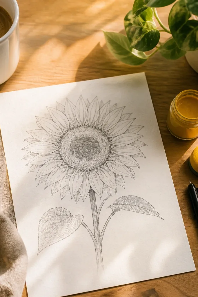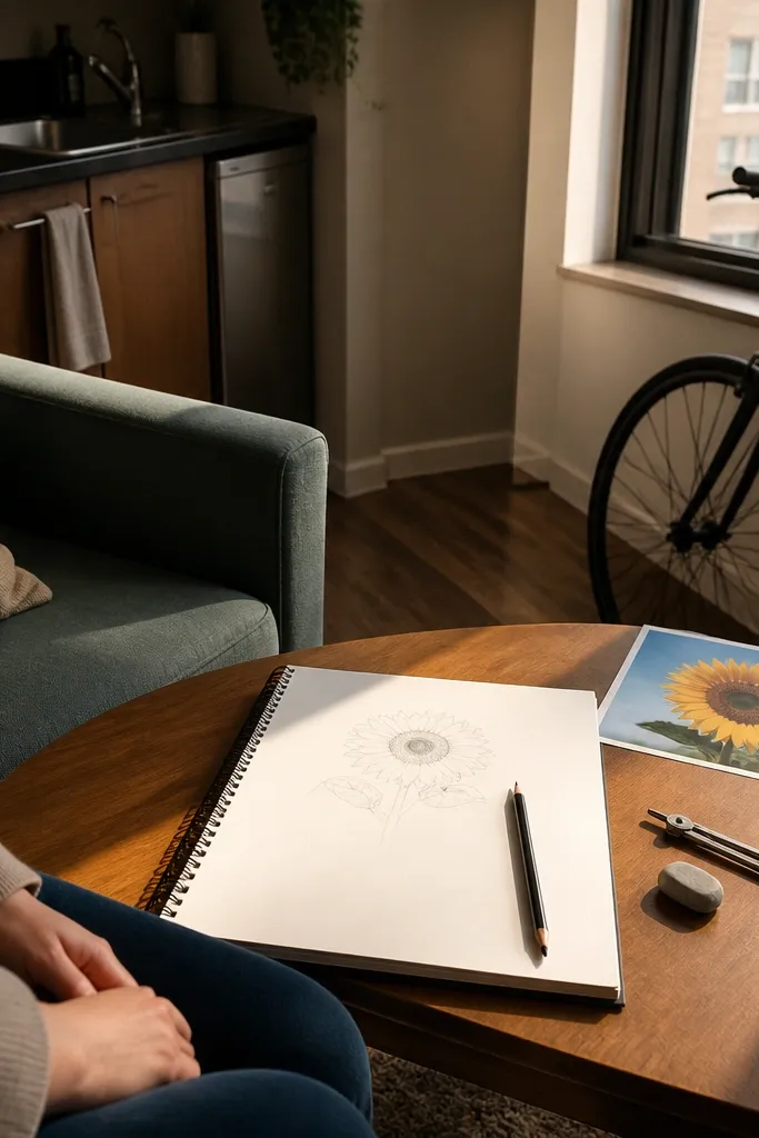
1. Charcoal Side Sunflower on Cream Mat Board
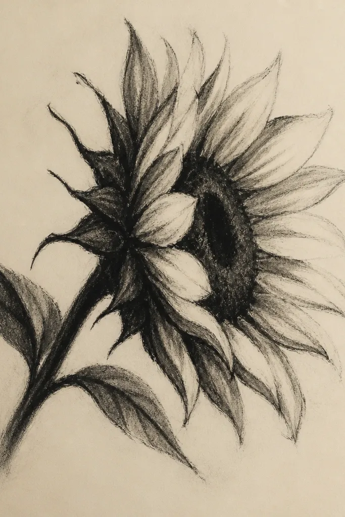
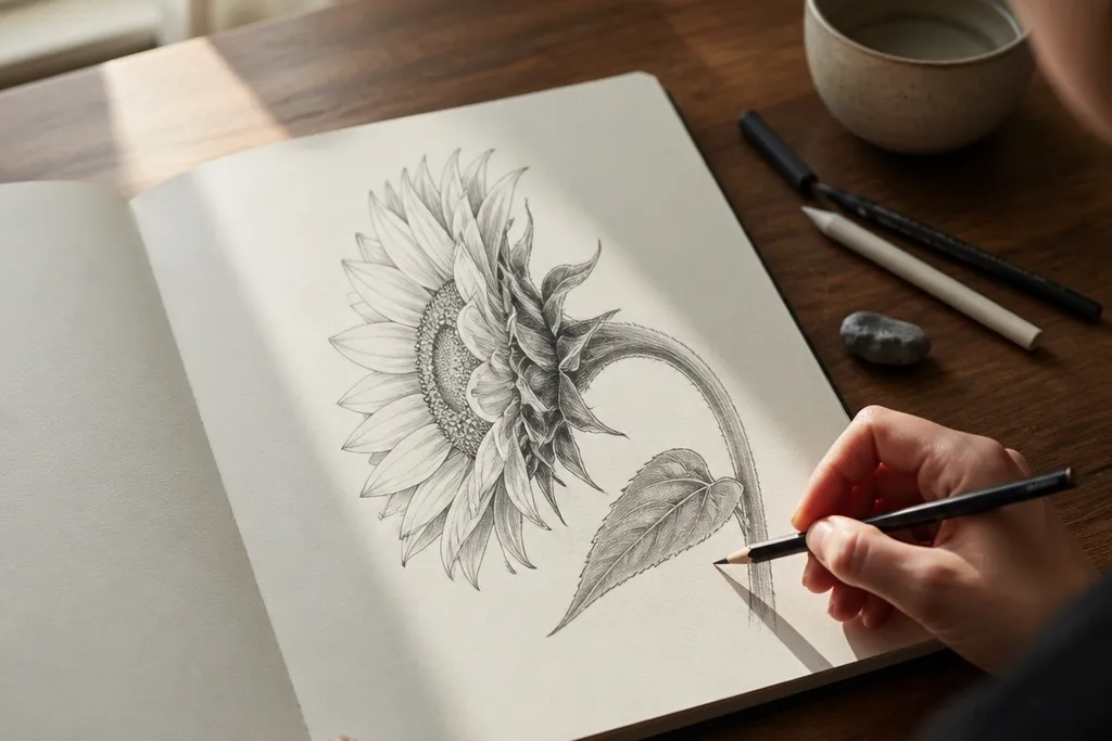
This idea leans into the “sculpture” look. A side-view sunflower works especially well in charcoal because you can push deep petal folds into near-black without needing color. The cream mat board matters: it gives you warm contrast so the yellowish highlights feel natural even if the drawing is grayscale. Keep the shadow shapes bold and clean — the high-end feel comes from fewer, stronger marks, not more texture.
Start by lightly sketching the silhouette with a 2H pencil, then add the head angle as one curved wedge. Block the darkest petal folds with charcoal using the side of the stick, keeping those areas separate from the lighter petal faces. Build midtones with HB, then finish the highlights by lifting graphite with a kneaded eraser in small, curved arcs that follow the petal edges. Finally, add one or two crisp shadow edges under the head to anchor the form against the background.
Good to knowUse a blending stump only on midtones; leave the darkest folds sharp so the drawing reads higher-end.
Common mistakeDon’t smear the entire sunflower — charcoal haze kills the side-view depth.
2. Graphite Side Sunflower with Torn Book-Page Shadow
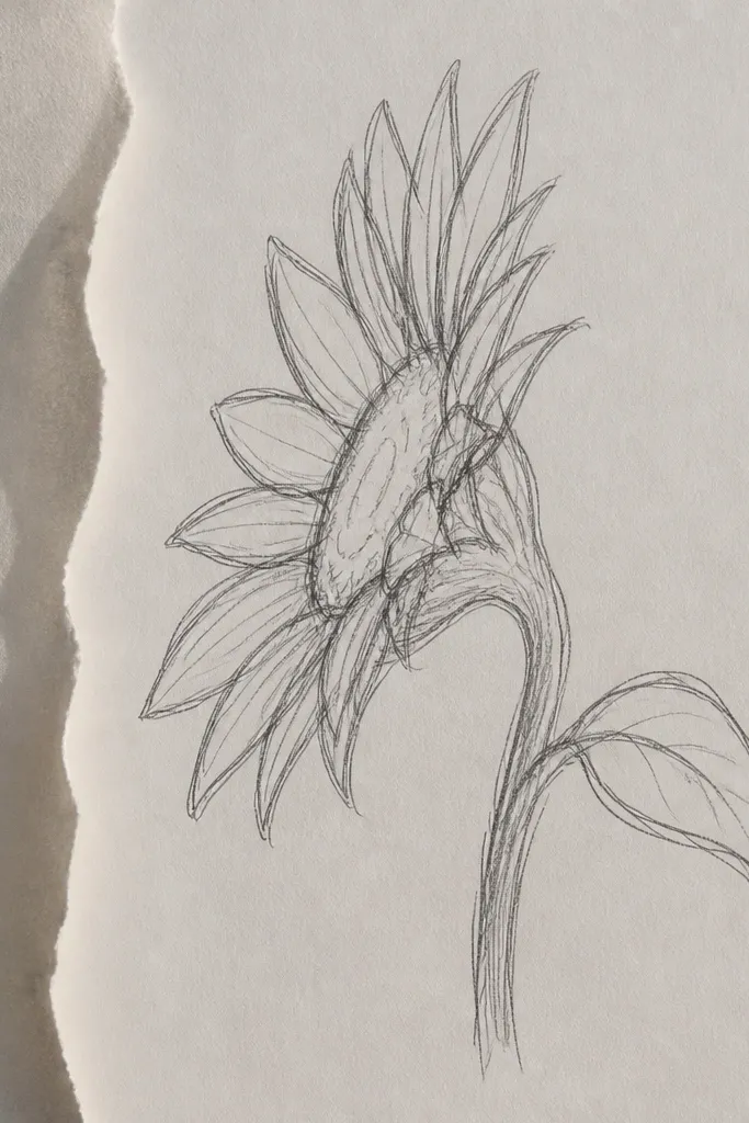
Here the background does the heavy lifting. A torn book-page silhouette behind the sunflower creates a layered, editorial look while keeping the sunflower itself clean and detailed. Side view benefits because the torn edge creates believable depth — it mimics the way petals overlap and cast partial shadows. The finished piece looks styled because the contrast is intentional: crisp graphite petals against a slightly chaotic paper texture.
Cut a narrow strip of old book paper and tear it into a crescent-like shape that sits behind the sunflower head. Tape it lightly to the drawing surface so you can draw without shifting the paper. Draw the sunflower side view in graphite first, then darken the shadow areas closest to the torn edge with a 2B pencil. Remove the tape and reinforce the shadow boundary with a darker graphite line so the tear edge reads as a cast shadow, not a random collage.
Choose book pages with small, tight text blocks; big headlines make the background compete.
Don’t glue the torn paper before you draw the sunflower — alignment matters for the shadow effect.
3. Sunflower Side Profile in Ink Wash and Pen Lines
This one looks expensive because it has two textures: soft wash for volume and sharp pen lines for structure. Side view is perfect for ink wash because the petal curvature turns into smooth gradients, while pen lines define the overlapping layers. Keep the linework restrained. When you over-ink, the sunflower turns into a cartoon; when you place lines only at petal edges and shadow boundaries, it reads gallery-clean.
Lightly map the sunflower head angle in pencil, then wet only the petal faces with clean water using a small brush. Load diluted ink and paint the midtones first, leaving the highlight arcs mostly blank. Use a fine pen to trace only the petal edges where layers overlap and add a few dark fold lines inside the head. Let it dry fully, then deepen the darkest shadows with a second pass of ink wash, staying inside the fold shapes.
Good to knowPaint wash edges slightly blurred, then draw the pen line over the blur to create that “ink + sculpture” look.
Common mistakeDon’t flood the paper — if the wash bleeds into the background, your side-view edges lose definition.
4. Watercolor Side Sunflower with Limited Palette Glaze
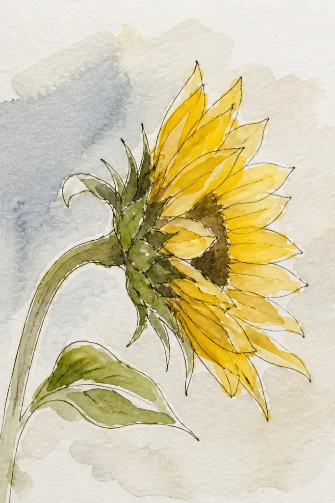
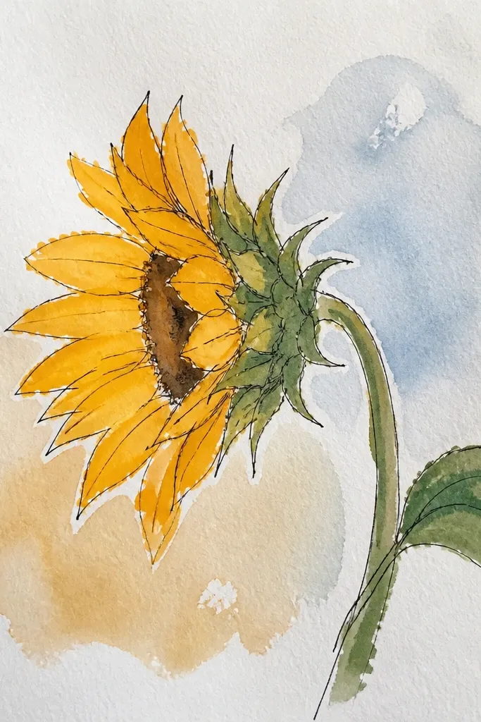
A limited-color watercolor side sunflower gives you that high-end softness without looking washed out. The trick is glazing: you build depth with thin layers instead of trying to get the darkest values in one go. Side view makes glazing look believable because shadows sit between overlapping petals like thin glass. This style photographs well because the colors stay controlled — no muddy greens or smoky yellows.
Mix a tight palette: sunflower yellow, warm orange, and a muted green (add gray to the green so it doesn’t turn neon). Sketch the side profile in pencil, then paint the base petal shapes with a light yellow glaze. When dry, glaze warm orange into the shadow sides and deepen darkest folds with a diluted green-gray mix. Finish by adding crisp petal edge lines with a fine brush and darker yellow-brown, then let the final layer dry flat.
Good to knowUse a fan brush for quick petal texture on the shadow sides only; highlights should stay smooth.
Common mistakeDon’t mix in a strong blue — it makes the yellow look dirty fast.
5. Colored Pencil Side Sunflower with Burnt Umber Shadow Blocks
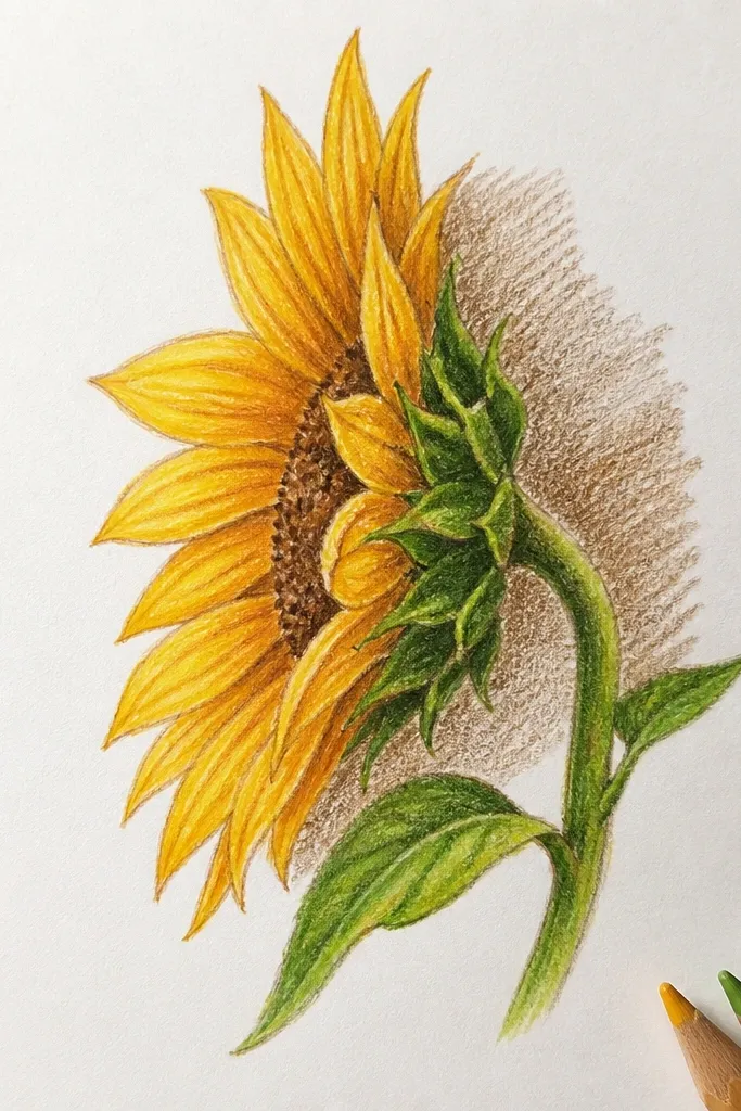
This is the “clean and expensive” colored pencil look. Burnt umber shadow blocks create instant depth and keep the petals from turning flat. Side view needs this because the overlap lines are where your eye reads form. The high-end effect comes from sharp transitions: light petal faces, then a concentrated shadow region that feels like it wraps around the head.
Start by sketching the side view silhouette with a light HB, then lightly map each petal overlap direction. Lay a base layer of pale yellow across the petal faces. Block the shadow regions with burnt umber using broad strokes following the petal curvature, then layer a warm orange on top where shadows meet midtones. Finally, sharpen the darkest folds with a darker brown pencil (near-black brown), and use a white colored pencil for thin highlight edges.
Work in layers with light pressure until the shadow blocks feel solid; then increase pressure only at the fold edges.
Don’t blend everything — leaving some pencil texture in midtones keeps the drawing crisp.
6. Ink Line Side Sunflower with Gold Leaf Vein Accents
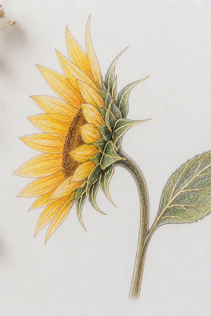
Gold leaf turns a sunflower side profile into something that looks framed and intentional. This style uses mostly ink linework, then adds gold only where it counts: petal vein highlights and a narrow rim shadow. Side view is ideal because those veins curve across the petal planes, so the gold looks like light catching texture. Keep the background matte and quiet so the gold doesn’t compete.
Draw the side profile in waterproof ink with a fine liner, using line weight changes at petal edges. Color the petal planes lightly with pencil or a very thin watercolor wash so the ink has something to sit on. Apply adhesive only to small vein paths and the rim highlight area, then press gold leaf onto those sections. Burnish gently with a soft tool, then seal with a matte fixative so the gold doesn’t smear.
Good to knowUse gold leaf sparingly — a few bright streaks look better than covering whole petals.
Common mistakeDon’t apply adhesive over the whole head; gold everywhere looks cheap fast.
7. Pastel Side Sunflower with Chalky Highlight Ridges
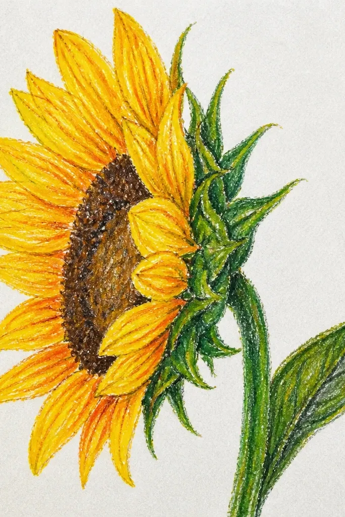
Pastels look high-end when they keep sharp value edges. For a side sunflower, you want chalky highlights that sit on top of darker shadow planes like ridges. This gives you that “ceramic glaze” feeling even though it’s drawn. The trick is controlling smudging: use pastel for volume, then carve crisp edges with a kneaded eraser and a fine pastel pencil.
Sketch the sunflower side outline lightly, then dust a thin base layer of pale yellow pastel across the petal faces. Build shadow planes using a warm gray or muted brown, keeping the darkest areas concentrated between overlapping petals. Lift highlights with a kneaded eraser in curved strips that follow the petal edges, then reinforce the ridge lines with a white pastel pencil. Add a few dark seed-head marks with a dark charcoal pastel to anchor the face.
Good to knowFixative too early makes pastels dark and dull — wait until the first layering is complete.
Common mistakeDon’t over-blend the shadow planes; side view needs separation.
8. Monochrome Side Sunflower with Negative Space Halo

Negative space is the shortcut to a high-end look. This idea uses a monochrome side sunflower with a crisp halo cut out of the background, so the silhouette reads instantly. It’s photogenic because the camera loves contrast edges. Use it when you want something dramatic without adding extra props or color chaos.
Choose a dark background paper or tone it lightly with gray wash. Sketch the side sunflower silhouette and keep the halo area empty — draw right up to it. Fill petals with graphite or charcoal in controlled layers, leaving the halo boundary razor clean. Add the darkest folds last with 4B or charcoal, then use a kneaded eraser to carve a second highlight edge on the petal rims.
Good to knowMake the halo slightly asymmetrical; perfect symmetry makes it feel graphic rather than sculptural.
Common mistakeDon’t shade into the halo — if you fill it, you lose the high-end edge.
9. Sunflower Side View on Upcycled Fabric Swatch Background
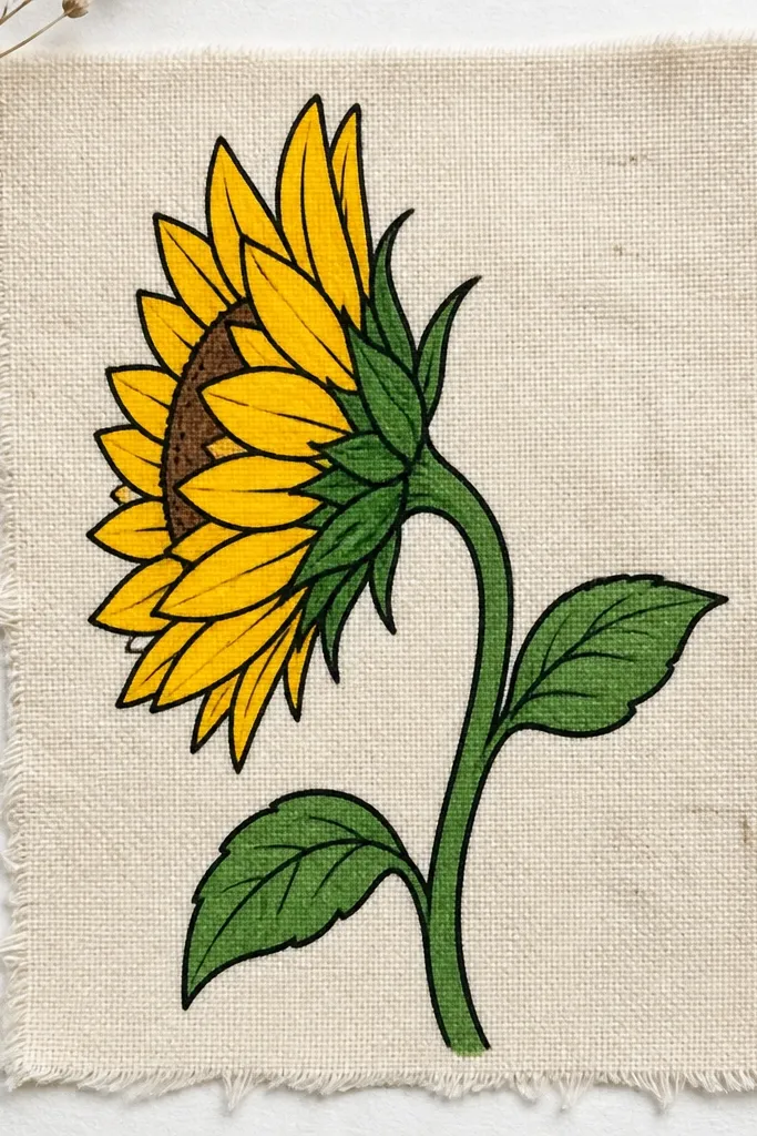
If you want the drawing to look like it belongs in a styled room, texture matters. A small upcycled fabric swatch behind the sunflower gives you a soft, photo-friendly surface without adding clutter. The sunflower linework stays crisp on top, so the fabric reads as mood, not noise. This is a great option when your goal is aesthetic packaging for a small frame or card.
Cut a fabric swatch and mount it to thick paper or mat board with a thin, even adhesive layer. Tape the fabric edges down so they don’t curl. Draw the side sunflower on the fabric surface with a light pencil first, then reinforce outlines and shadow boundaries with a fine pen. Add a limited yellow wash only on the petal faces; keep the background fabric unpainted so the sunflower stays the focal point.
Good to knowPick fabric with a subtle weave, not big patterns; small texture keeps the sunflower sharp.
Common mistakeDon’t use heavy marker lines on fabric — they bleed and blur the petal edges.
10. Sunflower Side Profile with Diagram Labels and Clean Typography
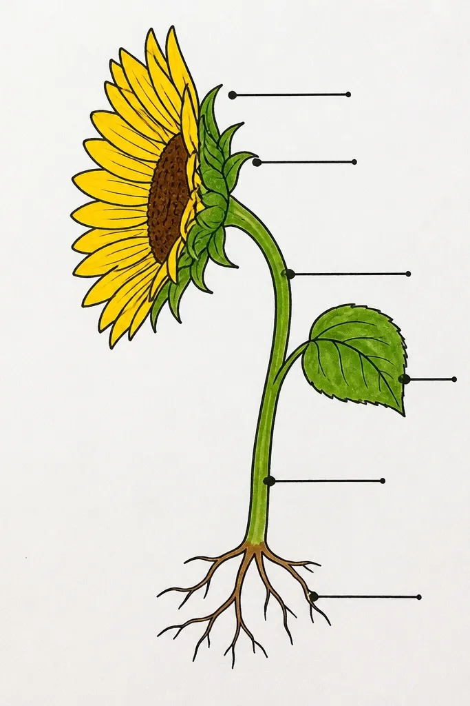
This is high-end because it looks intentional, not decorative. The side view sunflower becomes a “study drawing” with clean labels that point to specific petal folds, shadow planes, and seed-head structure. It’s photogenic because the typography creates strong layout lines around the curved subject. Keep the labels minimal — too many words makes it look like a worksheet.
Draw the side sunflower large, leaving space on one side for labels. Sketch three to five label callouts with a ruler, then write short phrases like 'petal fold', 'light rim', 'seed head' using a sharp pen. Shade the sunflower with graphite or colored pencil, but keep the darkest folds within a tight area so the labels stay readable. Add one thin border line around the drawing area to make the layout feel designed.
Good to knowUse one font style and consistent arrow angles; layout consistency is what sells the look.
Common mistakeDon’t label every petal — label only the features you actually shaded.
11. Sunflower Side View with Geometric Shadow on White Paper
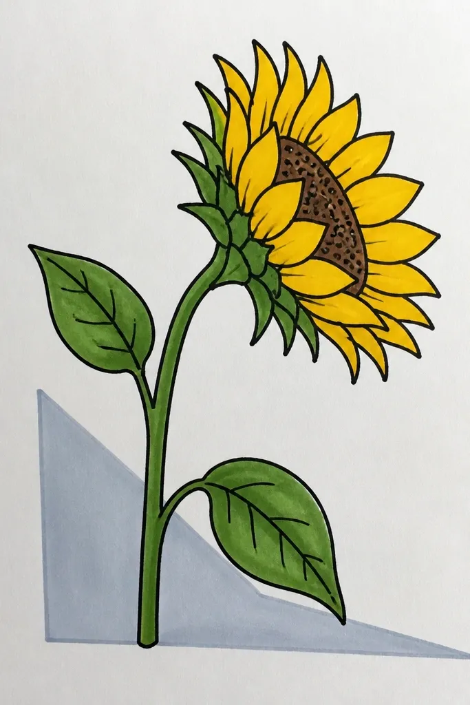
Geometric shadows make a side sunflower feel architectural. You draw the sunflower in clean value, then add a shadow shape behind it that’s a simple polygon or angled rectangle. The look is high-end because the shadow has edges — it behaves like studio lighting. This style is also easy to photograph since the background is bright and the shadow gives strong contrast.
Sketch the side sunflower head and stem, then decide where the light hits so the shadow direction is consistent. Draw the shadow as a simple shape behind the head in pencil first, then darken it with a graphite or charcoal block. Keep the shadow edge crisp and slightly offset from the sunflower silhouette. Add a thin highlight rim on the petals nearest the light so the geometry and the form match.
Good to knowMake the shadow slightly darker at the base and fade it with lighter strokes toward the outer edge.
Common mistakeDon’t make the shadow the same darkness as the darkest petal folds — it should support, not compete.
12. Sunflower Side View in Monoline Ink with Color Wash Tips
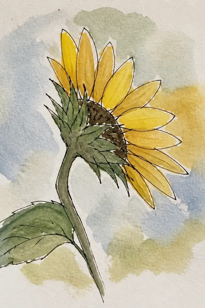
Monoline ink keeps the structure crisp, and tiny watercolor wash tips add just enough color to feel expensive. Side view is perfect here because the overlap lines are visible, and monoline makes them look deliberate. The watercolor should stay minimal — think small loaded edges on shadow sides, not full painting. This style is great for small art pieces and clean frames.
Draw the side sunflower with one consistent monoline ink pen, varying thickness only at the seed head and major petal edges. Color only the shadow-side petal edges with a diluted yellow-orange wash. After the wash dries, go back with pencil or pen to darken fold lines so the watercolor doesn’t blur the structure. Finish with a light green wash only on the underside of one leaf to keep the palette tight.
Good to knowDo the watercolor last — it prevents ink smudges and keeps edges sharp on the petal overlap lines.
Common mistakeDon’t flood the petals with wash; full coverage turns monoline into a muddy illustration.
13. Sunflower Side Profile with Resin-Peel Highlight Effect
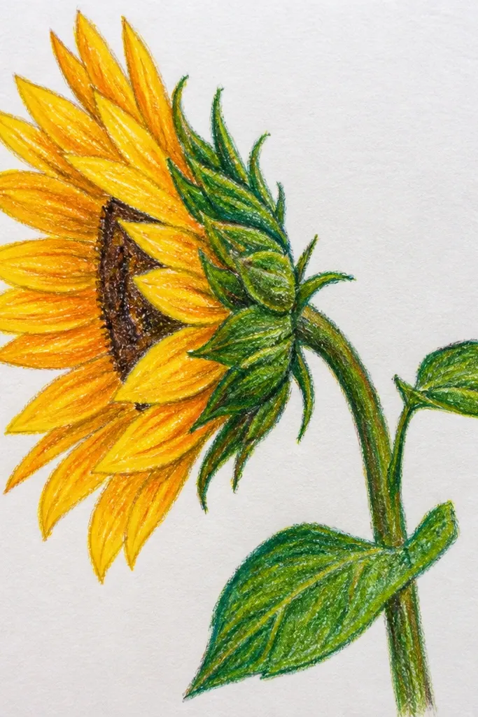
This one reads high-end because the highlights catch light. You draw the sunflower in pencil, then add small glossy “peel” highlights that look like resin sheen on petal edges. Side view makes the effect extra believable because highlights should trace the curvature. Keep the glossy spots tiny and placed where the petal rim faces the light.
Sketch the side sunflower and shade petals with a pencil value ladder: HB midtones, 2B folds, and a few 4B accents. Use a white gel pen or white acrylic paint to mark highlight rim lines lightly, then let it dry. Apply small dots of clear craft resin or clear UV resin onto the highlight areas only, using a toothpick to control size. Cure fully, then gently scrape any overflow with a craft blade so the surface stays neat.
If you use UV resin, cure in short bursts and check under angled light so you don’t over-gloss.
Don’t add resin to large areas — it looks like a sticker and hides your shading.
14. Sunflower Side View with Embossed Linework on Cardstock
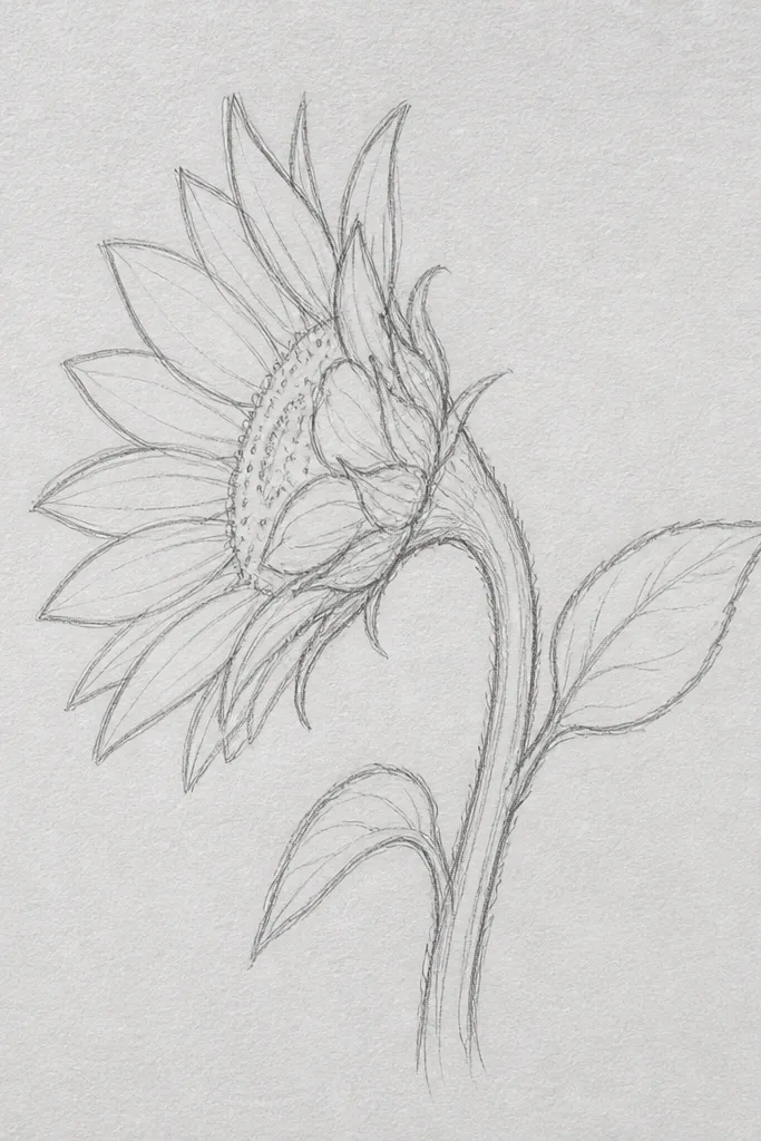
Embossed linework gives you tactile luxury. For a side-view sunflower, embossing works best on petal edges and the seed head ridge lines, where raised texture reads as form. The pencil shading stays flat, but the raised lines catch light in photos. Pair emboss with a restrained palette so the texture stays the star.
Print or sketch your side sunflower outline on cardstock, then trace petal edges with an embossing stylus or ballpoint using light pressure. Ink over the embossed lines with a thin pen or go over them with colored pencil to darken the raised edges. Shade the petal planes with graphite or colored pencil, keeping the shadow folds darker than the raised lines. Add a final highlight pass on the raised edges using a white pencil so the emboss pops under room light.
Good to knowUse heavier cardstock (at least 140 lb) so embossing doesn’t tear fibers.
Common mistakeDon’t emboss the entire petal face — it turns into texture soup.
15. Sunflower Side View with Transparent Tape Masking
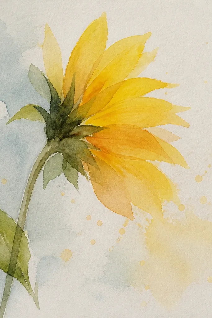
Tape masking makes crisp highlights without messy erasing. This idea gives you that clean, studio look because the petal rim highlights stay sharp while the shadows blend smoothly. Side view needs sharp highlights; they define the curvature where petals overlap. The tape also helps if you want a limited-color watercolor approach with no muddy edges.
Sketch the side sunflower and decide where highlight rims will sit. Place thin strips of transparent tape on the paper along those highlight curves, pressing edges down firmly. Paint the base petals with a light yellow wash, then remove the tape after the paint dries so the highlights stay white. Add shadow glazes with warm orange and a muted green-gray, keeping them inside the petal shapes. Finish by drawing a few dark fold lines with a fine pen for structure.
Use tape strips narrower than 3 mm for petal rims; wide tape creates blunt highlight shapes.
Don’t paint over wet tape — it can leak under and soften the highlight edge.