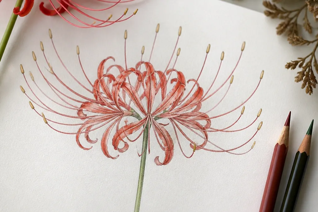

1. Single Spider Lily on Warm Kraft Paper
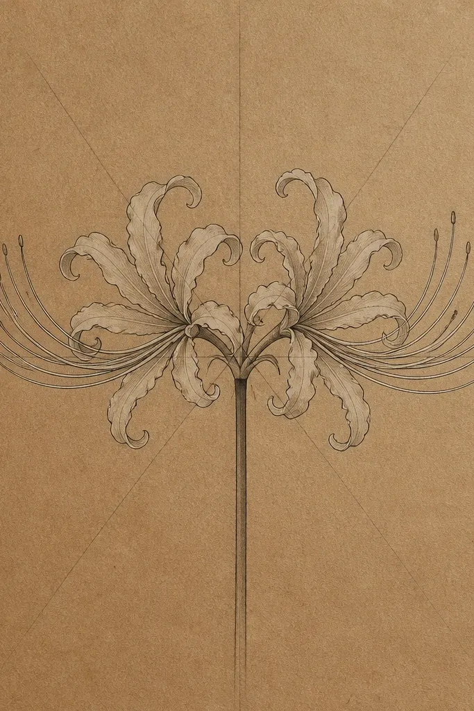
This idea is the fastest way to get a high-end look because kraft paper already gives you the midtone background. I used a cream-white gel pen for a tiny highlight on each petal tip so the long straps look like they're catching light. The petals sit slightly angled to the left, which makes the flower feel graceful instead of stiff. It flatters small spaces like bookplates and gift tags because the drawing reads clearly even when it's only 3 inches wide.
Start by lightly sketching a small oval around the center, then draw a vertical center axis through it. Add six petal rays spaced like a clock, then curve each ray so the petal arcs outward and back in. Ink the outer petal edges first, then add midtone shading only where petals overlap with a soft 2B pencil. Finally, draw stamens as short, light lines radiating from the center, then add a few darker stamen tips with the fineliner.
Good to knowIf you want extra glow, erase the pencil lines after inking and then add one thin highlight stroke with a white gel pen.
Common mistakeDon't shade every petal - heavy shading everywhere makes it look like a copied print.
2. Spider Lily Bloom with Pencil-Only Soft Shading
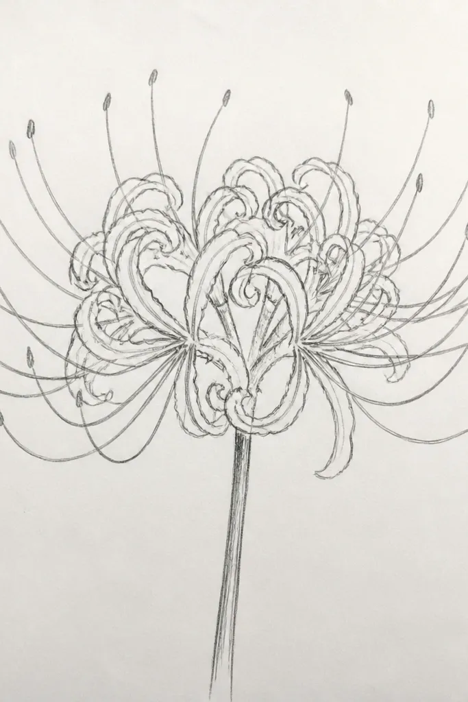
Pencil-only drawings feel intimate and slow, like a sketchbook page you'd want to keep. I like this version for people who want a muted, calm look without buying markers or ink. The trick is to keep the petal edges crisp while shading stays soft and blended. It's flattering for any paper color, but it really pops on light cream sheets because the graphite can range from near-white to deep grey.
Start with a light HB sketch of the petals and stamens, keeping the petal tips thin. Use a 2B pencil to add midtone shading only under the overlapping petals, using a tissue to blend in small circles. Leave the top edges of petals mostly unshaded so the straps look lifted off the paper. Press harder only at the densest center area, then use a kneaded eraser to pull back a few highlights along the petal curves.
Good to knowUse a kneaded eraser to carve thin highlight lines; it makes the petals look glossy without adding paint.
Common mistakeSkip the heavy blending on the whole flower - it turns the petals into one grey blob.
3. Watercolor Wash Behind Linework
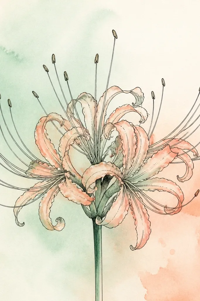
This one looks airy because the watercolor sits behind the drawing instead of over it. I paint a loose wash first, then ink on top once it's mostly dry. The best color combo for spider lilies is a pale green wash mixed with a touch of warm peach, since it mimics the subtle warmth you see in real petals. It flatters journal covers because it gives you color without hiding the fine petal structure.
Tape the paper to a board and paint a light oval wash behind where the flower will go, using diluted mint green. Let the wash dry until it's tacky, then sketch the flower lightly. Ink the petals and stamens with a waterproof fineliner so the lines don't blur. Add one extra watercolor glaze at petal overlaps with a tiny brush, keeping it thin enough that the ink stays sharp.
Good to knowPaint the wash a little off-center - the slight asymmetry makes the whole piece feel alive.
Common mistakeDon't flood the paper; if the wash pools, your linework will look fuzzy.
4. Monochrome Ink with Cross-Hatching Overlaps
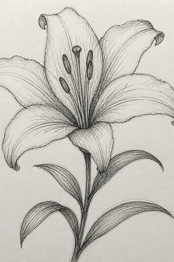
Cross-hatching makes spider lilies look dimensional without using color. I do this when I'm turning sketches into stencil-like prints or when I want a strong graphic look. The overlap areas get the most hatch density, which tricks your eye into seeing depth. It flatters bold, high-contrast layouts like upcycled cereal-box art because the ink reads from across the room.
Draw the flower with a light pencil first, keeping petal tips narrow. Ink the outer edges of petals, then wait a minute so the ink settles. Add cross-hatching only in the overlap pockets: draw short diagonal lines, then a second set of diagonals crossing them. Keep the petal top edges mostly clean so the hatch reads like shadow. Finish the stamens as single lines, then thicken only the central cluster with a denser hatch.
Good to knowUse a smaller nib for stamens and a bigger nib for petal edges so the line weight feels intentional.
Common mistakeDon't hatch the full petal - it kills the airy strap shape.
5. Spider Lily Side Profile on a Salvaged Book Page
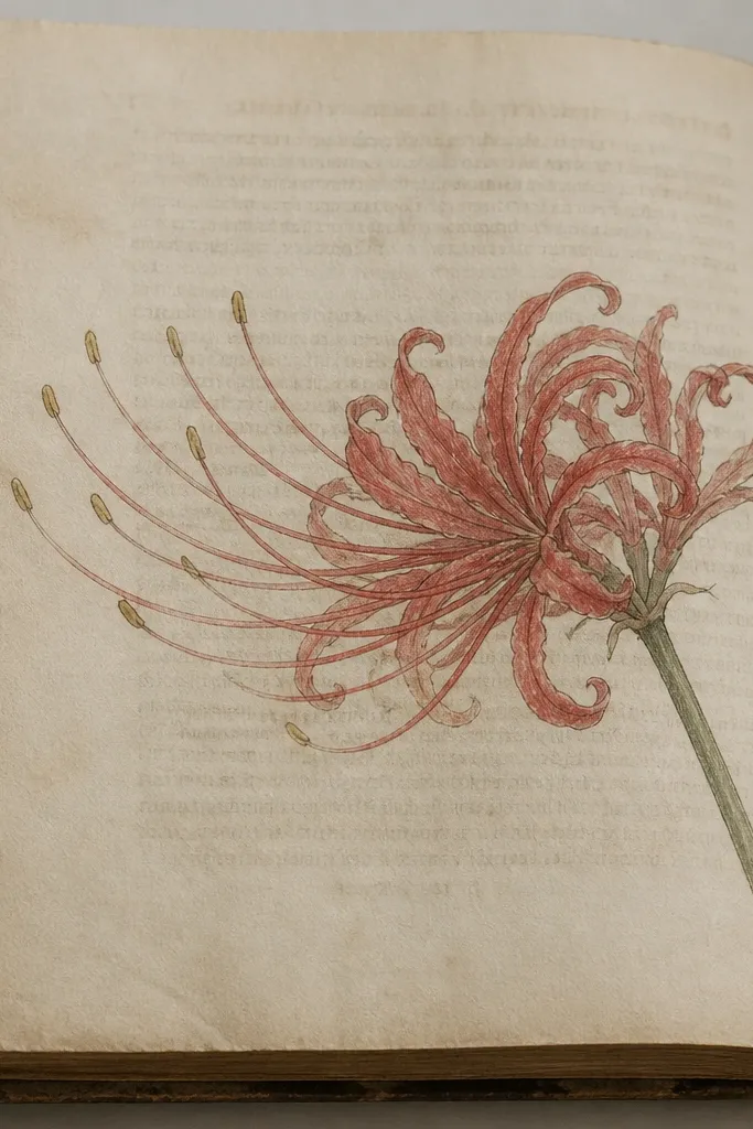
Side profile makes the flower feel like it's leaning out of the page, which is great for repurposed paper. I've done this on pages with old typography because the faint text acts like natural texture. The key is foreshortening: one side of petals looks slightly wider and darker, while the far side stays lighter. This style flatters small craft projects like bookmarks and collage cards because it uses space diagonally.
Pick a book page with light, readable texture, then sketch the flower with a 2H pencil so you don't dent the paper. Draw the center axis tilted, then place two main petal arcs closer to the viewer. Ink the near petal edges darker, and keep the far edges lighter with lighter pressure. Add stamens as short lines that fan toward the viewer, then use a soft pencil to shade under the near petals only.
Good to knowIf the page is glossy, lightly rough it with fine sandpaper before drawing so the pencil grips.
Common mistakeAvoid placing the flower straight-on; flat symmetry makes side profile look accidental.
6. Two Spider Lilies Interlaced Like a Bouquet
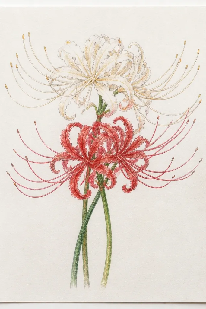
Interlacing two spider lilies looks romantic and full without needing many flowers. I like it for wall art mockups because the overlap gives you natural depth cues. The petals crossing between blooms makes it feel like motion, not like two separate stickers stuck together. It flatters wide formats - think 8x10 prints or the front of a notebook cover.
Sketch two centers first, about 2 inches apart, with one slightly higher. Add six petal rays for each flower, then let petals cross between flowers rather than keeping them separate. Ink the crossing overlap edges first, then shade the overlap pockets with a soft graphite smudge. Draw stamens in thin lines, and when stamens from both flowers meet, darken the shared center area so the bouquet looks cohesive.
Good to knowUse one darker ink pass only on the outer petals of the lower flower so the bouquet has a clear focal point.
Common mistakeDon't keep the petals at the exact same angle; that makes the bouquet look stuck.
7. Spider Lily Bud + Full Bloom Pair
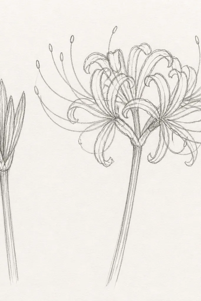
A bud and full bloom pair gives you story in one page. I use this when I'm making a themed set for upcycled planners because it looks intentional even if the page is small. The bud petals are shorter and more curled, so you get contrast in scale. It flatters people who like realistic proportions because it teaches how spider lilies change shape as they open.
Start by drawing a smaller oval bud shape, then sketch 6-8 tightly curled petal lines around it. Place the full bloom about 1.5 inches lower and sketch its center axis. Ink the bud first with lighter line weight so it feels softer. Then ink the open bloom petals with consistent tapered lines and add midtone shading only at overlaps. Finish with stamens for the open bloom and a few tiny emerging stamen lines for the bud.
Good to knowKeep the bud stamens minimal - a few short lines look more believable than drawing a full fan.
Common mistakeDon't make the bud petals the same length as the open bloom; it breaks the transformation.
8. Spider Lily with Bold Red Accents on Tips
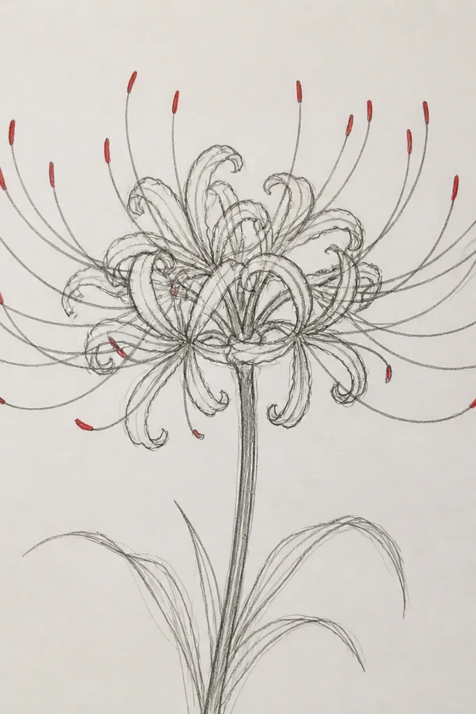
Red accents make spider lilies look dramatic without turning the whole drawing into a cartoon. I've used a tiny amount of diluted vermilion or tomato red at only the petal tips and the center cluster. The rest stays neutral - graphite grey, soft brown, or black ink - so the red reads as light catching pigment. This is great for greeting cards and cover art because it gives a clear focal hit.
Ink the full spider lily in black fineliner, then erase pencil marks lightly. Mix diluted vermilion with water so it looks like a soft stain, not a solid block. Touch the red paint only at 6-10 petal tips and let it fade slightly downward. Add a very light red wash around the center cluster, then let it dry fully before adding one last dark line to the overlap shadows.
Good to knowUse a toothpick to place tiny red dots - it gives you control at petal tips.
Common mistakeAvoid painting red across the whole petals; it flattens the strap shape.
9. Spider Lily Stamen Study Sheet (No Petals)
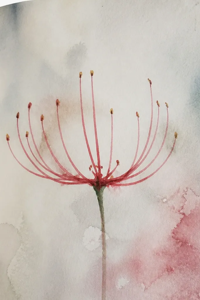
If your spider lily drawings fall apart, it's usually the stamens. This study sheet trains your eye to draw the center cluster as a layered fan, with some stamens stopping early and others reaching far. I use this sheet when I'm practicing for bigger compositions because it removes the pressure of drawing everything at once. It looks great printed or framed because it's graphic and textural, especially on off-white paper.
Draw a small circle for the center, then add a loose radial grid of 12-18 faint lines. Ink the center cluster with short, thick strokes first, then build out stamens as thin lines that vary in length. Add darker strokes only where stamens overlap, and keep gaps so the fan looks airy. Finally, add a few tiny dot marks in the center where the densest seed area would be.
Good to knowPractice with one set of 20 stamens first, then repeat on a second circle - you'll see the improvement fast.
Common mistakeDon't draw every stamen the same length; it makes the fan look like a comb.
10. Spider Lily Flower in a Circle Frame (Sticker Look)
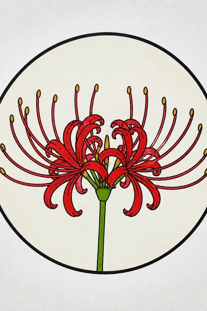
Framing the flower in a circle makes it feel like a finished sticker even if you're still sketching. I like this layout for upcycling because you can cut it out cleanly and glue it onto cardboard, book covers, or jar labels. The plain background keeps attention on the petal structure and the tapered tips. It flatters simple color palettes and looks sharp on kraft paper stickers or matte washi paper.
Use a compass or a round stencil to draw a neat circle, then sketch the spider lily centered inside. Ink the circle border first, then ink the petals so they don't cross the border. Shade overlap pockets with a light pencil so you keep the graphic edge. Add stamens last, keeping them thin and slightly uneven in length. Finally, use a white gel pen to add 3-5 tiny highlight strokes on the outer petals.
Good to knowIf you plan to cut it out, keep the outer petal tips at least a quarter inch away from the circle edge.
Common mistakeDon't use a fuzzy pencil outline under the ink; it shows through when you cut.
11. Spider Lily on Patterned Fabric Scrap (Marker + Pencil)
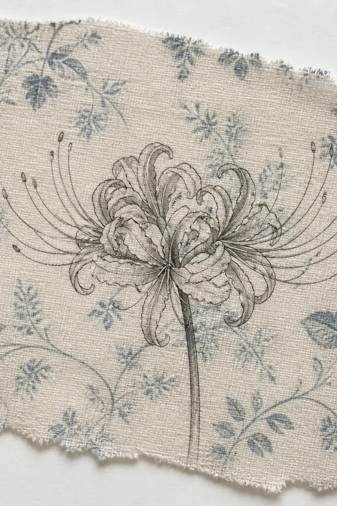
Drawing spider lilies on fabric scraps makes the sketch usable right away for patchwork, appliqué templates, or fabric collages. I use a black fineliner marker because it grips the fibers, then I add graphite shading only where petals overlap. The patterned background makes the flower feel layered and imperfect in a good way. It flatters upcycled quilts and tote bags because the drawing doesn't need a perfectly blank canvas.
Iron the fabric to flatten it, then tape it to a stiff backing so it doesn't shift. Sketch the flower lightly with a soft pencil, then outline the petals with a fine black marker. Add shading with a graphite pencil using short strokes, then smudge gently with your fingertip. Finish stamens with the marker or a darker pencil, and add highlights with a white gel pen if the fabric is dark.
Good to knowTest your marker on a hidden corner first; some bleed into thread texture.
Common mistakeAvoid pressing hard with pencil - it creates permanent dents on thin fabric.
12. Spider Lily on White Gessoed Cardboard (Bold Contrast)
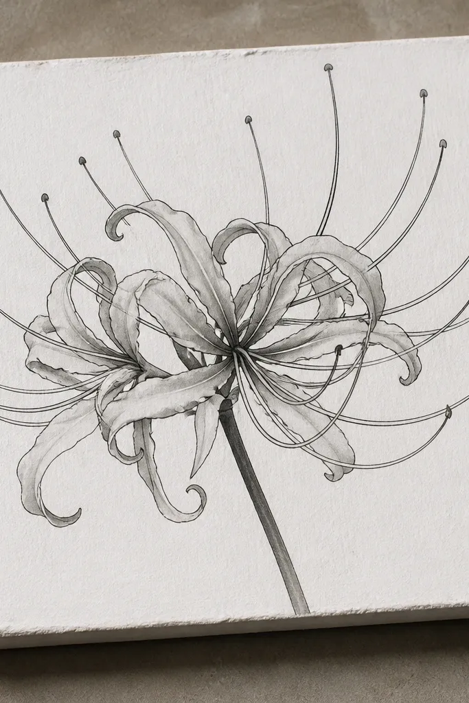
Gessoed cardboard gives you a smooth, toothy surface that makes linework look clean. I do this when I want a sturdy piece that can handle paint and glue without buckling. The white base lets the dark ink pop, and grey wash shading gives dimension without muddying. It flatters anyone making wall art from scrap cardboard because the drawing looks finished even before you add embellishments.
Sand the cardboard lightly, then brush on a thin coat of white gesso and let it dry overnight. Sketch the flower with a light pencil, keeping petals tapered and slightly curved. Ink the petals and stamens with waterproof black ink, then add a diluted grey wash in overlap pockets using a small round brush. Let the wash dry, then add a second ink pass on the darkest overlap lines for extra depth.
Good to knowUse a hairdryer on low for gesso drying, but keep it moving so you don't get ridges.
Common mistakeDon't skip sanding; slick cardboard makes ink smear.
13. Spider Lily with Soft Pastel Petal Gradients
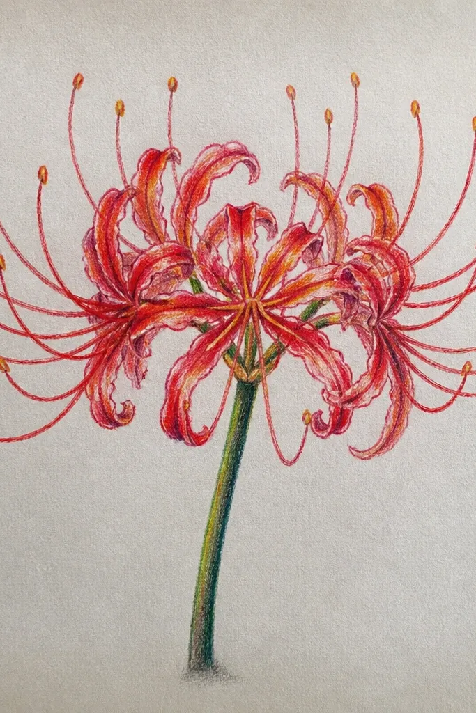
Pastel gradients make the petals feel like fabric, not just lines. I use a light hand and layer color in thin passes so the drawing stays airy. The base-to-tip color shift looks natural because spider lily petals fade as they extend outward. This style flatters warm skin tones in photos when you use it on tags or gift wrap cards, since the palette reads cozy, not clinical.
Sketch the flower with a light pencil, then lightly outline petals with a grey fine liner. Color the petal base near the center with pale peach using a pastel pencil, then blend outward with a lighter pink tone. Shade overlaps with a muted mauve pencil and blend with a soft brush or paper stump. Add stamens in a very light warm grey, then darken the center cluster with a deeper pastel layer.
Good to knowBlend with a paper stump, not your fingertip, so you don't smudge the linework.
Common mistakeDon't press hard on pastel early; it dents paper and makes muddy edges.
14. Spider Lily Bloom with Floating Petals in the Air
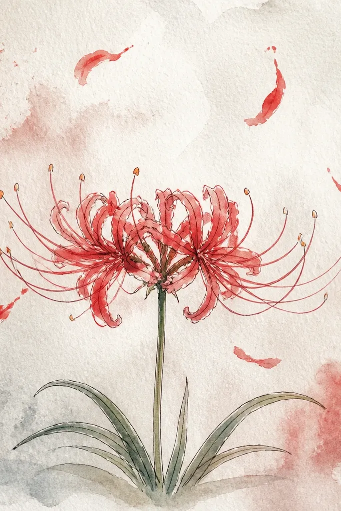
This is the drawing trick that makes spider lilies feel like motion. You keep the main bloom detailed, then you reduce contrast and line thickness on the floating petals. I like it for upcycled cover art because it fills empty margins without crowding. It flatters people who like whimsical art but still want the spider lily shape to stay recognizable.
Draw the main bloom first with a clear center axis and full stamens. Then add 5-7 smaller petals around it, each at a different angle, with lighter lines and fewer overlap shadows. Ink the main bloom with your darkest line weight, but outline the floating petals with a softer grey pencil or lighter ink. Add slight value differences: keep floating petals mostly light, and only darken a couple of overlap edges to suggest depth.
Good to knowRotate your paper a little while drawing petals in the air; it keeps your curves natural.
Common mistakeDon't give floating petals full stamens; it makes them look like extra flowers.
15. Spider Lily Botanical Frame with Simple Leaf Sprigs
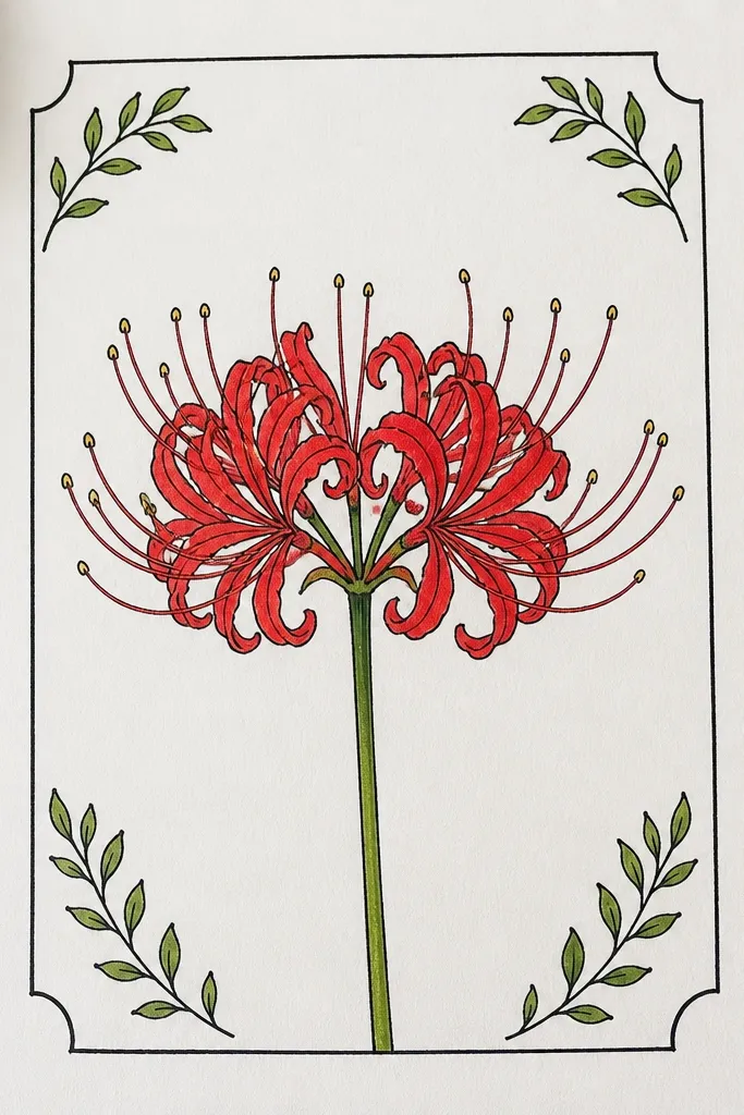
A simple leaf frame makes your spider lily drawing feel like a botanical plate without turning it into a busy page. I draw the leaves with lighter line weight than the flower, so the lily stays the hero. This is a great option when you're making repurposed stationery because the frame gives you a clear boundary for writing or stamping. It also flatters larger paper sizes where you want structure.
Sketch the spider lily in the center first, then plan the frame with 4 corner leaf sprigs. Draw leaves as long ovals with a center vein line, keeping them smaller than the petal length. Ink the frame lightly, then ink the flower with stronger lines. Shade overlap pockets in the flower only, and keep leaf shading minimal with one soft grey pass. Finish with a few white gel highlights on the spider lily tips.
Good to knowUse a ruler edge to guide leaf placement so the frame looks intentional, not random.
Common mistakeAvoid shading the leaves as heavily as the petals; it steals focus.
16. Spider Lily with Vintage Sepia Tone and Film-Grain Texture
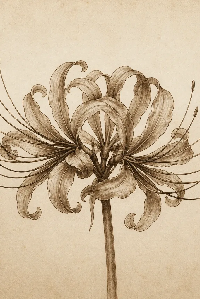
This style makes spider lilies feel like they came from a scanned old botanical book. I do it with sepia ink or diluted sepia ink wash, then add grain with a dry brush technique. The drawing stays readable because you still keep crisp overlap shadows. It flatters people who like warm, antique-looking craft projects like old envelope art and collage tags.
Sketch the flower with light pencil, then ink petals and stamens with sepia fineliner. Shade overlaps with sepia pencil in thin layers, keeping the top edges light. Add a very light sepia wash behind the flower, letting it fade toward the corners. For grain, flick diluted sepia paint with a toothbrush from a few inches away, then blot lightly with a paper towel so it doesn't pool.
Good to knowDo the grain after everything dries so you don't smear ink.
Common mistakeDon't go too dark on the background; it will compete with the petals.
17. Spider Lily One-Line Continuous Drawing (No Lifting Pen)
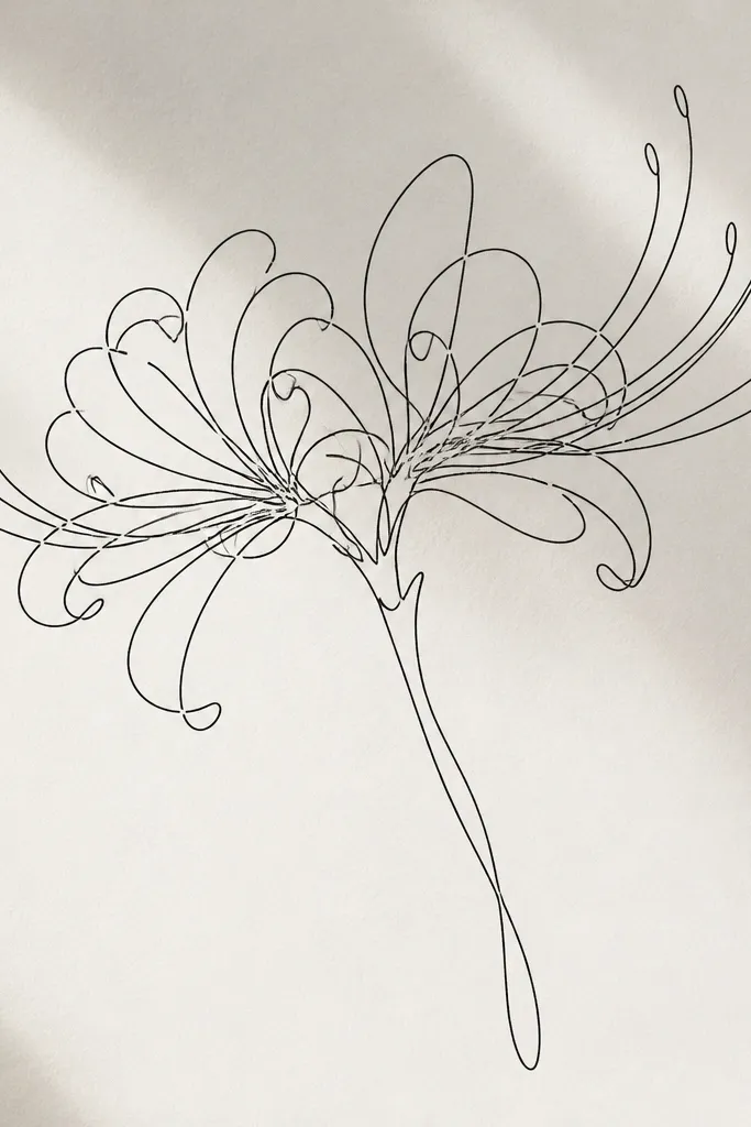
A one-line spider lily sketch looks modern and confident. I use it when I want a drawing that works as a quick transfer for upcycled labels or as a graphic element on top of collage paper. The key is to plan where your line crosses so it still reads as overlap shadows. It flatters minimal designs because the whole flower is made from movement, not shading.
Start with a center loop where the stamens will be, then spiral outward into the first petal. Keep your line continuous, looping through 6 petal shapes and crossing at overlap points. When you reach the far petal tips, curve back toward the center and add repeated passes for the stamen fan. Add no shading - instead, vary line thickness by slowing down your pen and pressing slightly more at overlap crossings.
Good to knowPractice the motion on scrap first; one-line drawings get easier once your hand knows the petal arcs.
Common mistakeDon't let your line drift straight; straight lines make it look like a doodle, not a spider lily.
18. Spider Lily with Embroidery-Thread Look (Marker + Tape Resist)
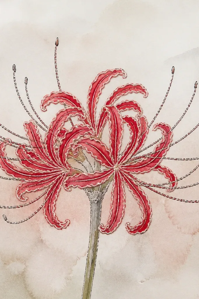
This idea gives you a stitched, thread-like look without actual embroidery. I use tape resist to keep thin highlight lines along the petal edges, then fill the rest with marker shading. It feels handmade and layered, and it's perfect for upcycled cards where you want texture you can see. The effect flatters monochrome palettes and looks striking on darker paper too.
Lightly sketch the flower with pencil. Place narrow strips of masking tape along a few petal edges where you want highlights, then wash or lightly color the petals with pale marker or diluted ink. Remove the tape after the color dries so you get clean white channels. Outline the petals again with a fine black marker, then add stamens with repeated short strokes to mimic thread density.
Good to knowUse painter's tape, not super sticky tape, so it doesn't tear paper fibers.
Common mistakeDon't cover too much with tape; the flower needs visible strap shape, not thick stripes.
19. Spider Lily on Black Paper with White Gel Highlights
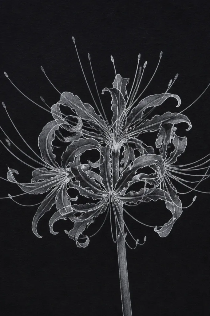
Black paper is brutal in the best way - it forces your drawing to rely on highlights and contrast. I outline petals in white gel pen, then use a soft grey pencil for midtone shading where petals overlap. The stamens look crisp and luminous, like they're glowing from behind. This style flatters bold craft projects like night-themed cards, because the flower reads instantly from a distance.
Sketch lightly with a white pencil or chalk pencil so you can see your guides. Draw the petals with a white gel pen, keeping tips thin and edges slightly uneven for realism. Add midtone shading with a grey graphite pencil under overlap areas, then deepen overlap shadows with another gentle pass. Build the stamen fan with fine white lines, then densify the center with a few thicker gel strokes.
Good to knowLet gel pen ink sit for a minute before shading with graphite so you don't smear.
Common mistakeDon't outline everything equally thick; thin petals need thinner lines to stay airy.
20. Spider Lily with Green Stalk and Soft Ground Shadow
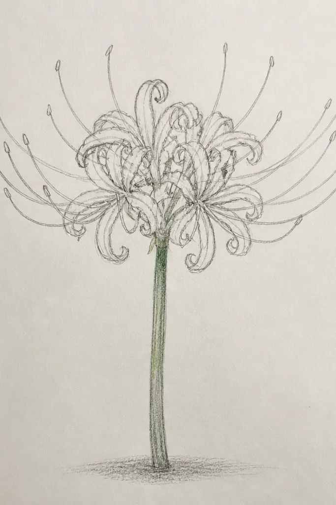
Adding a stalk and a ground shadow makes the flower feel planted, not floating. I color the stalk with muted green pencil so it doesn't steal attention from the petals. The ground shadow is a light grey ellipse underneath, softened with a fingertip or blending stump. This style flatters anyone who wants drawings that work as stickers for planners because it gives a clear "where it sits" cue.
Sketch the spider lily bloom and center axis, then draw a thin stalk line that curves slightly. Color the stalk with a muted green pencil, adding a darker green near the base. Add a light grey ellipse shadow under the bloom, keeping it smaller than the petal span. Ink the petals and stamens, then shade overlap pockets lightly with graphite. Finish with a few white gel highlights on petal tips and on the stalk where light hits.
Good to knowKeep the shadow softer than you think - a crisp shadow makes the drawing look like a cutout sticker.
Common mistakeAvoid thick stalks; spider lilies have thin stems and thick stems make the flower look wrong.
21. Spider Lily in a Hanging Window Composition (Diagonal Layout)
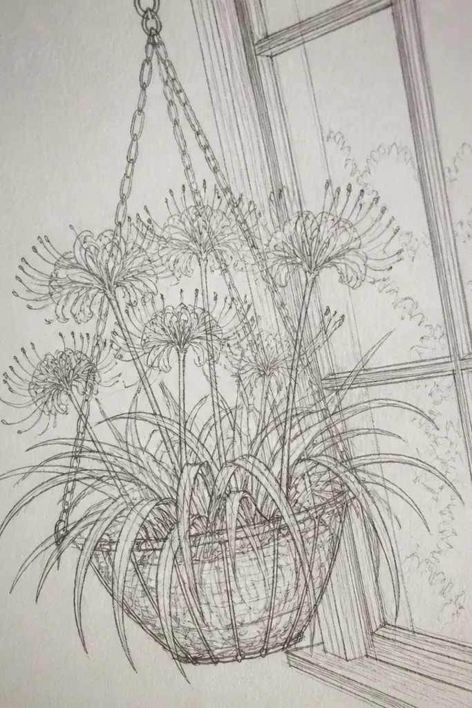
Diagonal layouts make your spider lily feel like it's caught in a breeze. I like this when I'm designing a cover for a repurposed planner or journal because the diagonal composition creates energy without extra elements. The trick is to keep the center cluster anchored so the flower doesn't feel like it's sliding away. It flatters portrait pages because the diagonal line uses vertical space well.
Draw a light border or pane lines on the page, then sketch the spider lily center off-center, near the upper left. Place petal rays so they stretch toward the lower right, tapering and curving each petal. Ink the petals with consistent line weight, then darken overlap pockets. Add stamens as a fan that sits closer to the anchored center cluster, so the rest of the petals don't look unsupported.
Good to knowUse a ruler only for the frame lines; draw petals freehand so they keep their organic curve.
Common mistakeDon't center the flower; the diagonal effect disappears.
22. Spider Lily with Botanical Icons and Tiny Labels
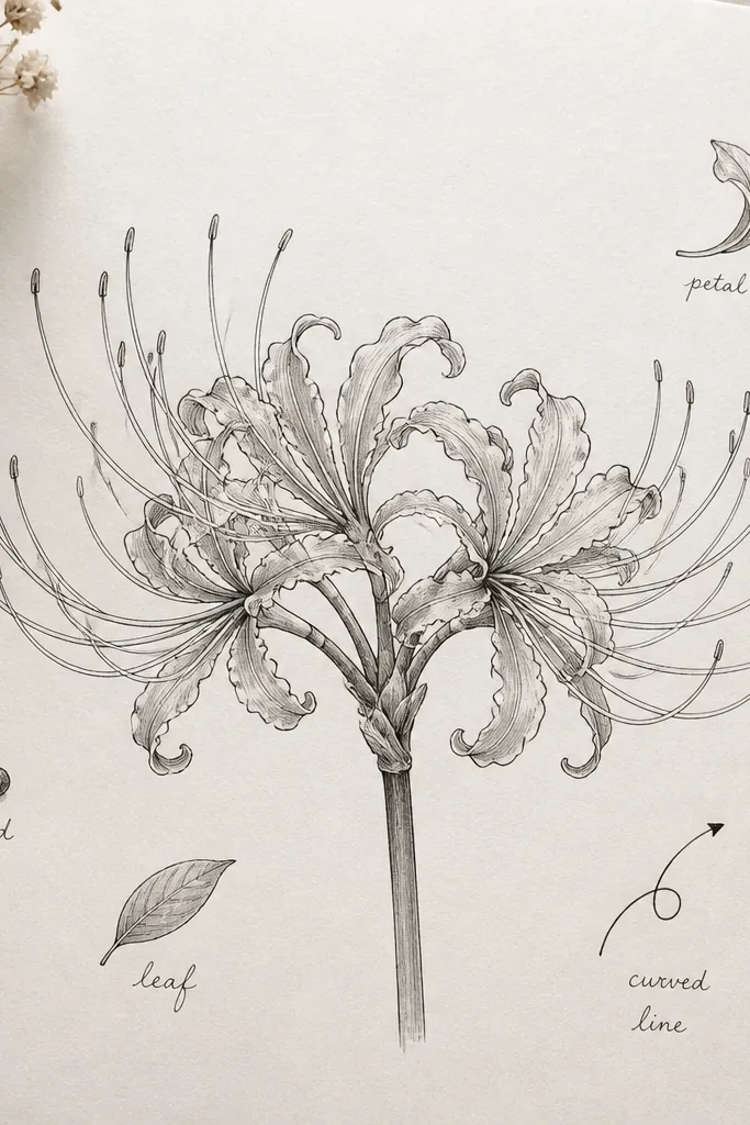
This one turns your spider lily sketch into an upcycled mini-collection page. I add small icons and short labels so the drawing looks like an observation sheet, not just a pretty flower. The icons keep the page from feeling empty, and the flower stays the main focus because icons sit outside the petal span. It flatters slow, careful drawing styles and works well on index cards or scrap paper sheets.
Sketch the spider lily center and ink petals with a fine liner, then shade overlaps lightly with graphite. Leave a clear margin around the flower for the icons. Add 3-5 small icons like a leaf sprig, a seed dot cluster, and a curved arrow pointing toward the center. Write tiny labels in pencil first, then go over with a fine pen. Keep label ink lighter than the flower ink so it doesn't compete.
Good to knowUse one consistent handwriting style for all labels so the page looks intentional.
Common mistakeAvoid long text; it crowds the flower and makes the page look cluttered.
23. Spider Lily Flower Crown on Old Ledger Paper
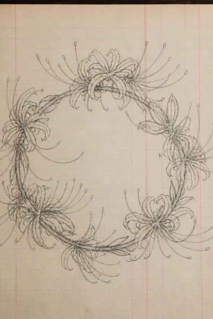
A crown layout is perfect for upcycling because it turns scrap paper into a decorative header. I've done this on ledger-style pages where the printed lines already create structure. Each small spider lily uses simpler lines, but the overlap shading is still there, so the pattern doesn't look flat. It flatters notebook covers and envelope fronts because the top arc frames the space below.
Sketch a gentle arc across the top third of the page. Place 5-7 small spider lily centers along the arc, spacing them about 1.5 inches apart. Draw petals as tapered straps that curl slightly upward, and keep crossing overlaps minimal but present. Ink each flower consistently, then shade overlap pockets with a soft grey pencil. Finish by darkening each center cluster slightly so the repeating pattern stays readable.
Good to knowIf you're cutting it out, keep each flower's petal tips aligned to the arc so trimming is cleaner.
Common mistakeDon't make every flower identical; tiny angle differences keep it from looking stamped.
24. Spider Lily with Soft Pencil Rosebud Background Bokeh
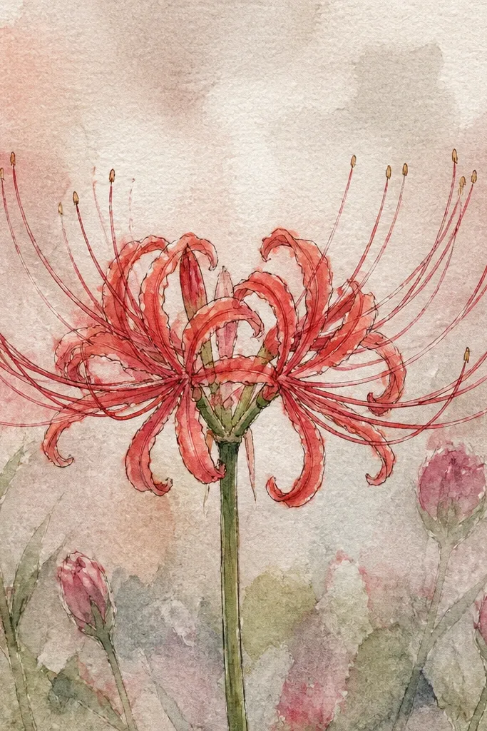
Background bokeh makes the spider lily look like it's in focus while everything else is gentle. I do this when I want a dreamy aesthetic for greeting cards and sticker sheets. The bokeh circles are made with light pencil dots and soft circles, not heavy shading, so they don't fight the petals. It flatters people who like soft, romantic visuals because the flower still stays crisp.
Sketch and ink the spider lily first, including petals and stamens with your normal line weight. Then, without shading the flower further, add light pencil dots in the background around it. Smudge a few dots into loose circles so they read as bokeh, keeping them lighter than the flower. Add a faint rosebud-like cluster near one corner using tiny teardrop shapes. Keep the bokeh farther from the flower edges so the center stays clear.
Good to knowUse a kneaded eraser to lift highlights inside a few bokeh circles for extra depth.
Common mistakeDon't shade bokeh near the petal edges; it blurs the silhouette.
25. Spider Lily with Watercolor Splatter Texture Only on Background
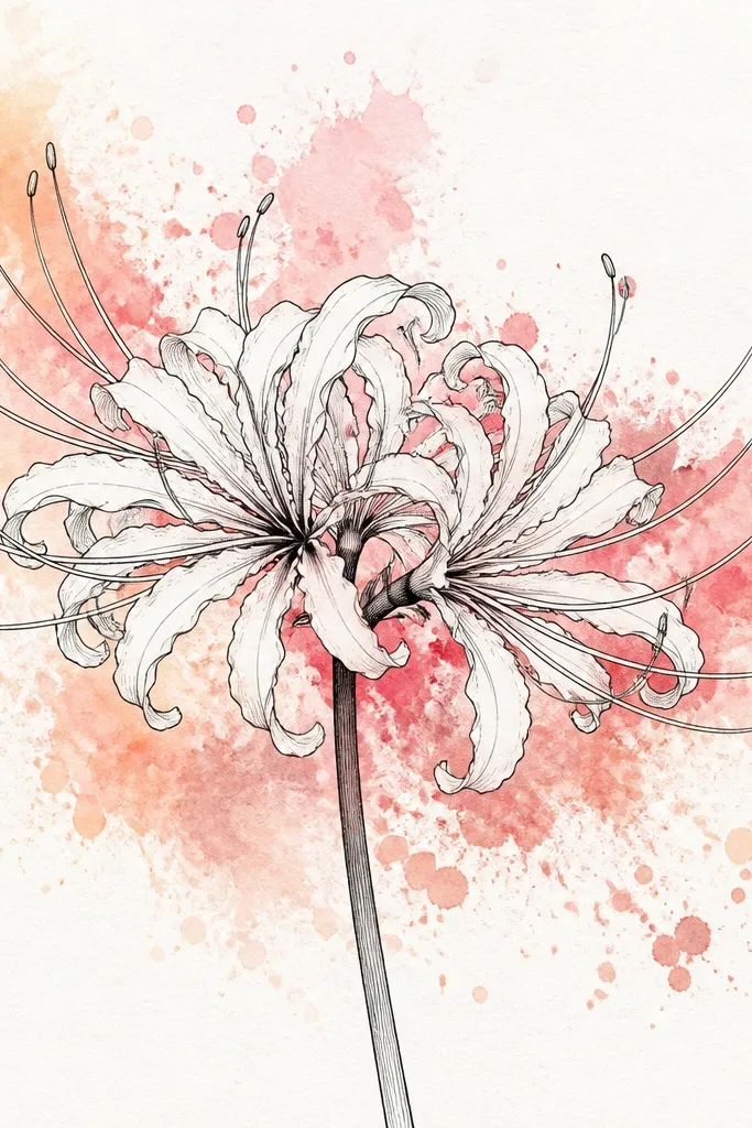
Splatter texture is a quick way to add energy without messing up the delicate petal structure. I keep the splatter away from the petals so the flower stays sharp. The best look happens when the splatter is diluted and varied in size, like paint dust in air. It flatters modern journal pages and upcycled paper crafts where you want texture but still need clear linework.
Paint a very light watercolor wash in the background only, using a pale neutral like warm grey or light sepia. Let it dry until it's not shiny, then tap diluted paint from a toothbrush across the page from a few inches away. Ink the spider lily petals and stamens after the splatter dries so lines stay clean. Add midtone overlap shading with pencil, then finish with a few white gel highlights on petal tips.
Good to knowCover the flower area with a paper scrap while splattering so you don't get random marks on the petals.
Common mistakeAvoid splattering over wet ink; it will bleed and ruin the crisp edges.