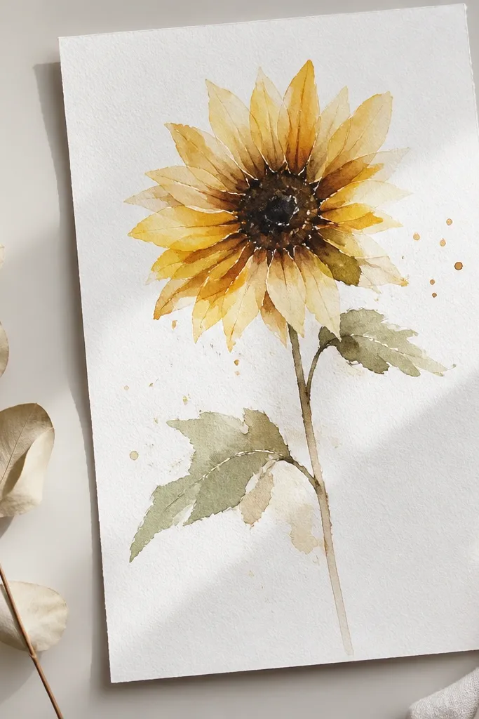
1. Single sunflower with off-center seed head
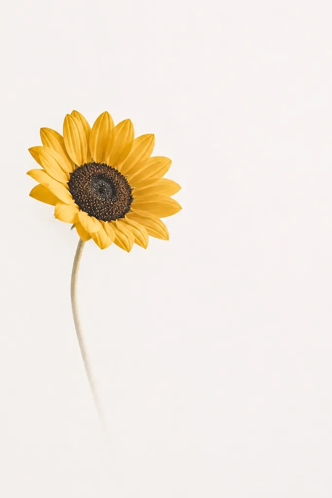
This one works because the sunflower sits off to the side, so your eye lands on the center immediately and then gets quiet. I paint the seed head slightly smaller than you think - about 1/4 of the paper width for a 9x12 - so the petals don't crowd the page. Use a warm yellow for petals and keep shadows minimal with a diluted orange-brown wash at the base of each arc. This layout looks great for gifts because it feels intentional and clean, especially on bright skin tones in photos when you wrap it with kraft paper and a cream ribbon.
Start by lightly sketching a circle for the seed head and placing its center 2 inches from the right edge on a 9x12 sheet. Mix a medium warm orange-brown, load a small round brush, and paint a tight circle; then tap a nearly dry brush over the circle to create seed texture. After it dries, paint 10-12 petal arcs around the seed head, each arc about 1/2 inch long, leaving white paper between arcs. Finish with a single thin stem line from the bottom of the seed head, using a cool gray-green wash, and let it fade before it hits the edge.
Good to knowIf your petals look flat, add one darker petal base per cluster with diluted orange so the flower has depth without extra detail.
Common mistakeDon't fill every gap between petals - that's how it turns into a "blob flower."
2. Sunflower in a 3x3 square grid
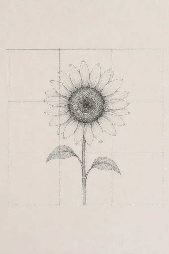
A grid makes the whole piece feel designed. I use it when I want the sunflower to look modern and a little graphic, like stationery art, not garden art. Keep the sunflower size consistent with the grid cells: the seed head should sit in the middle cell while petals reach only into the adjacent cells. This style looks good on warm walls and in frames with a matte - the grid lines read as structure and the sunflower reads as warmth.
Draw a light 3x3 grid with a ruler and pencil, leaving a margin of about 1 inch from the paper edges. Paint the seed head first in the center cell, keeping it about 1.2 inches wide on a standard sheet. For petals, paint five arcs on the top row of cells and four arcs on the bottom, so you don't cross the grid lines too much. Add the stem as a single vertical line from the seed head down to the bottom cell, then erase any grid pencil you can once the paint is dry.
Good to knowUse a very watery gray wash for the grid lines if you want them to show subtly under the watercolor.
Common mistakeDon't ink the grid with dark marker - it kills the watercolor softness.
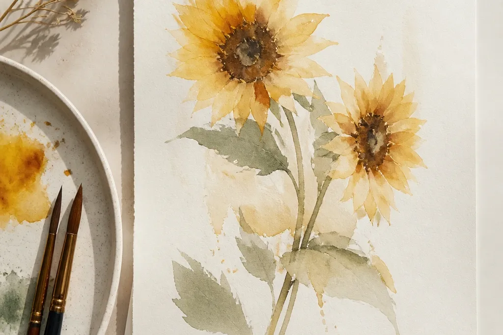
3. Two sunflowers, one shaded center
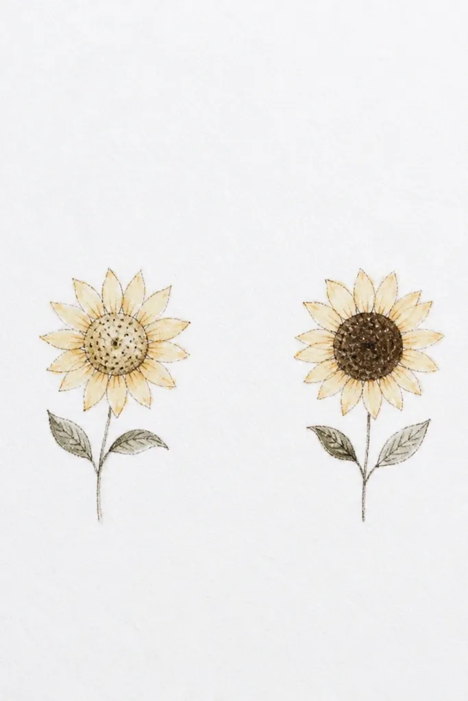
This layout feels modern because it gives you contrast through the seed head, not through extra petals. Place one sunflower slightly higher and one lower so the composition has movement without adding extra elements. I shade only the right seed head with orange-brown and a tiny touch of cool gray, then keep the left one mostly warm yellow to keep the palette calm. It's a great choice for cards because it reads clearly even at a small size.
Sketch two seed circles about 2.5 inches apart, with the top one about 3 inches from the top edge. Paint the left seed head with a warm yellow-orange wash and tap-dry texture, then keep it lighter by using more water. Paint the right seed head with the same base but add a small crescent shadow on one side using a diluted orange-brown; add a tiny gray dot in the deepest part for contrast. Paint petals for each flower as 8-10 arcs, keeping arc length consistent, then draw two thin stems that angle slightly toward each other.
Good to knowLet the darker seed head dry longer; it prevents the shadow from spreading into the petals.
Common mistakeAvoid adding extra background elements - the second sunflower already gives the balance.
4. Sunflower corner cluster with negative space band
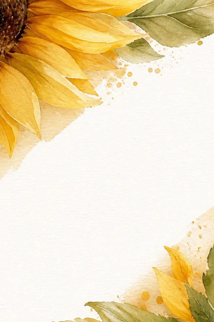
This one looks sleek because it frames the flower like a design sticker placed on paper. I use a diagonal negative space band so the sunflower feels intentional instead of floating randomly. Keep the petals tighter on the corner side so they look cropped and graphic. This works especially well if you plan to hang it in a slim frame - the corner placement makes the frame feel like part of the composition.
Start by placing the sunflower seed head about 2 inches from the top and 2 inches from the left edge. Lightly sketch a diagonal band across the page where you will not paint, about 3 inches wide. Paint the seed head with dry-brush texture, then paint petals only toward the inside of the band, leaving the outer side cropped by white paper. Add a short stem that follows the diagonal direction but stops before it reaches the band's edge.
Good to knowUse masking tape on the diagonal band if you want razor-clean negative space while you paint around it.
Common mistakeDon't extend petals past the band - that's when it looks messy, not modern.
5. Sunflower with minimalist stem calligraphy line
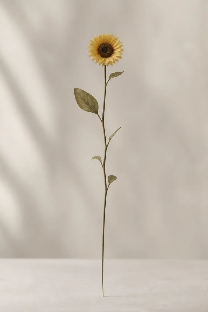
This style is modern because the stem becomes the main line instead of adding extra leaves. I like it when the sunflower is small and the stem is tall, like a single brushstroke drawing. Use a cool gray-green for the stem and let the line taper - it looks intentional even if your petal arcs are simple. It's flattering for busy backgrounds because the thin stem and lots of white space keep the piece from competing with the room.
Sketch a small seed head about 1 inch wide near the lower third of the paper. Paint the seed head first with orange-brown and dry-brush taps, then paint 7-9 petal arcs around it, each arc about 3/4 inch long. Mix a thin gray-green wash and load a liner brush; then pull one continuous line from the seed base upward, lifting your brush gradually to taper. Add one tiny offshoot line near the bottom as a dot or short flick, then let everything dry fully before you erase pencil marks.
Good to knowPractice the stem taper on scrap until you can get a clean point without stopping in the middle.
Common mistakeDon't add leaf clusters - they turn it into a garden illustration.
6. Sunflower with watercolor halo wash
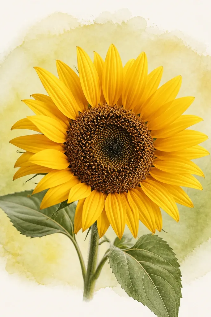
A halo wash makes the sunflower feel like it has its own light source. I keep the halo very pale so the flower stays the focus, not the background. Use a diluted warm yellow-green or light sage wash, and keep it loose around the edges. This idea looks great on cream paper or in frames with a white mat because the halo gives warmth without adding clutter.
Tape the paper edges lightly if you want clean borders, then sketch the seed head at center. Paint the halo first: mix diluted sage-green, wet the area around the sunflower in a rough circle, and brush outward in a ring shape, leaving the center lighter. Let it sit for 30-60 seconds, then paint the seed head with orange-brown dry-brush texture. After the seed head is set, paint petals as arcs, and keep the petals darker at their base for depth.
Good to knowIf the halo blooms too much, blot the edge with a clean dry brush rather than trying to repaint it.
Common mistakeDon't make the halo too saturated - it steals attention from the petals.
7. Sunflower with three-tone petals (ombre arcs)
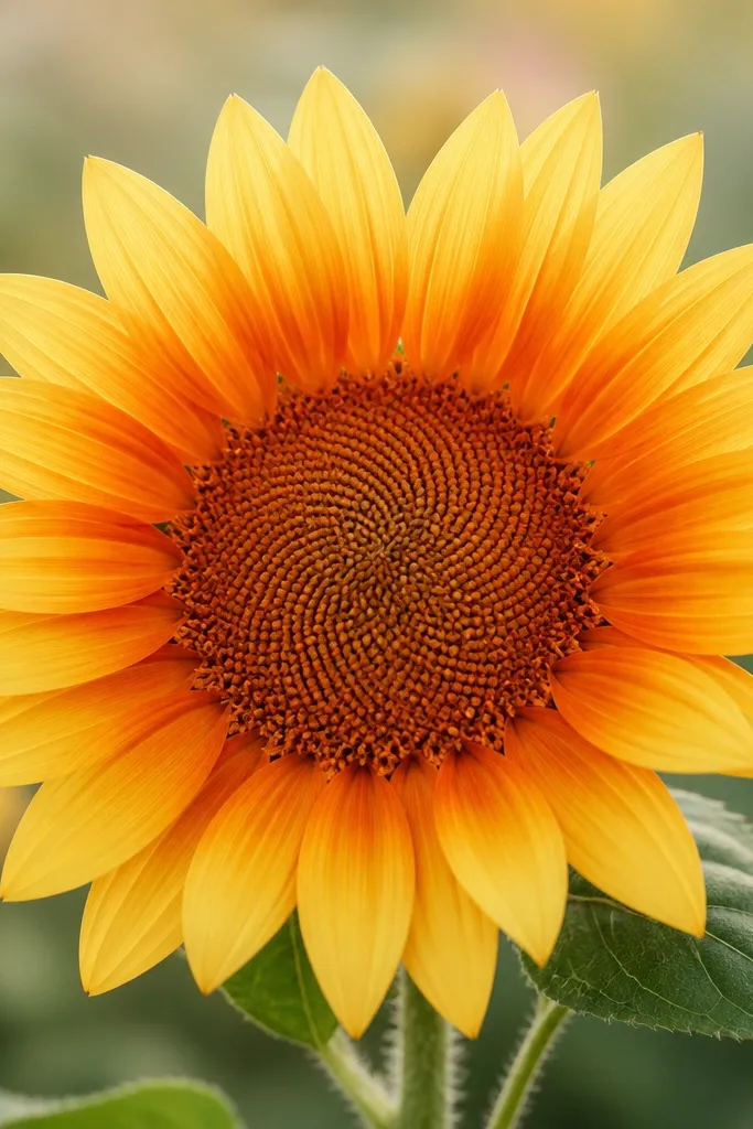
Three-tone petals look modern because they add depth without adding more shapes. I paint each arc with a fade: pale yellow at the top, then orange-brown at the base, with the middle fading naturally. This reads like "designed shading," not like a realistic painting of a specific flower. It flatters the eye in a way that makes the sunflower look crisp on both light and medium walls.
Sketch the seed head and lightly mark where petals will sit, about 12 petal positions. Paint the seed head first in orange-brown and add dry-brush texture with a nearly dry brush. For petals, load your brush with pale yellow, paint the arc, then touch the base of the same arc with orange-brown so it blooms just at the bottom. Keep every arc length uniform so the gradient pattern looks intentional, then add one thin stem line in diluted gray-green.
Good to knowUse two jars of water so your orange-brown stays clean and doesn't turn your yellow muddy.
Common mistakeDon't overwork the gradient - once the pigment is on the paper, leave it alone.
8. Sunflower on a muted rectangle postcard background
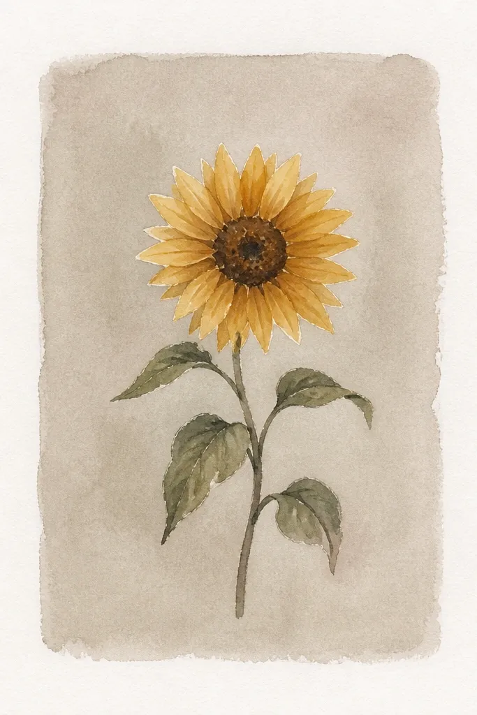
A painted rectangle background instantly modernizes the sunflower without turning it into a full scene. I use a muted gray-beige rectangle so the yellow petals still pop, and it looks good with minimalist frames. Keep the rectangle edges slightly soft, not sharp, so it still feels watercolor. This design works well if you plan to turn it into a postcard because the rectangle gives a natural "print" area.
Mask or pencil-guide a centered rectangle, leaving about 1 inch margin around it. Wet inside the rectangle and apply a diluted gray-beige wash, then stop and let the edges feather. Paint the seed head on top once the rectangle is dry or just barely tacky; then add petals as arcs with clean negative space between them. Finish with a thin stem and one small shadow under the seed head using diluted orange-brown.
Good to knowIf your rectangle looks streaky, rotate the paper and brush in one direction only for the last pass.
Common mistakeDon't paint the background too dark - yellow loses its glow.
9. Sunflower with seed head made of dots (stipple texture)
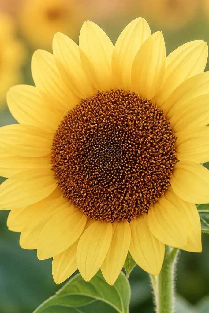
Dot seed heads look graphic and modern because you're building texture with repetition instead of brushy realism. I use dots only in the center so the petals stay airy. Keep the dot size consistent - tiny circles about the width of a pencil eraser tip on a 9x12 sheet. This gives a clean look that feels good in minimalist interiors and on planners.
Sketch your seed head circle and keep it around 1.3 inches wide. Paint the base circle with a light orange-brown wash, then while it's still damp, load a smaller round brush and stipple dots across the center, leaving small gaps for paper light. Let it dry completely, then paint petals as arcs around the seed head with pale yellow and a touch of orange at each base. Add a thin stem line and one small leaf shape as a single almond outline if you want a hint of detail.
Good to knowUse the tip of the brush, not the side, so dots stay round and consistent.
Common mistakeDon't cover the seed head entirely - a few pale gaps keep it looking airy.
10. Sunflower with broken-outline petals (painted gaps)
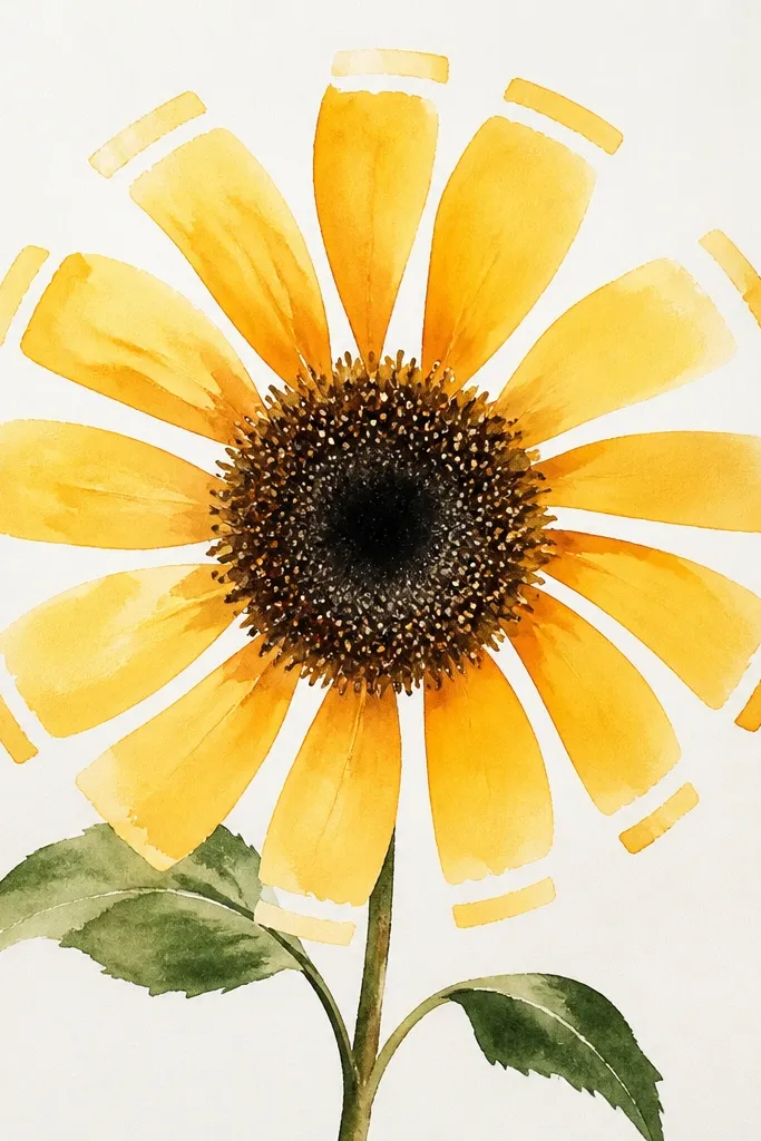
Broken outlines feel modern because they look intentional, like the artist left space for the paper to breathe. I do this by painting petals in two passes: first the outer arc, then a partial fill, leaving small white breaks. The sunflower looks lighter and more graphic than fully filled petals. It's also forgiving on beginner days because you can correct uneven arcs by leaving them broken on purpose.
Paint the seed head first using a warm orange-brown wash and dry-brush texture. Then paint petal arcs using a medium yellow, but stop about 1/3 of the way from the tip and leave a small gap. Go back for a second pass and fill only the inner half of each petal, so the outer tip stays broken. Add a thin stem in diluted gray-green, and keep it straight for a clean graphic vibe.
Good to knowIf a petal accidentally runs together, let it dry and then lift a bit of color with a clean damp brush to restore the break.
Common mistakeDon't try to make every petal perfect - the beauty is in the designed irregularity.
11. Sunflower with leafless stems and two curl accents
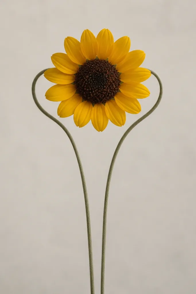
Leafless stems keep this modern minimalist because you remove the usual "busy garden" signals. The curls give movement and a sense of personality without adding extra botanical detail. I like this version for small frames because it reads clearly even when you crop tight. It also pairs well with warm neutrals like beige paper and white mats.
Sketch the seed head at center and paint it first with orange-brown and dry-brush taps. After drying, paint 10-12 petal arcs, each one slightly different in length by a few millimeters so it looks hand-done. Mix a thin gray-green wash and draw one main stem line downward, then add a second stem that curls near the top beside the sunflower, like a gentle parenthesis shape. Finish with two tiny accent strokes near the base of the seed head using the same gray-green.
Good to knowUse a liner brush and keep a steady paint load so the curls don't break mid-stroke.
Common mistakeDon't add leaf shapes - even one extra leaf can make it look like a cartoon.
12. Sunflower with watercolor wash shadow under petals
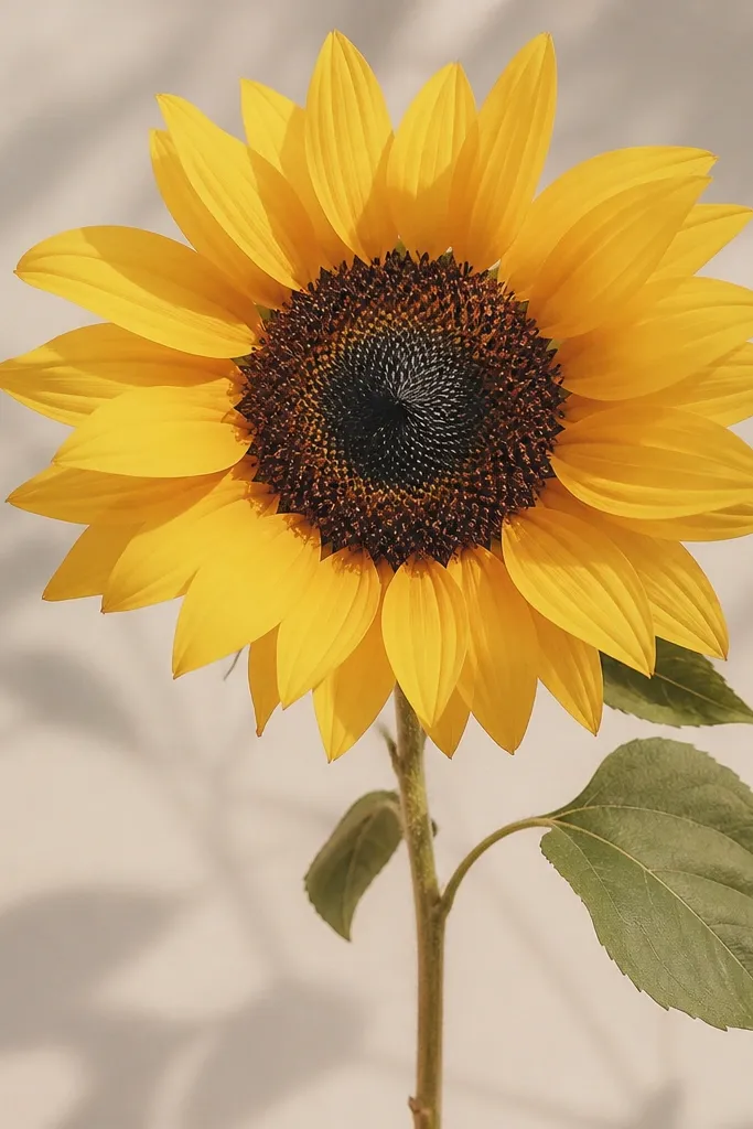
This one looks dimensional without heavy detail. You add a soft shadow wash under the petals, so the sunflower seems layered on top of the paper rather than sitting flat. I keep the shadow color cooler than the petals - diluted gray-blue or Payne's gray - so it doesn't muddy the warm yellow. It looks especially good on darker mats because the shadow gives a gentle separation.
Start with the seed head circle and paint it with orange-brown texture, then let it fully dry. Paint petals as pale yellow arcs, but before they dry completely, lightly brush a thin cool shadow wash under each arc, staying 2-3 millimeters below the petal line. When everything dries, go back and add a few deeper orange-brown bases to the petals so the center has warmth. Add a thin stem and one faint shadow line under the seed head with the same cool gray-blue.
Good to knowIf you want the shadow to stay soft, use a wide flat brush with very watery paint instead of a small round.
Common mistakeDon't use warm brown for the shadow - it makes the petals look dirty.
13. Sunflower with minimal background scribble lines
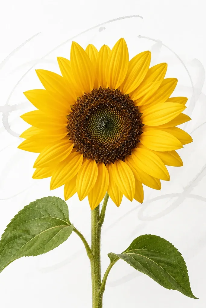
Scribble lines add energy, but they have to be faint or they fight the sunflower. I use them when I want the piece to feel alive while still staying minimal. Keep the scribbles in one cool tone so the petals stay the warm focus. This style works well for wall art where you want a little movement, but you still want it to match minimalist decor.
Lightly sketch the sunflower seed head at center and paint it first with orange-brown dry-brush texture. Mix a pale gray watercolor and, using a medium round brush, add 3-5 loose lines behind the sunflower, keeping them at least 1 inch away from the petals. Let the scribbles dry, then paint petals as arcs in pale yellow with orange-brown at the base. Finish with a thin gray-green stem line and one small curved accent stroke near the bottom.
Good to knowStop at five scribbles. More makes it look like a background accident.
Common mistakeDon't draw scribbles over wet petals - they bleed into the flower.
14. Sunflower with clipped petals at the edge (cropped petals)
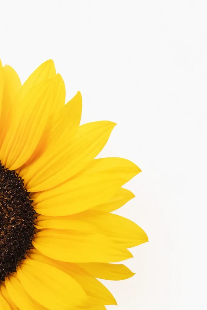
Cropping makes the sunflower feel like it's part of a larger design. I do this when I'm upcycling old frames or small canvases and the composition needs to feel intentional at the edges. Keep the seed head fully visible so the design still reads as a sunflower, then crop only the outer petals. It looks sharp on small prints and gives a confident, modern graphic feel.
Sketch the seed head slightly off-center near the right edge, leaving the center fully on the paper. Paint the seed head first with orange-brown dry-brush texture. Paint petals outward, but aim the brush so a few outer petals extend past the right edge and stop - you're letting the paper edge do the cropping. Add a thin stem line that stays inside the page, then erase pencil marks once dry.
Good to knowUse lighter pencil for the sketch so you can erase cleanly after you paint around the edge.
Common mistakeDon't crop the seed head. If the center is cut off, it reads unclear.
15. Sunflower with repeating mini petals band
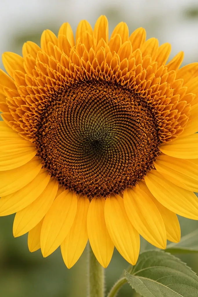
A repeating mini-petal band reads modern because it looks patterned, not random. I use it when I want the sunflower to feel like a design element you'd see on wrapping paper. Keep the band in one area only - top half - so it doesn't overwhelm the seed head. The result looks clean and graphic, and it's flattering in both bright and neutral color palettes because the pattern is controlled.
Paint a small seed head circle at center first, orange-brown with dry-brush taps. Then paint the lower petals as simple arcs - about 6 arcs - spaced with visible white gaps. For the top half, paint a band of 12-16 mini petal strokes: each stroke is short, curved, and about 1/3 the length of the lower petals. Add a thin stem and one small leaf-like curve near the bottom if you want a hint of motion.
Good to knowReload pigment less often than you think. A slightly lighter yellow makes the mini strokes look airy.
Common mistakeDon't make the mini strokes too long. If they match the lower petals, you lose the band effect.