1. Side-Lit Lily With Warm Peach Petals
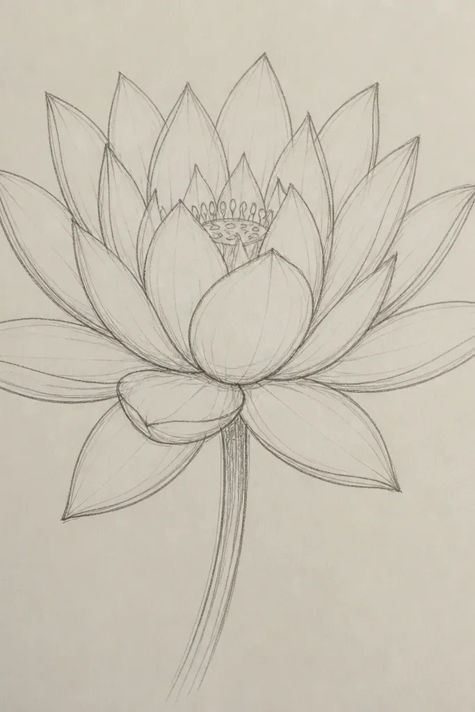
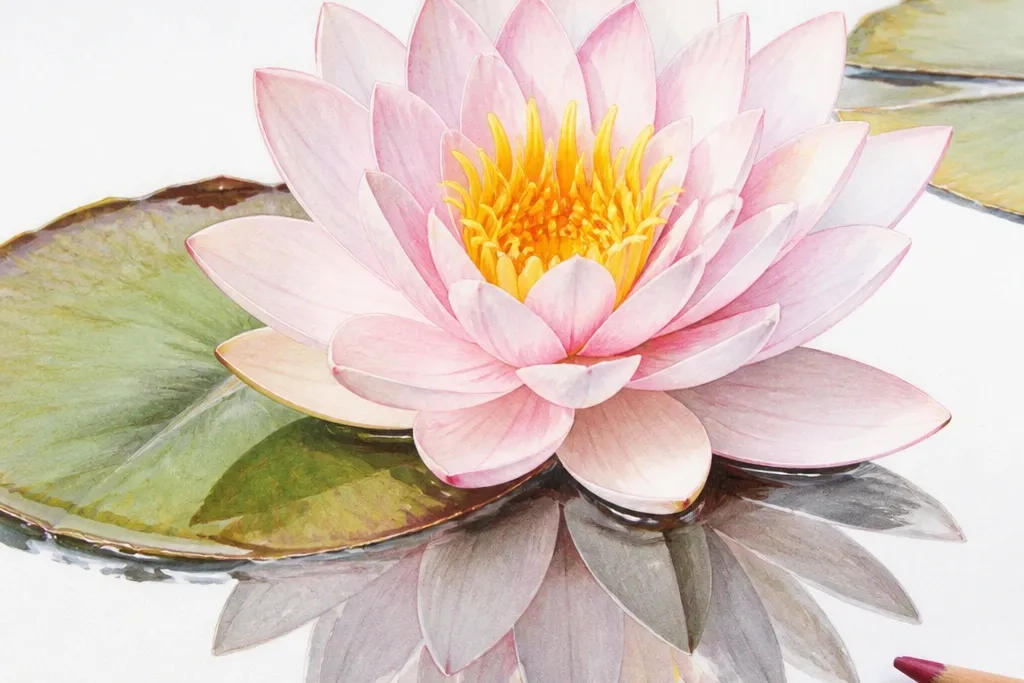
Start by sketching the lily head as an oval cluster. Then draw 10 overlapping petals using a teardrop shape, and keep the top edges slightly thinner than the bottoms. Shade each petal with 5 values: paper white, pale peach, stronger peach, blush shadow, and a final warm brown line only near the inner overlap. Add the center by placing a small circle of dots, then draw 12 to 16 stamens as short curved lines pointing slightly toward the highlight. Finish with a light teal wash behind the flower and let it dry before adding any extra lines.
This is the “glow” version I reach for when I want the flower to look like it’s breathing. Use warm peach for the main petal body and keep the highlight area almost untouched so the paper shows through. Your shadow goes on the opposite side of the light — in this drawing, that’s the lower right edges of each petal. The center should be warmer than the petals, so the stamens feel like they’re catching light. I’ve used this look on fair and medium skin-toned palettes with no problem because the peach-pink range stays flattering and not too gray.
Common mistakeDon’t outline every petal — heavy graphite around the edges makes it look like a sticker.
Good to knowIf your petals look chalky, glaze a second very light peach layer instead of pressing harder with the pencil.
2. Graphite Dream Lily on Tonal Gray Paper
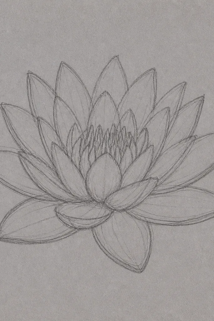
This one looks dreamy because the paper is already the middle value. You get instant depth without layering color — your highlights are the paper showing through, and your shadows are the darkest graphite. The center needs contrast, so keep it dense and slightly messier than the petals. This style flatters anyone who likes minimal color and clean composition because it reads as soft and dimensional even from a distance. I use it when I want the page to look calm, like early morning on a pond.
Start by blocking the lily head with a light oval and a center circle. Then sketch 9 to 11 petals with very light lines, leaving gaps where highlights will be. Shade the inner overlaps with a 2B pencil, and build the darkest values only around the center. Use a kneaded eraser to lift highlights on the upper left of each petal — press, lift, and repeat in small patches. Add the leaf with a darker outer rim and a single crease line, then smudge the edges lightly to keep the background misty.
Keep a scrap paper under your hand — gray smudges travel fast and can ruin crisp highlights.
Avoid going too dark on the outer petal edges — it turns the lily heavy instead of airy.
3. Watercolor Wash Lily With Salted Sparkle
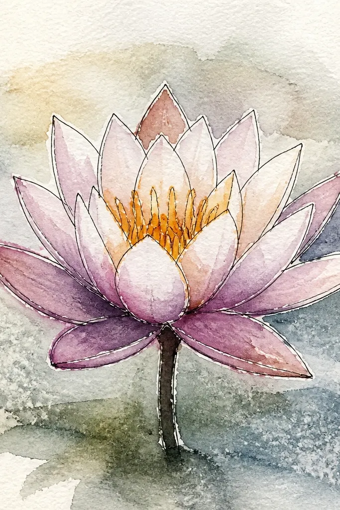
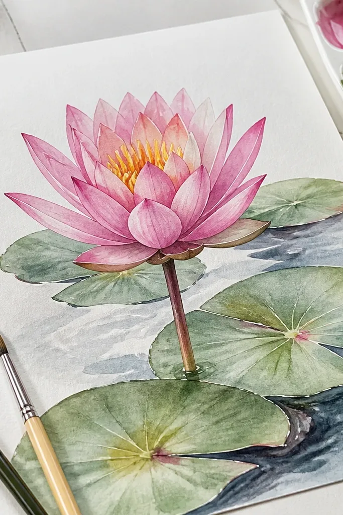
Salt makes the background feel like light hitting ripples, and that’s the fastest path to dreamy. Keep the petals watery and translucent so the texture of the paper shows through. I like a lavender-pink wash for the petals and a cool green-blue for the water, because the contrast makes the flower look like it’s rising. The center should still be readable, so don’t over-wash it — add stamens after the main petals dry. This style looks great for framed art because the sparkle gives depth without extra drawing detail.
Tape 140 lb cold-press paper to a board. Wet the background area with clean water, then drop in a light teal wash and sprinkle coarse salt while it’s still wet. For the petals, paint 8 to 12 petal shapes in a pale lavender wash, leaving the top edges lighter. After the petals dry, lift off salt and add thin darker veining with a diluted rose or violet. Paint the leaf as a dark green oval with a slightly lighter center, then add a few curved vein lines and finish by drawing the stamens in a brown ink or dark pencil.
Sprinkle salt off a pinch cup from 6-8 inches above so the specks land evenly.
Don’t paint the petals too wet over the salt area or the texture will smear into the flower.
4. Colored Pencil Lily With Wet-On-Dry Veins

Start with a light graphite sketch of the lily head and center cluster. Lay down a pale cream base on all petals, then add peach shadows on the lower right edges. Use a darker peach or muted rose pencil for the inner overlaps and a warm brown for the center. Now draw vein lines on each petal — small, curved lines toward the center. Tap a damp brush lightly on just the vein lines (not the whole petal), then let it dry completely. Finish the leaf with a dark green rim, a lighter green fold line, and a few curved veins.
This is the “soft but detailed” look. Colored pencil alone can stay matte, so I add a tiny amount of water only on the vein lines using a damp brush. That creates a wet-on-dry effect where the pencil pigment blooms slightly, then dries back to a smooth, realistic texture. Keep your petal base light and build shadows gradually — you want the highlights to feel airy. This works on any skin-tone palette because it uses natural warm neutrals and greens, not neon colors. I use it when I want the lily to look botanical but still dreamy.
Common mistakeAvoid heavy burnishing on the petals — it can make the pencil look waxy and too hard.
Good to knowUse a tiny brush and keep the water off the outer petal edges so you don’t blur the shape.
5. Ink Outline Lily With Bleeding Edge Wash
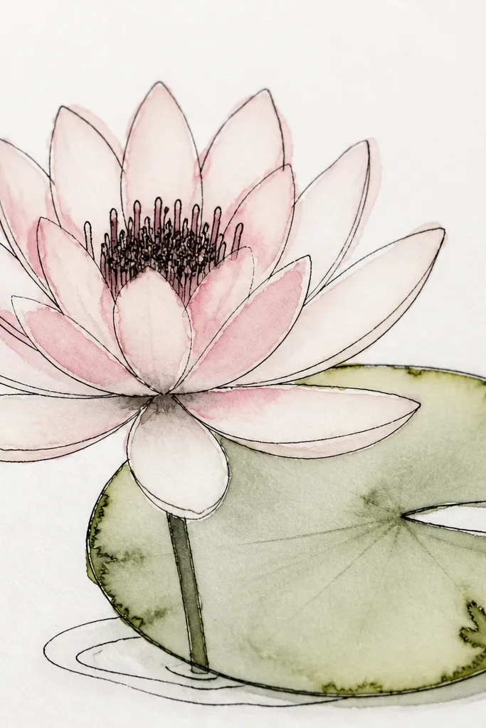
Sketch the lily head lightly, then ink the center cluster and the petal overlap lines first. Fill each petal with a pale wash of pink-lavender, leaving tiny gaps where paper shows through. Before the wash fully dries, touch the edge with a wet brush to create a small bleed halo — keep it under 2-3 millimeters. Add stamens with short ink strokes and dot the center with a dense cluster. For the leaf, outline it, fill with a light green wash, then add one or two intentional ink blooms near the rim for texture.
Ink lines plus controlled bleeding gives you that dreamy edge without turning the whole drawing into a blur. The key is to keep the ink crisp only at the structural lines, then let the color soften the boundaries. I like a thin brush pen for the outline, because thick black makes the flower look cartoonish. The bleeding halo reads like mist and makes the petals feel delicate. This style flatters people who love contrast and still want softness — the outline gives structure, the wash gives mood.
Common mistakeDon’t flood the page — big puddles erase the petal shape and kill the dreamy effect.
Good to knowLet the ink dry for 3-5 minutes before adding wash so the lines stay clean.
6. Monochrome Teal Lily on Kraft Paper
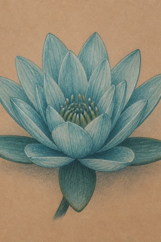
Start by sketching the lily head with light graphite and marking the center circle. Color the petals with a light teal first, then deepen the shadow side with a darker blue-green. Leave the top petal edges mostly untouched so kraft shows through as highlight. Shade the inner overlaps with the darkest teal and add a near-black around the center cluster. Draw 14-18 stamens with a fine pencil or pen. Add the leaf as a deep blue-green oval, then draw a pale crease line and a few curved vein marks.
Kraft paper gives you instant warmth, so cool teal petals look dreamy instead of harsh. I keep the palette to teal, blue-green, and a near-black for stamens, then let the kraft color act as the highlight. This draws attention to the petal form because there’s no competing color. It’s also forgiving if you’re still learning overlaps; the midtone paper hides small mistakes. I like it for cozy wall art because it looks like it belongs in a warm room, not a clinical white gallery.
Common mistakeAvoid bright cyan — it looks too neon on kraft and flattens the softness.
Good to knowUse a blending stump only on the leaf rim, not on the petals, so the flower stays crisp.
7. Pastel Rainbow Lily Rings
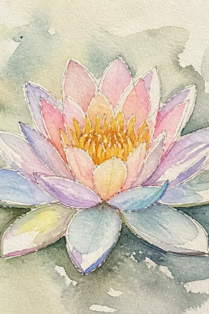
Sketch 10 petals and the center cluster. Color the petals starting at the inner overlap with pale peach, then blend outward to mint, then to baby blue near the outer edges. Use colored pencils in very light pressure so you get smooth transitions rather than stripes. Add a few thin darker lines near the petal base to suggest depth. For the center, layer yellow-ochre dots, then add a few brown stamens. Wash the background with a very pale blue and keep it lighter than the petals.
Rainbow rings in one flower sound risky, but it works because each petal stays in the same family — you’re shifting shades, not adding random colors. The effect looks dreamy because the eye reads the petals as layered light. Keep the rings faint and close together; thick bands make it look like a sticker. The center stays warm yellow so the cool petals don’t look lifeless. This is a great option for anyone who wants a pastel aesthetic without losing realism.
Common mistakeDon’t use saturated rainbow colors — they overpower the lily shape.
Good to knowBlend with a light hand and stop early — you want the rings to show, just not loudly.
8. Leaf-First Composition With Big Negative Space
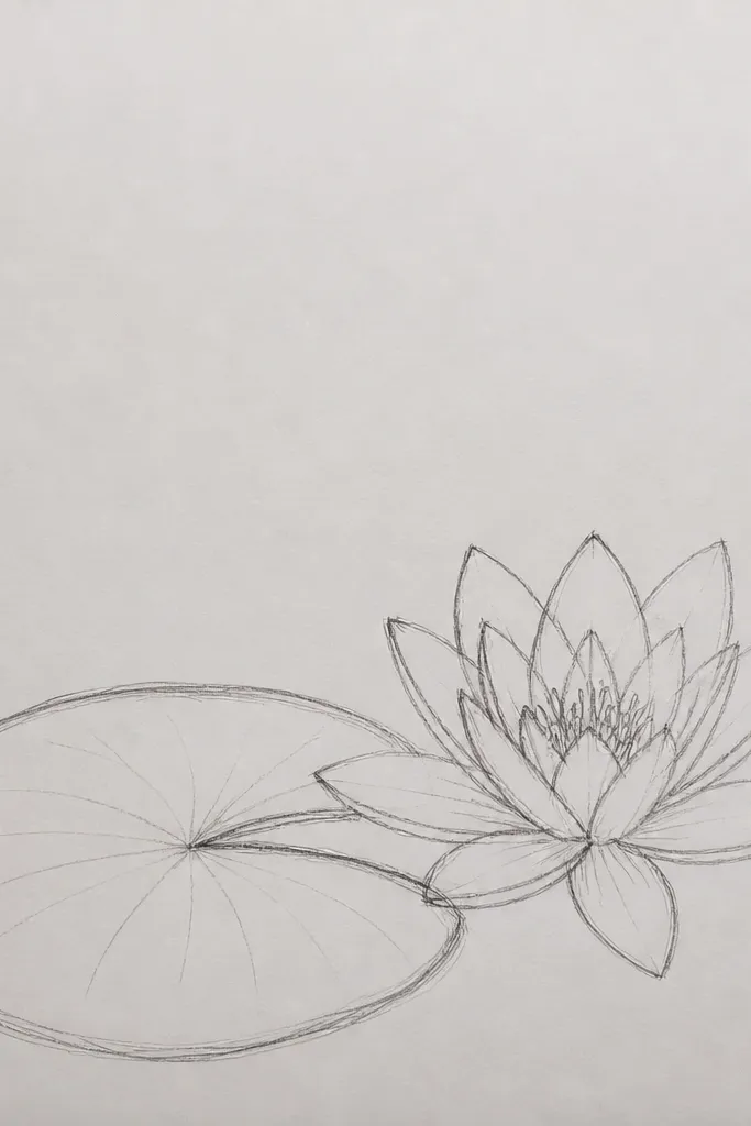
This idea makes the flower feel dreamy because you’re giving it room to breathe. When the leaf is bigger than you expect, the lily reads as delicate and floating. Negative space also hides messy shading — you only need to define the leaf rim and the crease line, then keep the flower light. I’ve done this on small sketchbooks and it still looks intentional because the composition does the work. It flatters almost every style preference: minimalists like the clean space, and maximalists like how it frames the flower.
Start by drawing the leaf oval first, filling about 60% of the page width. Add the stem attachment point and a single crease line that dips slightly. Shade the leaf rim with a darker green and keep the center lighter with a pale green glaze. Place the lily flower behind the leaf near the top right, making it about the size of a quarter on the page. Sketch 8 petals lightly and shade with pale peach and soft rose shadows. Add a tiny teal wash at the bottom edge only, so the rest stays open.
Use a ruler to place the leaf stem origin so the negative space feels balanced.
Don’t place the flower dead center — it looks like a clip-art stamp.
9. Ink Splatter Pond Background Behind the Lily
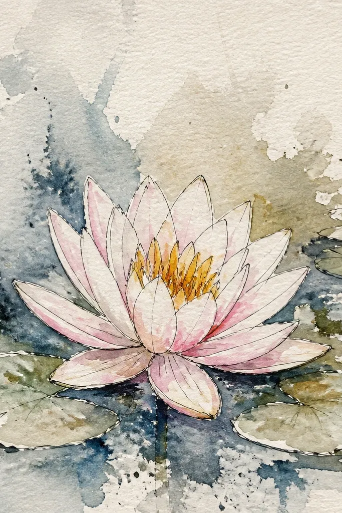
Sketch the lily head and leaf lightly, then shade the petals with a soft peach base and a rose shadow on the inner overlaps. Draw the center cluster with dots and add 12-16 stamens. Once the flower is shaded, tape a strip of paper around the lily to create a clear halo area. Mix teal ink with water until it looks like weak tea, then flick it with a toothbrush from 8-10 inches away. Remove the tape and let the ink dry. Add a faint wash under the splatter so the droplets feel like they’re sitting on water.
This is a fun dreamy look that still stays readable: splatter belongs in the background only. The key is keeping a safety zone so the droplets don’t touch the petal edges. I like drawing the lily in pencil first, then adding splatter with a toothbrush and diluted ink — it gives texture without muddying the flower. The halo makes the lily feel crisp and floating. It’s a great option for journaling pages where you want energy but not clutter.
Common mistakeDon’t splatter directly into the center — it makes stamens hard to see.
Good to knowTest the flick distance on scrap paper — one extra inch changes the droplet size a lot.
10. Monoline Water Lily With One-Color Shading

Sketch the lily head with a light pencil and mark the center circle. Ink the outline with a fine pen, keeping the line weight consistent. Choose one color family, like light green, and shade the petals by adding a gradient from inner overlap (darker) to outer edges (lighter). Use a slightly darker tone for the inner overlaps and a dot cluster for the center. Add the leaf with the same color, drawing a rim and a single crease line. Keep background smudges minimal — a few light strokes behind the leaf is enough.
If you want dreamy without mess, this is the style. One-color shading keeps everything cohesive and stops the “mud” problem when you mix too many pigments. The monoline outline gives you structure, and the limited palette makes the flower look calm. I’ve found it works especially well for beginners because you can focus on overlaps and value instead of color theory. It also looks great on paper you plan to frame, because the lines stay crisp and the shading stays soft.
Common mistakeAvoid multiple ink thicknesses — inconsistent lines make it look rushed.
Good to knowUse a kneaded eraser to lift pencil under the ink so you don’t get gray smears through the line.
11. Soft Charcoal Lily With Eraser Bloom Highlights
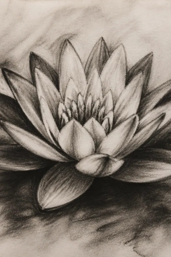
Charcoal gives you that dreamy haze because it blends naturally. The trick is to control it with an eraser — you shape the petals by lifting light areas, not by adding more charcoal everywhere. This look flatters people who love moody art because the lily feels like it’s in foggy morning light. The center can handle rough texture since the stamens are small and read as form. If you like soft edges and don’t mind a slightly messy vibe, this is your lane.
Start with a light charcoal sketch of the lily head and leaf. Block petal shapes but don’t define every edge yet. Blend the midtones with a paper stump, then darken only the inner overlap areas with extra charcoal. Use a kneaded eraser to lift highlights on the top left of each petal — press and drag lightly for a petal sheen. Add the center with a dense cluster of charcoal specks, then refine the stamens by scratching tiny lines with a clean tool. Smudge the background around the flower but keep a faint lighter halo so the lily pops.
Work in layers and stop before it looks “too dark” — charcoal gets worse when you try to fix it.
Don’t rub the whole page — it turns the lily into one flat gray blob.
12. Pencil Sketch Lily With Masked White Highlights
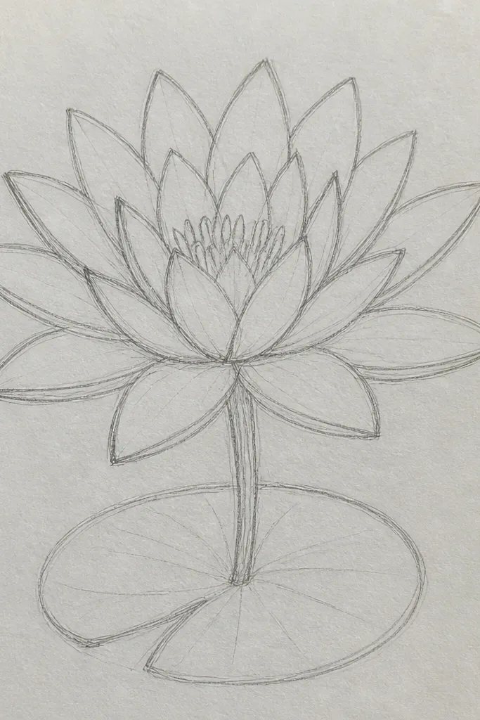
Sketch the lily head and leaf lightly with 2B pencil. Apply masking fluid or frisket film to the petal highlight areas — usually the upper left curves of each petal and a small shine near the inner overlap. Shade the petals with graphite in 5 passes: light, slightly darker, mid, darker inner overlap, darkest near the center. Lift the center cluster with a bit of eraser for a soft glow, then add stamens with thin graphite lines. Remove the masking once everything is dry and refine the edges with a softer eraser for a smooth transition. Finish the leaf with a darker rim and a single crease line.
This is a surprisingly effective technique for dreamy paper look without watercolor. Masking keeps the highlight spots bright, so your petals look glossy even though you only used pencil. I use frisket film or masking fluid, but frisket is cleaner if you’re new. The lily looks dimensional because the contrast is intentional: bright highlights against soft graphite shadows. This works for any color preference since it’s mostly graphite, and it’s also great for upcycling old paper because you’re not relying on expensive pigments.
Common mistakeDon’t wait too long to remove masking — it can tear paper fibers.
Good to knowUse a cotton swab to spread masking fluid thinly so it doesn’t leave a raised ridge.
13. Red Ink Center Bloom Lily With Soft Petals
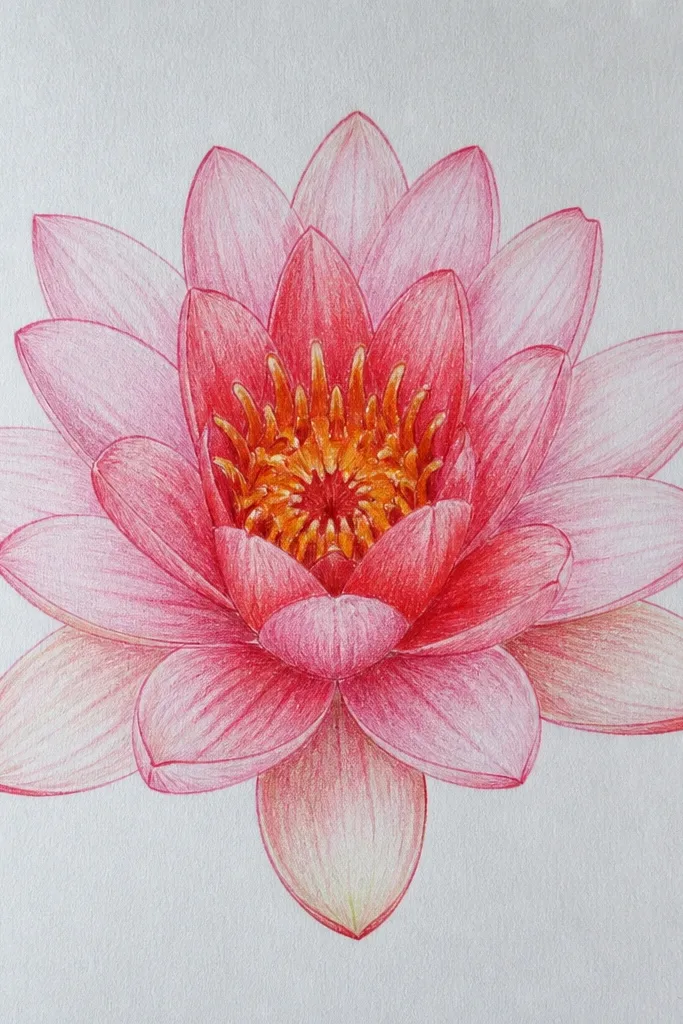
The dreamy part is the center bloom — it looks like warm light inside the flower. Keep petals light and simple so the red doesn’t overpower the shape. When you draw the center, use red ink diluted enough to feather, then let it spread slightly around the dot cluster. It makes the lily feel alive and warm even on a cool-toned page. This style flatters people who like bold focal points because your eye lands on the center instantly.
Start by sketching the lily head with light pencil and drawing the center circle. Shade petals in pale cream first, then add light pink shadows on the lower right edges. Keep the inner overlap slightly darker with a blush tone. For the center, place a dot cluster in warm brown, then add a small amount of diluted red ink around it — only a few millimeters of spread. Let it dry, then draw stamens on top in dark brown. Add a muted green leaf with a darker rim and a lighter fold line, then keep the background minimal with a faint wash.
Use less ink than you think — the feathering does the rest.
Avoid painting red into the petals — it turns the whole flower into a flat red blob.
14. Tea Stain Background Lily on Scrapbook Paper
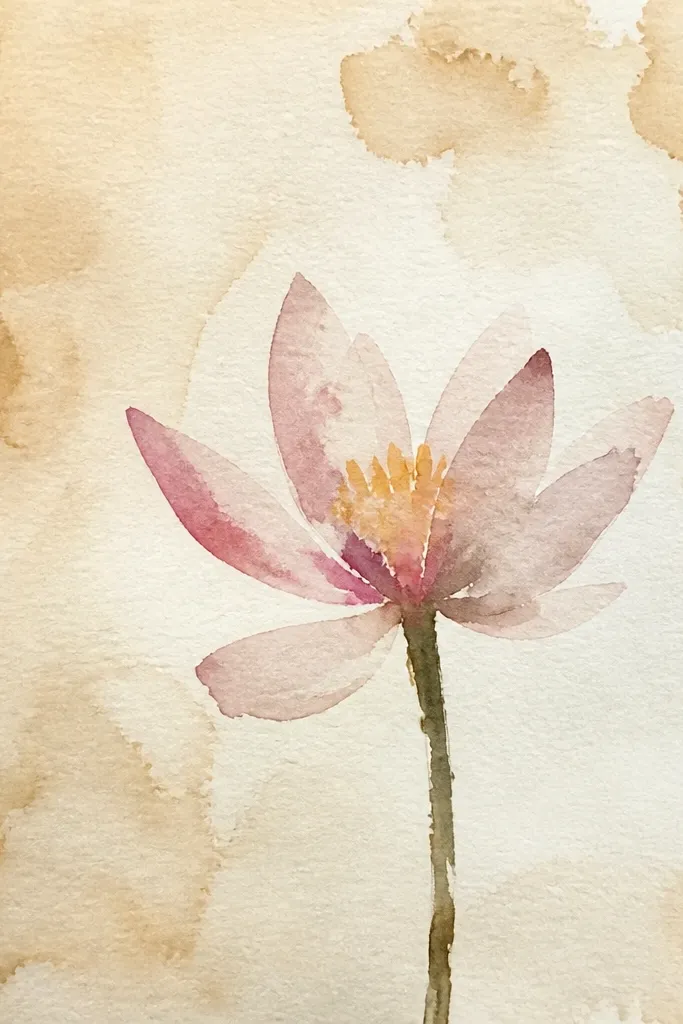
Brew black tea, let it cool, then brush or dab it onto scrapbook paper in uneven patches. Tilt the page so the stains pool slightly, then let it dry completely. Sketch the lily head and leaf on top once dry. Shade petals with pale peach pencil and soft rose shadows, keeping highlights clean. Draw the center with ochre dots and brown stamens. Add the leaf in warm green with a darker rim and a single crease line. Keep the background around the flower lighter so the lily stays the focal point.
Tea staining gives you an instant old-paper mood, and that’s what makes the lily feel dreamy without fancy supplies. You get mottled light and shadow behind the flower, so the lily reads as floating. This works especially well if you like warm, cozy tones — the stained background makes greens look deeper and petals look softer. I do this when I want a page that feels like a keepsake, not a clean art print. It also forgives minor pencil mistakes because the background already has texture.
Common mistakeAvoid soaking the paper — it can turn brittle and crack when you erase.
Good to knowSeal the final page with a light fixative or clear spray so the tea stain doesn’t lift when you add pencil smudges.
15. Patterned Petal Lily With Tiny Dot Gradients
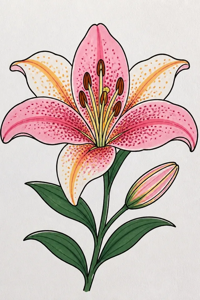
Dot gradients look dreamy because the texture suggests light scattering on water. You’re not relying on smooth shading, so it stays interesting even if your blending isn’t perfect. Keep dots small and consistent — the petal shape still needs to be obvious. I like this style for sketchbook pages because it feels handmade and calm rather than graphic. It flatters anyone who loves slow, detailed work, and it still looks good at a glance because the dot density creates depth.
Sketch the lily head and center circle lightly. Mark 10 petals and draw their overlap lines. Fill each petal with tiny dots in a gradient: heavy dots near the inner overlap, fewer dots toward the outer edge, and almost none at the highlight curve. Use one pencil for the base tone, then add a slightly darker pencil for the inner overlaps. Build the center with dense dots and add stamens as short curved lines. Draw the leaf with a simple rim and a few vein lines, then leave the background mostly white.
Use a 0.3 or 0.5 mechanical pencil tip for dot consistency.
Don’t change dot size from petal to petal — it makes the flower look accidental.
16. Two-Lily Pair on One Leaf With Overlap Depth
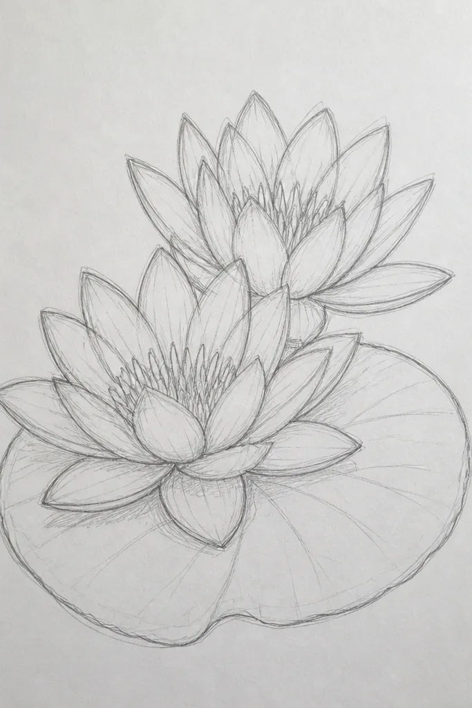
Draw the large leaf first, with a crease line and a darker rim. Place the main open lily on top of the leaf, about one-third from the top. Sketch 10 petals and shade with pale pink and a soft rose shadow on the inner overlap side. Add the smaller bloom behind the front lily — fewer petals, lighter shading, and a smaller center cluster. Draw stamens on both, but keep the smaller one with fewer, shorter strokes. Finish by adding a gentle shadow under the main lily where it touches the leaf.
Pairing lilies gives you instant story, and the overlap creates dreamy depth. The smaller bloom should look lighter and slightly more washed out, so it reads as farther away. This style is great if you want the page to feel decorative without adding a lot of background elements. I’ve done this with colored pencil and watercolor together, and the depth always looks convincing because the leaf anchors both flowers. It also looks flattering for mixed skill levels since you can spend detail time on the main lily and keep the second one simpler.
Common mistakeDon’t give both flowers the same contrast level — the page loses depth.
Good to knowMake the smaller lily’s center a little less defined so your eye stays on the main bloom.
17. Dreamy Lily in a Circle Frame With Soft Ripples
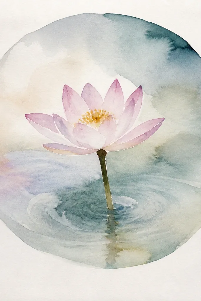
Draw a light circle border about 1 inch in from the page edges. Sketch the lily head slightly above center, leaving room for ripples. Shade petals with pale peach, then add soft purple-pink shadows only on the lower edges. Draw the center with ochre dots and brown stamens. Now add ripple rings around the flower: 6 to 8 arcs in light teal, each one fading as it gets farther out. Keep ripples thin and use light pressure so they don’t compete with petals. Add a partial leaf underneath with a darker rim and a crease line.
A circle frame makes the lily look like a floating emblem, and the ripple rings give you a dreamy pond cue without busy background. I like thin border lines because thick frames can look like craft-store stickers. The ripples should fade fast — keep them lighter than the flower. This style looks clean on greeting cards and prints because the composition is controlled. It flatters a range of color choices since the ripples are neutral teal and the lily does the personality work.
Common mistakeDon’t make ripples dark — if they match petal contrast, the lily won’t read as the main subject.
Good to knowUse a compass or a small bowl to keep the circle smooth — it changes the whole look.
18. Charcoal + Watercolor Hybrid Lily With Soft Bloom
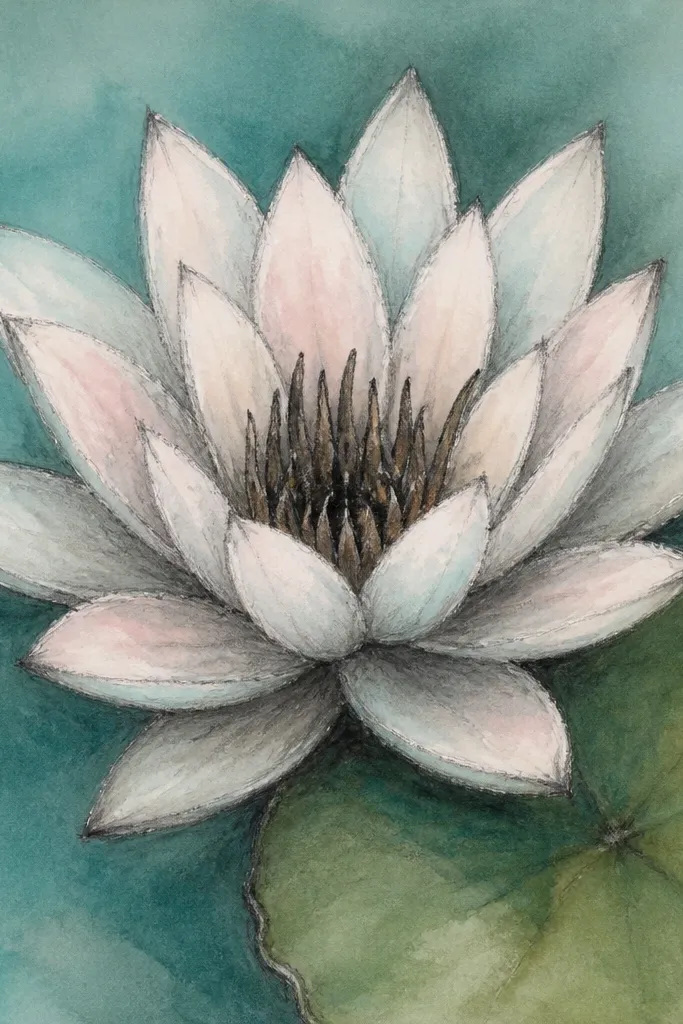
Start by sketching the lily and leaf with charcoal. Keep lines light but define the petal overlap structure and the center cluster. Wet the background and add a light teal wash, then let it settle behind the flower. For petals, paint watery aqua-blue first, then lightly glaze blush only on shadow sides. Add a small warm wash to the center, then sprinkle a tiny bit of salt if you want a few sparkle marks. Once everything is dry, refine the petal inner overlaps with a bit more charcoal and add stamens with a fine pencil or dark charcoal.
This hybrid makes the lily look handmade and dreamy because the charcoal gives texture while watercolor gives softness. You get natural variation in petal shading that blending alone can’t replicate. I like aqua-blue and blush watercolor on the petals because they create a cool-warm contrast that feels like morning light. The leaf should keep some charcoal edge definition so it doesn’t float away from the flower. This style flatters anyone who likes expressive art — it still stays readable because the structure is drawn first.
Common mistakeAvoid heavy charcoal after watercolor — it can lift pigment and make gray bruises.
Good to knowLet the first watercolor layer dry before adding the second glaze so you don’t get muddy transitions.
19. Pastel Gel Pen Lily With Glossy Highlights
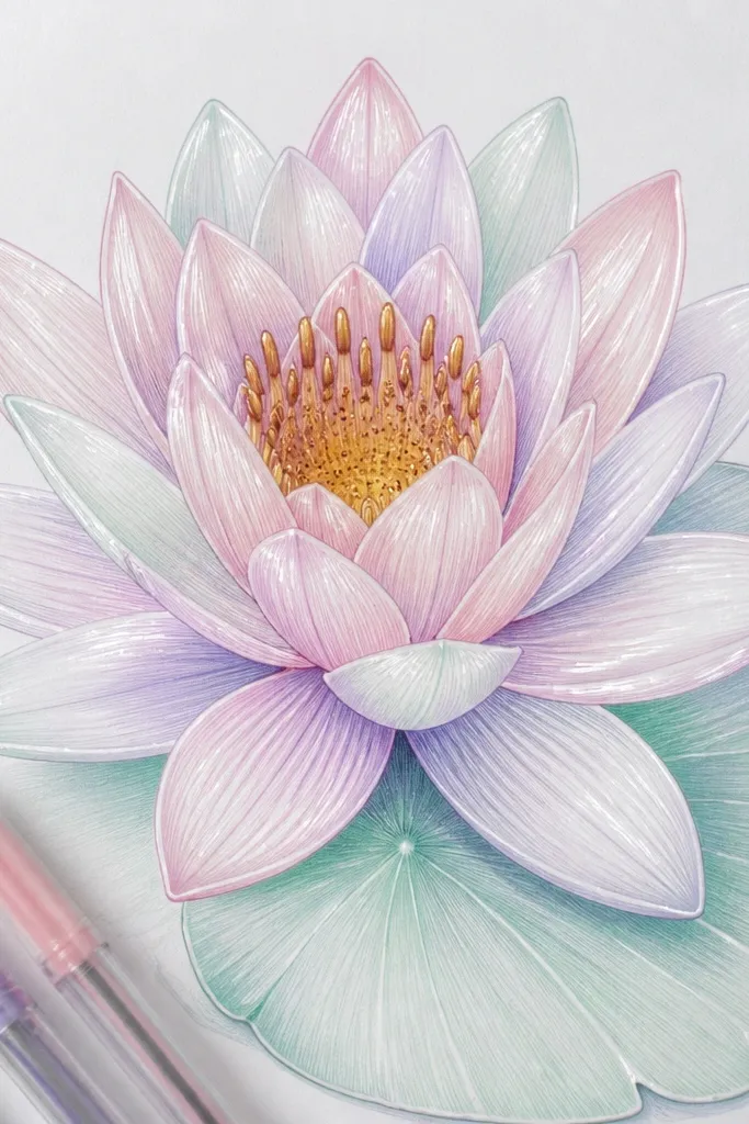
Sketch the lily head and leaf with a light pencil. Color the petals with pale pink first, then add lavender shading along the shadow sides where petals overlap. Add a hint of mint at the outer edges for that water-lily coolness. Draw the center with warm yellow dots, then add a thin ring of darker ochre around the dot cluster. Add stamens with a brown gel pen using short curved lines. For glossy highlights, use a white gel pen to draw a thin streak on each petal’s upper left curve. Finish the leaf with mint green and a slightly darker rim, then keep the background very light.
Gel pens make dreamy highlights because they lay down color smoothly and let you add crisp white streaks. I use them when I want the lily to look like it’s been illustrated for a stationery set. The key is layering: start with pale base tones, then add darker accents near overlaps, and finally add the white highlight streaks last. The center is where you add the most detail — warm yellow dots and brown stamens keep it from looking flat. This style looks great on fair to deep color palettes because pastel gel pens stay soft and don’t go chalky like some pencils.
Common mistakeDon’t fill the whole petal with thick gel pen coverage — it can look opaque and less watery.
Good to knowPress lightly for the base, then use heavier pressure only for the shadow edges.
20. Sumi-Style Minimal Lily With One Brush Stroke Leaf
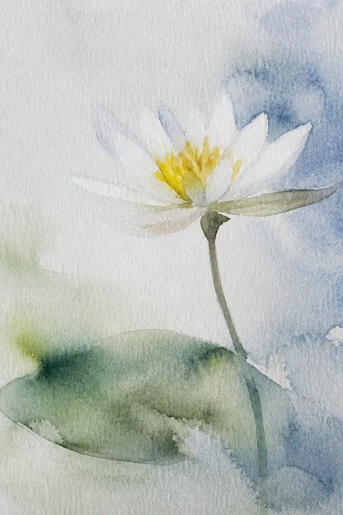
Prepare diluted ink in gray-green. Sketch the lily position lightly, then paint a center dot cluster first. Add 7 to 9 petal strokes with a soft brush — each stroke starts darker near the inner overlap and fades at the outer edge. For the dreamy effect, rinse the brush and pull a lighter wash along the petal edges while the ink is still damp. Paint the leaf with one sweeping stroke, then add a darker edge line only where the leaf curves. Let the background stay mostly white and add a tiny ink haze near the base of the leaf for atmosphere.
Minimal sumi-style works because your brain fills in the missing details. When petals are suggested with a few confident strokes, the lily reads as dreamy instead of unfinished. I keep the center simple — just a dot cluster and a few short marks for stamens. The leaf can be expressive: one brush stroke gives it movement, and that movement makes the whole page feel alive. This style flatters anyone who likes airy art and doesn’t want to spend hours shading. It also photographs well because there’s less fine detail to blur.
Common mistakeAvoid outlining the petals after painting — it makes the ink look rigid and less dreamy.
Good to knowPractice one petal stroke on scrap until it fades naturally — that fade is the whole look.