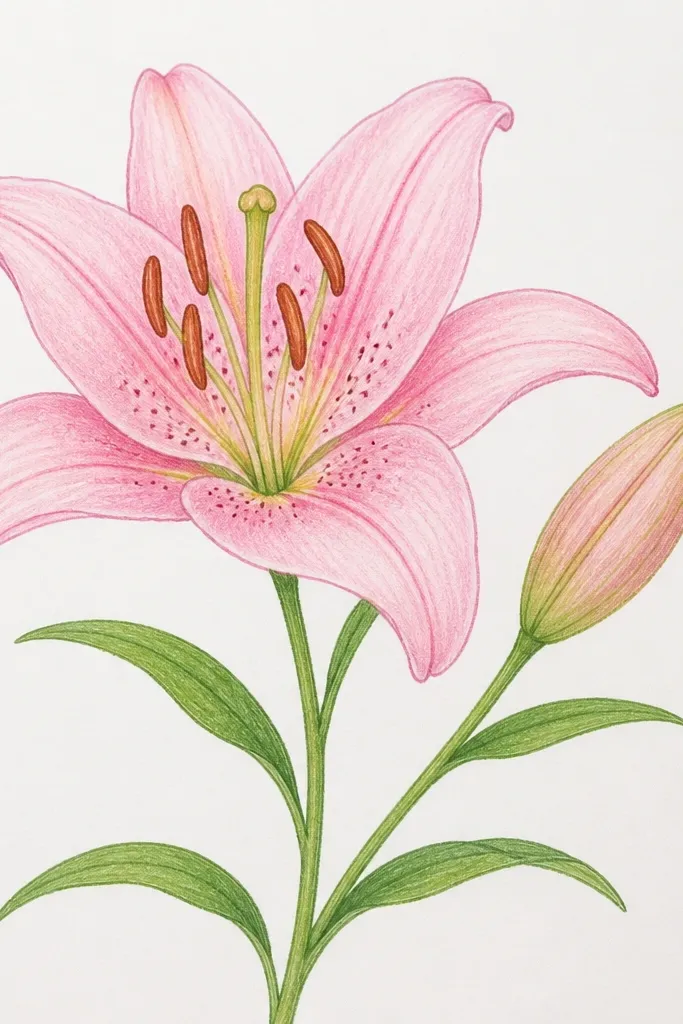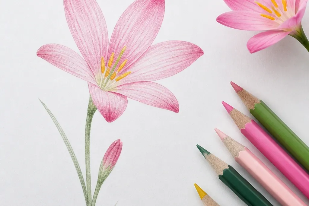
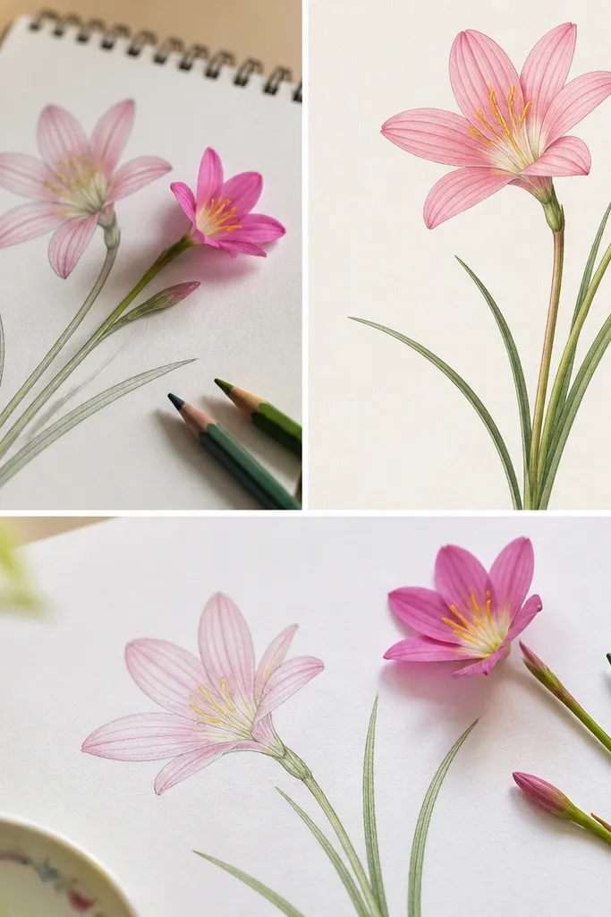
1. Tea-Stained Rain Lily in a Single Window Frame
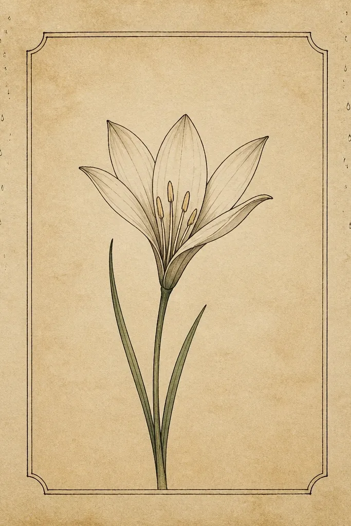
I love this one because it turns cheap paper into something that looks like it came from a slow, rainy afternoon. Draw the rain lily in the middle, then frame it with a simple window rectangle - two thin lines with slightly uneven corners. Use cream and warm gray for the petals so the flower looks soft against the tea background. This layout flatters smaller spaces because the border gives the eye a place to rest, and the lily stays readable even if your lines aren't perfect. It also looks great for gifts because you can tuck it into a 5x7 thrifted frame without extra decoration.
Start by tea-staining your paper: brew black tea, dab with a sponge, then let it dry fully before you draw. Lightly sketch a window rectangle using a pencil, leaving about 1 inch of margin all around. Draw the rain lily center first with short, curved lines, then add petals in mirrored pairs, each petal curving down slightly. Outline the petals with a gel pen, then watercolor-wash the petals with pale cream and a thin warm gray shadow on the inner fold. Finish with a few raindrop dots outside the window, using the same pen, but make the bottom drops lighter so the scene feels airy.
Good to knowRun your gel pen lines over pencil marks only after the paper is fully dry - tea moisture makes ink bleed fast.
Common mistakeDon't fill the whole page with raindrops; a few spaced drops read cozy, while a dense sprinkle looks messy.
2. Cozy Sweater Border with Micro Rain Lilies
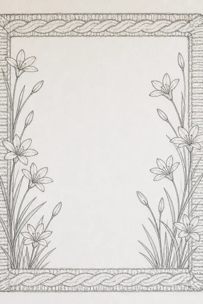
This style looks like a sweater cuff made of ink and watercolor. The reason it works is the scale: micro rain lilies keep the drawing cute instead of heavy, and the knit border gives you a texture cue without needing actual fabric dye. I've used it on fabric scraps for tote tags and on paper for bookmarks, and it always reads cozy because the border repeats a pattern the eye already understands. It suits people who like clean lines but don't want a big central flower. If you have an uneven hand, micro flowers hide that better than one large focal bloom.
Begin by drawing a border rectangle about 1/2 inch in from the edges. Add a knit pattern: alternating short curved "V" shapes like a garter stitch, then ink over only every other row so it looks hand-drawn. Place four micro rain lilies - one near each corner - and one centered on the top and bottom edges if you have room. For each micro lily, draw the center cluster, then add 5-6 narrow petals that curl down. Lightly wash the inside fold with gray diluted paint, leaving the outer petal edges lighter.
Good to knowUse a 0.3 gel pen for the micro petals so the lines stay delicate on small pieces.
Common mistakeAvoid thick marker outlines; they crush the tiny scale and make the flowers look like clip art.
3. Rain Lily Line Art on Repurposed Book Page
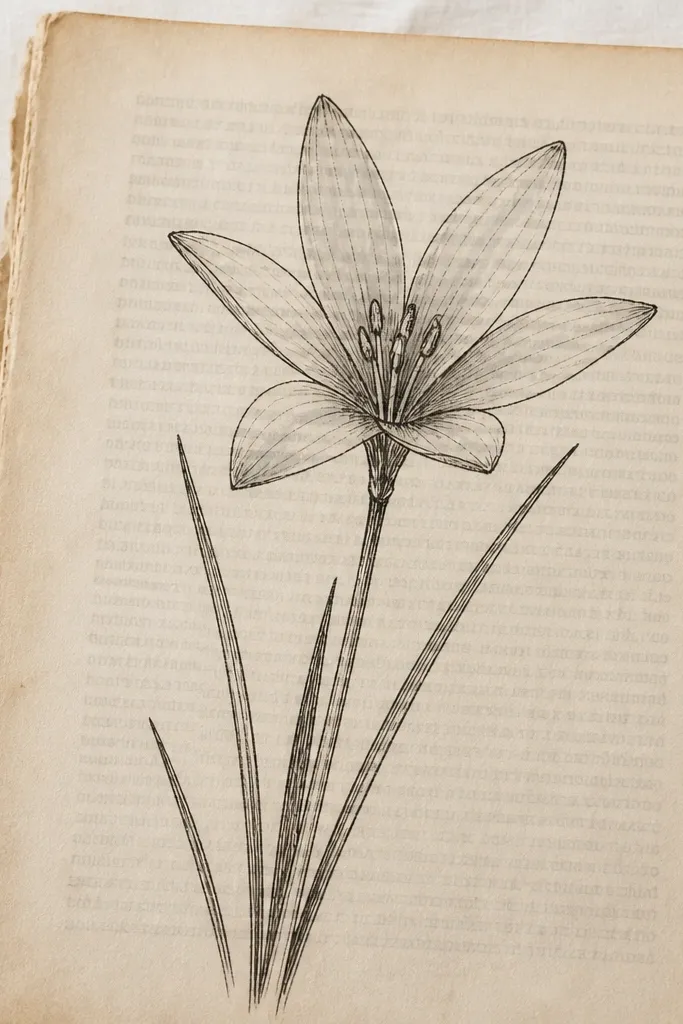
Book pages already have movement and age, so the line art has to be gentle. I like rain lilies here because the narrow petals play nicely with the text - the flower feels like it's growing out of the paper history. Keep the palette to one ink color plus a whisper of gray wash. This flatters warm undertone skin tones when you wear it in a brooch or use it on a tote, because the warm paper reads like caramel and tea, not cool white. It also works well for minimalist people who don't want a lot of pigment.
Cut the book page to your size, then smooth it with a dry cloth so the ink doesn't smear. Pencil in the flower lightly, leaving the text visible around the petals. Ink the center cluster first with short curved strokes, then draw petals in mirrored pairs. Add a thin gray wash under each petal fold using a small brush and very diluted paint. Let it dry flat under a book or scrap board so the paper doesn't curl. If you want a cozy finish, add a few tiny speckles with a stiff toothbrush and diluted ink.
Good to knowSeal it with a thin matte medium or spray from a distance so the book text doesn't bleed when you add the wash.
Common mistakeDon't flood the page with water; book paper cockles and ruins the line quality.
4. Watercolor Rain Lily with Wet-on-Wet Petal Glow
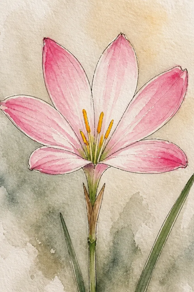
Wet-on-wet makes rain lilies look like they're breathing in humid air. I'm picky about this one: you need the petals to feather slightly, but not so much that the flower loses its shape. Use creamy yellow plus pale peach for the base, then tuck in a medium gray shadow near the inner fold. The glow effect reads cozy because the transitions look like early morning light. It's especially flattering for wall art because it softens the whole piece - even if your lines aren't steady.
Wet your paper first with clean water inside the petal shapes, leaving the outside edges dry. Mix a base wash of creamy yellow with a touch of pale peach, then paint the inner petal area while the paper is still damp. Drop in a small amount of diluted gray where the petal folds - keep it small so you don't muddy everything. After it dries, add a thin outline with a brush pen only along the outer petal edges. Finish with a misty background wash behind the flower using gray-blue, then add a few tiny specks for rain air.
Good to knowPractice on scrap: if your paint spreads too far, your paper is too wet or the pigment is too strong.
Common mistakeAvoid dark outlines everywhere; thick edges kill the wet-on-wet softness.
5. Rain Lily and Cup of Tea Still Life Sketch
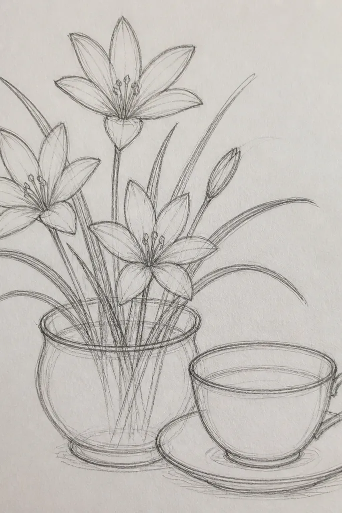
This one feels like a hug because it pairs the rain lily with an everyday comfort object. The cup anchors the bottom of the page so your lily doesn't float, and the steam lines create a motion that matches the drooping petal curve. I've used this for upcycled coaster art by transferring the sketch onto thin cardboard and painting only the petals. It suits anyone who likes cozy themes but wants the drawing to tell a mini story. The warm beige background makes the teacup and lily look like they belong together.
Sketch the teacup first with a simple oval opening and a slightly tapered body, leaving space on the right for the flower. Draw a single rain lily stem that curves toward the cup, then place the flower near the top third of the page. Outline everything with fine ink, then shade the teacup with a light gray wash, leaving the rim and handle highlights. For the petals, use pale yellow with a warm gray shadow under the inner fold. Add steam lines with the same ink, then dot a few tiny rain drops along the right edge to connect the theme.
Good to knowKeep the steam lines thin and slightly uneven; perfect symmetry looks too stiff for cozy art.
Common mistakeDon't shade the teacup with the same gray you used on the petals; make the cup shadow lighter so the flower stays the focus.
6. Thrifted Frame Backing with Rain Lily Corner Cluster
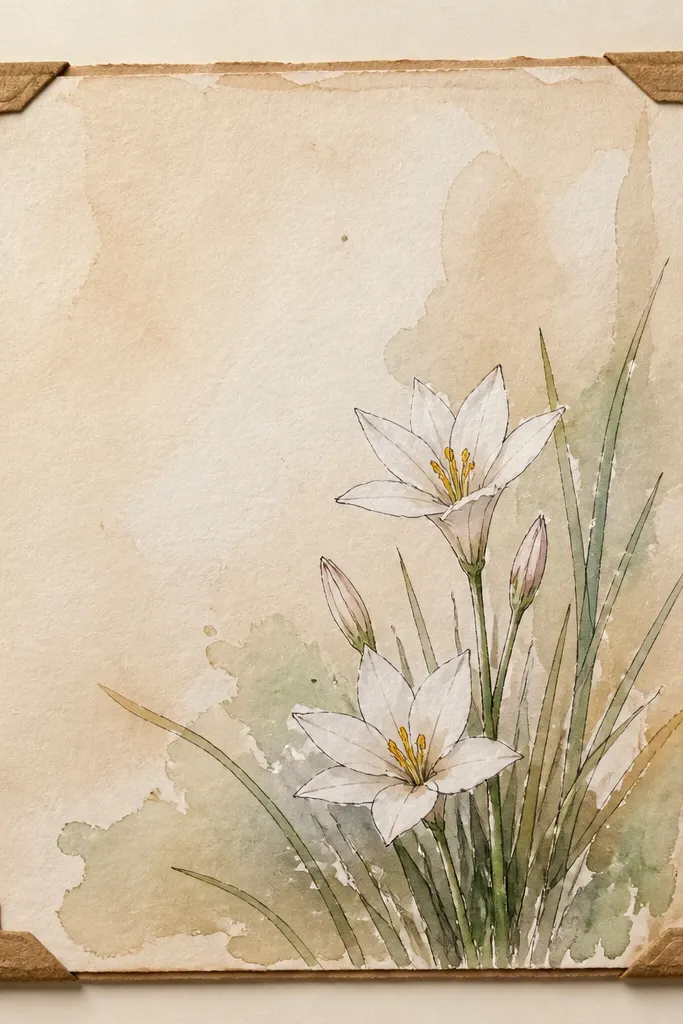
Corner clusters look expensive because they use negative space well. I've done this on the backs of frames people were going to toss, and the result looks intentional even if you don't have fancy paper. Rain lilies work great in corners because their droop naturally points inward, guiding the eye across the blank area. Use pale washes and thin outlines so the corner doesn't overpower the room. This style flatters clean interiors and small walls because it doesn't demand attention from every angle.
Cut or clean the frame backing so it sits flat. Lightly pencil a corner composition: cluster the center of the lily about 1.5 inches from the top and right edges. Ink the center cluster, then draw 2-3 petals first, then fill the rest in mirrored pairs. Add a tiny gray wash only on the lower half of each petal so the top stays bright. Add 5-8 raindrop marks near the corner, fading as they move away from the cluster.
Good to knowIf the backing is glossy, lightly sand with very fine paper so ink grips instead of smearing.
Common mistakeAvoid filling the whole corner with multiple flowers; one cluster looks calm, two clusters look crowded.
7. Rain Lily in a Circle Badge for Upcycled Tags
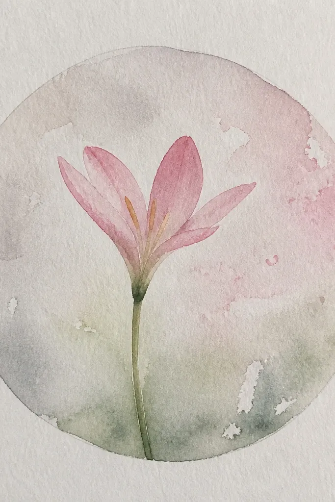
Badges make cozy art feel functional, like it belongs on a gift or a bag. The circle shape helps rain lilies look complete because the petals curl inward and the border gives a clean boundary. I like using this on upcycled tags cut from cereal boxes or thrifted packaging - it looks cute and it's fast. This design flatters small items because the lily stays readable at a glance. It also looks good on darker fabrics if you use a light pencil and then a fine white gel pen for highlights.
Draw a circle using a jar lid as a guide, then add a second inner ring about 1/8 inch inside. Sketch the rain lily center in the middle, then place 6 petals around it in mirrored pairs. Ink the petals with a fine pen, keeping your line thickness consistent. Color the petals with a pale wash - cream or soft yellow - and add a warm gray shadow near the inner fold. If the tag is dark, skip watercolor and use white gel pen highlights plus a gray pencil shadow instead.
Good to knowUse a white gel pen for the petal highlights if you're working on kraft or dark cardboard.
Common mistakeDon't shade the entire petal dark; keep the shadow narrow so the lily keeps its airy look.
8. Monochrome Rain Lily on Black Paper with Chalk Texture
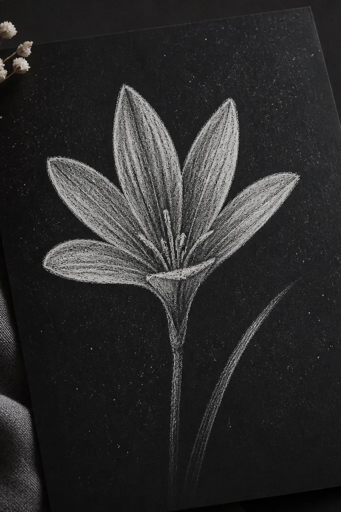
Black paper changes the whole mood - it feels cozy because the flower glows like it's lit by a lamp. I've used this on cut-up matte cardstock for holiday cards and late-night sketch sessions. Monochrome works because rain lilies already have delicate structure; you don't need color to make them interesting. This style flatters warm skin tones in photos because the contrast is clear and the chalk texture looks soft, not harsh. It also looks great in frames because you don't have to worry about the background showing through.
Use matte black paper, then sketch the lily lightly with a white pencil first. Draw the center cluster with short lines, then add narrow petals in mirrored pairs. Use chalk powder or a chalk pencil for the petal bodies, pressing lightly so you see grain. Add a light gray chalk shadow on the inner fold, then blend with a finger or soft tissue. Finish with tiny chalk speckles behind the flower to suggest rain mist.
Good to knowFixative matters: spray from far away in light coats so you don't blow chalk away.
Common mistakeAvoid thick chalk smears; they blur petal edges and make the lily look messy.
9. Fabric Transfer Rain Lily on Muslin with Stitched Line Detail
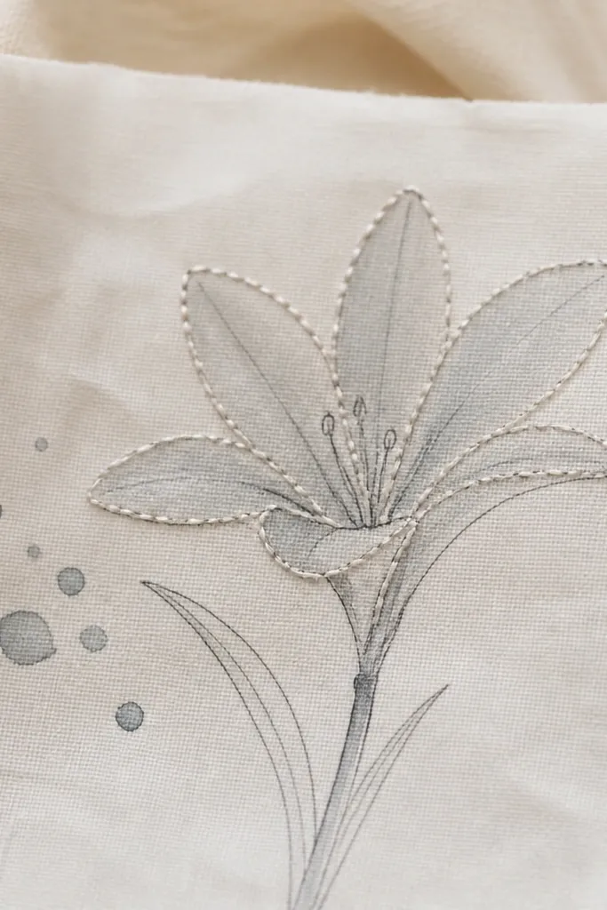
When you combine drawing with stitching, the rain lily looks like it lives on the fabric instead of printed on top. I do this on muslin scraps because the fibers catch watercolor and thread without looking stiff. The gray wash keeps it cozy and calm, and the stitched lines add a handmade texture you can feel from across the room. This flatters anyone who likes slow crafts, and it's especially good for people who want their art to last - stitching holds shape even if the ink fades. It also makes a sweet accent for tote panels and pillow covers.
Transfer the rain lily outline onto muslin using a graphite transfer method or chalk pencil. Lightly paint the petals with diluted gray watercolor, leaving the outer edges paler. After it dries, ink the lines with a fine fabric-safe pen, or skip ink and stitch directly over pencil marks. Stitch along the outer petal edges with pale thread using a running stitch, staying close but not tight. Add a few tiny raindrop stitches near the corner, then press the fabric flat.
Good to knowUse a fine needle (size 11 or 12) so your stitches follow the narrow petal curves cleanly.
Common mistakeAvoid soaking the muslin; too much water spreads pigment and makes petal shapes lose their curl.
10. Rain Lily and Falling Dots Pattern for Wrapping Paper
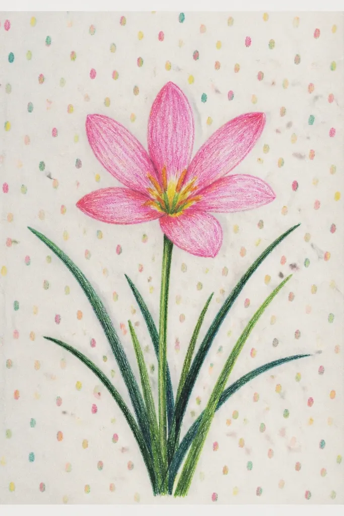
This is the one I reach for when I want wrapping paper that looks handmade without spending all day. The rain lily repeats well because the petals are slender, and the falling dots add movement like rain without clutter. Keep the pattern simple: one lily per "block" and a small dot tail beneath. It flatters gifts because it hides small imperfections - if one bloom is a little off, the repeating rhythm fixes it. Use warm off-white so the whole sheet feels like kraft paper, not printer paper.
Make a grid lightly with pencil, leaving about 4 inches between lily centers. Draw one rain lily silhouette in each grid cell: center cluster plus 6-8 petals in mirrored pairs. Add a pale wash inside the petals with diluted cream, then add a thin gray shadow on the inner fold. Under each lily, draw 10-15 falling dots that start denser and fade as they go down. Finally, add a few random speckles across the sheet using diluted ink and a toothbrush.
Good to knowIf you're using watercolor, test the wash strength first - too strong turns the pattern into a stain.
Common mistakeAvoid crowding dot tails; long heavy dot lines make it look like autumn confetti.
11. Rain Lily Bouquet with Three Bloom Sizes
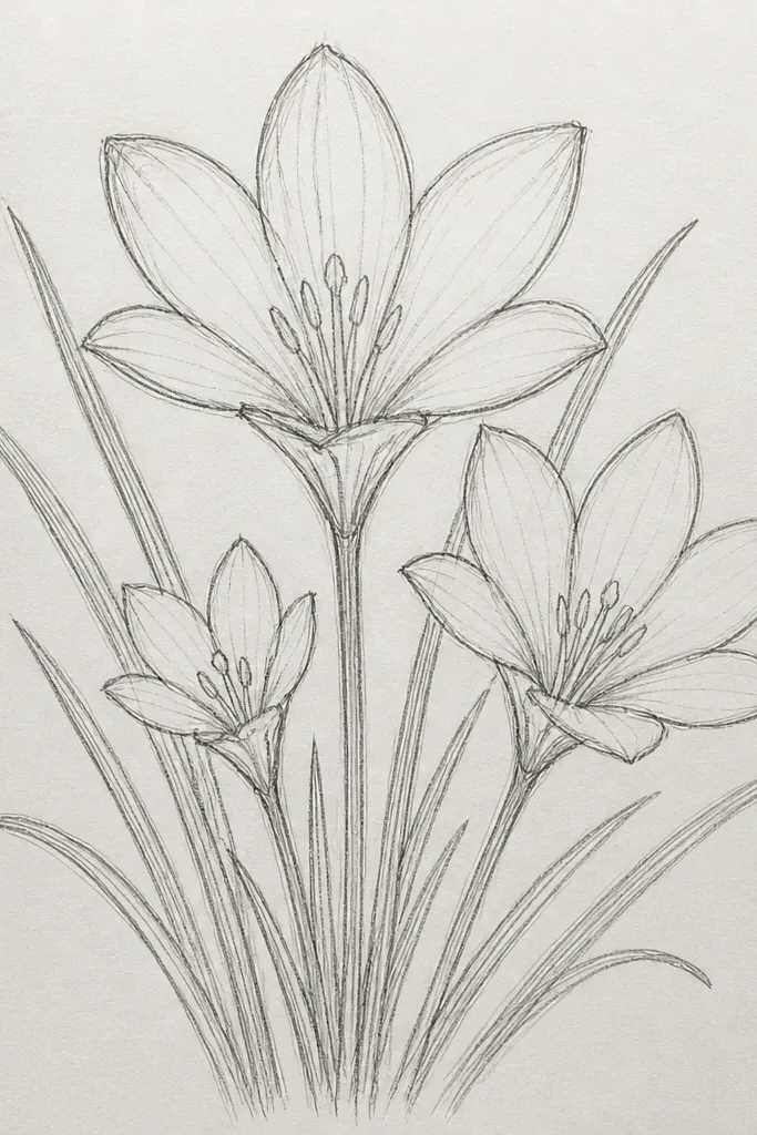
Size variation is what makes this feel like a bouquet instead of three separate drawings. I've used this layout on greeting cards and on the front of upcycled journals because it gives depth without complicated perspective. The large bloom sets the tone, while the medium bloom keeps the center balanced. The small bud at the top makes the piece feel alive. This design flatters most body types for photos because it creates a vertical flow, which looks good when you hold the card in front of your torso. It also looks cozy because the palette stays warm and the shading is gentle.
Sketch three stems that cross lightly, then place the large bloom at the lower center. Add the medium bloom slightly behind and to the right, and the small bud at the top left. Draw each bloom with the same petal shape, just scale down the number of petals for the bud. Ink all outlines with a fine pen, then watercolor the petals with pale yellow and a warm gray inner fold shadow. Blend the background with a beige-to-light-gray gradient using a wide brush, keeping the center behind the large bloom lighter.
Good to knowKeep the highlights consistent across all three blooms so the bouquet looks intentional.
Common mistakeAvoid changing the petal style between blooms; match the same curl direction for every size.
12. Rain Lily and Window Rain Lines Abstract
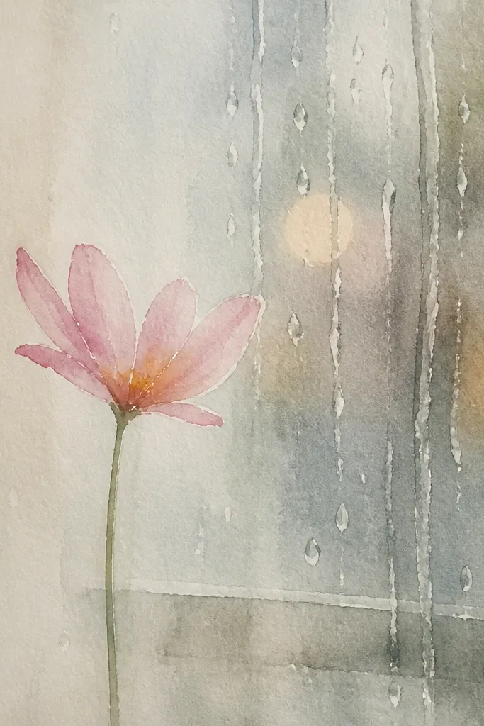
This one is cozy because it looks like weather outside your window, but it stays graphic enough for quick art. The rain lines create a texture layer behind the lily, so you don't need heavy shading on every petal. I like simplified rain lilies here because the background does the work. This style flatters minimalist interiors and busy rooms because it doesn't use a lot of color. It also reads well from a distance, which matters for wall art and thrifted frame displays.
Paint a light blue-gray wash background first, then let it dry. Draw the rain lily center and petals in the middle with pencil, then ink with a fine pen. Add vertical rain streaks behind the lily: 20-30 thin lines in pale gray that start thicker near the center and fade as they move outward. Leave a clear "breathing" space around the lily so the petals stay crisp. Finish by adding a few curved raindrop arcs near the bottom to break up the straight lines.
Good to knowUse a liner brush or the tip of a paint pen for consistent streak thickness.
Common mistakeAvoid dark streaks; heavy gray rain makes it look like a storm poster, not cozy weather.
13. Rain Lily Border with Dotted Stems and Lace Feel
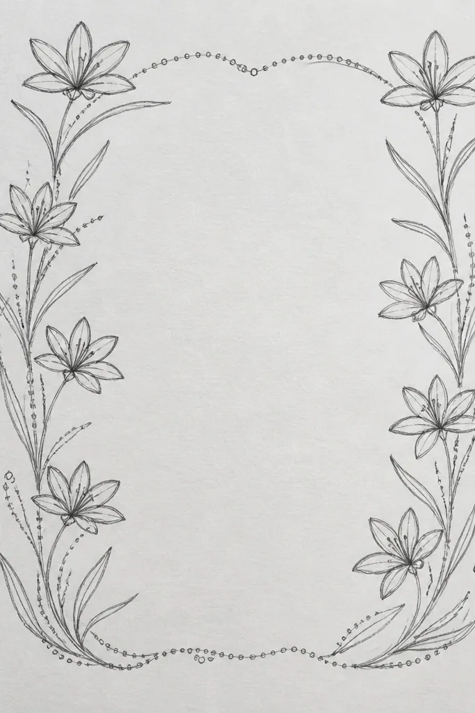
Lace borders give you that cozy, handmade stationery vibe, and rain lilies fit the lace mood because their petals are naturally delicate. This layout is practical too: you can write notes in the blank center while the border keeps the theme present. I've used it on envelopes and mini cards where people actually write back. It flatters small handwriting because the border frames the text instead of distracting from it. If you like clean, neat crafts, this one feels satisfying.
Draw a rectangle border about 3/4 inch from the edges. Add dotted stems along the border sides: small dots connected with faint lines. Place rain lily buds at the corners and midpoints - each bud is just a small center cluster with 3-4 narrow petals. Lightly wash the petals with pale cream and add a tiny warm gray shadow under each bud. Keep the center completely blank so the border reads like lace trim.
Good to knowUse a ruler for the outer border, but draw the dotted stems freehand so the lace feels human.
Common mistakeAvoid filling the border with full-size flowers; lace needs breathing room.
14. Rain Lily with Gold Gel Pen Highlights on Kraft
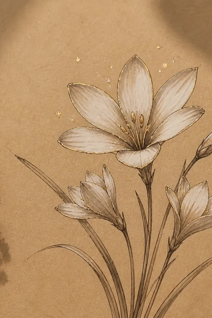
Gold highlights make rain lilies feel cozy and special without turning them into a holiday theme. Kraft paper already brings warmth, so your cream washes look like candlelight. I like brown ink here instead of black because it feels softer against the paper. This style flatters people who want their upcycled pieces to look "intentional" even if the drawing is simple. It also pops in photos because gold catches light at angles.
Start with kraft paper, then sketch the rain lily center cluster lightly. Outline the petals with a fine brown pen, then fill with diluted cream watercolor. Add warm gray shadow only on the inner fold of each petal. Let it dry, then use a gold gel pen to trace thin lines along the outer edge and a small highlight curve near the petal base. Add 5-8 tiny gold dots around the center to mimic pollen sparkle.
Good to knowGold gel pen works best on dry paint; if the watercolor is still damp, the gold goes dull.
Common mistakeAvoid covering large areas in gold; thin highlights look cozy, heavy gold looks flashy.
15. Rain Lily Botanical Diagram Style with Labels
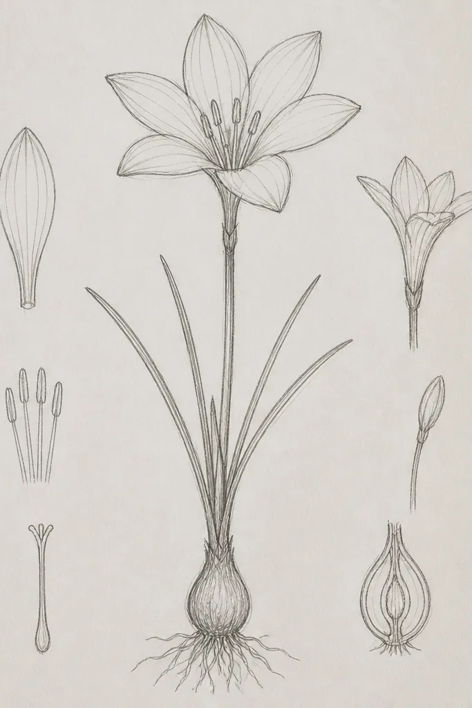
Diagram style makes rain lilies feel calm and thoughtful, like a plant study you did during quiet hours. The cozy part comes from the restrained palette and the handwritten labels - it looks personal, not clinical. I use this on upcycled scrap paper and on the inside of thrifted recipe books. It flatters anyone who likes structure because everything has a place. Also, labels hide uneven drawing: the viewer focuses on the information, not the tiny imperfections.
Draw the rain lily in the center using pencil, then ink only the outer petal edges and the center cluster. Add light gray shading under petals with diluted paint, keeping the background plain. Draw two or three label boxes near the top and sides, then add thin leader lines pointing to the stem, center, and one petal group. Write short labels in small handwriting with a fine pen. Keep the background off-white and add a faint wash only behind the flower if you want extra softness.
Good to knowUse one consistent label font size; uneven label sizing makes the whole diagram look rushed.
Common mistakeDon't use bright colors for the labels; keep it gray-brown so it stays cozy.
16. Rain Lily on Watercolor Postcard with Messy Splatters
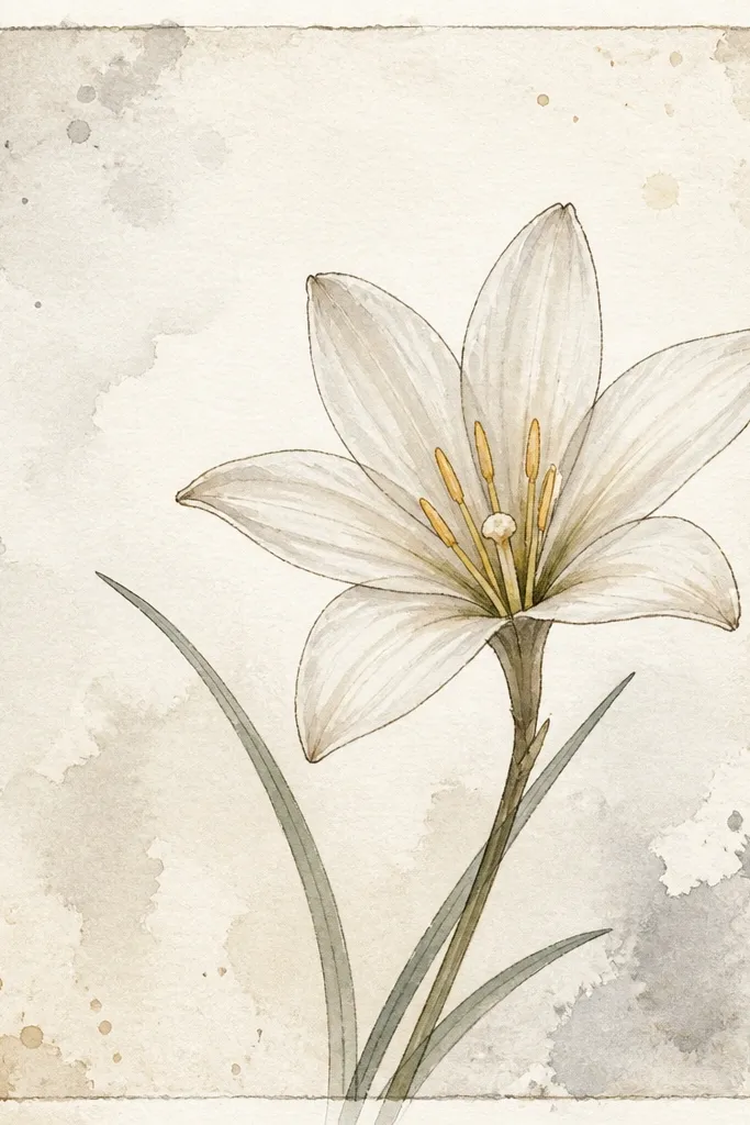
Messy splatters sound chaotic, but when you keep them muted, they read like rain mist around a calm flower. This is my go-to when I want a postcard that looks handmade without spending time perfecting the background. The rain lily stays the hero because you keep the splatter away from the petals. I've sent these as thank-you cards and gotten replies that mention how cozy they felt. It suits people who like a looser hand and want their art to look lived-in.
Paint a pale wash background in beige-gray, leaving the center slightly lighter. Outline the rain lily with ink and add pale cream petal fills and warm gray inner fold shadows. Keep the flower slightly off-center so the splatters can frame it. Load diluted gray paint on a toothbrush and tap lightly to create small edge splatters. Add a few larger splatters near corners only, then let it dry flat. If you want a postcard look, add a thin border line around the edges with pencil and ink it lightly.
Good to knowCover the flower area with scrap paper while splattering so you don't get speckled petals.
Common mistakeAvoid bright splatter colors; they make it look like craft foam, not watercolor.
17. Rain Lily on Upcycled Denim Patch with Fabric Paint
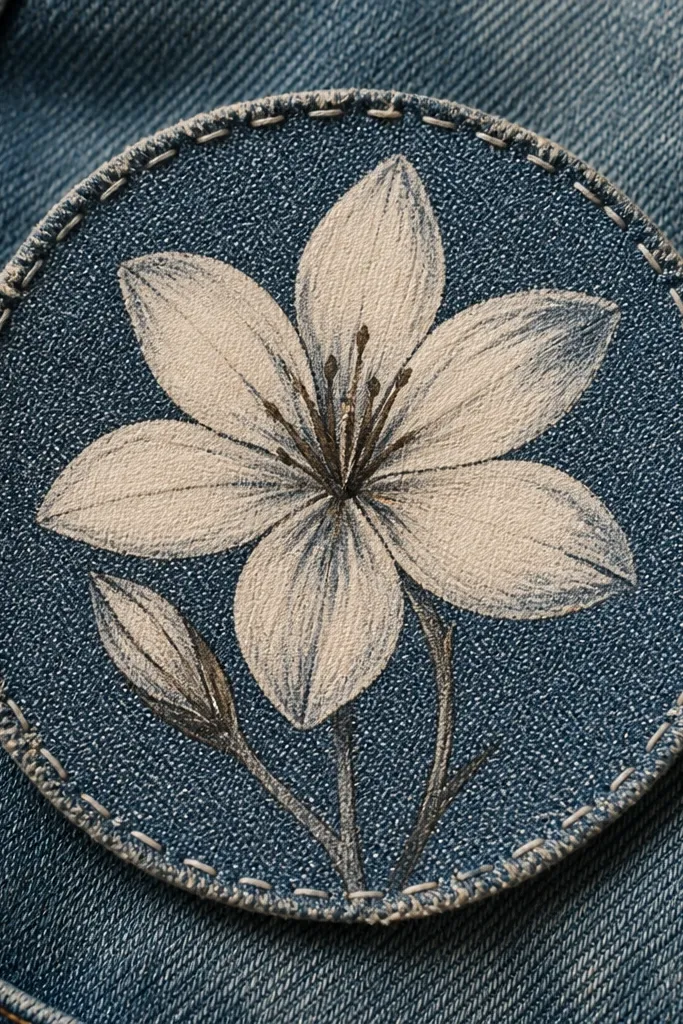
Denim is already textured, so rain lilies look extra cozy even with minimal color. I like this for upcycled jackets and bags because the flower feels like a tiny embroidery piece, even though it's paint. Use fabric paint or acrylic designed for textiles so the pigment sits on the fibers. This style flatters everyday wear because it looks casual, not precious. It also hides small brush mistakes - denim texture disguises them.
Cut a denim patch and clean it with a quick wash and dry so paint grips. Sketch the rain lily lightly with chalk pencil, then paint the petals with fabric paint in cream. Add muted gray shadow on the inner fold, keeping the outer edges lighter. Outline the center cluster with a dark brown fabric marker for crisp structure. Stitch around the patch with matching thread, then add a few tiny raindrop dots near the bottom using a fine brush.
Good to knowHeat set the paint if your product requires it, so it doesn't smear when the patch gets wet.
Common mistakeAvoid painting over oily fabric spots; they repel paint and leave shiny gaps.
18. Rain Lily and Mossy Leaves Half-Page Composition
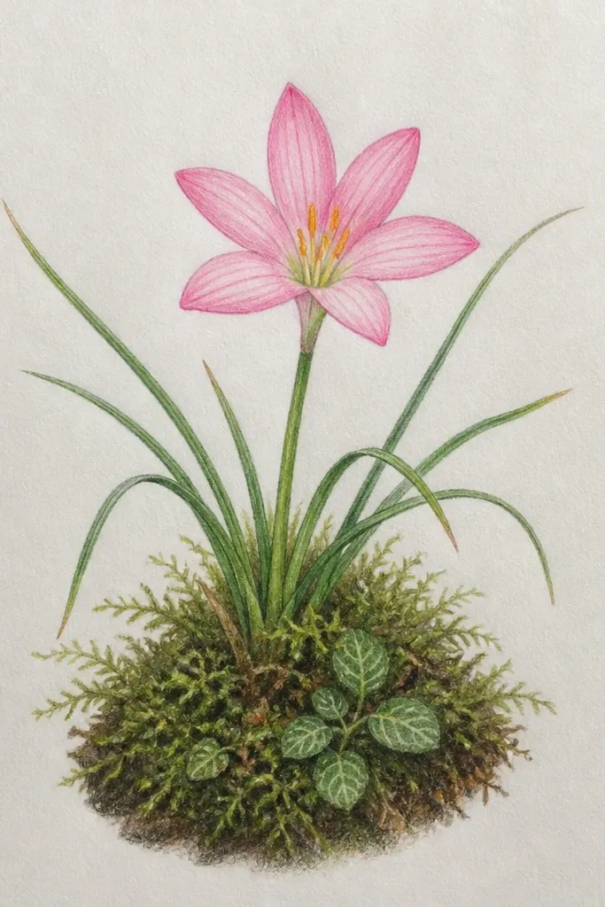
This layout feels cozy because it balances "rain" with "ground." The leaves give your rain lily a place to rest, and the half-page division keeps the drawing from getting busy. I like mossy greens with a gray-brown tint - they look like forest shade, not fresh garden neon. This style flatters people who want more than one element but still want calm composition. It also looks good when you fold a paper for a card, since the overlap area reads as intentional layering.
Fold your paper mentally into two halves and leave a 1 inch overlap zone in the middle. Draw the rain lily on the left: center cluster, then narrow petals in mirrored pairs, drooping slightly. Add pale cream watercolor and warm gray inner shadows. On the right, draw 5-7 leaf shapes with pencil first, then fill with muted moss green mixed with a touch of gray or brown. Lightly wash the overlap area with diluted beige so the two sides blend. Ink only the rain lily petals and the leaf veins, keeping the rest light.
Good to knowMix your moss green with a tiny bit of brown so it reads soft under indoor light.
Common mistakeAvoid bright leaf green; it makes the rain lily look colder and less cozy.
19. Rain Lily Monoline Bracelet Illustration Style
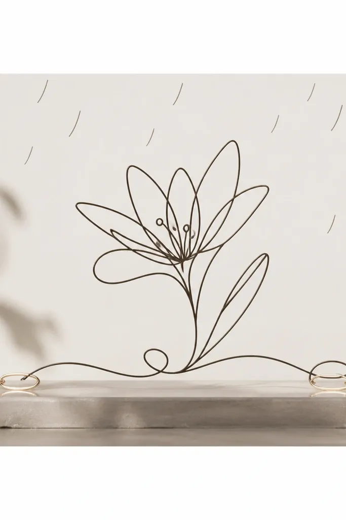
Monoline rain lilies look cozy because they're airy and graphic. I use this style when I'm designing printable fabric transfers or when I want a clean motif for a zipper pouch. The single-line approach keeps the flower from becoming too shaded, which makes it easier to transfer onto uneven surfaces. It flatters small spaces because the design reads clearly even when it's narrow. The subtle rain marks keep the theme without turning the piece into a weather scene.
Draw a long strip layout and decide where the flower sits - usually centered. Use a single dark pen line to sketch the rain lily: center cluster with short loops, then petals as repeated curved strokes that curl down. Keep line thickness consistent. Add a few rain arcs above the flower using the same pen. At the bottom edge, draw tiny linked shapes like bracelet links, spaced evenly about 1/4 inch apart. If you want color, add only one wash behind the petals - pale cream diluted so the background still shows through.
Good to knowDo a quick dry run sketch first so you don't break the line during the real drawing.
Common mistakeAvoid adding heavy shading; monoline designs look best with light color or none.
20. Rain Lily Patterned Napkin Rings with Dotted Petal Points
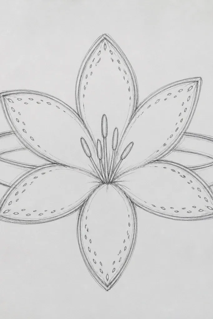
This idea turns a simple table setting into something you can actually draw yourself. The dotted petal tips give the rain lily a tactile, cozy sparkle without needing full color washes. I've used the same motif on paper napkin rings and on fabric ribbon bands for dinner parties - it looks cute in candlelight. It flatters most table themes because the palette stays warm and restrained. If you want your upcycling project to feel "host energy" without spending money, this is a solid pick.
Cut strips of kraft paper or fabric ribbon into ring-length pieces and tape them so they form a circle. Draw one rain lily motif size that fits the ring: center cluster plus 5-6 narrow petals. Outline the petals with a fine pen, then lightly fill with diluted cream wash. Put a tiny dot at each petal tip using white or gold gel pen after the paint dries. Repeat the motif around the ring, aligning the center cluster at the same height each time. Finish by adding a small raindrop dot near the bottom of each motif for cohesion.
Good to knowUse gel pen dots sparingly; too many dots makes it look like glitter glue.
Common mistakeAvoid thick marker fills on kraft; the ink soaks in and looks harsh.