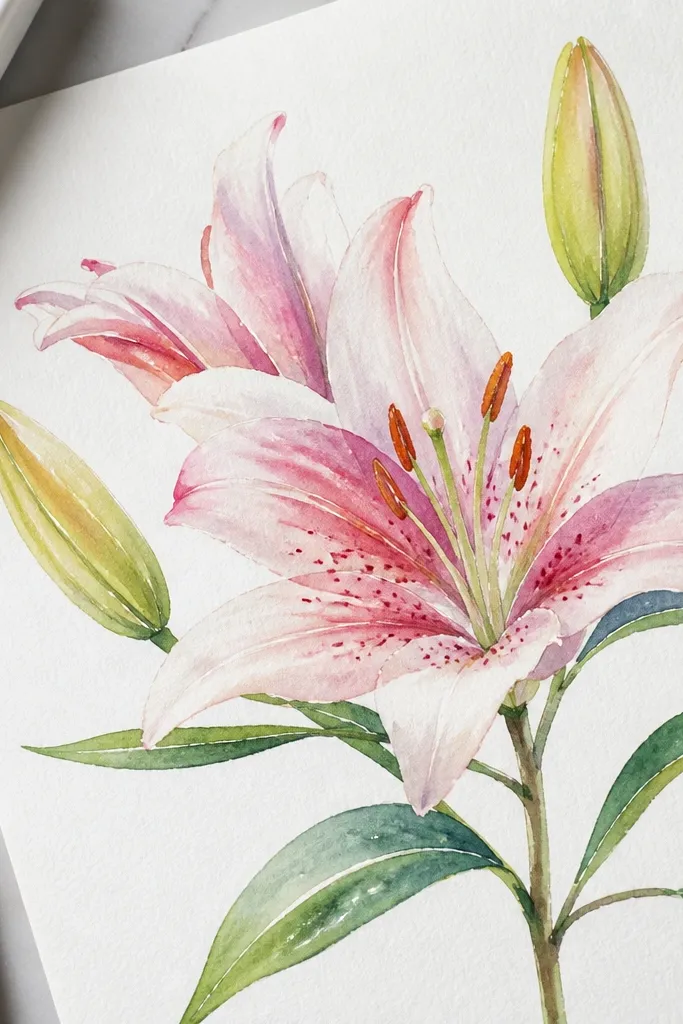
1. Single Lily on Warm Cream Paper
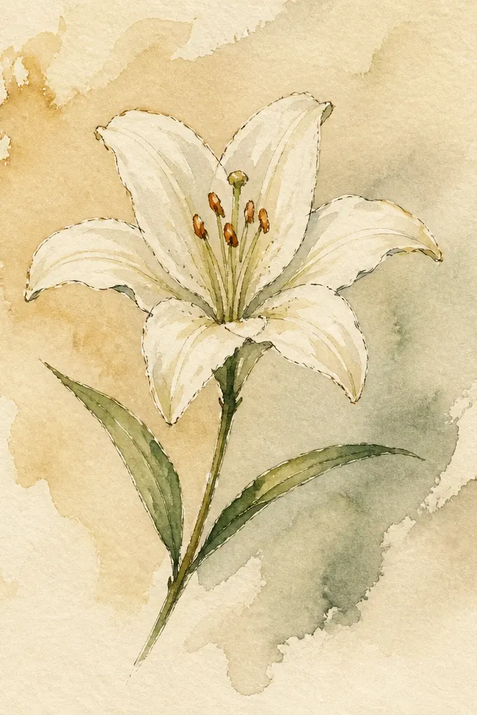
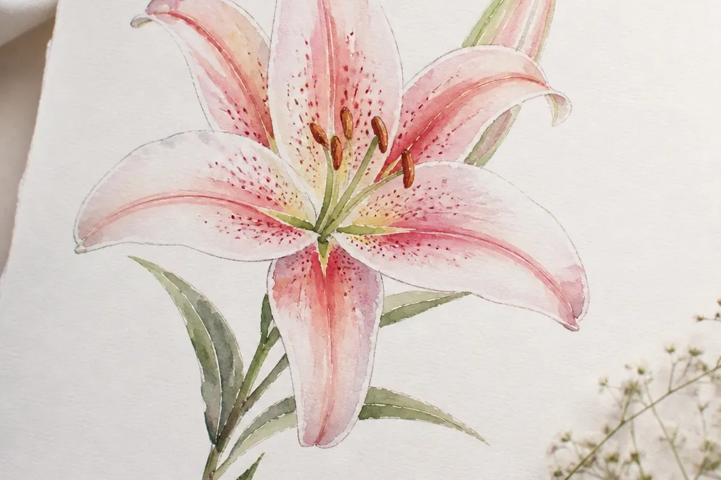
This look is the one I use when I want a clean, airy lily without fighting muddy color. The warm cream paper makes the whites read as soft ivory, so you get glow even if your pink wash is light. I paint the outer petals with a very diluted rose, then I add a thin lavender shadow only where petals overlap. Because the lily sits centered and slightly tall, it flatters anyone’s eye — it reads elegant on small surfaces like greeting cards and bookplates.
Start by sketching one lily with six visible petal lobes and a simple curved stem. Wet the petal areas with clean water using a flat brush, then drop in a pale rose wash and pull it toward the folds so edges stay airy. Let it dry completely. Then mix rose + a tiny bit of violet for shadows, and glaze just the fold lines and the petal bases near the center. Finish with a thin liner brush to add the stamen dots and a darker green line along the stem curve.
Good to knowIf your pink looks too strong, dilute it until the first wash is almost see-through, then glaze twice.
Common mistakeDon’t paint the white highlights with opaque paint; it turns chalky fast.
2. Two Lilies, One Leaning In
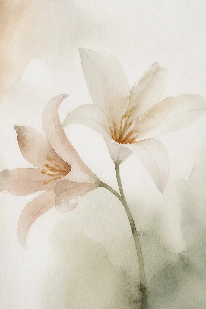
Two-lily compositions look more dimensional because you get natural overlap — the petals from one flower can cast soft visual shadows onto the other. I keep the palette consistent but shift the tilt: the leaning lily gets slightly cooler pink and lighter shadows, while the front lily gets warmer blush. This gives a subtle depth that looks good even in small formats. It’s also forgiving on uneven paper because the overlap hides minor staining.
Sketch both lilies with one stem taller and the other slightly shorter, then mark where petals overlap with small pencil ticks. Paint the background-wash areas first: a light diluted rose for both flowers, keeping the center white. Let dry. Next, glaze fold shadows on the front lily with rose + sepia-warm brown, and glaze the tilted lily with rose + violet for a cooler look. Add stamen dots to both flowers, then connect the stems with a thin green wash that fades at the edges.
Good to knowUse the same brush for stamen dots, but reload with clean, concentrated pigment so the dots stay crisp.
Common mistakeAvoid making both lilies the same exact temperature; it flattens the depth.
3. Lily Still Life in a Thrifted Jar Color Study
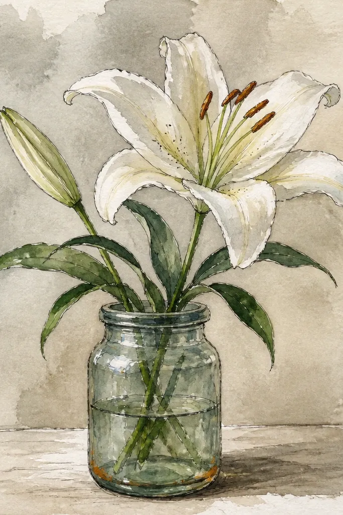
When you add a jar shape behind the lily, the flower edges look sharper because your viewer gets a reference frame. I paint the jar first in a soft gray-blue wash, then the lily on top so the lily stays the focal point. The petals read more luminous because the jar color cools the whites and makes pink gradients pop. This look is great for upcycled printables — you can cut around the jar and glue the lily piece onto a plain card for instant art.
Draw a simple jar outline behind the lily, then block in the jar with a diluted gray-blue (blue + a touch of brown). Keep the jar edges slightly uneven for a hand-painted feel. Let the jar dry. Paint the lily petals with pale rose underwash, reserving the bright inner petal highlights. After dry, add deeper fold shadows with rose + sepia for warmth, then paint leaves with green + burnt sienna for shadowed veins. Finally, glaze a faint shadow under the petals onto the jar interior.
If your jar turns too dark, lift pigment with a damp brush and tissue before it dries.
Don’t outline the lily with a thick line; the jar already provides contrast.
4. White Lily With Pink Veins
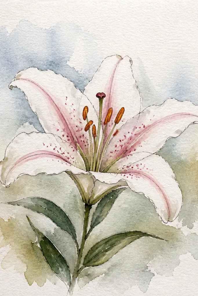
This is the lily version that looks expensive because it’s mostly white with controlled hints of color. The secret is to paint veins as thin, semi-transparent lines rather than filling the whole petal. I use diluted quinacridone rose for the veins and a mix of violet + a whisper of gray for the base shadow. The result flatters lots of skin tones when you frame it — whites and soft pinks look clean against warm wood frames and neutral walls.
Sketch the lily petals and lightly mark vein paths from the center to petal tips. Wet the petal area with clean water, then add a barely-there wash only at the petal base so the rest stays paper-white. Let dry. Load a small round brush with diluted rose and paint vein lines — keep them slightly tapered and leave gaps so they look like natural translucence. Then add base shadows with a thin violet-gray glaze and finish stamen dots with concentrated paint.
Use less water than you think for veins so they don’t bloom into stripes.
Don’t cover the whole petal with a solid pink wash; it kills the white-lily effect.
5. Lavender Shadow Lily on Pale Gray Paper
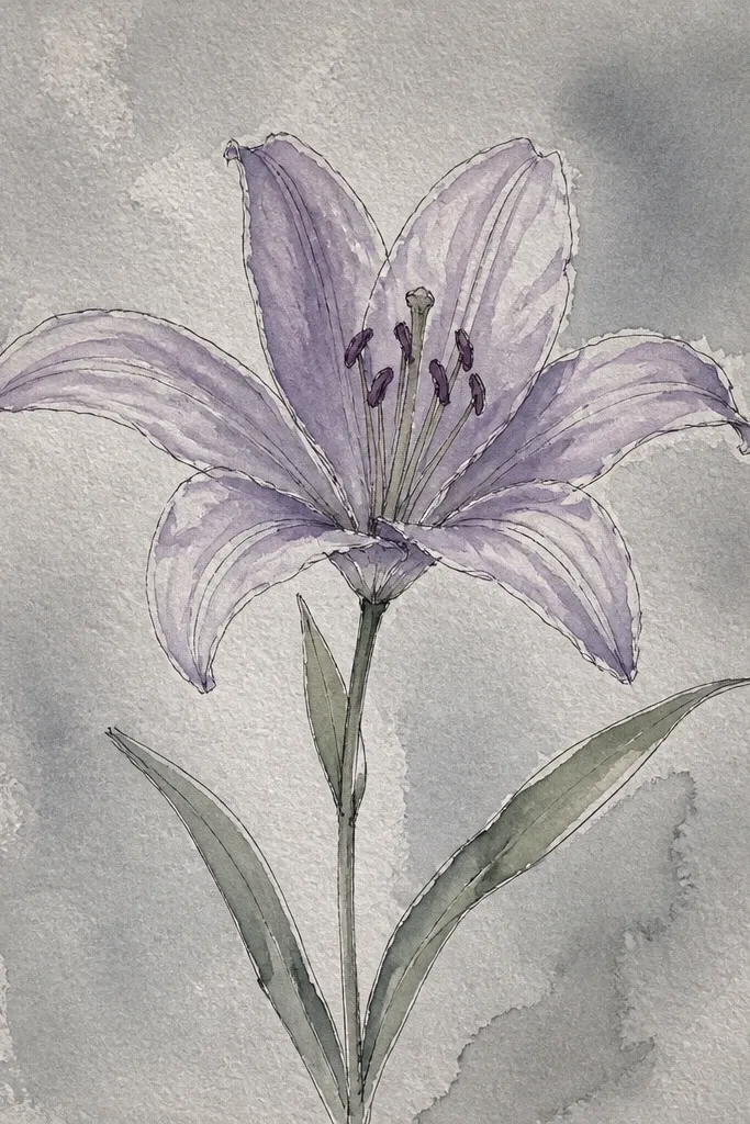
Gray paper makes the lavender shadows look crisp because you’re painting color over a neutral base. I like this palette when I want the lily to feel calm, not romantic. The petals still look airy because I reserve the lightest areas and only glaze shadows. This look also hides tiny paper texture issues, so it’s a good choice when your paper has speckles.
Sketch the lily and stem with a light pencil. Paint a thin, diluted rose wash at the center only, then let it dry. Next, glaze lavender-gray shadows along the fold lines and under overlapping petals — keep the color concentrated near the base and fade it outward. Paint leaves with a muted green mix (green + a touch of violet) and add a darker line along the vein. Finish with stamen dots in warm yellow-orange and a tiny dark line at the petal base folds.
Good to knowIf lavender looks too purple, add a pinch of brown to warm it without turning muddy.
Common mistakeAvoid heavy outlining on gray paper; it turns the lily flat.
6. Coral Pink Lily With Overlap Glaze
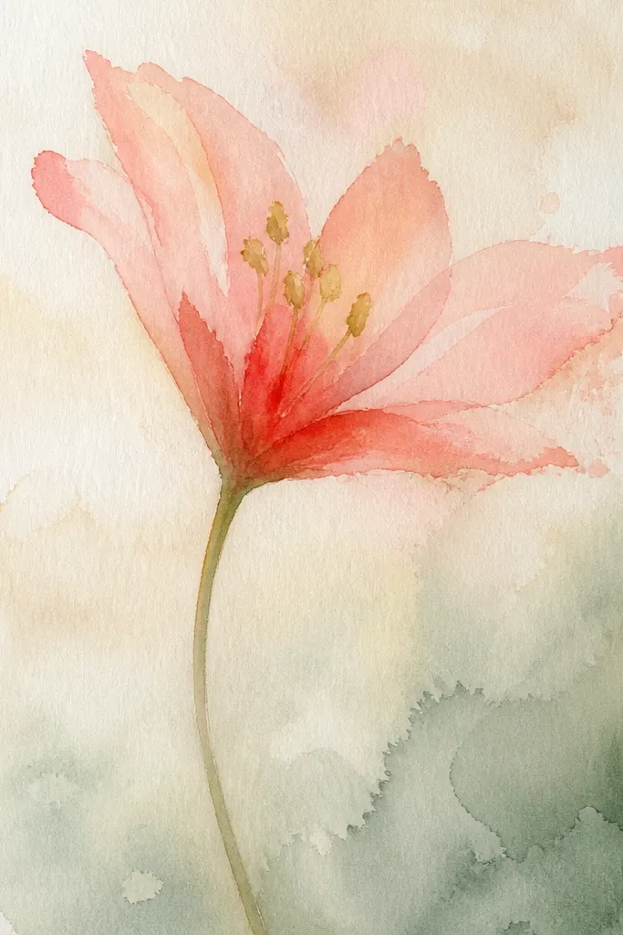
Coral lilies look modern because the pink leans warm and the folds have depth. The key is layering glazes: you paint a light coral underwash, then you glaze darker coral into the folds while keeping the petal edges soft. This creates a translucent, stained-glass effect that holds up in photos. It looks especially good on gift tags and bookmarks because the color reads bright without needing heavy line work.
Mix coral by combining rose with a tiny amount of orange-red, then dilute it heavily for the underwash. Wet the petal surfaces lightly and lay the coral wash, reserving the inner highlight. Let dry. Mix a darker coral (same pigments but less water) and glaze only the fold areas where petals overlap. Add yellow-orange stamen dots and a thin warm shadow under the center. Paint the stem with green + a touch of burnt sienna so it doesn’t look neon.
Good to knowGlaze with a damp brush, not a dripping one, so you keep petal edges feather-soft.
Common mistakeDon’t mix coral with too much brown at the start or it will go brick-red.
7. Monochrome Lily in Sepia Washes
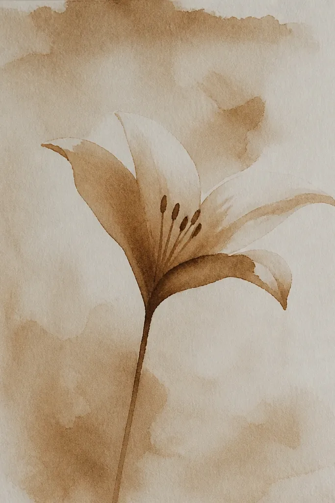
Sepia-only lilies feel vintage and they’re shockingly easy to control. With one pigment family, you don’t fight color temperature — everything reads together. I use light sepia for the underwash, then deeper sepia for folds and the stamen base. The lily still looks dimensional because the value contrast is doing the work. This is a great option for scrapbook pages where your background already has color.
Sketch the lily with clear petal fold lines. Dilute sepia to a watercolor wash and paint the petals, leaving the highlights as paper-white. Let dry. Mix sepia to a darker consistency and glaze only the fold creases and petal bases. Add leaves with a sepia + green mix, keeping the leaf veins visible through the wash. Finish with small stamen dots in warm sepia and a tiny darker point at the center.
Good to knowUse tissue to dab the petal base edge before it dries if you want a softer gradient.
Common mistakeDon’t overwork sepia; second passes can make it look like a photocopy.
8. Botanical Border Lily on Upcycled Cardstock
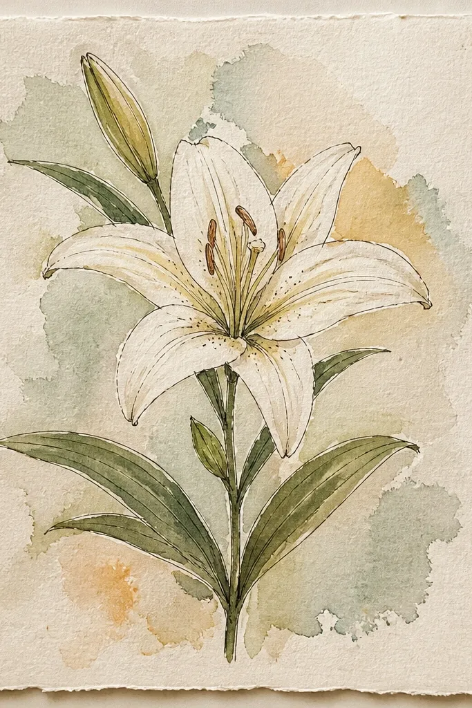
A border makes a lily drawing feel finished, even if the flower itself is simple. I’ve done this on thrifted cardstock and it works because the border gives the eye a path, so the piece reads intentional. The lily stays soft with watercolor, while the border can be slightly sharper because it’s just leaves and stems. If you’re making a repurposed gift tag, this layout looks great without needing extra embellishments.
Cut cardstock to a tag size, then lightly sketch a frame border 1 cm inside the edges. Paint the border first: thin stems in green, then small leaf shapes with a darker green vein line. Let dry. Paint the lily in the center using a pale rose underwash with reserved highlights. After dry, glaze fold shadows with rose + violet and add stamen dots. Finish by painting a soft shadow under the lily onto the border interior.
Keep the border pigments lighter than the lily so the flower stays the main event.
Don’t paint the border too dark or it steals attention from the petals.
9. Lily Corner Composition for Wrapping Paper Style
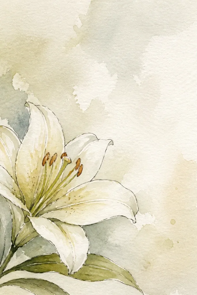
Corner compositions look great on wrapping paper and on repurposed book pages because they leave room for other elements. I place the lily so the stem points diagonally across the page — it makes the piece feel like it’s flowing, not sitting. The trick is to keep the petals lighter and let the stem do the work with a darker green shadow edge. This makes the drawing look intentional even with lots of surrounding text or patterns.
Mark the top-right corner and sketch a lily slightly smaller than you think, leaving at least 4 cm of blank space on the left. Paint the stem first with a mid green wash, then add a darker green line along one side of the stem for depth. Let dry. Paint petals with pale rose underwash and reserve inner highlights. After dry, glaze fold shadows with rose + violet and add stamen dots. Add one extra small leaf halfway down the stem so the corner doesn’t feel empty.
Use a smaller brush than you expect for stamen dots so they don’t look like blobs.
Don’t place the lily too close to the page edge or the petals get cropped in prints.
10. Lily Bud With Open Flower Pair
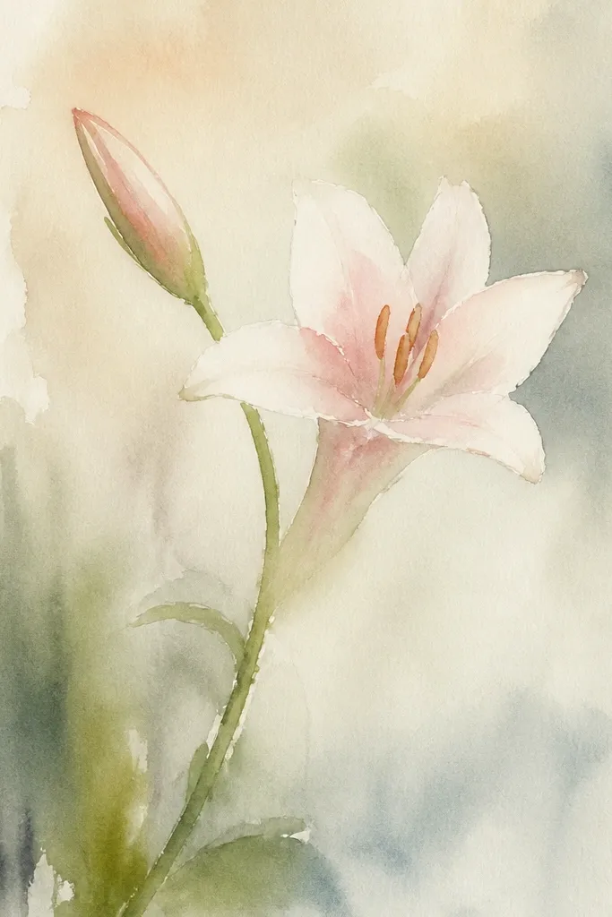
Adding a bud gives your drawing story without adding clutter. Bud petals need less detail, which makes the whole piece feel balanced and realistic. I paint the bud with fewer folds and more reserved highlights so it reads as not-yet-open. This look is perfect for small canvases and for upcycled labels because you get variety in shape — open flower plus compact bud.
Sketch the open lily slightly larger and the bud to one side, connected by the same stem line. Paint the stem and leaves first in green + a touch of burnt sienna for shadow. Let dry. Paint the open lily petals with pale rose underwash and reserve highlights. Paint the bud petals with the same rose but keep it lighter and add fold shadows only at the base. Finish both flowers with stamen dots on the open lily and a tiny darker center hint on the bud.
For the bud, use less water so the folds stay defined.
Don’t add full stamen detail to the bud — it looks like an open flower in disguise.
11. Loose Sketchy Lily With Dry Brush Texture
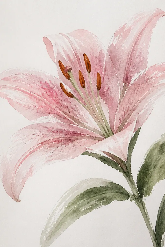
Dry brush texture makes watercolor lilies feel handmade, especially when you’re using a more expressive line style. I use it when I want the petals to look like they have paper fibers and natural variation rather than perfect smooth gradients. The fold shadows look more believable because they have streaks like real shadow transitions. This style looks great on art journals and on repurposed paper where you want a bit of grit.
Sketch the lily with light pencil outlines and petal fold lines. Load a flat brush with diluted rose, then wipe most paint off on a paper towel until the brush leaves faint pigment. Brush over the petals lightly to create speckled texture while keeping highlights. Let it dry. Mix a darker rose + violet and paint fold shadows with the same dry brush approach, then add leaf textures by dragging the brush along the vein directions. Finish with stamen dots in concentrated yellow-orange.
Good to knowTest your dry brush level on scrap paper so the speckles match your page tone.
Common mistakeDon’t dry-brush the center highlight or it will look dusty.
12. Realistic Fold Focus Lily (No Background)
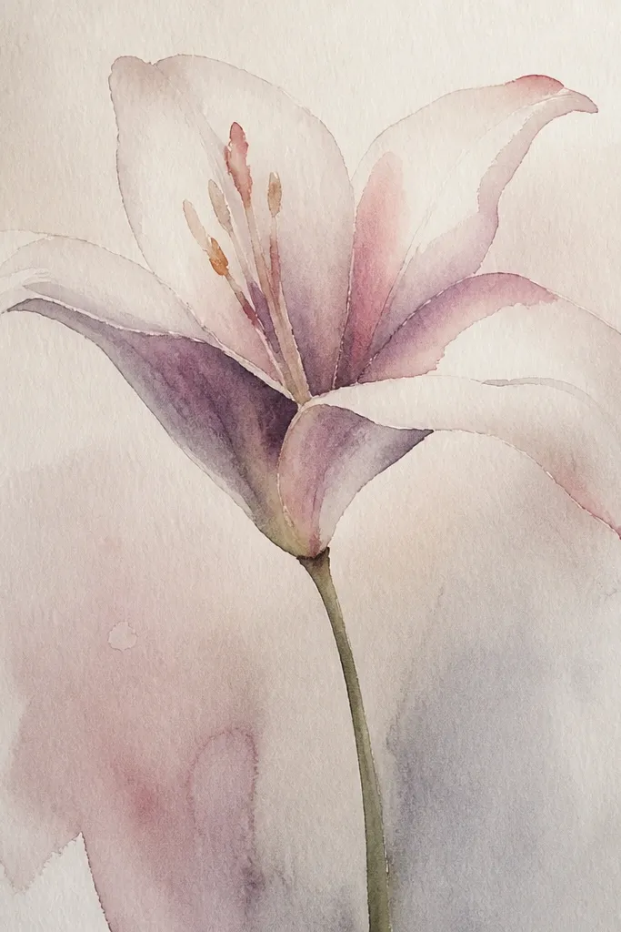
This is the lily look that reads realistic because you focus on folds and overlap, not on extra decoration. I crop close so the viewer’s eye lands on the fold lines and the center. The palette stays controlled: pale rose for base color, violet for cooler shadows, and burnt sienna for warm depth near the base. It’s flattering in a frame because the close crop hides uneven pencil lines and makes your brushwork feel intentional.
Sketch a close lily so four petals dominate the page and two petals are partially hidden. Paint the base underwash with very diluted rose, keeping the inner highlight paper-white. Let dry completely. Glaze fold shadows along the overlap lines using rose + violet, then deepen the base folds with a touch of sepia. Add stamen dots and a tiny dark line at the center where petals meet. Keep the petal edges clean by painting right up to the pencil lines and avoiding extra water around the perimeter.
Good to knowUse a pointed round brush for fold shadows so you get a hairline edge instead of a blob.
Common mistakeAvoid adding a wash to the entire petal after you’ve defined folds; it blurs the realism.
13. Lily With Watercolor Bleed Edges
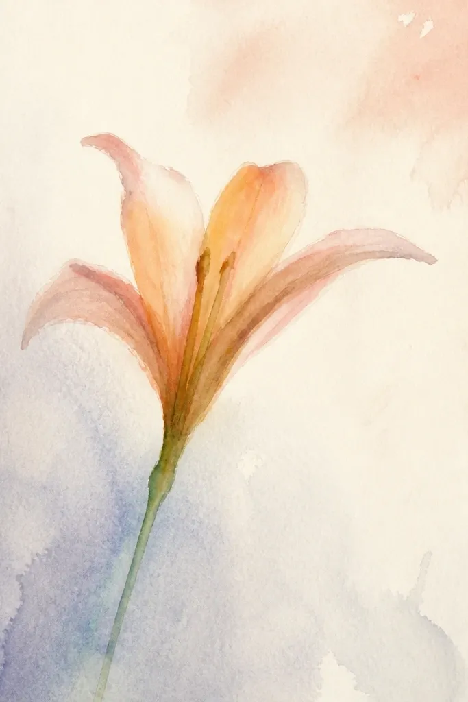
Bleed edges look dreamy, but you have to control where the bleed happens. I use it on outer petal edges only — the folds stay crisp so the flower still looks structured. The trick is a strong water touch at the edge while the center remains dry-protected. This style works when you want a softer, romantic feel for wedding invites or repurposed stationery.
Sketch the lily and mark fold lines. Paint the petals with a pale rose underwash, leaving the fold interiors slightly lighter. Let the underwash dry until it’s tacky, not wet. Touch clean water only along the outer petal edges, then add a tiny amount of rose at those edge points so it feathers outward. While it sets, paint the folds with rose + violet but keep them separate from the feathered edges. Finish stamen dots and paint the stem with a darker green so it anchors the softness.
Use a dry paper towel to stop bleed — press lightly at the edge you want to contain.
Don’t bleed the center or stamen area; it turns the flower into a pink cloud.
14. Two-Color Lily: Pink and Leafy Green Only
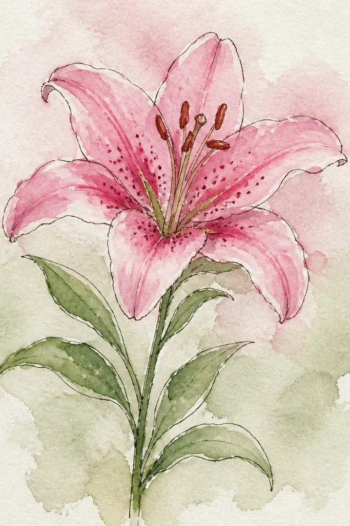
If you want a graphic, modern lily drawing, limit yourself to two colors. I use rose for everything on the flower and green for everything on the plant, then I create depth by using different water amounts instead of adding new pigments. That keeps the lily cohesive and makes it easy to match to decor colors. It’s also great for beginners because you’re not mixing multiple shadow colors.
Sketch a lily with clear petal folds and a simple stem. Mix rose into three consistencies: very pale, medium, and dark. Paint the very pale wash across most petals, leaving inner highlights paper-white. After dry, glaze medium rose into fold areas and add dark rose only at the deepest overlap points. Paint stem and leaves in green, then add a darker green shadow line along the underside of leaves. Add stamen dots using dark rose mixed with a tiny touch of yellow if you have it, or use dark rose alone for a monochrome center.
Keep your dark rose glaze thin — it should look like shadow, not a thick outline.
Avoid adding violet or brown if you’re going for the two-color look; it breaks the graphic feel.
15. Lily on a Watercolor Wash Background Stripe
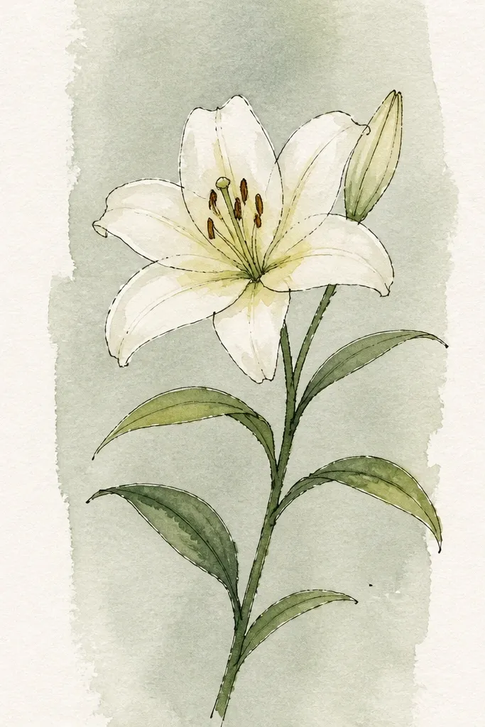
A simple background wash makes your lily feel like it belongs to the page instead of floating. I paint a thin horizontal stripe behind the flower in a watery yellow-green, then let it dry before the lily. The stripe creates a gentle color relationship with the leaves, so the whole piece looks coordinated. This is a good upcycling trick when you’re painting on recycled paper that has uneven tone — the wash evens it out without hiding the flower.
Lightly sketch the lily and stem on the page. Paint a horizontal stripe behind where the lily sits using diluted yellow-green (yellow + a touch of green) and let it dry. Then paint the lily petals with pale rose underwash and reserve inner highlights. After dry, glaze fold shadows with rose + violet and add base depth with a tiny amount of sepia. Paint leaves with green + burnt sienna shadow, then finish stamen dots with concentrated yellow-orange. Add a faint shadow under the lily onto the background stripe with diluted rose.
Keep the background wash lighter than the petals so it supports, not competes.
Don’t wet the background while painting petals; it can bleed into your lily edges.
16. Lily in a Minimal Circle Frame
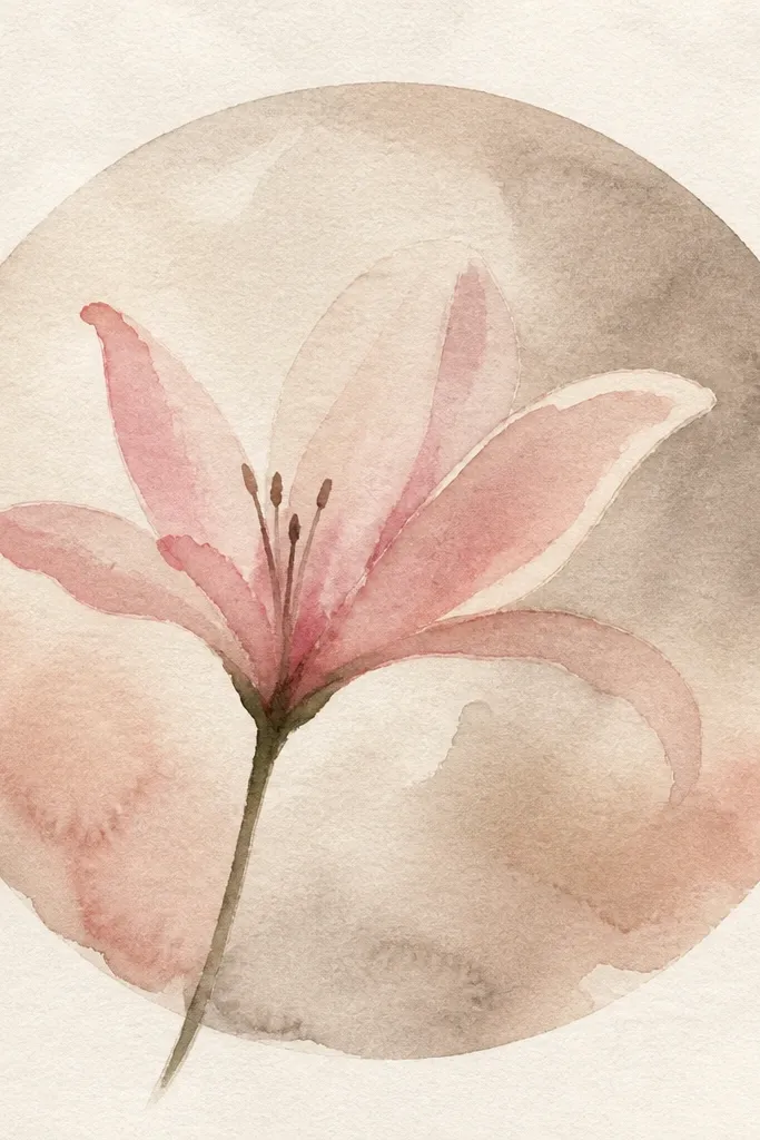
A minimal circle frame gives your lily a clean “print” feel without needing fancy calligraphy. I paint the circle first in a light gray-green so it doesn’t fight the petals. The lily stays soft and organic, and the circle provides a boundary that makes the watercolor look intentional. This works well for wall art or for turning into sticker-like labels because the circle reads as a finished graphic element.
Sketch the lily first lightly, then trace a circle around it using a template so the space is even. Paint the circle outline with diluted green-gray, then let it dry. Paint petals with pale rose underwash, reserving the inner highlight. After dry, glaze fold shadows with rose + violet, and deepen the base folds with a touch of sepia. Paint leaves with green + burnt sienna shadow and add stamen dots. Finish by adding a tiny dark line where the stem meets the petals so the lily looks anchored.
Good to knowUse painter’s tape to mask the circle if you want a perfectly even ring.
Common mistakeAvoid painting the circle too close to the petals; leave a 3-5 mm gap so edges don’t smear.
17. Lily With Soft Veil Glaze Over Entire Petals
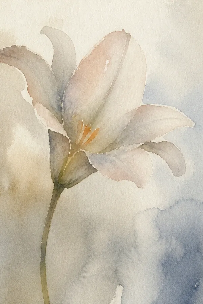
A veil glaze makes the lily feel like it’s lit from within. I use it when my underwash feels too patchy — the veil evens everything out while still keeping highlights visible. The key is to glaze thinly and let paper-white areas stay bright. The result looks flattering on handmade prints because it smooths minor pencil marks and paper texture. It also pairs beautifully with soft greens in leaves.
Sketch the lily and lightly mark fold lines. Paint a very pale underwash across the petals, keeping the inner highlights mostly untouched. Let dry. Mix a thin glaze of rose + a whisper of violet, then brush it over the petals in one direction so it looks like a translucent film. After that glaze dries, add fold shadows with a slightly darker rose + violet mix only at overlap points. Paint leaves with green + burnt sienna shadow and finish stamen dots with concentrated yellow-orange.
Glaze in one direction and don’t go back and forth; that’s how you keep it from streaking.
Avoid thick paint for the veil; it covers highlights and makes petals look opaque.
18. Lily With Pencil Lines Kept Visible
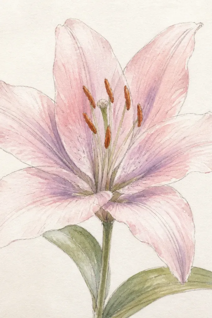
Keeping pencil lines visible gives a sketchy, illustration feel. I do this when I want the lily to look like a drawing first and a watercolor second. The pencil folds act like guides for the eye, and the watercolor stays light enough to show that structure. This style looks great for zines and upcycled paper because the imperfections read as handmade rather than mistakes. It also flatters smaller spaces because the lines add detail without adding heavy pigment.
Sketch the lily petals with confident fold lines, then erase lightly only where you want pure white highlights. Paint a thin, pale rose wash over most petals, but keep it watery so pencil lines show through. Let dry. Glaze fold shadows with rose + violet, concentrating at the fold intersections while leaving the pencil line visible at edges. Paint leaves with a light green wash and add one darker vein line. Finish with stamen dots and a tiny dark center point, using minimal pigment so the pencil lines still read.
Don’t erase too much; the pencil lines give the lily its structure.
Avoid heavy, opaque washes; they bury pencil lines and kill the sketchy look.
19. Lily on Dark Background With Watercolor Glow
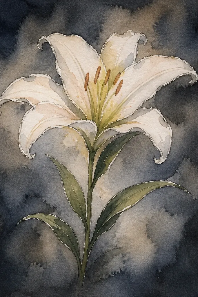
Dark backgrounds make lilies look like they glow, but you need to paint lighter values carefully. I use thick white watercolor or white gouache for the brightest petals, then layer pale pink over the white for softness. Fold shadows stay muted gray-violet so they don’t look harsh. This look is striking for wall art and for upcycled covers because the dark base hides stains and makes small details pop. It also looks good for anyone who prefers a modern, high-contrast aesthetic.
Sketch the lily on dark paper lightly with a light pencil or chalk pencil. Paint the brightest petal shapes with white gouache, leaving small gaps for highlight transitions. Let it set until it stops looking wet. Then glaze pale pink watercolor over the gouache to tint the petals without losing brightness. Add fold shadows with a diluted gray-violet mix, keeping them only in overlap areas. Paint leaves with muted green, then add a darker green line along the underside. Finish with stamen dots in concentrated yellow-orange for a crisp center.
If your white looks patchy, add a second thin gouache layer after the first dries.
Don’t use watery white watercolor on dark paper; it turns gray instead of glowing.
20. Lily Center Detail Portrait (Stamen + Center Folds)
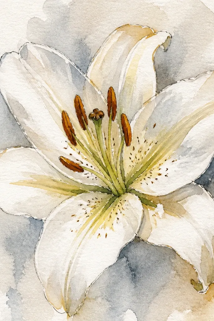
This look is all about the center — the part people zoom in on. When your stamen dots and center fold shadows are crisp, the rest of the lily can stay simple and still look convincing. I keep the outer petals light and focus pigments where petals meet in the center. It’s a great way to practice drawing without getting stuck on perfect petal shapes. If you’re making a small upcycled label, this center portrait gives you a high-impact focal point.
Sketch the lily center large, with only a few petal tips framing it. Paint a pale rose underwash on the petal edges, leaving the very center brightest. Let dry. Mix violet-gray for shadows and glaze just the fold creases around the center, keeping the shadow shape narrow. Then add stamen dots: use a small round brush and dot in a tight cluster, with a few slightly larger dots for variation. Finish by adding a tiny dark line where petals fold under the stamen cluster.
Good to knowDot the stamen while your paint is slightly tacky, not fully dry, so dots sit cleanly.
Common mistakeAvoid drawing every petal edge dark; it makes the center look messy.