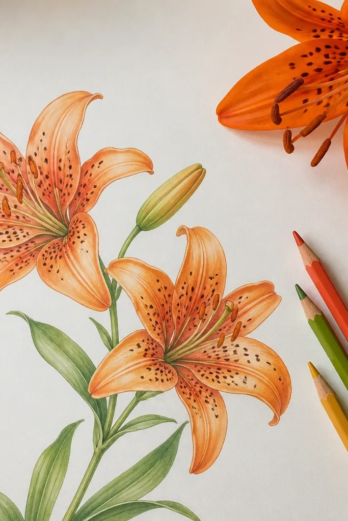
1. Back-Outline Tiger Lily on a Black Tote
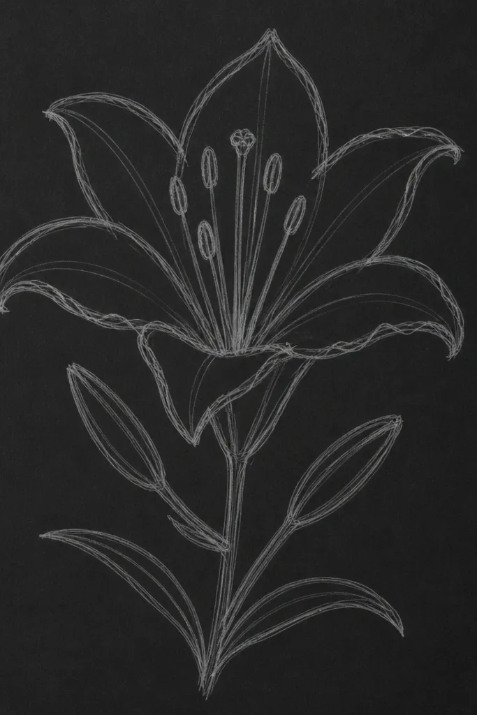
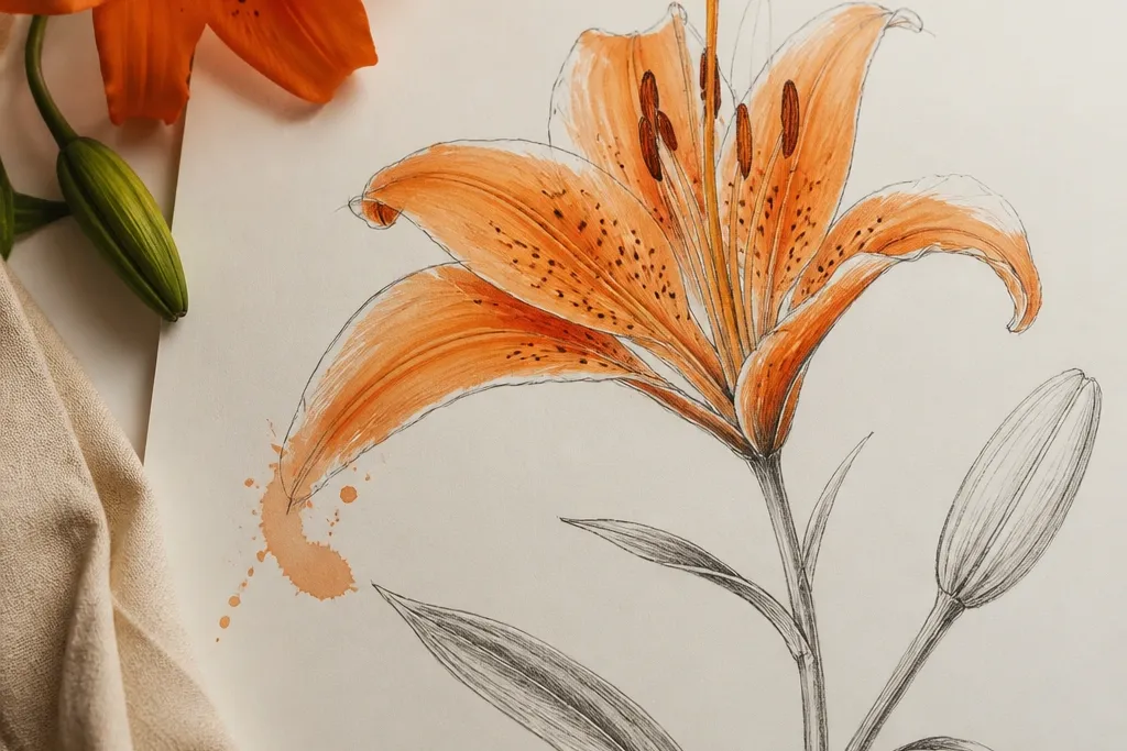
This look works when you want stylish without turning your tote into a busy print. I outline the outer petals thick, then add thin vein lines that stop before the petal tip so they don’t look scratchy. The throat gets a tight scatter of warm orange dots, like a controlled confetti, which pops against black without needing full coloring. It flatters anyone because the design stays high-contrast and doesn’t fight your outfit — black tote, any jeans, any neutral top. It also photographs well at night because the thick outline catches light like a graphic label.
Start by sketching the tiger lily centered on the tote back, about 7 inches tall, using a water-soluble fabric marker. Then trace the outer petal edges with a thick fabric paint marker or acrylic + brush set to a firm outline — keep your hand slow so the line stays confident. Add 10 to 18 freckles in the throat area using a small round brush or a paint pen with a tiny tip. Finally, draw a thin stem arc (no leaves) in the lower third, and let it dry fully before you carry it.
Good to knowIf the outline feels too heavy, thin it at the petal tips by lifting pressure as you reach the ends. That one trick keeps it from looking like a stencil.
Common mistakeDon’t fill every petal with flat orange — it turns black totes into a smeared sticker look after washing.
2. Watercolor Wash Tiger Lily with Crisp Speckles
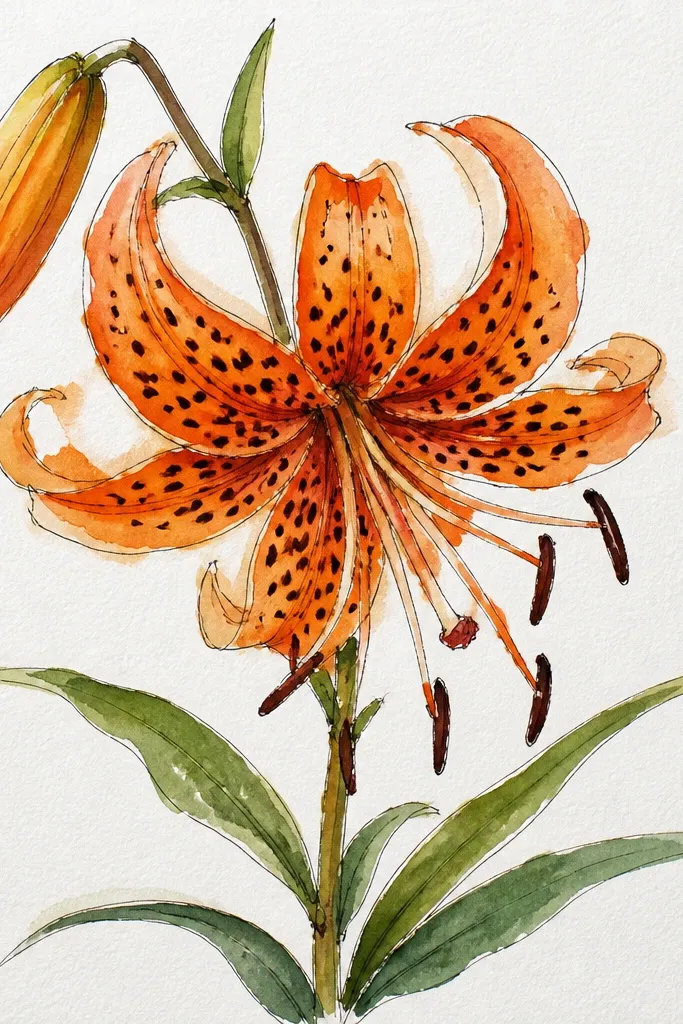
This is the pretty, airy version that still reads as tiger lily from across a room. I use a wet-on-dry watercolor wash for the petals, keeping the edges a touch darker so the flower has shape. The speckles in the throat stay crisp and dark — I add them last with a fine liner so they don’t bleed into the wash. This flatters light skin and warm tones because peach-orange sits softly against warm undertones, especially in spring outfits. It also looks great as wall art or a card because the paper texture makes the petals feel alive.
Start by lightly sketching the three petal layers, then wet the outer petals with clean water using a round brush. Drop in diluted orange and peach, letting the pigment pool slightly near the petal base. When it dries enough to touch without smearing (about 10 minutes), add a darker orange gradient at the throat rim. Finally, use a black-brown fineliner to place 25 to 35 freckles and a few thicker specks for depth.
Use a damp brush to pull one edge of each petal outward, then stop. That single drag makes the flower look like it’s blooming instead of sitting flat.
Don’t outline in dark ink before watercolor — it can create harsh edges that fight the wash.
3. One-Line Tiger Lily for Minimal Style Stickers
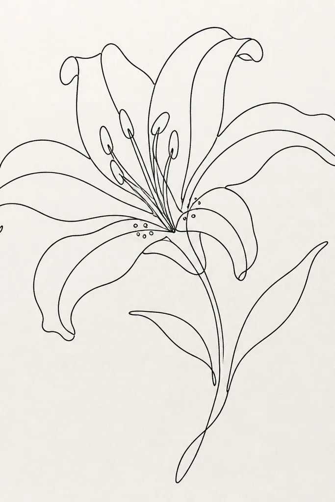
This is the cleanest “stylish” option when you want your art to look modern and intentional. I keep the line continuous and let it slightly overlap at the center so the lily reads even without color. The throat dots are the only filled marks, placed like punctuation — a few dots, not a full speckle field. It works on planners and laptop stickers because it doesn’t rely on shading to look good. If you wear monochrome outfits, this style looks extra sharp against a solid sweater or tote.
Start at the top petal tip and draw one smooth line down the outer edge, curving inward for the inner petals. Don’t lift your pen — when you reach the throat, loop once to create a small center swirl. Add three to five dot clusters with a fine marker, then draw a short stem line that stops early (about 2 inches) so it doesn’t crowd the page. For stickers, scan the drawing and print with matte sticker paper so the line stays crisp.
Good to knowKeep line thickness consistent by using the same nib angle the whole time. One slight wobble makes it look amateur.
Common mistakeDon’t add extra line segments. If you break the “single line” idea, the minimal look collapses.
4. Orange Ombre Petals with Black Throat Stroke
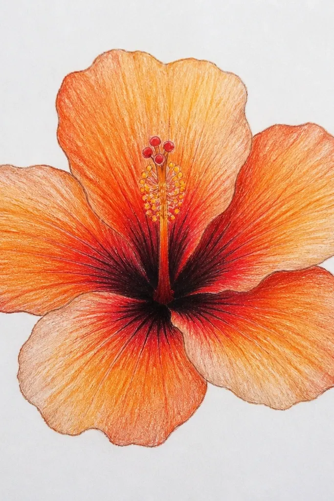
This look reads stylish because it uses one clear shading method instead of random hatching. I paint the ombre by blending orange into peach along the petal length, then I anchor the center with a black throat stroke. That dark curve frames the flower the way a frame does for art, so the drawing stays crisp even on fabric. It flatters bold outfits because the gradient gives movement, but the black keeps it grounded. I’ve used this on denim cuffs and it still looks sharp after a few washes when you seal it properly.
Start by sketching the petals and veins lightly in pencil or washable marker. Paint the outer petals with diluted peach first, then add orange near the base and blend upward while the paint is still wet. Add one thicker black curve at the throat center, then place 12 to 20 freckles around the curve. Finish by drawing thin vein lines in a dark orange (not black) so the petals don’t look like they’re outlined twice.
Blend with a clean damp brush, not more pigment. If you keep adding paint, the gradient turns muddy fast.
Don’t use brown for the ombre — it kills the tiger lily color and makes it look like old rust.
5. Tiny Tiger Lily Repeat Pattern on Scrap Fabric
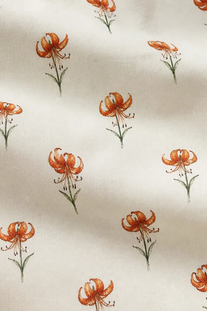
This is how you make upcycling look expensive without printing a full textile design. The secret is scale: small flowers keep the pattern from feeling loud, and thin stems keep it airy. I draw each lily with the same petal proportions and only vary the speckle count slightly, so it looks handmade but consistent. It flatters small spaces like zip pouches, chair ties, and scarf hems because it doesn’t overwhelm the object. On warm skin tones, orange-and-amber freckles feel cheerful rather than harsh.
Start by marking a grid on scrap fabric so each flower lands in a consistent spot, like every 2.25 inches. Draw the first lily, then trace the same petal outline for the next ones, changing only the speckle density. Use a fine fabric marker for the veins and a paint pen for the freckles so dot edges stay sharp. Leave at least 0.5 inch of empty space between flowers so the marker ink doesn’t blur together after drying.
Good to knowDo one test flower, then wash the scrap once. If the dots smear, switch from marker to fabric paint.
Common mistakeDon’t make the flowers all the same exact speckle pattern. Perfect repetition reads machine-printed and cheap.
6. Tiger Lily Bouquet Cluster for a Planner Cover
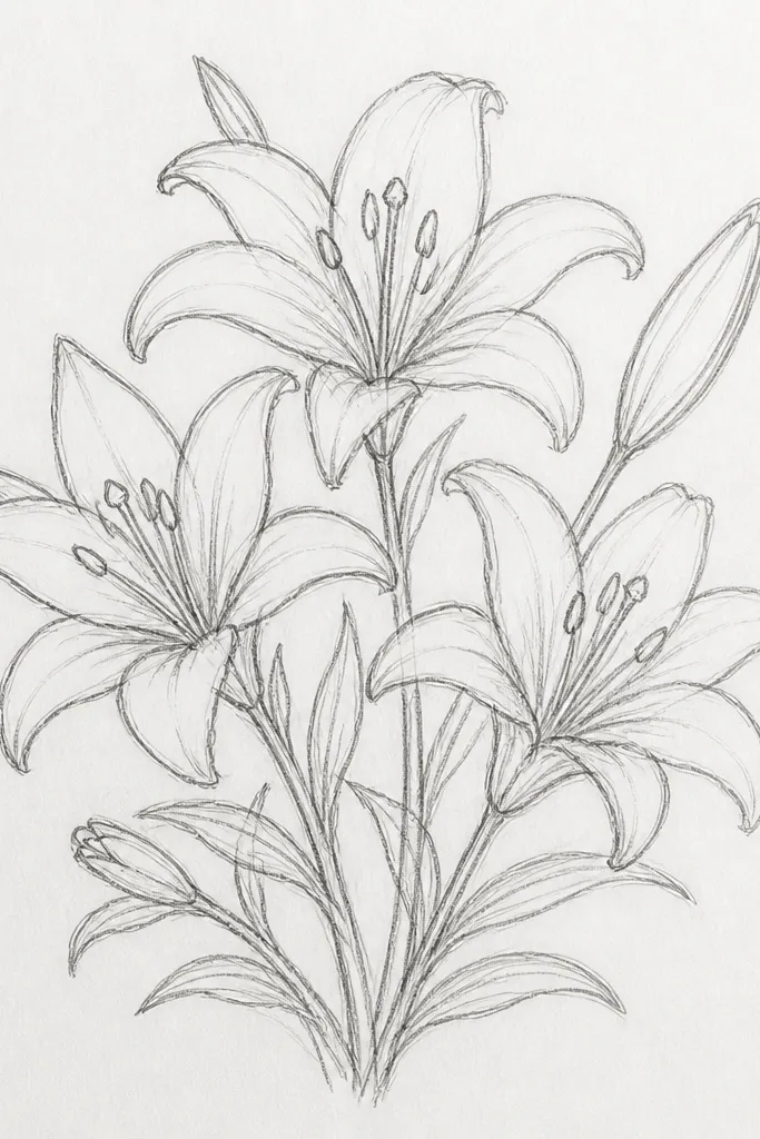
Cluster work looks stylish because it creates movement and depth on a flat surface. I place one lily upright as the anchor, then tilt two around it so petals overlap slightly. The overlapping is intentional: outer petals should overlap by about a quarter of their width, so you can still tell each flower apart. This flatters anyone who likes bold planner covers because it gives you a focal point without filling the entire page. It also looks great on cream paper or off-white notebooks because the orange glows.
Start by blocking three circles for the petal centers — roughly 2.5 inches apart for a standard planner front. Draw the upright lily first, then add the side lilies slightly smaller (about 80% size) so the bouquet feels layered. Shade the petals with light orange wash or watercolor pencil, then add darker freckles only in the throat centers. Finish with thin stems that overlap under the petals, and add one short leaf line under the cluster if you want a touch of realism.
Good to knowKeep the freckle size consistent across all three lilies. Mixed dot sizes make the cluster look messy.
Common mistakeDon’t outline every petal with the same thickness. If everything is thick, the cluster loses depth.
7. Single Side Profile Tiger Lily with Long Veins
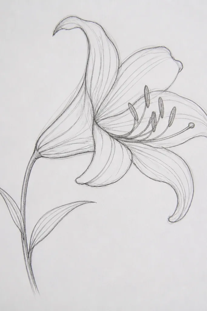
Side profile is stylish because it looks like a botanical sketch, not a generic flower clipart. I stretch the inner veins longer than you’d do for a front-facing lily, which makes the bloom feel delicate and airy. The highlight line down each petal is key — I leave a narrow pale streak by painting around it. This flatters slimmer silhouettes and smaller items like phone cases because it has a vertical rhythm. It also looks great with neutral wardrobes since the orange stays controlled and not too busy.
Start by sketching the lily at about 5 inches tall, leaning slightly to the right. Draw the outer petal in one long curve, then add two inner petals that overlap behind it. Paint orange over the petals but leave a 2 to 3 mm pale streak unpainted along each petal center. Add the throat with a small cluster of dark freckles and a single darker shadow line near the base, then finish with long vein lines in thin marker.
Use a fine brush and paint the highlight streak first by masking with painter’s tape for 5 minutes. It makes the highlight clean.
Don’t add too many freckles in profile. A few dark dots look intentional; a full speckle field looks crowded.
8. Tiger Lily Stencil Look with Hand-Finished Speckles
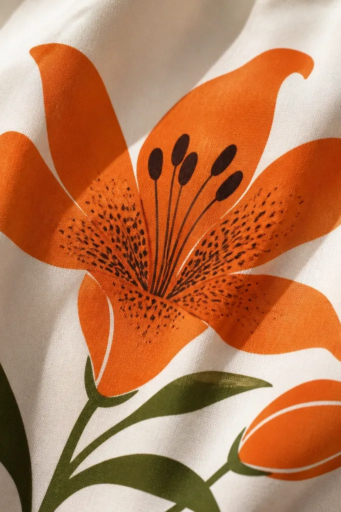
Stencil-style art reads stylish because it has clean edges, but handmade speckles keep it from looking like a mass print. I do solid petal blocks so the design stays graphic, then I add speckles by hand to give it that “someone cared” feel. This works on thrifted denim jackets where you want the flower to look bold from across the room. It flatters people who like statement pieces because the stencil look holds contrast against blue or black fabric. It also hides minor unevenness in fabric texture better than watercolor does.
Start by making or buying a tiger lily stencil and test it on scrap cloth. Tape the stencil down flat, then use a foam dabber to apply orange fabric paint — three light passes beat one thick pass. Let it dry 15 minutes, then remove the stencil carefully while paint is still slightly tacky. Finally, add throat speckles with a small brush and dark brown, then add one thin vein line per petal with a fabric marker.
Warm the stencil with your hands for 30 seconds before applying. It helps the edges sit flat on curved seams.
Don’t overload paint on the first pass. Thick paint bleeds under the stencil edges.
9. Tiger Lily with Faux Embroidery Thread Lines
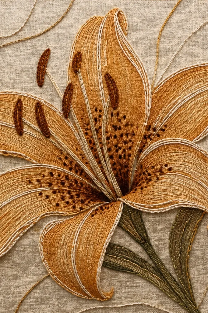
This one looks stylish because it mimics embroidery without requiring a needle. I use a dimensional fabric paint or puff paint for the outline so it sits slightly raised, then I color the petals with light marker or watered-down paint. The raised thread lines catch light and make the flower feel tactile. It’s flattering on bags and aprons because it reads handmade and cozy. If you like cottage vibes but still want a clean look, this design hits the sweet spot.
Start by sketching the tiger lily in pencil, then trace the outer petal edges with off-white dimensional fabric paint. Add a few raised vein lines — only 2 per petal — so the texture doesn’t feel cluttered. Let it cure according to the paint label, usually 24 hours, then fill petals with a light amber wash using a small brush. Finish with a dark throat cluster of dots, and add one tiny stitch mark at the base of the stem.
Good to knowUse a toothpick to drag puff paint into thin lines. It gives you a thread-like finish.
Common mistakeDon’t puff-paint the entire petal surface. Raised blocks look lumpy and cheap.
10. Tiger Lily Mandala Frame for a Wall Print
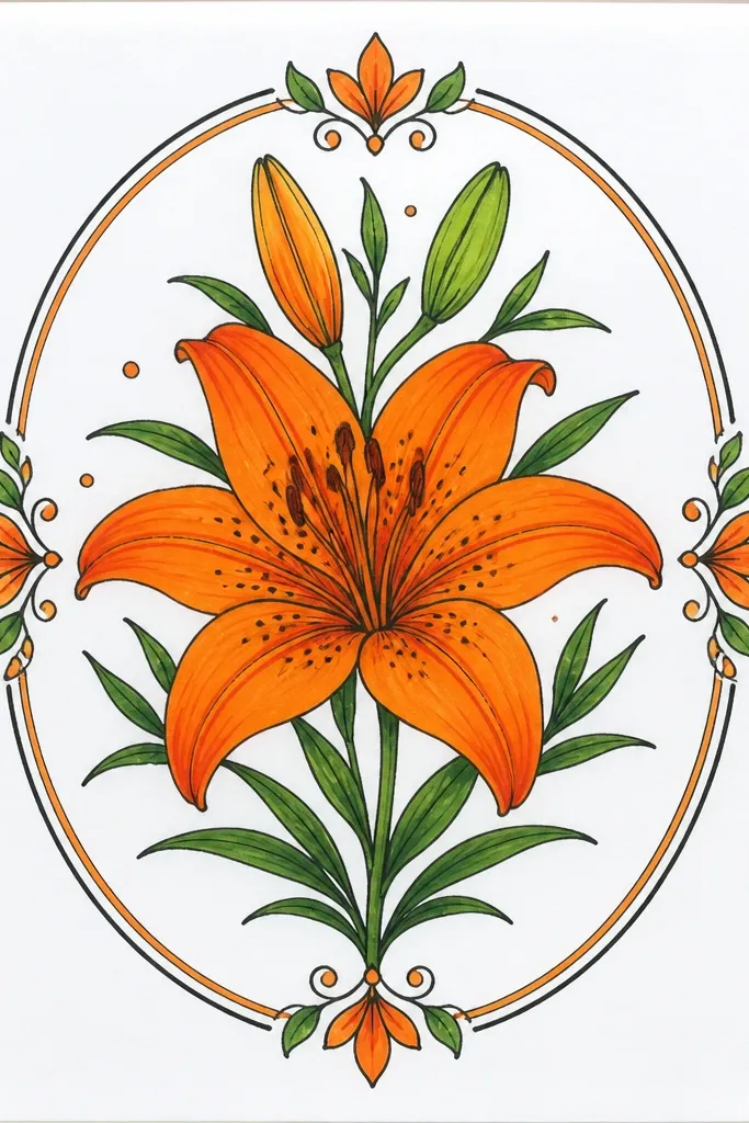
A frame makes the tiger lily feel styled like a poster, not a single drawing. I keep the mandala motifs small and curved, so they echo the petal curves without competing. The center lily stays clean with thick-to-thin outlines, and the frame uses lighter line weight so it doesn’t steal attention. This looks great for warm-toned rooms because orange-brown linework feels cozy. It also flatters people who like symmetrical art since the circular layout feels balanced.
Start by drawing a circle about 8 inches wide, then sketch a tiger lily in the center at about 4 inches tall. Add 12 to 16 small curved motifs around the lily, evenly spaced like a clock face. Use thicker brown lines for the tiger lily outline, then lighter orange lines for the frame motifs. Finally, add freckles in the throat and a few extra small dots in the frame so the whole thing feels connected.
Lightly erase the guide circle after drawing. A clean edge makes the print look intentional.
Don’t put heavy speckling in the frame. The center needs to win.
11. Tiger Lily with Geometric Background Shapes
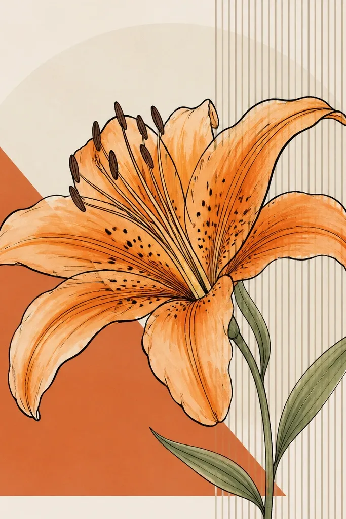
This look feels stylish because the flower sits in graphic space, like a poster design. I keep the tiger lily more detailed than the shapes: the petals get careful speckles and thin veins, while the background stays simple. That contrast makes the flower read instantly. It flatters people who like modern decor because geometric shapes add structure, especially on tote bags and laptop sleeves. In photos, the geometric background makes the orange pop without needing heavy coloring.
Start by drawing background shapes first: a large terracotta triangle in the lower left, a cream circle behind the center, and two thin stripe lines on the right. Then place the tiger lily so it overlaps the shapes — about half the outer petals should cross into the background. Color the petals with light orange wash, then outline the petals and veins in black fineliner. Add throat freckles last, then outline the geometric shapes with a thin black line to unify the design.
Use matte paint or marker for the background. Glossy shapes make the flower look like a sticker.
Don’t add too many background shapes. Three main shapes keep it clean.
12. Tiger Lily on Denim Cuff with Half-Petal Crop
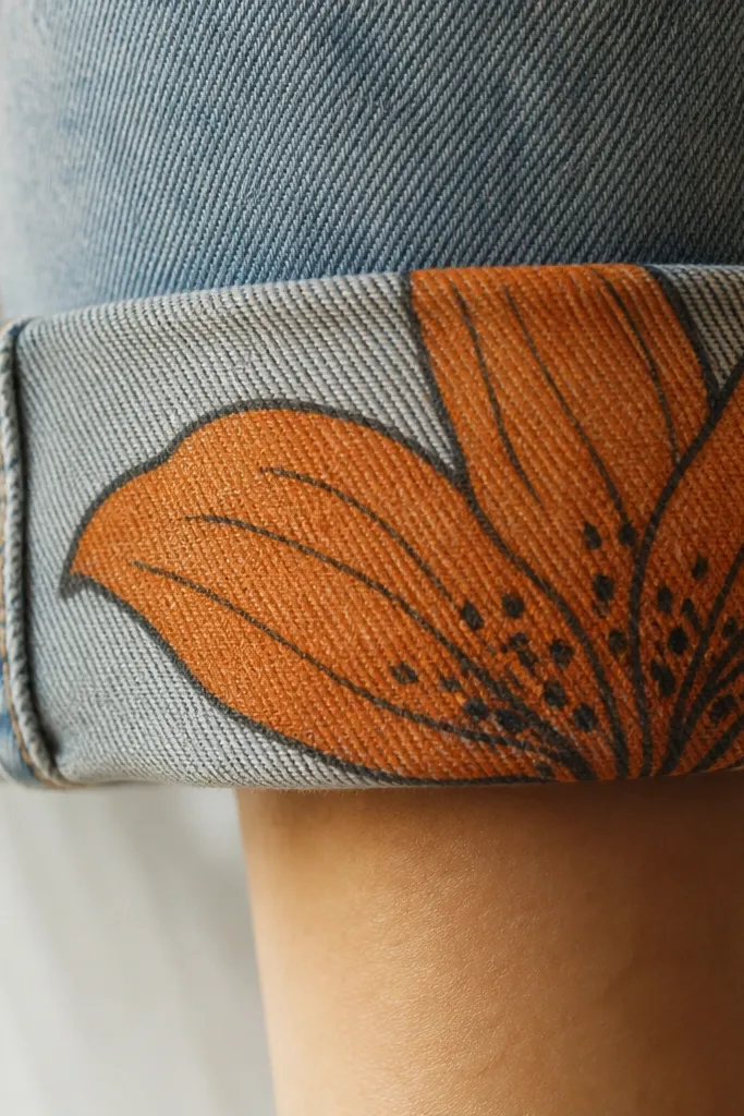
Cropped flowers look stylish because they create a motion blur effect even when the drawing is still. On denim cuffs, a full centered flower can feel too “patchy,” so I crop it so the petals run off the edge like a print design. The throat speckles stay visible, and the stem disappears behind the cuff seam. This flatters short sleeves and rolled cuffs because the design sits where your eye naturally moves. It also looks great on darker wash denim because the orange lines show up without extra background color.
Start by folding the cuff so you see where the seam sits, then sketch the tiger lily so the center lands slightly above the seam line. Draw only the visible half petals, leaving the cut edge clean. Outline with thick fabric marker, then add thin vein lines that start near the throat and fade out at the petal tips. Color the petals with orange paint diluted with a tiny bit of matte medium, then add 15 to 25 freckles at the throat.
Good to knowDo the crop by measuring: leave 1 inch of petal space from the cuff edge so it doesn’t look accidental.
Common mistakeDon’t center the throat perfectly. Slight off-center cropping looks designed, not misplaced.
13. Tiger Lily with Negative Space Petal Highlights
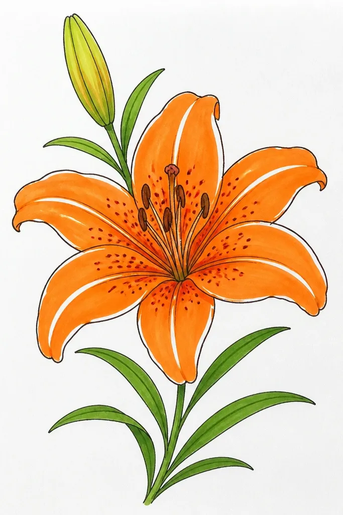
Negative space highlights look stylish because they mimic glossy petals without needing expensive paints. I paint over most of the petal, then carve out a thin pale strip by leaving it blank from the start. The result is a clean “light hit” that makes the drawing look fresher and less flat. This works well on paper and on fabric, but on fabric you need opacity so the base color doesn’t show through. It’s flattering on cream or off-white garments because the highlight feels bright and intentional.
Start by sketching the tiger lily and lightly marking a 2 mm highlight strip down each outer petal. If you’re painting on paper, mask those strips with thin painter’s tape for 10 minutes. If you’re painting on fabric, skip tape and instead paint carefully around the strip, then touch up with a fine brush. Fill petals with orange paint in one direction so the texture stays consistent. Add freckles in the throat using dark brown, then add a light shadow near the base with diluted orange-brown.
Good to knowUse one brush size for the highlights. Switching brushes makes the strips look inconsistent.
Common mistakeDon’t use highlights that are too wide. Thick white stripes make the flower look cartoonish.
14. Tiger Lily with Ink Hatching Veins (No Color Fill)
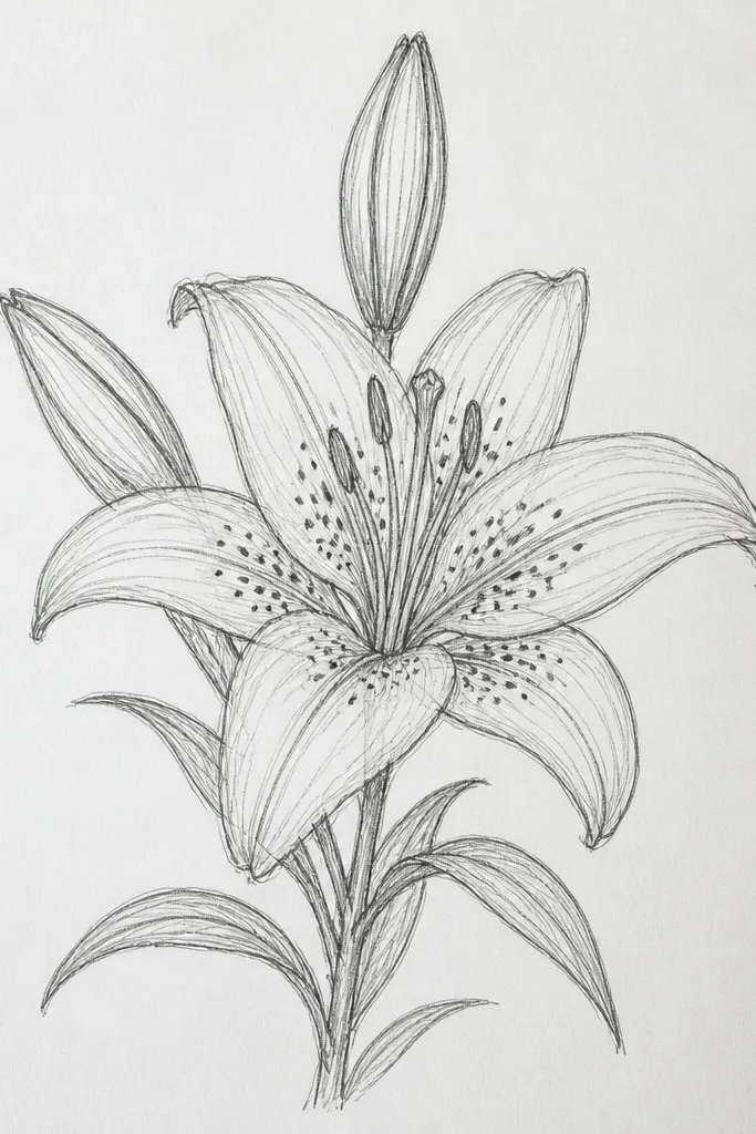
Ink-only versions look stylish because they rely on line and texture instead of color. I build depth by hatching in the petal base and along one side of each vein, leaving the highlight side blank. The throat gets darker freckles so the center has weight, otherwise it looks like a line drawing. This suits minimalist tastes and works on monochrome journals or wrapping paper. It also looks great on light fabrics when you want a subtle botanical detail.
Start by drawing outer petal shapes with a firm fineliner, then add veins as single lines. Shade the petal bases with short hatching lines that angle toward the center. Leave the top half of each petal mostly white so the flower stays airy. Put 20 to 30 freckles in the throat area using a brush pen or fine marker, then add one thicker shadow line where the throat meets the petals.
Good to knowShade only the lower third of each petal. If you hatch the whole petal, it turns into a dark blob.
Common mistakeDon’t make every vein end at the same spot. Natural variation keeps it from looking traced.
15. Tiger Lily with Gold Accent Throat Dots
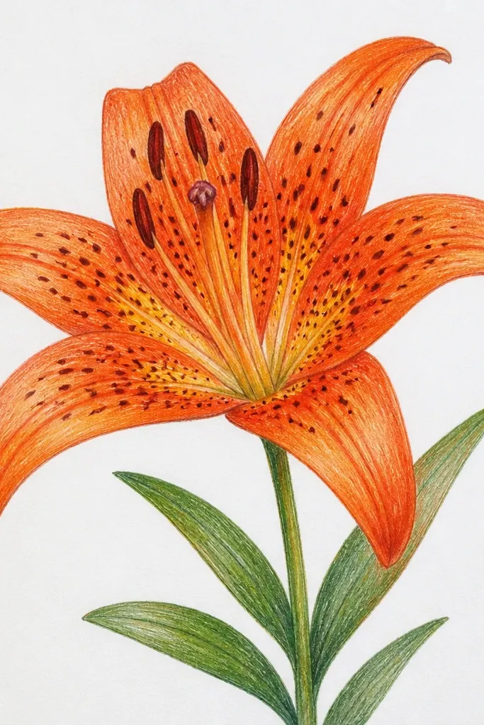
Gold accents look stylish because they add a tiny moment of sparkle without covering the whole piece. I keep the petals orange and the freckles dark brown so the gold dots feel like pollen glints. Use gold only in the throat center and a couple along the inner petal fold, never across the whole flower. This flatters warm skin tones and works for holiday cards or a fancy notebook cover. It also photographs better than full metallic fills because the gold is concentrated.
Start by drawing the lily with orange wash and black outline. Add freckles with dark brown first, then let it dry. Use a metallic gold paint pen to place 6 to 10 small dots on top of the freckles, mostly in the center. Add one thin gold line along a single inner petal fold to pull the eye inward. Seal paper with a light matte fixative if you used paint pens so the gold doesn’t smear.
Good to knowIf your gold pen skips, shake it for 30 seconds and press once on scrap before the drawing.
Common mistakeDon’t outline the whole lily in gold. It looks costume-y instead of refined.
16. Tiger Lily on Kraft Paper with Dark Brown Ink
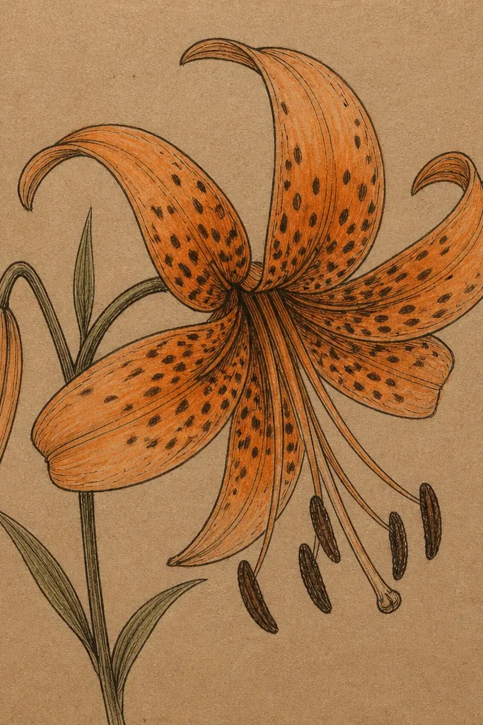
Kraft paper makes tiger lilies look instantly styled because the warm base matches the flower’s color palette. I use dark brown ink instead of black so the piece feels softer and less harsh. The orange petals are light — I don’t try to fully cover the kraft texture, because the texture adds realism. This flatters earthy outfits and looks great on gift tags, envelopes, and upcycled paper labels. It also makes the speckles feel like natural marks rather than printed dots.
Start by sketching the lily lightly, then outline with dark brown fineliner. Add orange watercolor pencil or diluted paint to the petal centers, leaving edges lighter so kraft shows through. Build the throat speckles with a near-black pen, placing them tighter in the center and sparser toward the edges. Add one shadow line at the base of petals with a wash of brown-orange. Let it dry fully, then gently erase any pencil marks so the kraft stays clean.
Good to knowUse a white gel pen only for one highlight — the petal tip. Too much white looks like glitter.
Common mistakeDon’t use bright neon orange on kraft. It looks cheap and fights the paper warmth.
17. Tiger Lily Bouquet Wrap Around a Mason Jar Label
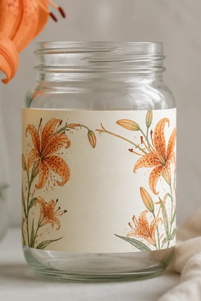
Wrap-around art looks stylish because it follows the object’s shape, not a flat rectangle. I draw the tiger lily so the stems curve like they’re holding the bouquet in place around the jar. The orange and amber petals stay medium-light so the label doesn’t overpower the jar contents. This flatters kitchen styling because it looks cohesive with herbs, tea, and pantry jars. It also makes a simple jar feel like a small designed product.
Start by measuring your jar circumference and cutting label paper with a 1 inch overlap. Sketch a tiger lily near the left edge, then continue the bouquet so the stems curve toward the right edge. Keep the flowers 2.5 to 3 inches tall and tilt them slightly to match the jar curve. Color petals with light orange and add dark speckles in the throat, then draw thin stems in brown or black. Wrap the label, tape the overlap, and seal it with a clear matte spray so moisture doesn’t smear the ink.
Shade the petal bases slightly darker than the tips. It keeps the bouquet readable once it wraps.
Don’t put text over the speckled throat area. It becomes hard to read and looks cluttered.
18. Tiger Lily Tattoo-Style Flash on a Thrift Tee
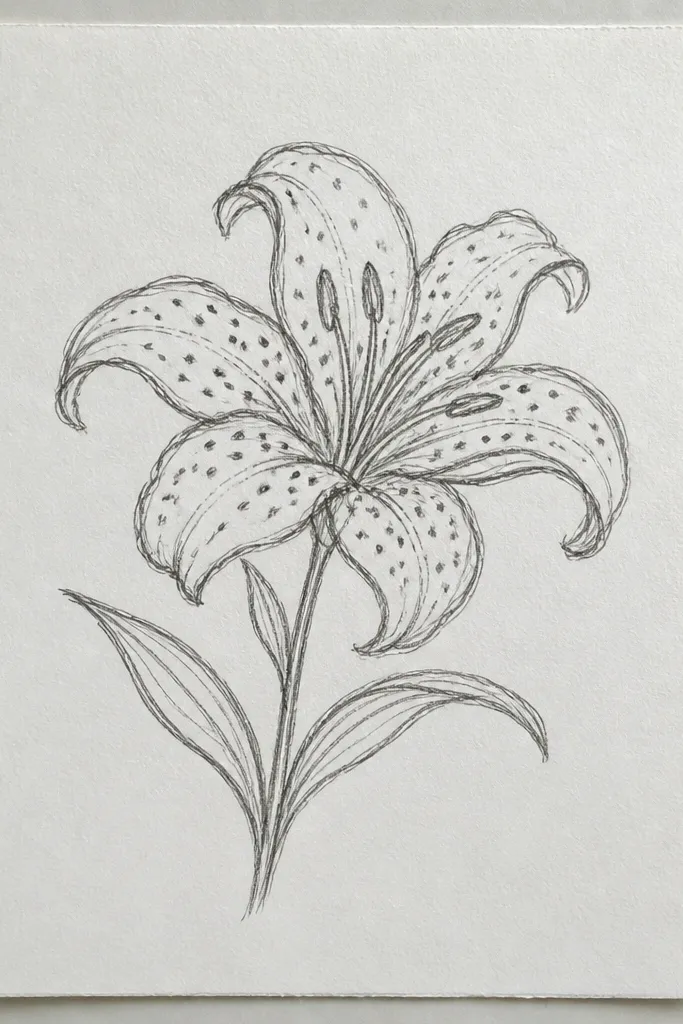
Tattoo-style flash looks stylish because it has confident outlines and controlled shading. I use stippling in the petal base instead of lots of color, which makes the flower crisp on cotton. The throat gets “stripe-like” marks — short dashes that suggest pattern without turning into full speckles. This flatters medium to darker shirt colors because black ink stands out. It also looks good on people who like graphic art rather than soft watercolor.
Start by choosing a shirt color that contrasts — I like heather grey or black. Sketch the tiger lily on the chest with washable marker, about 9 inches tall. Outline with a fabric-safe black marker, then stipple the petal bases with small dots until you see a smooth gradient. Add throat marks with short horizontal dashes, then add one thin stem line. Let it dry, then heat set if your marker instructions say so.
Good to knowDo stippling in clusters, not single dots everywhere. Clusters look intentional and faster.
Common mistakeDon’t use watery paint on cotton for this style. It spreads and kills the tattoo sharpness.
19. Tiger Lily with Split-Complement Colors (Orange + Magenta)
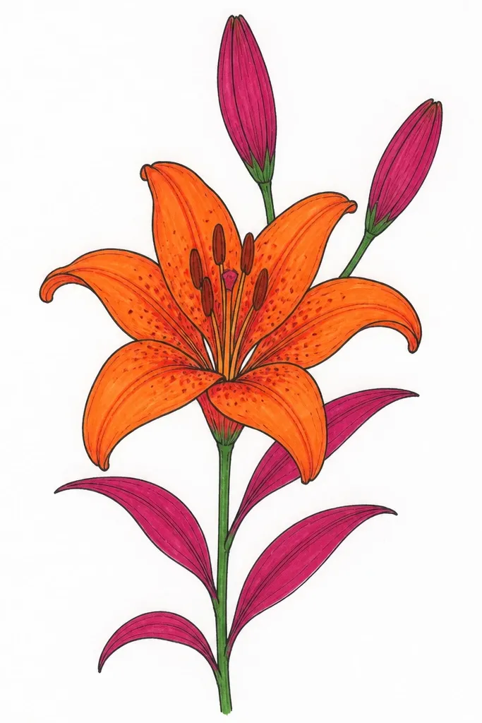
This version looks stylish because it adds a second color that makes the orange feel richer without turning it into a different flower. I keep the outer petals mostly orange, then add magenta shading only in the deepest folds and near the throat rim. The outline stays warm brown, not cool black, so the whole thing feels cohesive. It flatters warm and neutral skin tones because magenta brings a rosy warmth that looks good against everyday outfits. I’ve used this on a canvas tote and got compliments because it looks like “designer stationery” rather than a craft project.
Start by sketching the petals and veins, then outline with warm brown fineliner or paint marker. Paint outer petals with orange wash, then mix a small amount of magenta and dilute it so it looks like shadow, not paint splatter. Apply magenta only at the inner folds and the base near the throat — keep it under 20% of the petal area. Add throat freckles with dark brown, and use a thin orange-brown line for the veins. Let it dry, then add one tiny highlight dot at the petal tip.
Good to knowUse magenta sparingly. If you see it across the whole petal, it stops reading as shadow.
Common mistakeDon’t mix magenta directly into the orange everywhere. The result looks like muddy burnt orange.
20. Tiger Lily with Repeating Petal Scallop Border
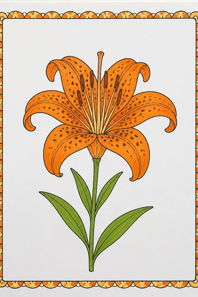
Borders make tiger lily drawings look styled like stationery or a wrapping label. I use a scalloped border made from simplified petal shapes, and I keep the border lighter than the center so it doesn’t steal focus. The center lily gets the full throat speckle detail, while the border stays line-only or lightly colored. This flatters gift wrapping and notebook covers because it turns one flower into a complete design. It also looks clean on paper and fabric because the border gives structure.
Start by drawing a square or rectangle frame around your design, leaving 0.5 inch margin. Create the scallop border by repeating half-petal bumps around each side — 10 to 14 scallops per edge depending on size. Draw the tiger lily in the center about 4 inches tall with thick-to-thin outline. Shade petals lightly orange, then add freckles in the throat. Finally, add a thin line connecting the border scallops to the lily with two or three short arcs so the design feels unified.
Keep the border line weight 1 step thinner than the lily outline. That contrast is what makes it look “designed.”
Don’t fill the border with dense color. Solid borders look like stickers.
21. Tiger Lily Mini Drawing for Keychains and Charms
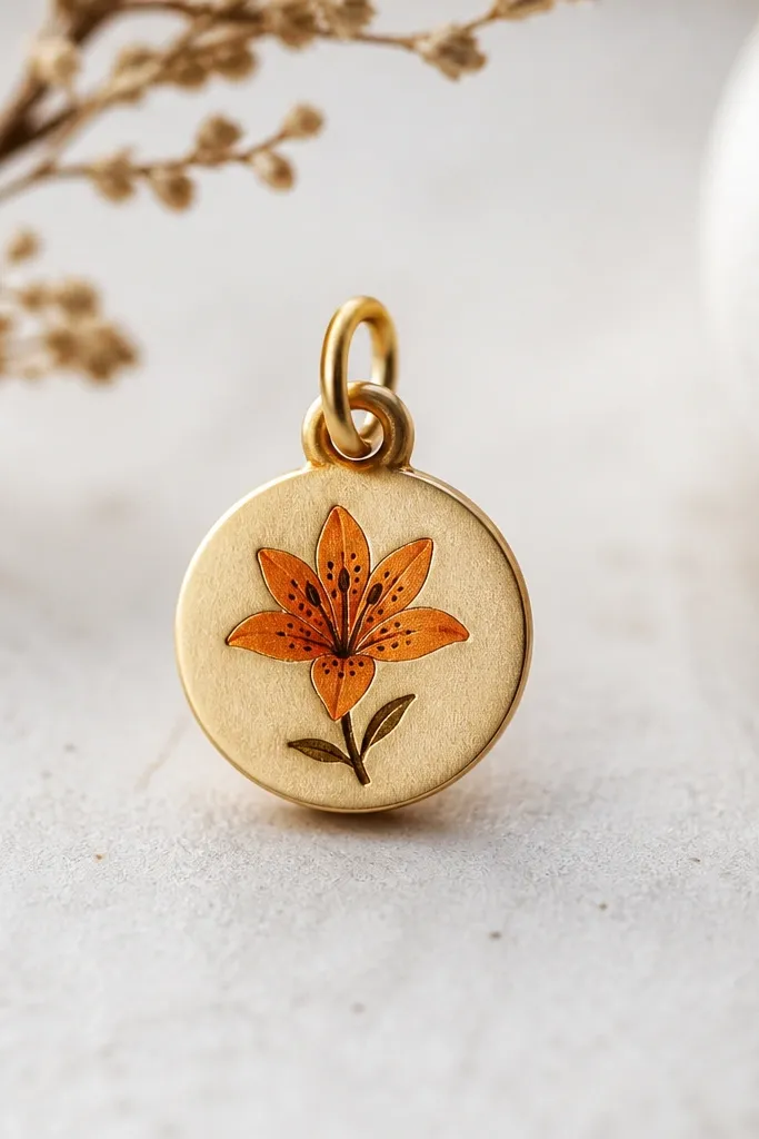
Mini art is stylish when it stays readable at a glance. I simplify the tiger lily into fewer lines: three outer petals, one inner fold, and the throat speckles as the only dense detail. The color is limited to orange with dark brown speckles so it doesn’t blur at small size. This flatters people who like accessories because it looks cute without looking childish. On keychains, it also survives wear better because the design is concentrated.
Start with a charm base or tag about 1.25 inches wide. Sketch the lily center at 0.9 inches tall so it fits with a small margin. Outline with a fine fabric marker or permanent marker, then color petals with a light orange paint pen. Add 10 to 16 throat freckles and 3 tiny inner fold dots for depth. Finish by sealing with a clear matte sealant so the dots don’t smear when you handle it.
Use dot-based shading, not hatching, for anything under 2 inches. It stays crisp.
Don’t add full vein detail at tiny scale. It turns into scribbles.
22. Tiger Lily with Leafy Side Vines and One Accent Leaf
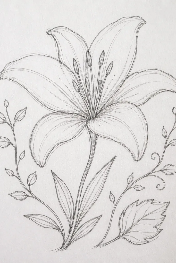
Vines make tiger lilies look styled because they frame the flower and pull your eye around the page. I keep the vines thin and slightly curved, then add exactly one larger leaf so the composition has a clear secondary focal point. The leaf is drawn with a simple vein line and a lighter edge tone, so it doesn’t look heavy. This flatters casual outfits because the linework feels botanical and wearable, not like a formal print. I’ve used this on tote sides where you need something that looks good even when it’s partially hidden.
Start by sketching the tiger lily center, then draw two thin vine lines starting from the stem base, curving outward like parentheses. Add one accent leaf on one side only, about the same height as the lily throat, and draw a single center vein with two side lines. Outline petals with thick line work, then add thin veins and throat freckles. Color petals orange with a light wash, keeping vines and leaf outlines in warm brown. Let everything dry, then go back with a fine marker to sharpen the freckles.
If the design feels crowded, remove one vine instead of adding more space. One vine is easier to balance.
Don’t add multiple large leaves. Two big leaves make it look like a generic garden clipart.
23. Tiger Lily Cutout Collage with Painted Edges
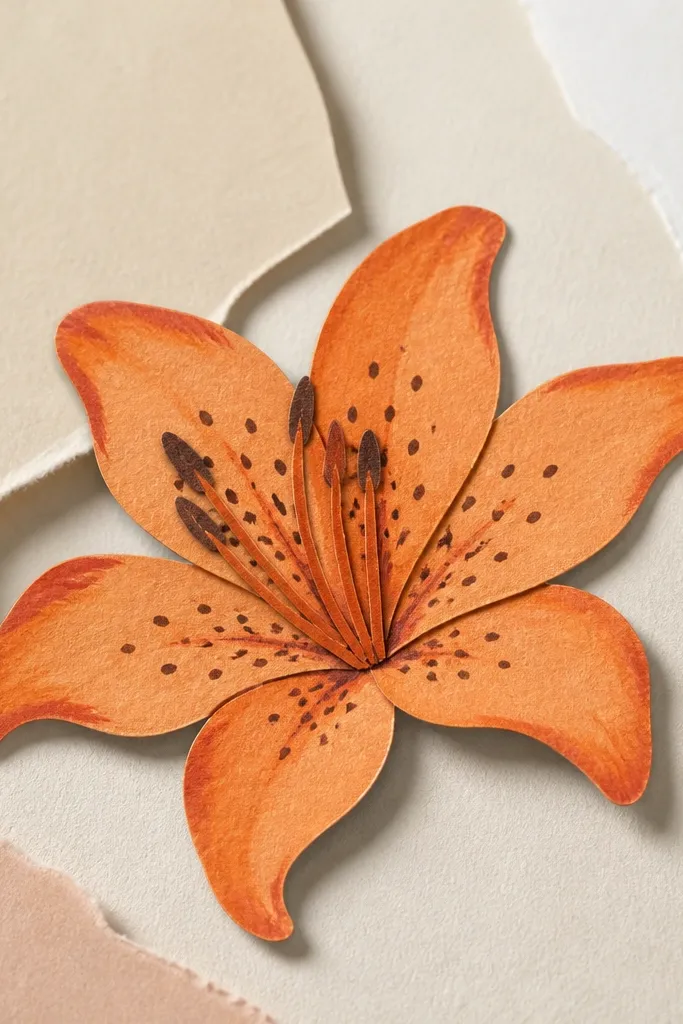
Collage looks stylish because you get texture and dimension without complicated shading. I cut the tiger lily shape from cardstock, then paint the petals and freckles before layering it onto a background paper. The edges get a darker orange brush stroke so the cutout looks like it belongs there. This flatters scrapbooking, greeting cards, and upcycled journal covers because it’s tactile and forgiving. It also hides small drawing imperfections because the layered edges create a clean boundary.
Start by drawing a tiger lily on cardstock and cutting it out carefully, keeping the petal tips intact. Paint the petals orange with a mid-tone base, then add a slightly darker orange around the petal base and throat rim. Add freckles with dark brown and keep them concentrated in the throat. Glue the cutout onto a contrasting background (cream or light tan looks best), then paint a thin shadow edge under the petals with diluted orange-brown. Let the glue set so the layers don’t warp.
Good to knowUse a craft knife and cut with a fresh blade. Dull blades tear petal edges and ruin the crisp collage look.
Common mistakeDon’t glue the cutout flat with thick glue blobs. It makes bubbles that show through paint.
24. Tiger Lily on Upcycled Cardboard with Chalky Pastel Fill
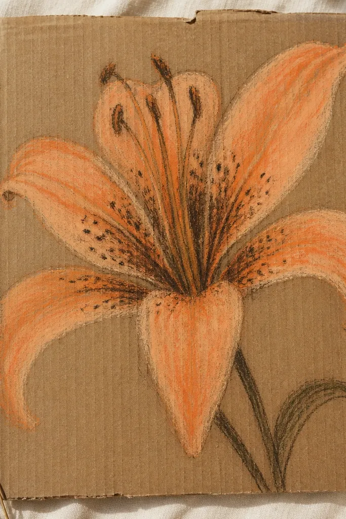
Cardboard gives a rough, real-life texture, and chalky pastel fills look stylish because they match that handmade surface. I use charcoal-brown for speckles so the dots look matte and natural, not glossy. The petals get pastel orange and peach in light layers, which prevents the design from looking too heavy. This flatters rustic decor and makes holiday gift packaging feel personal. It also works when you want a quick large piece without needing watercolor paper quality.
Start by sanding the cardboard lightly so pastel sticks evenly, then sketch the tiger lily with a light pencil. Apply pastel orange first, then blend a peach layer near the petal tips using a finger or blending stump. Add throat speckles with charcoal pencil, pressing darker in the center and lighter at the edges. Outline petals with a charcoal pencil line, then fix with a light spray so it doesn’t rub off. Mount it onto a sturdier backing or frame it with a simple clip frame.
Use 2 to 3 thin pastel layers instead of one thick layer. Thick pastel smears when you touch it.
Don’t use liquid paint straight on cardboard. It soaks unevenly and looks patchy.
25. Tiger Lily with Brush-Pen Splash Background Dots
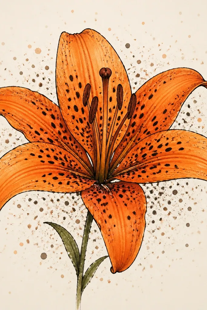
Splash dots make the flower feel lively and stylized, like it’s part of a print series. I keep the splash background lighter than the flower so it doesn’t compete with the petals. The tiger lily stays crisp with thick outline and thin veins, while the background is airy speckling created with a brush pen. This flatters people who like energetic art but still want the flower to remain the main subject. It also looks great on notebooks and covers because the scattered dots hide minor surface texture.
Start by drawing the tiger lily center about 6 inches tall and outline it in black brush pen. Add orange fill and throat freckles, then let it dry. For the background, dip the brush pen in diluted ink and flick from above the page, keeping the densest splashes near the flower edges. Add a second, lighter pass by diluting ink more and flicking farther away so the dots fade outward. Let everything dry flat so splashes don’t smear into the petals.
Good to knowPractice flicking on scrap first. Your wrist angle decides whether the dots become circles or ugly streaks.
Common mistakeDon’t flick directly over the throat speckles. The splashes can muddy the center.