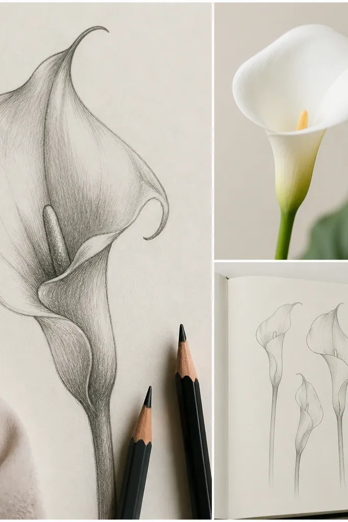
1. Single Calla Spathe Pinch Fold
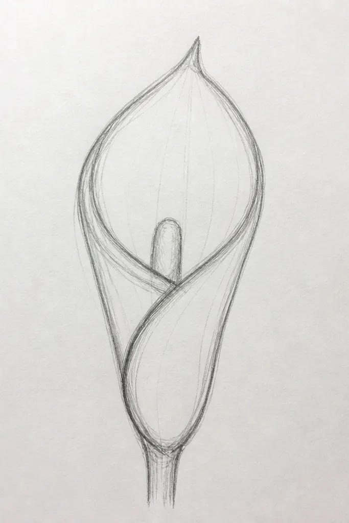
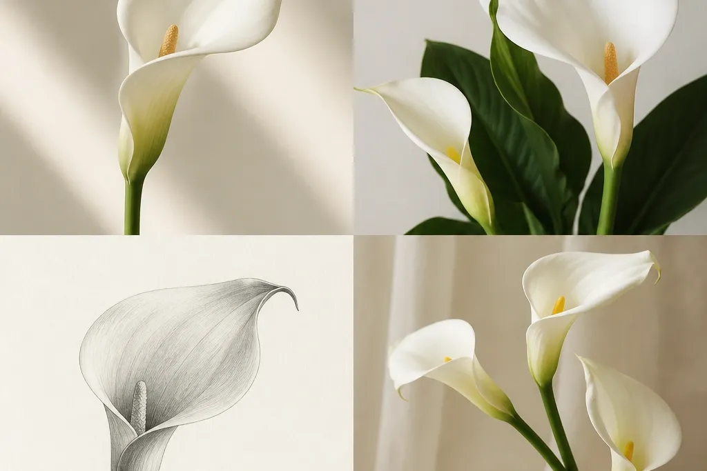
This is the calla lily sketch I reach for when I need something that looks clean in one sitting. Draw the spathe as one tall, smooth bean, then create a pinch crease on the left so the flower looks like it’s turning. The spadix should be a narrow curve that starts slightly lower than the spathe’s top and ends just past the fold line. I keep shading minimal — a soft gray under the crease and a faint shadow where the stem meets the base. It flatters small spaces because it stays tall and simple, and it works for both warm and cool paper tones.
Start by lightly sketching a vertical oval guide, then taper the bottom slightly so it feels anchored. Add the spathe outline in one continuous line: round the right edge, then pinch the left edge inward to form the fold crease. Draw the spadix as a thin S-curve inside the spathe, leaving a small white gap between the spadix and the spathe outline. Shade with a 6B only under the crease and along the inner edge of the fold, then smudge lightly with a paper stump if you want a softer look. Finish with one confident stem line and a single leaf vein line on the bottom leaf nub.
Good to knowIf your fold looks too symmetrical, make the pinch crease a hair closer to the left edge — that tiny imbalance makes it look real.
Common mistakeAvoid outlining the fold with two separate lines; that makes it look like a cartoon seam instead of a smooth turn.
2. Side View Calla Like a Bow
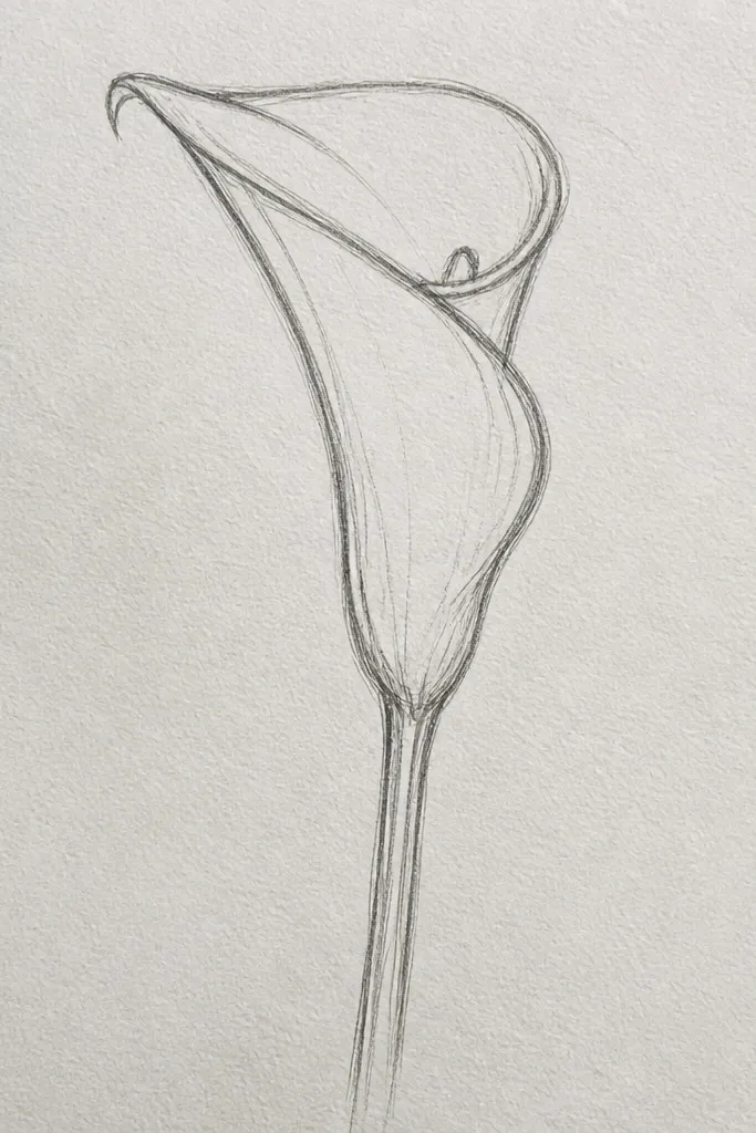
Side-view calla lilies look more dimensional because the fold faces sideways instead of straight-on. I draw the spathe like a ribbon bow: one edge is thicker and rounded, the other edge is flatter and slightly hidden. The spadix sits more behind the fold, so you only see part of it — that simple occlusion instantly makes the sketch feel 3D. I shade along the “thicker” edge with a gradient that goes from light to medium gray. This idea works great if you’re drawing for a bookmark or a narrow label because the composition naturally fits vertical edges.
Start with a curved guide line for the stem in an S shape. Sketch the spathe as a long curved ribbon: draw the outer edge first as a smooth arc, then bring the inner edge back toward it and flatten it near the fold. Add the spadix as a thin spike that starts under the fold and peeks out on the right side, leaving a white highlight line. Shade under the fold crease and along the outer edge where the ribbon would catch light. Add one leaf on the opposite side of the stem so the whole drawing balances left and right.
Good to knowUse a ruler only for the stem guide, not for the flower lines — free curves make it look botanical, not technical.
Common mistakeDon’t draw the spadix fully visible in side view; hiding part of it is what sells the angle.
3. Three Callas in a Tight Bouquet
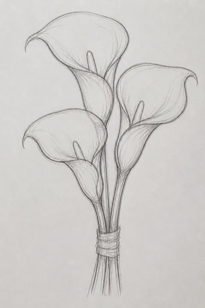
A tight bouquet makes calla lily sketches look intentional even if your line confidence is still building. I place one calla straight up as the anchor, then angle the other two so their spathes overlap. Overlap is the magic — it tells the viewer which flower is closer. I keep the spadix lines thinner for the flowers in the back and slightly darker for the front one. If you’re making a repurposed card or a sticker sheet, this layout gives you a focal cluster without needing a complex background.
Start by drawing three stem lines that converge near the bottom, but keep them separate until the last third of the page. Sketch the front spathe first as a folded bean, then add the left and right spathes as partial beans that tuck behind the front one. Draw the spadix for each flower: front spadix is longest, back spadix is shorter and slightly tucked. Shade only the overlap zones: add a soft gray under each fold where it disappears behind another spathe. Finish with two or three leaf tips behind the bouquet, using one clean center vein line each.
Keep spacing tight: leave about one “spathe width” between flowers so they overlap naturally instead of floating.
Avoid equal heights for all three callas; the bouquet looks stiff when every spathe top hits the same level.
4. Calla Lily Corner Frame on Kraft Paper
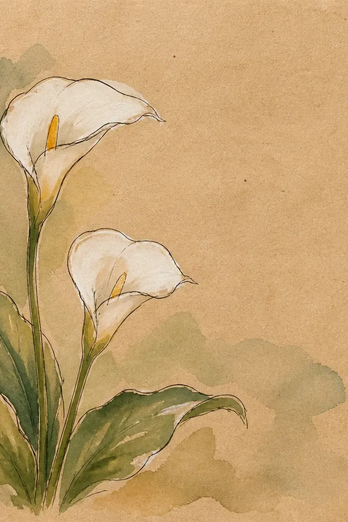
Corner frames are how I make a sketch feel like stationery, not scrap paper. Kraft paper gives the spathe a warm shadow by itself, so you only need light graphite and a few darker spots under the fold. I place the calla so the stem hugs the top and right edges, which creates a clean visual pathway. The spathe stays mostly unshaded except for one crease shadow, and the leaf marks are tiny, not detailed. This works especially well for gift tags and upcycled paper labels because the drawing already “reads” as a design element.
Start by lightly drawing a thin border line about 6-8 mm from the top and right edges. Place the calla so the spathe top sits about 2 cm from the corner. Sketch the spathe with a single folded bean outline, then add the spadix inside as a thin curve. Shade with a 4B under the fold crease only, and leave the rest of the spathe mostly light. Add two small leaf marks along the border line and one short stem line that follows the top edge before dropping down the right side.
Use a kneaded eraser to lift a highlight strip on the spathe — kraft paper loves that little bright edge.
Don’t shade the entire spathe on kraft; it turns gray-brown and loses the airy look.
5. Calla Lily One-Line Continuous Sketch
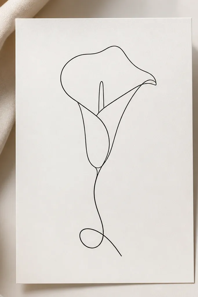
One-line calla sketches look modern and graphic, and they’re also a stress test for your control. I use a fineliner and let the line thickness vary by pressure: lighter on the outer spathe edge, heavier under the fold. The spadix line stays thin and slightly curved, so it doesn’t overpower the spathe. This style is great for repurposing because it prints cleanly and looks good even when you reduce it for small labels. It also flatters darker paper since the line does all the work.
Start at the base of the stem and draw a smooth stem curve down, then up toward the spathe. Without lifting your pen, outline the spathe as a tall loop with a pinch crease on one side. Bring the line back inside to form the spadix spike, then continue to the spathe top. Add a tiny leaf loop at the bottom by turning the line outward and back. Vary pressure: press a bit more under the fold crease so that area reads as shadow without any shading.
Good to knowPractice the spathe pinch once on scrap paper; the crease position is what makes one-line sketches look like calla lilies.
Common mistakeAvoid making the spathe too round; calla lilies have a tapered bottom and a distinct fold pinch.
6. Watercolor Wash Spathe with Pencil Vein
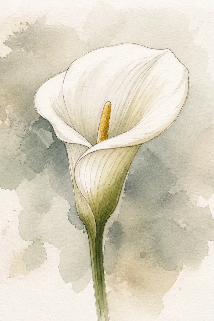
This one looks expensive because the wash does the soft volume while the pencil adds structure. I start with a light pencil outline, then I paint a very thin watercolor wash over the spathe, keeping the highlight area almost untouched. For the spadix, I add a light warm yellow tint near the top and keep the rest white. The stem gets a gray-green wash so it doesn’t compete with the flower. This is flattering for anyone who wants their sketches to look like “real art” without heavy shading.
Sketch the spathe as a tall folded bean and keep the lines light enough to erase later. Wet the spathe area lightly with clean water, then paint a thin wash of cool gray-lavender, leaving a narrow highlight strip white. Add a tiny warm yellow touch to the spadix top, then pull a little color downward with the tip of your brush. For the stem, mix gray with a little green and paint it as a single smooth stroke. Finish by drawing one pencil vein line down the spathe lightly so the fold still has structure.
Good to knowLet each wash dry before touching it again; watercolor blooms ruin the crisp fold look.
Common mistakeDon’t outline in dark pencil after you paint — it makes the flower look dirty.
7. Calla Lily Bud Emerging from a Fold
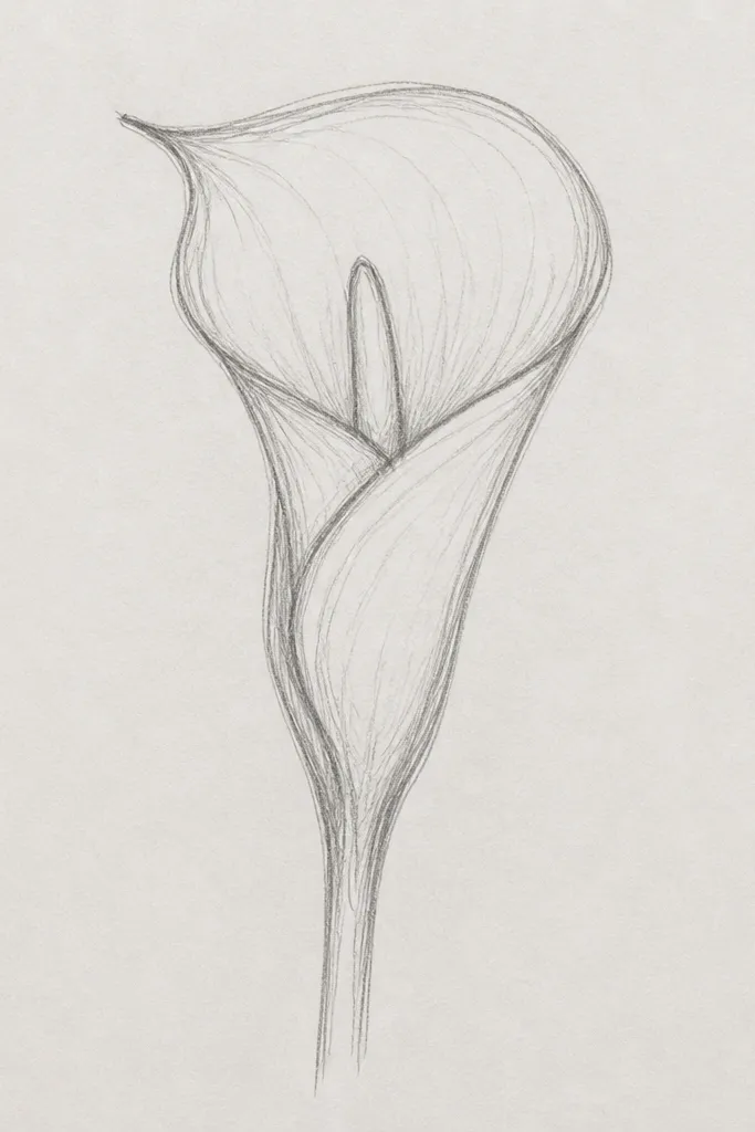
Buds are my favorite calla sketches for variety, because they let you simplify the structure while still looking botanical. Instead of a fully open spathe, you draw a tighter fold like a curtain — the spadix only peeks out. I shade the inside of the fold with a narrow dark strip, and I keep the outer edge lighter. This style is great for upcycling because it fits on small surfaces like jar labels and narrow bookmarks without needing lots of space. It also looks good for darker ink work because the fold does the heavy lifting.
Start with a short stem line and a small base leaf nub. Draw the spathe as a tall teardrop that is mostly closed, with the fold pinch closer to the center. Add the spadix as a thin curve that only shows a small portion inside the fold. Shade inside the fold: press a 4B lightly right where the opening would be, then fade outward. Finish with one small leaf behind the bud using a short curved line and a single vein.
Good to knowKeep the fold pinch sharper than you think — buds look best when the opening looks tight.
Common mistakeAvoid drawing a full open spathe; a bud needs the inside to feel darker and more tucked.
8. Calla Lily with Bold Marker Shadow
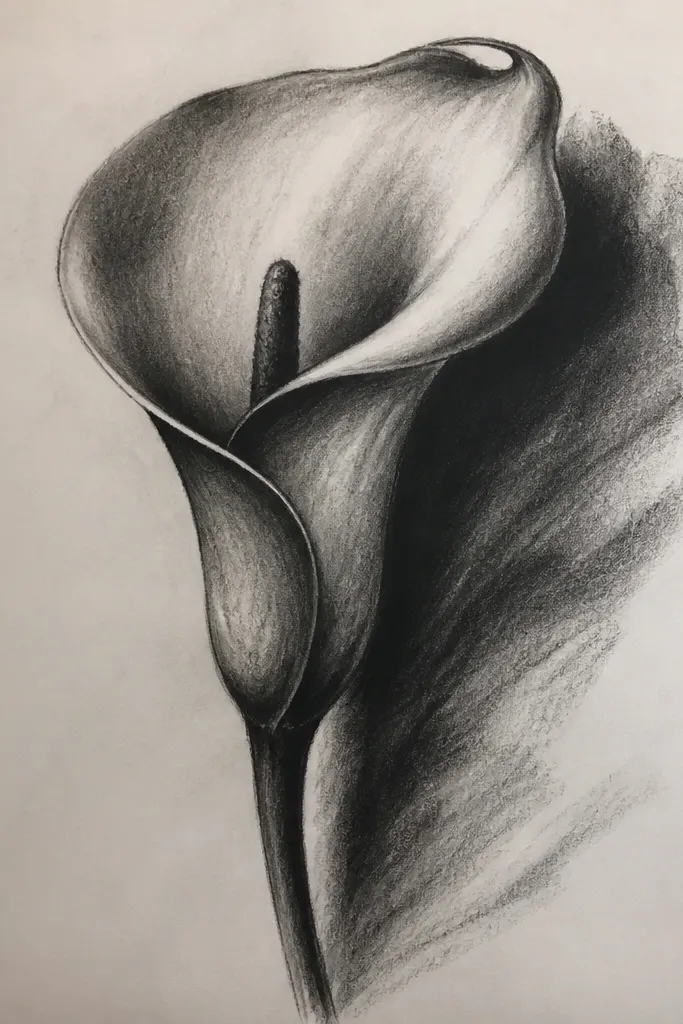
If you want a sketch that pops on paper scraps or printed backgrounds, this is the one. The trick is using marker only for the shadow block under the fold, not for the whole flower. I outline the spathe in pencil, then fill one shadow shape with a dark neutral marker so it looks graphic. The spadix gets a light yellow tint so it reads as the inner spike without adding complexity. This works well for people who struggle with graphite shading — your shadow becomes a controlled shape, not a smudgy blur.
Sketch the spathe as a folded bean and lightly indicate the crease line. Outline the spadix as a thin spike inside the spathe. With pencil, mark the shadow region: it should sit under the fold crease and follow the inner curve for about a third of the spathe height. Color that region with a dark neutral marker (cool gray or black-brown), staying inside your pencil marks. Add a light yellow marker touch to the spadix top, then leave the rest white. Finish by darkening the stem line slightly so the flower has a base.
Good to knowUse a scrap test strip to check marker bleed before you commit to the paper.
Common mistakeDon’t marker-fill the spathe edges; that makes it look flat and cartoonish.
9. Calla Lily and Two Leaves for Balance
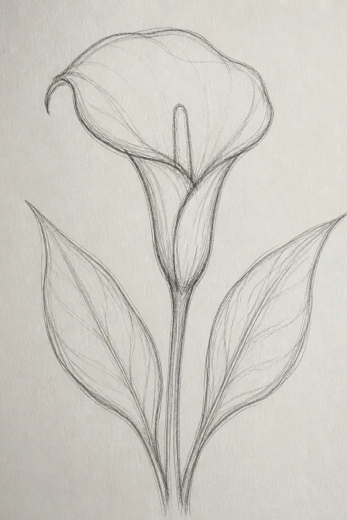
A calla with leaves looks finished because the plant structure feels complete. I keep the spathe simple and let the leaves add motion. The leaves should sit at different heights — one closer to the flower, one lower — so the composition doesn’t feel symmetrical. I shade the leaf underside lightly so the calla still stays the focal point. This is flattering on wide paper because the leaves use the space that the single tall flower leaves empty.
Start with the stem line down the center and sketch the spathe at the top as a folded bean. Place the first leaf to the left at mid-height, drawing it as a curved teardrop with a strong center vein line. Add the second leaf on the right, slightly behind the stem, and keep its outline lighter to suggest depth. Shade under the spathe fold with a small graphite patch, then add a soft gray line on the lower edge of each leaf. Keep leaf shading minimal: one darker line on the underside edge is enough.
Offset your leaves by 1-2 cm vertically; it instantly makes the drawing feel grown, not arranged.
Avoid drawing two leaves identical in size and angle; that symmetry kills the plant feel.
10. Calla Lily Minimal Branch Silhouette
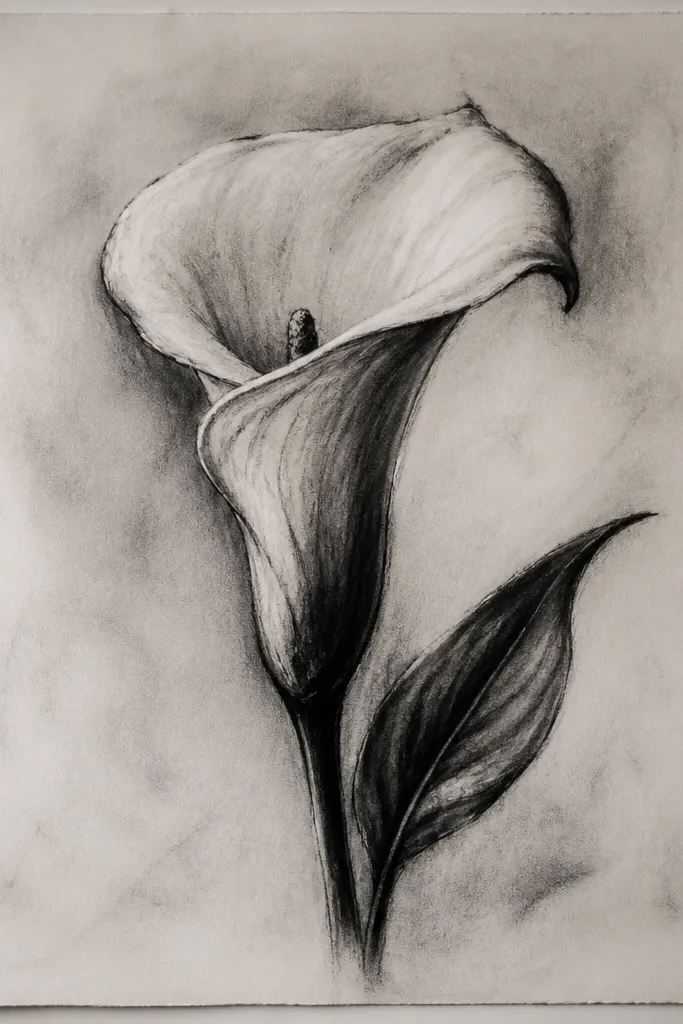
Silhouette-style calla drawings look bold and clean, and they’re easier than you think once you commit to one highlight line. I fill the spathe shape solid, then carve out a narrow white highlight where the fold catches light. The spadix is a thin white line or tiny gap inside the filled shape. This style works great for upcycled packaging because it prints sharply and reads from a distance. It also looks good on darker paper, since you don’t need to build gradients.
Sketch the spathe outline lightly first so you know your proportions. Fill the entire spathe shape with black ink or a fine brush pen, leaving a narrow highlight strip unfilled along the fold edge. Add the spadix as a small internal gap or a thin white line inside the spathe. Draw the stem as a single line that branches near the bottom into two small leaf tips. Finish by adding one short vein line on one leaf using a lighter ink or leaving it unfilled.
Good to knowUse a white gel pen to restore the highlight after drying; it makes the fold look crisp.
Common mistakeAvoid heavy stippling inside the silhouette; keep it flat so the calla stays graphic.
11. Calla Lily in a Circle Stamp Layout
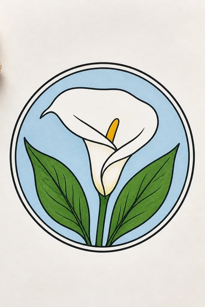
Circle layouts make sketches feel like a stamp, sticker, or label even when the drawing is simple. I design the calla to follow the circle’s curvature so it looks like it was meant to be there. The spathe sits in the center, and the stem curves slightly to echo the ring. I add a few tiny dots and two leaf marks to balance the page without clutter. This is perfect for repurposing because you can print or trace it onto small packaging pieces.
Draw a circle about 5-7 cm across, then lightly mark the center point. Place the calla spathe so its base sits near the circle’s inner lower edge and the top stays near the upper inner edge. Sketch the spathe as a folded bean and draw the spadix as a thin spike inside. Curve the stem so it lightly touches or nearly touches the circle’s inner edge, then taper it as it approaches the base. Add two tiny leaf marks on opposite sides and 6-10 small dots around the spathe to fill negative space.
Good to knowKeep the dots small — pencil dots the size of a pinhead read better than bigger decorative bubbles.
Common mistakeDon’t crowd the circle edges; leave a consistent margin so it still feels like a stamp.
12. Calla Lily with Patterned Background Lines
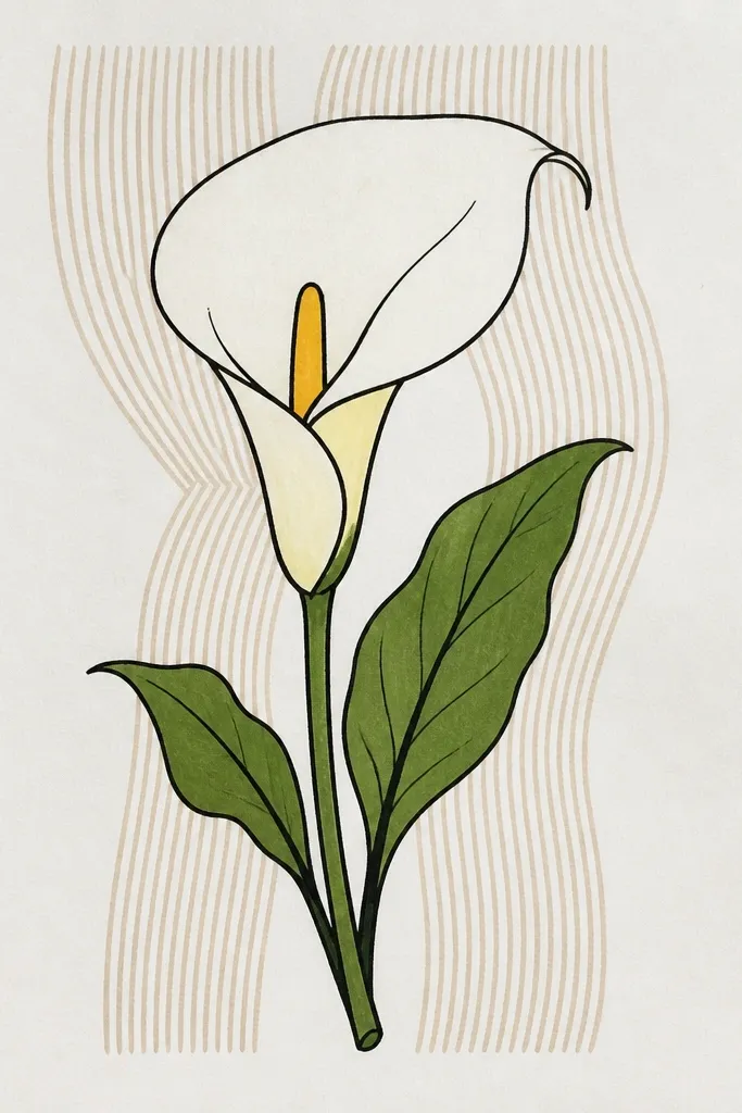
A patterned background makes your sketch look finished without adding more flower detail. I use diagonal lines because they create gentle movement and help the spathe feel like it sits in front of the paper. The calla stays simple: one fold crease shadow and a slim stem shadow. I keep the pattern light and fade it where the flower overlaps, so the flower remains the focal point. This idea works well for framing because the background gives the eye something to do.
Sketch the calla spathe first, then lightly block in the spadix and stem. Draw a set of diagonal pencil lines across the page, but keep them faint (HB pressure). Use an eraser to lighten the lines behind the spathe so the flower looks layered. Add your crease shadow under the fold with a 4B, and keep the rest of the spathe mostly light. Finally, darken the stem line slightly so it connects to the background pattern.
Good to knowErase the background lines with a kneaded eraser in short strokes; it keeps the fade natural.
Common mistakeDon’t draw the background lines too dark; if the pattern is darker than the crease shadow, the flower loses.
13. Calla Lily Border with Repeating Mini Flowers
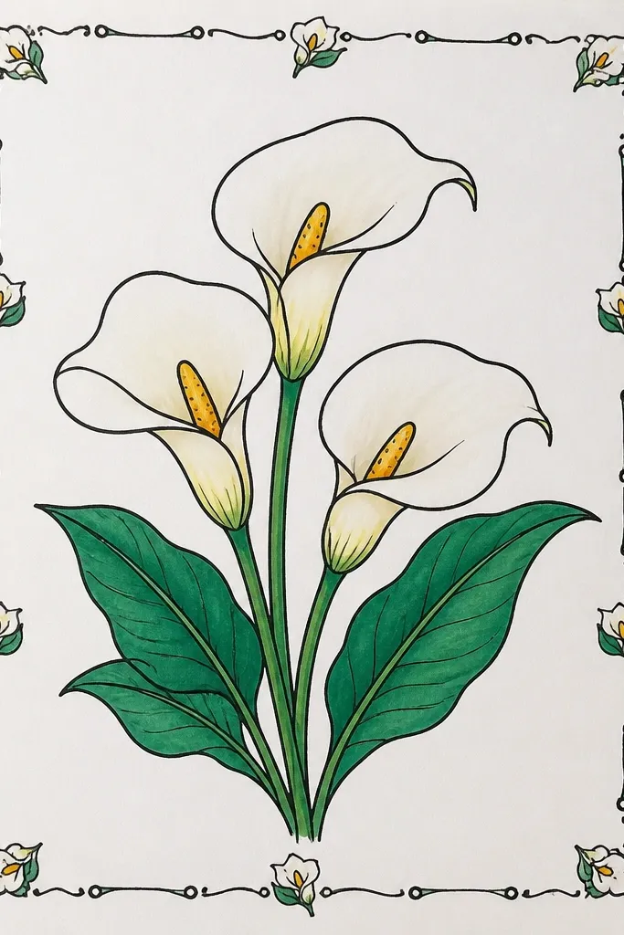
Repeating mini callas turn your sketch into a design sheet, which is exactly what I want for upcycling labels and wrapping paper. Each mini flower is small enough that you don’t need full shading — the fold crease is enough. I alternate the tilt direction so the border looks alive, not stamped. The leaf marks between flowers stop the border from becoming monotonous. This style is great for beginners because the shapes are quick, and mistakes are less noticeable when repeated.
Draw a thin rectangular border around your page, leaving about 8-12 mm margin. Along one long side, sketch a series of mini spathes as tiny folded beans, each with a pinch crease on alternating sides. Add a tiny spadix as a short spike inside each spathe, and keep the stem line very short. Place small leaf marks between callas — just a teardrop leaf with one center vein line. Shade only the crease fold for each mini flower using a light 2B, then erase any stray construction marks.
Keep the mini flowers the same height for the first row, then vary only the tilt on the next row.
Avoid adding full backgrounds behind each mini flower; it makes the border busy and messy.
14. Calla Lily on a Slanted Horizon Ground
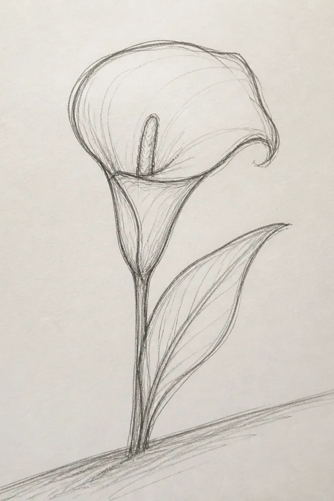
Putting the calla on a ground line gives it a place to live, and it makes your shading look smarter instantly. I draw a slanted horizon line and then cast a soft shadow from the stem and spathe fold onto it. The spathe still uses the folded bean shape, but now you can add one shadow direction that sells the light source. This is the easiest way I know to make a simple sketch feel grounded without drawing a whole background scene. It works for both light and dark paper because the ground line defines the contrast.
Start by drawing a slanted ground line across the lower third of the page. Sketch the calla spathe above it as a folded bean and draw the spadix inside. Place the stem so it touches or crosses near the center of the ground line, then add a small leaf near the base. Shade under the spathe fold with graphite and blend softly, then add a shadow on the ground line following the same direction as the fold shadow. Use a kneaded eraser to keep the shadow soft at the edges so it doesn’t look like a sticker.
Good to knowPick one light direction and stick to it; your shadows should all match that angle.
Common mistakeDon’t shade the stem and spathe shadows in different directions; that makes the light source feel random.
15. Calla Lily with Hidden Heart Shape Fold
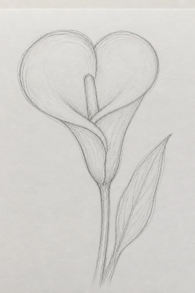
This is my trick for making calla lilies look sweet without turning them into cartoon hearts. The fold crease inside the spathe can hint at a heart shape — it’s mostly negative space, not a literal heart drawing. I place the pinch crease so it creates two gentle curves, then I shade just the inner crease area to show depth. The spadix stays thin so it doesn’t compete with the fold. This idea is perfect for wedding stationery, Valentine-style tags, and any repurposed paper project where you want softness but still keep it botanical.
Lightly sketch the spathe as a tall folded bean, then adjust the fold pinch so the inner edge curves like two sides of a heart. Draw the spadix inside as a narrow spike that starts at the base of the inner fold and ends near the spathe top. Shade only the inner crease area with a 4B, shaping the shadow like a soft inverted heart top. Leave a highlight strip on the outer edge of the spathe so the fold reads as turning. Add a single thin stem line and one small leaf off to the side so it still feels like a plant and not a symbol.
If the fold shadow feels too strong, lighten it with a paper stump — the heart hint should be subtle.
Avoid drawing an actual heart outline; the fold should be implied by the crease and highlight.