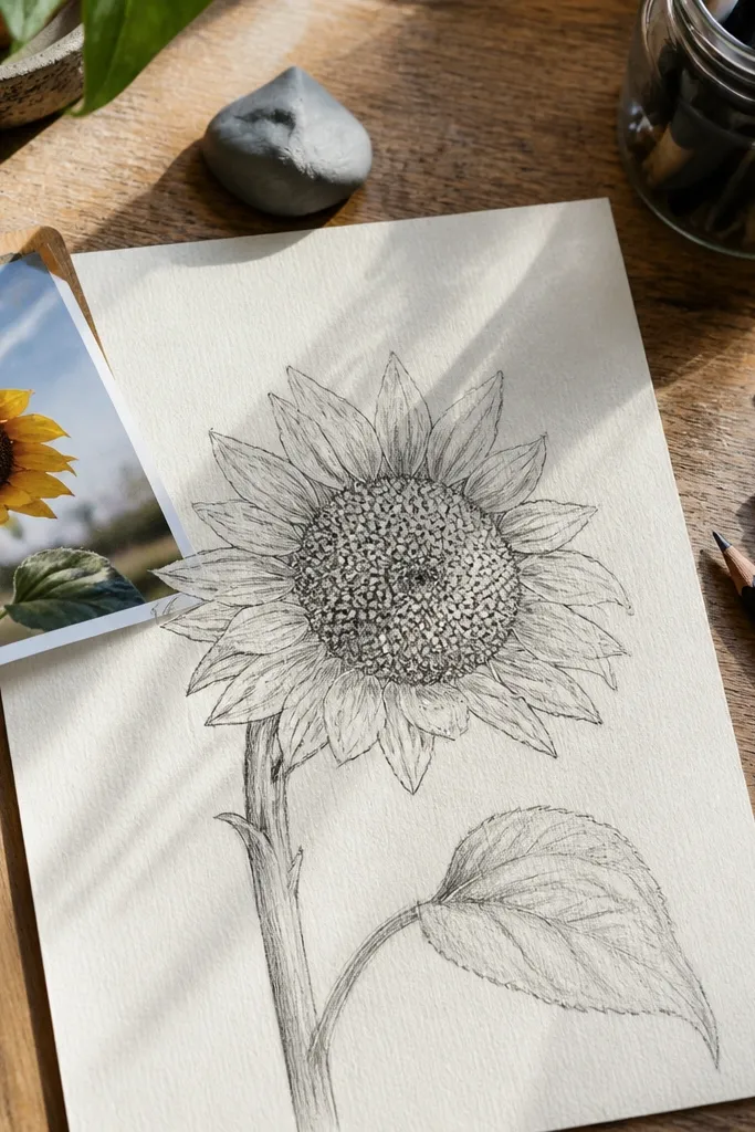
1. Twist-Spiral Mini Bud
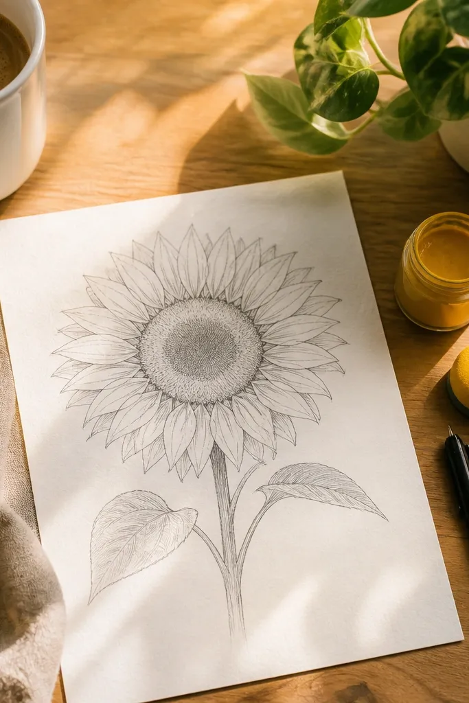
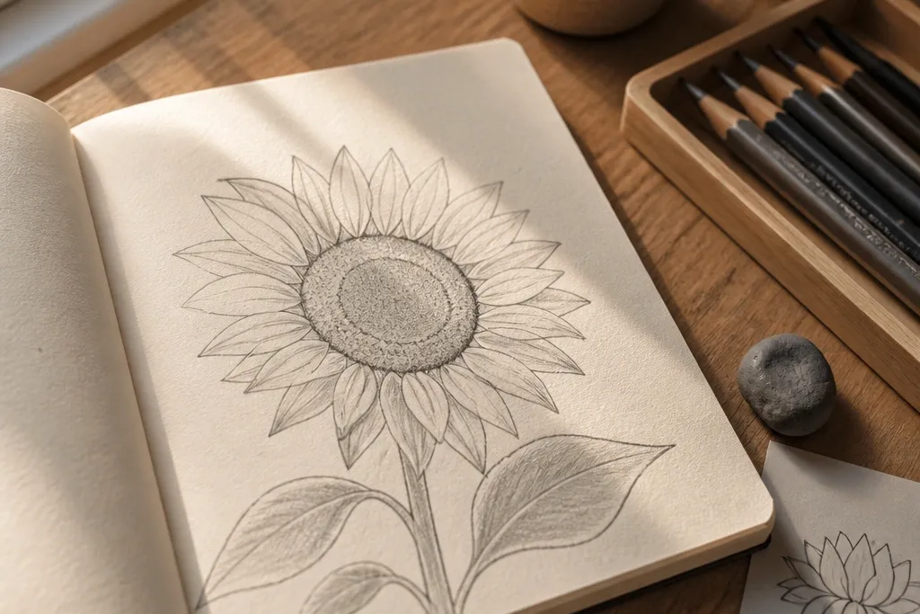
This one fixes the center problem by making the spiral the star. Start with a small circle, then draw a tight inward spiral so the viewer sees rotation even before shading. The petals are short and curled, like they’re just starting to open, which keeps the drawing simple and photogenic. Use a slightly darker spiral line weight than the petals so the center reads clearly at a distance. It’s great for sketchbooks, labels, and quick DIY stickers.
Step 1 — Lightly draw a 1.5 to 2 inch oval bud shape and a 0.6 inch center circle. Step 2 — From the center circle, draw 10 to 14 spiral loops inward, keeping the gap between loops consistent. Step 3 — Add 8 to 12 curled teardrop petals around the spiral, each rotated a little so they follow the bud’s curve. Step 4 — Shade only the inner fold areas with a 4B pencil, then blend lightly with a tissue.
Good to knowPress harder on the spiral lines, lighter on the petal outlines — it creates depth without extra rendering.
Common mistakeAvoid a center that’s just scribbles — you need loop spacing you can count.
2. Stacked Petal Fan Bud
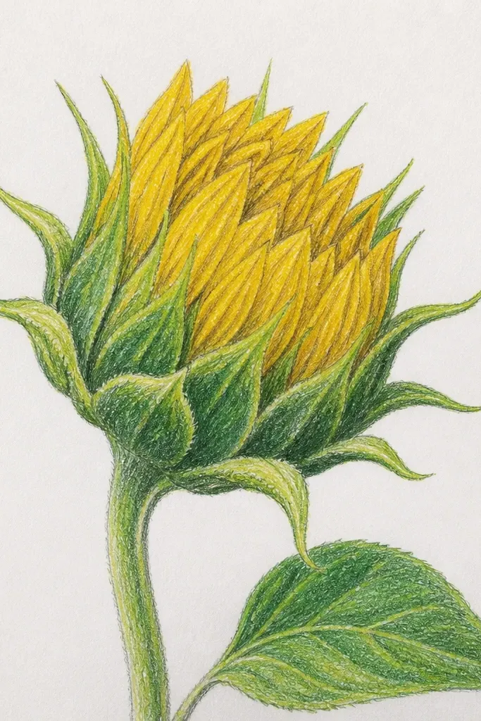
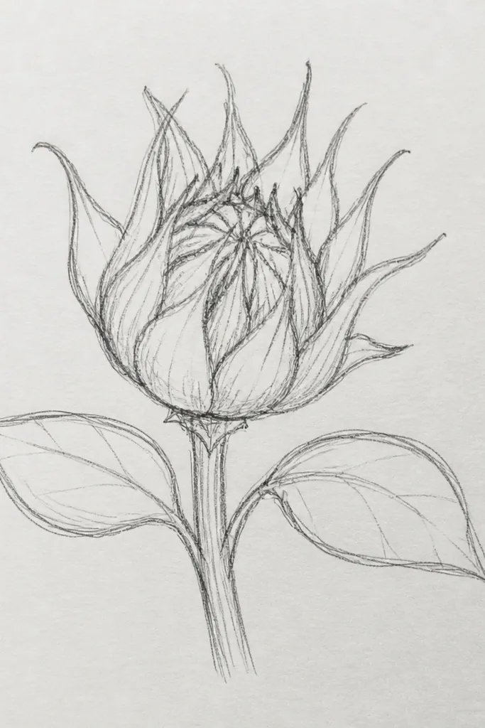
If your petals look messy, use a layered fan. This bud draws like a set of overlapping plates, so every petal has a clear start and finish. The look is clean, graphic, and easy to reproduce for a whole page of variations. Because the petals overlap, you get natural shadow shapes without heavy blending. It also photographs well on white paper because the layering creates crisp contrast.
Step 1 — Sketch a rounded bud outline like a vertical teardrop, about 2.5 inches tall. Step 2 — Draw 3 guide arcs across the bud (top, middle, bottom) to place petals. Step 3 — Place 12 to 16 petals as teardrops that overlap each other, each pointing slightly outward. Step 4 — Shade along the overlap edges with a 2B pencil, then darken the deepest overlaps with 4B.
Good to knowKeep petal tips all the same height for that tidy fan look.
Common mistakeAvoid petals that don’t overlap — separate petals create a flat, sticker-like effect.
3. Side-Profile Bud with Inner Fold
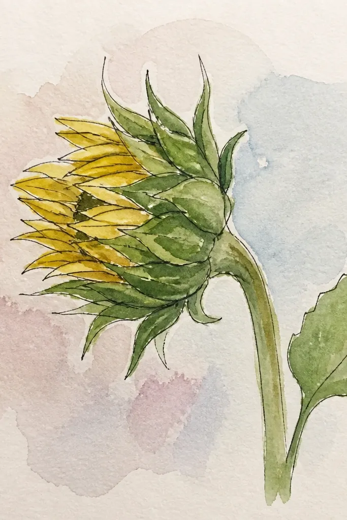
This idea solves the flatness issue by forcing one clear fold. A side-profile bud makes the center and inner shading direction obvious, which makes drawings look 3D without fancy techniques. The petals arc around the fold, so the eye follows the curve. Keep the outer rim lighter and the inner fold darker. It’s a strong option for greeting cards, where a side view adds instant interest.
Step 1 — Draw a curved bud outline like a comma, roughly 3 inches tall. Step 2 — Mark an inner fold line from top to bottom, slightly off-center. Step 3 — Add 10 to 14 petals that sit on one side of the fold, each with a thicker outline on the fold side. Step 4 — Shade the inner fold area with 4B, then fade outward with a light 2B layer.
Good to knowUse the fineliner to thicken the fold-side petal edges — it sells the angle.
Common mistakeAvoid shading all around evenly — inner-fold shading is what creates the side depth.
4. Dot-Center Bud (Pointillist Core)
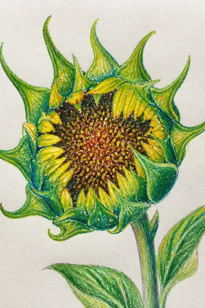
A dot spiral center instantly upgrades a sketch because it looks deliberate. This bud uses a pointillist core so the center reads cleanly even if you keep petals simple. The petals are small, rounded teardrops that sit around the dot spiral like a crown. You get texture without smudging, which is the big advantage if you scan or photograph your work at home. This also works great in black ink only.
Step 1 — Draw the bud silhouette lightly and mark a small center circle. Step 2 — Make a spiral of dots: start with 1 dot at the center, then add dots outward in 1.5 to 2 mm steps for 25 to 35 dots. Step 3 — Place 10 to 12 rounded petals around the center, each outlined with a fineliner. Step 4 — Add a few darker dots on the inner edge of petals for contrast.
Good to knowKeep dots the same size; inconsistent dot size makes the spiral look shaky.
Common mistakeAvoid a dot center that’s too big — keep it compact so petals stay the framing.
5. Watercolor Wash Bud with Pencil Edges
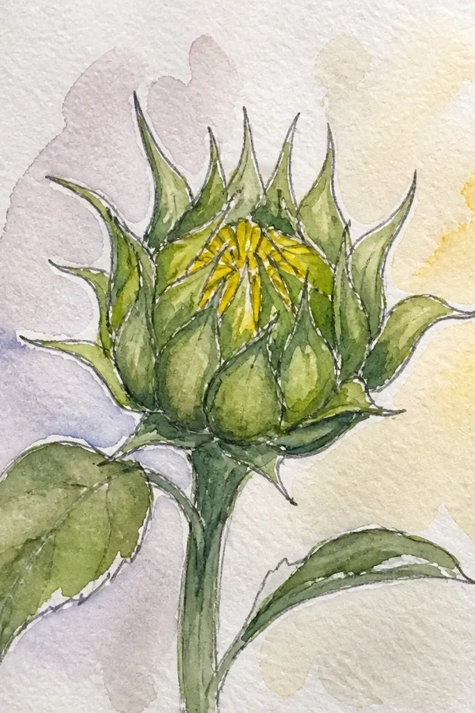
This is for people who want color without turning the whole drawing into a smudged mess. Pencil outlines stay sharp, while watercolor wash gives gentle gradients inside the petals. The bud looks airy and pretty in photos because the wash is translucent and the edges stay crisp. Use warm yellow for the inner petals, then a light orange-brown at the fold lines. It takes longer than graphite-only, but the result looks more finished on paper.
Step 1 — Sketch the bud outline and petals in pencil, then go over the final lines with a light hand in fineliner. Step 2 — Wet only the inside of petals (not the outlines) and apply a diluted yellow wash. Step 3 — Add a thin warm brown line where petals overlap to define the fold. Step 4 — Let it dry fully, then add 4B pencil shading only at the deepest overlaps.
Don’t paint over fineliner until it’s dry — it bleeds if you flood the lines.
Avoid heavy water — too much pooling washes out the petal structure.
6. Crayon Resist Bud on Tan Paper
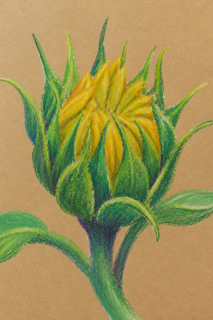
If you want a warm, aesthetic look with minimal effort, resist is the move. Draw the bud petals with a light wax crayon on tan paper, then paint over with a darker watercolor. The wax repels the paint, so your petal shapes stay bright and clean. This method also hides minor sketching mistakes because the resist makes the drawing feel intentional. It looks great for stickers, gift tags, and DIY wall art.
Step 1 — Lightly sketch the bud and center spiral, then trace key petal lines with a white or pale yellow crayon. Step 2 — Paint over the entire bud with diluted watercolor in sunflower tones (gold, then soft amber). Step 3 — Add a darker wash at the inner fold side so shadows stay readable. Step 4 — After drying, use a fine pencil or fineliner to sharpen a few petal edges and the spiral center.
Good to knowUse tan paper with a slightly rough tooth — it holds pigment better and looks more textured.
Common mistakeAvoid pressing too hard with crayon — it can create waxy glare in photos.
7. Graphite Crosshatch Bud
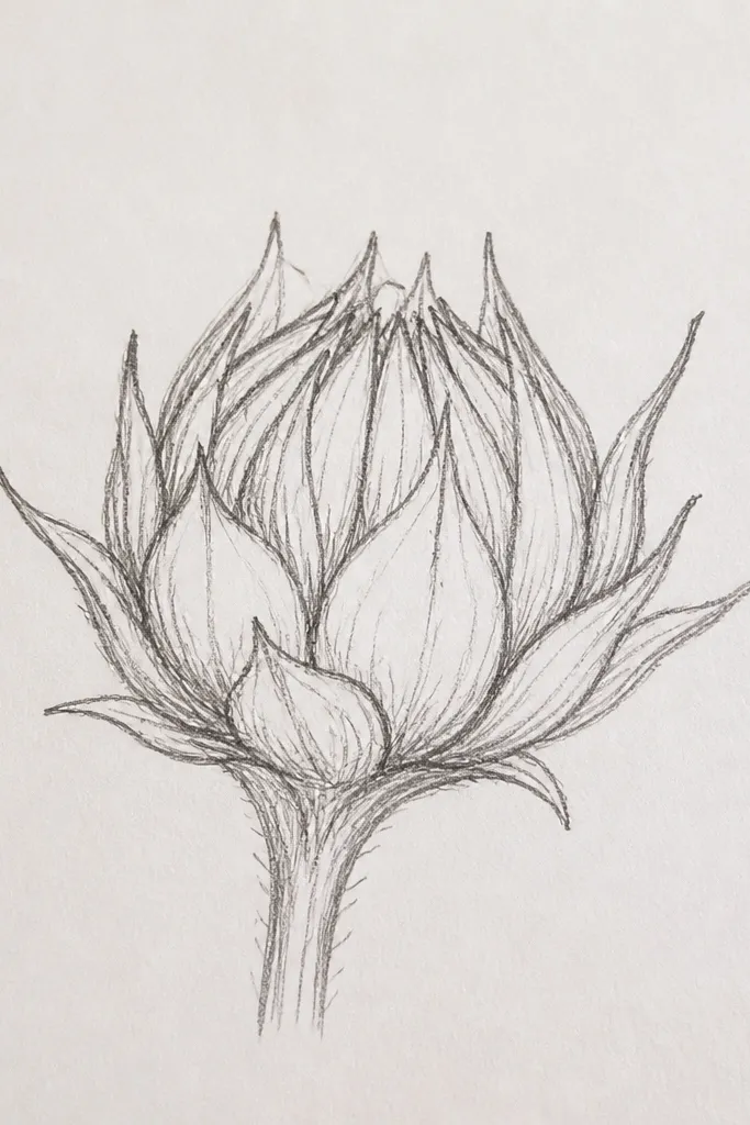
Crosshatching gives a clean, controlled texture that reads well even without color. This bud uses crosshatch only in the inner folds and along petal edges, so the drawing doesn’t turn gray everywhere. It’s a good choice if you want a moody aesthetic but still need the petals to look structured. The crosshatch lines also make the bud look rounded because the strokes wrap the curve. Expect a crisp, print-ready look.
Step 1 — Sketch the bud outline and set petal positions with 10 to 14 light guide marks. Step 2 — Outline petals with fineliner or darker pencil and keep the outer rim light. Step 3 — Shade using crosshatch: one set of strokes at about 45 degrees, then a second set at 90 degrees crossing them. Step 4 — Concentrate the darkest crosshatch in the center spiral and inner folds with a 4B pencil.
Good to knowStart crosshatching in small patches, then build darkness gradually instead of going all-in at once.
Common mistakeAvoid filling the whole bud with crosshatch — you’ll lose the petal separation.
8. Marker Gradient Bud (No Mud Look)
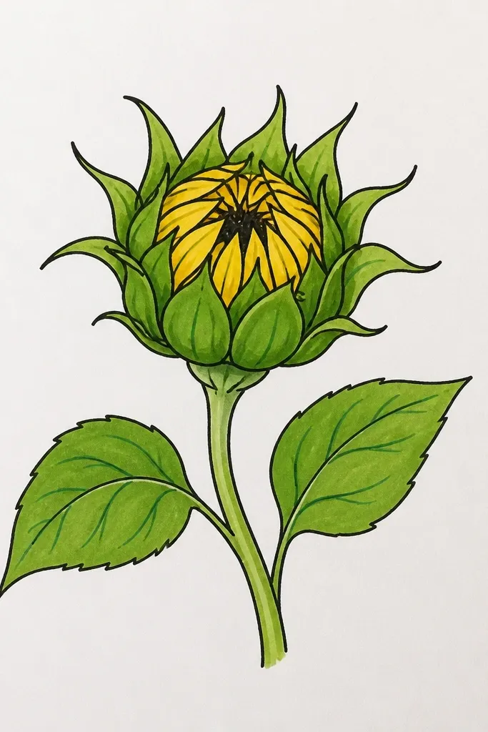
This idea keeps marker color pretty and controlled. Instead of coloring each petal randomly, you create a simple gradient: darker at the inner folds, lighter toward the outer rim. The outer edges get a thin highlight so the bud looks rounded. It’s ideal for quick DIY projects where you want color that still looks clean, not streaky. Works best on thicker paper (marker paper or cardstock).
Step 1 — Draw the bud outline and petals in pencil, then trace outlines with a fineliner. Step 2 — Color the inner fold areas first using a darker yellow-orange marker, staying inside petal boundaries. Step 3 — Blend outward with a lighter yellow marker using short strokes that follow petal direction. Step 4 — Leave a narrow uncolored strip along the outer rim for highlight, then add a tiny 4B line where petals overlap.
Use a light touch for blending — heavy pressure makes markers pool and look muddy.
Avoid full-petal coloring edge to edge — you need highlight space to keep it photogenic.
9. Tiny Bud Sprigs with Repeating Petals
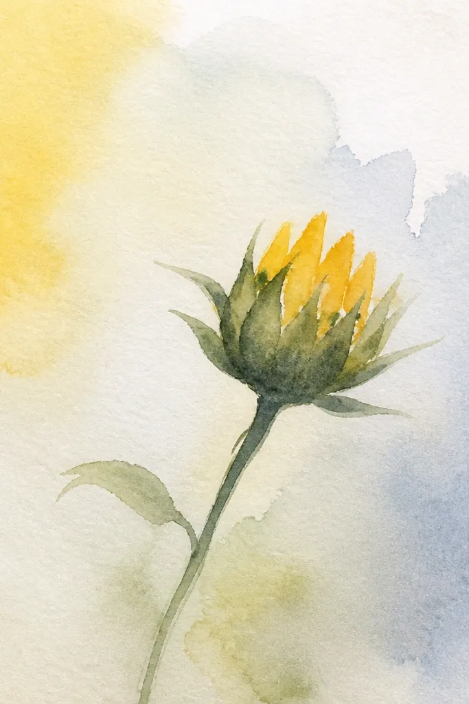
This one solves a common problem for DIY layouts: single buds look nice, but clusters look designed. You draw a few tiny buds that all share the same petal shape and center spiral spacing. The repetition makes the page look cohesive, even if each bud is only 1 inch wide. Use consistent line weight across all buds so they feel like a set. It’s perfect for patterned backgrounds and washi-tape style art.
Step 1 — Choose one bud size (around 1 to 1.25 inches wide) and sketch 3 to 5 bud silhouettes. Step 2 — For each bud, draw the center spiral with 8 to 10 loops and keep the spiral size identical. Step 3 — Add 7 to 9 petals per bud, each petal a consistent teardrop rotated around the center. Step 4 — Shade only the inner fold with 2B, then add 4B only on the darkest overlap line.
Good to knowIf petals drift, redraw the bud silhouette lightly and keep the center spiral the anchor.
Common mistakeAvoid changing petal size from bud to bud — the set stops looking intentional.
10. Ink Outline Bud with Negative Space
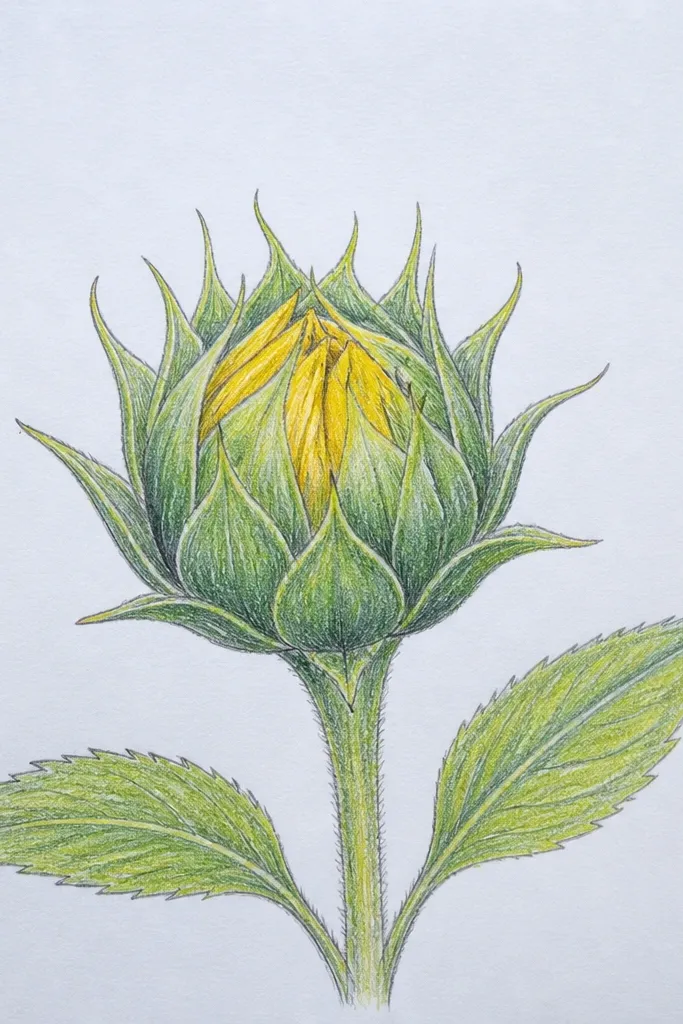
Negative space makes a sunflower bud look graphic and modern. You outline petals and let the paper show through as the lightest areas, which prevents the flat, colorless look. The center spiral is drawn with crisp ink lines, then you add a few bold shadow strokes that sit only at folds. This style is great for quick upcycling labels because it stays readable and high-contrast when printed or photocopied. It also scans cleanly.
Step 1 — Sketch a bud outline and center spiral lightly in pencil. Step 2 — Trace the spiral and petal outlines with a fineliner, keeping outer edges thin. Step 3 — Leave the inner petal areas mostly blank, then add 5 to 8 small shadow strokes on overlap folds using a thicker pen. Step 4 — Darken only the center spiral turns with extra ink passes so it stays the focus.
Use two pen widths: one for outlines (0.5) and one for shadows (0.8 or 1.0).
Avoid filling everything with ink — the light paper is part of the design.
11. Soft Pencil Ombre Bud (2B to 6B)
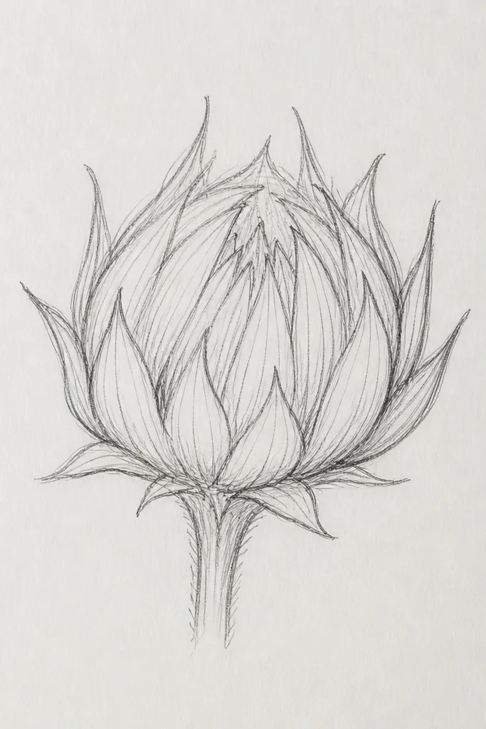
If your shading looks streaky, do it as an ombre. This bud builds a smooth gradient that makes petals look rounded instead of colored-in blobs. Use 2B for midtones and 6B for the darkest inner folds, then blend lightly with a soft blending stump. The rim stays light to preserve the bud’s shape in photos. This style looks great on off-white paper and works for both realistic and stylized drawings.
Step 1 — Outline petals and center spiral in 2H pencil so you can erase lightly. Step 2 — Shade the outer rim with 2B using light strokes following petal direction. Step 3 — Layer 4B in the inner folds, then add 6B only where petals overlap closest to the center. Step 4 — Blend gently with a stump or folded tissue, then lift highlights with a kneaded eraser.
Good to knowBlend with light pressure — pressing hard turns pencil into dust-gray.
Common mistakeAvoid using only one pencil grade — you need at least 2B and 4B for real depth.
12. Bud with Leaf Veins as Texture
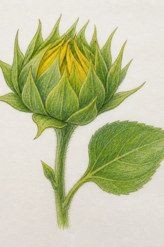
This adds context without clutter. A small leaf with visible veins frames the bud and makes the whole piece feel finished, especially for sticker sheets and gift tags. The veins also give you a second texture pattern, so the drawing looks intentional even if the bud stays simple. Keep the leaf veins thin and consistent, then shade the bud inner folds with the same direction as the vein lines. It’s photogenic because the textures catch light differently.
Step 1 — Draw a small bud and center spiral, then sketch a single leaf at one side using an almond shape. Step 2 — Add 5 to 7 leaf veins that curve from the center of the leaf outward. Step 3 — Shade the bud inner folds with 4B and keep outer edges light, then echo the vein direction with your shading strokes. Step 4 — Clean up with a kneaded eraser and reinforce a few petal outline lines.
Good to knowMatch shading direction to leaf veins — it ties the drawing together visually.
Common mistakeAvoid adding multiple leaves — one framed leaf reads cleaner on paper.
13. Butterfly-Style Bud Wings (Petal Arches)
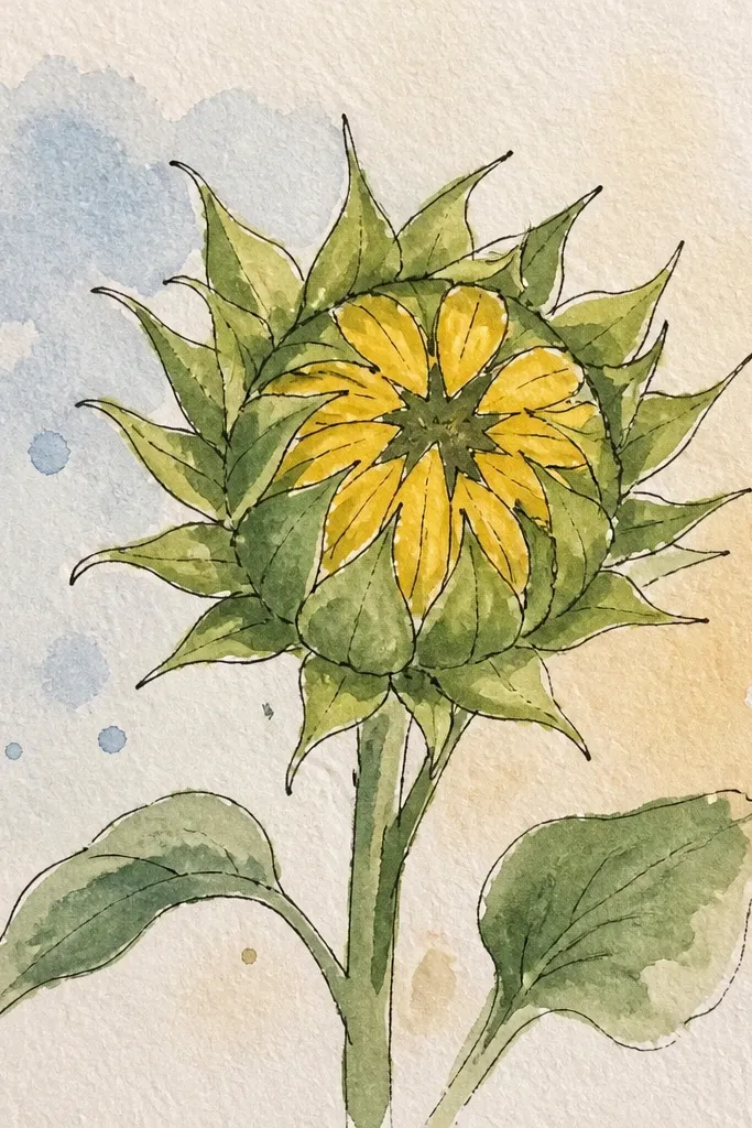
This style looks dramatic while staying simple. Big arched petals create a wing-like silhouette that stands out in photos and makes your sunflower bud feel bold. The center spiral stays tight, and the petals arc outward symmetrically so the composition reads instantly. Use light outlines on the outer petal edges and stronger shading inside the arcs. It’s a great choice if you want your DIY upcycling label or card to look like “real art” without complicated realism.
Step 1 — Sketch a centered oval bud and draw a small spiral center circle. Step 2 — Plan 8 large petals as long teardrops, each forming an arch that mirrors left and right sides. Step 3 — Outline petals, then add shading inside each arch with 2B, darkening the innermost arch edges with 4B. Step 4 — Add one highlight line on each outer petal edge by lifting pencil with a kneaded eraser.
Good to knowUse symmetry guides lightly — a straight center line helps the wings match.
Common mistakeAvoid uneven petal arcs — if one side droops, the bud looks off-balance.
14. Doodle Border Bud Frame
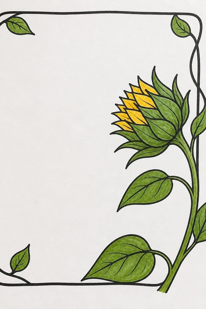
A bud alone can feel unfinished. This idea uses a tight doodle border to frame the sunflower bud and make it look like a complete design. The border is minimal: tiny dots, short leaf curls, and a few swooping lines. The bud stays clean and detailed enough to be the focus, but the border adds the “finished” look you want for prints and upcycled packaging. It also makes your drawing look intentional when photographed against craft supplies.
Step 1 — Draw a square or circle frame around where the bud will sit, about 3 to 4 inches. Step 2 — Center the bud and build the spiral core, then outline petals clearly. Step 3 — Add border doodles: 12 to 18 dots around the frame edge and 4 to 6 tiny leaf curls in the corners. Step 4 — Shade only the bud inner folds and keep border marks light so the bud stays dominant.
Good to knowKeep border thickness consistent — if some border lines are bold and others are thin, it looks accidental.
Common mistakeAvoid shading the border — it steals attention from the sunflower bud.
15. Sgraffito Petal Texture Bud
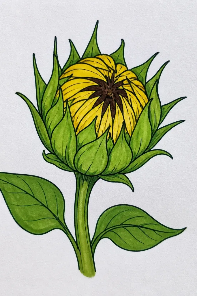
Sgraffito is a clean way to add texture without messy blending. You lay down a light wash or colored pencil base, then scratch petal detail lines back through so the texture looks intentional. This makes your bud look more detailed while still staying “simple inspiration.” It’s also great for people who hate shading but like line texture. The result is sharp and photogenic because the scratch lines catch the light.
Step 1 — Sketch the bud silhouette and petals, then outline with fineliner. Step 2 — Shade the petals with a light layer of colored pencil or diluted watercolor, leaving the outer rim lighter. Step 3 — Use a blunt needle or the tip of a craft knife to scratch short lines following each petal’s curve. Step 4 — Reinforce the center spiral with darker pencil so it stays crisp after scratching.
Good to knowPractice scratching on scrap paper first — too deep cuts tear the paper and look messy.
Common mistakeAvoid scratching the outer rim — keep scratches inside so highlights stay clean.
16. Pencil Bloom Gradient Bud with Lifted Highlights
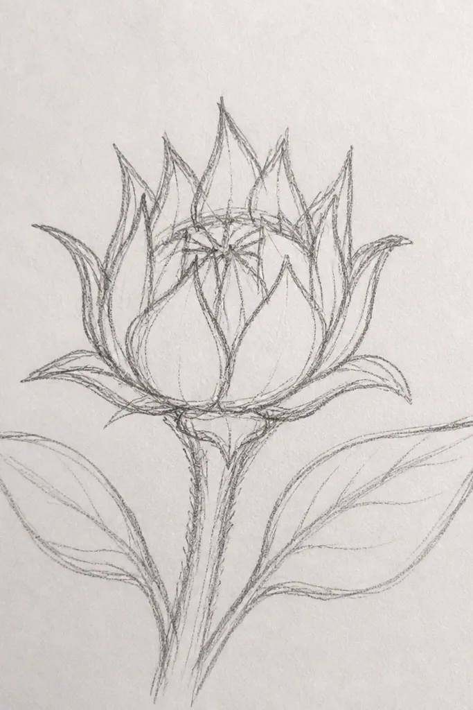
This is the “fresh and airy” graphite look that still reads as 3D. You build a gradient inside petals, then lift highlights so the rim and fold edges look rounded. The center spiral stays dark and crisp, which prevents the bud from looking washed out. This idea is perfect for minimalist DIY because the shading gives depth without heavy color. It also looks great on textured paper where pencil can grip slightly.
Step 1 — Lightly sketch petals as teardrops around a small spiral center. Step 2 — Shade inner folds with 4B, then blend outward with 2B using short stroke direction changes. Step 3 — Leave the outer petal edges almost untouched, then lift a few highlight spots with kneaded eraser. Step 4 — Add thin dark lines on the center spiral turns and 1 or 2 fold edges to lock the contrast.
Good to knowLift highlights after shading, not before — you’ll know exactly where the light should land.
Common mistakeAvoid over-blending — if you smear everything, the petal edges disappear.
17. Sunflower Bud with Thread-Like Center Lines
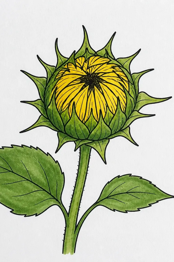
Thread-like center lines make the bud look detailed without adding clutter. Instead of dots or a thick spiral, you draw thin “threads” curving around the center, then let the petals frame the texture. This is the best option if you want a delicate aesthetic that still looks polished. Keep the threads consistent in thickness and spacing so the spiral looks engineered, not random. Great for fine-line tattoos-style DIY prints.
Step 1 — Draw a bud outline and a small center circle. Step 2 — Create 14 to 18 thin thread lines that spiral outward, each line following the same curve direction. Step 3 — Add 10 to 12 petals around the center as teardrops, with slightly thicker outlines on the inner side. Step 4 — Shade inner fold shadows using 2B, and keep the center threads unshaded for crisp texture contrast.
Good to knowUse a 0.3 or 0.4 fineliner for the thread center so it stays delicate on paper.
Common mistakeAvoid thick marker-like lines for the center threads — they flatten the detail.
18. Monochrome Bud with Charcoal Rim
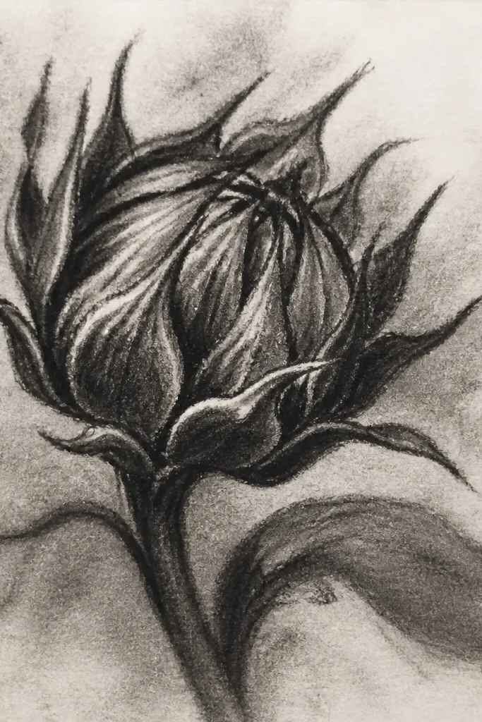
Monochrome looks intentional when you control the rim. This bud uses charcoal or very soft pencil to darken the outer rim slightly, then keeps the petal inner folds even darker. That contrast makes the bud read as a shape, not a sketch. It’s dramatic and works well for upcycled paper projects where you want a moody, artsy vibe. Keep the center spiral crisp with a darker pencil so it doesn’t blur.
Step 1 — Sketch petals and spiral lightly in pencil, then outline petals with fineliner or darker pencil. Step 2 — Rub charcoal lightly along the outer rim and along a few inner fold areas, staying within petal boundaries. Step 3 — Use a 6B pencil to deepen the center spiral turns and the deepest overlap shadows. Step 4 — Lift a few highlights with kneaded eraser to keep the rim from turning uniformly dark.
Good to knowUse a tissue to blend charcoal only at the rim, not across the whole bud.
Common mistakeAvoid smudging charcoal through the center — it kills the spiral clarity.
19. Sunflower Bud with Geometric Petal Facets
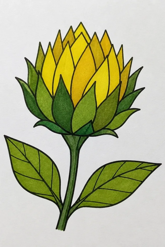
Facets make sunflower buds look graphic and design-y. Instead of smooth teardrops, you draw petal segments with slight angles, then shade each segment like a tiny “plane.” This style fixes the common flat shading mistake because the shading has edges and direction. The bud reads instantly in photos because the facets create crisp light-dark boundaries. It’s great for DIY prints, scrapbook pages, and wall art where you want a modern look.
Step 1 — Sketch the bud outline, then draw the center spiral with simple loops. Step 2 — Build each petal as 2 or 3 straight-ish segments that meet at a point, still keeping the petal overall teardrop silhouette. Step 3 — Shade each segment with a different value: light on the outer segment, mid on the middle, dark on the inner segment near the fold. Step 4 — Reinforce fold edges with a darker pencil line so the facets look intentional.
Keep facet angles subtle — extreme angles look like triangles, not petals.
Avoid random facet shapes — each petal should follow the same segmentation logic.
20. Layered Collage Style Bud (Paper Cut Lines)
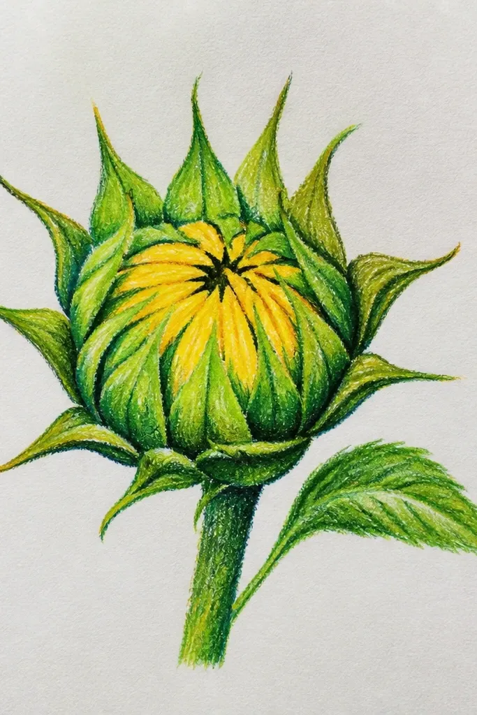
This idea gives you an aesthetic that looks handmade even when you’re keeping it simple. You draw the bud, then add “paper layer” edges by outlining petal sections with a slightly thicker line and shading only those sections. The result looks like a layered collage without needing actual cut paper. It’s photogenic because the petal layers create crisp separations and shadow bands. Great for DIY stationery and upcycled packaging where you want it to look crafty.
Step 1 — Draw the bud outline and center spiral in pencil, then trace with fineliner. Step 2 — Split each petal into 2 layers using a short curved line inside the petal (about halfway along the petal width). Step 3 — Shade the inner layer band with 4B and keep the outer layer band light. Step 4 — Add thin shadow lines between layers using a 2B pencil, then lift a highlight on the outer petal edge.
Good to knowUse consistent layer split position across all petals so it looks like a real layered design.
Common mistakeAvoid shading both layers the same darkness — the collage effect disappears.