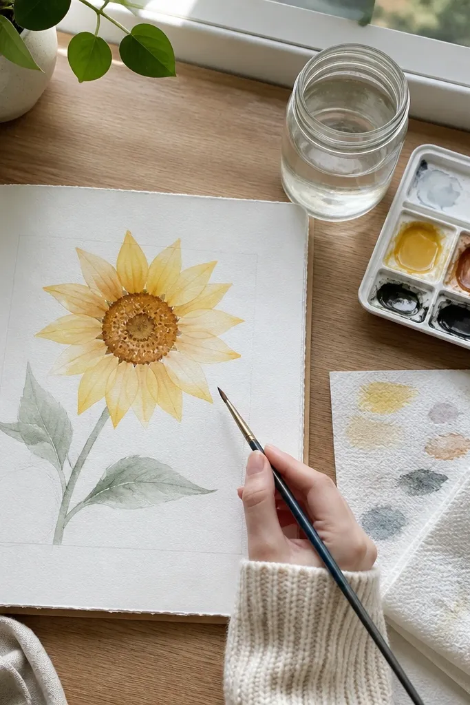
1. Sunflower with Watercolor Sky Gradient
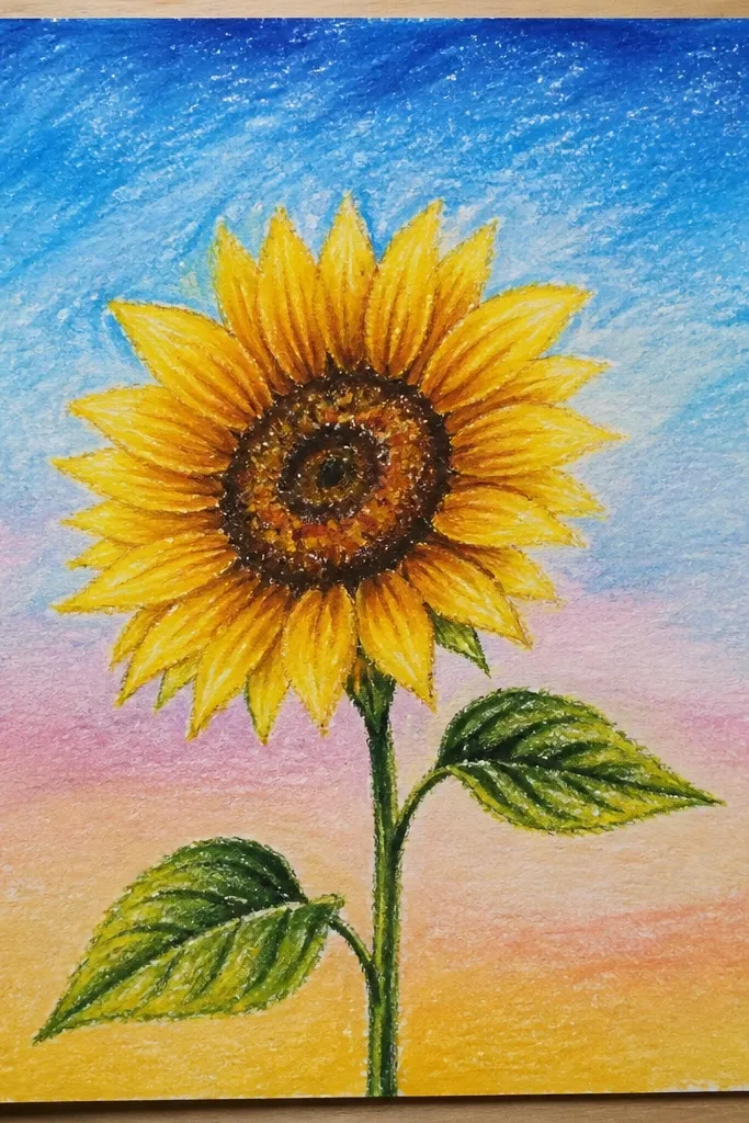
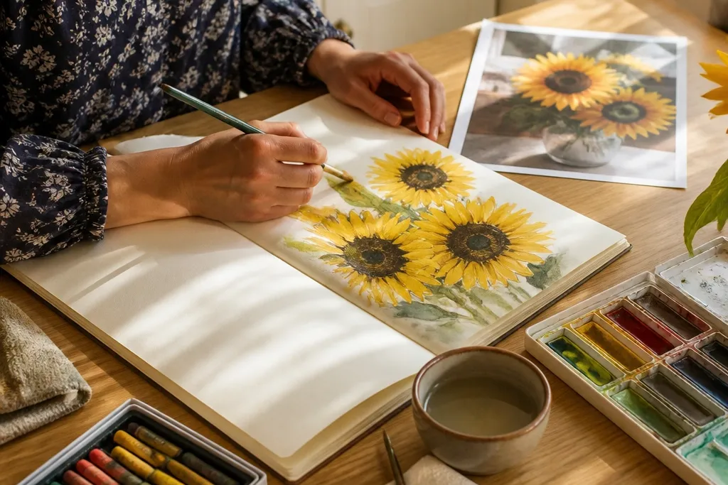
Start by sketching a simple circle center and 2 layers of petals using oil pastel side strokes, pressing harder on the outer petal edges. Then wet the background lightly with clean water and paint a top-to-bottom gradient using ultramarine mixed with water. Finally, deepen the horizon with a darker blue wash and let it dry completely before you add a few extra dark petal lines with oil pastel.
This idea gives you that “sunflower against open air” look that reads instantly in photos. Draw one large sunflower centered, then let a blue watercolor wash fade from top to bottom behind it. The oil pastel petals stay bright because watercolor beads and slides off the waxy pigment. Add a thin, darker blue at the horizon line so the bloom feels grounded instead of floating.
Common mistakeAvoid flooding the whole page with heavy watercolor — it makes the petals look washed out.
Good to knowTest your watercolor strength on a scrap first; if it’s too dark, it will overpower the pastel petals.
2. Two Sunflowers in a Slim Vase Line Drawing
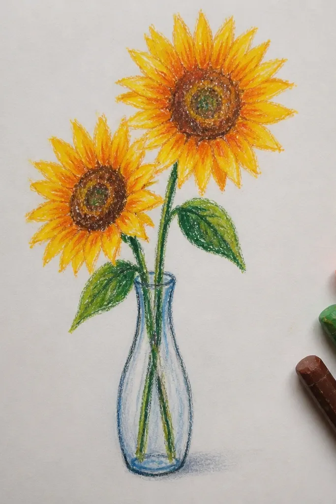
A slim vase forces clean composition and makes the sunflower shapes the star. With two blooms, you get natural overlap, which is where the watercolor + oil pastel combo really shines. Keep the vase mostly line-drawn in oil pastel so it resists the wash and stays crisp. This style looks great for wall art because the negative space around the vase makes it feel intentional.
Draw a minimal vase using oil pastel lines, then add two sunflower heads with overlapping petals and a textured center. Color stems and leaves with lighter green oil pastel so the watercolor wash has something to cling to. Wet only the background area between vase and flowers, then paint a light green-grey wash to suggest depth. Finish by tracing a few leaf veins in oil pastel to sharpen the edges.
Use a fine brush for the vase interior so the watercolor doesn’t creep into petal highlights.
Don’t outline every petal edge — a few strong dark lines look cleaner than full tracing.
3. Sunflower Border with Repeating Petal Frames
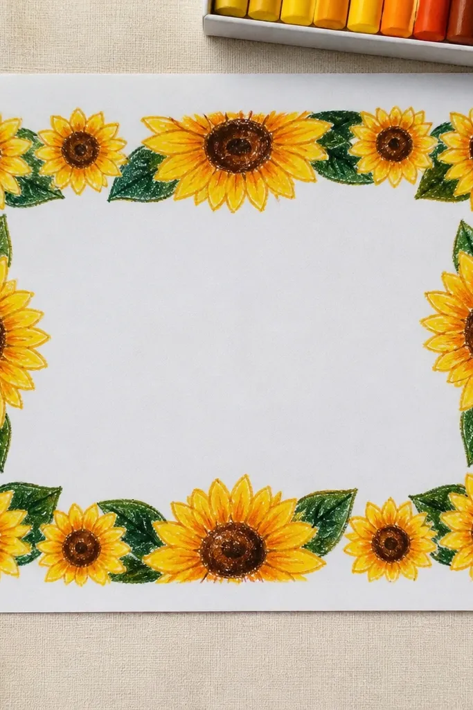
Mark a light pencil guide for a border strip around the paper edges, then draw 10-14 small sunflower heads using oil pastel, keeping petals chunky and consistent. Add a few leaf sprigs between flowers to break the repetition. Wet the center area only, then paint a pale wash like diluted warm grey or light olive. Let dry and add tiny dark oil pastel dots in the sunflower centers for texture.
Borders look advanced even when you’re learning, because your eye reads the pattern instantly. Use smaller sunflower heads around the perimeter and a calmer watercolor wash in the middle so the composition stays balanced. Oil pastel helps you get that crisp petal rhythm — each petal edge stays defined while the background softly fades. This is perfect for card fronts, bookmarks, or a framed piece where the edges are part of the design.
Common mistakeSkip a dark watercolor wash behind the border — it steals attention from the petal pattern.
Good to knowKeep your petal size consistent by using the same stroke length each time.
4. Sunflower on Textured Paper with Wet-on-Wet Background
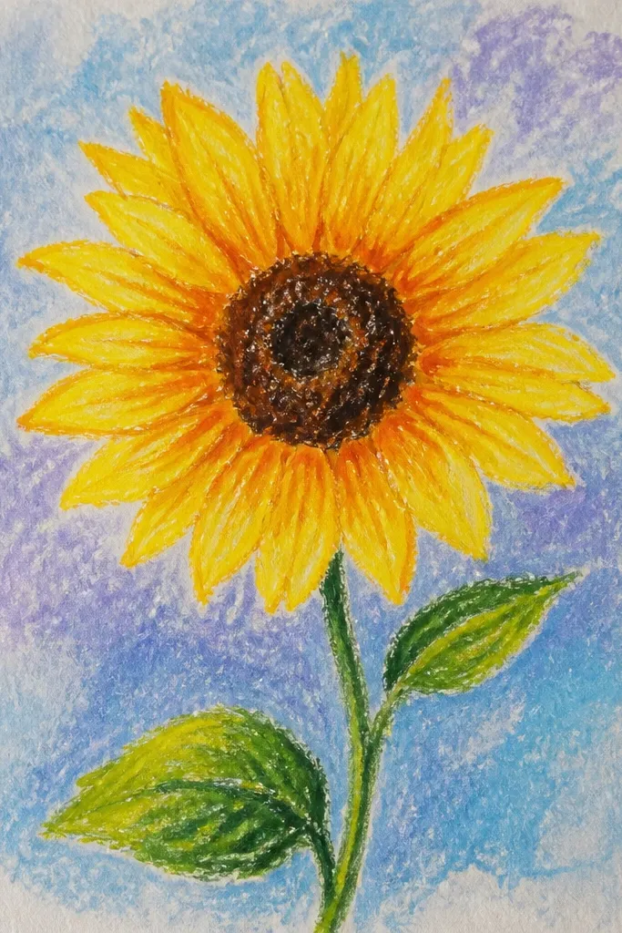
If you like the watercolor to look alive, this one uses wet-on-wet for a smoky halo behind the sunflower. Textured paper enhances the pigment edges, so the oil pastel petals look even more crisp by contrast. The result feels artsy and layered without needing advanced shading techniques. It’s also forgiving: the background can be messy as long as your sunflower shapes are bold.
Draw your sunflower petals with oil pastel, pressing enough that the wax lays down thickly. Wet the background around the flower (not the petals) with clear water, then drop in diluted ultramarine and a touch of burnt sienna. Tilt the paper slightly so colors drift and blend. When the background is nearly dry, add a second light wash pass to deepen the halo and let everything dry fully.
Use a paper towel to dab excess water at the edges so the halo doesn’t run into your petal highlights.
Don’t paint watercolor over lightly drawn pastel — thin wax can let the pigment bleed.
5. Sunflower Center Detail with Golden Sgraffito Look
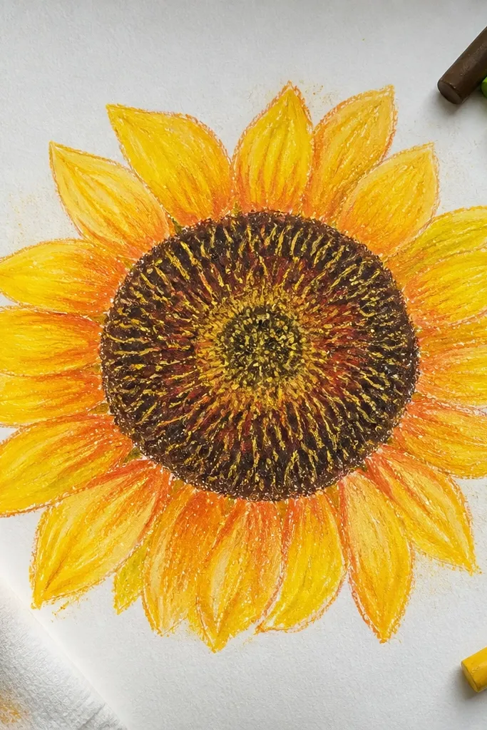
This idea focuses on a single sunflower head and makes the center look richly textured. Oil pastel lets you build a thick, golden base, then watercolor shadows make the center feel deeper. The “sgraffito” look comes from scratching or pulling lines through pastel before washing, so you get highlight streaks. This style is super photogenic because it has micro-texture your camera catches.
Draw one sunflower head and press thick oil pastel into the center, using golden ochre and a darker brown for ring shadows. Use a toothpick or the tip of a craft knife to lightly scratch thin lines through the pastel center to create highlight ridges. Wet around the flower and paint a soft shadow wash with diluted burnt sienna and a hint of indigo. Let it dry, then add a few new center dots with oil pastel to sharpen the texture.
Scratch gently — too much pressure tears paper fibers and makes the center look muddy.
Don’t skip the dark ring under the petals; without it, the center looks flat.
6. Sunflower Leaves with Layered Green Wash Ribbons
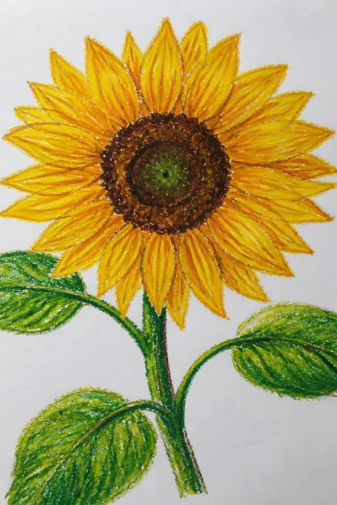
Sketch a sunflower and add 3 prominent leaves using oil pastel, tracing the main vein line in darker green. Paint each leaf area one at a time: wet the leaf lightly, then brush on a thin green wash and let it settle along the oil pastel ridges. Add a second darker pass only along the vein and the leaf tip. Finish by touching the leaf edges with oil pastel to keep the outline sharp.
Leaves are where watercolor can look messy if you don’t control the shape. This project gives you leaf “ribbons” — clear strokes of green that follow the leaf veins while the oil pastel keeps edges crisp. You end up with a botanical look that still feels beginner-friendly. It also gives you lots of practice with watercolor layering without turning the whole page into a blur.
Common mistakeAvoid painting all leaves at once; you’ll lose control of where the wash pools.
Good to knowWork leaf-by-leaf so the wash doesn’t dry mid-stroke and leave hard tide lines.
7. Sunflower in a Scrapbook Collage Frame
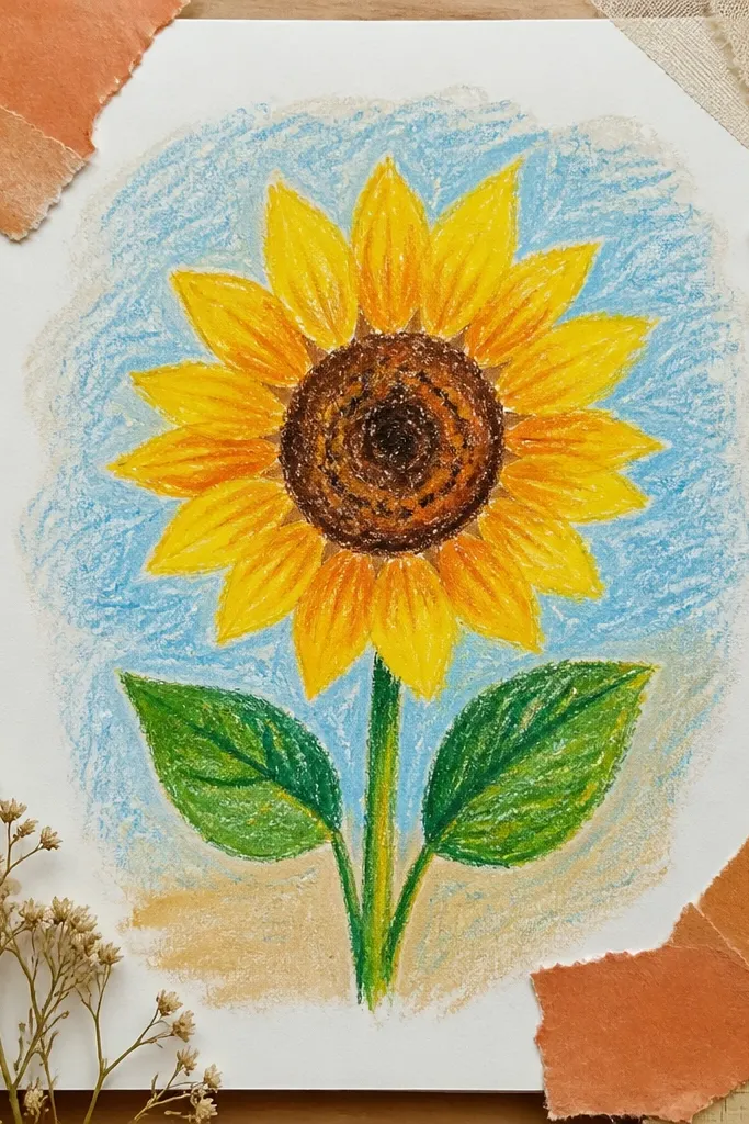
Draw the sunflower on a sheet, using oil pastel for petals and a textured center. Paint a soft background wash behind it, then let it dry fully. Cut or tear a frame from scrap paper and glue it around the sunflower area, leaving an even margin. Add a thin oil pastel shadow under the sunflower stem so it looks attached to the frame.
Collage frames make sunflower art look styled even if your drawing is simple. Use oil pastel for the sunflower and watercolor for the background, then add a torn paper frame to create contrast and depth. The torn edges show texture in photos and hide small watercolor imperfections. This is a great option if you want your project to look finished without perfect symmetry.
Common mistakeDon’t use glossy tape inside the frame — reflections ruin photo clarity.
Good to knowUse matte glue and press the torn edges flat so they don’t curl in humid rooms.
8. Sunflower on Cream Paper with Soft Sepia Wash
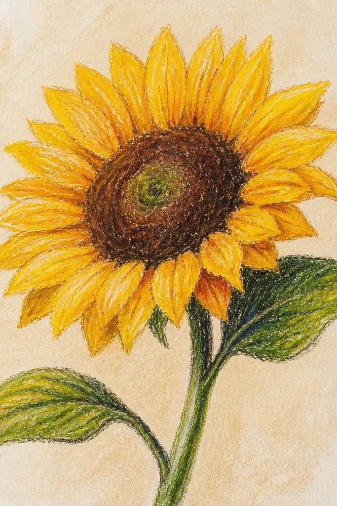
Cream paper plus sepia washes gives a vintage, cozy vibe without needing fancy techniques. The oil pastel petals stay warm and bright, while the sepia background softens everything behind them. This is a forgiving style because sepia hides small watercolor streaks. It also photographs well because the contrast is gentle, not harsh.
Choose cream cardstock or watercolor paper, then draw a single sunflower with oil pastel petals in golden yellow and warm orange shadows. Lightly press the center with darker brown and gold, then scratch a few tiny lines for texture. Wet the background around the flower and paint diluted sepia (brown) in a loose halo shape. Add one darker sepia pass behind the stem to ground the flower.
Keep your sepia wash thin; thick paint makes the whole piece look muddy.
Avoid using black watercolor — it kills the warm tone and makes the petals look dirty.
9. Sunflower with Indigo Drip Background
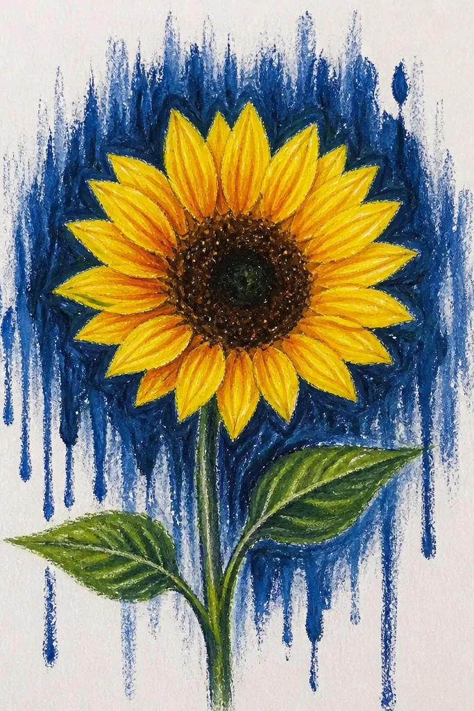
Drips add motion and make the sunflower feel graphic. The oil pastel keeps the petals bright while the indigo drips create a bold, modern backdrop. This style is also great for beginners because you don’t need perfect shading — the background does the drama. Keep the drips behind and around the sunflower so the flower stays the focal point.
Draw the sunflower and color petals with oil pastel, then keep the area inside the petals clean of watercolor. Mix indigo watercolor with extra water to make it flow. Load a brush and flick or drag from the top background area so drips fall behind the sunflower. Let the first layer dry, then add a second darker indigo pass for contrast.
Practice drip direction on scrap paper — a light flick gives cleaner lines than heavy dragging.
Don’t let drips touch the petal highlights; they blur the crisp look oil pastel gives.
10. Sunflower Bouquet with Loose Wash Confetti Background
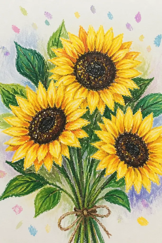
A bouquet with a confetti background looks playful and airy, and it’s very photogenic because the dots create sparkle-like texture. Use oil pastel for the petals so they stay sharp, then scatter watery watercolor drops behind. This gives you instant “movement” without overworking details. It’s ideal for cards and small prints where you want something cheerful.
Sketch a bouquet of 3 sunflowers with different sizes so the composition feels natural. Draw petals with oil pastel side strokes and add a textured center with pressed dots. After the sunflower is finished, wet only the background around the bouquet lightly. Flick diluted yellow-green, pale blue, and a touch of pink watercolor into the background. Let it dry and then add a few extra oil pastel dots in the centers for balance.
Use a toothbrush or stiff brush for controlled flicks; too much splatter overwhelms the petals.
Avoid using fully opaque watercolor for the confetti — it looks chalky instead of airy.
11. Sunflower with Watercolor Shadow Under Petals
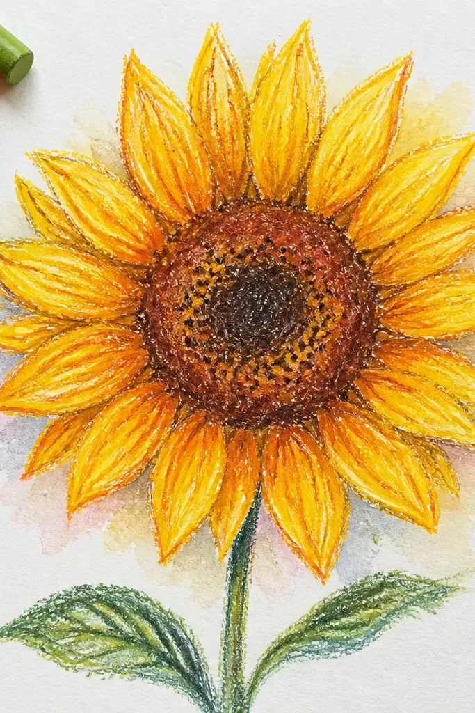
Draw the sunflower with two petal layers in oil pastel, leaving overlap areas clearly defined. Use a darker pastel shade (burnt sienna or deep orange) along the underside of the top petals. Wet only the overlap shadow areas with clean water, then paint a diluted cool shade like indigo or violet. Let the shadow fade naturally outward, then reinforce petal edges with a final oil pastel pass.
This idea makes the petals look layered and dimensional, even if your drawing is simple. The key is placing a soft watercolor shadow under each petal layer, following the overlap lines. Oil pastel keeps the top edges bright, while the wash sinks into the background. The result looks like a finished illustration, not a flat coloring page.
Common mistakeDon’t paint shadows on top of petal highlights; keep highlights clean and bright.
Good to knowKeep shadows cool; warm shadows under warm yellows make the sunflower look dull.
12. Sunflower with Color-Blocked Background Panels
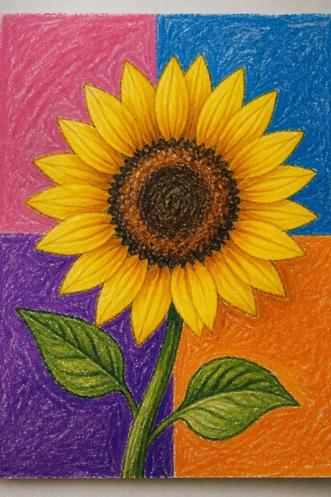
Draw your sunflower in the center using bold oil pastel strokes for petals and a textured center. Tape off areas if you want crisp borders between panels. Paint one background panel at a time with diluted watercolor, letting each panel dry before removing tape or painting the next area. Add a thin oil pastel outline around the sunflower silhouette if the panels blur the edges.
Color blocks make your sunflower drawing look graphic and intentional. The watercolor panels stay clean because you’re painting flat shapes around the oil pastel flower. This style is great for beginners because it avoids gradients and complex blending. It also photographs well since the color edges create crisp lines.
Common mistakeDon’t overwork the watercolor panels; repeated passes can lift pastel wax and smear the flower.
Good to knowUse masking tape and press edges firmly to stop watercolor creep.
13. Sunflower with Wet Paper Splash Texture
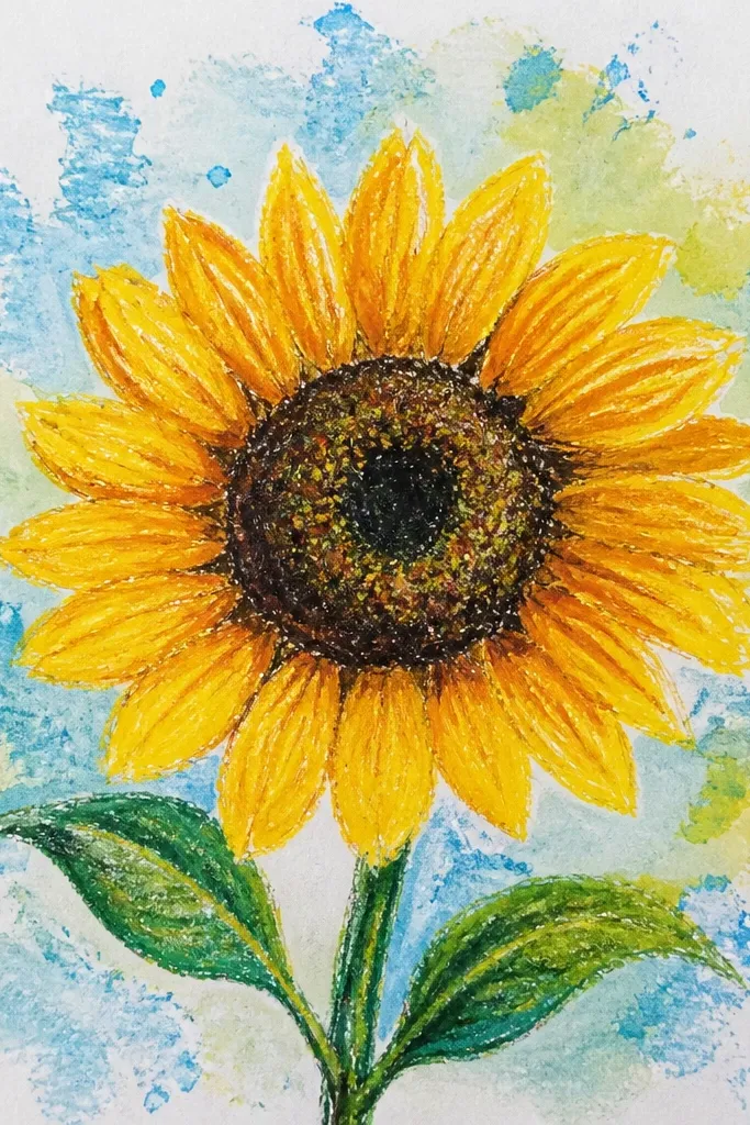
Splash texture gives your background energy while keeping the sunflower crisp. Use oil pastels for the flower so it resists the water, and let the splashes happen around it. This style looks handmade in a good way because the splatters are unpredictable but still controlled. It works well for a single sunflower on a page with lots of negative space.
Draw the sunflower petals with oil pastel and press the center texture thick. Wet the paper area around the sunflower lightly, leaving the petals dry. Load a brush with diluted watercolor and tap it so small splashes land in a loose ring around the flower. When the ring is dry, add one darker splash color near the bottom for depth.
Keep splashes small — larger splats steal attention from the petals.
Avoid splashing directly under the petals; it blurs the shape where you need crisp contrast.
14. Sunflower with Watercolor Ombre Petal Tips
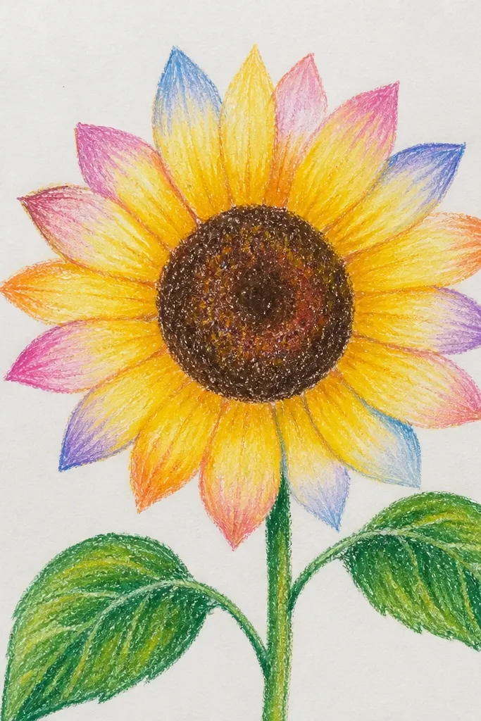
Sketch the sunflower and fill petals with oil pastel in golden yellow, pressing harder toward the petal base. Mix a translucent orange-yellow watercolor and keep it light. Paint only the outer third of each petal tip, letting the wash feather into the oil pastel. Add a tiny touch of darker orange at the very edge of the tips for definition.
This one makes the petal tips look like they’re fading into watercolor dye, which looks expensive on paper. You still rely on oil pastel for the main petal shape, but you paint only the tips so the rest stays bright. It’s a clean way to practice selective watercolor placement. The photo reads as “illustration,” not “watercolor background.”
Common mistakeAvoid painting the petal base; it kills the crisp oil pastel highlight.
Good to knowUse a smaller round brush and keep your brush loaded lightly so the wash doesn’t run down the whole petal.
15. Sunflower with Pencil-First Sketch + Pastel Finish
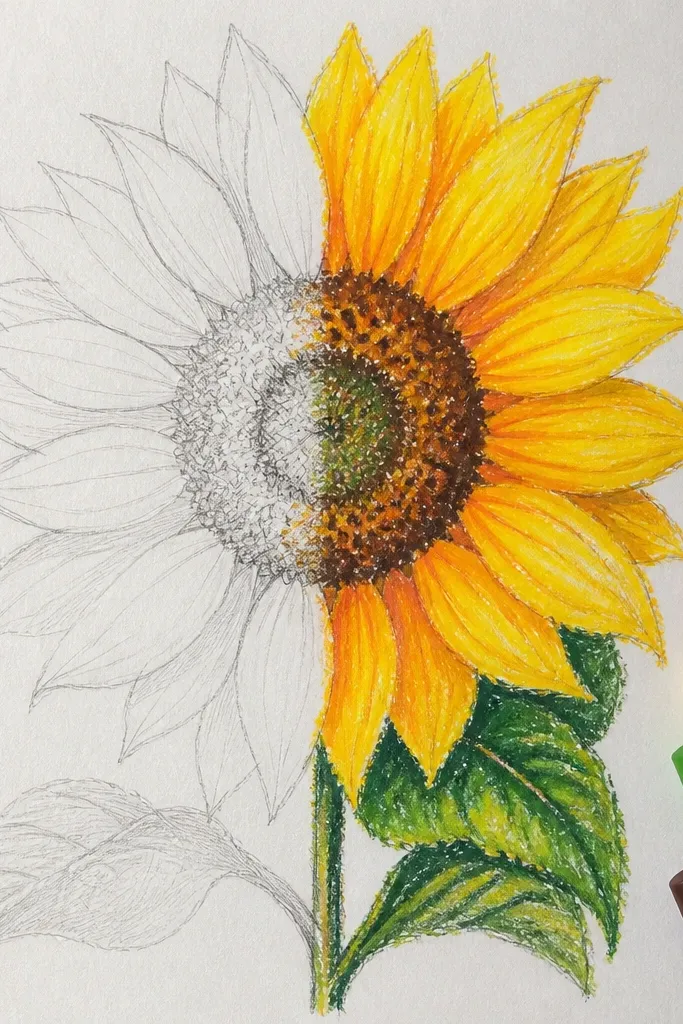
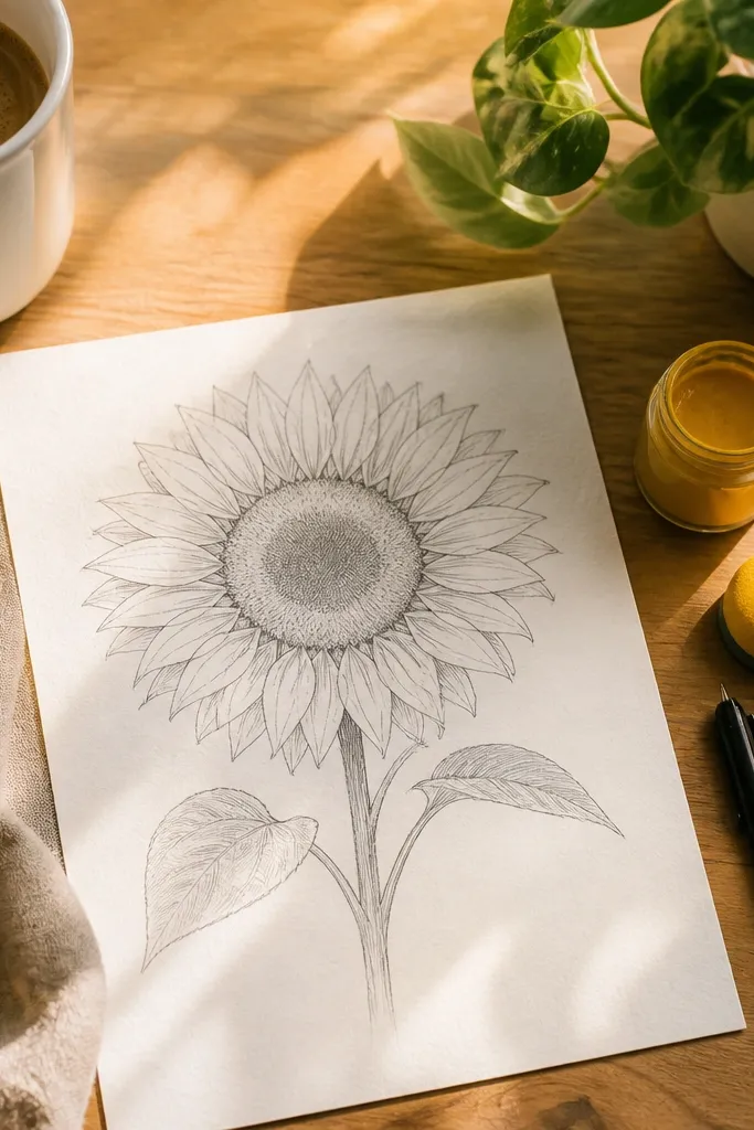
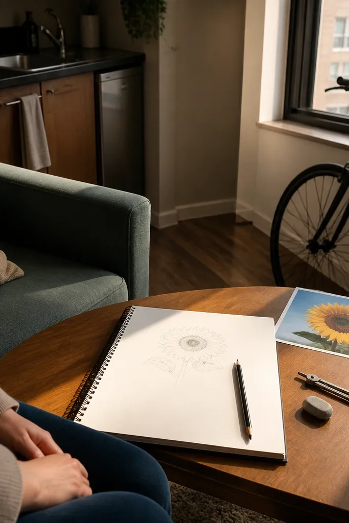
Lightly sketch your sunflower outline with pencil, including petal spacing and center size. Go over the pencil with oil pastel, using side strokes for petals and thicker pressing for the center texture. Paint a soft background wash around the sunflower, keeping water away from the pencil lines so you don’t smear graphite. When dry, erase any remaining pencil marks lightly with a kneaded eraser if they show through.
This is for beginners who worry they can’t draw petals freehand. You use pencil for structure, then oil pastel for the look that resists watercolor. After you paint, the pencil lines disappear visually because the pastel creates the bold edges. The result looks intentional and neat, especially if you keep the pencil sketch minimal and light.
Common mistakeDon’t press pencil hard; graphite can smear when the first watercolor layer hits.
Good to knowUse a kneaded eraser first — it removes pencil without scuffing pastel edges.
16. Sunflower with Burgundy Leaves and Warm Background
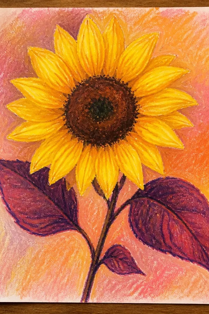
Draw the sunflower petals in golden yellow and add a deep brown center with oil pastel. For leaves, use burgundy oil pastel and dark green accents near the veins. Paint a warm background wash behind the sunflower using diluted burnt sienna and a small amount of violet for depth. Add a thin shadow under the stem with darker watercolor after the first wash dries.
Using burgundy leaves gives your sunflower a moody, fashion-editorial vibe. The warm background makes the yellow pop without needing heavy contrast. Oil pastel helps the leaf edges stay clean, even with darker colors like maroon. This is a strong choice if you want your art to look “styled” rather than garden-simple.
Common mistakeAvoid mixing burgundy directly into the yellow petals; it turns everything brown.
Good to knowKeep burgundy leaves smaller than you think — too much maroon can dominate the yellow.
17. Sunflower with Blue-Green Watercolor Wash Frame
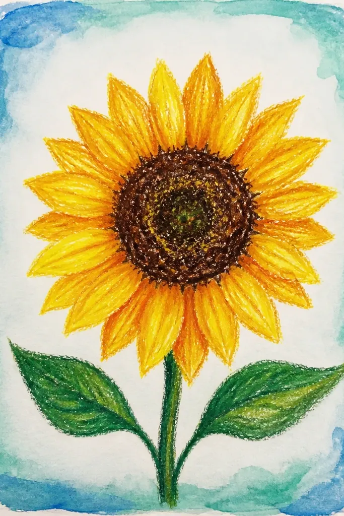
A frame makes the sunflower feel like a finished print. Instead of painting the whole background, you paint a border wash that wraps around the flower and creates instant focus. Oil pastel resists the wash, so the sunflower edges stay crisp while the frame stays soft. This one is also easy to control, which keeps it beginner-friendly.
Draw your sunflower in the center with oil pastel and keep the background area blank inside the future frame. Wet the outer border area (about 1-1.5 inches around the edges) and paint a blue-green wash. Add a second darker pass along the outer edge for a vignette effect. Let dry, then reinforce sunflower outlines with a final oil pastel touch if needed.
Use a ruler to keep the frame width consistent — it looks intentional in photos.
Don’t let the frame wash creep into the sunflower space; keep a clear margin.
18. Sunflower with Monochrome Ink-Look Watercolor
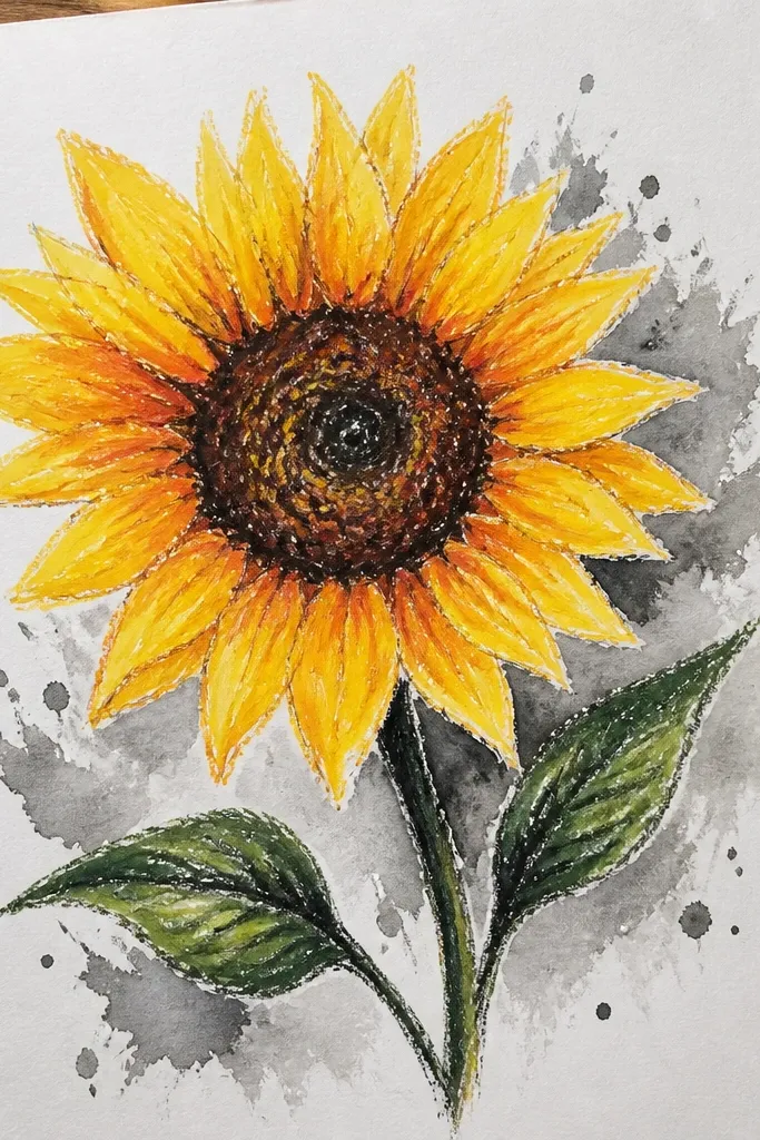
Monochrome backgrounds make the sunflower feel graphic and clean. Even if you only use one background color, the oil pastel gives you bright yellow that pops against it. This style is perfect if you want something that looks good in a minimalist home or matches neutral decor. It also reduces the color-mixing pressure for beginners.
Choose one background color like indigo or deep teal and decide the sunflower colors you’ll keep warm. Draw petals with oil pastel and press a darker pastel along overlap edges. Paint a monochrome wash behind the sunflower, leaving the flower itself untouched. Add a second thin wash pass near the bottom to create depth, then let everything dry before adding a few extra petal edge lines.
If your monochrome wash looks flat, add one darker band behind the stem instead of more color everywhere.
Avoid using multiple background colors — it removes the clean graphic look.
19. Sunflower with Lemon Yellow Highlights and Soft Violet Wash
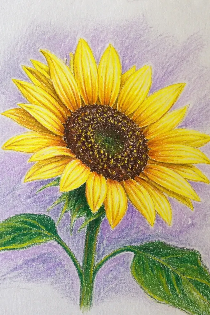
Draw petals with oil pastel using a bright yellow base, then add lemon yellow on the top third of each petal. Use a darker brown or burnt sienna at the petal overlap points. Paint a very light violet wash around the sunflower, keeping it diluted so it doesn’t overpower the petals. When dry, add tiny center dots with darker pastel to sharpen the focal point.
This combination looks bright without being harsh. Lemon highlights on petals make the flower feel sunlit, while a faint violet wash cools the background so the yellow reads warmer. Oil pastel keeps the highlights intact while watercolor adds a gentle atmosphere. It’s a great choice for beginners because both colors are forgiving and blend softly.
Common mistakeDon’t cover the petals with violet wash; it dulls the highlights.
Good to knowKeep violet super diluted; if it looks too purple on paper, water it down more.
20. Sunflower with Watercolor Checkerboard Background
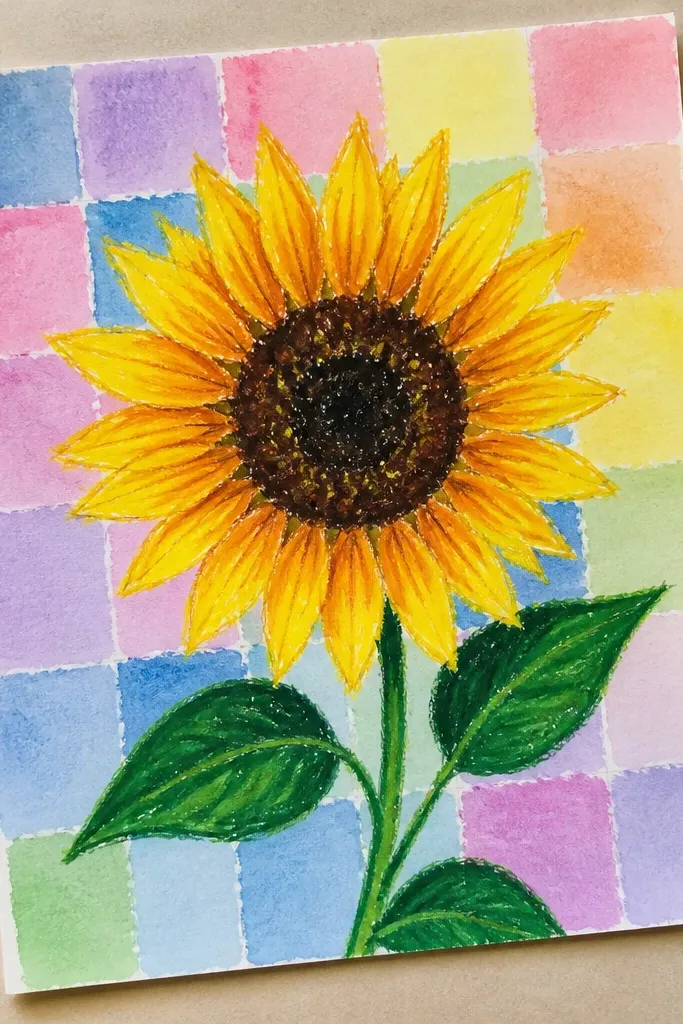
A checkerboard background makes the sunflower look like a design poster. The pattern is simple but striking, and it frames the bloom so the whole piece looks intentional. Oil pastel keeps petal edges sharp, so the checkerboard doesn’t blur into the flower. This is a fun way to practice clean watercolor edges without complicated realism.
Draw the sunflower with oil pastel on a grid-paper sheet or with a light pencil grid. Paint alternating squares with two diluted watercolor tones, letting each square dry just enough that colors don’t bleed. Keep the squares behind the petals lighter so the flower remains dominant. Add a final thin oil pastel line around the flower silhouette so it pops off the patterned background.
Use a small brush and paint the squares in rows to avoid uneven coverage.
Skip rushing; if you paint adjacent squares while one is still wet, the checkerboard edges disappear.
21. Sunflower with Tropical Palms Background (Simple Shapes)
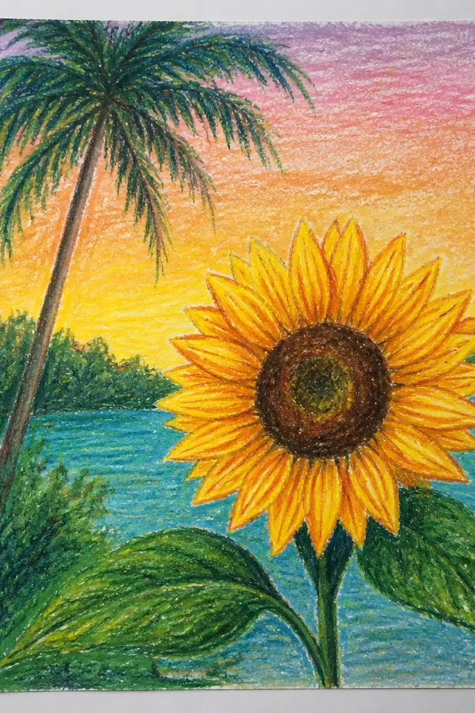
Sunflower + palm leaves feels summery and modern, especially when the palms are simplified and slightly transparent. Use oil pastel for the sunflower so it stays crisp while the palms are watercolor-only for a softer layer. This is a great choice if you want a scene, not just a flower — it gives more visual interest in photos. Keep the palms behind the sunflower so the bloom stays the focal point.
Draw the sunflower first with oil pastel and keep it bold and centered. Sketch two or three palm fronds behind it using a light pencil guide, then paint them with diluted green and teal watercolor. Add a warm yellow-orange wash behind the palms to connect the color story. Let dry, then reinforce sunflower petal edges with oil pastel so the layers stay clean.
Paint palms in one or two washes, not many — too many layers make them look muddy.
Don’t paint palms in the same yellow as the sunflower center; it makes the background compete.
22. Sunflower with Night Sky Stars and Deep Background
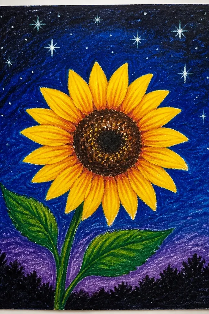
Draw your sunflower with oil pastel and add a darker center ring so it reads clearly against the dark wash. Paint the background with deep indigo, leaving the sunflower area untouched. When the background is dry, flick tiny white dots for stars using a stiff brush and watered white paint. Add a few extra dark petal edges with oil pastel so the silhouette stays clean.
A night sky background makes the sunflower look like it’s glowing. The deep blue watercolor stays dramatic, while oil pastel keeps petals bright and defined. Add tiny star dots using watered white or a light paint pen for crisp points that photograph well. This is an easy way to create contrast without needing realism.
Common mistakeAvoid using black watercolor; indigo looks richer and keeps the petals from turning muddy.
Good to knowLet the indigo dry fully before adding stars; otherwise the white dots spread.
23. Sunflower with Watercolor Ripped-Paper Effect Using Salt
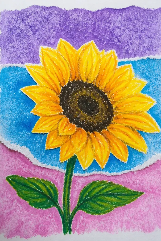
Draw sunflower petals and center with oil pastel, leaving the background around it blank. Wet the background area lightly with watercolor, then sprinkle coarse salt while the wash is still wet. Add a second diluted layer over the salt area using a single background color like burnt sienna or indigo. Let everything dry completely, then brush off the salt crystals gently to reveal the texture.
Salt texture gives you a “ripped paper” or crackle effect around the background, which looks amazing behind a clean sunflower. Oil pastel resists the wash, so the petals keep their crisp shape while the background gets that speckled texture. It’s a beginner-friendly trick because you’re not drawing texture by hand — you’re letting chemistry do it. This is great for moody or rustic looks.
Common mistakeDon’t touch the salt-wet area with your brush — it smears the texture.
Good to knowUse coarse salt, not table salt, for bigger speckles that show up clearly in photos.
24. Sunflower with Watercolor Curtain Backdrop
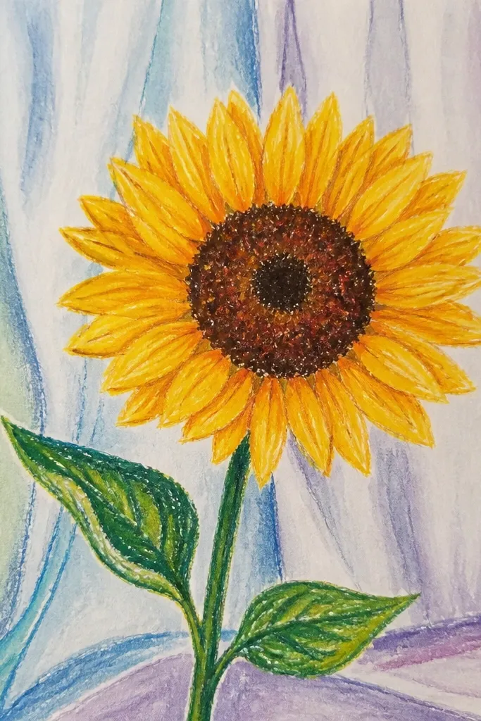
Curtain drapes add drama without needing complicated drawing skills. The trick is to paint loose vertical folds in watercolor behind the sunflower, then keep the flower crisp with oil pastel. This style looks good for framed art because the background has movement and the sunflower stays the anchor. It’s also a nice way to use a limited palette and still get a polished result.
Draw the sunflower with oil pastel and keep petal shapes bold. Wet the background lightly, then paint vertical curtain folds using diluted indigo and a warmer tint like burnt sienna on alternating lines. While the wash is still slightly wet, drag a damp brush down a few folds to create soft striations. Let dry and then add a darker oil pastel line under the stem for contrast.
Paint fewer folds than you think — 5-7 visible lines look cleaner than a dense curtain.
Avoid heavy watercolor coverage; if the folds are too dark, your sunflower loses focus.
25. Sunflower with Oil Pastel Resist Leaf Silhouettes
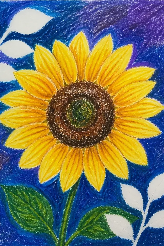
This one uses oil pastel like a resist to create leaf silhouettes behind the sunflower. You draw leaf shapes in pastel, then paint watercolor over everything — the leaves stay lighter because they repel water. It’s a smart way to add depth without drawing dozens of details. The result feels layered and graphic, and it hides beginner roughness in the background.
Draw your sunflower petals and center with oil pastel first. Then add simple leaf silhouette shapes around it by scribbling oil pastel in leaf outlines and centers. Paint over the entire background with a single diluted watercolor color, covering both the leaf silhouettes and the space between them. When dry, add a few extra sunflower edge lines to keep the flower crisp against the resist shapes.
Keep leaf silhouettes larger than the sunflower stem — small shapes get lost in photos.
Don’t use thin pastel lines for the resist; thin marks let watercolor seep through.