1. Center-Down Wilt Mandala with Ringed Petals
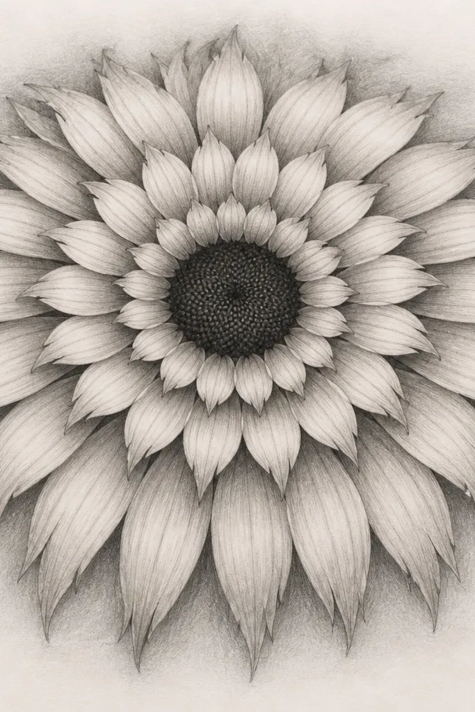
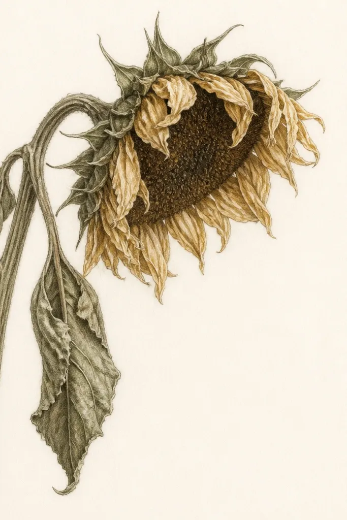
This one looks best when you want the wilt to feel romantic instead of messy. I draw the center in deep brown-black so it anchors the whole piece, then I angle every petal tip down at a slight diagonal. The petals use warm yellow-gold with muted olive shadows, so it reads like late-summer light even on dull rental walls. If you love earthy decor, this design matches both beige walls and cool gray paint because the values stay consistent. It also flatters small spaces since the center stays tight and doesn't sprawl.
Start by sketching a circle for the center (about 2.5 inches on an 8.5x11 page), then add three evenly spaced rings of petals around it. Draw each petal as a teardrop, but rotate them so their point faces the same downward direction. Ink the center first with a fine liner, then outline petals with a brush pen so the lines are slightly thicker near the base. Color the petals with yellow pencil or marker, then add olive under-petal shading on the lower half. Finish by adding a faint dot pattern in the background bands.
Good to knowUse a ruler for the ring spacing and freehand only the petal angles. That's what keeps the wilt looking intentional.
Common mistakeDon't make the center light or blank - a washed-out middle makes the whole mandala look unfinished.
2. Wilted Petals on a Honeycomb Mandala Grid
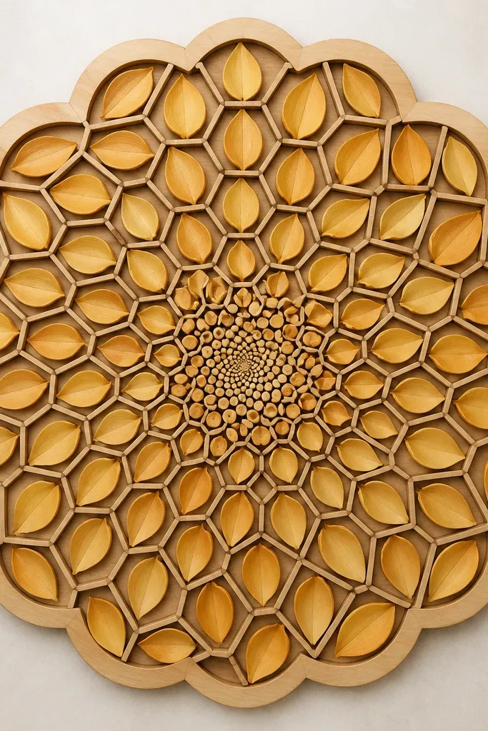
This drawing looks like stained glass without the mess, because the hex grid gives you clean boundaries for the wilt. I like it for renters because the geometry makes it forgiving if your ink line wobbles a little. Color-wise, I use sunflower yellow for the top-facing edges and a dusty amber for the droop side, plus a soft gray-green for the background hex shadows. It looks amazing on warm wood frames and also on black frames because the hex lines pop. If your room has lots of straight lines (shelves, blinds), the honeycomb balances the space.
Start by lightly sketching a hexagon grid that fits your page, leaving a 0.5 inch margin all around. Add a sunflower center with a dot spiral, then place petal teardrops inside selected hex cells, keeping the droop direction consistent. Outline the hex lines with a fine pen, then outline each petal with a slightly thicker line for contrast. Color the petal top edges yellow and blend the droop edge with amber using a second pass. Finally, shade the hex background lightly with a gray-green pencil so the petals don't look flat.
Good to knowIf you're printing, set your printer to 'Best' and don't oversharpen. You want crisp edges, not thick toner.
Common mistakeAvoid coloring every hex the same intensity; let the background stay lighter than the petals.
3. Scribble-Wilt Mandala with Crosshatch Shading
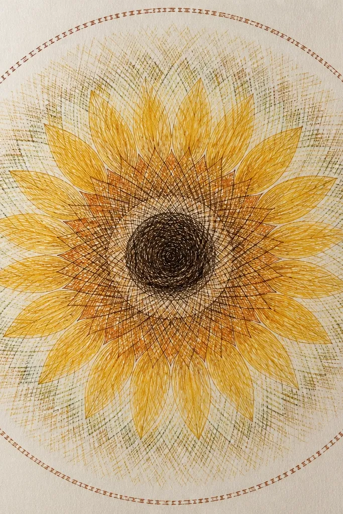
This one is my go-to when I want the art to look handmade and textured, like it was drawn on a Sunday afternoon. The crosshatch shading gives you depth without needing expensive markers. I keep the wilt gentle by making the scribble strokes follow the petal curve, not the page direction. Use warm brown and soft olive shading for a wilted, not dead, look. It's flattering in rooms with neutral tones because the texture catches light and adds warmth. It also looks great at larger sizes like 12x16 because the strokes feel intentional, not fuzzy.
Begin with a pencil outline: draw a center circle and then 4 petal rings. For each petal, sketch a teardrop outline and fill it with short scribble strokes that angle downward. Add crosshatching in the shadow side of each petal using a 2B pencil, then blend lightly with a tissue so it stays soft. Ink the center last so it stays the darkest element. Finish the outer ring with a dashed border and add a few tiny pollen dots around the center spiral.
Good to knowWork with a light hand on the first hatching pass. You can always darken later, but you can't remove ink.
Common mistakeDon't saturate the whole page with heavy crosshatching or the wilt loses its contrast.
4. Wilted Sunflower Mandala in Two-Color Ink (Sepia + Olive)
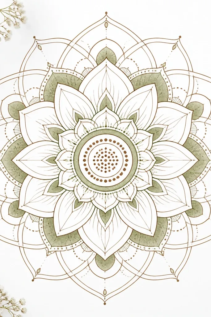
Two-color mandalas look expensive because your eye reads the structure first. I use sepia for outlines and the center texture, then olive only in shadow areas so the wilt looks dimensional. This design works in both bright apartments and darker corners because the white space stays clean. It flatters people who like minimalist decor - it doesn't fight your existing prints. If your walls are off-white, the sepia warms everything up.
Sketch your mandala bands lightly so you can erase without tearing paper. Draw petal outlines in sepia using a fine liner, then add a single olive shadow line along the underside of each petal. Color the center with sepia dot clusters, and add one olive ring just outside the center to create depth. Keep the outermost border thin and consistent, like a double line. Let the paper stay mostly white; don't fill every gap.
Good to knowUse a gel pen for the sepia dot spiral so the dots stay crisp after drying.
Common mistakeDon't use olive for outlines. Olive-only outlines make the petals look muddy.
5. Wilted Sunflower Mandala with Torn-Petal Fringe Edge
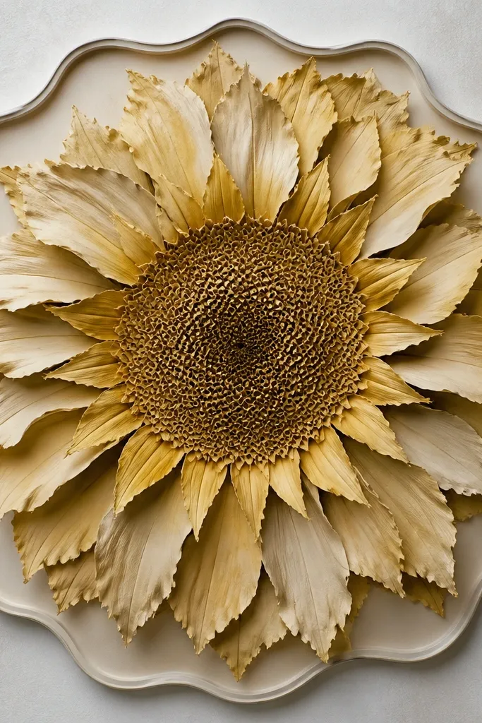
This one has the most "real wilt" feeling because of the fringe edges. I draw petals with slightly jagged tips and add tiny gaps between overlapping petals, so it looks like the flower is drying. The color palette I use is buttery yellow on the top edges and ochre with a hint of red-brown on the droop side. It looks striking in a black frame because the torn edges catch shadow. For renters, it also hides minor alignment issues because overlapping petals forgive small shifts.
Start with a center circle and draw 3 main petal rings, leaving room at the top for overlap. For each outer petal, sketch a jagged edge along one side and keep the other side smooth, then tilt the petals downward. Outline everything with a pen, then color the top half of petals yellow and the lower half ochre-red. Add a wavy outer border with evenly spaced short curves to keep the edge cohesive. Finally, add a few dry-brush style specks around the torn tips using a light brown pencil.
Good to knowIf you're using markers, let each petal dry before adding fringe details or you'll get bleed.
Common mistakeAvoid making the fringe too thick. Thin jagged edges look like paper; thick edges look like a mistake.
6. Mandala Sunflower with Drooping Petals and Lace Dots
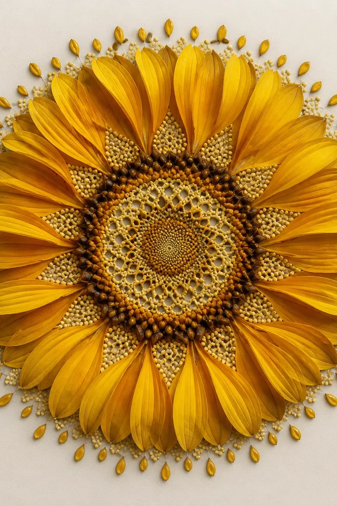
This is the prettiest option for soft, feminine decor without going full floral cliché. The drooping petals give the wilt, and the lace dots make it look delicate instead of ragged. I use light warm yellow for petals, then add pale peach shading on the droop side. The lace dots are done in a darker brown so they show up on camera and in daylight. It looks especially good on cream walls and in frames with a light wood tone. It's also forgiving for beginners because the dotwork covers shaky lines.
Draw a center circle and fill it with a spiral of small dots, spacing them evenly. Add 5 petal shapes around the center, each one rotated so the points face down. Between petals, place lace dot clusters: 5-7 dots forming a tiny half-moon. Outline the outer ring with a thin double line, then add teardrop ornaments along it at equal spacing. Color petals lightly, then add a peach shadow band along the lower petal edge.
Good to knowUse a 0.5 mm gel pen for the lace dots. A thicker tip looks blobbed at small sizes.
Common mistakeDon't crowd the lace dots so tight that they turn into a solid patch.
7. Wilted Sunflower Mandala with Drippy Center Paint Effect
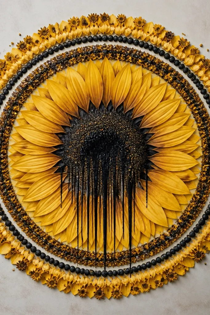
This is the one I make when someone wants "artsy" but still readable from across the room. The drippy center adds movement and makes the wilt feel real, while the crisp rings keep it from looking chaotic. I use a dark sepia or black-brown for the drip effect, then keep petals warm yellow with soft gray shadow. In a renter setup, a drippy center looks great even if the paper texture shows - it adds to the effect. It also flatters bold decor because the center is your focal point.
Sketch your petals first so you don't accidentally smear the center. Draw a tight center circle and outline it with a fine liner. For the drips, add 8-12 vertical drip lines from the center edge, then connect them with small pooled blobs at the top. Shade the area just around the drips with a darker pencil to blend. Color petals yellow, then add gray shadow where the petal droops. Finish with a clean circular ring around the center so the drip stays contained.
Good to knowIf you use a paint pen, practice on scrap paper first to match the drip thickness.
Common mistakeDon't let the drips reach the petal bases or it will look like a smudge.
8. Sunflower Mandala Clockwork Wilt (Spokes + Petal Fans)

This one reads super graphic, like a vintage illustration, which makes it perfect for renters who want a statement without complicated coloring. The spoke structure keeps the mandala crisp while the petal fans show the wilt. I use mustard yellow and a muted brown shadow so the droop doesn't turn into bright orange. It looks sharp against white, taupe, and even dark navy walls. If your home has modern furniture or black metal accents, this design matches that vibe.
Start with a center circle about 2 inches wide, then draw 12-16 spokes radiating outward. Between spokes, draw petal fan shapes that overlap slightly and all tilt downward. Outline spokes with a fine pen, then outline petals with a slightly thicker pen so petals pop. Color mustard yellow on the upper half of petals and add brown shadow on the lower half. Build the outer gear ring with small notches - 24 notches around the edge - and keep the border thin.
Good to knowCount your spokes and stick to one number across the whole page so the symmetry feels deliberate.
Common mistakeAvoid uneven spoke spacing; it makes the whole mandala look crooked even if you frame it.
9. Wilted Sunflower Mandala with Watercolor Wash Background

Watercolor backgrounds make your wilted sunflower feel softer and less "printout." I keep the wash light so the ink stays crisp, then I tint petals with watered yellow so the droop looks airy. This design looks good in bathrooms and bedrooms because the wash hides small wall shadows. It flatters cool-toned interiors because of the blue-gray top fade. If your decor is neutral with a hint of sage or blue, this ties everything together without adding extra colors.
Tape your watercolor paper to a board so it stays flat, then lightly sketch your center and 3-4 petal rings. Paint a very thin wash behind the mandala using diluted blue-gray at the top and beige at the bottom. Let it dry completely before adding ink lines, especially in the center. Color petals with diluted yellow, leaving white highlights on the upper edges. Finish by deepening the center with darker ink and a tiny watercolor pool at the top of the drip lines (if you want a wilt cue).
Good to knowUse a hair dryer on low to speed drying so your ink doesn't bleed.
Common mistakeDon't paint the background too dark. Dark wash behind thin lines looks muddy.
10. Wilted Sunflower Mandala with Cut-Paper Look Petals
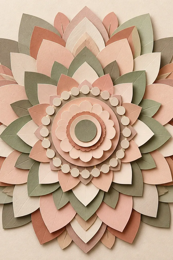
This is the design I use when I'm upcycling scrap paper and want the drawing to look like a collage even if it's printed. The cut-paper effect comes from drawing a thin shadow outline under each petal layer. It makes the wilt feel dimensional instead of flat. I recommend using warm yellow, cream, and a muted brown for the shadows so it looks like layered kraft paper. It flatters warm skin tones and cozy interiors because it reads earthy and tactile. In a rental, it also hides tiny printing misalignments because layered shapes cover small gaps.
Sketch petal layers in 3 groups: inner petals, middle petals, outer petals. For each petal, draw a second outline slightly offset down and right to create the shadow. Shade the top layer cream or pale yellow, then shadow layer in muted brown. Add a center dot ring and small semicircle shapes that radiate outward. Finish with a clean outer border line and optional tiny paper-cut notches along the edge of outer petals.
Good to knowIf you're doing this as a print-and-trace, trace the shadow outlines last so they stay consistent.
Common mistakeAvoid thick shadow outlines. Thin shadows look like paper; thick shadows look like a cartoon.
11. Sunflower Mandala with Drooping Petals and Starburst Seeds
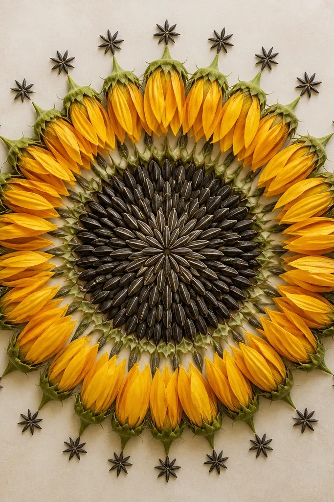
This keeps the wilt but still feels bright because the seed pattern radiates like a starburst. I love it for renters because it looks lively without being loud. Use warm yellow for petals, then a darker golden-brown for seed star shapes. The droop direction is consistent, so the wilt reads clearly. This design looks great in kitchens and entryways because the center detail pulls your eye in. It also works well for people who struggle with drawing petals - the seed pattern covers that area with texture.
Draw a center circle and fill it with small teardrop seed shapes that point outward like a sun, spacing them evenly. Add 4 petal rings around it, with each petal rotated so the tip points downward. Outline petals with a fine liner and add a thicker line at the petal base. Color petals yellow and add a small crescent shadow near each base using golden-brown. Create the outer ring by placing tiny starburst marks between petals, then finish with a thin circular border.
Good to knowUse a punchy gel pen for seeds so the star shapes stay defined after framing.
Common mistakeDon't leave the seeds uniform. Mix small and medium seed shapes so the center looks natural.
12. Wilted Sunflower Mandala with Falling Petals Along the Bottom Arc
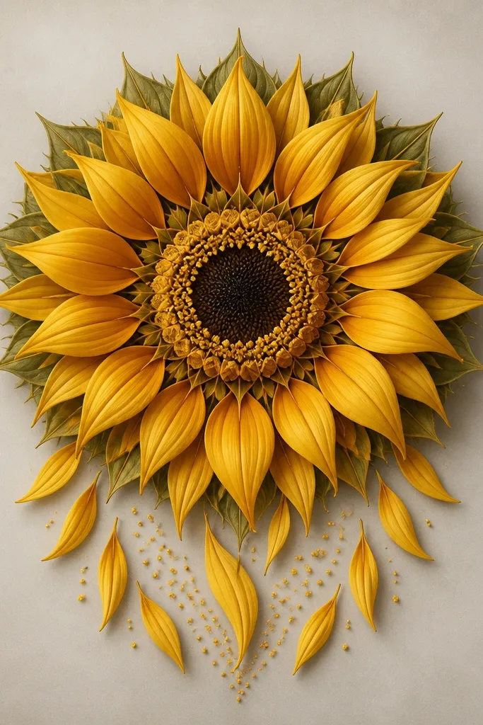
This design gives you the most dramatic wilt while still staying renter-friendly because the composition is controlled. I keep the top half symmetrical and let only the bottom side spill slightly. That contrast makes it look intentional, not lopsided. Color-wise, I do sunflower yellow with a warm brown shadow and a light dusty green for the background dots. It looks great in frames where the art sits slightly above eye level because the falling petals guide the gaze down. If you like movement in your decor, this one delivers without needing extra objects.
Sketch a standard sunflower mandala with a tight center and 3 rings of petals. For the bottom arc, extend 4-6 outer petals farther down by drawing longer teardrops and adding 2 extra pollen dots clusters beneath them. Outline the falling petals with a slightly thicker line so they feel like they're in the foreground. Shade the droop side with warm brown and keep the upper edges yellow. Add a thin dotted trail from the center toward the bottom arc, keeping it sparse so it doesn't look like a mess.
Good to knowUse a pencil guide line for the droop direction so every falling petal leans the same way.
Common mistakeAvoid extending too many petals down. Four to six is enough for impact.
13. Wilted Sunflower Mandala with Crossed Petal Veins
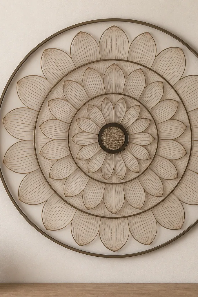
Vein lines make the wilt look detailed without needing heavy coloring. I draw a main vein line in each petal, then add 2-3 short cross lines that angle toward the droop edge. It gives you that botanical realism people want in sunflower art. Color stays simple: yellow petals with a pale tan shadow and dark brown veins. This works especially well if you want a piece that looks good in black frames too, because the veins act like a built-in texture. It also flatters small rooms because the linework adds interest without taking up extra space.
Start with a pencil layout: center circle, 4 rings of petals, and a thin outer border. Outline petals with a fine pen, then add one central vein line from base to tip. Add two or three crossed vein marks per petal, keeping them closer to the base so they don't clutter the tip. Color petals lightly yellow, then add a tan shadow on the lower half. Finish the center with a dot grid ring and a darker outer ring for depth.
Good to knowUse a mechanical pencil with a sharp tip for the vein sketch before inking. It keeps your lines straight.
Common mistakeDon't put veins all the way to the very tip on every petal - that makes the drawing look like it has too much going on.
14. Wilted Sunflower Mandala with Ombre Petal Coloring Bands
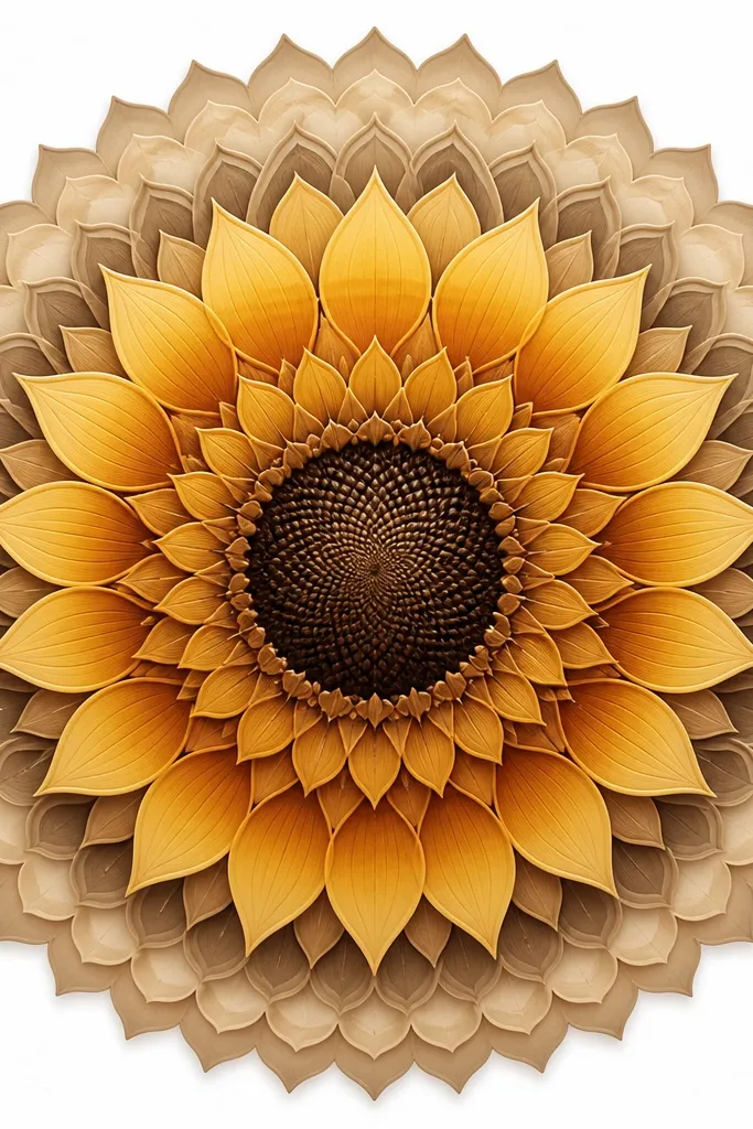
Ombre petals make wilt look natural because real petals darken as they droop. I use a gradient within each petal, so each one has a top highlight and bottom shadow. This looks clean and modern, especially if you're using colored pencils or alcohol markers. It flatters people who like a polished look because the gradients make the piece look intentional even if your linework isn't perfect. It also looks good on walls with mixed lighting since the gradient gives the art depth.
Sketch 3-5 petal rings with evenly spaced petals and a tight center. Color the upper half of each petal bright yellow, then blend into honey brown on the lower half. Use a lighter touch near the petal tip so it fades instead of becoming a block color. Add a dark brown center texture with small curved lines or dot spirals. Keep the mandala rings thin and leave the background white so the gradients stand out.
Good to knowBlend with a light circular motion using the same pencil that laid the color down. It prevents harsh lines.
Common mistakeAvoid blending too far into the top highlight. If the whole petal turns brown, you lose the wilt contrast.
15. Sunflower Mandala with Wilted Petals Inside a Circle Frame
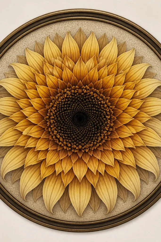
This is the renter-friendly option when you want a clean "printable art" look without the busy background. The thick double circle frame acts like a mat, even if you don't use a real mat board. I keep the mandala inside the frame crisp, so it works on small prints and looks tidy in tight hallways. The droop petals still give you the wilt, but the framing keeps everything from feeling messy. It's perfect if you're matching a set - like two prints side by side - because the circle frame standardizes the composition.
Draw a large circle frame first, leaving a margin for the page edges. Add a second circle just inside it, then sketch your center circle in the middle. Place petal rings inside the circles, all drooping downward but evenly spaced. Use fine liner for petals and a slightly thicker pen for the center outline. Add faint dot shading in the background inside the frame using a light brown pencil, then leave the outermost ring clean.
Good to knowIf you're framing without a mat, this design still looks finished because the double circle replaces the mat effect.
Common mistakeDon't skip the inner circle. Without it, the mandala can look like it's floating.
16. Wilted Sunflower Mandala with Sun Rays That Fade Down
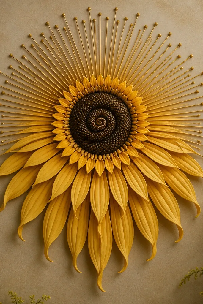
This one balances wilt and brightness by turning the rays into a droop effect. I draw long rays on the top half and shorter, more curved rays on the bottom half, so the entire piece leans. It's a strong choice for renters because it looks like a single cohesive illustration, not separate parts taped together. Color stays simple: golden yellow rays, brown shadows, and a dark center. It looks great in bright rooms because the rays catch light and add warmth without needing extra color.
Sketch a center circle and fill it with a dot spiral. Draw 24 sun rays radiating outward, but curve and shorten the rays on the lower half. Convert every 6th ray on the bottom half into a teardrop petal that droops under the main rings. Outline rays and petals with a fine pen, then add brown shading on the underside. Color rays yellow, leaving thin white highlights, and keep the background minimal with a few pollen dots near the center.
Good to knowUse a consistent ray length for the top half so the fade down feels intentional, not accidental.
Common mistakeDon't make the bottom rays too short. If they disappear, the wilt reads like an incomplete drawing.
17. Wilted Sunflower Mandala with Lace Mandala Border
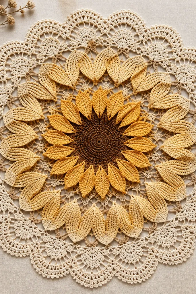
This is the one I pick when the frame is ornate or when the room already has decorative details. The lace border makes the wilt feel like it belongs in a vintage print, but the center still stays clear and readable. I use warm yellow petals, soft beige shadows, and dark brown lace lines. The lace border also hides print imperfections because the repeated pattern distracts your eye. It looks great in living rooms where you want a cozy vibe without adding more objects. If you're doing a single statement piece, this border helps it feel complete.
Sketch the sunflower center and 3-4 petal rings, keeping petal droop consistent. Fill the space between rings with small lace motifs like tiny loops and half-moons. Then build a separate outer lace border about 0.8 inches wide: scallops on the outside edge and small connecting loops inside. Outline lace with fine liner, and color petals yellow with beige shadows on the droop side. Finish by adding a few pollen dots near the center so the lace border and sunflower center feel connected.
Good to knowDraw the border last and use a scrap of paper to test the spacing so it doesn't get too tight.
Common mistakeAvoid overfilling the background between petals. Keep some clean white so the lace doesn't look like noise.
18. Wilted Sunflower Mandala with Arched Petals and Crescent Shadows
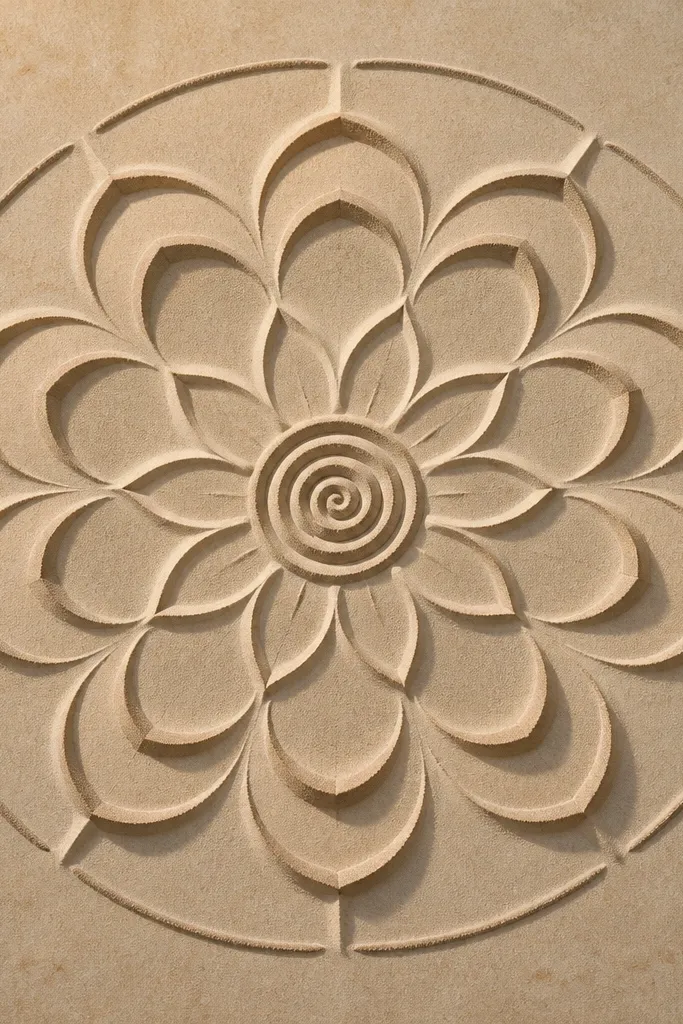
Crescent shadows make this look like it was printed from a vintage book. The wilt is visible because the crescents sit on the lower side of each petal, giving you instant depth. I use buttery yellow for the petal body and a muted taupe-brown for the crescents. This works in small frames because the shapes are graphic and readable. If your decor is light and airy, this design keeps the palette gentle. It also flatters people who like clean line art, since the shading is simple and consistent.
Sketch petal arches in 3 rings, each petal shaped like a curved teardrop that droops. Outline each petal, then add a crescent shadow under the petal base using taupe-brown pencil. Shade the center with a dot spiral and a slightly darker ring around it. Add curved separators on the outer ring - like small arcs between petals - to keep everything structured. Keep the background white and add only a light sprinkle of pollen dots around the center.
Good to knowUse a blending stump or tissue only for the crescent edges. Leave the petal outlines crisp.
Common mistakeDon't use gray-blue for the crescents. Taupe-brown keeps the wilt warm instead of cold.
19. Sunflower Mandala with Wilted Petals Cut by Vertical Dividers
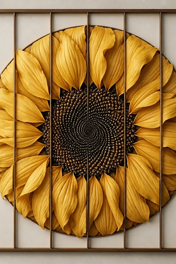
These vertical dividers make the wilt look organized, like a window panel. I like it when you want structure for renters who live with lots of straight furniture lines. The dividers also help if your petals aren't perfectly symmetrical because each section is its own mini composition. Use sunflower yellow petals, warm brown shadows, and dark brown dividers. It looks great in modern apartments and in spaces with black or brass accents. The rounded rectangle frame keeps it from feeling harsh.
Draw a rounded rectangle border first, then add 8-10 vertical divider lines from near the top to near the bottom, equally spaced. Sketch your center dot spiral in the middle and keep it the same size across all sections. Draw petal teardrops within each section, drooping downward but following the divider boundaries so the shape stays contained. Outline dividers with a fine liner and outline petals with a slightly thicker pen. Color petals yellow and add warm brown shadow on the lower half; keep dividers uncolored.
Good to knowIf you're printing, set margins so the rounded rectangle border doesn't get clipped.
Common mistakeAvoid too-thick divider lines. Thick dividers steal attention from the sunflower center.
20. Wilted Sunflower Mandala with Mini Petals Falling from the Outer Ring

This design makes the wilt feel alive because it adds a little "falling" motion around the edges. I use the main mandala to stay neat, then I let only the mini petals break the frame slightly downward. The color palette is warm: yellow petals with ochre shadows and a soft dark brown for seed texture. It looks especially good in simple frames because the falling petals act like a border. If you're decorating a hallway or entry where art is seen while moving, the falling motion reads quickly and looks charming.
Sketch your main mandala with 3 petal rings and a detailed center, keeping the outer ring intact. Then add 10-14 mini petals around the outer ring edge, each one tilted downward and spaced like raindrops. Outline mini petals with a thinner line than the main petals so they feel lighter. Color main petals yellow with ochre shadow, then color mini petals slightly paler so they don't overpower. Add a few pollen dots near the center and stop there so the extra motion stays focused.
Good to knowUse the same pencil for mini petals but a lighter pressure - it makes them look like they're catching light.
Common mistakeDon't add mini petals all around evenly. Concentrate them along the bottom third so the wilt direction is clear.