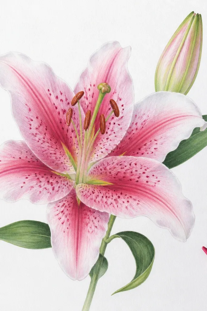
1. Top-Left Glow Lily on Thrifted Cardstock
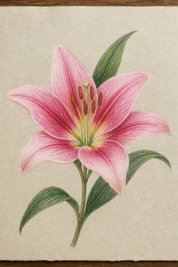
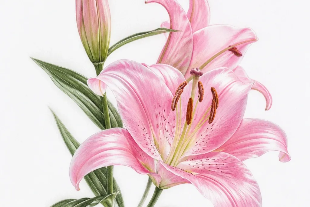
This one is my go-to when I want a drawing to look "real" fast. The lily is outlined with a 0.5 fine-liner, then shaded with a light pink wash that gets darker only along the fold lines. I add a small highlight on the upper-left of each petal - tiny, like a glossy spot - because that's what makes the flower look freshly opened. It works best on warm-toned paper because the off-white background makes the pink feel softer, not neon. If your style leans delicate, this is the cleanest way to get there without overworking the lines.
Start by sketching the center bud with a short curved stem and 6 petals that overlap - two in front, two behind, and two angled outward. Ink only the petal outline first, then draw 3 to 4 vein lines that start near the center and stop before the petal edge. Next, blend a light pink wash across the petals, leaving the upper-left edge slightly lighter each time. Finally, add a darker pink at the fold crease, then place a small gel-pen highlight near the petal tips and let it dry fully before moving on.
Good to knowIf your pink looks streaky, dilute your paint marker with a drop of water on a palette before you touch the paper.
Common mistakeDon't shade the whole petal evenly or the lily turns into a flat blob.
2. Pink Lily with Dot-Center Hatching
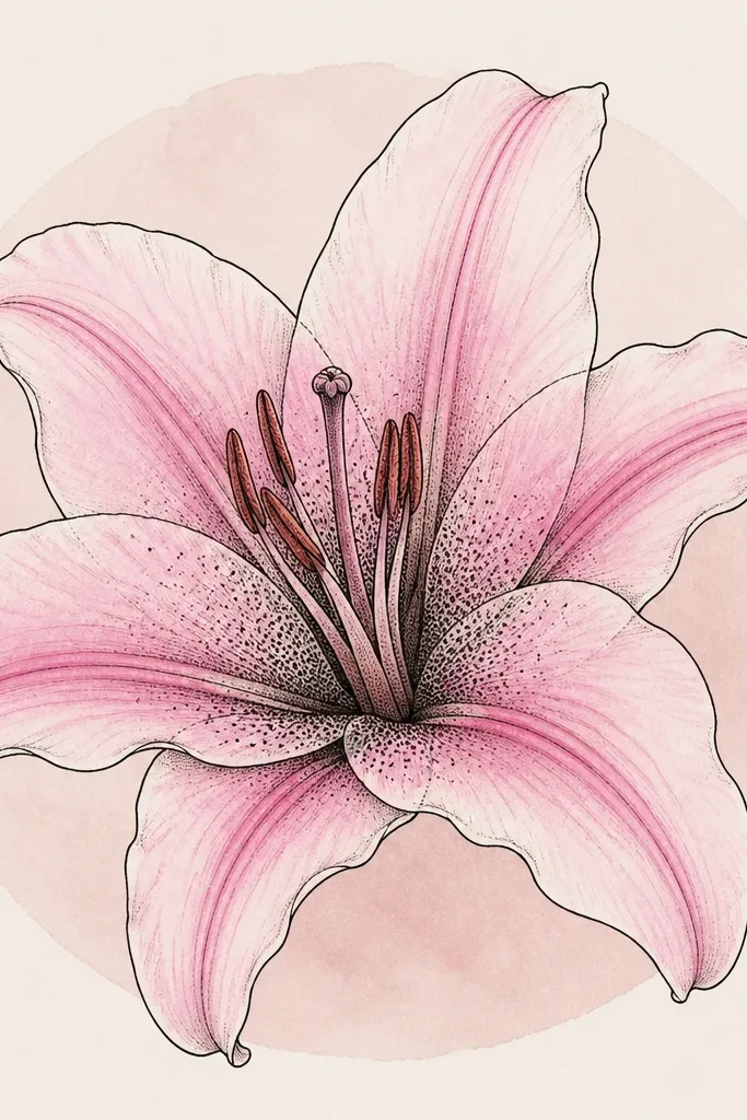
Dot-center shading gives lilies a handmade, textile-like texture. The petals stay smooth with a gentle pink gradient, but the center gets busy with stippling so it feels like the anthers and pollen. I use a 0.3 fine-liner to place dots that get denser toward the very center, then I connect the dots with faint short hatch marks for extra depth. This style looks especially good on thicker paper or watercolor postcards because the dots don't blur. It flatters a "soft but artsy" vibe - think vintage stationery instead of bold poster art.
Begin with a standard lily outline: center bud, then 6 petals with overlapping edges. Add vein lines lightly in the petal, keeping them thin so they don't compete with the center detail. Next, draw the center area and stipple it with dots - start sparse, then build density toward the middle until it looks like a dark halo. Add a thin ring of darker pink around the stippled center for contrast. Finish by washing a pale pink behind the whole lily in a loose circle, keeping the edges feathered.
Good to knowUse a scrap paper "dot map" first so your dot size stays consistent across the center.
Common mistakeSkip large filled circles in the center - they look like a stain instead of pollen.
3. Two-Lily Cluster for a Repurposed Jewelry Box Lid
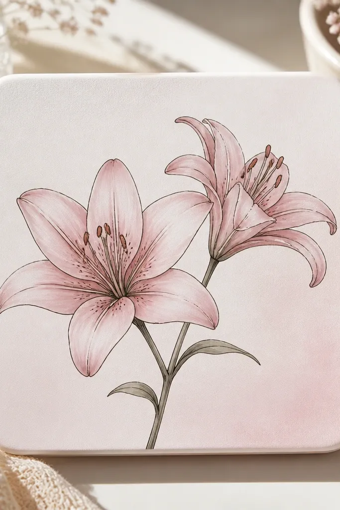
A two-lily cluster fills a small surface without making the drawing feel crowded. I draw one lily as the hero - front-facing petals with strong fold shading - and the second as a supporting bloom with simpler lines. The pink stays cohesive because both lilies share the same light direction and the same dark fold color. This looks great on white or cream surfaces because you get contrast without needing a heavy outline everywhere. It's a flattering choice for jewelry boxes, trinket tins, and any lid you want to feel feminine without being busy.
Sand the lid lightly so marker and paint grip, then base it with matte white acrylic. Sketch the main lily slightly off-center, then add the second lily behind it with one fewer detail pass on the veins. Ink the front lily's petal outlines and veins first, then fill the fold creases with a darker pink marker. For the second lily, keep the outline thinner and limit the fold shading to the inner half of each petal. Finish with a faint blush wash around both blooms, like a soft cloud that ties them together.
Good to knowSeal after you finish: two thin coats of matte clear spray keep the pink from dulling and protect the linework.
Common mistakeDon't center both lilies perfectly - symmetry makes it look like a sticker, not a drawing.
4. Single Lily Bookmark with Feathered Background Wash
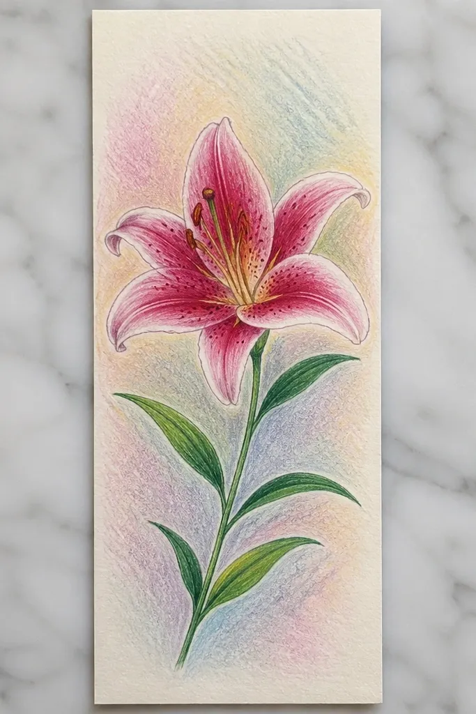
Bookmarks are where a single lily shines because the vertical shape gives your flower room to breathe. The feathered wash behind the lily makes the pink feel airy, like light passing through petals. I keep the lily compact and place the center closer to the top so the bookmark doesn't feel top-heavy. This style looks good on people who like clean layouts and readable linework because the drawing stays crisp even when the page moves. It also pairs well with hand-lettered captions if you want to add a name or date later.
Cut a bookmark from thick cardstock or an old file folder, about 2 inches wide by 6 inches tall. Draw a curved stem and one lily with 6 petals, leaving extra blank space below the flower. Ink outlines with 0.5 liner, then add 3 vein lines per petal using lighter pressure. Add a pale pink wash behind the lily, starting darker near the petals and fading outward with water on a brush. Finally, add fold shading and the small highlight spots, then let it dry flat.
Good to knowIf your wash bleeds, switch to paint marker for the background and keep the gel highlights for the petals only.
Common mistakeAvoid painting all the way to the edges - feathering needs a clean fade line or it looks messy.
5. Pink Lily on Black Paper with White Gel Highlights
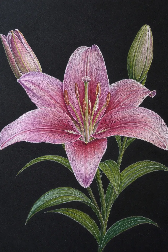
Black paper makes pink lilies look dramatic without adding extra elements. I outline petals in a dark fine-liner, then layer pink pigment so it feels luminous rather than flat. The highlight step changes here: instead of relying on paper brightness, I use a white gel pen for sharp, glossy highlights. The center looks rich with stippling in dark magenta and a lighter dot halo around the anthers. This is the best option when you want your upcycled piece to look bold from across the room, like on a thrifted frame or a gift tag tied to a bouquet.
Start by sketching the lily lightly with a pencil so you can erase without tearing. Ink the petal outlines with a 0.5 pen, then color petals with a pink paint marker in smooth passes. Add darker pink along the fold creases and near the center, leaving the upper-left edge lighter. Stipple the center area with tiny dots, then add a few short hatch strokes for texture. Finish with white gel pen highlights on each petal tip and a thin white edge line along the outer petal curve.
Good to knowWarm up your white gel pen on scrap first so it doesn't skip when you touch the black paper.
Common mistakeDon't use watery pink on black - it turns patchy fast and looks like smudged chalk.
6. Lily in a Heart Window on an Upcycled Tin
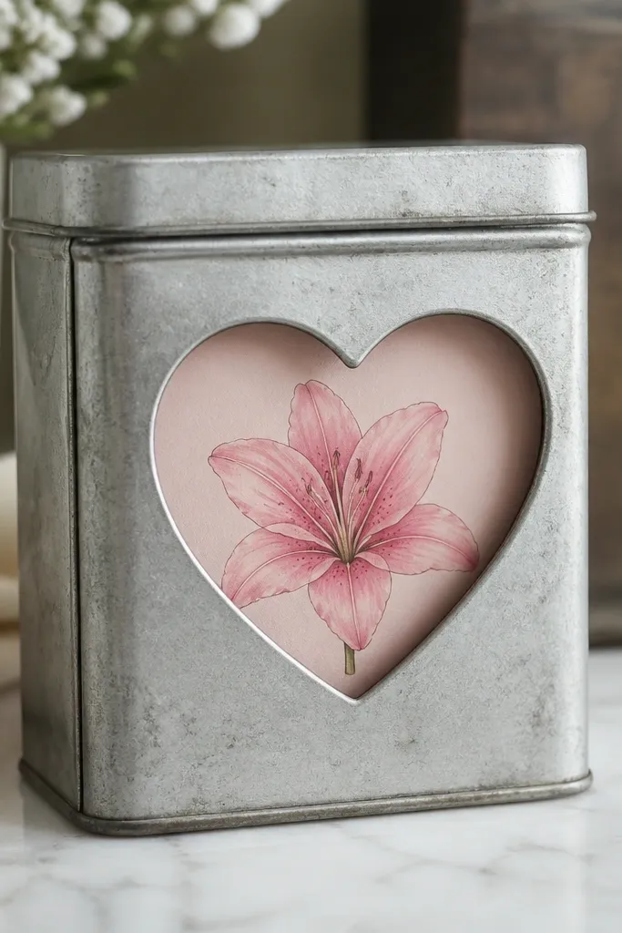
This idea is a neat way to make your drawing feel like it belongs to the object, not pasted onto it. The heart window frames the lily so your viewer's eye has an instant focal point. I draw the lily slightly smaller than the heart so the petals don't hit the edges and warp into the metal curve. The pale pink background wash behind the heart makes the petals pop, even if your linework isn't super thick. It works well for small tins, gift keepsake boxes, and anything that already has a cutout or you're willing to create one.
Paint the tin matte white or light cream first so the background wash looks even. Cut or trace a heart window on the lid, then cover the inside with a thin layer of translucent craft film or leave it open if the tin is already clean. Sketch the lily so it sits centered inside the heart, with the stem pointing slightly downward. Ink outlines and veins, then fill fold creases with a darker pink marker. Add a pale wash behind the lily inside the heart, then finish with gel pen highlights so the petals look glossy against the soft background.
Good to knowUse a thin paintbrush for the heart wash so you don't flood the cut edges and smear your outlines.
Common mistakeDon't let the lily touch the heart border - it makes the design feel cramped.
7. Watercolor-Style Pink Lily with Bleed Edges
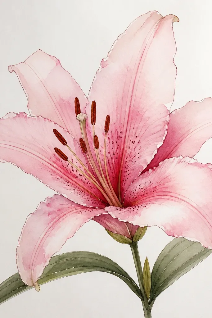
If you like a softer, painterly look, this is the lily style that reads "real flower" instead of "coloring page." The key is letting the pink bleed at the outer petal edges while keeping the fold lines darker and controlled. I outline the lily first, then add diluted pink wash and stop before it becomes puddles. The veins stay crisp using fine-liner, so the flower looks intentional even with the watercolor mess. This style looks great on mixed media paper and gives you forgiveness if your hand shakes.
Draw the lily outline lightly, then ink with a 0.3 or 0.5 liner so the veins stay delicate. Wet one petal at a time with clean water, then drop in diluted pink paint or watercolor marker for a soft edge. Leave tiny unpainted gaps near the center to suggest the petal folds. Add darker pink only along the fold crease with a small brush or paint marker, then add a thin line of gel highlight near the petal tip once dry. Finish by blending a very light wash behind the lily so it doesn't float on white.
Good to knowWork petal-by-petal so the wash doesn't dry before you get the bleed you want.
Common mistakeAvoid outlining too thick - thick black lines fight the watercolor softness.
8. Pink Lily on Ceramic Tile with Acrylic Ink Veins
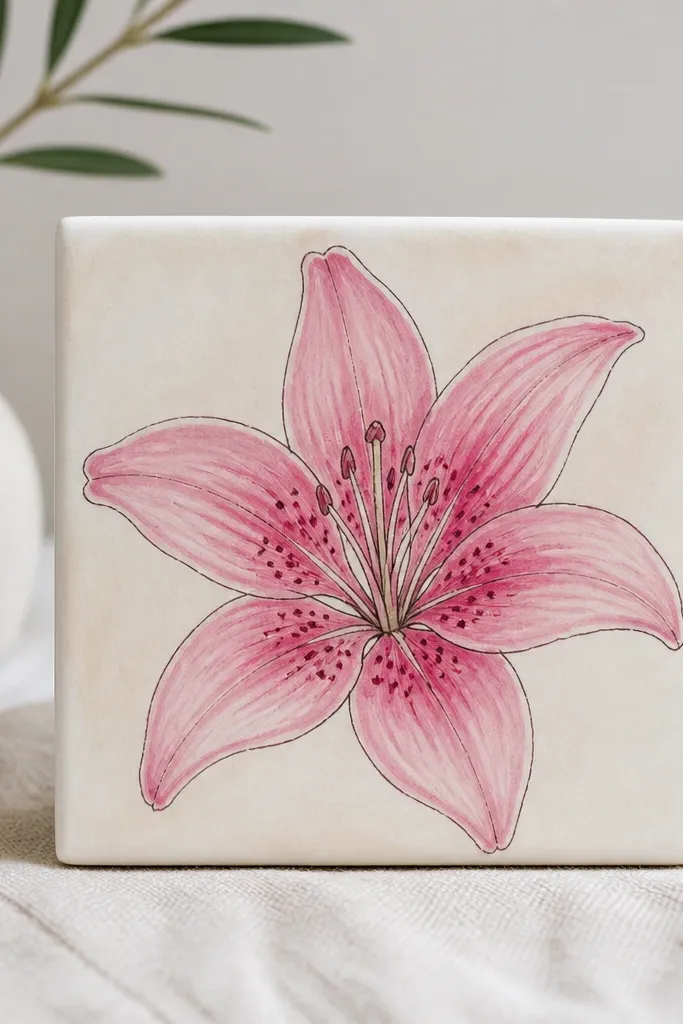
Ceramic tiles are where lilies look like real décor because the surface takes paint cleanly and holds color. I use acrylic ink or acrylic paint for the veins because pencil and most pens don't grip as well on glaze. The result is crisp linework with smooth pink gradients that don't smear when you handle the tile. This style is perfect for trinkets like mug coasters, wall hangers, or bathroom décor where you want a handmade look that survives splashes. It also flatters cool-toned pinks - think rose, not hot fuchsia.
Clean and lightly sand the tile so the paint grabs, then wipe with rubbing alcohol. Base-coat the area around the lily with a very thin pale pink wash so you have a background. Sketch the lily, then paint petals with acrylic pink, leaving the upper-left lighter. Draw veins with darker pink acrylic ink using a fine brush, then add fold crease shading with a deeper rose. Dot the center with a small brush loaded with dark pink, then seal the tile with a clear acrylic sealer.
Good to knowLet the tile cure overnight before sealing if you've used thicker paint.
Common mistakeDon't skip sealing - unsealed acrylic ink can scuff off glossy glaze.
9. Lily and Buds as Border on Upcycled Wrapping Paper
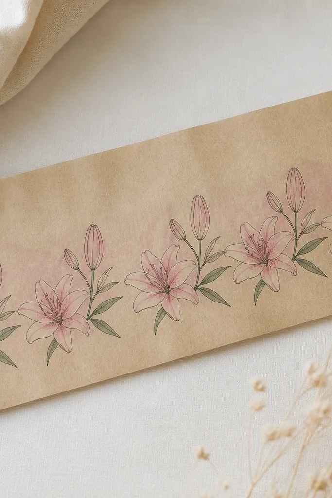
Borders are the fastest way to make repurposed paper look intentional. I draw one main lily shape and then shrink it into buds so the pattern doesn't feel random. The trick is keeping line weight consistent across sizes - if your big lily lines are thick and your buds are thin, the pattern looks off. Pink lilies in a border feel romantic without turning into clutter because the background stays mostly plain. This looks good on kraft paper and makes gifts look "wrapped by someone who cares."
Cut a strip of kraft paper or old brown wrapping paper to your size, then tape it flat. Pick a repeat spacing, like 3 inches between main blooms and 1.5 inches between buds. Draw the border using a simple stem curve, then add lily petals with the same 6-petal overlap pattern each time. Use a pale pink wash behind each bloom, staying light so the brown shows through. Finally, add darker fold creases and a few tiny highlight spots, then let everything dry before you wrap.
Good to knowUse a ruler for spacing only - keep the actual lily drawing slightly imperfect so it looks human.
Common mistakeDon't fill the entire page - a border needs breathing room.
10. Pink Lily Mandala Corner on a Thrifted Notebook Cover
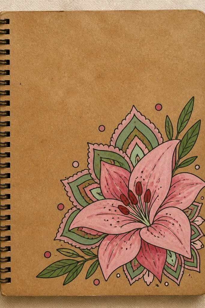
A corner lily with a mini mandala gives the drawing structure without making it look like generic doodles. I keep the lily as the main subject - full petal shading and veins - then surround it with simple dot rings and tiny petal shapes that echo the lily. This is how you get an aesthetic that looks planned even if you're drawing on a slightly curved notebook cover. It also flatters people who like pattern work because the linework repeats cleanly. The pink stays cohesive because I use only two pink tones plus dark fold shading.
Sand the notebook cover lightly, then base-coat with a thin layer of off-white acrylic if the cover is dark. Sketch the lily in the top corner so it sits about 1 inch from the edges. Ink petals and veins, then shade petals with light pink and darken fold creases with a rose marker. Add a ring of small dots around the lily, then repeat tiny petal shapes outward in a half-circle. Finish by adding a faint pink wash behind the mandala area and a few highlight spots on the lily tips.
Good to knowDraw the dot rings with a compass or a small circle template so spacing stays even.
Common mistakeAvoid mixing too many line thicknesses - the mandala looks messy if some lines are bold and others are hairline.
11. Lily on Translucent Vellum with Layered Pink Prints
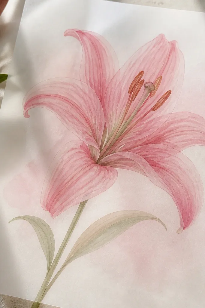
Vellum makes lilies look expensive because the layers show through light. I draw the lily once in fine-liner, then do two color passes with different pink opacity so the petals look like they're glowing from behind. The center gets stippled and then softened with a very light pink wash so it doesn't look like a dark sticker. This style is gorgeous for framed art and for wrapping small gifts where you can see the design through the material. It also flatters delicate, airy aesthetics better than heavy marker fills.
Tape vellum flat over a sketch so you can trace the lily outline lightly. Ink the petal edges and veins with fine-liner, then add the first wash of pale pink using diluted paint marker or watercolor. Let it dry, then add a second pass only along the fold creases with a slightly darker rose. Stipple the center and add a few tiny highlights with white gel pen. For the background, brush a faint pink haze behind the lily only, keeping most of the vellum clear.
Good to knowUse a low-tack tape so you don't tear vellum when you remove it.
Common mistakeDon't flood vellum with wet paint - it wrinkles and the highlight edges get muddy.
12. Pink Lily and Lace-Inspired Veins on Linen Scrap
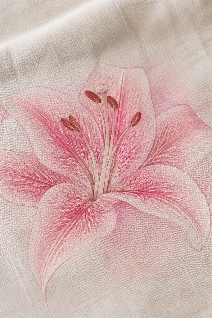
On fabric, lily drawings look best when the veins feel delicate and stitch-like. This design uses lace-inspired vein patterns: a main vein line with short branching lines that stop before the petal edge. I keep the petal shading light and let the linen texture show through so the flower doesn't feel painted-on. This style is flattering for tote bags, linen napkins, and thrifted aprons because it feels handmade. It also makes your drawing stand out even from a distance because the lace veins catch light differently than filled color.
Start with a linen scrap and mark the lily outline lightly with a fabric-safe pencil. Ink the petal outlines with a fabric marker or thin paint marker, then draw veins with a 0.3 liner-style tip. For the lace look, add 6 to 10 tiny short branches per petal vein, keeping them evenly spaced. Shade petals with a light pink wash using diluted paint marker, then deepen fold creases with a rose tone. Let it dry, then heat-set if your marker requires it and add a couple of white gel highlights at the petal tips.
Good to knowTest heat-setting on a scrap corner so you don't warp the fabric.
Common mistakeAvoid heavy black outlines on linen - they look harsh and hide the texture.
13. Lily Facing Left with Long Stem for Wall Sticker Effect
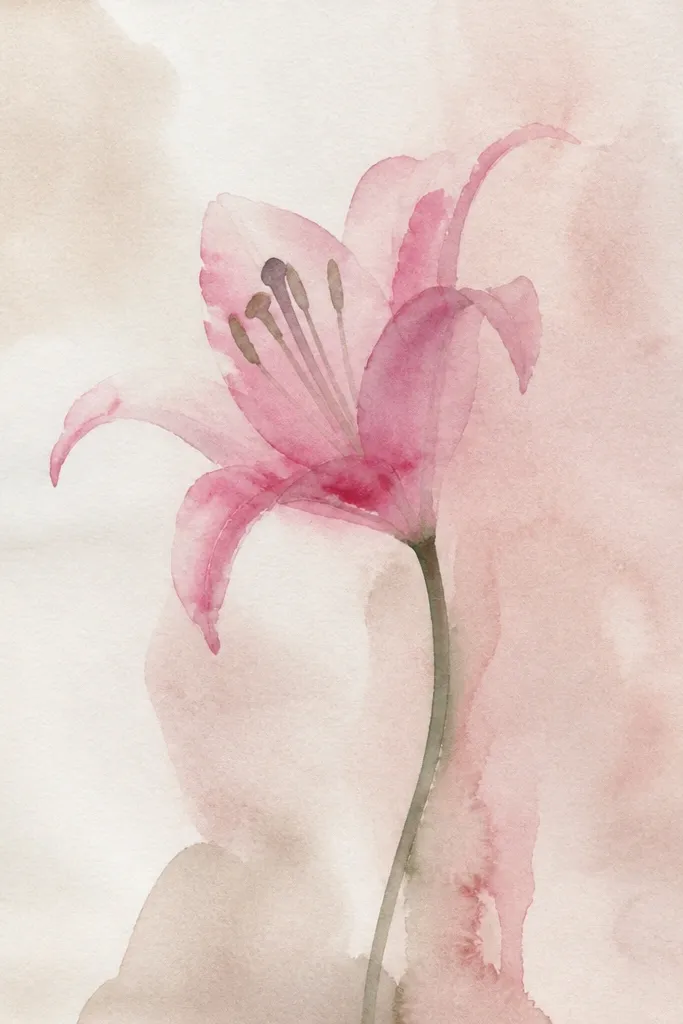
This is the design I use when I want the drawing to look like it belongs on a wall or on a framed print without a lot of extras. The long stem creates motion and gives your lily a "grown" feeling. I keep the lily detailed but leave the background clean, then add a subtle shadow line under the stem to ground it. It flatters people who like minimal layouts because the whole piece reads clearly. The pink stays soft by using two tones only - pale blush and rose - plus dark fold lines.
Sketch a long stem that curves slightly, then draw the lily facing left with 6 petals overlapping. Ink petal outlines with 0.5 liner and veins with 0.3 liner, then shade the petals with pale pink. Add rose fold shading only along the petal crease and near the center. Place small highlight spots on the upper-left petal edges and tips. Add a faint gray shadow line under the stem using a light pencil or a very diluted gray paint marker.
Good to knowIf you plan to print it, draw slightly larger than you think so the highlights don't get lost in scaling.
Common mistakeDon't crowd the stem with extra buds - the clean negative space is what makes it feel like a sticker.
14. Pink Lily with Gold-Tipped Petal Edges on a Thrifted Frame
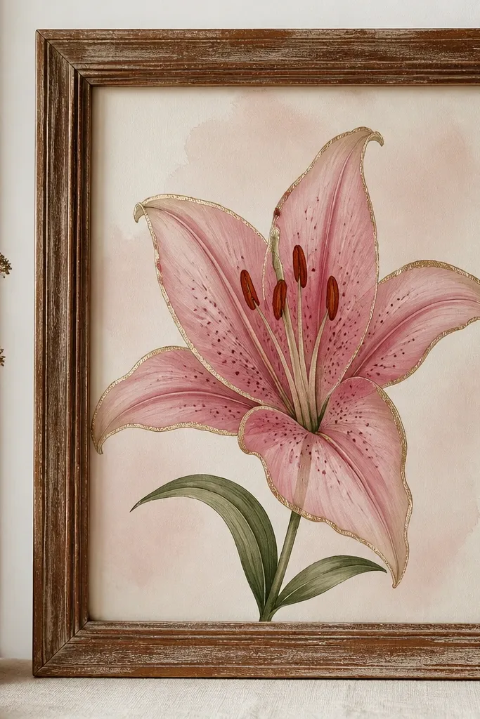
Gold-tipped petal edges make the drawing feel dressed up without changing the whole design. I use gold paint pen or metallic acrylic to trace only the outermost petal edge and just the upper half of each petal, so it looks like light catching the flower. The rest stays classic pink with darker fold lines and a stippled center. This looks great on warm wood frames and on gift cards where you want a little sparkle. It's also a flattering choice if you like glam but you don't want glitter everywhere.
Sand and clean the thrifted frame, then paint the inner backing with a pale pink or cream base. Draw the lily centered, keeping petals about 1.5 to 2 inches tall depending on frame size. Ink outlines and veins, then shade petals with blush pink and deepen folds with rose. Stipple the center and add tiny highlights with gel pen. Finally, trace a thin line of gold along the outer edge of each petal tip and stop before the inner fold so the gold doesn't overpower the shading.
Good to knowLet metallic paint cure fully before touching it - gold smears if it's still wet.
Common mistakeAvoid thick gold bands - thin edges look like light, thick ones look like you colored it with a marker.
15. Mini Pink Lily Repeat on a Rag Rug Strip
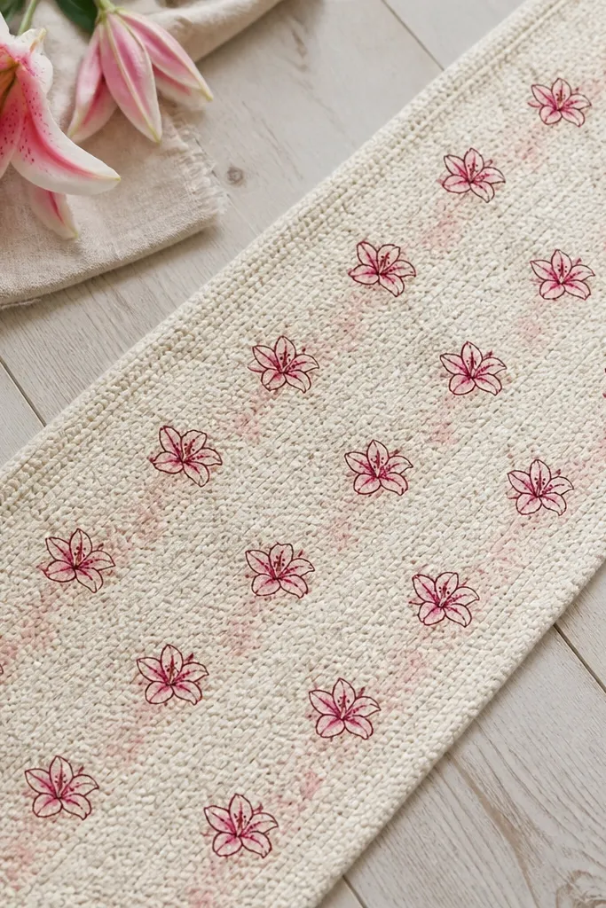
Mini repeats work because the rug texture already adds visual interest. I keep each tiny lily simple: outline, 3 vein lines, and two pink tones. The fold crease shading is the only "depth" you add, so the pattern stays readable even on rough fabric. This style looks great on runners, placemats, and upcycled fabric strips where you want something handmade but not heavy. It flatters a playful, everyday aesthetic - it doesn't look precious, it looks lived-in.
Cut a rag strip straight and decide your repeat spacing, like 3 inches apart. Mark a light guide line with chalk so lilies stay aligned. Draw each lily with 6 petals overlapping lightly, then ink outlines with a fabric-safe fine liner or paint marker. Fill petals with pale pink and add rose fold creases on the inner half of each petal. Add a tiny center dot cluster and two highlight specks, then step back and check spacing before you keep going.
Good to knowUse a stencil for the petal shape if your hand wobbles - it keeps the repeat consistent.
Common mistakeDon't over-render veins on tiny lilies - too many lines disappear into the fabric texture.
16. Pink Lily on Glass Jar with White Outline for Crisp Edges
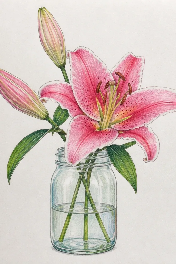
Glass needs edge control, and a white outline is the trick that makes the drawing look crisp instead of floaty. I draw the lily in pink tones, then trace a thin white line around the petal outer edge and along the stem. The white border makes the design readable against whatever background is behind the jar. This looks great for candle jars, storage containers, and upcycled bathroom organizers. It also flatters a clean aesthetic because the white outline frames the flower like stained glass.
Clean the jar with glass cleaner and let it dry completely. Sketch the lily on masking tape placed on the jar so you can erase pencil marks safely. Paint petals with pink and rose, keeping fold creases darker and the upper-left edge lighter. Outline veins lightly, then stipple the center. Finally, add a thin white outline around petals and stem, then seal with a clear glass medium so it doesn't rub off.
Good to knowWork in small sections and rotate the jar so your brush always hits the same angle of curvature.
Common mistakeDon't skip the outline - without it, pink blends into glass glare and looks smudged.
17. Lily Bouquet Sketch Style with Loose Lines and Firm Center
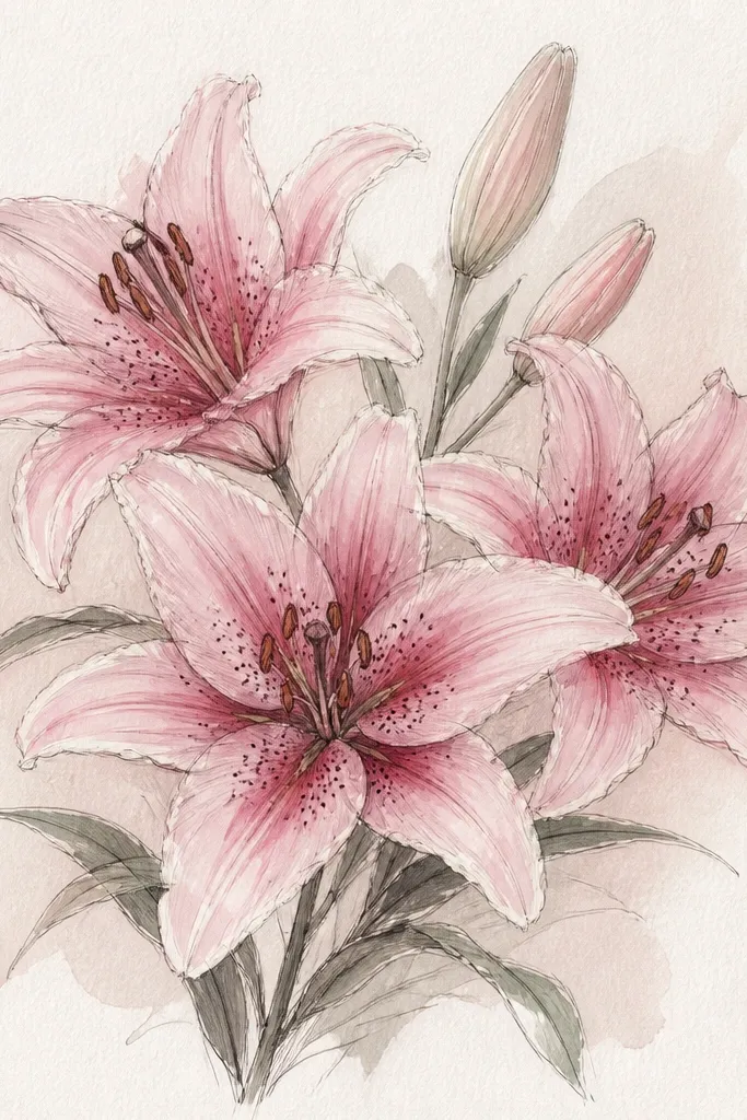
This style looks intentional because you separate "loose" from "detailed." The petals are drawn with lighter, almost airy lines, but the center is firm - darker stippling and clear fold lines. That contrast makes the lily read instantly even if you don't have perfect precision everywhere. I use it when I'm drawing quickly for an upcycled gift tag or a quick wall piece. It flatters people who like sketchy art but still want the flower to look like a lily, not a random bloom. The pink stays believable by using a diluted wash instead of heavy marker fill.
Start by drawing the bouquet shape with a single light stem and two or three blooms branching off. Use a lighter pen for petals so lines look sketchy, then ink only the center bud area with darker pressure. Add pale pink wash to petals, leaving some paper showing through for that airy feel. Deepen fold creases with a rose marker and stipple the center until it looks dark and textured. Add a faint blush wash behind the bouquet and stop there - no extra doodles.
Good to knowIf your lines look shaky, draw petals first, then go back only for the center and fold creases.
Common mistakeAvoid detailing every petal equally - the sketchy charm disappears.
18. Pink Lily Drawing on Kraft Paper with Deep Rose Margin Frame
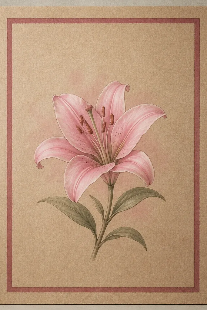
A margin frame makes your lily look like a finished print, even when the drawing is one simple flower. I like deep rose because it matches the fold shading and ties the design together without stealing attention. The lily stays the focus because the frame is clean and straight, while the petals are soft and curved. This style works on kraft paper especially well because the warm brown makes the pink feel old-fashioned and gentle. It flatters gifts and DIY wall art where you want a calm, cohesive look.
Cut or choose kraft paper and draw a rectangle margin frame about 1 inch from the edges. Sketch the lily centered so there's breathing room between petals and frame lines. Ink petal outlines and veins, then shade petals with pale pink and deepen fold creases with deep rose. Add small highlight spots at the upper-left of petal tips. Finish by painting a very light blush wash behind the lily and let it dry before tracing the margin frame with deep rose marker.
Good to knowUse a ruler for the frame, but freehand the lily so it keeps a human feel.
Common mistakeDon't use black for the frame - it makes the pink look harsher than you want.
19. Pink Lily with Vertical Stems and Tiny Bud Accents
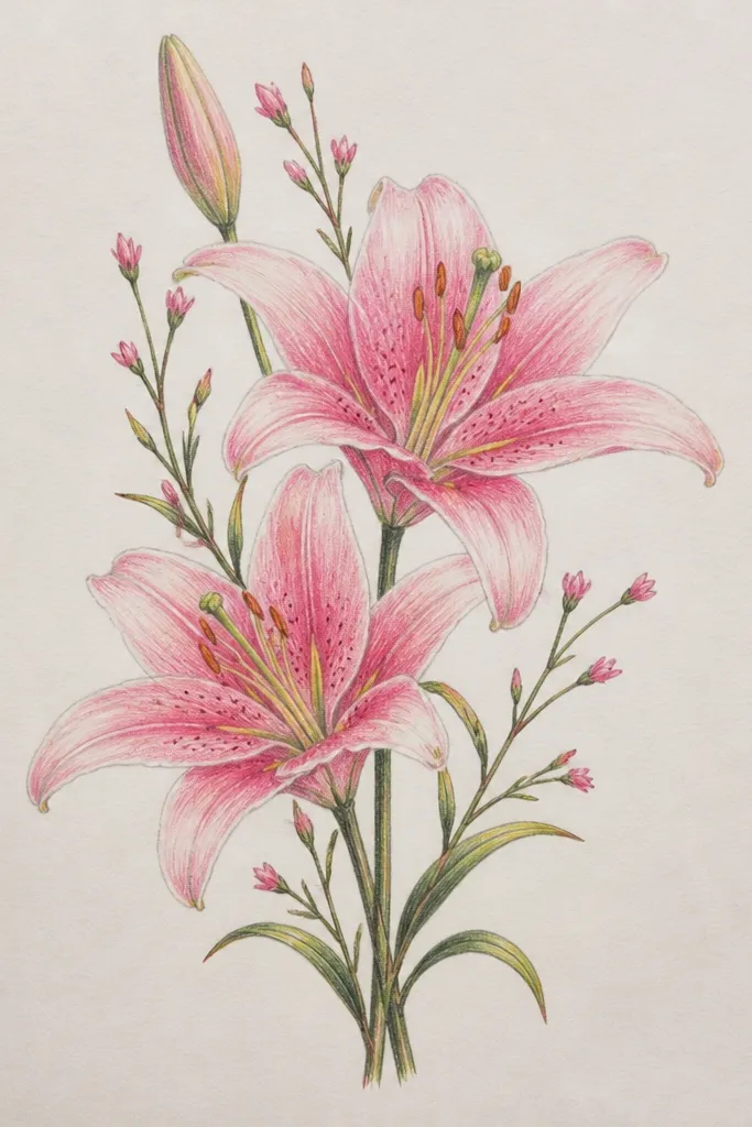
Vertical stems make the drawing feel taller and more graceful, which is why it works on tote panels and long gift tags. The tiny bud accents keep the design from looking isolated while still keeping the lily as the hero. I keep bud shapes simpler - just 3 to 4 petal segments - so they don't compete with the main bloom. The pink gradient stays consistent across the whole cluster by using the same two pink tones and the same highlight placement. This style flatters slim spaces and looks good for everyday gifts because it feels light, not heavy.
Draw a vertical central stem line, then add two side stems angled slightly outward. Place the main lily at the top third, then add two small buds at mid-height and a tiny side blossom if your space allows. Ink outlines, then shade petals with pale pink and rose fold creases. Add tiny highlights on the main lily petals only, and keep bud shading simpler with just fold lines. Finish with a light pink wash behind the stems so the cluster feels connected.
Good to knowIf you're drawing on fabric, keep buds smaller than you think so they don't blur when stitched or stretched.
Common mistakeAvoid giving buds full vein detail - it clutters the vertical flow.