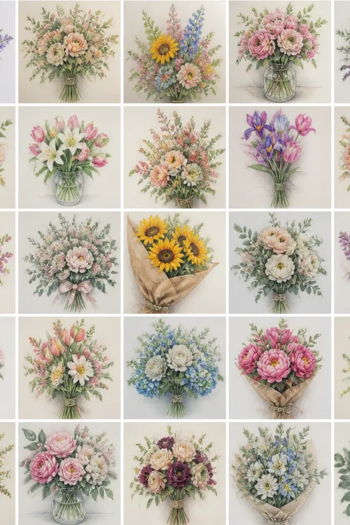
1. Single-Loop Ribbon Bouquet
This one looks finished because the ribbon creates a strong focal point without needing shading. I draw the bouquet in a gentle S-curve, then place the bow so it sits slightly above the midpoint, which makes the whole outline feel balanced. Use this style for small cards and gift tags because the silhouette stays readable even at tiny sizes. It flatters most color palettes too - it looks great when you later add a single accent color to the ribbon. If you like clean, modern stationery, this layout fits that vibe because the line work stays airy and controlled.
Start with a curved stem line that leans right, then add three flower heads: one large front bloom, two smaller behind it. Wrap the stems with a simple band line around the base, then draw the ribbon as one big loop with a tail - keep the loop thick at the outer edge. Add a few petal gaps inside each bloom using short, angled lines. Finally, thicken the outline just around the bow and the outer bouquet edge so it pops when printed or traced.
Good to knowColor the ribbon only - pick one shade like deep red or soft sage and leave the flowers unfilled for a crisp look.
Common mistakeDon't add tiny petal lines all over the bouquet - too many micro-gaps make it look like doodles.
2. Wrapped Kraft Paper Bouquet Edge
This bouquet reads like a real gift because the wrapping edge gives you structure. I like it for fall and winter since the wrap lines suggest kraft paper without needing brown shading. The folds also add a natural "frame" around the flower heads, which keeps the drawing from looking floating. It flatters a wide range of paper colors - even white paper looks warm because the wrap lines create contrast. If you're making holiday cards, this style feels more like a present and less like a random flower sketch.
Draw the bouquet silhouette first: cluster the flower heads on the upper left, then taper stems down to the center. Add one wrapping sheet line that curves around the stems like a cone, then draw a second parallel fold line to show thickness. Sketch a crisscross wrap at the bottom with two diagonal lines crossing once. Add small leaf lines behind the front flowers to create depth. Finish by thickening the wrap edge lines and leaving the petals thinner.
Good to knowWhen you print it, set your line thickness so wrap folds stay darker than petals - it makes the "gift" read instantly.
Common mistakeAvoid flat, straight wrap edges - straight lines make it look like a bag, not wrapped paper.
3. Holly Sprig Side Accent Bouquet
Side accents are my favorite for holiday because they add seasonal identity without crowding the center. The holly sprig lines create a vertical rhythm, so the bouquet looks taller and more elegant. I draw the berries as small circles with tiny inner dots, which keeps it cute and not spooky. This works especially well for winter thank-you cards where you want the flowers to stay simple but the page still feels festive. It flatters lighter skin tones on printed art too, because the berries add contrast without heavy color.
Start with a basic bouquet of three main blooms and a loop of stems. On the left side, add one holly sprig: a central leaf line with two side leaves branching out. Place three berries along the sprig, spaced evenly from top to bottom. Add a few short leaf veins using single curved lines. Keep the holly outlines slightly thinner than the bouquet edge, so the flowers stay the hero.
Good to knowUse one berry size for consistency - I keep them the same diameter so the side accent looks intentional.
Common mistakeDon't scatter berries across the whole bouquet - it turns into confetti instead of a side frame.
4. Star Charm Bouquet Outline
This idea makes the bouquet feel like a keepsake because the star charm gives motion and a reason to look twice. I place the charm just below the bow knot so it hangs naturally and doesn't cover the flower heads. The star outline is quick - five points - but it adds holiday energy for winter and New Year cards. It flatters clean, minimalist layouts because it adds one extra object without needing extra flowers. If you like line art that still feels playful, this is the one I reach for.
Draw your bouquet in a simple oval silhouette with three front blooms. Add a ribbon bow at the center top of the bouquet, then attach a short string from the knot down to a star. Sketch the star with crisp lines and a small inner cut line so it reads as a charm, not a spark. Add tiny stem curls near the bottom to echo the star's angles. Thicken the outer bouquet edge and star outline slightly for print clarity.
Good to knowIf you plan to trace, draw the star last - it helps you keep the charm centered under the bow.
Common mistakeSkip the extra swirls around the star - too many decorative lines make the charm look messy.
5. Peony Layered Petal Lines
Layered petal arcs make line drawings look rich even without color. I use peony-style blooms because the concentric curves naturally suggest depth, like petals folding over. This bouquet looks gorgeous on white cardstock and on craft paper because the petal arcs create their own contrast. It's especially flattering for audiences who like romantic styling - the curves are soft and not sharp. For seasonal use, it can read as spring or Valentine's depending on your ribbon and small leaf accents.
Start with three big circles for the peony heads, then lightly sketch the outer petal arc boundary. Inside each circle, draw 3-5 concentric curved lines that taper at the edges. Add a few small "petal breaks" where the lines stop short so it doesn't look like a target. Draw stems and leaves with single-line veins, keeping leaf lines thinner than the flower arcs. Finish by thickening the outermost petal boundary and leaving inner arcs lighter.
Good to knowUse a 0.3 for the outer boundary and a 0.1 for inner arcs so the layers show up when you print.
Common mistakeDon't make every arc the same thickness - uniform weight flattens the flower.
6. Daisy Chain Bouquet
Daisies look cheerful fast because the structure is simple and repeatable. I arrange them like a chain, which creates movement and keeps the bouquet from feeling static. The dot centers are the secret - even without shading, the circles anchor each flower. This style is great for spring birthdays and early summer parties, and it still works for holiday cards if you swap the ribbon to red or add one tiny berry branch. It flatters small surfaces because each daisy stays readable at thumbnail size.
Draw a looping stem line that snakes across the page, then place daisy heads along it. Each daisy head gets 8 petals: draw alternating petals as short teardrops around a central circle. Add a few leaf lines at the stem bends, not near every flower. Keep the bouquet outline loose - don't box it in. Thicken the outer stem line and keep the petal lines lighter for a light, airy look.
Good to knowSpace the daisies so there's at least one petal gap between neighboring flowers - it stops the shapes from merging.
Common mistakeAvoid drawing daisies too close together - tight spacing makes the line art blur.
7. Tulip Bud Trio
Tulip buds are clean and graphic, and they look great when you keep the lines simple. I do three buds with one slightly taller than the others, which gives the bouquet a natural pyramid shape. The pointed petal tops create a strong silhouette that reads well on envelopes. This style flatters minimalist tastes and works on both light and darker paper because the outlines do the heavy lifting. For seasonal use, it turns into spring when you color the buds, and it turns into winter when you add a single pine sprig.
Start with three vertical bud shapes, each drawn as a pointed oval. Add an outer petal line and an inner petal line for each tulip, leaving a narrow gap to show separation. Connect the buds to stems that meet at a wrap point below. Add a small ribbon knot at the wrap point with two tails flowing outward. Finish by drawing two simple leaves that angle away from the center and thickening only the outer petal edges.
Good to knowColor only the inner petal gap later - it makes the tulip look layered without heavy fills.
Common mistakeDon't add extra petal layers - too many lines inside tulips makes them look like generic flowers.
8. Rose Bud with Thorny Stem
A thorny stem gives the bouquet personality. I use it when I want the line drawing to feel more grown-up and slightly dramatic, like a winter romance card. The thorn marks are tiny, but they add texture and movement without needing shading. This style also flatters monochrome prints because the thorns create fine contrast against the petals. If you want something romantic but not overly cute, this is the outline I'd pick.
Draw one main rose bud in the center with a spiral-like petal opening, then add two smaller buds behind it. For the rose bud, draw an outer petal outline, then add 4-6 curved petal lines that spiral toward the center. Create one long stem line down the page and add small thorn triangles at intervals on one side. Add two leaves that wrap around the stem with a single center vein line. Thicken the rose outer outline and keep the thorn marks lighter so they don't dominate.
Good to knowKeep thorn spacing consistent - I place one thorn every 1.5 to 2 cm in my sketches so it looks intentional.
Common mistakeSkip big thorn spikes - oversized thorns make the drawing look cartoonish.
9. Wildflower Meadow Bouquet
Wildflower mixes look best when the lines are light and the stems vary in length. I like this for late spring and early summer because it feels natural, not posed. The trick is choosing a few flower types and repeating them enough to feel like a bouquet, not a scatter. This bouquet flatters people who want a more organic look because it doesn't rely on perfect symmetry. In monochrome, the variety of stem directions gives visual texture.
Start with a loose oval silhouette, then inside it place three taller stems that rise above the rest. Add 6-8 flower heads total, mixing simple five-petal blooms, small daisy-like circles, and tiny bud dots. Keep leaf lines thin and varied - some are single curved lines, some are small clusters. Draw stems with slight curves, not straight lines, and connect them to a wrap point at the bottom. Thicken only the outer silhouette line and leave interior stems thin.
Good to knowPick two flower types to repeat twice each - repetition makes it look designed.
Common mistakeDon't add ten different flower styles - the page turns into clutter.
10. Sunflower Facing Bouquet
Sunflowers bring instant warmth even as line art. I draw the centers as big circles and the rays as short curved strokes, which makes the bouquet feel full without color. This is a great idea for late summer cards and graduation thank-yous. It flatters bold, high-contrast styles because the circular center acts like a visual anchor. If you're making prints for friends, sunflowers are the one everyone recognizes immediately.
Sketch two large sunflower heads and one smaller behind, all facing forward. Draw each sunflower center as a thick-outlined circle, then add 12-16 ray petals as short curved lines around it. Connect the heads with stems that slightly diverge so the bouquet doesn't look like a straight line. Add a wrap band at the bottom with one fold line. Finish by thickening the outer rays and keeping the inner stem lines lighter.
Good to knowIf you plan to color later, leave the center unfilled until you add the ray color - it keeps the sunburst crisp.
Common mistakeDon't make the rays too long - long rays turn the bouquet into a spiky halo.
11. Anemone Burst Bouquet
Anemone outlines look intricate even when you keep the lines minimal. The ringed center gives a built-in "texture" so you don't need shading. I place one anemone in the front and two half-hidden behind, which creates depth that feels expensive. This style works well for wedding stationery and winter-neutral cards because the lines stay calm. It flatters people who like artistic botanical drawings without going full realism.
Draw three flower circles at different heights. For each center, draw a small inner circle, then a thicker ring around it using two concentric outlines. Add 8-10 petal shapes around the ring as curved teardrops pointing outward. Keep the petals slightly uneven in size so the flower feels organic. Add stems and leaves with simple curved lines and thicken only the outer flower outlines.
Good to knowUse the ring center to guide your spacing - keep the ring diameter consistent across all flowers.
Common mistakeAvoid filling the petals with too many extra lines - the center already does the work.
12. Lavender Sprig Bouquet
Lavender line work is long, tidy, and easy to repeat, which makes it perfect for holiday bundles and simple gift tags. I draw lavender as one main stalk with small bud clusters along both sides, then tie it with a narrow ribbon. The look is airy, and it reads as "herb bouquet" without needing extra flowers. This style is flattering for minimal palettes - even black ink looks clean and modern. If you want seasonal charm without clutter, lavender is my go-to.
Start with one long curved stem line, then draw bud clusters along it in two rows. Each cluster is a tiny oval group - 3-4 buds per cluster, spaced evenly. Add two smaller stems behind the main one, each with fewer clusters. Wrap the bottom with a single band line and add a narrow ribbon tie with two short tails. Thicken the ribbon knot and the outer outline of the lavender stalk.
Good to knowMake the bud clusters uniform size - uneven clusters make the sprig look rushed.
Common mistakeDon't draw buds as detailed leaves - keep them small ovals so the sprig stays legible.
13. Pine Bough and Rose Combo
This combo looks like a holiday florist arrangement, even in simple line art. The pine bough adds texture and seasonal identity, while the rose keeps it romantic. I like placing the pine on the side and letting the rose sit more central so the bouquet doesn't become a pine sketch. This is a strong pick for winter cards because it reads festive even if you keep everything monochrome. It flatters people who want a classic look without heavy ornamentation.
Draw a central rose bud, then add two smaller rose shapes behind it. On the left or right side, draw a pine bough that curves inward toward the bouquet. For pine needles, draw short branching lines and tiny dash marks at the ends of those branches. Add a few leaves around the base, then wrap the stems with a ribbon band. Thicken the rose outer outline and the pine bough edge, leaving internal needle dashes thinner.
Good to knowKeep the pine needles clustered - long needle lines make it look like a feather, not a bough.
Common mistakeDon't cover the whole bouquet with pine - leave clear space so the rose stays readable.
14. Orchid Long Petal Bouquet
Orchids look sophisticated because the petals are long and sculptural. I draw two orchids facing forward and one angled slightly, so the bouquet looks like it has depth. The central lip shape gives a clear focal point, even without color. This style flatters modern interiors and clean invitations, and it prints well because the lines are simple and spaced. If you like floral line art that looks more "design" than "kid drawing," orchids do that for me.
Sketch three orchid heads on a diagonal arc. For each orchid, draw two long side petals that curve outward and a central petal that dips down. Add a small inner lip shape in the center using a curved outline. Connect to slender stems that meet at a wrap point. Draw two narrow leaves that angle away from the center. Thicken only the outer orchid outline and the wrap band; keep inner petal lines thin.
Good to knowMake the central lip the only thick inner line - it gives a focal highlight without needing shading.
Common mistakeAvoid drawing orchid petals too symmetrical - slight asymmetry makes it look real.
15. Wild Rose with Lace-Like Petal Lines
This is the bouquet I pick when I want the drawing to look delicate and textured. The trick is that the petal lines overlap like lace, but you keep the line weight light so it doesn't turn into a dark clump. I place the rose in front and let smaller buds peek from behind to create a layered feel. This style flatters soft, romantic themes, especially for spring and Mother's Day notes. It also looks great when you color only the leaves later.
Start with one main rose head in the center, drawn as an oval with an open center. Add 10-14 petal arcs around it, each petal arc slightly overlapping the next. Keep the arcs short and airy - leave small gaps between them. Add two smaller bud shapes behind the main rose with fewer petal arcs. Draw thin stems and leaves with single center veins. Thicken the outermost rose outline and leave the inner lace lines thin.
Good to knowUse a ruler for your stem only - it keeps the lace petals from wandering.
Common mistakeDon't add heavy outlines everywhere - lace line art needs breathing room.
16. Ribbon Crosswrap Bouquet
Crosswrap ribbon is an easy way to make your bouquet feel more "packaged" without adding extra flowers. I like how the crisscross lines pull the eye down to the base, which balances tall stems. This style looks strong on square cards and gift labels because the wrap pattern creates a defined bottom anchor. It flatters bold color choices later, like red and green for winter or blush and gold for weddings. The lines also hide minor unevenness because the crosswrap creates structure.
Draw a bouquet silhouette with 4-5 flowers clustered toward the top. Add a wrap band at the base, then draw two diagonal ribbon lines crossing once in the middle. Add two more diagonal lines crossing again lower down, so you get a simple crisscross pattern. Keep the ribbon lines slightly thicker than the leaf lines. Finish by drawing a small bow knot at the top of the crosswrap and thickening the outer silhouette edge.
Good to knowKeep the crosswrap to 2 levels, not 4 - too many crisscross lines makes it look busy.
Common mistakeAvoid drawing crosswrap lines straight through flowers - route the wrap behind the petals.
17. Bouquet in a Vase Silhouette
Putting the bouquet in a vase makes the line drawing look finished even if you only draw a few flowers. The vase outline gives you a clear base and makes the bouquet feel like a scene, not just an arrangement. I like this for seasonal menus, recipe cards, and thank-you notes because the vase keeps the page organized. This style flatters both dark and light paper since the vase rim and side lines create contrast. It also works well for prints because the shape is easy to crop.
Draw a simple vase outline first: a slightly wider top rim and a narrower bottom. Place 3-4 flower heads rising from behind the vase opening. For each flower, use a distinct petal style - one tulip bud, one daisy, one peony arc - so the bouquet feels mixed. Add a few leaves that tuck behind the vase line. Thicken the vase rim and outer vase outline, then keep flower lines slightly thinner.
Good to knowChoose one vase style and reuse it - changing only flower types makes a cohesive set of seasonal prints.
Common mistakeDon't let stems float inside the vase without crossing the vase opening line - that makes it look disconnected.
18. Bouquet with Hanging Tag Label
A hanging tag turns your line drawing into something gift-ready. I keep the tag blank in the art so you can add a name later with handwriting, and the outline still looks complete. This style works great for holiday exchanges because it gives a clear spot for dates or a short message. The tag also adds vertical detail, which is flattering on cards with lots of white space. It's the kind of drawing that looks like you bought it from a paper shop.
Draw your bouquet silhouette with a ribbon bow at the top center. Attach a string from the bow knot down to a small rectangular tag. Add a tiny rounded top on the tag and a small hole loop at the top edge. Keep the tag outline thin and the bouquet outline thicker. Finish by adding a few small leaf lines around the tag area so the tag feels integrated, not taped on.
Good to knowLeave the tag slightly narrower than the ribbon tails so it looks delicate, not bulky.
Common mistakeDon't make the tag the same width as the bouquet cluster - it steals attention from the flowers.
19. Winter Berry Branch Bouquet
Berry branches are perfect for winter because they read as seasonal even when the flowers are simple. I draw berries as small filled circles with a tiny highlight dot left unfilled, which makes each berry look like glass beads. This style works on both cards and prints because the berries add a pattern texture. It flatters minimal compositions since the berries fill gaps that would otherwise feel empty. If you want a holiday bouquet that still looks clean and modern, this is it.
Start with a small cluster bouquet of 3-4 flower heads near the top. Add two berry branches that arc out from the sides and meet near the base. Draw each berry as a circle with a tiny inner dot left blank. Add small leaf clusters as short curved lines with one center vein. Wrap the stems with a simple band and thicken the outer edge of the berries and bouquet silhouette.
Good to knowUse a consistent berry size across the whole drawing so the pattern looks intentional.
Common mistakeAvoid random berry sizes - the drawing looks messy when the pattern changes constantly.
20. Ribbon Bow Center Knot Bouquet
A center knot is the quickest way to make line art look "designed" instead of casual. The knot sits at the center and gives you a visual weight point, which is why the bouquet doesn't feel top-heavy. I like this for Valentine's and Mother's Day because the ribbon reads clearly even if you only add one accent color later. It flatters layouts with extra white space since the bow handles the composition. It also prints well because the knot's shape stays crisp at small sizes.
Draw your bouquet cluster with 5-6 flower heads, keeping the heights staggered. Place the center ribbon knot at the exact midpoint of the bouquet. Draw two ribbon tails that curve outward - one to the left, one to the right - and keep them slightly longer than the bottom of the flower cluster. Add a few leaf lines around the base to connect the flowers to the ribbon. Thicken the knot outline and the outer edge of the ribbon tails; keep petal lines thinner.
Good to knowMake the knot slightly wider than the combined width of the ribbon tails - it looks more realistic.
Common mistakeDon't draw the tails straight down - straight tails make it look like a paper label.
21. Clover and Flower Spring Bouquet
Clover gives a spring identity that feels fresh without changing your whole bouquet style. I mix clover leaves near the bottom and along one side, so the bouquet stays floral-first. The clover's three-leaf shape is quick to draw and looks cute in line art, especially when you add one tiny stem curl. This style flatters pastel color schemes later, but it's also great monochrome because the clover shapes create pattern. Use it for St. Patrick's adjacent cards or early spring thank-yous.
Sketch a bouquet of 3 main flowers and a few smaller buds around them. Add clover leaves near the wrap point: draw three teardrop leaves around a tiny center stem. Place 2-3 clover clusters so they frame the bouquet base instead of floating randomly. Draw one small leaf line behind each clover cluster to connect it to the stems. Wrap the stems with a band and add a small ribbon tie. Thicken the outer bouquet edge and keep clover outlines slightly thinner.
Good to knowKeep clover clusters closer to the ribbon - it makes the bouquet look intentional.
Common mistakeAvoid adding clover on every side - too many clovers makes it look like a shamrock collage.
22. Poppy Seed Pod Bouquet
Seed pods make a bouquet feel autumnal and textural, even in line art. I draw the pods as elongated ovals with subtle ridges, which adds detail without cluttering the flower heads. This style looks great for fall thank-you cards because the shapes feel seasonal. It flatters clean graphic tastes since the ridges give structure like design elements. If you want a bouquet that feels more grown-up than daisies, poppies and pods are my pick.
Draw two poppy blooms and one bud pod behind. For each bloom, draw a simple outer petal outline with 6-8 rounded petal shapes and a central dot cluster. For the seed pod, draw an elongated oval with 4-6 short curved ridge lines inside. Add stems that converge at a wrap band, and draw two leaves with a single center vein. Tie the ribbon with a simple bow at the base, then thicken only the outer silhouette and pod ridges.
Good to knowRidge lines should follow the pod curve - straight ridges look pasted on.
Common mistakeDon't add ridges to the flower heads - keep detail concentrated on the pods.
23. Mistletoe and Mini Bouquet
Mistletoe arches are a great holiday hook because they create a top frame. I keep the mistletoe small and place it above the bouquet so the bouquet stays the main subject. The berries add a pattern that feels festive even without color. This works well for winter cards where you want a clear holiday element without turning the whole page into ornaments. It also flatters narrow layouts because the arch uses vertical space nicely.
Draw a small bouquet cluster with 3-4 flowers and a wrap band at the bottom. Above it, sketch an arch line for mistletoe, then add small leaf pairs along the arch. Draw 4-6 berries as small circles spaced evenly along one side of the arch. Add a short vine line connecting the leaves. Thicken the arch outline and berries slightly so they read clearly, then keep the flower petals thinner.
Good to knowUse one berry size and one leaf size - consistency makes mistletoe look clean.
Common mistakeAvoid making the mistletoe leaves too large - oversized leaves overpower the bouquet.
24. Monochrome Bouquet with Single Accent Leaf
This is my favorite trick for making line drawings look intentional without adding color everywhere. The single accent leaf creates a focal point that feels like a design choice, not an accident. I use it when I want the bouquet to look modern and a little artsy, especially for minimalist holiday cards. It flatters both light and dark paper because the thicker line area creates contrast. When you later color that leaf, the whole piece suddenly looks styled.
Draw your bouquet with thin outlines: 4-5 flowers, a wrap band, and a few leaves. Choose one leaf on the right or left side and outline it with a thicker line, keeping its shape slightly larger than the other leaves. Add one small vein line inside the accent leaf. Keep all other leaves with just one thin vein or a simple outline. Finish by thickening the outer bouquet edge and leaving interior petals thin so the accent leaf pops.
Good to knowWhen you scan or print, check that the accent leaf line weight doesn't merge with the bouquet outline - adjust pen pressure if needed.
Common mistakeDon't pick multiple accent leaves - two focal points make it look unfinished.
25. Bouquet with Ribbon Tail Swirls
Swirled ribbon tails add charm while keeping the rest of the bouquet simple. I use swirls when I want the drawing to look a little playful for birthdays and spring parties, but I keep the flower heads minimal so it doesn't get busy. The swirl shape is easy to trace and holds up at small sizes. This style flatters anyone who likes cute details but doesn't want a heavily decorated page. It also looks good in black ink because the curls create line rhythm.
Start with a bouquet of three main blooms and a wrap band at the base. Draw a ribbon bow in the center, then extend two ribbon tails downward. Turn each tail into a single curl - like a loose question mark - with a smooth line that tapers. Add one or two tiny leaf lines near the base to connect the ribbon to stems. Thicken the outer ribbon edges and keep the curl lines slightly thinner than the bow knot.
Good to knowKeep the swirl tight - wide curls eat space and make small cards look crowded.
Common mistakeAvoid adding multiple curls on each tail - one curl per tail looks clean.