1. Sunset Single Tulip with Burnished Petal Highlights
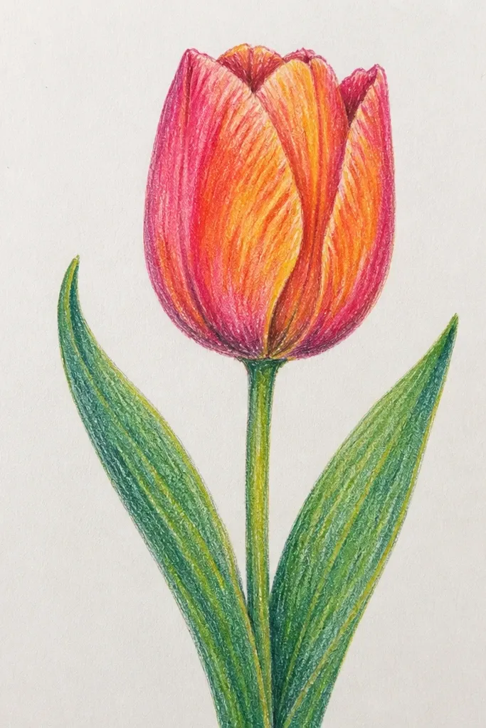
This one is my go-to when I want the tulip to look like it's lit from inside. Use orange, persimmon, and deep red for the petal base, then add a pale yellow stripe where the light hits. The contrast works on warm skin tones and also looks great in frames because the highlights catch light when you move the paper. I keep the background light so the tulip reads instantly even from across the room.
Start by drawing one tulip with a simple cup shape, then block the inner petals with orange and the outer petals with red. Add a thin layer of deep brown-red at the petal folds, pressing slightly harder along the crease lines. Blend only the mid-tones with a tissue so the yellow highlight stays crisp - don't blend the highlight stripe. Finally, darken the stem with deep green and add a few short leaf strokes using a lighter green on top for shape.
Good to knowBurnish the highlight stripe with a clean fingertip or tissue edge for a glossy look without adding more pigment.
Common mistakeDon't blend the whole tulip - if you soften every edge, it turns flat and gray.
2. Two-Tone Tulip Pair on Striped Fabric Background
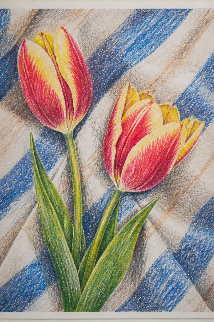
This style looks like you're drawing directly from a scarf or tablecloth, and it instantly feels seasonal. The coral-red tulip gives you warmth, and the dusty blue stripe background keeps it from looking too sweet. It's flattering for cooler color palettes in your home because the blue makes the pink tulip pop. I like it for gifts because it reads as "intentional" even when the tulip shapes are simple.
Start by sketching two tulips with different heights - keep one slightly taller. Color the background first: draw diagonal stripes across the whole page using cream and dusty blue, then lightly press over the stripes so they're even. Add the coral tulip petals with red-orange, then layer a darker maroon at the base of each petal. Place the pink tulip next to it using mauve-pink and a touch of lavender shadow, then finish by letting the stripes show between petals for clean separation.
Good to knowUse a ruler for the stripe spacing, but vary pressure so the stripes look like fabric, not printed lines.
Common mistakeDon't color the tulips over the stripes without leaving gaps - you'll lose the crisp "fabric" feel.
3. Tulip Bouquet Frame with Holiday Ribbon Tail
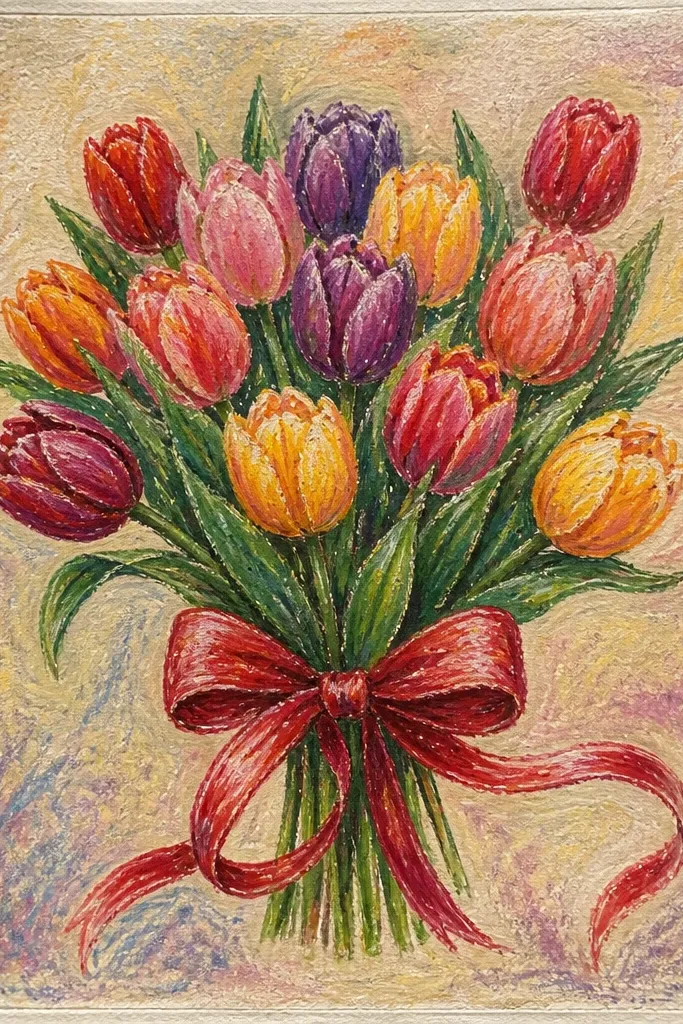
This is the fastest way I've found to make tulips feel holiday-ready without adding heavy seasonal clutter. The ribbon tail gives a clear focal point, and the rectangular frame makes the whole drawing look like a gift tag expanded to wall art. I use deep red and muted gold because they look warm next to the green stem and don't fight with the tulip colors. If you like clean edges and a tidy look, this one fits.
Draw a rectangle frame around the page area, leaving a 1 inch border. Block in three tulips grouped at the top center - one red, one orange, one pale pink - then draw stems that meet behind the ribbon. Color the ribbon with deep red for the outer fold and add muted gold highlights on the inner curves. Finish by speckling the off-white background with light pastel dots (a tiny amount of gray-brown) and darkening the tulip folds with a thin layer of brown-red or deep plum.
Good to knowWhen you draw the ribbon folds, keep the crease lines thin and sharp - thick lines make it look cartoonish.
Common mistakeDon't over-detail every leaf - the frame and ribbon already carry the structure.
4. Stained Glass Tulips with Black Outline Cracks
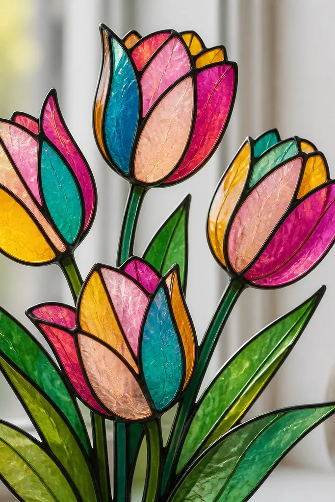
Stained glass tulips look bold and clean because the outline does the heavy lifting. I've done this with oil pastels and a black waxy crayon, then filled each petal section with limited colors so it looks like real glass panels. It flatters any palette because your colors stay separated - no messy blending required. For holiday art, the strong contrast feels festive even when the tulips are simple.
Start by using a black waxy crayon to draw the tulip shapes with thick outline lines, including a few crack-like lines that stay inside the sections. Fill one petal section at a time with color blocks - teal for one section, magenta for another, sunflower yellow for the highlight areas. Add a thin layer of pale peach near the center to create depth, then reinforce the black outline where colors meet. Finish by lightly burnishing the colored sections with tissue so the pigment looks smooth like glass.
Good to knowUse limited color per section and change the color on every other petal fold - that's what makes it look like stained glass.
Common mistakeDon't blend across the black lines; stained-glass look dies when sections smear together.
5. Snowy Window Tulips with Frosty Background Speckles
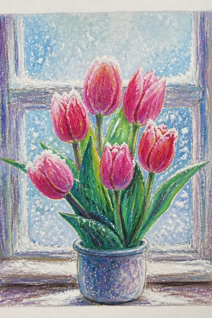
This one reads wintery without turning into a snowman drawing. The cool shadows give the tulip a fresh, icy look, and the frosty speckles make the scene feel like it's outside a window. I use pale blue plus near-white for the background because it makes pink and lavender tulips glow. It's great if you're making holiday cards or small wall art because it stays readable at a distance.
Start by coloring the background with very light pale blue, leaving the brightest spots for highlights. Add frost speckles by rubbing a white pastel lightly with your fingertips and flicking tiny dots across the blue. Draw the tulip shape, then color petals with mauve-pink and lavender, adding deeper purple at the fold lines. Add near-white highlights along the petal edges, then lightly blend only the mid-tones. Finish with a cool green stem and a few tiny leaf strokes that don't compete with the frost.
Good to knowFor speckles, use the back of a stiff paper edge - it makes tighter dots than finger flicks.
Common mistakeDon't make the background too dark; dark blue makes the tulip look bruised.
6. Tulip Oil Pastel Gradient Sky and One Dark Stem
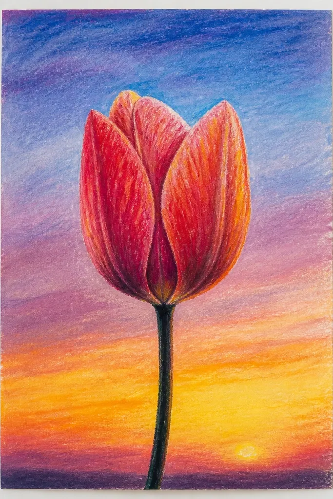
This style is clean and graphic, and it's the quickest way I know to make tulips look modern. The gradient sky gives you atmosphere, while the dark stem acts like an anchor so the tulip doesn't float. I love it for people who want a "minimal but finished" look. It flatters small frames because the composition stays simple and the colors do the work.
Start with the sky: color the top area with pale lavender, then blend downward into peach using a tissue for a smooth transition. Draw a single tulip with a clear center, then fill petals with peach on the outer edges and pink toward the inner folds. Press darker pigment at the petal base, then soften outward with light blending so the center stays richer. Add one deep green stem line and two small leaves, keeping them narrower than the petals. Finish by darkening the tulip outline slightly with a matching darker pastel so it reads against the sky.
Good to knowKeep the gradient smooth - if you leave streaks, the whole piece looks rushed.
Common mistakeAvoid adding extra flowers; the sky gradient already provides the drama.
7. Tulip Mandala Background Dots and Petal Rings
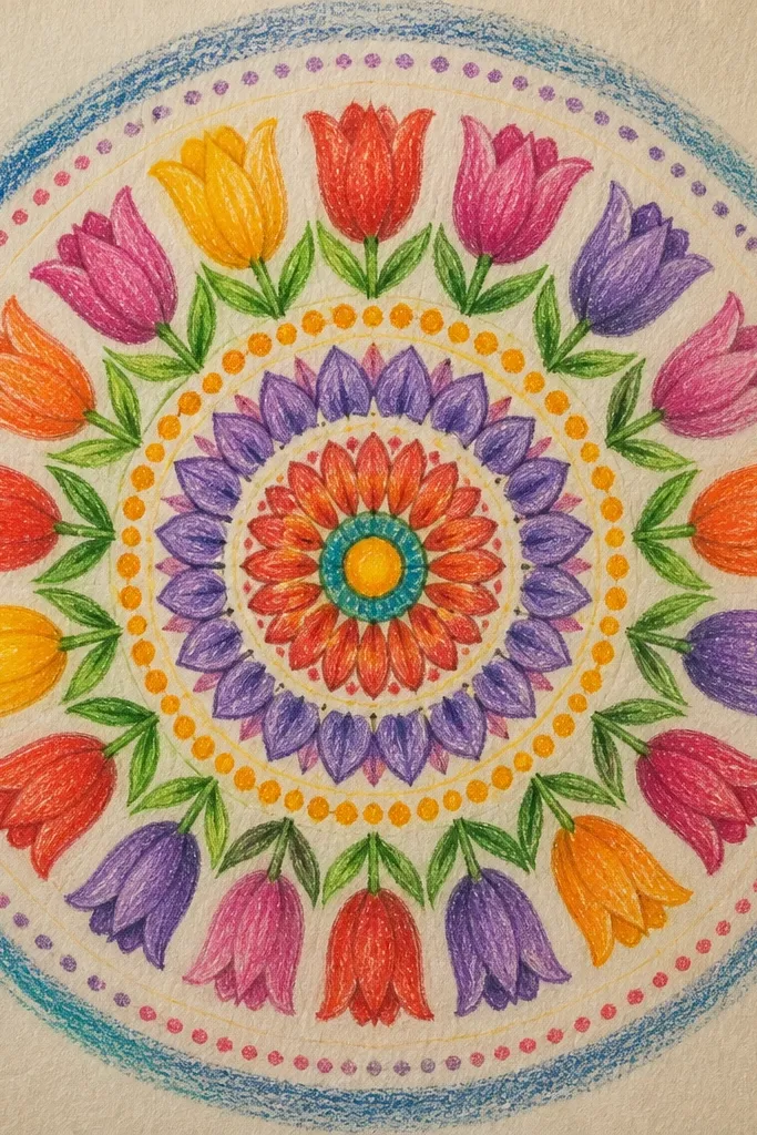
Mandala-style backgrounds make tulips feel like holiday decor without adding literal ornaments. The concentric rings pull your eye to the center, and the dots add texture that oil pastels love. I use gold tones because they look warm against pink petals and don't fight with green. This style is great if you want your tulips to look ceremonial and slightly magical.
Start by drawing a circle guide behind the tulip center, then sketch the tulip in the middle. Color the petals first - pale pink for the main area and magenta for folds. Build the mandala background with concentric rings: draw 4 to 6 rings using light gold, then add dot rows between rings with cream and soft teal. Add small leaf-like accents around the outer ring using pale green to keep it cohesive. Finish by blending just the tulip petals, leaving the ring lines crisp.
Good to knowUse a toothpick to place dot patterns - it gives consistent dot size without smearing.
Common mistakeDon't blend the mandala dots; soft dots turn into messy smudges.
8. Gingham Tablecloth Tulips with Tiny Check Shadows
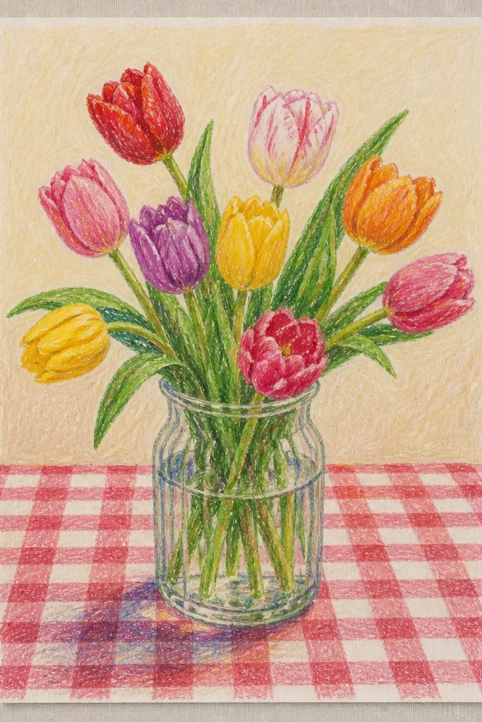
Gingham makes tulips feel like spring plus farmhouse holiday charm. The key is the tiny check size: it adds texture without cluttering the tulip. I use muted green checks and warm tulip colors because the contrast looks cozy. This one flatters casual spaces and looks great on paper that's framed with a simple mat.
Start with the background checks: draw light pencil lines for a grid, then color alternating squares with cream and muted green. Press lightly at first so you can correct mistakes. Draw the tulip on top, then color petals with red-orange and add a deep brown at the base where petals overlap. Add small yellow highlight spots on the inner petal edges. Finally, shade under the tulip with a soft muted gray-green to create a grounded shadow that makes it pop.
Good to knowMake the checks slightly uneven in pressure - perfect symmetry looks printed.
Common mistakeDon't make the check colors too dark; dark gingham makes the tulip look crowded.
9. Tulip Bouquet on Kraft Paper with Creamy Pastel Burnish
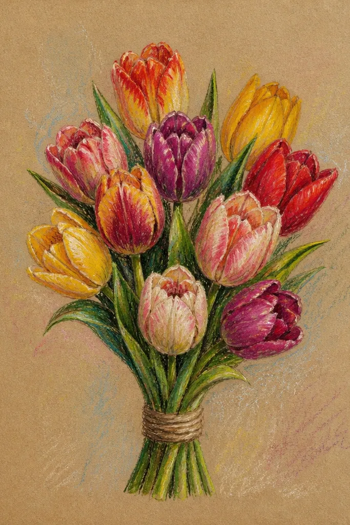
Kraft paper changes everything - your tulip colors look warmer and more "real" because the paper has a built-in golden base. I like this for holiday wrapping paper vibes and for cards because it feels handmade. The creamy burnish on highlights makes the petals look like satin. This style flatters anyone who likes earthy palettes and wants less work blending.
Start by sketching three tulips loosely, leaving the kraft paper untouched around them. Color the petals with peach and pale yellow, pressing harder near the center folds. Add coral and reddish-brown at the petal outer edges for depth. Burnish the highlight areas with a clean tissue so they look smooth and brighter than the surrounding kraft. Finish by drawing stems in cool green and adding thin leaf lines using lighter green over the dark base.
Good to knowUse a white pastel sparingly on kraft - a little hits harder than heavy white coverage.
Common mistakeDon't cover the whole page with pastel; kraft should show through for that warm glow.
10. Single Tulip in a Glass Vase with Side Light Reflections
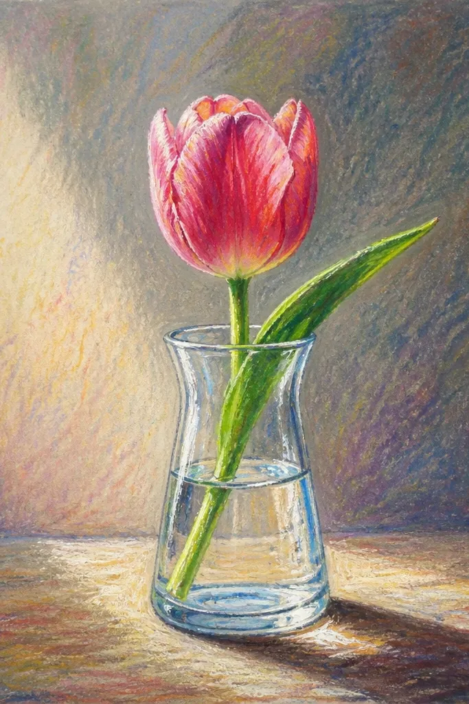
Glass reflections make this drawing feel expensive even when you use simple tulip shapes. Side light reflections add realism - and oil pastels are great for it because you can layer translucent-looking tones. I use deep pink and maroon for the tulip, then keep the vase mostly clear with light gray-blue shading. This looks good for dinner-table decor and holiday hosting themes.
Start by drawing the vase outline and a simple water level line inside the vase. Color the vase with very light gray-blue, then add a darker gray-blue on the right side where shadows would fall. Keep the left side lighter and add a near-white highlight stripe along the vase edge. Draw the tulip above the vase, color petals with deep pink and maroon folds, then add near-white highlight edges. Finish by adding a thin shadow under the tulip where it meets the vase opening.
Good to knowFor the vase highlight, use minimal pigment and burnish it lightly with tissue so it stays glossy.
Common mistakeDon't outline the vase too thick - thick lines make the glass look like a cartoon.
11. Tulip Wreath with Overlapping Petal Steps
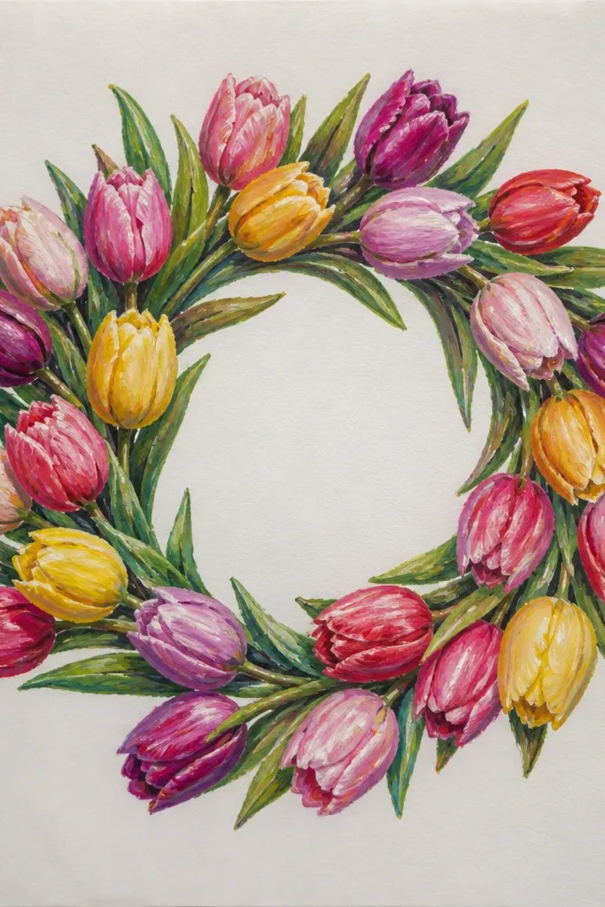
A wreath is the easiest way to make tulips feel holiday-ready because it frames itself. I like this for ornaments and prints because it looks good even if your drawing is slightly imperfect - repetition hides small mistakes. The overlapping petal steps create depth, and alternating red and pink keeps it lively without getting chaotic. It also works well for people who don't want to draw stems and leaves in detail.
Start by drawing a large circle and an inner circle to mark the wreath area. Sketch petal arcs around the ring, then color them in alternating sections: red-orange for one arc, soft pink for the next. Add darker maroon or mauve at the base of each petal arc, then use a tissue to gently blend only the base shadows. Leave the top petal edges brighter and add tiny near-white highlights. Finish by adding a few pale green leaf sprigs in the outer ring gaps, keeping them short.
Good to knowWhen you overlap petals, press harder on the lower layer - it makes the step effect visible.
Common mistakeDon't fill the center circle - blank space makes the wreath look intentional.
12. Tulip and Holly Berries Minimal Holiday Mix
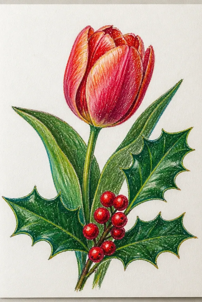
This is my favorite "holiday mix" because it keeps the tulip as the main character. Holly berries add that winter punch, and the small number of leaves keeps it from turning into a Christmas card cliché. I use deep red berries with tiny white highlights so they look like glossy ornaments. The pale cream background makes the tulip and berries read clearly.
Start by drawing the tulip first, with a slightly angled stem. Color petals in coral-red and pink with darker folds at the base, then add near-white highlight edges. Next, draw 5 to 7 holly berries as small circles clustered near the stem - color them deep red, then add tiny white dots on the upper left. Add 3 holly leaves with dark green and a lighter green vein line, using short strokes. Finish by lightly smudging a pale cream background and adding a faint shadow under the tulip base.
Good to knowKeep berry cluster size small - too many berries makes it look busy.
Common mistakeDon't draw holly leaves with thick black lines; they look harsh and cheap next to soft pastel petals.
13. Tulip Watercolor-Look Wash with Oil Pastel Resist
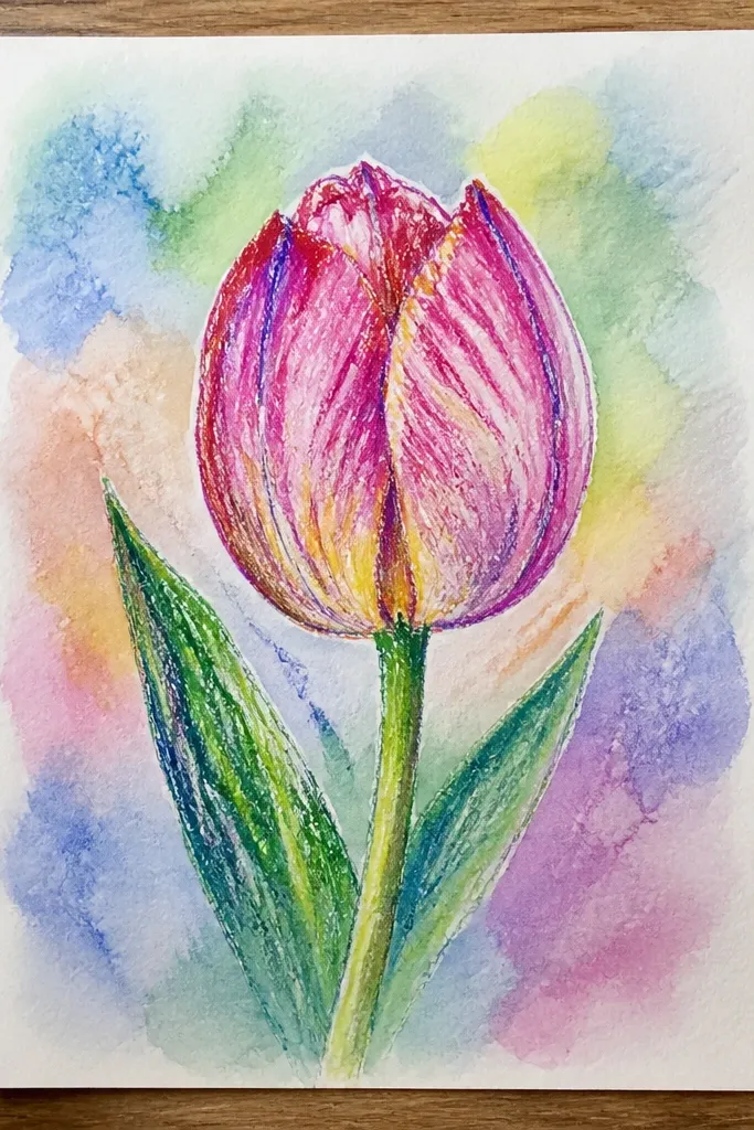
Oil pastels can fake a watercolor wash if you treat the background like dye and keep the tulip highlights protected. This style looks dreamy but still clean because you're not blending everything - you're letting the wash do the atmosphere. The resist effect happens when you leave some pastel areas untouched so they repel the wash. It's gorgeous for spring prints and looks especially good in light frames.
Start by drawing the tulip and coloring petals with oil pastels, but leave a few highlight spots mostly unblended. Then color the background lightly with pastel - pale blue and lavender - and spread it with a dry tissue. Mix a small amount of water-based wash (ink or watercolor) on a separate palette, then lightly paint the background around the tulip without flooding the paper. Let it dry, then go back and reinforce tulip folds with a second layer of pastel. Finish by adding a clean highlight edge with a near-white pastel stick.
Good to knowUse less water than you think - heavy water lifts pigment and makes blooms.
Common mistakeDon't paint over the tulip body with wash; it kills the resist and makes colors flat.
14. Tulip Close-Up with Macro Petal Veins
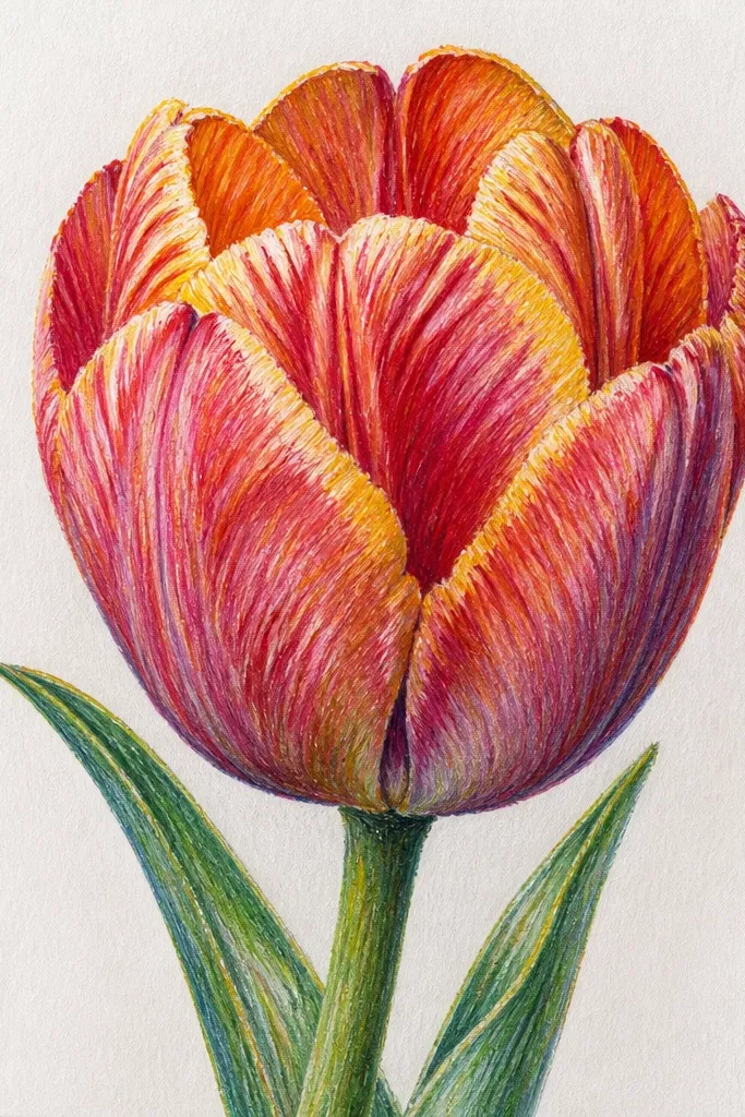
Close-up tulips feel fancy because you're drawing what people normally ignore - the petal veins and folds. This style flatters small spaces because the composition is tight, and the color transitions look smooth. I like peach-to-rose because it gives a natural gradient, and the dark shadow lines make the petal look layered. It's also a great way to improve your control with oil pastels since you'll practice line pressure.
Start by drawing a single petal shape large enough to fill 70% of the page. Color the base area with pale peach, then layer rosy pink along the outer curve. Press deeper pigment at the fold lines and use a tissue to soften only the areas between folds. Add macro veins by drawing thin curved lines with a darker rose pastel, then lightly blend the edges of each vein so they look embedded, not drawn on top. Finish by burnishing a thin highlight edge with near-white pastel on the highest curve.
Good to knowUse a light hand for veins - if you press hard, the line becomes a ridge.
Common mistakeDon't outline the whole petal in dark - it makes the close-up look like a sticker.
15. Tulip at an Angle with Perspective Floor Shadow
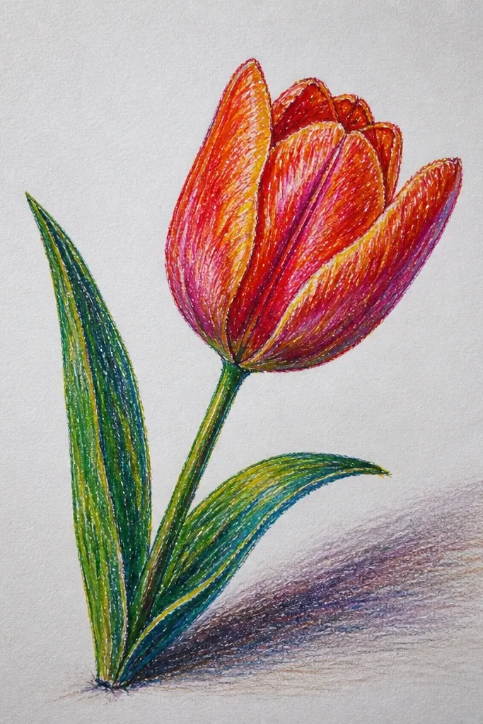
Angle drawings feel more dynamic than straight-on studies, and the floor shadow adds instant depth. I use a trapezoid shadow because it looks like the tulip is sitting on a surface, not floating. The cool shadow under warm petals makes the tulip look dimensional - warm on top, cooler underneath. This is a strong choice if you want your art to feel like a still life, not a flat illustration.
Start by drawing a simple trapezoid floor area at the bottom of the page using light pencil or faint pastel. Place the tulip stem so it crosses the floor plane - keep the base of the tulip touching the floor. Color petals with orange-red and add darker maroon at the folds, then add near-white highlight edges. Shade the floor with a muted gray-green, blending outward from under the tulip base. Finish by adding a darker cast shadow beneath the petals where they overlap the floor.
Good to knowMake the cast shadow darker closest to the tulip and lighter farther away - that's where depth comes from.
Common mistakeDon't shade the whole floor evenly; even shading kills the perspective.
16. Tulip Patterned Wallpaper Background with Repeating Motifs
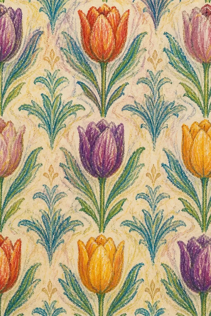
Patterned wallpaper backgrounds make the main tulip feel like a centerpiece. The trick is to keep the background motifs smaller and lower contrast than the main flower so it doesn't compete. I use pale teal and muted coral because those colors play well together and still read festive. This style is great for holiday decor that feels modern, not traditional.
Start by drawing the large tulip in the center with detailed petals and crisp folds. Then add a repeating background pattern: draw tiny tulip shapes or leaf curls in a grid around the edges, using pale teal for silhouettes and cream for small dots. Keep the background motifs lightly colored so they look like printed wallpaper. Go back to the main tulip and deepen folds with maroon and add near-white highlights. Finish by lightly blending the background so the pattern looks like it's behind glass.
Good to knowUse two pressure levels: light pressure for wallpaper motifs, heavy pressure only for the main tulip.
Common mistakeDon't make the background motifs as dark as the main tulip - it looks like a busy mess.
17. Tulip with Golden Confetti Background Dots
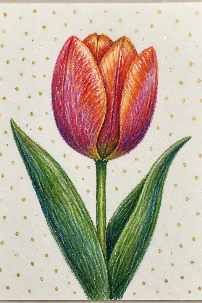
Confetti dots give you instant celebration energy without adding ornaments. I use a limited dot palette so it still looks clean: gold, cream, and a few tiny brown-gold dots. The pink tulip works because it has both warm and cool notes - warm in the highlights, cool in the folds. This is a great choice for end-of-year holiday cards and for prints that need a little sparkle.
Start by drawing the tulip and coloring petals with mauve-pink and deep mauve at the folds. Add near-white highlight edges along the inner petal curves. Keep the background mostly white. Then add confetti dots by tapping gold pastel onto the page with a stiff scrap of paper - vary sizes by changing the tap pressure. Add a few cream dots to keep it from looking too uniform, then lightly blend the tulip mid-tones so the petals look smooth.
Good to knowIf your gold looks too flat, rub it with tissue once after dotting - it spreads into a soft shimmer.
Common mistakeDon't cover the whole page with dots; leave breathing space around the tulip.
18. Tulip Oil Pastel Still Life with Teacup and Steam
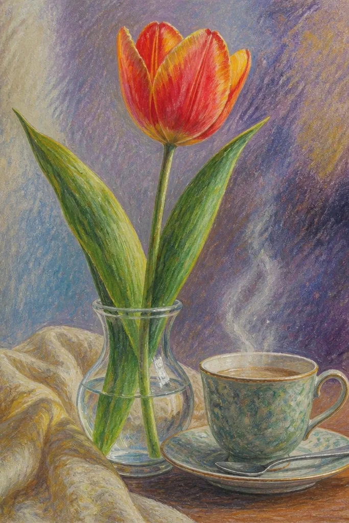
Tea-and-tulips makes the scene feel cozy, which is exactly what holiday season needs when you're not trying to go full Christmas. The teacup gives you a second shape to anchor the composition, and the steam lines create movement without clutter. I use pale gray-blue steam so it doesn't overpower the tulip colors. This style flatters warm kitchens and works well in medium frames because the objects create depth.
Start by drawing the teacup shape with a clear rim and handle, then sketch 3 to 4 tulips next to it. Color the tulip petals with red and peach, adding maroon shadows at petal bases and near-white highlights on edges. Shade the cup with light gray-blue and a darker line under the rim. Draw steam as thin curving lines in pale gray and white - keep them light and let the paper show through. Finish by adding a soft shadow under the cup and lightly blending the area behind the steam for a gentle haze.
Good to knowMake steam lines uneven in thickness - uniform lines look like a cartoon font.
Common mistakeDon't darken the steam too much; heavy steam makes the whole piece feel smoky and muddy.
19. Tulip Alphabet Banner with Hand-Lettered 'SPRING'
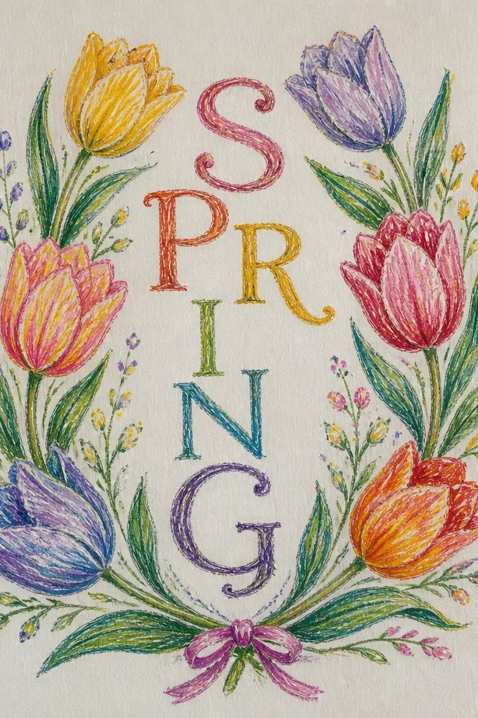
Lettered banners turn a tulip drawing into seasonal decor you can actually use. I've made these for friends who don't want full holiday scenes but still want something cute and personal. The banner gives structure, and the tulip illustrations add softness against the straight letterforms. This style works well for warm or neutral rooms because the palette stays grounded: muted green, coral-pink, and dark red.
Start by drawing a horizontal banner strip across the middle of the page with a slight curve. Letter SPRING in big capitals using muted green for the main strokes and dark red for shadow under the letters. Place small tulips above and below a few letters, coloring petals with coral and pink and adding darker fold shadows with maroon. Add tiny leaf sprigs near the letters to connect the banner to the tulips. Finish by lightly blending the background with off-white pastel so the whole piece feels cohesive.
Good to knowLetter first, then draw tulips to fit around letter curves - this avoids awkward spacing.
Common mistakeDon't outline letters in black; use a darker pastel so the banner stays soft.