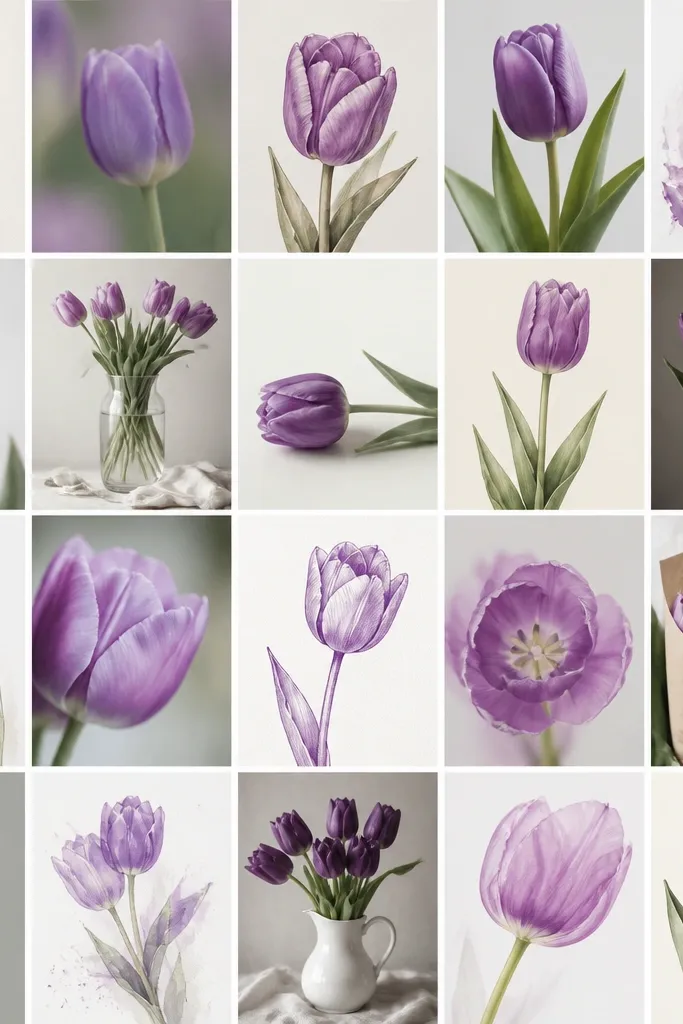
1. Lavender Cup Tulip with One Dark Edge
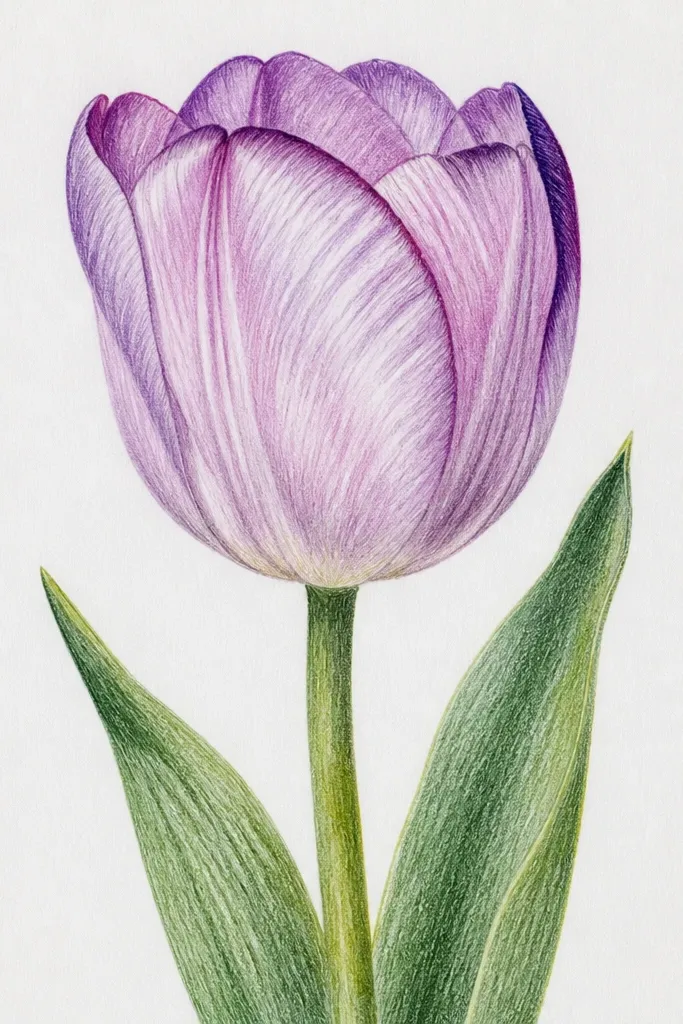
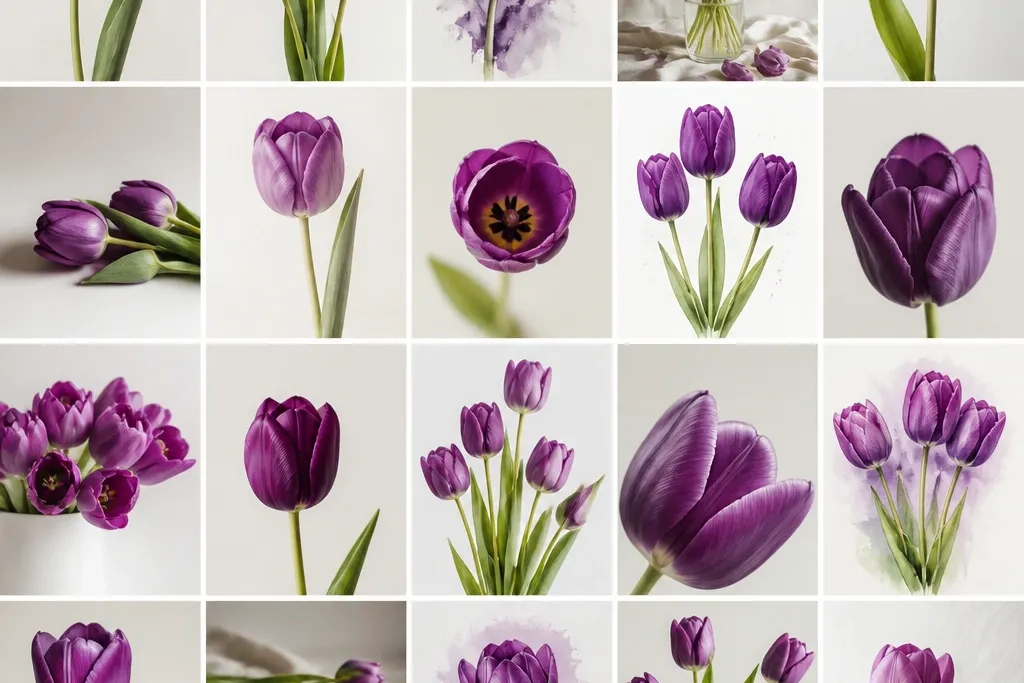
This is the first tulip I teach because it forces the correct petal structure without making you overthink. Use lavender purple for the main petal area, then add grape purple only along the fold edge where the petals overlap. The highlight strip is left untouched so the flower looks glossy instead of flat. It looks best on bright white paper and suits anyone who wants a clean, gift-ready drawing. If your hand is shaky, the simple composition still looks intentional because the shading has one clear direction.
Start by sketching a teardrop cup shape - wider at the top, narrower at the bottom - then add two inner lines to divide the cup into three sections. Color the whole cup with lavender, leaving a thin vertical highlight strip on the fold that faces the light. Add grape purple only along the outer fold edge and blend lightly with the lavender if your marker bleeds. Finish with a stem line that curves like an S, then add two short leaf strokes that point slightly outward.
Good to knowShade the fold edge first, then stop. Overworking the outer petals makes it look muddy.
Common mistakeDon't shade the entire petal evenly - that kills the tulip fold and makes it look like a blob.
2. Two-Tone Tulip Bouquet in a Tight Vertical Frame
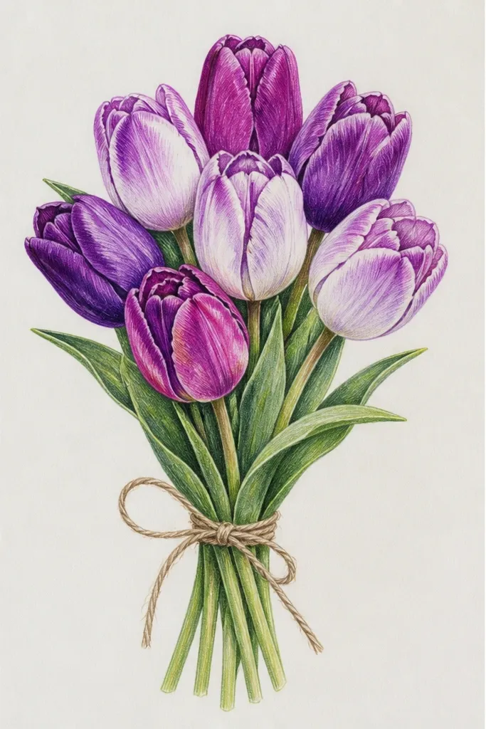
This one makes your drawing look like a real bouquet because you get overlap and scale. The trick is controlling size: the middle tulip is the largest, the one on the left is medium, and the right is smaller and tucked behind. Keep the colors limited to two purples so the bouquet stays crisp and not messy. I've used this for birthday cards and it looks classy even when the background is simple. It flatters the page because the vertical frame pulls the eye upward toward the blooms.
Draw a tall rectangle border first, then place the biggest tulip cup near the top center. Add a second tulip slightly to the left and behind, with its cup partially hidden by the center flower. Color each tulip with lavender first, then deepen the outer fold edge with grape purple. Braid the stems so they meet lower down, then add a few tiny leaf nubs near the stem crossings to show growth.
Good to knowIf you're using markers, let the lavender dry for 30 seconds before adding grape so you don't get purple smears on the highlight.
Common mistakeDon't space the tulips evenly like three stickers - overlap is what makes it look like a bouquet.
3. Purple Tulips on Tinted Paper with White Gel Pen Veins
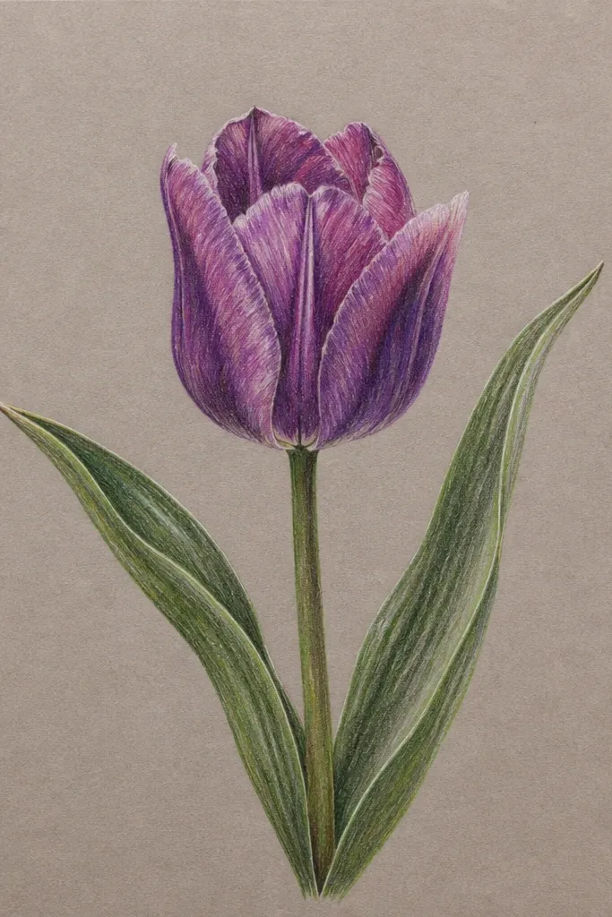
Tinted paper is the secret shortcut to richer purple without heavy coloring. I like a medium gray-lavender sheet because it makes lavender and grape look more dimensional. Then you use white gel pen for veins and a crisp highlight line - it pops like light reflecting off glass. This style looks great for art prints and it's forgiving because the paper texture adds depth. If your skin tone runs cool (pink undertones), the cool tinted background makes the purple feel extra harmonious.
Sketch your tulip cups lightly with a pencil so you can erase. Color the petals with a muted purple (not too dark), leaving the centers a bit lighter. Add grape purple only at the fold and outer edges, then let it dry fully. Finally, use a white gel pen to draw 3-4 curved vein lines per petal and a thin highlight stroke along the fold. Add two or three tiny dot speckles behind the flowers to keep the background from feeling empty.
Good to knowTest the gel pen on the same paper first. Some brands skip on smoother sheets.
Common mistakeDon't press hard with the gel pen - it can scratch and make the veins look uneven.
4. Pencil Sketch + Watercolor Wash Tulip (Soft Edges)
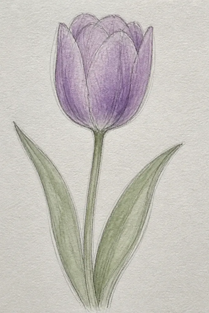
This is the tulip drawing I reach for when I want it to feel airy. Pencil gives you structure, watercolor gives you softness. Use light lavender wash first, then drop a darker grape near the fold where petals overlap. That "wet-on-wet" spot makes the fold look real. It looks best in small wall art or bookmarks, especially if you like gentle, not cartoonish, shapes. It also flatters people who prefer calm colors instead of bold marker lines.
Start with a pencil cup shape and lightly mark the three petal sections. Wet only the petal area with clean water using a small round brush, then wash lavender across the cup. While it's still damp, touch grape purple to the fold and outer edge so it blooms naturally. Let it dry, then add a thin green stem and a couple leaf strokes with a lighter green. If you want veins, add them last with a very light purple pencil or a tiny diluted paint line.
Good to knowKeep the highlight area nearly unpainted. Even a tiny untouched strip makes watercolor tulips look glossy.
Common mistakeDon't flood the whole page with water - it turns the purple into a flat gray smear.
5. Ink Outline Tulips with Purple Crosshatch Shadows
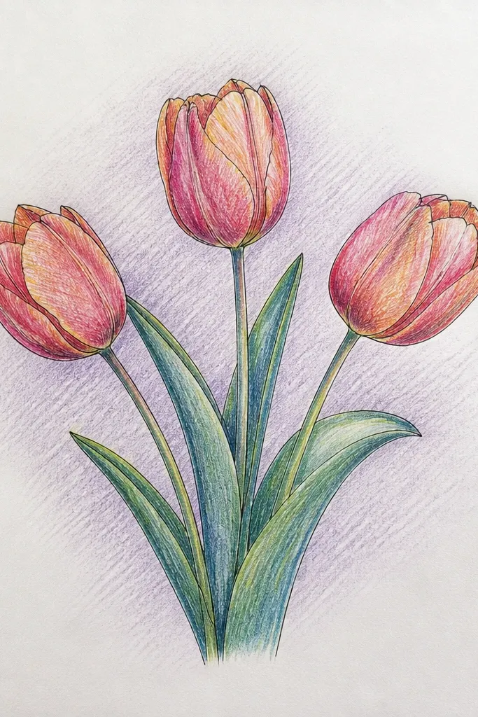
If you like clean line art, this style looks sharp and intentional. The outlines are black ink, then you shade with purple crosshatch only where the petals overlap. The white highlight gaps stay open, so the drawing keeps that glossy tulip look. I've used this for sketchbook pages and it ages well because ink lines don't fade like some markers. It also looks great for gift tags because it's easy to reproduce in smaller sizes.
Draw the tulip cups in pencil first, then trace the outline with a fineliner or brush pen. Leave a thin highlight strip unshaded along the fold. Add crosshatch lines in grape purple inside the folded-over areas, keeping the hatch direction consistent (like slanting left). Build depth by increasing hatch density near the fold center. Finish with a thin stem line and two small leaf shapes using the same crosshatch approach but lighter pressure.
Good to knowUse a purple marker or colored pencil for hatch - it looks smoother than coloring in large blocks.
Common mistakeDon't shade the entire petal with crosshatching. The negative space is what makes the tulip read as a cup.
6. Purple Tulip Side Profile with One Leaf Behind
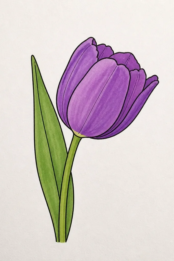
Side profiles look more advanced, but they're simple if you commit to perspective. You're drawing the cup as a slightly flattened oval, with the fold line curving toward the center. The leaf behind adds depth without clutter. I like this for wrapping paper-style art because it feels dynamic and less "front-facing sticker." It also flatters smaller pages since the composition takes up less vertical space. If your hand cramps easily, side profile lines are shorter and less repetitive.
Sketch an oval cup shape, then tilt it slightly so the opening faces right. Divide the cup into three petal sections with two curved lines that converge near the center. Color the visible petal surfaces lavender, then shade grape along the fold where petals overlap. Draw the stem as a single curve, then place a leaf behind the cup - start with a teardrop leaf and add one center vein line. Add a tiny shadow under the leaf edge using light purple.
Good to knowKeep the leaf slightly larger than you think. A small leaf behind can disappear against the petals.
Common mistakeDon't draw the leaf in front of the flower. Behind placement is what creates depth.
7. Sketched Tulip Bud Trio (Closed Buds in Purple)
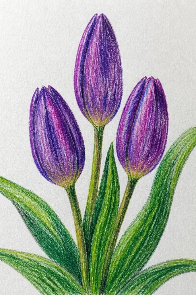
Closed buds are the fastest way to practice tulip structure because the petal folds are compressed. You still get the purple fold shading, but you don't need to draw open petals perfectly. This makes the set look cohesive and it's perfect for seasonal decor where you want volume without big flowers. I've used this in small frames and it reads clean even from a distance. It also suits beginners because the shapes are smaller and easier to correct.
Draw three bud shapes as small ovals with pointed tops, like little cups turned inward. Mark a seam line on each bud where the fold would be, then shade grape purple along that seam. Fill the rest of the bud with lavender, keeping the seam darkest. Add thin stems that angle outward slightly, then place two small leaves near the bottom stems. Keep the spacing uneven - one bud closer to the viewer looks more realistic.
Good to knowUse a darker purple for the seam only - it gives the bud the "tucked petals" look.
Common mistakeDon't add open-petal details to buds. That's the quickest way to make them look like imaginary flowers.
8. Purple Tulips with a Dotted Background and Soft Halo
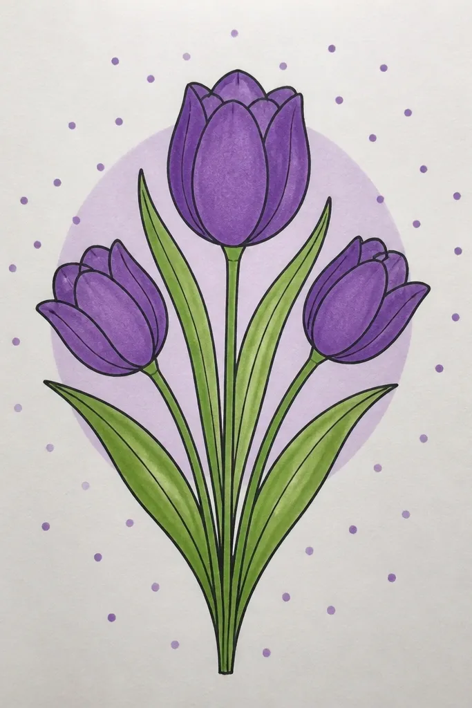
A dotted background makes tulips feel playful without losing elegance. The halo behind the bloom adds depth and makes the purple look brighter. I like this style for cards because the background hides uneven coloring and gives you texture instantly. The dots also help hide any pencil marks you forgot to erase. It flatters a wide range of occasions, from spring birthdays to Mother's Day.
Draw your tulip cup first and color it with lavender, leaving the highlight strip blank. Shade grape purple along the fold edges and add a tiny darker spot near the center. Then lightly pencil a circle halo behind the tulip - about 1.5 times the width of the flower. Fill the halo area with dots using a fine tip pen, making them denser near the tulip and lighter as they reach the outer edge. Add a few dots outside the halo at lower density so it feels airy.
Good to knowUse the same purple family for dots - a lavender dot looks softer than a dark grape dot behind the flower.
Common mistakeDon't make the dots the same size everywhere. Uniform dots can look like a stamp.
9. Water-Soluble Colored Pencil Tulips with Lifted Highlights
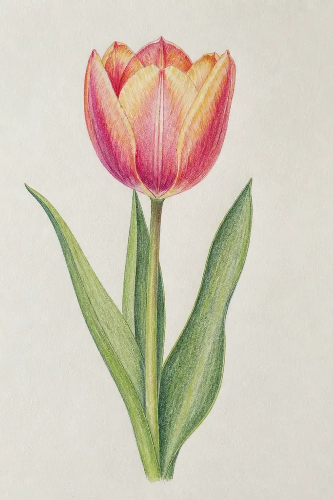
This gives you the most realistic petal gradients with minimal paint mess. Colored pencil lets you place light and dark precisely, then water-soluble blending smooths it into watercolor-like transitions. The lifted highlight trick is what makes it look glossy: you color, blend, then erase a small strip to pull back the paper color. I use this for art journal pages because it's controllable and doesn't warp paper as much as heavy watercolor. It's also great if you like subtle shading instead of bold outlines.
Color the tulip petals with lavender colored pencil first, then layer grape only at the folds and outer edges. Lightly blend with a damp brush, working from the light areas toward the darker edges. Wait for it to dry, then use a kneaded eraser or white pencil eraser to lift a thin highlight strip along the fold. Add the stem with muted green pencil, then blend lightly so it doesn't look like a separate sticker. Finish with a few tiny vein marks using a light purple pencil.
Good to knowBlend in short strokes. Long strokes can smear the highlights and turn them gray.
Common mistakeDon't erase while it's wet. It smears and leaves a dark patch.
10. Gouache-Style Solid Petals with Paper Texture
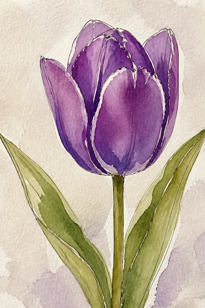
Gouache-style painting is a cheat code when you want bold color without perfect blending. Opaque coverage makes the petals look like real fabric-like paint, not transparent watercolor. The fold stays crisp because you place darker purple right at the overlap line. I like this for prints and bookmarks because it holds up well when you scan or photograph it. It also looks good on thicker paper like cardstock because the paint sits on top.
Sketch the tulip cup in pencil, then paint the whole cup lavender in one opaque layer. Add grape purple only along the fold and outer petal edge, keeping a clean edge where highlight should be. Leave a narrow highlight strip unpainted or paint it with lighter lavender and then scrape it back with a damp cotton swab. Paint the stem with opaque green and add two small leaf shapes near the base. Let everything dry fully before you add any tiny vein marks with a darker lavender.
Good to knowIf your purple looks too streaky, add a second thin lavender layer before you deepen the fold.
Common mistakeDon't overblend with water. It turns gouache-style paint into streaky watercolor.
11. Marker Gradient Tulip with a V-Shape Center Fold
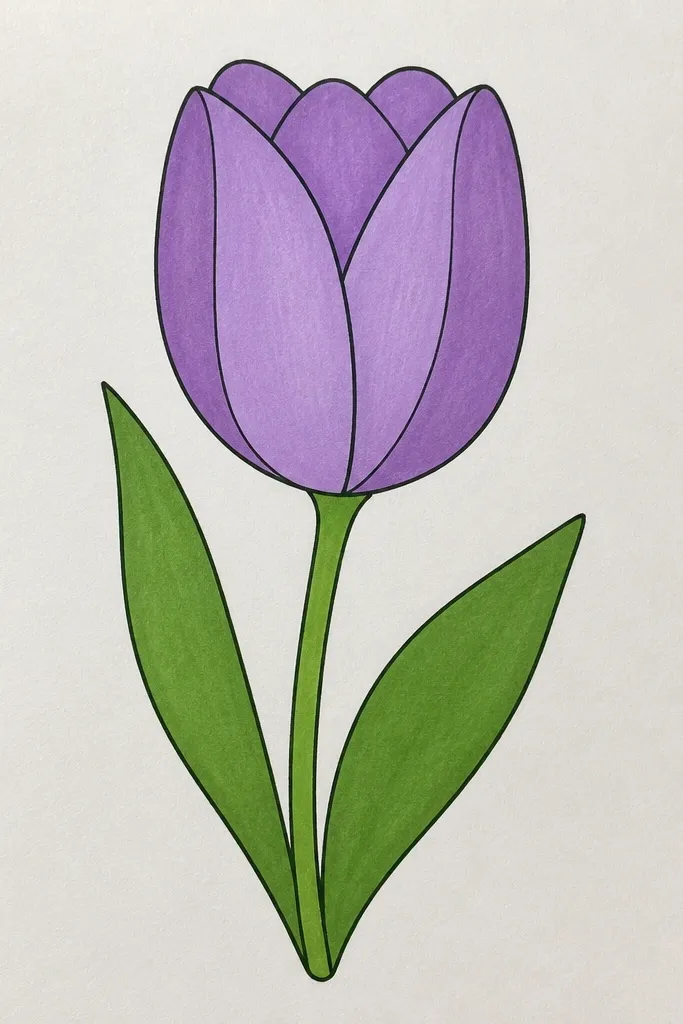
This idea makes your tulip look dimensional by shading to a center "V," not just around the edges. When you shade toward the center fold, the cup shape reads instantly. I've done this with alcohol markers and it looks clean because the gradients stay smooth. It's perfect for larger pages where you want a confident, modern look. If you like crisp marker work, this one feels satisfying because every pass changes the shape.
Sketch the tulip cup and draw a V-shaped center fold line that points down into the cup. Color the outer petals with light lavender first, then blend toward the center using mid purple. Add grape purple directly along the V fold edges and keep the highlight strip blank. Use a light green marker for the stem, then add two leaf shapes with the same two-tone approach: light green base and darker green veins. Finish by touching grape purple lightly at the bottom center where petals overlap.
Good to knowUse a lighter hand near the highlight strip so the marker doesn't bleed into it.
Common mistakeDon't color the V fold too wide. A thick fold makes the tulip look like a cartoon flower.
12. Purple Tulips in a Wavy Vase Container
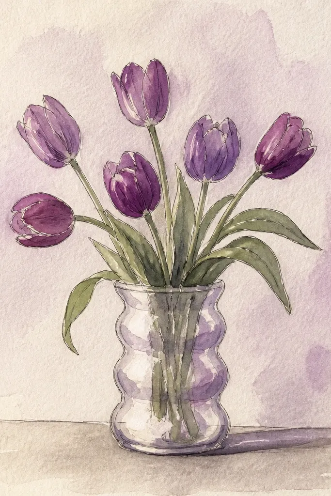
A container instantly makes the drawing feel finished because it frames the stems and gives your composition a bottom anchor. The wavy vase edge adds movement without adding extra flowers. I like pale gray or soft blue for the vase because it doesn't compete with purple. This style looks great for kitchen wall art and it makes the tulips feel like a real arrangement. It also flatters people who want to draw more confidently with background elements that are simple shapes.
Draw a vase shape at the bottom with a wavy rim and simple side curves. Sketch three tulip cups above it, with one tall in the center and two shorter ones leaning outward. Color petals in lavender, shade grape along folds, and leave the highlight strips open. Add stems that disappear into the vase opening, then draw 3-5 tiny leaf marks between stems so the arrangement looks alive. Shade under the vase rim with a very light gray pencil to ground it.
Good to knowKeep the vase lighter than the flowers. If the vase is as dark as the tulip, it steals attention.
Common mistakeDon't draw straight stems into a vase opening with no leaves. It reads like a plant diagram.
13. Tulip Mandala Border with Purple Blooms
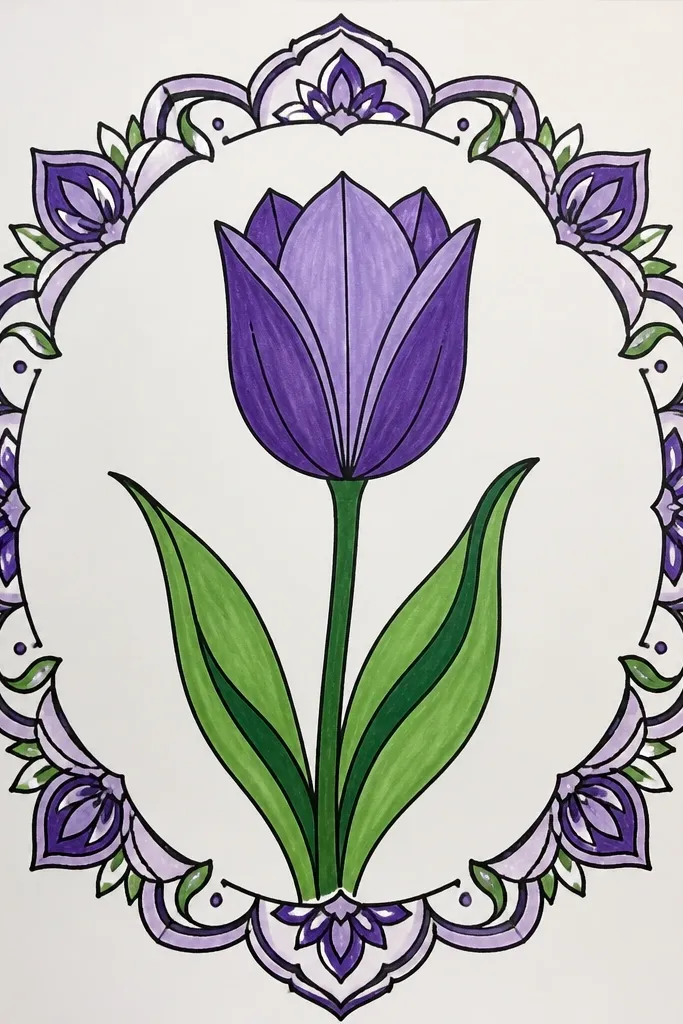
Borders make your tulips look intentional because they create a pattern, not a one-off sketch. I've used this for gift wrap and printed invitations where you want the tulip theme to repeat. The trick is keeping the border tulips smaller and simpler than the center flower so the layout stays clean. Use lavender for the main petals and grape only for folds, then repeat tiny leaf arcs to connect the pattern. This style suits anyone who likes symmetry but doesn't want to draw perfect circles.
Draw a thin rectangle border margin, leaving space in the center. Place small tulip cup shapes along the top and bottom edges, alternating left-right tilt so it doesn't look stiff. Add tiny curved leaf shapes between cups so the border feels organic. Color each mini tulip with lavender, shade grape at folds, and leave a narrow highlight strip. Finish with a few dot accents in the corners to tie the purple together.
Good to knowTrace the border lightly with pencil first. Repeating shapes looks better when they line up.
Common mistakeDon't make every mini tulip identical in height. Variation keeps the border from looking mechanical.
14. Purple Tulips with a Gel Pen Outline and Watercolor Wash Background
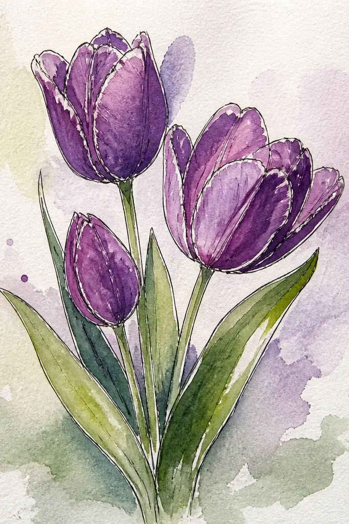
This hybrid looks polished fast because watercolor does the background work and gel pen makes the tulips look sharp. The background wash gives you atmosphere, and the outline keeps the flowers from blending into the page. I prefer pale blue or very light periwinkle behind purple tulips because the color contrast makes the purple pop. It looks great for spring wall art and it photographs beautifully because the lines stay crisp. If your coloring tends to go outside the lines, this method is forgiving because the outline defines the edges.
Paint a loose watercolor wash behind your flowers using pale blue with a few drops of lavender. Let it dry completely. Sketch tulip cups on top with pencil, then color petals in lavender and deepen the fold edges with grape. Outline the entire tulip with a fine gel pen and add a thin white highlight stroke on each petal fold. Draw stems with the same gel pen line weight so they match the outlines.
Good to knowWait for the wash to dry before you outline. Outlining wet watercolor can cause bleeding.
Common mistakeDon't use a dark background. A heavy background makes the tulips look cramped.
15. Monochrome Purple Tulip Study with One Shade Only
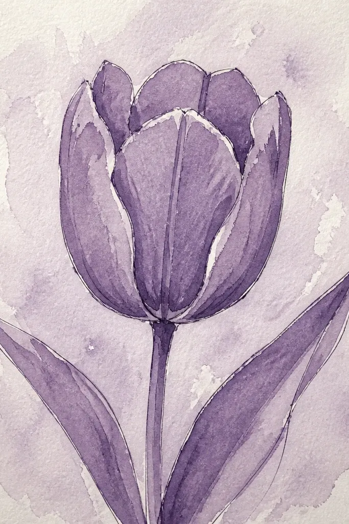
This is the practice piece that fixes your shading faster than any tutorial. Using one purple forces you to control value with pressure and layering, not color switching. I did this in my sketchbook when my tulips looked flat, and the change was immediate. You still get depth because the fold gets darker and the outer edges stay lighter. It's perfect for beginners because the palette is simple, and it also helps experienced artists refine shape without distraction. It looks good on any paper because the whole point is value.
Start with a pencil sketch of the tulip cup and divide it into three sections. Use one purple marker or one purple colored pencil and build value by layering: light passes first, then darker passes only on the fold and overlap areas. Leave a thin highlight strip blank or scrape it back with an eraser once dry. Add the stem using the same purple, but keep it lighter than the flower. Finish with a few small leaf marks in the same tone so the whole drawing feels cohesive.
Good to knowHold the purple marker farther from the tip and use a lighter touch for the top petals.
Common mistakeDon't switch to a second darker purple mid-way. Keep the study pure until you finish the shading.
16. Purple Tulip with Torn-Paper Background Texture
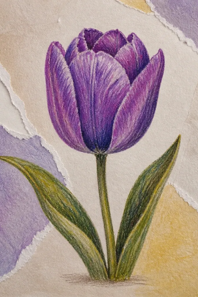
Texture makes drawings feel expensive without adding complicated drawing skills. Torn paper behind the tulip creates a natural, uneven background that hides minor pencil lines. I use pale cream paper with a lilac scrap because it supports purple without turning the page gray. The tulip itself stays crisp with a clean outline and two-tone shading, so the texture doesn't swallow the flower. This looks great for handmade cards and small gift tags because the layers catch light.
Tear small pieces of cream and lilac paper and place them behind where your tulip will sit. Glue lightly and press flat, leaving uneven edges visible. Draw the tulip cup on top, then outline it with a fineliner. Fill petals with lavender, shade grape at the fold and outer edges, and add a narrow highlight strip. Add a small shadow under the tulip cup using a light gray pencil so it pops off the torn texture.
Good to knowUse matte glue so the paper doesn't shine. Glossy glue makes the texture look plasticky.
Common mistakeDon't cover the whole page with torn bits. A few zones behind the tulip look better than a full collage.
17. Purple Tulip Corner Piece with Diagonal Leaf Scratches
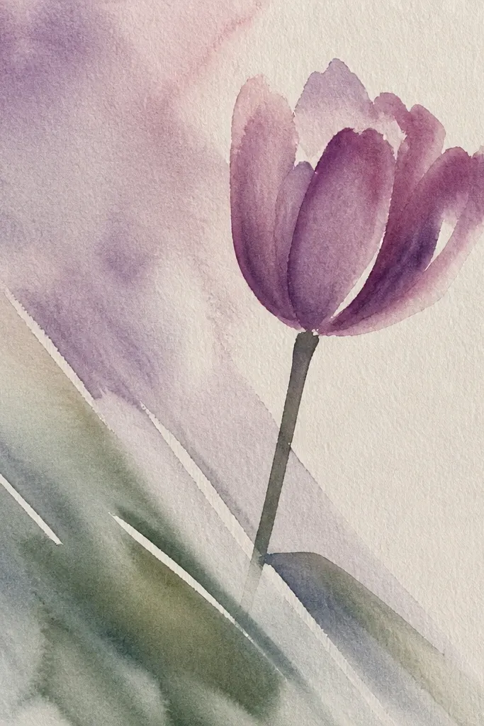
Corner compositions look modern and graphic, especially when the stem follows the page diagonal. The leaf scratches are my favorite trick because they suggest movement without drawing full leaves. This style is great when you want a minimalist seasonal piece that still feels handmade. It also flatters smaller paper sizes because you're not trying to fill the whole sheet. If you like clean layouts, this one scratches that itch.
Sketch a tulip cup in the corner, keeping it slightly smaller than you think for a balanced look. Draw the stem diagonally down toward the center, then add two or three diagonal leaf scratches that point along the stem direction. Color the petals lavender and deepen only the fold edges with grape. Leave the highlight strip blank and keep the outline light so it feels airy. Add a few tiny dots near the stem to finish the corner without clutter.
Good to knowKeep leaf scratches thin and short. Thick leaves overpower the tulip.
Common mistakeDon't center the tulip if you're going for this style. The diagonal corner placement is the whole look.
18. Purple Tulips with a Simple Horizon Background Line
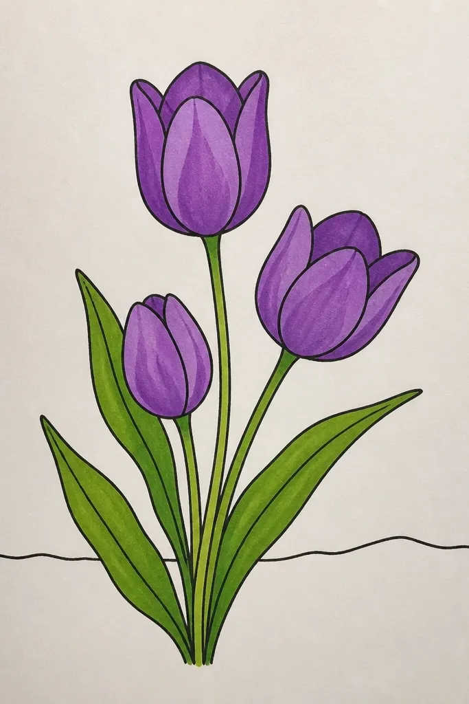
A horizon line turns a flower drawing into a scene. It gives your viewer a place to stand, even if the scene is just one line and two soft washes. I like this for seasonal art because it feels spring without adding extra elements like birds or buildings. The tulip stays the main subject, and the background line makes it look like it's growing in a small patch of ground. This is also easy to adapt for cards: just shrink the horizon line and keep the tulip proportions.
Draw a thin straight horizon line behind the tulip, slightly above center. Wash the area above with a pale lavender tint and the area below with a light green-gray wash. Sketch the tulip cup in front of the line and color it with lavender, then shade grape along the folds. Add a stem that crosses the horizon line so it looks rooted, and draw two small leaves that sit just above the horizon. Leave the highlight strip untouched for glossy petals.
Good to knowMake the horizon line lighter than you think. If it's too dark, it competes with the flower.
Common mistakeDon't add a busy sky or ground texture. One line plus two washes is the clean trick.
19. Purple Tulips with Blackboard Chalk Look (Soft Smudged Edges)
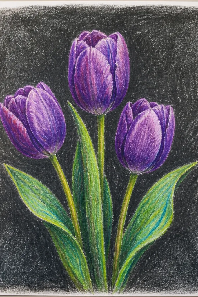
Dark paper makes purple tulips feel like chalk drawings on a café board. The smudged edges hide small mistakes and make the petals look velvety. I use this when I want a cozy seasonal vibe without complicated shading tools. It also photographs well because the chalk texture shows up clearly. If you like artsy, slightly imperfect marks, this style fits your hand instead of fighting it.
Use dark gray or black paper. Sketch the tulip cup lightly with pencil, then apply soft lavender chalk to the petals. Add grape chalk only along the fold and outer edge, and blend with your fingertip or a tissue for a gentle smudge. Use a lighter chalk for the highlight stroke along the fold. Draw the stem with muted green chalk, then add two small leaf smudges near the base. Dust off extra chalk lightly so the drawing doesn't look dusty.
Good to knowPress the chalk lightly at first, then build. Heavy pressure early makes the highlight disappear.
Common mistakeDon't use bright neon purple chalk on dark paper. It looks harsh and cartoonish.
20. Purple Tulip Cut-Paper Collage with Torn Edges and Black Ink Stems
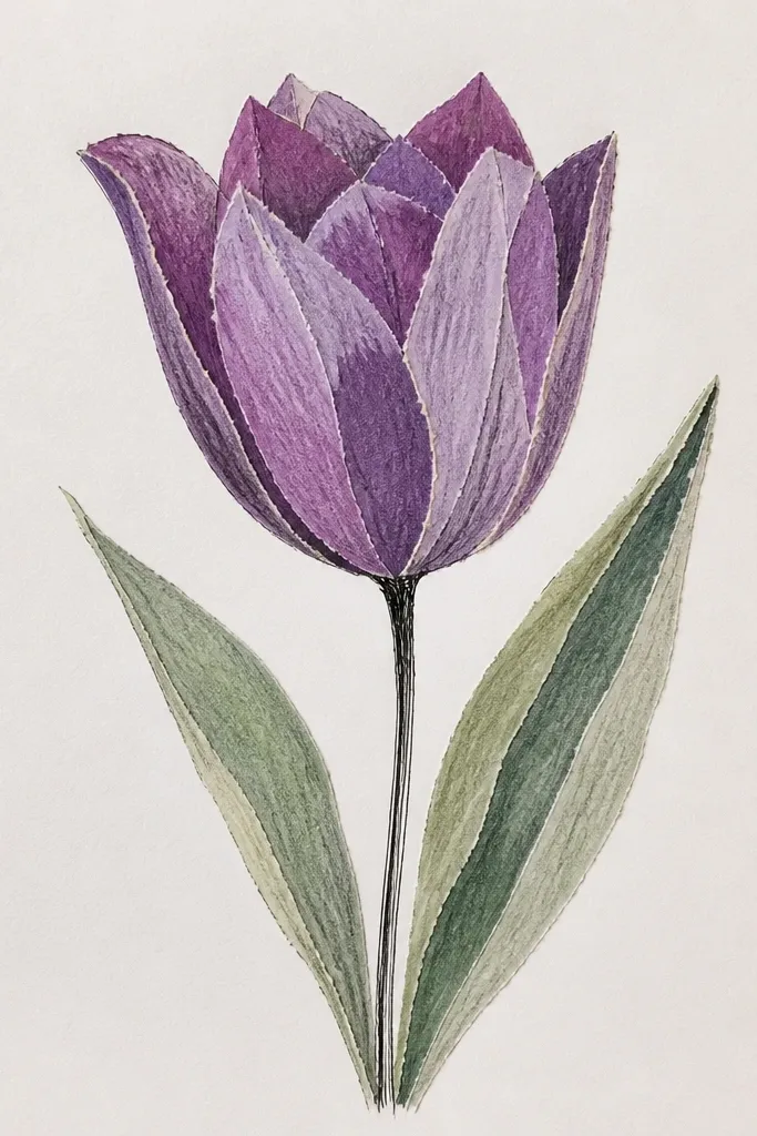
This drawing idea looks like a collage, but you still get to draw - the ink stems and the petal outlines make it feel intentional, not random. I did this on 9x12 inch cream cardstock and the torn edges catch light in a way plain paint never does. Use two or three purple tones so the tulip has depth even if you keep the shading simple. The black ink stems give it a crisp frame, so the purple petals don't blend into the background. It works great when you want something pretty fast, with texture you can't fake by blending.
Step 1: Tear three small petal shapes from purple paper - one deep violet for the outer petal, one lavender for the inner petal, and one pale purple for the throat highlight. Keep the tears uneven on purpose, then test the shapes on your cardstock before gluing. Step 2: Lightly sketch the tulip outline in pencil so you know where the petal layers land, then glue the outer petal first, followed by the inner petal, leaving a narrow "valley" line. Step 3: Add the throat highlight with the pale purple piece and press it down with a dry paper towel so it grips the fibers. Step 4: With a black fineliner, draw a single stem line that curves like it's moving in wind, then add 2 short leaf strokes that look hand-cut, not perfectly shaped. Step 5: Finish by dragging a tiny bit of diluted black ink along the stem edges using a damp brush for a soft bleed.
Good to knowIf your torn edges look too clean, rough them up with your fingers for 10 seconds, then glue - the glue soaks in and the texture sharpens.
Common mistakeDon't outline every torn edge in black - it makes the petals look like stickers instead of layered paper.