1. Classic 5-Petal Pansy Bouquet in a Tall Vase
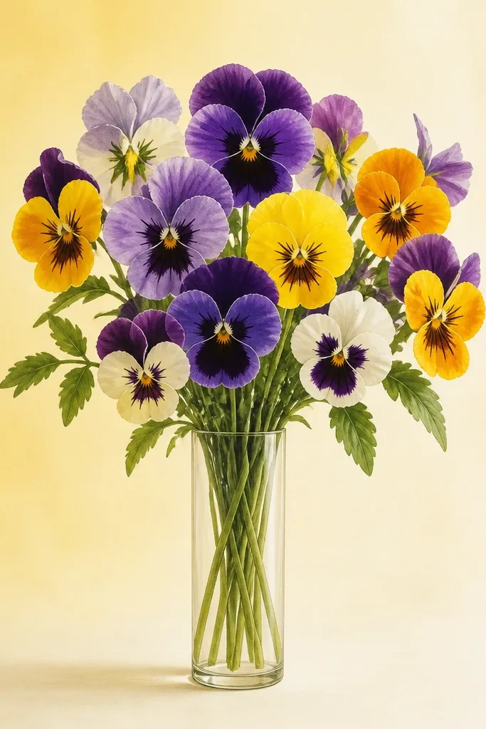
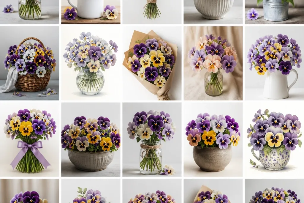
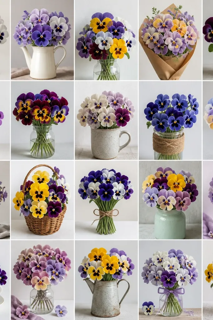
This one is the easiest way to get "bouquet" energy fast because the shapes stay consistent. Use deep purple and near-black for the center, then paint the upper petals in muted lavender and the lower petals in violet with a thin yellow streak near the throat. The tall vase shape stretches the flowers upward, which looks good on smaller paper sizes because it gives you vertical structure. It also flatters warm skin tones in photos when you frame it with a cream mat and a thin gold frame.
Start by lightly sketching a tall vase silhouette - just two curves and a rim - then draw three pansy units across the top half. Place one bloom front and center, then two behind it, slightly smaller and angled. Add stems as three long lines that converge under the flowers, then tuck two small leaves at the sides. Finish by painting a pale background wash, then watercolor the petals from light to dark, and deepen only the center and petal edges with a denser pigment.
Good to knowAfter the paint dries, go back with a 0.3 mm liner and add tiny center "freckles" so the pansy looks alive, not painted.
Common mistakeDon't outline every petal edge with thick black - it makes the drawing look like a coloring page.
2. Monochrome Pansies with Soft Graphite Shadows
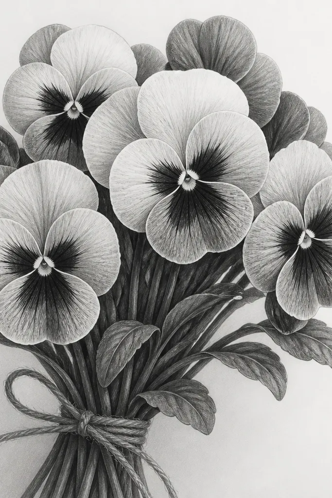
If you want elegant winter-to-spring decor without adding color, graphite pansies do the job. Keep the petals mostly light gray, then build shadows under the top petals and along the three lower petals where they overlap. I like this look for people who prefer neutral art - it doesn't clash with bold furniture, and it looks calm on dark frames. It also reads well at a distance because the contrast comes from shading placement, not heavy outlines.
Begin with a light pencil sketch of four pansy units clustered in a loose triangle. Erase any hard edges you don't like - graphite looks best when the lines are faint. Add overlap shadows first: shade under the upper two petals and along the sides of the lower three petals. Finally, darken the center with a tight circular scribble and leave a small paper-white highlight to suggest gloss.
Good to knowBlend shadows using a folded paper stump and stop before it turns gray everywhere.
Common mistakeSkip heavy scribbling across the whole petal - it flattens the flower and makes it look smudged.
3. Watercolor Wet-on-Dry Pansies with Speckled Centers
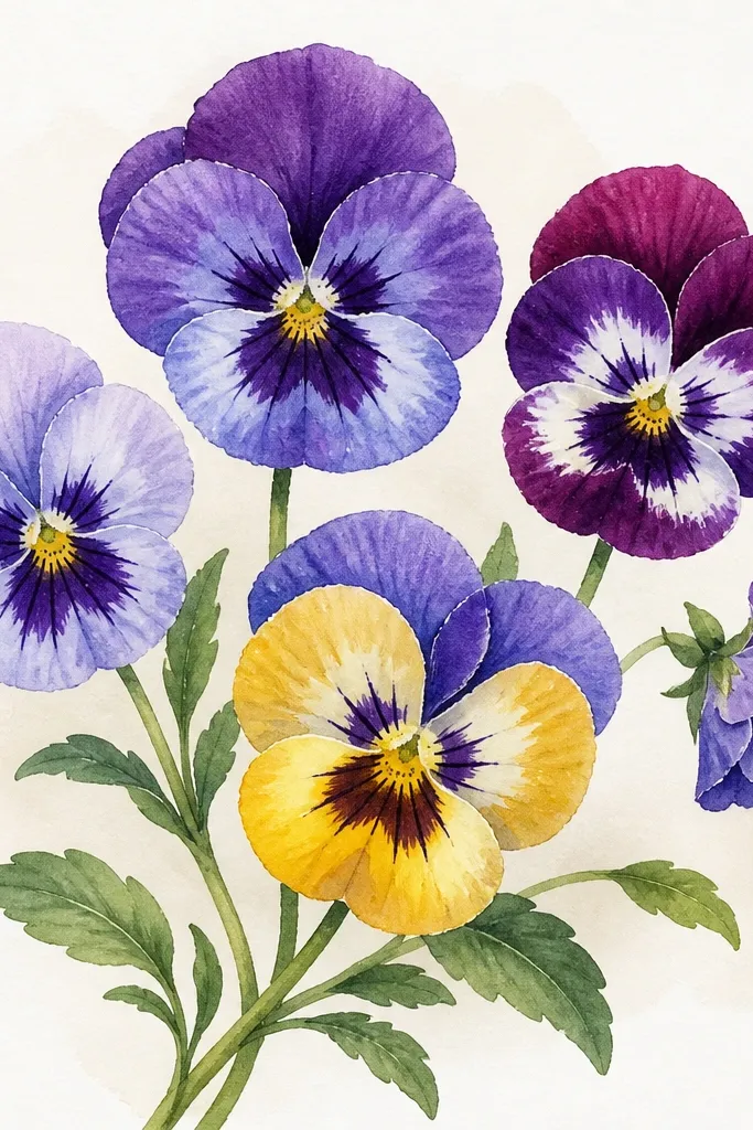
This style looks fresh because the paint stays mostly controlled. Wet-on-dry keeps petal edges sharp, which makes the pansy pattern easy to read. Use a light wash of blue-violet on the petals, then deepen the throat area with a darker purple and a touch of burnt sienna for warmth. The speckled center makes the bouquet feel realistic even when the petals are simplified. It works great for spring birthdays because it looks bright without turning neon.
Sketch your bouquet with pencil and keep the lines light. Wet the paper area for each petal only after you've decided the shape, then load your brush with diluted pigment and paint the petal in one direction. Let each petal dry before you add darker throat lines, otherwise the color bleeds into the wrong spot. Finish with a fine brush to place tiny center dots and a thin line of darker pigment at the petal edges.
Good to knowFor speckles, tap the brush tip lightly off the center first, then touch down for a few controlled dots.
Common mistakeDon't overwork the center while it's still wet - it turns into a muddy ring.
4. Pansy Bouquet Drawing with Soft Pastel Background Card
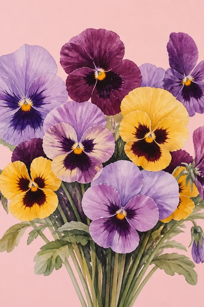
Drawing pansies on a pastel paper background makes the colors look intentional. The blush base warms up the yellow throats and keeps the purples from looking cold. I like this for Valentine-season frames because it feels romantic without adding hearts or text. The bouquet looks best when you keep outlines thin and let the background do the work of making the image "finished."
Choose a pastel card in blush, sage, or pale sky blue and cut it to your final size. Sketch the bouquet lightly in pencil, then paint petals with diluted watercolor so you can still see the card tint through. Add the yellow throat as a soft wash, then glaze a deeper purple around the edges. Use a liner only where petals overlap so the bouquet has depth.
Good to knowIf your paper is textured, press your pencil lightly - heavy pencil dents show through watercolor.
Common mistakeDon't use very dark outlines over a colored background - it can look harsh and heavy.
5. Botanical Border Frame with Tiny Pansies at the Corners
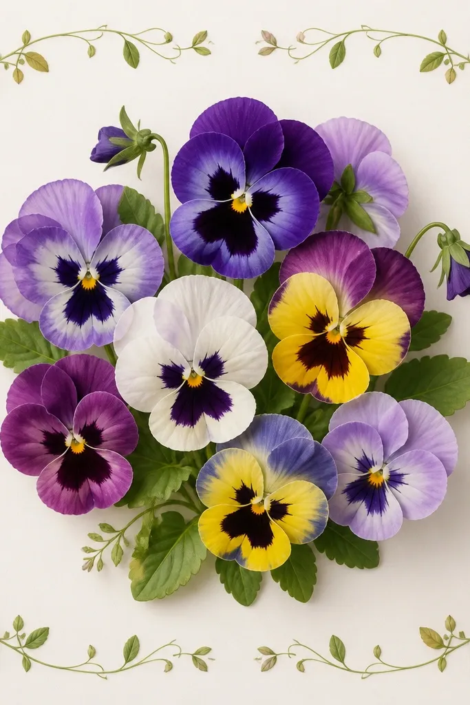
This idea makes your bouquet feel like part of a set. The corners act like visual anchors, and the border gives you that "printed ephemera" vibe people love in seasonal decor. Keep the main bouquet slightly larger and more detailed, then simplify corner pansies to just the face and two leaf tips. The contrast between big and tiny pansies makes the drawing look designed, not accidental. It also works on both light and dark mats because the border is thin and controlled.
Draw a square or rectangle frame line first, leaving an even margin. In the center, sketch three pansy units in a cluster and add stems that curve inward. At each corner, draw one tiny pansy face - smaller than your pinky nail on the page - plus a small comma-shaped leaf. Shade the main petals with watercolor washes, then keep corner pansies mostly outline with a single color wash for restraint.
Good to knowUse a ruler for the outer frame line, then draw the border leaves freehand so it doesn't look mechanical.
Common mistakeDon't put full detail in the corners - it steals focus from the bouquet.
6. Pansy Bouquet with Ribbon Bow and Hand-Lettered Banner Space
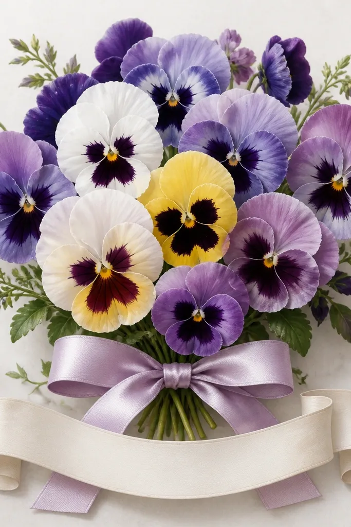
Adding a ribbon bow gives the bouquet a "present" feeling without needing text. I've used this layout for spring thank-you cards and it always looks more thoughtful than a plain bouquet because the viewer has a clear focal point. Color the ribbon in cool gray-lavender so it doesn't compete with the flowers. Keep the bow folds simple: two loops, one knot, then three shadow lines so it reads as satin.
Sketch the bouquet cluster first, then draw a ribbon loop that wraps behind the stems. Add the bow knot at the center and two loops that extend left and right, slightly taller than the flowers. Paint the pansies with purple and yellow, then paint the ribbon with a gray wash and darker gray under the folds. Leave the banner area clean and unpainted so your future lettering stays crisp.
Good to knowAfter watercolor dries, use a gel pen to add two or three bright highlights on the ribbon folds.
Common mistakeDon't paint the ribbon the same purple as the petals - it blends and makes the bow disappear.
7. Pansy Bouquet Drawing in a Wicker Basket Top View

Top views look playful and they hide mistakes because overlapping blooms cover sketch lines. The wicker texture gives you extra visual interest, so you can simplify individual petal details. Use a mix of purple, soft blue, and a few pale lavender pansies so the basket looks full without turning into a monochrome blob. This layout looks great for wall art because the composition is tight and doesn't need a lot of background.
Draw a circle or oval basket opening first, then add weave lines with a repeating pattern of curved "U" shapes. Sketch 6 to 8 pansy units inside the basket, letting some petals overlap the basket rim. Paint the petals in layers: light wash first, then darker throat and edge lines. Add a few stems peeking out, drawn with thin pencil lines, then lightly erase the ones you don't want to show.
Good to knowKeep your weave lines lighter than your flower outlines so the pansies stay the hero.
Common mistakeAvoid dark basket shading under bright petals - it makes the whole image feel heavy.
8. Two-Tone Pansies with Colored Pencil Veins
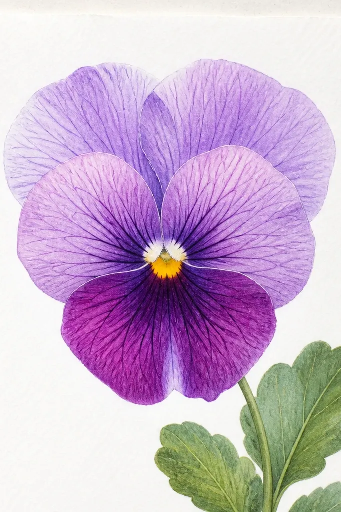
This is the best combo when you want realism without spending hours. Watercolor gives you soft color, and colored pencil veins make the petals look textured. I use pale violet for the upper petals and deeper plum for the lower ones, then add thin yellow streaks near the throat. The veins pull the eye toward the center, which makes the bouquet look detailed even if the shapes are simple. It's flattering in bright rooms because the pencil lines add a little sparkle under daylight.
Paint the bouquet petals with a light watercolor wash first, keeping the edges clean. While the paint is still slightly damp, drop a darker shade into the throat area, then stop there. After everything dries, use a light purple colored pencil to draw 3 to 5 vein lines per petal, following the petal curve. Finish by tracing the edges of the overlap petals with a darker pencil so the bouquet has depth.
Good to knowUse a sharp pencil and draw veins lightly - press too hard and the petal surface looks scratched.
Common mistakeDon't add veins before watercolor dries - they get muddy and lose their crisp look.
9. Pansy Bouquet with Dry Brush Texture on Petals
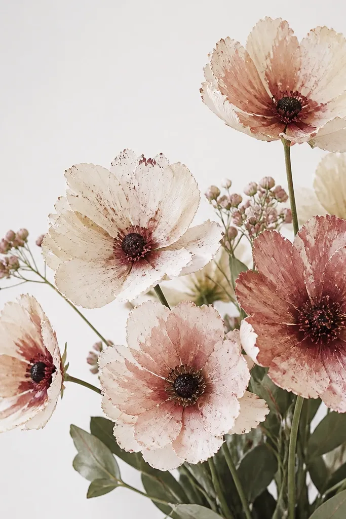
Dry brush texture makes pansies feel handmade in a good way. It's perfect when you want the drawing to look like it belongs in a cozy seasonal craft room, not like a perfect illustration. Use watercolor with a slightly gritty pigment like ultramarine or cobalt-violet, then load less water on your brush. The speckling adds depth, especially around the petal edges. This also works well for smaller drawings where smooth gradients would look too plain.
Sketch your bouquet cluster and lightly add stem lines. Load your brush with pigment, wipe most of the water off on a paper towel, then paint each petal with short, dragging strokes. Let the dry brush speckle show, especially on the lower three petals. Add a darker throat wash in a narrow band, then darken the center with a small circular scribble. Leave the background mostly unpainted so the texture stands out.
Good to knowTest your dry brush on scrap paper first so you know how speckly the pigment will get.
Common mistakeDon't over-wet the paper - dry brush only looks right when the paint doesn't flow.
10. Pansy Bouquet Drawing with Ink Splatter Background
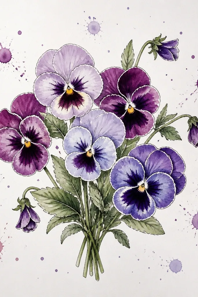
Splatter gives your bouquet energy without adding extra flowers. I use it when I want the piece to feel modern but still seasonal. Keep the splatter light and behind the flowers, so the petals stay crisp and readable. Color the splatter with diluted ink or watercolor so it matches your palette. This works especially well for gift tags and small prints because the background detail makes the piece look finished.
Outline your bouquet with a fine liner and keep petal shapes crisp. Paint petals lightly, leaving the center darkest and clean. Tape off the area around the bouquet so splatter doesn't hit your focal blooms. Load your brush with diluted plum ink, flick once or twice from a distance, then remove the tape while the paint is still slightly damp for clean edges.
Good to knowCover your table with scrap paper and use a stiff brush for predictable splatter.
Common mistakeDon't splatter on top of wet petals - it will stain the flowers and ruin the clean look.
11. Pansy Bouquet with a Window Scene Behind It
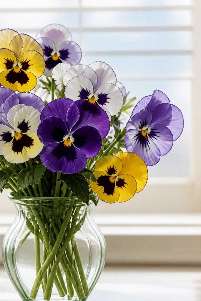
This layout makes pansies feel like they're sitting somewhere real. The window frame is a simple shape that adds depth, so your bouquet doesn't have to rely on lots of background color. Use soft sky blue and pale gray for the window, then keep petals in purple and yellow. The contrast between cool background and warm throat color makes the flowers look brighter. It's a great choice for spring home decor because it feels airy.
Draw a rectangle window frame behind the vase, leaving space around the edges for the mat. Sketch the vase in front and place three pansy units so their tops overlap the window frame lightly. Shade the window with a pale sky wash and add two or three thin blind lines. Paint the petals with watercolor, then add darker ink outlines only where petals overlap the vase rim.
Good to knowAdd one tiny highlight line on the vase rim to sell the glass feel.
Common mistakeAvoid drawing window lines too dark - they compete with the flowers.
12. Pansy Bouquet Drawing in a Moonlit Palette
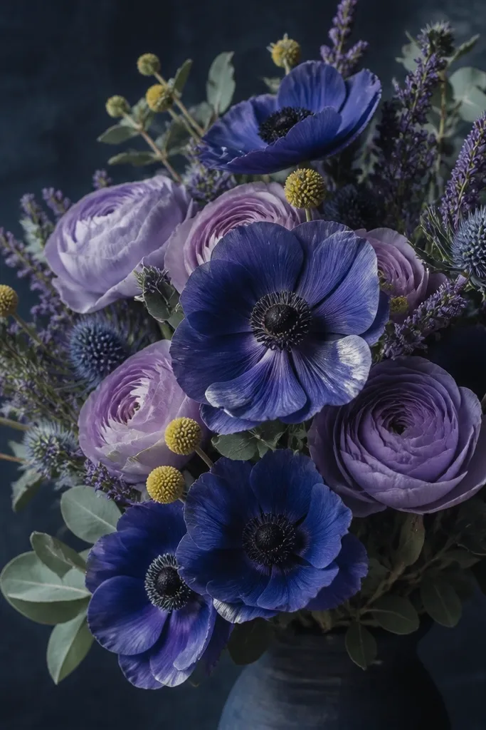
Moonlit palettes make pansies look dramatic without changing the flower. Use a dark navy or deep charcoal background, then paint petals in dusty lavender and indigo. The throat can be a muted ochre so it doesn't glow neon against the dark. Add tiny white gel pen highlights on the petal edges where light hits. This looks incredible for nightstand frames and winter parties, and it photographs well under warm indoor lighting.
Paint or sponge a dark background first, letting it dry completely. Sketch the bouquet in light pencil and keep lines faint. Paint the petals with diluted indigo and lavender, then deepen overlap shadows with a darker wash. Add throat color in a small band and finish with white gel pen dots and edge highlights after everything dries.
Good to knowUse a white gel pen with a fine tip for highlights, not paint - it gives sharper points.
Common mistakeDon't use bright lemon yellow on a dark background - it looks like a different flower.
13. Pansy Bouquet with Watercolor Pencil Gradient Petals
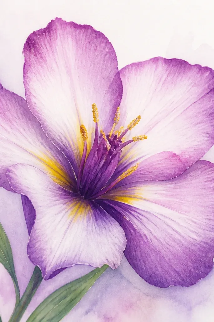
Watercolor pencils give you control over the gradient look without needing fancy brushes. The petal edges stay crisp while the center fades, which matches how pansies naturally have soft shading. Choose two tones: a medium violet for the outside and a pale lavender for the inner petal. The center throat line in yellow makes the gradient look more dimensional. This is my go-to when I want a polished look but I'm working at the kitchen table.
Sketch your bouquet and lightly block in petal shapes with watercolor pencil. Add medium violet along the petal edges and around overlaps, then soften it with a damp brush for a smooth fade. Keep the throat area lighter until the end, then add yellow as a narrow streak. Finish by darkening the center and adding a few short pencil lines for petal texture.
Good to knowKeep a paper towel nearby and blot your brush - it stops the pigment from spreading too far.
Common mistakeAvoid rubbing watercolor pencil hard over wet paint - it pills the paper and looks grainy.
14. Pansy Bouquet with Embossed Look Using White Gel Pen
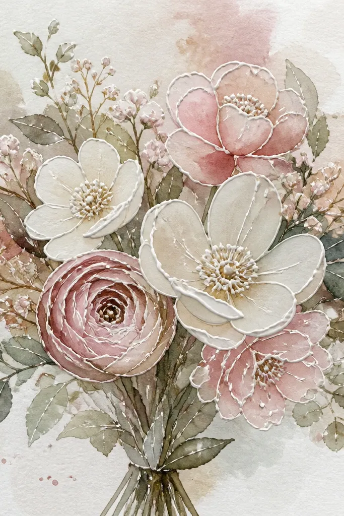
White gel pen highlights make pansies look dimensional even if your petals are simple. I use this when I want the drawing to pop on a colored mat or in a frame behind glass. The raised lines catch light, so the bouquet looks more "finished" than a flat watercolor piece. Keep the highlights limited: a few center dots, a thin edge line, and one highlight curve on each lower petal. That restraint is what makes it look intentional.
Paint your petals first with light watercolor washes and let them dry fully. Outline the pansy unit with a fine liner if you like, but keep the lines thin. Add the throat color and dark center, then wait for complete dryness. Finally, use a white gel pen to draw tiny center dots and a single highlight curve on each lower petal. Let the gel pen dry and don't smudge it with your hand.
Good to knowPress the gel pen lightly at first and do a second pass for only the brightest highlight edges.
Common mistakeDon't add big white areas - it turns into snow instead of highlights.
15. Pansy Bouquet Drawing with Pressed-Leaf Style Leaves
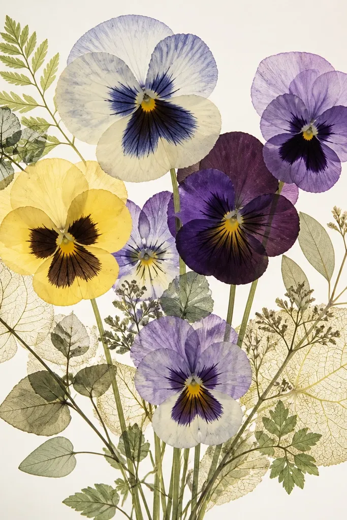
Leaves make pansies look real, and this pressed-leaf style does that fast. You get a botanical feel without making the whole drawing complicated. Use light green watercolor with a slightly yellow tint, then draw veins with a fine pen. The leaves should be smaller than you think - if they're too big, they steal attention from the pansies. This look is great for scrapbooks and seasonal stationery because it feels scientific and sweet at the same time.
Sketch the bouquet stems and place 2 to 4 leaves along the outer edges. Paint the leaves with a light green wash, leaving a few lighter streaks where veins can show through. After drying, draw vein lines from the center outward with a fine liner or gel pen. Add one or two tiny leaf shadows under the bouquet so the leaves look layered, not pasted on top.
Good to knowUse a reference leaf shape and copy the vein spacing - it reads as authentic immediately.
Common mistakeDon't outline every leaf edge with thick ink - pressed leaves look delicate.
16. Pansy Bouquet Drawing with Corner Tucked Blooms
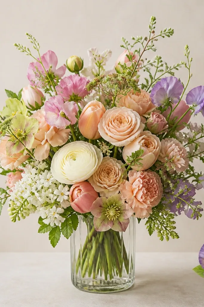
Corner-tucked blooms add a playful, layered composition. It makes the bouquet feel like it's interacting with the page, which is why it looks good in greeting cards. Keep the tucked blooms smaller and slightly out of focus with lighter pigment so the main cluster stays sharp. I like this for spring events because it feels lively without adding clutter. It also flatters a variety of color palettes since the tucked blooms can be any purple shade you like.
Draw a simple vase in the center and sketch three pansy units inside it. Add two smaller pansy units tucked into opposite corners, with one petal edge overlapping the page frame line. Paint the main bouquet with fuller color, then paint the corner blooms with diluted pigment. Finish with darker centers on all blooms, but keep the corner centers slightly lighter so they don't steal focus.
Good to knowUse the same center marking pattern on every pansy unit so the eye reads them as matching flowers.
Common mistakeDon't make the corner blooms the same size as the main cluster - it flattens the hierarchy.
17. Pansy Bouquet Drawing with a Kraft Paper Look
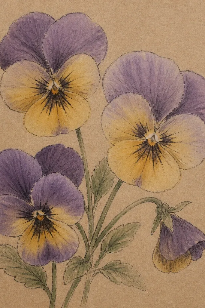
Kraft paper changes everything. The warm paper tone makes pansies look vintage, especially when you use muted pigments instead of bright watercolor. I use dusty lavender, plum edges, and a soft yellow throat that looks like aged sunlight. This is a great choice for fall-spring crossover decor because it feels cozy even when the flowers are "spring." It also hides small sketch lines, which is a relief when you're drawing quickly.
Use kraft paper and sketch your bouquet lightly with a brown pencil. Paint petals with diluted violet and plum, keeping the center area darker and more concentrated. For the throat, paint a narrow yellow streak and blend it outward with a damp brush edge. Add thin ink lines only where petals overlap so the drawing stays readable against the warm background.
Good to knowIf the violet looks too strong, glaze a tiny bit of water around the edges to soften it into the kraft tone.
Common mistakeDon't use heavy white paint on kraft - it looks chalky unless you keep it to tiny highlights.
18. Pansy Bouquet Drawing with Colored Marker Outline and Wash
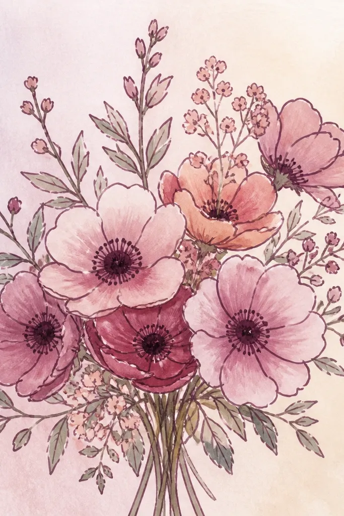
Marker outline gives you that crisp poster look, but you have to keep the marker color consistent. Use a muted plum or deep violet marker instead of black so the drawing feels cohesive with the flower palette. Then fill with watercolor wash so the petals look soft rather than cartoonish. This style works for people who want clean shapes and fast results because you don't have to ink every tiny edge. It also looks great in thicker frames because the contrast is bold.
Sketch the bouquet in pencil, then go over outlines with a plum marker. Fill petals with diluted watercolor, starting with light lavender on upper petals and deeper violet on the lower petals. Add yellow throat streaks with a small brush tip and keep them narrow. Darken the centers with marker or a very concentrated watercolor, then add a light background wash behind the vase.
Good to knowLet marker outlines dry for 5 minutes before watercolor - it prevents bleeding into the wash.
Common mistakeDon't use a super-thick marker line - it makes pansies look like a logo.
19. Pansy Bouquet Drawing with Embossed Paper Flower Center Dots
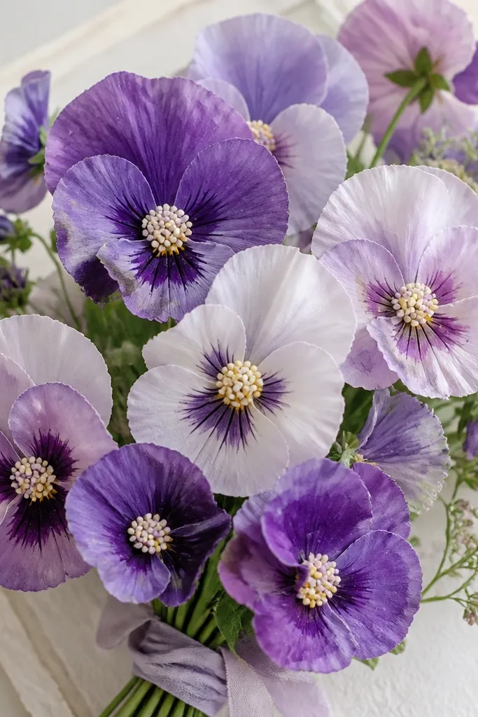
This is the only idea on the list that adds physical texture to the drawing. The raised center dots trick your brain into reading the flower as tactile, like a handmade card. Use watercolor for the petals and then add tiny paper dots with glue so the center looks speckled and raised. Keep the dots small - a few millimeters - and place them only in the center ring. The result looks special for gifts and holiday cards because it feels "crafted," not printed.
Sketch and watercolor your pansy bouquet first, leaving the center ring slightly lighter. Cut tiny circles from white paper or cream cardstock, about 2-3 mm wide. Dab a small amount of craft glue in the center ring, then press the paper dots into place in a loose cluster. After the glue sets, paint over the dots lightly with a very diluted purple so they blend into the center color.
Good to knowUse tweezers for the dots. Finger-gluing makes them smear and slide.
Common mistakeDon't flood the glue - it warps the paper dots and shows lumps around the center.
20. Pansy Bouquet Drawing with Pastel Gel Pen Stems and Leaves
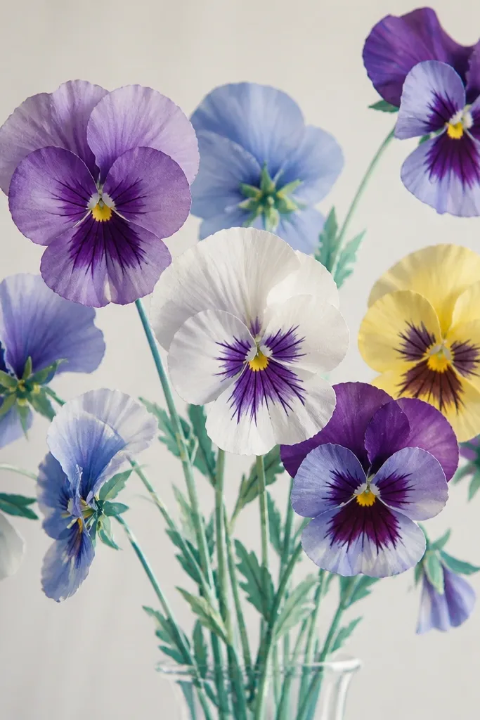
Pastel gel pen detail makes stems and veins look clean without heavy ink. I use this when I want the bouquet to feel airy and modern, because the stems look like they're drawn with light. Choose a cool green for stems and a slightly darker teal for leaf veins so the leaves have depth. The gel pen line stays bright against watercolor petals, so the bouquet reads clearly even in small sizes.
Watercolor your pansy petals and let them dry. Sketch stems and leaves lightly in pencil so you can place them correctly. Use a pastel green gel pen for the main stems, then switch to a teal gel pen for leaf vein lines and a few vein accents on larger leaves. Add tiny leaf highlights with a lighter gel pen tone and keep the lines thin so the flowers stay the focal point.
Good to knowPress gel pens lightly and go over once. Too many passes creates waxy buildup.
Common mistakeDon't use gel pens on wet watercolor - they skip and leave streaks.