1. Ribbon-Loop Orchid Bouquet in a 5x7 Frame
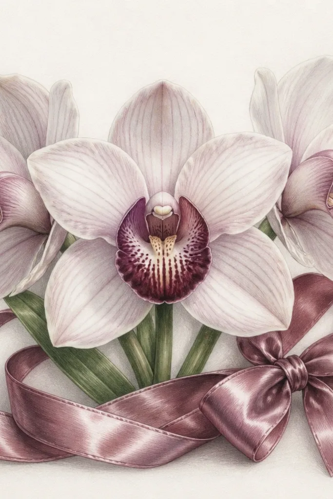
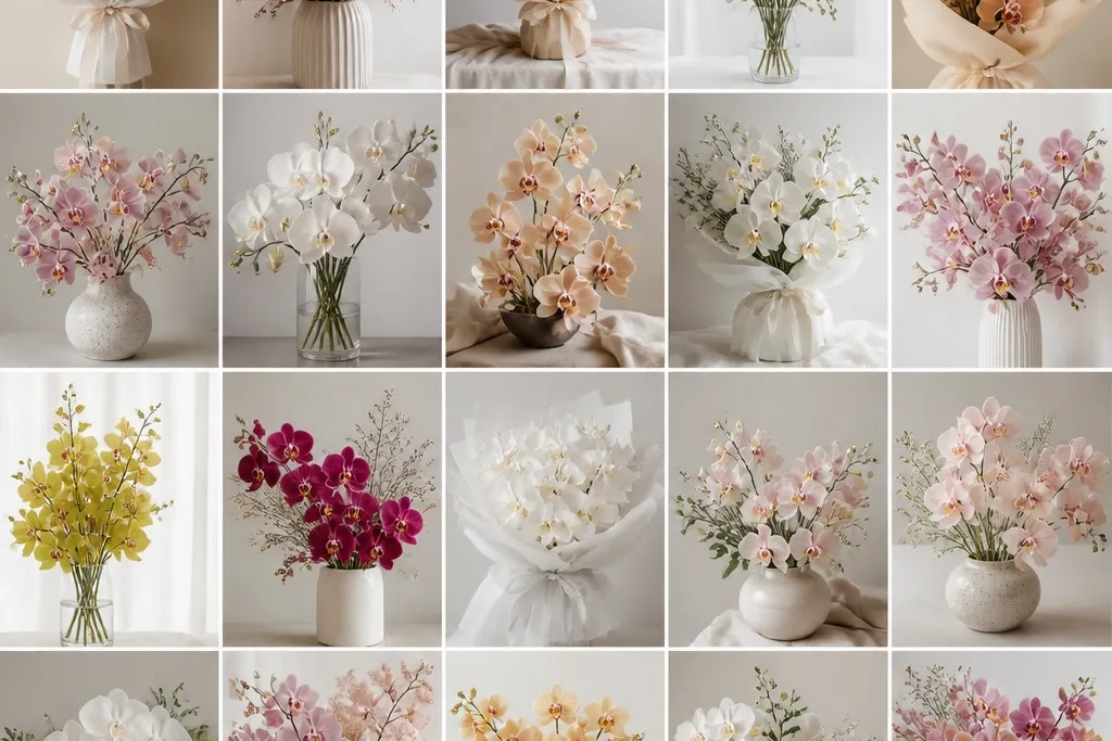
This layout works because the ribbon gives you a natural anchor at the bottom, so your orchids don't float. I draw the orchids in a triangle: one center bloom, one slightly higher on the left, one lower on the right. The lip petals get the deepest shading, while the outer petals stay lighter so the flower looks dimensional. It flatters most card designs because the eye lands on the center bloom first, then follows the ribbon bow to a neat finishing point. For color, I use a pale orchid purple on the petals and a warmer magenta-violet on the lip, with a light yellow dot near the lip base.
Start by sketching a light oval for the center bloom and two smaller ovals for the side blooms, angled outward. Then block the ribbon: draw a shallow V shape for the loop, wrap the ends under the flowers, and tie a small knot on the right. Add petal shapes - three main petals for each orchid plus the lip - keeping the front edges darker than the back edges. Finally, shade the lip and inner folds with a soft pencil or watercolor, leaving 2-3 tiny highlight spots on the petals and ribbon folds.
Good to knowUse a kneaded eraser to lift tiny highlights off the ribbon - it looks like satin in seconds.
Common mistakeDon't outline every petal edge the same dark thickness - that's how it turns into a coloring-book print.
2. Three-Orchid Staircase Cluster for Depth
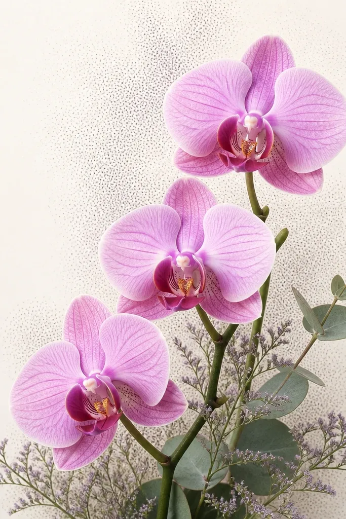
This is my go-to when I want depth without a busy background. The "staircase" placement makes the front orchid feel closer because its lip and inner folds are drawn larger and darker. I keep the middle orchid medium-dark and the back orchid lighter, so the viewer's brain reads distance automatically. It's especially flattering for minimalist paper because the shapes do the work. If you're working with warm skin tones in your finished project (like a peach card), the soft purple orchid petals look extra clean against it.
Start with three guide circles on a diagonal from bottom left to top right. Draw the front-facing orchid first with the largest lip and the darkest inner lines, then draw the second bloom slightly behind it with lighter line weight. Add the third bloom last, smaller and lighter, with fewer interior shading marks. Finish by shading a faint "shadow" under each bloom using a light pencil arc - keep the background around them mostly blank.
Good to knowAdd one small leaf stem only at the back - it sells the layering more than extra flowers.
Common mistakeAvoid crowding the petals so tightly that the lip shape disappears.
3. Orchid Bouquet with Gold Ornament Tucked Behind
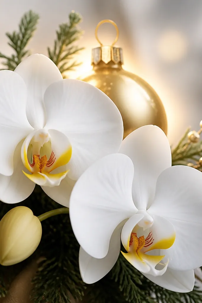
This idea is holiday-ready without turning the bouquet into a Christmas scene. The ornament is behind the orchids, so it reads as a background detail, not competition. I draw the ornament as a circle with a bright highlight crescent on the right side, then I soften it with lighter pencil so it doesn't steal the show. The orchids stay crisp - front petals have firmer edges, back petals are lighter. It looks great on warm cream paper because the gold highlight pops and the purple orchids feel richer without getting muddy.
Sketch your bouquet first: one center orchid, one side orchid, and one small bud behind. Place the ornament ball so it peeks between the petals near the center - keep it partially hidden. Add the ornament hook at the top and draw a faint halo circle around it using very light pencil. Shade orchids with a purple base, then deepen the lip and inner folds; keep the ornament highlight bright by leaving it unshaded.
Good to knowIf you color with markers, use a gold gel pen just for the ornament highlight and hook line.
Common mistakeDon't outline the ornament with the same thickness as the orchid petals.
4. Snowy Background Orchid Bouquet Wash
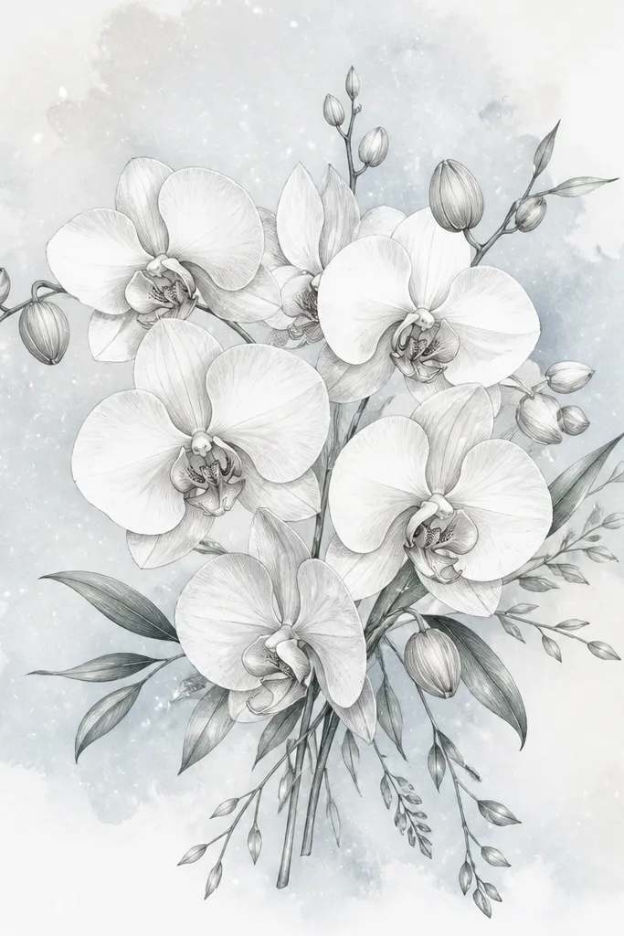
A light snowy wash makes orchids feel winter-cute while keeping the flower structure clean. I use a very pale blue-gray background so the purple petals still read clearly. The trick is the order: background first, then orchids on top so your petal edges stay sharp. This works well for people who want a softer look because the snow speckles cover minor sketch imperfections. On off-white paper, the blue-gray wash feels airy and the orchid lip stays the focal point.
Start by wetting the paper lightly behind where the bouquet will go, then paint a thin pale blue-gray wash leaving the bouquet area slightly lighter. While it dries, draw the orchid petals and lip shapes in pencil, then ink or darken with pencil only after the background sets. Add snow speckles using a toothbrush flick or a splatter brush, but keep the densest speckles farther from the bouquet. Finally, shade the lip folds and inner lines, leaving 2-3 small highlights on the petals.
Good to knowUse a tissue to dab the wet wash edges so you get soft snow gradients instead of hard blocks.
Common mistakeDon't paint the background over your orchid lines - it blurs the petal edges and kills the depth.
5. Orchid Bouquet with Hand-Lettered Banner Strip
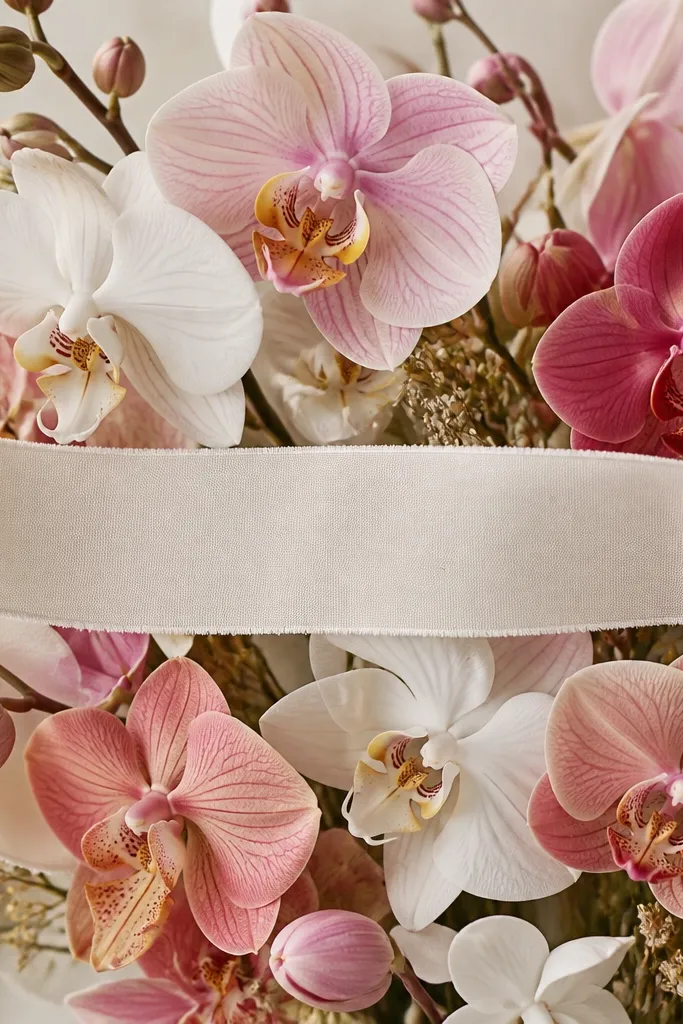
This one is practical for cards because the banner gives you a writing space that still looks decorative. I draw the orchids so they frame the banner, with the lip petals facing toward the text area for balance. The banner strip looks best when it has clean curves and light shading, because it's the "flat" element that contrasts with the "sculpted" orchid petals. If you're using a darker ink pen, the banner makes your composition feel finished instead of floating. It looks good on white or pale gray cardstock because the lettering stays crisp.
Draw a horizontal curved banner first - a long strip with slightly arched ends. Place one orchid above the banner and one below, then add a third smaller bloom at the center edge so it looks like it's peeking. Shade orchids with purple tones and keep the banner shading light, using a single soft gray gradient on the lower side. Add letterforms on the banner after the pencil shading is dry, then trace only the banner text with a fine pen.
Good to knowWrite the letters first in pencil, then ink - you'll avoid shaky pen lines.
Common mistakeDon't let orchid stems cross directly through the banner text.
6. Wide Orchid Bouquet with Loose Airy Stems
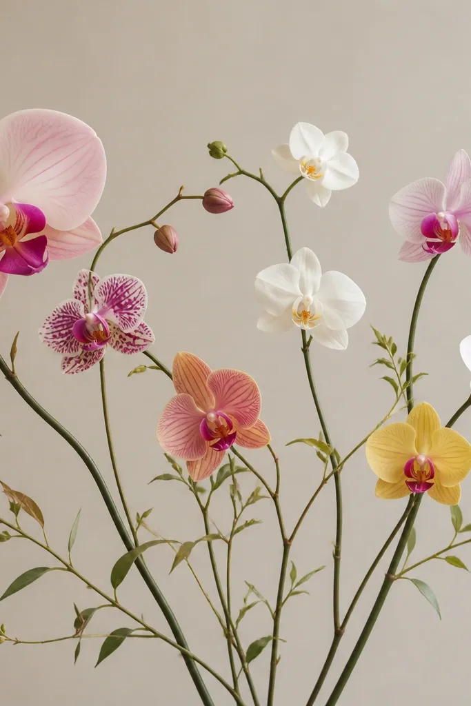
Wide spacing makes orchids feel airy and expensive-looking, even with simple coloring. You get a clean silhouette because the orchids are separated, so each bloom stays readable. I keep the line weight lighter on the far-right orchid and darker on the left hero bloom, which makes the whole composition feel intentional. It's flattering on larger paper because negative space frames the flowers. If you use pastel purple and a cool green for stems, the drawing feels modern and calm.
Start by lightly sketching a sweeping S-curve stem line across the page as your main guide. Place the left orchid first as the hero - bigger, with deeper lip shading - then position two smaller orchids to the right and slightly higher. Draw thin stems and add only 2-3 leaves total so the page doesn't get cluttered. Shade petals with a light purple wash and deepen only the lip and inner folds, then add soft shadow lines under each bloom.
Good to knowLeave a big blank area in the top right - it makes the bouquet look designed, not accidental.
Common mistakeAvoid drawing all stems the same thickness.
7. Orchid Bouquet in a Morning Mug (Funny + Cute)
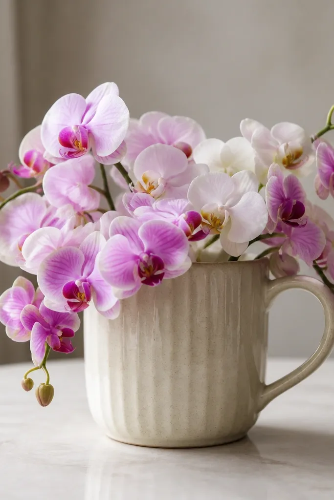
A mug changes the mood instantly, and orchids still fit because the flower shape is elegant. I draw the mug with a soft, rounded rim and a couple of shadow bands so it looks like ceramic. The orchids spill out of the top like they're fresh-picked, which gives you a natural sense of movement. This layout flatters people who like a casual style and want a drawing that looks great without a fancy frame. It also works on smaller paper because the mug gives you a clear boundary.
Sketch the mug first: draw an oval opening, then connect it to the body with two slightly curved sides and a handle on the right. Place one center orchid coming up from the mug, angled slightly left, then add two side blooms that tuck behind the rim. Shade the mug with vertical light-to-dark bands, leaving a highlight on the left side. Shade orchids with purple petals and a warm magenta lip, keeping the lip folds darker and the outer petals lighter.
Good to knowUse a light gray pencil to add tiny specks to the mug glaze - it adds realism fast.
Common mistakeDon't make the mug too wide - if it's bigger than the orchids, the flowers lose their focus.
8. Orchid Bouquet with Watercolor Edge Bleed Effect
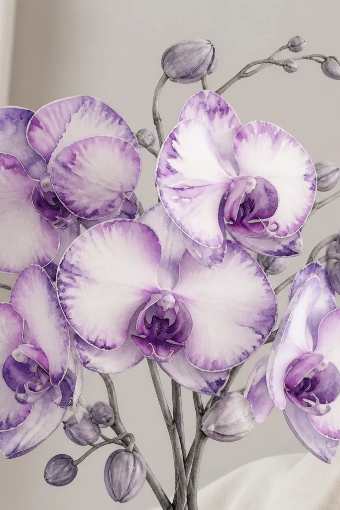
This is the "soft art" version that still looks high-effort. The edge-bleed effect happens when you paint wet-on-wet at the petal border, so the pigment gathers near the lines and fades inward. I keep the center lip more saturated, then let the outer petals fade for a gentle gradient. It looks great for people who want a dreamy look and don't want hard outlines everywhere. On textured paper (like cold-press watercolor paper), the bleed looks even better.
Draw orchid shapes in pencil lightly, then wet only one petal area at a time with clean water. Mix a pale orchid purple and a slightly deeper violet; paint the deeper color at the petal edge and let it fade toward the center. Keep the lip darkest by painting a thicker band of violet and adding a tiny yellow dot near the base. Repeat for each bloom, then let everything dry fully before darkening a few key outline edges with pencil.
Good to knowControl the bleed by using less water than you think - too much water turns it into a stain.
Common mistakeAvoid outlining in marker before watercolor - the ink barrier can block the soft fade.
9. Orchid Bouquet with Patterned Wrapping Paper Background
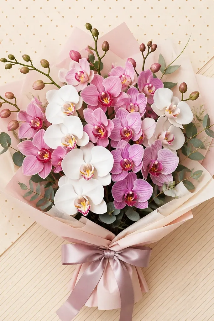
A patterned background makes the bouquet feel gift-like without adding more flowers. The key is to keep the pattern small-scale and low-contrast so it doesn't compete with the orchid petals. I use thin stripes and tiny dots in light gray or muted blue behind the blooms. Your orchids need crisp edges: front petals are darker, back petals are lighter. This works especially well for holiday cards because it reads like wrapped presents even if you never draw the box.
Start by lightly sketching a border rectangle for the "wrapping paper" area. Add a pattern with a fine pen or pencil: tiny dots in one corner and thin stripes in another, keeping everything light. Then draw your bouquet on top, leaving the patterned area visible around the petals. Shade orchids with purple and magenta tones, but keep shadows minimal so the pattern stays readable. Finish by darkening only the orchid lip and inner folds.
Good to knowUse one pattern type only if you're nervous - dots OR stripes, not both at full strength.
Common mistakeDon't make the background pattern dark enough to match the orchid contrast.
10. Single Orchid Portrait with Close-Up Lip Detail
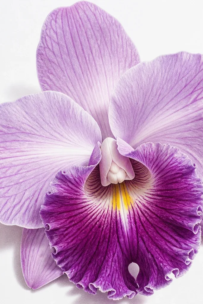
If you want the cleanest "wow" for the least work, draw one orchid big and let the lip do the talking. Close-up portraits hide mistakes because you're not trying to balance multiple blooms. I place the orchid slightly off-center and draw a crisp outline on the front petals only, keeping the back petals lighter. The yellow dot and lip folds make it feel realistic even if the rest is simple. This one flatters any skill level because it rewards careful observation more than complex composition.
Sketch the orchid silhouette first - a large oval for the front petals and a smaller shape behind for the side petals. Add the lip as a distinct teardrop shape that points toward the bottom center. Shade the lip folds with a deeper violet and keep the outer petals lighter with a thin wash or light pencil. Add a faint shadow behind the orchid using a soft pencil, then lift a highlight on the top petal with a kneaded eraser.
Good to knowDraw the lip folds as 2-3 curved lines only. Too many lines look scratchy.
Common mistakeAvoid making the lip the same color intensity as the outer petals.
11. Orchid Bouquet with Hanging Teardrop Charms
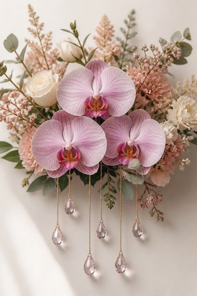
This is a fun holiday spin because the charms add vertical motion. I keep the orchid arrangement compact so the charms become the movement, not the flowers. The teardrops also give you an easy way to add highlights and reflections, which makes the drawing feel more finished. It looks great on darker or toned paper because the white highlight spots pop. If you color with colored pencils, the charms let you practice smooth gradients without messing up the orchid structure.
Draw a compact bouquet cluster: one center orchid, two smaller side orchids behind it. Then draw strings hanging down - three or four thin lines that start from just under the bouquet. Add teardrop charms as simple teardrops with a bright highlight crescent on the upper right. Shade the charms with a light-to-dark gradient and add a soft shadow line under each charm. Finish by deepening the orchid lip and inner folds so the charms don't steal contrast.
Good to knowUse a white gel pen for the charm highlights after everything else is dry.
Common mistakeDon't make the strings thick - thick strings look like marker doodles.
12. Two-Tone Orchid Bouquet on Black Paper (Glow Effect)
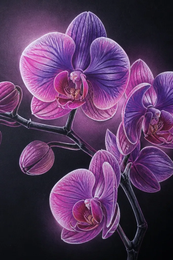
Black paper makes orchids look like they're lit from within. I use two-tone coloring: cool purple for the outer petals and warmer pink-violet for the lip and inner folds. Then I add bright white highlights along the petal edges and a soft halo behind each bloom. This layout flatters people who like bold contrast and want a drawing that reads from across a room. It also works well for winter events because the "glow" feels icy and festive.
Start by outlining the bouquet in white pencil or very light gray pencil so you can see it on black paper. Build the orchids: front petals get a brighter outline, back petals get lighter shading. Color outer petals in cool purple first, then layer the lip with warmer pink-violet. Add tiny white highlights on the lip folds and along the top edge of each petal. Finish with a faint halo behind each bloom using a dry brush or soft pencil, then clean up any smudges with a kneaded eraser.
Good to knowIf your white gel pen skips, warm the tip by rubbing it on scrap paper for 10 seconds.
Common mistakeAvoid coloring over your white highlights - keep them for the final layer.
13. Orchid Bouquet with Minimal Line Art and One Accent Color
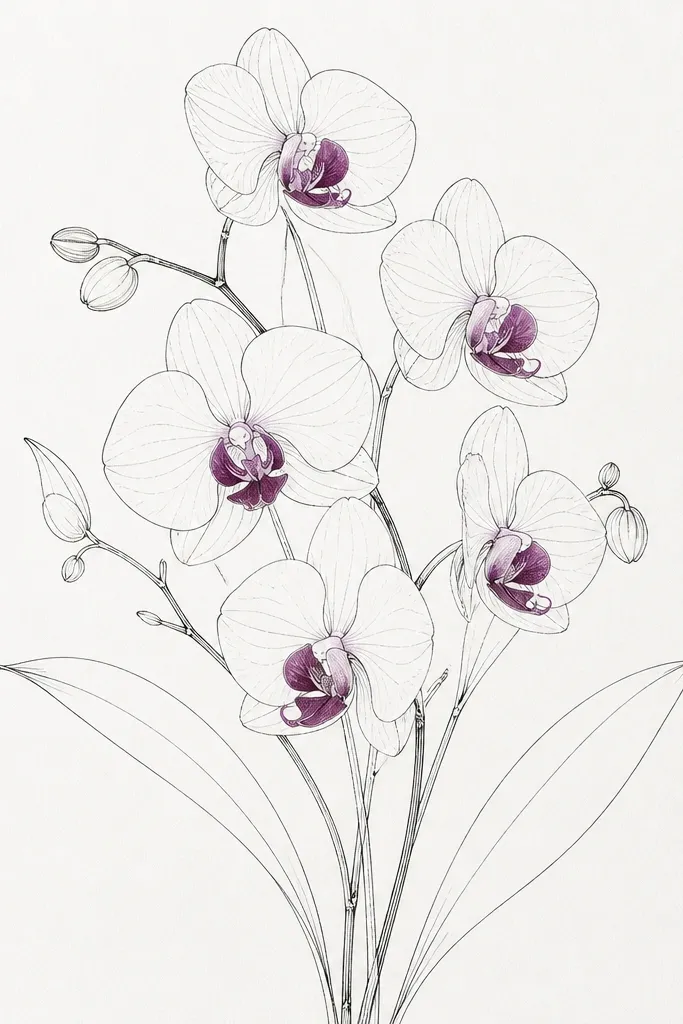
This one is for clean, modern holiday prints. Thin line art looks sharp when you commit to one accent color and let the paper do the rest. I draw the orchids with light-to-medium line weight: darker only at the lip and inner folds. Then I color only the lip petals with a strong orchid purple, leaving outer petals uncolored. The result feels airy but still "finished," because the contrast is intentional. It looks great on white cardstock and gives you a premium feel without coloring everything.
Sketch the bouquet shapes in pencil: a center orchid and two supporting blooms with simple stem lines. Ink over your pencil using a fine liner, keeping line weight thin and consistent except on the lip edges. Add the lip shape and then color only the lip petals with one deep purple - stay inside the lines. Leave the outer petals blank so the composition breathes. Add one small shadow under the bouquet with a soft pencil to ground it.
Good to knowUse a ruler for your stem baseline or your stems will drift and feel casual.
Common mistakeDon't add extra colored accents (like leaves or stems) - the clean look disappears.
14. Orchid Bouquet with Cherry Blossom-Style Background Dots
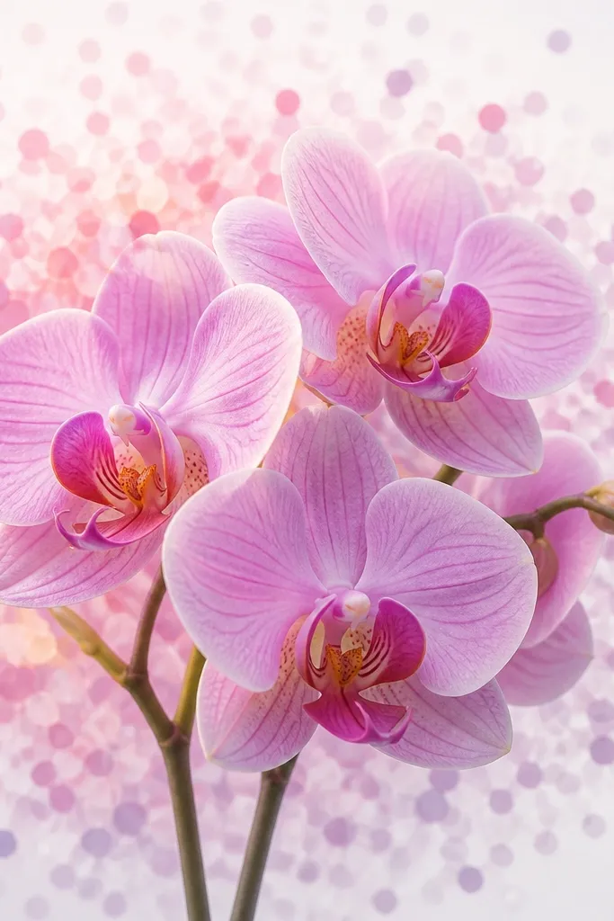
Dot backgrounds make orchids feel celebratory without adding clutter. I keep the dots small and layered, with the densest dots behind the center orchid and fewer dots near the edges. The orchids stay crisp and slightly darker than the dots, so they remain the focal point. This style works for spring holidays and birthdays because it reads cheerful, not heavy. The contrast between delicate dots and structured orchid petals looks balanced in a way that's hard to get with stripes or scenes.
Draw your bouquet first with pencil: three blooms, one center hero and two behind. Then plan the dot field by lightly marking a loose oval area behind the bouquet. Add circles using colored pencil or a fine marker: start with pale pink dots closest to the center, then add light purple dots around them. Keep the dots smaller as they move outward so the center feels deeper. Finish by shading orchid lips and inner folds, then add a single darker outline line on the front petals.
Good to knowUse a cotton swab to blur a few dot edges for a softer, airbrushed look.
Common mistakeAvoid using one dot color at full intensity everywhere.
15. Orchid Bouquet with Patterned Vase and Soft Shadows
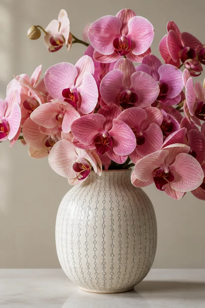
A patterned vase makes the bouquet feel like a complete still life, which helps when you want a "finished" look for holiday decor. I draw the vase with a clear rim and a slightly narrower waist, then add a repeating pattern that stays light. The orchid petals should still be the darkest elements - lip folds get the most contrast, vase pattern stays mid-tone. This flatters a homey vibe and looks great in gift tags where you want both the flowers and the container to read. For color, I pair cool purple orchids with a warm beige vase and gray shadows.
Sketch the vase first: draw an oval top, taper to a narrower middle, then widen slightly at the base. Add a simple repeating pattern across the vase body - small circles in one row, short dashes in the row below. Place orchids coming out of the top opening: center bloom bigger, two side blooms tucked behind. Shade the vase with a soft gray gradient on the right side and add a shadow under the base. Color orchids with purple petals and a deeper violet lip, then deepen only the lip and inner folds for depth.
Good to knowKeep the vase pattern at least 2 shades lighter than the orchid lip.
Common mistakeDon't over-detail the vase pattern - if it's too busy, it competes with the flowers.
16. Orchid Bouquet with Wrapped Twine Bow and Tags
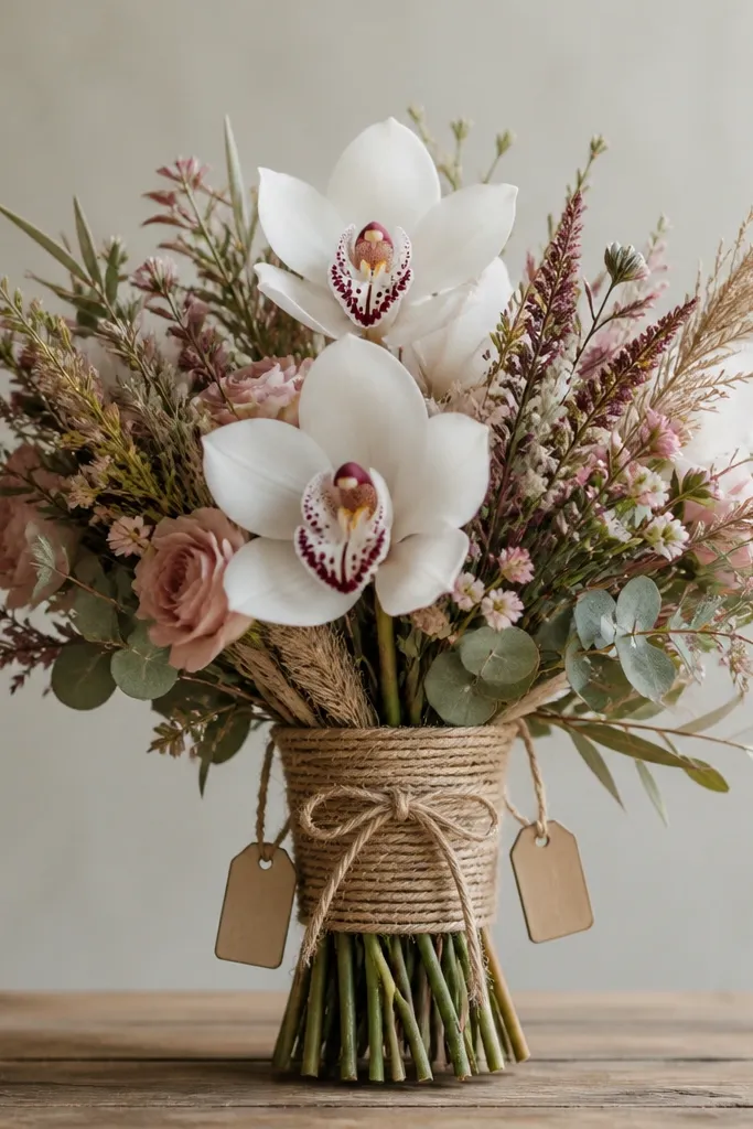
Twine and tags make an orchid bouquet feel like a handmade gift, and it's easy to draw because the shapes are simple. I wrap the twine around a few stem lines, then draw a loose bow on the front with curved loops. The tags add charm, and the best part is you can leave them blank for your own message later. This style looks great for holiday gifting because it feels personal without extra decoration. It also flatters warm paper tones because the twine shading blends naturally with beige or kraft-colored backgrounds.
Draw the stems first as three or four curved lines, then add a small knot point at the front. Wrap twine by drawing thin parallel curves around the stem bundle, leaving tiny gaps for realism. Add a bow with two loops and two tails - place it slightly lower than the orchid center. Draw two small rectangular tags hanging from the bow knot using thin strings. Finally, shade orchids normally with purple petals and a darker lip, then shade twine with light brown pencil and a few darker ridges.
Good to knowUse a very light gray pencil to sketch the tag text lines so it looks like stamped paper.
Common mistakeAvoid thick twine lines - thick lines look like marker scribbles.
17. Orchid Bouquet with Floating Petal Confetti
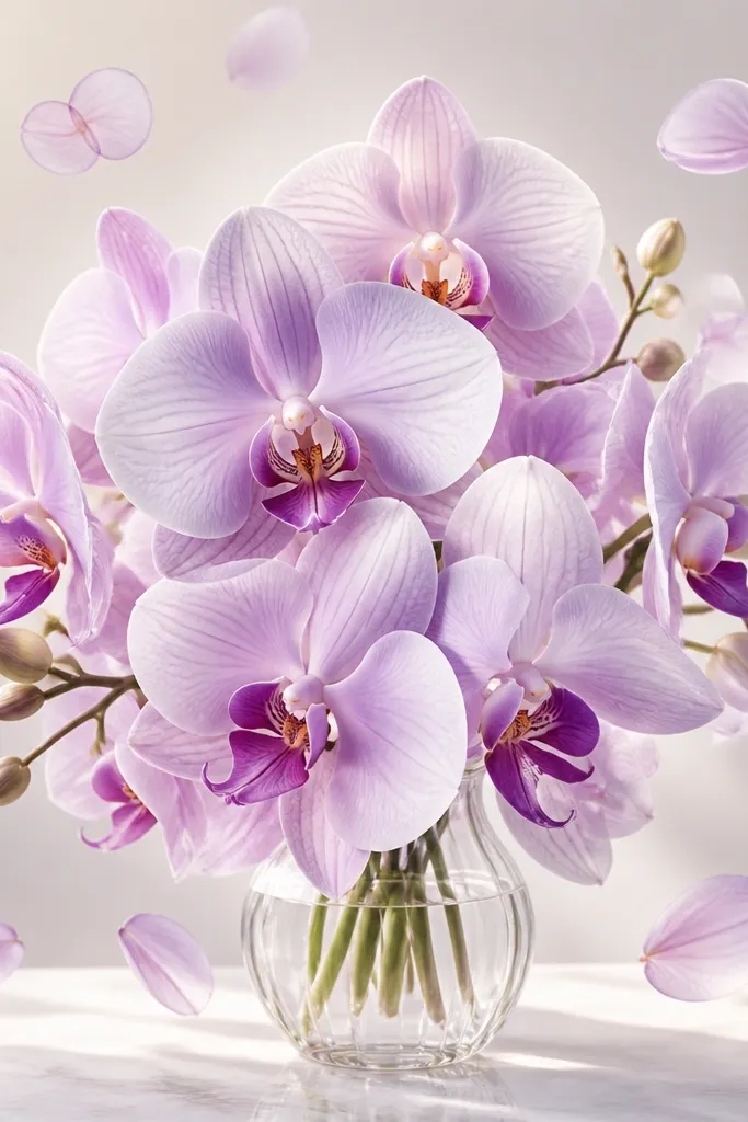
Floating petal confetti makes the bouquet feel alive, like the flowers are in motion. I keep the confetti petals smaller than the main orchid shapes and place them around the edges, not covering the center bloom. The confetti petals get lighter shading and fewer detail lines so the bouquet remains the anchor. This is a great option when you want a festive look without adding more flowers. It also flatters a clean composition because it adds movement while keeping the center readable.
Sketch the bouquet first with one hero orchid in the center and two smaller ones behind it. Then add 6-10 petal confetti shapes around the bouquet, using simple teardrops and curved rectangles. Lightly outline each confetti petal and shade them with a pale purple gradient that fades toward the bottom. Keep the confetti shadows very light or none at all so they look airy. Finish by deepening the hero lip folds and adding a few crisp highlights on the main petals.
Good to knowVary petal sizes by 1-2 mm if you're working on small paper - it keeps the confetti from looking patterned.
Common mistakeDon't place confetti inside the orchid silhouette - it creates visual clutter.
18. Orchid Bouquet with Side-Profile Orchid Faces
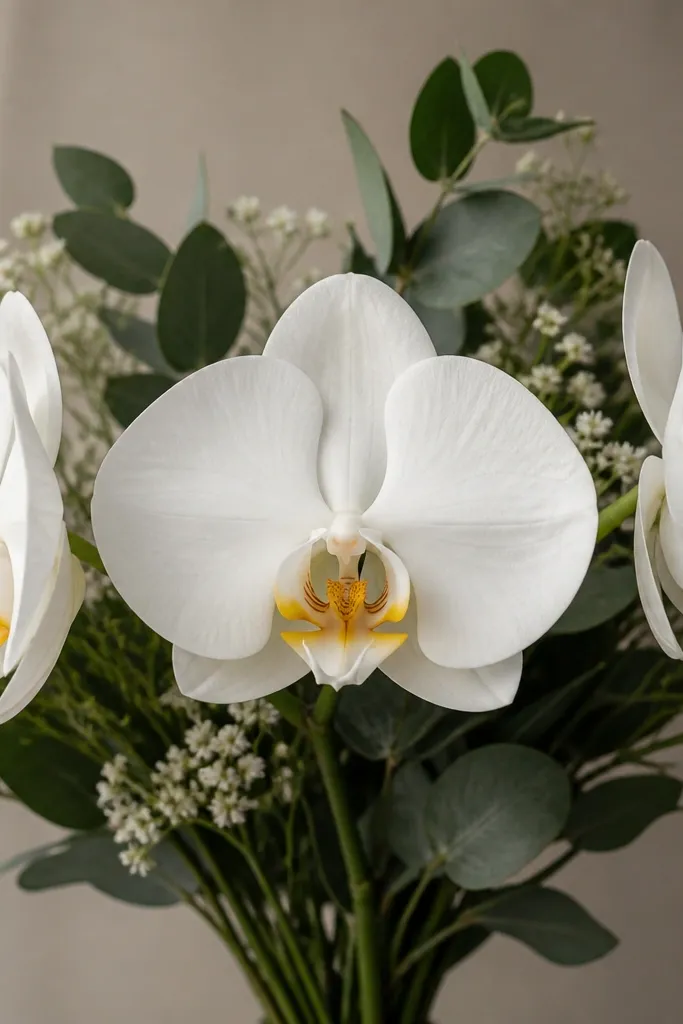
Side-profile orchids add realism because orchids aren't always shown from straight-on. You get a natural variation in petal width and the lip shape changes from a full teardrop to a thinner, angled curve. I draw the side orchids with fewer interior fold lines and lighter shading, so the center bloom remains the focal point. This style looks good for greeting cards because the composition reads quickly: front bloom first, then the side blooms add interest. It also makes your drawing look more "observational" even if you're using simple shapes.
Start with a front-facing center orchid: draw the full lip and three main petals. For the two side-profile orchids, draw narrower petal shapes angled left and right, with the lip shown as a partial teardrop edge. Shade the side orchids with lighter purple and keep their lip shading less intense than the center. Add stems that curve slightly toward the center so the bouquet feels gathered. Finish with a soft shadow under the center orchid and a few highlight marks on the top petals.
Good to knowAngle the side orchids so their lips point toward the center - it ties the group together.
Common mistakeDon't draw side-profile orchids with the same full lip shape as the front bloom.
19. Orchid Bouquet with Bold Black Ink Outline and Soft Color Fill
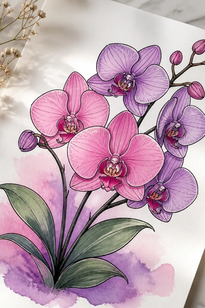
Bold ink outlines make your bouquet look graphic and gift-worthy fast. I use the thick outline only on the outer silhouette and key petal edges, then I keep the interior shading soft. The lip gets the deepest color fill, and the outer petals fade outward with lighter purple. This style flatters people who want a polished look without heavy blending. It also works well for printing on stickers or card fronts because the outlines stay crisp.
Sketch the bouquet in pencil first, then ink over it with a fine-to-medium black pen for the outer petals and lip edges. Keep interior fold lines thinner or skip them until after coloring. Color the outer petals with a light purple wash or colored pencil, then layer the lip with a stronger pink-violet. Add a tiny yellow dot at the lip base if you want that orchid signature detail. Finish with a very light watercolor shadow under the bouquet so the flowers feel grounded.
Good to knowUse two pen sizes: one for outer edges, one for inner folds - it adds control.
Common mistakeAvoid coloring over wet ink with watery paint - it bleeds and blurs the crisp look.
20. Orchid Bouquet with Lacy Heart Frame (Valentine Holiday)
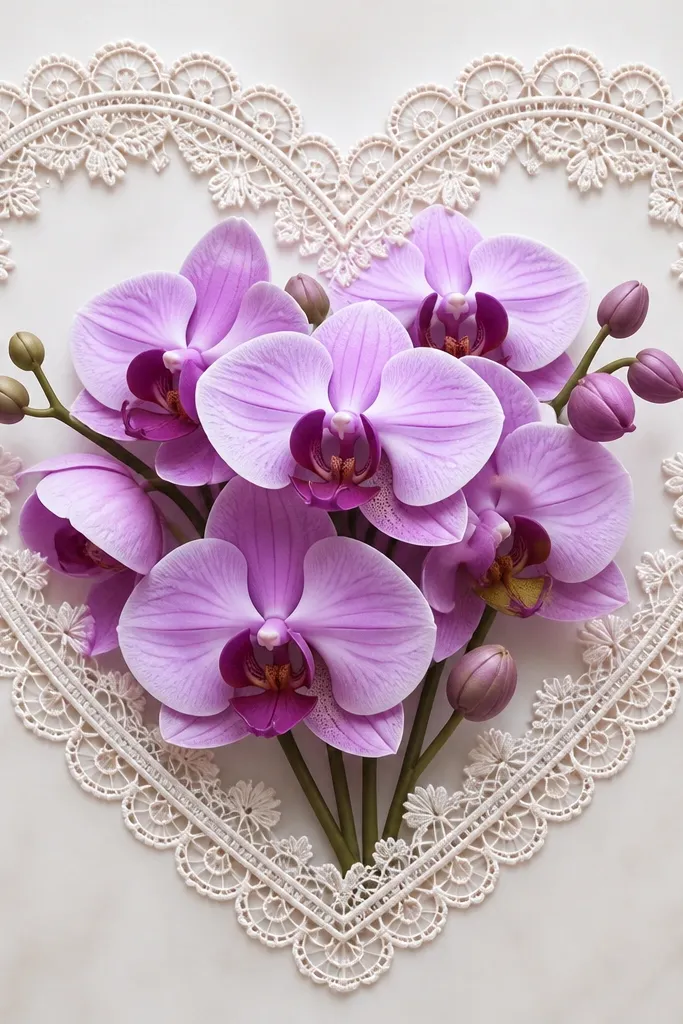
A lace heart frame makes orchids feel romantic without needing a ton of extra symbols. I draw the lace as a light line pattern around the heart so it doesn't overpower the flowers. The orchids stay centered, with the lip petals slightly darker and the outer petals lighter for contrast against the delicate lace. This is flattering for small art sizes because the frame gives structure and hides uneven spacing. It also looks great for Valentine cards on white or pale pink paper.
Draw a heart outline first, then add a lace border by sketching scallops along the outer edge and small loop patterns between scallops. Place the bouquet in the center: one hero orchid facing forward and two smaller blooms angled upward. Shade the hero lip with deeper violet and add a small yellow dot near the base. Keep lace lines light gray or very pale pink so the orchids remain the darkest elements. Add a faint shadow beneath the bouquet so it sits inside the heart.
Good to knowIf your lace looks shaky, erase and redraw the outer scallops - the frame sets the whole vibe.
Common mistakeDon't make the lace border as dark as the orchid outlines.