1. Crimson Tulip Close-Up with Vein Map
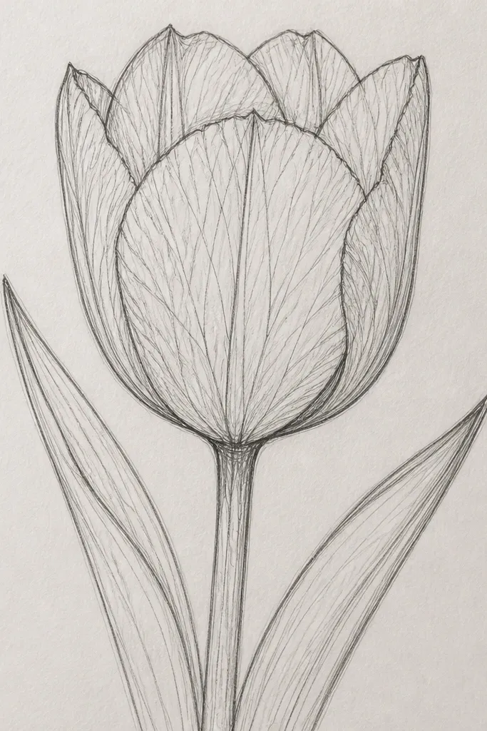
This idea is for when you want the tulip to look detailed without adding a whole background. I draw the bloom so it takes up about 80% of the page, then I treat the veins like curved brush strokes, not straight lines. Start with a warm crimson color mood by using graphite values: keep the highlight bright and let the vein lines sit lighter than the fold shadows. It flatters drawings that feel “too light” because the vein pattern gives structure even if your shading is still learning. If your paper is slightly textured, the veins look softer; on smoother paper they look crisp and botanical.
Step one: sketch the tulip head shape with a light HB outline, then add one strong fold line down the center of the front petal. Step two: draw veins as short arcs that start near the fold and curve outward, using a sharpened 2B for the mid-dark veins and HB for the lighter ones. Finally, shade the overlap zones under the lifted petals with 4B, leaving a clean white highlight on the upper fold. Add one small shadow under the bloom with a soft gradient — don’t shade the entire stem area.
Sharpen your pencil to a long point before veins, then rotate the page so you’re drawing the arcs with wrist motion, not arm motion.
Avoid turning veins into one uniform dark layer — veins should be lighter than the fold crease.
2. White Tulip with Soft Gray Fog and One Dark Center

White tulips look hard until you commit to a simple value plan: keep most of the petals near-white and concentrate your darkest darks in the center. I use this when my drawings look muddy, because it forces restraint. The petals get soft gray gradients, while the center crease stays crisp and dark so the bloom still reads clearly. This works for beginners because you can focus on blending and highlight placement rather than obsessing over every vein. It also looks great for calm seasonal art — winter cards, sympathy prints, or minimalist frames.
Step one: block in the tulip silhouette with HB, then choose one highlight stripe and leave it untouched. Step two: blend light gray graphite using a tissue or blending stump, staying lighter than you think you need. Finally, darken only the center crease and the pollen area with 4B, and add a thin shadow under the petals where they overlap. Lightly erase any graphite that creeps into the highlight zone so the white stays believable.
If the petals look too gray, lift graphite with a kneaded eraser in small patches instead of adding more white later.
Don’t outline every petal edge dark — it kills the “white softness” and makes it look like a sticker.
3. Two Tulips in a Glass Jar with Condensation Highlights
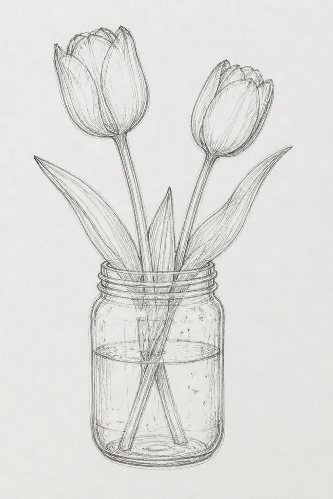
Step one: draw the jar outline with a light pencil, then add a thick shadow band at the base and one curved reflection highlight on the right side. Step two: sketch two tulip heads at different heights, then shade their centers with 2B and 4B while keeping petal edges slightly sharper than the glass blur. Finally, add condensation by dotting a few small circles and smudging them lightly so they look like moisture, not confetti. Keep the jar highlights clean — don’t blend them into the petals.
This one is for when you want tulips but also want the drawing to feel “real-world.” Glass reflections give you shapes to place — they make the whole piece look finished even if your petals are only medium detailed. I draw the jar first, then I place the tulips so their petals overlap the jar highlights slightly, which adds depth. Condensation is just tiny circles — it reads as cool air without needing complicated texture. This flatters drawings where your petals look good but your background always feels empty.
Common mistakeAvoid drawing the jar with heavy dark outlines all around — glass needs thin edges and controlled shadows.
Good to knowUse the jar reflection as a guide: wherever the reflection curves, soften the surrounding graphite so the glass looks round.
4. Tulip Bouquet Bow with Petal Ribbons
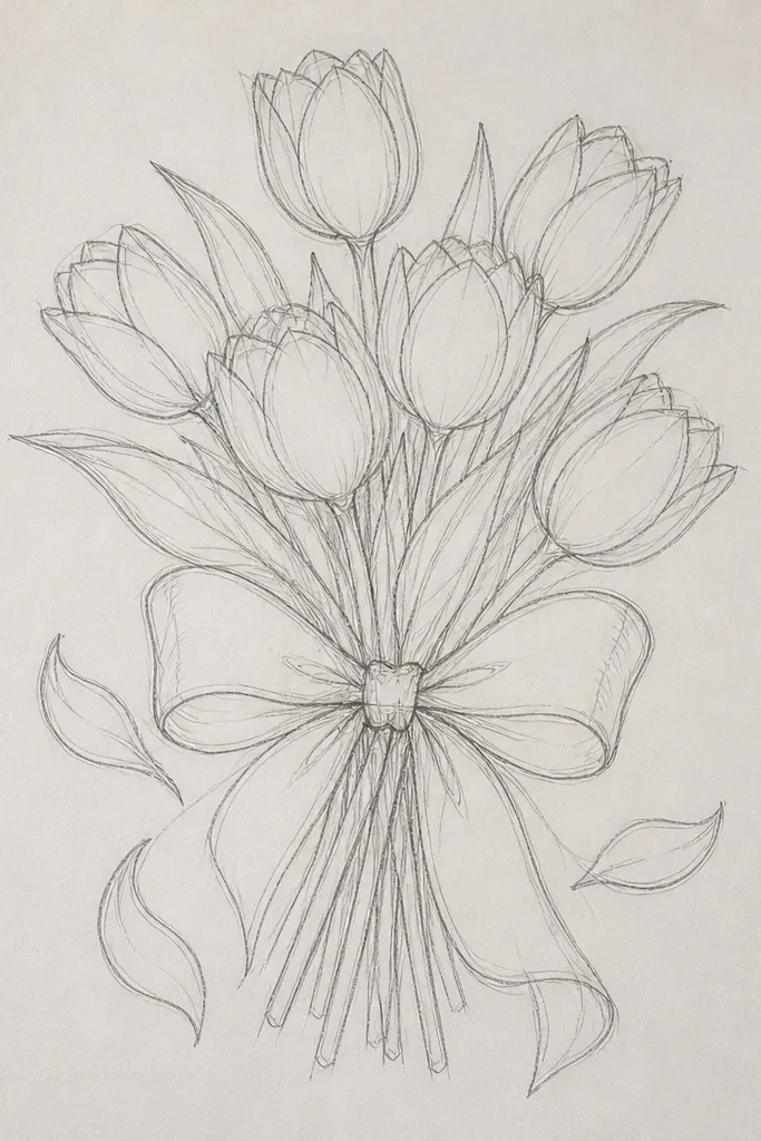
This idea is for gift-style art and holiday cards because the bow gives you a clear focal point. I treat each tulip petal like a ribbon - a bright highlight line that follows the petal curve. Then I deepen the fold shadows so the petals look like they’re wrapping around the center. The ribbon folds add a second texture, which makes the drawing feel layered without adding a busy background. It flatters almost any skill level because you can keep the bouquet simple and still look polished.
Step one: sketch the bow first — two loops and two tails — then draw stems rising behind the loops. Step two: for each tulip, add one highlight stripe on the front petal and one slightly darker stripe along the fold, using HB for the highlight outline and 2B for the shadow. Finally, shade the ribbon folds with short, curved strokes and leave tiny white gaps for shine. Add one soft shadow under the bouquet wrap so everything sits on the same plane.
Draw the bow folds with fewer lines than you think; the shine gaps do most of the work.
Don’t add lots of tiny petal specks in the background — the bow needs clean negative space.
5. Pastel Tulips on Kraft Paper with Colored Pencil Veins
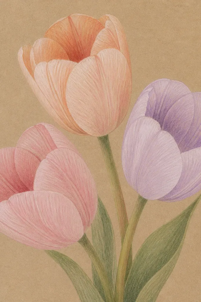
Kraft paper changes everything. The warm base makes even light tulip colors look grounded, and it’s the best setup when you want a cozy seasonal feel. I layer colored pencil veins on top of the pastel petal base so the veins look intentional, not scratched in. Use a light touch first so you don’t burnish the paper too early. This flatters drawings that look too “flat” with pencil alone because colored pencil adds color structure. If you like gentle aesthetics instead of high contrast, this is the one.
Step one: lightly block in petal shapes with a pale base color (peach or blush) so the kraft shows through. Step two: build the darker fold with a slightly deeper shade, then add veins with a sharp pencil in a darker tone, following the petal curve in short strokes. Finally, shade stems with a muted green and a warm gray for shadow under overlapping petals. Keep the highlights by leaving the paper untouched on the top petal ridge.
Use a white colored pencil only on the highlight ridge — too much white makes kraft look chalky.
Avoid heavy burnishing over the whole petal; you want visible paper tooth for the soft pastel look.
6. Tulip Side Profile with Overlapping Petal Layers
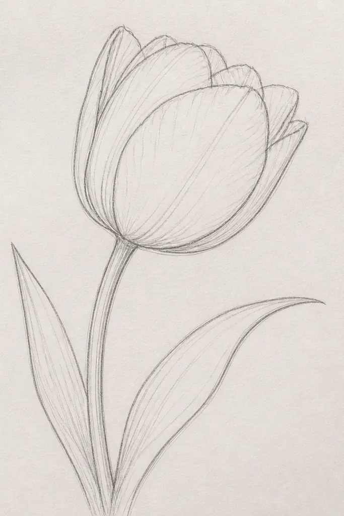
Step one: sketch the tulip as a long teardrop shape, then add a second teardrop behind it to show the overlapping petal layer. Step two: outline the inner separation with a thin HB line, then shade the inner pocket with 2B and 4B. Finally, add the narrow highlight bead on the front petal edge and blend the surrounding graphite with a soft brush or tissue, stopping before the highlight. Add a stem curve that matches the petal tilt so the whole flower feels aligned.
Side profile tulips teach you how petals stack, and that’s where most drawings go wrong. I like this angle because you can draw fewer petals but make them look thicker. The inner rim needs a dark line right where the petals separate, then the overlap area needs a softer shadow. This idea is great for leveling up because it forces you to draw depth through edges, not through extra background clutter. It also flatters hands — if your lines feel shaky, a side profile lets you focus on one clean contour curve.
Common mistakeDon’t outline the entire petal perimeter dark — only the separation rim should be sharp.
Good to knowDraw the inner rim line first, then shade up to it — that order keeps the rim crisp.
7. Tulip Bud About to Open with Tear-Drop Highlight
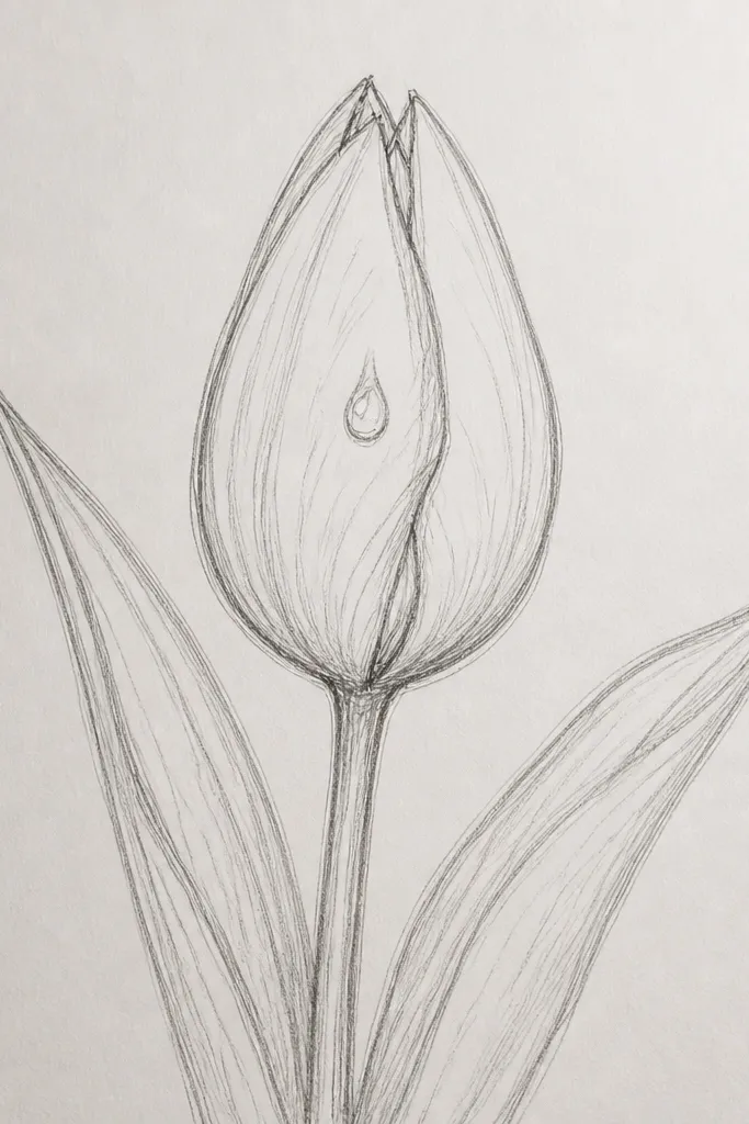
A bud drawing looks advanced even when it’s simple because the petal wrapping gives you natural folds. I use a tear-drop highlight to sell the “fresh” look — that shiny spot is the difference between flat and alive. You don’t need many veins here; just a few feathered lines where petals press against each other. This works great for spring seasonal art and for practicing patience with shading transitions. If you struggle with drawing the center, buds hide it until you’re ready.
Step one: draw the bud as a tight oval with a slight point at the top, then add one shadow pocket where the petals pinch together. Step two: place the tear-drop highlight and leave it white, then shade around it with HB to 2B gradients. Finally, add a few vein lines on the outer petal using a sharp 2B, and lightly shade the stem with one darker edge for form. Optional: add a tiny leaf behind the bud for depth.
Keep the highlight shape consistent — if it looks like a smudge, erase and redraw with a clean kneaded-erased edge.
Avoid heavy dark shading on the whole bud; buds need soft transitions with only one dark pinch point.
8. Black Background Tulip with White Gel Pen Veins
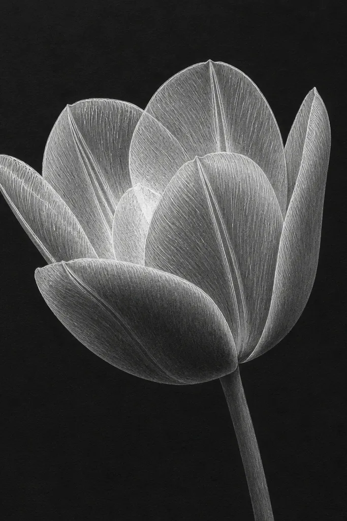
Working on black paper gives you instant contrast, and it makes veins look like stained glass. I shade the petals with gray pencil first, then I draw veins with a white gel pen so they pop. This is the fastest way I know to get a “detailed” look without fighting pencil visibility. It’s also great for holiday cards because the black background feels dramatic. If your drawings look washed out on white paper, black fixes that immediately.
Step one: sketch the tulip outlines in light gray pencil, then blend the petal areas with a smooth, even graphite layer. Step two: leave a highlight area untouched, then shade the overlap pockets with darker gray pencil (press harder near the center). Finally, trace veins and the petal rim with white gel pen — use short, curved lines that follow the petal shape. Add a thin shadow at the base in gray so the flower doesn’t float.
Test gel pen pressure on scrap paper; too hard makes blobs that look thick and cheap.
Don’t use thick gel pen for the whole petal edge — keep it for veins and a few rim lines.
9. Yellow Tulip with Pollen Speckle Center
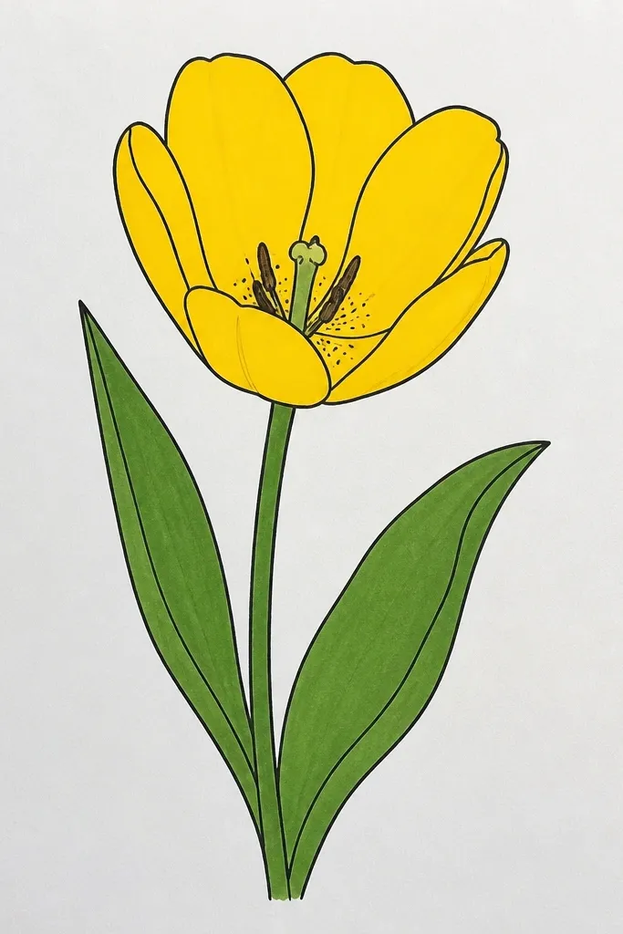
Pollen texture is the shortcut to realism. For this idea, the petals stay smooth, but the center gets detailed with tiny speckles that look like powder. I shade the yellow petals with warm mid-tones and keep the top highlight clean so the center doesn’t steal all the light. This works for anyone who can draw a tulip shape but can’t make it feel alive — pollen gives it a reason to be detailed. It’s also a great spring-themed piece that still reads well in monochrome.
Step one: sketch the tulip head and keep the center area smaller than you think — the pollen should concentrate in a small circle. Step two: shade petals with light-to-mid values, leaving a bright highlight on the top fold. Finally, add pollen using a sharpened pencil tip or a white gel pen dotting motion, then darken the underside of the petals with 2B for separation. Add one soft shadow under the bloom with a gradient edge.
Use three speckle sizes: tiny dots for the top layer, slightly bigger dots for the lower layer, and fewer dots near the darkest crease.
Avoid drawing pollen as a solid gray blob — it should look powdery, not shaded.
10. Tulip and Leaf Study with Vein-First Leaves
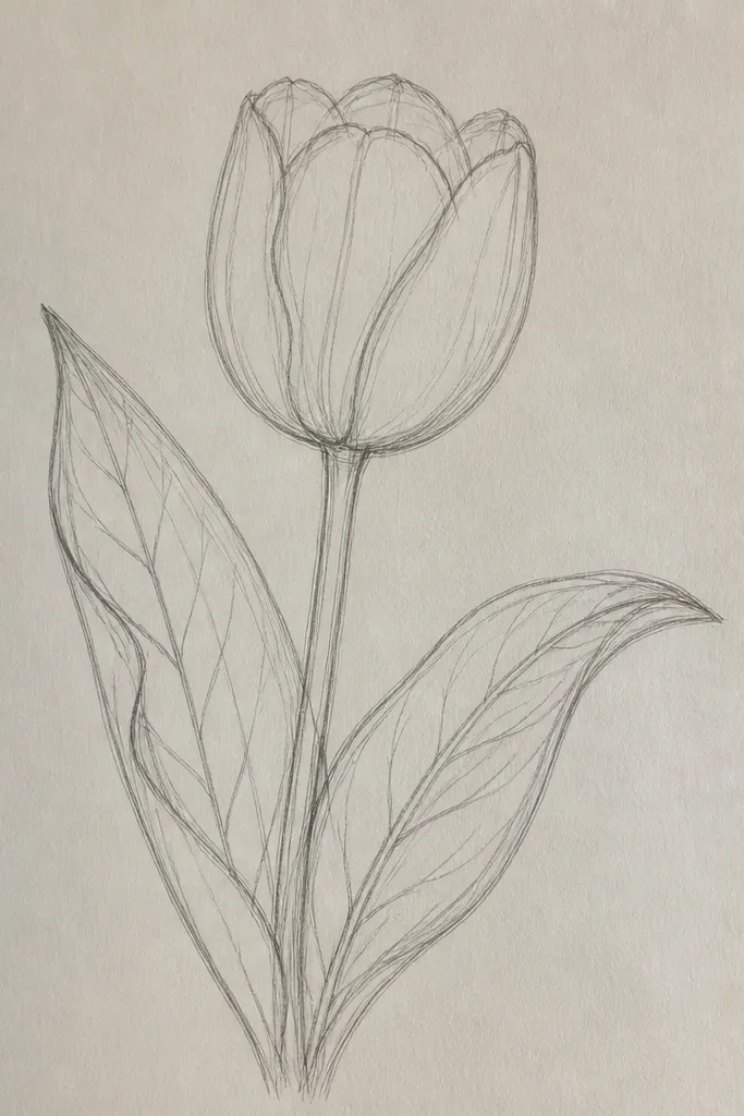
A leaf study makes your tulip look more believable because you add a second subject with consistent vein logic. I draw the leaf veins first so the direction of linework matches the tulip petal veins. The leaf also gives you a place to use a slightly different green value, which makes the whole piece feel less flat. This is ideal when you want “detailed” but still clean enough for a frame. It flatters people who like botanical drawings and want structure beyond the flower.
Step one: sketch the tulip head and stem lightly, then draw the leaf shape with a center vein line. Step two: add leaf veins with short branching lines, pressing a little harder at the base and lighter toward the tip. Finally, shade the tulip petals so the darkest fold lines line up with the leaf’s underside shadow direction. Add a soft shadow under the leaf where it overlaps the stem.
Match your vein thickness: if leaf veins are medium-dark, keep tulip veins in the same value family so it feels cohesive.
Don’t shade the leaf edge too dark — a thin highlight edge makes leaves look fresh.
11. Tulip in a Hand-Drawn Pattern Frame
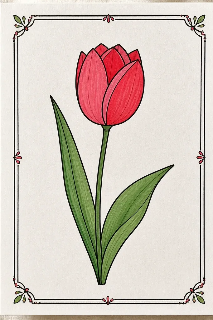
Step one: draw a light rectangle border about 1 inch from the page edges, then sketch the tulip in the center. Step two: add a simple repeating pattern in the border zones using one pencil grade (HB for dots, 2B for leaf marks). Finally, render the tulip petals with smooth shading but keep the rim lines crisp and dark. Add one shadow under the bloom so it sits above the border.
This is how you make a tulip drawing feel like a finished piece without adding a busy background. The frame does the “decor” work, so your tulip can focus on petal detail. I keep the border pattern consistent — tiny dots on one side, small leaf marks on the other — so it looks designed, not accidental. This idea flatters line-focused drawing styles because it rewards clean edges and steady line weight. It also works great for seasonal wrapping paper style prints.
Common mistakeAvoid making the border as dark as the tulip; the tulip should win the contrast.
Good to knowUse a ruler only for the border — draw the pattern by hand so it has a human rhythm.
12. Tulip on a Diagonal with Long Cast Shadow
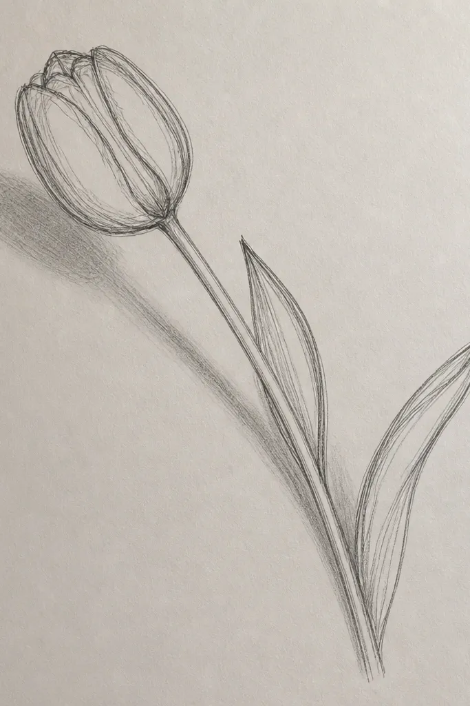
Step one: sketch the tulip on a diagonal, then decide where the light comes from — for example, top left. Step two: shade the underside of petals with 2B and 4B, then draw the cast shadow as a single shape with a soft gradient edge. Finally, add the highlight folds on the petals and keep them brighter than the shadow. Keep the shadow slightly wider near the base so it feels grounded.
Long cast shadows make your tulip look like it’s in a real space. I use this when I want the drawing to look dimensional even if I’m not spending ages on background texture. The trick is to commit to one light direction and keep the shadow edge consistent. The diagonal angle also makes the petal overlap look thicker, because gravity pulls the folds in a believable direction. This idea flatters people who like dramatic holiday lighting or moody seasonal art.
Common mistakeDon’t blur the entire shadow uniformly; the near edge should be darker and the far edge lighter.
Good to knowDraw the shadow first as a light gray shape, then darken only the shadow core near the stem.
13. Tulip with Watercolor Wash Background and Pencil Petal Rim
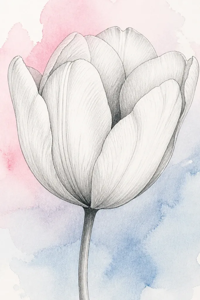
Mixing watercolor behind pencil is the easiest way to get a finished seasonal look without overworking the petals. I keep the watercolor background watery and let the tulip rim stay crisp so it pops. This idea works especially well for spring and early summer moods because the background wash can be airy. It flatters anyone who loves color but struggles with controlling pencil shading. The watercolor also helps hide minor pencil smudges because the background is already soft.
Step one: tape your paper down and paint a wet-on-wet wash behind the tulip area, leaving a clean area where the tulip will be. Step two: once dry, pencil in the tulip outline and petal folds, keeping the rim lines slightly darker than the inner shading. Finally, add center crease shadows with 4B and keep highlights untouched. Add a thin pencil shadow where the bloom overlaps the watercolor so it looks placed, not floating.
Use masking tape edges for a clean white border around the wash so the tulip area stays crisp.
Avoid painting directly over your pencil lines before they’re set — it turns them into gray smears.
14. Tulip Corner Bouquet for Scrapbook Pages
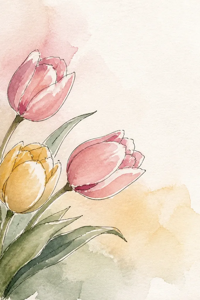
Step one: mark the corner placement with light pencil guidelines, then sketch one bud and two tulip heads following the curve of the stems. Step two: shade the center folds with 2B and add highlights with clean erased lines on each top petal. Finally, draw one leaf or small stem curl to tie the cluster together, then add a simple cast shadow under the lowest bloom. Keep the blank page area truly blank — no background texture behind the empty space.
Corner bouquets are practical and they look intentional, which is why I use them for scrapbook-style seasonal pages. You get detail where you want it and leave space for text or dates. I keep the tulip heads smaller than a full-page flower, around a quarter of the page height, so the linework stays readable. The blank area makes the petals look sharper by contrast. If you’re making holiday cards or planners, this layout helps you avoid the “too much drawing, no room to breathe” problem.
Common mistakeAvoid placing the bouquet dead center if you want a scrapbook look; it always reads like a poster.
Good to knowAdd one tiny extra detail like a small pollen dot or a single vein burst on the closest tulip to make the corner feel finished.
15. Tulip in Ink with Crosshatch Petal Texture
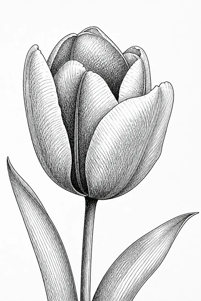
Step one: sketch the tulip outline lightly, then ink the outer rim and the separation line between petals. Step two: add crosshatching inside the petals, starting lightly near the highlight and increasing density toward the fold. Finally, ink the center crease with the darkest hatch pattern, then lift highlights by leaving the paper untouched. Add one small shadow cast under the bloom with a few concentrated hatch lines.
Ink crosshatching makes petals look textured without smudges. I use this when I want crisp lines that still feel detailed, like vintage botanical prints. The key is to crosshatch with direction — follow the petal curve so the texture wraps around the form. The center crease gets the densest crosshatching so it feels like a pocket of shadow. This flatters people who love linework and want a drawing that stays sharp in scans or prints. It also works well for holiday seasons because black-and-white ink looks classy on kraft cardstock.
Common mistakeAvoid heavy ink everywhere; if the whole petal is equally dark, the tulip loses shape.
Good to knowKeep your crosshatch angles consistent: one direction follows the petal, the other direction crosses it — don’t randomize the angles.
16. Tulip with Frosted Edge Effect (Iced Highlights)
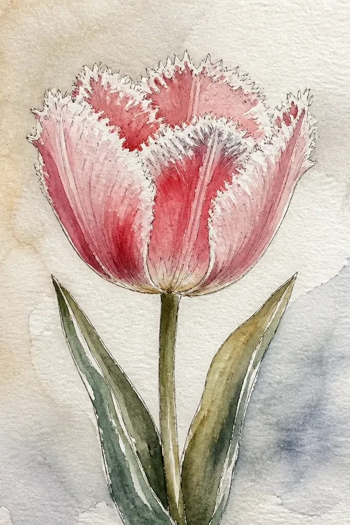
Step one: shade the petals with light gray-blue pencil or diluted watercolor if you work with paint, keeping the center crease darker. Step two: leave a couple of highlight breaks on the top petals so the shine looks icy rather than glossy. Finally, add a frosted rim by lightly tapping a white pencil or gel pen along the outer edges, then blend the inner petal shading gently so the rim texture stands out. Add a soft background wash in very light gray.
Frosted tulips look like winter cut flowers, and they’re a fun seasonal twist. I create the effect by adding a light speckled rim around the petal edges and keeping the highlights slightly broken — not one smooth stripe. The center stays darker so the frosted edge doesn’t flatten the flower. This idea flatters seasonal planners and holiday art because it has a cold, airy mood. If you like texture, this is a good way to add detail without drawing every vein.
Common mistakeAvoid putting speckles over the entire petal surface; it turns the drawing into static.
Good to knowUse fewer speckles than you think; the best frosted edges look airy, not snowy.
17. Tulip with Embossed Look Using Kneaded Eraser Lift
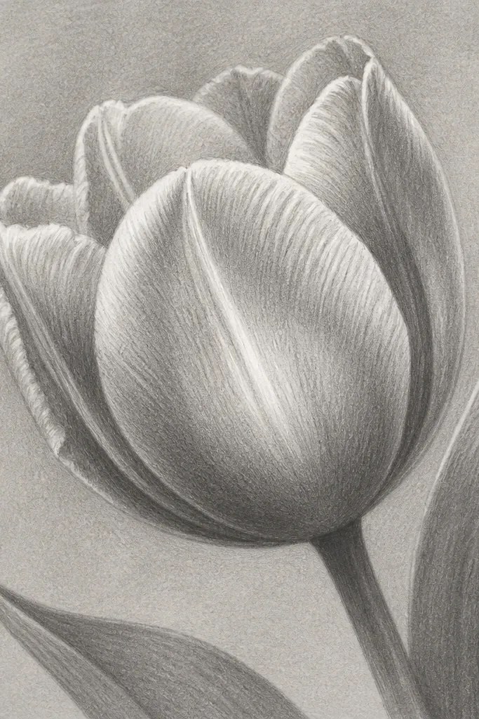
Step one: build the tulip with light-to-mid graphite shading (HB to 2B), leaving no harsh highlight blanks. Step two: once the petals look evenly toned, use a kneaded eraser to lift graphite along the petal fold highlights in small curved shapes. Finally, deepen the overlap shadows with 4B and soften the edges around lifted areas with a tissue so the highlight transition feels natural. Add a thin stem shadow to anchor the bloom.
This is the method I use when I want highlights that look like they’re catching light, not just left blank. The kneaded eraser lift creates a subtle highlight edge that feels raised, especially on smoother paper. I keep the mid-tones gentle and then lift highlight shapes along petal folds. The center crease gets darker shading so the lifted highlights have something to contrast against. This flatters people who struggle with overworking highlights — you can correct them by lifting instead of erasing everything.
Common mistakeAvoid using a hard eraser that scratches the paper; the lifted highlight should stay smooth.
Good to knowPress the kneaded eraser lightly and lift repeatedly in the same area instead of dragging — dragging smears graphite back in.
18. Tulip and Butterfly Pair with Minimal Background
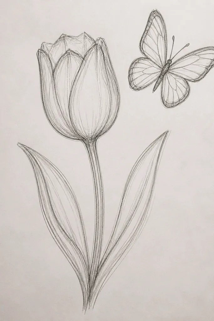
Adding a butterfly gives you an excuse to draw delicate wing texture without cluttering the whole page. I keep the background minimal so the tulip stays the main subject and the butterfly becomes a fun detail. The butterfly also helps you practice tiny curved lines, which you can then reuse for petal veins. This idea flatters drawings that feel too “single-note” — it adds life while keeping the composition clean. It works for spring seasonal art and looks great when framed with a simple mat.
Step one: sketch the tulip head and stem lightly, then place the butterfly so it touches the tulip near the center crease. Step two: draw tulip petal folds with HB and shade overlap pockets with 2B and 4B, leaving a highlight on the top petal. Finally, add butterfly wing patterns with light pencil lines, then shade the body slightly darker. Add one soft cast shadow under the tulip bloom only.
Keep butterfly wing lines lighter than tulip veins so the tulip remains the focal detail.
Avoid drawing the butterfly too large; if it competes, the tulip looks secondary.
19. Tulip on Patterned Fabric Background (Pencil Over Print)
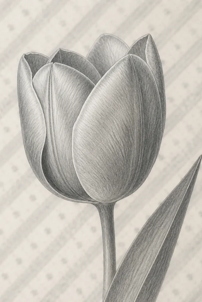
Step one: lightly sketch a diagonal stripe pattern behind the tulip area, then add small dot accents between stripes using a single pencil grade. Step two: blend the background lightly so it looks like fabric, not a hard graphic. Finally, draw the tulip on top with darker rim lines and stronger center crease shading, and keep highlights clean. Add a soft shadow under the bloom that matches the direction of the fabric contrast.
If you like cozy seasonal visuals, this is a great way to make the tulip feel like it belongs on a card, tea towel, or wrapping paper. I draw the background pattern first, then I lighten it with blending so it doesn’t fight the tulip. The tulip gets crisp edges and deeper shadows so it stands out over the print-like texture. This flatters people who want detail but don’t want to paint a full background scene. It also makes your tulip look more “designed” than “isolated.”
Common mistakeAvoid making background stripes as dark as the tulip outline; it makes the tulip look flat.
Good to knowIf the pattern looks too sharp, lightly erase it with a tissue — you want fabric blur, not print clarity.
20. Single Tulip with Leafy Negative Space Shape
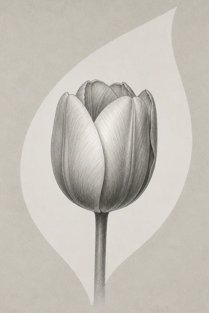
Step one: sketch the tulip head and stem, then lightly outline a big leaf-shaped negative space behind it. Step two: shade the tulip petals with HB and 2B, keeping the highlight ridge untouched. Finally, darken the overlap pockets with 4B and keep the rest of the page blank inside and around the negative space shape. Add one thin stem shadow that lands outside the blank leaf shape so the composition feels grounded.
Negative space is a detail trick that makes drawings feel intentional. Here, I use a leaf-shaped blank area behind the tulip so the eye has a clean graphic shape to read. This idea is for when your background always looks like you couldn’t decide what to do, so you give the page a planned empty space. The tulip petals still get detailed folds and overlap shadows, but the blank shape makes them stand out. It flatters people who like minimal compositions but still want petal realism.
Common mistakeAvoid filling the negative space with light gray “just to be safe” — it ruins the crisp graphic look.
Good to knowPlan the negative space first. Once you shade around it, it’s hard to fix the shape.