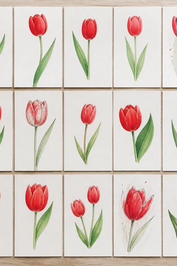
1. Wine-Shadow Tulip Stack with Bold Outline
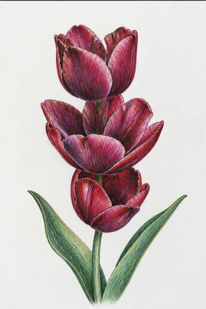
This one works because the outline does the heavy lifting. I used a dark brown-black ink for the outer petal edges, then filled the inner petals with warm red so the flower reads as red from across the room. For shadow folds, I switched to a wine red and placed it exactly where the petal overlaps - that fold line is what tells your brain "this is 3D." It flatters most compositions because the stack shape pulls the eye upward, and it looks especially good on cards where you need a clear focal point. Keep the stems slightly different lengths so it doesn't look like a sticker sheet.
Start by sketching three teardrop heads with a slight twist - the tips lean in different directions. Then draw one continuous outer outline per tulip head, keeping the line weight heavier at the outer edges. Fill the main petal area with warm red, leaving tiny white gaps near the highlight edges. Next, add short, tight shadow shapes in wine red at the overlap folds, and finish with a few thin leaf shapes on the stems. Finally, add one white gel pen highlight line on the inner petal fold so the red looks glossy.
Good to knowIf your red feels flat, add shadow folds before adding extra petal lines. That order fixes most "cheap-looking" tulips.
Common mistakeDon't shade the whole petal with wine red - it kills the fold effect and makes the flower look like it's filled in, not folded.
2. Single Tulip Portrait with Side-Light Highlights
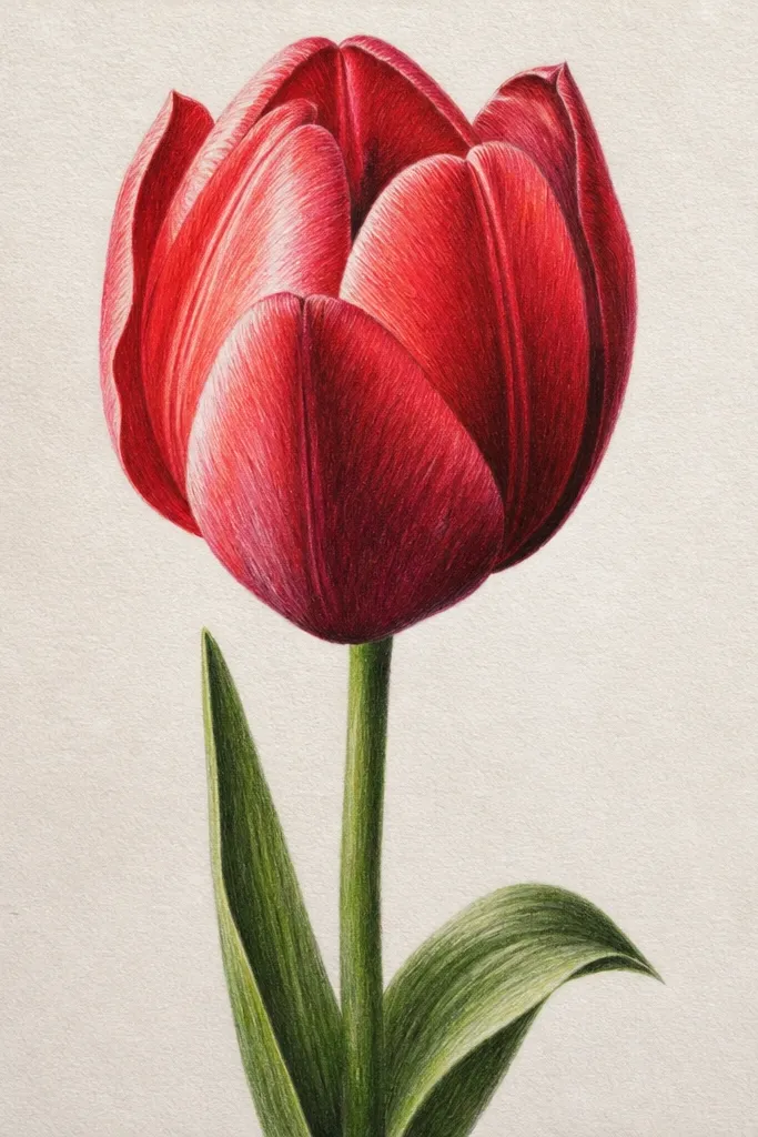
A single tulip portrait is my go-to when I want the drawing to look "finished" without adding a whole bouquet. Side lighting makes red feel real because you're telling the viewer where the light hits and where it falls off. I used a light gray wash behind the tulip so the red has contrast, but I kept the background soft to avoid stealing attention from the petals. This style flatters small paper sizes because the flower fills the space without crowded details. It also works well for people who struggle with symmetry - the tilt hides uneven petal angles.
Start with a center sketch: a teardrop tulip head with the tip leaning right, and a stem line that curves gently. Then lightly wash a pale gray background behind the head, staying away from the petal edges so you keep crisp outlines. Color the main petals with warm red, and leave the left edge of each petal almost uncolored. Add wine-red shading only on the right overlap area, using small curved strokes that follow the petal fold. Finish with white gel pen highlights on the left petal edge and a thin highlight on the inner fold.
Good to knowUse a reference photo with strong side light - even a phone screenshot works - and copy the brightest edge placement.
Common mistakeAvoid outlining every petal segment equally. If every line is the same weight, the flower looks like coloring-book segments.
3. Watercolor Wash Tulip with Ink Petal Segments
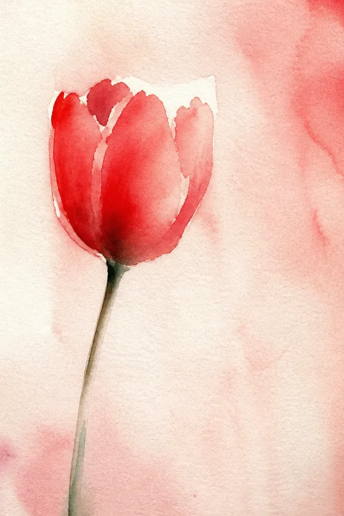
This one looks airy, but it still reads as holiday-ready because the ink segments lock the shape in place. I did a wet watercolor wash first, letting the red pool slightly in the inner fold so the center looks deeper. Then I added ink petal segments once the wash was dry, so the lines don't bleed. The result is a tulip that feels fresh and light instead of flat. It looks great for framed art because the soft edges catch light, and it's forgiving if your linework isn't perfect. The green tint behind it also makes red feel warmer.
Start by taping your paper flat and lightly sketching the tulip head and stem in pencil. Wet the petal area with clean water, then drop warm red watercolor into it, letting it spread naturally. Add a slightly deeper wine-red at the inner fold while the wash is still damp. Let it dry fully, then ink the petal segments with a fine liner, focusing on the central overlap lines. Add a few light green wash dots behind the tulip and finish with a tiny white gel pen dot on the inner highlight.
Good to knowIf your watercolor blooms too much, blot once with a dry tissue and stop adding water. One blot saves the shape.
Common mistakeDon't ink over wet watercolor - the lines turn fuzzy and the tulip looks messy instead of intentional.
4. Red Tulip in a Mason Jar with Simple Background Blocks
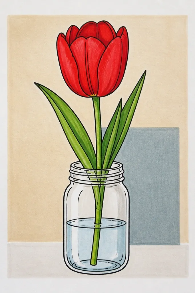
Putting a tulip in a jar makes the drawing feel like a real scene, not just a flower experiment. The jar gives you extra structure for highlights and reflections, so the red tulip automatically looks more "styled." I used muted background blocks because they frame the jar without making the page busy. This is the style I use for seasonal cards because it reads clearly even when the card is small. If you're drawing for someone who loves farmhouse decor, this one lands fast. The jar also helps hide stem placement mistakes since the stems sit inside the glass.
Sketch the jar first: an oval mouth, a wider body, and a lid ring, keeping the jar slightly off-center. Draw the tulip head above the jar opening so the petals overlap into the jar space. Color the petals warm red, then place wine-red shading at the fold lines. Add jar highlights by leaving narrow white strips on the left side and drawing a thin curved highlight line on the right. Block in the background with two flat rectangles, then outline everything with a darker pen for crisp edges. Finish by adding a few tiny jar reflection dots just below the tulip center.
Good to knowKeep the jar lines slightly thinner than the tulip outline so the flower stays the focus.
Common mistakeDon't shade the jar with the same red shadows as the tulip. Glass reflections should look cool and light.
5. Top-View Tulip with Petal Fan and Center Twist
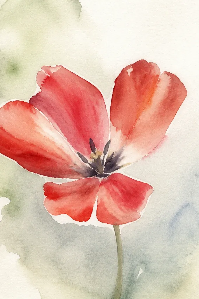
Top-view tulips look dramatic because you see the petal fan and the center twist clearly. I like this idea for holiday scrapbooking because it gives you a "statement" flower without needing a whole bouquet. The key is the spiral center: if you get that twist right, the petals look arranged rather than randomly drawn. The red stays believable because the shadows sit toward the center and along the overlap arcs. This works well for people who want their drawing to look advanced but still want a clear step-by-step plan. It also looks great on patterned paper since the fan shape creates a strong silhouette.
Start by drawing a circle guide for the tulip head, then sketch a spiral line from the center to the edge. Draw petal shapes as curved teardrops radiating from the spiral, keeping overlap consistent. Color each petal warm red, leaving a thin lighter edge toward the outer rim. Add wine-red shading mostly near the center spiral and where petals overlap, using short curved strokes. Add a darker red center swirl and dot a few tiny white gel highlights on the inner petals. Finish by darkening the outermost petal edges for a crisp silhouette.
Good to knowUse a single pencil compass point for a light circle guide so your spiral spacing stays even.
Common mistakeAvoid drawing petals all the same size. Vary petal lengths slightly so the fan looks natural.
6. Red Tulip Linework Only with Cross-Hatch Shadow
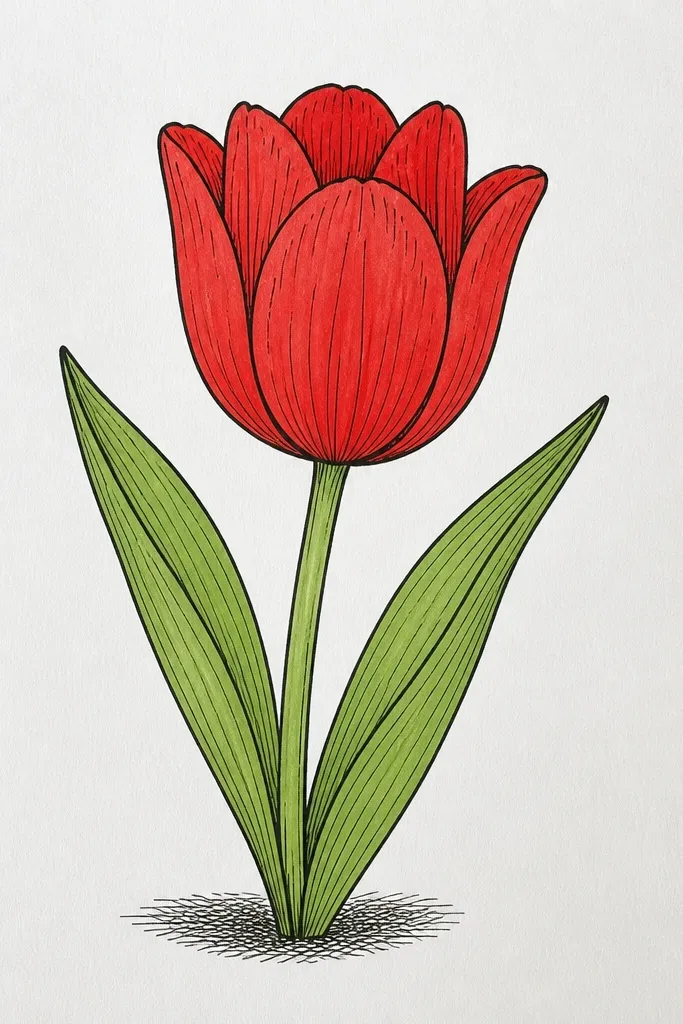
This is the "I want it to look like art, not a coloring page" version. Instead of coloring everything, you use linework density to create depth. I outline the petal edges, then shade the fold areas with cross-hatching that follows the petal curvature. The tiny red accents make the tulip feel like red even when most of the page is white. It's also the fastest style I do for quick seasonal tags because it needs fewer materials. This one flatters small designs and works well with monochrome stationery. If you're nervous about painting, this gets you a dimensional look without heavy color work.
Start with a pencil sketch of the tulip head and stem, then ink the outer petal edges with a pen. Add inner petal fold lines - keep them thinner than the outer outline. Leave most of the petal white, then cross-hatch only in the shadow folds using short strokes close together. Add a little warm red color only at the center and a small fold highlight area, not the entire petal. Finish with a white gel pen line on the brightest petal edge to make the contrast pop. Optional: add a few cross-hatch marks on the stem base to anchor the flower.
Good to knowCross-hatch direction should follow the petal curve. If the hatching goes straight across, the shape looks wrong.
Common mistakeDon't hatch the whole tulip evenly. Uneven shading is what makes it look like a real fold.
7. Red Tulip and Snowflake Dots Holiday Pattern Background
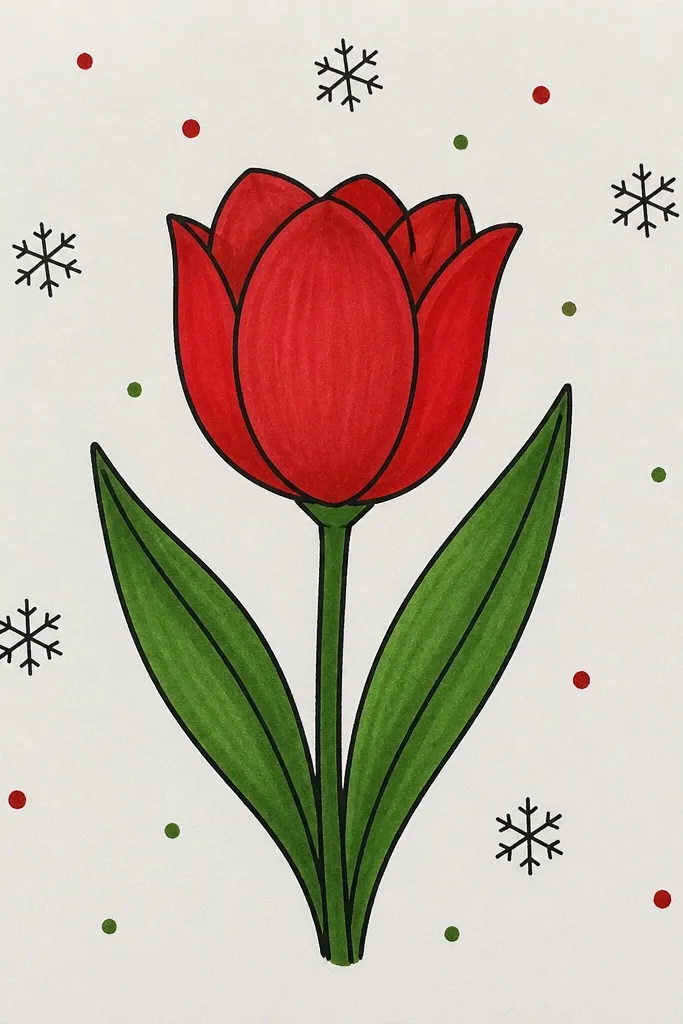
This one is made for holiday cards and printable art because the background pattern adds season without turning the tulip into the background. I keep the snowflake dots small (think pinhead scale) and light gray so the red stays dominant. The tulip is drawn with crisp outlines and only two red tones, which keeps everything clean when the background gets busy. This style flatters bold color preferences because the red stays saturated against the cool gray pattern. It also works for people who get overwhelmed by detailed scenery - here, the pattern does the work. Make the tulip slightly larger than you think so it doesn't get lost in the dots.
Draw the tulip head and stem with pencil, then ink the outer edges. Color the petals warm red and add wine-red shadow folds at overlap points. Leave a small highlight edge on each petal and hit it with white gel pen once dry. For the background, use a fine brush or a toothpick to place tiny gray snowflake dots around the tulip, keeping them farther from the tulip edges. Add a few starburst marks near the corners, not behind the center of the flower. Finally, lightly erase pencil lines and tighten any uneven outline spots.
Good to knowUse a scrap paper test sheet to find the dot size you like before you start the real background.
Common mistakeDon't place snowflakes directly inside the petal silhouette. That makes the tulip look cluttered.
8. Two-Tone Ombre Tulip with Marker Fade
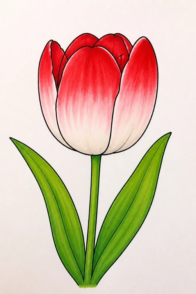
Ombre tulips look polished fast because your eye reads the gradient as depth. I used marker blending for the petal surfaces, and it gives a smooth transition that pencil shading can't match quickly. The center stays darker, which matches how real tulips fold and shadow. This style looks great on thicker paper because markers don't feather as badly. It's also flattering for beginners because the fade hides minor line wobble. I like it for simple seasonal prints where you want a clean, modern look.
Sketch the tulip head as a teardrop with a twist, then ink the outline. Color the center fold area with deep wine marker, staying inside the inner overlap lines. Blend outward into warm red using lighter pressure, then add a second pass on the outer petal edges for saturation. Add a tiny white gel pen highlight on one petal edge to keep it from looking flat. Color the stem in muted green and add a single leaf shape angled away. Let the marker dry fully, then go back with a fine pen to sharpen the fold lines.
Good to knowBlend from dark to light with lighter pressure. If you reverse it, you lose the gradient.
Common mistakeAvoid coloring right up to the outline with the darkest wine - it makes the tulip look like a blob.
9. Red Tulip with Gold Gel Pen Veins
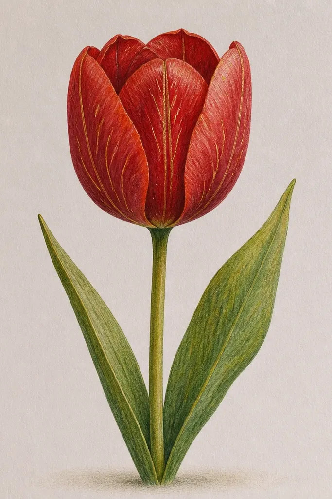
Gold veins turn a simple tulip into holiday art instantly. I did the petals in two reds first, then added gold gel pen veins only on the top half of each petal so it doesn't look like a whole leaf pattern. The gold sits on top of the red and catches light, which makes the drawing feel "special" even when it's just one flower. This style flatters warm skin tones because the gold echoes warm highlights, and it looks gorgeous for gift tags and ornaments. It also works well if you like metallic accents but don't want to use actual foil.
Start with a pencil sketch of one tulip head and a slightly curved stem. Ink the outline with a fine pen, then fill petals with warm red. Add wine-red shadow folds at the overlap lines using a small brush or colored pencil. Once the red is dry, draw 4-6 vein lines per petal with gold gel pen, starting at the center and tapering as they reach the outer edge. Add two small gold accents on the stem near where the leaf would sit. Finish with white gel highlights on the brightest petal edges to balance the metallic gold.
Good to knowTest gold gel pen on scrap first - some brands feel scratchy. You want smooth lines before you commit.
Common mistakeDon't add veins everywhere. Too many metallic lines make it look busy and cheap.
10. Minimal Tulip Icon for Holiday Labels
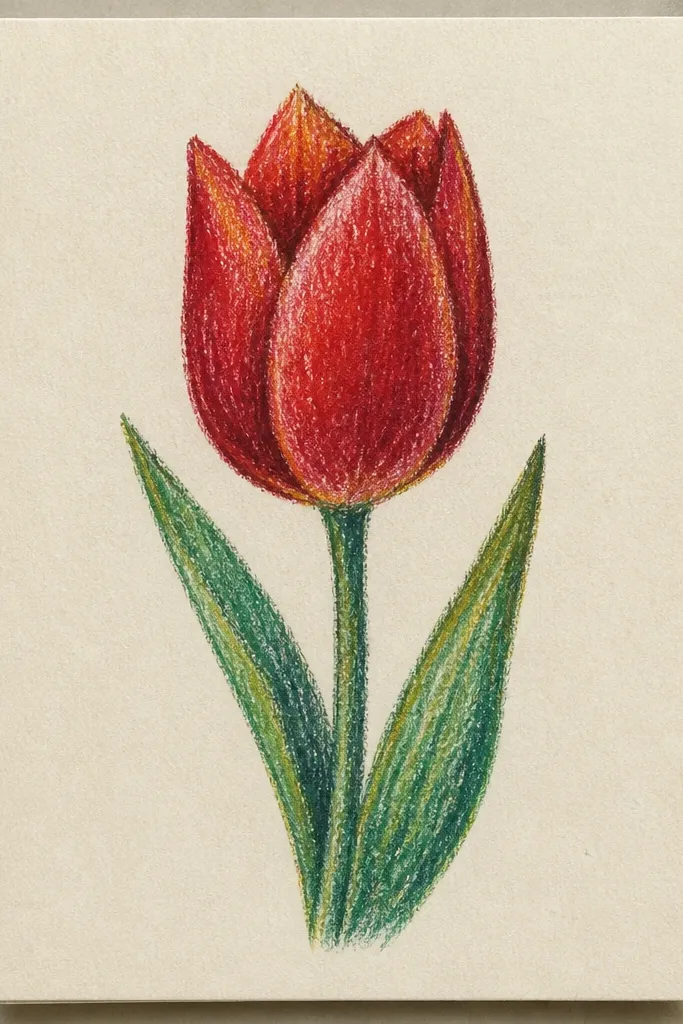
This is the version I use when I'm making a batch of labels or small envelope stickers. Minimal icons look clean because the shapes are bold and the red is flat, so it prints well and cuts neatly. I keep the tulip head to a simple teardrop with one inner fold line. The shadow fold is a single darker red triangle, not a shaded area. This style flatters people who want consistent results across multiple sketches. It also works for kids' projects because there's less to mess up.
Draw a teardrop tulip head, slightly wider at the top, then add one inner fold line that curves from the center toward the outer edge. Outline thickly with a dark pen. Fill the petal with warm red flat color, then add one small wine-red shape where the fold would be. Draw a straight stem line down and add one tiny leaf angled to the side. Keep everything centered so the icon reads at small sizes. If you're cutting labels, leave a small margin around the icon so the edges don't get clipped.
Good to knowFor print or Cricut cutting, use a single outline thickness. Mixed weights can create jagged edges.
Common mistakeDon't add extra petal segments. More lines in a tiny icon make it look cluttered.
11. Red Tulip with Faux Embroidery Stitch Border
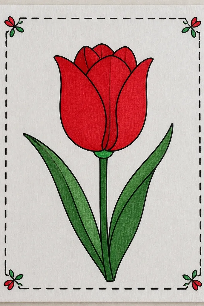
I love this one for seasonal wall prints because it looks hand-made even if you're drawing on paper. The stitch border frames the tulip and adds texture, which makes the red feel warmer. I draw the tulip with clean two-tone shading, then I add the stitch border last so it doesn't distract while you're coloring. This style flatters anyone who likes cozy crafts because it mixes drawing with a craft detail. It also helps if your tulip drawing is a little uneven - the border gives the piece an intentional "finished" edge. Use it for gifts where you want that handmade card vibe.
Sketch the tulip head and stem in pencil, then ink the tulip outline first. Color petals warm red, add wine-red fold shadows, and finish with white gel highlight lines on two petal edges. Leave the border area blank while you work on the flower. Draw a rectangle border with pencil about 1 cm from the paper edge. Then add faux embroidery stitches: small diagonal loops along the border, alternating directions each stitch. Color the stitch lines with muted red and cream to mimic thread. Finally, darken the tulip outline a touch so it stands out against the textured border.
Good to knowKeep the stitch spacing consistent. If the stitches get random, the border stops looking like fabric work.
Common mistakeAvoid using bright neon colors for the border. Muted thread tones look more believable.
12. Red Tulips in a Row with Patterned Striped Background
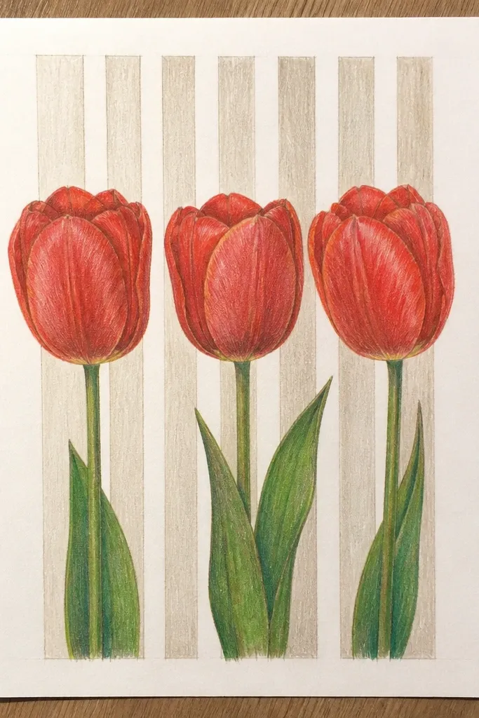
Rows of tulips look great when you need a repeat pattern for wrapping paper or a scrapbook strip. The striped background adds movement, but keeping it pale stops it from overpowering the red flowers. I keep the tulips consistent in size and outline weight so the row feels like a set. The wine-red folds are placed at the same general angle across the row, which makes it look intentional instead of random. This style flatters people who like tidy compositions and want a clean aesthetic for holiday planners. It also helps you practice repeating a shape without losing the "hand-drawn" feel.
Start by drawing five tulip heads as teardrops with the same twist direction, then add thin stems that line up at a baseline. Ink outlines and the inner fold lines with consistent line weight. Color all petals warm red, then add wine-red shadow folds at the same fold angle for each tulip. Add white gel highlights on the same petal edge across the row so the set looks cohesive. Next, draw diagonal background stripes with a light pencil guide, then fill stripes with pale red and cream. Keep stripes behind the tulips so the flowers stay crisp. Finish by touching up any outline spots where the stripes cross near the stems.
Good to knowIf stripes feel scary, do them last with a ruler and light pencil first. You want straight lines, not freehand wobble.
Common mistakeDon't let the background stripes get darker than the wine-red shadows. That steals the focal point.
13. Red Tulip Bouquet with Cut-Paper Shadow Effect
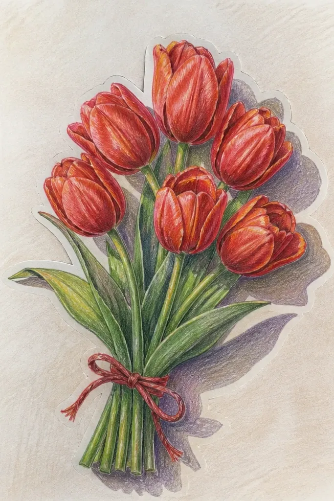
This style is a trick I learned the hard way: adding a simple offset shadow makes flat drawings look layered and expensive. I draw each tulip as a complete shape, then I place a gray offset behind it to mimic cut-paper. The red stays solid because I don't blend too much; the shadow does the depth work. It looks great for holiday decor because it reads well at a distance and photographs nicely against plain backgrounds. It also flatters anyone who wants "dimension" without learning complex shading. The bouquet shape keeps it from feeling like a single icon.
Sketch three tulip heads and stems in pencil, then ink each tulip outline as a separate shape. Color petals warm red and add wine-red fold shadows, keeping the interior coloring clean and not too blended. For the cut-paper effect, trace each tulip outline onto a scrap or mentally plan an offset, then add a dark gray shadow shape behind each tulip by shifting it 3-5 mm down and right. Leave a thin white gap between the red tulip and its gray shadow so the layering reads. Draw stems and leaves on top of the red tulips, not in the shadow layer. Finish with white gel highlights on the inner petal edges and a tiny highlight on the leaf veins.
Good to knowUse a consistent offset direction for every flower. One direction makes the effect feel planned.
Common mistakeDon't blur the shadow. Soft shadows make it look like a smudge, not cut paper.
14. Red Tulip with Stippling Texture and Soft Wash Background
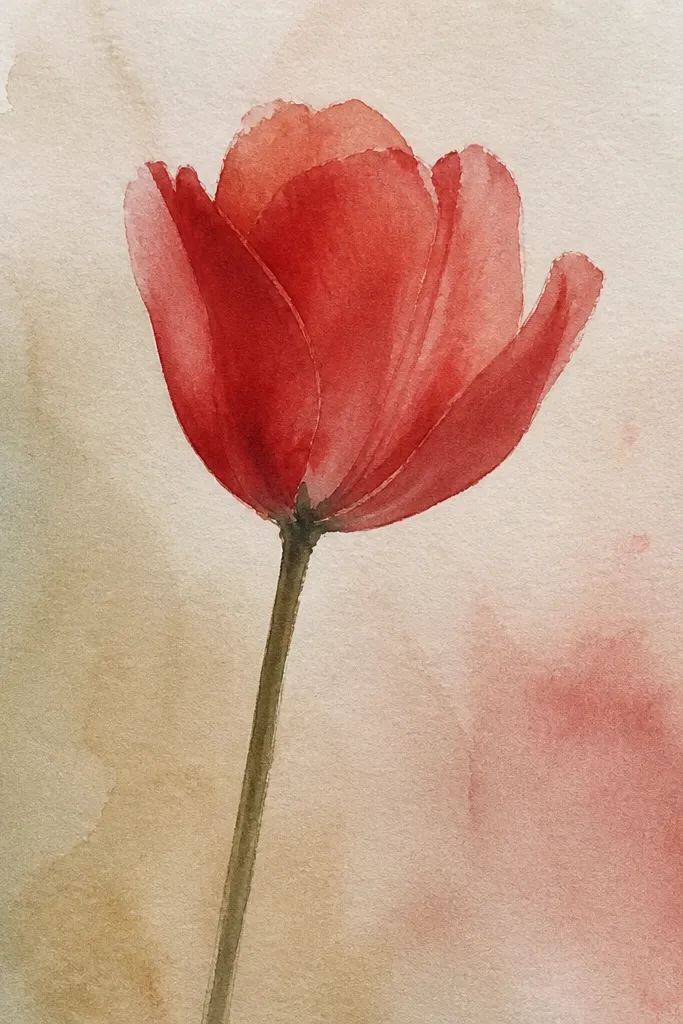
Stippling is my favorite texture trick when I want the tulip to look handmade and not like a flat fill. Dots let you build value gradually, so the shadow folds look natural instead of harsh. I pair stippling with a soft wash background because the background smoothness contrasts the petal texture. The red reads as richer when the dots are varied - tiny lighter dots on highlight edges keep it from looking muddy. This style flatters people who like vintage print vibes and want something that holds up in close-up photos. It also hides minor uneven sketch lines because the texture covers them.
Start with a pencil sketch of the tulip head and stem, then ink only the outer petal edges. Lightly wash a pale blue-gray background behind the flower and let it dry. Fill the petal mid-tones with warm red using stippling dots, keeping dot size small (like a fine pen tip). For wine-red shadows, increase dot density in the overlap fold area and near the base of each petal. Add a few tiny white gel pen dots on highlight edges after the red dries. Finally, lightly sketch the stem and leaf without heavy ink so the texture stays on the flower.
Good to knowWork in small sections: do one petal at a time so your dot density stays consistent.
Common mistakeAvoid using only one dot size everywhere. Variation makes it look like pigment, not a stamp.
15. Red Tulip on Kraft Paper with White Chalk Highlights
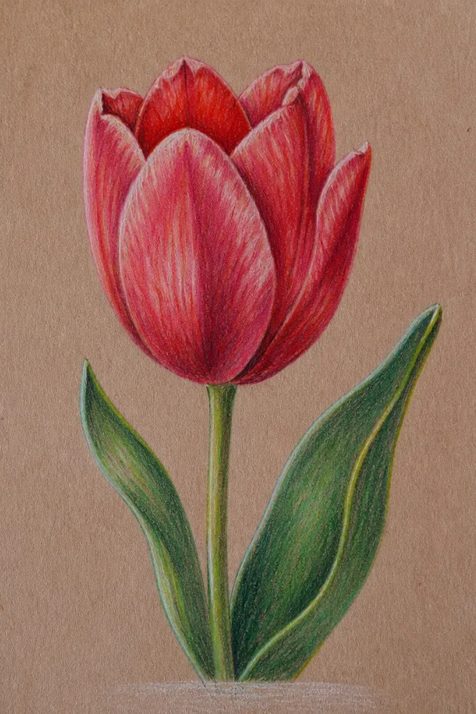
Kraft paper changes everything. The warm brown undertone makes red tulips feel cozy and autumn-ready even when the flower is classic spring. I use white chalk for highlights because it sits on top of the paper texture and looks like real pigment catching light. The outline stays dark brown so it doesn't look like it was drawn on white copy paper. This style flatters rustic aesthetics and looks amazing in frames with simple wood or black metal. It also hides small mistakes because kraft has texture that blends pencil smudges. If you want holiday art that doesn't scream "holiday clipart," this one does it.
Sketch the tulip head and stem lightly in pencil, then ink the outline with a dark brown pen. Color petals warm red, and add wine-red folds at the overlap points using colored pencil or a small brush. Leave a highlight edge on the left side of each petal mostly untouched. Rub white chalk over those untouched areas to create bright highlights, then gently smudge with a clean fingertip for a soft edge. Add one chalk highlight dot near the center of the tulip to mimic gloss. Finally, add a tiny kraft "shadow" under the stem by lightly darkening the paper with a brown colored pencil where the stem meets the page.
Good to knowSeal chalk highlights with a light mist of fixative from 12-15 inches away so you don't smear them while handling.
Common mistakeDon't use bright white marker highlights on kraft. Chalk-like highlights look believable; marker looks harsh.