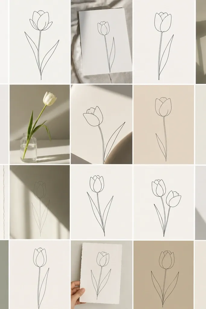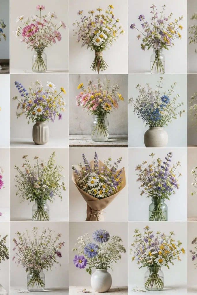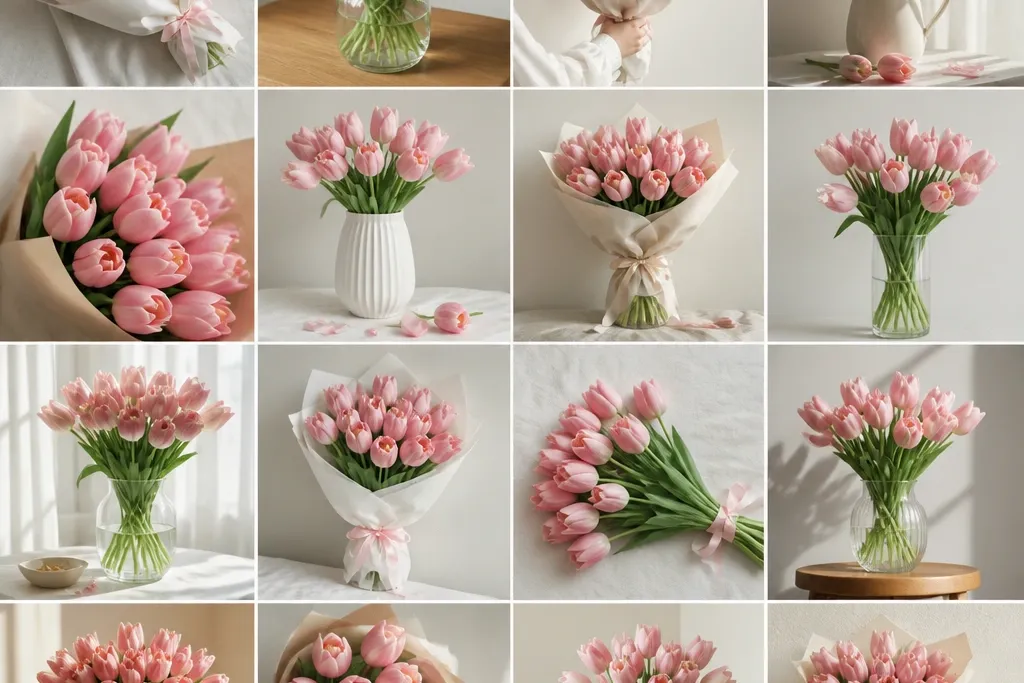
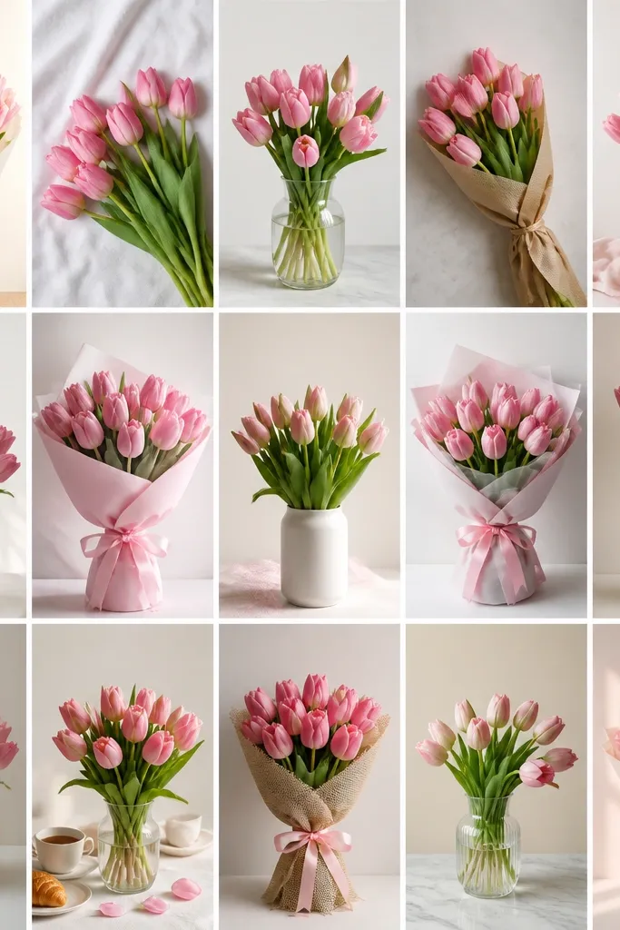
1. Blush Ribbon Wrap Pink Tulip Bouquet on Kraft Paper
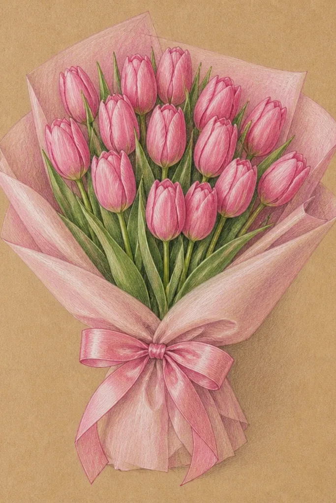
This drawing works because the bouquet is framed by a ribbon shape, so your flowers have a clear boundary to sit inside. I use three pinks: pale blush for the main petals, dusty rose for petal folds, and a tiny touch of coral at the very tips where petals catch light. The kraft-paper tone makes the pink look warmer and less flat, even if your washes are light. It flatters small spaces like gift tags because the composition reads instantly from a distance. For skin tones, the blush palette pairs especially well with fair-to-medium tones since it doesn't pull too cool or too neon on the page.
Step 1: Sketch the bouquet silhouette first - a rounded clump about 2.5 inches wide, with a ribbon band cutting across the middle. Step 2: Draw one tulip bud in the center, then mirror two more blooms on the left and right, keeping the petals slightly larger near the ribbon and smaller toward the top. Step 3: Add petal folds with a thin dusty-rose line inside each bloom, then sweep a light blush wash over the petals. Step 4: Darken overlap areas under the ribbon and at the base of each bloom using sepia or dark gray. Step 5: Finish the ribbon by drawing 3-4 fold lines, then leaving the highlight stripe on the top edge white.
Good to knowIf your tulip petals look stiff, soften the wash edges with a damp brush for the first 10 seconds after you paint.
Common mistakeDon't outline every petal the same thickness - it makes the bouquet look like stickers.
2. Two-Column Pink Tulip Bouquet Card with Clean Center Stem
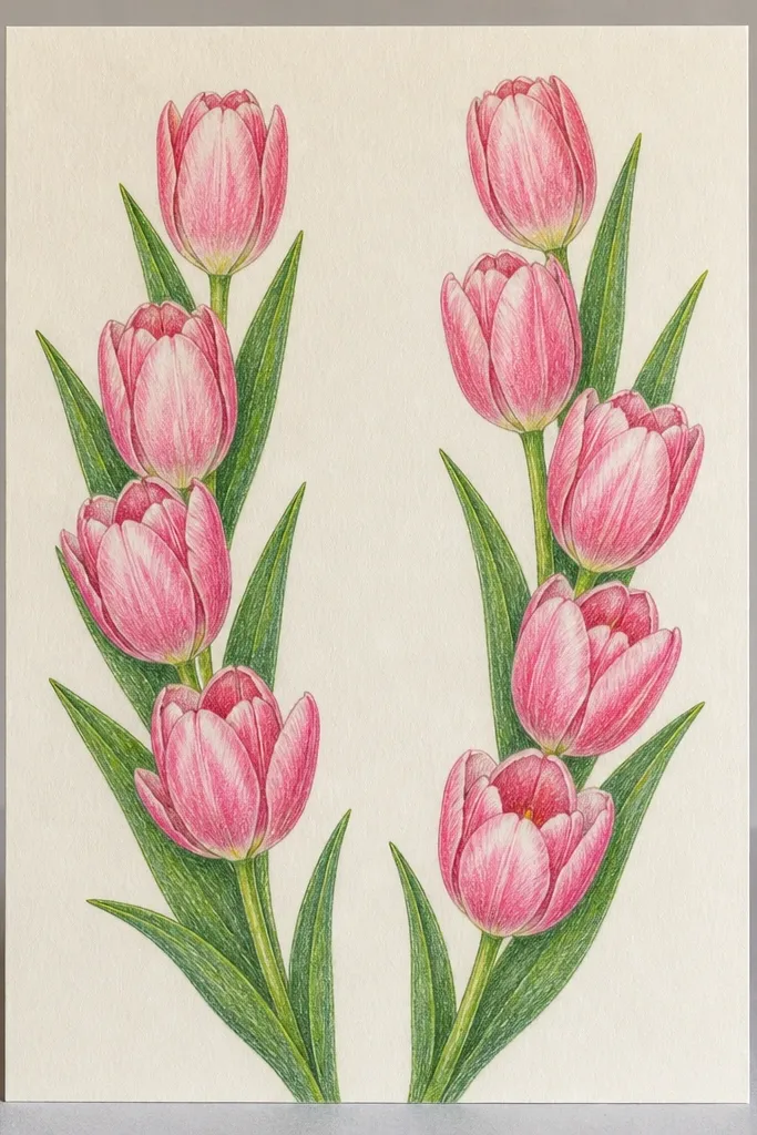
This layout is for when you want the drawing to look tidy without feeling stiff. The clean center stem gives you a visual spine, so even if your petals vary a little, the bouquet still reads as intentional. I keep the pink palette to pale blush plus one medium rose for shadows. The white background makes the tulips feel airy, and the slight outward lean adds motion. It flatters minimal, modern aesthetics and works well for people who like clean lines and calm color. If you're making something for someone who prefers understated gifts, this style lands well.
Step 1: Draw a vertical center line and two curved side stems that arc outward, like a shallow U shape. Step 2: Place three tulips on the left column and three on the right, spacing them so the blooms alternate height by about 0.3 to 0.5 inches. Step 3: For each tulip, draw the center bud first as a teardrop with a notch at the top, then add two main petals around it. Step 4: Shade only the inner fold and the underside using medium rose, leaving the outer petal edge mostly pale. Step 5: Add tiny stem highlights with a white gel pen or a clean eraser scrape.
Good to knowUse ruler-guided spacing for the first card - once the rhythm is right, it's easy to freehand the next one.
Common mistakeDon't fill the whole page with blooms - leave breathing space around the bouquet.
3. Loose Ink Pink Tulips with Washy Pink Watercolor Drop Shadows
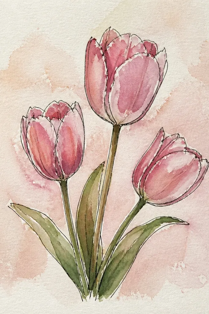
This is the style I reach for when I want it to look handmade fast. The ink does the structure - the watercolor does the softness. I use a single pink wash diluted enough to look translucent, then I deepen only the fold shadows with a slightly stronger rose. The drop shadow trick makes the flowers feel like they're sitting on the paper instead of floating. It flatters anyone who likes imperfect charm and makes the bouquet look more expensive than the time you spent on it. It also hides small drawing mistakes because the watercolor bloom edges are intentionally irregular.
Step 1: With a fineliner or brush pen, draw 7 tulips in a gentle arc, each one slightly different in height but consistent in shape. Step 2: Paint blush watercolor over the petals, keeping the top highlight lighter by leaving a thin unpainted strip. Step 3: Mix a deeper rose and paint shadows under each bloom - a soft oval or teardrop shape that follows the bloom base. Step 4: Let the watercolor dry 2-3 minutes, then add a second ink pass on the darkest overlap lines. Step 5: Finish stems with one extra ink line so the curves look confident.
Good to knowIf your watercolor blooms bleed, wait for the paper to fully dry before you add the shadow layer.
Common mistakeDon't over-darken the whole shadow - just the underside, or it turns muddy.
4. Minimal Line Pink Tulip Bouquet with One Dark Outline Lane
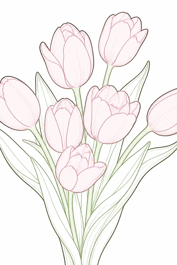
Minimal drawings look hard until you give them one job: control the silhouette. This idea uses a bold outline only along the outer edge of the bouquet, while inner petals get delicate lines. I color only the petals with a light blush wash or colored pencil, and I keep the stems mostly uncolored. That contrast makes the bouquet pop without needing lots of shading. It flatters small frames and print sizes because the composition stays readable even at thumbnail size. If you're drawing for modern decor, this is the one I'd pick first.
Step 1: Lightly sketch the bouquet as one rounded cluster, about 3 inches tall and 2 inches wide. Step 2: Draw thin center buds and petal shapes inside the silhouette, keeping each tulip facing mostly upward. Step 3: Go back and trace only the outer edge of the cluster with a darker pen, making that line 1.5x thicker than the rest. Step 4: Add blush color with colored pencil, staying inside the petal lines and leaving the highlight edge white. Step 5: Add a single dark overlap mark under two or three blooms so you get depth without clutter.
Good to knowUse a kneaded eraser to lift pencil lines before coloring - it keeps the white highlight crisp.
Common mistakeDon't color the stems heavily - minimal styles need stem calm.
5. Pink Tulip Bouquet in a White Ceramic Vase with Specular Highlight
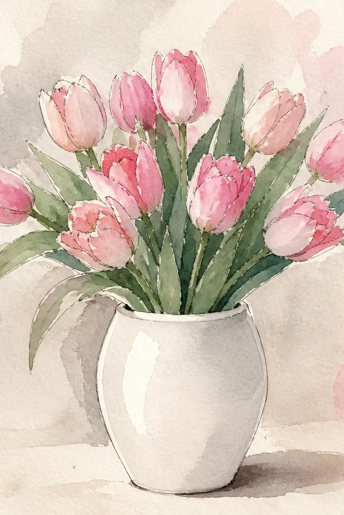
This one looks realistic because the vase has one clear light source. I draw the vase in simple shapes, then place a bright highlight stripe where the light hits. That stripe makes the whole drawing feel "real," even if the tulips are semi-stylized. I keep the tulip palette layered: pale blush for the outer petal and rose for the inner fold. It flatters warmer skin tones because the warm pinks and the soft gray vase shadows don't fight each other. If the recipient likes clean home decor, the vase detail makes it feel like a small still life.
Step 1: Draw an oval opening and a wider vase body under it, about 2.5 inches tall for a small page. Step 2: Add the tulip stems first - 9 stems clustered tightly, then blooms spread slightly outward at the top. Step 3: For each bloom, draw the center bud and two main petals, then add a third side petal behind it. Step 4: Color the vase with light gray pencil or watercolor, leaving a vertical highlight stripe uncolored. Step 5: Add a soft shadow at the vase base and under the bottom petals, then deepen the overlap lines at the petal folds.
Good to knowMake the highlight stripe narrower than you think - 2-3 mm looks right and keeps it believable.
Common mistakeDon't skip the base shadow - a vase without a shadow reads like paper cutout.
6. Top-Down Pink Tulip Bouquet Flat Lay on Linen Texture
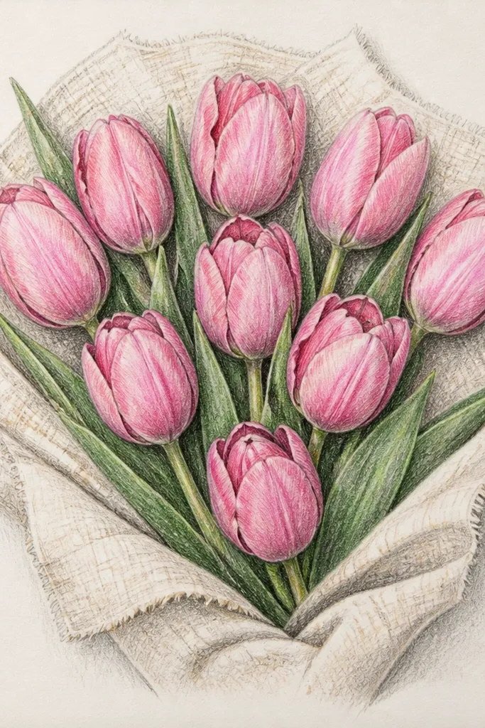
Top-down layouts feel intimate because you're seeing the bouquet like a flat lay photo. The linen texture helps your eye read the scene as something you could touch. I draw tulips with slightly wider petals and keep the shadows short and close to the overlap points. Pink stays soft by using pale blush as the main color and rose only where petals cross. This style flatters small printable art - it fills a square nicely and looks great on flat backgrounds. It also works well for people who like cozy, homey visuals without heavy realism.
Step 1: Lightly sketch a circle boundary for the bouquet spread, then place 5 tulips around it like spokes. Step 2: Draw each tulip with the open cup shape facing up, then add two overlapping petals behind the front layer. Step 3: Shade overlap areas with rose pencil, but keep the shadow edge soft. Step 4: Add linen texture by drawing tiny, short parallel lines in the background at 2-3 different angles, faintly. Step 5: Color the petals with blush wash or pencil, leaving a thin highlight edge along each petal's top curve.
Good to knowIf the texture looks too strong, lighten it with an eraser so it stays in the background.
Common mistakeDon't make every shadow the same size - vary them with how far petals overlap.
7. Pink Tulip Bouquet with Buttercream Yellow Accent Ribbon
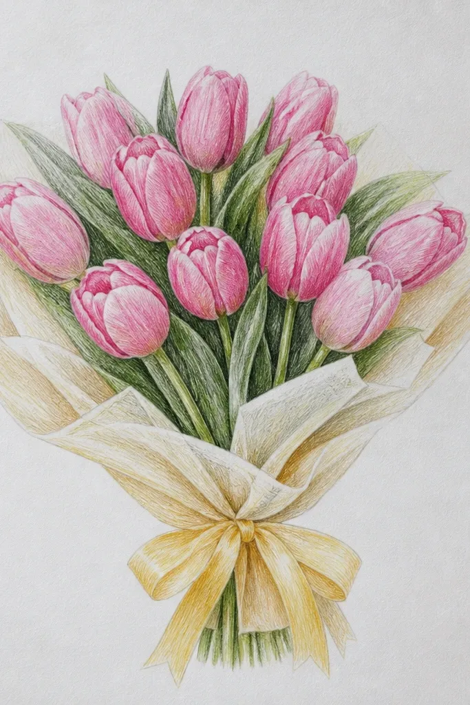
Adding a yellow accent makes the pink look cleaner and brighter, especially when your pink is pale. I use buttercream yellow for the ribbon with a tiny touch of warm orange in the fold shadows. The tulip petals stay blush and rose, but I deepen the centers so the bouquet doesn't look washed out next to the warm ribbon. This style flatters people who like a cheerful, gift-ready look. It also works great for Easter-adjacent art because the yellow feels springy without being childish.
Step 1: Draw the bouquet as a rounded cluster with slightly taller blooms in the back. Step 2: Place the buttercream ribbon horizontally across the middle, then draw the knot slightly below center. Step 3: Color tulip petals pale blush, then add rose in the inner folds and around the center notch. Step 4: Color ribbon folds with darker buttercream mixed with a hint of orange, and leave a highlight stripe on the top of each ribbon loop. Step 5: Add a few tiny stitch-like marks on the ribbon tail if you want extra handmade charm.
Good to knowKeep the yellow ribbon narrow - about one-third the bouquet width - or it fights the tulips.
Common mistakeDon't add blue shadows to the pink - it makes the bouquet look sickly.
8. Monochrome Pink Tulips Bouquet with Charcoal Speckle Background
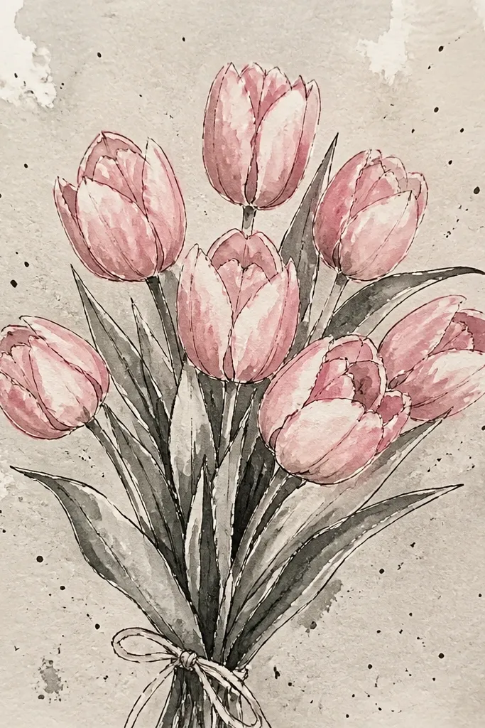
A speckled background turns a simple pink bouquet into something that looks textured and intentional. I keep the tulips mostly monochrome - pale blush, mid rose, and a darker rose for overlap - so the speckles don't overpower the flowers. The charcoal speckle gives a grainy contrast that makes the petals look softer by comparison. This style flatters moody, evening cozy vibes and looks great on dark paper or tinted sketchbook pages. If you're making wall art, it reads like a finished print instead of a sketch.
Step 1: If you're on white paper, lightly shade the background with very light charcoal on one side so it doesn't look flat. Step 2: Flick charcoal specks with a toothbrush held over the page, then stop before it gets too dense. Step 3: Draw 6 tulips in a loose bouquet cluster, keeping petal shapes consistent. Step 4: Shade petals with blush pencil first, then add rose in the inner fold and around the notch. Step 5: Deepen only a few overlap edges with dark rose so the bouquet has focal points.
Good to knowTest speckle density on scrap paper - one pass too many kills the softness.
Common mistakeDon't outline the whole bouquet in charcoal - keep the darkest line work only where petals overlap.
9. Single Pink Tulip Bouquet Study with Bud-to-Bloom Gradation
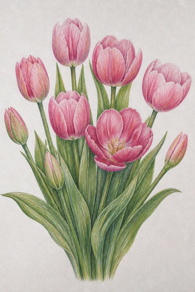
This is a great one when you want the page to feel intentional even with only three flowers. The bud-to-bloom gradation gives you depth and a natural rhythm, like a real bouquet where not everything opens at the same time. I use pale blush on the open petals and tighter rose shading on the bud petals because buds have more shadow. It flatters beginners because the structure is simple: one shape repeated at different openness. It also works for small labels and minimalist inserts.
Step 1: Draw a vertical stem that splits into two smaller stems at the bottom, making a gentle Y. Step 2: Place three tulip heads along the stems, with the top bloom widest open, middle slightly open, and bottom mostly closed. Step 3: For each tulip, draw the center bud notch first, then add petal layers that match the openness (open = wider petals; closed = tighter petals). Step 4: Color the petals with blush, then shade folds with rose, keeping the darkest areas inside the bud notch. Step 5: Add a soft shadow at the base of each bloom head to separate it from the paper.
Good to knowIf your tulips look the same, change the openness first - not the color.
Common mistakeDon't make all three blooms equally open - that's what makes small studies look flat.
10. Pink Tulip Bouquet with Vintage Postcard Border and Pink Wash Corners
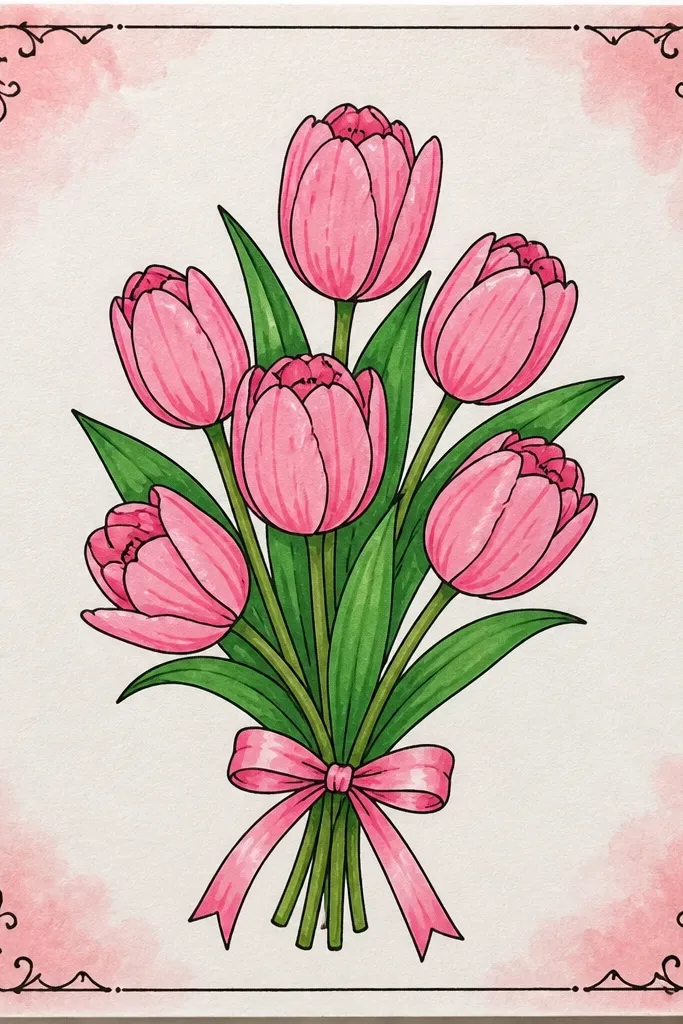
Borders make a bouquet drawing look like it belongs in the real world - a card, a label, a keepsake. The pink wash corners tie the border to the bouquet so it feels cohesive, not pasted on. I keep the tulips in blush and rose, with a slightly darker outline on the outer petals to match the postcard border's vintage ink feel. This style flatters people who like classic stationery and gives you a frame even if your bouquet isn't perfectly centered. It also hides uneven coloring because the border draws the eye outward.
Step 1: Draw a thin rectangular frame with a 0.25 inch margin around the page. Step 2: Add dashed lines along the inner edge and tiny leaf sprigs in the top corners. Step 3: Paint light pink wash in the bottom corners first so you can match the exact pink tone for the tulips. Step 4: Sketch the tulip bouquet in the middle, 7 blooms max, and keep the petals slightly angled outward. Step 5: Color petals blush, shade folds rose, then outline the outermost petals with a dark pen matching your border line weight.
Good to knowMatch the tulip pink to your corner wash by using the same paint mix, not a different tube shade.
Common mistakeDon't over-detail the border - two tiny motifs are enough.
11. Pink Tulip Bouquet with Perspective Vase and Ground Shadow
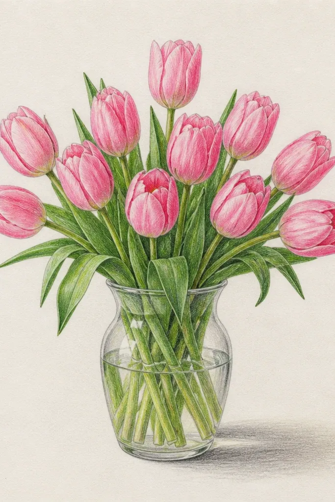
Perspective makes a drawing feel like a real object sitting on a surface, even if you keep the flowers simple. The ground shadow is the part people notice first - it anchors the vase and gives the bouquet weight. I draw the vase with a slight tilt so the tulips lean naturally. Pink looks best here when you keep petals semi-transparent and reserve the darker rose for the inner folds and the shadow side. This style flatters anyone who wants a more "still life" look without heavy realism. It also makes the bouquet feel more mature and gift-ready for adults.
Step 1: Draw the vase as a trapezoid shape that narrows upward, with a slightly tilted opening oval. Step 2: Add stems that fan upward and outward, then place 8 tulip heads so they partially overlap each other. Step 3: Shade the vase with light gray and leave a subtle highlight on the upper left. Step 4: Paint a ground shadow under the vase - a soft ellipse that's darker at the center and lighter at the edges. Step 5: Color petals blush, then add rose only in the inner fold and along overlap seams.
Good to knowMake the ground shadow wider than you think - it sells the "sitting" effect.
Common mistakeDon't place the shadow too high - it should touch the base area of the vase.
12. Pink Tulip Bouquet in a Glass Jar with Condensation Marks
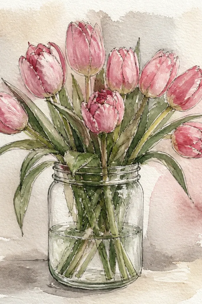
Glass details make a bouquet drawing feel like you're looking at something fresh and new. The condensation marks add texture without needing extra flowers. I keep the tulip petals lighter because glass already adds contrast through highlights and reflections. For the pink, I use pale blush for most petals and reserve deeper rose for the inner folds, then I leave tiny highlight gaps on the petal edges like light catching paper. This style flatters spring parties, brunch invitations, and any card where you want "fresh" vibes. It also works well for medium skin tones because the blush reads warm, not icy.
Step 1: Draw a jar outline with two curved vertical sides and a thick rim, then add a simple perspective reflection line. Step 2: Sketch stems inside the jar opening, clustered in the center, then fan tulip heads outward. Step 3: Color tulips blush, then shade inner folds rose, leaving small highlight slits at the top of each petal. Step 4: Add glass highlights with a white gel pen or unpainted paper strips, and draw 6-10 condensation droplets along the jar wall. Step 5: Shade the jar base with a very light gray wash and add a faint shadow behind the stems.
Good to knowKeep condensation droplets different sizes - 2-4 mm to 6-7 mm - so it doesn't look like a pattern.
Common mistakeDon't outline the jar in a thick black line - glass edges should feel lighter than petals.
13. Pink Tulip Bouquet with Striped Background Paper and Soft Movement Lines
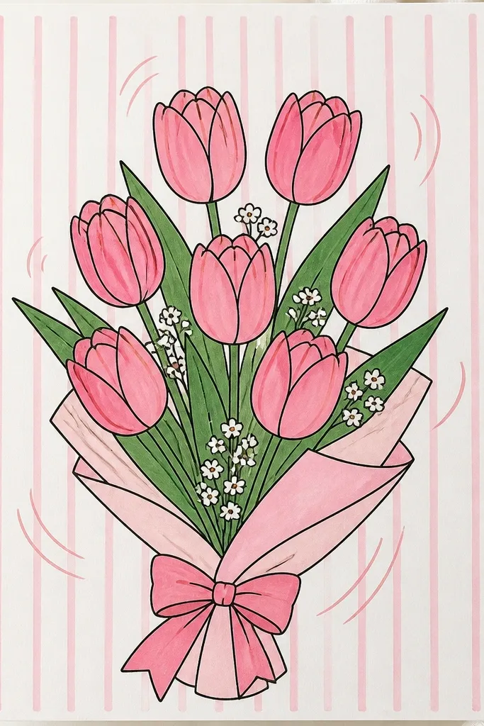
Stripes give your drawing a built-in rhythm, and movement lines help your eye follow the bouquet as one unit. I keep the stripes faint so they don't fight the flowers; then I use blush and rose to stay the star. The movement lines are short, curved strokes behind the stems, not around the petals. This style flatters graphic design layouts and makes the bouquet look energetic without being messy. If you're drawing for a planner page or a scrapbook spread, this one makes the page feel designed, not random.
Step 1: Lightly draw parallel stripes across the page using a gray pencil, spacing them about 0.15-0.2 inches apart. Step 2: Add 3-5 curved movement lines behind the bouquet, following the arc of your stems. Step 3: Sketch 7 tulips in a clustered bouquet, keeping outer petals slightly larger. Step 4: Color petals blush, then add rose folds and a few overlap shadows under the top layer. Step 5: Darken only a few stem lines for contrast so the stripes stay background and the bouquet stays foreground.
Good to knowErase stripe edges near the bouquet slightly so the flowers look like they sit on top.
Common mistakeDon't draw stripes too dark - the bouquet should win the contrast fight.
14. Pink Tulip Bouquet with Hand-Lettered Tag and Tiny Heart Doodle
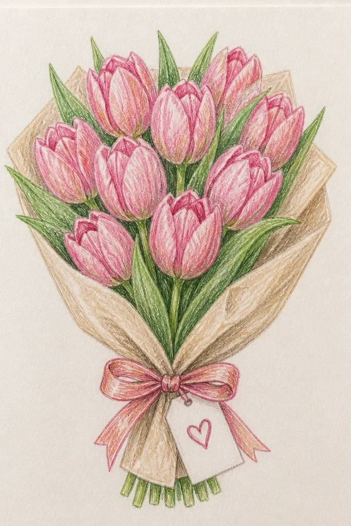
A tag turns a drawing into a usable gift label. The best part is the tag gives you a second focal point, so your bouquet can be slightly simpler and still look complete. I keep the tulips soft and rounded, then make the lettering crisp so it reads clearly. Pink stays blush with rose folds, and the ribbon knot shadow anchors the center. This style flatters personalized gifts because it makes space for a name, date, or short message. It also looks good for anyone who likes cute details but not cartoonish flowers.
Step 1: Draw the bouquet first with a ribbon band across the middle, then add a small tag hanging from the center knot. Step 2: Sketch 6-8 tulip heads clustered above the ribbon, with petals slightly open so the tag is visible. Step 3: Color petals blush, shade inner folds rose, and add overlap shadows under the ribbon. Step 4: Letter on the tag using 2-3 strokes per letter - keep it simple and legible - then add a tiny heart doodle under the text. Step 5: Outline the tag and ribbon with a slightly darker line than the tulip inner lines for readability.
Good to knowIf lettering looks shaky, practice the exact word on scrap first and keep the tag font consistent in height.
Common mistakeDon't cram the tag with too many words - 2-5 words reads best.
15. Pink Tulip Bouquet in a Watercolor Resist Window Frame
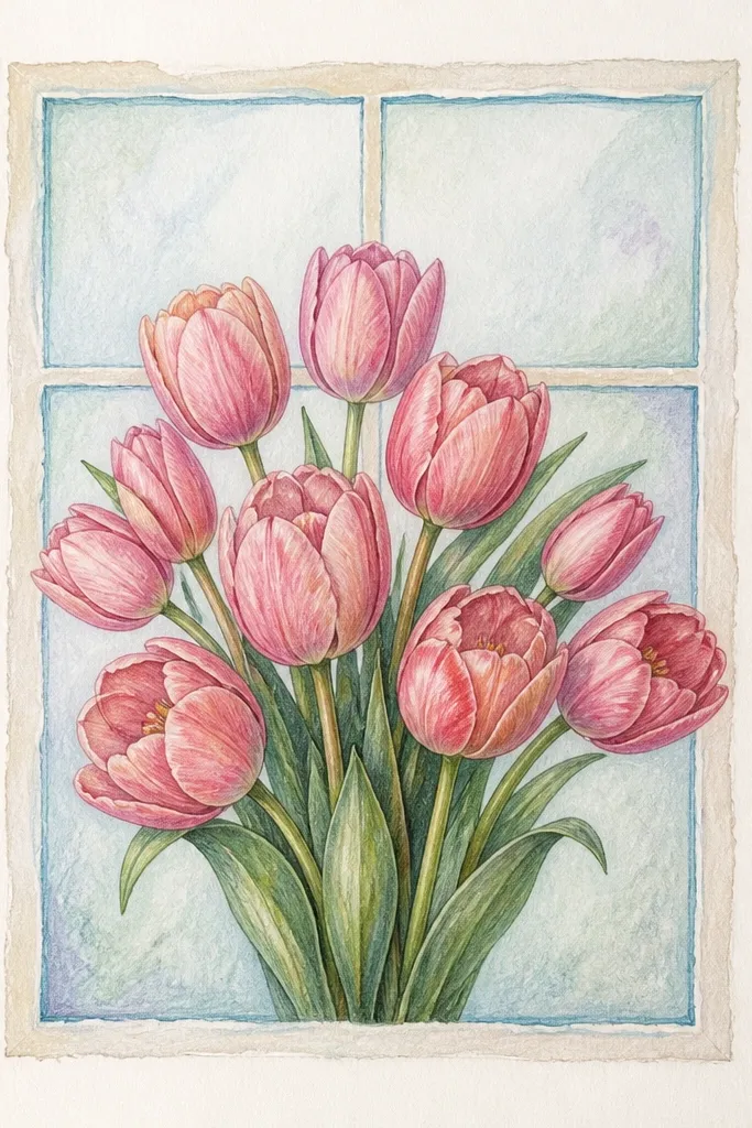
This one looks special because the window frame creates a "view." The watercolor resist effect gives you natural crisp edges that feel like printed stationery. I use a resist tool like white crayon or masking fluid to protect the window lines, then paint a wash around it. The tulips stay blush and rose, but the frame keeps the scene from looking like a random watercolor blot. It flatters people who like architectural or "cozy home" visuals. It also helps if your drawing tends to smear - the resist edges give you clean structure.
Step 1: Draw the window frame rectangle and mullion lines in pencil, then go over the frame lines with white crayon or apply masking fluid on top of the lines. Step 2: Paint a light pink-gray wash behind the tulips and around the frame, avoiding the protected lines. Step 3: Draw tulip petals over the wash with blush watercolor, then deepen folds with rose. Step 4: Remove the crayon or masking fluid once fully dry so the frame lines stay bright. Step 5: Finish with a thin dark outline on the outer bouquet edge and a couple of overlap shadows under the blooms.
Good to knowLet the background wash dry completely before you paint petals so the edges stay crisp.
Common mistakeDon't scrub the resist too early - it will smear and dull the frame effect.