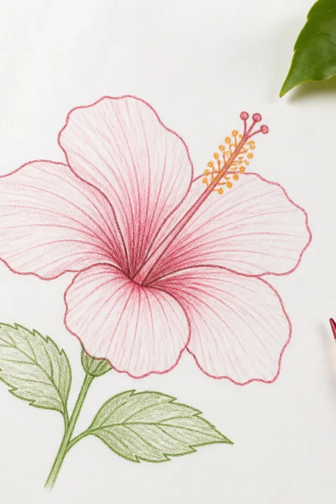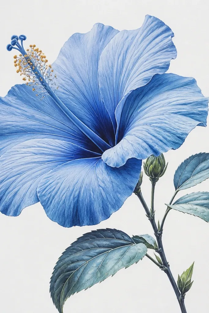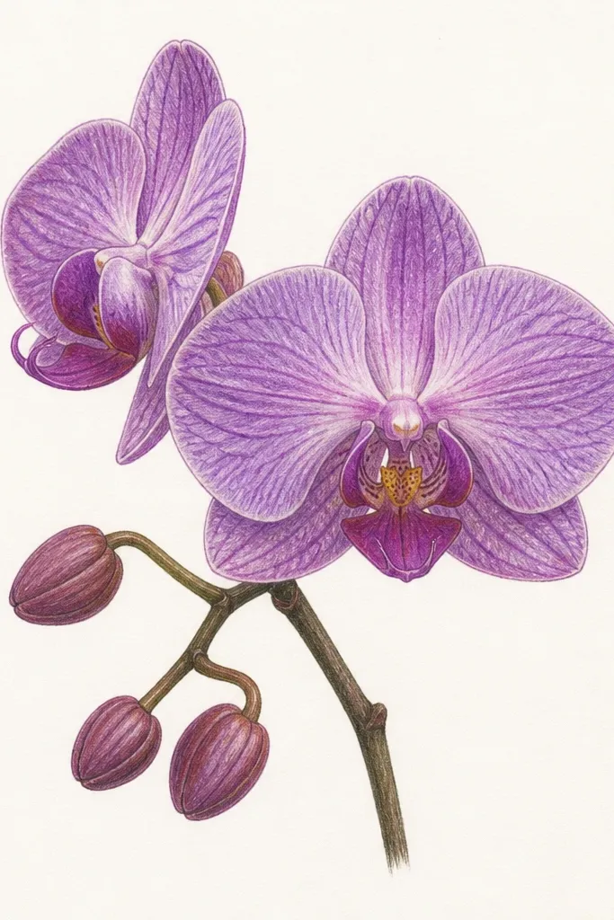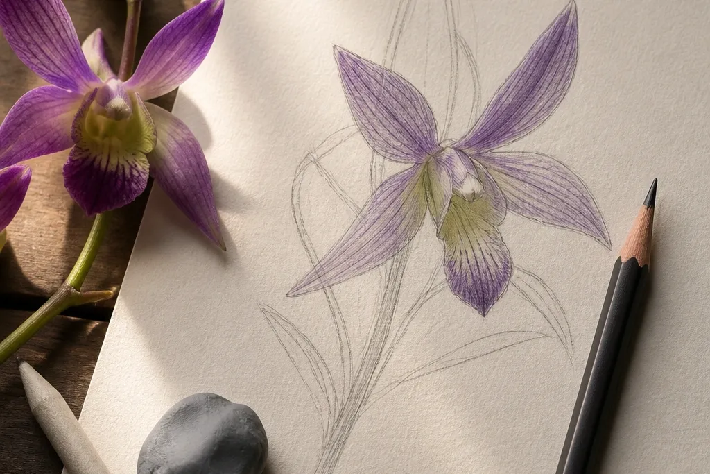

1. Crisp Silhouette Wild Orchid (two-pass outline)
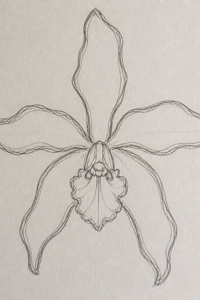
This idea fixes the most common “cheap” look: wobbly petal edges. I draw the outer silhouette in a confident line, then I redraw it lightly with a smaller pencil pressure so the shape looks intentional instead of shaky. Keep the outer petals slightly thicker at the base where they attach, and taper them toward the tips. The central lip should feel like a folded scoop — the top edge is darker, the underside is lighter. This look flatters most paper tones because the contrast sits mostly on the outline, not across the entire page.
Start by sketching the orchid’s overall proportions with a light 2B — don’t add veins yet. Then do the first outline pass: trace the outer edges with firmer pressure, one smooth motion per petal. Next, do a second outline pass inside the first by a few millimeters using lighter pressure, so you get a subtle “double contour” without looking traced. Finally, add only a few vein lines near the center lip and shade the underside of each petal with a soft gradient using a 4B or 5B.
If your line shakes, rotate the paper a quarter-turn and draw the petal in the direction your wrist feels stable.
Avoid pressing hard on the first sketch pass — it forces gray marks that won’t lift cleanly.
2. Central Lip Fold Study (the key shape)
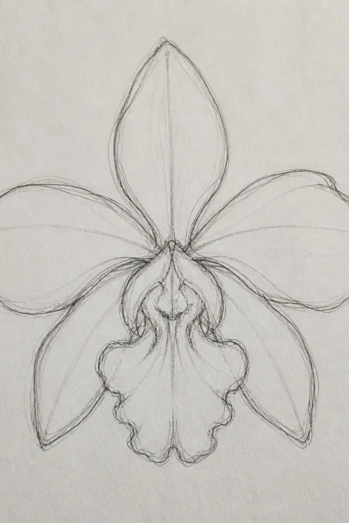
Start by blocking in just three shapes: the two side petals as tall ovals, and the central lip as a curved teardrop. Then add the fold line: draw a thin curve slightly off-center and shade below it with a 4B pencil. Layer a lighter tone on the upper portion of the lip, leaving a small highlight gap near the fold. Finally, add 3-5 thin vein lines that radiate from the lip base, stopping before they hit the tips so the drawing stays airy.
Orchids look right when the lip fold looks right. I treat the central lip like a small bowl: the upper rim catches light, and the fold line creates a shadow that makes the whole flower feel dimensional. Use one darker value along the fold and keep the rest of the lip lighter so it reads as folded fabric, not a flat oval. Side petals stay simpler in this version, which keeps the viewer’s eye on the anatomy. This works great for portraits of flowers because the center lip is what people instinctively look for.
Common mistakeAvoid shading the entire lip evenly — flat shading makes it look like a sticker.
Good to knowBefore shading, lightly mark the fold line with a ruler edge or a straight pencil held at an angle — it keeps the fold from looking random.
3. Vein Map First (light guide lines)
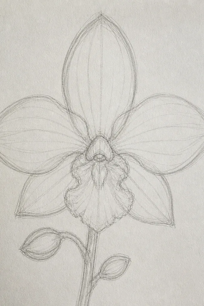
Begin with a light outline of the petals using 2B, then draw the vein map with an HB pencil. Place the strongest vein lines starting near the lip base and branching outward in a gentle fan. Leave the outer third of each petal with fewer veins so the structure doesn’t turn busy. After the map is set, go back with a 4B or fineliner to darken only the veins that run into shadows, then add soft shading under those same lines.
Veins are the skeleton of an orchid drawing. I start with a “vein map” made of light lines so I can place the dark shading exactly where the petal thickens. Keep the veins denser near the lip and sparser near the outer edges. This gives you a natural look even if you’re not painting every tiny detail. The result looks best on warm or off-white paper because the light pencil guide lines blend naturally into the background.
Common mistakeAvoid drawing dark veins everywhere — it turns the flower into a coloring-book page.
Good to knowUse a mechanical pencil for the vein map — consistent thin lines make the final shading look cleaner.
4. Watercolor Wash + Lifted Veins
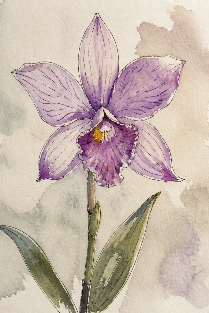
Tape your paper down and wet the petals lightly with clean water using a size 8 round brush. Mix a diluted dusty rose wash and paint the main petal areas, leaving the outer edges slightly lighter. While the paint is still damp, use a clean damp tissue to lift thin streaks where veins should be, then rinse the brush and soften the lifted edges with a gentle touch. Add a concentrated magenta shadow under the lip fold only after the lifted veins look dry to the touch.
This is the orchid look that always gets compliments because it feels alive. I lay down a pale wash first, then I lift pigment to “draw” the veins without outlining every line. The trick is keeping the wash wet long enough to lift — if it dries fully, lifting becomes streaky. Choose a limited palette: dusty rose, lavender, and a tiny bit of deep magenta for the lip shadow. This flatters people’s taste for soft art because it looks delicate without requiring tiny hand lettering.
Common mistakeAvoid overworking the wash — too many passes make the petals look muddy.
Good to knowKeep one tissue corner reserved for lifting — if you swap to a dirty corner, you smear color into your highlights.
5. Ink Outline with Pencil Shading (clean edges)
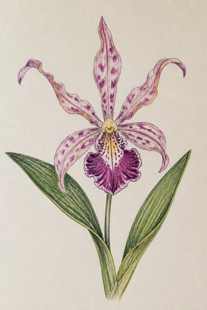
If you want a drawing that looks finished fast, ink the outline first. I like this because ink gives you that crisp outer silhouette while pencil shading handles the depth. The trick is line weight: outer edges are darker, inner vein lines are thinner, and the lip fold has a slightly thicker shadow line. Pencil shading should stop short of the strongest highlights so the petals don’t look flat. This works for sketches on printer paper too, but it looks best on 100-140 lb paper that can take a little erasing.
Sketch the orchid lightly in pencil, then ink only the outer silhouette and the lip fold line with a fine liner. Let it dry, then go back with pencil for shading: use a 2B for mid-tones and a 5B for the underside of each petal. Add vein shadows by shading just beside the vein lines, not directly over them. Finally, erase remaining pencil construction lines carefully, then darken only 2-3 key shadow pockets so the drawing doesn’t go gray.
Use a kneaded eraser for mid-tones — it lifts without tearing paper like a hard rubber can.
Avoid inking the veins too thick — it makes the flower look graphic and harsh.
6. Monochrome Orchid in Graphite (value-only)
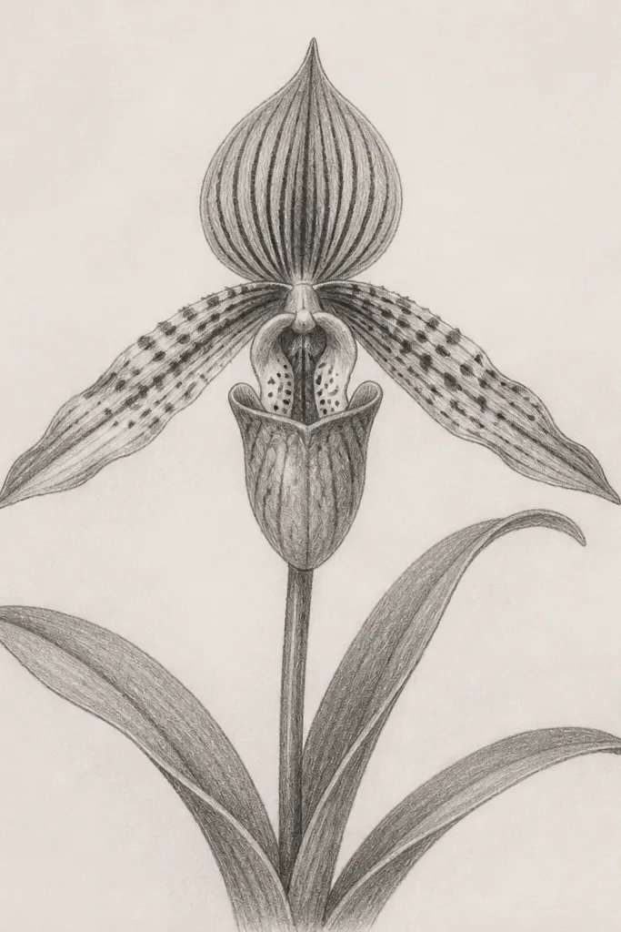
A monochrome orchid is the fastest way to practice realism because you’re forced to rely on value, not color. I build it with three levels: light base (2B), mid shading (4B), and deep pockets (6B). The outer edges stay crisp and slightly darker, while the interior transitions soften. Veins show up as lighter lines against darker shadows, so you get that natural “ribbed” look. This is forgiving on skin tones and backgrounds because it doesn’t compete with color — it just reads as form.
Start with a light graphite sketch using HB, then shade the underside of each petal with 4B. Leave the top edges and a small highlight strip along the lip fold mostly unshaded. Add veins by lifting with a kneaded eraser after you lay a mid-tone, or shade next to the vein lines to create contrast. Finish with 6B only in the deepest shadow pockets under the lip and along the base where petals overlap.
Squint at the drawing — if you can’t see three distinct value steps, add more contrast under the lip fold.
Avoid spreading the darkest value everywhere — use 6B sparingly or it looks like smudged charcoal.
7. Dried Orchid Study on Brown Paper
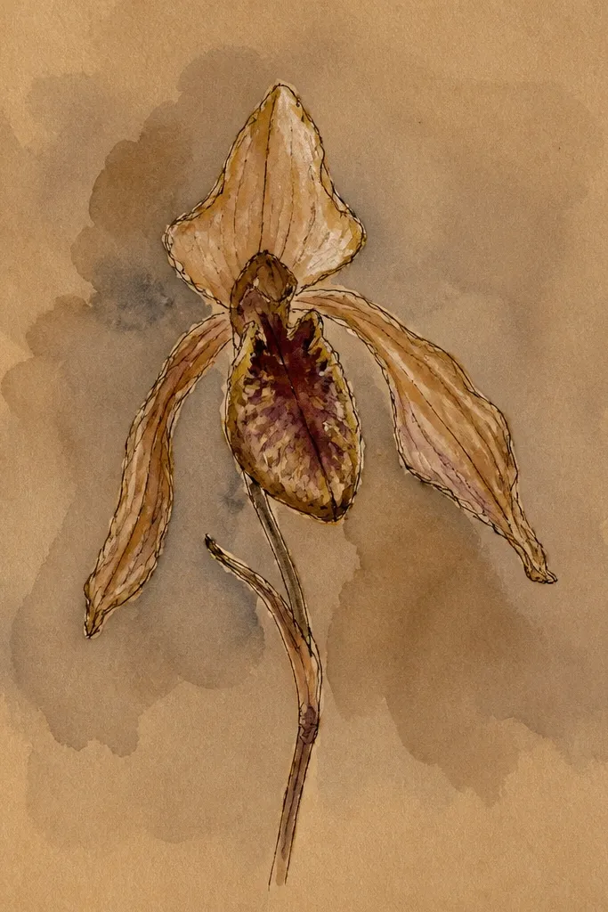
Lightly sketch the orchid in soft pencil, then color the petals with colored pencils in dusty mauve and faded lilac, keeping pressure light for transparency. For shadows, use warm brown pencil under the lip fold and where petals overlap. After the colors set, use a white gel pen to draw a few vein accents and tiny highlight lines along the petal edges. Finish by deepening just two shadow pockets with a darker brown pencil so the flower has a focal point.
Brown paper changes the whole mood. I use it when I want that dried, pressed-flower vibe without making it look like an old museum photo. The petal colors should be muted: dusty mauve, faded lilac, and a warm brown for shadows so the drawing feels like it’s been in sunlight. White gel pen becomes your highlights tool — it’s the easiest way to get crisp vein sparkle on a darker surface. This is flattering for anyone who likes earthy palettes and wants the orchid to feel grounded.
Common mistakeAvoid using bright neon colors on brown paper — they look synthetic against the warm base.
Good to knowTest your gel pen on a scrap first — some brands skip on kraft paper if the tip is dry.
8. Orchid in Perspective on a Curved Leaf
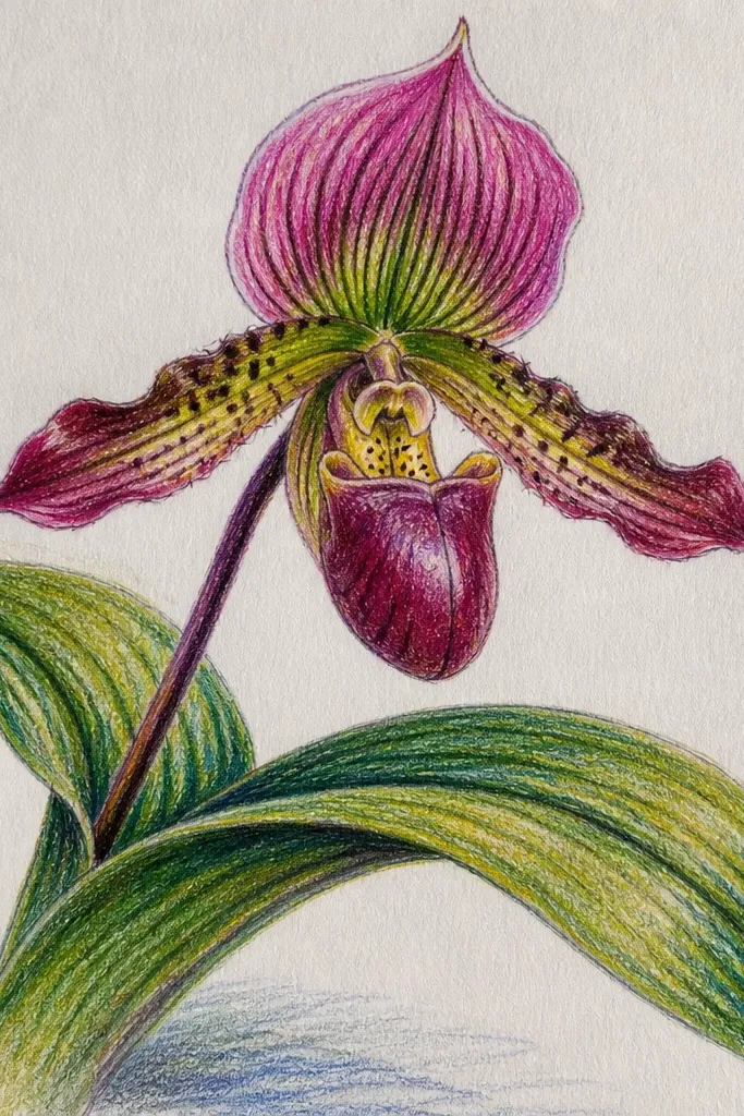
Sketch a curved leaf shape with a clear midrib line, then decide where the orchid sits along the curve. Draw the orchid structure using the same tilt as the leaf — rotate your paper if needed so the orchid’s vertical axis matches the leaf’s slant. Shade the orchid’s underside based on the same imagined light source as the leaf. Add a few tiny stem lines connecting the orchid to the leaf so the overlap feels physical, then finish with highlights on the top edges of both leaf and petals.
This idea makes your orchid look like it belongs in a real plant scene. When you align the orchid’s tilt with the leaf’s curve, your brain reads it as “grown,” not “placed.” I draw the leaf first with a strong midrib and a slight twist, then I angle the orchid so its lip faces the light. It’s also a great way to hide mistakes because perspective gives you a reason for asymmetry. This works for anyone who has trouble drawing orchids straight-on.
Common mistakeAvoid drawing the orchid straight while the leaf is tilted — the mismatch screams “sticker.”
Good to knowUse a single light direction for everything — one shadow angle across leaf and petals makes the scene look intentional.
9. Seed Pod Orchid Companion (plant pair)
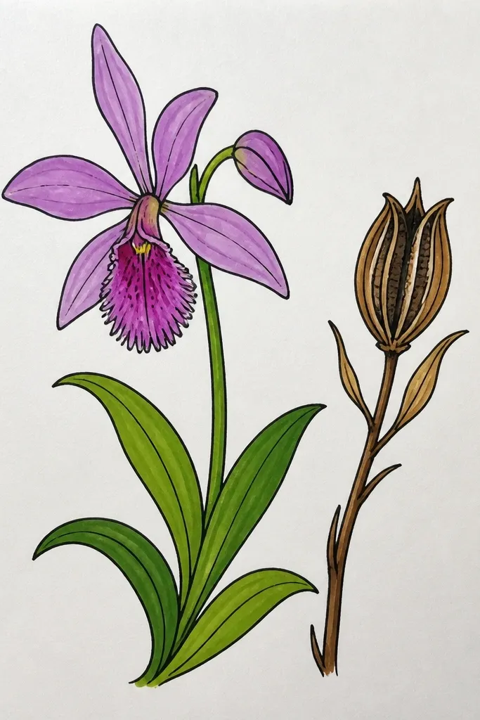
Start with the orchid bloom and block it in at the top half of the page. Then draw a seed pod in the lower third using a slender oval with a taper, and add 6-10 shallow ridge lines. Shade the ridge bottoms with 2-4B, leaving the top ridge edges slightly lighter. Finally, add a few tiny seed dots at the pod opening with a fine liner or sharp pencil point, then soften the background with light pencil so the pod doesn’t look pasted on.
Orchids don’t live alone. Adding a seed pod or a small bud gives your page a plant timeline, not just a single flower portrait. I draw the pod with ridges and a slightly tapered end so it looks like it’s drying or preparing to release seeds. Keep the pod values lighter than the orchid bloom so the flower stays the focus. This is also a practical way to use negative space — the pod fills the lower third without crowding the petals.
Common mistakeAvoid making the pod as detailed as the bloom — it steals attention.
Good to knowIf your pod looks too perfect, make one ridge slightly shorter — real pods are uneven.
10. Orchid on Moss Background (texture trick)
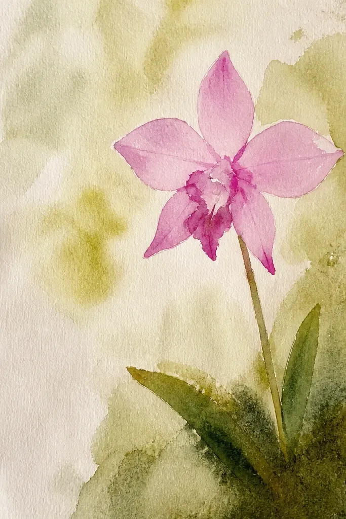
First, sketch the orchid lightly and decide where it sits on the moss patch. Create the moss background by stippling tiny dots with a green pencil, then add short scratch marks in deep green to create depth. Add bluish gray under the orchid and around the underside of the petals. Color the orchid petals with light washes or pencil shading that stays lighter than the moss, then outline only the outer petals with a darker pencil or fineliner.
A mossy background makes the orchid pop without adding more flower detail. I build moss with stippling and short strokes, then I keep the orchid edges crisp so the contrast feels intentional. Use two greens and one gray: olive green, deep green, and bluish gray for shadows. Keep the orchid palette lighter than the moss; otherwise the flower blends into the texture. This style flatters people who like nature scenes and want a “found in the woods” vibe.
Common mistakeAvoid coloring the orchid darker than the moss — it makes the flower look trapped in the background.
Good to knowLeave a clean halo around the orchid edges by erasing tiny moss dots right near the silhouette.
11. Hot Pink Lip with Soft Lavender Petals
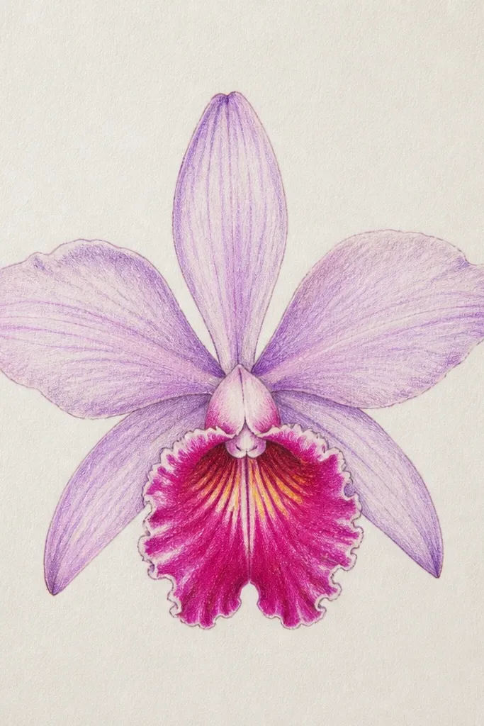
This is the color combo I keep coming back to because it matches how wild orchids often look in real light. The lip is the loudest part: hot pink with a deeper maroon shadow under the fold. The surrounding petals stay soft and slightly cooler in lavender so the lip reads as the focal point. I also add a few pale yellow-green accents near the lip base to mimic that natural glow. It flatters most paper and sketch styles because you’re not forced to color everything — just the center does the work.
Start by coloring the petals in a light lavender first, leaving the lip area mostly blank at first. Then color the central lip hot pink, and deepen the fold shadow with a maroon or deep magenta pencil. Add a tiny stripe of pale yellow-green near the lip base and blend lightly with a clean pencil or brush. Finally, darken the underside of side petals with a cooler violet and add a few vein lines with a fineliner for crispness.
Use a light hand on lavender — one heavy layer makes it look bruised.
Avoid making the lip the same tone as the petals — the drawing loses its focal point.
12. Pastel Orchid with Chalky Texture
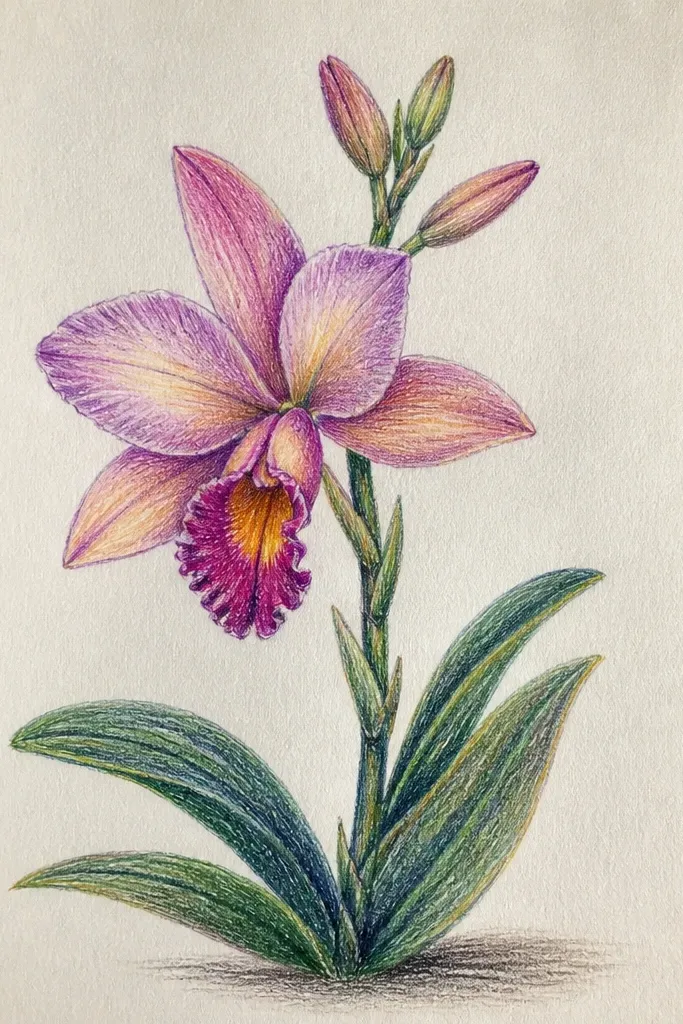
Sketch the orchid in light pencil, then apply pastel powder or chalky colored pencil in thin layers. Tap on color with a cotton swab for the petals so the texture stays grainy instead of glossy. Add vein hints with a slightly darker pencil, but keep pressure light so the veins don’t punch through. Finish by using a white pencil or soft pastel to lift highlight edges along the petal tips and the lip rim.
Matte, chalky textures make orchids feel soft and airy. I use this when I want the flower to look like it’s been lightly dusted by mist. Keep your colors pale: powder pink, faded peach, and pale periwinkle. Veins should be drawn lightly, almost like they’re sketched into the surface, not carved in. This style flatters smaller paper sizes because the texture fills space without needing lots of tiny detail.
Common mistakeAvoid heavy burnishing — it smooths the grain and kills the chalky look.
Good to knowFixative helps, but I only spray from far away — close spraying can darken the whole piece.
13. Orchid in Pencil Only with White Highlight Gel
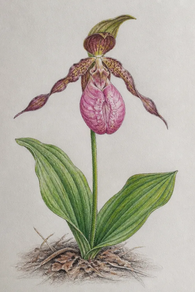
This is the pencil version that looks like it has light bouncing off it. I shade petals with graphite and then use white gel pen for the highlights that pencil can’t keep bright. The best highlights are short and specific: a thin edge line on the outer silhouette and a few broken vein strokes near the lip. Keep the gel pen controlled — if you draw long continuous lines, it looks like paint marker. This works for anyone who wants a “clean” finish without watercolor mess.
Shade the orchid petals with 2B for mid tones and 4B for underside shadows, leaving the top highlight areas unshaded. Add vein shadows by darkening just under where veins would cast light. Let the pencil fully settle, then draw highlight edges with a white gel pen — start at the outer petal tips and work inward. Add 3-5 small highlight breaks on the lip fold and stop before it turns sparkly everywhere.
Use the gel pen tip like a pencil — barely touch the paper, then lift quickly.
Avoid outlining everything in white — it makes the orchid look like a sticker outline.
14. Two Orchid Buds + One Bloom (growth composition)
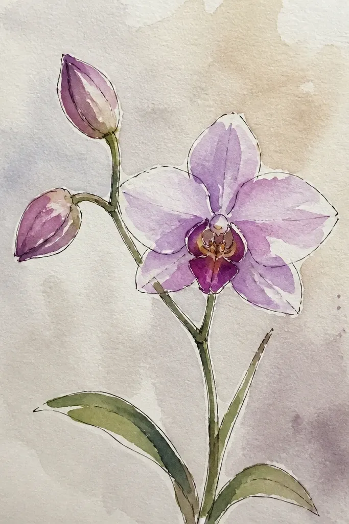
Draw the main bloom first and place it slightly above center so there’s room for the buds. Sketch two buds on either side using simple teardrop shapes and minimal vein lines. Shade the buds lightly with 2B and reserve your darkest shadows for the main bloom’s lip fold. Add a connecting stem line at the base of the main bloom and let it split toward each bud. Finish by darkening only the outer edges of the main bloom with pencil or fineliner.
This composition makes your page feel like a real plant moment. The big bloom gives you detail and focus, while the buds are smaller and simpler so the viewer’s eye doesn’t get lost. I keep the buds at about one-third the height of the main bloom and shade them with softer values. This style also helps you practice proportion because bud anatomy is simpler: fewer visible veins, more smooth petal arcs. It suits sketchbooks and greeting-card panels because it reads well from a distance.
Common mistakeAvoid making all three flowers the same size and detail — it kills the focal hierarchy.
Good to knowKeep bud outlines smoother and lighter — crisp bud edges make them look like separate stickers.
15. Orchid with Inked Veins Only (no petal color)
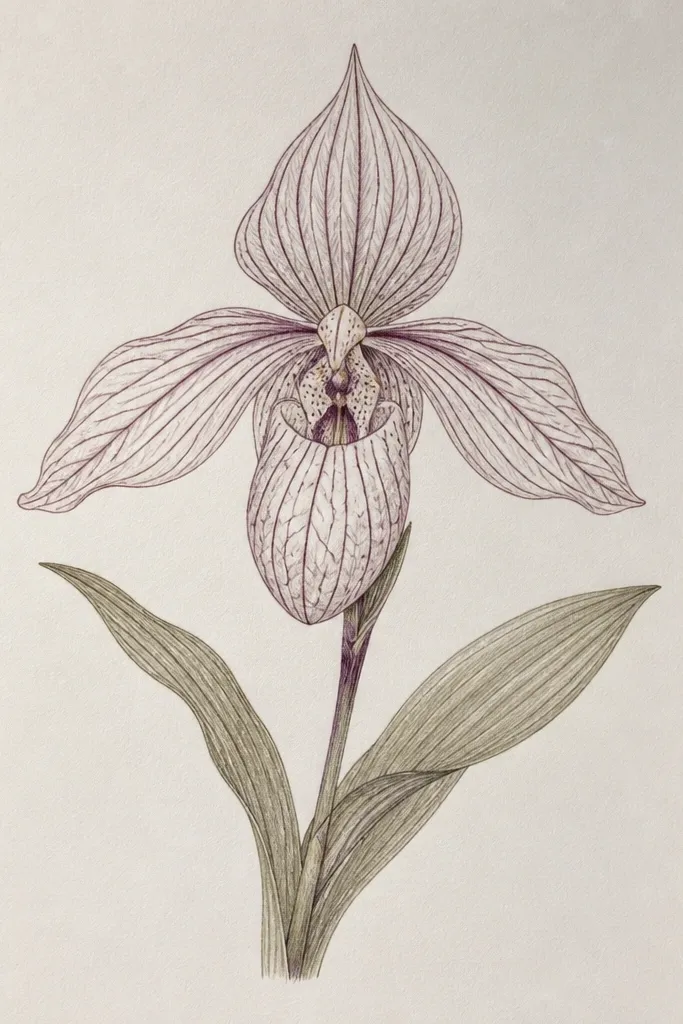
This is a clean, modern look that still feels botanical. You’re using the vein network as the design, not the color fill. I keep petals mostly uncolored so the paper tone becomes the petal surface. The lip fold gets just a small pencil shadow to suggest depth. This works especially well if you like minimal art and want it to fit on a page without feeling busy. It also hides shaky shading because the detail is in the line work.
Sketch the orchid outline lightly in pencil, then ink only the outer silhouette and the veins with a fine liner. Leave most of the petal area blank — don’t color inside. Add a tiny pencil shadow under the lip fold using 4B so the center has depth. If you want extra contrast, add one thin ink line along the underside edge of each petal, then stop. Erase the remaining pencil construction lines carefully so the ink reads crisp.
If your veins look too dark, ink them thinner first and add darkness with pencil under the vein roots only.
Avoid filling petals with gray to “finish” — it makes the minimal look feel dirty.
16. Orchid Shadow Play on the Ground
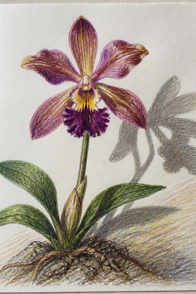
Adding a ground shadow makes a drawing feel staged and real. I draw the orchid normally, then I place a soft shadow beneath it with a darker value and a blurred edge. The trick is direction: the shadow should match your light source and be slightly wider under the widest petal overlap. This style looks great for framed art because it gives the orchid a “lift” from the page. It also helps if your petals feel flat — the shadow adds depth instantly.
Sketch the orchid and decide your light direction, then lightly draw a soft oval ground shadow beneath the widest part of the flower. Shade the shadow with 4B or 5B, making the center darkest and the edges lighter. Keep the shadow edge softer on the lighter side and slightly sharper near the orchid base. Add one small cast shadow on the underside of the lip fold to tie the bloom to the ground. Finish by keeping the highlights on petal tips brighter than the shadow so the flower reads forward.
Use a blending stump or folded tissue for the shadow edge — don’t blend so much that it fills the whole page.
Avoid drawing a perfectly crisp shadow outline — it looks like a sticker cutout.
17. Orchid Watercolor Drips at the Petal Tips
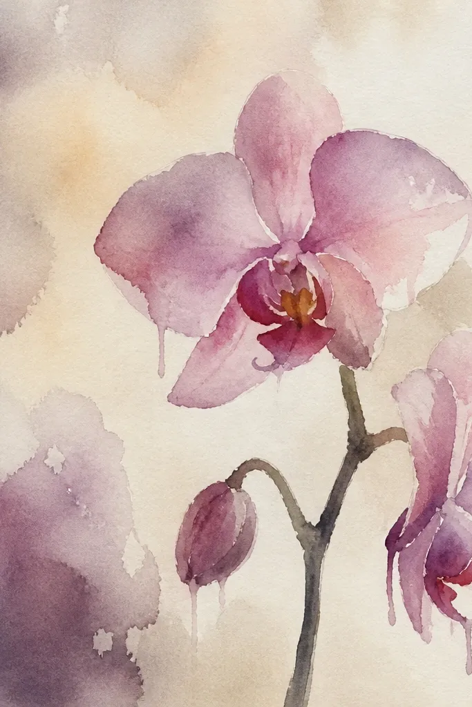
Paint the orchid petals with a light wash first, then load your brush with a deeper pink or purple. Touch the brush to only the outer petal tips where you want drips to start, and pull the brush away so gravity does the rest. Keep your paper slightly tilted so drips fall downward in one consistent direction. While the deeper color is still damp, add a small magenta shadow under the lip fold and a few vein lines with a fineliner once dry. Leave the background mostly blank so the drip detail stands out.
Controlled drips make orchids feel like they’re fresh after rain. I keep the drip only at the petal tips and only in the deeper colors, so the rest stays clean. This gives a natural texture without turning the page into chaos. The lip should stay more defined than the tips — that contrast keeps the drawing readable. This style is fun for art journaling and looks great in small frames because the drips add energy without covering the whole flower.
Common mistakeAvoid dripping on the center lip — it ruins the anatomy and makes it look smeared.
Good to knowPractice on scrap with the same water-to-pigment mix — drip behavior changes fast.
18. Orchid Border Panel for Cards (tight composition)
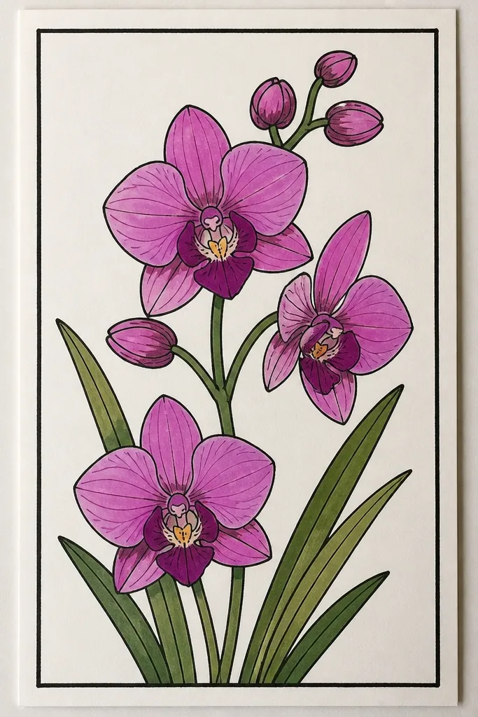
Draw a rectangle border about 8-10 mm from the paper edges. Sketch the orchid so the bloom touches the border on two sides, then crop the outer petals intentionally. Add two small leaf stems in the lower corners using simple curved lines and light green shading. Shade petals with pencil or watercolor but keep the darkest shadows under the lip fold and where petals overlap. Finish by darkening the border line slightly so it frames the orchid cleanly.
Cropping makes orchids look intentional, not tentative. I do this for card art: a thin border line and a cropped bloom so the petal shapes fill the space. Add two tiny leaf stems at the corners to balance the composition without competing with the flower. Use clean edges and keep the veins visible near the lip, then simplify the outer petals where the crop cuts them off. This flatters small formats because it removes blank space and makes the flower look larger than life.
Common mistakeAvoid centering the orchid with lots of empty space — it reads like a worksheet.
Good to knowCrop so one petal edge is cut smoothly at the border — jagged crop lines look accidental.
19. Orchid in Colored Pencil with Burnished Highlights
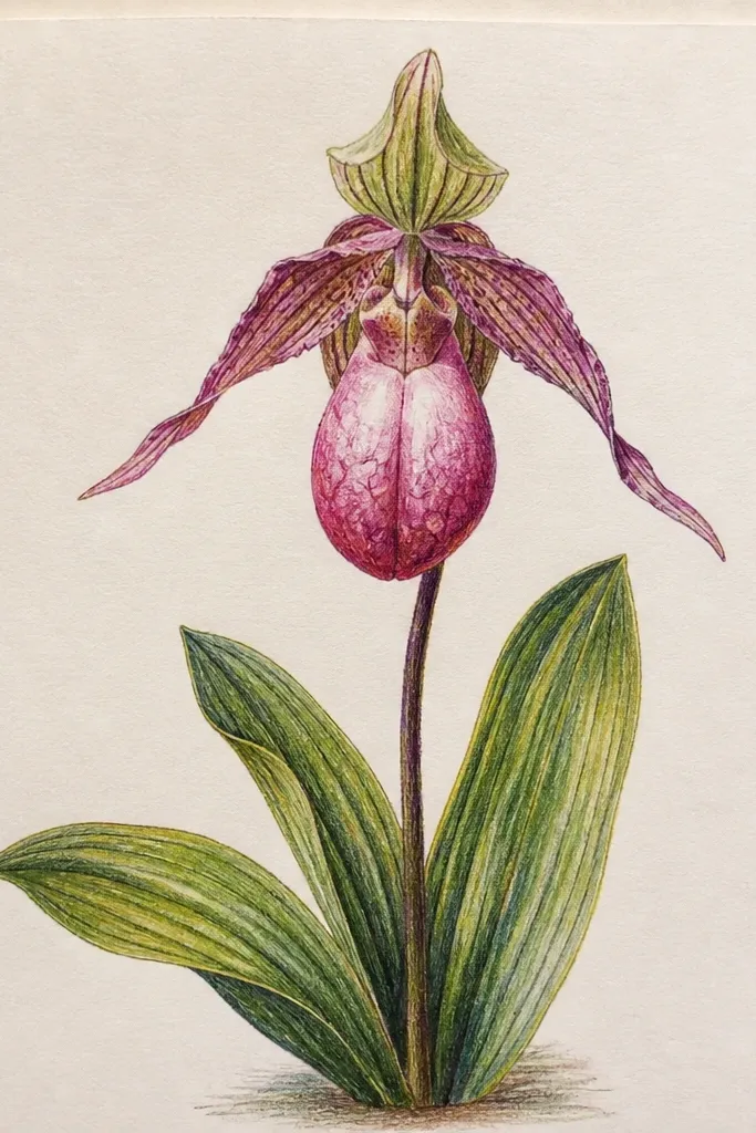
Burnished highlights make colored pencil orchids look polished. I blend the mid-tones first, then I use a lighter pencil and a firmer hand only on the highlight edges. The highlight should be narrow — think 1-2 mm — and follow the petal’s curve. This gives you that “wet petal” feeling without adding paint. This works well for skin tones and eye-catching prints because the contrast is controlled and bright in just a few places.
Layer your mid-tone colors first: dusty pink for petals and a cooler lilac for shadows. Blend with light pressure using a colorless blender or a light pencil, then add darker shadow under the lip fold with a deeper magenta. For highlights, press lightly but consistently with a white or pale cream pencil along the outer petal edges and the top rim of the lip. Finally, sharpen a few vein lines with a slightly darker pencil next to the highlight so the veins look dimensional.
Burnish after the whole flower is blended — trying to burnish too early creates patchy shine.
Avoid heavy pressure everywhere — it makes colored pencil look waxy and dull.
20. Orchid Buds in Cross-Hatching Shadows
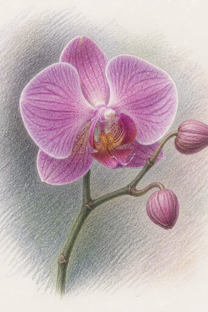
Cross-hatching gives you control without smudging, especially when you’re drawing multiple flowers on one page. I build shadows with hatch lines that follow the petal curve so the shading looks like it wraps around the form. Keep cross-hatching density higher under the lip fold and lower on the top edges. This style looks graphic but still botanical because the hatching direction matches the petal direction. It’s perfect for sketchbook pages where you want speed and consistency.
Outline the orchid and buds lightly, then ink the outer silhouette and the lip fold. Shade the underside of petals using cross-hatching: start with one direction of lines, then add a second direction only where shadows are darkest. Leave the outer third of petals mostly unshaded so the flower stays airy. Add a few vein lines with thin pencil or fineliner, then reinforce only the darkest overlap areas with denser hatching. Erase pencil guides after ink is dry.
Change hatch direction at the petal bend — that bend is where the form turns.
Avoid random hatch direction — it makes petals look flat and messy.
21. Orchid on Black Paper with Chalk Pencils
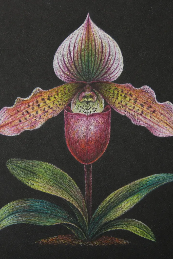
Sketch the orchid in a very light chalk pencil first, then lay down pale lavender on the petals with broad strokes. Add cool pink to the lip, then deepen the fold shadow with a darker purple or muted teal. Use white chalk to draw vein accents and petal edge highlights, keeping those lines narrow and curved. Blend gently with a clean blending tool or tissue — don’t smear too much or you lose the glow. Finish by adding a few extra bright highlights on the lip rim and the outer petal tips.
Black paper makes orchids look dramatic fast. I use chalk pencils or soft pastels because they sit on top and glow against the dark base. Keep your colors icy: pale lavender, cool pink, and a touch of teal in the shadow areas. The central lip needs the brightest highlights because it’s the focal anatomy. This style flatters people who like night scenes or bold stationery because the orchid reads from far away.
Common mistakeAvoid using dark pencil on black paper for highlights — it kills the glow effect.
Good to knowWork in layers and stop when it looks bright enough — chalk can look overdone if you keep adding.
22. Orchid Reference Grid Transfer (clean proportions)
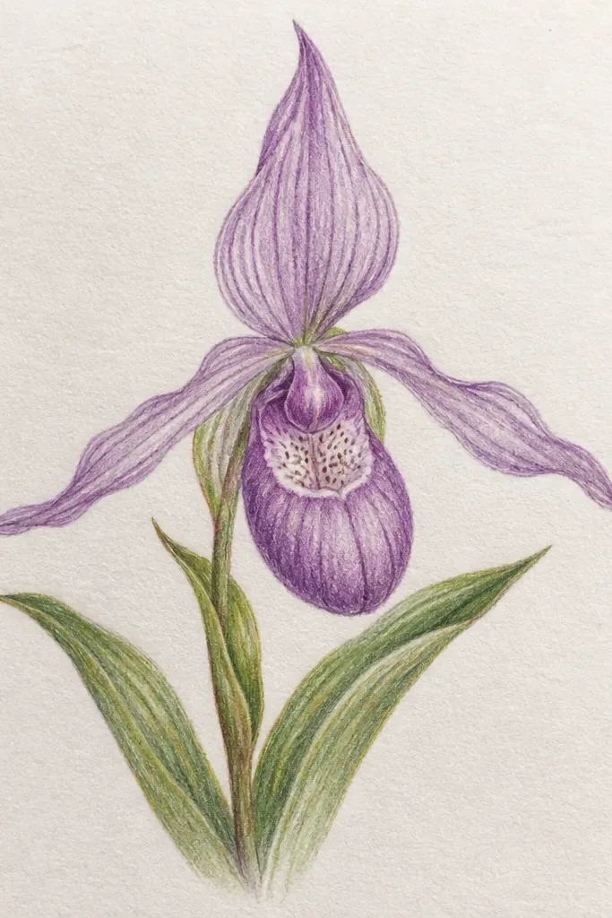
Print or place your reference photo and draw a light grid on it, like 1 cm squares. Then draw the same grid lightly on your drawing paper. Use each intersection to place the central lip first, then mark the top tips of the side petals. Once the structure is in, remove or ignore grid lines and add veins and shadows with your chosen medium. If you’re using watercolor, paint only inside the structure lines and keep washes light at first.
Grid transfer is how I keep orchid proportions from drifting. When you’re drawing a flower with lots of curves, your eye lies about symmetry. I use a simple grid on the reference and then on my paper, which keeps the central lip and side petal angles accurate. After the placement is right, you can relax and focus on the shading and veins. This is also a confidence booster if you’ve struggled with anatomy in the past.
Common mistakeAvoid skipping the placement step and jumping straight to shading — that’s where proportions go wrong.
Good to knowUse a fine mechanical pencil for grid lines — heavy grid lines show through in watercolor.
23. Orchid Veins with White Ink on Color
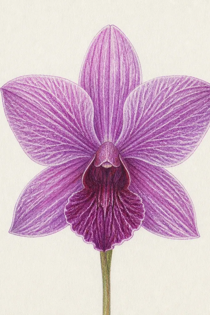
White ink veins turn orchids into something graphic and crisp, like a botanical print. I paint the petals with color first, then I draw veins on top so they look raised. This method hides small vein mistakes because the white line still reads as an intentional structure. Use a limited palette so the white veins don’t look chaotic. It looks great for framed prints and stickers because the lines stay clear even at a distance.
Paint or color the petals first with diluted dusty rose and lavender, keeping the outer edges lighter. Let the paint dry fully so the white ink doesn’t bleed. Then use a white gel pen or opaque white ink with a fine tip to draw vein lines that radiate from the lip base. Add a few thicker white vein marks where the petal thickens near the center, then soften surrounding color with a light colored pencil if needed. Finish with a small darker shadow under the lip fold using a deep magenta pencil.
If your white ink looks streaky, prime the pen on scrap until it flows smoothly.
Avoid drawing too many white veins — three to five strong lines per petal looks more natural than a full network.
24. Orchid in a Fern Frame (natural border)
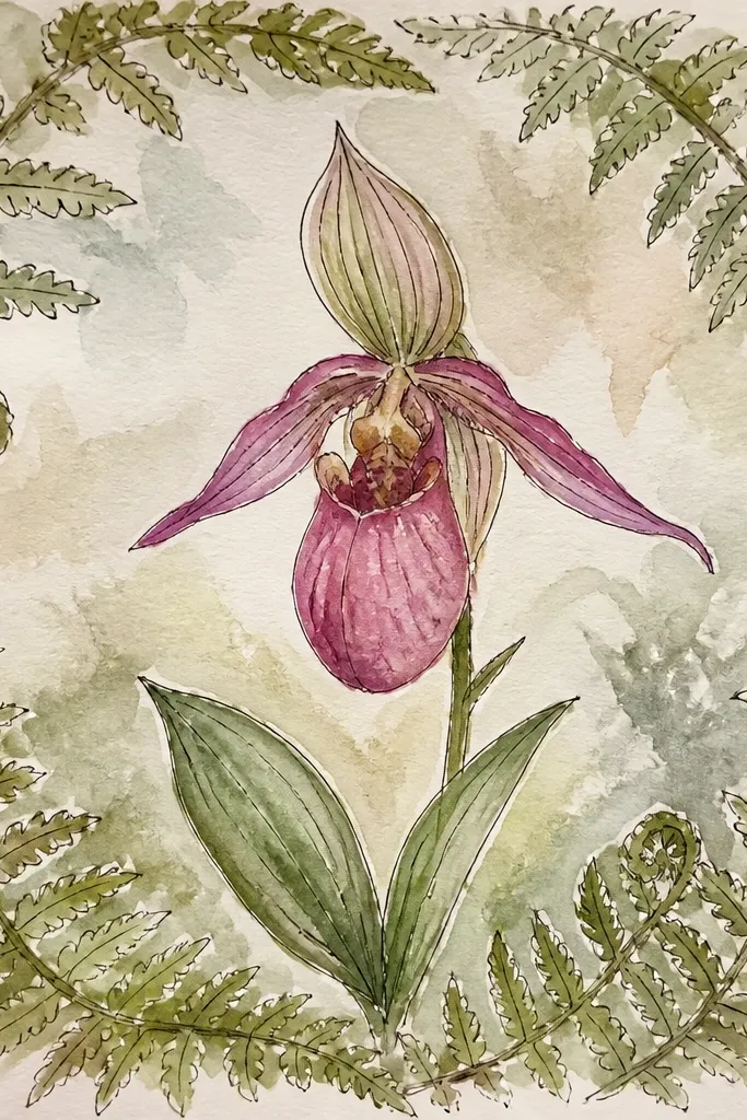
Framing matters more than people think. I use fern fronds because they repeat in a way that feels botanical but doesn’t steal focus from the orchid anatomy. The fern lines create motion around the bloom, which makes the orchid feel like the main subject even when it’s small. Keep fern values lighter than the orchid — the fern should look like a soft background texture, not another focal flower. This style fits wall art and sketchbook spreads because it gives the page structure.
Sketch a loose fern frame around the orchid using curved frond lines that arc inward. Shade the fern lightly with a green pencil and a bluish gray for shadow under each frond crease. Place the orchid in the center and build it with the usual structure: lip fold first, then veins near the center. Keep the orchid petals slightly darker than the fern so the bloom reads as the subject. Finish by adding crisp outline to the orchid outer silhouette and softening the fern edges so it feels atmospheric.
Stop the fern fronds short of the orchid silhouette by a few millimeters so the flower stays clean.
Avoid dark fern shading behind the lip — it competes with the orchid’s fold shadow.
25. Orchid with Pencil Powder Smudge Control
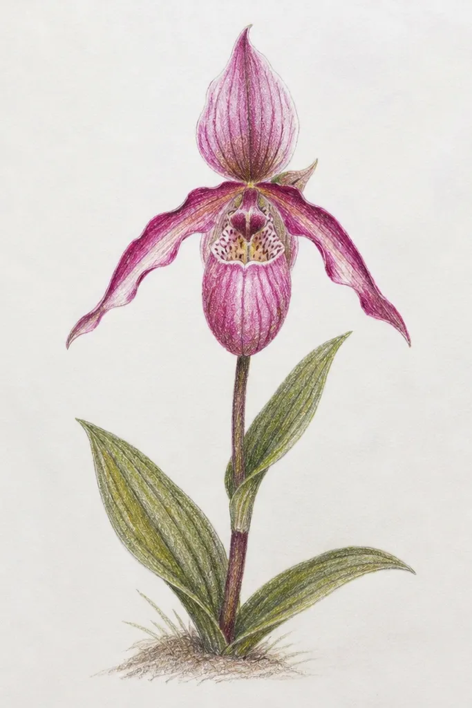
Shade petals with 2B and 4B, then use a small blending stump to smooth only the mid-tone areas. For veins, do not blend over the vein lines — shade beside them so the veins stay visible. For deeper shadows under the lip fold, apply 6B lightly and blend outward just a little with the stump. If you want extra softness, scrape a tiny amount of pencil and tap it into gradients rather than smearing. Finally, sharpen a few vein edges by lightly re-drawing them with a pencil tip.
Smudging can make orchids look soft, but it can also ruin them fast. I do controlled smudging by using pencil powder — not my finger — so I can keep veins crisp. The goal is smooth gradients on the broad petal areas while the veins stay readable as structure. I keep the darkest values only in shadow pockets, then blend outward. This style looks great for larger petals and when you want a painterly pencil effect.
Common mistakeAvoid finger smudging everywhere — it makes veins disappear and the whole flower turns gray.
Good to knowUse a paper towel under your hand when smudging — it keeps graphite from transferring to areas you didn’t shade.