1. Blush Orchid on Warm Linen Paper with Thin Black Frame
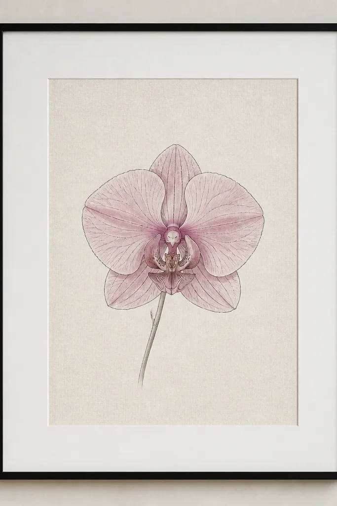
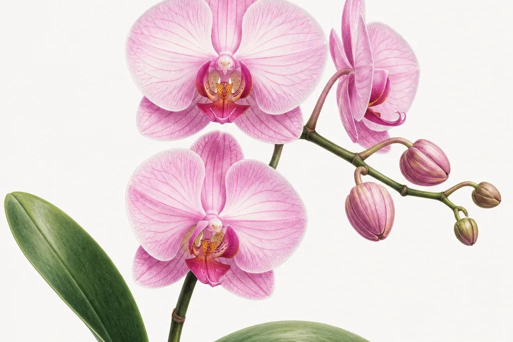
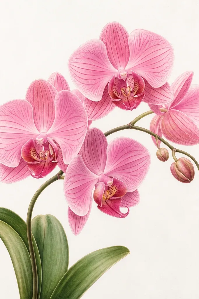
Start by choosing warm off-white paper with a visible linen texture (not glossy). Draw one orchid at about 70% of the paper height, leaving at least 1.5 inches of blank space on all sides. Use a 0.3 or 0.5 fineliner for the outlines, then paint a soft wash in blush pink and mauve, keeping the edges feathered. Next, mount it on a white or slightly warm mat, and frame it in a thin black frame so the contrast stays clean. Finish by hanging it where daylight hits the wall for 1-2 hours so the texture shows through.
I did this one on purpose for a client who kept changing decor seasonally. The warm linen paper makes the pink read creamy instead of neon, and the thin black frame keeps it crisp without looking harsh. I use blush pink for the highlights and mauve for the midtones, then add only a few deep magenta accents near the throat of the orchid. This version flatters light skin tones in photos and works well in bright rooms because the drawing stays readable without getting washed out. It also looks calm on busy shelves because the background texture gives it interest without extra shapes.
Common mistakeAvoid thick, heavy outlines all over — it makes the orchid look like a sticker instead of a drawing.
Good to knowIf your pink looks too loud, dilute your magenta and keep the deepest color only in the orchid center and a couple petal folds.
2. Watercolor Orchid Dip-Dyed Border in Dusty Rose
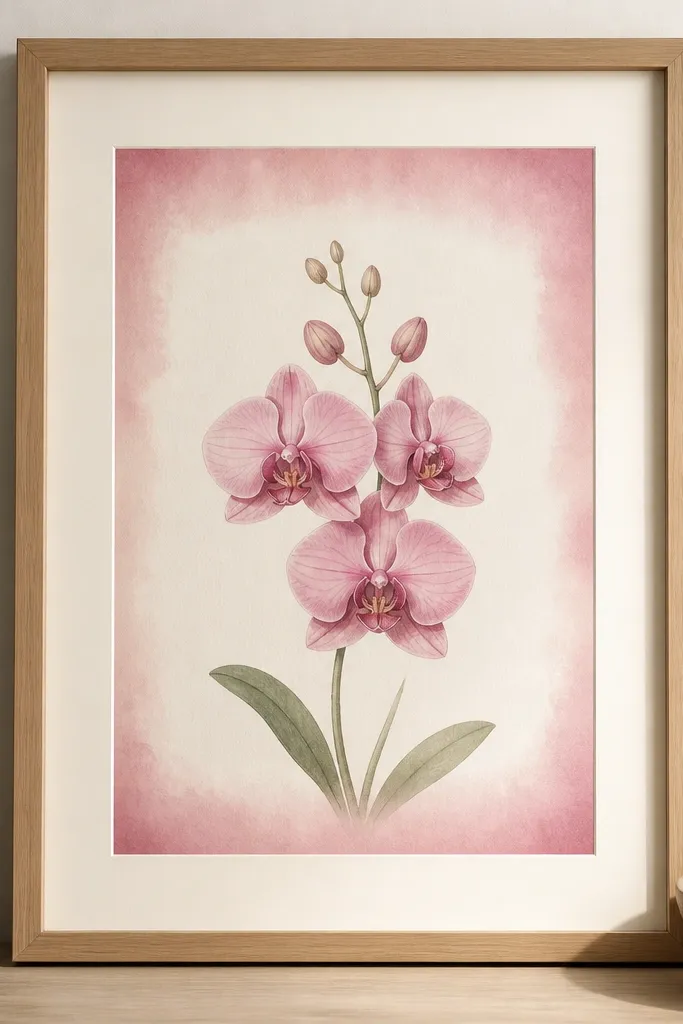
Start with a centered orchid drawing, about 6-7 inches tall if you’re working on an 8x10 or A4-size sheet. Paint the orchid petals with blush and mauve washes, leaving the paper visible in the lightest areas. Then, create the border by wetting the outer edge of the paper lightly and loading dusty rose watercolor at the top and bottom edges so it fades inward. Let it dry flat, then mount with a creamy ivory mat that’s at least 1 inch wide. Frame it in natural wood or oak so the warm tones match the watercolor.
This style is the one I reach for when a room needs softness but you still want the art to feel styled. The orchid sits clean and central, while the dip-dyed border adds a seasonal hint without changing the whole piece. Dusty rose works better than bright pink for evergreen — it reads like old blush instead of new paint. I’ve used this in bedrooms and it looks good next to white bedding and oatmeal throws because the border color echoes textiles. The styling principle is a gradient halo: you add mood around the orchid, not clutter on top of it.
Common mistakeDon’t make the border fully opaque — solid blocks of pink make it look like a craft print.
Good to knowDilute your rose so it fades at least 60% before it reaches the mat opening — that fade is what keeps it timeless.
3. Orchid Trio with One Repeating Leaf Curve
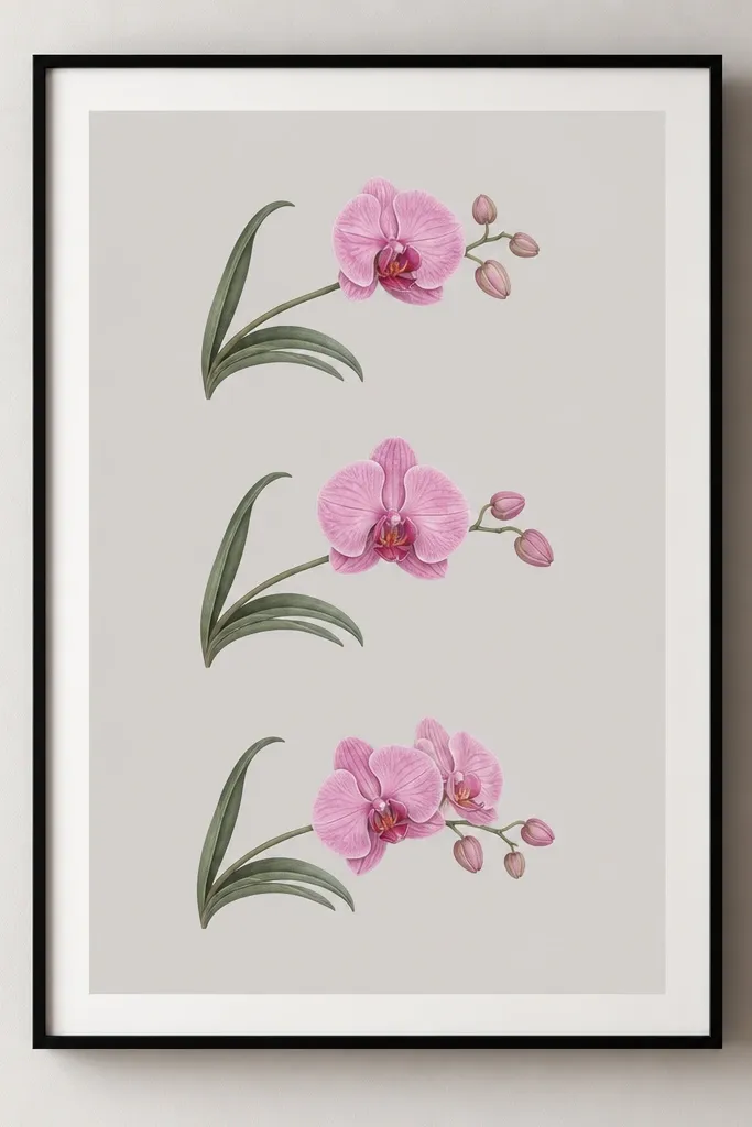
Draw three orchids stacked with consistent spacing — leave about 0.75-1 inch between each bloom. Make the left leaf curve identical on all three drawings, even if the orchid angle changes. Use thin fineliner outlines, then add watercolor washes only on the petals and lip. For the background, wash the paper with very light cool gray so it doesn’t turn the artwork muddy. Mount with a thin mat and frame in black or charcoal to keep the trio crisp.
This is my answer for people who want more than one orchid but don’t want a busy pattern. I keep the orchid trio spaced so each bloom gets its own quiet space, and I repeat only one leaf curve so it feels intentional. The repeating curve is what makes it look designed rather than random — your eye recognizes the shape instantly. I use blush pink and mauve like the first idea, then keep the shadows soft with a watered-down magenta. This flatters cooler interiors because the soft gray background stops the pink from dominating. It also looks great for gallery walls because the three pieces read like one set.
Common mistakeAvoid changing the leaf shape in every drawing — that makes the set look like separate sketches.
Good to knowPick one leaf curve and practice it on scrap paper until it looks smooth in one stroke.
4. One Orchid Corner Sprig with Big Negative Space
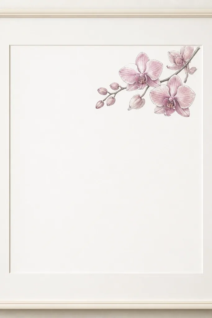
Start by lightly sketching the orchid sprig in the top-right corner, keeping it about 25-30% of the page area. Ink the outline with a fine pen and add mauve shading under the top petals, keeping highlights nearly unpainted. Add a few tiny dots or small leaf marks near the sprig to suggest growth, but keep them sparse. Leave the rest of the page fully blank. Use a wide mat (at least 1.25 inches) and a warm off-white frame so the corner doesn’t feel cramped.
Corner compositions look expensive because they respect space. When the orchid sits in the corner, it feels like a designed detail rather than a full poster. I keep the drawing small enough that you notice it when you walk past, not something you have to search for. The pink stays evergreen because it’s limited — fewer petals means less chance of seasonal loudness. This one works especially well for kitchens and bathrooms where you want wall art that doesn’t compete with cabinets or mirrors. The styling principle is “quiet anchor”: one flower, one place, no border clutter.
Common mistakeAvoid adding a full border around a corner piece — it makes the composition feel boxed-in.
Good to knowIf your corner orchid feels too small, increase only the lip and throat details — that’s where the eye lands.
5. Pink Orchid Drawing with Graphite Shading Background
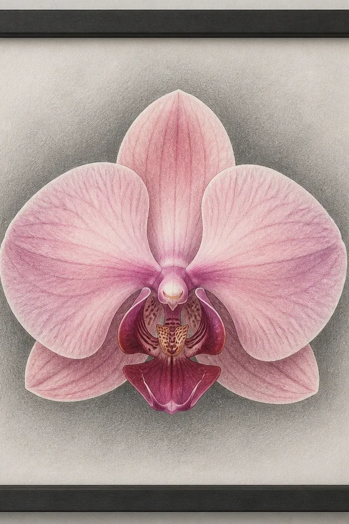
Graphite behind the orchid gives you depth without adding more color. I’ve used this when someone wants a more modern, less “watercolor-y” look but still wants the pink to feel dreamy. The graphite gradient makes the orchid pop and keeps the palette grounded, so it stays evergreen even in darker rooms. Blush highlights still feel light, while the gray background stops the pink from looking flat. It also photographs well because the gradient creates a gentle contrast you can’t get with plain white paper. The principle is value control: you let gray do the heavy lifting for dimension.
Start with a toned paper base — plain white is fine, but I prefer slightly textured hot-press paper for smoother graphite blending. Shade a soft oval or vertical gradient behind the orchid using a 2B pencil and a blending stump, keeping the edges feathered. Draw and ink the orchid on top, then add blush and mauve washes only on the petals and lip. Place deep magenta only in the throat and a couple folds so the center reads dimensional. Frame with a charcoal or dark gray frame and a thin mat so the graphite gradient feels intentional.
Test your graphite gradient on a scrap first — if it’s too dark, the pink will look tired.
Don’t smudge over wet watercolor — it turns into gray-brown streaks.
6. Orchid Bloom Inside a Thin Gold Foil Oval
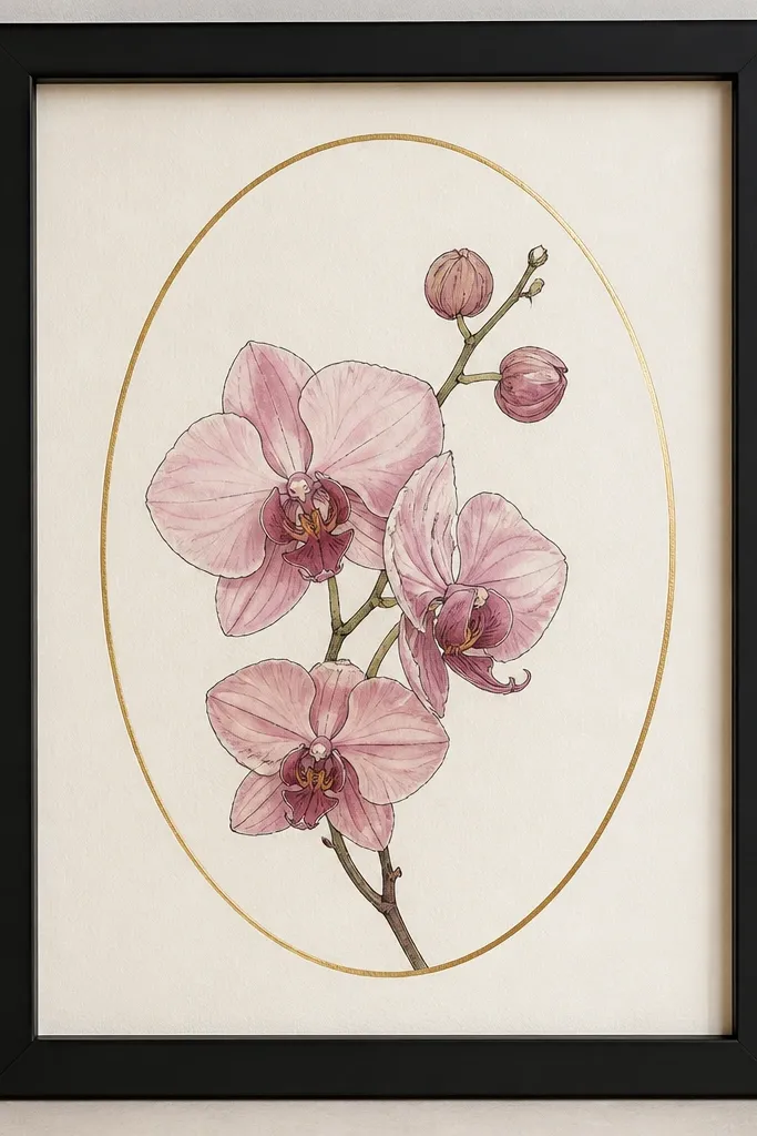
Start by drawing the oval border lightly in pencil, about 1 inch away from the orchid edges. Ink your orchid first, then paint blush and mauve washes, keeping the throat lip more saturated. Apply gold foil using a fine-adhesive foil pen or gold foil transfer adhesive — follow the oval line only. Let it set, then mount on a warm off-white mat. Frame in matte black so the gold stays classy instead of flashy. Hang at eye level so the gold catches light as you pass.
Gold foil makes the orchid feel finished, but only if you keep it minimal. This oval border works year round because it doesn’t scream “holiday” — it’s just a shape that frames the bloom. The gold catches light in a gentle way, so the pink looks more luminous without adding extra colors. This style flatters warm undertones in living rooms and looks great with brass lamp bases and light wood furniture. The principle is one reflective detail: a small amount of gold plus controlled pink shading.
Common mistakeDon’t add gold accents to the whole orchid — that’s where it starts looking like a craft kit.
Good to knowUse a smaller oval than you think — gold looks best when it’s a quiet frame, not a giant ring.
7. Monoline Orchid with Mauve Wash on White Matboard
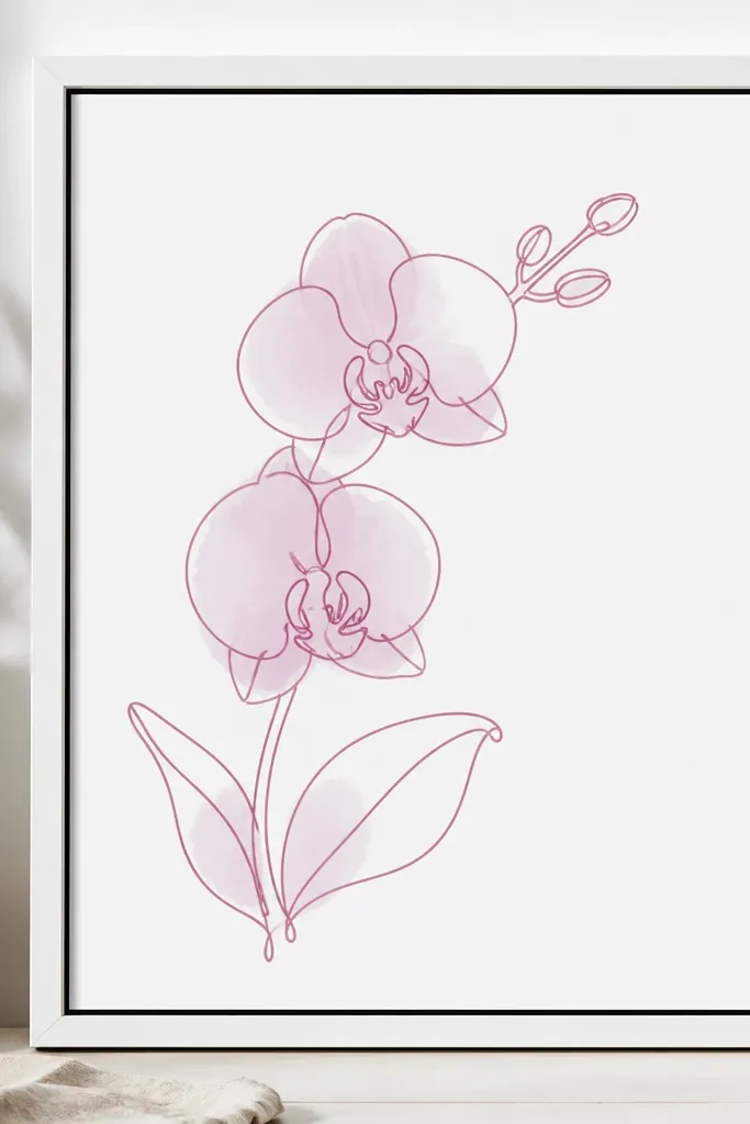
Start on white matboard or thick watercolor paper so the wash sits smooth. Draw the orchid with one line weight — a 0.3 or 0.5 pen — and avoid any thicker “decorative” strokes. Add a light mauve wash under each petal, leaving the top highlights mostly unpainted. Keep the throat details in slightly darker mauve, then deepen with a tiny touch of magenta. Mount with a crisp white mat and frame with white trim and a thin black inner edge for definition.
If you like clean walls, this is the style that never feels busy. Monoline outlines keep the drawing modern, and the mauve wash adds softness without flooding the page. I use just two values — mauve midtones and blush highlights — so the orchid reads calm. It flatters minimalist interiors and works with both cool and warm color palettes because the paper stays neutral. The styling principle is constraint: one line weight plus one soft wash keeps it evergreen.
Common mistakeAvoid using multiple pen sizes — mixed line weights can make it look unfinished.
Good to knowLet the wash dry between layers so you don’t get tide marks on the petals.
8. Orchid Drawing Set for a Shelf - Three Small Sizes, Same Palette
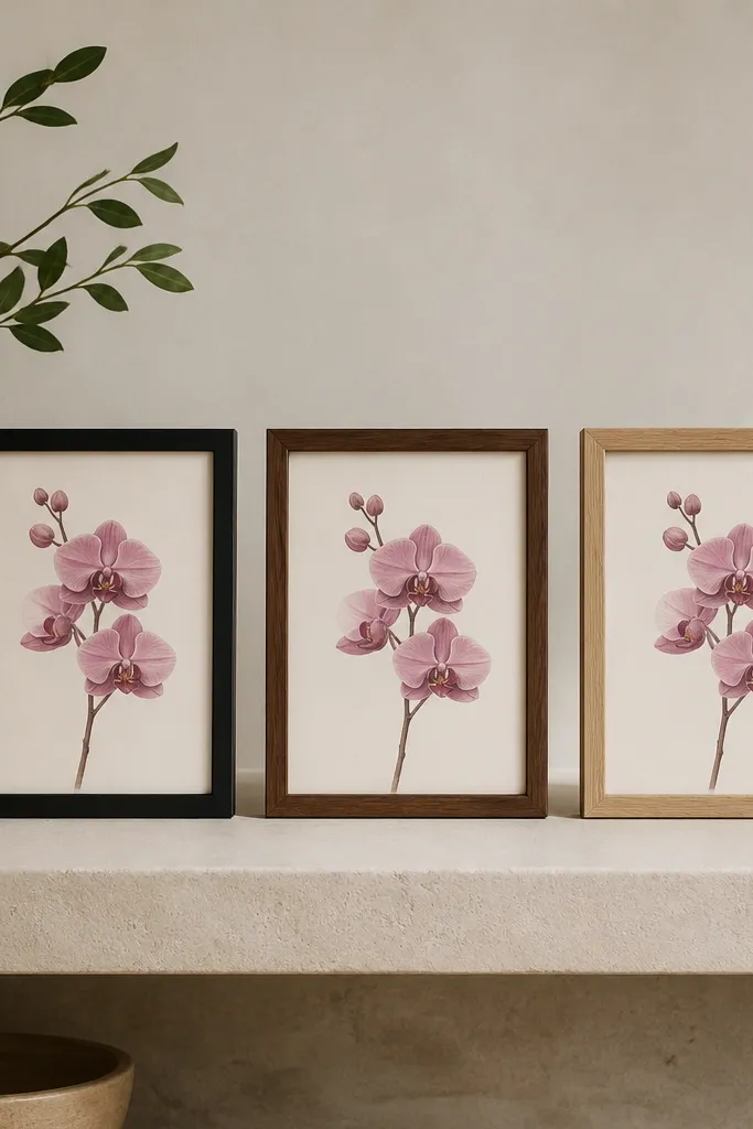
Make three pieces: one 5x7, one 6x8, and one 8x10, each with the orchid centered and surrounded by wide negative space. Use the exact same blush-mauve-magenta ratio in all three so the set looks like one design. Keep the background either warm off-white or very light cool gray across all sizes. Frame each with a different wood or black finish, but keep the mat style consistent. Place them on a shelf with at least 2-3 inches between frames so the eye can separate them.
Shelf sets are where seasonal evergreen really shows. I’ve tested this with clients who change pillows and throws constantly — the orchid trio stays consistent because the palette and spacing match across sizes. Use three scales so it looks intentional, not random. The pink reads “soft spring” in daylight and “cozy winter” under warm bulbs because the mauve shadows deepen the color. This style flatters rooms with lots of small objects since the drawings have clean edges and calm backgrounds. The principle is scale rhythm: same composition, different sizes.
Common mistakeDon’t mix wildly different backgrounds (warm vs gray) across the set — it breaks the evergreen feel.
Good to knowLabel the back of each frame with the paper type and date — you’ll thank yourself when you reorder.
9. Orchid Drawing on Peach-Tinted Paper with Charcoal Details
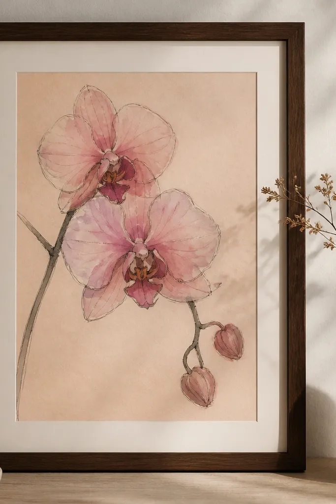
Peach paper changes the whole mood. Instead of looking like a pink-on-white print, the orchid feels like it belongs in warm interiors and late-afternoon light. Charcoal details keep the drawing grounded so it doesn’t go too sweet. I’ve used this in rooms with beige walls and warm wood furniture — the peach tint makes the orchid look naturally integrated. The pink reads more muted, which is exactly what keeps it evergreen. The principle is undertone matching: warm paper + cool gray lines gives you balance.
Start with peach-tinted paper or a watercolor paper you’ve toned with diluted peach wash. Draw the orchid with charcoal or a charcoal-gray pen, keeping linework thin. Paint blush highlights directly into the paper’s warm base and layer mauve washes in the petals' shadow areas. Add deep magenta only at the orchid lip center so it looks dimensional. Mount on a cream mat and frame in espresso wood so the warm tones look intentional.
If your peach paper is too orange, reduce your magenta saturation and increase blush highlights to keep it soft.
Avoid bright neon pink on tinted paper — it makes the whole piece look cheap fast.
10. Orchid + Tiny Butterflies in Blush Ink (Ultra Subtle)
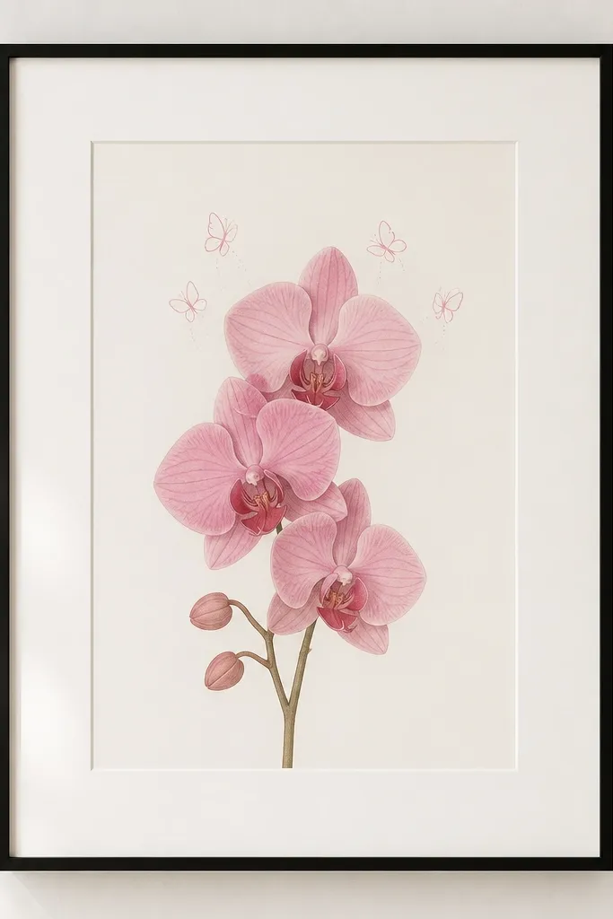
I love this when someone wants “a little life” but hates busy art. The orchid stays the star, and the tiny butterflies add movement without turning it into a themed kids' print. Blush ink for the butterflies keeps the palette consistent and evergreen. It looks great in nurseries too, but it also works in adult spaces because the butterflies are minimal. The principle is micro-motif: one small secondary element that never competes with the main flower.
Draw the orchid first, centered and about 65-70% of the paper height. Ink the orchid with thin lines and paint blush and mauve washes, keeping the throat details deeper. Add 3-5 tiny butterflies near the top of the orchid only, using blush ink and simple wing lines and a dot body. Leave plenty of blank space around them so they feel airy. Mount with a wide white mat and thin black frame so the butterflies don’t get lost.
Place the butterflies where the orchid’s top petals already create a visual curve — it makes the motion feel natural.
Don’t draw detailed butterfly wings — that pulls attention away from the orchid.
11. Orchid Drawing with Stenciled Leaf Texture in Pale Sage
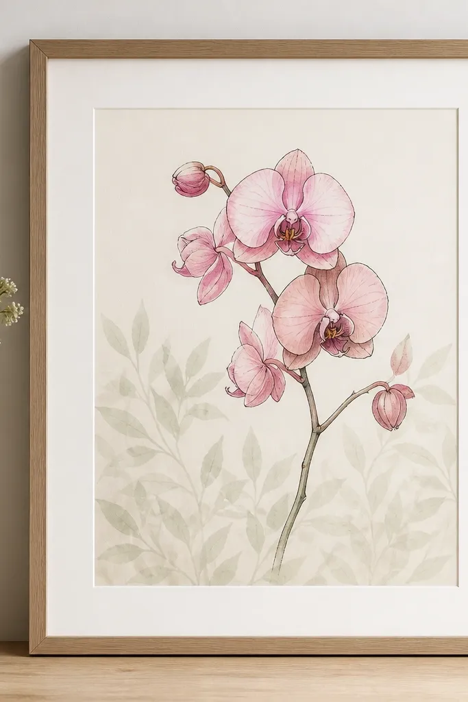
Start with a clean orchid drawing centered. Paint petals with blush and mauve washes, then add deep magenta only in the throat. For the background, use a small leaf stencil and pale sage craft paint, watered down to a milky consistency. Stencil only the lower half of the paper, keeping it faint and uneven so it doesn’t look like wallpaper repeat. Let it dry fully, then mount on warm white mat and frame in light oak.
This is the one I do when a room feels too blank. Pale sage leaf texture gives you depth like wallpaper, but it stays subtle enough to keep the orchid dreamy. I keep the texture light so the pink doesn’t fight it. Pale sage also makes the orchid feel fresh without leaning spring-only. This style looks good in dining rooms because the sage pattern adds calm movement while the orchid anchors it. The principle is background texture that stays under the main subject.
Common mistakeAvoid fully opaque sage texture — it turns into patterned decor instead of art.
Good to knowTest the stencil opacity on scrap paper — you want it barely visible unless you look close.
12. Orchid Drawing with Handmade Deckle-Edge Border
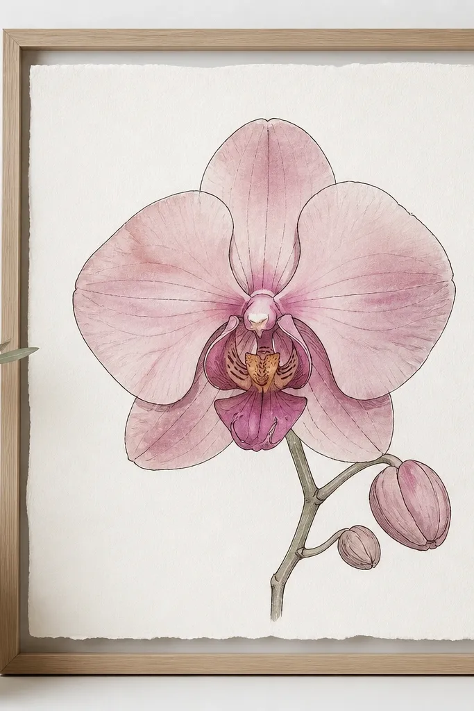
Start with watercolor paper that already has deckle edges, or create a handmade deckle effect by tearing a strip and trimming inconsistently around it. Center the orchid with enough breathing room so the deckle edge can frame it naturally. Ink thin outlines, then add blush and mauve washes with soft edges. Keep the throat magenta minimal so it doesn’t look like a stain. Frame with either a thin natural wood frame and a very light mat, or no mat if the deckle edge is the hero.
Deckle edges make the piece feel handmade and timeless. I don’t use them for everything because they can look messy if the drawing is too loud, but paired with a calm orchid it looks intentional. The orchid stays evergreen because the deckle edge doesn’t add color — it adds texture and softness. This works best for people who like artsy, slightly imperfect things but still want their wall art to look neat. The principle is texture-only framing: you let paper edges do the styling.
Common mistakeAvoid heavy borders around deckle edges — it can look like you’re hiding imperfections.
Good to knowIf you’re using no mat, use glass that reduces glare so the deckle texture still shows.
13. Pink Orchid Drawing with Dotted Halo Background
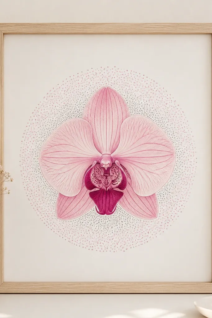
Draw and paint the orchid first, centered and about 60-65% of the page height. Outline with thin fineliner, then wash petals with blush and mauve. Mix light pink ink or watercolor and use a fine brush or dip pen to dot around the orchid in a loose circle, leaving gaps so the paper still shows through. Add a few gray dots to ground the glow behind the leaves. Mount with a simple mat and frame in pale wood so the dots look airy.
Dotted halos are my go-to for dreamy without turning into glitter art. The dots create depth and a gentle glow effect, and because they’re small and spaced, they don’t overwhelm the orchid. I use light pink and a touch of gray so the halo feels atmospheric rather than childish. This style looks great in entryways because it catches attention without being loud. It also flatters warm lighting — the dots make the drawing feel softly lit even on cloudy days. The principle is pointillist mood: you add sparkle as structure, not decoration.
Common mistakeAvoid dense dots all the way to the edges — it makes the piece look like a background pattern.
Good to knowKeep your dot size consistent — vary only the spacing, not the dot diameter.
14. Orchid Drawing on Black Paper with Blush Highlights
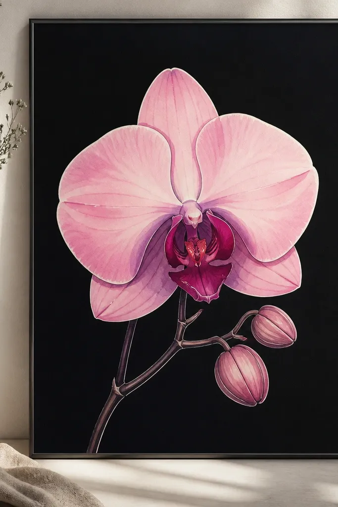
Black paper makes pink look like it has light behind it. I did this for a client with dark wood cabinets, and it instantly made the orchid feel modern and expensive. The key is that you don’t try to paint everything dark — you use blush and mauve as luminous layers. Deep magenta in the throat reads like depth and shadow, not just color. This style is the least “seasonal” because it doesn’t depend on daylight; it already looks dramatic under warm bulbs. The principle is contrast reversal: light pink becomes the highlight, not the midtone.
Start with black watercolor paper or black cardstock that accepts watercolor. Sketch the orchid lightly, then ink with a white gel pen or opaque white ink for crisp outlines. Paint blush highlights on the petal ridges and use mauve for midtones, letting the black paper show through for shadows. Add deep magenta at the lip and a couple folded petals so the center looks dimensional. Frame with minimal mat or a very thin mat so the black background stays visible.
Use opaque white ink for outlines; pencil lines disappear on black and you’ll lose control.
Avoid transparent pink washes on black — they look dull and gray.
15. Orchid Drawing with Soft Pink Wash Background and No Border
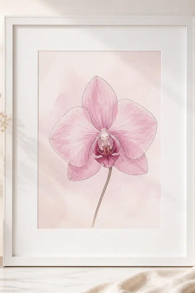
Start by washing the background with a very diluted blush pink — you want almost-paper-colored, not a full pink sheet. Let it dry fully. Draw and ink the orchid on top using a darker mauve or brown-black pen so it stands out. Paint petals in blush and mauve, keeping the throat a touch deeper with magenta. Use a thick white mat so the pale pink doesn’t blend into the frame, and frame in white or light walnut.
This one is deceptively simple. A soft pink wash background makes the orchid look like it’s floating, and because the wash is pale, it reads evergreen instead of romantic-only. I keep the background close to the highlight color, so the orchid doesn’t clash with its own palette. This style works well for bedrooms and calm living rooms because it feels gentle. The principle is tonal harmony: you keep everything in the same family of pinks and let linework separate the shapes.
Common mistakeAvoid painting a thick pink background band behind the orchid — it makes the whole piece look flat.
Good to knowIf the background looks too strong, wipe it gently with a damp brush while it’s still wet.
16. Orchid Drawing with Faux Dry-Brush Texture Corners
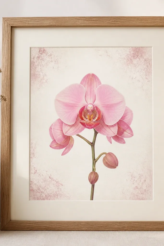
Dry-brush corner texture keeps the drawing from feeling sterile. I like it for people who want texture but don’t want a full background wash. The corners add visual interest and a handmade feel, while the center stays crisp so the orchid remains the focus. This style is evergreen because the speckling is subtle and doesn’t introduce new seasonal colors. It also looks great with neutral decor — greige walls, cream curtains, light oak furniture. The principle is “texture at the edges”: you add artfulness where your eyes rest, not where it competes.
Start with a clean orchid drawing centered and about 65% of the paper height. Ink thin outlines, then watercolor petals with blush and mauve. For corners, load a dry brush with very diluted mauve and tap or drag lightly in each corner, keeping the texture small and airy. Add a few tiny magenta specks only in the top corners so it echoes the orchid center. Mount on a cream mat and frame in natural wood to keep it warm and handmade.
Use a brush you don’t mind ruining — dry-brush texture needs old bristles.
Don’t spread the speckling across the whole page — it turns into noise.
17. Two-Orchid Mirror Composition with Center Vertical Spine
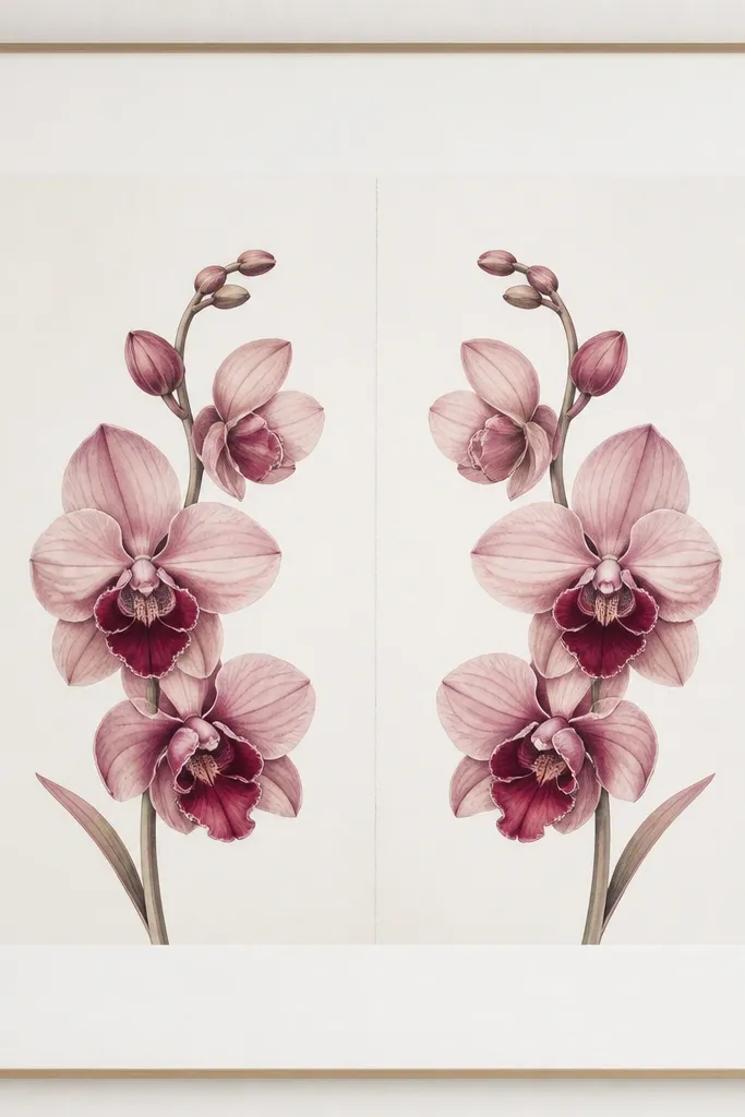
Draw a light vertical guide line down the center of your paper. Sketch one orchid first, then mirror it so the petal angles match — keep both orchids the same size. Ink with thin lines, then paint blush and mauve washes on both sides, keeping the magenta throat accents consistent. Add a few matching leaf strokes near the bottom so the composition feels grounded. Mount with a wide white mat and use a frame with clean edges, like black metal or white wood.
Mirror compositions look calm because your eye can predict the shape. I use this when I want the orchid to feel architectural, not just floral. The vertical spine line keeps the symmetry from feeling random, and it makes the pink look balanced on both sides. This style works especially well for slim walls and narrow frames because the symmetry guides attention. It flatters people who like structured decor — it looks good next to straight-line furniture. The principle is symmetry with a soft center: mirrored blooms plus a quiet spine.
Common mistakeAvoid uneven magenta amounts between the two orchids — that breaks the mirror effect.
Good to knowIf one side looks heavier, fix it by adjusting only the leaf shadows, not the petal outlines.
18. Orchid Drawing with Blush Ribbon Banner (Hand-Lettered Title Space)
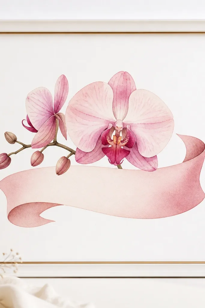
This style is great for people who want to personalize later without repainting the whole artwork. The ribbon shape adds movement and keeps the orchid from feeling like a standalone sketch. I keep the ribbon gradient subtle so it doesn’t compete with the petals. You can add a date, a name, or a short phrase in neat handwriting, but leaving it blank still looks finished. It stays evergreen because the ribbon is a neutral motion shape, not a holiday theme. The principle is functional styling: add a place for small personal details.
Start with an orchid drawing centered and slightly below the midpoint so the ribbon can sit behind the top half. Paint the orchid petals in blush and mauve washes, then add deep magenta in the throat. Draw the ribbon banner behind the orchid using a light blush pencil guide, then paint it with a gradient from blush to pale rose. Keep the ribbon edges soft and slightly uneven so it looks hand-done. Frame with a white frame and a thin gold inner edge, and leave the banner area clean for your handwriting.
Use a pencil guide for your lettering later — don’t commit ink until you know the spacing.
Avoid thick, dark ribbon outlines — they make it look like clip-art.
19. Pink Orchid Drawing on Grid Paper with Clean Margins
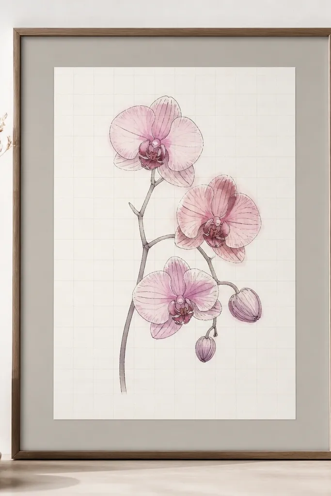
This one feels modern and oddly cozy. The grid paper gives you a built-in structure, which makes the orchid look intentional even if your painting isn’t perfect. I like it for small sizes because the grid lines help the composition stay crisp. The pink reads evergreen because the palette is still blush and mauve, and the grid is neutral. It also looks great in home offices because it matches the “organized” vibe without being sterile. The principle is structure under art: let the grid do the discipline.
Use grid paper that’s subtle (gray lines, not dark). Draw the orchid centered with lots of negative space, leaving clean margins of at least 1 inch. Ink with a fine pen and keep linework consistent. Paint petals in blush and mauve, letting the paper show through for highlights. Keep the grid visible around the orchid by using a gray mat and a minimal frame so you don’t hide the structure. Place it where desk light or window light hits so the grid lines are noticeable but not distracting.
If the grid lines are too strong, lightly erase them with a kneaded eraser before painting.
Avoid heavy watercolor over the grid — it can blur the structure and look messy.
20. Orchid Drawing with Pressed-Foil Flower Accent on the Lip
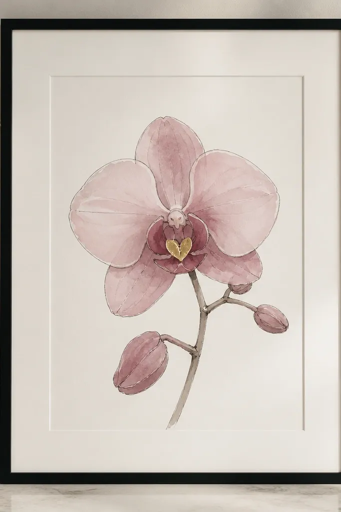
Metallic accents can go tacky fast, so I keep it tiny and placed exactly where the eye already lands — the orchid lip. A small pressed-foil accent makes the center look dimensional without changing the palette. This style feels evergreen because it’s a detail, not a theme — no glitter border, no metallic frame everywhere. It looks amazing under warm lighting because the foil catches highlights like a real bloom. The principle is micro-luxury: add one reflective point at the focal spot.
Draw and ink the orchid first, then paint the petals with blush and mauve washes. Leave a small area in the orchid lip center slightly unpainted or lightly painted so foil adheres better. Apply tiny pressed-foil pieces using foil adhesive or a dab of tacky medium, then press gently for a clean edge. Seal lightly with a protective spray made for paper if your foil needs stability. Mount with a wide mat and frame in black so the metallic accent stands out against neutral surroundings.
Work under a bright lamp and angle the paper — you’ll see where foil sticks and where it needs a second press.
Avoid applying foil across multiple petals — it turns into a metallic sticker look.