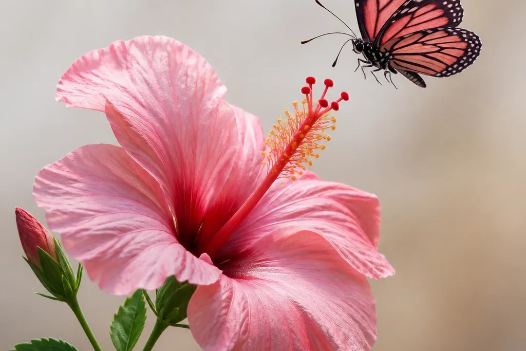
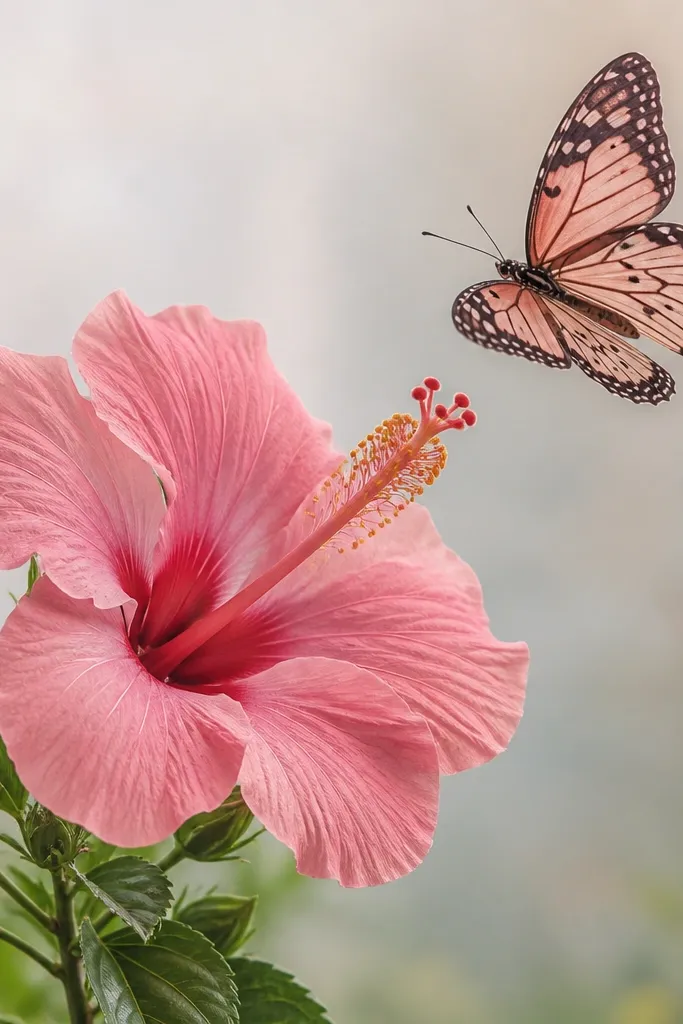
1. Sunrise Hibiscus with Side-Gliding Monarch Butterfly
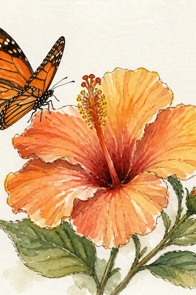
This idea is bold and graphic. The hibiscus petals are shaded with a sunrise gradient: peach at the base of each petal, then coral-pink toward the edges, and a faint warm glow around the center. The butterfly uses orange with crisp black vein lines so it pops against the lighter background. I like it on light paper (cream or watercolor paper) because the wash spreads gently and keeps the edges soft. This style looks especially good for medium skin tones and warm undertones because the orange-yellow center reads like sunshine, even in a small drawing.
Start by drawing the hibiscus first, then place the butterfly so its body points toward the center of the flower. Outline petals with a 0.5 fineliner, then fill each petal using a brush pen — keep the base darker and blend lighter as you move outward. Add the butterfly wings last: keep the wing outline thin and add vein lines with a 0.3 pen. Finally, paint a thin background sunrise wash behind everything, staying lighter behind the butterfly so it stays crisp. Let the background dry fully before you add any final gel pen highlights on petal edges.
Use a white gel pen to place one tiny highlight on the top edge of two petals. It makes the hibiscus look glossy without repainting the whole flower.
Avoid using the same line weight for butterfly and hibiscus — it makes the butterfly look glued to the page.
2. Tropical Hibiscus Frame with Butterflies in the Corners
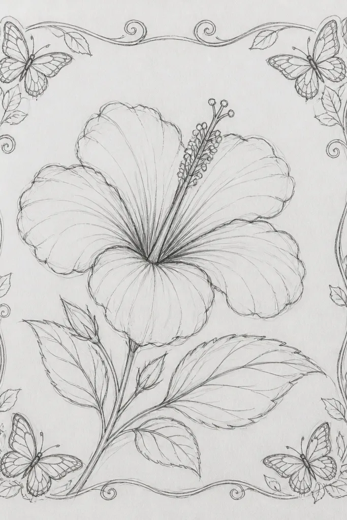
This one looks like a finished card design. The center hibiscus is strong and simple, while the corner butterflies create a balanced frame that feels intentional. I use deep magenta petals with a lighter pink wash on each petal crease, so the folds show even if you’re not great at blending. The butterflies are smaller and drawn with thinner lines than the hibiscus, so they feel like they’re hovering rather than competing. This layout works well for rectangular frames and for people who want their art to look “organized” instead of busy.
Draw a centered hibiscus first and keep it slightly taller than it is wide. Add stamens as short, repeated lines radiating from the center, then color petals with magenta at the base and lighter pink at the outer edge. Next, place one small butterfly in each corner, angled slightly toward the center — wings should never touch the page edges. Add a mint background wash, then sprinkle a few tiny speckles with a toothbrush flick (hold it 8-10 inches away). Finish by adding a few thin white highlights along the hibiscus petal folds.
Good to knowIf your corner butterflies feel too heavy, reduce the body size and keep the wings mostly patterned with lines, not filled color.
Common mistakeDon’t fill the background too dark — it makes the corner butterflies disappear.
3. Single-Petal Close-Up with Butterfly Landing on the Stem
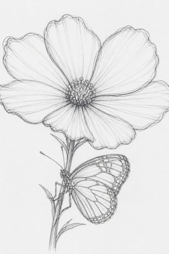
This is the most forgiving style if you struggle with full flower proportions. By focusing on one petal, you can make the shape look dramatic without worrying about every petal symmetry. The butterfly landing on the stem gives you a clear story: it’s not floating randomly. I keep the background mostly white so the petal texture and vein detail stand out. This looks great for people who like minimal art or want something that fits small frames, because the drawing reads from close range.
Sketch the stem curve first, then draw one petal that arcs outward from the stem. Outline the petal with a 0.5 fineliner, then add one clear vein line slightly off-center with a darker pink brush pen. Fill the petal in layers: lighter pink on the flatter areas, deeper pink at the petal base and along the vein. Place the butterfly at the stem bend so the body touches the stem line — wings should extend outward but not cover the whole petal. Add a few light pencil specks around the landing spot and then trace over them with a faint pink wash for a soft texture.
Good to knowKeep the butterfly wing pattern sparse: 5-7 vein lines per wing looks cleaner than full heavy filling.
Common mistakeAvoid coloring the background — the close-up needs breathing room.
4. Watercolor Bleed Hibiscus with Semi-Transparent Butterfly
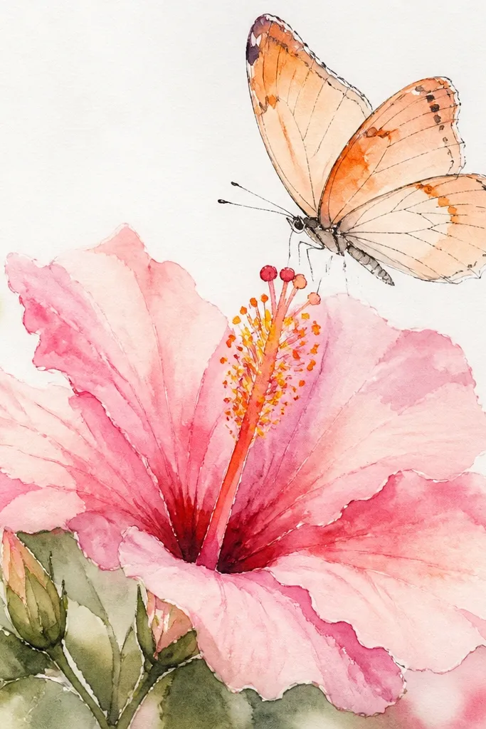
This style looks like it was made in real time with wet paint, and it hides small drawing mistakes. Hibiscus petals are done with watered-down pink so edges blur naturally, while the butterfly is lighter and slightly “washed” so it feels like it’s hovering. I like this for beginners because you don’t need perfect smooth blends; the pigment bloom does the work. The translucency also flatters the composition because your eye moves from center stamens to butterfly without getting stuck on hard outlines.
Start with light pencil sketch lines, then outline only the hibiscus center and major petal edges using a fine waterproof pen. Wet your brush lightly and apply diluted pink paint in petal sections, letting colors bloom at the petal folds. For the butterfly, use the same orange paint but water it down so the wing pattern reads faintly. Drop a few tiny yellow dots near the hibiscus center to mimic pollen. Let everything dry completely, then add a few crisp line accents with gel pen on the butterfly veins.
Use cold-press watercolor paper if you want consistent blooms. Smooth paper makes washes streak.
Don’t outline the butterfly thickly in this style — it kills the translucent look.
5. Black Ink Hibiscus with Neon Butterfly Accent
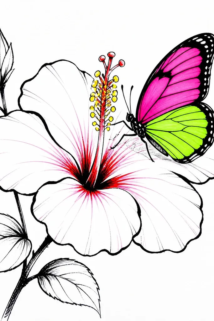
If you want your art to look like a print from a shop, this is it. The hibiscus stays mostly black-and-white with only selective color in the center and petal crease shadows. Then the butterfly gets neon accents, which makes it feel like it’s lit from behind. I’ve used this combo on sketchbook covers and it always gets comments because the contrast is obvious and clean. It also works for anyone who prefers sharp lines and graphic shapes over painterly softness.
Draw the hibiscus with bold ink outlines first, then add a few petal crease shadows using a light gray wash or very diluted black ink. Color only the center stamens and a small portion of the petal folds with warm yellow and a touch of red. Next, draw the butterfly on top of one petal so it overlaps slightly — overlap makes it look intentional. Add neon green to the wing base and neon pink to the outer wing edges, keeping the vein lines black and thin. Finish by adding a thin white gel pen highlight along the neon wing edge for a “glow” effect.
Good to knowIf neon markers look streaky, layer two thin coats instead of one heavy coat.
Common mistakeAvoid coloring the entire hibiscus in neon — it turns the piece into a mess fast.
6. Hibiscus and Butterfly in a Circle Mandala Layout
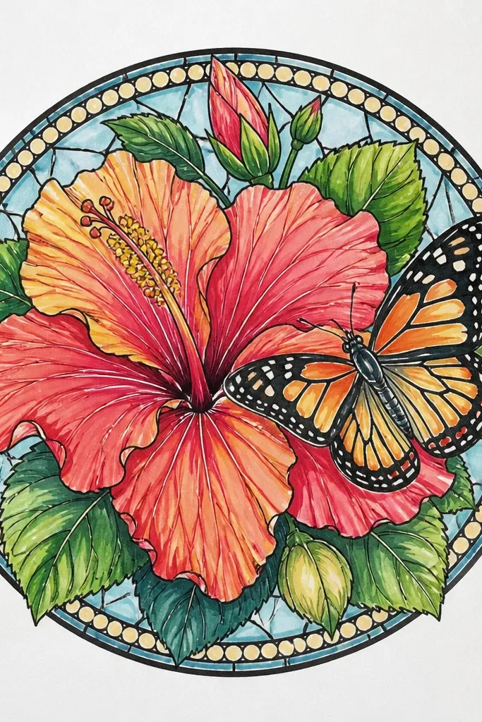
Mandala-style layouts make the hibiscus and butterfly feel like part of a bigger system. The circle gives you a natural boundary, so you don’t need a complicated background. I use a centered hibiscus with simplified petal shading, then add small leaf and petal repeat patterns in the ring to create rhythm. The butterfly sits slightly above center, wings angled so they follow the circle curve. This looks great for larger paper sizes and for anyone who wants their art to feel calm and deliberate.
Draw a faint circle guide first, then place the hibiscus in the center. Outline petals with a fine pen, then color with two pink tones — light on the outer petal area, deeper on the folds. Add a small warm yellow dot cluster at the center and draw stamens as tiny straight lines. Place the butterfly hovering at about the 12 o’clock position, wings angled left and right so they echo the circle. Finally, fill the ring with repeating leaf shapes and small dot accents using green and pale yellow, then add a thin darker outline on the ring motifs.
Use a compass or trace a bowl for the circle guide. The whole design looks sharper when the ring is clean.
Don’t crowd the ring with too many motifs — leave at least 1/4 inch breathing space between repeats.
7. Pastel Wash Hibiscus with Butterflies and Doodle Vines
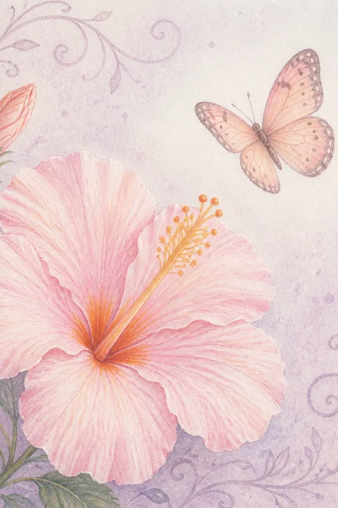
This is the “tea-time” version of hibiscus art. Pastel washes make the petals look airy, and the doodle vines keep everything from feeling too floating. I draw the vines with a thin brown or gray pen so they don’t steal attention from the hibiscus. The butterfly gets light peach and pale yellow, plus a few tiny dot accents to suggest pattern without heavy coloring. This style flatters small, delicate frames and looks especially good on scrapbook pages.
Sketch the hibiscus lightly, then outline with a 0.3 fineliner. Paint petals with watered-down pastel pink, leaving the petal center slightly lighter so the folds show. Color the center with warm yellow and add a few orange dots on stamens. Draw the butterfly above the top petal, then add tiny dot clusters on the wings instead of full wing filling. Finish by doodling thin vines around the border with brown-gray ink and add lavender speckles in the background using a paint brush flick.
Keep vines thinner than your hibiscus outline. If the vines are as bold, the piece looks cluttered.
Avoid using too many pastel colors at once — pick pink, yellow, and one accent like lavender.
8. Embroidery-Style Hibiscus with Butterfly in Satin Stitch Lines
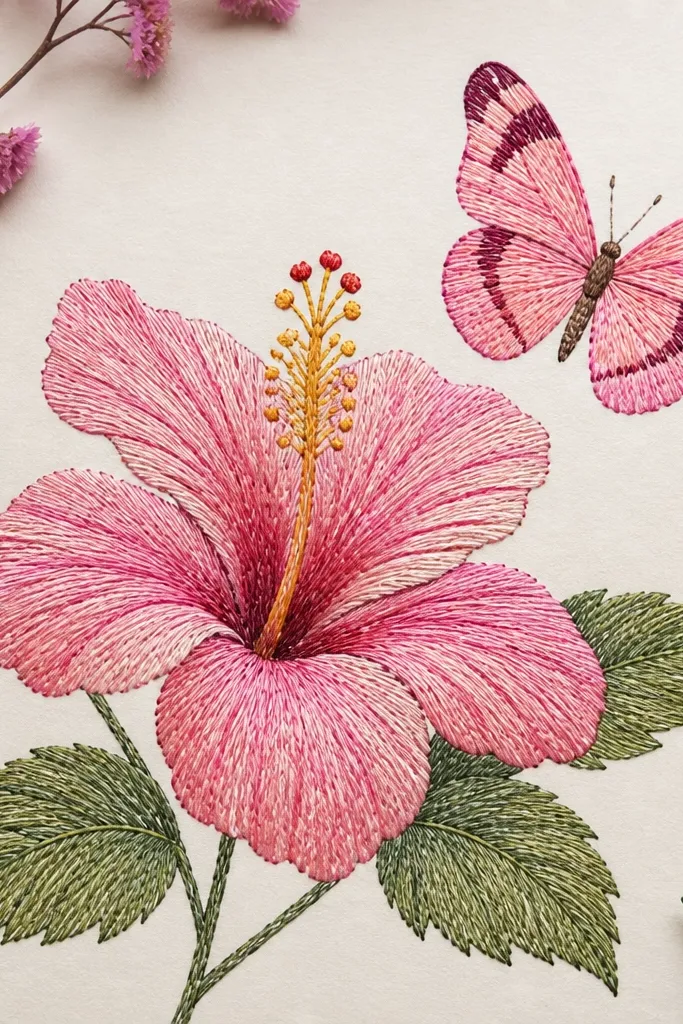
This style looks hand-stitched even though it’s drawn. The illusion comes from repeating short curved lines that follow the petal shape. I do the hibiscus with two pink shades and a darker rose shadow along petal folds. The butterfly gets satin-stitch strokes too, but keep them tighter and lighter so it looks delicate. This is a great option if you want texture without actually doing fabric embroidery.
Outline the hibiscus and butterfly first using a 0.5 pen. Fill each petal by drawing curved stitch lines that start near the petal base and sweep outward — keep spacing consistent. Use a darker rose shade only on the inner crease area, not across the whole petal. For the butterfly, draw wing outlines thinly, then fill with shorter satin strokes that follow the wing curve. Add yellow stitch-like dots in the hibiscus center and finish by tracing a few stitch highlights with gel pen for a slight sheen effect.
Good to knowPractice one petal section on scrap paper until your stitch spacing looks even. That consistency is what makes it believable.
Common mistakeDon’t fill every area equally dark — use lighter stitches on outer petals so depth shows.
9. Hibiscus Bouquet with Butterfly Hovering Over the Bouquet Tip
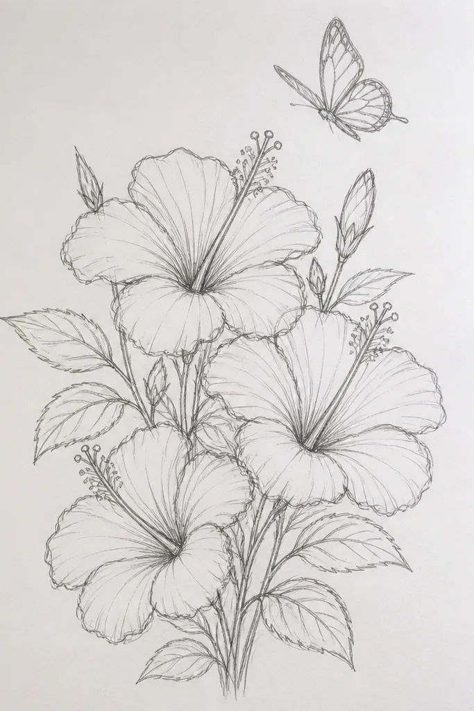
When you add multiple hibiscus flowers, the butterfly becomes the “stop point” for the eye. This idea works because the bouquet has natural height variation, and the butterfly sits over the top bloom like it’s checking in. I keep the bouquet shadows soft and gray so the flowers don’t look like stickers. The color palette stays consistent: pink petals in two shades, warm yellow centers, and tiny red accents near the stamen base. This layout looks flattering on tote bags because the eye travels upward and the butterfly adds movement.
Draw three hibiscus blooms, with the tallest one on the right or center so the composition feels dynamic. Outline petals and add folds, then color each bloom with the same two pink tones to keep it cohesive. Put the butterfly above the tallest bloom and slightly overlap its wing with one petal edge. Add a thin gray shadow under each bloom using a light marker — keep it close to the petals so it looks grounded. Finally, add a few small leaf doodles behind the blooms to connect the group and prevent gaps.
Good to knowChoose one direction for the butterfly body — I pick it so the butterfly faces into the bouquet, not away from it.
Common mistakeAvoid spacing the flowers too evenly. Uneven height looks more realistic and less “clipart.”
10. Botanical Sketch Look with Light Graphite and Inked Hibiscus
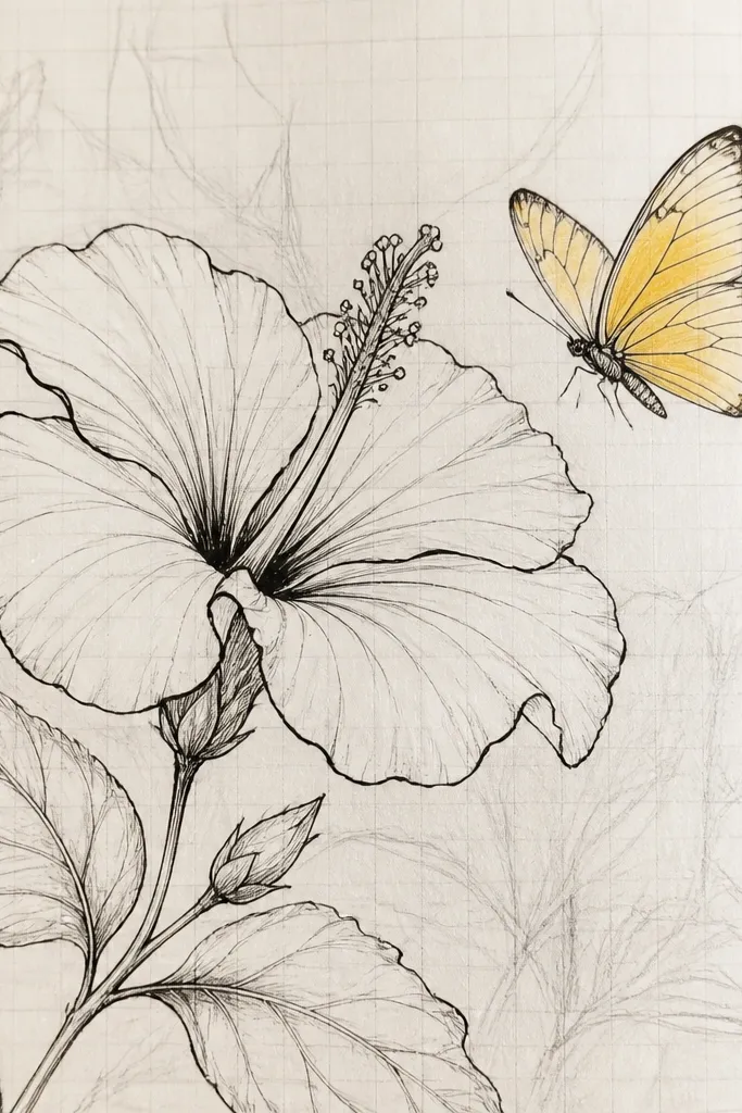
This one is for people who like real sketchbook energy. Light graphite underdrawing gives you a sense of planning, and inked lines make the flower feel crisp. I keep the hibiscus mostly line-based with only a gentle pink wash on the petal edges and a deeper pink along one fold. The butterfly gets a tiny warm yellow wash so it looks alive without turning into a colored cartoon. This style looks great for wall art if you frame it behind glass, because the graphite texture makes it feel authentic.
Start with light pencil: draw the hibiscus outline and petal veins lightly, then erase only the darkest pencil lines. Ink the hibiscus first — use 0.3 for veins and 0.5 for outer petal edges. Add a thin pink wash only at petal edges and around the center, leaving the middle lighter. For the butterfly, draw wings with fine lines and add a light yellow wash in small patches. Add a few extra graphite hatching lines near the stem to suggest shadow, then seal the drawing with a clear fixative if you’re using graphite.
Good to knowUse a kneaded eraser to lift graphite highlights on the petal centers. It makes the wash look brighter.
Common mistakeAvoid heavy marker fills in this style — it flattens the botanical feel.
11. Hibiscus Petals as Paper-Cut Shapes with Butterfly Overlay
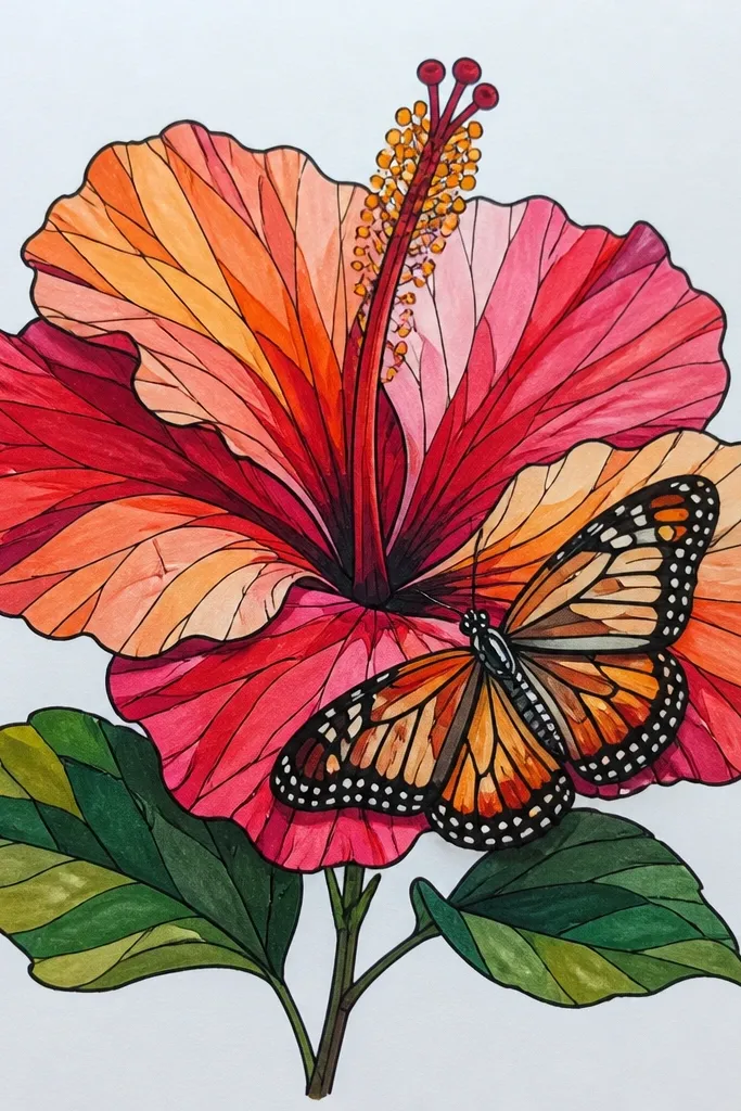
This idea looks like real paper-cut art even if you’re working quickly. The trick is layering: each petal is a separate piece with a slightly different pink tone, so you get depth from materials, not just shading. The butterfly overlay adds motion because it sits “above” the hibiscus. I use a black outline around each paper petal so the colors stay crisp, even from a distance. It flatters small spaces because the layered edges create shadows without needing a complex background.
Cut petal shapes from three pink papers (light, medium, and rose) and outline them lightly with a pen. Layer the petals from back to front, starting with the lightest pink pieces behind and placing rose pieces on top near the folds. Build the center using yellow paper strips cut into tiny fringes for stamens. Draw the butterfly on thin translucent paper or vellum, then position it so one wing overlaps a petal edge. Glue the butterfly overlay at the body only, leaving wings free so they catch light as you move the piece.
Good to knowUse a sharp craft knife and a cutting mat. Paper edges that are clean make the whole illusion believable.
Common mistakeAvoid thick glue blobs under petals — they create bumps that look messy.
12. Hibiscus on Patterned Background with Butterfly as the Only Plain Element
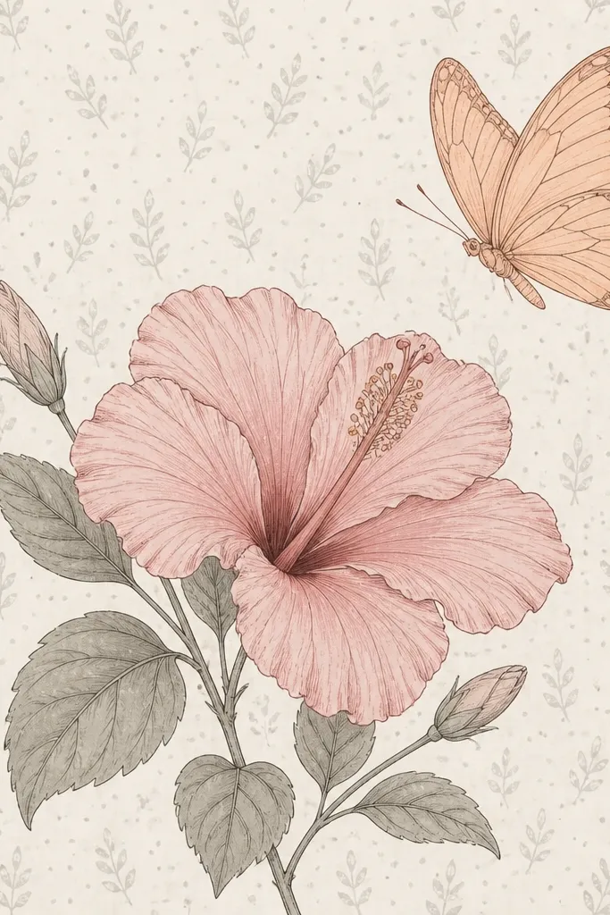
This layout is about contrast. If your background has texture — dots, tiny leaf repeats, light stripes — you have to keep the butterfly simpler than the rest of the scene. I color the hibiscus with muted pink and controlled shading so it doesn’t clash with the pattern. The butterfly stays mostly line art with one peach wash and minimal wing pattern. This is a great choice for people who want their art to feel lively but still readable when viewed quickly.
First, create the patterned background: use a light gray pen to add tiny dots in a grid and sprinkle faint leaf doodles. Then draw the hibiscus on top and keep its outline crisp with a 0.5 pen. Color petals with muted pink and add a deeper pink crease wash only where petals overlap. Place the butterfly above the hibiscus and keep the wings simple: outline plus one peach wash, plus 6-8 vein lines. Finish by adding a small highlight dot on two hibiscus petal edges so it stays the focal point despite the busy background.
Good to knowIf the pattern steals attention, lighten it more by using a lighter gray pen and fewer dots near the hibiscus.
Common mistakeAvoid adding butterfly patterns that match the background. Keep the butterfly calmer.
13. Hibiscus and Butterfly in Indigo and Coral for Evening Mood
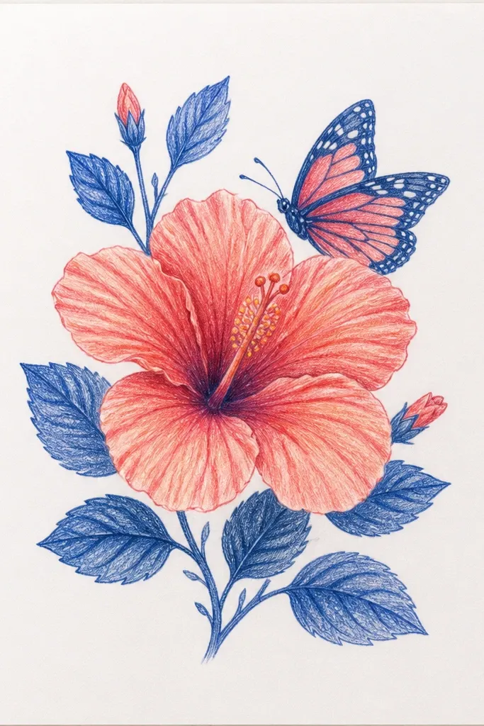
Dark backgrounds make hibiscus color look like it’s glowing. I use indigo for the background, then coral-pink petals with a warm yellow center so the whole piece feels like sunset against night. The butterfly gets coral wings with a deeper indigo wash along the lower edge, which gives it shape. White gel pen highlights are non-negotiable here — they mimic the shine you’d see on a real wing. This style looks dramatic in frames and prints, and it’s flattering for people who like bold color choices.
Start by painting the indigo background with a brush or marker, covering the page evenly. Let it dry, then outline the hibiscus with a lighter pen or white gel pencil so you can see the lines. Color petals with coral-pink, and add a warm yellow center with tiny orange dots on the stamens. Draw the butterfly with thin outlines, then fill wings with coral and a light indigo shadow near the bottom edges. Finish by adding white gel highlights on petal edges and on the butterfly wing tips.
Good to knowUse a white gel pen on top of dried indigo, not while paint is wet. Otherwise the highlights smear.
Common mistakeAvoid using too many bright colors besides coral and yellow — indigo plus extra hues looks muddy.
14. Hibiscus Leaves and Butterfly Trio for a Hair Clip Card Design
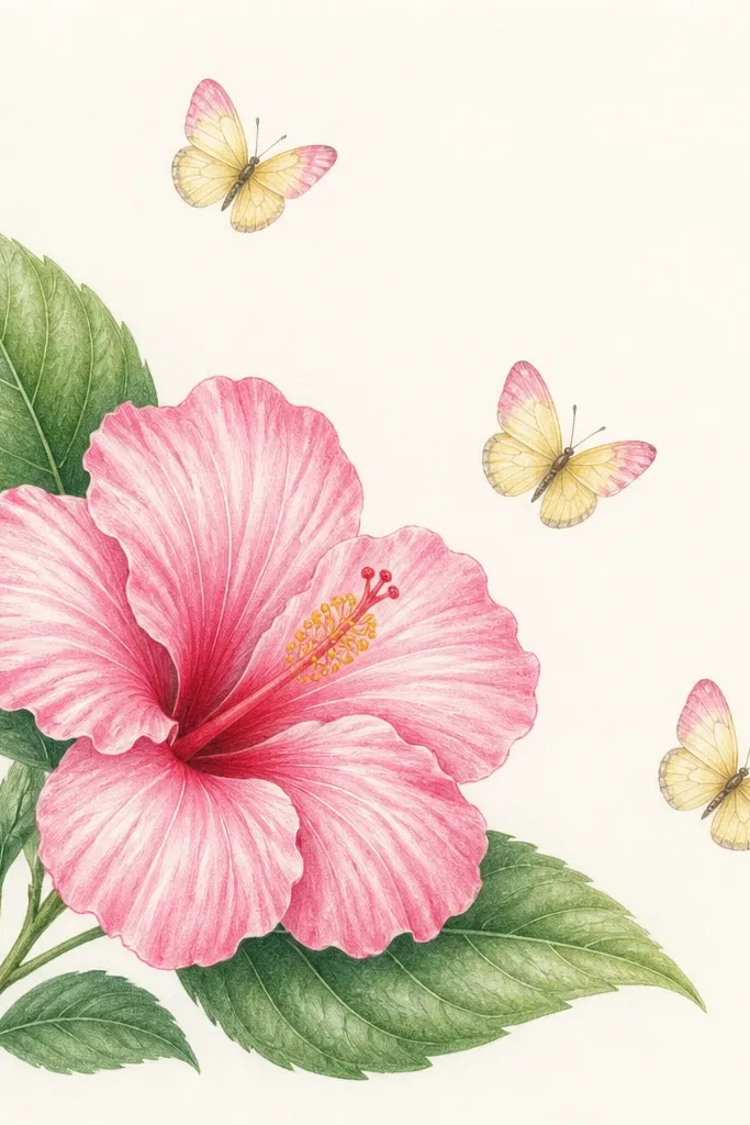
This one is built for small formats. A single hibiscus plus leaves gives you structure, and a butterfly trio creates movement without crowding the page. I keep the butterflies tiny and consistent in style — same wing shape and same color palette — so they read as a group. The leaves are drawn with a simple vein pattern in muted green, which anchors the composition. This style is perfect for gift cards, sticker sheets, and packaging inserts where you need something cute but not too detailed.
Draw the hibiscus first, then add two leaves behind it so they frame the flower. Outline petals in 0.3 or 0.5, then color with pink and a lighter pink highlight near the top petal edges. Color the center with warm yellow and add a few short stamen lines. Place three butterflies diagonally, each one slightly smaller than the last, with wing tips angled toward the hibiscus. Add a faint light gray shadow under the hibiscus and leaves so the card doesn’t look flat. Finish with tiny dot accents on the butterflies' wing tips using a pale pink marker.
Good to knowKeep the butterfly trio spacing even — if one butterfly is too close, the diagonal stops reading as intentional.
Common mistakeAvoid drawing three different butterfly styles. Consistency makes the trio look designed.
15. Monoline Hibiscus with Butterfly in Negative Space
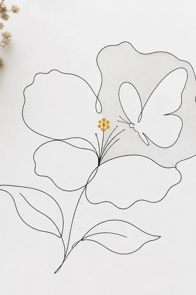
Negative space is the secret when you want a super modern look. With monoline drawing, the hibiscus stays airy and the viewer reads the shape without heavy shading. The butterfly in negative space looks clever because the wing “pattern” comes from what you don’t fill. I use a very thin line for the whole piece, then add only one warm yellow detail at the center and a tiny dot pattern on the butterfly wings. This style works well for minimal home decor and for small prints where you need crispness.
Use a single 0.3 fineliner to draw the hibiscus petals and center as clean continuous shapes. Add a light wash only inside a few petal sections so the lines remain the main structure. For the butterfly, draw the outline and then lightly shade a portion of the wings, leaving clear white shapes inside to create the negative-space pattern. Add stamens as tiny straight lines from the center and dot a warm yellow cluster around them. Finish by adding one or two extra thin lines to define the butterfly body and wing edges so it stays readable when printed.
Good to knowIf your negative space gets messy, simplify the butterfly wing outline and remove any tiny extra patterns.
Common mistakeAvoid thickening the line halfway through. Monoline looks best when it stays consistent.