
1. Single Orchid Cup Lip Study on Cream Card
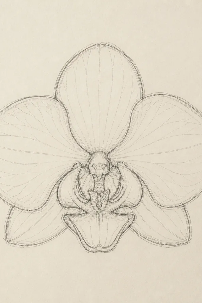
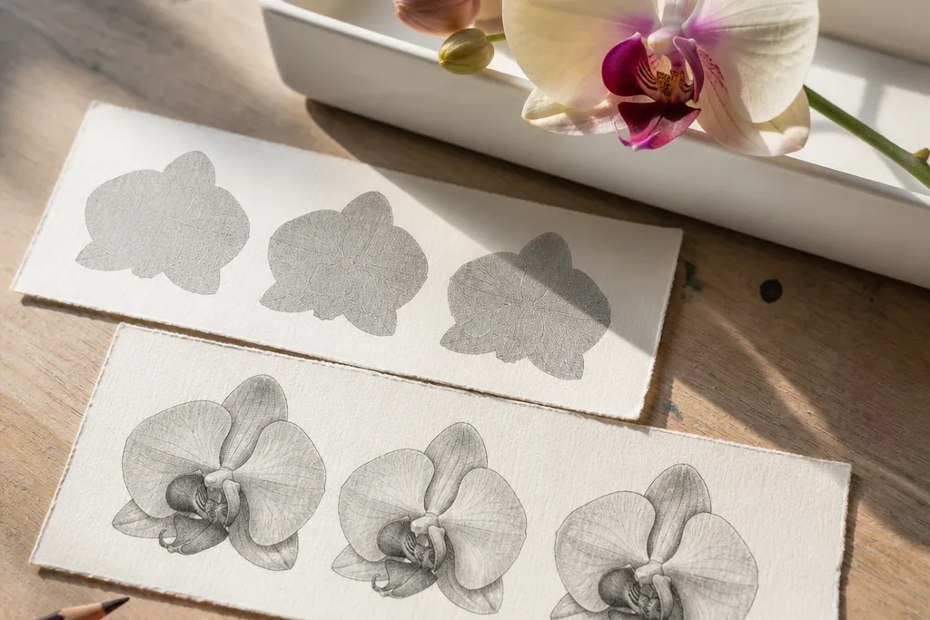
This is the orchid I start with when I want the drawing to look dimensional fast. The cream background makes the pale petals feel soft, and the darkest pencil sits under the lip’s fold so the shape reads like it’s catching light. Use a medium black outline for the petals, then switch to lighter graphite for the gradients. It flatters small spaces because the focal point is tight — great for a 5x7 frame or a label card. If you like clean, airy art, this style gives you that “studio sketch” look without needing heavy color.
Good to knowDraw the lip fold shadow first, even before you add veins — it locks the whole orchid’s 3D look.
Start by sketching the orchid in pencil lightly: one main front petal, two side petals, and the lip as a rounded cup shape. Then outline only the outer edges of the petals with a fine liner, keeping the line thicker on the front-facing petals. Add graphite shading in three bands: darkest under the lip fold, mid-tone at the petal base, and light tone toward the edges. Finish with 6-8 short vein marks on the side petals and a couple of tiny dots on the lip where you want highlights. Finally, erase any pencil smudges around the cup so the shadow edge stays crisp.
Common mistakeDon’t shade the lip like a flat oval; if the underside shadow is missing, it reads like a sticker graphic.
2. Three-Quarter Orchid with Side-Leaf Sweep
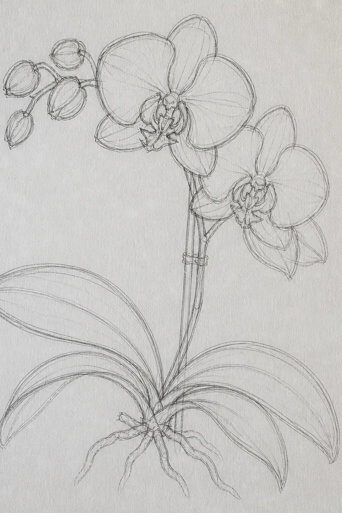
This composition looks elegant because it gives your eye a path: leaf sweep, lip, then side petals. The three-quarter view makes the lip appear slightly more forward, so the shadow under the fold can be smaller and still believable. I like this for people who want their orchid to feel airy, not crowded. It works well on lighter skin tones in terms of styling because the line work is crisp and the palette stays monochrome, which looks good with warm neutrals in a room. The key principle is direction: one strong leaf curve should guide the viewer toward the orchid.
Good to knowKeep the leaf shading minimal; one soft tone is enough so it doesn’t compete with the lip.
Begin by drawing a long leaf line that curves from lower right toward the orchid, then lightly sketch the orchid head so it sits at the curve’s midpoint. Use a thicker pen on the orchid outline than on the leaf outline, so the lip stays the focal point. Shade the petals with a soft graphite gradient, leaving the very edge lighter to imitate a highlight. Add a few short crosswise vein marks on each side petal, grouped near the base. Finish by darkening the shadow edge at the lip fold and lightly erasing pencil lines that overlap the leaf so it looks clean.
Common mistakeDon’t put the orchid dead-center if you want movement; the side-leaf sweep needs space to breathe.
3. Orchid Cluster with Staggered Overlaps
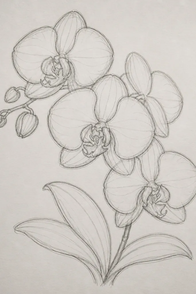
Overlaps are where DIY orchids start looking “designed” instead of copied. By stacking three heads with staggered sizes, you get depth without painting gradients everywhere. The front orchid uses the darkest lip shadow and the clearest outlines; the middle orchid has slightly lighter lines; the back orchid is lighter and more simplified. This flatters busy spaces because it reads as botanical decor even when you keep details minimal. It also works great for gift tags since the cluster fills the space without needing a border.
Good to knowChoose one “hero” orchid and let it have the most contrast; the others should look quieter.
Sketch three orchid heads at different heights: one front (largest), one middle (medium), and one back (smallest). Outline the front orchid petals with a darker liner, then outline the middle orchid with a slightly lighter pressure and fewer extra vein marks. For the back orchid, draw only the main outline and the lip fold shadow, leaving out most veins. Draw shared stems that connect the heads at different angles so they don’t look glued on. Shade each lip with the same method, then erase stray pencil lines where petals overlap to keep the edges sharp.
Common mistakeDon’t make all three orchids the same line darkness or the cluster turns into a flat blob.
4. Monoline Orchid on Toned Grey Paper
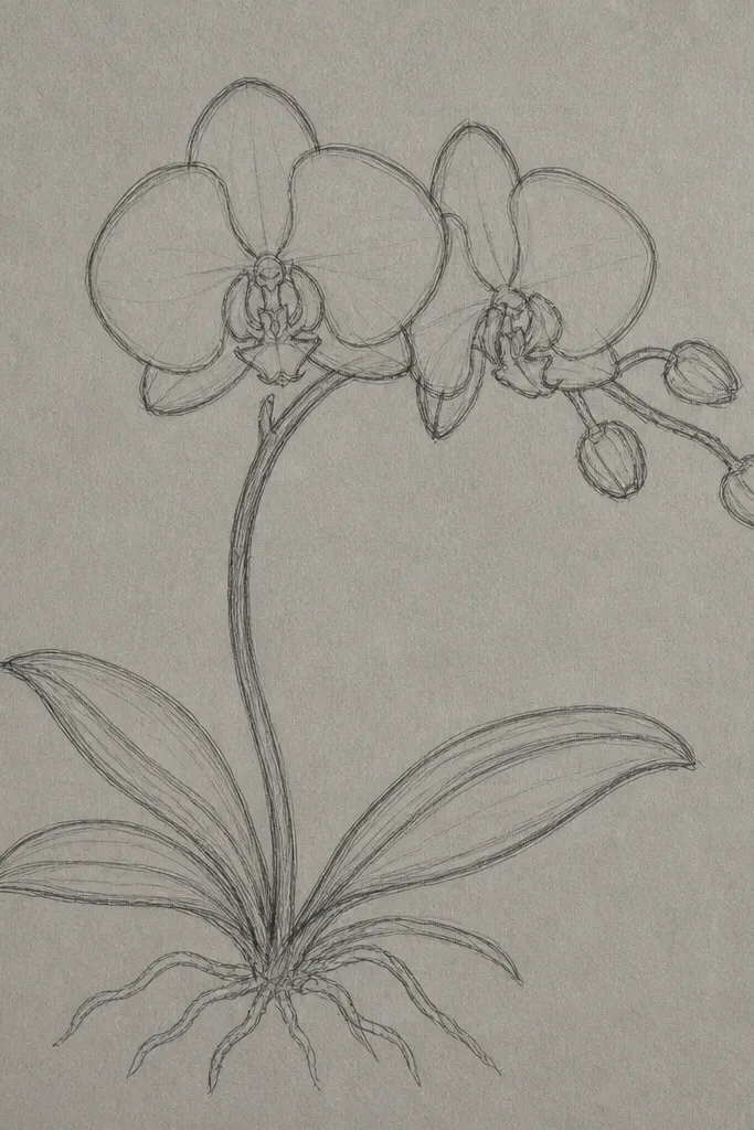
Toned grey paper gives you instant contrast, and monoline keeps the look modern. Instead of heavy graphite shading, you use the paper as your mid-tone, then add white highlights where light hits — especially on the lip rim and the top petal edge. This style is clean and graphic, and it looks great in minimalist homes. It also flatters smaller wall sizes because the line work is consistent and the eye doesn’t get lost in gradients. If you like a crisp, fashion-illustration feel, this is the one to copy.
Start by lightly sketching the orchid in pencil so you can place the lip correctly, then trace the main petal outlines with a black fineliner using the same pressure for every edge. Skip full shading; instead, add a few tiny vein marks near the petal base. Use a white gel pen to draw highlight lines on the lip rim and a thin highlight on each petal edge. Add one small shadow under the lip fold with a light grey pencil so the cup still reads in 3D. Finish by cleaning the background around the orchid so no smudges show through the grey paper.
Test your gel pen on a scrap first; some brands get chalky on textured paper.
Don’t add full graphite gradients on grey paper; it usually makes the piece look muddy.
5. Watercolor Wash Orchid with Pen Veins
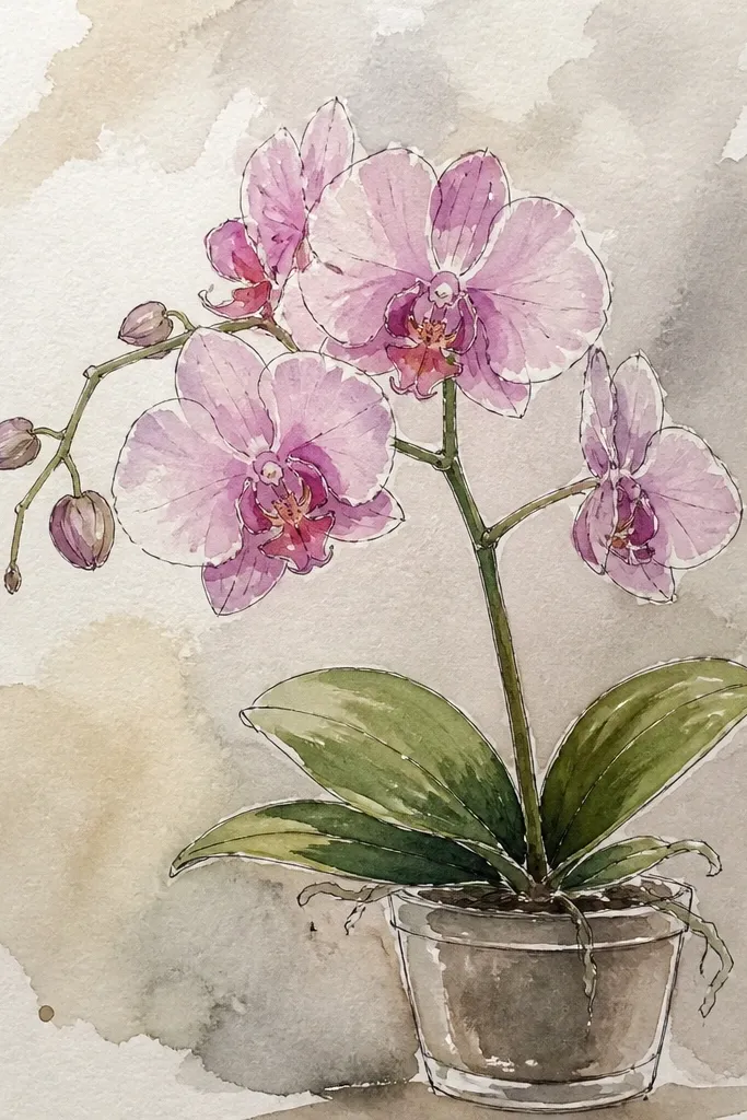
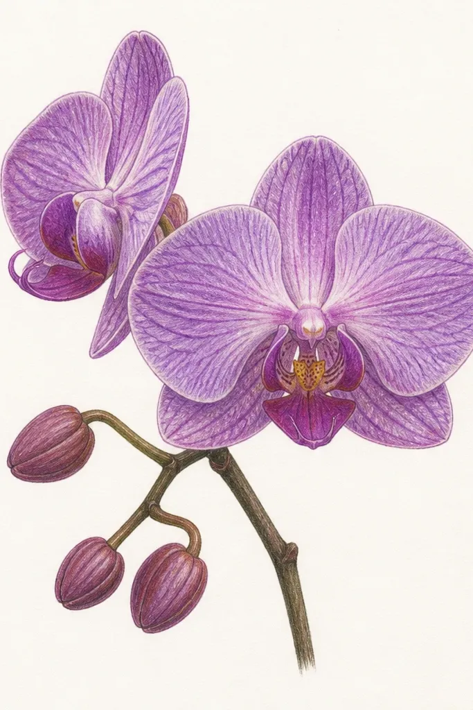
This is the “pretty but still hand-drawn” combo I reach for when I want color that looks natural instead of marker-flat. Watercolor wash gives the petals a gentle bloom, and pen veins keep the orchid crisp where the eye expects detail. The lip center in a slightly deeper pink makes the flower feel alive, while the pen shadow under the fold keeps it dimensional. This style looks best in frames with white mats because the watercolor needs clean edges. It flatters warm interiors, and it’s a good choice if you want the orchid to feel like a real plant photo.
Good to knowLet the lip wash dry fully before inking veins; wet paper makes pen lines bleed and look cheap.
Tape your paper down and wet the petal areas lightly with clean water so the wash spreads smoothly. Add a pale wash of pink on the side petals and lavender in the shadow areas near the base. While it’s still damp, drop in a slightly darker pink at the lip center and let it feather outward. After the wash dries, draw veins with a fine black pen using short lines clustered near the base. Outline the petal edges lightly with diluted ink or a very light pencil, then darken only the lip fold shadow for depth.
Common mistakeDon’t flood the background; watercolor blooms behind the orchid look messy unless you’re aiming for an intentional wash.
6. Ink-Only Orchid with Cross-Hatch Depth
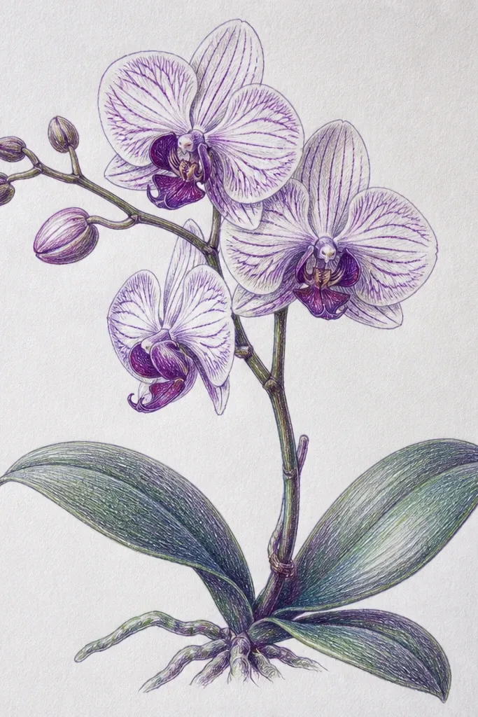
Cross-hatch gives you depth without any color, and it looks better than plain scribble shading when you control spacing. I like this when I’m making a monochrome set for a gallery wall because it stays consistent from piece to piece. The lip fold shadow is where you put most of the contrast — dense cross-hatching under the cup, lighter near the rim. This looks great in homes with black frames and simple decor. It also flatters people who like clean line art but still want the orchid to look dimensional from a few feet away.
Good to knowUse a ruler for your hatch direction if your hand gets wobbly — consistent angle looks intentional.
Draw the orchid outline in pencil first, then ink the outer petal edges with a fine liner. Add cross-hatching only in shadow zones: under the lip fold, inside the inner petal edge, and along the base of side petals. Keep hatch spacing wider in mid-tones and tighter in the darkest spots so the value shift feels smooth. Add vein lines with short strokes that follow the petal direction, not straight lines across the surface. Finish by going over the lip outline with a slightly darker pen so the cup edge reads sharply.
Common mistakeDon’t cover the whole petal with cross-hatching; it flattens the shape and makes it look like a coloring book.
7. Graphite Burnished Orchid on Smooth Bristol
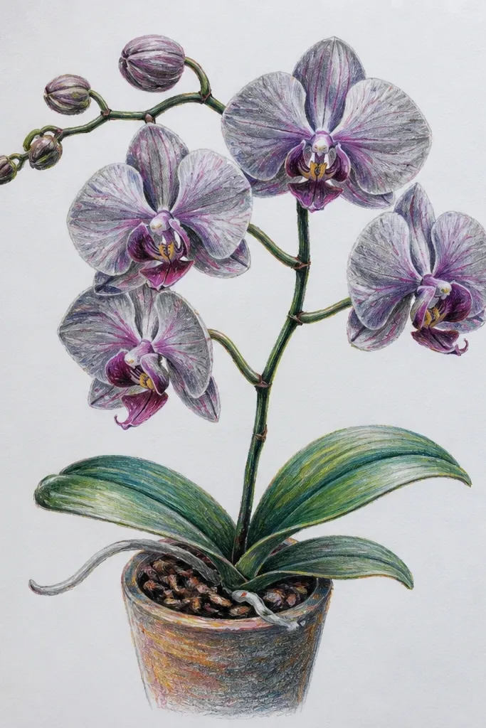
Burnishing is how you get that near-airbrushed look without paint. Smooth Bristol paper lets the graphite polish into gradients, so the orchid feels silky instead of sketched. The trick is layering: light graphite first, then more pressure in the shadow zones, then a final gentle burnish on highlights. This style looks expensive in simple frames because the gradients read like studio illustration. It’s also forgiving if you’re not great at line detail since the shading carries the realism. Great if you want monochrome elegance with minimal color work.
Start by blocking the orchid shape in light pencil, then shade the base of each petal with a medium graphite tone. Use a tortillon or folded paper to blend outward from the base, leaving a narrow highlight line near each petal edge. Build the lip fold shadow with darker graphite and blend it softly so it transitions into the mid-tone. Add faint veins last using a sharp pencil with minimal pressure so they don’t overpower the gradients. Finally, burnish the highlight areas gently with a clean fingertip or kneaded eraser edge to lift graphite slightly.
Keep a kneaded eraser handy for micro-highlights on the lip rim; two or three tiny lifts make a big difference.
Don’t burnish the entire petal; full-surface smoothing kills the contrast that makes the orchid look 3D.
8. Orchid with Gold Accent Lip Rim
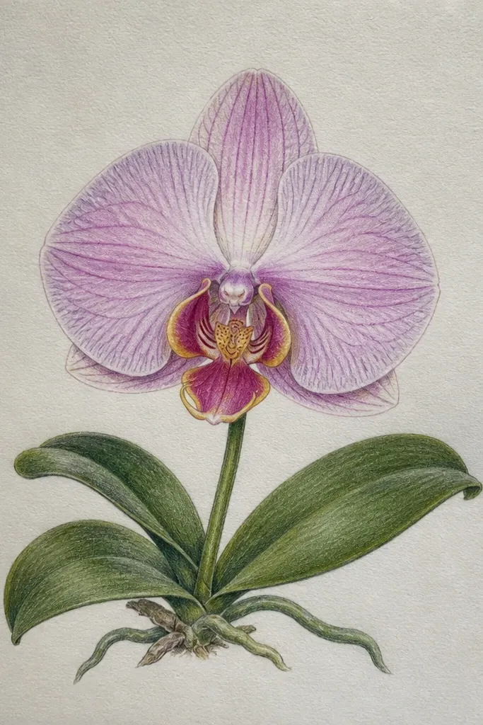
Metallic accents make the orchid feel like jewelry art, but you need restraint. I use gold only on the lip rim and one inner curve so it catches light without turning the whole piece into a craft project. The rest stays monochrome so the gold doesn’t compete. This looks amazing on dark frames and black or charcoal mats. It flatters warm undertones and looks especially good next to brass hardware. The principle is selective shine: one controlled highlight area reads intentional.
Draw the orchid in pencil and ink the main outlines with a fine black liner. Shade with graphite using a mid-tone at the petal base and a lighter edge, leaving the highlight areas clean. Add a subtle warm blush (very light pink or peach pencil) only in the lip center, then darken the shadow under the fold in graphite. Once everything is dry, trace the lip rim with a gold paint pen — keep the line thin and follow the cup edge. Add one tiny gold dot where the light would hit the top petal edge, then let it dry flat to avoid smearing.
Outline the gold shape with a pencil first; it makes the metallic line smoother and less wobbly.
Don’t add gold to veins or the whole lip; that’s where it starts looking costume-y.
9. Muted Blush Orchid with Ink Outline and Water Brush
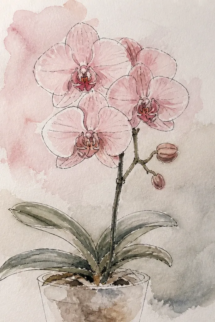
This is a watercolor look without the mess, using ink outline plus a water brush to move pigment. It keeps your drawing crisp while still giving that living, soft petal feel. The blush tone is muted, so the orchid looks calm instead of candy-colored. I like this style for bedroom prints because it doesn’t shout. It also flatters people who want color but don’t want to commit to full watercolor washes. The key principle is edge control: ink defines the boundaries, and water brush softens inside them.
Ink the orchid outline first with a fine waterproof pen so the pigment doesn’t bleed. Mix a pale blush (light pink) with water in a small palette, then use a water brush to pull the color into the petal areas. Keep the color concentrated at the petal base and feather it out toward the edges. Add a slightly darker blush in the lip center and let it fade upward into the rim. Finish by drawing vein lines with the same pen and deepening the lip fold shadow with a light graphite glaze if needed.
Use waterproof ink if you want to add a second light wash later; regular pens smear under water brush.
Don’t overwork the petals after they dry; repeated brushing makes the paper pill and the color looks streaky.
10. Orchid on a Vertical Stem with Two Leaves Only
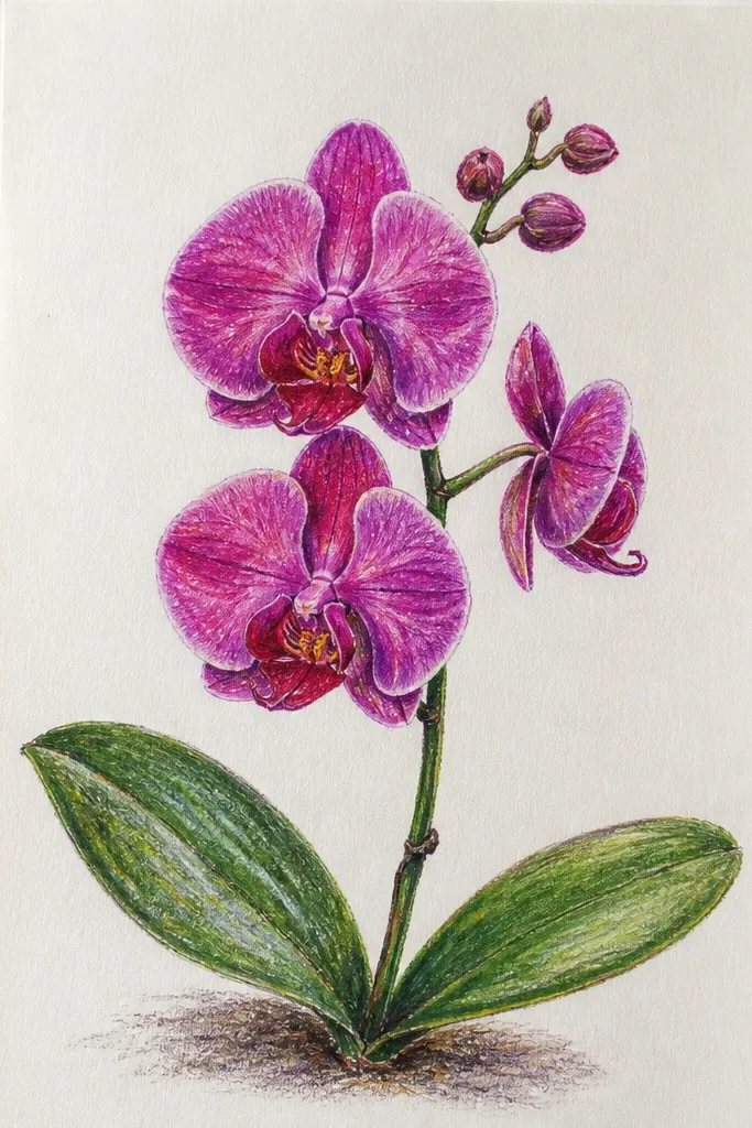
Negative space makes orchids look expensive, and a tall vertical stem gives you that clean, gallery feel. Two leaves only keeps the composition from turning cluttered. I like this for minimalist prints because the orchid reads as a single sculptural object. The lip shadow stays the darkest value, so it still looks 3D even with minimal detail. This flatters narrow frames and tall walls because it fills the height without crowding the width. The guiding principle is simplicity: fewer elements, stronger edges, clearer focal point.
Good to knowIf your line wobbles, redraw the stem and leaves — it’s the part people notice fast.
Sketch the vertical stem line first, then place the orchid head so it sits slightly above center for a natural balance. Draw two leaves that angle outward from the stem, keeping them lighter in line weight than the petals. Shade the petals with a smooth graphite gradient and leave a thin highlight edge. Add veins with just 5-7 marks per side petal, grouped near the base. Darken only the lip fold shadow and the inner crease under the lip so the cup reads even from a distance.
Common mistakeDon’t add extra leaflets or buds; the negative space is what makes it look intentional.
11. Orchid Corner Frame with Border Dots
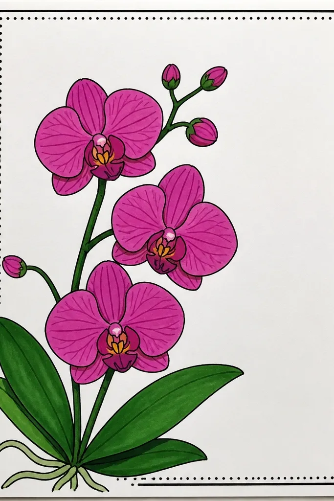
Corner placement is underrated because it makes the orchid feel like stationery, not a big wall illustration. The dotted border gives structure without taking over. I use this when I’m making stationery sets, gift wrap labels, or a set of matching art prints. The orchid’s lip shadow stays deep, but the rest of the shading is lighter so it doesn’t look heavy in the corner. This flatters small formats and looks great on off-white paper because the dots can be near-black without harshness.
Lightly sketch the orchid so it sits in the top-left corner, leaving at least 1.5 inches from the top and left edges. Draw a thin dotted border along those same edges, spacing dots about 1/4 inch apart. Outline the orchid petals with a fine liner, then shade with light graphite and add the lip fold shadow last. Keep veins detailed only on the side petals facing you; the far side can be simplified. Add a few tiny dots inside the orchid stem line to suggest texture, then erase pencil guides so the border stays clean.
Use a 0.3 mm pen for the dots; thicker pens make the border look cartoonish.
Don’t crowd the corner with a full stem and leaves; keep the orchid head dominant.
12. Orchid with Patterned Background Wash (Soft Polka)
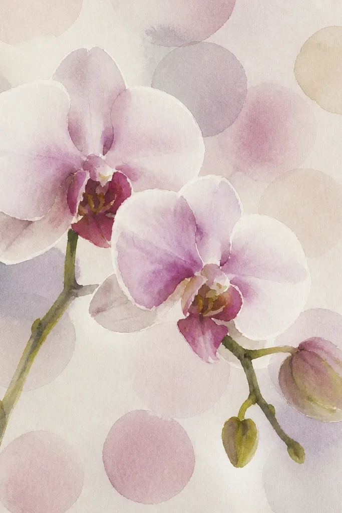
A subtle patterned background makes the orchid feel styled, not isolated. I keep the pattern very pale so it supports the orchid instead of competing with it. The lip shadow still has the highest contrast, so your eye lands there immediately. This works well for printable art because the pattern stays consistent and doesn’t require complex painting. It flatters rooms with soft pink, grey, or cream decor. The principle is contrast hierarchy: pattern stays mid-tone, orchid edges stay crisp.
Use a light stencil or a homemade dot template to place pale dots behind the orchid first, keeping them at least 1/2 inch away from the petals. Use grey pencil or very light water-based paint so the pattern stays soft. Then draw the orchid outline on top with a fine liner. Shade petals with light graphite gradients and add a deeper graphite shadow under the lip fold. Add a few vein marks and keep them sparse so the background pattern doesn’t clash. Finish by darkening the orchid outline slightly at the lip and inner crease for crisp separation.
Test dot intensity on scrap; if dots look darker than the petal base, lighten them.
Don’t use a busy pattern with dark dots; it makes the orchid look like it’s printed, not drawn.
13. Orchid with Leafy Vine Frame (Minimal Green Pencil Tint)
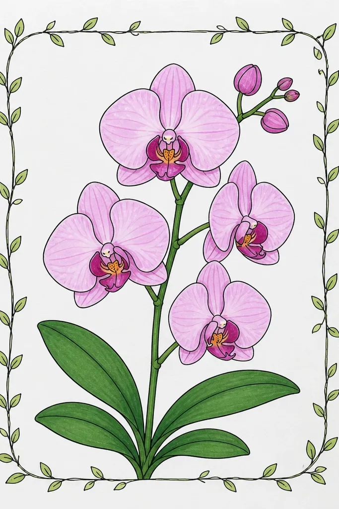
This one makes the orchid feel like it belongs to a larger botanical set without adding heavy color. The vine frame is light and thin, and the orchid stays the dark focal point. I tint only the leaves with a gentle green pencil, and I keep the green away from the petals so it doesn’t change the orchid’s tone. This looks great for holiday cards and everyday prints because the palette stays calm. It flatters people who want an aesthetic that looks handmade but still clean. The principle is framing: surround with line, not with more shading.
Draw the orchid first, then add a vine frame around it using thin linework — keep the frame about 1 inch away from the petals. Sketch two small leaf shapes on opposite sides and add a few vein lines in light green pencil. Keep the vine line weight thinner than the orchid outline. Shade the orchid petals in graphite, and deepen only the lip fold shadow and inner crease. Add 6-10 vein marks per petal, then erase any pencil smudges on the vine so it stays crisp. Finish by adding a tiny highlight line on the lip rim with a white gel pen if you have one.
If your frame looks too strong, erase it lightly and redraw only the top curve — that’s the part that matters.
Don’t shade the vine like the orchid; matching textures makes the frame compete.
14. Orchid with Airy Sumi Ink Bleed Edges
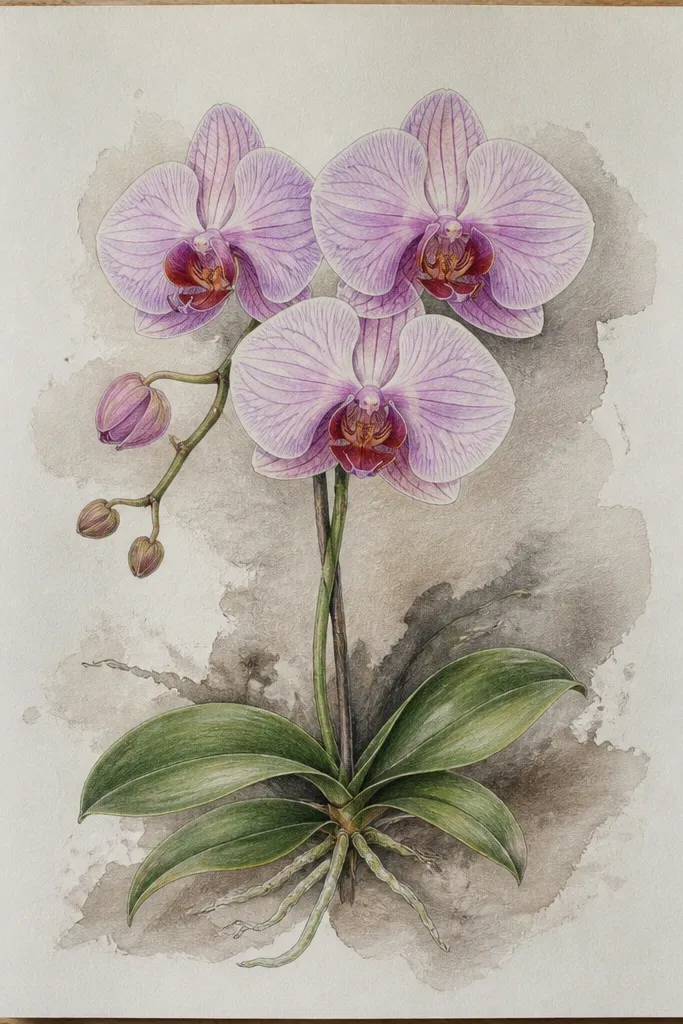
Feathered edges look painterly, and they hide shaky lines that happen when you’re copying. I use this when I want the orchid to feel soft and slightly romantic without turning it into full watercolor. The technique is controlling ink on damp paper so edges bloom just a little. The lip fold stays defined, so the orchid still reads as a real flower. This style looks best on thicker paper that can handle ink — it gives you that ink bloom effect instead of blotchy mess. It flatters moody interiors because the contrast feels deeper and more atmospheric.
Good to knowPractice the ink bloom on a scrap — you want a soft feather, not a spreading puddle.
Use heavier paper like 140 lb watercolor or smooth mixed media. Wet the area around each petal lightly with a brush, then apply sumi ink along the petal edge so it bleeds inward. Let the darker center form naturally, then add a few vein lines with a fine pen once the ink settles. For the lip, keep the shadow under the fold darker and more concentrated, then allow a slight feather at the outer lip edge only. Let everything dry flat, then add a white gel pen highlight on the top rim of the lip to make the cup pop.
Common mistakeDon’t flood the lip area; too much bleed makes the cup shape disappear.
15. Orchid Portrait with Soft Grey Background Wash
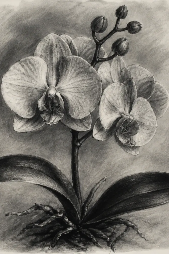
A soft grey background makes the orchid feel like a photograph printed on matte paper. The wash is subtle enough that it doesn’t compete with the lip shadow, but it adds depth behind the petals. I like this for framing because the mat and background wash work together — you can keep the same grey tone across a set. It flatters modern interiors with neutral palettes. The key principle is fade direction: the background should lighten near the orchid so the flower stays crisp.
Good to knowUse a size 2 round brush for the wash edge so you don’t get hard water lines.
Wash a light grey background using diluted graphite or grey watercolor, keeping it lighter around the orchid edges. Draw the orchid with a fine pen outline after the background dries, then shade petals with graphite gradients. Add the lip fold shadow with darker graphite, keeping the darkest value tight under the fold. Leave clean highlights on the top petal and along the lip rim. Add veins only where they help the form, usually near the petal base and along the inner crease. Finish by darkening the stem line lightly so it doesn’t disappear into the grey wash.
Common mistakeDon’t make the background darker than the lip shadow; if it is, the orchid loses its focal point.
16. Orchid with Watercolor Edge Tint (No Fill in Center)
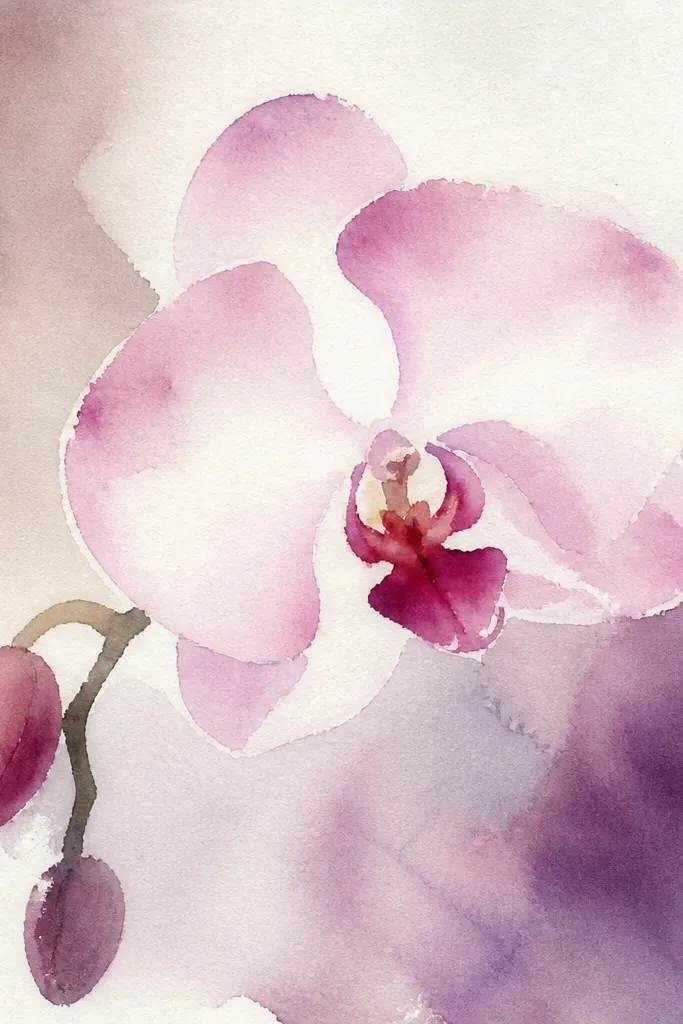
Leaving the petal center white makes the orchid look fresh and airy, like light is hitting the flower. Edge tint is less work than filling entire petals, and it looks more intentional when you keep the tint thin. The lip still needs depth, so you add the shadow under the fold and a slightly darker edge tint around the cup rim. This style flatters bright spaces and looks great on white cardstock. It’s also beginner-friendly because you’re drawing fewer colored areas. The principle is highlight preservation: protect the brightest parts so the rest can look dimensional.
Good to knowIf your edge tint spreads too far, blot once with a dry paper towel — don’t keep brushing.
Outline the orchid petals in fine ink first, then lightly sketch where the lip fold shadow goes. Add watercolor tint only along the edges of the petals, using a very diluted pink or lavender and keeping the paint band narrow (about 1-3 mm). Leave the petal centers unpainted so they stay bright. For the lip, tint the rim slightly darker and add a shadow under the fold with diluted grey or light purple. After drying, add pen veins and a couple of short highlight strokes on the lip rim with a white gel pen.
Common mistakeDon’t fill the petal centers with wash; it kills the crisp, glowing look.
17. Orchid with Tiny Dot Highlights and Speckle Background
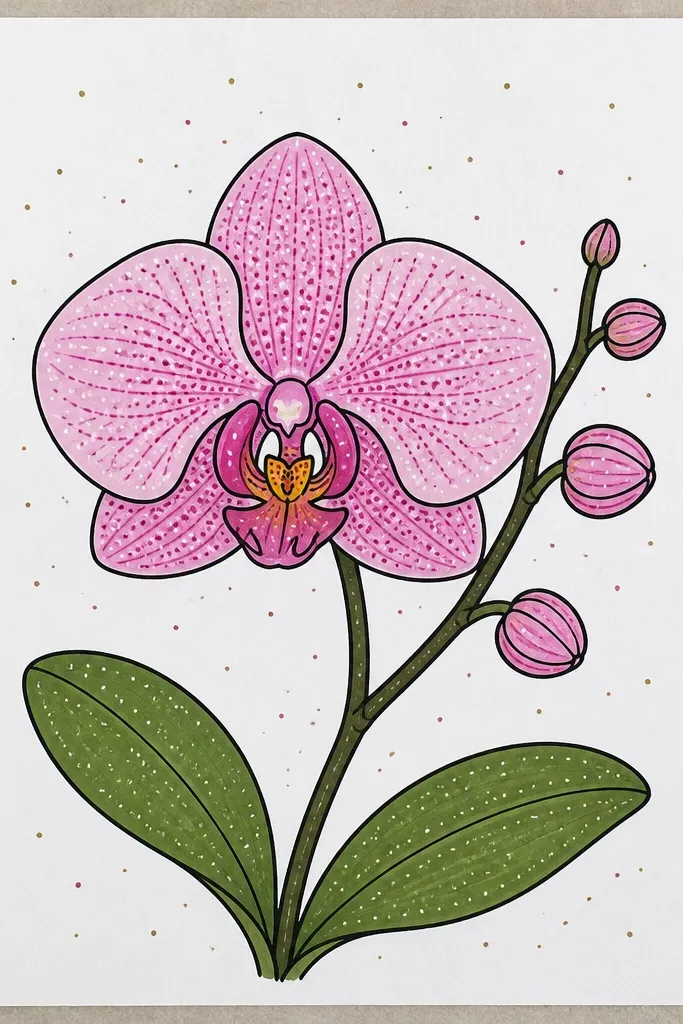
Speckle and dot highlights add a hand-made sparkle without turning the orchid into glitter art. I use tiny white dots on the lip rim and top petal edge to mimic reflected light. The speckle stays behind the orchid and stays pale, so it reads as texture rather than pattern. This style is fun for gift cards and small prints because it feels playful but still elegant. It also flatters art you plan to scan and print, since the dots show up clearly. The principle is micro-contrast: small bright accents make the flower feel more dimensional.
Draw the orchid outline and shade petals with graphite, keeping the lip fold shadow the darkest area. Add veins with short ink strokes, grouped near the petal base. Use a white gel pen to place 6-10 tiny dots on the lip rim and a few on the top petal edge. For the background, speckle around the orchid with a diluted grey or light pencil using an old toothbrush — test on scrap first. Keep speckles at least 1/2 inch away from the orchid edges so the flower stays crisp. Finally, darken the lip fold shadow slightly if the speckle makes it look too light.
Use a second sheet under your paper when speckling so you don’t stain your desk or other prints.
Don’t put speckles inside the petals; it looks like noise instead of light.
18. Orchid Side View with Curved Stem Calligraphy Line
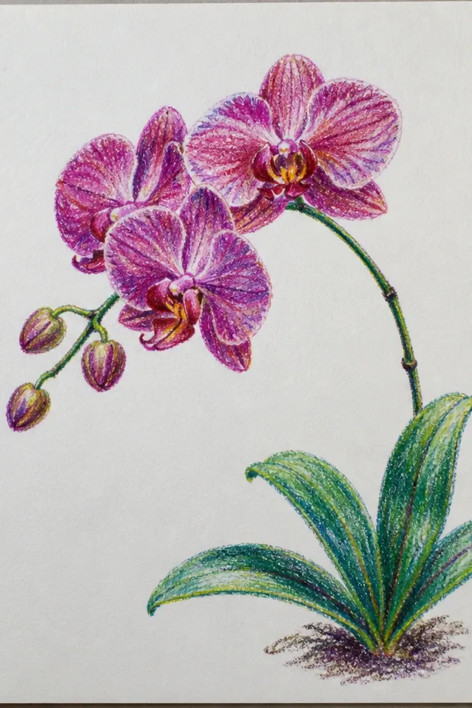
Side view orchids look sophisticated because the lip doesn’t sit flat — it turns with the flower. The calligraphy-style stem adds motion, and taper gives the composition a sense of breath. I keep the petal veins minimal here because the angle already creates texture through shape. This style flatters tall frames and print designs where you want a clean, modern line. It also looks great in black-and-white because the stem taper acts like the contrast engine. The principle is using one bold line element to carry the design.
Good to knowIf the stem taper looks uneven, practice on scrap until the stroke feels smooth before committing to the final paper.
Sketch the orchid head and keep the lip slightly angled, not facing straight forward. Draw the stem with a brush pen or a calligraphy pen, using thicker pressure at the base and tapering up toward the orchid. Outline petals with a fine liner, then shade with graphite only near the petal base and under the lip fold. Add a few veins as short marks that follow the petal curve, usually 4-8 total per petal. Leave the far edge of the petals lighter to show the side view. Finish by adding a single highlight line on the lip rim with a white gel pen.
Common mistakeDon’t over-ink the petals if you already have a bold stem; the design needs a hierarchy.
19. Orchid on White with Soft Charcoal Smudge Shadows
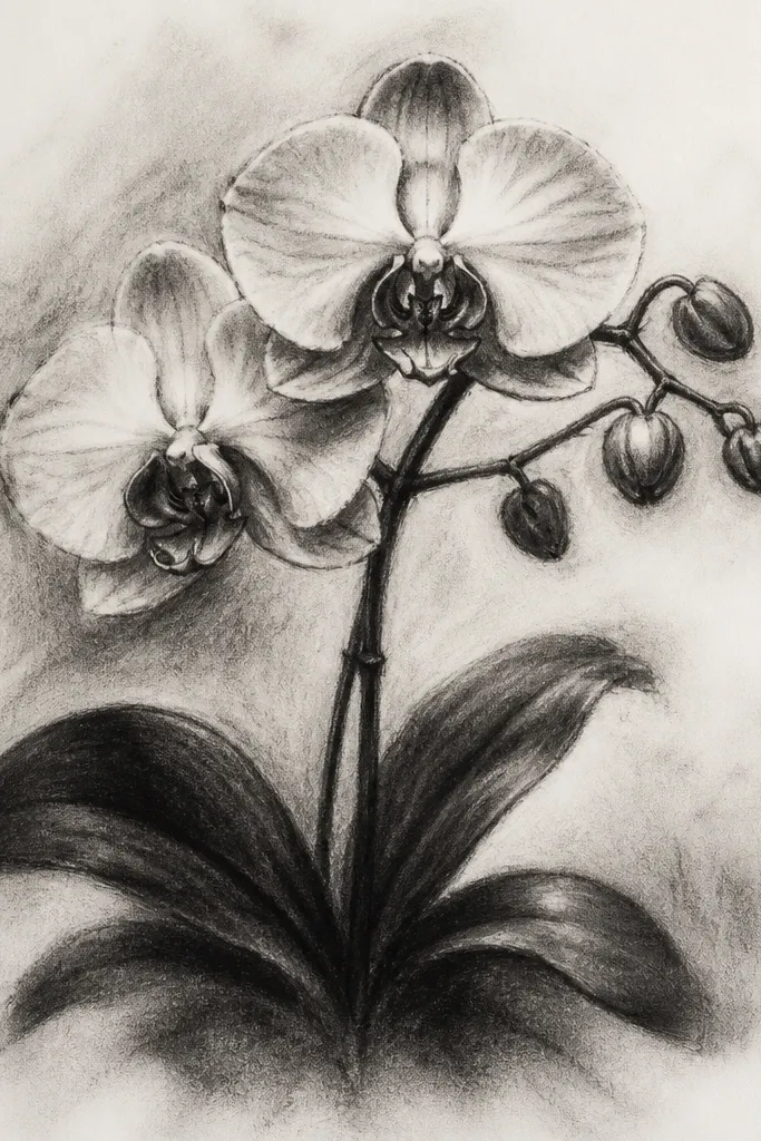
Charcoal makes orchid petals feel soft and plush because it blends quickly. I use it when I want a more tactile look than graphite, and it works well for people who like a less “inked” aesthetic. The trick is controlling smudge edges: keep them soft inside petals, but keep the lip fold shadow edge slightly darker so the cup reads. This style looks good in frames with light wood or white mats. It flatters cozy interiors because it feels warm and imperfect in a good way. The principle is contrast through softness — dark pocket under the lip, lighter smudges elsewhere.
Lightly sketch the orchid in pencil, then begin shading with charcoal only on the petal base areas. Blend with a tissue or blending stump, keeping the outer edges lighter. Press a bit harder under the lip fold for the darkest pocket, then soften the surrounding edge so it melts into the mid-tone. Add minimal veins with a charcoal pencil or very light pencil so they don’t turn into grain. Use a kneaded eraser to lift highlights along the lip rim and top petal edge. Keep the background clean, adding only a tiny shadow near the stem if you need grounding.
Use fixative if you plan to handle the piece; charcoal smears fast on skin contact.
Don’t smudge the entire petal surface evenly; that makes the orchid look flat and grey.
20. Orchid with Tiny Heart-Shaped Lip and Strong Outline
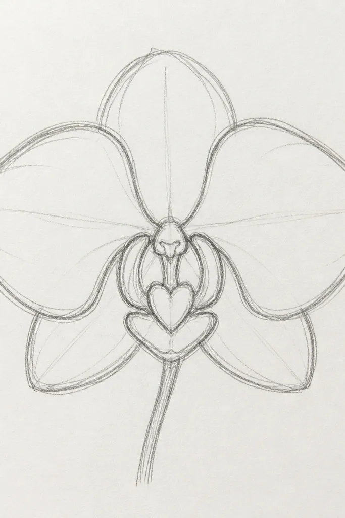
This is the “cute but still true” version. The heart-shaped lip reads instantly because the shape is simplified, and the strong outline keeps it from looking like a cartoon. I use this when I’m making quick DIY cards or stickers where fine details won’t survive at small sizes. The lip shadow stays present, even if the veins are reduced. It flatters people who like friendly art rather than hyper-real botanical illustration. The principle is simplification with one non-negotiable detail: the folded lip shadow.
Good to knowIf you’re making stickers, keep the line thickness consistent and avoid tiny specks — they disappear in cutting.
Draw the orchid head with simplified petals, keeping the lip slightly smaller than you think it should be. Outline the petals with a bold black pen, but keep the leaf and stem lines thinner. Add a small, clear lip fold shadow under the heart-like lip shape using graphite or light charcoal. Add only 3-5 vein marks per side petal so the design stays readable. Finish with a few tiny highlight dots on the lip rim using a white gel pen. Keep the background blank so the bold outline does the work.
Common mistakeDon’t remove the lip shadow entirely; without it, even a cute lip looks flat.