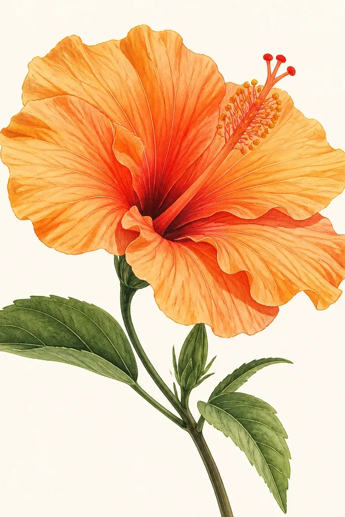
1. Sunset Gradient Hibiscus with Inked Fold Lines
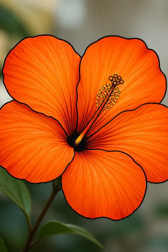
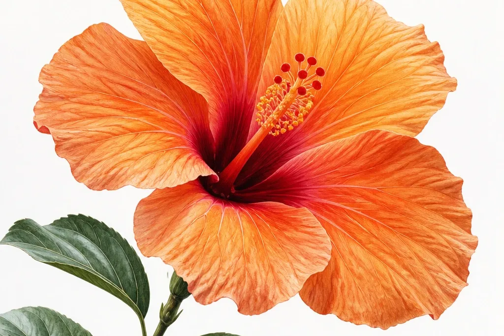
Start by sketching five main petals in a loose star shape, with each tip pointing slightly outward. Trace the outer petal edges with a fineliner, then draw one curved fold line from the base toward the tip on every petal. Color the fold area lightly with tangerine, then blend outward to medium orange, and finish the outer rim with burnt orange. For the center, draw a fan of thin stamen curves and color the bases with yellow; add a tiny warm shadow behind the fan using light burnt sienna.
This style is my go-to when I want a hibiscus that looks crisp but still dimensional. The petals use three orange values: pale tangerine on the fold, medium orange across the mid-petal, and a deeper burnt orange near the rim. I outline the outer petal edges with a 0.5 or 0.3 black fineliner, then I redraw the fold line with the same pen so it looks like a crease. It flatters anyone’s drawing skill level because the structure is doing the heavy lifting; even if your shading is imperfect, the fold line keeps it readable.
Common mistakeDon’t shade the whole petal evenly; flat fill kills the hibiscus shape.
Good to knowBlend orange with a damp brush only along the fold line — keep the edges darker so the flower doesn’t wash out.
2. Orange Hibiscus Silhouette with White Gel Highlights
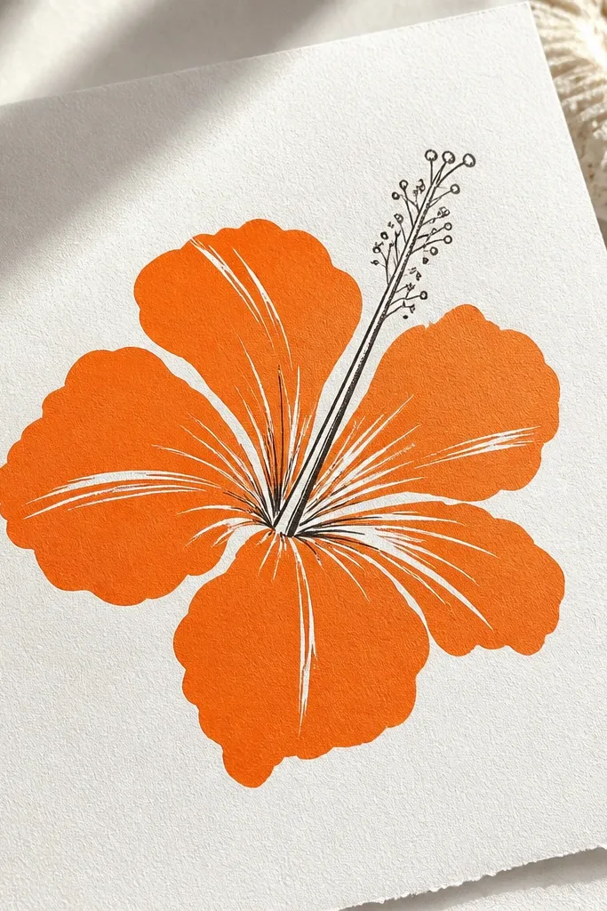
Begin by drawing the hibiscus petals with one continuous outline — keep the outer shape smooth and slightly asymmetrical. Fill the petals with a solid orange (marker works best because it lays down evenly). Add 3-4 curved highlight streaks per petal using a white gel pen, placed near the fold line and toward the tip. Finish by drawing the stamen with a dark pen and dotting the center with a small yellow accent.
This one looks dramatic and clean, and it’s perfect if you’re drawing for cards or stickers without wanting complicated gradients. I use a saturated orange marker or colored pencil to fill the petals, then I add white gel pen streaks where the light hits. The stamen stays simple: a few dark lines fanning out, plus a tiny dot of yellow at the base. It’s flattering for people who struggle with shading because the white highlights create the illusion of texture instantly.
Common mistakeSkip heavy outlines inside the petals; it makes the silhouette look cluttered.
Good to knowUse white gel pen on top of dry marker — if the ink is still tacky, it smears.
3. Watercolor Wash Hibiscus with Salt Speckle Texture
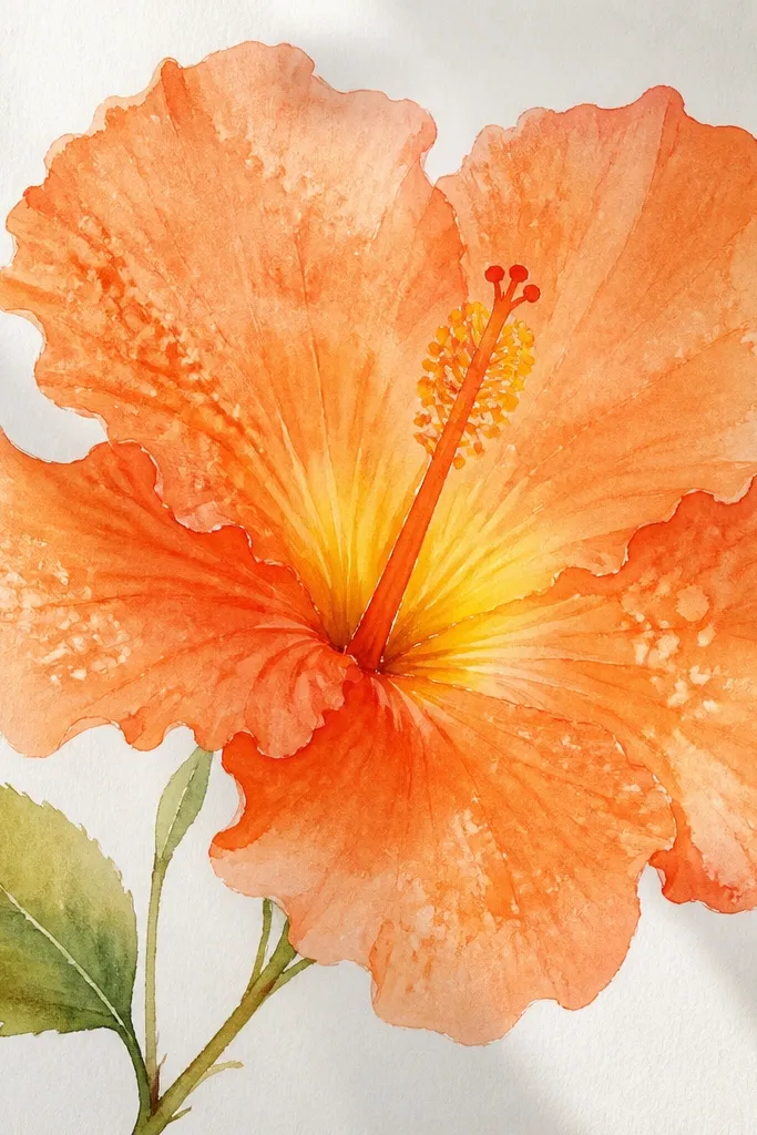
Wet the petal area with clean water first, then paint a loose orange wash from base to tip. While it’s still damp, sprinkle a pinch of salt over the petals and let it sit until the paper dries fully. Brush off the salt gently, then add a darker orange glaze along the outer rim of each petal. For the center, paint a small yellow circle, then soften burnt sienna shadows behind the stamen fan.
This style looks airy and real because the texture is doing the work. I paint the petals with a watery orange wash, then deepen the edges with a second layer of orange-brown. The salt speckle gives the petals a natural mottled look, which is exactly what orange blooms need to avoid looking like a flat sticker. If you have dry hands or shaky control, watercolor forgives you; the speckles hide uneven blending.
Common mistakeDon’t overwork the wet wash after it starts drying; repeated strokes make it muddy.
Good to knowUse thicker paper (at least 140 lb) so the salt doesn’t tear the petals.
4. Colored Pencil Layered Hibiscus with Burnt Sienna Depth
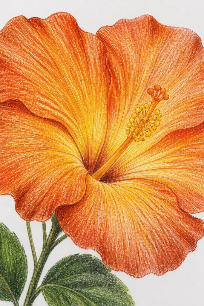
This is the most controllable method I’ve used for orange hibiscus drawing when I want it to look “hand-crafted” and textured. I build the petals in layers: light orange first, then medium orange, then burnt sienna at the rim to create depth. The key is keeping the pencil strokes angled in the direction of the petal fold so the grain looks natural. It flatters medium-skill drawers because the texture hides small shape errors.
Sketch the hibiscus petals lightly, then start coloring with light orange using short strokes that follow the fold direction. Add a second layer of medium orange, leaving the fold slightly lighter. Use burnt sienna only at the outer edge and near the petal base, blending with gentle circular strokes. Draw the stamen fan with a darker brown pencil, then press a little harder at the base and fade outward.
Sharpen your pencil and keep the tip clean; dull tips smear and make orange look dusty.
Don’t blend everything to one tone; orange needs an edge shadow to look dimensional.
5. Marker + Colored Pencil Hybrid Hibiscus with Crisp Edges

This hybrid style gives you the speed of markers and the control of pencil. I fill the petals with a marker so the orange looks even, then I add pencil fold lines and edge shadows so the flower looks like it has form. The center gets pencil work because those thin stamen curves need precision. It flatters anyone who wants clean results without spending hours blending.
Draw the hibiscus outline with a fine pen, then fill each petal with orange marker, staying just inside the outline. After the marker dries, add thin fold lines with a colored pencil in a slightly lighter orange. Shade the outer rim with burnt orange pencil and lightly feather it inward. For the stamen, draw each curve with a dark brown pencil, then add a small yellow base behind the fan.
Use colored pencil on top of dry marker only; if you start early, the pencil drags and clumps.
Don’t outline every inner detail with pen; it makes the petals look busy.
6. Minimal Line Hibiscus with Orange Wash Center
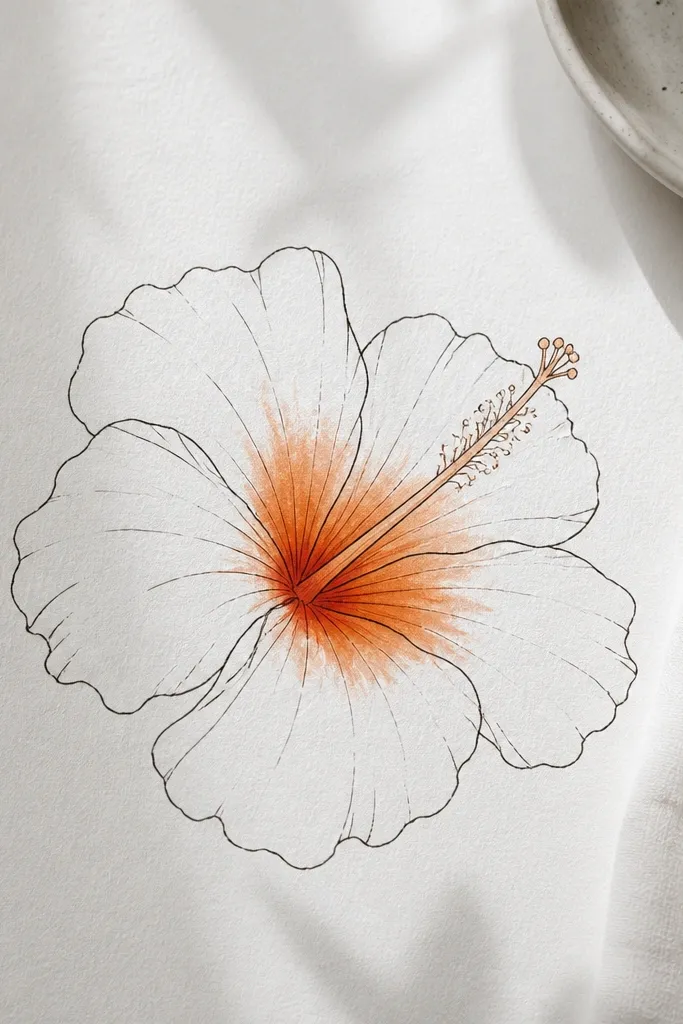
Sketch five petals with thin lines and minimal internal folds. Keep the petals uncolored or lightly tinted with a very pale orange pencil so they don’t look empty. Paint the center using a small brush: a loose orange circle, then soften yellow into the top portion. Add a few dark stamen curves on top of the wash once it’s almost dry.
This is for when you want the drawing to feel modern and airy. The petals are mostly line work, so the hibiscus silhouette stays light and graphic. Then the center gets the color hit: a warm orange wash with a yellow highlight so the flower still looks alive. It flatters planners and small tattoos mockups because the design holds up even at tiny sizes.
Common mistakeDon’t color the whole flower — that defeats the minimalist look.
Good to knowLet the center wash stay slightly uneven; perfect circles look fake in this style.
7. Orange Hibiscus with Patterned Petals (Dotted Marbling)
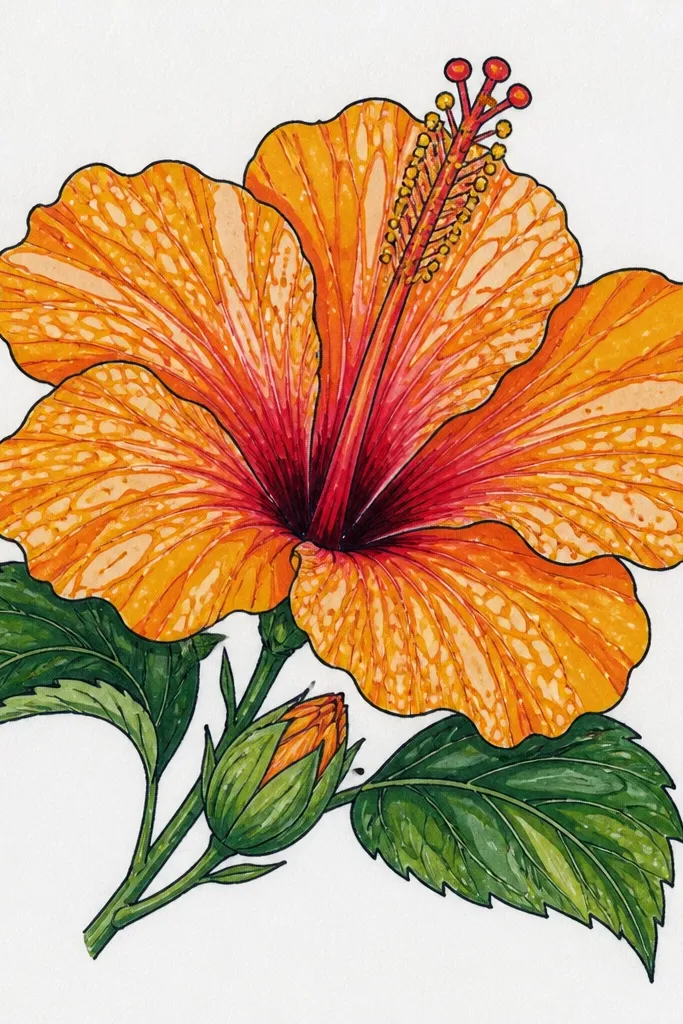
Start with a solid orange base using colored pencil or marker, leaving the fold slightly lighter. Create the marbling by placing small dots with a darker orange pencil in curved lines that mimic the fold direction. Add a few lighter orange dots near the tips for sparkle. Draw the stamen fan with thin brown lines, then color the stamen base yellow and add one small shadow behind the fan.
This style makes orange hibiscus feel decorative instead of botanical. I use a base orange, then I layer dotted marbling patterns that follow the petal fold, so the dots look like they’re wrapped around the form. The stamen is kept simple so the pattern stays the star. It’s flattering for people who like design work because you get a clean, repeatable pattern system without losing the hibiscus identity.
Common mistakeDon’t stack the dots too densely; it turns into a texture block.
Good to knowVary dot sizes — tiny dots near the fold, bigger dots toward the rim.
8. Rough Pastel Texture Orange Hibiscus (Dry Brush Look)
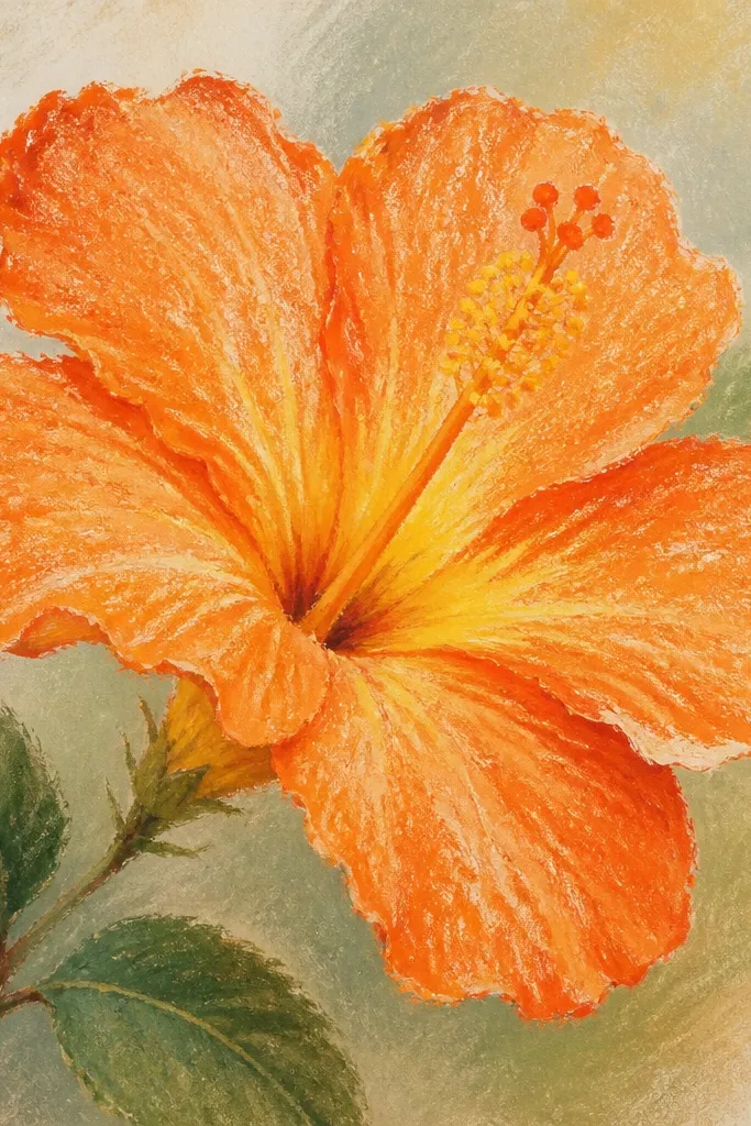
Pastel texture makes orange hibiscus look like it’s been painted, even when your drawing is simple. I use dry brush strokes so the edges look feathered, which matches how real petals catch light. The center stays soft and slightly smudged, then the stamen lines sit on top for contrast. This flatters beginners because the grain hides uneven pencil pressure.
Lightly sketch the petal shapes, then rub orange pastel into the petals with short, dry strokes. Leave the fold area a touch lighter by skipping a few passes there. Add darker orange pastel along the outer rim and blend by lightly tapping with a clean fingertip. For the center, smudge yellow pastel into a warm circle, then draw the stamen fan with a dark brown pencil once the pastel is set.
Fixative helps, but apply it from a distance — too close darkens the orange unevenly.
Avoid heavy smudging across the whole petal; it turns the flower into a single orange blob.
9. Orange Hibiscus Line Art with Single Continuous Stamen Stroke
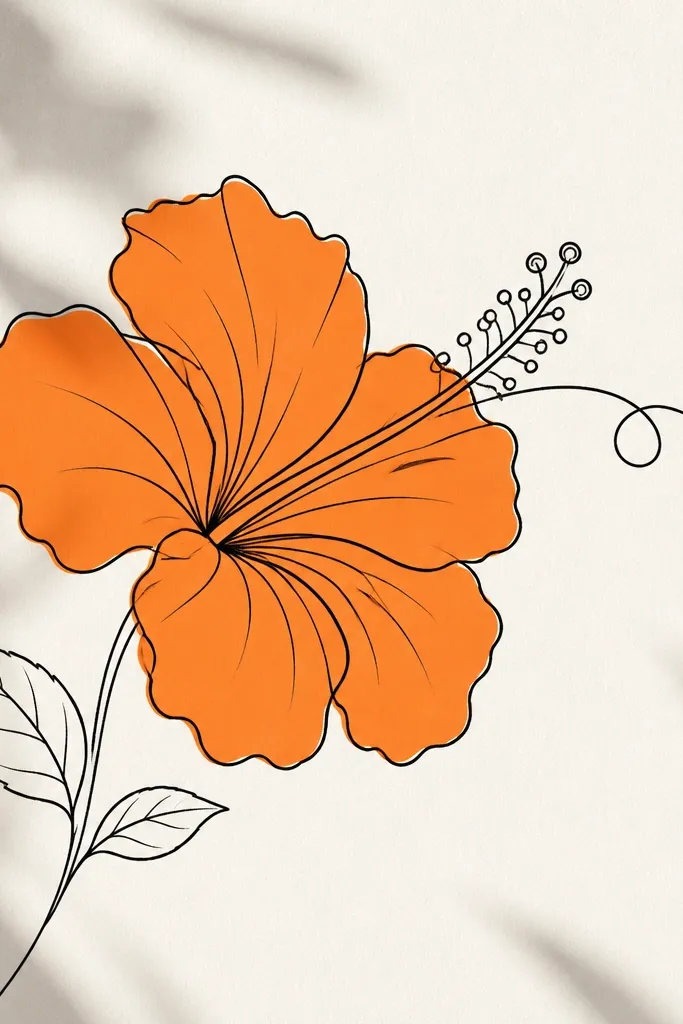
Outline the hibiscus in black, then fill each petal with a flat orange using marker or pencil. For the stamen, start at the center base and draw a single sweeping line upward, then add small outward curls along the way to suggest multiple stamens. Color the base of the stamen with yellow-orange pencil. Add a thin shadow behind the stamen using a very light burnt sienna wash or pencil so the center pops.
This one is about rhythm. The petals get simple orange fill, but the stamen is drawn as a single flowing stroke that branches with small curves. That continuous line gives the center a graceful motion, and it keeps it from looking stiff. It flatters anyone who struggles with drawing lots of tiny stamen lines — you still get detail without the mess.
Common mistakeDon’t make the stamen too thick; thick strokes flatten the center.
Good to knowPractice the stamen stroke on scrap paper first; your wrist angle matters more than you think.
10. Orange Hibiscus with White Petal Veins (Reverse Highlight)
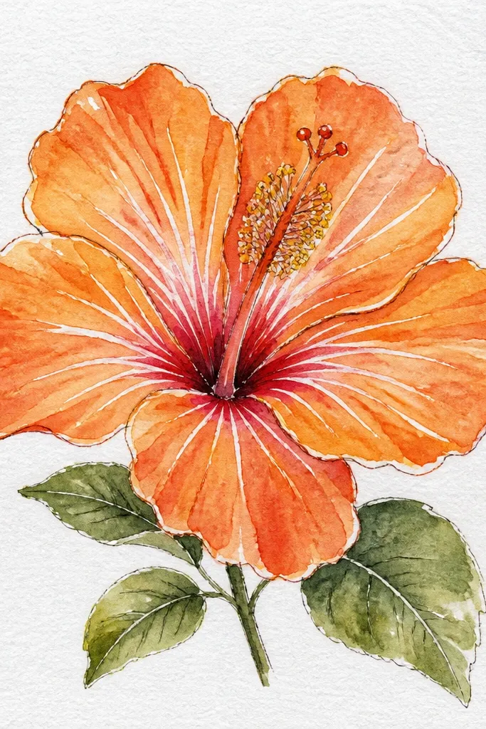
Reverse highlights make orange hibiscus look crisp and almost stained-glass. I start with an orange base, then draw the veins using a white gel pen so the veins show up as bright lines. It gives the petals a real structure, especially when your shading is minimal. This style flatters card makers because it reads clearly from a distance.
Draw the hibiscus outline and fill the petals with a medium orange marker or watercolor. Let it dry completely. With white gel pen, draw vein lines starting at the petal base and branching slightly toward the tip, following the fold curve. Shade behind the stamen with a light burnt sienna pencil, then add a yellow center and thin dark stamen curves on top.
Use gel pen on dry paint and press lightly — too hard makes the ink streak.
Don’t draw veins that are all the same thickness; vary line pressure for a natural look.
11. Orange Hibiscus with Ombre Rim and Soft Center Glow
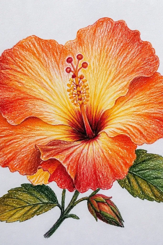
This is a “glow” style. The petals have a dark-to-light rim so the flower looks like it’s lit from the outside, and the center has a creamy gradient that pulls your eye in. I use a lot of soft blending here, but I keep the rim darker so it doesn’t turn into one orange mass. It flatters people who want a calm, dreamy look for prints and stationery.
Sketch five petals and outline them lightly. Color the outer rim first with dark orange or burnt sienna, then blend inward with medium orange using a damp brush or blending pencil. Keep the fold area lighter so the petal shape still shows. For the center, blend yellow into orange, then place the stamen fan on top with dark brown lines once the base glow is dry.
If your rim looks too harsh, soften it with a light orange layer — never lighten the fold area.
Don’t blend the center and petals together; keep the stamen area distinct.
12. Orange Hibiscus Corner Doodle for Bullet Journal Pages
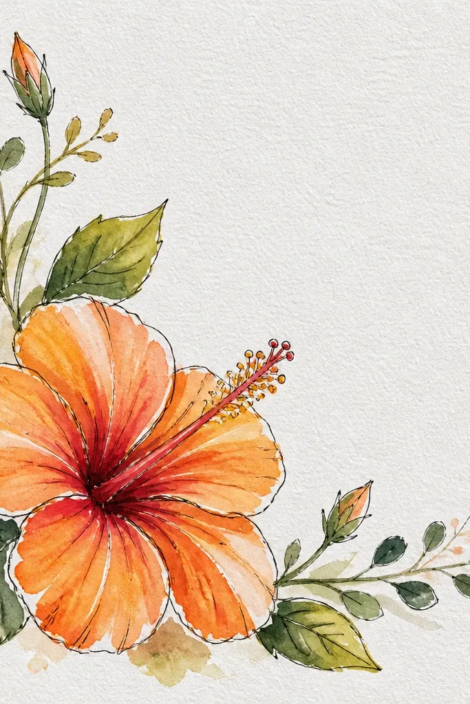
Place the hibiscus in one corner and sketch it at about 2.5 to 3 inches tall. Draw five simplified petals with slightly uneven spacing so it feels organic. Color petals with bright orange, leaving a tiny white edge on the fold side. Add two small leaf shapes in lighter orange or yellow-green, then draw a short stamen fan in dark brown with a yellow base dot.
Corner doodles make your page look finished without taking over. I draw a smaller hibiscus with simplified petals and fewer internal details, then I balance it with two tiny leaf doodles and one curled stem line. The orange stays bright, and the stamen is drawn with just enough lines to read. It flatters bullet journal layouts because it doesn’t compete with your handwriting.
Common mistakeDon’t add too many extra flowers; three elements max per corner.
Good to knowKeep the doodle smaller than you think; corner art looks cleaner when it leaves breathing room.
13. Orange Hibiscus Flower Study with Cross-Hatching Shadows
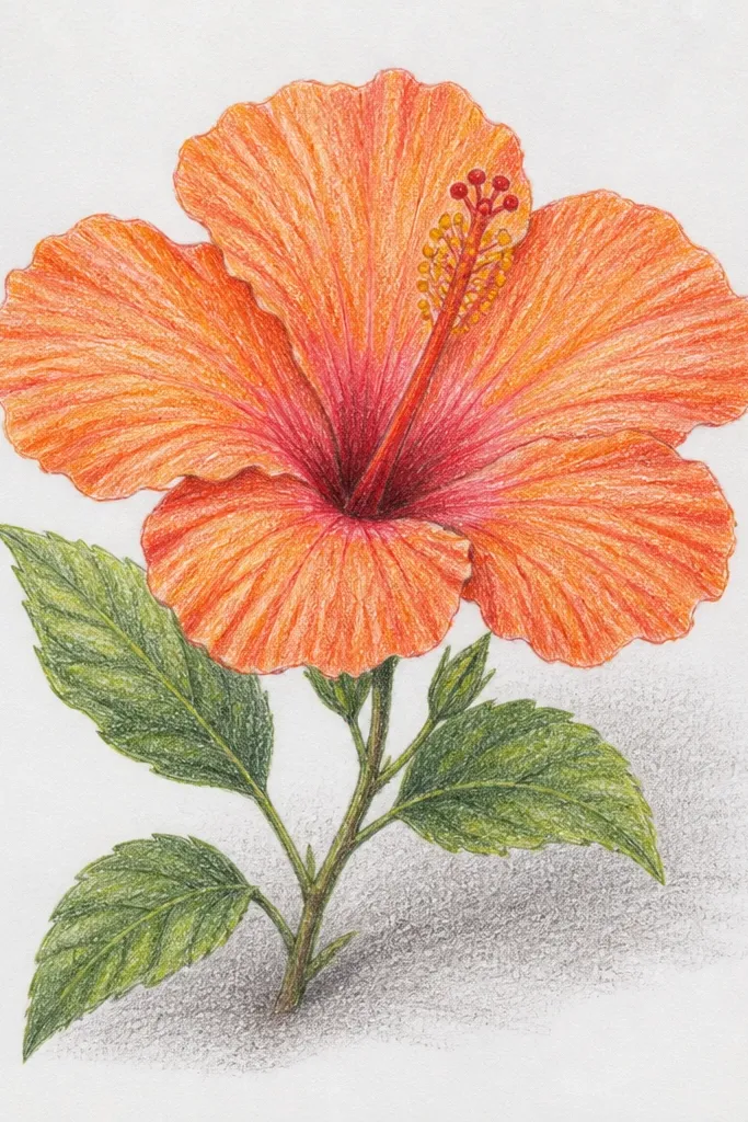
If you want your orange hibiscus to look like it has real form, cross-hatching is the way I’ve stuck with. Instead of blending everything smooth, I use cross-hatching to build shadows under each petal and around the center. The orange stays warm, but the value changes create volume. This style flatters anyone who loves drawing with pencil because it’s predictable and repairable.
Sketch the hibiscus petals and stamen lightly, then pick one light source direction (I use top-left). Shade the fold lines lightly with light orange pencil. Build shadows by cross-hatching with burnt sienna under each petal where it overlaps, and around the stamen base. Keep the highlights near the top of each petal by leaving paper showing or using very light orange only.
Use two hatch angles only — 45 degrees and 90 degrees — so it doesn’t look chaotic.
Avoid shading every surface the same intensity; hibiscus needs overlapping shadows.
14. Orange Hibiscus with Stipple Gradient Petals
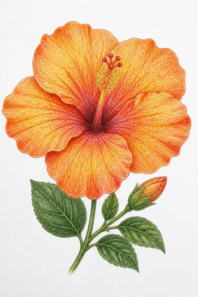
Draw the outline and add a fold line on each petal. Start stippling with light orange dots in the fold region, leaving more space between dots. Move outward and increase dot density toward the outer rim using medium orange, then switch to burnt orange for the darkest edge band. Finish with a yellow center and a thin stamen fan outlined in dark brown pencil.
Stippling makes orange feel textured without messy smears. I use dot density to create the gradient: sparse dots on the fold, denser dots on the rim, and a warm shadow behind the stamen. The stamen stays outlined, so the center reads even with the dotted petals. It flatters beginners because you’re not blending; you’re repeating a dot pattern.
Common mistakeDon’t outline the petals too thickly if you’re stippling heavily; it can look heavy and dusty.
Good to knowUse a consistent dot size; switch colors, not dot size, for cleaner gradients.
15. Orange Hibiscus with Paper Cutout Look (Masking Tape Edges)
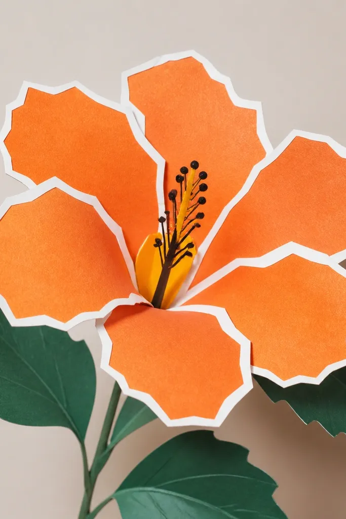
Lightly sketch the hibiscus on watercolor paper. Place thin masking tape along the petal edges and around the fold lines so you preserve white space. Paint the exposed areas with orange watercolor or orange marker, then remove the tape after the paint dries. Add the stamen fan with a dark pen and fill the center with yellow-orange, then soften one warm shadow behind the stamen with light burnt sienna.
This style looks like you made a paper collage even if you only used paint or markers. The crisp white edges happen because I mask the boundaries with thin strips of masking tape before coloring. Orange stays bold and clean, and the center has a defined yellow glow. It flatters anyone doing prints because the edges look professional.
Common mistakeDon’t use thick tape; it creates chunky borders that look homemade.
Good to knowPull the tape back at a low angle to avoid tearing the paper edge.
16. Orange Hibiscus with Ombre Background Wash and White Flower Outline
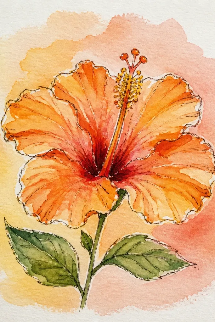
Paint a light ombre background first: pale yellow at the top, blending into light orange toward the bottom. Let it dry. Draw the hibiscus outline with pencil, then paint petals with orange, keeping the fold lighter. Outline the petals with a white gel pen or white paint pen for a crisp edge, then draw the stamen fan in dark brown and add yellow at the base.
Adding a background wash makes the orange hibiscus look like a designed illustration, not just a flower sketch. I keep the hibiscus outline white so it stands out against the warm background. The background is a gentle gradient, usually pale yellow near the top and light orange near the bottom. This style flatters prints and wall art because it creates a finished frame effect.
Common mistakeDon’t make the background too dark or the white outline will look like a sticker edge.
Good to knowUse watercolor for the background so the hibiscus colors don’t look stuck on top.
17. Orange Hibiscus in a Circle Frame with Tiny Dot Confetti
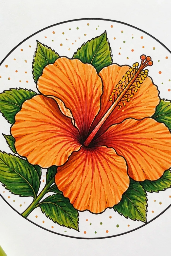
Draw a circle about 4 inches across. Place the hibiscus in the center, keeping petals inside the circle boundary. Color petals with medium orange, deepen the rim with burnt orange, and keep the fold lighter. Add yellow confetti dots outside the flower within the circle, then draw the stamen fan with dark brown lines and a yellow base.
Frames make hibiscus drawings look intentional. I draw the flower centered inside a circle, then I add tiny dot confetti around it so the empty space feels decorated. The orange palette stays consistent: medium orange petals, darker rim shading, and yellow center glow. It flatters scrapbook pages because you can stamp the circle area and it still looks balanced.
Common mistakeSkip large shapes outside the circle; it competes with the flower.
Good to knowMake the confetti dots smaller as they get farther from the flower so it feels airy.
18. Orange Hibiscus with Black-and-Orange Split Tones
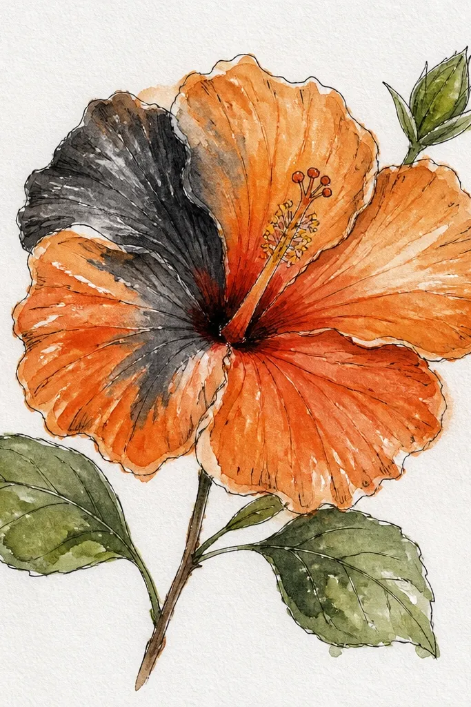
Sketch five petals with clear fold lines. Shade one side of each petal with black (I pick the lower-right side), leaving the fold side orange. Fill the unshaded portion with bright orange and blend slightly at the split edge using a light orange pencil. For the center, paint a yellow circle, then add orange shading near the black shadow side and draw stamen curves in dark brown.
Split tones create a punchy, modern look that still reads as hibiscus. I use black for shadow areas and orange for highlights, which makes the petal shape pop without complicated blending. The center stays warm with yellow, and the stamen lines are dark so they match the shadow tone. It flatters people who want contrast and clean graphic style for t-shirts, posters, or bold greeting cards.
Common mistakeDon’t let black swallow the whole petal; keep a visible orange highlight band.
Good to knowKeep the split direction consistent across all petals for a clean graphic look.
19. Orange Hibiscus with Fine Ink Cross Lines on Petals (Botanical Etching)
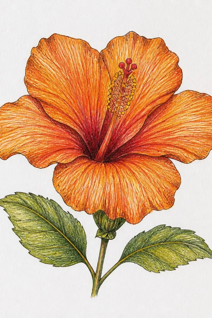
Ink etching lines make your orange hibiscus look like a pressed botanical drawing with warmth. I lay down a light orange wash, then I add fine cross lines over the petals, denser near the rim. The stamen stays minimal and crisp so the etched texture doesn’t overwhelm the center. It flatters artists who like linework because it gives you a clear structure for shading.
Paint a light orange wash across all petals, leaving the fold slightly paler. Once dry, add fine cross lines with a 0.1 or 0.05 pen, following the petal curve. Increase line density near the outer rim and keep lines lighter near the fold. Add a yellow wash in the center, then draw the stamen fan in dark ink and add one burnt orange shadow behind it.
Use a ruler edge lightly under the paper when you draw lines — your curves look steadier.
Avoid thick markers over etching lines; they flatten the detail.
20. Orange Hibiscus Flower Drawing with Two Petals Cropped for Dynamic Layout
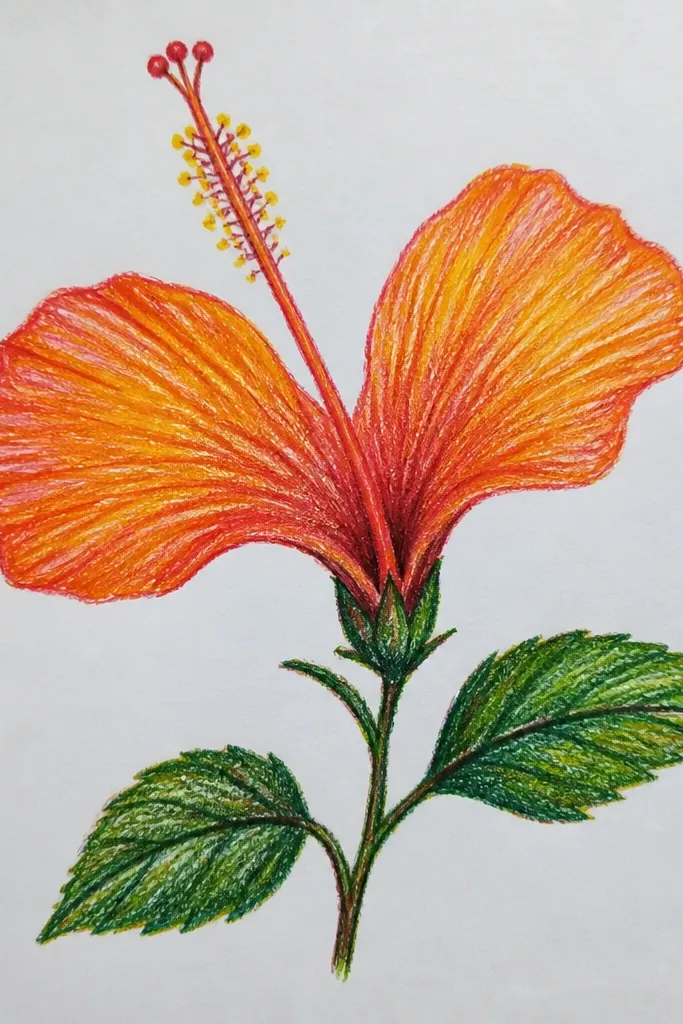
Sketch the hibiscus normally, then intentionally cut off two petals by placing the flower so the paper edge hits the petals. Outline the visible petals with a pen and add fold lines only where petals are fully visible. Color the visible petals with medium orange, deepen the rim with burnt orange, and keep fold areas lighter. Draw the stamen fan fully in the center and add a yellow base, then add a warm shadow behind the stamen on the visible side.
Cropping makes the drawing feel like it’s moving toward you. I shade only the visible petals with deeper orange at the edges and softer orange near the fold, while the center stays fully drawn. This style looks great on prints because the composition feels “designed,” not centered and flat. It flatters anyone who wants a more interesting layout without extra background elements.
Common mistakeDon’t crop the stamen; keep the center intact so it still reads hibiscus.
Good to knowCrop from one corner, not both sides, so the composition doesn’t look accidental.