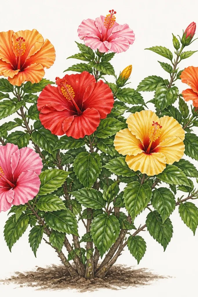
1. Diagonal Cliffside Hibiscus Bush
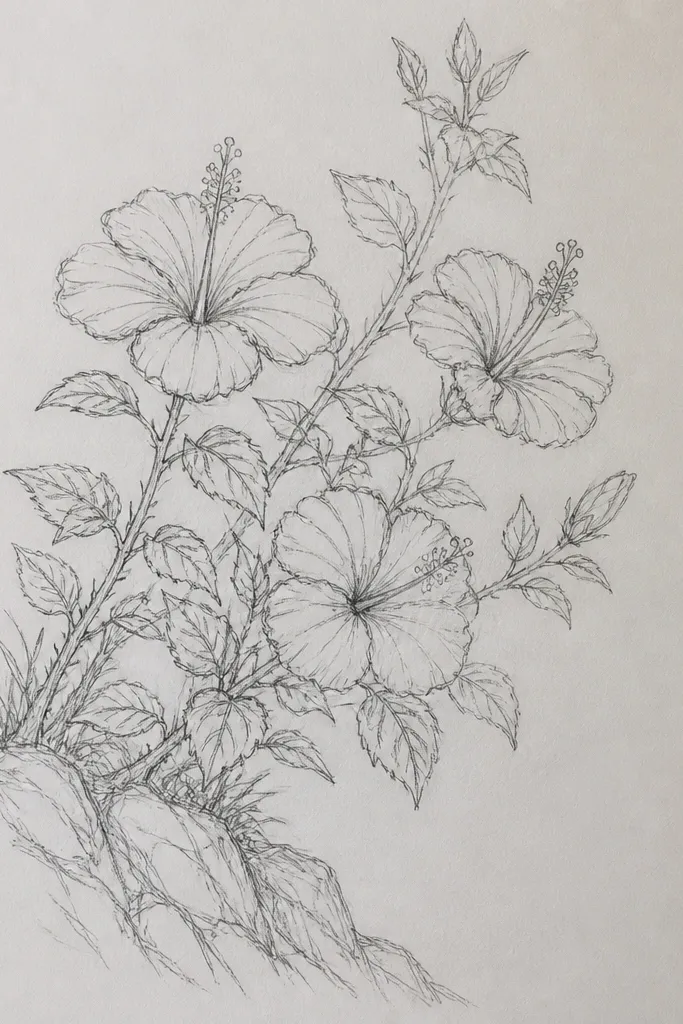
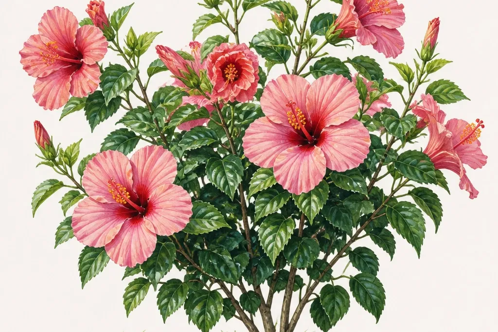
This layout looks dramatic because the bush climbs on a diagonal instead of sitting flat in the center. I put the largest hibiscus in the bottom-left corner so the petals spill upward and right, then I tuck two medium flowers behind leaf clusters so the center stamens still read clearly. The color stays simple: pink petals with a darker magenta base, yellow stamens, and deep green leaves with a slightly warm tint from burnt umber. It flatters anyone who wants a “scene” drawing because it gives you built-in direction — your eye follows the climb. It also looks great for ink-only versions since the diagonal leaf overlaps create depth without needing heavy shading.
Start by lightly sketching a diagonal guide line from bottom-left to top-right, then plan one big foreground cluster at the bottom-left. Add two medium hibiscus around the diagonal line — one facing forward, one turned slightly right — and keep them separated by leaf overlaps. Finally, place small buds and half-flowers along the top edge, then draw leaves that cross over the petal edges like a curtain. Ink the big flower first, then ink the medium ones, and add the smallest buds last so they don’t look heavy. Color the petal bases with magenta first, then soften the rest with diluted rose wash or light pink pencil so the yellow stamens pop.
Good to knowBefore you ink, circle the flow path with a pencil line so you can keep every leaf pointing the same general direction.
Common mistakeAvoid placing the big cluster in the exact center — symmetry makes hibiscus bushes look like a sticker.
2. Garden Path Frame Hibiscus
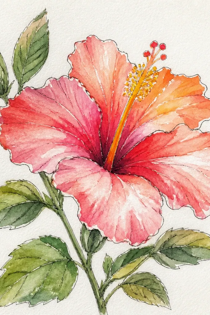
This one feels polished because the bush acts like a picture frame. I draw two large hibiscus at the left and right edges so the petals push inward, then I add one smaller flower at the top center where the leaves arch. The centers stay consistent — yellow stamens with a thin red line near the petal base — so the flowers read clearly even when they’re partially tucked behind leaves. It flatters a “soft garden” vibe and works nicely if you like calmer color palettes. If you do this in colored pencil, it also looks clean because the background path gives you a place for light shading.
Sketch a simple path opening in the middle — a narrow wedge that widens slightly downward. Place one large hibiscus on the left edge and one matching size on the right edge, both angled toward the center. Add a third hibiscus at the top center with smaller leaves that overlap the petals like a crown. Fill the gap with buds and leaf clusters, keeping the leaves smaller closer to the path. Color the path first with pale gray-green, then color flowers last so you don’t accidentally stain the background; finish by adding a darker green underleaf shadow behind each bloom.
Good to knowKeep the path edges lighter than the leaves so your hibiscus frames the scene instead of blending into it.
Common mistakeDon’t draw the background as detailed grass — a simple path is what makes the bush look intentional.
3. Tropical Watercolor Splash Hibiscus
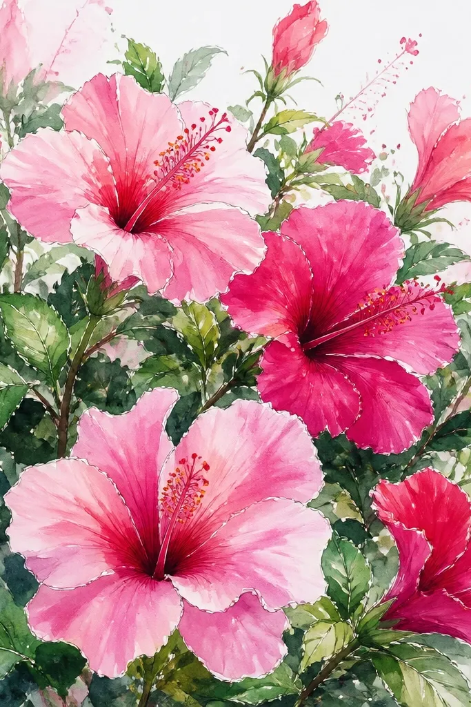
This style is for when you want the hibiscus bush to feel like it’s in motion. I start with watercolor washes that bleed slightly at the edges, then I ink only the key outlines: petal outer edges and the stamen bundle. The color palette is punchy but controlled: rose pink, magenta at the petal base, and pale yellow for the stamens with tiny orange dots. It flatters people who like a freer hand because you’re not forced to draw every single leaf perfectly. Even if your lines wobble, the ink anchors the flowers and keeps the page from looking messy.
Wet the paper lightly where you’ll place the bush and drop in diluted rose wash for the petal shapes, leaving some white paper gaps for highlights. Add magenta only at the base folds of each petal and let it feather outward. While it’s still damp, paint leaf masses in two greens — one cool (green + a little blue) and one warm (green + a touch of burnt umber). When everything dries, ink the stamen bundles and the outer petal edges, then add a few darker ink leaf veins for structure. Finish by splattering diluted green and yellow around the outer edges, not the center, so the flowers stay the focus.
Leave at least 20% of the page as clean white space so the watercolor splash doesn’t turn into a full-page stain.
Don’t ink every leaf vein in this style — it ruins the airy watercolor look.
4. Monochrome Ink Hibiscus Bush with Pop Center
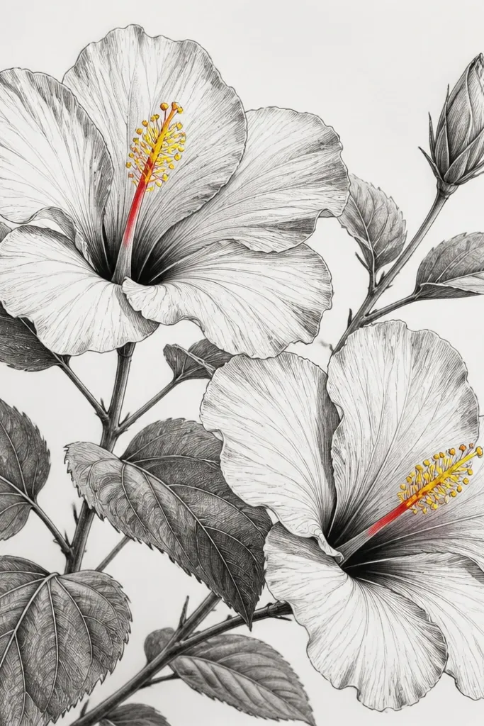
This is the fastest way to make your hibiscus bush look designed instead of decorative. I use ink hatching for petals and leaf shadows, then I color only the stamen area with yellow and a tiny red stroke near the petal throat. The result looks striking because the eye goes straight to the center — where hibiscus naturally draw attention. It flatters anyone who wants their drawing to look good in a sketchbook photo, since the contrast reads even at small size. It also works well if you’re worried about color bleeding or uneven washes.
Sketch the bush in three clusters: one foreground bloom cluster on the left, one mid cluster on the right, and a small cluster at the top edge. Ink petal outer contours with a 0.5 fineliner, then add light hatching inside petals following the curve from base to tip. For leaves, draw the main vein line first, then add short hatch marks on each side. Finally, color only the stamen bundle: paint a warm yellow base and add a thin red line at the inner petal throat using a tiny brush or colored pencil. Darken leaf overlaps with extra ink where leaves cover petals to create depth.
Good to knowIf your yellow looks dull, add a second layer after it dries — hibiscus centers look best with two passes.
Common mistakeSkip coloring the whole petal throat — the center pop should be small and intentional.
5. Botanical Study Row of Hibiscus Buds
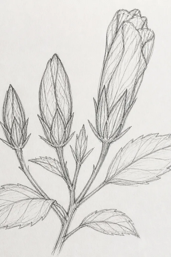
This layout looks like a plant journal page, and it’s great if you want accuracy. I treat each bud like its own little object: tight spiral petals for the bud, then half-open petals for the in-between stage. The leaves are drawn separately with visible vein lines, which makes the whole bush feel scientific without losing charm. It flatters beginners because it’s easier to draw multiple small forms than one giant scene. You’ll also learn hibiscus structure fast because your eye keeps comparing bud-to-bloom changes.
Draw a gentle baseline across the page where the plant sits, then place one large bloom slightly off-center. Add 5-7 buds and half-open flowers along the baseline, spacing them so each one has a clear silhouette. Draw leaves as separate shapes that overlap lightly but don’t hide the buds completely. Use a consistent leaf shape and vary only the size and angle as you move along the row. Color lightly: use pale green for the far leaves, darker green for the closest leaves, and keep petal color muted for buds (light pink wash, no heavy magenta).
Mark the bud tips lightly with a pencil dot before you ink so your petal folds stay pointed.
Don’t make every bud the same size — the row looks fake when everything reads identical.
6. Hibiscus Bush in a Hanging Planter
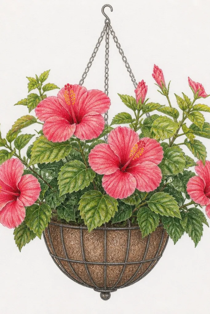
This is a cute, home-project friendly drawing because it turns your hibiscus bush into a usable motif for cards, stickers, and fabric transfers. I draw the planter first — a simple oval rim with a shadow — then treat the bush like it’s pouring down. The largest hibiscus sits near the top of the spill, while smaller buds trail downward along the leaf cascade. The color trick is to keep leaves darker near the planter rim and lighter as they fall. It flatters people who want a cozy, decorative look rather than a landscape scene.
Sketch the planter rim and two hanging lines, then draw a curved boundary where leaves will spill. Put one large hibiscus just below the rim and angle it toward the viewer. Add two medium hibiscus around it, then fill the rest with leaf strands that hang downward and overlap the hibiscus bases. Ink the planter rim and hanging lines before you ink leaf edges so the structure looks clean. Color the planter shadow with cool gray, then paint leaves in two greens and finish by adding yellow stamens last so they stay bright.
When you color leaves, leave a thin lighter edge along one side of each leaf — it makes the cascade look glossy.
Don’t draw the hanging leaves all the same length — the spill needs uneven drops to feel real.
7. Sunlit Hibiscus Bush with Soft Shadow Leaves
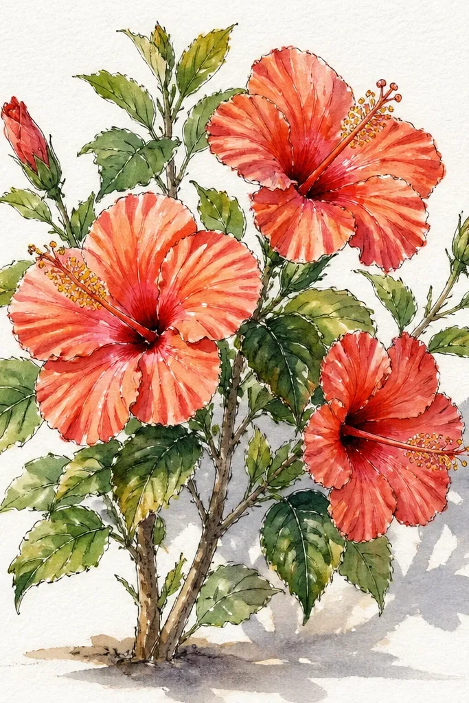
This style looks like late afternoon light on a porch. I keep petals light and use shadows only where leaves overlap, not everywhere. The leaves are shaded with a soft gray-green underlayer so the bush feels dimensional without looking heavy. It flatters anyone who likes gentle color and clean paper — it looks good in watercolor sketchbooks. If you’re making art for a room with warm lighting, this one matches the mood.
Lightly wash a pale background behind the bush using very diluted warm gray or light beige. Paint hibiscus petals with pale pink, leaving white highlights on the upper petal edges. Use magenta only at the base folds and keep it thin. For leaves, paint the top surface green and add a shadow wash under each leaf where it covers a petal. After drying, ink the stamen bundle and add a few darker leaf outlines so the bush doesn’t disappear into the wash.
Shadow first, ink second. If you ink first, your shadows can look like they’re floating under the lines.
Avoid dark green everywhere — it makes hibiscus look muddy in soft lighting.
8. Hibiscus Bush Corner Composition
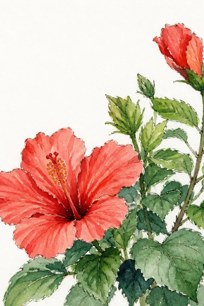
Corner compositions give you a high-end look fast because they use negative space on purpose. I place the biggest bloom so it touches two edges, then I let leaves frame the blank middle. The trick is cropping: the hibiscus doesn’t need to fit fully on the page to look complete. It flatters people designing printable art or wall decals because corners naturally fit frames and margins. The blank space also makes the drawing easier to photograph without glare.
Sketch a big hibiscus at the bottom-left corner and let it run off the page edge by about a third. Add two medium blooms along the right side, each angled slightly toward the corner so the bush feels anchored. Fill the top margin with leaf clusters that overlap petals and cover some flower edges. Leave the middle of the page mostly blank except for a few small buds near the outline of the leaves. Color with simple pink and magenta petals, yellow centers, and deep green leaves, then add a thin ink outline around the outer leaf silhouette.
Good to knowUse a ruler for your page edges and plan your crop before you draw petals — the crop decides the whole composition.
Common mistakeDon’t fill every blank area with leaves — the corner look dies when the page turns busy.
9. Hibiscus Bush with Rainy Droplets
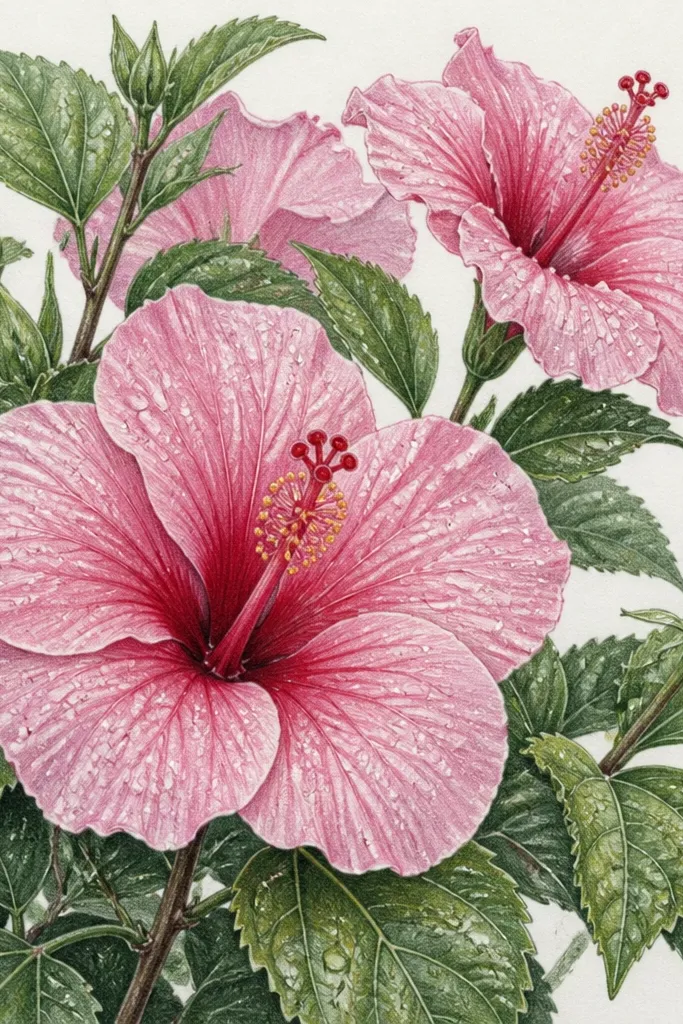
This one is fun because the droplets add texture without changing your drawing skills much. I paint the hibiscus normally, then I add droplets as tiny circles and teardrops with a white highlight. The droplets catch attention, so you can keep the rest of the bush simple and still get a lively result. It flatters anyone who likes whimsical details for greeting cards. The trick is to place droplets mainly on the top surfaces of leaves and the upper petal edges — that’s where rain would land first.
Draw your hibiscus bush with the usual layering: one foreground cluster, two mid clusters, and small buds at the edges. After you color and dry, add droplet shapes on leaf tops and on the upper petals. Use a light gray pencil or watercolor for the droplet body shadow, then add a white gel pen highlight on top once it’s dry. Ink the droplet outlines very lightly so they don’t look like stickers. Color the stamen centers last so the yellow stays bright against the rain effect.
Good to knowUse a 0.8 or 1.0 gel pen nib for droplets so they look round, not scribbled.
Common mistakeDon’t add droplets on the underside of leaves — it reads backwards and looks fake.
10. Hibiscus Bush with Hand-Lettered Botanical Labels
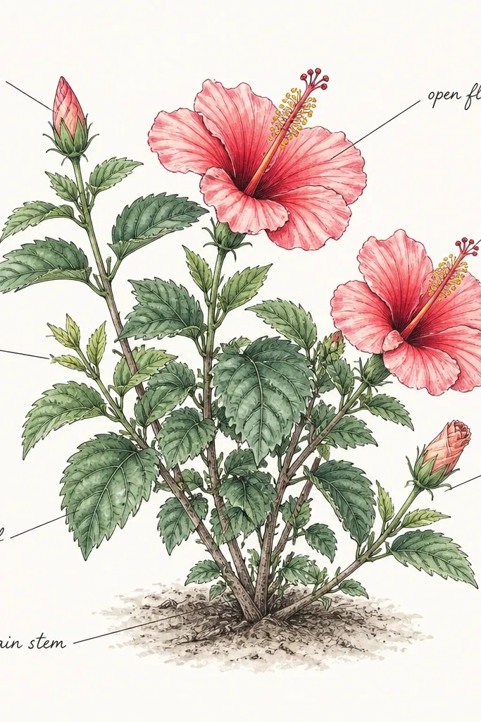
This is how you make a DIY drawing feel like a real botanical card. I place labels only for three points: one leaf cluster, one bud, and the main bloom. The hibiscus stays the star, and the labels add personality without clutter. It flatters people who like functional decor, like wall art or desk prints, because the text makes it feel intentional. If you do it in pencil first, you can adjust label placement until it doesn’t crowd the petals.
Sketch the hibiscus bush first with a clear main bloom in the center and two supporting clusters on either side. Draw three thin leader lines using a light pencil — one to a leaf cluster, one to a bud, one to the main hibiscus. Ink the bush, then erase any pencil lines that show through the ink where you don’t want them. Add label text in pencil or fine pen, keeping each label short (one or two words). Color the drawing lightly, and keep label text uncolored so it stays crisp against the plant.
Good to knowWrite labels after coloring so you can see where the bush highlights are and avoid placing text on a dark shadow patch.
Common mistakeAvoid long sentences — labels should read in one glance.
11. Hibiscus Bush with Woven Basket Background
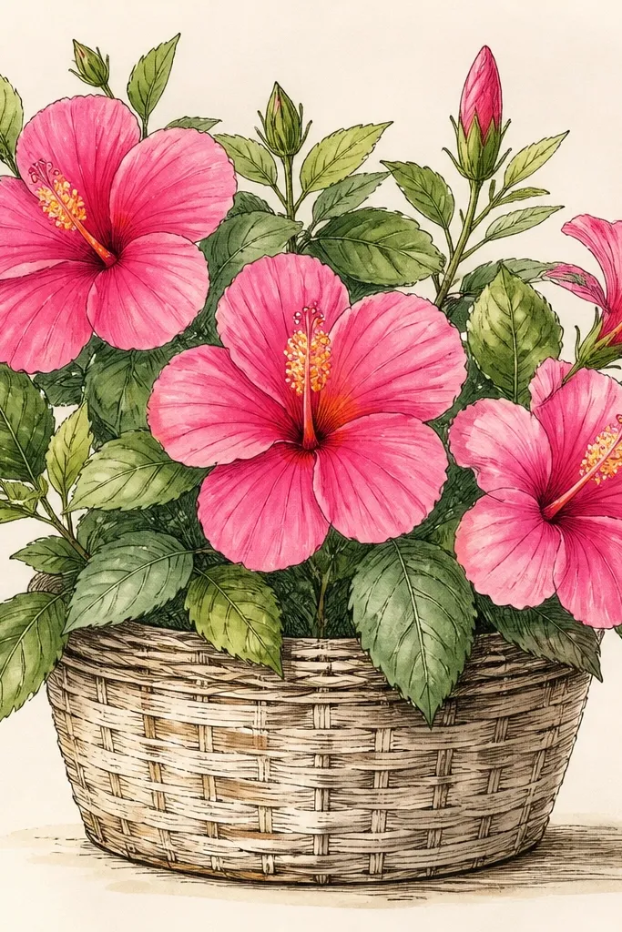
Woven backgrounds make hibiscus look like it belongs in a homey kitchen or patio setting. I draw the basket texture first in light pencil or gray ink, then I layer leaves and hibiscus over it so the plant pops forward. The texture gives you a second pattern to enjoy, but the key is keeping the basket behind and lighter than the flowers. It flatters warm-toned spaces because the wicker lines look cozy under pink petals. If you’ve ever felt hibiscus drawings look too flat on plain paper, this fixes it.
Lightly sketch a basket rectangle or oval, then draw vertical wicker lines and cross them with gentle curves for the weave. Keep the basket lines thin and light so they don’t compete with the hibiscus. Place one large hibiscus near the center and two medium blooms near the top, then let leaves overlap the basket lines. Ink the hibiscus outlines after the basket is in place, and use darker ink on leaves where they cover basket texture. Color petals with pink and magenta base, then add yellow stamens and a warm green leaf shade with a tiny burnt umber tint.
Press lightly on the basket lines — if the basket is too dark, it steals attention from the flowers.
Don’t color the basket the same intensity as the leaves.
12. Pink Hibiscus Bush with Lime Leaves Contrast
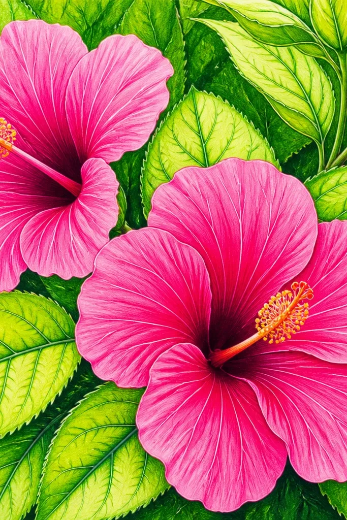
This color combo looks fresh because lime leaves fight with pink instead of blending into them. I use lime green for the top leaf color and a darker green only for shadows under overlaps. The hibiscus petals stay in the pink family with a magenta throat line so the center looks like it’s glowing. It flatters drawings that need to read clearly at a distance — like wall art or prints. If you’re making a DIY transfer, this palette also holds up because the contrast survives photocopying.
Sketch your bush with the usual layering: big foreground cluster, medium mid clusters, and small buds at edges. Color leaves first with lime green, then add a second darker green layer under leaves where they cover petals. Paint hibiscus petals in light pink, then darken only the petal base folds with magenta. Color stamens yellow and add tiny orange dots on the anthers for realism. Finish by outlining the outer leaf silhouette with a thin darker green line so the bush doesn’t fade.
When using lime, add a touch of blue to the shadow green so shadows look crisp, not muddy.
Avoid using the same green for shadows and highlights — it makes the bush look flat.
13. Hibiscus Bush with Sunset Gradient Sky Wash
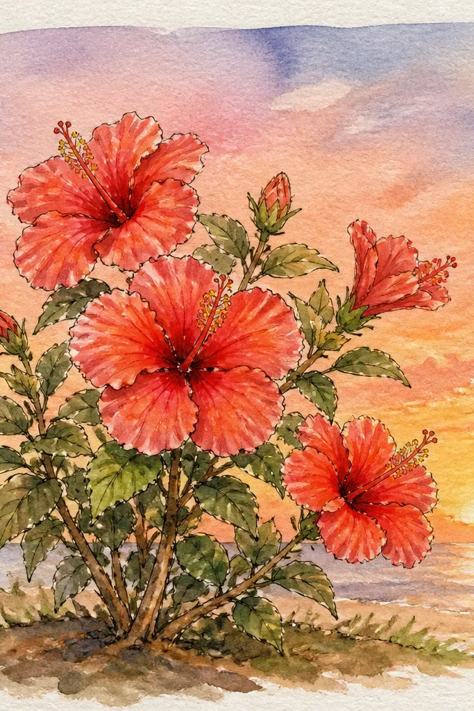
A gradient sky makes hibiscus feel like a real outdoor moment. I paint the sky first so it sets the mood, then I draw the bush as a foreground shape with clear leaf overlaps. Keep the sky light and let the hibiscus do the color work — too much saturation in the background makes petals look dull. This flatters anyone who likes atmospheric art without heavy detail. It’s also great for practicing negative space because you’ll outline the bush against the sky wash.
Wet the paper at the top area and paint a pale lavender wash, then blend down into peach and a tiny touch of warm orange near the horizon line. Let it dry just enough so it doesn’t smear when you draw. Sketch the hibiscus bush in pencil with one main cluster in the lower third and smaller buds trailing upward. Ink the leaf outlines and petal edges, then paint petals with pink and magenta base, followed by yellow stamens. Add leaf shadows with a slightly darker green and a hint of gray so leaves look grounded against the bright sky.
Good to knowKeep the gradient edges soft but the hibiscus outlines crisp — that contrast is what sells the scene.
Common mistakeDon’t paint the sky too dark or your flowers will lose their shine.
14. Hibiscus Bush with Patterned Fabric Background
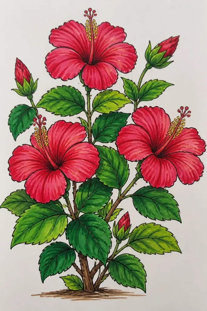
Patterned backgrounds make hibiscus look like it belongs on a tote bag or a cushion. I keep the pattern simple so it doesn’t fight the plant: small dots and thin stripes in muted colors. The hibiscus sits on top with stronger contrast — darker leaf shadows and brighter petal bases. It flatters people who like DIY craft visuals because the drawing reads like design, not just a plant study. You can also adapt it for fabric transfer by keeping the pattern light.
Create a background pattern first: draw thin diagonal stripes and small dot clusters in light gray-green and pale pink. Keep the pattern at low contrast so the hibiscus stays dominant. Sketch the hibiscus bush with one large bloom at center-left, two medium blooms around it, and buds near the lower right. Ink the hibiscus and leaves with darker lines than the background pattern. Color petals with light pink plus magenta at the base, then color leaves deep green with warm shadows. Leave the background uncolored or lightly washed so the pattern stays subtle.
Good to knowUse a single background pattern scale: if dots are small, keep all dots small across the page.
Common mistakeDon’t add intricate florals behind the hibiscus — it becomes visual noise.
15. Hibiscus Bush with Pencil Shading and White Highlights
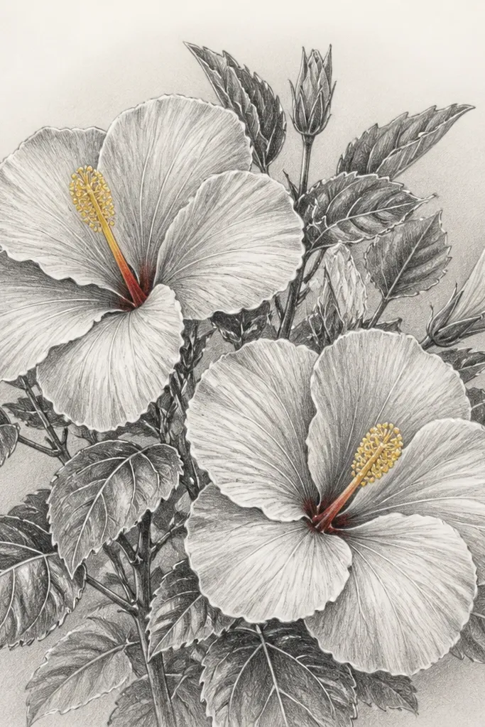
This is the version I reach for when I want a clean, controlled look without watercolor mess. Pencil shading gives you smooth gradients on petals, and white gel pen highlights make the hibiscus feel glossy. I shade petals lightly at the base folds and keep the tips brighter. Leaves get a graphite shadow under overlaps so the bush has depth. It flatters anyone who draws in sketchbooks and wants it to look good even when scanned. Also, this style forgives small mistakes because highlights can hide uneven coloring.
Sketch the hibiscus bush in pencil with a clear foreground cluster and overlapping leaves. Shade petals with graphite using a light circular motion, heaviest at the base fold and lighter toward the tip. Add leaf veins with a light pencil line, then shade under each leaf where it covers a flower. Color the stamen bundle with light yellow pencil and add a tiny red line at the petal throat. Finally, add white gel pen highlights along the upper petal edges and a few leaf veins for shine.
Good to knowSharpen your pencil to a fine point for leaf veins, then wipe away stray graphite with a kneaded eraser so highlights stay crisp.
Common mistakeAvoid smudging everything — glossy hibiscus needs selective shine, not a gray haze.
16. Hibiscus Bush with Ink-Only Leaves and Watercolor Petals
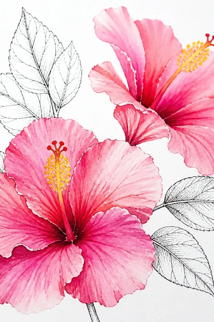
This combo looks sharp because the leaves give structure while the petals stay soft. I paint the petals with watercolor first, then I ink the leaf veins and outer leaf edges so the bush has a backbone. The contrast between soft petals and crisp leaves makes the hibiscus feel fresh and airy. It flatters people who want a clean line aesthetic without coloring every leaf in paint. It also works well if you want to make a repeat pattern later, like for wrapping paper.
Sketch your bush with pencil, placing one large hibiscus in the foreground and two medium ones behind it. Paint petals in watercolor: rose pink for most of the petal, magenta at the base fold, and leave white paper highlights. Let petals dry fully. Then ink leaves only: outline leaf shapes and draw the main vein plus a few short side veins. Ink the stamen bundle and a few petal edges so the watercolor doesn’t look unanchored. Optionally add a thin green wash at the very base of leaves if you want extra depth.
Good to knowLet petals dry completely before inking leaves — wet ink makes leaf lines bleed into pink petals.
Common mistakeDon’t watercolor the leaves too — the point of this look is crisp leaf structure.
17. Hibiscus Bush with Paper Cut-Out Edge Effect
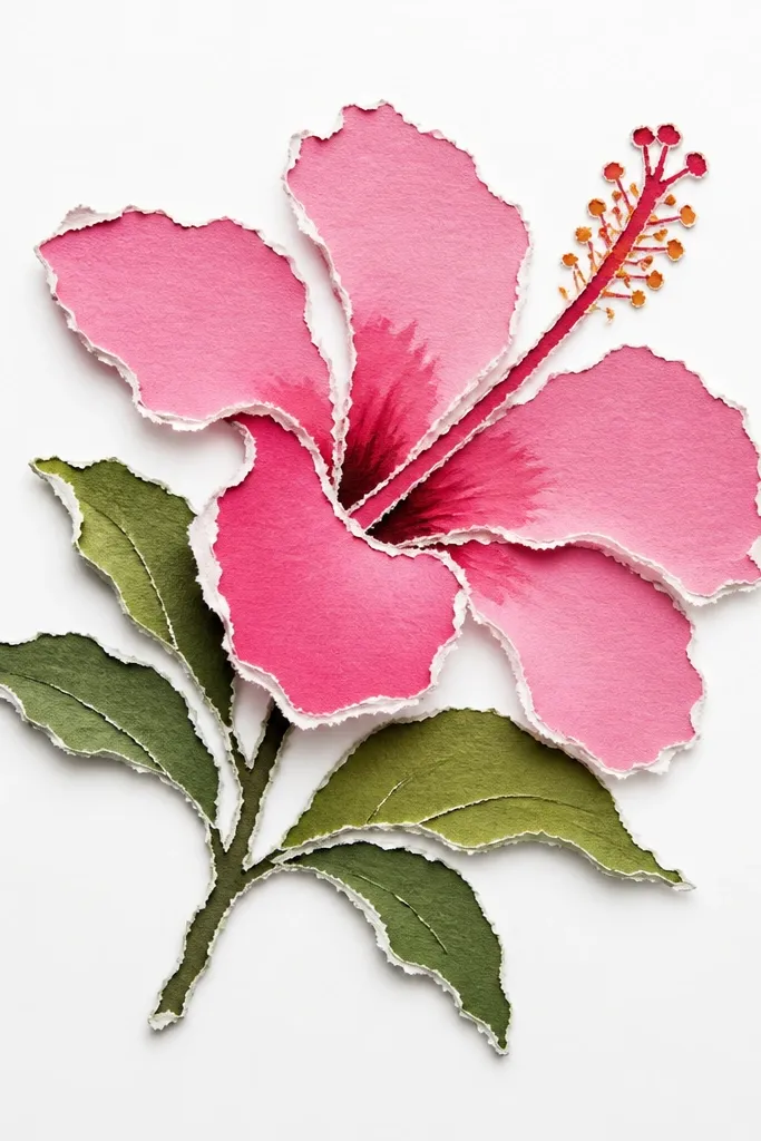
This idea gives a handmade, craft-paper feel even if you’re using standard drawing tools. I create the torn edge by drawing the outline with intentional roughness and then coloring inside the silhouette. It flatters people who want their hibiscus art to look tactile, like it could be layered on a scrapbook page. The torn edges also hide small drawing errors because the irregular outline disguises uneven lines. When you keep the background plain, the texture effect reads clearly.
Sketch the bush silhouette first with a rough outline — don’t aim for smooth curves. Fill the hibiscus petals with pink and magenta base, keeping the edges slightly darker for contrast. Color leaves in deep green and add lighter green highlights on leaf tops. Add ink only on the stamen bundle and a few petal veins, leaving other lines uninked so the torn edge stays the star. If you want the edge to look more cut-out, lightly erase a few pencil bits along the outline before final coloring.
Good to knowUse a darker color pencil right at the silhouette edge so the torn look reads even on low-resolution photos.
Common mistakeDon’t over-ink the whole silhouette — it turns into a normal cartoon outline.
18. Hibiscus Bush with Hanging Vines and Buds
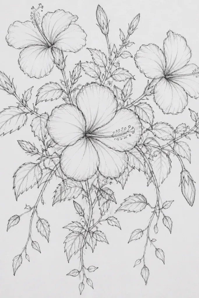
Adding hanging vines makes your hibiscus bush feel like it’s growing in real time instead of sitting in place. I draw thin vine lines with slight curves, then I hang buds from them so the whole plant has vertical rhythm. The larger hibiscus stays higher up, which keeps the drawing from feeling bottom-heavy. It flatters anyone who likes a romantic, porch-climb vibe without drawing a full wall or trellis. The vines also give you thin lines to balance the thicker petal shapes.
Sketch a main bush mass with one big foreground hibiscus slightly above the center. Draw two or three vine lines extending downward from the bush mass, then add small buds along those vines at different distances. Place leaves so they overlap the vine lines — leaf edges should cover parts of the vine to create depth. Ink the vines with a 0.3 fineliner for thinness, then ink the hibiscus petals and stamen bundle. Color petals in light pink with magenta base folds, and color buds in lighter pink with minimal magenta. Finish by adding a few darker leaf shadows under the biggest blooms.
Good to knowVines look better when they have tiny bends, not smooth arcs — mimic how real stems twist.
Common mistakeAvoid hanging every bud at the same height — it makes the vines look like decorations.
19. Hibiscus Bush with Side-View Profile Cluster
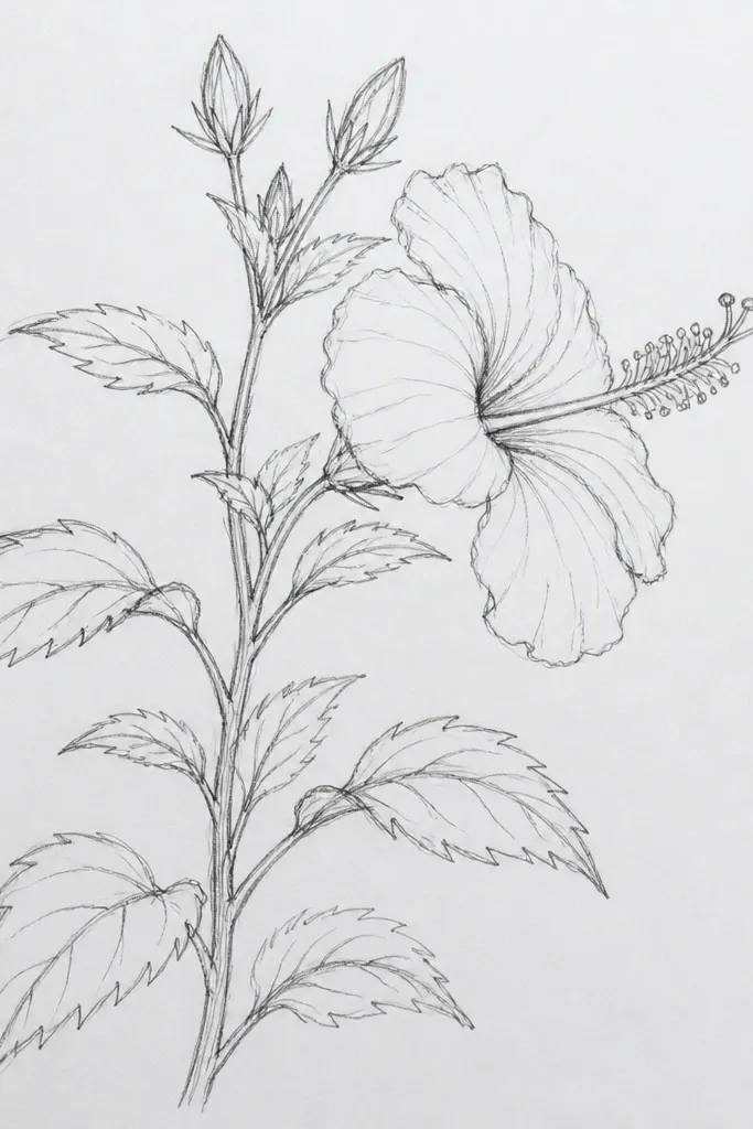
Side-view clusters make hibiscus look more natural because real plants have depth, not a flat front. I keep only two blooms fully facing you and angle the rest so their petal shapes overlap like stacked plates. The leaves are drawn in layers with clear overlap — front leaves cover parts of the middle leaves. This flatters readers who want a more realistic drawing without needing complicated backgrounds. It also works great for teaching yourself perspective because you’re practicing angles, not scenery.
Draw a simple side profile outline for the bush using a rough silhouette. Place one big hibiscus in the front layer, then add a second bloom behind it angled slightly away from you. Fill the middle with smaller half-flowers and tight buds, and stack leaves so each new leaf covers the one behind it by about a third. Ink the front layer first so it stays crisp, then ink the back layer lightly. Color petals with pink and magenta base folds, and keep back-layer petals lighter by using diluted color. Add leaf veins and a darker shadow line under each overlap to sell the profile depth.
Good to knowIf a bloom looks too face-on, rotate it by drawing one petal edge thinner and more curved to show the side angle.
Common mistakeDon’t draw every bloom as a perfect symmetrical flower — side view needs uneven petal edges.
20. Hibiscus Bush with Frame of Leaves Only
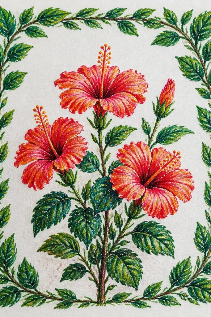
This is an elegant use of negative space without making the page feel empty. The leaf frame does the work of a border, then you place just a few hibiscus inside so each bloom gets attention. I keep the big center hibiscus slightly lower than the middle so it feels grounded, and I tuck small buds into the corners of the leaf frame. It flatters anyone who wants their drawing to look like decor for prints, invitations, or a DIY label. The leaf frame also lets you use repeating leaf shapes to stay consistent.
Sketch a rectangular or rounded frame boundary lightly, then fill the border with leaf clusters that overlap each other. Make the outermost leaves slightly larger and darker to anchor the frame. Inside the frame, draw one large hibiscus near the center and two smaller blooms — one near the upper right, one near the lower left. Add small buds between the flowers but avoid filling the entire interior with leaves. Ink leaves with a consistent line weight, then ink hibiscus petals and stamen bundle. Color leaves in deep green with lighter highlights, and color petals in pink with magenta at the base so the center bloom looks like a focal point.
Repeat one leaf shape at least three times in the border so the frame feels intentional, not random.
Avoid too many flowers inside — the leaf frame should be the first thing you notice.