1. Classic front-facing hibiscus with 6-petal symmetry
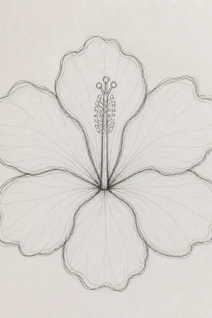
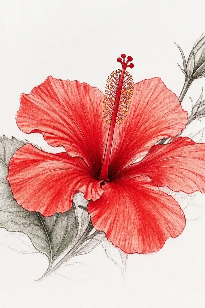
This one teaches you hibiscus symmetry without turning it into a generic flower. Draw six petals evenly spaced, then make the overlap lines slightly offset so the petals look stacked, not pasted on. Use a light pink-red palette in your pencil choices: HB outline, 2B for mid areas, and a darker 4B only for the throat ring. This style flatters a clean, balanced page layout and works great for small tattoos or greeting cards because the shape reads fast. Keep the stamen and stigma small at first; the petal ring is the star here.
Start with a light circle guide for the overall flower and a vertical center line. Sketch six petal shapes using curved “teardrop” forms, then add a single overlap line on each petal that tucks under the next. Shade the inner overlap ring with 2B and leave a thin highlight strip along the top edges of the petals. Add vein lines from the center guideline outward, keeping them lighter than your overlap shadows. Finish by darkening the petal-to-throat junction and adding a tiny dot highlight in the throat.
Good to knowIf your symmetry feels stiff, tilt just two petals by a few degrees so the bloom looks alive, not printed.
Common mistakeDon’t shade the whole petal evenly — hibiscus looks flat when every section is the same darkness.
2. Side-angle hibiscus with overlapping petal depth
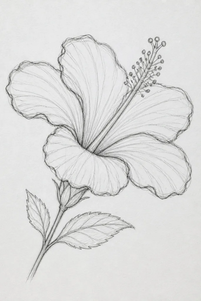
Side-angle hibiscus is where your drawing suddenly looks dimensional. The far petals should feel “lifted” because less of them block light, so their shading stays lighter and edges look thinner. I use overlap depth as the main realism tool: the petal that sits on top has sharper contrast and a darker underside. This works especially well for portrait-oriented pages and for people who struggle with perspective in flowers. It also looks great in botanical-style sketchbooks because the bloom feels like it’s turning toward you.
Begin with an oval for the bloom mass and place the center line slightly off to one side. Draw three petals on the near side larger and with darker underside shading, then draw the far-side petals smaller and lighter. Add a clear “hidden” edge where the top petal covers the one behind — that edge is where you concentrate contrast. Shade the underside of the near petals with 2B, then deepen only the throat overlap using 4B. Finish with veins that curve slightly with the petal — don’t draw straight lines.
Good to knowTo get the near/far look, press harder only on the overlap edges, then lighten pressure as you move away from the throat.
Common mistakeDon’t center the throat if the bloom is turned — the off-center throat sells the angle.
3. Hibiscus throat gradient with a sharp highlight rim
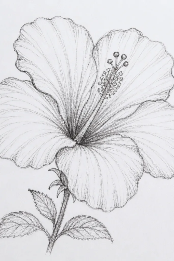
This study is all about the throat, because hibiscus looks realistic when the center has depth and a controlled highlight. I draw the throat as a rounded cup: dark at the overlap ring, mid-tone in the cup walls, and a pale highlight where the light hits. Keep the highlight rim thin and crisp — if it’s smudged, the whole bloom looks chalky. This is a good pick if you’ve had hibiscus turn muddy when you shade too much. It also makes your drawing look “finished” even if your petals are still developing.
Start with the petal ring lightly, just enough to show where the throat sits. Draw the throat as an oval cup and mark the overlap ring as a curved band. Shade the band first with 4B, then blend outward with 2B while leaving the highlight rim unshaded. Use a kneaded eraser to lift a narrow bright line along the top of the throat cup. Add converging veins that get lighter as they approach the highlight.
Blend with a light circular motion near the center, then stop — blending past the highlight rim is what ruins the clean look.
Don’t fill the center with uniform dark graphite — the throat needs a gradient and a preserved rim.
4. Vein practice: radiating hibiscus lines with tapered ends
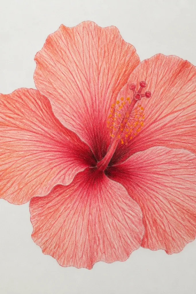
Veins are the difference between “flower-looking” and “hibiscus-looking.” I learned to draw them by treating each vein like a ribbon that fades at the tip, not a permanent etched line. The center should have tighter spacing, and the spacing increases as veins reach the outer petal edge. This style is perfect for learning because it removes pressure to shade perfectly. It also flatters beginners because you can get a strong result with minimal shading.
Sketch one petal shape first and draw a center guideline running the petal’s length. From the guideline, add 4-6 vein lines on each side, starting close together and then spacing them wider as they go outward. Keep the vein ends tapered by lifting pressure as you reach the tip. Lightly shade the petal base with HB so veins stay visible. Repeat across the six petals, keeping vein direction consistent with the petal curve.
If your veins look too dark, draw them with the side of the HB pencil instead of the tip for softer taper.
Don’t draw identical veins on every petal — hibiscus veins vary, and that variation looks natural.
5. Frayed petal edge hibiscus with controlled speckle
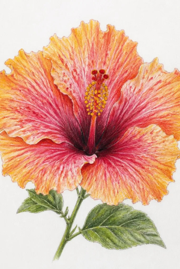
That slightly ragged edge is a hibiscus signature, and it makes your drawing feel hand-made. The key is contrast control: keep the interior smooth, then add texture only along the outer rim. I use a light hand and let the paper tooth catch graphite for the speckled effect. This look is great for a more natural, garden-sketch vibe and it hides minor outline mistakes because the edge breaks up the silhouette. It’s also a lifesaver if you always draw perfect edges and your flowers feel too “cartoon.”
Draw your hibiscus petals with a clean outline first, even if you plan to rough the edge later. Shade the petal interior gently with HB, then decide where the edge will fray — usually the top outer rim and a few spots on the sides. Use a sharpened 2B pencil and make tiny micro-notches along the perimeter, varying their size. For speckle, tap the pencil lightly with the tip just above the edge, then blend inward with a clean blending stump only a little. Finish by re-tracing the main overlap edges so the flower still reads clearly.
Good to knowUse a kneaded eraser to lift a few tiny gaps in the speckle — that gives the fray a lighter, airy look.
Common mistakeDon’t speckle the whole petal — texture everywhere turns into a dirty gray bloom.
6. Two-tone petal shading like a real hibiscus photo
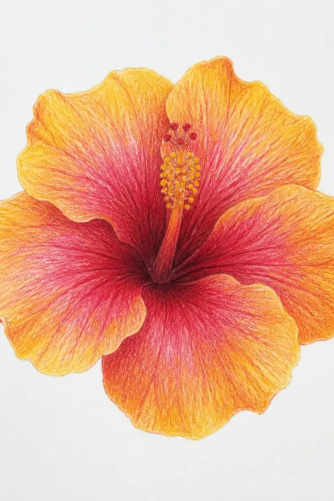
Most hibiscus photos have a two-tone feel: outer petals fade lighter, and the inner petal area deepens as it approaches the throat. When you copy that split, the bloom looks instantly more like a living flower. I shade with a hard edge transition, then soften only the middle part so it doesn’t look painted with a marker. This style flatters anyone trying to draw from color photos without getting overwhelmed. It also makes your drawing look richer without heavy black tones.
Sketch the petals and overlap lines lightly with HB. Mark a curved boundary on each petal: lighter outer zone up to about the midline, then a darker inner zone toward the throat. Shade the outer zone with HB to keep it airy, then shade the inner zone with 2B. Blend the boundary just slightly with a stump so it looks like light wrap, not a hard stripe. Deepen the overlap junctions with 4B and add veins so they sit across both tones.
Good to knowHold your pencil at a low angle for the outer zone so it stays soft and pale.
Common mistakeDon’t blend the boundary until it disappears — the two-tone split is what sells the realism.
7. Hibiscus petals with ink outline then graphite fill
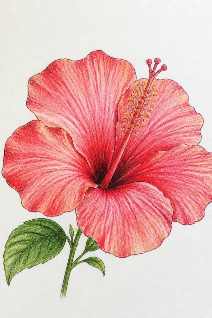
This is the workflow I keep coming back to when I want clean results. Ink gives you a confident edge, and graphite does the soft work inside the petals. The reason it looks better is separation: your outline doesn’t get dragged around by smudging while you shade. It also flatters people who love line art but struggle with shading — you can keep the ink lines as your structure. For hibiscus, where petals overlap, ink makes the hidden edges read immediately.
Sketch the hibiscus lightly with HB first, including petal overlap lines and the vein direction. Trace only the outer petal silhouette and the overlap boundaries with a 0.5 fineliner, leaving the interior veins uninked. Let the ink dry for a minute or two, then shade the petals with HB and 2B, keeping the darkest spots at the overlap underside and throat ring. Add veins with a light HB touch, following the same direction you drew earlier. Finish by darkening the overlap edges with a 2B pencil if any ink lines need extra contrast.
Good to knowUse a kneaded eraser only after ink dries — graphite lifting too early can smear your outlines.
Common mistakeDon’t ink the whole interior — too much ink can make the flower look heavy and flat.
8. Giant petals filling the page for impact
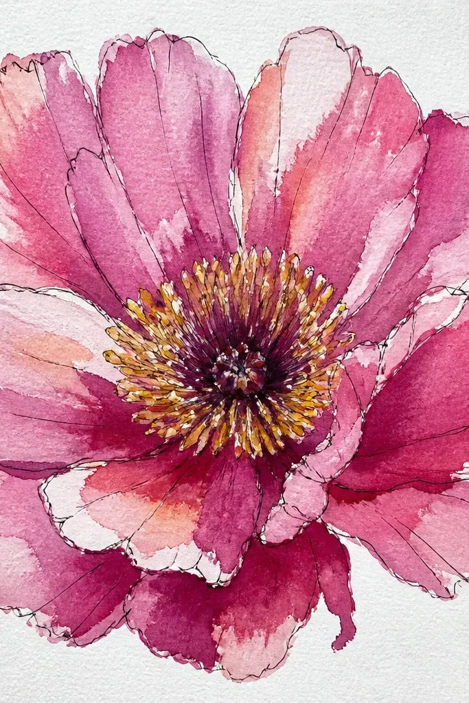
Big petals change your drawing habits in a good way. When the petals fill the page, you stop drawing tiny lines that you can’t control, and you can see your shading transitions better. It also looks impressive for wall art or cover sketches because the bloom has a strong silhouette. This style flatters beginners because the shape is the main focus, not perfect micro-detail. It also works well when you’re drawing with limited time and want a finished-looking piece quickly.
Draw a light border margin, then plan the hibiscus so the outer petal edges sit within about 1 cm of the margin. Sketch the petal shapes larger than you think you need, keeping the center circle as your anchor. Shade the overlap underside areas with 2B and use 4B only at the throat ring and the deepest overlap cuts. Add veins that are slightly thicker in the center and taper outward, since the scale needs readable detail. Keep the stamen lines fine and minimal so they don’t compete with the petals.
Good to knowIf you lose the shape while shading, stop and re-trace the petal silhouette lightly with HB before continuing.
Common mistakeDon’t cram the veins everywhere — at big scale, too many lines make it look busy.
9. Minimal hibiscus line drawing with 3 shading pockets
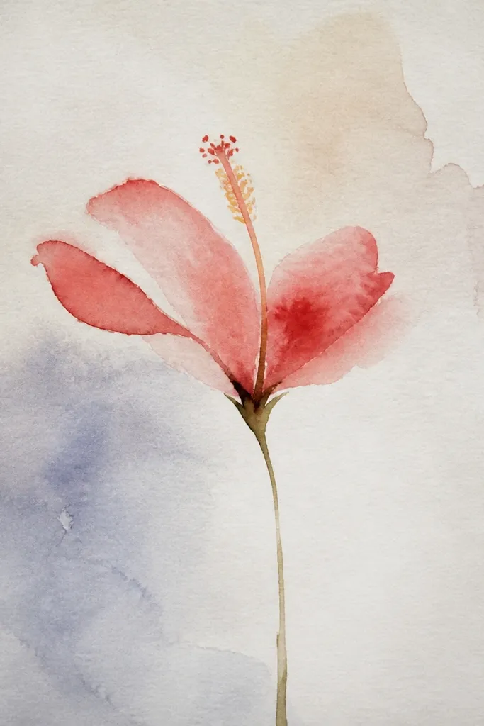
This is for when you want the hibiscus to look airy and graphic. Instead of shading every petal, you place three high-impact shadows that define the form. I learned this after my early hibiscus drawings got muddy because I tried to render everything. This approach keeps the edges crisp and makes the flower read instantly. It’s great for quick studies, journaling, and covers where you want something pretty without heavy rendering.
Sketch the hibiscus with HB using confident outlines for petal edges and overlap boundaries. Add a few vein lines per petal — enough to show direction, not enough to fill every space. Choose three shadow pockets: one under the top overlap petal, one curved ring around the throat, and one small underside highlight break on a far petal. Shade each pocket with 2B, then deepen the throat ring with 4B. Leave the rest of the petals white or lightly tinted with HB.
Good to knowUse the kneaded eraser to lift tiny highlights inside the throat ring — it makes the minimal style feel dimensional.
Common mistakeDon’t add extra shading just because it feels unfinished — minimal becomes messy fast.
10. Hibiscus with colored pencil wash over graphite veins
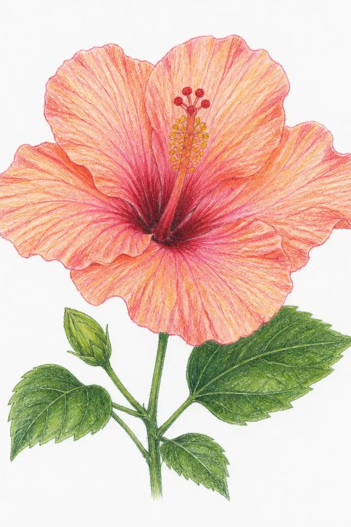
I like this hybrid when I want realism but I don’t want to fight with full watercolor. Graphite veins anchor the structure, and colored pencil adds the petal mood - pink, coral, and a darker inner blush. The reason it works is that pencil color sits into the paper tooth and respects the line direction you already drew. It flatters people who like color but struggle with staying within lines. Also, it photographs well because the veins peek through instead of disappearing.
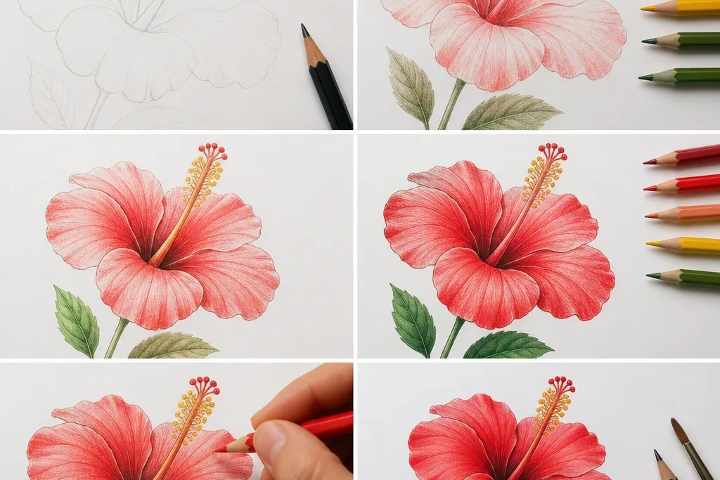
Start by drawing the full hibiscus in HB, including vein lines and the overlap shadows. Shade the throat ring lightly with 2B so it’s ready to deepen. Apply a light pink-red colored pencil wash over the outer petal areas, keeping pressure light and even. Then layer a darker rose or maroon only near the inner overlap zones and throat ring. Burnish lightly with a blending tool or clean finger in small circles to smooth transitions, but stop before the veins vanish.
Good to knowPress lighter than you think on the outer petals — hibiscus color should look airy, not painted thick.
Common mistakeDon’t color over the overlap edges with the same pressure as the petal center — you need contrast at the cuts.
11. Hibiscus with pencil stipple texture on inner petals
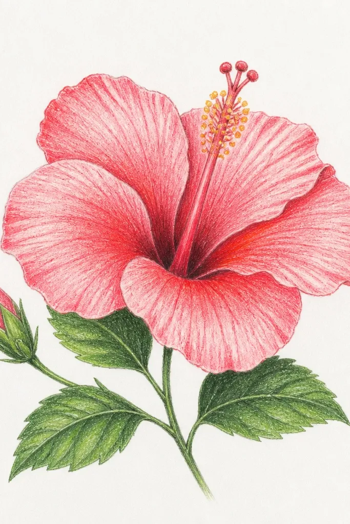
Stipple texture is how you get that slightly velvety hibiscus look. You’re not trying to fill the whole petal — you’re creating a surface variation that catches light differently. I use it mostly on the inner petal zones where real hibiscus often looks denser and more saturated. This style works well for people who like texture and want to avoid smudgy shading. It also hides small pencil imperfections because the dots create a consistent pattern.
Sketch petals and overlap lines in HB and draw vein direction lightly. Shade the outer petal areas with HB only, keeping them smooth. For inner zones near the throat, use a sharpened 2B pencil and create stipple dots following the petal curve. Increase dot density near the throat ring and reduce it as you move outward. Keep veins lighter than the stipple layer so they still read. Finish by darkening overlap cuts with a few heavier 4B strokes, not more stipple.
Good to knowUse smaller dot clusters near the throat and let them spread out — that size change sells depth.
Common mistakeDon’t stipple the entire flower — outer petals will look gritty instead of soft.
12. Hibiscus stamen focus with clean linework
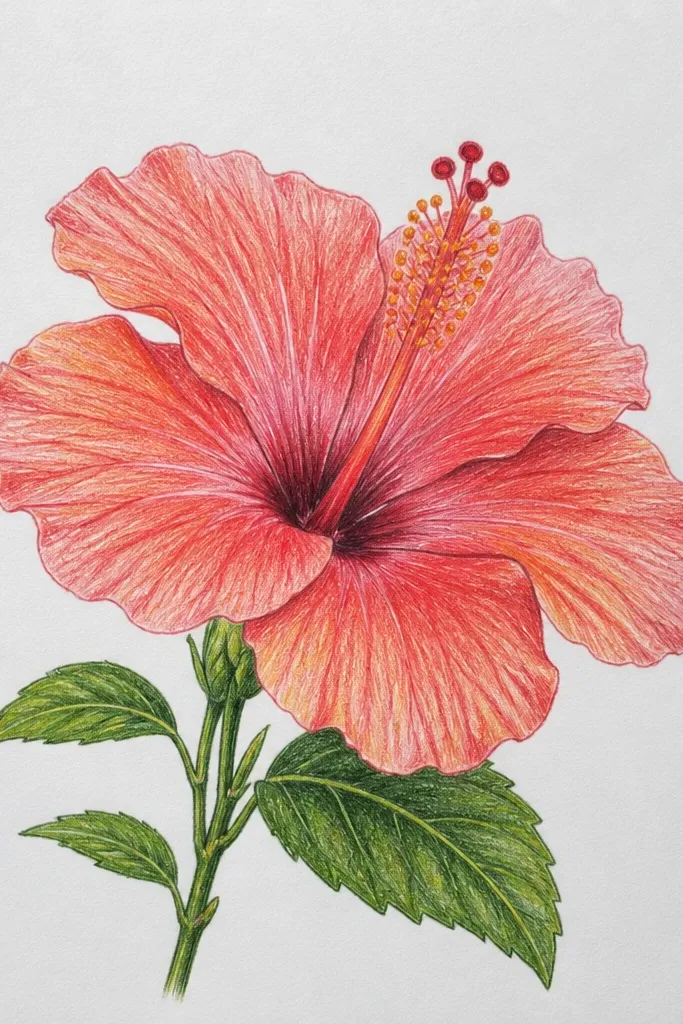
If your hibiscus center looks generic, it’s usually because the stamen is too thick or too symmetrical. This study forces you to draw filaments as separate threads that vary in thickness and curvature. Keep the anthers small and add tiny dark dots where pollen gathers. This style flatters anyone who likes botanical accuracy because the center becomes the focal point. It also works great for stickers or small art prints because the stamen detail reads even at a distance.
Draw the petals lightly as a frame so the center has room. Sketch the center throat shape and then draw 10-12 filaments as thin lines radiating outward and slightly upward. Vary filament thickness by using lighter pressure for the far ones and slightly darker for the near ones. Add anthers at the tips — small ovals with a few dots of 4B graphite inside. Shade the throat ring lightly with 2B so the stamen sits in a shadow pocket.
Good to knowKeep a steady hand by resting your wrist on the paper edge and moving from the elbow for the filaments.
Common mistakeDon’t make all filaments the same length — real hibiscus centers look uneven in a good way.
13. Hibiscus petals with colored marker edge + graphite interior
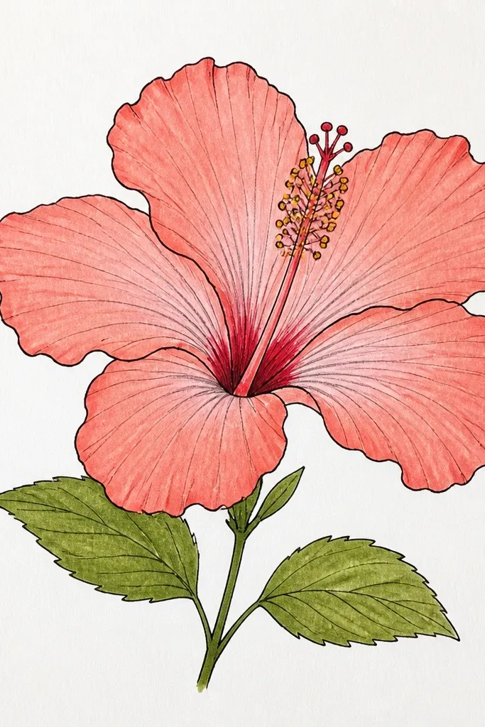
This technique is fast and it looks crisp on paper. The marker edge gives you a clear silhouette and overlap definition, while graphite keeps the petal form soft. I use a light red or magenta marker and only apply it to outer rim lines and a few inner overlap boundaries. This style flatters people who want the flower to pop without coloring every petal fully. It also makes your drawing look intentional even if your graphite shading is still learning.
Sketch the hibiscus in HB and decide exactly where the marker will go: outer petal silhouettes and the overlap cuts. Color those edges with a light red or magenta marker using short strokes that follow the petal curve. Let the marker dry completely, then shade the interior with HB and 2B so it stays muted. Deepen the throat ring and the underside overlaps with 4B graphite. Add veins with HB lightly, so they show through but don’t fight the marker color.
Use a scrap paper test first — markers vary, and you want a thin edge, not a thick band.
Don’t marker-blend the interior — it turns into flat color that kills the hibiscus depth.
14. Hibiscus in a square frame with margin breathing room
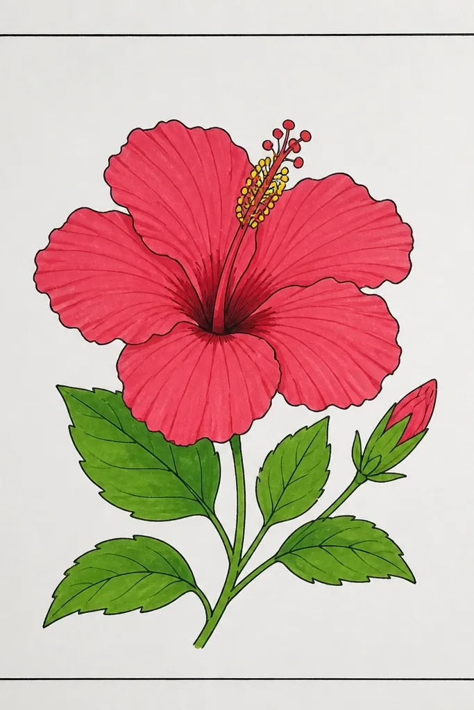
Framing changes how your eyes judge spacing. When hibiscus is centered with no margin, it often looks crowded and heavy. A square frame forces you to scale the bloom and control where the darkest tones land. I place the flower slightly above the center line so the throat doesn’t feel like it’s sinking. This style is great for prints, journal stickers, and any piece you plan to scan. It also helps you avoid over-detailing because the composition has room to breathe.
Draw a square border about 1 cm from the page edges. Sketch the hibiscus slightly above center so the petals have space to expand downward. Keep the outer petal silhouettes inside the border — no touching the frame. Shade the overlap underside and throat ring as your darkest areas, then keep the rest lighter. Add veins selectively: more visible on the near petals, lighter on the far ones. Finish with a thin HB cleanup pass on any lines that stray too close to the border.
Good to knowKeep the border line lighter than your flower lines so the bloom stays the focus.
Common mistakeDon’t place the darkest throat directly in the middle of the square — it makes the composition feel stuck.
15. Hibiscus with pencil watercolor effect using wet brush
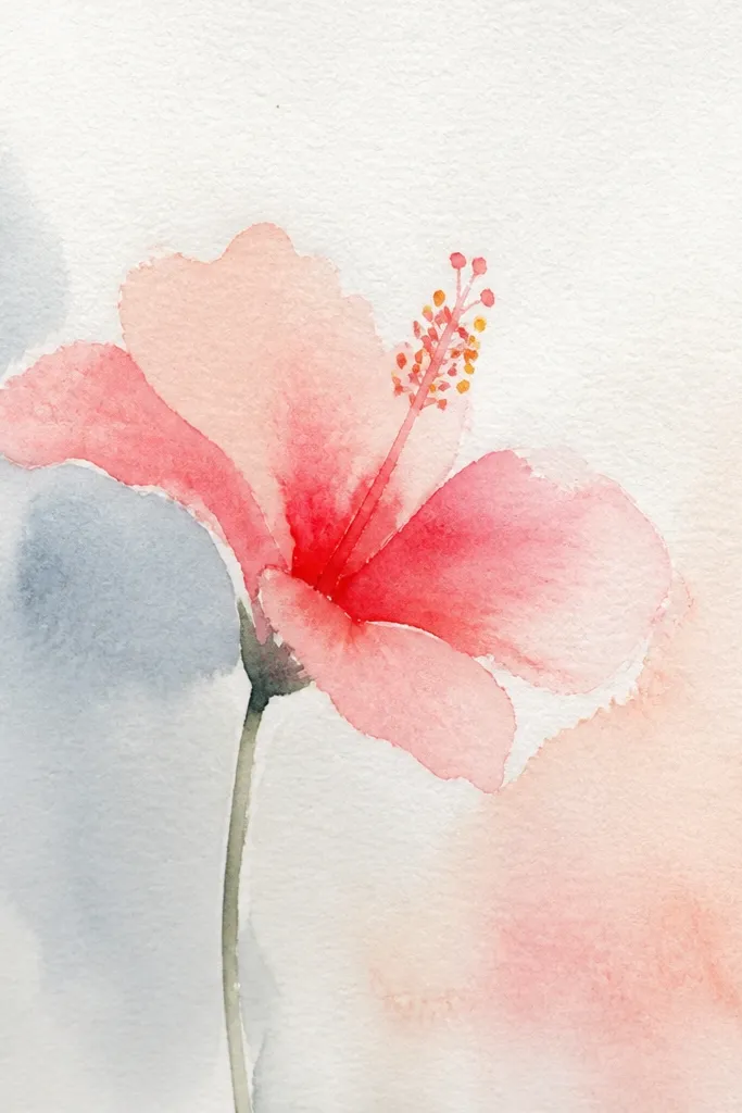
Wet brush over pencil gives you that hibiscus “glow” without doing full watercolor. You still get control from your pencil structure, but the wash softens transitions and reduces harsh graphite texture. I use this when I want a dreamy look while keeping the petal overlap readable. It flatters people who hate hard shading and want smooth gradients. The key is restraint — you’re tinting, not painting over every detail.
Use HB to sketch the hibiscus and draw overlap boundaries and vein direction. Lightly shade petals with pencil so there’s pigment to pick up. Dip a clean round brush in water, then touch it to a shaded area so the pencil dissolves into a wash. Work in small sections: outer petals first, then inner zones near the throat. Keep the vein lines lighter by not saturating over them. Darken the throat ring with extra pencil after the wash dries.
Good to knowUse two passes: one light wash, then a second tiny pass only where you need deeper color.
Common mistakeDon’t over-wet the paper — it buckles and turns your petals into blobs.
16. Hibiscus with dramatic shadow under petals
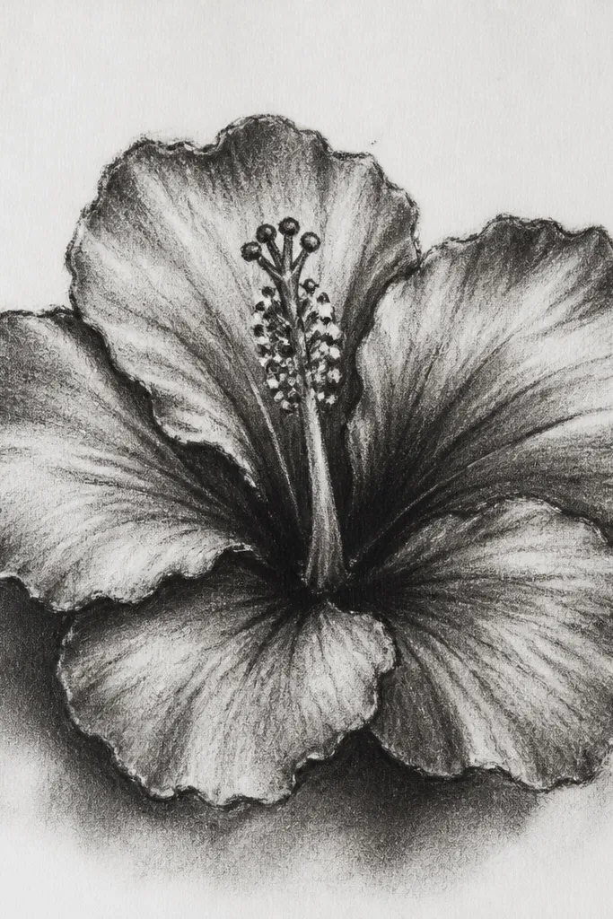
Dramatic shadows make hibiscus look sculpted. I don’t mean black everywhere — I mean you choose one light direction and commit. The underside of each overlapping petal gets a dark shadow wedge, while the top edges keep crisp highlights. This style is dramatic but still believable because it follows the overlap structure. It’s great for making a drawing look high-contrast and poster-like. It also helps you learn where shadows actually fall in layered flowers.
Sketch petals with overlap lines and decide a single light direction. Leave highlight strips on the top edges of each petal — don’t shade over them. Shade the underside of overlapping petals with 2B, then deepen the deepest overlap cuts with 4B. Add a strong throat ring shadow with 4B and blend it outward only slightly. Keep vein lines light so they don’t turn into dark scratches against the shadow.
Use a kneaded eraser to carve back tiny highlight edges on the petal tips for extra pop.
Don’t shade the top of petals — highlight areas must stay lighter or the flower turns flat.
17. Hibiscus with realistic pencil cast shadows around the bloom
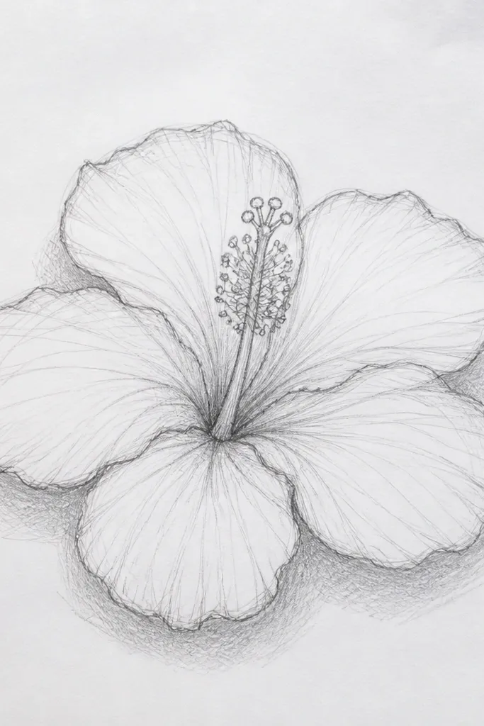
This one makes the whole drawing feel like it’s sitting on paper, not floating. Cast shadows are where people usually skip effort, and that’s why their flowers look pasted onto the page. I add soft shadows only under the lowest petal edges and slightly behind overlap cuts. The result is subtle but noticeable — your hibiscus looks grounded. This style flatters anyone who wants a more “real object” feel without adding a full background scene.
Draw the hibiscus normally with HB and shade petals with 2B and 4B at overlaps and throat ring. After the flower is done, lightly sketch shadow shapes beneath the lowest petal edges — thin gray shapes that follow the curve. Use a very light HB or 2B to fill those shadow areas, then blend with a stump for soft edges. Keep the shadow edge closest to the petal darker and gradually lighter as it moves away. Add a tiny shadow under the throat where petals overlap and block light.
Good to knowIf your shadows look too gray, lift them with a kneaded eraser while they’re still light.
Common mistakeDon’t add a full background wash — cast shadows should be focused and close to the flower.
18. Hibiscus bud and half-open blossom study
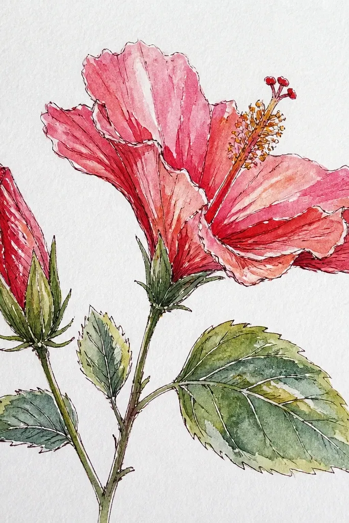
Half-open hibiscus teaches you how petals fold, which makes open-bloom petals look more believable. The bud shape forces you to draw curved layers that wrap around a center point. I simplify veins on the bud so you don’t over-detail something that isn’t fully visible. This style is great for learning realism because you’re drawing multiple petal states in one piece. It also looks good for botanical compositions and gives your page a story.
Sketch the bud first as a tight oval with 3-4 petal folds wrapping around a center. Shade the bud folds with HB and a small 2B darker spot where petals overlap. Then draw the half-open blossom nearby, with fewer visible petals and one petal partially covering the throat. Shade overlap cuts with 2B and deepen the throat ring with 4B. Add veins only on the open petals, keeping them lighter where petals turn away from light.
Use fewer veins on the bud and make them thicker near the fold — that sells the folded texture.
Don’t draw a full open flower’s vein density on the bud — it makes the bud look flat and wrong.
19. Hibiscus with mirror-petal shading for practice control
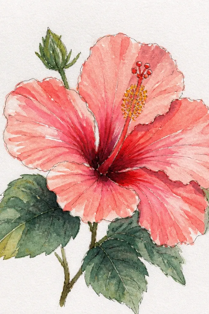
This is a control exercise disguised as art. When you mirror-pair two petals and shade them the same way, you catch your own habits — like over-darkening one side or making veins too heavy. It’s how I fixed my tendency to draw one side more confidently than the other. The result still looks natural because hibiscus has symmetry cues, even when the whole flower isn’t perfectly balanced. This style is great for people who want accuracy and a clean finished look.
Sketch the hibiscus and lightly mark two opposite petals as your mirror pair. Draw the first petal with overlap lines, then shade it with a clear inner darker zone and a lighter outer zone. Now copy the shading plan onto the opposite petal: same shadow wedge placement and similar highlight strip width. Keep vein spacing consistent between the two petals, but allow tiny differences in thickness so it doesn’t look mechanical. Shade the throat ring last, then adjust contrast so both mirrored petals match the overall light direction.
Good to knowTake a quick pause and compare the two petals by looking at them from across the room; differences jump out fast.
Common mistakeDon’t force perfect symmetry — match the shading plan, then allow small natural irregularities in vein thickness.
20. Hibiscus in a glass teacup with wet-on-wet petal glow
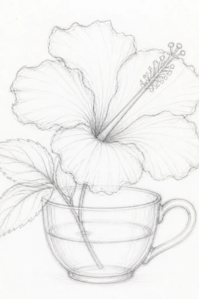
I drew this one after trying to copy a real hibiscus sitting in a glass cup on my kitchen table. The trick is that the petals look like they are lit from inside, while the cup stays glassy and reflective. This drawing works because you separate the jobs: petals get wet pigment first, the cup gets thin controlled lines and careful highlights. It also forces you to observe how light bends — the hibiscus looks slightly warmer through the glass, and the rim catches a white band like a highlight strip. When you finish, it looks like a still-life photo even if your drawing started as simple outlines.
Start with a light pencil sketch of the teacup shape first — outer rim, inner rim, handle curve, and the waterline. Draw the hibiscus on top of the cup as if it is floating behind the glass, then keep the stem and lower petals slightly obscured by the cup interior. Wet your paper lightly with clean water using a flat brush only on the petals, not the cup — then load diluted magenta, then add a little warm orange at the petal base near the throat. While it is still damp, drop in a darker rose pigment along the outer petal edges for a soft bleed effect, then blot the very tips with a tissue to create uneven fray-like edges. Let that dry fully, then switch to a fine pen or dark pencil to sharpen the petal outlines and add vein lines in the areas you want to read clearly. Finally, redraw the glass highlights: leave a clean white highlight band on the rim, add a faint gray under the bloom inside the cup, and keep reflections short and curved so they match the cup’s curvature.
Good to knowUse two brushes — one dedicated to wet watercolor petals and one kept dry for the cup highlights so you do not accidentally tint the glass.
Common mistakeDo not paint the cup first — if you lay watercolor on the glass rim too early, you lose the crisp white highlight bands that make the glass look real.