1. Lavender Rim Hibiscus With Pencil Texture
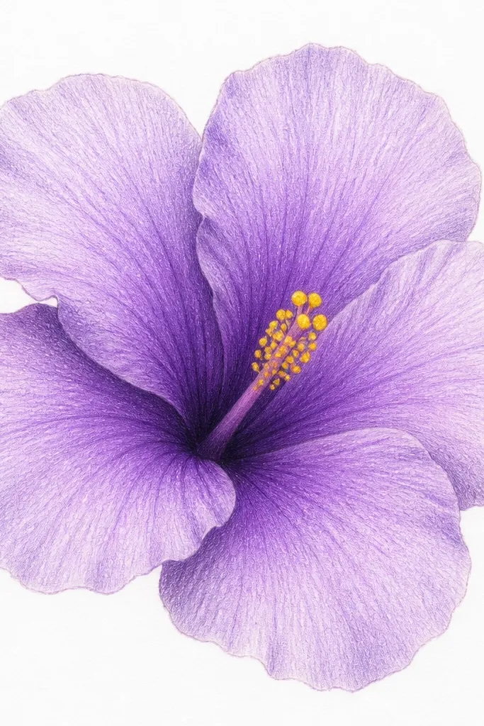
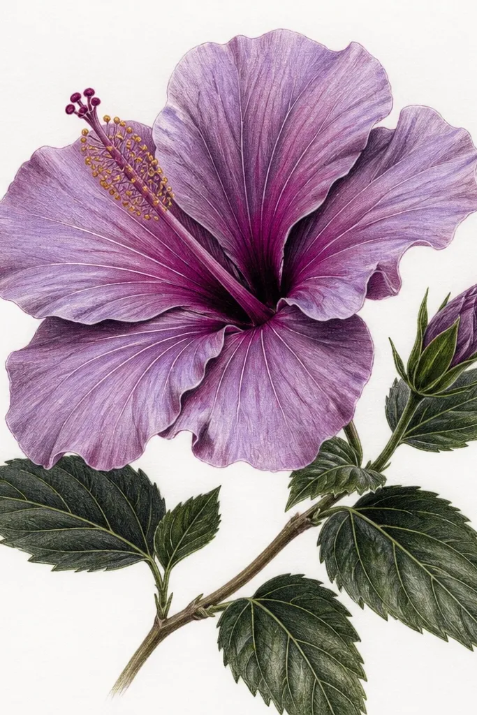
This one is all about crisp edges and visible pencil texture. I sketch the petals first with a 2H pencil, then shade the mid-tone with a light violet pencil and leave the rim almost untouched. For the fold shadow, I switch to a deeper purple and press a bit harder where petals overlap, especially near the throat. The center is yellow-gold with tiny stipple marks so it reads as pollen even from a distance. This drawing flatters anyone who wants a softer, airy look without heavy color — it works great for fair to medium skin tones if you’re using it for a printable sticker set.
Start by drawing the flower at about 3.5 inches wide, with five main outer petals shaped like slightly stretched teardrops. Add a second layer of petals inside, smaller and tilted, and keep the lines light enough to erase. Shade the rim zone with light lavender, then fill the mid-tone with violet using short strokes that follow the petal curve. Finally, add the fold shadows with deep purple using heavier pressure and a few tight hatch lines. Finish by dotting the center with yellow-orange and a few tiny brown specks for depth.
Use a kneaded eraser to lift a thin highlight strip on each petal rim — it makes the purple look glossy.
Don’t outline every petal in dark purple; it makes the flower look like a coloring-book sticker.
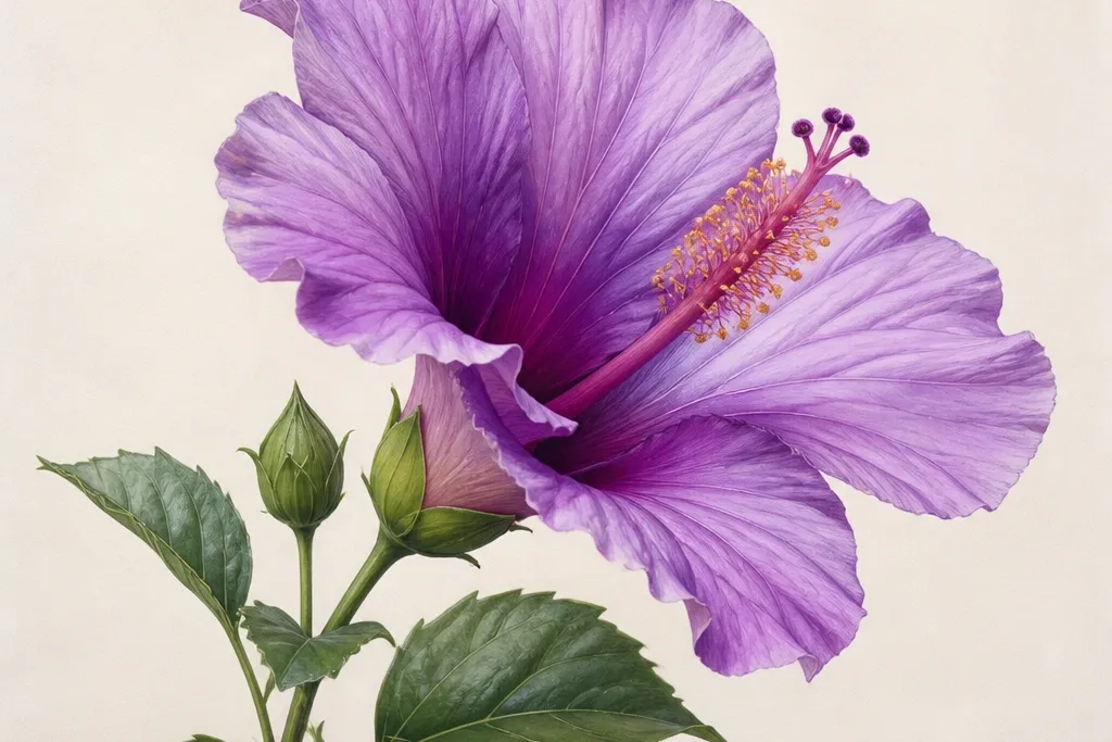
2. Watercolor Violet Wash Hibiscus With Salt Speckles
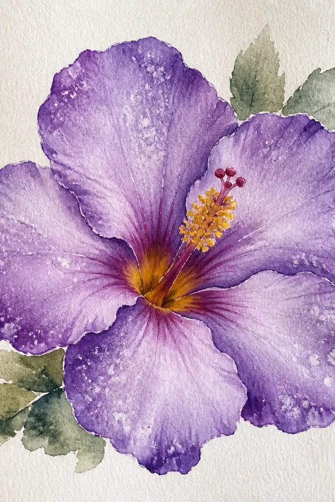
I use this when I want dreamy, slightly magical texture without drawing tons of lines. The key is the hibiscus petals get a wet-on-wet violet wash first, then the shadows deepen only along the fold edges. Salt speckles land randomly, so your flower never looks flat or overly controlled. The center stays warm and bright so the purple pops — I like yellow with a touch of burnt sienna near the base. This style looks especially good for gift art because it feels special even if your drawing isn’t perfect.
Wet the petal areas lightly with clean water, then drop in light lavender first and let it spread. While the wash is still damp, sprinkle a pinch of salt and tilt the paper so crystals don’t all clump in one spot. After it dries, brush off the salt gently and glaze deeper violet along the folds using a small round brush. Paint the stamens with warm yellow, then add tiny red-violet dots at the base for contrast. Finish with a soft wash background so the speckles don’t look like accidental mistakes.
Good to knowIf you hate random texture, sprinkle salt only on two petals — you still get the effect without turning the whole flower grainy.
Common mistakeDon’t overwork the petals while wet; repeated brushing makes purple turn gray-brown.
3. Brush Pen Hibiscus With Dark Fold Lines
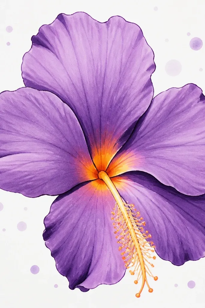
This is the cleanest option when you want a finished, graphic look fast. I draw each petal outline lightly, then fill with a brush pen using the tip for the rim highlight and the belly of the brush for the mid-tone. The fold shadow gets a second pass with a darker violet — you’ll see the line where two petals meet, which makes the bloom look dimensional. The stamens are thin and slightly curved so the center doesn’t look like a blob. This looks great on dark paper too, but I’ve done it on white for maximum contrast.
Start by sketching a light circle for the center and five outer petals around it, spacing them evenly. Color the rim of each petal with a lighter violet, then drag the color toward the center while the ink is still damp. Add fold lines by tracing where petals overlap using a deeper purple — keep these lines narrow. Color the center with yellow-orange and leave a tiny lighter spot to suggest shine. Add 10-14 stamens as thin strokes with the pen held upright, then finish with a few dot accents in pale lavender.
Practice the fold shadow on a scrap petal first; the best lines come from two quick strokes, not one slow one.
Don’t fill every petal edge with dark purple; it makes the whole drawing look like a thick outline.
4. Colored Pencil Hibiscus on Kraft Paper
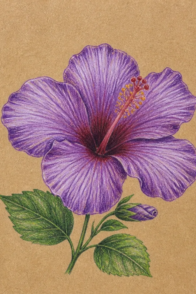
Kraft paper changes purple in a good way. The warm base makes lavender look creamy and keeps deep violet from going too cool. I layer colored pencils slowly: light lavender first, then medium violet, then deep purple only on the fold shadows. The center stays yellow-orange so it reads as pollen against the warm paper. This style looks best for cozy home decor because the paper tone already feels like a handmade card.
Draw the hibiscus at 3 inches wide and keep the pencil lines light so they don’t dent the paper. Shade the petal rims with light lavender using gentle, circular strokes. Build mid-tones with violet in the center of each petal, leaving a narrow highlight strip near the rim. For shadows, use deep purple and press a bit harder along the fold lines and at the base of the inner petals. Finish the center with bright yellow, then add orange near the base and a few tiny brown freckles for texture.
Use a white gel pen only on the petal rim highlights; kraft paper makes highlights pop without needing heavy color.
Avoid blending with too much pressure; you’ll flatten the paper texture and the purple looks muddy.
5. Purple Hibiscus Line Art With Watercolor Wash Background
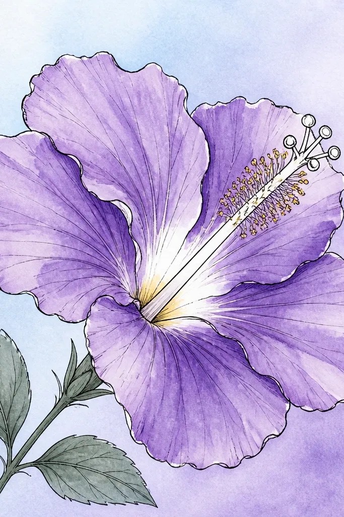
This is for when you want your hibiscus to look airy and modern. The line art keeps the petal shapes clean, and the watercolor stays loose in the background instead of fighting to stay inside every edge. I keep the petals mostly filled with a controlled purple wash, then add darker violet only along the fold shadows. Leaving some light areas in the petals keeps the flower from looking like a sticker. It’s also forgiving for beginners because the lines do a lot of the work.
Ink the hibiscus first with a waterproof fine liner so it doesn’t bleed into the wash. Paint the background wash first using pale blue and lavender, keeping it light around the flower. Then brush a thin lavender wash over the petals, leaving the rim highlight areas lighter. Add deeper violet to the fold lines with a smaller brush, and keep the center minimal — a few yellow strokes and tiny dots are enough. Let it dry fully before erasing any pencil marks under the ink.
If your watercolor creeps, tape a border around the paper with painter’s tape and remove it while the paint is still slightly damp.
Don’t go heavy on the background; if it’s too strong, the flower looks secondary.
6. Monochrome Deep Violet Hibiscus With Glow Center
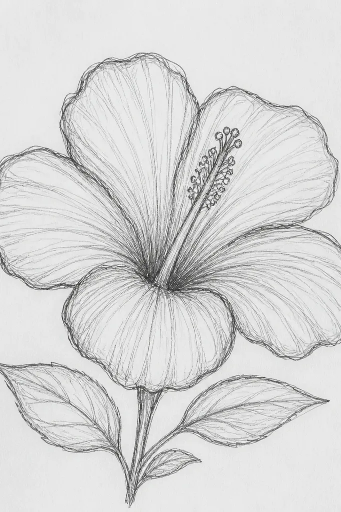
This one looks intense and pretty because it uses one color family with strong contrast. I build the petals from near-black violet in the fold shadows up to lighter violet on the rim, so the flower has that “glow” effect. The center becomes the brightest point — yellow with a slight orange edge — which makes the rest feel luminous. This style fits bold wall art or a phone wallpaper because the contrast holds up at small sizes. It also flatters darker color palettes in your home because it doesn’t introduce extra colors that clash.
Sketch the flower with light pencil and mark the fold lines lightly. Fill the petals with a mid violet wash or pencil, then deepen the folds using near-black purple. Keep the rim highlight thin and bright by leaving a stripe uncolored or lightly colored. Paint the center yellow-orange and add a tiny halo wash of pale lavender around it so it looks like light. Finish by drawing a few stamens with a very thin brush or pen so the center doesn’t look flat.
Use two purple values only: one mid-tone and one deep shade. The fewer steps you use, the cleaner the contrast looks.
Avoid adding extra colors like green or pink in the petals; it breaks the monochrome glow.
7. Hibiscus Flower Crown With Purple Petals
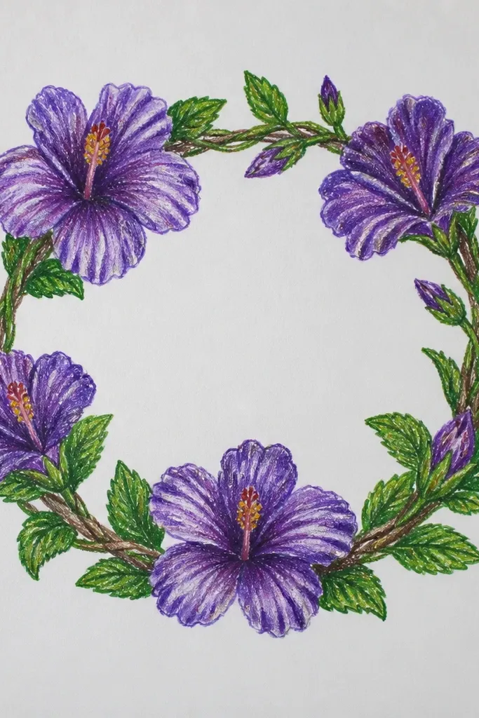
A hibiscus crown drawing looks special because the petals repeat in a rhythm. I keep the central bloom largest and darkest, then taper the other flowers smaller around it. Each hibiscus uses the same petal zoning — rim, mid-tone, fold shadow — so it looks cohesive instead of messy. The leaves are minimal so the purple stays the focus. This works great for invitations, bridal shower art, or a kids' craft page where you want something that reads clearly even from far away.
Draw a circle guide the size you want the crown to be, then place one hibiscus at the top center. Add two more blooms on the sides and four at the bottom arc, each smaller by about a quarter. Shade the main petals with lavender first, then deepen folds with violet and near-black purple. Add simple leaf strokes between flowers so gaps don’t look empty. Keep stamens short and bright yellow so each center pops without taking over the page.
Good to knowUse the same yellow center shape in every bloom; repetition makes the crown look designed, not accidental.
Common mistakeDon’t make every flower the same size; the crown looks flat and loses that wreath effect.
8. Hibiscus in a Teacup With Purple Steam Swirls
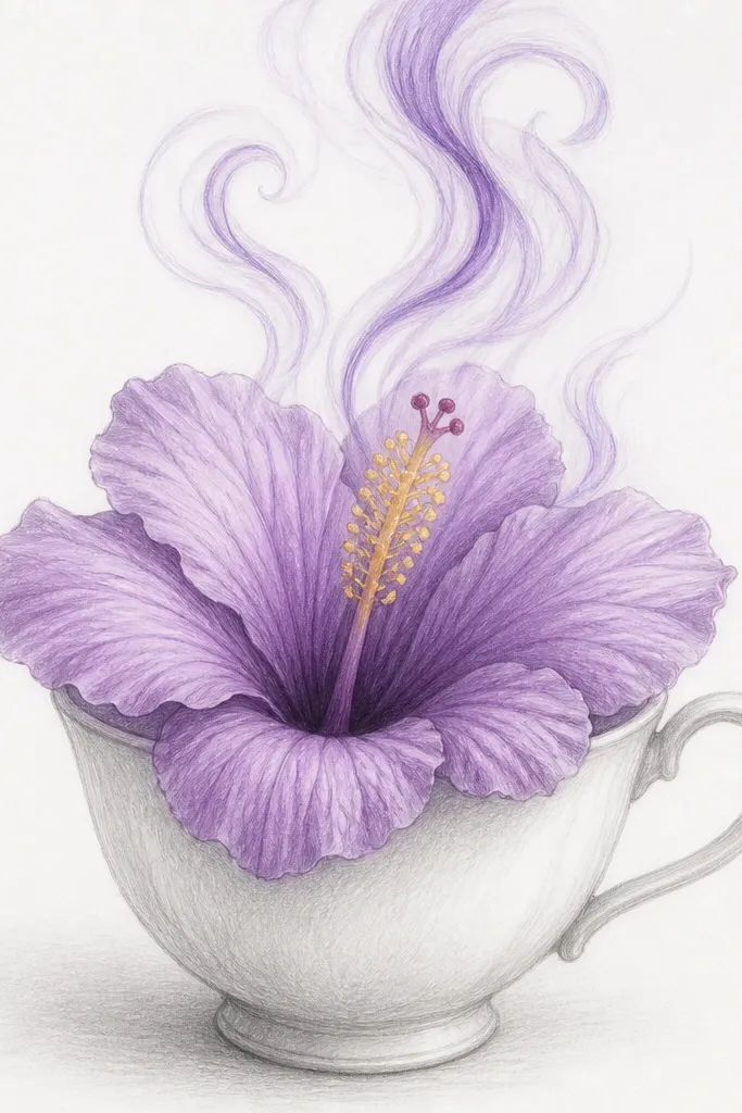
This idea is cute and homey because the hibiscus feels like it belongs in your everyday objects. I draw the teacup with simple contour lines and keep it lighter than the flower, so the purple bloom is the main subject. The steam swirls are purple lines that match your petal colors — lavender near the cup and deeper violet higher up. That color tie makes the whole page feel unified. It’s a great pick if you’re making a card set and want each card to have a clear scene, not just a single flower.
Sketch a teacup first, about 2.5 inches wide, with a slightly oval rim and a gentle taper. Place the hibiscus center right above the cup opening, then draw three outer petals that rise above the rim. Color petals in lavender and violet with darker fold shadows, keeping the cup mostly gray and off-white. Add steam lines in two shades of purple, starting thin and widening slightly as they rise. Finish with a yellow center and a few stamens that point upward toward the steam.
Add one tiny highlight on the cup lip using a white gel pen — it makes the whole scene look cleaner.
Don’t darken the cup too much; if it competes with purple, the flower looks smaller than it is.
9. Purple Hibiscus With Ink Dots and Negative Space Background
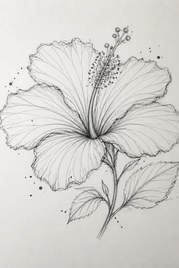
Negative space makes purple hibiscus look more expensive than it is. I keep the background mostly white, then add a few dot clusters like pollen dust around the flower. The petals get a controlled purple gradient so the drawing has depth without needing a busy scene. This works especially well for framing because the empty space gives your eyes a place to rest. If you like clean art for small spaces, this is the one I reach for first.
Draw the hibiscus about 3.5 inches wide and lightly map the petal folds. Shade petals with lavender first, then add violet fold shadows using pencil or watercolor. Leave a thin highlight line on each petal rim by not filling all the way to the edge. Paint the center yellow-orange and add tiny brown freckles. Finally, tap a fine brush or pen to add small dot clusters in light gray and pale violet around the petals, not behind the petals.
Good to knowKeep dots farther from the flower edges than you think; it keeps the flower edges crisp.
Common mistakeAvoid dotting inside the petals; it turns the texture into noise.
10. Purple Hibiscus With Patterned Petal Edges
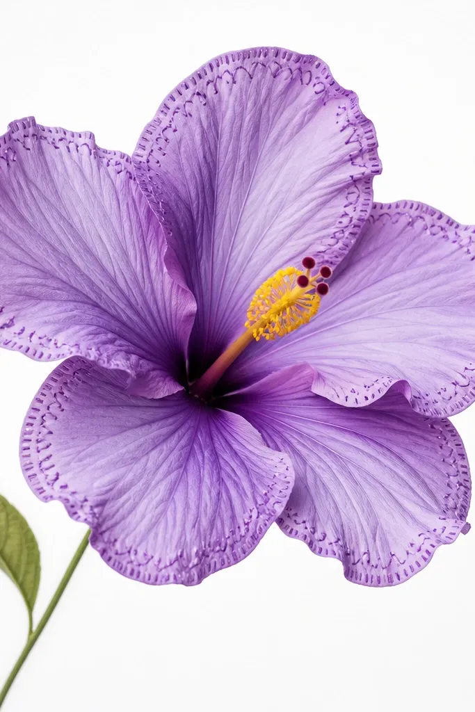
Patterned edges make the hibiscus feel handmade and intentional. I add tiny dashes along the outer petal rim, then keep the rest of the shading smooth so the pattern doesn’t overwhelm the flower. The fold shadows stay solid violet so the flower still looks dimensional. This style is great if you’re making a journal page because the pattern gives you something to notice up close. It also works for mixed media since you can do the pattern with pen after you paint.
Sketch the hibiscus and shade the petals with a smooth lavender base first. Add violet to the mid-tone areas and deepen the fold shadows with deep purple. Use a fine liner to add short outward dashes along the outer petal rims only, keeping them evenly spaced. Add a second layer of tiny scallops on two petals if you want extra detail, but keep it light. Color the center yellow-orange and place a few red-purple dots at the base of the stamens.
Good to knowDraw the pattern dashes last, after shading dries, so the pen doesn’t catch wet pigment.
Common mistakeDon’t pattern every edge; two or three petals with detailed rims look designed, five look busy.
11. Hibiscus and Palm Leaf Fan in Purple and Green
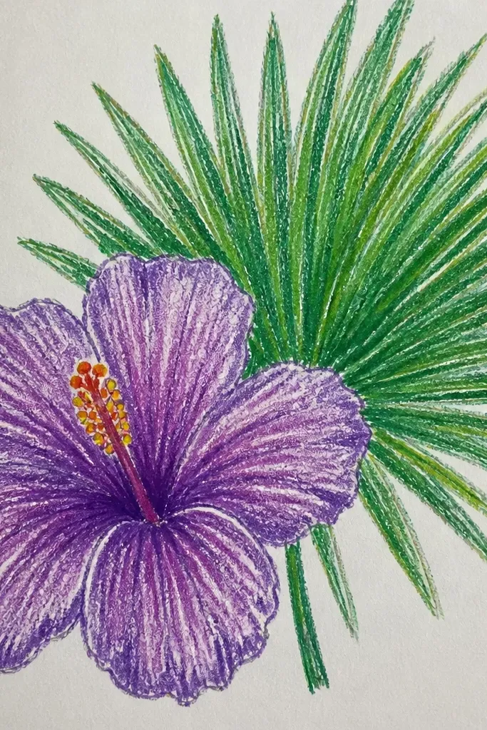
This combo looks tropical without getting messy. The palm leaf fan gives you structure behind the hibiscus, and the purple petals add the dreamy focus. I keep the leaves smaller and more line-based than the flower so the purple remains the star. The shading principle is the same: rim highlight on petals, fold shadows with deeper violet, and a bright yellow center. This is a great choice for wall art because the fan shape creates a strong silhouette.
Draw a fan shape first with 6-8 palm leaves fanning out behind the flower, starting from a single point low on the page. Shade leaves with green pencil or paint, using a light mid-stripe on each leaf. Then draw the hibiscus in front, slightly larger than the fan’s inner edges. Color petals with lavender base, violet mid-tone, and deep violet fold shadows. Paint the center yellow-orange and add a few stamens that point downward toward the leaf tips.
Good to knowUse one green value for leaves and one purple value for shadows; limiting colors keeps it clean.
Common mistakeDon’t shade the leaves as dark as the petal folds; the flower should win.
12. Purple Hibiscus With Ink Splatter Background
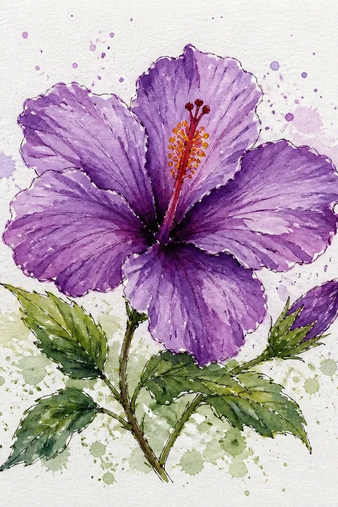
Splatter backgrounds make the hibiscus look energetic while still staying focused. I keep the flower itself clean and softly shaded, then let the splatters happen behind it. The purple splatter colors match your petals so the drawing feels cohesive instead of random. This works well for posters, tote-bag transfers, or any project where you want motion. The center stays bright so the splatter doesn’t swallow the flower.
Sketch and shade the hibiscus first with lavender base and violet mid-tones, then add deep violet fold shadows. Leave the petal rim highlights light so the flower stays readable. Put a scrap paper shield behind the flower area so splatter lands only in the background. Flick a toothbrush with diluted deep violet ink for medium splatters, then flick lavender for smaller ones. Let it dry, then add the yellow center and thin stamens with a fine pen.
Good to knowTest your splatter strength on scrap paper — a lighter flick gives you dots instead of blobs.
Common mistakeDon’t splatter near the petal edges; messy edges look like accidental stains.
13. Purple Hibiscus in a Vintage Botanical Frame
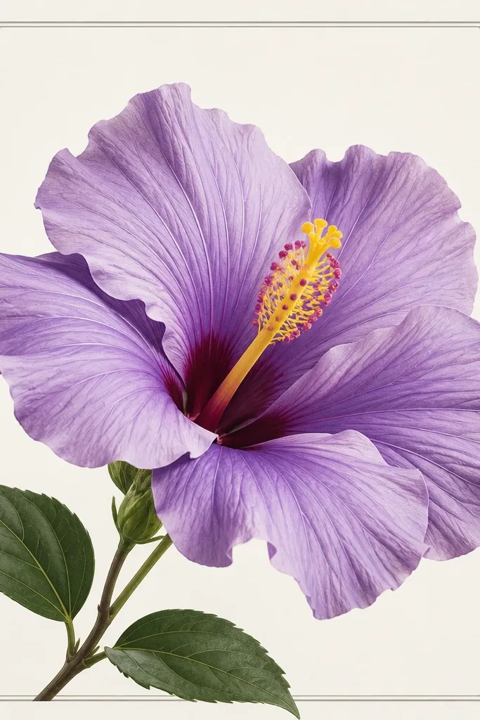
If you like vintage prints, this is the easiest way to make your drawing look “collected” instead of casual. The flower has detailed petal folding, but the frame stays thin and restrained. I use gray for the frame flourishes so it doesn’t compete with purple. The center gets crisp yellow-orange so the flower feels alive. This style flatters older-paper aesthetics and looks great in 5x7 frames.
Draw a rectangular frame around your flower with a thin gray pencil line, leaving a 0.5 inch margin. Add small corner flourishes using short curves and tiny leaf shapes. Place the hibiscus in the center, about 3.5 inches wide, and shade petals with lavender base and violet mid-tone. Add deep violet fold shadows with pencil pressure changes so the folds look sculpted. Finish the center with yellow-orange and a few red-purple specks, then lightly erase any stray pencil marks outside the frame.
Lightly age the background with a soft gray pencil wash so the paper looks like it’s been handled for years.
Avoid heavy black frames; thin gray lines make it feel botanical, not cartoon.
14. Purple Hibiscus With Stained Glass Petal Sections
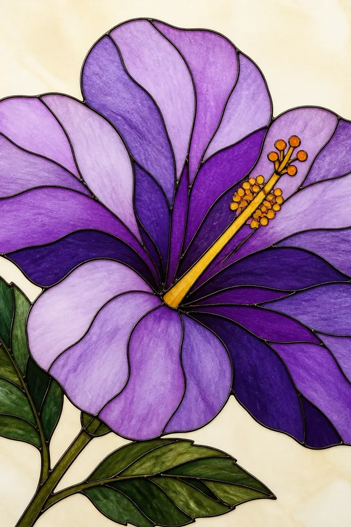
Stained-glass style makes hibiscus look bold and decorative without needing complicated shading. I outline each petal section with a darker violet line, then fill with lighter purple washes so the sections glow. The key is to keep section lines follow the petal veins and fold direction, not random. The center stays bright and slightly warm so it reads like light passing through. This works well for holiday cards and crafts because it looks finished even with simple paper.
Sketch the hibiscus and map petal sections by drawing 3-4 curved lines across each outer petal. Use a fine pen or pencil to outline the sections in deep violet. Fill each section with a different purple value: lavender, light violet, and a medium violet, leaving tiny gaps where outlines are visible. Add fold emphasis by making one or two sections per petal the darkest shade near the base. Paint the center yellow with orange at the core, then add a few tiny highlights with a white gel pen.
If your outlines bleed, let ink dry fully and then color between lines with colored pencil for control.
Don’t make the section outlines too thick; thick lines make it look like a kid’s craft.
15. Mini Hibiscus Trio With One Big Purple Center
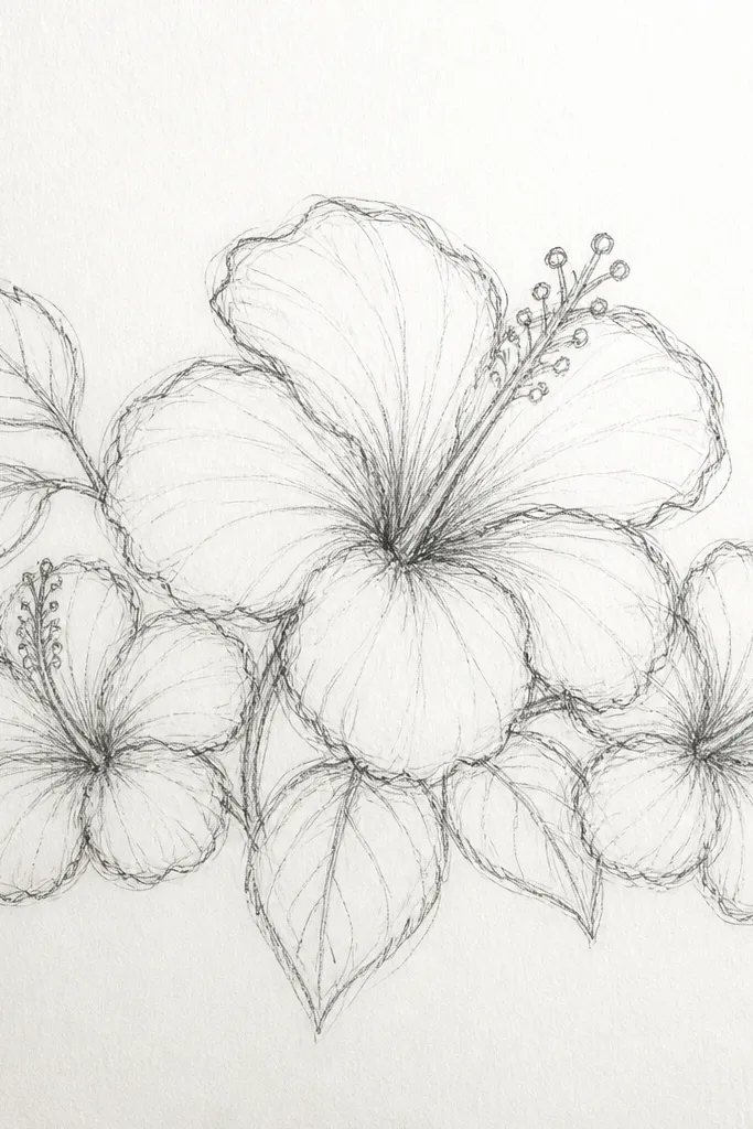
A trio layout looks like a set, not practice. I make the middle flower the star by using deeper purple folds and a more detailed center, while the side flowers get lighter shading so you don’t lose the focal point. Each hibiscus still follows the same zoning, so the trio reads cohesive. This is perfect for making a mini art series — you can cut them out and place them in a scrapbook. It also works for beginners because you repeat the same flower shape three times.
Draw three hibiscus flowers across the page with the middle one about 3.75 inches wide and the side ones about 2.75 inches. Keep spacing so edges don’t touch, leaving about 0.25 to 0.5 inch between blooms. Shade the side flowers with lavender base and medium violet folds, but keep the darkest near-black purple only for the middle flower folds. Paint all three centers yellow-orange, then add extra stamens only on the middle flower for depth. Finish with one or two leaf strokes behind the left and right blooms to anchor them.
Good to knowUse the same center shape on all three and vary only petal depth — it keeps the set looking intentional.
Common mistakeDon’t add as much detail to every flower; the focal point disappears.