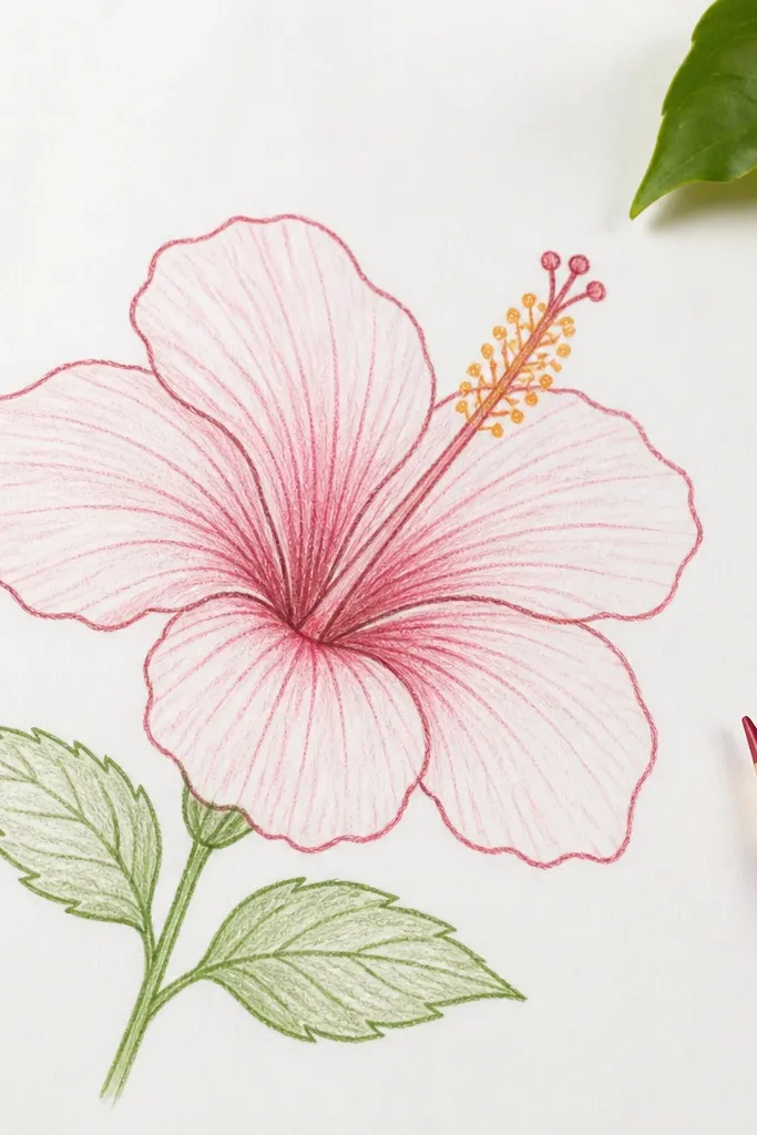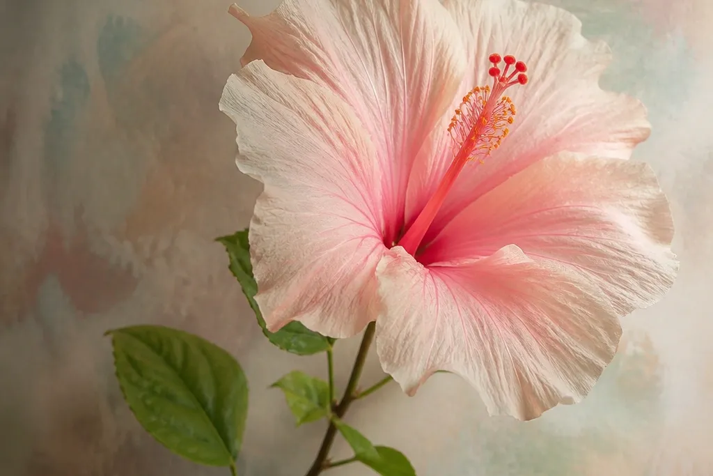
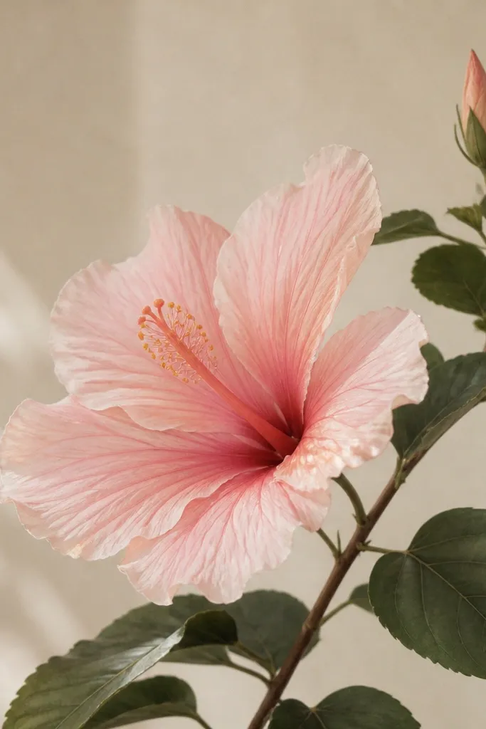
1. Peach Hibiscus with a Powder-Soft Center
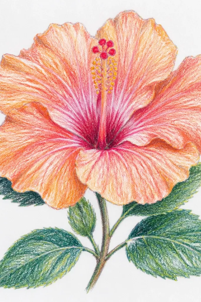
Draw the hibiscus petals as overlapping fans with a gentle wave at the outer edge. Use pastel pencil in peach for the main petal color, then press a little harder only along the fold line — that’s where you create the illusion of creasing. The stamen should be light yellow with tiny warm-orange specks, and I keep the center blur softer than the petal edges so it feels like the flower is lit from above. This look flatters warm skin tones and peachy backgrounds because the flower color stays close to your natural warmth. It also works great for beginners because the palette is small and forgiving.
Start by lightly sketching the center oval and the stamen curl lines. Then block in each petal with peach pastel pencil, leaving a thin lighter rim along the very outside edge. Next, blend the inside of each petal with a blending stump or a very small soft brush, focusing only on the area between the fold line and the rim. Finally, add a mint wash at the bottom using a diluted watercolor or watered pastel pigment, then stop before it reaches the flower. Use a white pastel pencil to put two tiny highlights on the top petals.
Good to knowIf your center looks too sharp, smudge just the stamen bases with a fingertip or paper stump for a powder effect.
Common mistakeDon’t darken the entire petal — the fold line should be the main shadow.
2. Lavender Hibiscus Over a Morning Sky Wash
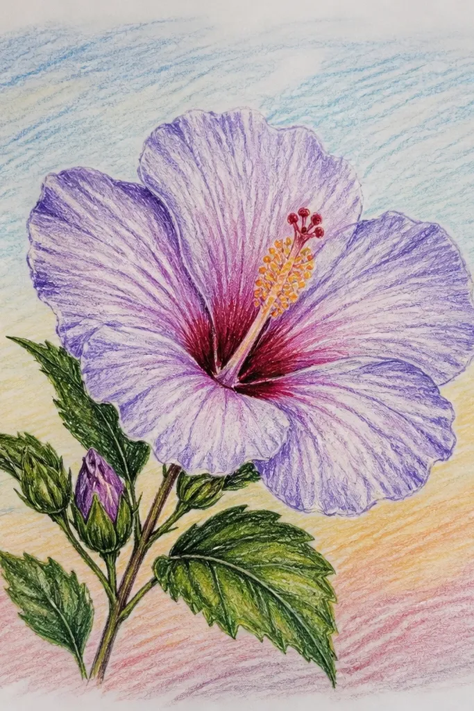
This one looks airy because the background is cooler and the hibiscus stays slightly more saturated in the petals. I use lavender pastel pencil for the petal base, then deepen only the fold line with a richer purple. Keep the stamen thin and delicate — don’t overfill it, or it will compete with the sky. The lighter cream stamen reads clean against lavender, and it’s perfect for people who like soft, calm color stories. If your paper has a bit of tooth, the sky smudges will look like real watercolor clouds.
Wet the background lightly (just the paper area behind the flower) with clean water using a flat brush, then blend pale blue wash from top to middle. Let that dry, then sketch the hibiscus center and petals on top lightly. Color the petals with lavender pencil, and add a deeper purple crease line running from the petal base toward the center. Blend the inside of each petal lightly so the crease line stays visible. Finish by adding thin lilac stamen lines and a couple of white highlights on the petal tips.
Use a larger brush for the sky wash, but a smaller one for any cloud smudges so you control the edges.
Don’t outline every petal edge in dark purple — it makes the whole flower look like a sticker.
3. Sunset Coral Hibiscus with a Soft Shadow Underlay
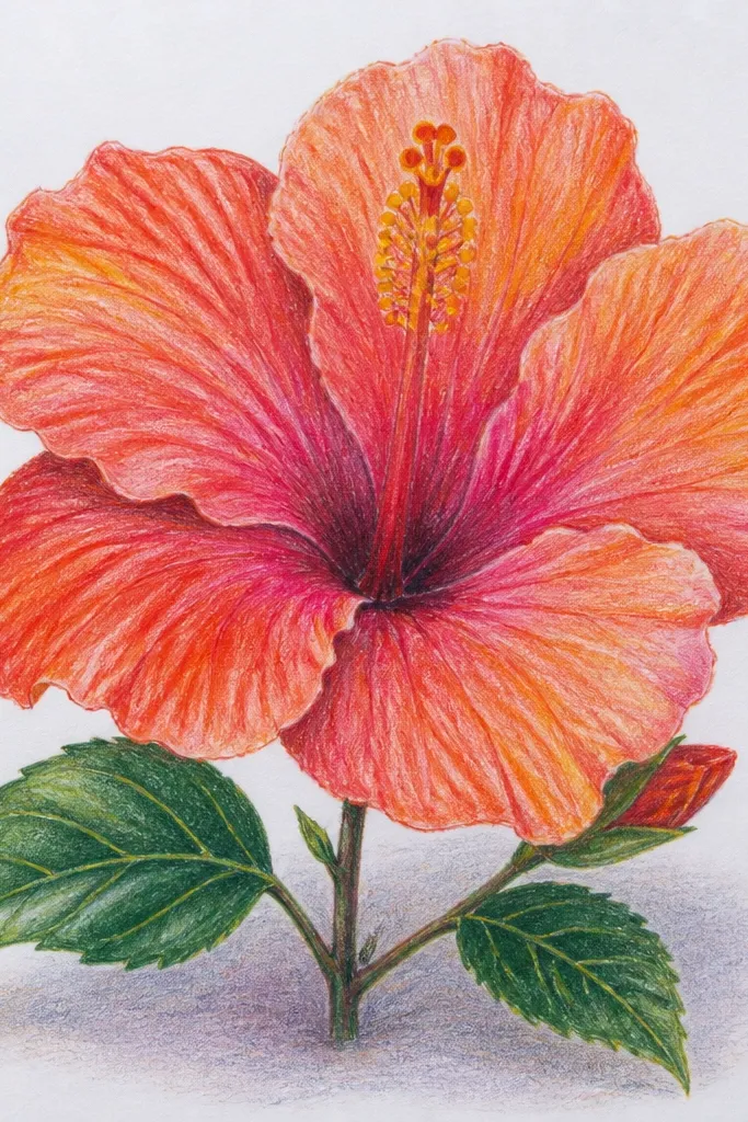
This drawing looks dimensional because the shadow is separate from the flower. Use coral and pink in a gradient across each petal: darker at the base and lighter at the rim. The fold line still needs a deeper hue, but I keep it mauve instead of red so it doesn’t get harsh. The stamen is warm yellow so it ties the petals together, and the shadow ellipse anchors the bloom in space. This style works for anyone who likes warm palettes and wants the flower to look like it’s sitting on paper rather than floating.
Start with a light sketch and place the flower slightly above center so there’s room for the shadow. Shade each petal with coral pencil near the base, then blend outward into pale pink. Add a mauve crease line on each petal and blend only around it, leaving the crease visible. Draw a soft ellipse shadow under the flower with mauve pastel pencil, then blend it outward with a stump so it fades at the edges. Add warm yellow to the stamen and finish with two small white highlights on the top petals.
Good to knowMake the shadow wider than you think — it reads more natural than a tight oval.
Common mistakeDon’t add a dark shadow that matches the crease tone exactly — it will look pasted on.
4. Mint-and-Pink Hibiscus with Leafy Corner Cluster
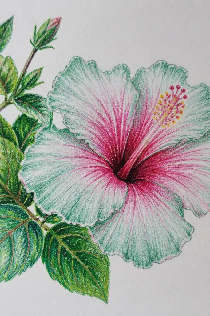
Placing the hibiscus in a corner makes it feel like a real plant cutting in a sketchbook. The mint leaves add a cool contrast that keeps the pink petals from looking flat. I shade the petals so the fold line is rose, while the outer edge stays a lighter blush. The leaves get a two-tone treatment too: mint base with a slightly deeper green vein, so they look crisp without overpowering the flower. This look flatters cool undertones and is perfect for greeting cards where you want a clean, fresh vibe.
Sketch the hibiscus center and petals in the upper left, then lightly map a small leaf cluster below and to the left. Color the hibiscus petals with blush pink pencil, then deepen the fold line with rose. Blend the inside petal area softly while keeping the outer rim pale. For leaves, use mint pencil for the body and add deeper green veins with light pressure. Add a few tiny green speckles behind the leaves using the side of the pencil, then finish with a white highlight on one petal edge.
Keep the leaf cluster smaller than the flower — the hibiscus should still feel like the star.
Don’t crowd the background with speckles around the hibiscus petals — it muddies the focus.
5. Butter Yellow Hibiscus with Blush Veins
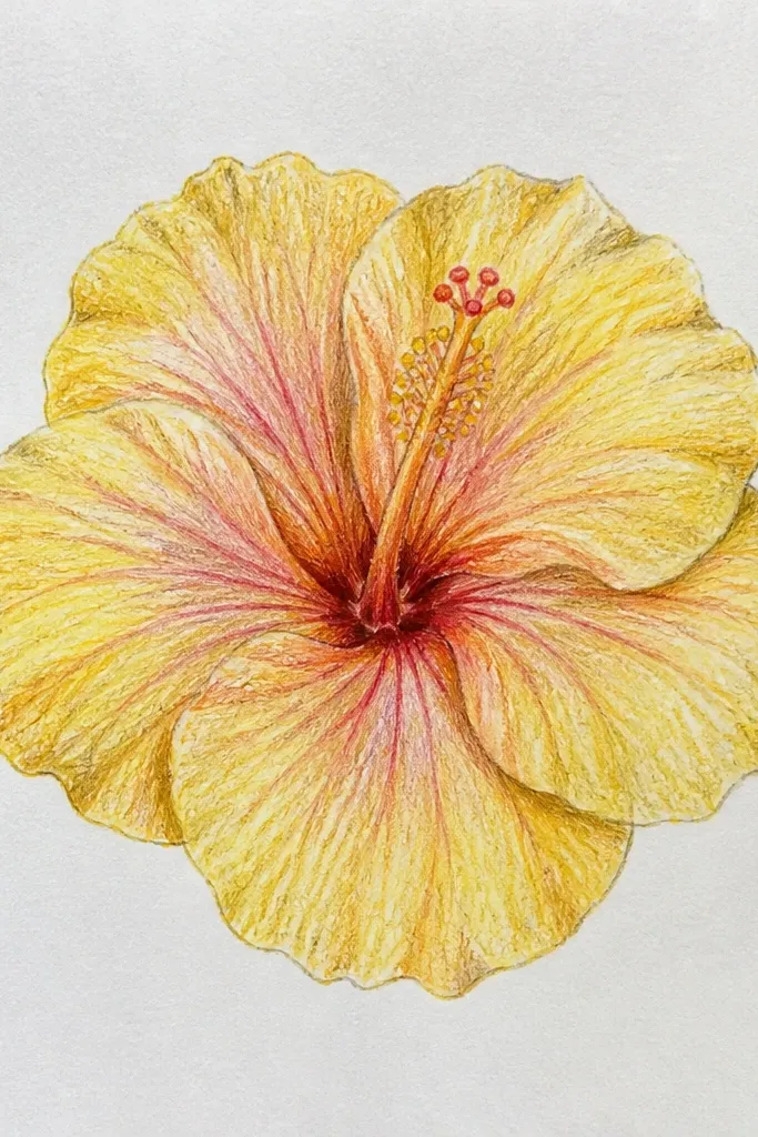
This style is all about controlled linework inside the petals. Instead of shading the whole petal heavily, I lay down a light butter-yellow base and then draw blush-pink vein lines that taper toward the petal edge. The fold shadow is present but faint, so the drawing feels delicate rather than heavy. The stamen stays mostly white so the center doesn’t steal attention from the petal veins. This is the best hibiscus idea if you want the drawing to look like it could be printed on fabric or a stationery set.
Start with a light butter-yellow wash using pastel pencil on its side, then blend gently with a stump. Sketch the petal fold lines lightly, then add blush-pink veins in thin strokes that angle from base to edge. Use a slightly darker yellow at the very base of each petal, but keep the rim pale. Draw the stamen with a white pencil, then add a faint yellow tint at the tips. Add a whisper of gray wash behind the flower for depth and stop before it reaches the petal edges.
Use a light touch for vein lines — press too hard and they look like permanent cracks.
Avoid heavy shading plus veins — it looks messy and loses the delicate look.
6. Rose Hibiscus with Watercolor-Edge Blooming
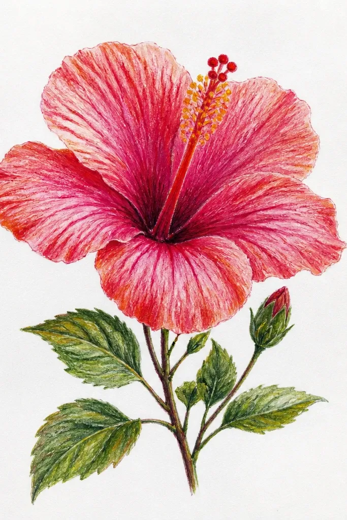
This one uses a deliberate bleed effect, but only at the outer edges. I lay down rose pastel pencil on dry paper, then lightly tap water at the petal rim so the color feathers without smearing the fold line. The fold line stays pencil-sharp in magenta, which gives the flower structure even when the edges are blurry. The stamen is cream with a tiny magenta shadow near the base. This style looks gorgeous on mixed media paper because the surface holds a soft watercolor halo.
Sketch the center and petals, then color the petals with rose pastel pencil, keeping the fold line a deeper magenta. With a damp brush, tap water only along the outer rim of each petal, not the center fold. Let it feather for 5-10 seconds, then stop so it doesn’t flood the whole petal. Add cream stamen lines and a faint magenta base shadow. Finish with a white pastel highlight on the top petals to pull the bloom forward.
Good to knowTest the water-tap on scrap paper — your bleed amount depends on how absorbent your page is.
Common mistakeDon’t wet the paper before you draw the fold line — you’ll lose the structure.
7. Two-Petal Close-Up Hibiscus Study
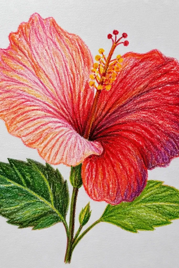
Close-ups look impressive because you’re not fighting symmetry. I zoom in on two petals so the shading can be detailed: you can see the fold crease, the lighter bulge, and a subtle gradient near the base. Use coral for the crease area and peach for the bulge area, then blend the transition so it looks like fabric. The center pod is only half shown, which keeps the drawing from becoming crowded. This style flatters anyone who wants an art page that looks like a botanical photo, not a “complete flower” icon.
Sketch the center pod first, then place two large petals around it, leaving cropping space at the edges of the paper. Shade the crease line with darker coral, then fill the bulge with lighter peach. Blend gently along the bulge, but keep the crease line more defined than the rest. Add a few tiny shadow marks where the petals overlap. Keep the background almost blank — add only faint smudges under the petals and one soft shadow stroke near the pod.
Good to knowUse the side of the pastel pencil for broad fades, then switch to the tip for crease lines.
Common mistakeDon’t add a full background scene — too much detail competes with the petal texture.
8. Hibiscus Bouquet with Three Different Pastel Bloom Tones
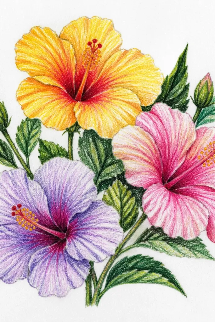
A bouquet reads lively because you get repeated shapes with different values. I keep each flower in its own color family: pink uses rose fold lines, lavender uses purple fold lines, and coral uses mauve fold lines. The stamen stays cream in all three so the page looks cohesive. This is a great idea for people who struggle with drawing one perfect hibiscus — you’re distributing focus across multiple blooms. It also fits table decor and gift tags because the bouquet composition looks balanced even in a small space.
Sketch three flower centers at slightly different heights, then draw thin stems that converge near the bottom. Color each hibiscus petals in its assigned palette, keeping the fold line darker and the outer rim lighter. Blend each flower lightly so the petals don’t look like colored pencil scribbles. Add cream stamen lines and small yellow dots at the stamen tips. Finish with a few mint-green leaves at stem junctions and add one pale shadow under the whole bouquet.
Pick one stamen color for all blooms — it ties the bouquet together fast.
Don’t make all three flowers the same brightness — variety in value is what makes it look like a bouquet.
9. Monochrome Pink Hibiscus with Heavy Petal Texture
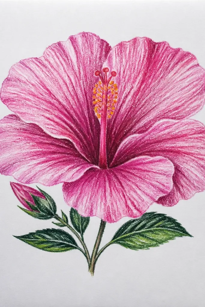
Monochrome looks high-end when you lean into texture and value range. I use three pinks: pale blush for highlights, mid pink for the main petal, and fuchsia for the fold and stamen depth. Instead of blending everything smooth, I leave some pastel grain so the petals feel like they have surface fibers. The stamen is fuchsia-tipped with a pale center so it has that hibiscus “alive” center look. This style flatters minimalists and it’s perfect if you want a calm page that still feels detailed.
Sketch the center and petals, then block the petals in mid pink. Add fuchsia crease lines and small shading pockets near the base of each petal. Use a blending stump only on the outer third of each petal so you keep texture in the folds. Add a pale blush rim and a couple of tiny white highlights on the top petals. Finish by lightly brushing a pale pink wash behind the bloom and letting it stay subtle.
Good to knowIf you want texture, don’t over-blend — blend the rim, not the whole petal.
Common mistakeAvoid using only one pink shade — you need at least three values to make it look dimensional.
10. Turquoise Hibiscus with Soft Speckled Background
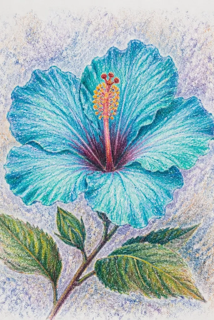
Speckled backgrounds make hibiscus feel like it’s in fresh air. I use turquoise for the petal base, then deepen the fold line with a slightly darker teal so the petal has structure. The stamen gets cream with tiny turquoise dots so it matches the overall palette. This style looks great on bright paper because the white speckle space stays clean and airy. It also suits people who like modern, graphic botanical art because the specks act like a controlled pattern.
Sketch the center and petals, then color petals with turquoise pastel pencil, leaving a lighter rim at the edge of each petal. Add a darker teal crease line and blend lightly toward the rim so the crease stays visible. Color the stamen cream and add small turquoise dots at the tips. For the background, load a little pastel pigment on a stiff brush, flick gently to create tiny specks behind the flower only. Keep the specks sparse near the petals so you don’t lose the flower edges.
Good to knowFlick from farther away than you think — it makes specks look natural instead of splattery.
Common mistakeDon’t speck over the petals — it turns into visual noise.
11. Apricot Hibiscus with Gold-Tinted Highlights
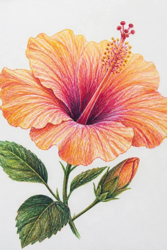
This drawing looks cozy because the highlights feel like sunlight. Use apricot and pale peach for petal color, then add brownish-orange shading along the fold line. For the stamen, I keep it creamy yellow with deeper yellow at the tips. The trick is highlights: I use a light gold pastel pencil (or metallic pastel powder) on only the top ridges of petals, not the entire petal. That keeps it from looking glittery or messy. This is the best hibiscus idea if you want a warm, evening tea vibe in your sketchbook.
Sketch the center oval and stamen, then color petals with apricot pastel pencil, leaving a pale rim on the outer edges. Add brownish-orange crease lines and blend lightly toward the rim. Color stamen cream yellow and deepen the tips. Then add gold-tinted highlights along the top ridge of each petal where light would hit. Finally, add a soft warm beige wash behind the flower, keeping it lighter than the petals so the bloom stays readable.
Use metallic pastel sparingly — two or three highlights per petal is enough.
Avoid coloring the entire petal with gold — it looks chalky and uneven.
12. Pink Hibiscus with a Clean White Negative Space Background
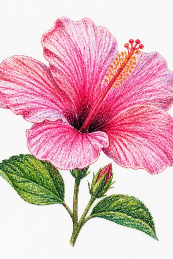
Negative space is what makes this look modern and expensive. I keep the background almost completely blank, then focus all the color and contrast inside the flower. Petal edges stay cleaner because you’re not covering the page with wash or specks. This style looks flattering on any paper tone because the white space gives you a consistent “gallery” feel. If you struggle with backgrounds, this is the simplest solution that still looks intentional.
Sketch the hibiscus centered and lightly map the petal folds. Color petals with pale pink pastel pencil, then deepen only the folds with rose. Blend the inner petal area slightly, but keep the outer rim sharp and lighter. Draw stamen in cream and add tiny pink dots at the tips. Add one soft shadow under the bloom using a very light gray-pink pencil, then stop. Leave everything else untouched so the paper stays clean and bright.
Good to knowErase your pencil sketch lines fully under the petals before you add darker folds — it prevents gray showing through.
Common mistakeDon’t add a full gradient background — it ruins the crisp negative-space look.
13. Hibiscus with Striped Petal Pattern (Pastel Pencil Only)
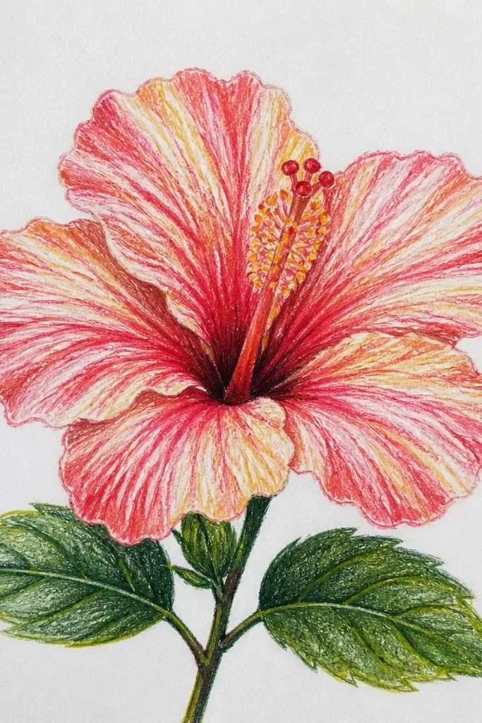
This is a graphic hibiscus idea that still feels botanical because the stripes follow the petal folds. I use pastel pencil only so the lines stay crisp and clean. Each petal gets a repeating set of thin stripes that get slightly darker near the fold line, then lighter toward the rim. The stamen stays mostly cream with a few colored stripes so it matches without overpowering. This style is great if you like patterns and want your hibiscus drawing to look like wearable art or print-ready stationery.
Sketch the center and petals, then lightly mark where the petal fold runs. Color the petal base with a light layer of pale pink, then draw thin lavender stripes across each petal following the curve. Add deeper rose stripes only along the fold area, keeping the outer rim lighter. Keep the stamen cream and add a couple of striped accents near the tips. Finish by lifting a few highlights with an eraser on the palest stripe areas so the petals look glossy.
Use a ruler edge lightly to guide stripe spacing on the first petal, then go freehand after you find the rhythm.
Don’t make the stripes too thick — chunky stripes stop reading as petal folds.
14. Hibiscus Flower in a Soft Watercolor Frame
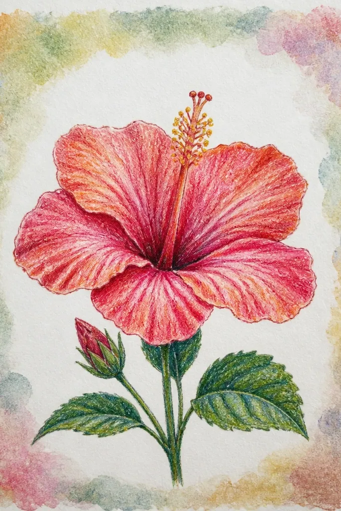
A watercolor frame makes the hibiscus feel finished without crowding it. I draw the flower first, then paint a thin irregular border around it so the bloom stays the sharpest thing on the page. The frame colors are pale green and pale blue, chosen to complement pink without turning the whole page into a rainbow. Keep the frame light enough that you can still see paper grain through it. This look is perfect for wall art because it has a built-in “mat” effect.
Sketch and pastel-color the hibiscus first, using rose for the folds and pale pink for the main petals. Blend lightly so the flower has smooth transitions but keep the petal rim lighter. Add cream-yellow stamen details. Then paint a diluted pale green wash around the flower area, leaving space between the border and petals. Add a thin pale blue wash on the opposite side of the frame so it feels balanced. Let it dry flat, then add two white highlights on the top petals to sharpen the flower against the border.
Keep the frame at least 1 cm away from the flower edge so it doesn’t blur into the petals.
Avoid thick frame paint — it looks like a sticker border rather than a wash.
15. Hibiscus with Drooping Petals and Minimal Stamen Detail
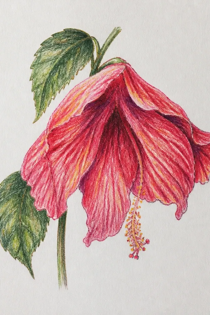
Drooping petals make the flower feel calm and lived-in. I keep the stamen minimal by drawing only a few curved lines and one or two dot clusters in the center. That keeps the focus on petal weight and fold shading, which is where this drawing gets its softness. Use muted mauve for the main petals, then deepen the folds with a slightly darker plum. The gray-beige background helps the petals look tender instead of bright. This style flatters moody palettes and works well for smaller sketchbooks because you don’t need a lot of extra elements.
Sketch the center oval, then draw petals that angle downward and overlap more than usual. Color petals with muted mauve pastel pencil, leaving pale blush along the outer edges. Add deeper plum fold lines and blend lightly inside the folds, keeping outer edges lighter. Draw only a few cream stamen lines and small dot clusters at the center. Finally, apply a diluted gray-beige wash behind the flower, keeping it light so it doesn’t dull the petals.
If the petals feel too stiff, bend the crease lines slightly — it sells the droop.
Don’t over-detail every stamen filament — minimal stamen detail is the point here.