1. Tape-Strip Meadow on a Single Wall Corner
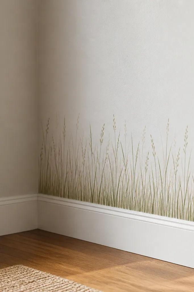
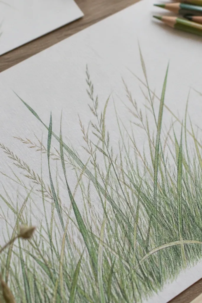
This one is for people who want the grass look without committing to a full panel. I draw a tight meadow strip that sits in the corner where two walls meet, so the negative space in the corner does half the work. Use muted greens like sage and olive, then add warm tan shadows so the blades look sunlit. It flatters small rooms because the height pulls the eye up while the corner keeps it from feeling crowded. Styling-wise, it looks best with light wood shelves or white frames nearby.
Start by cutting a 12 x 18 inch piece of cardstock and sticking painter's tape around the edges on the wall - not on the paper. Draw your grass on the cardstock first: long blades down the center, then shorter blades that lean outward toward the taped border. Layer color by doing a light green base line with a fine liner, then brushing diluted olive paint for shadow only on the left side of each blade. Finally, add 5-8 seed dots with a tiny brush or the tip of a colored pencil, then press the cardstock into place so the tape holds it flat.
Good to knowKeep the blades mostly vertical - even a slight lean looks intentional in a corner.
2. Window Acetate Grass Curtain with Soft Seed Heads
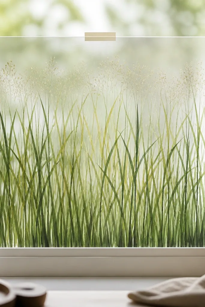
If your room gets daylight, this looks like the grass is "outside" the window. I like acetate because the lines stay crisp and the light passes through, which makes greens look calmer. This design flatters rooms with warm neutrals - beige curtains, oak furniture, cream walls - because the grass reads like morning light. It also works great for renters since the mounting is temporary and doesn't touch the glass with permanent residue. Keep the seed heads soft, not spiky, so it feels airy.
Cut acetate to the size you want, usually 10 x 20 inches for a single panel. Draw blade outlines with a 0.3 fineliner using dark green first, then add a diluted sage wash with a small round brush for mid-blade shading. For the seed band, tap the brush lightly upward near the top so you get small clusters rather than one heavy line. Mount by sticking removable window tape or a thin strip of repositionable adhesive at the top corners only, so the panel hangs straight.
Good to knowMist the finished piece with matte fixative from 12-16 inches away so it doesn't smear when you handle it.
3. Framed Grass Blades Behind Clear Glass
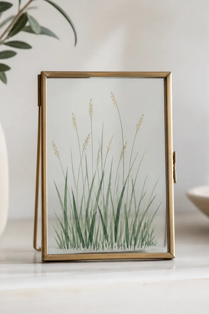
This is my go-to when you want the grass to look polished on a shelf. Drawing behind clear glass makes the lines look sharper and gives you that "gallery" calm. I use deep green ink for the outlines, then a thin wash of olive so the blades have depth without looking messy. It flatters darker shelves and black picture frames especially - the contrast makes the blades pop. It also looks clean with neutral outfits in a photo room setup since it's a simple, controlled shape.
Use a frame that has a backing you can remove, then swap in a sheet of smooth paper or acetate. Draw the tallest blades at the center and taper them outward - think of a soft triangle mass. Add shadow by painting diluted olive on the left side of each blade, leaving the right side mostly unpainted. Finish with 6-10 tan dots along the upper third so the top has movement. Put the glass back on carefully and mount the frame with picture-hanging strips rated for your wall weight.
Good to knowIf your frame has glare, tilt it slightly when you choose the final wall location.
4. Peel-and-Place Grass on a Removable Foam Board Panel
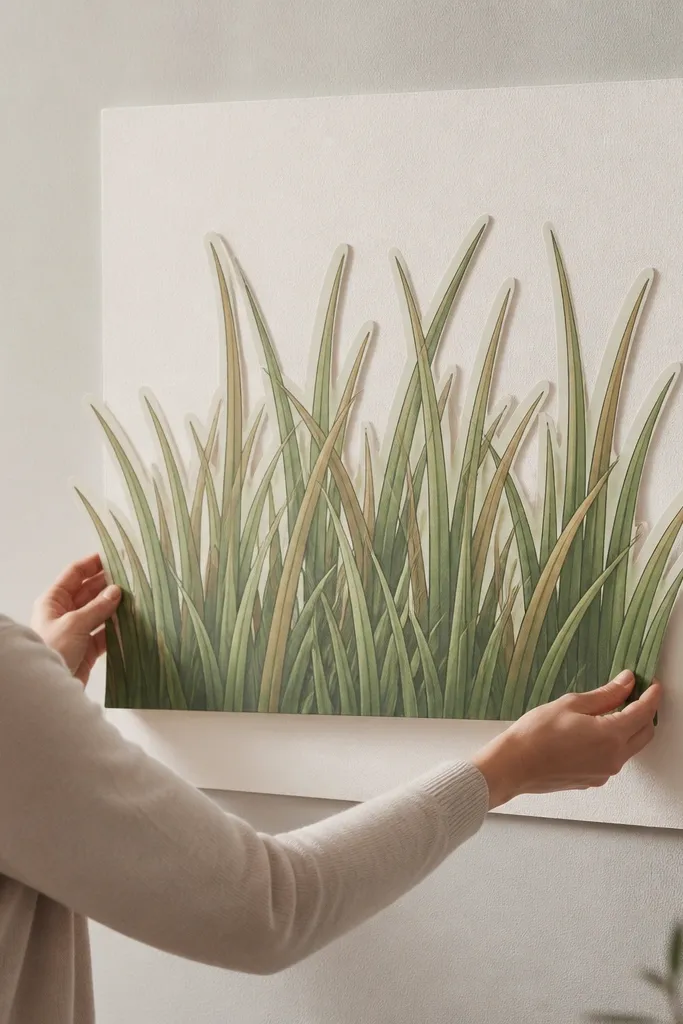
Foam board is sturdy, so your grass stays flat and doesn't curl like thin paper can. This design is great for renters who want something that still looks substantial. I keep the palette to two greens plus tan so it reads as intentional, not chaotic. It flatters gallery walls because the panel has a defined shape and sits well next to photos. If you have a dining spot with lots of wall space, this fills it without feeling heavy.
Cut foam board to 8 x 12 inches or 11 x 14 inches, then draw a border margin of about 3/4 inch. Start your blade set at the bottom edge with thick clusters, then thin them as they rise. Use a fineliner for crisp blade edges, then brush diluted green on the blade bodies and tan wash only where shadows would fall. Mount with removable mounting squares at the corners - press for 20 seconds each. Keep the panel away from humid kitchens so the paper and foam don't warp.
Good to knowPress the mounting squares with a flat palm so they fully bond before you hang it.
5. Seed-Head Topper for a Height-Short Shelf Look
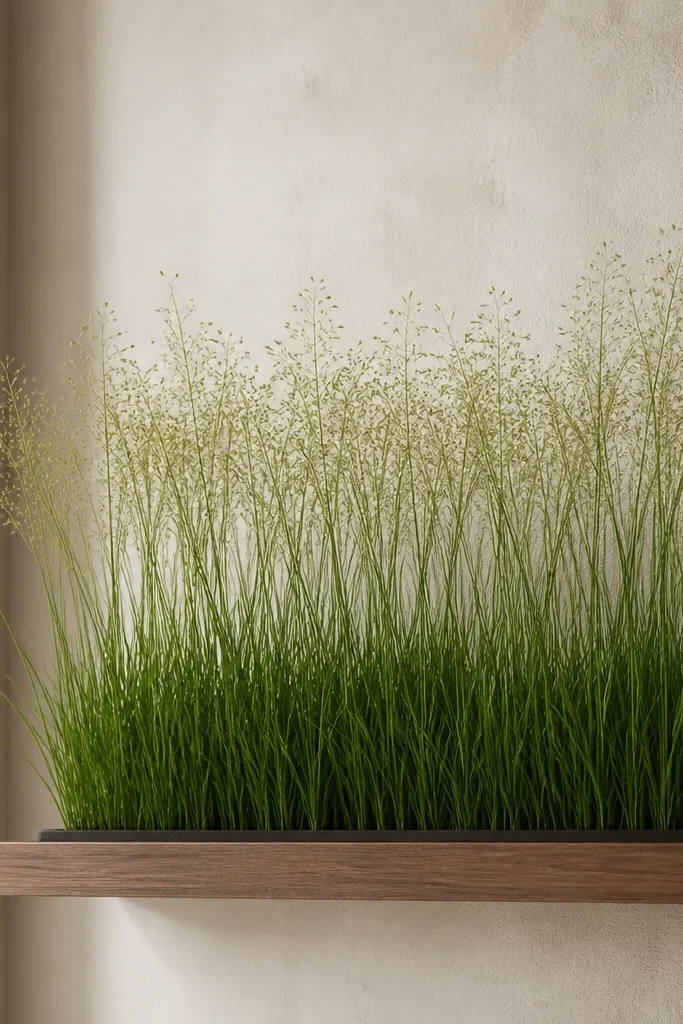
This one is for short spaces: the shelf edge, a mantle lip, or a bedside table backdrop. You're basically drawing grass that "starts" at the bottom and fades into seed heads near the top. I use lighter sage and pale yellow-green for the top so it feels soft and not heavy. It flatters people who like minimal decor because it stays narrow and doesn't compete with objects. Style it with one ceramic vase or a single dried stem so the grass looks like it belongs there.
Cut a 4 x 12 inch cardstock strip and sketch a baseline where your grass will begin. Draw 10-12 blade clusters across the bottom, each cluster 2 inches wide, then leave gaps between clusters. Add a second pass of shorter blades that tilt slightly, so the top doesn't look uniform. For seed heads, dot tiny circles in a loose band across the upper third using pale yellow-green. Mount by placing removable adhesive putty in the back corners or along the back edge so the strip sits flush.
Good to knowUse a toothpick to place seed dots - it gives you tiny, controlled circles.
6. Ombré Grass Wall Panel for a Soft Fade Effect
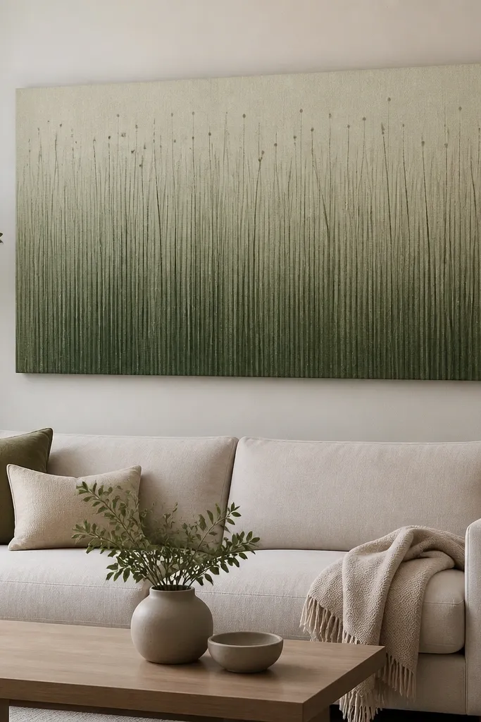
Ombré grass looks calm and expensive because the eye reads it as light changing with height. I do it on a rectangular panel about 12 x 18 inches, which is big enough to show the fade but not so large that it feels busy. The bottom blades are dark olive, and the top blades shift to pale sage, with tan shadow only in the lower half. This flatters bedrooms with soft bedding or neutral curtains because the fade matches that gentle palette. It's also great behind a plant stand since it makes real plants look more intentional.
Draw your blades first in a single dark green outline so every blade has a consistent shape. Then paint the blade bodies with diluted washes in stages: bottom third dark olive, middle third sage, top third pale yellow-green. Shadow is only added where the wash is darker - brush tan on the left side of blades in the bottom half. Keep seed dots minimal: 6-8 dots near the top where the color is lightest. Mount with a peelable adhesive border or removable mounting tape at the corners so the panel lifts cleanly.
Good to knowLet each wash dry 2-3 minutes before you add the next lighter layer so the fade stays clean.
7. Sunset-Tinted Grass with Warm Blade Tips

This one looks great in rooms that have warm lights. I add orange-tan to just the top 1/3 of the blades so it feels like sunset glow, not Halloween grass. Use deep green for the blade outlines, then brush green and tan, and finally dab orange only at the tips. It flatters warm skin tones in photos because the decor adds a gentle warm cast, especially under amber bulbs. Pair it with terracotta, cream, or brass accents.
Start with dark green blade outlines across the full panel, keeping the density higher at the bottom. Paint blade bodies with diluted olive, leaving the top areas lighter. Then use a tiny brush to dab orange-tan at the top tips, two to three dabs per cluster. Add a faint background haze behind the seed dots with very diluted peach watercolor, keeping it light so blades stay readable. Mount using removable wall strips or adhesive putty so the panel can be swapped seasonally.
Good to knowUse orange-tan paint that's slightly brown, not bright carrot orange, so it stays natural.
8. Black Ink Grass with Chalk-Style Texture
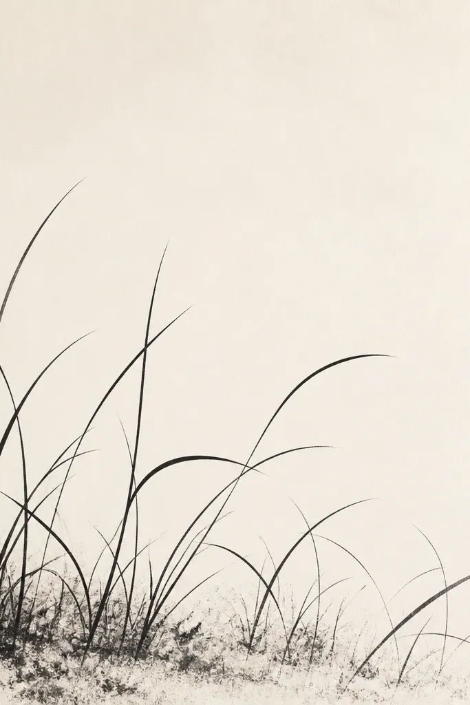
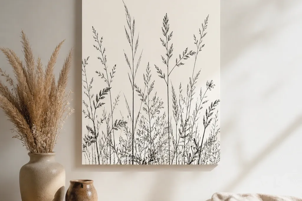
If you love minimalist decor, black grass looks sharp and graphic. I draw with black fineliner and then add texture at the base using chalk or chalk pastel dust blended lightly with a finger. The result reads like dry grass in a field, not like a cartoon. It flatters rooms with white walls and black metal accents, and it also looks good on light wood because it creates high contrast. Keep the seed heads tiny so it doesn't turn into a doodle.
Use cream paper or a matte white cardstock and draw blade outlines with a 0.3 fineliner. Vary blade length and tilt, but keep the line thickness consistent so the style stays clean. For base texture, rub black chalk pastel lightly along the bottom edge and tap off excess with a dry brush. Add a few seed dots using a fine paintbrush with diluted black ink. Mount with removable tape at the corners or an adhesive putty strip behind the bottom so it stays flat.
Good to knowSeal chalky texture with matte fixative sprayed from far away - close spray can blow the dust around.
9. Linen-Look Grass on Kraft Paper with Tan Shadows
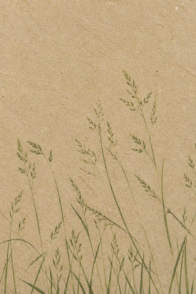
Kraft paper makes grass look earthy even with simple lines. I use kraft as the base because it already has the warm, linen-like tone, so your tan shadows look natural instead of pasted on. Blade outlines go in olive green ink, and shadows are a thin tan wash that follows the left side of each blade. This flatters farmhouse rooms and anyone who likes neutral decor without adding color clutter. It also photographs well because the paper texture shows through.
Cut kraft paper to 9 x 12 inches and tape it to a flat surface while you draw. Outline blades with olive ink, clustering them at the bottom and thinning upward. Mix a tan wash with water so it's translucent, then paint shadows along the left side only. Add seed heads with a pale beige pencil for a soft look. Mount with removable adhesive putty at the back corners so the paper doesn't curl.
Good to knowUse a kneaded eraser to lift a tiny highlight on a few blades - it makes the texture feel more real.
10. Watercolor Wash Grass with One Crisp Line
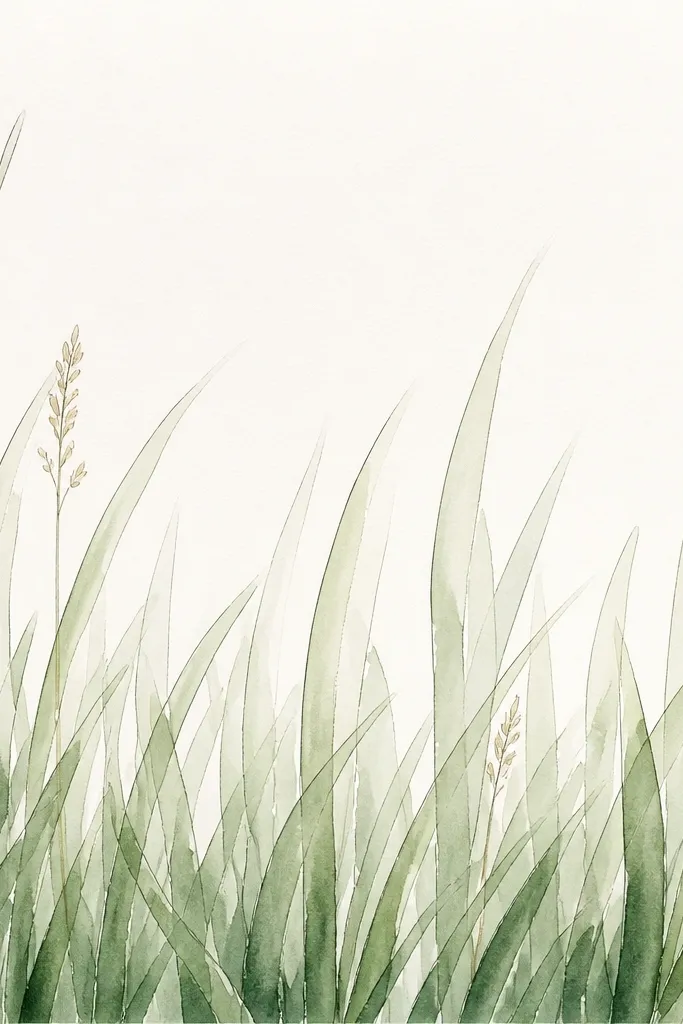
This style is for people who want grass to feel airy, not ink-heavy. The trick is keeping one crisp line per blade so the soft watercolor doesn't turn into a blur. I use a fine liner for outlines, then a diluted watercolor wash for the blade body, letting the top fade. It flatters people who have pastel walls or airy bedding because it matches that light feel. Pair it with white frames and a matte finish so it doesn't look shiny.
Use cold-press watercolor paper because it holds wash without soaking through too fast. Draw blades with a fineliner, then paint the blade bodies with diluted sage and olive using a small round brush. Leave the top 1/4 of each blade lighter by pulling paint upward and then lifting the brush. Add seed heads as a light cluster of dots in pale yellow-green, not a solid band. Mount by fixing the panel to a removable foam backing or by using removable tape behind the frame edges.
Good to knowRinse your brush often - watercolor mud makes blades look dull.
11. Grass Silhouette Cutout with Removable Magnetic Backing
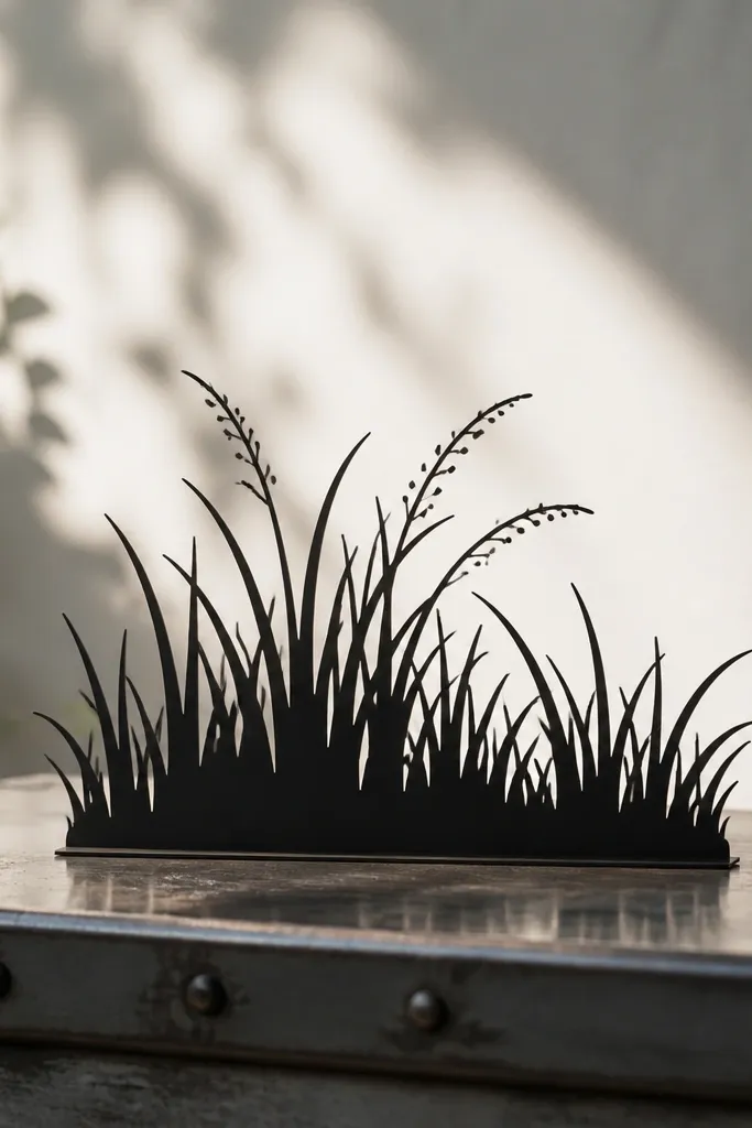
This is the cleanest-looking option when you want instant impact. A silhouette cutout reads as grass from across the room, and the removable magnetic backing means it can be swapped without wall marks. I use black craft vinyl or thick felt for the silhouette, then add tiny seed accents in dark gray or warm tan. It flatters modern rooms because the shape is crisp and controlled. If you have a fridge, metal cabinet door, or magnetic board, it's perfect there.
Cut a grass shape from black craft vinyl or felt, starting with a bottom-wide base and tapering to a thinner top. Add a few seed dot cutouts from tan vinyl and press them onto the silhouette. Attach magnetic sheet squares to the back with a glue that stays flexible, usually fabric glue for felt. Place it on a magnetic surface and adjust until the blades lean in the direction you like. For photos, add one small real plant nearby so the silhouette doesn't feel like a sticker.
Good to knowKeep your silhouette blades at least 1/4 inch wide so they don't look fragile.
12. Mixed Media Blades with Washi Tape Texture Lines
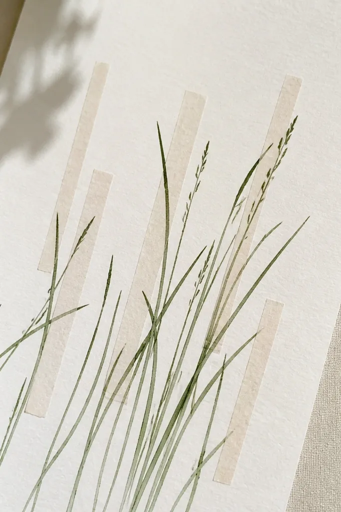
This one adds texture without adding clutter. I use thin washi tape strips as "highlight bands" behind a few blade clusters, so the grass looks sun-struck. The color palette stays natural: sage, olive, and warm tan, with one patterned tape that has tiny beige dots. It flatters spaces with patterned textiles because the tape echoes that vibe. Keep the tape placement sparse so it still reads as grass, not craft chaos.
Tape down your base paper and map two or three blade clusters where you'll place the washi tape. Draw the blade outlines first with a fineliner so you know where the grass needs to sit. Add washi tape behind part of a cluster - I place it for only 1-2 inches height - then paint over the area lightly so the tape shows through as a highlight. Finish shadows with diluted tan on the left side of blades. Mount with removable adhesive putty at the corners so the paper stays flat.
Good to knowUse a tape that's thin enough to disappear when viewed from 5 feet away.
13. Diagonal Wind-Grass for a Dynamic Entryway Feel
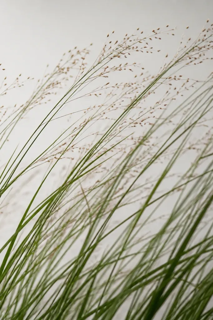
Diagonal wind-grass makes the whole piece feel like movement. I draw blades leaning up to the right, so it brings energy into hallways and entryways where you need visual motion. Use deep green outlines and a lighter sage wash, plus tan shadow only on the lower-left side of each blade. It flatters people who have strong lines in their decor because diagonal shapes match that energy. Pair it with a simple bench or a narrow console so it doesn't compete with clutter.
Cut a 10 x 16 inch panel and draw a diagonal baseline where blades start. Start with long blades that run at a consistent angle, then add shorter blades that overlap them for depth. Paint sage wash across the blade bodies, but keep the shadow side slightly darker using diluted olive. Place seed dots in a line along the upper edge - about 10-12 dots total. Mount at eye level with removable wall strips, and keep it away from door frames so it doesn't look crooked.
Good to knowDraw 10 blades first as a "wind test." If they don't feel like wind, fix the angle before you add everything else.
14. Layered Blade Panels for a 3D Grass Effect
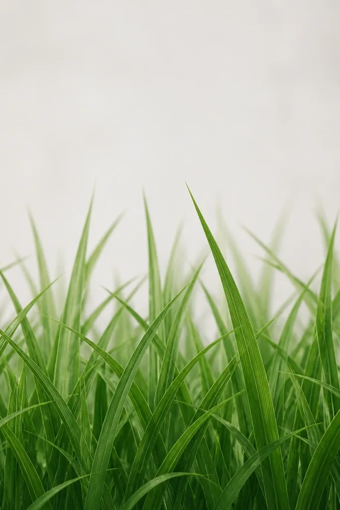
Layering is how you get that 3D look without complex sculpting. I make two panels from cardstock: back layer in pale sage, front layer in deeper olive. The shadow happens because the layers don't sit perfectly flat - there's a tiny step created by mounting tape. This flatters shelves and mantles because the depth catches light and looks good from the side. If your room has overhead lighting, the stacked blades look even better.
Cut two identical panels (for example 8 x 12 inches) and draw blades on each. On the back panel, draw fewer blades and keep them lighter - pale sage wash with minimal seed dots. On the front panel, draw more blades, slightly longer, and add tan shadow on the left side. Mount the back panel first with removable tape at the corners, then add thin foam mounting dots or folded tape strips under the front panel so it sits 1/4 inch forward. Press edges down so the layers align.
Good to knowKeep the front layer blades about 10-15% longer than the back so depth reads instantly.
15. Grass and Tiny Wildflowers Removable Accent
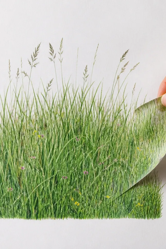
Adding a few wildflowers makes the grass look like an actual patch, not just decoration. I only add three to five flower marks so it stays airy; too many and it turns into a floral illustration. Use pink for petals, yellow for centers, and keep the grass mostly sage and olive. This flatters neutral rooms because the small color pops look intentional. It also looks great in kitchens and bathrooms where you want a soft, cheerful touch.
Draw your grass first on cardstock: clusters at the bottom, fading upward. Then add flower marks by drawing tiny teardrop petals with a fine brush and putting one yellow dot in the center. Place flowers slightly above the densest grass so they don't disappear. Shade grass blades with diluted tan on the left side only, and keep flower outlines light. Mount using removable adhesive putty in the back corners so the piece can be swapped seasonally.
Good to knowUse a damp brush to blend the petal edges for a soft wildflower look.
16. Monochrome Sage Grass with One Tan Ridge
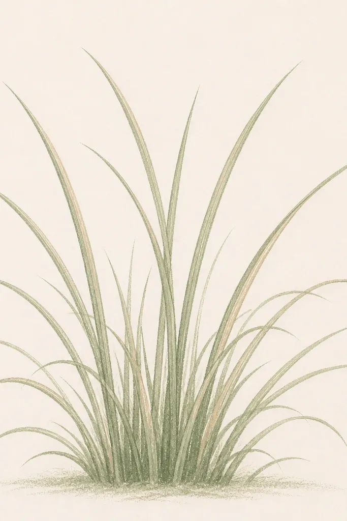
Monochrome grass looks clean and modern, and it's surprisingly forgiving. I use sage for the blade bodies and one tan ridge line on each blade cluster so the piece has depth without extra colors. This flatters small rooms because it doesn't visually weigh down the space. It also pairs well with patterned pillows because the decor stays controlled. If you're worried about color matching, this is the safest route.
Start with sage fineliner outlines or a sage marker, then fill blade bodies with a diluted sage wash. Add a single tan ridge line by dragging a thin brush along one side of each blade - I do it on the right side for a consistent highlight. Keep seed dots very light: five to seven tan dots near the top. Leave wide gaps between clusters so the minimal style breathes. Mount with a removable frame or tape border so the edges look intentional.
Good to knowPick one side for the tan ridge and never change it across the whole panel.
17. Chalkboard-Style Grass on Removable Black Paper
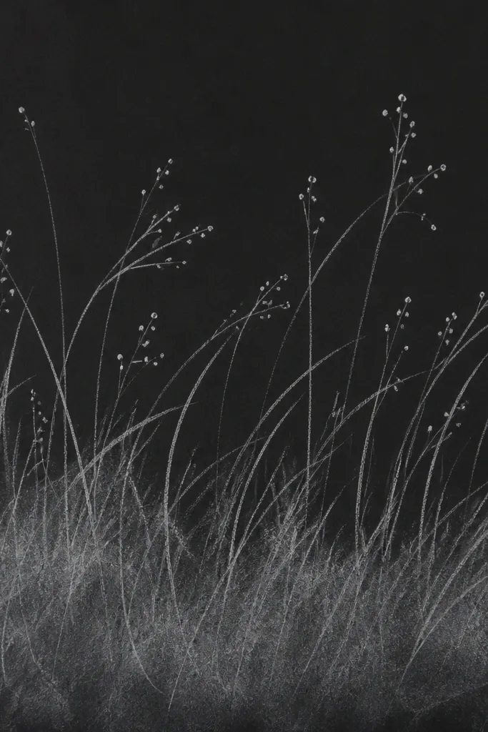
Chalkboard style makes grass look handmade and cozy. I use matte black cardstock and draw with white gel pen or chalk pastel, then blend lightly at the base for that dusty field feel. It flatters rooms with dark accents and works well for seasonal swaps because it's bold. Under warm light, the white blades look bright without being neon. Keep the seed heads small so the piece stays elegant.
Cut black cardstock to 8 x 14 inches and secure it to a board. Draw blades with white gel pen, varying lengths and tilts, and keep line thickness around the same width. Blend a little white pastel at the bottom edge, then lightly smudge with a paper towel so it looks like dust. Add seed dots with the gel pen for crisp points. Mount with removable tape along the top edge or adhesive putty at corners so you can take it down easily.
Good to knowUse a matte spray fixative labeled for chalk to prevent smearing.
18. Grass Halo Around a Candle Jar
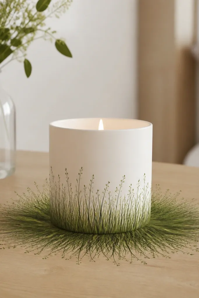
This is a decor trick I use when I want the grass to feel like it's part of the styling, not separate wall art. You draw grass in a ring shape around the candle jar, so the flame and the blades feel connected. I use mid-green for the blades and tan shadows to make it look grounded. It flatters warm, cozy settings and looks good on coffee tables and side tables. Keep the candle jar centered so the halo reads clearly.
Cut a circle of cardstock or thick paper, about 9-10 inches diameter. Draw blades radiating around the circle, taller at the back edge and shorter near the front so it feels layered. Paint blade bodies with diluted olive and add tan shadow on the left side of each blade. Place seed dots in a loose arc near the top of the blades. For removability, tape the paper to the underside of a clear acrylic tray or use removable adhesive tabs so you can lift it off after the season.
Good to knowUse a matte finish so the candle light doesn't reflect off glossy paint.
19. Paper Garland Grass Blades for a Staircase Runner
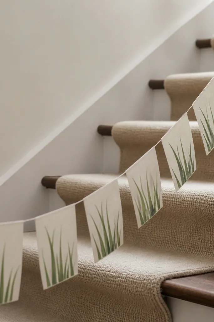
Garland grass looks best when it hangs and sways, because the blade tips create movement. I draw repeating grass blades on small tabs and string them so the spacing creates rhythm. Use sage and olive with tan shadow so it still reads from a distance. This flatters staircases and entry runners where you want a soft, airy line across the space. It also hides imperfections because each tab is small and forgiving.
Cut 20-30 tabs from cardstock, each about 2 x 5 inches, and punch a hole near the top of each. Draw 7-10 blades per tab, with the longest blades in the center and shorter ones near the edges. Add diluted olive wash and a thin tan shadow on one side only so the whole garland looks consistent. String the tabs with thin twine and adjust spacing so the garland has a gentle arc. Attach the ends with removable hooks on the wall or banister so you can take it down without damage.
Good to knowKeep your twine slightly slack so the garland breathes instead of hanging stiff.
20. Grass Frame Liner for a Mirror with Removable Edge Clips
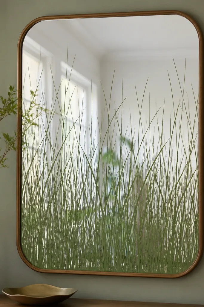
This one makes a mirror feel like a seasonal decoration instead of a flat reflective surface. The grass liner sits inside the frame border, so it's visible but protected from smudges. I keep the palette to two greens and tan so it doesn't fight with your mirror reflection. It flatters bathrooms and hall mirrors because it adds softness without taking up wall space. The liner also works well on round mirrors where a halo effect looks natural.
Measure your mirror's inner frame opening and cut a liner sheet from cardstock or smooth paper. Draw grass blades starting from the bottom half, tapering upward so the top half stays mostly clear. Outline with a fine green liner, then paint diluted olive wash on blade bodies and tan shadow on one side. Add 8-12 seed dots near the upper third. Secure the liner with removable edge clips or thin adhesive tabs on the back so you can swap designs without removing the mirror.
Good to knowUse a matte finish on the liner so it doesn't show glare in the mirror.