
1. Single-Direction Grass Band Across the Bottom
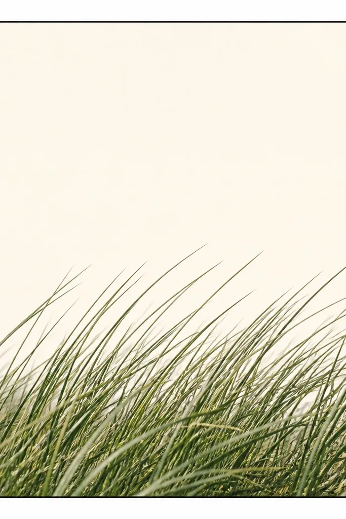
This is the design I use when I want the page to look expensive fast. The blades lean one way, like a gentle breeze, so your eye reads it as one clear shape. I draw the band across the bottom third using a 0.3 mm pen, then I add a few extra overlaps near the center so it feels grounded instead of flat. It flatters small spaces and narrow frames because the negative space does the heavy lifting.
Start by marking a pencil guide line 2.5 inches from the top on a 5x7 card. Then draw 25-35 grass blades from that line, each starting at the guide and leaning right, with 2-4 mm gaps between blades. Keep all tips roughly in the same height range so the band looks even. Finally, add 5-7 overlapping blade outlines near the center only, leaving the left and right edges airy.
If your lines look wobbly, practice the blade shape on scrap and keep your hand moving in one smooth arc for each blade.
Don’t fill the band with heavy black — it kills the minimalist outline look and makes it look like a sticker.
2. Horizon Line Grass with a Clear Sky Gap
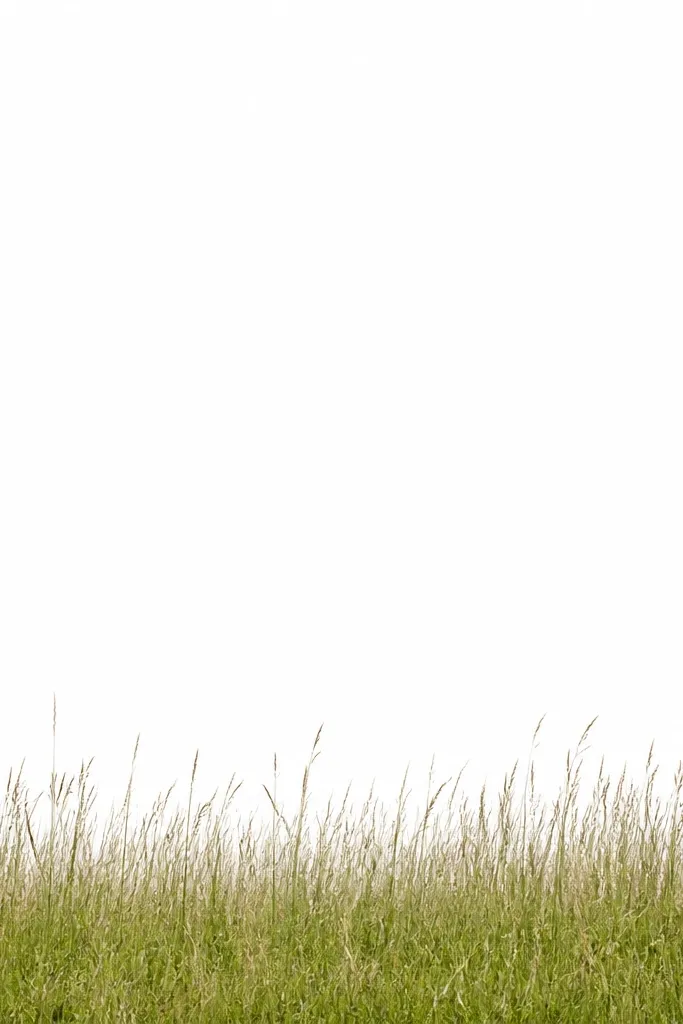
This one reads modern because it separates land and air with a single horizon. The grass sits under a straight line, so the drawing feels architectural instead of decorative. I keep the blades shorter near the horizon and slightly taller toward the middle, which gives a calm sense of depth without any shading blocks. It’s great for wall art where you want a graphic feel that matches modern interiors.
Draw a straight horizon line with a ruler at about 55% of the card height. From that line, sketch 20-28 blades that grow downward in an outline-only style, leaning subtly left. Make the blades near the horizon about one-third the height of the tallest blades in the center. Then leave the top 45% completely blank so the sky gap stays crisp.
Use a straight edge for the horizon even if you freehand everything else — that one line makes the whole piece look intentional.
Skip extra details above the horizon; adding clouds or seed dots makes it feel busy.
3. Two-Tier Grass Steps (Top Short, Bottom Tall)
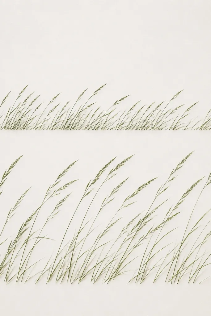
Two-tier grass looks like minimalist staging — it feels layered without filling anything in. The top tier stays short and airy, like foreground plants, while the bottom tier is taller and denser, like a base. I like it on 8x10 pieces because the extra space lets each tier breathe. It flatters walls that need a vertical composition since the tiers guide your eye up and down.
On an 8x10 sheet, draw a pencil line for the first tier at about 4 inches from the bottom. Then draw 15-20 short blades from that line, keeping them about 1.5-2 inches tall and leaning right. Place a second guide line at about 2.5 inches from the bottom and draw 25-35 taller blades from there, around 3 inches tall. Keep the overlaps mostly in the bottom tier, and let the top tier remain mostly separate blades.
If the tiers blur together, make the top tier blades thinner (0.1 mm for tips) and keep the bottom tier main lines at 0.3 mm.
Don’t make both tiers equally dense — that flattens the depth and loses the step effect.
4. Center Cluster with Sparse Outer Edges
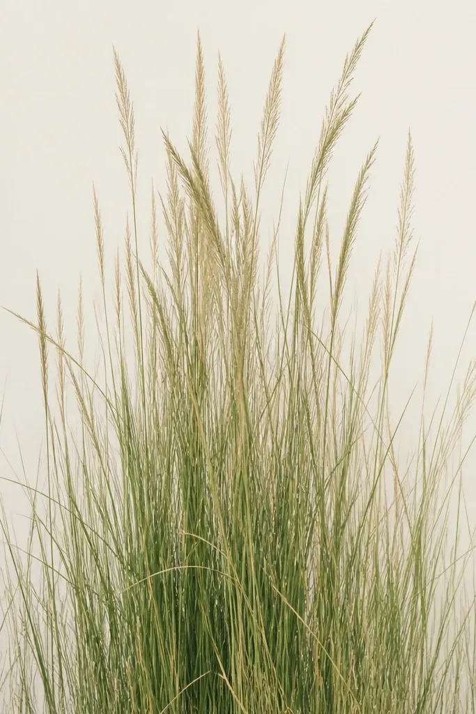
This design looks modern because it’s asymmetry controlled. The center cluster draws your eye immediately, and the sparse edges keep it airy instead of crowded. I use a tighter blade spacing in the middle (about 1-2 mm between overlaps) and open spacing outside (2-4 mm). It works especially well for portrait frames, drawer fronts, and small stickers.
Good to knowAdd one extra tall blade in the center cluster and stop — that single “hero” blade makes the composition feel designed.
Use a 4x6 card for this one. Draw a faint vertical pencil guide down the center. Then draw blades in three zones: left third sparse (about 10-12 blades total), middle third dense (about 20-25 blades), and right third sparse. Keep all blades leaning slightly inward toward the center so the cluster feels intentional.
Common mistakeDon’t mirror the density perfectly left and right; perfect symmetry makes it look like a template.
5. Wavy Grass Outline Like a Hand-Drawn Wave
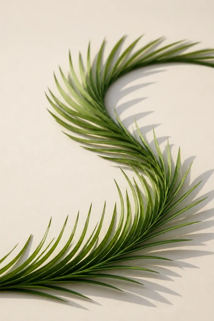
Wavy grass feels modern because it moves without turning into a full landscape. The base curve tells the story, and the blade outlines echo that rhythm. I keep the blades mostly the same length, then vary only the base height — that keeps it minimalist. This one looks great on long bookmarks and horizontal prints where you want a graphic flow.
Good to knowWhen your wave wobbles, redraw just the pencil guide; the ink will look cleaner if the base curve is right first.
On a 3x8 strip of cardstock, draw a gentle S-shaped pencil line across the bottom third. From that line, draw grass blades that are about 1.5-2 inches long, following the curve so they lean with the wave. Keep spacing consistent at around 3 mm within each wave segment. Finish by adding a slightly thicker outline at the wave’s top edge using a 0.2 mm pen so it reads as one smooth silhouette.
Common mistakeDon’t vary blade length wildly along the whole piece — the wave shape should stay the main visual.
6. Minimal Seed Head Above the Blades
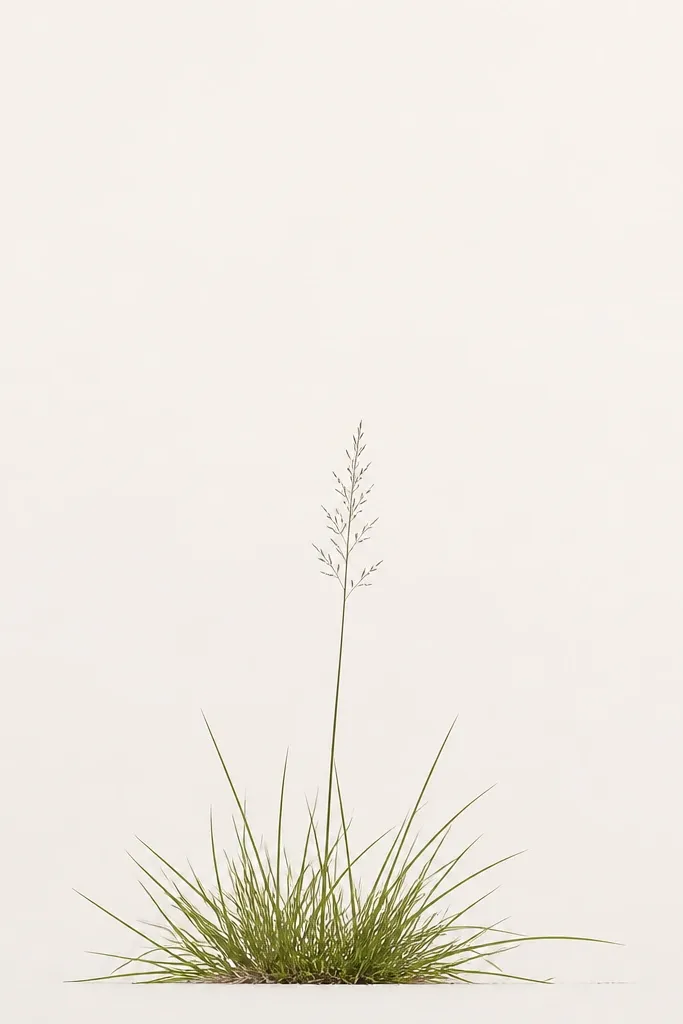
A seed head is the perfect “one extra element” for modern grass drawing minimalist work. It adds a focal point without cluttering the whole page. I draw the blades first, then I place one seed head slightly off-center, about 1.5 times the height of the tallest blades. It looks good on wedding signage, thank-you cards, and calm-toned home decor.
Start with a grass band across the bottom third using 20-30 blades leaning right. Then pick one point near the center and draw a seed head outline: a thin oval base with 8-12 tiny lines radiating upward. Connect the seed head to the blade cluster with one curved stem line, still in outline. Keep the rest of the page blank so the seed head stays the only vertical accent.
Use a lighter touch for the seed head lines; the top should feel airy, not heavy.
Don’t add multiple seed heads — two or more makes it look like a botanical illustration instead of minimalist grass.
7. Grass Frame Border with Corner Air
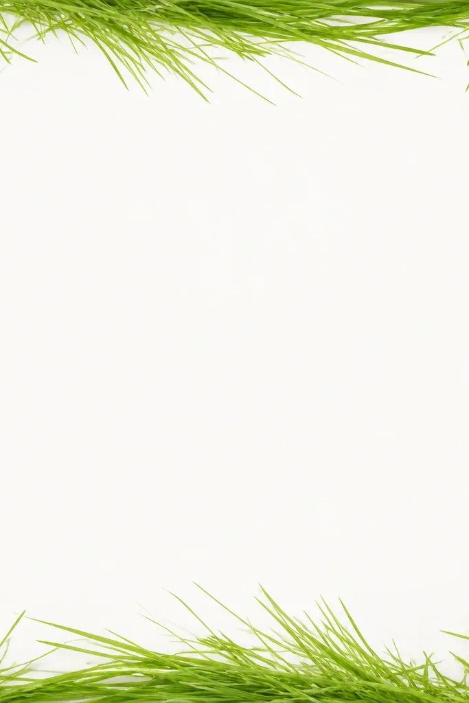
This one turns grass into a border without turning the whole thing into a pattern. I like leaving the corners mostly empty because it keeps the drawing crisp and modern. The grass border works best when the blades all lean the same direction around the frame edges, like they are blowing in one wind. It’s a strong choice for prints that need a clean “window” feel.
Good to knowIf your border looks too busy, reduce the number of blades and increase the blank corner space.
On an 8x10 sheet, draw a rectangle border in pencil about 1 inch from the edges. Then draw grass blades along the left and right sides, leaning outward from the center, leaving the top-left, top-right, bottom-left, bottom-right corners with only 2-3 short blades. Along the top and bottom edges, lean blades the same direction so the whole frame feels coherent. Finally, reinforce the border silhouette with a slightly thicker line where blades overlap the pencil rectangle.
Common mistakeDon’t put full grass density into every corner; corners are where minimalist designs go to look messy.
8. Diagonal Meadow Drift (Blade Grid with One Diagonal Sweep)
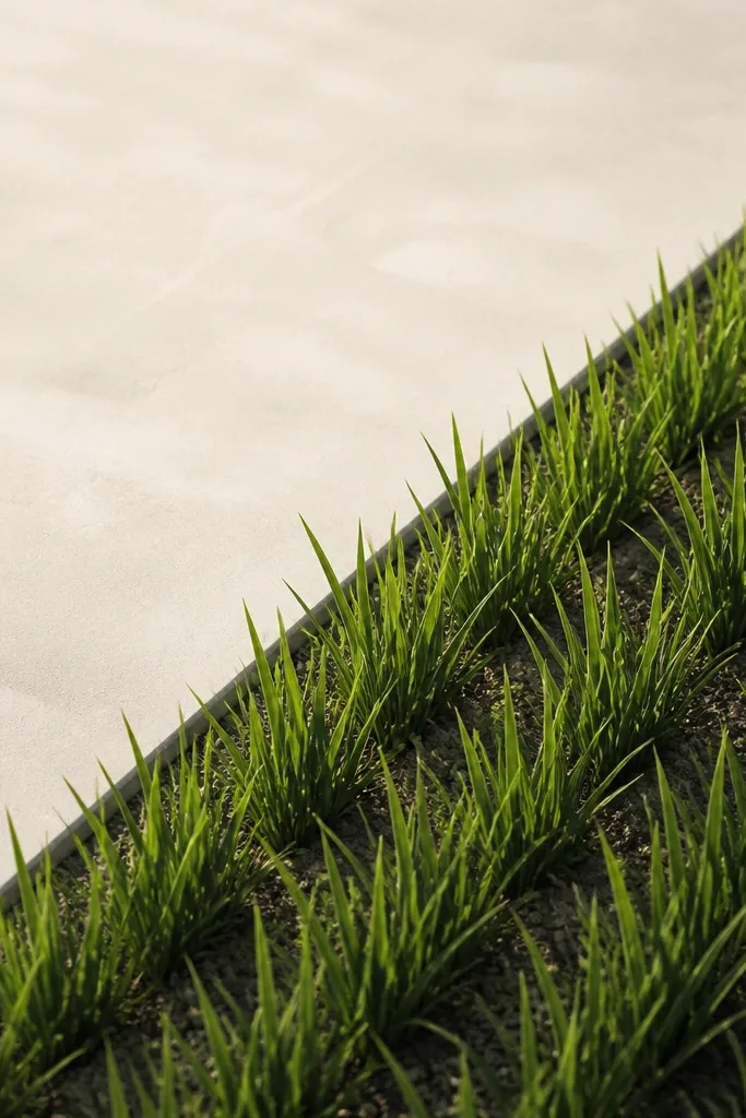
Diagonal grass feels modern because it breaks the usual horizontal calm. This design uses a diagonal boundary so the viewer gets a clean “movement” line. I keep the blade outlines consistent in width and length, then I vary only how many blades sit on each side of the diagonal. It suits wall art and tote bag prints because diagonal compositions read well at a glance.
Good to knowKeep your diagonal line straight; the whole drift depends on that boundary looking clean.
On a 6x9 card, draw a diagonal pencil line from bottom-left to top-right. Then draw blades on the lower-left side that lean toward the diagonal, about 2.5 inches tall. On the upper-right side, draw fewer blades, about 1.5 inches tall, and keep them more spaced. Finish by adding a thin outline shadow line along the diagonal boundary using a 0.1 mm pen to define the edge.
Common mistakeDon’t angle the blades randomly; choose one lean direction relative to the diagonal.
9. Grass Outline with One Thick Underline
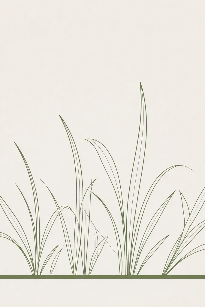
A thick underline makes the grass feel anchored without adding filled shapes. The blades stay outline-only, but the base line gives you that modern poster vibe. I use a 0.8 mm fineliner or a brush pen for the underline, then keep all blades at 0.3 mm. This is especially flattering for small prints because it creates contrast that holds up from a distance.
Draw the underline first on a 5x7 card, placing it about 2.2 inches from the bottom. Use a ruler and a brush pen for a smooth, slightly uneven hand-made thickness. Then draw grass blades rising from the underline, leaning right, with 2-4 mm gaps. Add overlap only where blades meet the thick base line so it looks like growth from the same stem area.
Practice the underline on scrap once; brush pens get darker if you go over the same spot too many times.
Don’t thicken the entire grass silhouette — only the underline should be bold.
10. Minimal Grass Row with Two Heights Only
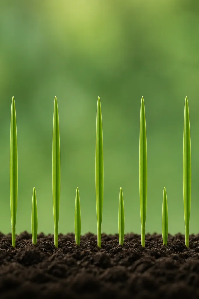
This is the “control freak” layout that still looks soft. Using only two blade heights makes it feel graphic and calm, not cluttered. I alternate short and tall blades in a way that looks random but repeats, which keeps it from looking like a barcode. It’s great for minimalist prints where you want a strong structure without heavy shading.
Good to knowCount your blades before you start in ink; it’s easier to keep the alternation even.
On a 4x6 card, create a baseline pencil line across the bottom third. Draw 24-30 blades, alternating short (about 1.2 inches) and tall (about 2.2 inches). Keep all blades leaning slightly right and use the same blade outline shape each time. Leave 2-4 mm gaps between blades, but allow a few tiny overlaps where a tall blade passes in front of a short one.
Common mistakeDon’t add third height blades; that extra length kills the tidy minimalist rhythm.
11. Grass and One Curled Stem Bow
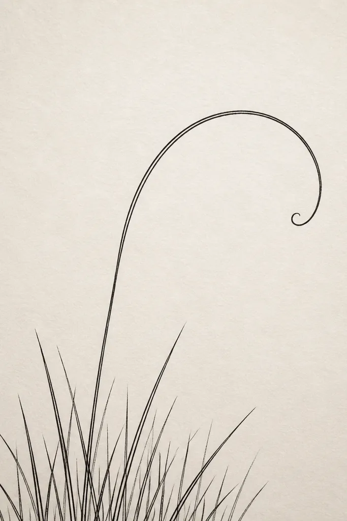
A single curled stem gives movement and softness without turning the page into a full plant drawing. I use it like a minimal flourish that frames the grass rather than competing with it. The stem curl adds a curved line, which contrasts nicely with the mostly straight grass blades. This design looks great for greeting cards because it feels personal but still clean.
Good to knowMake the stem curl smooth and slow; jagged curves make the minimalist look cheap fast.
Draw a simple grass base across the bottom third with 20-30 blades leaning right. Then pick a center point and draw one curled stem: a thin line that rises, curves left, dips slightly, and ends back near the grass. Add 5-7 small blade tips along the stem curve, keeping them shorter than the main grass blades. Keep the rest of the page blank so the curl reads like a signature line.
Common mistakeDon’t add extra leaves or buds — one stem curve is enough.
12. Grass Silhouette Outline in a Circle (No Fill)
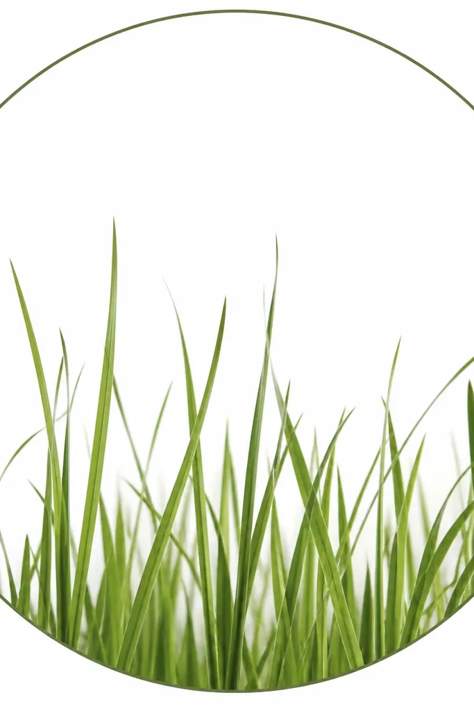
Circles make grass feel playful and modern because the boundary is clear. I keep everything outline-based, so the circle doesn’t become a filled sticker. The grass emerges from the bottom of the circle like it’s growing from a ring, and the negative space inside the circle stays bright. This one looks great for stickers, labels, and round wall decor.
Good to knowIf the circle looks off, redraw it before you ink the grass. A wobbly circle makes the whole piece feel sloppy.
Draw a circle on a 5x7 card using a compass or a traced lid, centered. Then draw a baseline inside the circle at about the circle’s bottom third. Add grass blades rising from that baseline, leaning slightly outward so they follow the circle’s shape. Keep the blades only in the lower half of the circle so the upper half stays mostly blank. Finally, thicken the circle outline with a 0.4 mm pen so it reads as the frame.
Common mistakeDon’t let blades touch the circle all the way around; spacing keeps the minimalist outline clean.
13. Grass Outline with a Single Vertical Stem Post
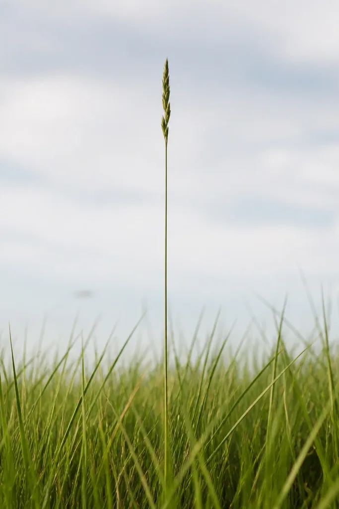
This is a simple way to add a focal point without adding a whole plant. The tall vertical stem gives you a strong center line, and the grass becomes the soft base. I like it for wall art because it reads like modern typography — one clear axis. It flatters most spaces since the design stays balanced even when the blades vary slightly in height.
Draw a grass base across the bottom third with 25-40 blades leaning right. Then draw one taller stem in the center: a straight line up from the grass, about 2 inches taller than your tallest blade. Add 6-10 small blade outlines branching from that stem near the top, but keep them short and sparse. Use a 0.3 mm pen for the grass and a 0.2-0.3 mm pen for the stem so the stem feels like a guide, not a giant thick line.
Make the stem perfectly straight with a ruler — it’s the anchor for the whole minimalist composition.
Don’t add multiple tall stems; two creates a cluttered “forest” look.
14. Layered Outline Grass Over a Thin Grid Background
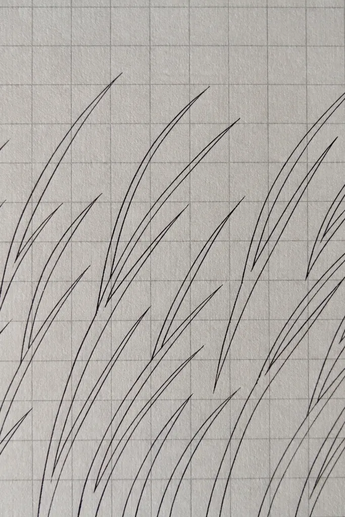
Grid background is the fastest way to make grass feel modern without adding color. The grid lines stay faint, while the grass outlines do the visible work. I use a light pencil grid or a very pale grey printed grid so it doesn’t compete. This design looks clean in offices, kitchens, and entryways because it feels orderly and graphic.
Good to knowIf your grid shows too much, lighten it with a kneaded eraser before you ink the grass.
Start by drawing a very light grid with a 2 cm spacing on a 8x10 sheet. Keep it faint enough that you can barely see it after erasing. Then draw grass blades in one direction (lean right), placing blade bases on grid intersections or along grid lines for a tidy rhythm. Use 0.3 mm pen for blades and keep overlaps minimal. Finish by erasing any leftover pencil smudges so the grid stays crisp and the ink stays clean.
Common mistakeDon’t go dark on the grid; dark grid lines make it look like construction paper.
15. Grass Outline with a Minimal Arch (Gate Effect)
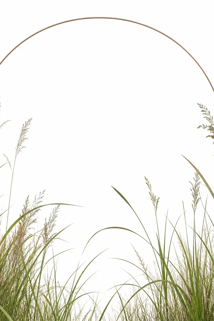
An arch gives your grass a “frame within a frame” feeling, and it stays minimalist because the arch is only one line. I draw the arch first, then I place grass underneath so it feels like growth under a doorway. The arch works especially well for portrait formats because it creates a soft top curve. This is a great option for entryway decor and framed quotes.
Good to knowUse a consistent curve thickness for the arch; a thin arch looks cleaner than a thick one here.
On a 4x7 card, draw an arch line using a curved template or a string method, placing the arch about 1.5 inches tall from the top. Then draw a grass baseline just under the arch span. Add blades rising from the baseline, leaning slightly right, with 2-4 mm spacing. Keep the tallest blades just below the arch so they never touch the arch line, then add a few overlaps near the center for depth.
Common mistakeDon’t add extra arch lines or drapery details; the arch has to stay simple.



