
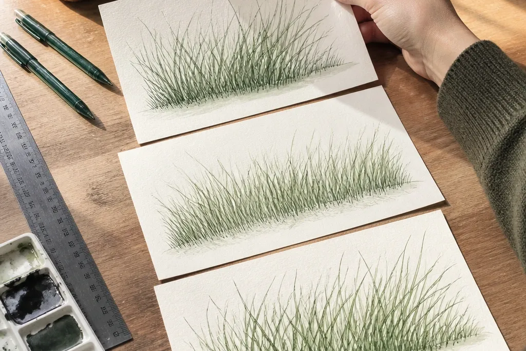

1. Single Rock Crest with Leaning Blade Border
Start by sketching the rock first with a 0.5 fineliner, keeping the underside slightly flatter than the top. Then draw grass blades in one band about 1.5 cm tall, repeating a single blade shape that leans left (top-left light). Next, add a second pass shadow line: a thin darker stroke right under the blade tips and lightly under the rock base. Finish by rubbing a tiny amount of 2B pencil under the shadow area only, so the base looks darker without smudging the whole panel.
This one is the fastest way to make grass outline drawing look intentional. The rock is a simple oval with jagged edges, then the grass is a border strip — about 1/3 the rock height. I like it on lighter skin tones and small spaces because the off-white background keeps everything clean and bright. Use muted greens so the rock feels grounded, not cartoonish. The styling principle is framing: the grass border tells your eye where the ground meets the stone.
Common mistakeDon’t make the blades all the same length; uniform blades make it look like a stamp.
Good to knowIf your grass looks shaky, draw three guide lines first — the top of the blades, the base line, and the shadow line.
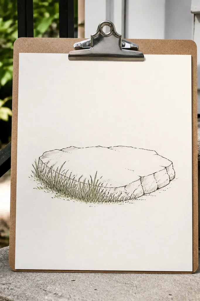
2. Two-Tone Meadow Grass Under a Flat Stone
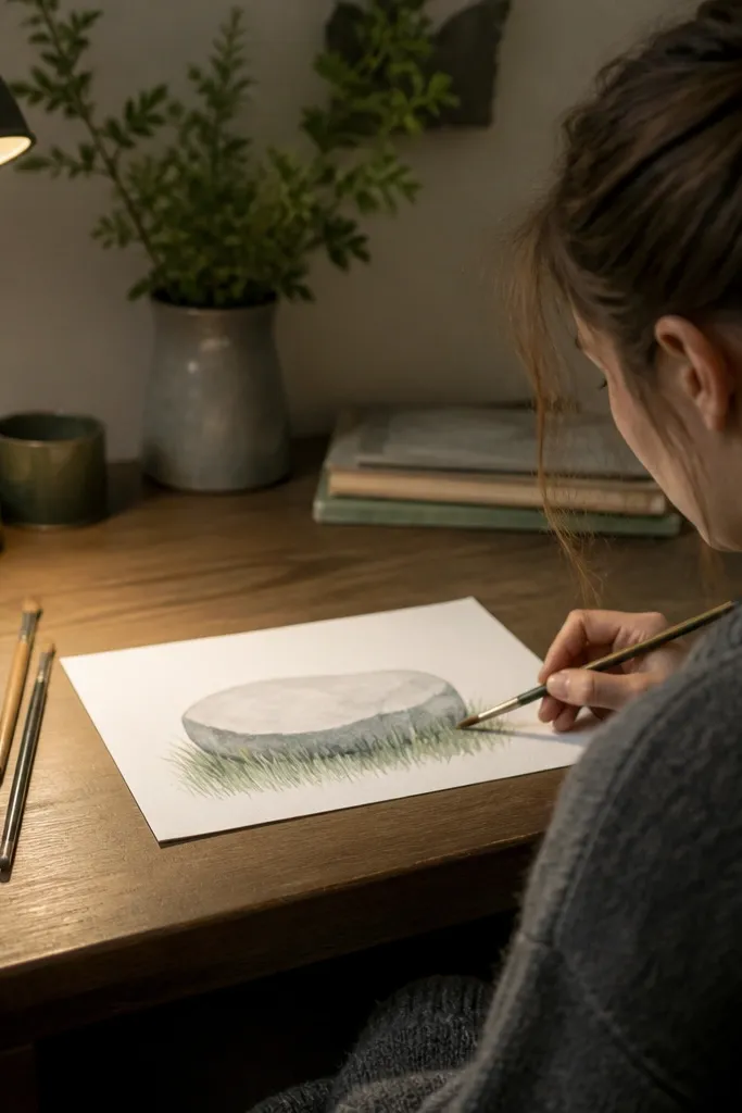
Begin with the flat rock — draw a thick outline and then shade the rock underside with a soft grey pencil. Next, block in the grass base across the bottom third with short blades about 8-10 mm tall using a diluted green wash or a light pencil. After that, add taller back blades behind the rock edge, about 15-18 mm tall, using a darker olive or olive + a touch of grey. Finish with a shadow pass under the rock: a thin band of grey-green wash that follows the rock’s base line.
This layout reads “best” because it adds depth without overworking details. The flat stone creates a natural ledge, so the grass looks like it’s growing from beneath it. I’ve used this on panels sized 6x8 inches and it looks great in small frames because the two-tone grass gives contrast even from a distance. Choose an olive green for the base layer and a cooler grey-green for the shadow layer. The principle here is depth through layering: front grass is shorter and lighter, back grass is taller and darker.
Common mistakeDon’t fill the whole space with tall grass; it makes the rock look glued to the paper.
Good to knowKeep the back blades fewer in number than the front blades so the stone stays the main subject.
3. Wind Sweep Grass with Curved Rock Path
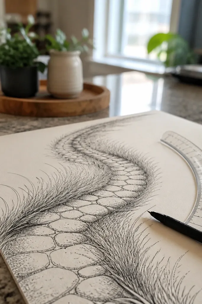
This is the one I reach for when a simple border feels too static. The curved rock path gives your composition motion, and the grass sweep makes it feel like a breeze. It works especially well for people who like clean lines but want movement — the grass still uses outline shapes, just arranged with a curve. Use a single highlight green and one shadow green so the sweep stays readable. The styling principle is controlled chaos: the blades can vary slightly in length, but the light direction stays constant.
Sketch the curved ground line first with a light pencil, then place three rocks on it — each rock about 2 inches wide in a 9x12 panel. Draw grass blades along the curve, but angle their placement so they follow the arc while still leaning left for the light. Keep the blades mostly 10-14 mm tall, then create variation by making every fourth blade slightly longer. Add the shadow by drawing a thin darker stroke under the blade tips, following the same arc direction.
Use a ruler for the ground curve lightly, then erase it after the grass outline is in place.
Don’t reverse the lean direction in the middle; mixed directions make the wind effect look like a mistake.
4. Rock Steps with Checker Blade Heights
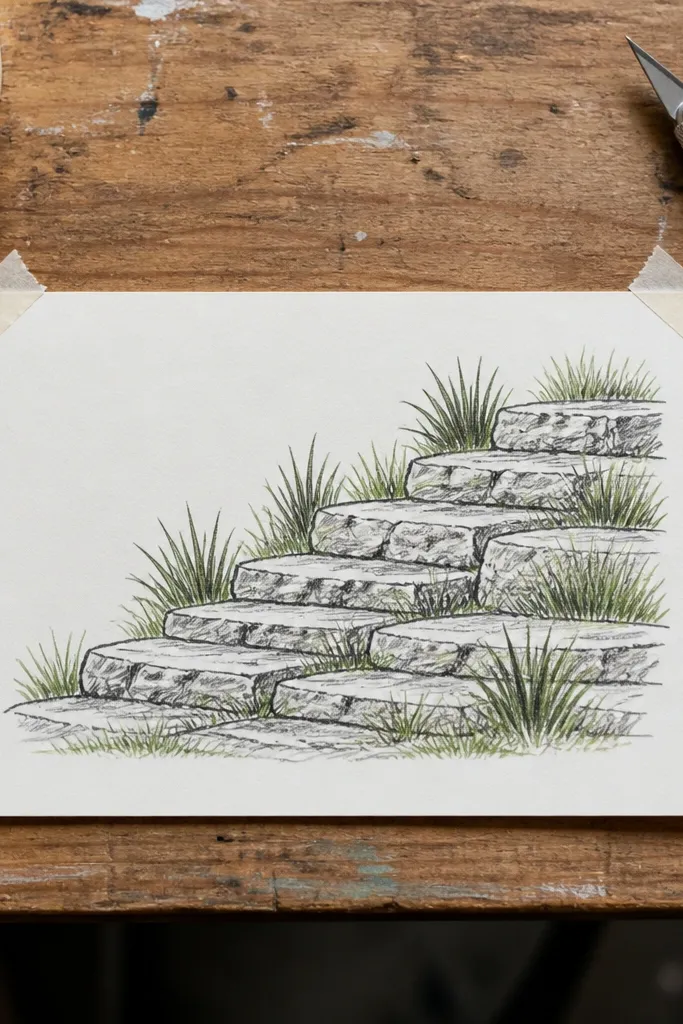
Draw the three rocks as rounded rectangles with uneven edges, then shade each step’s underside slightly darker. For the grass, start at the base line and draw short blades first (about 8-10 mm) across the bottom half. Then fill in medium blades (about 12-15 mm) in a checker pattern — leave gaps so the short blades peek through. Finish by adding a thin shadow strip under each rock step base using a grey-green wash, keeping it only 3-5 mm tall.
This layout looks “designed” because the grass has a rhythm. The rock steps create height changes, and the checker blade heights echo that. I like it for gift pieces because it finishes quickly but still looks intentional. Pick two greens: pale mint-green for short blades and a darker olive for medium blades. The principle is pattern control: you repeat a simple height rule so the eye reads it as style, not clutter.
Common mistakeDon’t make the checker pattern too tight; leave breathing space between blades so it stays airy.
Good to knowIf you’re using pencil, press lightly for mint blades and harder for olive blades so you don’t need to switch tools.
5. Cove Rock with Shadowed Grass Bowl
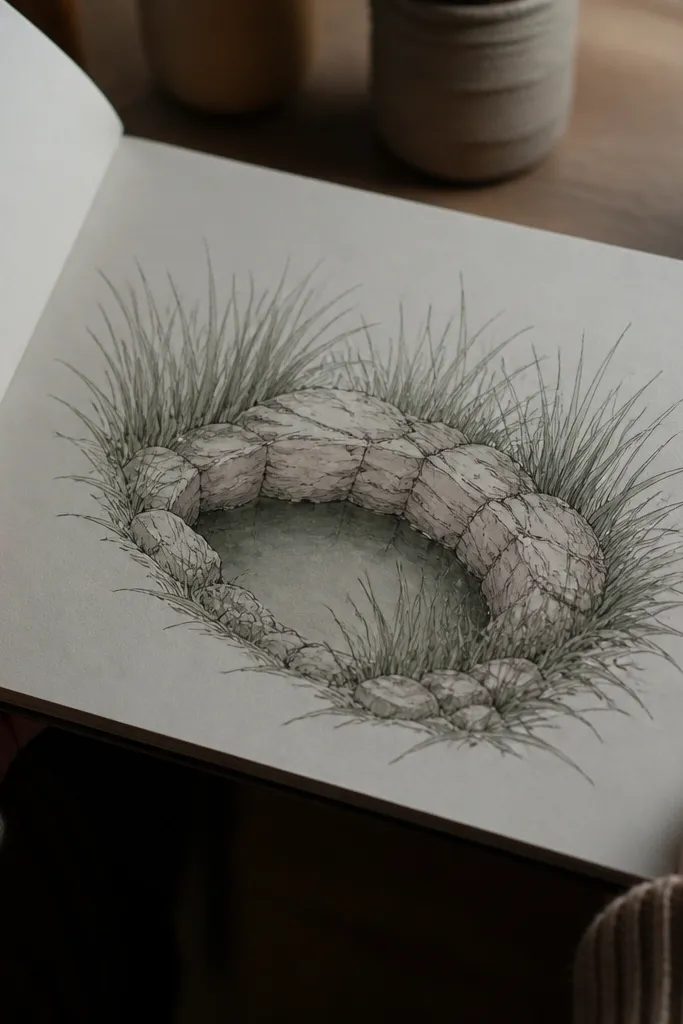
Sketch the large rock with a clear cove notch on one side, then outline it firmly with a fineliner. Draw grass blades only around the cove rim, about 1 cm tall, leaning left. Then wash grey-green into the inside bowl area lightly, keeping it darker at the center and lighter near the rim. Add a final shadow pass under the rim blades with a thin darker line so the rim reads as raised. Let the wash dry before adding any extra pencil so it doesn’t smear.
This one makes grass outline drawing look dimensional fast. The rock cove creates a natural “bowl,” so your shadow can sit inside and make the grass feel like it’s growing from a dip. It’s flattering for panels you want to look calm, not loud. Use olive-green for the outer blades and grey-green wash inside the cove. The principle is negative space shading: the shadow area is controlled and stays inside the rock’s shape.
Common mistakeDon’t extend the shadow wash into the light areas; it flattens the rock and makes the grass look dirty.
Good to knowUse a flat brush and keep your shadow wash to the cove area only — that clean boundary is what makes it look pro.
6. Dew Drop Grass Tips on Dark Paper
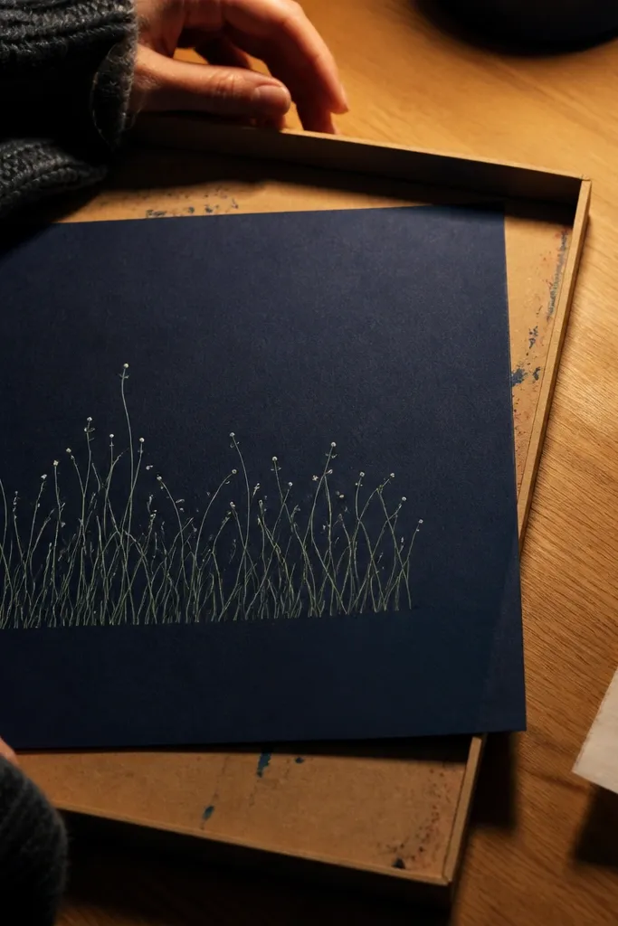
Tape your dark paper to a board and sketch the rock lightly first, then outline it with a pale grey pencil. Draw grass blades around the rock base using a light green pencil or diluted paint, leaning left. Keep the blades mostly 10-12 mm tall and leave tiny gaps between them so the black shows through. Add dew drops by dotting white gel pen at every third or fourth blade tip. Finish by drawing a single thin highlight line along the rock’s upper edge to tie the whole piece together.
I love this for dramatic contrast because it flips the usual palette. Drawing grass outline on dark paper makes your whites and pale greens pop instantly, and the dew dots look crisp even if your hand shakes. It’s great if you want a piece that looks “finished” with minimal shading. Use a light mint gel pen or white acrylic marker for dew, and a soft olive for blades. The principle is highlight placement: you only add bright accents at the tips, not all over.
Common mistakeDon’t color the entire grass white; it turns into a glowing mess instead of dew.
Good to knowIf the dew looks too big, dot with the pen tip and stop — don’t drag the ink.
7. Rock + Grass Frame for a Small Photo
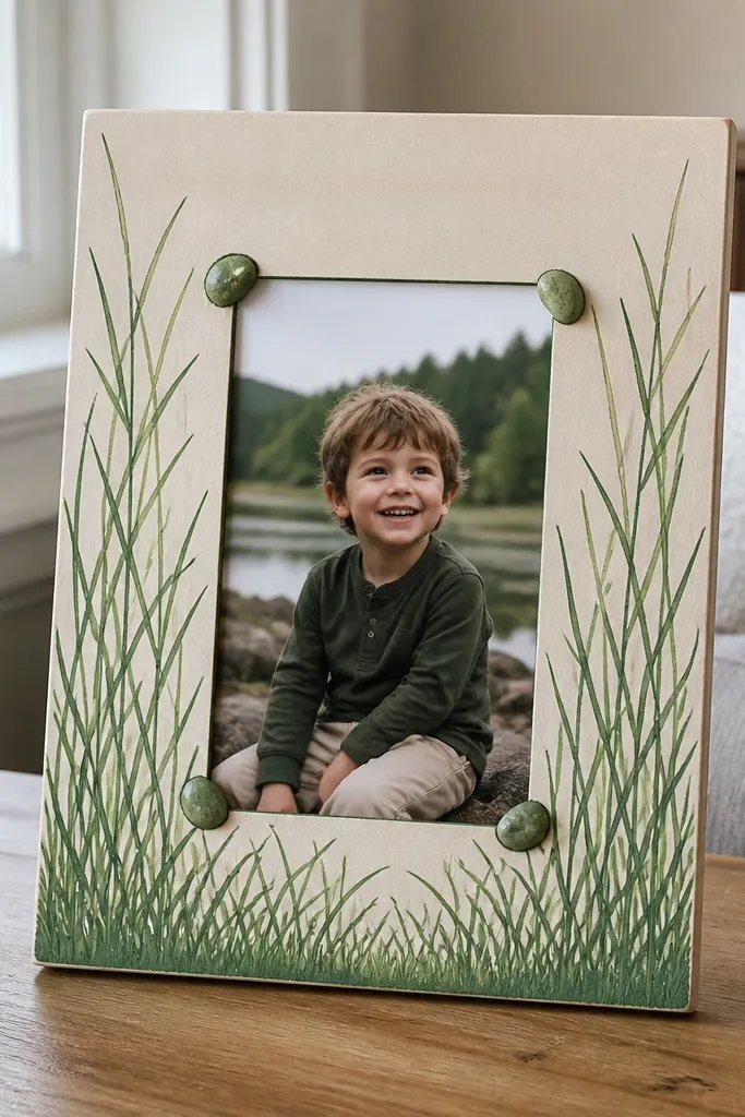
This is a practical decor trick. You draw grass outline around a center window so the grass becomes the frame, and the rocks keep it from looking like generic grass wallpaper. I’ve used it for 4x6 photo inserts on a simple wooden backing and it looks custom without learning a new style. Use two greens only: one for blade bodies and one darker for the shadow strokes. The principle is composition: corners get rocks, sides get grass, and the center stays clean.
Decide your inner window size first, like 3.5x5.5 inches, and lightly mark it with pencil. Place small rocks in each corner, keeping them about 1.25 inches wide, and outline them with a fineliner. Draw grass blades along the top and bottom borders in two passes: first the main blades, then a thin shadow stroke 2-3 mm below the blade base. On the left and right sides, shorten the blades to about 8-10 mm so the frame stays balanced. If you want extra polish, add a tiny highlight line on each rock where the light would hit.
Use the same blade spacing on all four sides; one uneven side makes the frame look handmade in a bad way.
Don’t let grass cross into the inner window; keep a hard boundary.
8. Charcoal Rock with Soft Smudged Grass Base
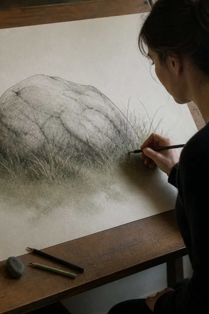
This one looks best when you like texture. The smudged base makes the grass feel like it’s been there longer, not freshly drawn. It’s especially flattering for bigger rocks because the softness gives you contrast against the hard rock outline. Use charcoal or a 2B pencil for the rock and a grey-green pencil for the shadow band. The principle is softness at the ground only — the blades stay crisp, the base fades.
Outline the rock with a fineliner, then shade it with charcoal or 2B pencil, leaving a couple lighter patches. Draw grass blades around the rock base with a 0.3 fineliner or light pencil, keeping the tips crisp and leaning left. Next, add a grey-green shadow band along the ground under the grass, about 5-8 mm tall. Smudge that band with a tissue or blending stump, but keep the blade lines untouched. Finish by darkening a few blade bases with pencil so the smudge doesn’t erase your structure.
Test your smudge on scrap first; charcoal smears fast and you need a light touch.
Don’t smudge over the blade tips; that’s where the drawing loses definition.
9. Tiny Pebble Field with Micro Blade Outline
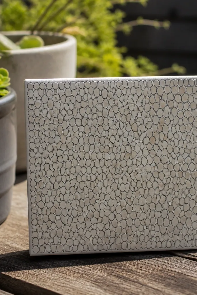
This is the “simple” version that still looks high-end because scale is everything. Micro blades make the whole piece feel delicate, and the pebbles add realism without needing heavy shading. I like it for mini canvases or ornaments because the fine lines hold up in close-ups. Stick to one blade size for the micro look, then add only a single shadow line. The principle is consistent line weight — every blade should look like it belongs to the same tool.
Draw pebbles first as small rounded shapes, then outline each one lightly so they don’t compete. Use a 0.3 fineliner to draw micro grass blades, 3-6 mm tall, leaning left at a consistent angle. Keep the spacing even so the field reads as grass and not random scratches. Add the shadow with a single thin grey-green line along the ground line, not under every blade. If you want color, tint the pebbles with warm grey and leave the grass outline unfilled for a clean look.
Use a magnifying lamp if your lines start to wobble; it’s the difference between neat and messy at this scale.
Don’t add tall blades into the micro field; it breaks the scale instantly.
10. Tall Grass Veil Behind a Big Rock
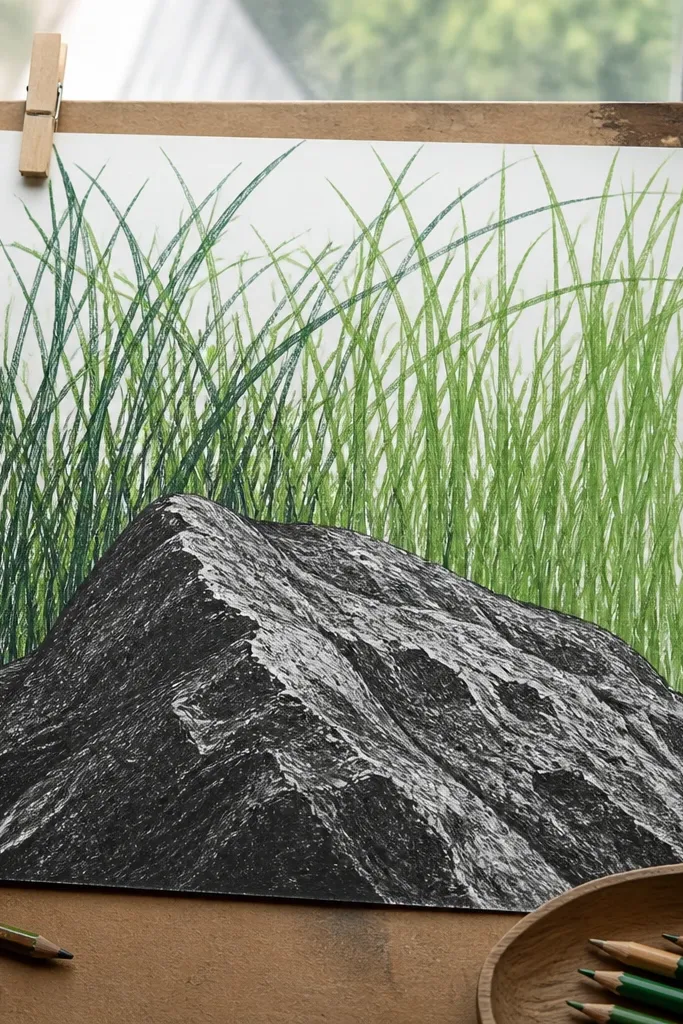
Sketch the big rock first and outline it clearly, then shade its underside with a grey wash or pencil. Draw tall grass behind the rock, from the bottom up, varying heights between 18-28 mm while keeping the lean direction consistent. Leave a clear gap where the grass meets the rock outline so the rock edge stays sharp. Then add shadow near the base by drawing a thin grey-green wash band under the grass, 6-10 mm tall. Finally, add a few shorter blades in front of the rock edge to connect the foreground.
This layout gives you drama without complicated drawing. The big rock grounds the piece, and the tall grass behind creates a curtain effect that feels layered. It flatters anyone who wants a strong focal point because your eye lands on the rock first, then reads the grass depth. Use two greens only: a brighter green for the front half of the tall blades and a grey-green for the base shadow. The principle is foreground vs background separation — tall grass stays behind the rock edge.
Common mistakeDon’t let the tall grass cover the rock outline; the rock must stay readable.
Good to knowMake the tallest blades fewer in number; a few tall strokes look intentional, many tall strokes look chaotic.
11. Curled Grass Tips with Warm Highlight Stone
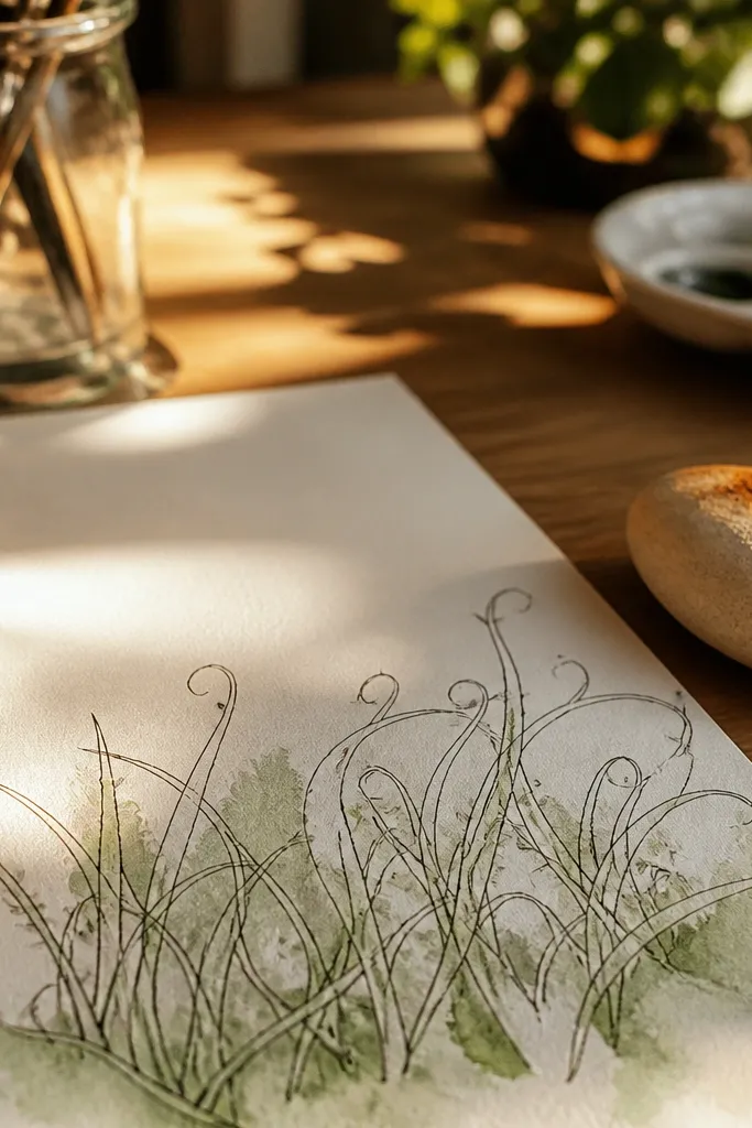
Outline the rock with a fineliner, then shade it in cool grey first. Add a warm ochre highlight as a thin band along the rock’s top edge, leaving the sides cooler. For grass, draw blades leaning left with a consistent angle, using a green pencil or diluted paint. At the end of each blade, add a tiny curl by drawing a second short line that curves back toward the light direction. Add the shadow pass as a thin grey-green stroke under the blades and stop — don’t over-shade.
Curling the tips is a small move that makes your grass feel alive. The warm ochre highlight on the rock makes the whole piece feel like late afternoon light, even if your background is plain. I’ve used this on white paper and it still reads warm and cozy because the ochre is concentrated only on the top edge. Keep your grass body green and use a slightly darker green for the shadow line. The principle is accent control: curls are limited to the tips so the grass stays crisp.
Common mistakeDon’t draw curls in the opposite direction; it breaks the light logic.
Good to knowKeep curls to every other blade. If you curl every blade, it looks like seaweed.
12. Rainy Ground Line with Parallel Shadow Grass
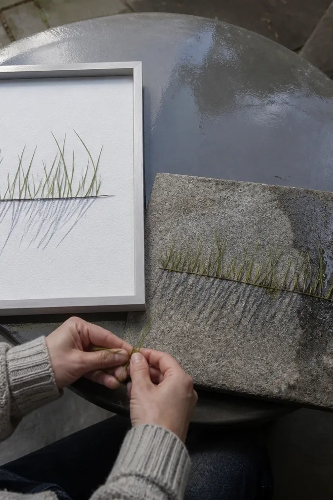
Draw the rock outline low in the composition and shade its underside with a cool grey-blue pencil. Draw grass blades across the bottom with parallel strokes, leaning left, and keep them around 10-14 mm tall. Then add the wet shadow band: a grey-blue wash under the blades, 4-6 mm tall, with slightly uneven thickness. For rain texture, flick a few tiny lines downward from the shadow band using a damp brush loaded with grey-blue paint. Let it dry fully before adding any extra blade lines so the wet marks don’t smear.
This one gives you a graphic, clean look that still feels natural. Parallel shadow lines make the ground feel wet, and the rock stays sharp because the grass is organized. I like it for minimalist decor because the lines look tidy in a frame. Use olive green for blades and grey-blue for the wet shadow. The principle is repetition with one variation: all blades are parallel, but the shadow band has a slightly irregular edge.
Common mistakeDon’t shade the whole background grey-blue; keep the wet effect only under the grass.
Good to knowUse a stiff brush for flicks so you get short streaks instead of puddles of paint.
13. Mossy Rock Edge with Micro Fill Dots
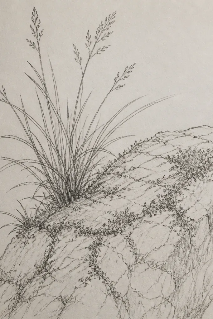
This layout is my go-to when I want grass outline drawing to look like texture instead of stripes. The mossy edge uses micro dots as the base, with a few outlined blades sticking out for realism. It’s flattering on any background because the dot clusters create depth even without a sky gradient. Use one moss green (olive) and one deeper green (forest) for the dots. The principle is mixed mark-making: dots for bulk texture, outlines for structure.
Outline the rock with a fineliner and shade the rock body lightly with pencil so the edges show. Along the rock’s outer perimeter, draw a thin ring of grass blades about 6-9 mm tall, leaning left. Inside that ring, add moss dots using the tip of a small paintbrush or a colored pencil — make clusters, not a uniform grid. Use olive dots first, then add a few forest-green dots in the densest areas near the rock base. Finish with a very thin grey-green shadow line under the ring so it looks embedded in the ground.
If your dots look too round, lightly drag the brush tip for a teardrop dot — it reads more like moss.
Don’t outline every moss dot; leave most of it as texture so it doesn’t look fake.
14. Diagonal Rock Slant with Zigzag Grass Border
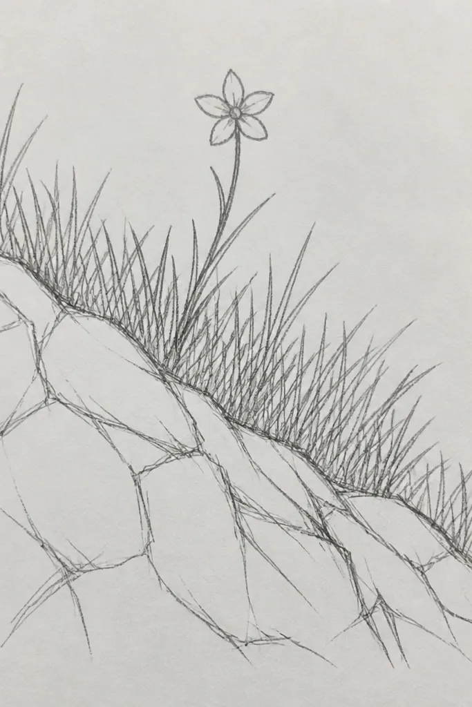
Sketch the slanted rock first and outline it with a thicker line than you used for earlier panels. Shade the rock with a cool grey pencil and leave a highlight edge on the side facing the light. Create your zigzag grass border by drawing a jagged ground silhouette about 1 cm tall along the bottom of the rock. Then draw blades inside the zigzag area, leaning left, keeping blade lengths consistent (10-12 mm). Add the shadow band as a parallel zigzag line 2-3 mm below the silhouette using grey-green wash.
Zigzag grass borders look bold because the silhouette changes, not because the grass is complicated. The diagonal rock slant gives you an immediate dynamic composition, and the grass border anchors it. I like this for larger panels because the silhouette reads from across the room. Use a single medium green for blades and a grey-green for the shadow band. The principle is shape first: make a clean zigzag outline, then fill it with consistent blade marks.
Common mistakeDon’t draw random grass all over the panel; keep the border limited to the silhouette area.
Good to knowDraw the zigzag with pencil first, then ink over it once it looks right. The silhouette is what sells the look.
15. Night Garden Stone with Neon-Green Outline Grass
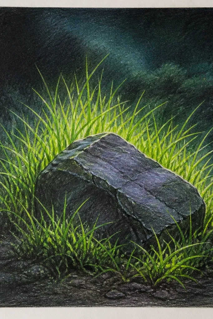
This one is for when you want your grass outline drawing best vs simple to be obvious by contrast. The neon-green outline makes the blades readable instantly, even if your drawing skills are still building. I’ve done this on navy cardstock and the color pops under warm indoor light, like a small night garden. Use neon green for the blade outline, a darker green undertone for shadow, and tiny white highlights at the blade tips. The principle is high contrast with limited color — you’re controlling attention, not covering the whole page in color.
Start with navy paper or cardstock and outline the rock in pale grey pencil first, then ink it lightly so it doesn’t look heavy. Use neon-green marker or paint to outline grass blades leaning left, keeping them 12-18 mm tall. Add the undertone shadow by brushing a darker green wash along the base of the blades and under the rock edge only. Finish with tiny white highlights on every fifth blade tip using a white gel pen. Let the marker dry fully before adding the wash so the neon doesn’t bleed.
If your neon bleeds, outline with pencil first and only ink the final blade lines.
Don’t add neon to the rock; keep it only in the grass so the stone stays grounded.



