

1. Sunlit meadow edge with tapered blades
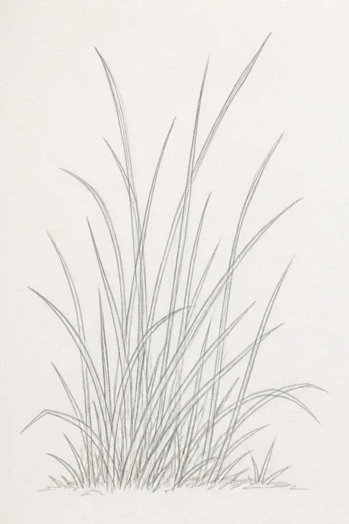
This layout makes grass look airy because the blade tips stay lighter. I draw the horizon line first, then keep the blades longest near the center and shorter toward the sides. Use a light base tone so the paper color shows through the “sun” area. The darkest strokes go only at the very bottom edge, where grass looks denser in real life. It flatters small spaces too — even a 5x7 page reads like a wide meadow.
Start by lightly shading the whole page with a pale green or yellow-green, leaving the horizon area a shade lighter. Then draw blade strokes with a 0.5mm pencil or light pastel, all leaning the same way, and keep them tapered — press a little, lift, repeat. Next, add mid-tone grass with a 2B pencil or darker green pastel in small clusters, mostly in the bottom third. Finally, place a few bright highlights: erase gently with a kneaded eraser at random blade tips so they pop.
Good to knowIf your grass looks flat, brighten only 20 percent of the blade tips and leave the rest alone.
Common mistakeDon’t shade the entire field dark — that’s how it turns into a green carpet.
2. Three-value hill grass (light, mid, dark)
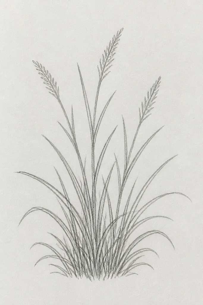
A hill is the easiest way to force depth without overcomplicating. The hill reads as rounded because each zone has its own value. I keep the top area light and shorter, then increase blade length and darkness as you move down the slope. This works especially well for beginners because you’re not trying to draw every blade — you’re controlling value. The result looks good for anyone who prefers a clean, calm look instead of busy texture.
Sketch the hill outline lightly — a gentle curve, no sharp corners. Lay a pale base tone over the entire hill, then add mid-tone strokes (short, consistent directions) in the middle band. For the bottom band, press harder and draw thicker clumps — think “bundles,” not single lines. Blend only the base tone with your finger or a tissue, but keep the blade edges crisp; then add a few dark strokes under the hill edge to ground it.
Good to knowUse shorter strokes at the top of the hill. Longer strokes at the bottom will make it look closer instantly.
Common mistakeDon’t use the same length and darkness across the whole hill.
3. Diagonal grass waves for wind movement
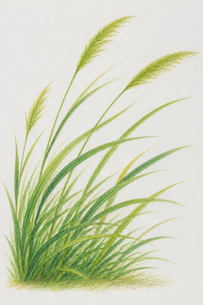
Wind is where grass drawings start to feel alive. Diagonal waves work because your eye reads rhythm, not random scribbles. I draw wave crests with lighter strokes and troughs with darker clumps so the movement looks like it has a direction. This style is forgiving because you’re repeating a pattern — even if your lines aren’t perfect, the wave structure carries the look. It also looks great for greeting cards because it frames the motion.
Draw a few faint curved guide lines across the page, like gentle waves. Shade the top background lightly, then start blade strokes along the wave direction, keeping them all leaning the same way per wave. Make the strokes slightly longer on the crest side and shorter in the trough. Then add dark clump shading in the troughs with a 2B pencil or dark green pastel, blending just at the base of each clump.
Good to knowPick one wave angle (for example, leaning down-right) and stick to it — mixed angles kill the wind effect.
Common mistakeDon’t blend the wave crests until they lose their blade edges.
4. Pencil-only grass frame with negative space
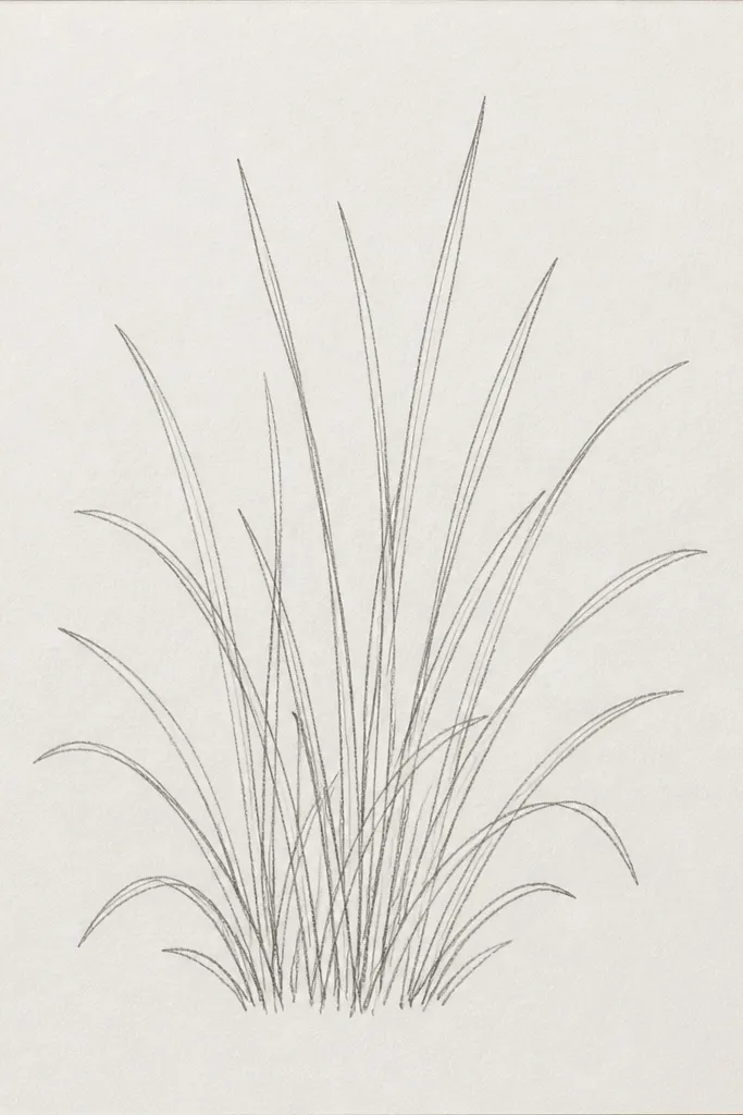
Negative space makes a grass frame look intentional. I’ve used this to border small quotes and it always looks cleaner than trying to fill the whole sheet. The trick is to keep the inner center light and let the blades define the frame edges. Pencil-only is great for beginners because you can control values without color shifts. This also flatters small art because the white center gives breathing room.
Lightly draw a rectangle border with a ruler — keep it 1 inch from the page edges. Shade the border area lightly with a soft pencil so the frame has a base tone. Then draw blades upward from the bottom border line, varying heights from 0.5 inch to 1.25 inches depending on the corner. Darken only the corners and a few random clumps along the bottom using 2B, and leave the inner rectangle untouched.
Good to knowUse a kneaded eraser to carve a few tiny “highlight gaps” between blade tips for sparkle.
Common mistakeDon’t fill the center with grass. The frame loses its clean shape.
5. Tiny lawn with a stepping stone path
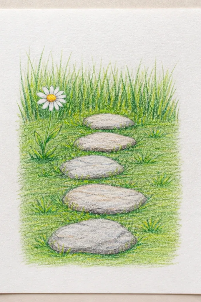
This is the easiest grass drawing that still feels like a scene. Stones give you a clear focal point and they force you to vary grass density. I keep grass denser around the stones because that’s where real blades gather and cast tiny shadows. It flatters beginners because you can draw simple shapes for stones and focus your blade effort in one zone. The contrast between smooth stones and textured grass makes it look more detailed than it is.
Draw three oval stepping stones in the center, then add a faint shadow line beneath each oval with a soft pencil. Shade the lawn base lightly in a pale green or light graphite. Draw grass blades outward from the stones, leaning away slightly so they wrap the stones visually. Darken the grass just beside the stone edges with thicker strokes and add a few short blades that break around the stone shadow.
Good to knowMake the grass around stones darker but shorter. That contrast reads as depth.
Common mistakeDon’t let grass blades cross through the stone shapes.
6. Macrame-style grass knot using repeating clusters
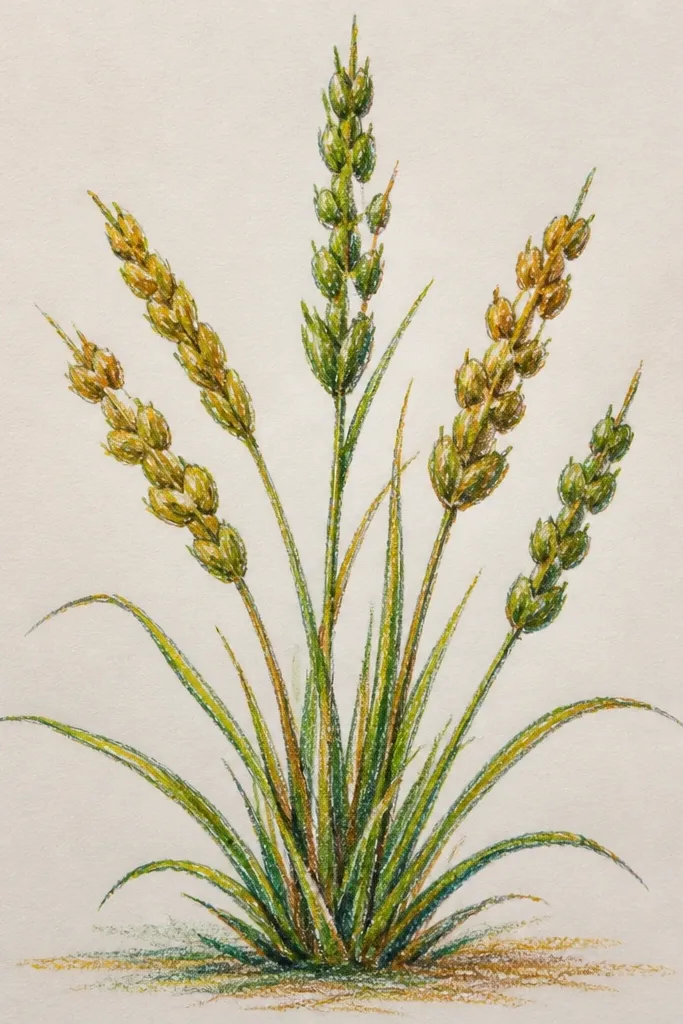
This one looks decorative fast because you repeat a cluster pattern instead of drawing a full landscape. The knot shape gives structure, and grass bundles make it feel handcrafted. I use short, grouped strokes so the knot edges stay crisp. It looks great on a small square or as a panel behind a candle label. If you like symmetrical designs, this style scratches that itch without needing perfect drawing skills.
Sketch a loop-knot outline with a light pencil — two overlapping loops like a sideways figure-eight. Fill the loop edges with small grass bundles: 5 to 8 short blades per bundle, all leaning the same way. At the overlap area, press harder and add darker clumps to show the “thickness” of the knot. Finish by adding a few stray longer blades that poke out beyond the knot edges so it feels alive.
Good to knowCount your bundles. If you keep each bundle the same size, the knot looks intentional.
Common mistakeDon’t draw single random blades across the whole knot.
7. Watercolor-wash background with dry-brush grass tips
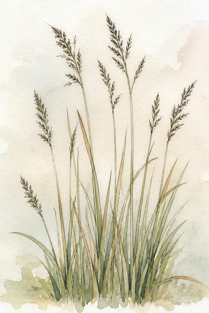
This style works because watercolor handles the background and dry-brush handles the grass. You get soft depth behind the blades without spending time blending everything. I use a light wash first, then wait until it’s almost dry so the paint doesn’t bleed into the blade lines. Grass tips stay crisp and that’s what makes it look like grass, not paint scribbles. It flatters people who want a softer, dreamy look.
Wet the paper lightly at the top and middle with clean water, then apply a very thin wash of pale green and sky-blue for the background. Let it dry until it feels cool but not wet. Load a small flat brush with darker green or diluted ink, then drag the brush lightly along the bottom edge to create dry-brush blade tips. Add a second pass with a darker green only at the base and in small patches so the bottom reads denser.
Test your brush on scrap first. Dry-brush success depends on the paper drying stage.
Don’t draw blade lines while the wash is wet.
8. Black-and-white grass with white pencil highlights
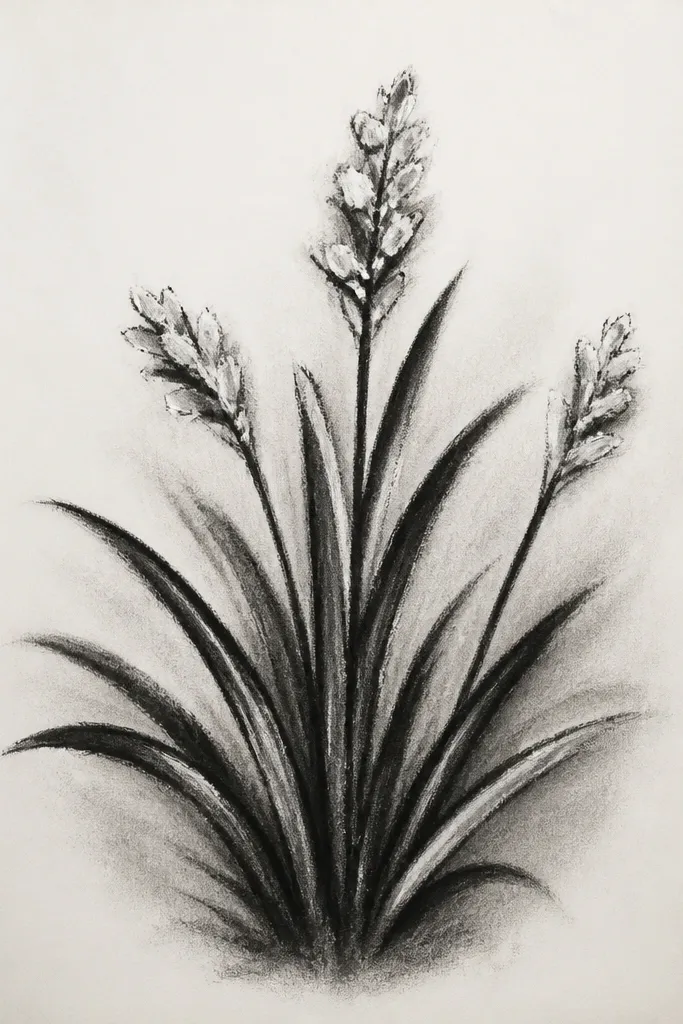
Monochrome grass looks sharp because value does all the work. When you add white pencil highlights, the scene reads as sunlit without needing color. I build it with three grays: light background, mid blades, and dark clumps. The highlights go only at the very tips and a few blade edges. This is great for anyone who wants a bold, graphic look that still feels natural.
Lightly shade the background with a gray graphite wash using a blending stump or tissue. Draw blade strokes with a 2B pencil, keeping spacing consistent and direction mostly the same. Add dark clumps with a heavier pencil at the bottom and near the center focal area. Finally, use a white colored pencil to touch only the blade tips and a few edges, then blend the background lightly so the highlights stay crisp.
If highlights look smeared, switch to a harder white pencil and use tiny strokes.
Don’t fill the whole drawing with white — highlights need restraint.
9. Grass silhouette against a pale sky
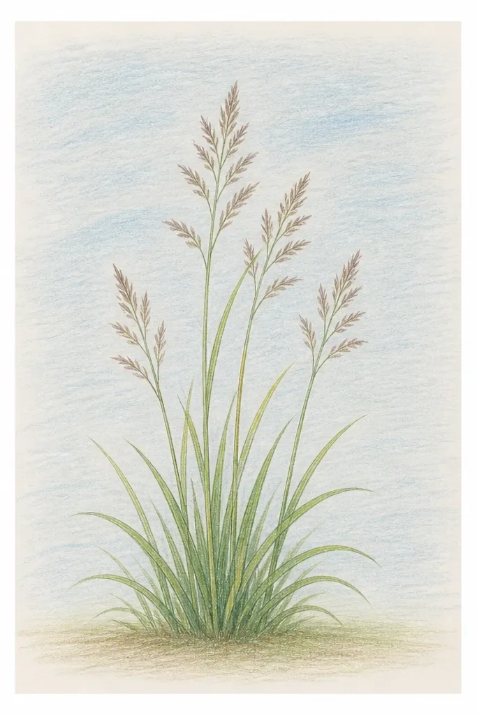
Silhouette grass is the fastest way to get “grass drawing” recognition. It works because the shape is doing the heavy lifting. I keep the silhouette edge irregular, with a few taller spikes to suggest depth. The sky stays pale and clean, so the contrast makes the grass read instantly. This style is perfect for beginners who get overwhelmed by blade-by-blade work.
Draw a simple sky gradient with light blue at the top and pale yellow near the horizon. Then mix a dark graphite or black pastel and block in the grass silhouette along the bottom third. Press harder for thicker clumps and lift your pressure for thin blade spikes at random points. Add a thin light line just above the silhouette to separate layers, and gently erase inside the silhouette edge to create slight “spark” texture.
Good to knowUse three silhouette heights: short, medium, and tall spikes. Two heights looks repetitive.
Common mistakeDon’t make the silhouette a perfect straight line.
10. Grass in a circle wreath for wall art
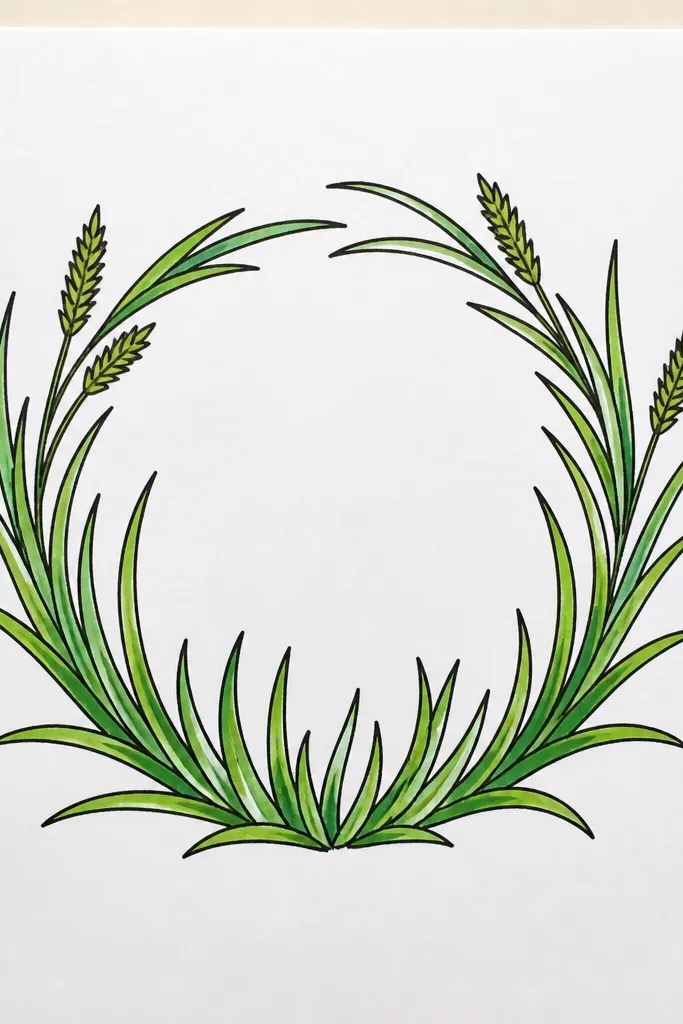
A wreath shape forces you to think about radial growth, which makes your grass look more realistic. I keep the outer ring dense and add lighter, shorter blades toward the inner edge. The center stays open so the wreath feels airy instead of heavy. This looks great behind photos or as a standalone wall panel. It also hides beginner inconsistencies because the circle guides the eye.
Sketch a circle and lightly mark a ring area, leaving a clear inner circle. Shade the ring area lightly in pale green. Draw grass blades outward from the ring center, all leaning slightly outward so the wreath feels like it’s blooming. Add darker clumps at the bottom-left and bottom-right for balance, then soften the base tone with a tissue so the blades stand up.
Good to knowVary blade direction by a tiny amount within 10 degrees. Too much direction change makes it look tangled.
Common mistakeDon’t fill the inner circle with grass. Keep it open.
11. Foreground clumps with blurred mid-ground
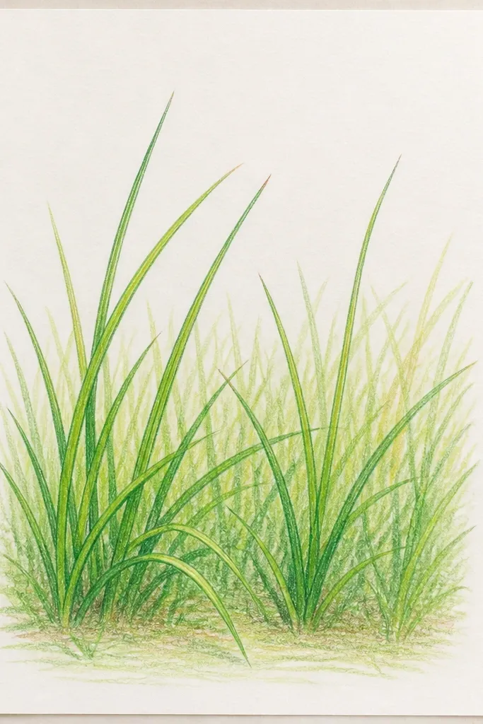
Depth comes from focus, not from more detail. I put sharp blades in the foreground and blur the mid-ground with gentle smudging. The background stays simple — just tone and a few grass hints. This style reads as “closer camera” immediately. It flatters people who want a more painterly look but still want the grass to feel real.
Divide the page into three horizontal zones using a light pencil line. Shade the background zone with a pale green wash or light graphite tone. In the mid-ground, draw short blade strokes but blend the base with a tissue so the blades soften. In the foreground, draw longer blades with minimal blending, then add dark clumps at the very bottom edge and around the focal center.
Good to knowSmudge only the base, never the blade tips.
Common mistakeDon’t make the whole drawing equally sharp.
12. Grass texture under a simple arch
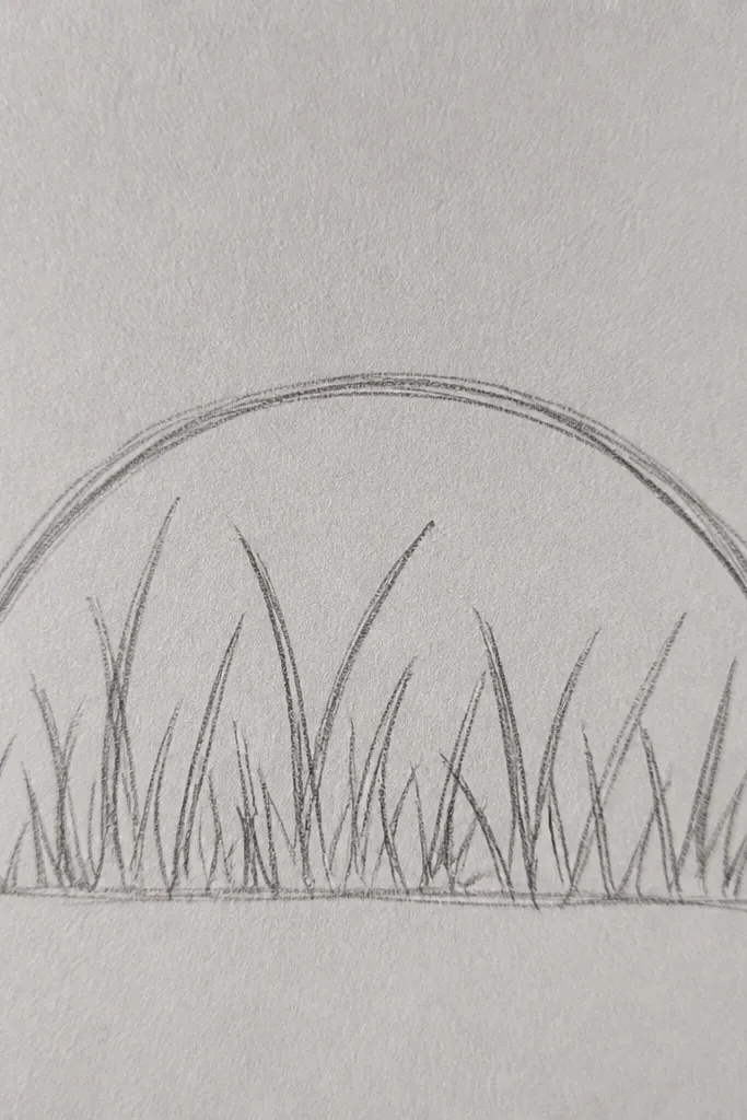
An arch gives you a ceiling, so the grass naturally fills the space below it. I keep the grass denser near the arch base because shadows gather there, then thin out as the blades rise into the open. The arch can be as simple as a pencil curve and it still looks like a garden detail. This works for beginners because you’re combining one clean shape with texture. It also looks great framed for seasonal decor.
Draw a simple arch with a smooth curve and lightly shade the inside. Add a pale base tone for the ground area below the arch. Draw grass blades upward from the bottom edge, and when you reach the arch base, press harder for a darker band. Keep the blades shorter near the arch so they don’t hit the arch line, then add a few bright highlights by erasing blade tips.
Leave a small gap between the darkest clump and the arch line so the shadow looks believable.
Don’t let grass pile up directly touching the arch outline.
13. Checkerboard grass for a playful pattern piece
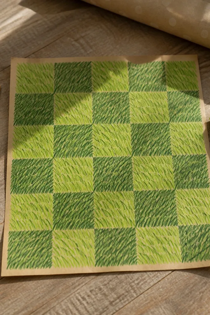
Patterns hide drawing flaws because your brain reads structure. This checkerboard grass works because each square has a different “grass mood” while still sharing the same blade language. I use two directions alternating left and right, plus one value variation. It looks playful on wrapping paper, small canvases, or a scrapbook page. If you want decor that feels intentional but not too serious, this is it.
Draw a grid of equal squares, like 6 by 6 on a 6x6 page. Shade alternating squares with pale green and medium green so the board has base contrast. In each square, draw blades with a consistent direction per square: left-leaning in light squares, right-leaning in dark squares. Add small dark clumps in only one corner of each square, then finish with a few erased highlights at random blade tips.
Good to knowKeep the number of blades per square the same. It stops the pattern from looking accidental.
Common mistakeDon’t draw the same blade direction in every square.
14. Meadow path grass with a vanishing point
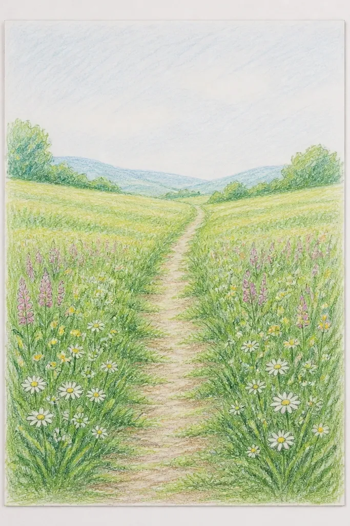
A vanishing point instantly makes grass look like it has distance. The path gives you a clean “no grass” zone, so you’re not fighting with texture everywhere. I make the blades shorter and closer together near the vanishing point, which mimics how real grass recedes. This style is great if you want an art piece that looks like a tiny world, not a flat texture. It also helps beginners learn spacing without needing fancy math.
Mark a vanishing point halfway up your page. Draw two lines from the bottom corners toward that point to create the path edges, then lightly fill the path area with a pale tone. Place grass on both sides: start with longer blades at the bottom and shorten them as they approach the vanishing point. Keep blade direction mostly parallel to the path edge so it wraps the corridor. Add dark clumps near the bottom edges of the path for weight.
Use a ruler for the path edges, then freehand the blades. The perspective should come from the path, not from perfect blade angles.
Don’t keep blade lengths identical across the whole width.
15. Daisy meadow with grass around flower heads
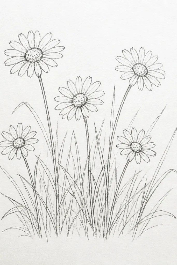
Flowers force you to create a focal point, and grass has to behave around it. I draw the daisies first, then place grass blades so they partially overlap behind the flower heads, not in front of them. That overlap makes the scene feel layered instead of pasted. The grass should be slightly lighter near the flowers so it doesn’t fight the petals. This is beginner-friendly because the daisies can be simple symbols.
Sketch 3 to 5 daisies with small circles for centers and short curved petal lines. Shade a pale base for the meadow. Draw grass blades around the flowers, keeping them mostly behind the petals by stopping blade strokes at the flower outline. Darken the grass underneath the flowers and at the bottom edge, then add a few lighter strokes around the sides to frame the petals. Finish with tiny erased highlights on blades that sit near the brightest petal areas.
Good to knowLet 30 percent of the grass be “behind” the flowers. That overlap is what sells depth.
Common mistakeDon’t draw grass blades on top of the flower outlines — it looks messy.
16. Tall grass silhouettes with a dark-to-light gradient
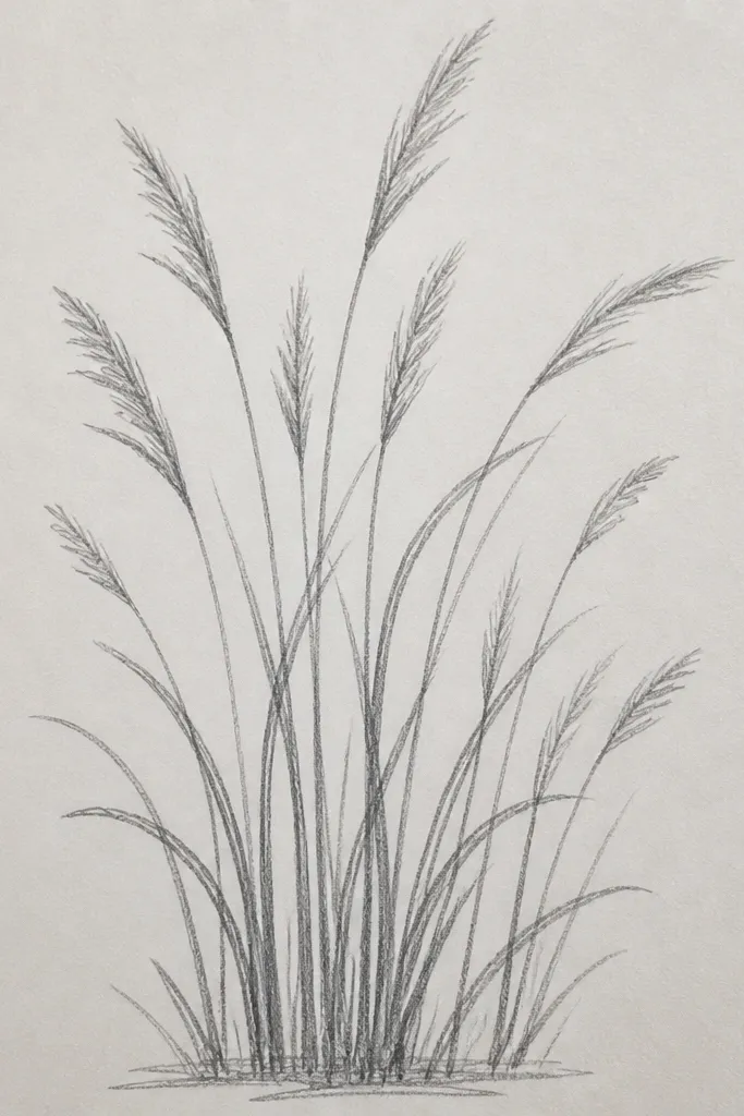
This is the fastest way I’ve found to get that “late afternoon” look. The grass fades because your values fade — dark at the bottom, lighter as it rises and recedes. I draw fewer blade details in the lighter zone, then concentrate blade definition at the bottom. It feels realistic without requiring hundreds of lines. This style also looks great on thicker paper because the graphite or pastel holds crisp edges.
Create a pale sky gradient first, then leave the horizon area lighter. Block in the bottom grass silhouette with a dark graphite or black pastel, then soften upward with a tissue so the top becomes lighter. Add a few tall blade spikes only in the bottom third with a darker pencil. In the middle zone, use lighter strokes and shorter blades, then stop adding detail near the horizon. Add a very thin highlight line along the base edge to suggest sun glow.
Good to knowIf your fade looks abrupt, blend with a tissue in tiny strokes instead of rubbing the whole area.
Common mistakeDon’t draw the same dark blade detail at the top — it flattens the scene.
17. Graphite grass texture on colored paper (sage base)
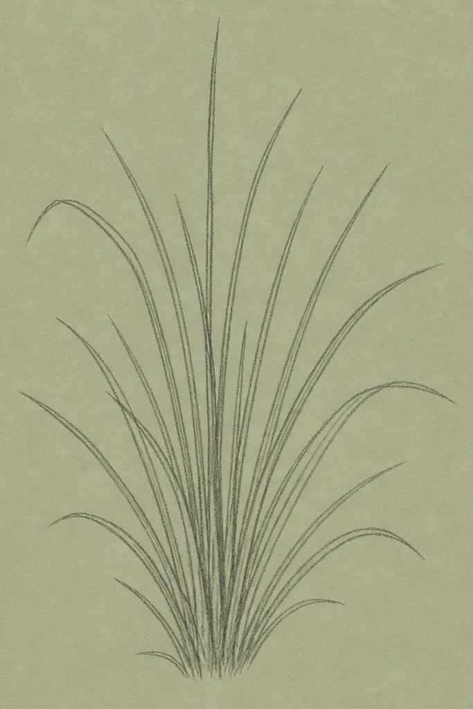
Colored paper removes one big beginner problem: you don’t have to build a full green base. I use sage or soft green paper because it already has the right mid-tone. Then graphite can create realistic depth without color muddying. The highlights are created by erasing, which looks more natural than adding white paint on green. This works for people who want a clean, modern look and don’t want to blend colored pencil for hours.
Choose sage-green paper so you have a built-in base tone. Lightly sketch your grass patch boundary with a pencil. Draw blades with graphite, keeping direction consistent per patch and varying length from short at the top to long at the bottom. Add dark clumps with a 2B pencil at the bottom edge and around your focal point. Finally, erase a few blade tips to create highlights, then smudge only the base tone lightly so the paper color still shows.
Good to knowTest erasing pressure on scrap. Too much erasing makes shiny spots that stand out.
Common mistakeDon’t cover the entire page with green pencil when the paper already has the base.
18. Grass and fence line for a backyard feel
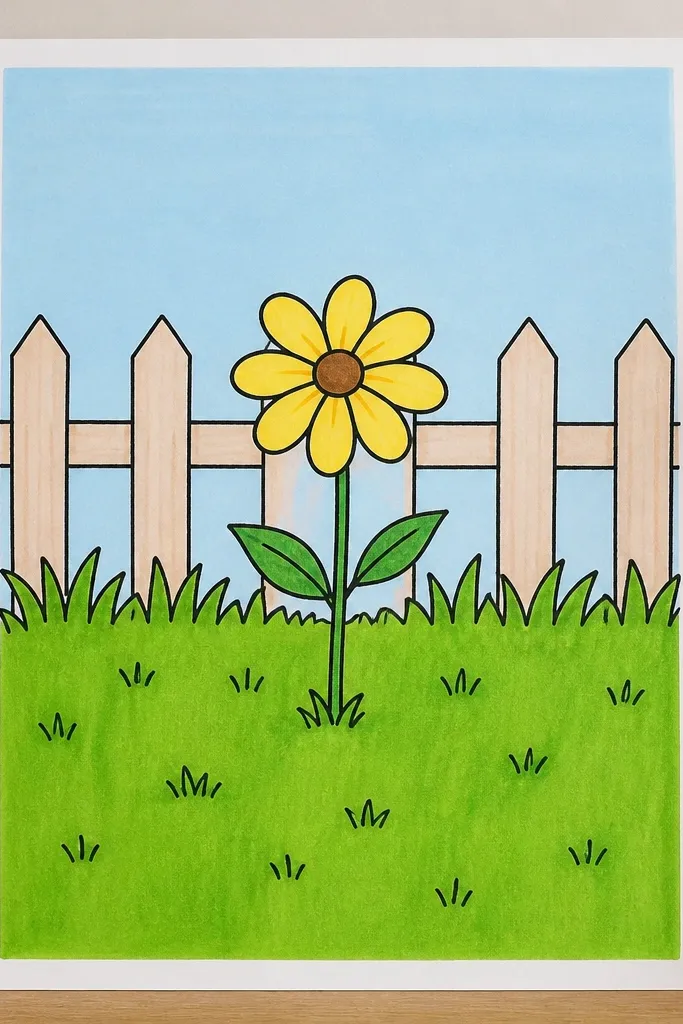
A fence gives you a natural horizon and a clear depth layer. I draw the fence first so I know exactly where the grass needs to stop and overlap. Grass in front should be darker and sharper; grass behind the fence should be lighter and fewer strokes. This style looks homey and real because it mixes straight lines (fence) with organic texture (grass). It’s perfect for beginners who like scenes but don’t want complicated buildings.
Sketch a fence line across the middle with light pencil, including 7 to 10 vertical posts. Shade the ground area in a pale tone. Draw grass blades in front of the fence from the bottom edge, and make them taller toward the center. Overlap grass on the lower fence area by letting some blades cross in front of the posts. Add dark clumps at the bottom corners and a few mid-tone blades behind the fence to suggest depth without clutter.
Good to knowKeep the fence lines thin and crisp. If they get thick, the grass seems messy by comparison.
Common mistakeDon’t draw grass on both sides of the fence with the same intensity.
19. Grass border with polka-dot wildflower accents
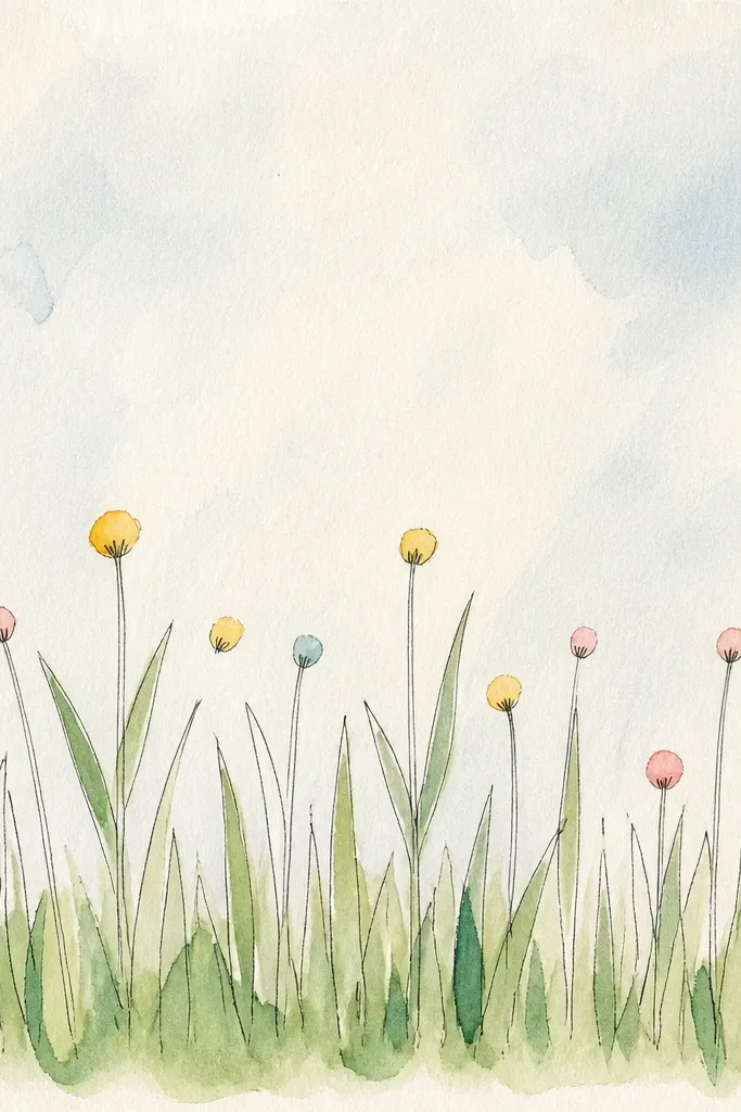
Wildflower dots are the easiest decoration that still makes grass feel intentional. I add tiny dots and small petals only on the top half of the grass blades, like flowers peeking out. The grass needs a clear border thickness so the dots don’t float. This style flatters small art projects because it’s quick and it looks cute even with imperfect blade lines. It also works for seasonal themes — spring, summer, and garden party invites.
Create a border by drawing a thin inner rectangle, leaving a margin. Shade the border area with a pale green base. Draw grass blades along the border, keeping them slightly taller at the corners. Add wildflower dots: small circles in pink or yellow, then a tiny white dot highlight on each. Place the dots where the grass is lighter so they pop, then deepen only a few grass clumps at the bottom edge for grounding.
Good to knowUse three flower colors max. Too many colors makes the grass look chaotic.
Common mistakeDon’t place flowers evenly all over. Cluster them near corners or one side.
20. Ribbon grass strip for bookmarks and labels
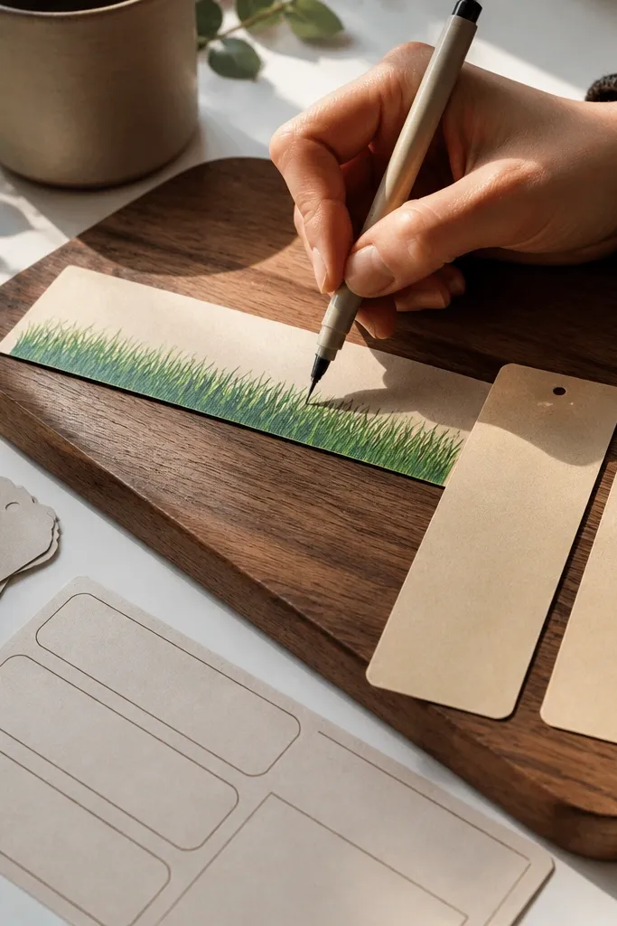
A narrow strip turns grass drawing into a texture study. It’s easier to manage spacing because you’re working with a defined width and you can leave a blank writing area. I keep the blades short and consistent, then add a darker base strip to give it a layered look. This works for bookmarks, gift tags, and label art because the texture stays readable when it’s small. If you want something you can actually use, this is the one I reach for.
Make a strip template about 2 inches wide and 6 to 8 inches tall. Lightly shade the whole strip with a pale green. Leave a narrow center band blank for writing or a name. Draw grass blades on the left and right sides, leaning slightly toward the blank band so it frames the center. Add a dark green strip along the bottom edge, then draw a few extra long blades that reach upward at the top corners for a finished look.
Good to knowWrite first in pencil, then draw grass around the letters. Erasing later is messy.
Common mistakeDon’t draw full-length blades across the blank writing band.



