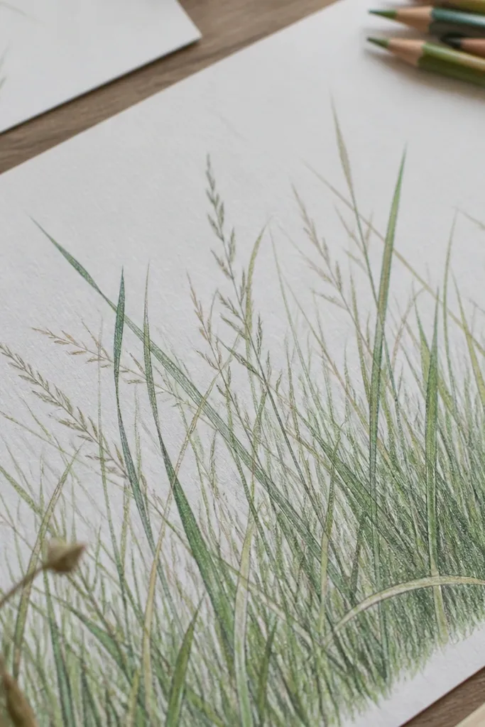
1. Sunlit edge grass on textured watercolor paper
This one looks like real shoreline grass because the paper texture grabs pigment and makes the blades feel airy. I use off-white watercolor paper (about 140 lb) so the grain holds a faint haze in the distance. Your grass should be darker near the sand line and gradually lighten as it moves upward. This flatters light to medium skin tones in the same way light fabrics flatter - it keeps the piece bright without turning it gray. It also works well for coastal decor because the sunlit edge reads clearly from across a room.
Start by washing a thin blue background from the middle down, leaving the top area mostly blank. Then draw your main blade stems with a 0.3 liner, all leaning in one wind direction. Add shadow by going back to the lower third of each blade with slightly darker pencil or ink, keeping the top third lighter. Finally, use a soft pencil or diluted yellow watercolor to trace a thin highlight line along only the top edge of select blades, not all of them. Let it dry fully, then erase any harsh pencil marks so the highlight stays crisp.
Good to knowUse diluted lemon-yellow or warm cream for the edge highlight instead of bright white. White on top often looks like marker, not sun.
Common mistakeDon't color every blade the same darkness - that makes it look like a repeating pattern.
2. Monochrome storm beach grass (ink-only contrast)
Ink-only pieces look dramatic when you control contrast and blade taper. I do this with one ink color plus a gray pencil for midtones, so the scene feels like a storm photo turned into line art. It's flattering in a different way - it hides small mistakes because the limited palette forgives uneven pigment. If you like moody coastal vibes for a hallway or entryway, this is the one that makes visitors stop. The wind tilt is what sells it; the blades feel pulled by weather instead of drawn randomly.
Lay down a dark gray wash for the sky using watered black ink, then keep the sand area lighter with a dry-brush pass. Draw the blade stems with a 0.5 liner, leaning them at about a 45-degree angle. For depth, press harder at the base and lighten pressure as you pull upward. Add a few mid-gray lines by lightly sketching over select blades with a gray pencil, then blend gently with a tissue. Finish by adding a thicker dark cluster at the bottom left or bottom right so the composition has weight.
Good to knowIf your ink bleeds, let the wash dry longer than you think. I've rushed it and watched the wind direction blur.
Common mistakeAvoid uniform line thickness across the whole piece - storm grass needs taper.
3. Soft pastel haze grass for beginners
This is the easiest path to a beach grass drawing transformation before after because it forgives shaky hands. Pastels let you build value gradually, so you don't need perfect line work. I use a limited palette: dusty blue for background haze, soft peach for sand warmth, and light gray for grass shadows. It looks great for people who want coastal art that feels gentle rather than high-contrast. The airy gaps make it look intentional even when your blades aren't identical.
Start with a light peach base wash for sand and a dusty blue wash for sky, using very diluted paint or chalk pastel. Sketch the wind direction with a light pencil, then place only 10-20 main grass stems. Add shadow by layering light gray pastel near the sand line and blending upward with your fingertip or a soft brush. Finish with tiny darker strokes at the blade tips to suggest movement, then add a few bright cream touches on the highest edges. Keep the rest of the blades implied by leaving paper showing.
Good to knowUse a kneaded eraser to pull back highlights on the tallest blades. It's faster than trying to paint white.
Common mistakeDon't fill the page with full strokes. Leaving negative space is what makes it look like air.
4. Colored pencil grass on kraft paper (warm beach glow)
Kraft paper gives you a natural warm sand tone, so your grass instantly looks like it belongs on a beach. I like this when I want the piece to feel cozy instead of icy coastal. The grass palette is olive and cocoa brown, with a tan highlight that matches the paper. It flatters warm interiors and looks especially good near wood shelves because the brown tones echo the grain. The best part is that you don't need a heavy background wash; the paper does the work for you.
Leave the paper as your sand base, then lightly burnish a pale tan area where the horizon would be. Draw blade stems with a dark brown colored pencil, keeping the base thick and the tip thin. Layer olive green on the lower half of the blades for shadow, then use a lighter tan pencil to trace a thin highlight on the top edge. Add a few darker clusters in the foreground so the scene has depth. Finally, blend the background lightly with a soft brush to keep the kraft texture from looking too sharp.
Good to knowSharpen your colored pencil to a fine point and rotate it often. Kraft grabs pigment, so you want clean, hairlike lines.
Common mistakeAvoid using cool gray for the grass highlights - it makes the scene feel cold and off-tone.
5. Marker + pencil hybrid for crisp blades
This combo gives you the best of both worlds: marker for structure and pencil for natural fading. I start with marker for the main blade silhouettes because it lays down even darkness fast. Then I soften and add highlights with pencil so it stops looking like flat graphic art. This looks flattering for most spaces because the foreground stays readable while the background stays gentle. It's also the most reliable way to get a beach grass drawing transformation before after when your first attempts look too scribbly.
Wash a pale blue background, then let it dry so marker doesn't bleed. Draw your main stems with a fine marker, pressing harder at the base and lifting at the top. While the marker is still slightly dry, lightly add pencil over it to create gradient - darker near the bottom, lighter up top. For distance, add fewer blades and keep them lighter with barely-there pencil. Finish by adding a thin cream highlight along the top edge of 20-30% of the blades only.
Good to knowUse a scrap paper test first. Some markers bleed into watercolor paper faster than you expect.
Common mistakeDon't blend marker too aggressively with your hand - you'll smear the highlight and lose the wind direction.
6. Graphite-only blades with a kneaded eraser glow
Graphite-only sounds limited, but it's one of the cleanest ways to get realistic depth because you can lift light exactly where the sun hits. I use a kneaded eraser like a tiny sculpting tool, pulling highlights along the top edge of select blades. This flattering style works when you want a subtle, gallery feel without color. It also makes your mistakes less obvious because you can erase and rebuild values. The realism comes from how the light is shaped, not from adding more lines.
Shade the background with a light graphite haze behind the blades, then keep the top area lighter for atmosphere. Sketch blade stems with HB pencil, leaning them consistently. Darken the base and mid-stem using a softer pencil like 2B, then blend lightly with a paper stump for soft edges in the distance. Use the kneaded eraser to lift thin highlights along the top edges of the tallest blades. Finally, add a few darker tips and a light sand band at the bottom so the composition has a clear shoreline.
Good to knowMake highlights thin and uneven. Real grass doesn't give you a perfect white stripe.
Common mistakeAvoid heavy blending everywhere - if the whole piece turns gray, the blades lose their form.
7. Mixed media grass with torn paper sand
Torn paper sand makes the whole drawing look more expensive because the texture is physical, not just drawn. I glue torn strips of beige and tan paper to the bottom third, then draw grass stems coming out of that edge. This gives you instant depth and makes the grass feel anchored to the beach. It flatters both minimalist and maximalist decor because the texture adds dimension without needing more color. If your flat drawings always look like they're floating, this fixes that by giving them a "ground."
Cut small torn pieces of kraft, tan, and light beige paper and glue them across the bottom third with a thin matte medium. Press the edges down so there are no hard ridges, then blend the paper seams with a little diluted paint. Draw your skyline or horizon wash in the background, then let it dry. Add grass stems on top of the sand edge using a fine liner, with darker bases where the paper meets. Finish with a few highlight strokes on the top edge of blades using a light tan pencil.
Good to knowTear in different directions. Straight-edged sand looks like a collage, not shoreline.
Common mistakeDon't flood glue over the torn paper. It warps and makes the sand look shiny.
8. Salt-air grass with white gel pen highlights
White gel pen is the quickest way to make grass look sun-struck, especially if your first versions look dull. I use it sparingly so it reads as highlights, not snow. The grass base colors are green-gray and charcoal, which keeps the scene grounded. This style flatters people who want beach art that looks crisp at night on a dark wall. It also makes your transformation before after dramatic because the highlights show up instantly once you add them right.
Paint or wash a pale blue background and let it dry completely. Sketch blade stems with a dark pencil, then outline them with a fine liner. Color the lower half of each blade with green-gray and keep the upper half lighter with less pigment. Now add gel pen highlights along the top edge of only the tallest blades, using short, slightly broken strokes. Add a few tiny gel dots near the midline to suggest sea spray and stop there so it doesn't turn into glitter.
Good to knowTest gel pen on scrap paper first. Some pens are too opaque and look like a thick line.
Common mistakeAvoid highlighting every blade. One highlight per cluster looks real; full-page white looks fake.
9. Beach grass silhouette with negative space sky
Silhouette grass is a fast win when you want drama without tons of layering. The trick is using negative space as your glow - leaving the sky clean makes the grass read as a shape, not a tangle. I use dark ink for the blades and keep the background minimal so the silhouette stays crisp. This flatters small pieces because bold shapes scale better than fine detail. It's also perfect for beginners who struggle with value gradients; you replace gradients with crisp design.
Paint a very light blue wash in the top half, or keep it mostly white. Draw a sand line across the lower third lightly, then block in grass silhouettes with a brush pen or ink. Make blades vary in height and thickness; don't repeat the same pattern. Leave the top edge of the silhouette jagged but controlled so it looks like wind. Add one thin lighter line along the sand line with a gray pencil to suggest depth, then frame it with a white mat so the negative space stays bright.
Good to knowCut your silhouettes into clusters of 3-6 blades. Random single blades look like confetti.
Common mistakeDon't fill the entire bottom with the same density. Change spacing to keep it from looking like a stencil.
10. Watercolor wash grass with dry brush tips
Dry brush tips give you that "salt and sun" look because the pigment breaks up at the top. I use a watery wash for the blade body so the grass fades into sea air, then I load less water for the tips. This style flatters anyone who wants a softer, painterly coastal vibe. It also works well on larger paper because the texture becomes part of the composition. The realism comes from the contrast between wet-blur stems and drier, more textured tips.
Wet the area where grass will sit with clean water, then paint each blade with a diluted mix of gray-blue or muted green. Keep your strokes long and slightly curved in one wind direction. For tips, reload your brush with pigment but wipe most of it off on a paper towel, then touch down at the top ends to create speckled texture. Let the wash dry completely. Add a second layer only at the base with a slightly darker pigment so the foreground reads clearly. Finish by pulling a few highlights with a clean, damp brush edge - just enough to brighten select tops.
Good to knowRotate the paper while painting. Dry brush tips look better when gravity helps the speckle land naturally.
Common mistakeAvoid going back over dry brush tips with a wet wash. It turns texture into mud.
11. Embossed grass look using white pencil + ink wash
This technique looks like the grass is lit from behind because you draw light first. I use a white colored pencil to mark the blade outlines lightly, then I paint a darker wash over it. When the wash dries, the white pencil resists pigment and shows through as a glowing edge. This flatters modern coastal spaces because it looks graphic but still organic. You get a clean beach grass drawing transformation before after by turning value into a physical effect.
Start by lightly sketching blade stems with a white colored pencil. Keep them leaning in one consistent direction and vary height in clusters. Mix a blue-gray ink wash and paint over the entire area where grass will appear, avoiding heavy pooling. Once dry, go back with a darker ink or pencil to add shadow lines behind some blades so the white edges pop. Add a thin darker sand band at the bottom, then add a few extra white pencil highlights along the top edge of the tallest blades. Frame with a dark mat if you want the glow to feel extra punchy.
Good to knowUse wax-based white pencil, not chalk. Chalk lifts and smears when you paint over it.
Common mistakeDon't press hard on the white pencil. Thick wax marks look like scribbles under ink.
12. Felt-tip grass on craft felt board (3D wall effect)
When you draw on felt, the texture gives you instant depth and a soft blur that paper can't match. I use craft felt as the base for a small wall piece, then I build grass in layers using felt-tip markers and colored pencil. The blades look like they have fuzz - like coastal grass that brushes your ankles. This flatters small spaces because it reads as tactile art, not a flat print. It also makes your lines look smoother even if your hand isn't steady.
Cut a felt rectangle and stretch it onto a simple backing or frame so it stays flat. Add a background wash with diluted acrylic on felt if you want color, then let it dry fully. Sketch the wind direction with a light pencil. Color the grass bases first with a dark marker, then add mid-stems with a lighter marker, and finish with a pencil highlight line along the top edge of a few blades. For distance, draw fewer blades and lighten pressure so the felt texture shows through. Seal with a thin fabric medium if the marker tends to rub off.
Good to knowTest marker on a scrap felt first. Some bleed and feather more than you want.
Common mistakeDon't overwork the felt with repeated marker passes. It stains and makes the grass look muddy.
13. Beach grass drawing with thread-like stems (embroidery-style lines)
Thread-like stems trick your brain into reading texture. I do this by drawing the blade with a fine liner, then adding tiny dotted marks along one side like stitch marks. This creates a subtle "fuzzy" effect that reads like grass even at a distance. It flatters people who like craft-meets-art pieces because it feels handmade. The realism comes from micro-detail - the blade edge looks rough, not smooth.
Paint a soft background wash and keep it light so the textured grass linework can stand out. Draw your main stems with a fine liner, leaning consistently in the wind direction. Add depth by darkening the base and leaving the top more open. Then take a 0.3 liner and create tiny dot clusters along the top edge of selected blades, following their curve. Add a few longer dot trails on the foreground to make it feel closer. Finish with a light sand band and a couple of highlight dots near the tallest tips.
Good to knowDot size should shrink as blades go back. Foreground gets bigger marks; distance gets tiny ones.
Common mistakeAvoid uniform dot spacing. Real grass texture is messy in a natural way.
14. Gold-accent beach grass for a glam coastal shelf
Gold accents look amazing when they act like sun, not like glitter. I use warm gold acrylic paint or metallic gel for the highlights on the top edges of the tallest blades. The base grass colors are muted teal-gray and warm brown so the gold doesn't float. This flatters warm lighting and looks especially good on shelves with brass frames or warm lamps. It also makes the transformation before after feel obvious because gold highlights read instantly.
Wash the background in muted teal and warm sand tones, leaving the top airy. Draw blade stems with a dark brown or charcoal pencil, then outline with a fine liner. Color the lower third of the blades with teal-gray, keeping the upper parts lighter. Mix a thin gold paint with water so it flows like a line, then paint a single thin highlight along the top edge of only the most prominent blades. Add a second gold pass just at the tips for a tiny sparkle effect. Let it dry flat, then seal with a matte varnish so it doesn't look too shiny.
Good to knowGold should be thin enough to show the paper texture through. Thick gold turns into a sticker look.
Common mistakeDon't add gold to every blade. A few accents make it feel intentional.
15. Varying blade widths using brush pen pressure control
This idea makes your grass look alive because brush pen pressure control creates natural thickness and taper. Paper grass that uses only thin liners often looks like hair drawn with a ruler. When you vary width, the scene reads as depth even if your background is simple. I like this for people who want a clean, modern look without watercolor work. It flatters most rooms because it stays crisp and graphic while still feeling organic. The key is that each blade should start thicker and end finer - every single time.
Sketch the wind direction lightly with pencil, then choose one brush pen with a flexible tip. Press down at the base to make a thick start, then lift pressure as you pull upward to create a tapered blade. Keep the foreground blades bolder and place more detail in the lower half of the page. For distance, use lighter pressure and draw fewer blades, leaving gaps for the background haze. Add a simple gray wash behind the grass using watered pencil shading or very light paint. Finish with one light highlight line on the top edge of a few foreground blades using a cream pencil.
Good to knowPractice taper on scrap paper for 2 minutes before you touch the final sheet. Your hand learns the pressure curve fast.
Common mistakeAvoid drawing blades with the same stroke speed. Slow strokes make everything thick and flat.