
1. Single Red Lotus on Clean White Space
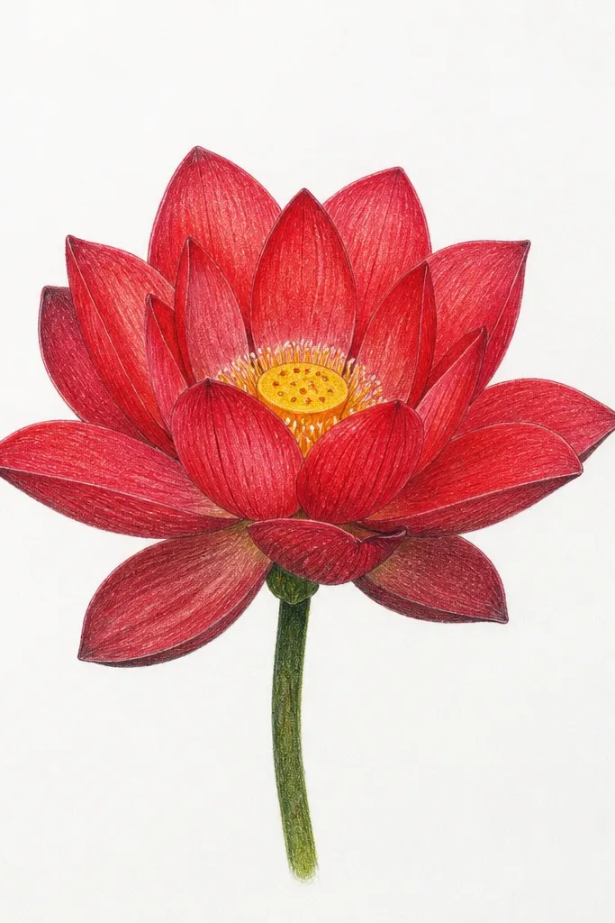
I love this one when I want the drawing to look crisp and modern. Keep the lotus big — about 70% of the page width — so the red gradients have room to show. Use a light rose for the top half of each petal and deep crimson for the underside folds near the center. This composition flatters small sketchbooks because it doesn’t need a lot of background space to feel complete; it also looks clean enough for framing without extra effort.
Good to knowLeave the brightest petal highlights as untouched paper — even a small uncolored strip makes red look glossy.
Start by sketching the outer ring of petals: 8 to 10 teardrops with a slight outward tilt. Then draw a second ring of 6 to 8 petals overlapping the first, with the center petals pointing more upward. Color the top planes in light rose, blend mid red into the middle, and press harder with crimson at the base where petals overlap. Finally, add a tight inner calyx using short curved lines, then shade the underside of the inner petals to pull the eye inward.
Common mistakeDon’t outline every petal equally dark; the drawing looks like a coloring page instead of a finished sketch.
2. Top-Down Lotus with Tight Petal Overlaps
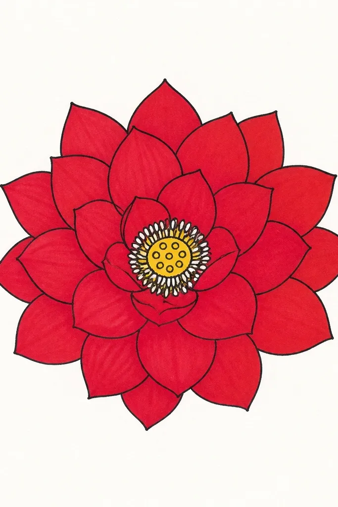
A top-down view makes the lotus feel more graphic, and it’s easier to keep the petals symmetrical. I do this when I want a “meditation poster” vibe without needing a complex background. The key is overlap: each petal should sit on the one behind it, so the shadow line is consistent. This looks flattering on small pages because the flower reads clearly even when you keep the stem minimal or skip it.
Good to knowUse a ruler or coin for the center circle guide; it keeps your stamens from drifting.
Draw a circle guide lightly, then map 12 to 14 outer petal points around the rim. Shape each petal as an almond with a center crease line, and keep the tips pointing toward the circle edge. Shade the overlap areas with mid red, then deepen the shadow where one petal covers another using crimson. Add a small inner ring of 6 petals that curve inward, then finish with a compact stamen cluster: tiny vertical strokes in warm yellow-orange and a few darker red dots at the base.
Common mistakeAvoid spacing petals too far apart — the top-down view collapses when there’s too much white gap between overlaps.
3. Red Lotus with Water Droplets on Petals
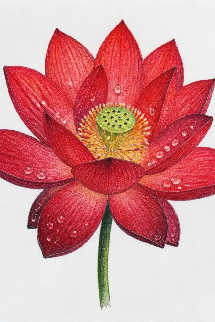
Water droplets make a red lotus look fresh and “real,” and you don’t need elaborate background to sell the effect. I use this when I want the drawing to feel playful but still detailed. The trick is to shade the droplet shadow lightly in cool gray so it doesn’t turn muddy. This works especially well for medium skin tone paper covers and warm-toned sketchbooks because the cool gray shadows make the red feel brighter.
Good to knowIf you’re using gel pen, test on scrap first; some pens leave a thick blob that ruins the droplet shape.
Sketch the lotus with 9 to 11 outer petals and 7 inner petals, leaving a few spots on the outer petals for droplets. Color the petals with a light rose base, then deepen crimson at the underside folds. For each droplet, draw a teardrop outline in pencil, then color the droplet edge with very light gray and leave a small white oval highlight. Add a second, softer shadow under each droplet using a faint gray line that follows the petal curve. Finish by outlining the calyx and adding a few stamens in muted gold.
Common mistakeDon’t make droplets too large; big droplets turn the drawing into a cartoon instead of a glossy sketch.
4. Half-Bloom Lotus Peeking from Leaves
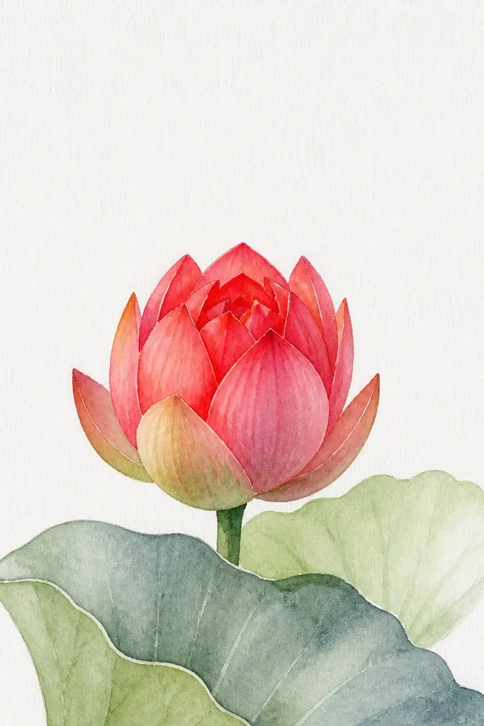
This is my go-to when I’m drawing in a busier page layout. The partial bloom looks natural and gives you a built-in sense of depth because leaves block parts of petals. Use deep green for the leaf shadows and yellow-green highlights so the red doesn’t get swallowed. It flatters anyone who wants a drawing that looks “designed” without drawing a full stem and water background.
Good to knowKeep leaf highlights near the same light direction every time, or the red petals will look like they have inconsistent lighting.
Place the lotus slightly off-center to the right, then sketch 2 large leaves in the foreground using long oval shapes with pointed ends. Draw the lotus behind the leaves: keep the visible petals on the right side and tuck the left petals behind leaf edges. Shade the red petals with light rose on top and crimson under the leaf-covered areas. Add a thin darker red line at the petal edges where they meet the leaves to create a clean separation. Finish the inner calyx and stamens with warm yellow strokes, then add a few leaf veins in darker green.
Common mistakeAvoid drawing the leaves in flat mid-green; it makes the red look like it’s floating.
5. Red Lotus in a Circle Frame
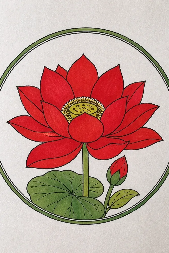
Framing the lotus inside a circle makes it feel like a stamp or print. I use this for gift tags and small prints because the composition is self-contained. The circle also helps your petals stay evenly spaced, so you don’t end up with lopsided bloom rings. This one looks great on tan paper too, because the red gradients still read clearly against a warm background.
Draw a circle about 80% of your page width using light pencil, then sketch the lotus center. Build outer petals first: 10 to 12 petals that follow the circle’s curve, leaving a small gap between the petal tips and the frame. Shade each petal with a consistent direction: light rose on the upper half, mid red in the middle, and crimson at the base. Add an inner ring of 6 petals that angle toward the center. Finish with a stamen cluster and a few tiny seed dot accents inside the calyx.
Use a thin black fineliner for the circle only; the lotus can stay in softer pencil-to-color for contrast.
Don’t outline the entire lotus with heavy black if you color it; the edges get thick and cheap-looking.
6. Red Lotus with Ink Wash Background
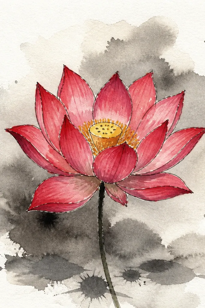
Ink washes make red look richer because the background adds a soft atmosphere. I do this when I want the lotus to look like it belongs in a watercolor set without painting every petal with full color. Keep the wash light so it doesn’t steal attention from the petals. This suits people who like a calm, spa-like look — the lotus still stays the main subject.
Good to knowLet the wash dry fully before you color the petals; wet backgrounds bleed into red and dull the highlights.
Tape down watercolor paper and lightly sketch the lotus. Mix a very diluted gray-blue ink wash and brush it behind the lotus, leaving the flower edges mostly clean. Color the petals with light rose and mid red, then deepen crimson only in the petal folds. Add a darker shadow under the lowest visible petals using a soft brush or a diluted crimson wash. Finish by adding the stamens in warm yellow and a few red dots to suggest depth inside the calyx.
Common mistakeAvoid a dark wash behind the center; it makes the stamens disappear.
7. Red Lotus with Patterned Background Dots
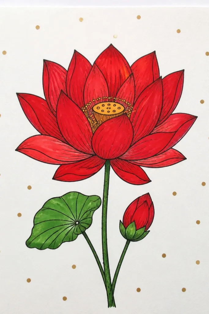
Dot backgrounds add texture without fighting your shading. I like this when I’m using colored pencil because it gives the page a finish even if the lotus is just a few minutes of color. The dots also help hide small unevenness in petal shading. This looks best on white paper and on smooth sketchbook pages where pencil can’t grip deeply.
Sketch the lotus first, keeping petal shapes clean and not too many. Shade petals with light rose on top, mid red in the middle, and crimson in folds. Then switch to a fine pen or pencil to add dots around the lotus, keeping dots smaller as they approach the edges of the petals. Leave a small halo area right around the lotus so the flower edges stay crisp. Add stamens using short vertical strokes in muted gold, then add a tiny darker red base line under the calyx.
Use a dot spacing you can repeat: count 6 dots across a small square and keep that rhythm all over.
Don’t put dense dots inside the flower shape; it makes the petals look busy instead of layered.
8. Red Lotus and Floating Leaves
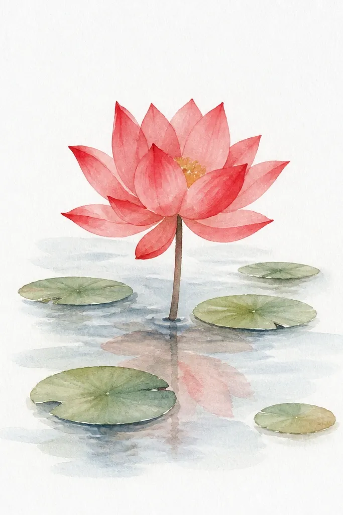
Floating leaves give the scene motion, and they also help you place the lotus in a natural composition. I use this when I’m making a decor piece for shelves because it reads like a mini watercolor scene. Keep the leaves slightly paler than the lotus — the red should be the loudest color on the page. This works well for anyone who wants a drawing that looks good even from a distance.
Good to knowMake the leaf shadows cooler than the leaf highlights; it makes red feel warmer by comparison.
Draw the lotus slightly lower on the page so leaves can frame it. Sketch 3 floating leaves: one at the left edge, one at the right edge, and one near the bottom. Shade lotus petals with a light rose base, then add crimson shadows under each overlap. Color leaves with yellow-green highlights and darker green undersides, then add simple vein lines. Finish by drawing a thin water reflection line under the lowest petal — just a faint curved stroke in gray-blue.
Common mistakeAvoid thick outlines on leaves; thin, soft edges look more realistic.
9. Red Lotus with Center Stamen Spotlight
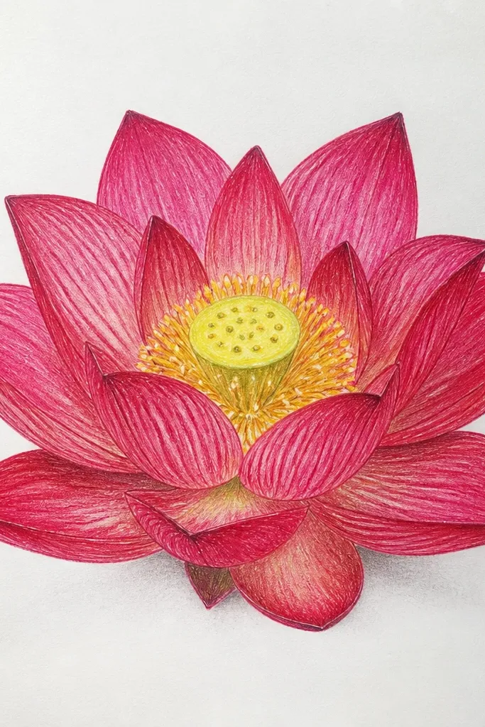
This is the version I draw when I want the viewer’s eye to land fast. The outer petals can be simpler, but the center needs crisp detail. I shade the petals with smooth gradients and then use a darker red ring around the calyx so the stamens pop forward. This flatters portraits and small wall art because the center detail reads clearly even when the piece is scaled down.
Good to knowUse a sharp mechanical pencil for stamens; blunt tips make the lines look fuzzy and weak.
Sketch a lotus with 10 outer petals and 7 inner petals, then keep the petal shading simple: light rose top, mid red midtone, crimson fold shadows. Darken the calyx rim with a thin line in deep crimson. Add stamens as 12 to 18 fine lines in warm yellow-orange, then add tiny dot tips in a slightly darker gold. Put a small highlight at the top of the calyx by leaving a white gap and softening around it with light red pencil.
Common mistakeDon’t over-detail the outer petals; it competes with the center and kills the spotlight effect.
10. Red Lotus with Bold Outline and Limited Color
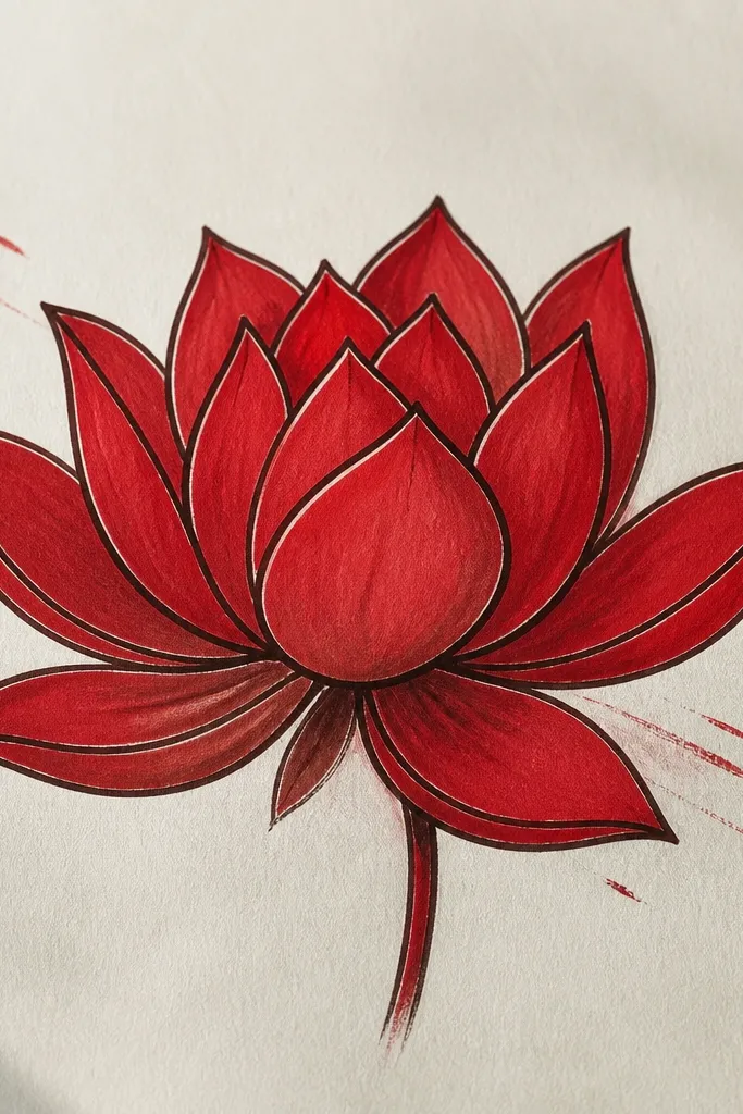
If you want a poster-like look, bold outlines plus limited color is the fastest path. I do this when I’m short on time but still want it to feel intentional. The thick outline keeps the petals from looking wobbly, and the limited palette means your red values matter more. This suits people who like graphic art and clean edges.
Sketch the lotus lightly, then trace the outer petal edges with a 0.8mm or 1.0mm pen. Color each petal with a single mid red tone, then add brown-crimson shadow only at the base folds. Leave small white highlights along the petal edges so it doesn’t look flat. Draw the inner calyx with a darker red and add a few gold stamens as tiny strokes. Keep the background blank so the bold outline does the work.
Press the pen firmly on the first pass; going over thick outlines multiple times makes them look uneven.
Avoid using three different reds in this style; limited color looks best with one midtone plus one shadow.
11. Red Lotus with Side Profile Petals
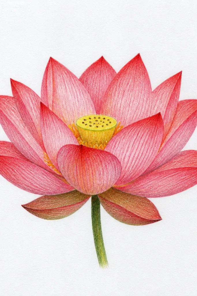
Side-profile petals make the lotus feel like it’s turning in your hand. I like this when my drawings usually look too symmetrical. The trick is to treat one side as the light side and the other as the shadow side. This style looks great for greeting cards because it feels dynamic without needing a full scene.
Sketch the lotus center as an oval, not a circle. Draw outer petals so they arc around that oval, with the right-side petals catching more light. Shade the light side petals in light rose and mid red, then shade the left-side underside petals in deeper crimson. Add a few inner petals that fold toward the viewer, using darker shadows under the fold lines. Finish with stamens clustered slightly off-center to match the angle.
Pick one light direction and follow it on every petal, even the ones hidden in the back.
Don’t shade both sides the same; the lotus loses its 3D twist immediately.
12. Red Lotus with Gold Ink Accent
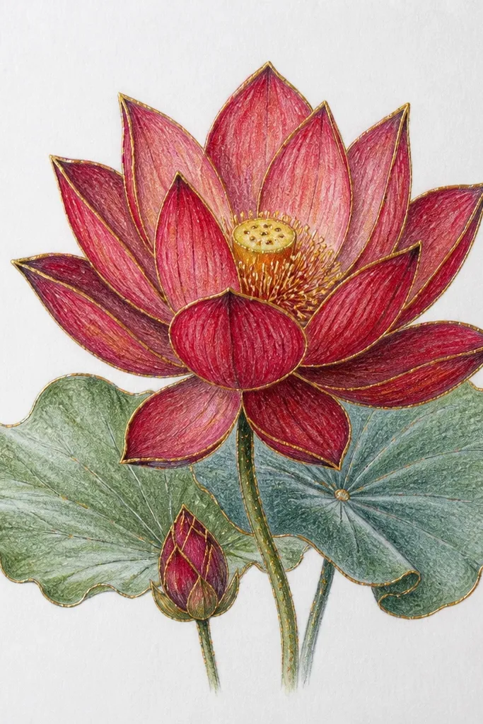
Gold accents make the lotus feel celebratory without changing the core drawing skills. I use this when I want a “gift label” look and I’m working with a gel pen or metallic ink. The gold works best on thin edges — petal rims and stamen tips — because thick gold fills look dull. This is flattering for warm paper tones and for anyone who likes a little sparkle.
Good to knowUse metallic ink sparingly; two or three thin passes beat filling big areas.
Draw and shade the lotus petals first using light rose, mid red, and crimson shadows. Wait until the red is dry if you’re using paint or marker. Then add gold ink along the outer petal rim on just the top-facing edges. Use gold for stamen tips and a few tiny dot highlights inside the calyx. Finish with a light shadow line under the lowest petals in diluted crimson so the gold sits on top, not floating.
Common mistakeAvoid painting gold over wet red; it turns muddy and wipes out the metallic look.
13. Red Lotus on a Mirrored Water Surface
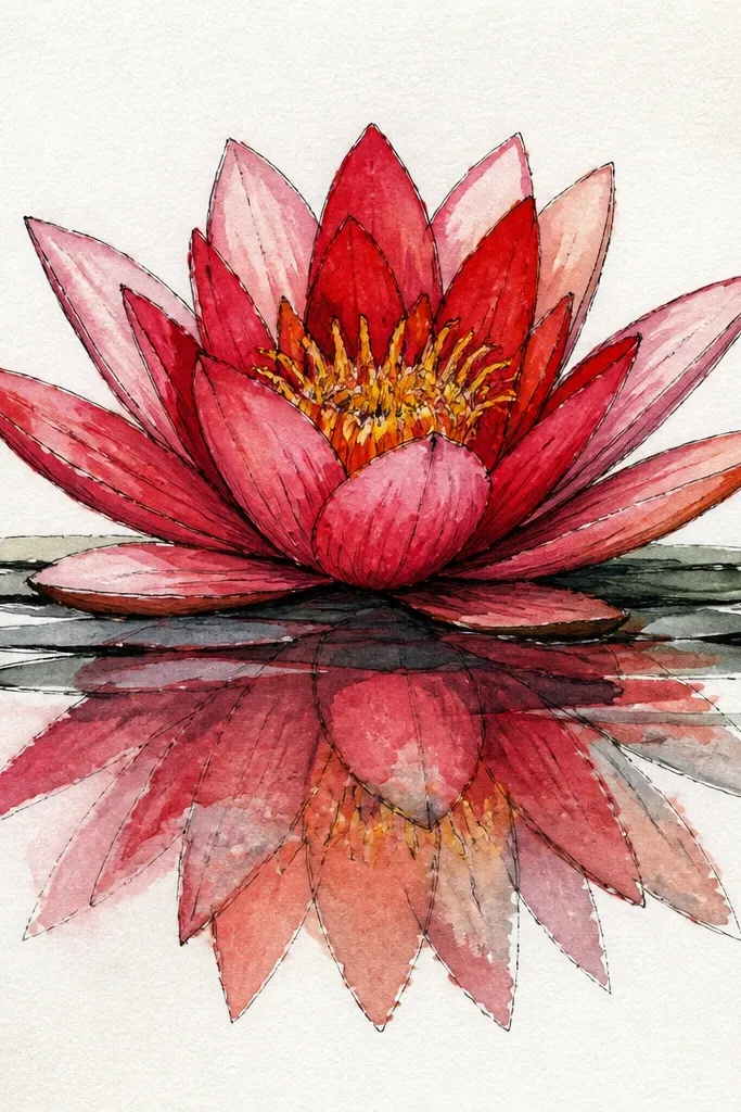
Reflections make even a simple lotus look like a scene. I do this when I want extra depth without adding a whole background. The reflection should be lighter and shorter, with softer edges than the flower itself. This style works well for decor prints because it creates a clean vertical balance.
Sketch the lotus in the upper half of the page, then draw a gentle water line across the middle. Shade the lotus petals in full color values: light rose top, mid red center, crimson folds. Under the water line, draw a reflection by re-drawing only the petal shapes as faint mirrored curves, then blend them with a light red or gray so they fade quickly. Add a little darker shadow just at the base of the lotus where it meets the water line. Finish with a few reflection stamen marks as tiny faded lines, then stop before it gets too busy.
Fade the reflection using fewer strokes as you go downward; the last third should be almost invisible.
Don’t copy the lotus reflection at full strength; it looks like a sticker mirrored on glass.
14. Red Lotus with Symmetry Guide Grid
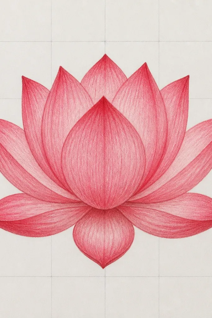
This one is for when you want perfect symmetry without guesswork. The grid keeps your petal count and spacing consistent, especially if you’re drawing for a pattern or repeat design. I use it when I’m making a set of drawings that need to match across a series. It’s also beginner-friendly because the structure is already there.
Lightly draw a square or rectangle frame, then add a 3x3 grid using a very light pencil. Place the lotus center at the middle square. Sketch 10 to 12 outer petals following the grid lines as guides for angles. Shade using the same direction on every petal: top planes light rose, folds mid red to crimson. Add inner petals and stamens, keeping their position aligned with the center grid point.
Erase the grid after shading the petals; keep it visible only while you’re planning shapes.
Don’t press hard with the grid pencil; it shows through red and ruins the clean finish.
15. Red Lotus with Minimal Line Art and Red Wash
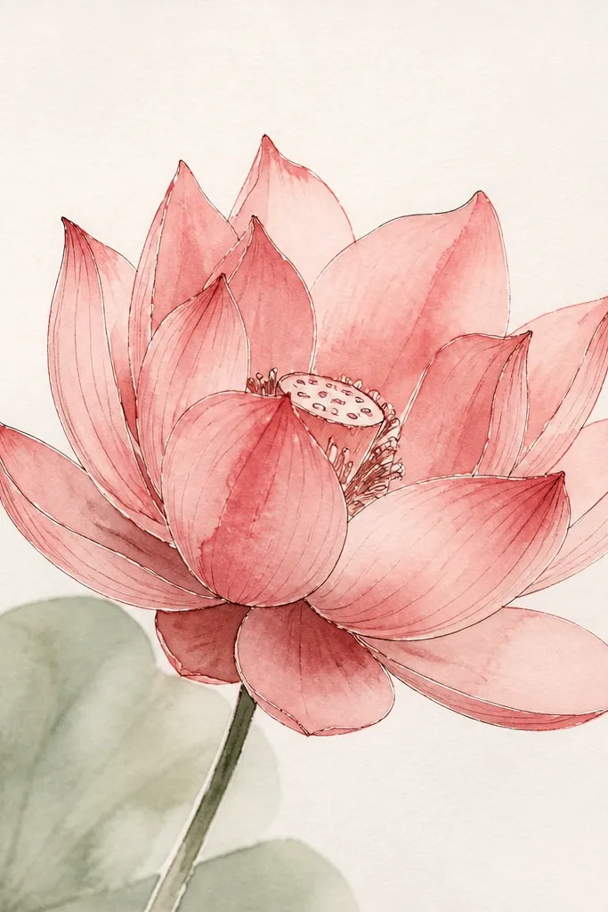
Minimal line art plus a red wash is how you get that airy, modern look. I do this when I want the drawing to feel light and not overworked. The wash gives you natural gradients, and the thin outlines keep the petal shapes crisp. This style flatters people who like watercolor aesthetics but don’t want to spend hours blending.
Good to knowPaint one petal at a time so the wash edges don’t dry into hard borders.
Sketch the lotus outlines lightly with a fineliner or HB pencil. Mix a watery red wash (rose-red) and paint over each petal, leaving tiny white gaps for highlights. Add a second wash in deeper crimson only at the petal folds and where petals overlap. Let the wash blend naturally; don’t keep re-brushing the same spot. Finish with a darker red calyx outline and a few gold stamens painted or penciled as short strokes.
Common mistakeAvoid using thick paint right at the overlaps; it makes petals merge into one dark blob.
16. Red Lotus with Patterned Petal Edges (Damask Style)
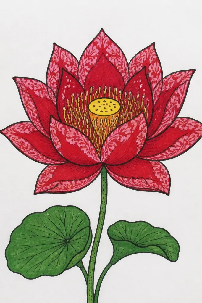
Petal-edge patterns turn a simple lotus into something you can use on stationery and fabric prints. I use this when I’m drawing for a craft project and want a repeatable element. Keep the pattern only on the outer rims so it doesn’t overwhelm the whole flower. This looks best on smooth paper with sharp pens, and it makes red feel more intentional rather than flat.
Good to knowDraw the pattern only on petals facing the same direction; it keeps the design consistent.
Sketch the lotus with clear outer petal rims, then shade each petal in light rose to mid red. Add crimson shadows in the fold lines but keep the center relatively clean. For the patterned edge, use a fine pen to draw tiny repeating curls or scallops along the top-facing petal rims. Vary the pattern spacing slightly so it looks hand-drawn, not stamped. Add the calyx with a deeper red tone and dot a few gold stamens for balance.
Common mistakeDon’t pattern the undersides; patterned shadows look messy and cheap.
17. Red Lotus with Branching Stem and Buds
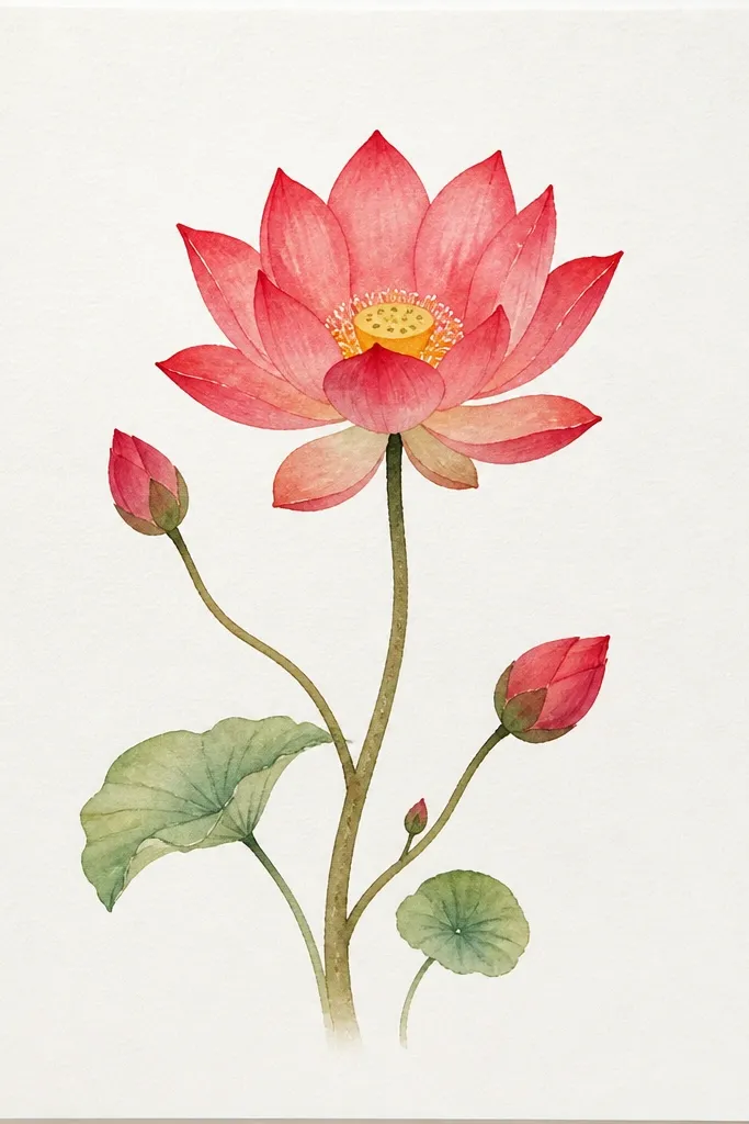
Adding buds makes the drawing feel like a bouquet, not a single flower. I like this for wall art because the stem gives your eye a path. Shade the main bloom with deeper crimson folds, but keep the buds lighter rose so they read as “younger” and not competing. This flatters vertical pages and skinny sketchbooks because the stem fills that shape.
Good to knowKeep the buds' petal edges smoother and less detailed than the main bloom.
Draw a main stem line that curves slightly to the right, then add two side branches at about a 45-degree angle. Sketch the main lotus first, then place two smaller lotus buds along the branches — each bud should be about half the petal count of the main bloom. Shade the main petals in light rose and mid red with crimson folds. Shade buds in lighter rose with only a few shadow folds. Add 3 leaves: one near the base, one mid-stem, and one near the top, using yellow-green highlights and darker undersides.
Common mistakeAvoid drawing buds with the same full complexity; they steal focus from the main lotus.
18. Red Lotus with Charcoal Smudged Shadows
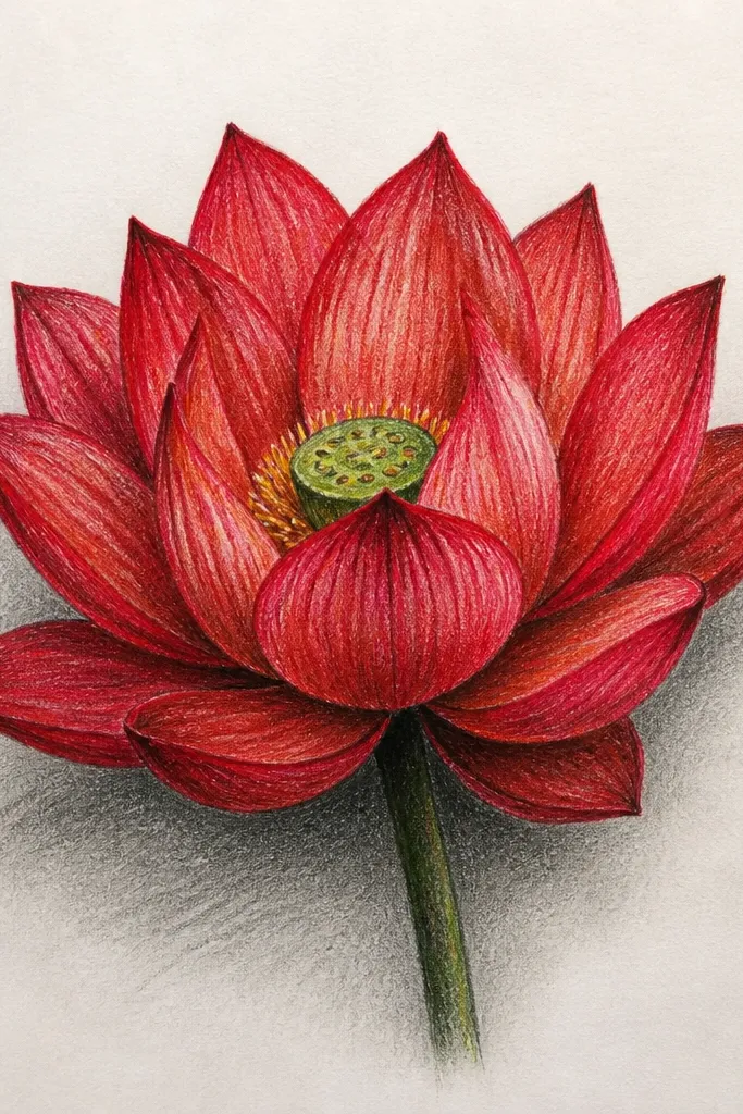
Charcoal smudged shadows give the lotus a soft, dramatic grounding. I use this when I want the flower to look like it’s sitting on paper instead of floating. Keep the charcoal only in shadow zones — under the bloom and between lower petals — so the red stays clean. This looks great for moody wall decor and for people who like smoky art without turning the whole piece dark.
Sketch and shade the lotus petals normally: light rose top planes, mid red midtones, crimson folds. Leave the area around the base slightly lighter at first. Use a soft charcoal stick to add a shadow mass under the lowest petals, then blend it with a tissue or blending stump. Add a second charcoal pass only where petals overlap to deepen the shadow pockets. Finish by adding a few gold stamens and a thin crimson rim line on the calyx so the flower edge stays sharp.
If charcoal dust gets into red, gently rub with a kneaded eraser; it lifts dust without ripping paper.
Avoid smudging charcoal over the entire background; it turns the page into one gray haze.
19. Red Lotus with Neon Pink Highlight Edges
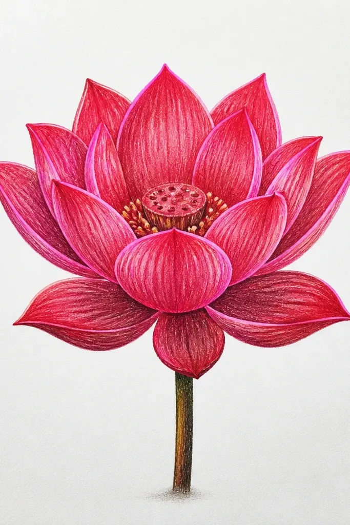
This one is for a modern, high-contrast look. The neon pink highlight makes the red feel brighter, like the petals are catching light. I use it when I’m drawing for stickers, phone wallpapers, or any decor where you want punchy color. It flatters clean layouts because the neon lines guide the eye along petal shapes.
Good to knowUse a steady hand and make the neon line continuous; broken dashes look messy fast.
Shade the petals first using light rose and mid red, then deepen folds with crimson. Keep the highlights uncolored at this stage. Use a neon pink fineliner or gel pen to draw a thin line along only the top-facing petal edges and a few center crease highlights. Add a darker crimson outline at the base overlaps so the neon doesn’t look like it’s floating. Finish with gold stamens in the center and leave a small white highlight in the calyx for sparkle.
Common mistakeAvoid neon highlights on every edge — pick the top-facing edges only.
20. Red Lotus Mandala Rings Around the Flower
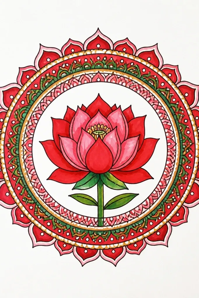
Mandala rings make the lotus feel ceremonial and intentional, especially for prints and bookmarks. The red stays the hero, and the rings add structure. I keep the rings in black or deep brown so they don’t compete with the red gradients. This is a great option when you want a drawing that looks “finished” even if you’re not super detailed on the outer petals.
Good to knowMake the ring patterns smaller as they move outward; it keeps the design balanced.
Draw the lotus center with 10 outer petals and 6 inner petals. Shade petals with light rose and mid red, then add crimson folds and a darker red calyx rim. Draw a small circle around the lotus, then add 3 to 5 rings outside it. Fill the rings with repeating elements: tiny dots in one ring, short curved leaf marks in another, and small zigzags in the last. Keep ring spacing even by using a light compass or tracing a round object. Add stamens in gold and a few red seed dots inside the calyx.
Common mistakeDon’t crowd the rings too close to the petals; leave a little breathing space so the lotus stays readable.



