
1. Sunrise koi with five-petal lotus in the corner
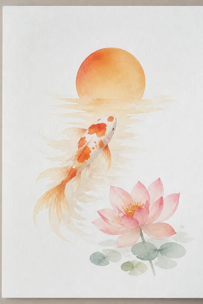
Place the lotus in the corner so it feels intentional, not stuck on. I draw the koi first with a dark outline and then keep the fins slightly translucent by leaving gaps in the coloring. Use warm orange (near the lotus) and pale peach (toward the edges) so the fish look like they’re catching morning light. The lotus should have five big petals plus a small center cup — that simple count reads clean even when you’re not perfect. This style flatters small spaces and looks good on lighter skin tones when you’re making a print for a desk or entryway because the warm palette stays friendly and airy.
Start by sketching a diagonal water path with a single S-curve. Draw the koi heads first — keep them oval with a pointed snout — then add the body curve and tail. For the lotus, draw a center cup first, then five petals around it with the same arc spacing. Finally, shade the water with tiny, broken dots and short strokes, leaving the koi outlines darkest. Add a thin orange wash behind the lotus petals only, so the flower feels like it’s lit from above.
Use a white gel pen to add three tiny highlight dots on the koi eyes and one on the lotus center rim.
Don’t color the lotus edges as dark as the petals — that makes it look like a sticker cutout.
2. Black ink koi with dot-scale pattern and lotus bud
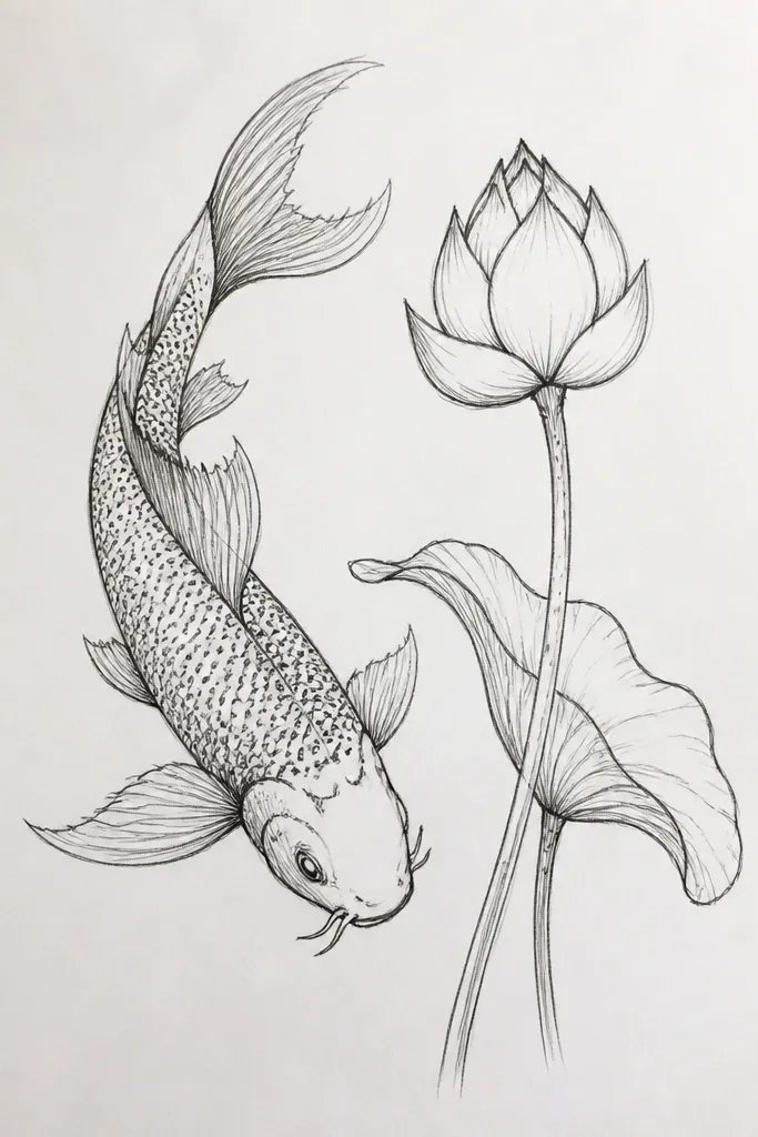
This idea is for when you want a crisp, graphic look. I do dot scales by making a grid-like rhythm: dot, dot, dot along the belly line, then shift the next row slightly so it feels alive. Keep the lotus as a bud with fewer petals — a spiral center reads more premium than a fully open flower when you’re working in black ink only. The koi should have strong head outlines and slightly thinner linework on fins so the shapes breathe. It looks great for monochrome rooms and it also works well for people who like cleaner contrast — it’s easy to read from across a table.
Start with a light pencil sketch of the koi bodies as two long curves with heads at opposite ends. Ink the outer contour in one pass, then add the dot scales using a 0.3 fineliner — place dots close together on the back and more spaced on the belly. Draw the lotus bud center as a tight spiral, then add three petal tips that curl outward just a little. Shade under the lotus cup with a small patch of dense dots, keeping the petal edges crisp. Finish by adding a few short water lines behind the koi — not around the lotus.
If your dots look shaky, rest your wrist on scrap paper and keep your dots the same size for the whole fish.
Don’t outline every tiny fin detail — heavy outlines on fins make the drawing muddy.
3. Colored pencil koi and lotus with teal water haze
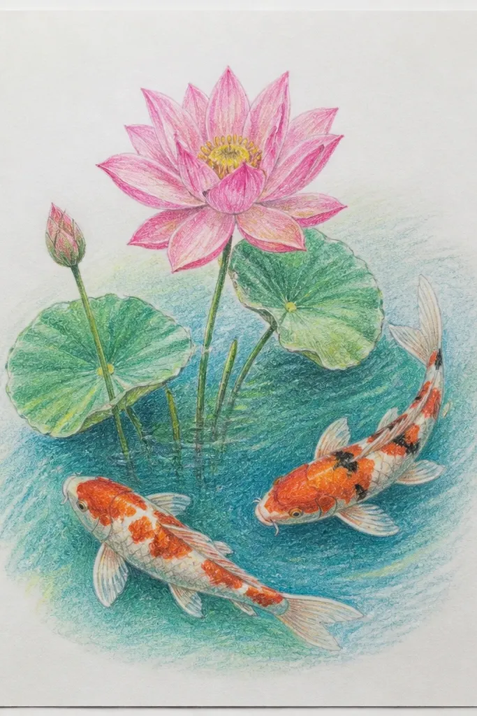
Colored pencil gives you that “slow, soft” look, and teal water haze is the easiest way to make koi feel atmospheric. I layer rose at the petal bases first, then blend outward with a pale pink so the lotus looks dimensional without dark scribbles. For the koi, keep the orange-red patches on the back and let the belly stay creamy. Teal behind the fish makes the orange pop, and it also keeps your drawing from looking like flat sticker art. This one flatters bold home decor because teal and warm koi colors balance each other.
Start by lightly mapping the koi body and the lotus petal stack with a light graphite line. Color the lotus center cup first with a warm rose, then add petals in layers: outer petals first, then inner petals, leaving thin white paper highlights. For the water, use a light teal pencil and scribble in a loose haze behind the koi body — keep it lighter near the fish outlines. Build depth by adding a second teal shade only in the far background. Finish with a darker pencil for koi outlines and a thin shadow under each lotus petal.
Good to knowBlend petal edges with a lighter pink and a clean blender pencil so the base stays darker without hard lines.
Common mistakeAvoid heavy burnishing on the lotus — it turns petals shiny and breaks the soft look.
4. Top-down pond view: koi ring around a centered lotus
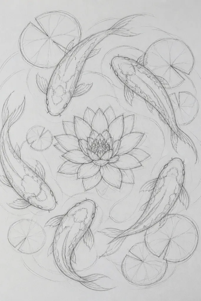
A centered lotus with koi arranged in a ring creates instant balance, even if your koi anatomy is still a work in progress. I keep the koi heads slightly different angles so it doesn’t look like four identical stickers. The lotus should be the darkest element: deepen the center cup shadow and add a few darker petal veins. Concentric ripples behind everything make the composition feel like a top-down pond photo. This style works great for larger paper sizes because the ripples need space to breathe.
Start by drawing the lotus center cup and the petal rings with a compass-like symmetry — outer petals wider, inner petals tighter. Sketch four koi bodies around it, each body following part of a circle, and keep their tails pointing outward. Ink the lotus petals first, then ink the koi outline last so the fish stay crisp. Add concentric oval ripples in the background with light, broken lines that fade as they approach the lotus. Color lightly if you want: pale green for water, soft pink for petals, and warm orange-red for koi patches.
Good to knowUse a ruler for the ripple spacing, then loosen your hand so the ripples look organic, not mechanical.
Common mistakeDon’t place koi too close to the lotus edges — overlapping makes the shapes compete.
5. Lotus lily pad waterline with koi coming out of shadow
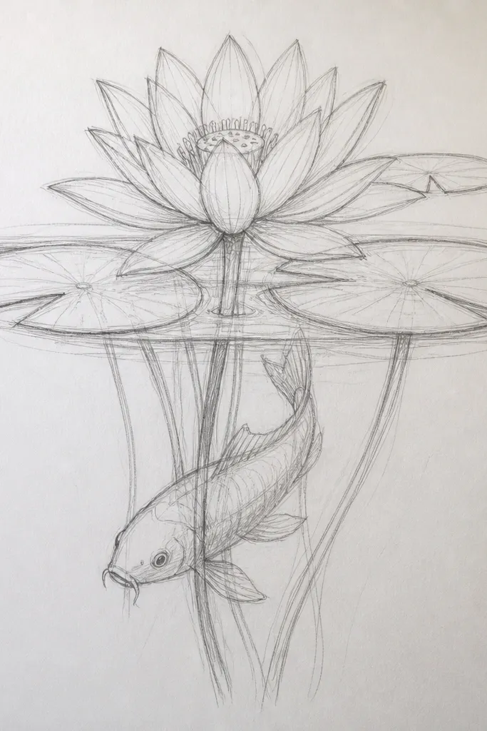
This drawing looks real because it uses value contrast — dark water on one side, lighter water on the other. I shade water with pencil first, then I add a thin, wet-looking highlight band along the waterline. The koi body should get gradually brighter as it crosses that line. Lotus on a lily pad anchors the flower so it doesn’t float. This is flattering for anyone who likes a moody aesthetic because the contrast makes the koi feel like they’re moving toward you.
Sketch the lily pad and lotus base at the bottom, then outline the lotus petals so their tips point slightly upward. Shade the left water area darker with a cool gray-blue pencil, leaving a soft gradient toward the right. Draw the koi so its head starts in the dark side and its tail ends in the light side. Color koi patches with warm orange-red and keep the belly creamy, then add a thin shadow where the koi overlaps the lily pad area. Finish by adding a thin, light highlight along the waterline using a white gel pen.
Make the koi belly highlight follow the body curve — that single move sells the 3D look.
Skip full black fills in the water — if you black it out, the koi won’t separate.
6. Single lotus bloom with koi silhouettes and gold accents
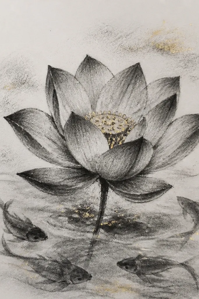
Silhouettes make the drawing feel graphic and calm. I draw the lotus with full petal detail, then I keep koi as darker shapes — still koi-shaped, but without scale clutter. Gold accents go on the lotus center cup rim and one or two places on the koi bodies so it feels like light, not decoration. This style flatters minimalist rooms and it looks good on phone wallpapers because the contrast is strong. It’s also forgiving if your scale marks aren’t consistent yet.
Start by outlining the lotus petals with a confident dark line, then fill the petal bases with a light pink wash or pencil. Draw the koi behind the lotus as two simple curved silhouettes, keeping the head shape recognizable. Add a few thin ripple lines around the lotus but keep the background mostly clean. Use gold gel pen to draw a short arc highlight on the lotus center rim, then add two tiny gold dots on the koi bodies. Darken the lotus center cup shadow so the gold sits on top of a believable depth.
Test the gold gel pen on scrap first — some brands need a few passes to stop looking streaky.
Don’t add gold to every petal — it turns the whole flower into confetti.
7. Koi pair with lotus petals shaped like commas
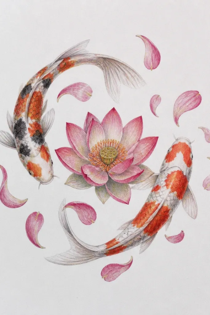
Comma-shaped petals are my go-to when I want lotus petals to look hand-drawn but still neat. Each petal comes from a single wrist motion: curve in, curve out, taper the tip. The koi pair should mirror each other — same curvature, slightly different head angle. I keep the koi scales minimal here and focus on the body curve and fin edges. This style suits people who like clean lines and it looks great for greeting cards because it reads quickly.
Sketch the koi pair with two parallel S-curves and place them so their heads are slightly above the lotus. Draw the lotus center cup first, then add outer petals as comma shapes that overlap by about one-third of their width. Add an inner ring of smaller comma petals, then finish with a few center petals pointing upward. Ink the koi outline and the lotus petal edges in the same pen weight. Add background ripples with a light gray pencil — keep them behind the lotus petals, not through them.
Count petal overlaps: aim for 6 outer petals and 5 inner petals so your rings feel balanced.
Don’t make petals flat ovals — they need taper at the tips to look like real petals.
8. Watercolor wash koi with linework lotus
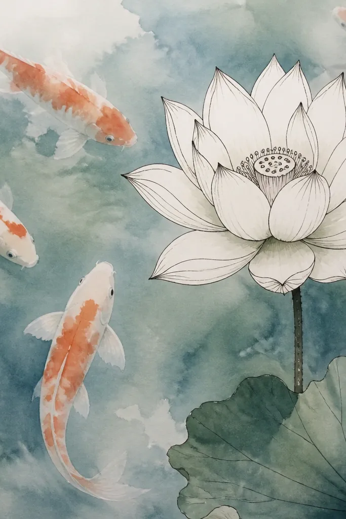
This combo is a lifesaver when you want movement without losing structure. I paint the koi in diluted watercolor — let some pigment bleed so the fish look like they’re in real water. The lotus stays ink-drawn with controlled color, so it anchors the loose wash. Use a limited palette: blue-green water, pale pink lotus, and one warm koi color like coral-orange. The contrast between loose koi and crisp lotus reads premium even if your watercolor edges aren’t perfect yet.
Start by penciling the koi positions and the lotus petal stack. Ink the lotus outlines with a fineliner, then wet the koi areas with clean water and drop in diluted blue-green paint. While the koi wash is still damp, add coral-orange to the koi patches and let it feather slightly. For the lotus, add a thin rose wash at petal bases only, then deepen the center cup shadow with a darker rose or brownish red. Finish by touching up koi edges with a darker pencil line so the fish separate from the wash.
Use a small round brush for koi patches so you keep the edges soft but not fuzzy everywhere.
Don’t wash over your lotus ink lines — it spreads and kills the crisp look.
9. Koi climbing the lotus stem with tiny scale highlights
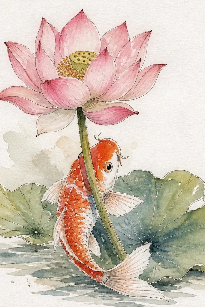
This is a fun, slightly whimsical composition that still looks grounded because the koi is placed on a stem, not floating. I draw the koi body following the stem angle so it feels like the fish is moving through the plant structure. Tiny white scale highlights help the koi look glossy without heavy coloring. The lotus petals stay realistic by adding faint vein lines and a darker petal base shade. This style flatters art prints and journals because it has a clear focal path from stem to petals.
Sketch a lotus stem that rises from the bottom edge, then draw the lotus petals at the top. Add a koi that hugs the stem curve with its spine line — keep the head near the middle of the stem. Outline the koi in dark ink, then add small scale marks along the back with a lighter pen or pencil. Use white gel pen to place 6-10 tiny highlights on the koi scales and one highlight on the eye. Shade the stem and petal base lightly with muted green and warm rose so the koi stands out.
Good to knowKeep the scale highlights in a single direction so the body looks like it has a consistent light source.
Common mistakeDon’t put the koi highlights on the belly — that region should stay softer unless you’re going for a super glossy cartoon.
10. Lotus in a glass bowl pond with koi reflections
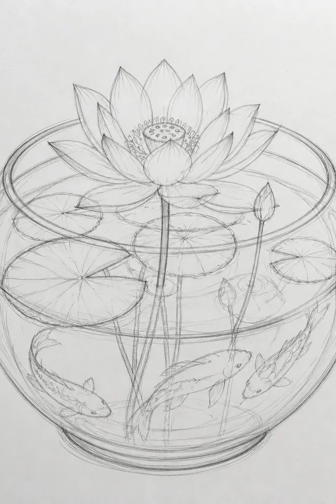
Drawing a glass bowl makes the scene feel specific and decorative. I start with the bowl rim highlight because it sets the light direction for everything else. The koi should look slightly darker near the bottom and lighter near the bowl’s curved highlight, which sells the “glass” illusion. The lotus gets clean linework and gentle color only on the petal bases so it doesn’t compete with the bowl shape. This style flatters table-top decor art because it looks like a mini still life.
Draw the bowl outline first — an oval with a thicker rim and a curved highlight line on the upper right. Sketch the lotus bloom inside the bowl, keeping petals centered. Add koi below the lotus as simple curved bodies, then draw faint ripple lines that are mirrored slightly under the bowl’s highlight. Color the water with a light blue-green wash, leaving the rim highlight mostly white. Finish by adding soft shadow under the lotus petals so they look like they sit above the water.
Good to knowMirror the ripples at the rim: make ripple lines bend more near the bowl edge.
Common mistakeDon’t make the bowl rim too dark — a heavy black rim makes it look like a cartoon circle.
11. Koi and lotus in a vertical scroll format
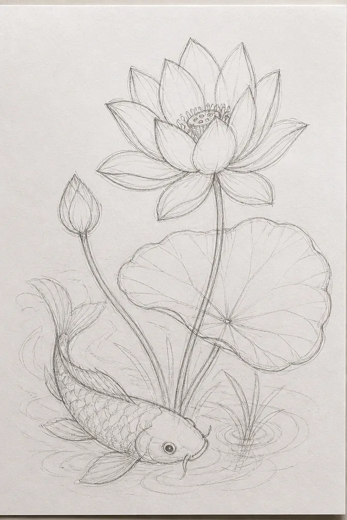
Vertical scroll format makes the lotus feel like it’s reaching upward, which koi naturally complements with their movement. I keep the lotus petals stacked so they form a strong silhouette from a distance. The koi gets a longer body curve and a tail that points upward, matching the vertical flow. Use a top-to-bottom value gradient: darker near the top, lighter near the bottom. This style looks great for wall art because it reads clearly even when the viewer is standing back.
Start by drawing a faint vertical guideline down the center. Place the lotus at the lower third, then draw petals in three rings: outer ring large, middle ring medium, inner center cup smaller. Ink the lotus outline thicker than the koi outline so the flower wins the eye. Draw one koi on the left side with an S-curve that follows the vertical guideline, and add minimal scale marks only on the back. Shade the background with a light wash gradient and add vertical ripple lines that fade behind the lotus and koi.
Good to knowAdd one darker shadow under the lotus base — it anchors the flower to the water.
Common mistakeAvoid placing the lotus dead center in a tall page — it can feel static unless you add a strong diagonal koi.
12. Mini koi around a lotus mandala center
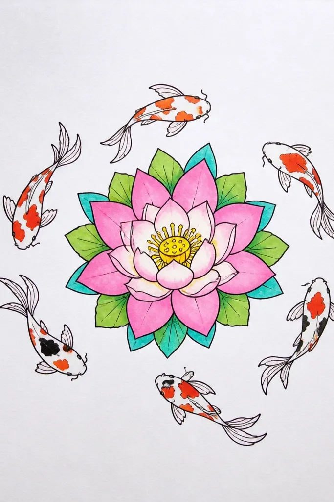
When you shrink the koi, you stop fighting scale detail and you focus on pattern. This design works because the lotus mandala has the complexity, while the koi act like accents. I keep the koi bodies simple: one dark outline, a few scale strokes, and a small tail flick. The lotus petals radiate with consistent spacing so the whole piece looks intentional. This style flatters sticker sheets, small framed art, and anyone who likes symmetrical designs.
Sketch the lotus mandala first with a center cup and 10-12 small petal points around it. Draw the outer petal ring as evenly spaced teardrops, then add a second ring of smaller petals. Place four tiny koi at compass points around the lotus, facing inward so they frame the center. Ink the koi outlines and add 3-4 scale strokes on each body — no dots needed. Add tiny dot ripples around the koi heads only, leaving the rest of the page clean.
Good to knowUse a compass or a string to keep petal spacing even if you’re drawing freehand.
Common mistakeDon’t over-detail the koi scales — tiny clutter makes them disappear.
13. Koi crossing a lotus shadow on the water
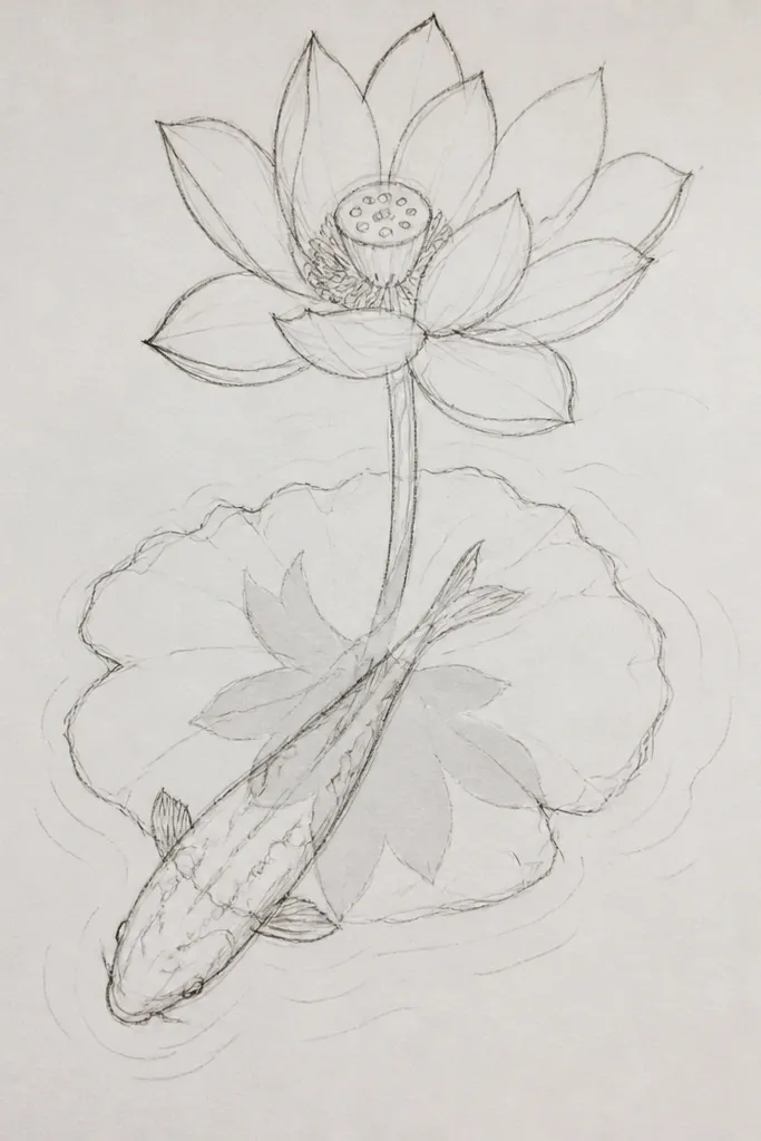
Shadows make drawings look like they belong in the real world. I draw a soft shadow shape under the lotus where petals meet water, then I let the koi pass over that shadow so it feels layered. Keep the shadow cooler in tone than the water so it stands out without turning black. The lotus petals can stay simple: fewer lines, stronger center shading. This style flatters people who like dramatic lighting and clean depth.
Start by sketching the lotus bloom near the top with a clear center cup. Draw the shadow on the water as an oval-ish patch beneath the petals, slightly darker at the center and lighter at the edges. Add the koi crossing the page so its belly passes over the shadow area. Shade the water around the shadow with light strokes and add small ripple breaks where the koi tail moves through. Color the lotus bases with a warm rose and keep the water cooler with gray-blue pencil.
Good to knowOutline the shadow edge lightly in pencil, then erase parts so it looks like light diffusion.
Common mistakeDon’t make the shadow a hard-edged sticker shape — it should blur into the water.
14. Koi with scale texture bands and lotus with ink veins
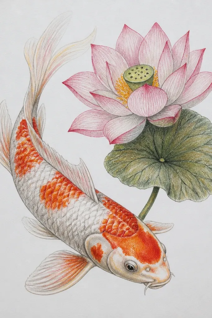
Horizontal scale bands look structured and intentional, especially for mid-size drawings. I draw them as curved stripes that follow the body contour, then I fill each band with small V-shaped marks. The lotus gets ink veins — thin, slightly curved lines that start near the petal base and stop before the tip. This gives the petals a subtle realism without heavy shading. This style flatters mixed-media work because it looks sharp in pen and still holds up when you color lightly.
Sketch the koi body as a long curve and mark three to five horizontal band positions. Ink the outline, then draw each band as a curved stripe — keep the bands closer together near the tail. Fill each stripe with tiny V marks so they read as scales. For the lotus, draw petals with a defined outline, then add 3-5 vein lines per petal using a steady hand. Shade only the petal base with a light rose pencil, leaving the top half lighter. Keep the background minimal: a few pale ripple strokes behind the koi belly.
If your V marks look too uniform, vary the size slightly — it reads more natural.
Avoid coloring over the ink veins heavily — it turns them into dark smudges.
15. Lotus and koi in a rainy pond with splatter highlights
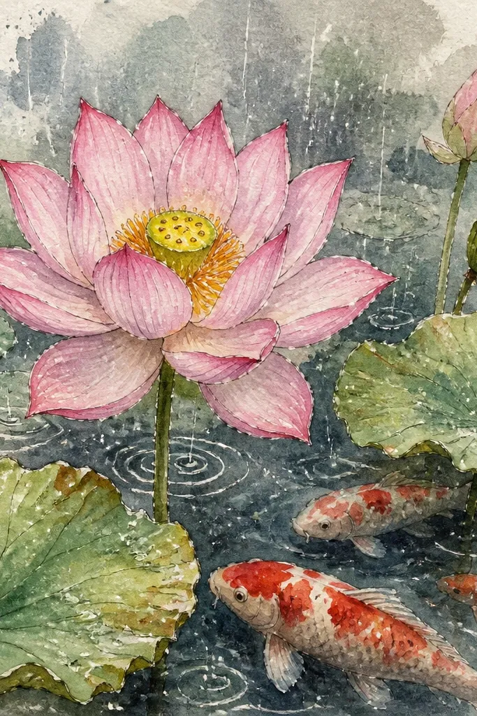
Rain splatter is the easiest way to make koi feel like they’re in motion without drawing extra ripples. I keep the lotus clean and slightly more solid than the koi, so the eye lands on the flower even in a busy background. The koi should look softened by haze: lighter outlines, fewer scale details, and more value contrast around the head. Use gray-blue water and add white splatters for rain hits. This style flatters moody art spaces and it looks great for seasonal decor.
Start with a gray-blue wash background using diluted paint or pencil smudging. Sketch the lotus and koi lightly, then ink the lotus outlines darker than the koi. For the koi, leave many areas uncolored so the haze remains visible. Add rain splatter by flicking a brush loaded with white paint over the page from about 6-8 inches away. Draw a few small streaks near the lotus petals to suggest raindrops sliding down. Finish by adding a couple of darker ripples behind the koi heads so they don’t vanish.
Practice splatter on scrap paper first — distance changes droplet size a lot.
Don’t splatter directly over the lotus center cup — it makes the flower look noisy.
16. Koi pair with red-and-cream lotus petals and green stems
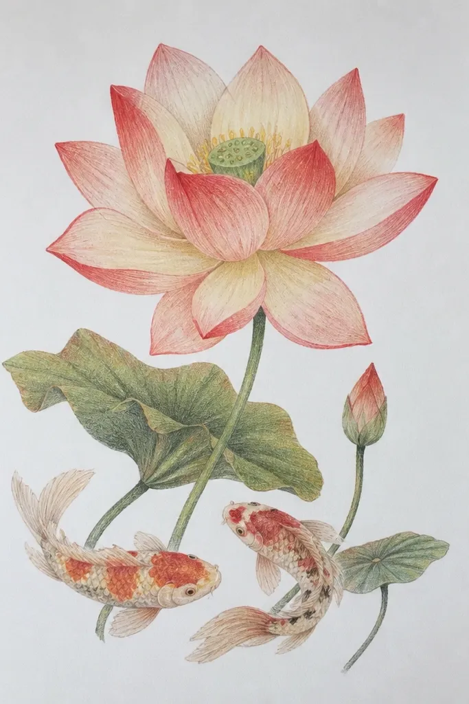
This is the color scheme I use when I want koi and lotus to look like a matching set. The koi get red patches and cream bellies, while the lotus petals fade from cream to red at the base. Add green stems and lily pad veins so the plant looks alive, not floating. I keep the lotus center deeper and slightly darker than the petals, so it feels like a real cup. This style flatters warm-toned rooms and it looks great when you want a cohesive, giftable piece.
Sketch the lily pad and stem first, then position the lotus bloom above the pad. Color the lotus center cup with a darker rose-red, then blend outward into cream petals — leave a thin highlight on each petal edge. For the koi, outline in dark ink and color patches with warm red-orange, leaving the belly cream. Add a few scale dots only on the back half of each koi, then blend the water behind them with pale green-gray. Finish by drawing tiny lily pad vein lines and a soft shadow under the stem.
Use two pencils for the lotus base: one rose-red and one pale pink, so the gradient stays smooth.
Avoid using only one red tone for everything — flat color makes both koi and lotus look pasted on.
17. Lotus flower head-on with koi circling behind it
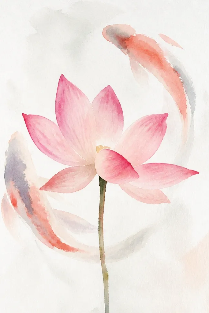
A head-on lotus gives you a strong focal shape and makes the center cup feel believable. I draw the inner petals like nested bowls, each one smaller and slightly darker at the base. The koi sit behind the lotus, so I keep their outlines thinner and their scales fewer. This makes the lotus read first, then the koi motion becomes a second layer. It’s a nice choice for beginners because the lotus structure guides the whole drawing.
Start with the lotus center cup — draw it as a teardrop bowl shape with a darker bottom. Add inner petals as overlapping ovals that point upward, then outer petals as larger teardrops. Place two koi behind the lotus so only their bodies and tails show around the petal edges. Ink the lotus outlines thick, then ink the koi outlines thinner. Add ripple rings in the background using light, curved lines that fade as they approach the lotus. Color lightly: pale pink petals, deeper rose in the inner cup, and soft orange for koi patches.
Keep the inner petals darker than the outer petals — it gives the cup depth instantly.
Don’t let the koi overlap the lotus petals — they should sit behind, or the layers get confusing.
18. Koi and lotus in a wreath frame
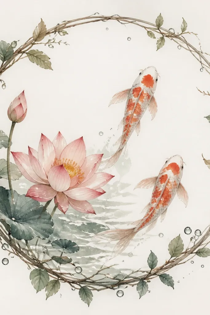
A wreath frame gives your koi + lotus drawing a finished look without needing a fancy border. I draw the wreath leaves as small almond shapes with a single vein line, then I add tiny droplet shapes around the ring. Inside, the lotus stays the biggest element and the koi act like upward movement — tails pointing toward the top of the circle. This style flatters gift tags and printable art because the circle format makes it easy to crop.
Draw a large circle as your outer wreath boundary, then add two or three evenly spaced leaf segments around it. Place the lotus inside the circle, slightly off-center, and draw petals in three rings. Add two koi that curve upward on opposite sides of the lotus, keeping their heads near the middle. Ink the wreath leaves lightly and ink the lotus petals darker. Add tiny droplet accents in the background and keep the water ripples inside the circle minimal so the wreath doesn’t overpower the main scene.
Use the circle as your guide for spacing: keep koi tails following the circle curve so everything feels matched.
Avoid thick wreath outlines — thick framing can steal attention from the lotus.



