1. Lavender pencil wash with a plum seed pod
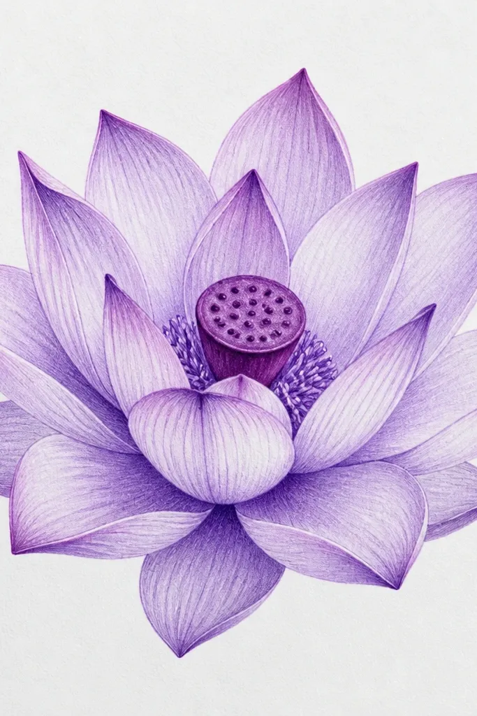
This one is my go-to when I want a clean, dreamy lotus that still looks dimensional. The outer petals use a very light lavender (think pale violet-lilac), while the fold lines are violet-blue so the petals look folded, not flat. The center has a plum seed pod with a few tight seed dots so it reads "lotus" instantly. It flatters card-front art and small frames because the contrast stays crisp without getting heavy. I also like it for people who prefer soft color over bold ink - it looks gentle on warm skin tones in photos and doesn't fight busy backgrounds.
Start by sketching the outer petal shapes as 8 wide ovals around the center, leaving a gap for the pod. Add the middle layer with 6 overlapping petals that hug the inside edge of the outer ones. Then shade the outer petals lightly with lavender pencil and darken only the fold lines with violet-blue pencil. Finish by coloring the seed pod plum and adding 10 to 14 tiny seed dots with a 0.5 gel pen. Use a soft kneaded eraser to lift highlights along the top edge of each outer petal.
Good to knowPress lighter on the petal tops and heavier only on the fold lines - the drawing suddenly looks like it has thickness.
Common mistakeSkipping fold lines makes the petals look like a flat flower sticker instead of a lotus.
2. Ink outline + watercolor bleed edges
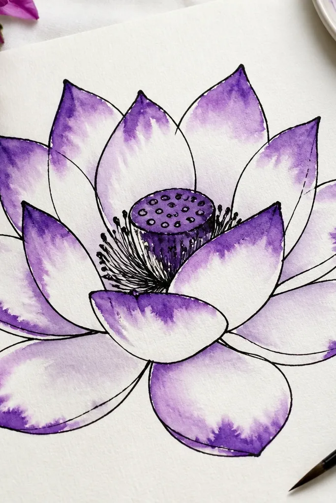
This style looks fancy because the ink gives structure and the watercolor does the romance. The outer petals are outlined with a medium black line, then you paint only the edges with a diluted purple so the color blooms outward. I use a cool purple wash (violet with a touch of blue) so the bleed looks misty instead of muddy. It's great for wall art because the crisp outline keeps it readable from a distance. If you're gifting, this one photographs well on neutral backgrounds since the watercolor has that airy halo effect.
Draw the lotus in pencil lightly, then ink over the final lines with a 0.3 or 0.5 fineliner. Mix a watercolor purple wash that's about 70% water and 30% pigment, then load it on a small round brush. Paint only along the outer petal edges and let the wash run slightly into the centers - don't fill every petal. For the middle petals, use a stronger purple but keep it at the folds and lower halves. Finish with a deeper plum around the pod and add a few seed marks with a darker ink or pen.
Good to knowIf your bleed looks too harsh, drag a clean damp brush once through the edge to soften the boundary.
Common mistakeFilling the whole petals with watercolor makes it look flat and stains the paper instead of blooming.
3. Stippled purple glow lotus on dark paper
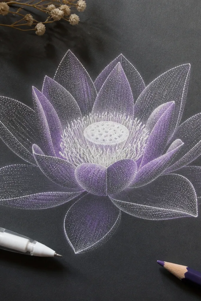
On dark paper, purple lotus drawings look like they're lit from within. The trick is mixing white gel pen highlights with purple pencil shadows so the petals look curved and luminous. I use a deep plum for the pod and a brighter lilac for the petal midtones, then build depth using stippling density. This style suits moody decor and night-themed journals, and it flatters accessories like gold frames because the contrast is dramatic. It also photographs really well because the white stippling pops even under phone lighting.
Start by sketching the lotus in soft pencil so you can erase if needed. Shade the folds with a dark violet pencil, keeping it mostly near the underside of each petal curve. Then switch to a white gel pen and stipple highlights along the top edges and the center of each petal. Increase stippling density closer to the center so it feels like a glow. Add the seed pod as a tight plum oval, then dot white highlights inside it and around the pod rim.
Good to knowUse a scrap of the same dark paper to test how heavy your gel pen marks look before committing.
Common mistakeLeaving the whole petal uniformly purple makes it look like a blob - keep the highlight zones brighter.
4. Marker gradient lotus with a white gel pen highlight
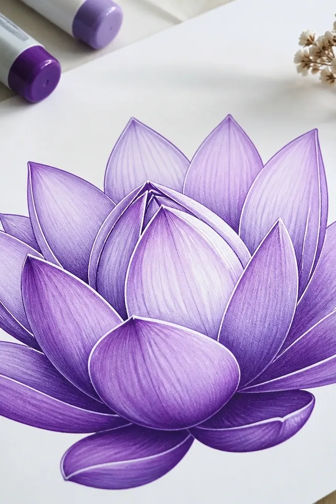
This is the quickest way to get that "professionally colored" look. Each petal is a gradient: deeper purple in the fold, lighter purple on the top edge, and a crisp white highlight line to sell the shine. I like using two marker tones - one plum and one lavender - because it keeps the color clean. It's flattering for scrapbooking and stickers because it stays bold without turning muddy. If you're making a set, this style keeps every lotus consistent even when your hand varies.
Sketch the lotus lightly with a pencil, then trace the main petal outlines with a purple fineliner or marker edge. Color the outer petals first: start with plum along the fold area, then blend up to lavender by skimming the lighter marker over the top half. Add the middle petals with the same gradient but make the folds slightly darker. Use a white gel pen to draw a thin highlight curve on each petal top edge. Finish by coloring the pod plum and adding a few white seed dots.
Good to knowBlend while the marker is still slightly wet so the gradient looks smooth instead of banded.
Common mistakeGoing back and scribbling over dry marker creates chalky texture - stop after the first blend pass.
5. Colored pencil petal fan with a thin black center ring
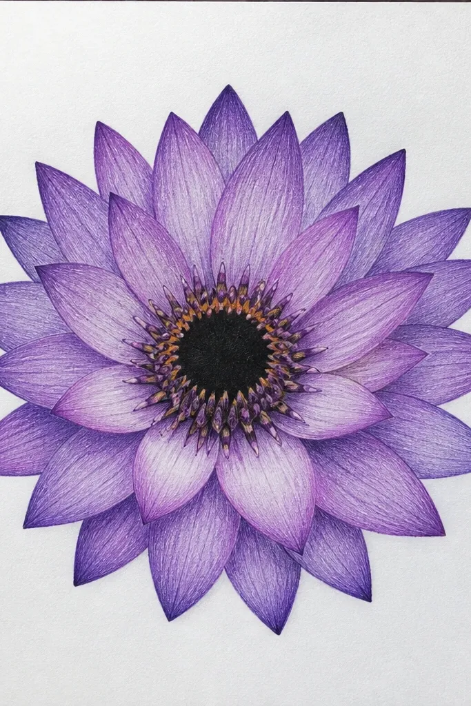
This one looks refined because the center ring gives you a focal boundary. The petals are shaded with colored pencil in short strokes that follow the petal curve, which makes the texture feel like real paper and not digital coloring. I use violet for the middle shading and pale lavender for the top highlights, then I add a thin black ring around the pod to sharpen the silhouette. It's great for bookmarks and small prints because the linework stays airy. It also flatters minimal decor since it doesn't rely on heavy color blocks.
Draw the outer petals as 9 shapes with slightly pointed tips, leaving space between them. Add the middle layer with 7 petals that overlap and angle inward like a handheld fan. Shade using colored pencil in short curved strokes from petal base to tip, keeping the top edge lighter. Draw a thin black ring around the pod area, then shade the pod plum with small circular motions. Add 12 tiny seed marks inside the pod with a fine black pen.
Good to knowIf your center looks fuzzy, trace the ring twice with the pen: once lightly, then a second time with steady pressure.
Common mistakeOver-shading the outer petals makes the fan effect disappear - keep the outer layer lighter.
6. Gouache-style creamy purple lotus on textured paper
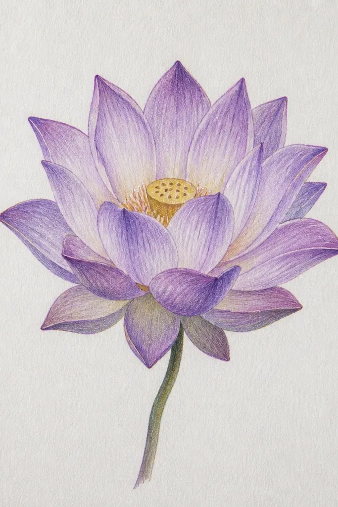
When you want a lotus drawing that looks like it came from a painting, use opaque creamy purple. I mix violet with a touch of white so the petals look milky and smooth on textured paper, not watery. The folds are darker plum, and the pod is a concentrated plum oval with a few crisp seed shapes. This works well for larger pieces because the opacity holds up and doesn't look washed out. It also looks good with warm-toned frames because the creamy purple plays nicely with wood grain.
Prime your paper mentally by testing opacity on a scrap - textured paper can drink paint. Sketch the lotus lightly, then mix a creamy lavender and paint the outer petals as solid shapes with slightly feathered edges. Add middle petals using a darker violet, keeping the fold areas more opaque than the top edges. Paint the pod plum and add 2-3 darker seed clusters with a smaller brush. Finish by dry-brushing a little pale lavender along the petal tops so the edges catch light.
Good to knowUse a flat brush for outer petals and a round brush for the pod; you'll get cleaner petal edges fast.
Common mistakeUsing watery paint on textured paper makes speckling look accidental instead of intentional.
7. Paper-cut style lotus drawing with crisp negative space
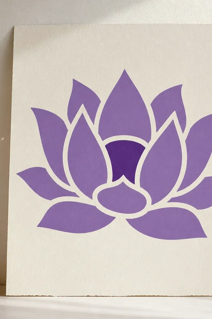
This design looks like a paper cut even if you draw it with markers. The secret is keeping intentional white gaps between petals so the lotus shape feels layered and dimensional. I use a single purple family: a mid violet for most petals and deep plum for the pod and shadow gaps. It works great for greeting cards because the white negative space keeps it clean when printed. It also flatters minimalist aesthetics - the whole drawing reads clearly even at small sizes.
Sketch the lotus in pencil, but decide where your white gaps will be before you color. Fill the outer petals with mid violet, leaving narrow white channels between each petal edge. Add the middle petals as a second layer with slightly darker violet so they sit in front. For the pod, fill it solid plum and leave tiny white dots as seed highlights. Use a fine purple pen to redraw petal edges where the marker may have bled.
Good to knowPlan gaps with a ruler - even 1-2 mm consistent spacing makes the cutout look polished.
Common mistakeColoring over the gaps removes the layered effect and makes it look like a single blob.
8. Monoline lotus with tiny seed crosshatch
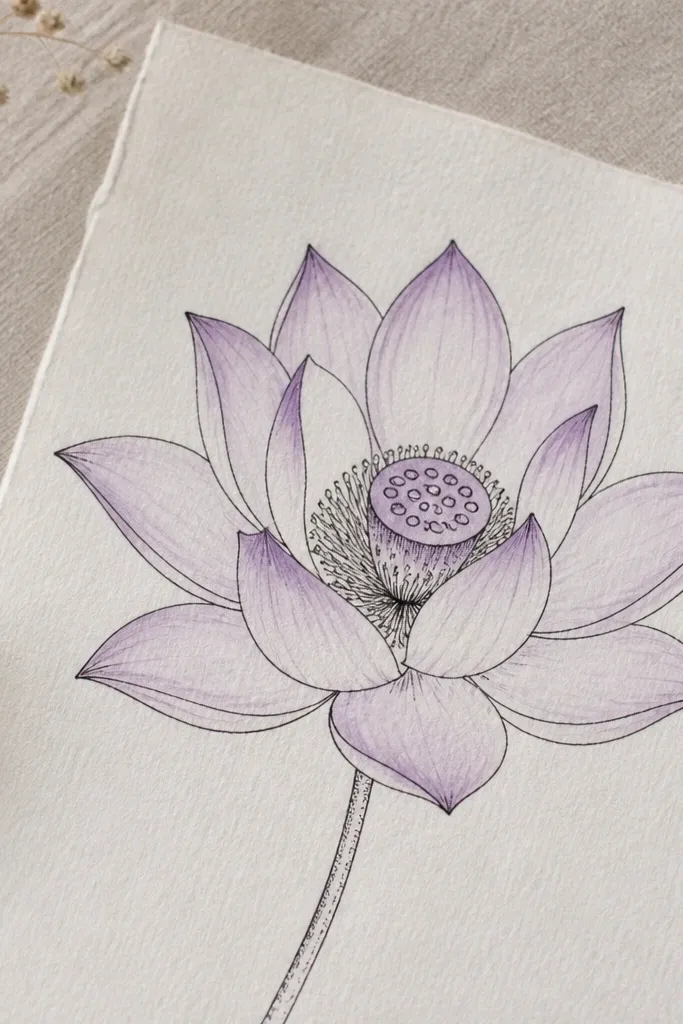
If you like line art that still looks soft, this is the one. The outline is monoline black, which keeps the silhouette sharp, and the petals get a light lavender tint for color. The center pod is where you add texture: tiny crosshatch marks in violet create depth without heavy shading. It's perfect for stationery sets because it looks neat and not messy. The contrast between thin lines and gentle purple wash makes it feel balanced on both light and medium-toned paper.
Draw the lotus outline with a black fineliner, keeping petal curves smooth and evenly spaced. Lightly wash the outer petals with very diluted lavender using a small brush, leaving the fold areas almost white. Add middle petals with a slightly stronger lavender tint but keep the edges light. For the pod, fill the pod oval with pale violet, then crosshatch small seed grooves with a darker purple pen or pencil. Add a few crisp seed dots on top of the crosshatch so the center looks detailed.
Good to knowLet the lavender wash dry fully before you crosshatch, or the ink will feather.
Common mistakeOver-washing the petals makes the monoline outline disappear.
9. Water-soluble colored pencil lotus with wet blending
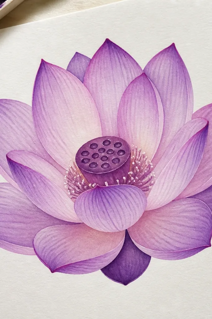
This gives you control like colored pencil but the softness of watercolor. I use water-soluble pencils so I can layer color, then blend with a damp brush to smooth transitions. Outer petals get pale lavender with violet fold shading, and the middle petals deepen to plum where they overlap. The center pod is darker plum with blended edges so it looks rounded. It's great for people who want a forgiving medium - you can lift color with a damp brush if it goes too dark.
Sketch the lotus lightly, then layer pale lavender on the outer petals with a colored pencil. Add darker violet to the fold lines and overlap areas, keeping the top edges lighter. Load your brush with clean water (not dripping) and gently blend the outer petal color from base to tip. Repeat blending for the middle petals using a slightly stronger violet so they feel closer. Blend the pod last with plum and then add a few seed dots with a pencil once it dries.
Good to knowUse a tissue to blot your brush between petals so you don't drag purple into highlights.
Common mistakeBlending too early wipes out your pencil structure and turns the petals into one flat wash.
10. Gel pen line lotus with watercolor ring halo
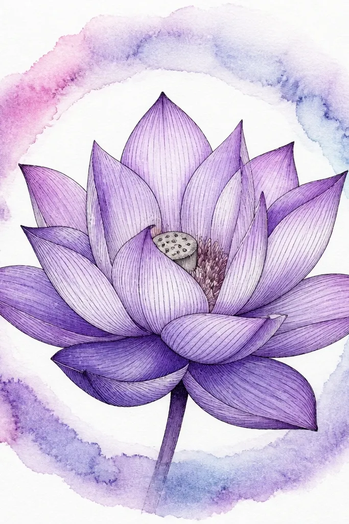
This one looks like a finished print because the halo ring frames the lotus. I draw the lotus with a gel pen outline so every petal edge stays crisp, then I paint a thin watercolor ring behind it in a lighter purple. The petals use lavender for midtones and violet for folds, while the pod stays plum for contrast. It's great for wall art and printable downloads because the halo makes the subject feel intentional. The crisp gel pen line also handles imperfect paper textures better than fine ink alone.
Trace a light circle guide behind the lotus with a faint pencil, then sketch the lotus inside it. Outline the lotus petals with purple gel pen, keeping lines slightly thicker where the petals overlap. Fill petals lightly with lavender watercolor or diluted watercolor pencil, focusing color on fold areas. Paint a thin halo ring behind the lotus using a diluted lavender wash, leaving the center clear. Finish the pod in plum and add small seed marks with a darker gel pen.
Good to knowKeep the halo ring thin - around 1-2 mm on the paper - or it competes with the petals.
Common mistakePainting the halo ring too close to the petals makes the whole piece look crowded.
11. Sumi ink style lotus with purple wash accents
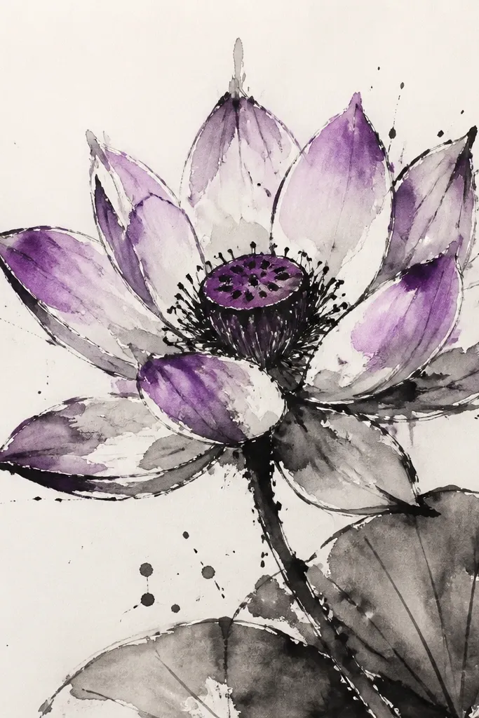
This feels artsy without being messy if you place the purple like accents. I use black ink for the petal edges and the inner fold strokes, then add purple wash only where lotus petals catch light - outer petal tops and the middle overlaps. The pod is a deeper plum wash so it anchors the composition. This style works for larger sketchbook pages and mixed-media collages because the texture adds character. It also looks great in monochrome rooms since the purple accents give it a gentle focal point.
Sketch the lotus in pencil, then ink the outer petal edges with a brush pen or sumi-style ink, letting a few strokes taper naturally. Add inner fold lines with lighter ink strokes so the petals look layered. Mix a diluted violet wash and dab it on the top halves of outer petals, leaving the underside mostly black. Paint the middle petals with a slightly stronger purple at the fold zones. Finish with a plum pod wash and a few tiny seed marks in darker ink.
Good to knowUse a dry brush to lift a little purple from the petal tops so the highlights stay airy.
Common mistakeAdding purple wash everywhere makes it look like a stained background instead of ink + color contrast.
12. Lettering-friendly lotus with a centered calligraphy curve
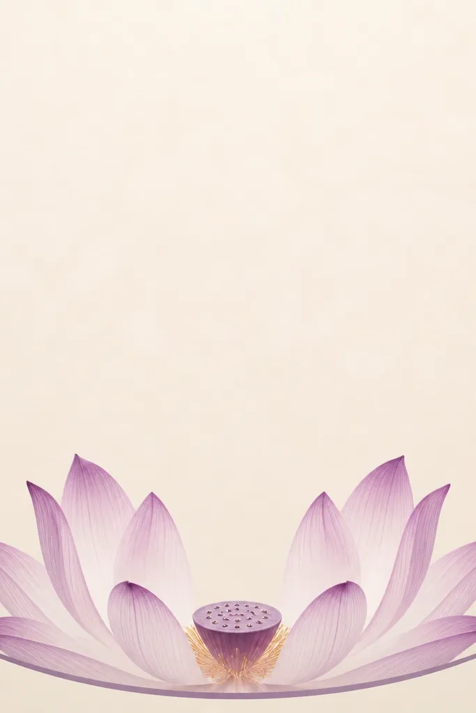
This is for when you want your lotus to frame a phrase or date without blocking it. I draw the lotus slightly higher and keep the outer petals wide but not too dense, so there's an open space for lettering underneath. The petals are lavender with violet folds, and the pod is plum with just enough seed detail to look real. It flatters invitations, thank-you cards, and handmade labels because it creates a natural top border. The center alignment also makes the composition feel intentional, even when the lettering varies in style.
Plan your layout first: draw a curved baseline for your text area, then place the lotus above it with a small gap. Sketch 7 outer petals that arc outward and leave two small gaps on the sides for text breathing room. Add 5 middle petals that overlap toward the center, keeping them tighter so they don't swallow the text space. Shade outer petals in lavender and add violet fold lines with a fine pencil. Color the pod plum and add 8-10 seed marks, then outline the petal edges with a thin purple gel pen to keep everything crisp.
Good to knowIf your lettering looks tight, widen the outer petal spacing by 1-2 mm rather than shrinking the text.
Common mistakeCrowding the outer petals directly over the text makes the whole card look busy.
13. Symmetry practice lotus with a ruler-guided petal grid
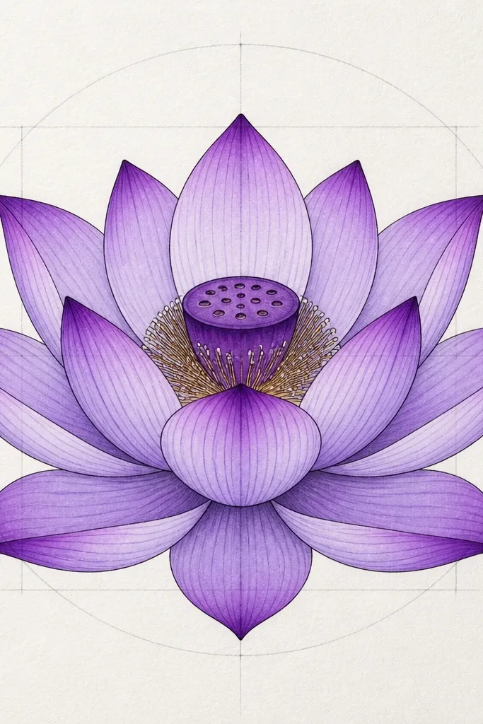
This one is for when your lotus keeps coming out lopsided. I use a faint grid to control petal spacing, then I remove the guide lines with a kneaded eraser once the ink is dry. The symmetry makes the purple look smoother because each petal catches light the same way. Outer petals are lavender, middle petals are violet, and the pod is plum - a simple color order that stays consistent. It's ideal for beginners because you can correct spacing early instead of fighting it later. If you frame your work, symmetry also makes it feel more "designed," not improvised.
Lightly draw a center vertical line and a center horizontal line, then add 8 evenly spaced radial guide marks around the center. Sketch outer petals so each petal aligns with one radial mark, leaving consistent gaps between petals. Ink the outline and fold lines, then erase the guide grid carefully. Color outer petals with light lavender pencil, middle petals with deeper violet pencil, and blend the pod with plum. Add tiny seed marks inside the pod and a few highlight strokes on the top edges of outer petals.
Good to knowAfter you ink, hold the paper up to a window and check symmetry - fix spacing while pencil still has life.
Common mistakeTrying to correct petal spacing after coloring makes the purple look uneven and patchy.
14. Mini lotus cluster with one large flower and two buds
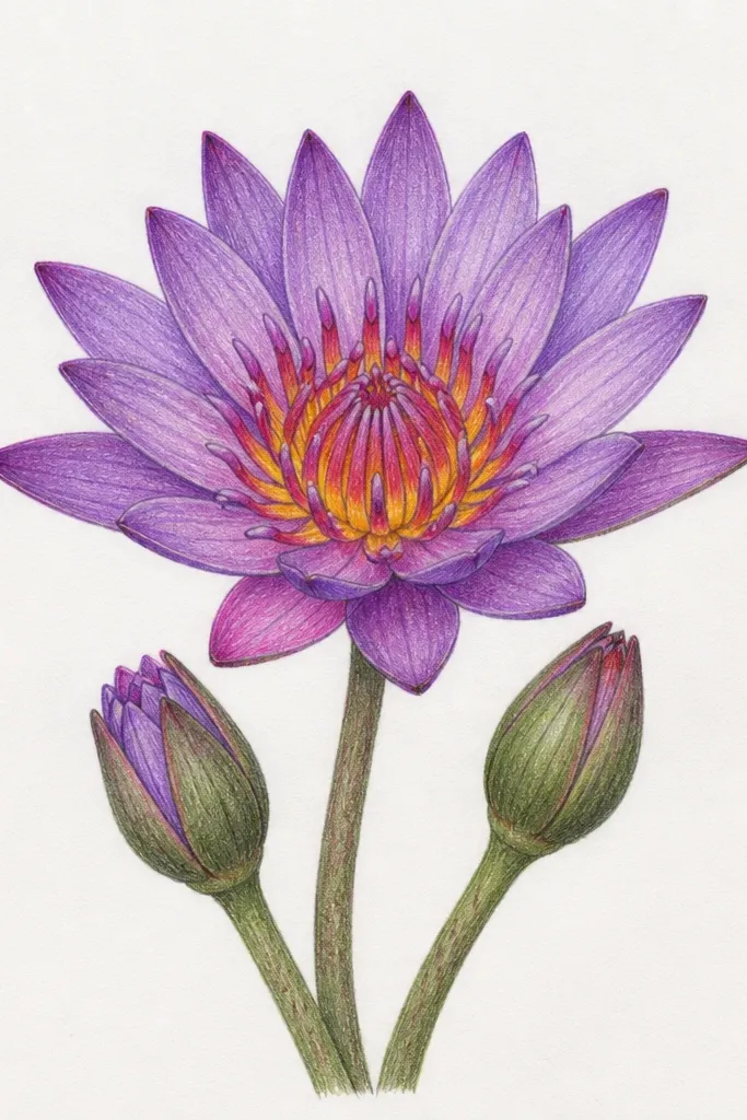
This is how you make a page look styled, not blank. I draw one main lotus with full petals and two smaller buds that look like they're just about to open, using simplified shapes. The main flower uses lavender outer petals, violet fold lines, and a plum pod, while the buds use fewer petal strokes and lighter purple shading. It flatters scrapbook layouts because it adds movement without taking over the page. Also, it's easier to get right on uneven paper because the composition has multiple focal points.
Sketch the main lotus first - 8 outer petals and 6 middle petals with a small plum pod. Place the two buds to the right, about 1/3 the height of the main flower, and draw them as folded petal teardrops. Shade the buds lightly in lavender and add just one violet fold line on each bud. Add a tiny hint of pod detail on buds with 3-5 seed dots. Finish by outlining key petal edges with a purple gel pen so the cluster looks crisp.
Good to knowKeep the buds simpler than the main flower - if they have the same detail level, the page looks cluttered.
Common mistakeDrawing all three flowers with equal size and detail makes it look like a random set instead of a cluster.
15. Purple lotus on watercolor wash background with masked petals
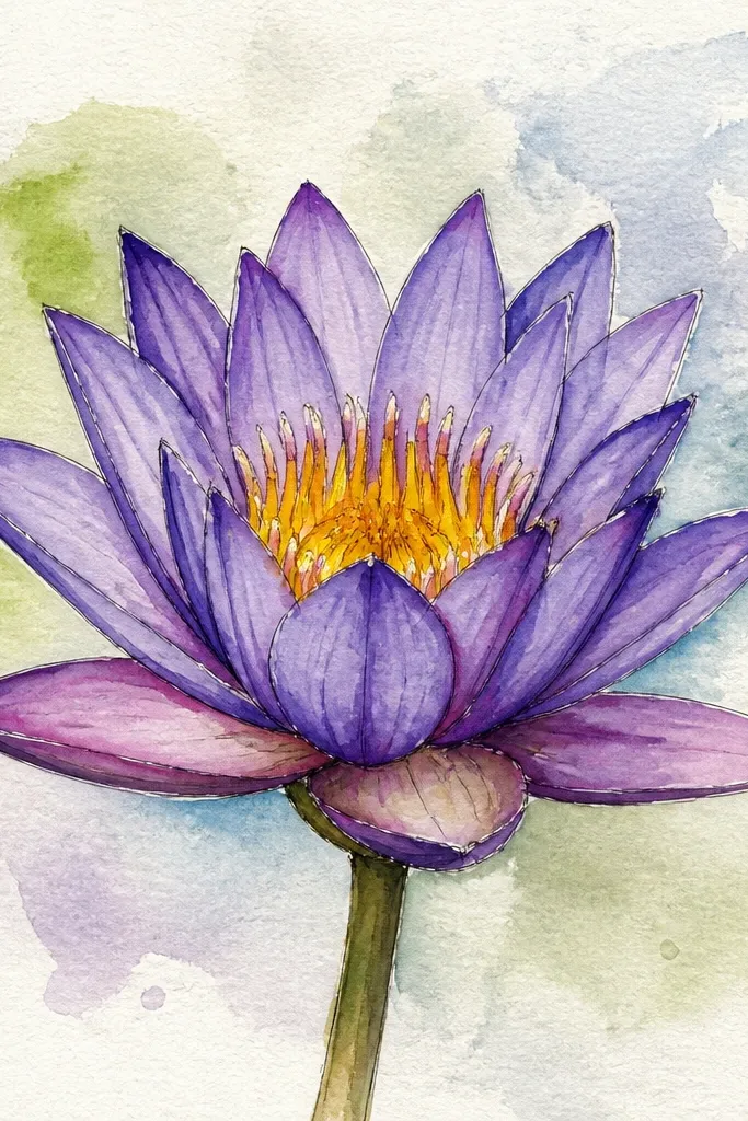
This style looks like a printed art card because the background stays soft and the lotus stays sharp. I paint a loose purple-blue wash behind the lotus, then mask the lotus petals so they don't get stained. The petals are then painted with lavender and violet folds, and the pod is plum with seed dots. It's perfect for making stand-alone wall art or gift tags because the contrast is clear. If you like color but hate muddy backgrounds, masking is the difference between "pretty" and "messy."
Wet the background paper and paint a loose purple-blue wash around where the lotus will sit, leaving the center area pale. Mask the lotus petal areas with masking fluid or carefully cut frisket shapes, then let the background dry fully. Paint the outer petals in lavender and the fold lines in violet, then remove masking to reveal clean edges. Add middle petals in deeper violet, and paint the pod plum. Finish with seed dots and a few white gel pen highlights on the petal tops.
Good to knowUse a hairdryer on low for the background so it doesn't bleed into your masked lotus edges.
Common mistakeSkipping masking and painting the lotus directly on a wet background turns the petals into stained shapes.