
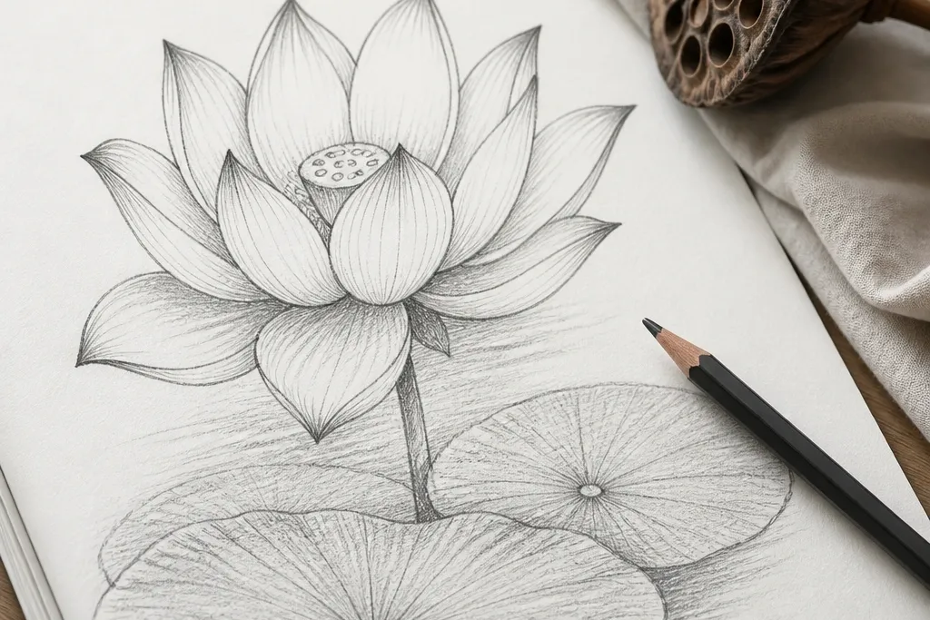
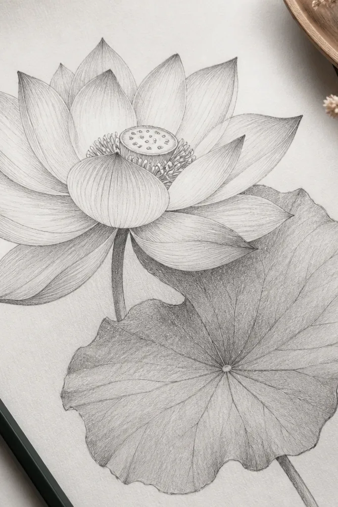
1. Outer Rim Lotus with 3 Value Petals
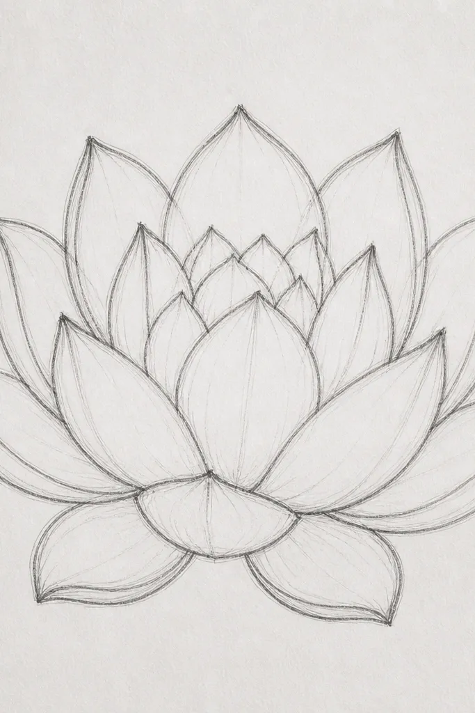
This one is the easiest lotus to make look polished because it limits your palette to three graphite values. Start with light HB lines for the petal shape, then shade each petal in one sweep: midtone on the inner half and a darker rim shadow on the outer edge. The center seed pod stays lighter so the bloom has a natural focal point. I like it for beginners because it teaches restraint — the lotus reads airy instead of heavy. It flatters small frames and sketchbook pages because the contrast is clean and doesn’t rely on heavy smudging.
Good to knowDo one petal at a time. If you try to shade them all at once, the graphite piles up and your edges blur.
Step 1, sketch the outer ring first: draw 8 wide petals like rounded teardrops around a small circle, leaving a gap for the seed pod. Step 2, shade the inner half of each petal with 2B, then add the rim shadow with 4B along the outer edge where petals overlap. Step 3, deepen the pockets between petals with a soft 6B touch using the side of the pencil, not the tip. Finally, lift highlights along the petal ribs with a kneaded eraser so the petals look thin and layered.
Common mistakeAvoid blending the whole flower — it makes the petals look like one gray blob.
2. Lotus Side View with Curled Petal Edges
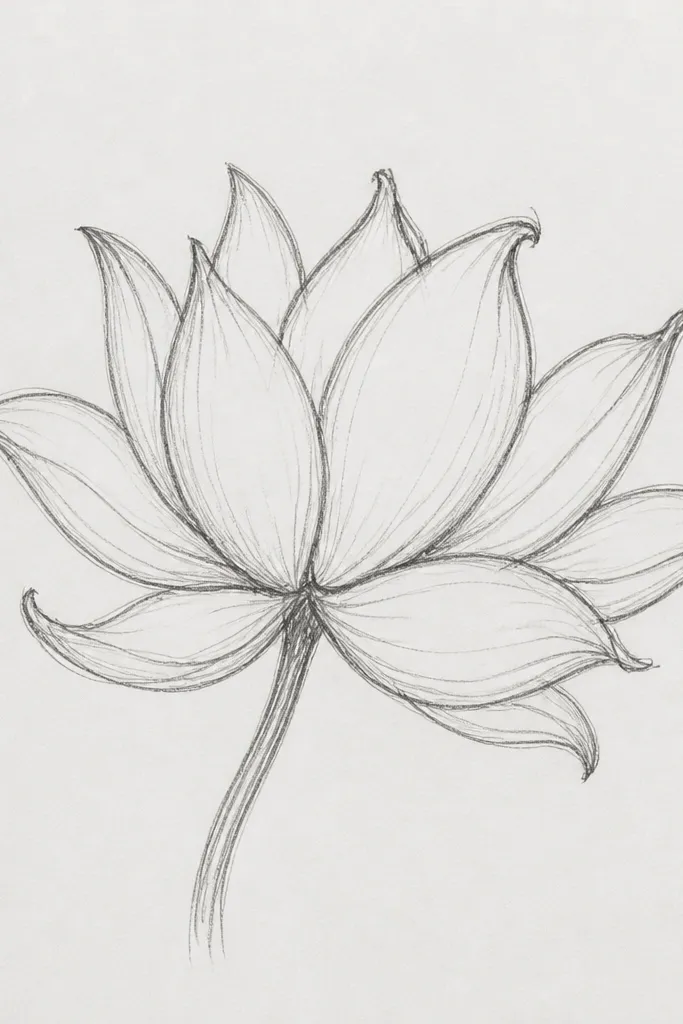
Side-view lotuses look more realistic because you’re forced to show thickness. The curled edges catch light differently, so the drawing gains form even with simple shading. I use this when I want the lotus to feel delicate and a little dramatic, like it’s leaning toward the light. The petals on the far side look darker at the base because they fold under. This style works well for medium-sized paper because you need some breathing room for the tilt and the highlight lines.
Step 1, draw an oval seed pod first, slightly tilted, then place 5 main petals around it like overlapping cups. Step 2, keep the near-side petals brighter: use HB for the outline and 2B only in the lower half, following the curl direction. Step 3, darken the under-folds on the far side with 4B, then add a few sharper crease lines using the pencil tip. Finally, use a kneaded eraser to pull a thin highlight along the top curl edges so they look like paper-thin folds.
Flip your paper upside down for 20 seconds while you shade — it helps you see whether the tilt looks convincing.
Don’t make both sides the same value. A side view needs one side brighter or it turns flat.
3. Seed Pod Center Study with Fold Shadows
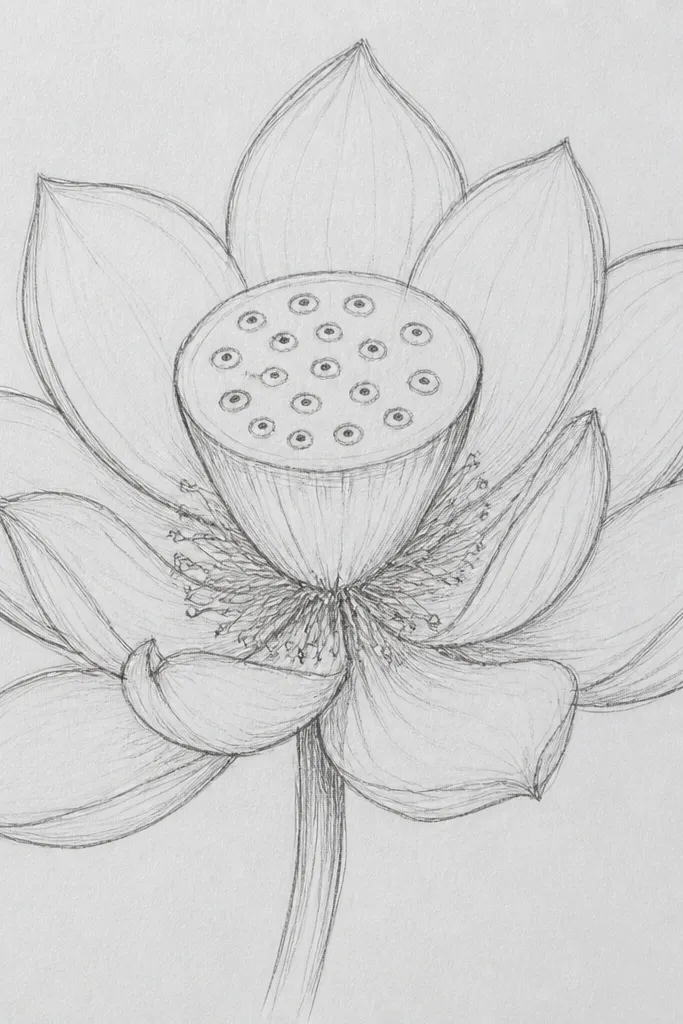
If your lotuses always look like they’re missing something, it’s usually the center. This study focuses on the seed pod so you learn how to shade grooves without over-darkening. I like this approach because the pod creates instant depth even when petals are simple. The key is that each cell has a shadow on one side, like tiny scoops. It flatters anyone who struggles with drawing tiny details because you can keep the cell shapes consistent and just vary pressure for depth. It also looks great as a standalone circle sketch or a center medallion for cards.
Good to knowPress lighter than you think on the cell outlines, then deepen only the groove shadows. Outlines that are too dark make the pod look etched.
Step 1, sketch the seed pod as a thick oval with a slightly wider top and tapering bottom. Step 2, draw 10-14 small oval cells across the face, keeping them evenly spaced. Step 3, shade the grooves between cells with 6B using the pencil side, then refine the cell edges with a sharp HB line. Finally, add a soft 2B gradient on the pod surface and lift small white dots with the kneaded eraser for highlight ridges.
Common mistakeAvoid drawing every cell with heavy lines. The pod should feel shaded, not engraved.
4. Gouache-Look Lotus Using Soft Graphite Gradients
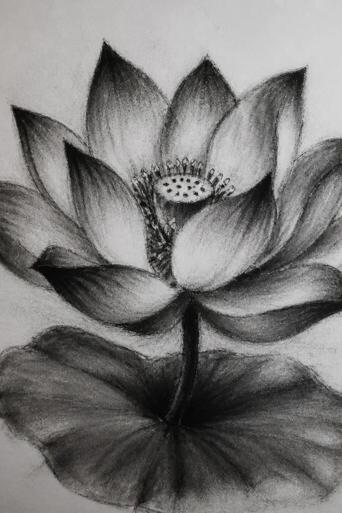
This style mimics a painted look, which is why it’s so good for decor pieces. The petals don’t have harsh graphite lines; they fade like watercolor washes. I use it when the drawing needs to match a soft interior palette or when I want the lotus to feel calm. The center pod still gets structure, but the shadows are blended into a smooth ring so it looks cohesive. It flatters larger walls because the bloom reads from far away without crisp linework. You get a more “print-like” feel without actually using a printer.
Good to knowBlend with a light touch. If your stump is too loaded with graphite, it turns the whole petal gray.
Step 1, block in petal shapes with HB using only outlines — no shading yet. Step 2, shade each petal with 2B in a broad stroke, then blend lightly with a blending stump or tissue in the direction of petal ribs. Step 3, add darker fold edges with 4B, then blend again just at the fold line so the shadow stays soft. Finally, keep the top highlights clean by lifting with the kneaded eraser after blending, not before.
Common mistakeAvoid overworking the same area for 10 minutes. You’ll burnish the paper and the shading will look shiny.
5. High-Contrast Lotus with Hard Outline and Deep Shadows
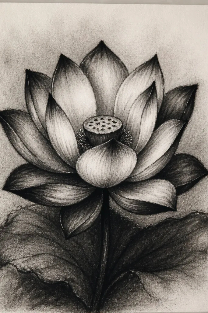
This lotus looks like it belongs on a poster because it uses graphic contrast. The hard outline gives clarity, and the deep shadows create a strong sculpted look. I pick it for gift cards and framed sketches where you want the flower to pop even under warm lighting. The petals still have folds, but they’re emphasized with darker pockets instead of gentle gradients. It flatters people who like dramatic art and don’t mind a more “illustration” vibe. The bloom reads clearly even if someone stands a step away.
Good to knowSharpen your pencil before the shadow pockets. A dull tip makes the contrast look smoky instead of intentional.
Step 1, draw the outer petals with a firm HB outline, then go over the main contour lines with 2B so the border stays crisp. Step 2, shade under each petal base with 6B, keeping the shadow shape narrow so it doesn’t smear across the petal. Step 3, add thin crease lines with a sharpened pencil tip using 4B. Finally, erase bright white highlight streaks along the petal ribs with a kneaded eraser and reinforce only the deepest shadow pockets.
Common mistakeAvoid outlining every tiny edge. Too many dark lines makes the drawing look cluttered.
6. Lotus Bloom in a Circle Frame Composition
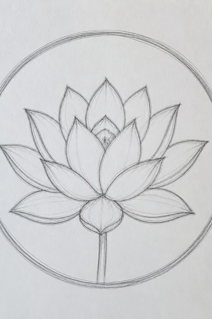
A circle frame forces symmetry, which helps your petals look intentional instead of drifting. This composition is great for wall decor because it reads like a stamp or mandala without needing ornate extras. I use it when I want a clean aesthetic for prints and gift tags. The circle border also gives you a boundary, which helps keep petal spacing consistent. It flatters smaller spaces because the whole piece feels balanced. Even if your shading varies slightly, the circle keeps the design tidy.
Step 1, lightly sketch a circle using a template, then place the seed pod at the center. Step 2, draw 6 to 8 main petals radiating outward, making each petal’s base touch the inner area of the circle. Step 3, shade petal folds with 2B, then darken the overlaps with 4B only where petals overlap each other near the rim. Finally, add three or four small highlight streaks on the top edges of the petals and keep the circle border lighter than the flower.
Use the circle as a spacing guide. If a petal doesn’t reach the intended radius, redraw it before you shade.
Avoid making the circle border darker than the petals. Then the border fights the flower.
7. Minimal Lotus with One-Pass Shading
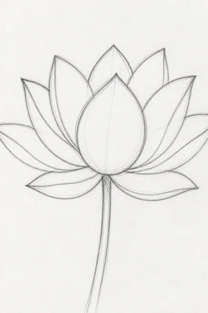
Minimal lotuses look modern because they rely on shape, not heavy graphite. This one teaches you how to imply depth with fewer marks. I use it when I want a fast piece that still looks intentional, like a quick card topper. The center pod gets just enough detail to read as a seed pod, while the petals stay airy. This style flatters small paper sizes because you don’t need to fill the page. It also looks great if you plan to add color later with colored pencil.
Step 1, sketch the outer petals with HB, keeping the lines light and confident. Step 2, shade each petal once with 2B following the petal rib curve — stop as soon as you see a midtone band. Step 3, add the seed pod cells with HB outlines, then fill only the bottom groove shadows with 2B. Finally, leave the top half of each petal unshaded and let the paper be the highlight.
If you can’t stop yourself from adding more graphite, switch pencils: use HB to refine edges instead of 4B or 6B.
Avoid heavy blending. Minimal drawings look best when the marks stay clean.
8. Lotus Flower with Petal Rib Texture
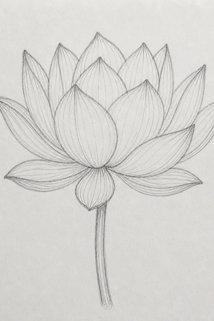
Petal rib texture makes a lotus feel real because lotus petals have subtle structure. This style is great when you want the drawing to look detailed without turning into a full realism project. I like it for close-up art because the ribs catch the light and guide your eye across the bloom. The center pod stays simple but shaded enough to anchor the petals. It flatters anyone who likes texture work and enjoys slow, careful drawing. The result looks crisp in frames and stands out against plain backgrounds.
Good to knowDraw ribs with the side of the pencil for smoother curves, then sharpen for the rib ends near the tips.
Step 1, outline the bloom with HB and lightly mark one rib line per petal using a faint curved stroke. Step 2, shade along each rib with 2B, keeping the shading narrow so the ribs remain readable. Step 3, add darker fold shadows with 4B at the petal base pocket and blend just at the base. Finally, use a kneaded eraser to lift tiny highlights along the rib tops so the texture looks raised.
Common mistakeAvoid drawing ribs too dark. Dark ribs look like veins in leaf anatomy, not lotus petals.
9. Backlit Lotus with Strong White Highlights
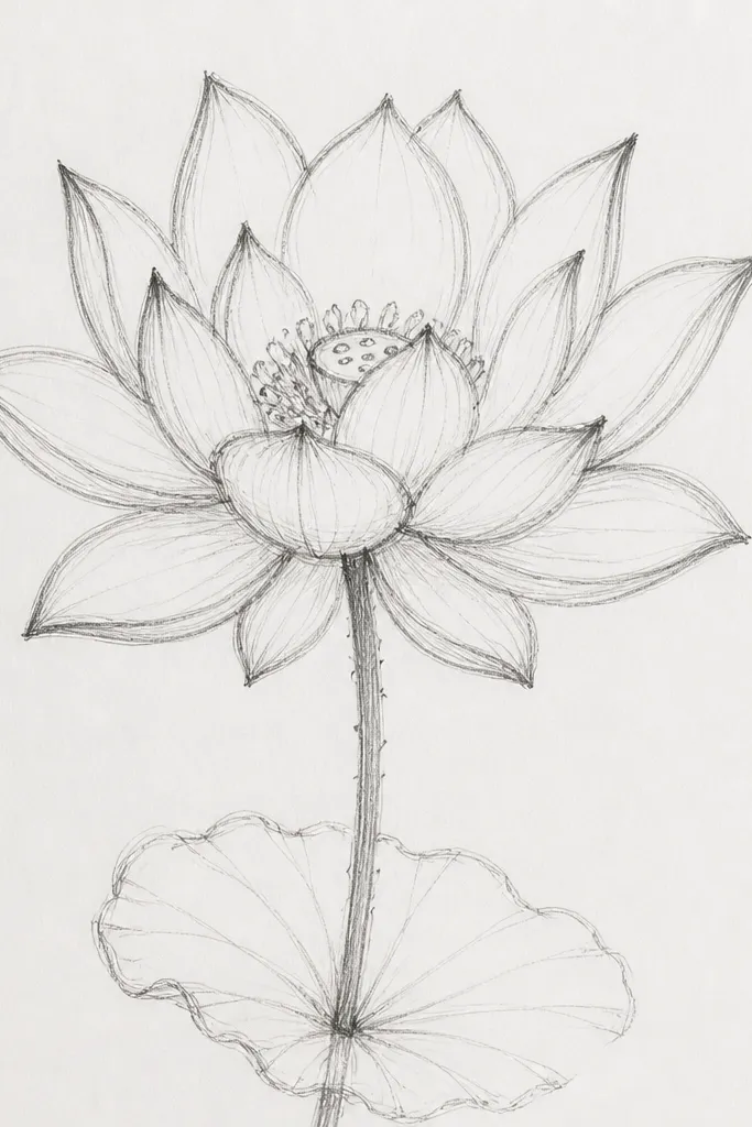
Backlit lotus drawings look special because the eye reads the highlights first. If you keep most of the petal light, then only shade the folds, the whole bloom feels like it’s catching sun. I use this when I want a calming, airy piece that still has depth. The center pod is slightly darker in the grooves, but the top ridge stays bright. This style flatters light-toned rooms and works beautifully on off-white paper. It’s also a great way to practice highlight control with an eraser.
Good to knowLift highlights after shading. If you erase first, you’ll lose your shading map and overwork the folds.
Step 1, sketch petals with HB and leave the inner petal faces mostly untouched. Step 2, shade only the fold areas and petal base pockets with 2B, then deepen the overlap shadows with 4B. Step 3, add the seed pod grooves with 6B but keep the top ridge light. Finally, pull long white highlight streaks along each petal rib with a kneaded eraser, using gentle repeated lifts rather than one harsh rub.
Common mistakeAvoid filling the whole petal with gray. Backlit lotuses need light space to feel like light.
10. Lotus on Water Surface Reflection
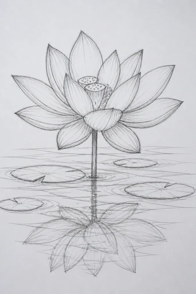
Adding water reflection changes everything because it forces you to control softness. The top flower should look sharper, while the reflection fades and breaks up. I like this for decor because it turns a single flower into a small scene without needing a full landscape background. The lotus petals stay detailed, but the reflection uses lighter values and gentle smudges. This flatters people who want a slightly more complex drawing but still manageable. It also looks great in portrait frames where you can include the water line.
Good to knowUse a separate tissue for blending the reflection so you don’t smear graphite back into the crisp petals.
Step 1, draw the lotus bloom in the upper half with your usual HB structure and 2B fold shading. Step 2, draw a water line under the bloom, then mirror the petals downward but keep them lighter by using only HB and 2B. Step 3, blur the reflection using a clean blending stump or tissue, but only in the lower half, and stop while it still looks airy. Finally, add a few darker reflection streaks under the darkest petal folds so the reflection doesn’t look flat.
Common mistakeAvoid mirroring the seed pod with full detail. Reflections should soften quickly.
11. Lotus Mandala with 12 Petals and Small Buds
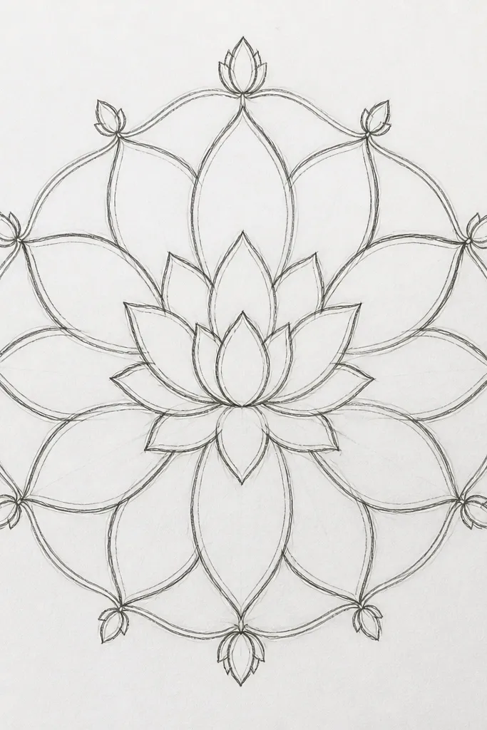
This one looks decorative because it adds buds and uses strict spacing. The 12-petal structure gives a repeating rhythm that feels intentional, not random. I like it for wall art because it reads like a complete motif even if the background is blank. The buds help fill the negative space so the drawing doesn’t feel empty around the bloom. It flatters people who want a more ornamental look without switching to ink or markers. The result is clean enough to scan and print for cards.
Good to knowCount your petals out loud while you draw. It sounds silly, but it keeps your spacing even.
Step 1, lightly mark 12 points around a circle, then sketch petals connecting each point to the center pod. Step 2, add small bud shapes between petals near the rim, using simple teardrop ovals. Step 3, shade petals in an alternating pattern: use 2B midtone on one set and 4B deeper folds on the other set, so the rhythm shows. Finally, keep the buds lighter than the main petals and add tiny highlight lifts on the bud tips with a kneaded eraser.
Common mistakeAvoid putting all the buds at the same size. Vary them by just a little so it feels hand-drawn.
12. Lotus with Feathered Shadow Edges (No Smudge)
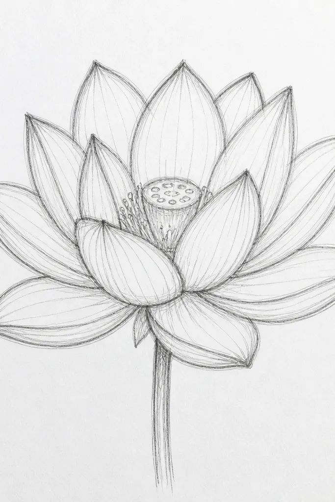
This style looks clean because you don’t rely on smudging. Feathered shadow edges keep the drawing airy while still showing depth. I use it when I want a “fresh pencil” look that won’t blur over time. The trick is building shadows with many light passes instead of one heavy layer. The lotus looks especially good on textured paper because the graphite catches the tooth and fades naturally. It flatters anyone who hates blending tools or wants a drawing that stays crisp.
Good to knowIf you see a hard edge forming, switch to lighter pressure instead of blending. Feathering is pressure control.
Step 1, sketch petals with HB and keep outlines light. Step 2, shade fold shadows with 2B using short back-and-forth strokes that stay within the fold pocket. Step 3, add deeper shadows with 4B in the same pocket area, but keep the edges feathered by lifting pressure near the boundary. Finally, add a few dark overlap pockets with 6B and leave the rest of the petal faces mostly clean.
Common mistakeAvoid using a blending stump for the shadows. You’ll lose the pencil-fresh edges.
13. Lotus with Colored Pencil Accent Over Pencil Base
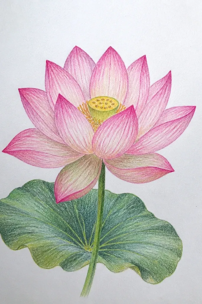
Graphite sets the form, and color adds mood. This version uses colored pencil accents only where the petal would naturally warm up — around the inner folds and near the seed pod. I like it for gifts because it looks more “finished” than pencil alone without becoming fully time-consuming. The outer petals stay mostly graphite so the color doesn’t flatten the bloom. This flatters people who want an aesthetic lotus drawing that matches pastel decor. It also makes the center pod feel alive, because the warm tones pull attention inward.
Step 1, draw the lotus fully in pencil first using HB structure, 2B fold shading, and 4B overlap shadows. Step 2, lightly color the inner petal folds with a pale pink colored pencil, then add a touch of soft yellow around the seed pod cells. Step 3, keep the brightest petal ribs uncolored so the highlight stays crisp. Finally, reinforce only the darkest graphite pockets with 6B so the color doesn’t take over the contrast.
Use light pressure for color, then let graphite shadows do the heavy lifting. Heavy color can hide your petal folds.
Avoid coloring the entire petal. It makes the lotus look flat and uniform.
14. Lotus with Dark Background for Glow Effect
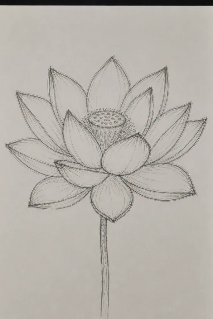
A dark background makes pencil lotuses feel luminous without needing ink. You get instant contrast, and the petal highlights look like they’re glowing. I use this for statement pieces because the bloom pops hard even when the drawing is small. The center pod still needs careful shading, but the dark field makes the grooves read clearly. This flatters people who want dramatic decor that still stays monochrome. If you’re making a wedding-style card, this one looks very intentional.
Good to knowUse the eraser edge like a tool — short controlled lifts look cleaner than rubbing in circles.
Step 1, start with medium-dark gray paper or tone your page with a light charcoal wash, then let it dry. Step 2, sketch the lotus petals with HB, keeping outlines lighter than the background. Step 3, shade folds with 2B and 4B, then add overlap pockets with 6B. Finally, use a kneaded eraser and a hard rubber eraser edge to lift bright petal rib highlights and a few seed pod ridge spots.
Common mistakeAvoid heavy graphite coverage over the whole background. It dulls the glow effect.
15. Lotus Bouquet Arrangement with 3 Blooms
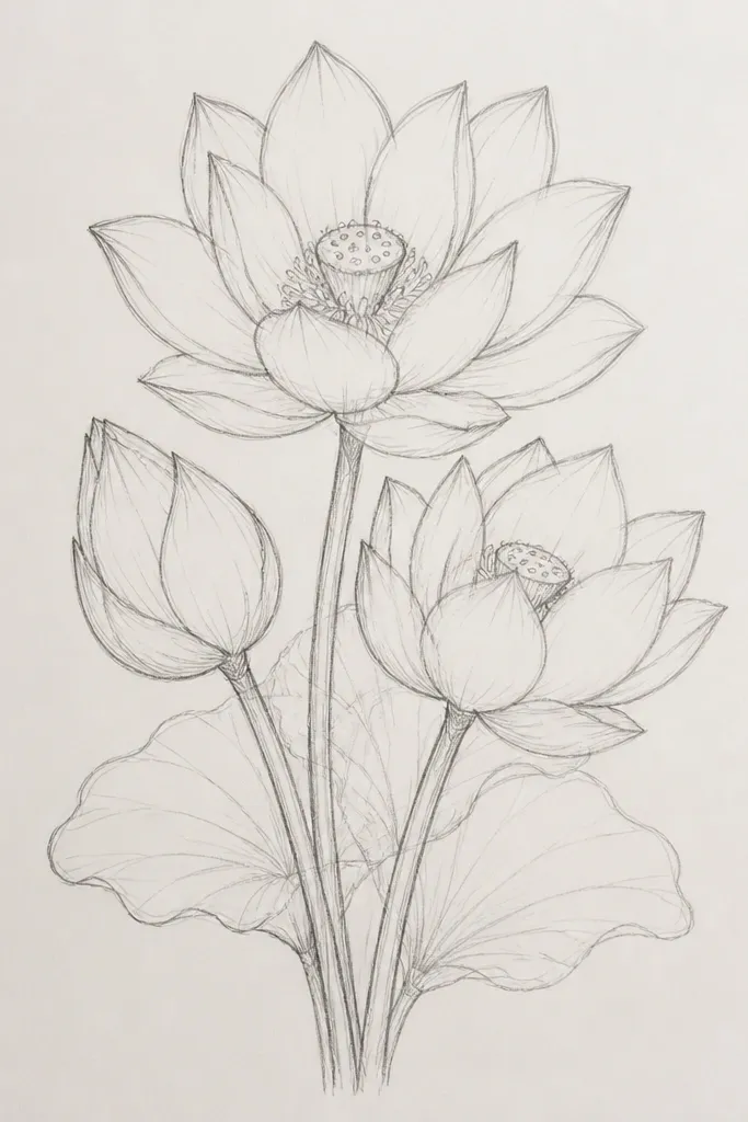
Multiple blooms make your page look styled instead of empty. When you vary size and angle, you create depth even if each bloom uses the same shading method. I like this arrangement because it’s forgiving — if one bloom isn’t perfect, the group still looks cohesive. The front bloom gets the darkest shadows and the cleanest highlights, while the back bloom stays lighter so it recedes. This flatters anyone who wants a decor-ready sketch without adding a full scene. It also works great for gift wrap labels because the composition is readable.
Good to knowKeep the front bloom’s highlights bigger. Bigger highlights read closer, even in pencil.
Step 1, lightly block the stems first: draw three curved stems that meet at different heights, then place the bloom centers along the stems. Step 2, give the front bloom 8-10 detailed petals, the middle bloom 7-8 petals with slightly lighter shading, and the back bloom 6-7 petals. Step 3, shade folds with 2B across all blooms, but only use 6B for the front bloom overlap pockets. Finally, lift highlights on the front bloom petal ribs, keep the middle bloom highlights smaller, and leave the back bloom mostly paper-light.
Common mistakeAvoid giving every bloom the same contrast level. That flattens the bouquet.



