
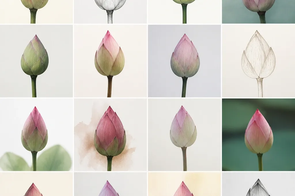
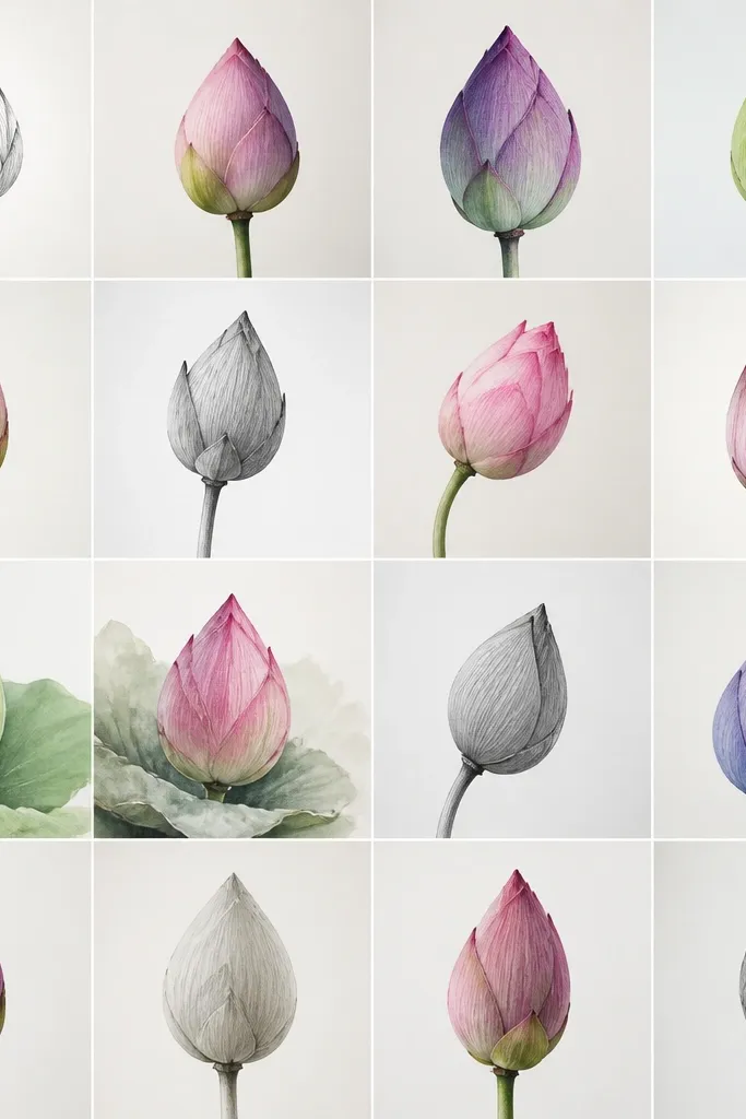
1. Tight Bud with 6 Folded Petals
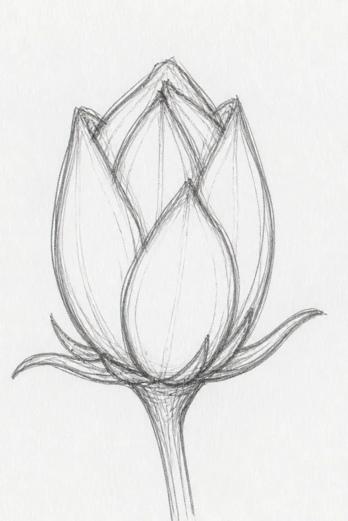
This is my go-to closed lotus when I want it to look “new” and calm. The petals are only six, so each one has space to show its fold without crowding. I use a light blush pink for the outer curve and a deeper plum for the inner shadow, which makes the bud look layered even if you keep the linework simple. This style flatters smaller pages and card fronts because the whole flower stays compact. It also works well on fair to medium skin tones in painted versions because the pink reads soft rather than harsh.
Start by drawing a faint vertical center line and a small oval for the bud base. Sketch six petals as inward C-shapes around the oval, leaving a little gap at the top where the petals meet. Shade the inner side of each petal with plum, concentrating where the petal overlaps the one behind it. Finally, add a tiny highlight stroke on the center folds using a lighter pink or a clean unpainted patch. Keep the outer petal tips short so the bud stays tight.
Good to knowIf your center looks flat, darken only the bottom half of the center oval and leave the top half lighter.
Common mistakeDon’t draw the petals as full circles — closed lotus petals should curl inward, not ring outward.
2. Medium Bud with 8 Petals and a Soft Center Gap
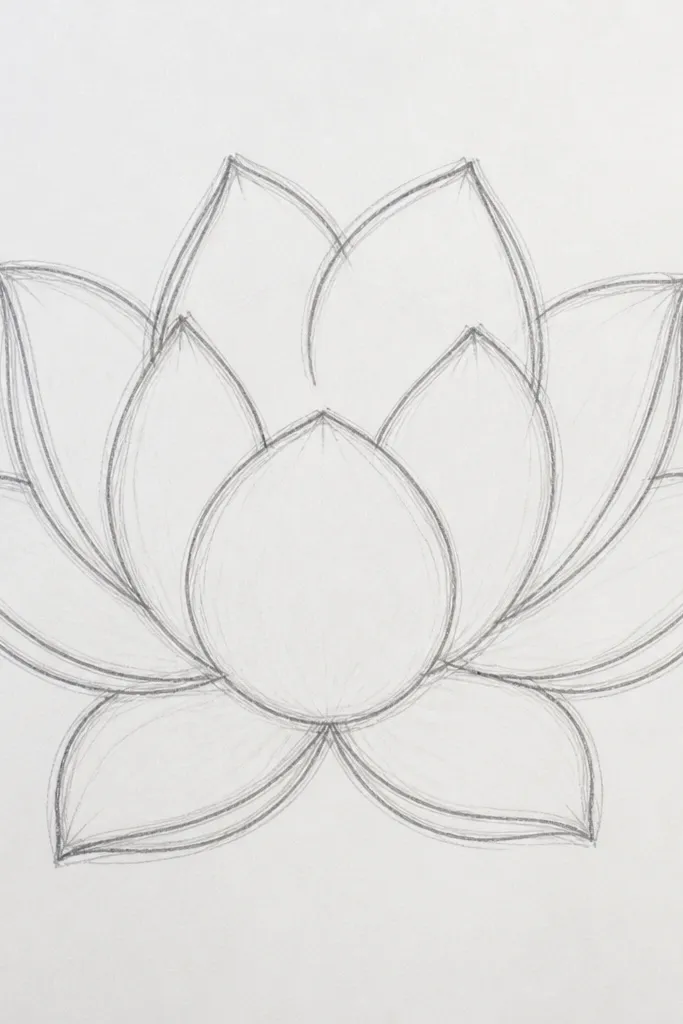
This version looks more dimensional because it has a small center gap. Eight petals give you a fuller silhouette without turning into a busy flower. I like warm mauve shading in the center gap because it reads like shadow inside the bud. This style looks great for wall art because the bud has a clear shape from a distance. If you’re coloring, warm pinks and mauves make it feel friendly rather than icy, especially on off-white paper.
Draw a medium oval for the bud and mark a ring around it where the petal tips will land. Add eight petals as curved blades — each one starts near the outer ring and curves inward toward the center, stopping before it fully meets the gap. Leave a small opening at the top by not closing all the inner ends. Color the outer petal edges light pink, then glaze the inner folds in mauve so the gap looks like depth. Finish by adding one thin darker line on the inner side of two or three petals to anchor the layering.
Use a fine brush or a gel pen to draw the inner fold lines — they make the gap look intentional.
Skip filling the center gap with the same color as the petals; it should look like shadow, darker than the petal base.
3. Closed Lotus Mandala Ring (12 Petals)
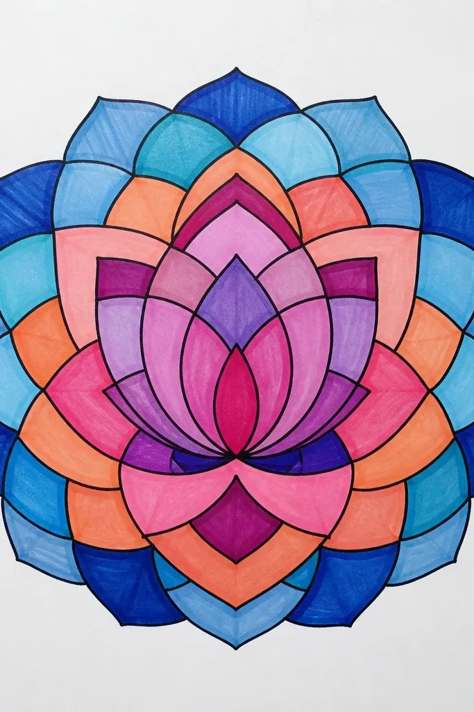
This one is for when you want the lotus to look decorative instead of botanical. Twelve petals create a neat ring, and the closed center makes it feel like a meditative emblem. I use muted rose and gray-lilac tones so the bud looks calm and slightly vintage. This style flatters printed stickers and bookmarks because it reads crisp and symmetrical at small sizes. It also looks good in monochrome ink if you skip color — the petal rhythm still carries the design.
Start with a light circle and mark 12 equal points around it with a pencil dot guide. Draw each petal as a pointed teardrop that curls inward at the top, keeping all tips roughly the same distance from the circle. Add a shaded inner center by drawing a small circle and filling it with a light plum wash. Then add a second inner layer with five or six tiny curved petal hints that sit behind the ring. Finish by placing small dots or short ticks around the outer circle for a mandala feel.
Good to knowIf you struggle with symmetry, draw one petal carefully, then rotate your paper mentally and copy the same curvature around the circle.
Common mistakeDon’t make the petals too thick at the base; thick bases turn it into a rosette instead of a closed lotus.
4. Single-Line Lotus Bud (No Shading)
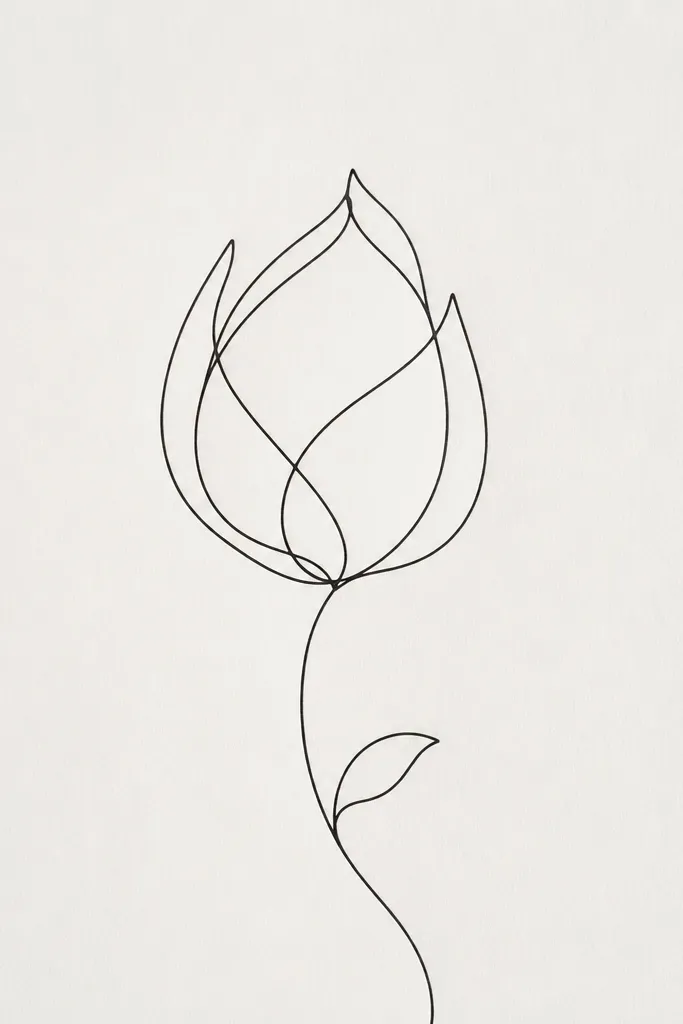
I love this style for quick sketchbooks and minimalist decor. The closed lotus reads by overlap alone, so you don’t need shading or color to make it look real. The spiral overlap gives it a gentle, intentional feel. This is also beginner-friendly because you’re not trying to blend gradients. It looks best in black ink or dark gray, and it works on any paper color because the lines do the work.
Use a fineliner and start at the top center of the bud, drawing the first petal as an inward curve. Continue into the next petal so it overlaps the previous one, then repeat until you have five or six petals. Keep the line thickness consistent, and leave the center white to show the bud opening. Add a short base curve under the petals, then extend a thin stem line downward. Finish with one small leaf behind the bud — draw it as a simple teardrop with one center vein line.
Good to knowIf your line looks shaky, do two passes: one light guide pass, then a firmer ink pass over the same path.
Common mistakeDon’t add cross-hatching in the center — it kills the airy minimalist look.
5. Closed Lotus with 3D Petal Edges (Marker Shading)
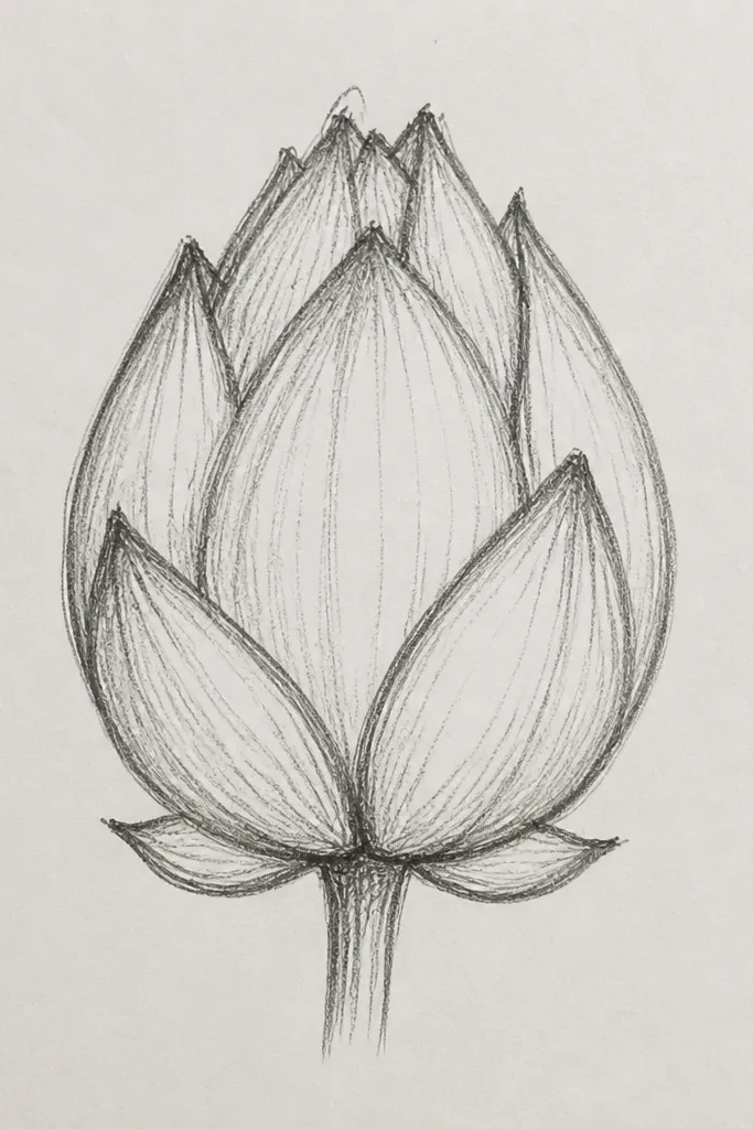
This is the style I use when I want the drawing to look like it has real thickness. The trick is shading the inner fold edge with a marker that has a soft tip and keeping the outer edges lighter. It makes the petals look like they’re wrapped around a core. This style looks good for greeting cards because it pops without needing watercolor. It also flatters warmer skin undertones in painted versions because the pinks stay friendly, not gray.
Start with a pencil sketch of six petals as inward curves, then trace over the outer edges first with a light pink marker. Shade each petal’s inner fold with plum, staying close to the overlap line so the edge looks crisp. Add a small dark oval in the center and leave a narrow uncolored highlight strip along one side. For extra depth, draw one thin darker line where each petal overlaps the one behind it. Finish by adding a tiny shadow under the bud on the paper — a light gray line or soft dot.
Use the marker chisel edge for wider petal bases and the tip for the fold lines so you get two widths.
Don’t shade the entire petal — only the inner fold makes it look 3D.
6. Closed Lotus Bud with Gold Outline (Ink + Wash)
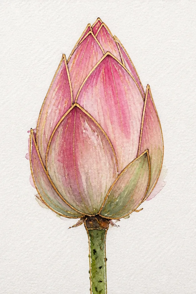
Metallic outlines make closed lotus drawings feel special without adding extra complexity. I outline the petal edges in gold so the overlap lines look intentional. The wash colors stay soft: pale peach on outer petals and warm pink in the folds. This style looks great for wedding stationery and gift tags because gold reads festive even when the drawing stays simple. It’s also forgiving on uneven paper because the gold hides minor sketch lines.
Sketch the bud in pencil with six to eight petals as inward C-curves, then ink the outer edges in black or dark brown first. Add watercolor washes: pale peach on the outer petals and warm pink on the inner folds, leaving the center slightly darker. Let it dry, then trace the petal edges again with metallic gold, focusing on the outer rim and the top fold edges. Add a single gold highlight curve across the center fold for shine. Finish by painting a thin stem line in a muted green wash behind the bud.
Gold looks best when you only use it on the edges and one highlight, not as a full fill.
Don’t flood the watercolor into the gold outline; it dulls and bleeds.
7. Closed Lotus Bud Inside a Teacup Frame
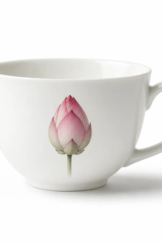
This is a decor trick I use when the lotus needs context. The teacup frame makes the bud look like part of a still-life, not a floating flower. I draw the cup rim in gray and keep it lighter than the lotus, so the lotus stays the focal point. The closed petals inside the cup create a cozy, calm mood that works for kitchen prints. It also looks good with neutral palettes: blush petals and warm taupe shadows.
Draw the teacup first: a rounded cup body with a slightly thicker rim and a small handle on one side. Place the closed lotus bud centered inside the cup, with six petals forming a tight bud. Keep the cup lines thin and light, then shade the lotus petals with blush and plum folds. Add a soft shadow under the lotus inside the cup using a light gray pencil or diluted paint. Finish by adding one tiny leaf shape near the cup rim, mostly hidden behind the bud.
Good to knowMake the teacup rim 10-15% darker than the paper so it looks grounded without competing.
Common mistakeDon’t outline the cup as thick as the lotus; that forces the viewer to read the frame first.
8. Closed Lotus Bud with One Stretched Petal Vein
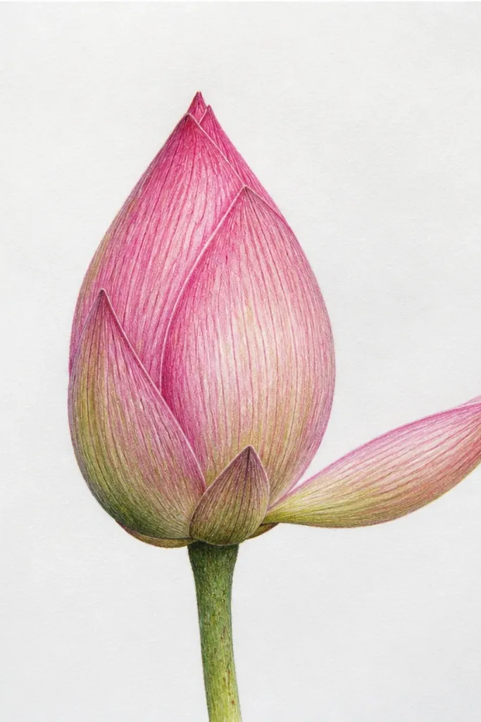
This style adds realism without turning into a detailed botanical drawing. A single vein line per petal makes the petals look like they’re wrapped and slightly textured. I keep the vein line thin and darker than the base color but lighter than the inner fold shadow. It looks especially good on watercolor paper because the vein line catches the paint texture. If you like clean, graphic art, this one gives you that structure while still feeling soft.
Sketch six petals as inward curves around a small center oval. Draw one vein line on each petal as a gentle curve that follows the petal’s spine, starting near the base and ending near the tip. Paint or color the outer petal area pale pink, then shade the inner fold in plum. Add a dark plum center oval and keep it slightly smaller than your petals' base. Leave tiny unpainted spots along the vein lines if you’re using watercolor to mimic highlights.
Use a gel pen for the vein lines if your paint feathers too much on paper.
Don’t draw multiple veins; it makes the petals look like a leaf instead of a lotus bud.
9. Closed Lotus Bud with 5 Outer Petals and 2 Hidden Ones
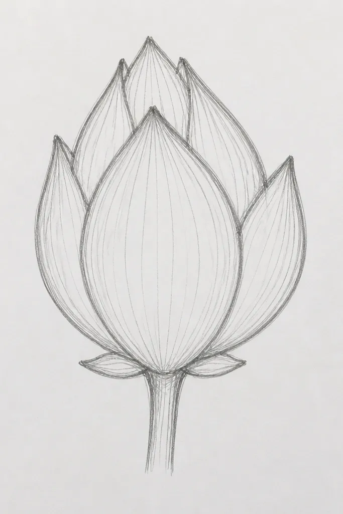
This is the layering trick that makes closed lotus drawings look expensive even when they’re simple. Five outer petals are easy to space, and the two hidden ones give depth without clutter. I shade the hidden petals slightly darker than the outer petals so they read as behind layers. This design looks great for minimalist wall art because it has a strong silhouette. It also works for portrait-style compositions where the bud is centered and you want a vertical feel.
Start by drawing five large petals around a center oval, keeping their outer tips evenly spaced. Then add two hidden petals by drawing small curved shapes only at the top between two outer petals, so they peek out. Shade the inner fold of each outer petal with plum, and shade the hidden petals a touch darker. Fill the center oval with a darker plum, but leave a small light crescent near the top to show depth. Add one thin outer rim line in a slightly lighter pink to make the bud edge clean.
Good to knowIf the hidden petals disappear, increase their contrast slightly — darker edge shading fixes it fast.
Common mistakeDon’t add hidden petals at the bottom; they should peek from the top where the bud opens.
10. Closed Lotus Bud with Dotted Texture Background
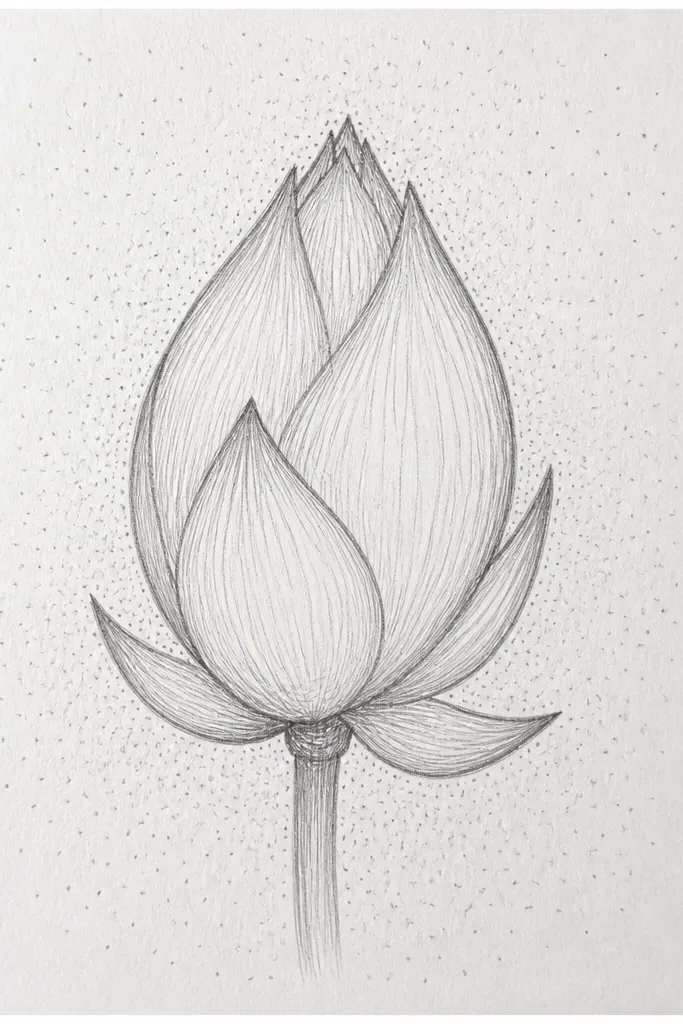
Texture backgrounds make closed lotus drawings feel finished, and dotted texture is the easiest kind to control. I keep the dots pale gray and lower contrast than the petals, so your bud still reads as the main subject. The closed bud shape works well with dots because the symmetry makes the pattern look intentional. This style is perfect for scrapbooking, because it fills space without adding extra elements. It also looks good in both color and graphite since dots carry the composition either way.
Draw your closed lotus bud first in pencil with six petals as inward curves and a dark center oval. Ink the petals, then color the outer petals pale pink and the inner fold plum. Next, add background dots starting around the bud and moving outward, making the dots smaller and lighter as they get farther away. Keep dot density higher near the bud and lower at the edges. If you’re using paint, stamp the dots with the tip of a round brush using diluted gray so it doesn’t smear.
Use a toothpick or a dotting tool for consistent dot size; your background will look cleaner instantly.
Don’t make the dots as dark as the plum folds; then the background competes.
11. Closed Lotus Bud with Side Angle View (3/4 Perspective)
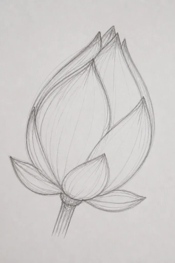
Side angle views are the fastest way to make your lotus look like it has space. You still keep the closed bud concept, but the center becomes a curved opening instead of a symmetrical oval. I like this style for practice because it teaches you how overlap changes with perspective. It also looks great on small decor pieces like coasters because the bud fills the surface without needing background elements. Warm peach and plum shades help the petals look like soft fabric folds.
Sketch an almond-shaped guide for the bud center, tilted slightly to one side. Draw five petals: three on the front that are bigger and two on the back that are smaller and tucked behind. Keep the inner folds darker, but make the back petals' shading lighter so they recede. Shade the center opening with a plum curve and leave a thin highlight line on the outer edge of the opening. Add a single stem line that angles away, plus one tiny leaf tucked behind the bud.
Good to knowRotate your paper slightly while drawing — it helps your petal curves stay smooth at an angle.
Common mistakeDon’t keep the center perfectly centered in the page; the whole bud should lean with the perspective.
12. Closed Lotus Bud with Thick Outer Rim and Thin Inner Lines
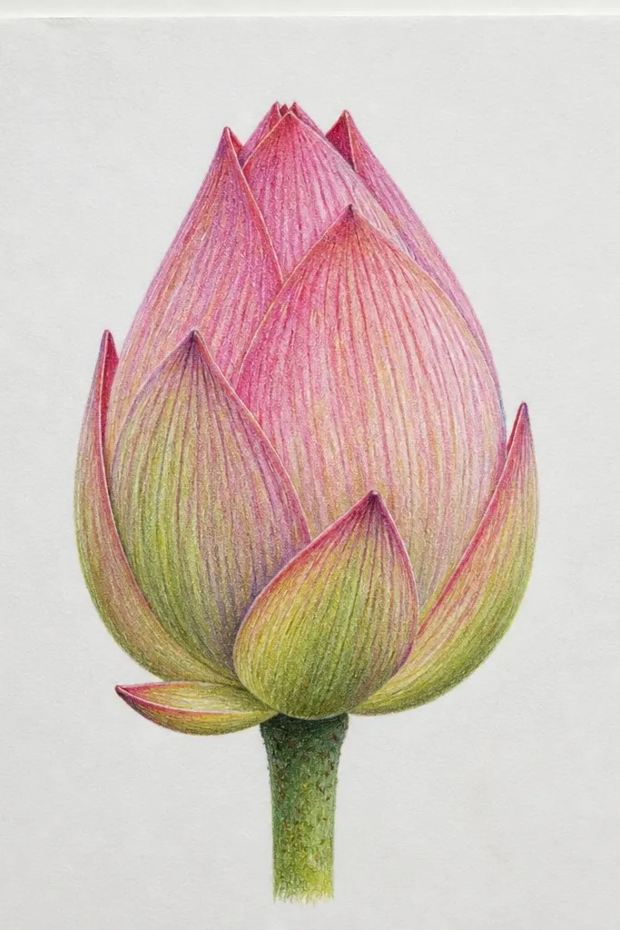
Line weight is the cheat code for making closed lotus drawings look crisp. Thick outer rim lines tell the viewer where the bud boundary is, and thin inner lines show layering. I use two pens: a bold fineliner for the rim and a lighter fineliner for the folds. This style looks great for coloring books pages because it stays readable even after you add color. It also flatters paper that has slight texture, since the thick lines hold their shape.
Draw the bud in pencil with six petals as inward C-curves and a center oval. Ink the outer petal edges and the bottom rim with a thick pen, staying consistent around the silhouette. Use a thin pen to draw the inner fold lines and overlap edges. Add color: pale pink for outer petal bodies, then plum for inner folds and the center oval. Finish with a tiny highlight on two petal tips using a white gel pen if your paper allows it.
Good to knowDo the thick rim first, then let it guide where your thin lines should start and stop.
Common mistakeDon’t use the thick pen for every line; it makes the petals merge into one shape.
13. Closed Lotus Bud with Watercolor Bloom Edges
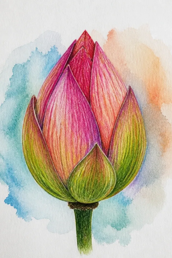
Watercolor edges can make a closed lotus feel alive because the pigment naturally softens. I paint the outer petals with a light wash and let it bloom slightly at the edges, then I pull the darker plum into the inner folds. The closed bud shape keeps the watercolor from looking messy because the folds create natural boundaries. This style looks best on 300gsm watercolor paper where the pigment stays put. It’s also very forgiving if you’re learning because you don’t need razor-sharp lines.
Lightly sketch six petals with a pencil outline, then wet the outer petal areas with clean water using a small round brush. Drop in pale pink wash and let it spread to create soft edges. For the inner folds, use a smaller brush and paint plum only where petals overlap, leaving a lighter gap between folds. Add a soft plum shadow in the center oval, then lift a small amount of paint with a damp brush corner to create a highlight. Let it dry fully before adding any pen details.
If the bloom looks too wide, tap the edge with a dry brush to pull pigment back in.
Don’t paint the entire center dark; closed lotus centers need a softer gradient so the bud still looks rounded.
14. Closed Lotus Bud with Minimal Leaf Placement
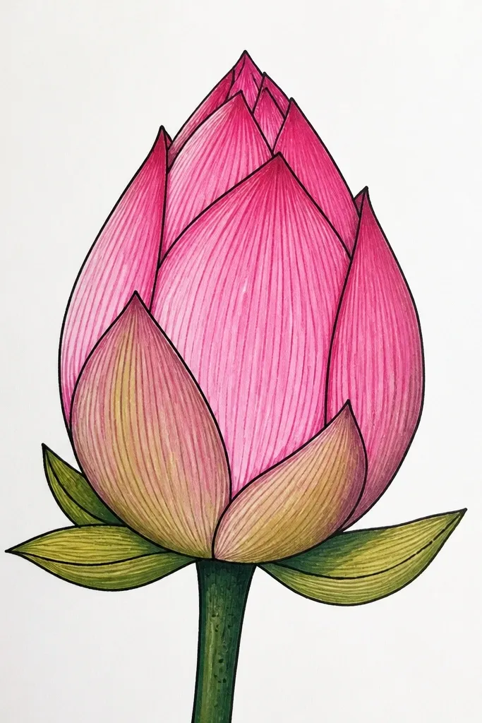
This style is for when you want the lotus to feel like it’s growing, not floating. One leaf is enough to anchor the drawing without distracting from the closed petal structure. I keep the leaf smaller than the bud and place it behind the lower left or lower right edge, so it frames the flower. The result looks clean for prints and easy for wall decals. It also works well for people who struggle with stems because you’re not drawing a full plant — just one supporting leaf.
Sketch a closed lotus bud with five petals around a small center oval, using inward C-curves. Draw a single stem line that curves slightly downward and stops behind the bud base. Add one leaf behind the bud: draw it as a teardrop shape with one center vein line, and keep it partially covered by the lowest petal. Color the outer petals pale pink and shade the inner folds plum. Finish by adding a tiny shadow under the leaf edge using a light gray pencil or diluted paint.
Good to knowPlace the leaf so it touches the bud silhouette — a tiny overlap makes it look intentional.
Common mistakeDon’t add two leaves on opposite sides; it turns a simple bud into a busy plant sketch.



