1. Soft Glow Lotus with Wet-Edge Petals
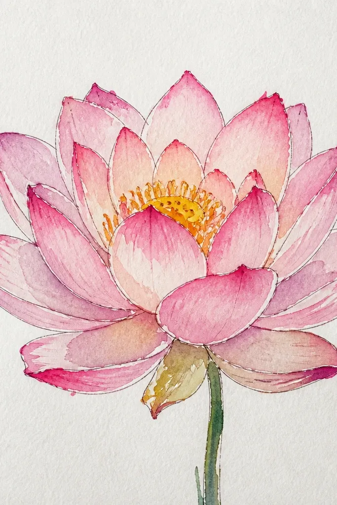
This look is the one I reach for when I want the lotus to feel lit from above. You start with a light wash of pale pink (think diluted quinacridone rose or a similar rose tone), then deepen only the petal bases with a slightly darker rose mixed with a touch of warm brown. The seed pod stays mostly dry so it reads as a crisp focal point, and you add tiny dark dots after the wash dries. It flatters a simple, centered composition - the flower sits higher on the page and the leaves act like a frame. For skin tones and mood, it reads clean and calm: the petals look like soft blush, not hot magenta.
Step 1: Lightly sketch 10-14 petal arcs around a small seed pod oval, then erase the sketch lines you won't need with a kneaded eraser. Step 2: Wet just the petal area (not the seed pod) with clean water using a size 6 round brush, then drop in pale rose wash. Step 3: After the first wash settles, touch a darker rose-brown mix only at the petal overlap lines and let it bleed a little. Step 4: When everything is dry, glaze a thin shadow under the petals and add seed pod dots with a small brush or fine pen. Step 5: Paint leaves with a very light green wash and add 3-4 vein lines in a thinner, darker green.
Good to knowKeep a paper towel folded and blot the brush tip before you touch the darker color - it stops hard blobs at the petal bases.
Common mistakeDon't paint the seed pod while the petals are still soaking wet or it turns into one muddy center.
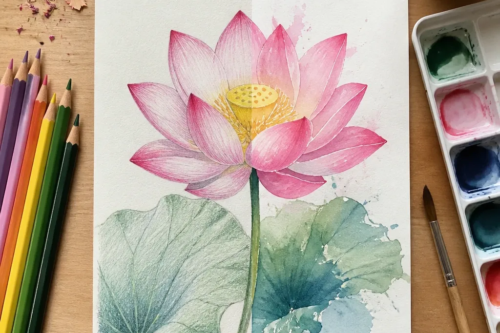
2. Watercolor Pencil Lotus with Tap-Blend Edges
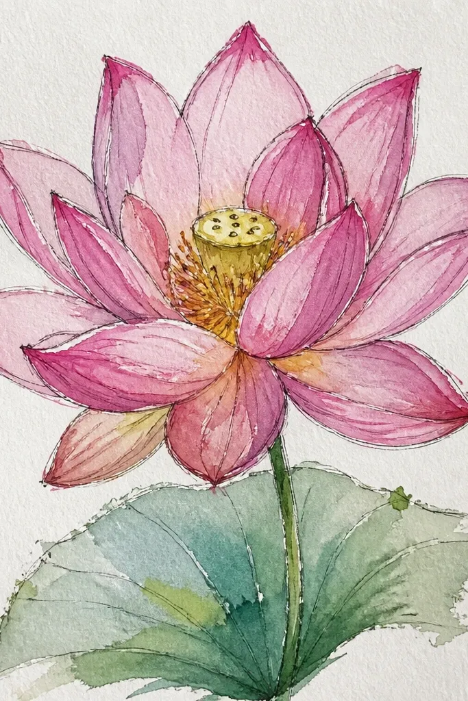
This is the method I use when I want a lotus that looks soft but not watery. Watercolor pencils create a more "drawn" texture, which makes the petal ridges feel real - especially when you tap blend instead of scrubbing. You get a flattering look for small formats because the center stays defined and the petals don't spread unpredictably. The color palette here is gentle: pale pink petals, warm beige in the seed pod, and olive leaves. It suits people who like controlled results - it's also forgiving because you can darken later without the whole petal turning into a stain.
Step 1: Sketch the lotus arcs and seed pod with a light mechanical pencil (0.5 mm), then shade petal bases with a pink pencil using short curved strokes. Step 2: Load a water brush (or damp small round) and tap lightly on one petal section at a time - press, lift, move on. Step 3: Let it dry, then add a second pencil layer only where you want deeper overlap shadows. Step 4: Color the seed pod with warm beige pencil, then add tiny dark dots and a thin shadow under the pod with a brownish pencil. Step 5: Finish leaves with olive pencil, then tap-blend only the leaf surfaces, leaving vein lines slightly sharper.
Good to knowUse a light hand for the first layer. If the paper looks dusty, you're overworking the pencil and the blend will go chalky.
Common mistakeDon't flood the paper with water brush - the pencil pigment lifts and you lose the clean petal shape.
3. Two-Tone Lotus: Rose Tips, Ochre Centers
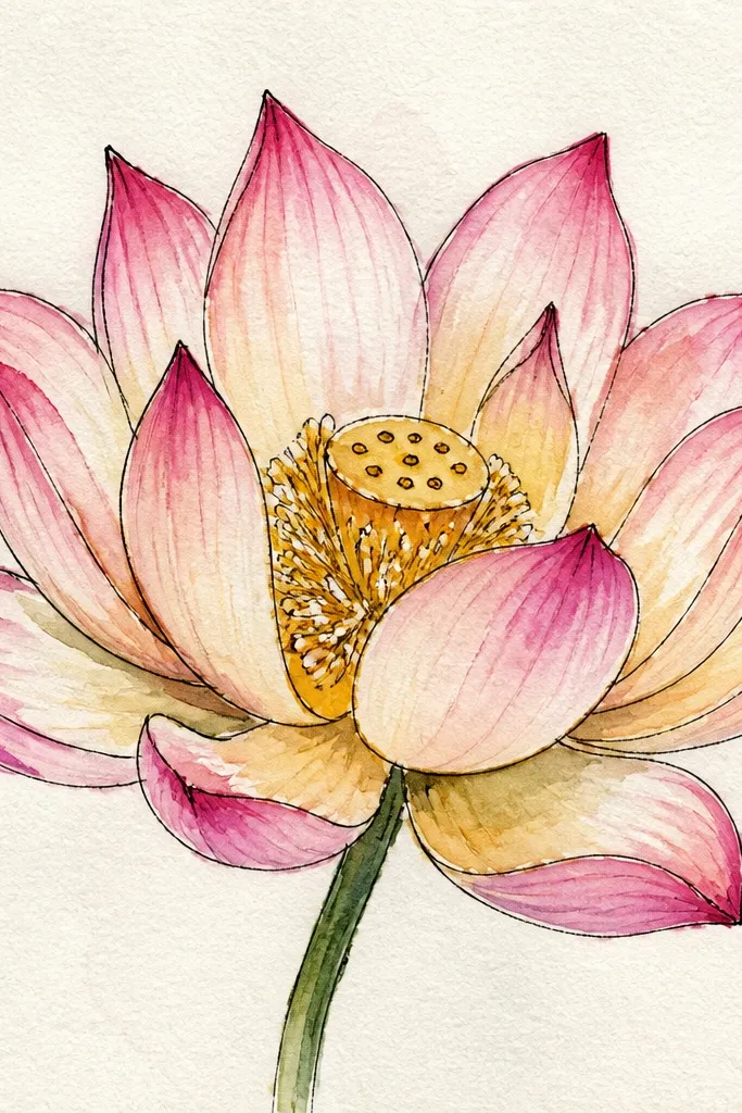
This palette makes the lotus look more dimensional because the warm ochre center acts like a spotlight. I've done this with both paint and watercolor pencils, but it looks especially good with paint because the rose tips can bloom while the ochre stays controlled. The center pod reads clearer when you keep it warmer than the petals - it pulls the eye in without making the whole flower too dark. The teal-green leaves keep the composition from turning monochrome pink, and the contrast feels modern. It flatters a bold but clean look - great for cards or small wall art where you want the flower to pop.
Step 1: Sketch petals as layered commas around the seed pod, and mark the center overlap lines lightly. Step 2: Paint the petal tips first with rose wash, leaving the inner petal area lighter and slightly unpainted for highlights. Step 3: Mix ochre (or a warm yellow-brown) and glaze it around the seed pod edges, keeping the pod dots darker than the surrounding wash. Step 4: Add leaf wash in muted teal-green, then draw vein lines with a darker green pencil or thin paint once dry. Step 5: Finish by glazing a thin rose shadow under the inner petals so the center doesn't float.
Good to knowIf your ochre looks too orange, gray it down with a tiny touch of burnt umber in your palette before glazing the pod.
Common mistakeDon't color the leaves the same intensity as the petals or the center loses its job.
4. Monochrome Ink-Look Lotus with Watercolor Wash
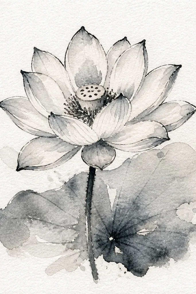
This is the lotus look I use when I want it to feel like a print, not a painting. The lines give structure and the watercolor wash stays light enough to let the ink do the heavy lifting. It's flattering for anyone who likes clean shapes because the petal edges stay readable even if your wash is messy. I also like it because it hides small tremors in hand-drawn arcs - the ink makes the arcs look intentional. The monochrome palette looks calm and modern, especially with gray-lavender petals and desaturated leaves.
Step 1: Sketch lightly, then trace the final petal edges and seed pod outline with a waterproof fine liner after you're happy with the shape. Step 2: Mix a pale gray-lavender wash (lavender plus a hint of gray) and paint only the petal interior, leaving the ink lines untouched. Step 3: Add a slightly darker wash at the petal overlap points - just two or three touches per petal layer. Step 4: Paint leaves with a light desaturated green wash and draw 2-3 vein lines in darker green once the wash is dry. Step 5: Add a few seed pod dot details and one thin shadow under the petals with a diluted gray.
Good to knowUse waterproof ink if you plan to wet the paper. Regular ink lifts and smears into the wash.
Common mistakeDon't go too dark with the wash. If the petals match the ink weight, the drawing turns muddy.
5. Loose Botanical Lotus with Paint-Only Petals
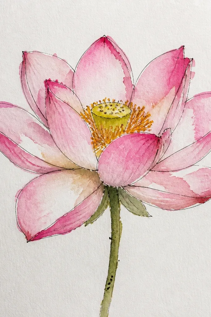
This version is for when you want a lotus drawing that looks alive, not over-rendered. Paint-only petals create soft, broken edges and that makes the flower feel less stiff. I like it for practice because it teaches you how to control water load: too wet and petals merge, too dry and you get hard chalky edges. The seed pod stays simple here, with a few dots and a shadow, so the eye still finds the center. It's flattering for larger page layouts because the softness needs space. The color palette is usually pale pink or peach with light green leaves so the bloom stays gentle.
Step 1: Lightly block in the petal arcs with a pencil, then erase most of the pencil once you've got placement. Step 2: Use a wet brush to pull a light wash across each petal area, then drop in pigment at the overlap. Step 3: Leave some petal edges lighter by not painting all the way to the outer rim. Step 4: Paint the seed pod with a thin warm brown wash, then add 6-10 tiny dark dots after it dries. Step 5: Add leaf washes with fewer strokes and let water streaks show, then add veins with a darker green pencil.
Good to knowReload the brush often. A dry brush in the middle of a petal makes scratchy edges that look accidental.
Common mistakeDon't chase perfection in the first pass. If you re-wet everything, the lotus turns into one watercolor blob.
6. Watercolor Pencil Lotus with Crisp Highlight Pulls
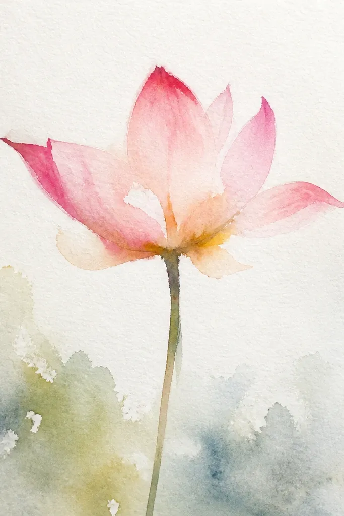
This one looks "clean" because you keep highlights as actual paper white. Watercolor pencil makes it easy because you can shade around the highlight and then add water only where you want a gentle gradient. I like this look for small pieces because it stays readable even when the colors are light. The petal overlap lines appear as slightly darker arcs, not thick outlines. It flatters a minimalist style: light petals, warm seed pod, and simple leaf veins.
Step 1: Sketch the petal layers and seed pod, then shade petal bases with a light-to-medium pink pencil while leaving white highlight zones uncolored. Step 2: Blend by tapping a damp brush just along the boundary between shaded and unshaded areas. Step 3: Add a second pencil pass only at the overlap arcs to increase depth without darkening the highlights. Step 4: Shade the seed pod with warm beige pencil, then dot in dark brown specks and add a thin shadow line under the pod. Step 5: Color leaves with olive pencil, blend lightly, and keep vein lines a touch darker for structure.
Good to knowUse a white gel pen only after everything dries if a highlight gap gets accidentally filled.
Common mistakeDon't blend the entire petal. If you wet-blend the highlight zones, they lose their crisp look.
7. Lotus Bud and Full Bloom Pairing
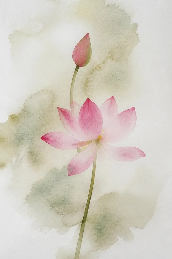
Pairing a full bloom with a bud adds story and makes your composition feel intentional even if your drawing is simple. The bud gives you a chance to practice petal curl - the petals overlap tighter, so watercolor edges show up differently than in the open bloom. I like doing this when I want a piece that looks like a set, not a single flower floating in space. The full bloom can carry the glow, while the bud can stay lighter and more controlled. It works for both watercolor pencil and paint; paint just makes the petals bloom more dramatically on the open flower.
Step 1: Place the full bloom higher and to one side, then sketch the bud lower with fewer petal arcs (about 6-8). Step 2: Paint or pencil the full bloom petals first, keeping the darker color at the overlap bases and leaving highlights as paper white. Step 3: Keep the bud petals lighter - use less pigment and fewer layers so it doesn't steal attention. Step 4: Add seed pod dots on the full bloom and a smaller, simple pod on the bud. Step 5: Paint or pencil leaves to connect the two motifs: one leaf pointing toward the bud and one leaf sweeping behind the bloom.
Good to knowUse a slightly cooler green on the leaf behind the bloom so the front leaf stays "closer."
Common mistakeDon't match the bud's contrast to the full bloom's. If both are equally dark, it looks flat.
8. Color-Blocked Lotus Background for Pop
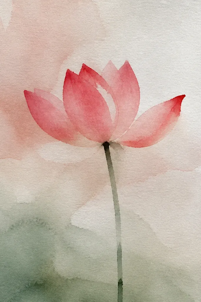
Color-block backgrounds make a lotus drawing feel finished even when the flower itself is modest. I've used this approach with watercolor paint and it's the easiest way to make the petals look brighter - the background gives them a frame. The key is keeping the background lighter than your flower colors, so the petals don't get swallowed. Teal or pale blue backgrounds work because they oppose pink without turning the piece childish. It's flattering for wall art and prints because it reads clearly from a distance.
Step 1: Stretch your watercolor paper flat and tape the edges if you have a board. Step 2: Paint a light teal background wash in a rectangle behind where the lotus will sit, then leave the very center area slightly lighter for breathing room. Step 3: After the background dries, draw the lotus petals and seed pod over it lightly with pencil. Step 4: Paint the petals with rose wash, concentrating darker pigment at overlap lines and keeping the outer tips lighter. Step 5: Add leaves in muted green and keep leaf veins thin so the flower stays the focus.
Good to knowMask the lotus area with low-tack tape for cleaner edges on the background if you hate accidental splatters.
Common mistakeDon't paint the background so dark you need to overwork the petals. You'll lose the soft watercolor look.
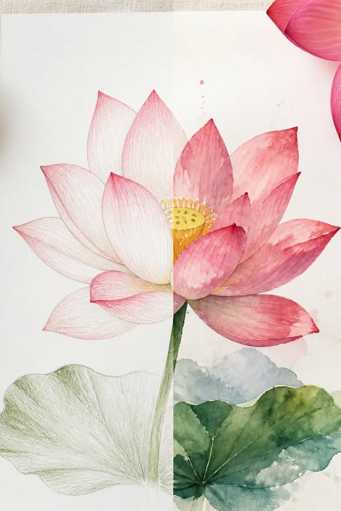
9. Pencil First, Then Selective Watercolor Glazes
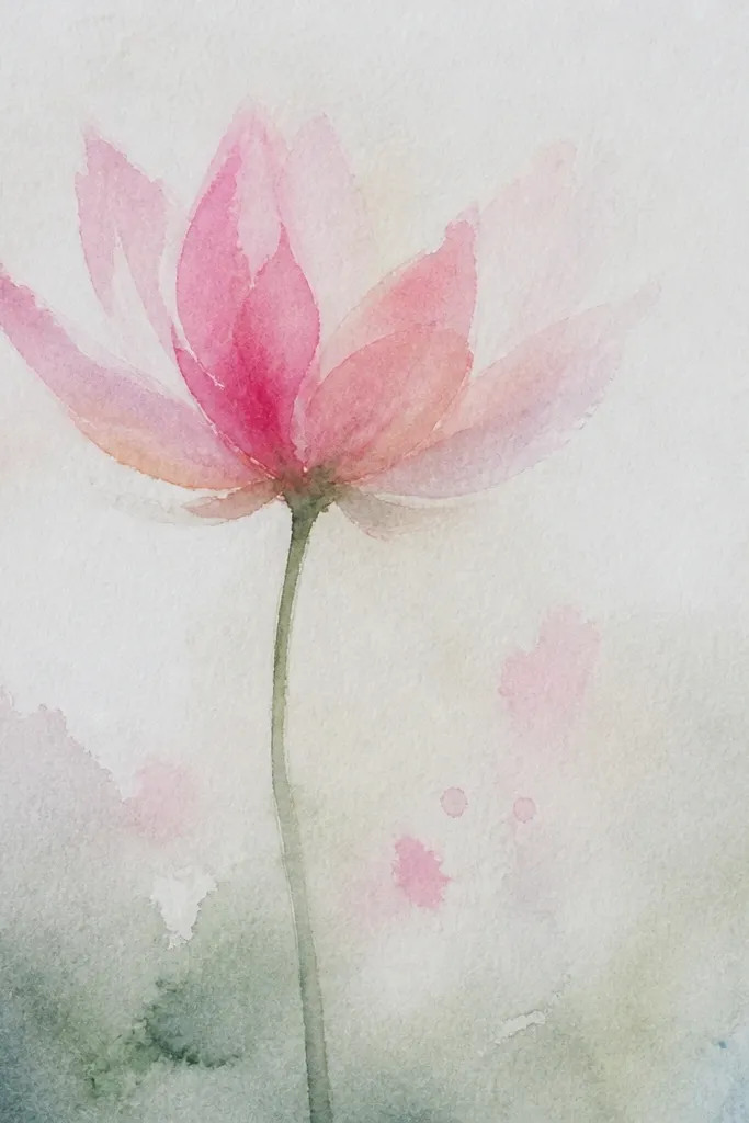
This hybrid approach is my favorite for getting both definition and glow. You build the shapes with pencil so the petals stay crisp, then glaze watercolor only where you want that airy, wet-edge softness. The contrast between pencil texture and watercolor smoothness makes the lotus feel dimensional without turning into a full watercolor blur. It's flattering for people who want control but still want the "paint look" in key spots. I use it when I'm working on paper that's not heavy enough for lots of wet paint - the glazes are light and targeted.
Step 1: Shade petal layers with watercolor pencil first, using a light pink base and a deeper pink-brown for overlap arcs. Step 2: Go over only 30-40% of each petal with a very light rose glaze using a flat or round brush, keeping the rest pencil-textured. Step 3: While the glaze is still damp, touch a darker rose at the overlap line for a soft gradient. Step 4: Add the seed pod with pencil dots, then glaze a thin shadow wash under the pod. Step 5: Paint leaves lightly with watercolor pencil and blend only the leaf surface, leaving vein lines sharper.
Good to knowTest your glaze on scrap with the same brush. If it beads up, your pencil layer is too waxy and you need lighter pressure.
Common mistakeDon't glaze over heavy, dark pencil scribbles. The watercolor gets muddy and kills the petal highlight.
10. Seed Pod Detail Practice Lotus (Small Center Focus)
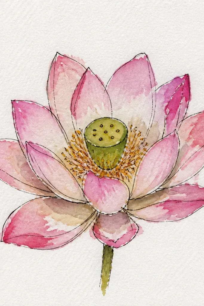
If your lotus centers look messy, this is the study that fixes it. You keep the petals spare so your eye can learn how seed pods sit: the pod oval has a rim, then rows of tiny dots that get smaller toward the top. With watercolor pencil, you can shade the rim with warm beige and then dot in dark brown with a sharp tip. With paint, you can glaze a light brown wash and add dots once it dries. This look is great for small paper because the center detail holds attention. It also flatters a clean, calm style since the petals don't compete for focus.
Step 1: Sketch a small seed pod oval and add 2-3 curved rows of dot guides inside the oval. Step 2: Lightly block petals around it with 8-12 arcs, keeping petal shading minimal. Step 3: Color the seed pod rim with warm beige pencil or a thin warm brown wash, then add dots with dark brown once the base is dry. Step 4: Add a soft shadow under the pod using a diluted rose or brown, keeping it lighter than your dots. Step 5: Finish leaves with a pale olive wash and draw just 3 vein lines so the center stays the hero.
Good to knowUse a magnifying glass or phone camera zoom to check dot spacing before you commit to the full pod.
Common mistakeDon't make the dots all the same size. The pod looks fake when every dot is identical.