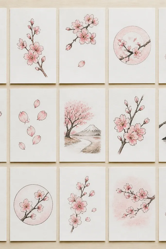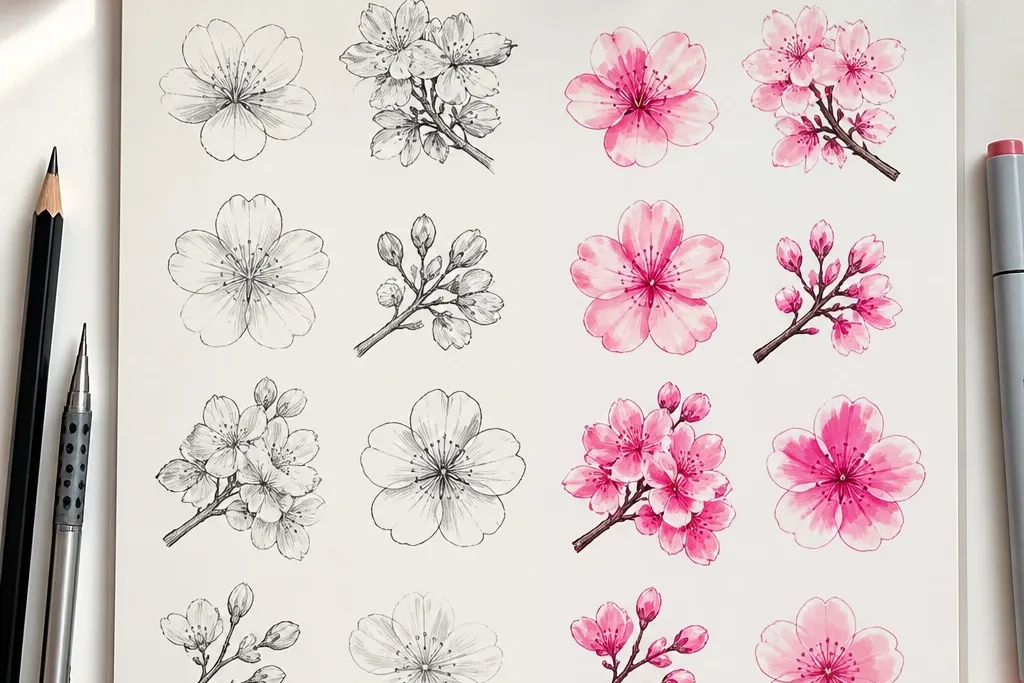

1. Feather-Light Pencil Blossoms on Warm White Paper
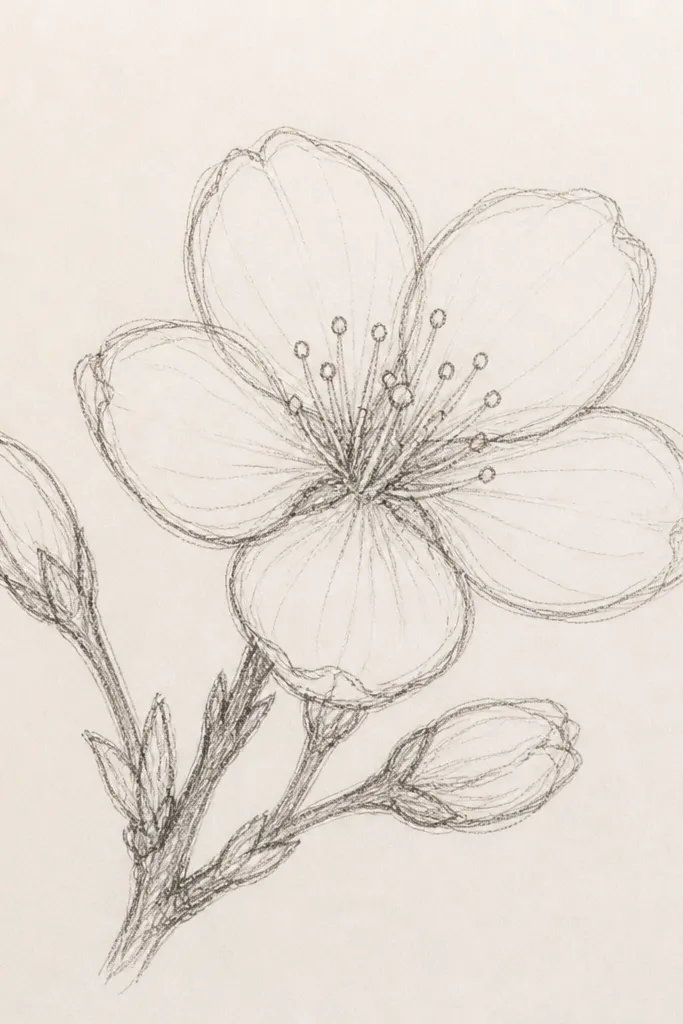
This look is the one I reach for when I want the petals to feel airy, like they’re floating on a breeze. I use a regular HB pencil for the branch and a softer 2B pencil for petal shadows, so the centers and overlaps look darker without turning the whole page gray. The petals stay pale pink by leaving most of the paper untouched and only shading where petals overlap. It flatters kid drawings because it forgives crooked lines — you can erase and redraw without leaving harsh scars. For skin tones and outfits, this style works with anything because it reads as gentle and calm, not harsh.
Start by sketching the branch with HB in one continuous curve, then add small twig offshoots using short, light strokes. Next, draw each blossom as a tiny center mark, then place five petals around it with slight overlap — keep the petal tips rounded, not pointy. After that, shade only the petal bases with 2B, staying under the top petal so you get a natural layered look. Finally, add a few tiny leaf nubs with light HB so the branch doesn’t look like it’s floating in space. If your paper is thin, press lightly — heavy pressure dents the page and makes later shading look muddy.
Use a kneaded eraser for petal highlights — it lifts graphite cleanly without tearing paper.
Don’t darken every petal edge; it makes blossoms look like little ink stamps.
2. Pencil Bloom with a Soft Gradient Cluster
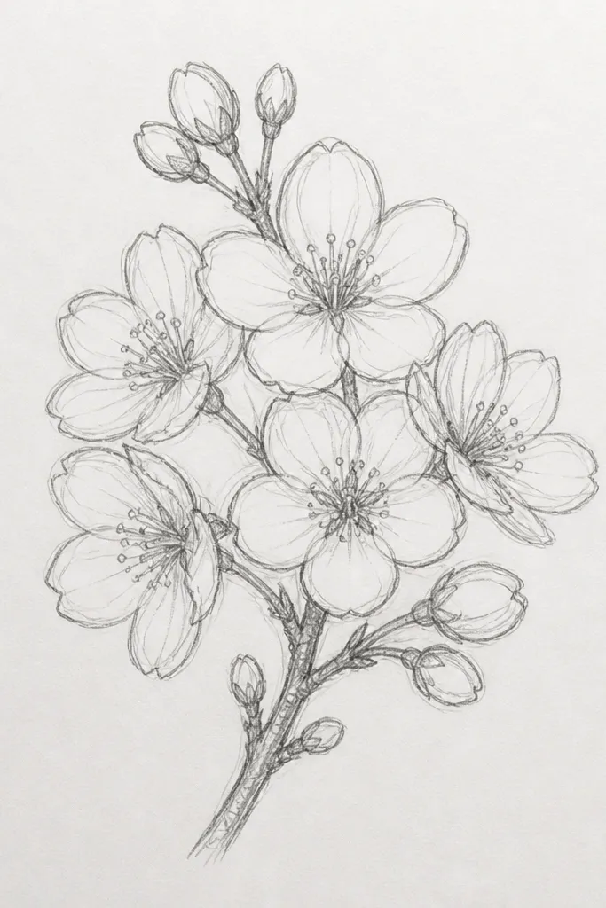
This is the “bloom haze” look that makes cherry blossoms feel like a cloud, not a bunch of separate flowers. I do it with pencil shading built in layers, then I blend only the cluster area so the branch stays crisp. The key is that the darkest values sit near the center of the cluster and fade outward. It’s the style that looks best on kids' drawings when they like to color — they get to see how pressure changes the darkness. If you’re making a set of 20, this style helps because even if petals aren’t perfect, the gradient makes them feel cohesive.
Start with HB to map the branch and place 3 to 6 blossoms in a tight cluster. Shade the inside of the cluster with a light 2B, concentrating around the centers and the overlap spaces between petals. Then use a blending stump or even a paper stump made from folded scrap to soften only the shaded area — keep the branch and petal edges sharper. Finally, go back with HB to sharpen a few petal tips so the cluster has both softness and definition. Keep your shading strokes curved to match the blossom shape — straight scribbles look wrong fast.
Blend in small circles, then stop. If you blend too long, the petals lose their five-petal identity.
Don’t blend the branch — it should stay a line, not a gray smear.
3. Fine-Tip Marker Branch with Clean Five-Petal Flowers
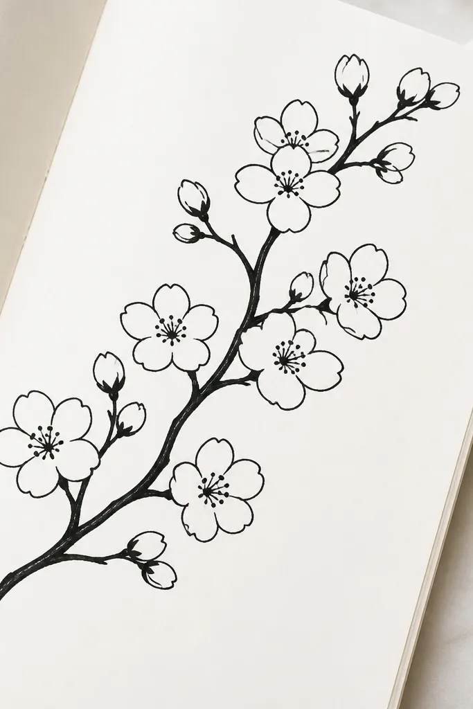
This look is for when you want the drawing to read instantly, even from across a room. Fine-tip marker gives you clean outlines that kids can repeat across 20 pages without worrying about erasing. I keep internal petal shading very light or none at all, because marker already brings the contrast. It flatters kids who have steady line control — their blossoms end up looking neat and consistent. It also works great for classroom display because you don’t need heavy color to make it pop.
Start by drawing the branch with the marker at a steady speed, then add twigs with lighter touches so they don’t look thick. Place the blossom centers first as tiny dots, then draw five petals around each center with rounded arcs. Leave a small gap between blossoms so the clusters don’t turn into one blob. For depth, darken just the underside of a couple petals in each blossom — not all five. Finally, add a few tiny leaf shapes as short marker strokes near the branch, keeping them smaller than the blossoms.
Good to knowTest the marker on a scrap sheet first. Some marker tips run too wet and thicken your lines fast.
Common mistakeDon’t color every petal solid black — you’ll lose the petal overlap and the flower shape.
4. Marker Outlines with Pink Wash Overlap
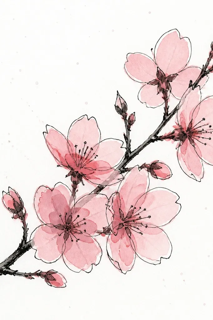
This is my go-to when I want marker crispness but still want that soft cherry blossom mood. The black outline gives structure, and the pink wash creates the bloom effect without needing heavy pencil shading. I use a watered-down pink so it pools slightly at petal overlaps — that’s what makes the petals look layered. Kids like it because they can stay in the lines, and you still get a believable “petal depth.” It also photographs well because the ink stays sharp while the wash adds softness.
Start with marker outlines: branch first, then blossoms as five rounded petals with tiny dot centers. Mix a light pink wash by combining a small amount of pink paint (or a watercolor pan) with lots of water — you want it translucent. Paint inside the petals, leaving the very top edges lighter so the petals look curved. When petals overlap, let the wash slightly deepen there by touching the brush to the overlap for one second. Let each cluster dry for a minute before adding more wash so you don’t create dark puddles.
Good to knowUse a paper towel under your hand when painting — it stops smudging if your fingers brush the wet wash.
Common mistakeDon’t flood the page. Too much water makes ink bleed and petals lose their clean edges.
5. Marker + Colored Pencil Petal Shadows
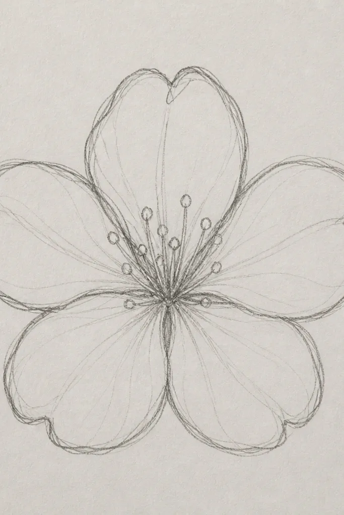
This combo looks more “finished” than plain marker and it’s still fast enough for 20 drawings. Marker gives you the exact shape — the petals and branch read clearly. Colored pencil adds subtle shading without soaking paper, so you get depth without ink bleeding. I like using a light pink plus a touch of cool purple just at the shadow side of petals, because it keeps the blossoms from looking flat. Kids who rush usually benefit here because pencil shading can fix unevenness by guiding the eye to overlap areas.
Outline the branch and blossoms with marker first, keeping petals rounded and the center dot small. Then use a light pink colored pencil to shade the underside of each petal — aim for a crescent shape, not full coloring. Add a tiny amount of cool purple where two petals overlap, especially near the center of the cluster. Blend by lightly layering more pink over the purple, staying near the shadow edges. Finish with a white gel pen or white colored pencil to add tiny highlights on a couple top petal edges if the outlines look too heavy.
Sharpen the colored pencil. A blunt tip makes waxy streaks inside the petals.
Don’t press hard with colored pencil right after marker. You’ll dent paper and smear the ink edge.
6. Pencil Cherry Blossoms with a Tiny Center Detail
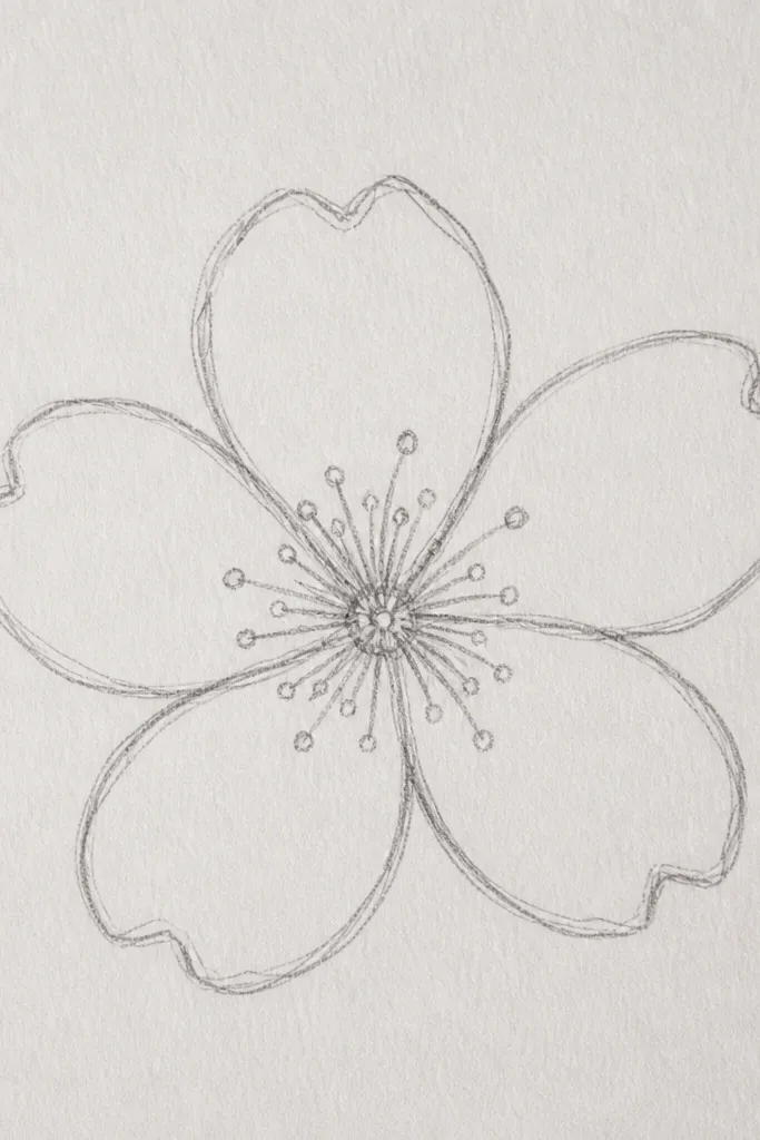
Most kids draw cherry blossoms as five petals and stop there. Adding tiny center detail makes the whole drawing look more intentional without making it complicated. I use HB for the outline petals and then add a couple short lines or a dot cluster in the center, shaded lightly with 2B. The center detail pulls attention inward and makes even simple petal shapes look more like flowers. It’s flattering for small hands because it’s quick and repeatable — every blossom gets the same center mark. If you’re making a set of 20, this detail helps the drawings feel like they belong together.
Start with HB and lightly sketch the branch curve, then place blossom centers as tiny dots. Draw five petals around each center using short arcs, leaving the petal tips a touch lighter than the bases. Add a center mark: two to four tiny strokes around the dot, angled slightly so it looks like a small cluster. Shade the very base of petals with 2B, but keep the center slightly darker than the petal middle. Repeat until the page has 8 to 15 blossoms so the center detail shows but doesn’t clutter.
Keep the center detail tiny — if it grows, the blossoms start looking like cartoon stars.
Don’t outline every petal edge heavily; keep the outer edges light so the center detail stands out.
7. Marker Blossoms with Negative Space Background
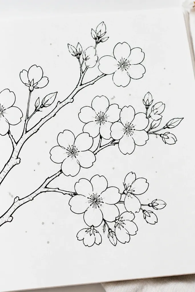
Negative space is what makes marker cherry blossoms feel airy instead of heavy. When you leave most of the background untouched, the blossoms look like they’re floating on bright paper. I use marker outlines only, then add a few light gray dots or tiny specks around the cluster using the side of a pencil or a very light marker. This gives you that spring texture without filling the page. It flatters busy kids because they can focus on outline accuracy, not coloring. It also keeps the set consistent across 20 drawings — the background treatment stays the same each time.
Outline the branch and blossoms with marker and keep petals mostly unfilled. Leave the spaces between blossoms white, and don’t add heavy hatch lines. To add texture, lightly tap a gray pencil (or a very pale marker) around the blossoms — use the side of the lead and keep it random. If you want a stronger bloom look, draw a couple faint curved lines behind the cluster with pencil, then stop before it turns into a full background wash. Finally, add a few tiny twig lines so the branch feels connected from start to finish.
Use a light touch with the speckles. Two seconds too much and the page looks dirty instead of airy.
Don’t fill the whole page with marker dots. It removes the springy white space that makes blossoms look delicate.
8. Pencil Cherry Blossoms with a Branch-First Layout
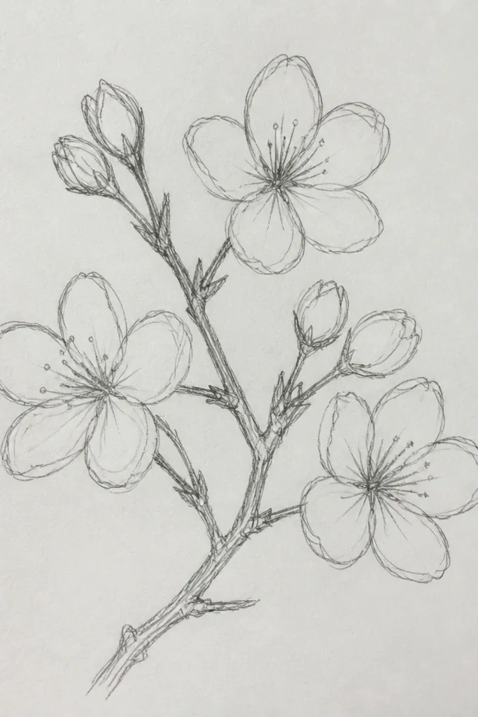
This layout makes your 20 drawings look more thoughtful even when blossoms aren’t perfect. By building the branch first, you control where the blossoms land and how the page breathes. I keep blossoms smaller as they go farther along the curve, and I lighten the pencil pressure on those distant clusters. That tiny depth trick is what makes it feel less like stickers on paper and more like a real branch with flowers. It’s beginner-friendly because you’re not juggling five-petal symmetry everywhere at once. Kids also like it because the branch is the “main drawing” and the blossoms feel like decorations you place.
Start by sketching a sweeping branch curve with HB, then add twig offshoots at intervals. Place blossoms along the branch in a staggered rhythm — don’t put them all the same size. Draw the nearest blossoms with slightly darker petal shading using 2B, and keep far blossoms lighter with HB only. Add leaf nubs sparingly between clusters so it doesn’t turn into a forest. Step back every few blossoms and check spacing — if clusters are too close, erase one and re-space before you shade.
Use a ruler for the page edge only, not for the branch. Let the branch curve naturally so it doesn’t look stiff.
Don’t shade every blossom equally. Depth disappears when all clusters have the same darkness.
9. Marker Blossoms on Smooth Paper for Sharp Classroom Pop
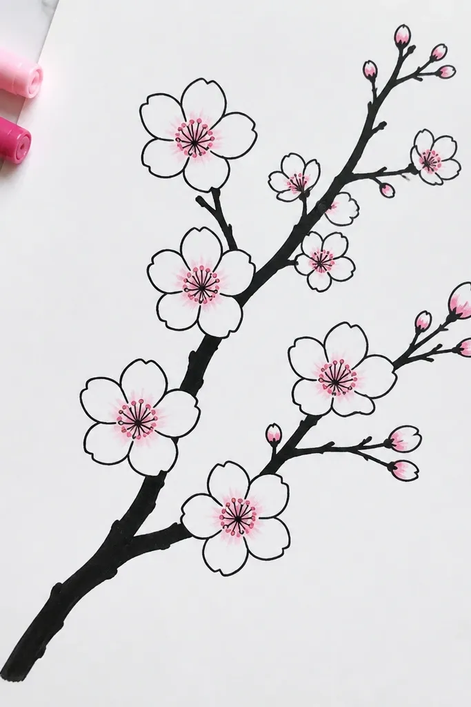
If you’re doing 20 drawings for a classroom or family wall, smooth paper is the easiest way to get that crisp marker look. The petals read clearly because the ink sits on top of the paper surface instead of feathering out. I keep the branch line thicker than the twig lines so the drawing has hierarchy. For coloring, I add only a light pink tint inside petals using marker or colored pencil, enough to show overlap depth. This style flatters kids because it covers small mistakes — the clean outlines do the heavy lifting visually.
Use smooth paper like a heavier cardstock or a glossy sketch pad page if you have it. Outline the branch with a fine marker and vary line weight by pressing slightly more for the main branch and less for twigs. Draw blossoms as five rounded petals with tiny center dots, keeping the petal spacing consistent. Add a light pink layer inside petals — don’t fill to the edges; leave a thin white border for highlight. Finish with a few extra twig lines to connect blossoms back to the branch so it feels like one drawing.
If your marker bleeds, switch to a lighter paper weight and slower strokes. Faster strokes reduce ink pooling.
Don’t use thick felt-tip marker for tiny blossoms. It makes petals too wide and everything looks chunky.