1. Spiral Center Rose with 8 Petal Loops
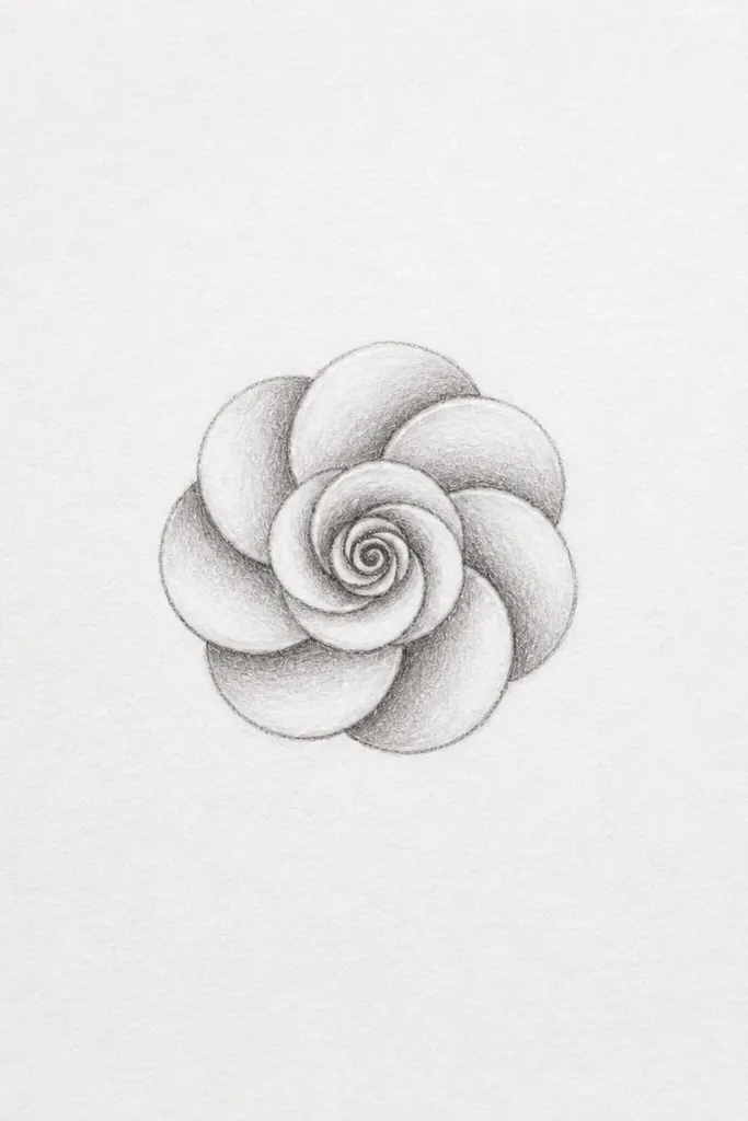
This one is my go-to when a beginner says they can’t draw roses. Start with a tiny spiral so the middle looks like it’s turning inward, not collapsing. Then place eight petals around it like a ring of overlapping bracelets. The petal loops are forgiving because the C-shape already suggests curvature. I like it for kids and first-timers because it looks finished even when the shading is simple.
Step 1: Draw a small dot, then make a tight spiral that takes up about 1/4 of the rose’s final height. Step 2: Add eight C-shaped petals around the spiral, each one overlapping the next by about one-third of its width. Step 3: Shade the lower-right side of each petal with a 2B pencil, keeping the top edge lighter. Step 4: Add one or two thin highlight lines on the inner two petals by lightly erasing or leaving paper untouched.
Good to knowKeep your petals slightly different sizes — the rose looks real when one petal is a little taller than its neighbor.
Common mistakeDon’t draw all eight petals the exact same height or angle — that’s what makes it look like a stamp.
2. Rosebud with Three Folded Petals
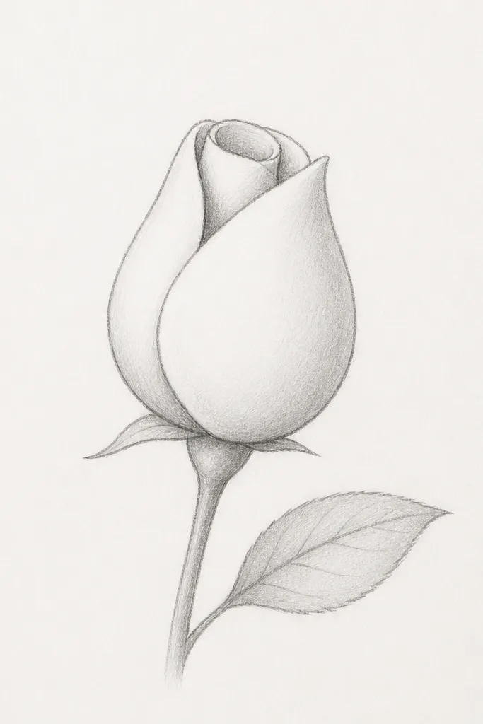
This style is for when you want a rose that looks young and tight, like a bud about to open. Instead of a full rosette, you draw three folded petals that tuck inward. The shape reads “rosebud” even with very little detail because the petals look wrapped. It’s also great for kids because the petal count is low. I use it for greeting cards when I want the flower to stay cute and not take over the whole page.
Step 1: Draw a small curved base like a shallow teardrop. Step 2: Add three rounded petals on top of that base, each one curling inward — think of them as folded spoons. Step 3: Shade the underside of each folded petal with light pencil pressure, leaving a clean edge highlight on the outer side. Step 4: Draw a simple stem line ending in one leaf that has a center vein — keep the leaf about half the bud’s height.
Make the opening at the top slightly off-center — symmetry makes buds look cartoonish fast.
Skip adding a full outer ring of petals — it stops being a bud and starts looking like a messy half-rose.
3. Thick Petal Rose with Rounded U Edges
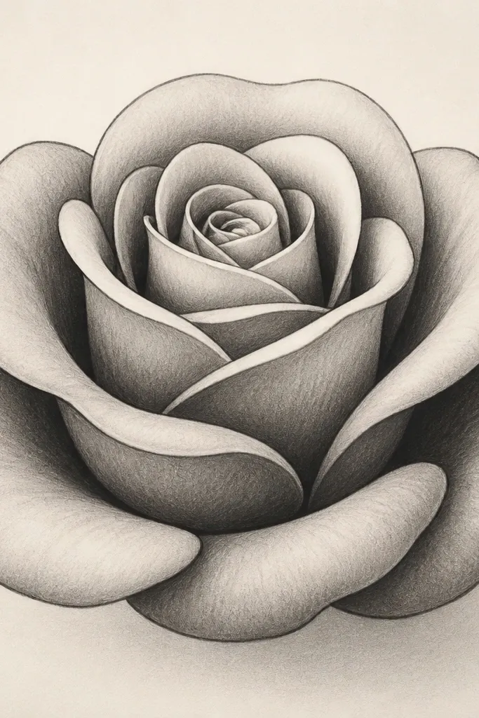
If you love roses that look juicy and full, this is the one. The rounded U shape gives you thick petal edges without needing fancy lines. You build the rose in layers: inner petals are smaller U’s, outer petals are bigger U’s. Because the petals are thicker, you don’t need lots of tiny shading marks — one darker patch under each overlap looks enough. This works great for marker-first drawings because the U edges hold ink nicely.
Step 1: Draw three small rounded U’s in a circle, leaving a small gap in the center. Step 2: Add a second layer of four bigger U’s around them, overlapping each inner U by about half. Step 3: Add a third layer of five U’s with slightly wider openings, so the outer petals look flatter. Step 4: Shade under the overlap lines with short, heavy strokes, keeping the top rim of each petal lighter.
Use a darker outline for the outer layer only — inner outlines stay lighter so the rose has depth.
Don’t make the U shapes too narrow — thin U’s make the rose look like a tangled scribble.
4. Single-Line Rose for Quick Coloring
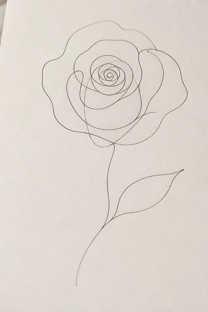
This is the rose I use when I want kids to color without getting stuck on details. One-line roses look great in crayon, colored pencil, and even marker because the coloring has clear boundaries. The secret is to draw the overlap with line direction, not with extra petals. If your lines cross in the right spots, the rose reads layered. It’s also perfect for planners and journals because it doesn’t take much space.
Step 1: Start with a small spiral in the center, about the size of a pencil eraser tip. Step 2: Without lifting your pen, flow into three to five petal loops that wrap outward like a snail shell. Step 3: Add a simple stem line from the base of the spiral and a small leaf using one curved vein line. Step 4: Lightly trace over the overlap areas with a darker line so the front petals stand out when you color.
Color the inside petals one shade darker than the outer ones — it tricks the eye into seeing depth.
Don’t add shading scribbles — they smear into the color and make the rose look muddy.
5. Rose with Wavy Petals and Tiny Center
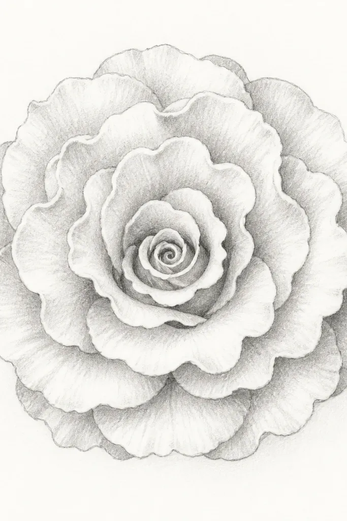
This rose has a lighter, more whimsical look because the petals are wavy instead of smooth C-shapes. The tiny center keeps it from looking heavy, even when you add more petals. I like it for scrapbook pages and for decorating notebooks because it looks airy. The wavy edges also help if your hands shake slightly; uneven edges are part of the style. It’s a fun change from the classic rosette.
Step 1: Draw a very small spiral center, smaller than you think — about 1/6 of the rose’s final diameter. Step 2: Around it, draw six to seven scalloped petals using short curved lines that form a wavy edge. Step 3: Add a second outer ring of five larger scalloped petals, each overlapping the previous by about one-third. Step 4: Shade with curved pencil arcs along the underside of each petal, keeping the top rim clean.
Good to knowIf petals feel messy, reduce the number to six total and make each one bigger.
Common mistakeDon’t make the center spiral large — a big center plus wavy petals looks like a flower explosion.
6. Classic Rose Rosette with 12 Petals
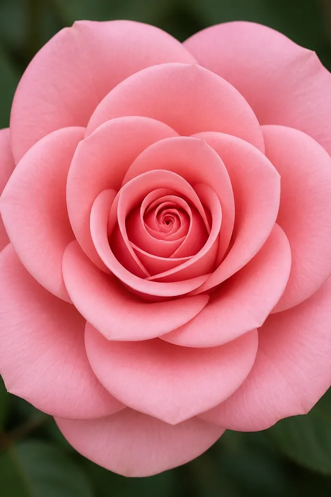
This is the “I want a real-looking rose” version for beginners. Twelve petals gives you enough structure to look classic without turning into a detailed mess. The two rings matter: inner petals are tighter and point slightly upward, outer petals are flatter and flare outward. When you shade under overlaps, the rose looks dimensional even with simple pencil. I’ve used this exact layout for kids' cards because it looks impressive but stays manageable.
Step 1: Draw a center spiral and then place six inner petals as teardrops that hug the spiral. Step 2: Add six outer petals as larger teardrops that sit lower and overlap the inner ring. Step 3: Shade with a darker pencil patch under each overlap line, keeping the petal tip light. Step 4: Add three short lines inside a couple of outer petals to show fold direction — just enough to guide the eye.
Rotate the rose slightly in your mind while drawing — don’t force every petal to face the same direction.
Don’t shade the entire petal — leave a light strip along the top edge.
7. Rose in Side View (3 Petals Showing)
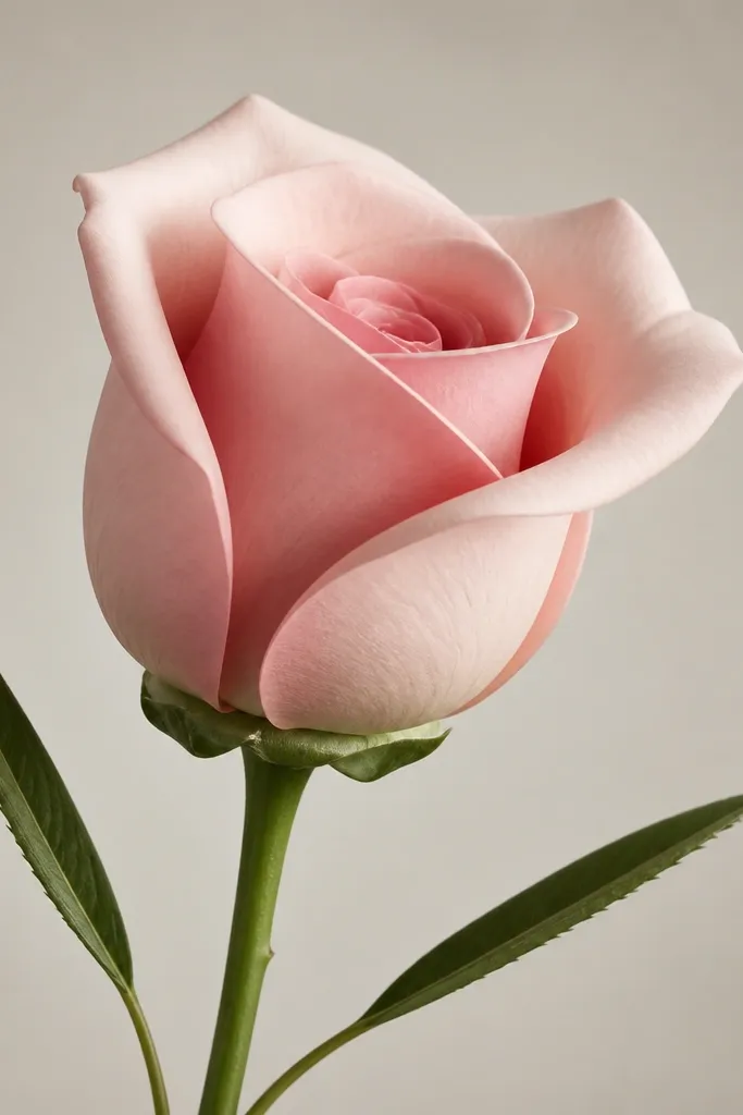
Side-view roses are a cheat code for beginners. When you limit what you show, you avoid the problem of drawing too many petals at once. Three visible petals give the impression of depth, especially when the back petal is partially covered. This style looks great on bookmarks and margins because it takes less space vertically. It also looks fancy without extra work.
Step 1: Draw an oval outline for the rose’s outer edge, then sketch a small spiral tucked inside the oval. Step 2: Add three petals: one front petal that covers part of the spiral, one side petal that wraps around, and one back petal that’s mostly hidden. Step 3: Shade the inner overlap area with a darker pencil line following the oval curve. Step 4: Draw a thin stem and two narrow leaves pointing slightly different directions.
Good to knowMake the back petal lighter — either erase it slightly or use lighter pencil pressure so it feels behind.
Common mistakeDon’t draw a full front-facing rosette and then “pretend” it’s side view — the perspective won’t read.
8. Rose with Jagged Petal Tips (Crisp Look)
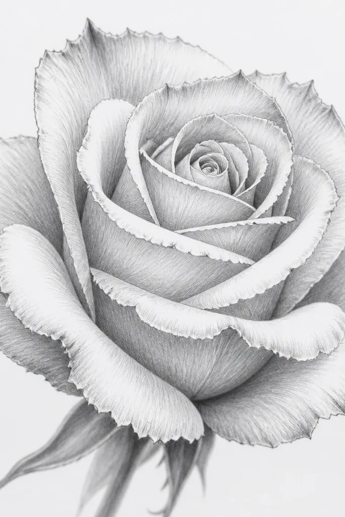
This rose looks crisper because of the tiny notches at the petal tips. It feels more like a stylized rose illustration than a soft watercolor rose. If you use colored pencils, those notches catch pigment and look textured without you doing extra blending. I like it for cover art on kids' projects because it looks bold even when it’s simple. The key is keeping the jaggedness small — too much and it turns into a spiky flower.
Step 1: Draw the center spiral, then add six C-shaped petals around it. Step 2: For each petal, add one or two small notches along the outer edge — tiny U-shaped dips, not big cuts. Step 3: Add an outer ring of four petals, slightly larger, with the same notched tips. Step 4: Shade with short pencil strokes concentrated at the base of each petal notch, leaving the outer edge lighter.
Good to knowUse a sharper pencil point than you think — blunt tips turn notches into thick blobs.
Common mistakeDon’t notch every edge heavily — pick just the outer half of each petal.
9. Rose with Cross-Hatched Petal Shading
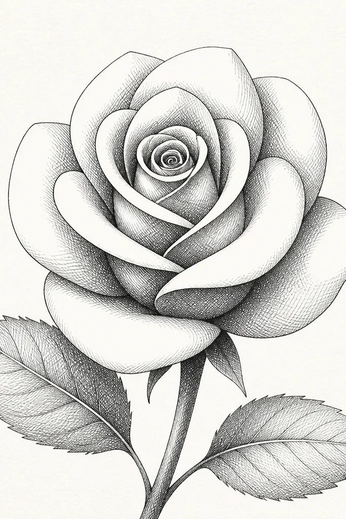
This is for when you want your rose to look “finished” without blending. Cross-hatching gives texture and shape, especially on paper that holds pencil well. The trick is to hatch only where petals overlap — not the whole flower. I use this style when I’m doing black-and-white drawings for kids because it teaches a clear rule for shading. It also makes the petals look layered even if your petal lines are simple.
Step 1: Draw a classic rosette outline with a spiral center and twelve teardrop petals in two rings. Step 2: Identify the shadow side under each overlap, usually the lower-left or lower-right — pick one direction and stick to it. Step 3: Add cross-hatching in those shadow zones with diagonal lines, then a second set of lines crossing them. Step 4: Leave a clean highlight strip along the top right edge of each petal.
If the hatch looks dark too fast, use fewer lines and spread them wider — it reads smoother.
Don’t hatch into the highlights — that’s what kills the “petals are folded” look.
10. Rose with Watercolor Wash and Pencil Outline
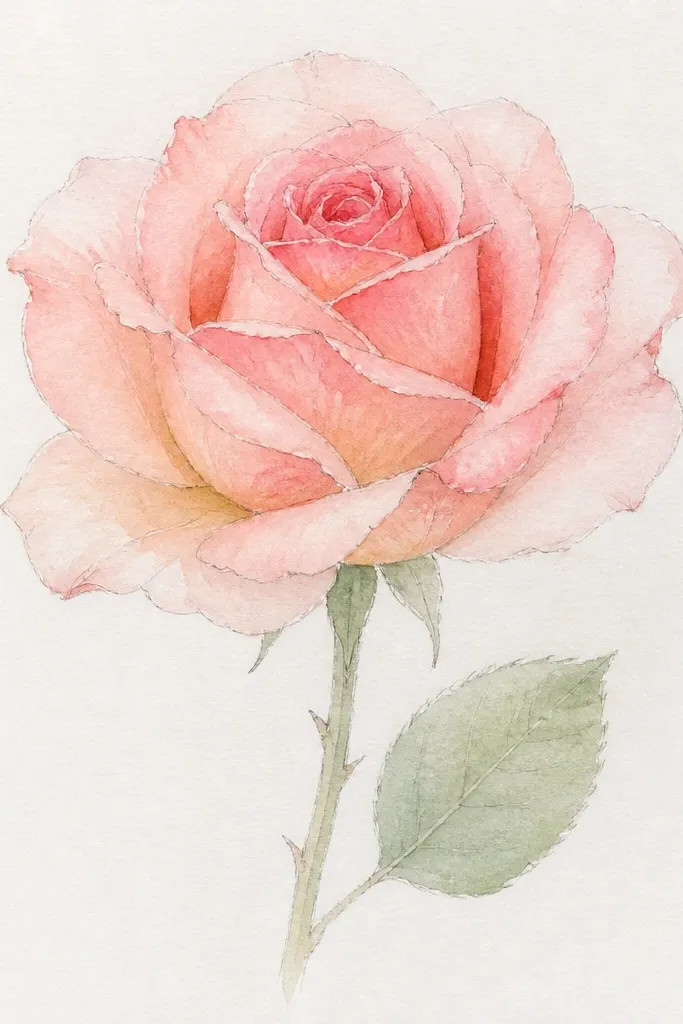
This rose style looks delicate and pretty because the color bleeds slightly at petal edges, like real rose pigments. Pencil outline keeps it beginner-friendly and stops the watercolor from turning into a blob. I like it for card-making because you can keep the rose simple and still get a “painted” result. The shading comes from watercolor layering, not from heavy pencil work. It flatters most skin tones in a photo because the palette stays warm and soft.
Step 1: Lightly sketch a spiral center and eight outer petals as C-shapes. Step 2: Mix a thin pink wash (water-heavy) and paint the inner petals first, leaving highlights as blank paper. Step 3: Add a second, slightly darker pink or peach wash along the overlap edges — keep it concentrated, not across the whole petal. Step 4: Let it dry, then reinforce a few overlap lines with light pencil if needed. Step 5: Paint the stem and leaf in a muted green, then add a darker green vein line after it dries.
Use two paint strengths only: one for the base and one for the overlap edge. Anything in between usually looks muddy.
Don’t outline in dark pencil — watercolor will pick up the graphite and look gray.
11. Marker Outline Rose with Colored Pencil Fill
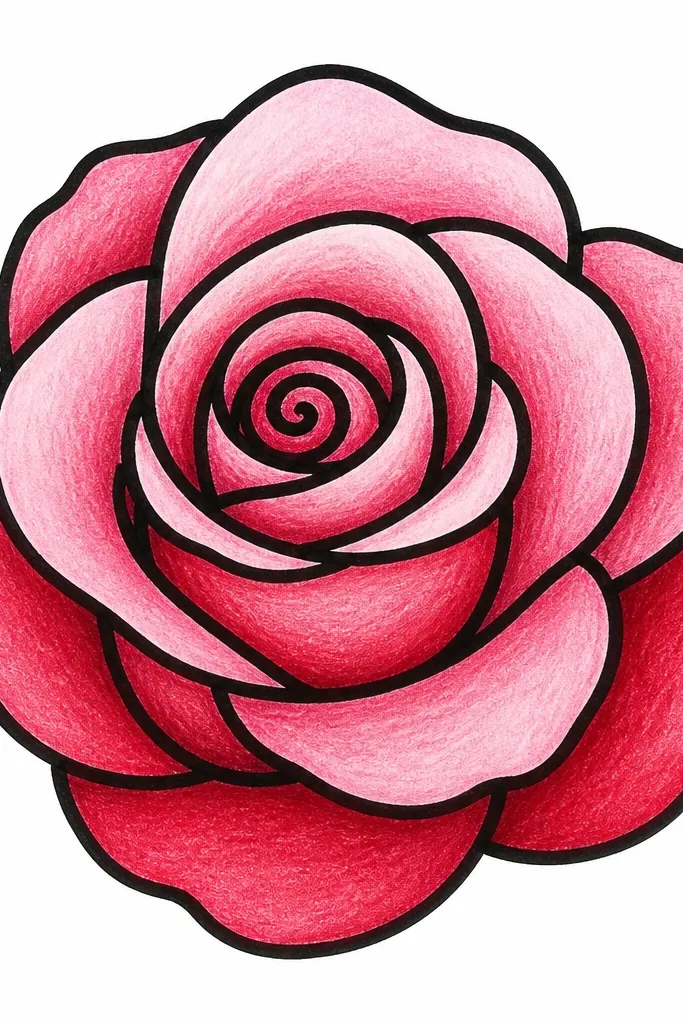
This is the easiest way to get clean lines and pretty color. The marker gives you crisp boundaries, and colored pencil adds the gradient you need for dimension. I like this for beginners because the marker makes mistakes obvious and fixes quick. You can choose a rose palette like dusty pink with a warm peach center, and it always looks intentional. It also works well for kids because colored pencil is easier to control than paint.
Step 1: Draw a spiral center and then six inner C-shaped petals and six outer petals, keeping each petal overlap clear. Step 2: Go over the outline with a fine black marker, but avoid coloring inside yet — let the ink dry. Step 3: Use colored pencil to fill the inner petals with a stronger pink, then blend outward to a lighter pink. Step 4: Add a warm peach or gold tone in the center spiral area so it looks like depth. Step 5: Shade the underside of each petal with a darker rose tone, not brown.
Good to knowPress lightly for the first layer, then add one darker layer only in the shadow zones.
Common mistakeDon’t use heavy brown in the shadows — it makes roses look dirty instead of dimensional.
12. Rose Border Pattern for Kids' Sheets
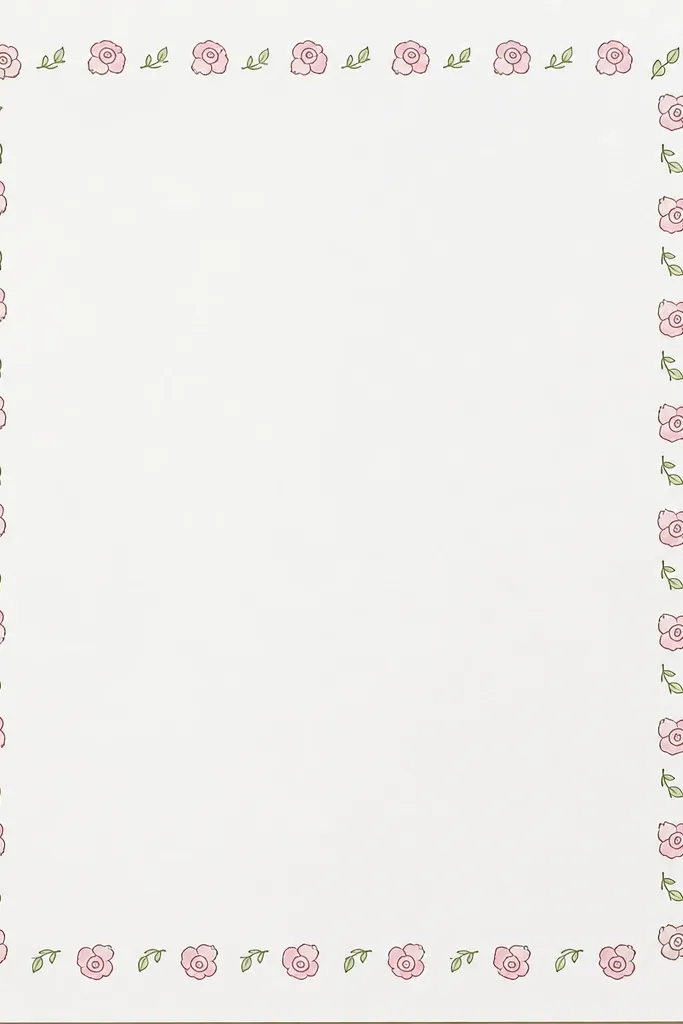
A single rose is nice. A rose border is way more fun for kids because it fills the page and hides uneven drawing. This pattern uses tiny, simplified roses: spiral center plus a few petals, repeated with consistent spacing. The repeat rule matters — if every rose is too different, the border looks chaotic. I like this for coloring sheets and classroom art because it gives structure without limiting creativity.
Step 1: Decide your spacing — for a standard letter page, leave about 1 inch margin and place roses every 1.5 to 2 inches. Step 2: Draw a tiny spiral, then add three petals as small C-shapes around it. Step 3: Alternate each rose direction by flipping the petal angles left or right. Step 4: Fill gaps with small leaf doodles shaped like teardrops with a single center line. Step 5: Keep the border thickness consistent by using the same line weight on every flower.
Use a ruler lightly for spacing marks, then erase them — it makes the border look store-bought.
Don’t crowd the roses — touching flowers turn into a scribble when kids color.
13. Rose with Ribbon Bow Stem (Cute Card Style)
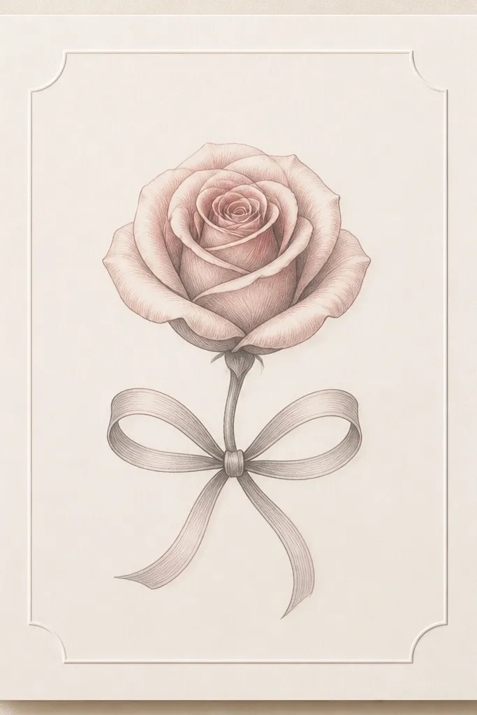
This is the rose I draw when the goal is cute, not realistic. The ribbon bow adds a clear focal point, so you can keep the rose simple and still get a sweet result. The petals are drawn as C-shapes in two rings, and the shading is light — just enough to show overlap. This style looks good on cards for birthdays and teachers because it reads as gift-like instantly. It also pairs well with soft color choices like pink, coral, and warm cream.
Step 1: Draw the rose first — a spiral center with six inner C-petals and five outer C-petals, all slightly rotated so they don’t look flat. Step 2: Add a single curved stem line that loops downward and back up to form a bow base. Step 3: Draw two ribbon loops on each side of the stem and a small knot at the center. Step 4: Shade under each rose petal overlap with light pencil, then color the ribbon in a slightly different shade than the petals for separation.
Make the ribbon color one step darker than the rose center — it helps the bow show up in photos.
Skip adding extra leaves — the bow already fills the space.
14. Mini Rose Bouquet Cluster of 5
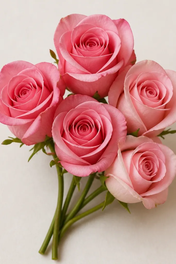
A cluster hides beginner inconsistencies. When five small roses overlap, your eye reads the group instead of inspecting one flower’s perfect symmetry. This is how I make simple drawings look intentional fast. Each rose uses the same formula, but they vary in size by about 2x — one is the hero, the others are smaller. It’s great for kids because it feels like a bouquet instead of a single drawing assignment.
Step 1: Pick one “main” rose about 1.5 inches wide, then place four smaller roses around it at half the size. Step 2: For each mini rose, draw a spiral center and four to six C-shaped petals, keeping overlaps between roses. Step 3: Add curved stems that meet at a bundle point at the bottom, then draw a simple wrap band line around the bundle. Step 4: Shade only the overlap areas inside each rose cluster with light pencil — keep it consistent across all five.
Good to knowChoose one shadow direction for all five roses so the bouquet looks cohesive.
Common mistakeDon’t space the roses too far apart — the cluster effect disappears.
15. Rose with Center Spiral and Petal Vein Lines
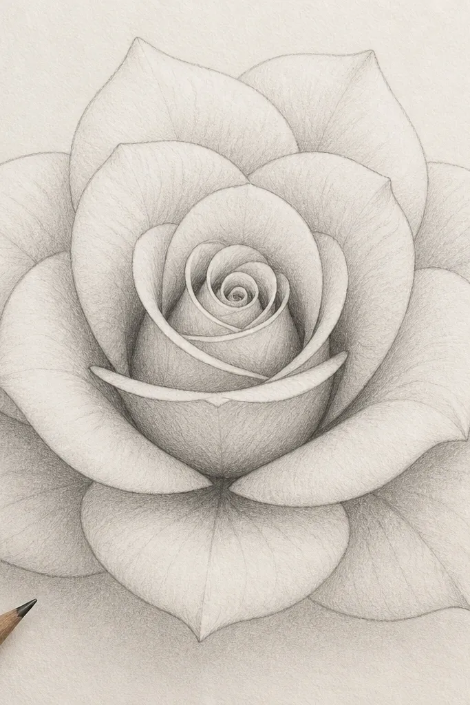
Petal vein lines make roses look more realistic even when the petals are simple. You don’t need to draw lots of texture. One curved vein line per petal gives the eye a folding cue. This style works well with colored pencil because the vein line guides where darker pigment goes. I like it for beginners who want “more detail” without adding more petals. It also looks good on plain white paper with minimal background.
Step 1: Draw a spiral center and then arrange eight inner teardrop petals and six outer petals around it. Step 2: On each petal, add one curved vein line starting near the center and ending about halfway down the petal. Step 3: Shade under overlaps with a soft 2B pencil, using the vein line as a guide for where the shadow sits. Step 4: Leave a highlight edge on the outer rim of each petal by either not shading there or lightly erasing after shading.
Keep vein lines lighter than your outlines — if they’re too dark, they look like cracks.
Don’t add multiple vein lines per petal — it turns into leaf territory quickly.