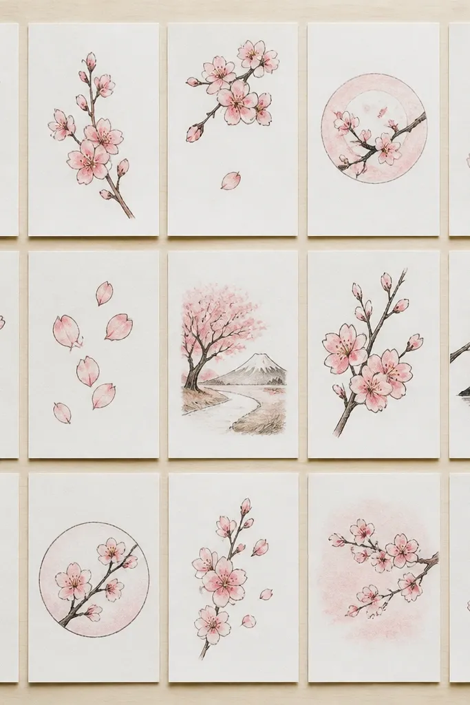
1. Single Cherry Blossom with 5-Loop Petals
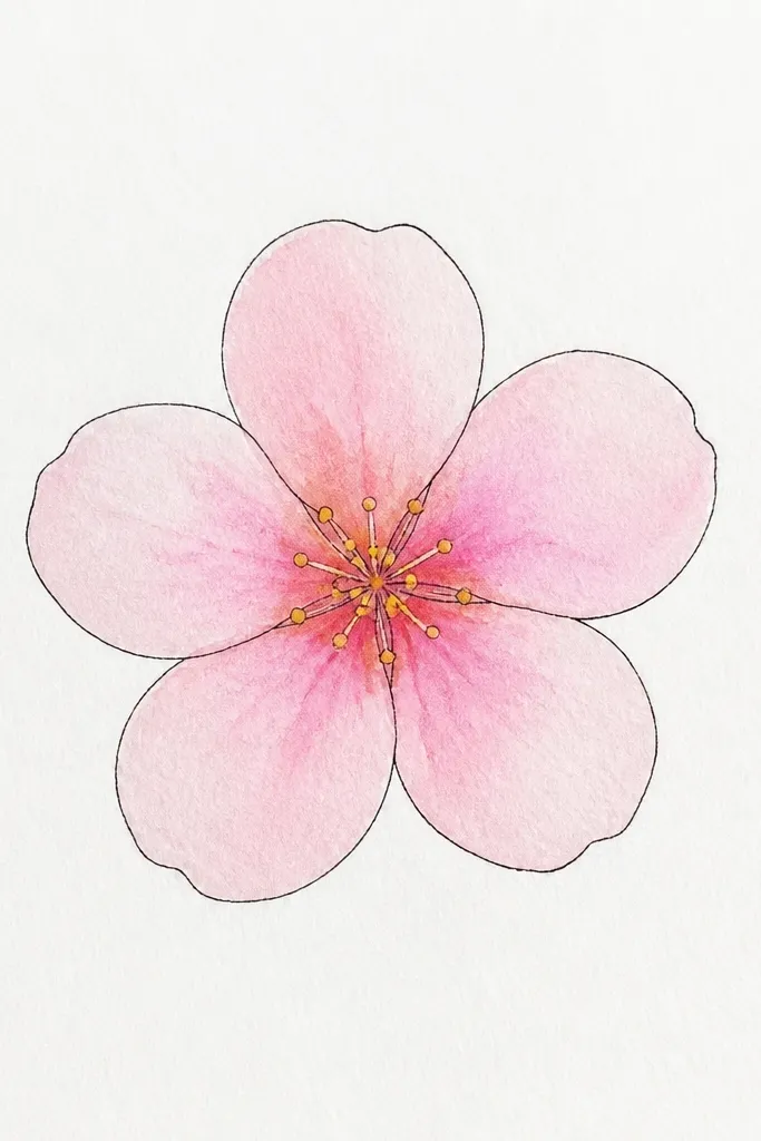
This one is my go-to when I’m teaching kids because it trains the eye on petal order. Start with five petals that look like soft commas, then keep them slightly uneven — real cherry blossoms never match perfectly. I use pale pink for the main wash (think blush, not hot magenta) and add a tiny darker spot at the petal base so the flower has depth. The center gets warm yellow dots so it reads as a blossom from a distance. It looks flattering on any skin tone if you’re making a card because it stays light and clean, not heavy or neon. It also works for adults who want a simple, “finished” look without shading hundreds of details.
Step 1: Lightly sketch a small circle guide, then draw five loop-like petals around it, leaving small gaps between petals. Step 2: Ink the petal outlines with a 0.3 or 0.5 fineliner, then erase the pencil marks. Step 3: Color each petal with a light pink wash, keeping the base slightly darker. Step 4: Add the center with a warm yellow dot cluster and two or three tiny stamen marks. Finally, add one thin shadow line under one petal using a slightly darker pink pencil or diluted paint.
If you’re using markers, tap the pink down gently and stop before it pools — cherry blossom petals should look airy, not filled in solid.
Don’t outline every petal too thick or the flower will look like a sticker instead of a blossom.
2. Cherry Blossom Branch in Side Profile
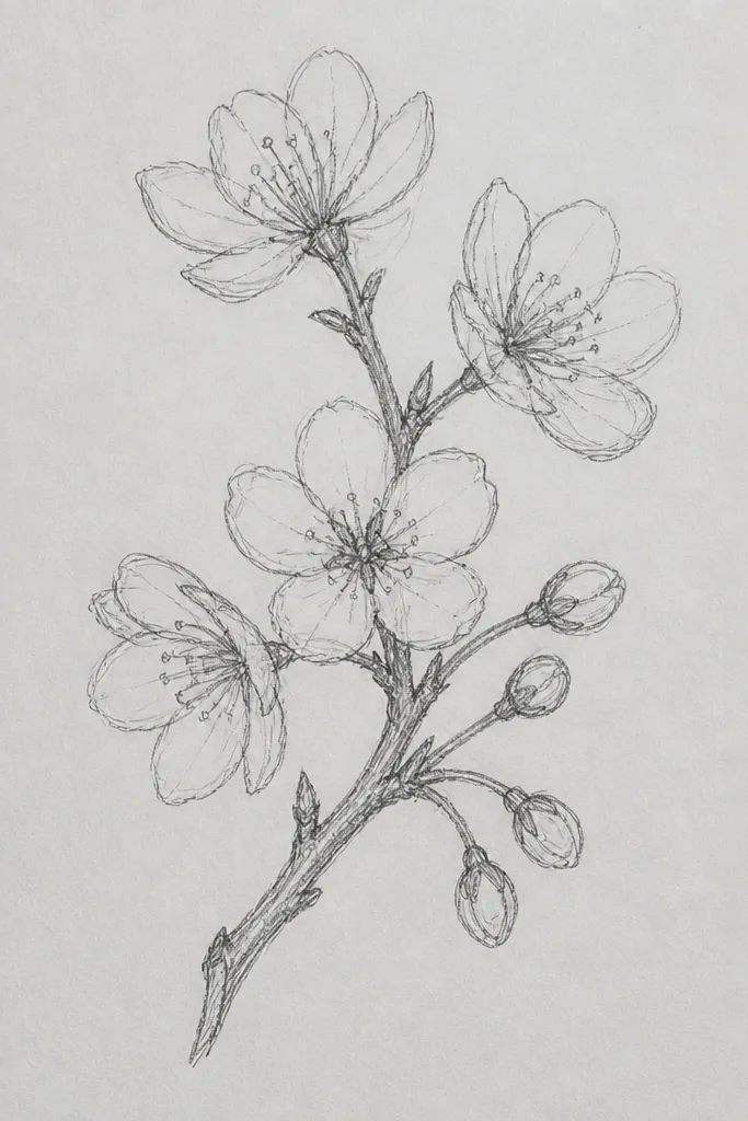
Branch drawings are where cherry blossoms start to look like a real scene, even if you’re keeping the flowers simple. This style uses a side-profile branch — one main line with smaller twigs — so the page has direction and movement. I like it because it frames the flowers instead of scattering them randomly. For color, I keep the blossoms mostly pale pink and use a slightly deeper pink only on the underside of petals. The branch line is done in a warm gray or soft brown, which looks more natural than pure black. This is a strong choice for kids because you can plan the composition with just three sizes of twigs and a handful of blossoms.
Step 1: Draw a main branch line lightly in pencil, then add two to four offshoot twigs that taper as they move away. Step 2: Place blossoms along the top half of the branch first, then add a smaller cluster near the middle for balance. Step 3: For each flower, draw five petals as rounded teardrops, ink lightly, and leave the center mostly open. Step 4: Color with pale pink and add a darker pink edge on the petals closest to the branch. Finally, add a few tiny fallen petals as faint ovals or short curved strokes near the lower right.
Good to knowUse a ruler only for the branch guide line — once you ink, let the twig lines wobble slightly for a natural look.
Common mistakeSkip drawing equal-sized blossoms everywhere; uneven cluster sizes make it look real.
3. Cherry Blossom Mandala Tile (Round Frame)
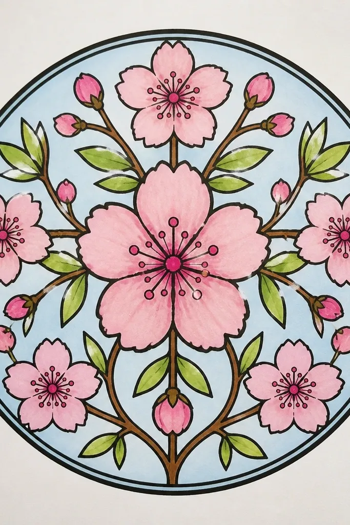
This is the “pretty on a fridge” style. A mandala layout makes cherry blossoms look intentional, not accidental, and it’s easier for kids because symmetry acts like a guide. I use a round frame so the eye knows where to stop, then I repeat flower clusters in a consistent rhythm. Keep the petals light and airy, and only deepen a few petals for shadows. The center gets slightly darker pink so it pulls everything together. This style works especially well for classroom art because it photographs cleanly and doesn’t require perfect realism.
Step 1: Draw a circle for the outer border, then lightly divide it into 6 or 8 wedge sections. Step 2: In each wedge, place one blossom cluster of 2 flowers — draw the flowers first as simple 5-petal shapes, then add centers. Step 3: Fill the gaps with small leaf teardrops and a few tiny petal ovals. Step 4: Color petals with pale pink and add darker pink only on the bottom halves. Finally, ink the border and thickly outline only the outer ring and the main flower outlines.
If symmetry feels boring, vary petal overlap by drawing one flower slightly turned sideways in each wedge.
Don’t shade every petal; one shadow rule per flower is enough.
4. Watercolor Cherry Blossom Fade with Salt Speckle
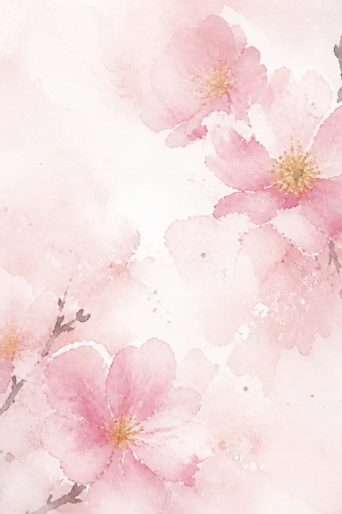
If you want that dreamy, airy cherry blossom look, salt speckle is the trick I use when I want texture without overworking the page. You paint a light pink wash, add a little salt while it’s wet, and the paper makes tiny starburst edges that mimic petal grain. Then you layer a few blossoms on top with diluted pigment so they look like they’re floating in mist. This style looks best on thicker watercolor paper (around 200 gsm) because it holds texture. It also works for gift tags because the background already looks artsy even when the flowers are simple.
Step 1: Wet a small area with clean water, then brush in pale pink watercolor until it spreads softly. Step 2: While it’s still shiny wet, sprinkle a pinch of salt lightly over the wash (don’t drown it). Step 3: After it dries, brush off the salt and add a few branch twigs in light gray pencil or ink. Step 4: Paint 6 to 10 blossoms as quick five-petal shapes, keeping the paint lighter at the petal tips. Finally, add tiny yellow center dots with a fine brush or colored pencil.
Good to knowUse less salt than you think — a few speckles look like petal texture; too much turns it into glitter glue.
Common mistakeDon’t ink over a wet watercolor wash; it bleeds and makes the whole piece look messy.
5. Ink Outline Cherry Blossoms with Pink Wash Only on Shadows
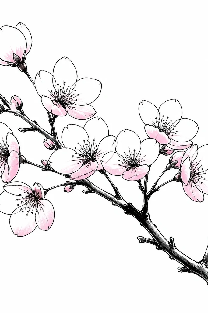
This one looks clean and grown-up because it limits color to shadow areas. By keeping most petals white, the blossoms stay airy and the ink lines do the heavy lifting. I use a fineliner or brush pen for outlines, then watercolor or pink pencil only under one side of each petal. It creates a clear light direction, and your brain reads the flower as dimensional. This style works great for kids too because “white petals with pink under-shadow” is a simple rule. It’s also perfect for making bookmarks because the design stays readable and doesn’t blur.
Step 1: Sketch a branch and blossoms lightly in pencil, then ink the branch first. Step 2: Ink each flower outline with a consistent line weight, and keep the petals open (no full filled shapes). Step 3: Color only the lower half of each petal with pale pink, using a wet brush or watered pencil. Step 4: Add a tiny yellow center and one or two darker pink dots near the base. Finally, add a few small fallen petals as short ink curves in the same pink wash tone.
Good to knowPick one “shadow side” and stick to it across the whole page — that consistency makes it look intentional.
Common mistakeAvoid full-petal fills; if you color everything the same, it loses the airy look.
6. Pencil-Only Cherry Blossom with Soft Blending Center
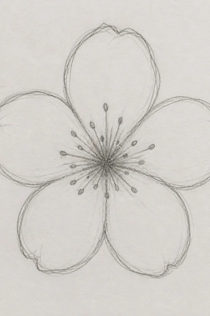
Pencil-only drawings look surprisingly elegant, and they’re cheap. The secret is using light pressure for petals and keeping the darkest values only in the center and petal bases. I use a 2B for the base shading, then blend lightly with a tissue or blending stump so the petal texture stays soft. For highlights, I lift graphite gently with a kneaded eraser — that makes the petals look like light is hitting them. This style is great if you’re stuck with supplies at home or want a drawing that doesn’t need drying time. It also works well for kids because it teaches shading in small, manageable areas.
Step 1: Draw five petals with light pencil lines, leaving the center slightly open. Step 2: Shade the base of each petal using 2B graphite, keeping the tips lighter. Step 3: Blend the shading softly, then deepen the center with small strokes and stipple dots. Step 4: Add a few stamen lines with a sharper pencil point. Finally, use a kneaded eraser to lift tiny highlight spots on each petal tip and on the top petal edge.
Press less than you think, then build darkness slowly — pencil blossoms look best when they stay delicate.
Don’t smudge the entire petal; only blend the shaded areas.
7. Crayon Resist Cherry Blossom on Watercolor Paper
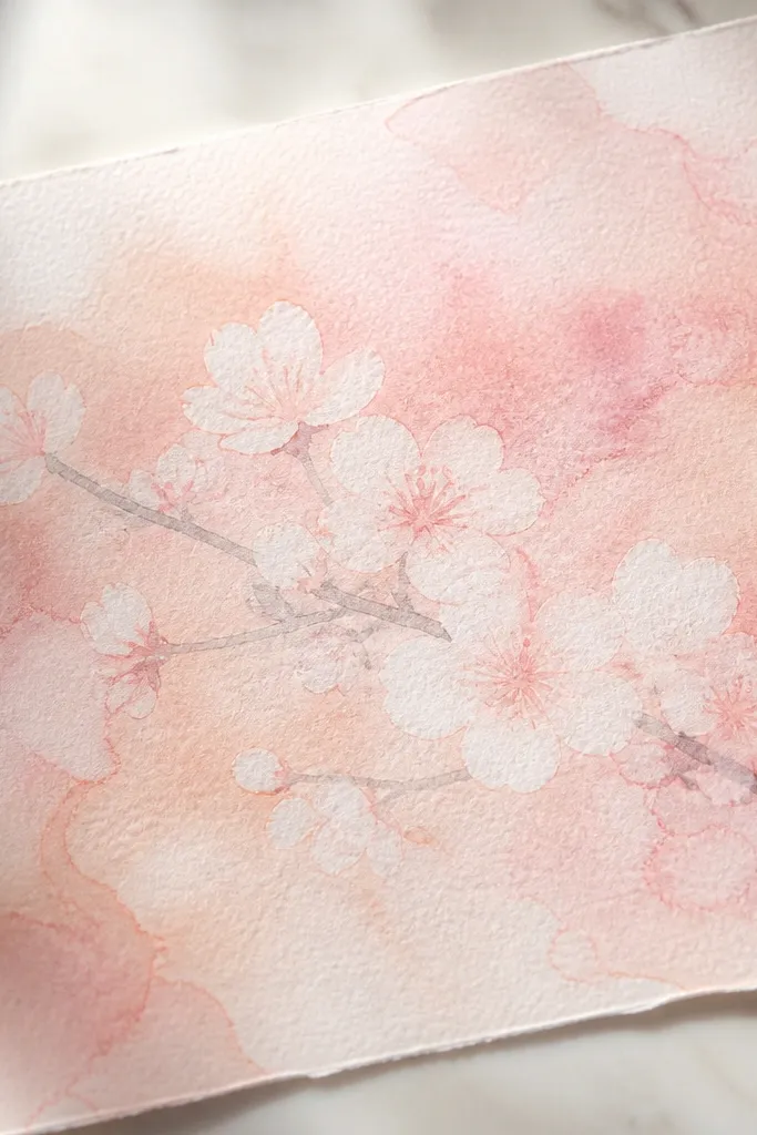
Crayon resist looks like magic, and it’s one of the easiest ways to get “soft petal edges” without fancy tools. You draw the blossoms in white or light crayon, then paint over everything with watered watercolor. The wax resists the paint, so the petals stay bright and crisp even though the background is loose and textured. I like it for kids because it’s forgiving — they can paint messy and it still looks intentional. For adults, it’s a great way to add atmosphere quickly. This style looks good on thicker paper and gives a watercolor vibe even if you only have kid-grade paints.
Step 1: On watercolor paper, sketch a branch and 8 to 12 cherry blossoms with white crayon. Step 2: Color the background with pale pink and peach watercolor, letting colors bleed a little. Step 3: Add a light gray or brown outline branch after the paint dries, or draw the branch in pencil before painting. Step 4: Once everything is dry, add small yellow centers and a few darker pink dots inside the blossom openings. Finally, clean up edges with a light pencil eraser if any paint smudged into the resist petals.
Good to knowUse a thick crayon line for the petal outline so the resist area stays bright.
Common mistakeDon’t use metallic crayons; they resist differently and the texture looks off.
8. Cherry Blossom Flower Crown Sketch for Kids
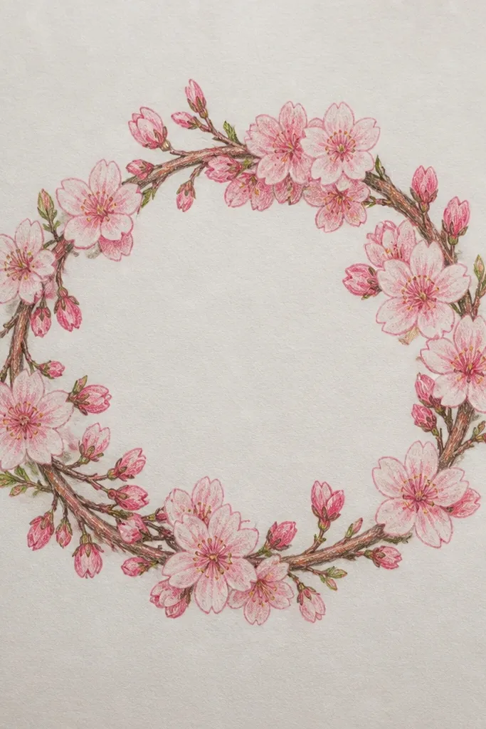
This idea is fun because it turns the drawing into a wearable accessory design. I’ve used it with kids to make “paper crowns” and it always gets smiles because it looks like a real headpiece, not just a flower page. Keep the blossoms small and consistent, then vary leaf angles so the crown looks alive. Use pale pink for petals, green for leaves, and a warm yellow center so the blossoms read clearly. This style flatters any face shape you cut out because the crown sits evenly around the head circle. It’s also a good way to practice spacing — the flowers should touch the crown ring, not float randomly.
Step 1: Draw a head circle or oval guide, then draw a crown ring around it leaving a 2 cm gap. Step 2: Add leaf teardrops evenly around the ring, alternating left and right tilt. Step 3: Fill in between leaves with small five-petal blossoms, keeping each flower about the same size. Step 4: Color petals pale pink, leaves a soft medium green, and centers warm yellow. Finally, add 3 floating petals outside the ring in a lighter pink so it looks playful.
When cutting the paper crown, leave a thicker border line around the ring so it doesn’t tear.
Skip tiny details inside the petals — kids' crowns look best with bold shapes.
9. Sakura Bloom with Overlapping Petals (Layered Look)
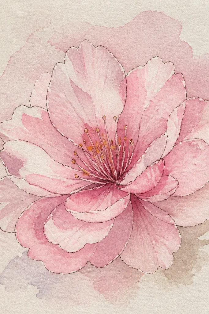
Overlapping petals create depth fast, and you don’t need heavy shading to get it. This style looks more realistic because petals stack — one petal edge covers another. I like it for adults who want a more “drawing-y” look without painting. Use three pink values: pale blush for top petals, a slightly deeper pink for middle petals, and a light shadow gray-pink for the underside. The center stays small and warm so it doesn’t overpower the petals. This works for cards and wall art because it reads as a single focal flower.
Step 1: Draw a small oval center guide, then place 3 petals around it as the front layer. Step 2: Add 2 more petals behind the first ones so you can see edges peeking out. Step 3: Ink the outlines, but keep the hidden petal edges lighter or thinner. Step 4: Color the front layer with pale pink, the middle layer with slightly deeper pink, and the underside with diluted gray-pink. Finally, add yellow dot stamens and a tiny darker dot ring around the center.
Good to knowMake the front petals slightly bigger than the back ones — it sells the overlap instantly.
Common mistakeDon’t draw all petals the same size; flat blossoms happen when every petal is identical.
10. Cherry Blossom Spray Paint Effect with Spatter Dots
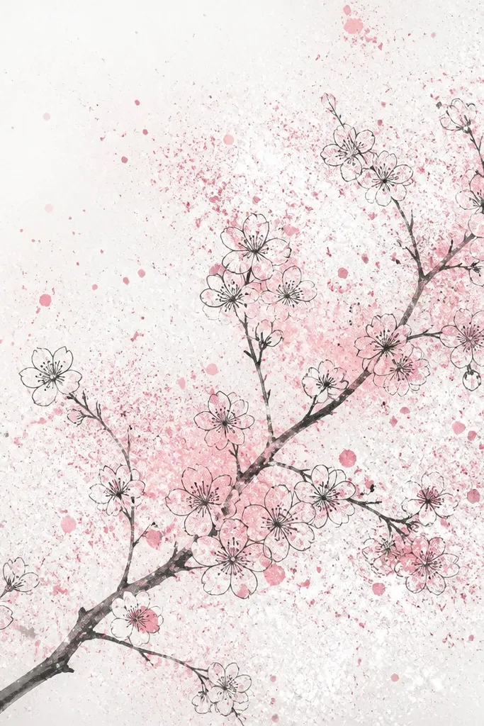
Spatter dots look like falling petals, and you get motion without drawing every petal. I used this on a craft table when we had limited time, and it still looked intentional because the spatter is controlled around the branch. Keep the branch simple, then let the spatter do the atmosphere. Use two colors: pale pink and a slightly warmer peach-pink. The blossoms themselves can be outline-only so the speckles don’t get busy. This style is great for kids because it’s forgiving and fun. It also looks good on dark paper if you reverse the colors — white and light pink paint pop nicely on black cardstock.
Step 1: Draw a thin branch with a few blossoms spaced along it, ink lightly. Step 2: Mix pale pink paint with a lot of water so it splatters when you tap the brush. Step 3: Load the brush, then flick near the blossom clusters to create spatter dots. Step 4: Add a second round with peach-pink, focusing on the top right area for a light direction. Finally, reinforce one or two blossom outlines so they stay readable against the speckles.
Good to knowCover the edges of your paper with scrap so you control where the spatter lands.
Common mistakeDon’t overdo the spatter across the whole page; concentrate it near the branch.
11. Cherry Blossoms on Grid Paper for Perfect Spacing
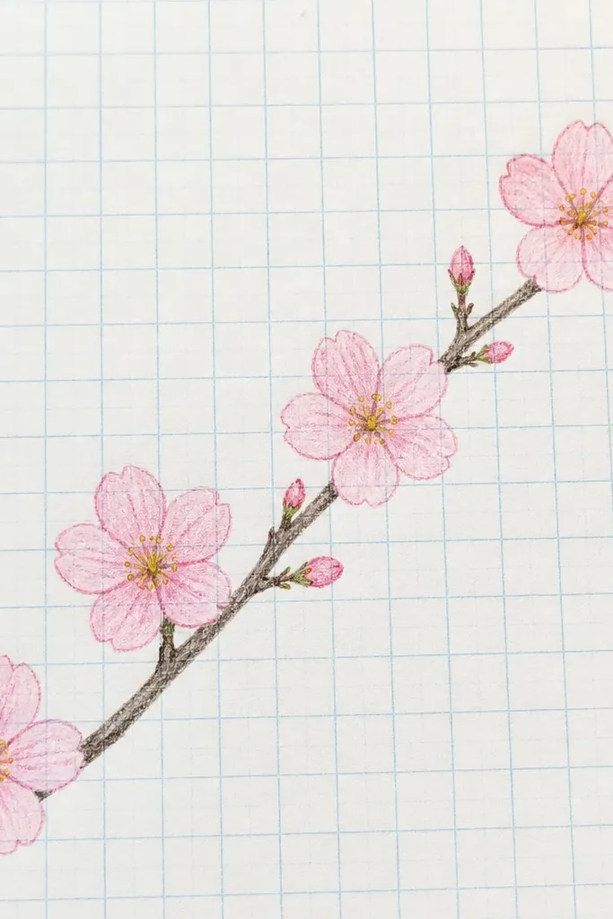
Grid paper is how you keep blossoms from drifting into chaos. When kids draw freehand, flowers often end up too close together or too far apart. Using the grid gives you a spacing rule without making the drawing stiff. Each flower can be about 2 squares wide, and you can place clusters every 3 to 4 squares along the branch. I like this method for making repeat patterns for bookmarks or a classroom banner. It looks neat, and the finished piece looks like you planned it, not guessed. The pink stays consistent because you shade within the flower boundaries.
Step 1: Use a ruler to lightly sketch the branch across the grid, then mark spots for blossoms every 3 squares. Step 2: Draw each blossom as five petals that fit inside a 2x2 square, keeping the center at the middle of that block. Step 3: Shade petal bases with a light pink pencil, then keep the petal tips lighter. Step 4: Add yellow dots in the center and a tiny darker pink at the petal base points. Finally, erase any extra grid marks that show through and ink the branch lightly if you want it cleaner.
Good to knowIf you’re using markers, test one flower on scrap grid paper first so the color doesn’t bleed into the lines.
Common mistakeAvoid drawing on heavy scribble lines; erase the construction marks early.
12. Cherry Blossom Silhouette in One Continuous Line
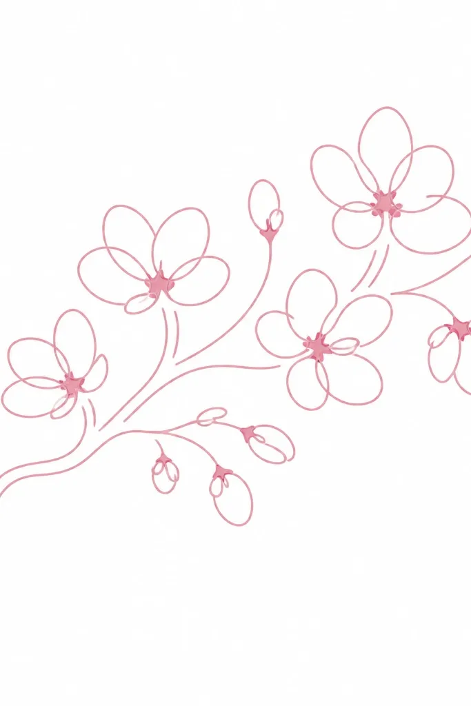
This style looks modern because it’s fluid and minimal. I use it when I want a drawing that looks like a design element, not a detailed illustration. The trick is to plan where the line crosses — each loop becomes a petal, and the crossings create natural separation. Use a fineliner to keep the line smooth, then add only a few pink washes to suggest depth. It works well for kids because it reduces decision-making: they just keep the line moving. For adults, it’s a great way to make gift wrap stickers or the front of a notebook cover.
Step 1: Draw a long sweeping branch line first with a fineliner, then start looping around it to form petals at 8 to 12 points. Step 2: Keep each flower made from one continuous loop set so you don’t break the line between petals. Step 3: Color the petals with pale pink marker, but leave 1/3 of each petal uncolored so the outline still shows. Step 4: Add tiny darker pink dots at the petal bases where the loops overlap. Finally, thicken only the branch line slightly so it anchors the blossoms.
Practice one flower loop on scrap until you can close the loop cleanly — that makes the whole branch look intentional.
Don’t outline over and over; multiple passes make the silhouette look clunky.
13. Cherry Blossom Bouquet with Three Flower Sizes
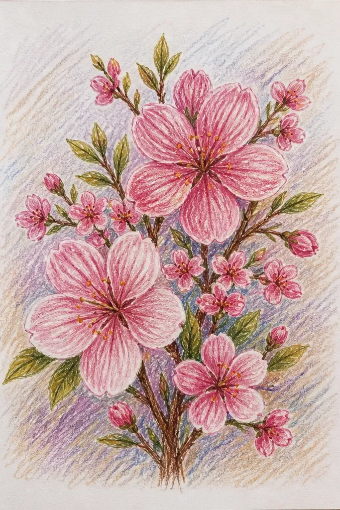
Bouquet layouts look “complete” because they create a focal point and depth through size. I use three sizes so the eye knows what to look at first: one big bloom, a few medium ones, and a scattering of small blossoms. Color stays consistent by using the same blush pink across all sizes, with darker pink only on the larger focal flower. Add a few leaves or tiny twigs to connect the clusters. This style works for kids because it’s simple to place: big in the center, medium around, small near the edges. It’s also great for greeting cards because it looks good even if you keep the background blank.
Step 1: Sketch a loose oval bouquet area, then place one large blossom at the center and 4 medium blossoms around it. Step 2: Add 8 to 12 small blossoms near the edges of the oval, leaving some negative space. Step 3: Ink the outlines, then color petals with pale pink. Step 4: Make only the center bloom’s petal bases darker pink, and keep the smaller blossoms mostly light. Finally, add 3 to 5 leaf teardrops in soft green and connect them with thin twig lines.
Leave at least a third of the oval area as blank space — blossoms look airy when the background breathes.
Avoid filling the whole oval evenly; blank space makes the bouquet read as a bouquet.
14. Cherry Blossom Branch with Faux Japanese Print Texture
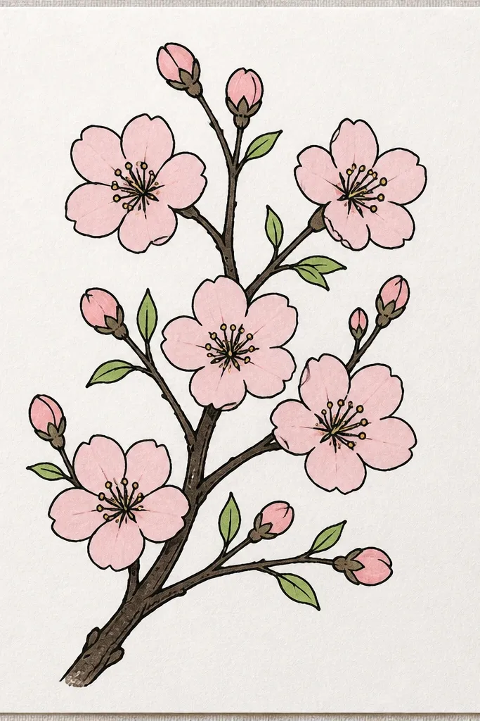
If you want that Japanese print vibe without doing complicated printmaking, you can fake the texture with simple paper and light speckling. The key is flat coloring with one shadow tone, not lots of gradients. I use warm brown for the branch and a light pink palette for petals, then add a tiny bit of grain using a dry brush or a light stipple with diluted paint. It looks intentional and classy because the shading stays controlled. This style also photographs well because the texture adds depth without clutter. It’s a great choice for kids who can handle outlines and simple color blocks.
Step 1: Draw a branch diagonally and add blossoms in clusters of 2 to 3 flowers, plus a few leaves. Step 2: Ink outlines, then color petals with pale pink and add one darker pink shadow at the base. Step 3: With a dry brush, flick diluted gray-brown or watered paint to create subtle background grain. Step 4: Add a few darker branch lines to suggest knots, then let the rest stay flat. Finally, erase any pencil marks and keep the background mostly light so the scene stands out.
Use slightly rough paper or lightly crumple then flatten it — it helps the grain show without extra work.
Don’t add heavy watercolor gradients; the print look comes from flat tones plus texture.
15. Pastel Chalk Cherry Blossoms on Black Cardstock
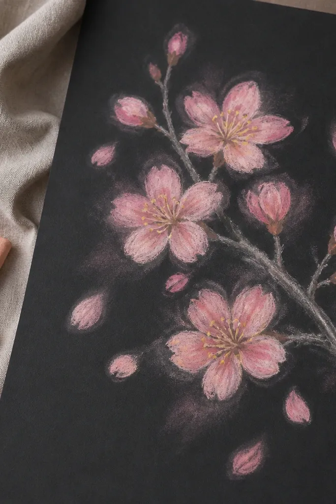
Chalk on black paper makes cherry blossoms look instantly dramatic and soft. You get that velvety petal feel because chalk naturally blends at the edges. I like using three chalk tones: light pink for most petals, peach-pink for mid petals, and a tiny bit of deeper rose for shadows. Centers stay yellow so they pop against the black. This style is great for kids because chalk is forgiving; smudges can look like petals in motion. For adults, it’s a fast way to make artwork that looks like a finished piece even with simple flower shapes.
Step 1: Sketch the branch and blossoms lightly with a white or light gray chalk, keeping lines thin. Step 2: Color petals with light pink chalk, then add peach-pink on a few petals closest to the center. Step 3: Add deeper rose only at petal bases where petals overlap. Step 4: Tap warm yellow chalk for the center dots, then use the side of your finger or a tissue to soften only the petal edges. Finally, add a few floating petal smudges in pale pink near the branch.
Good to knowFixatives can change chalk color, so test a tiny corner first if you plan to spray.
Common mistakeDon’t press hard early; thick chalk lines look chunky and ruin the delicate look.
16. Cherry Blossom Flower Step-by-Step with Stamen Dot Cluster
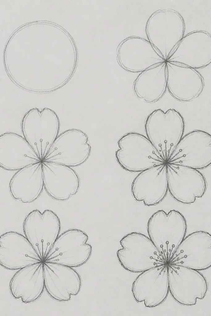
The stamen dot cluster is what makes a blossom read as cherry blossom, not just a generic flower. When you draw the dots small and tight, the center looks like it’s glowing. I use a fine colored pencil or a watered yellow paint dot with a brush tip. The petals stay simple: five shapes, light pink wash, and darker base shading. This style is beginner-friendly but still looks detailed because the center has character. It also works for kids because the center is a single repeated action: make a tiny dot cluster in the middle.
Step 1: Draw five petals around a small circle, then ink the petal outlines. Step 2: Shade the petals lightly in pale pink, and darken only the base area under each petal. Step 3: Create the stamen cluster by tapping 10 to 18 tiny yellow dots into the center circle. Step 4: Add 2 to 4 curved stamen lines that stick out slightly, using a darker yellow-brown pencil. Finally, add one highlight on each petal tip by erasing gently or leaving it unpainted.
If your center dots look too big, switch to a sharpened colored pencil point instead of a brush.
Avoid drawing the center as a big filled circle; dots keep it airy.
17. Cherry Blossom with Leafy Frame and Corner Blossoms
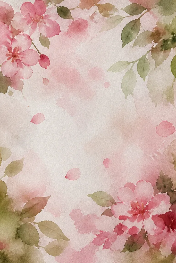
Corner blossoms make a page look designed without covering the whole surface. I use a leafy frame because it gives structure, then I place a few larger blossoms only in two corners. That keeps the composition balanced and keeps the drawing from becoming crowded. Use green leaves with simple vein lines and light shadows under leaf edges. Petals stay pale pink with darker base shading, and the corner flowers get the most detail so they pull attention. This style is great for kids making certificates or art cards because it looks neat and stays within borders. Adults can use it for printable-style stationery too.
Step 1: Lightly draw a rectangular border inside the page edges, leaving about 1 cm margin. Step 2: Add leafy branches along the top and sides, then place one larger blossom cluster in the top left corner and one in the bottom right. Step 3: Fill the center with 5 to 7 small blossoms so the frame doesn’t look empty. Step 4: Color petals pale pink, add darker pink at bases, and keep leaf shading minimal with a slightly darker green under one side. Finally, ink the border and branch lines, then erase pencil marks.
Good to knowLet leaves overlap the border slightly so it feels like the frame is growing, not pasted on.
Common mistakeDon’t put big flowers in all four corners; it overwhelms the page.
18. Cherry Blossom Bouquet in a Simple Vase Outline
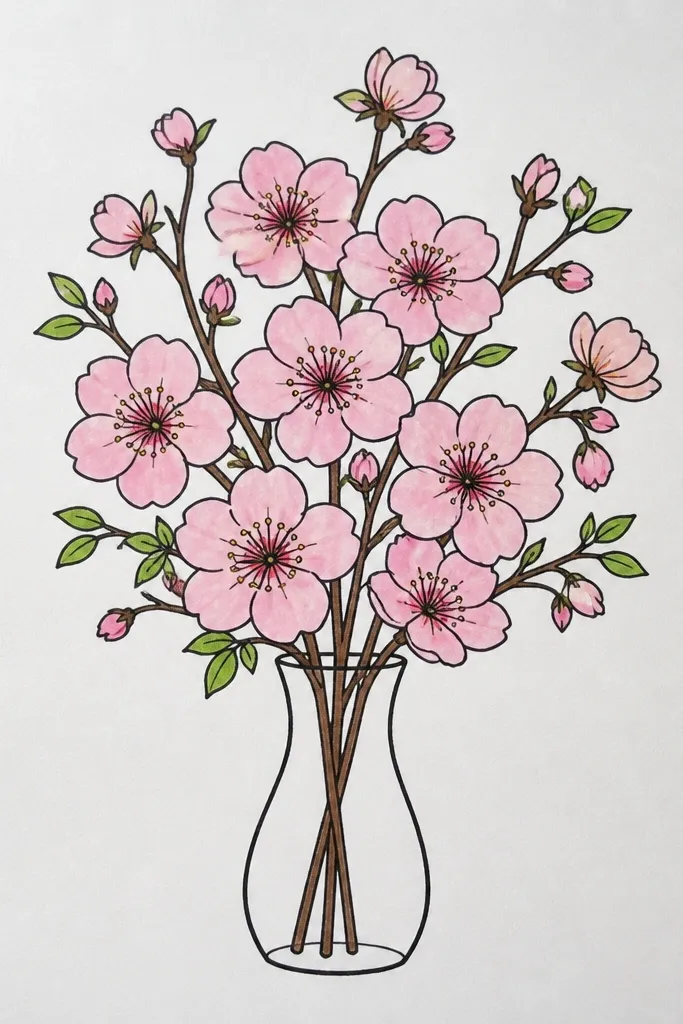
A vase outline gives you an automatic structure for stems, which makes blossoms look like they belong together. I like this because it turns a bunch of flowers into a clear arrangement, even if you keep the vase minimal. The petals can be simple five-petal shapes, but the stems must taper and curve — that sells the bouquet. For color, keep the blossoms blush pink and add darker pink only on the underside. The vase can be a light gray or muted brown so it doesn’t compete with the flowers. This style works for kids who can draw a basic oval vase and for adults who want a card-ready composition quickly.
Step 1: Draw a simple vase shape — an oval top, a slightly narrower middle, and a flat base. Step 2: Add 6 to 9 thin stems that rise and curve outward, then attach blossoms at the stem tips. Step 3: Draw each blossom as five rounded petals with small gaps, ink, and color pale pink. Step 4: Add yellow dot centers and a tiny darker pink at the petal base. Finally, add a few leaf teardrops along the stems and keep the background white.
Good to knowMake the outer blossoms slightly smaller than the ones near the center so the bouquet feels layered.
Common mistakeDon’t draw straight stems; straight stems make the bouquet look like it’s floating.
19. Cherry Blossom with Branch Shadow and Soft Ground Wash
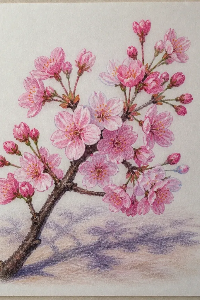
This is the style that makes blossoms feel like they’re standing on something, even on a blank page. The “ground wash” is a light shadow area under the branch, and it gives the flowers a place to rest. I use a very diluted gray-pink or warm gray wash, keeping it lighter than the petals. Then I shade the petal bases in slightly deeper pink so the whole piece has consistent light direction. It’s a good choice for kids making posters because it looks more finished than a floating branch. Adults also like it because it adds depth without complicated detail.
Step 1: Sketch the branch and blossom clusters lightly, then ink the branch and flower outlines. Step 2: Paint blossoms with pale pink, then deepen only the petal bases with a slightly darker pink. Step 3: Mix diluted warm gray-pink and paint a soft oval or curved shape under the branch like a shadow ground. Step 4: Add a second light wash to the shadow edges so it fades naturally. Finally, place yellow dot centers on each blossom and let everything dry flat.
Keep the ground wash under the densest blossoms; it makes the focal area look intentional.
Avoid making the shadow too dark; dark shadows make the pastel petals look muddy.
20. Cherry Blossom Doodle Border for Notebooks and Cards
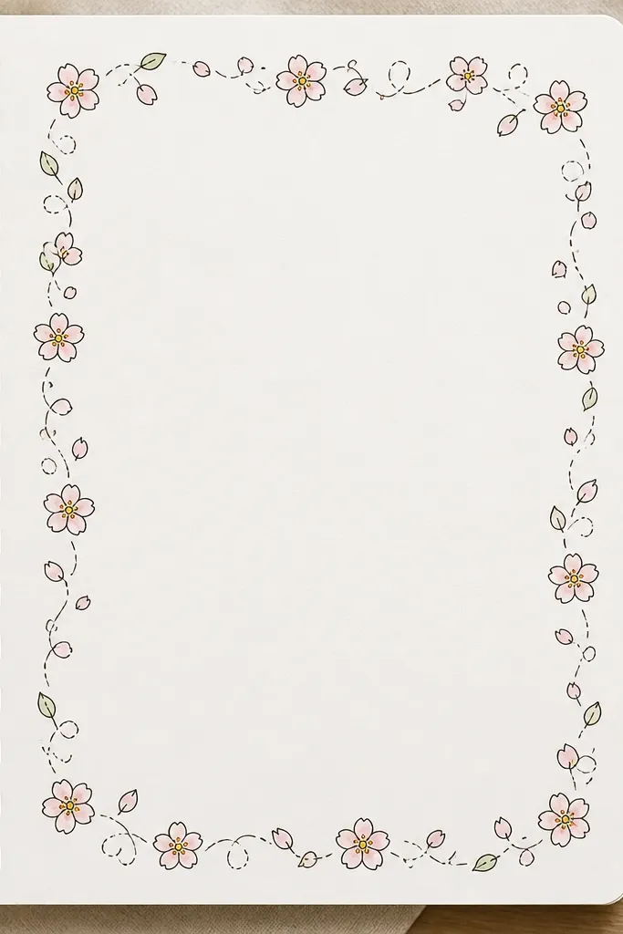
Borders are where kids' art often looks best because the design stays contained and tidy. This border uses repeated small blossoms, but you keep them from feeling uniform by rotating a few flowers and varying leaf shapes. I keep the coloring minimal: pale pink petals, yellow dot centers, and one darker pink spot at the base of each flower. The swirls between flowers make the border feel like it’s flowing, not pasted on. This is great for labeling folders, decorating envelopes, and making a quick “pretty” gift card. It also works for adults because it’s easy to repeat and scales up or down.
Step 1: Lightly draw a rectangular margin line inside the page edge. Step 2: Along the top and bottom edges, place small blossoms every 2 to 3 cm and interleave leaves or petal swirls. Step 3: Color petals pale pink, add yellow dot centers, and add a tiny darker pink base dot for depth. Step 4: Outline everything with a warm gray or brown fineliner so it doesn’t look harsh. Finally, erase the margin line and add 2 to 3 slightly bigger blossoms in the corners to anchor the border.
If you want it to look more “designed,” make the border corners slightly denser than the middle edges.
Don’t make every blossom the same exact size; repetition without variation looks machine-made.