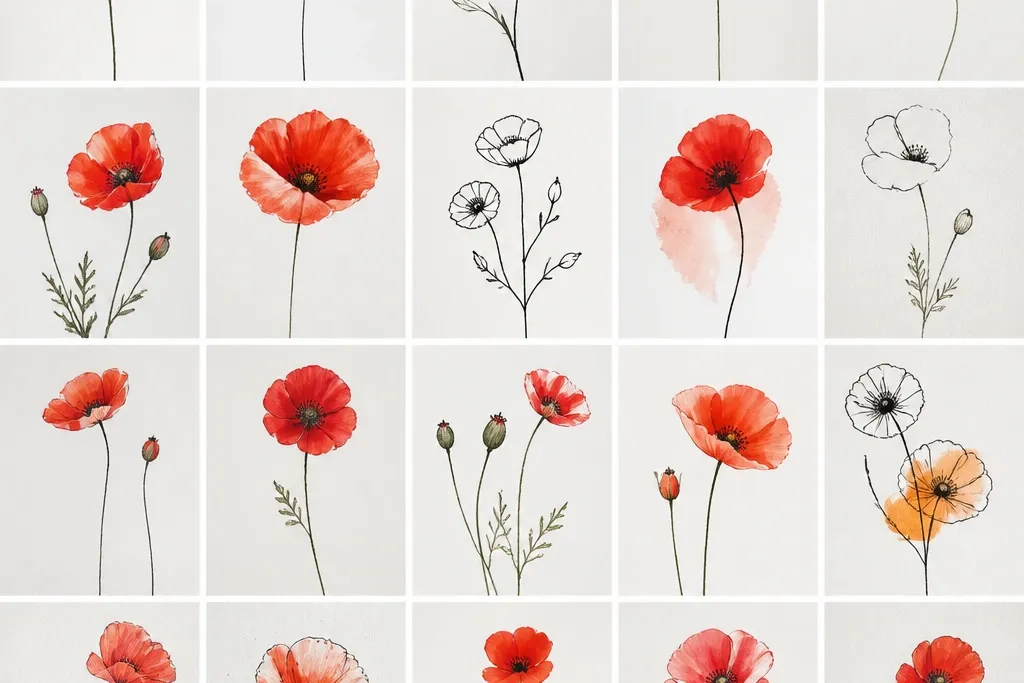
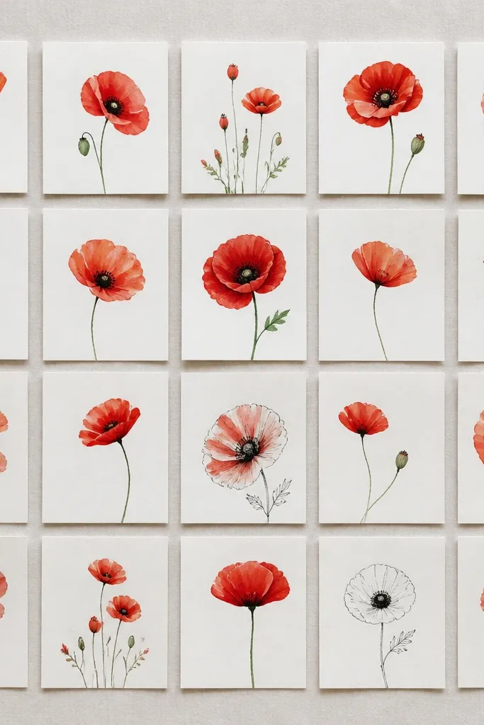
1. Single Poppy Face with 5 Teardrop Petals
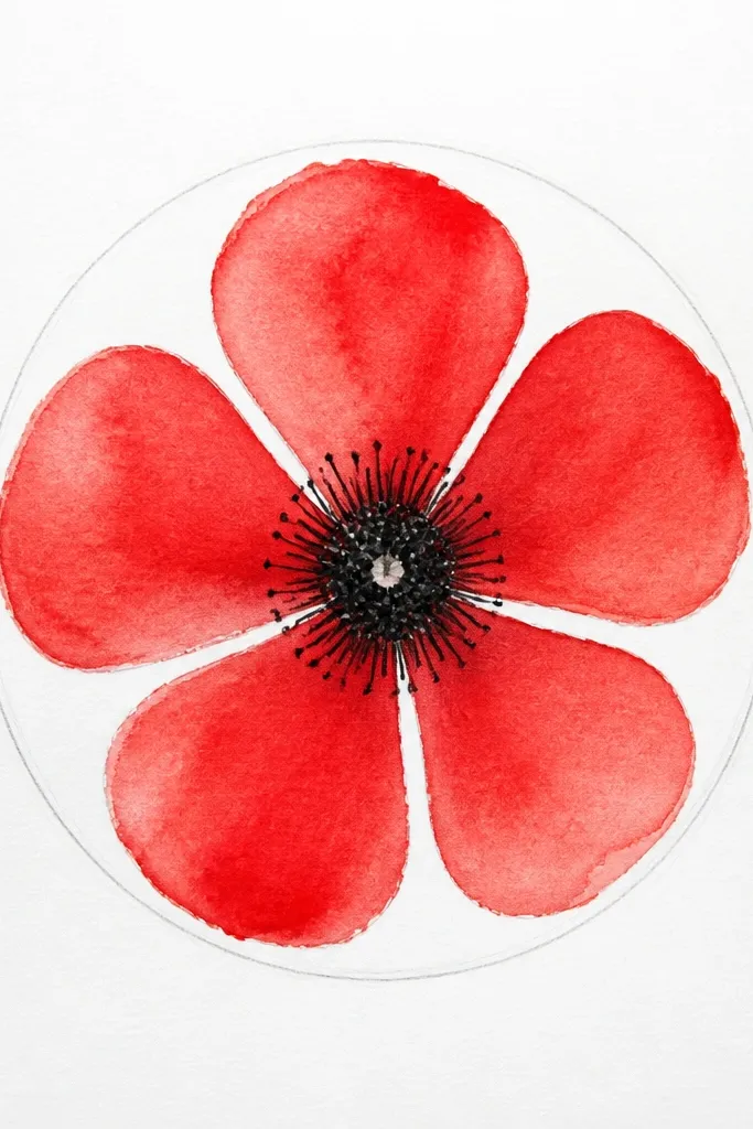
Draw one poppy face when you want the cleanest “label art” look on a budget. The five teardrop petals make the flower readable from across the room, even if the edges wobble. Use bright red for the petal base, then add a darker red stripe on the lower left of each petal so it looks round. The center stays deep brown or black with a tiny off-white highlight — that contrast is what makes the simple drawing feel real. This style works for kids because it uses only one repeatable petal shape and one center pattern.
Step 1: Lightly sketch an oval head about 3 inches tall, then place a tiny circle in the middle for the center guide. Step 2: Add exactly five teardrop petals around the oval, keeping the widest part at the outer edge so the petals don’t collapse inward. Step 3: Color the petals bright red, then shade each petal with a darker red line following the petal’s curve. Step 4: Dot the center with a dark marker or pencil — press 10-15 small dots — and leave one small pale spot uncolored. Finally, add 5-7 short, thin lines rising from the center for the stamens.
Use a ruler to keep the oval centered, then ignore symmetry after that — poppies look better with small natural differences.
Don’t outline every petal edge thick and dark; it makes the drawing look like a cartoon sticker.
2. Poppy Bud in a Tight Oval Frame
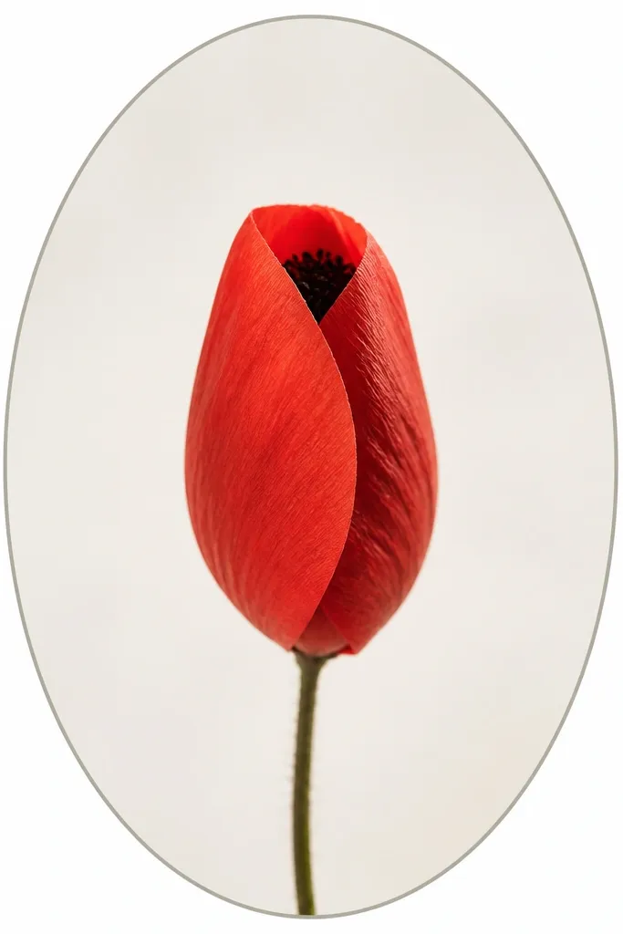
Go with the bud when you want something easier than a full flower but still clearly poppy. Buds hide the complex center, so you can focus on petal folds instead. The folded look flatters kids because it uses fewer shapes: two or three petal “layers” instead of five open petals. For adults, it looks extra intentional when the bud sits inside a simple frame like a vertical oval or rounded rectangle. This drawing also works well on bookmarks and small card fronts.
Step 1: Draw a vertical oval frame about 4 inches tall, leaving a 1/4 inch margin around it. Step 2: Inside, sketch a smaller oval bud and add two curved petal folds on the sides, leaving a small opening at the top. Step 3: Color the visible folds bright red and add a darker red shadow along the inner edge of each fold. Step 4: Place a small dark dot cluster at the top center for the hidden center, then add 3-4 tiny stamens as short dashes. Finally, draw a thin stem line from the bottom of the frame and add one simple leaf on the left.
Shade the inside folds more heavily than the outside — it makes the bud look like it’s closing.
Don’t draw a full open flower inside the bud frame; it turns into a cluttered mess fast.
3. Side-Facing Poppy Profile (3/4 View)
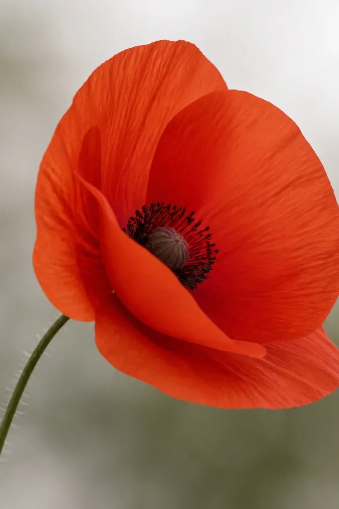
Use a side profile when you want your drawing to look more grown-up without adding complexity. The 3/4 view means you draw fewer petals, but the overlap makes it feel dimensional. Overlapping petals is the trick that makes cheap markers look like a real illustration. Color the foreground petal a brighter red and the back petal a slightly darker red so the flower reads as facing one direction. This style is great for kids who get frustrated with “too many petals” because you only commit to three big petal shapes.
Step 1: Sketch an oval head and tilt it slightly to the right, like a face turning toward someone. Step 2: Draw three teardrop petals — one front petal large, one middle petal tucked behind, and one smaller petal on the side. Step 3: Color the front petal bright red, and shade the tucked petal with darker red on its right edge. Step 4: Place the center slightly toward the visible side, then dot it with dark brown and leave a small pale highlight. Finally, add a short curved stem line and one narrow leaf angled opposite the flower.
Good to knowKeep the overlapping petal edges clean — even one crisp overlap line makes the whole drawing look planned.
Common mistakeDon’t center the dot cluster perfectly; side views look better when the center shifts a bit.
4. Poppy Trio on a Single Stem
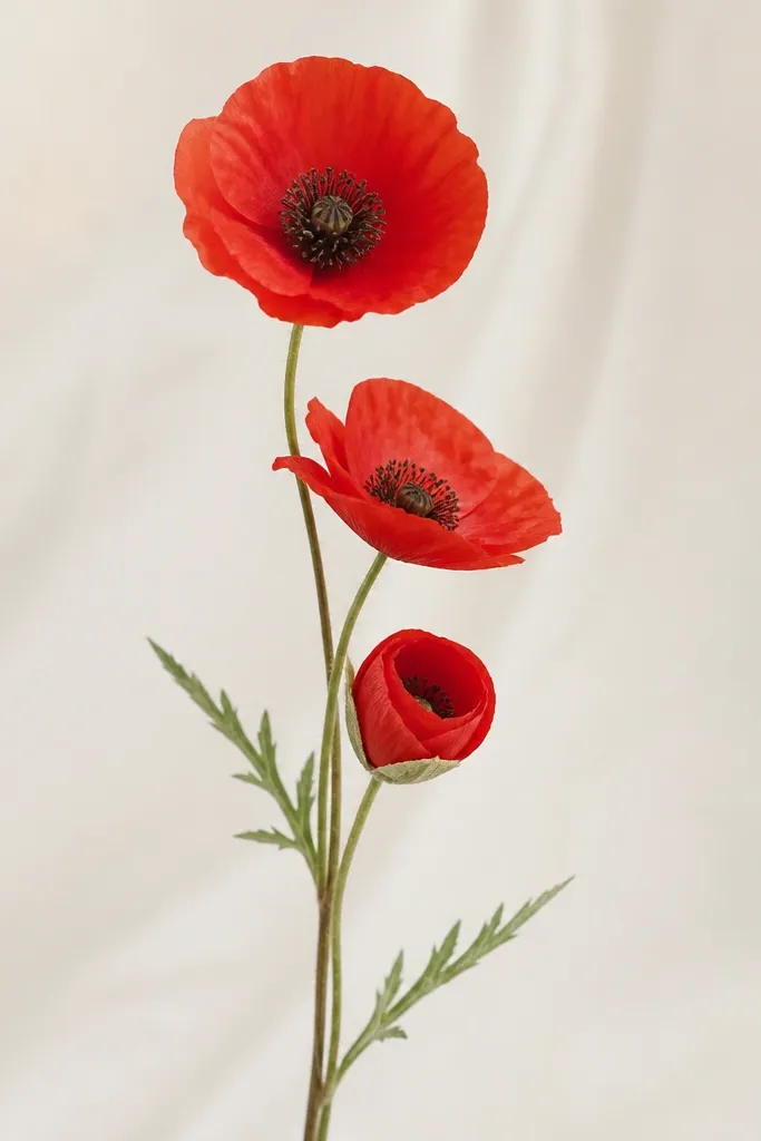
This is the one I reach for when I’m making a quick kids' card and want it to look like a bouquet. Three flowers keep the page interesting, but the shapes stay simple because each head uses the same teardrop petal method. It flatters kids because they can repeat a pattern without thinking too hard: draw one flower head, then scale it down for the next two. For a more “designed” look, keep one flower facing forward and the other two slightly angled. Use the same red shade for all three and vary only the shadow intensity.
Step 1: Draw one vertical stem line with a slight curve, then mark three spots along it for flower heads (top, middle, bottom). Step 2: At the top spot, draw a standard open poppy with five teardrop petals. Step 3: At the middle spot, repeat the flower but tilt it and overlap one petal. Step 4: At the bottom spot, draw a bud-half version with two folded petals and a small dot center. Step 5: Add two narrow leaves near the stem — one left, one right — and keep them simple teardrops with a center vein line.
Good to knowMake the middle flower the smallest; it gives the bouquet depth without doing fancy shading.
Common mistakeDon’t make all three flowers the same size and angle; it reads like three stickers stuck on paper.
5. Poppy Flower Mandala of 8 Petals
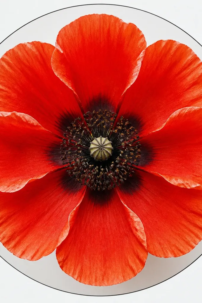
When you want a more decorative look, go for eight petals. It still reads as a poppy because the center and color plan stay the same, but the extra petals make it feel like a patterned flower you’d see on stationery. This works for kids who like “symmetry games” because you can place eight petals evenly around a circle. For adults, it looks great in a coloring page style because it leaves room for neat shading. Keep the shadows consistent — same side of each petal — so it doesn’t look random.
Step 1: Draw a circle about 3.5 inches wide, then lightly sketch a smaller center circle. Step 2: Place eight teardrop petals around the circle, aiming each petal point outward like a clock face. Step 3: Color all petals bright red, then add darker red shading on the inner side of each petal (the side facing the center). Step 4: Dot the center with dark brown and add 8-10 tiny stamens as short lines. Finally, trace a thin ring around the outside petals for a clean frame.
Good to knowIf you’re using markers, use the same pressure for all petals; consistent edges look more expensive.
Common mistakeDon’t add extra lines inside the petals; the mandala reads messy fast.
6. Watercolor Wash Poppy with Marker Outline
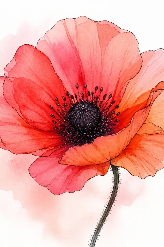
This combo is a cheat code when you want softness without losing the poppy shape. The watercolor wash gives you natural color variation in the petals, while the marker outline keeps the flower crisp. I like using a marker outline first, then watercolor on top or beside it, because kids can stay within the lines. The pale highlight at the petal edge shows up naturally with watercolor — it’s why this looks good even when the wash bleeds a little. It also looks great for older kids who want “pretty” instead of just “cute.”
Step 1: Sketch the oval head lightly, then draw five teardrop petals with a fine black marker. Step 2: Color the center with a dark brown or black, leaving one tiny pale spot unpainted. Step 3: Mix a loose watercolor wash: a bright red diluted with water plus a tiny touch of orange for warmth. Step 4: Paint each petal with the wash, leaving a lighter edge where the petal curve turns toward the outside. Step 5: Add darker red paint only along the lower half of each petal, then let it dry before adding any extra dots in the center.
Use a small round brush and load it lightly; too much water makes the petals balloon and lose shape.
Don’t skip the marker outline if you’re using watered paint — it turns into a vague blot.
7. Poppy on a Grid Paper for Perfect Petal Spacing
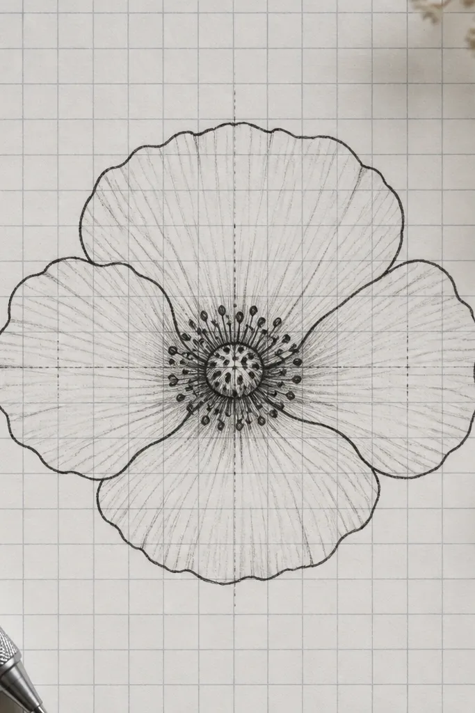
Grid paper fixes the most common kid problem: petals bunching together. When you draw on a grid, you can space each teardrop consistently, and the flower looks intentional even if the lines aren’t fancy. This also helps adults who want a cleaner sketch for journaling or DIY stickers. The grid lines can stay lightly visible if you’re using pencil, then you trace only the final outline. Keep the center small and centered — the grid makes it easy.
Step 1: Use graph paper or place a transparent grid over your sheet, then mark a center point. Step 2: Draw an oval head spanning about 10 grid squares in width. Step 3: Place five teardrop petals so each petal peak touches a consistent arc line; use the grid intersections to guide the petal widths. Step 4: Trace the final petal outlines with a black pen, then add bright red fill with markers or coloring pencils. Step 5: Dot the center with dark pencil or marker and add short stamens as tiny straight lines.
Good to knowCount squares for the petal base width; that single measurement keeps the whole flower balanced.
Common mistakeDon’t erase the grid completely if it’s faint; it can guide you while coloring.
8. Minimal Poppy Doodle with One-Line Stems
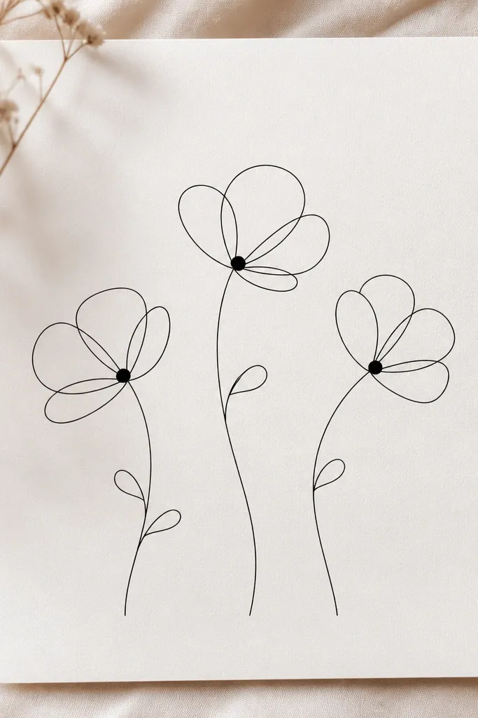
This one is for when you want the poppy look with the least effort. Minimal doodles work great for kids because they don’t require careful coloring. The secret is keeping the outlines consistent: one line weight for petals, one for stamens, and dark dot centers. It also looks good on plain white paper next to handwritten notes because it’s light and doesn’t crowd the page. If you’re making a budget craft, this style uses almost no supplies.
Step 1: Draw a teardrop petal outline for one poppy, then repeat it five times around a light oval center. Step 2: Add the center as a small circle filled with 12-15 dots using a marker tip or pencil press. Step 3: Add five short stamens as tiny lines from the center. Step 4: Draw a single curved stem line with one narrow leaf teardrop on the side. Step 5: Repeat for two more flowers, placing them at different heights so the page doesn’t look flat.
Good to knowUse a black pencil first, then trace the final outline so the line stays steady.
Common mistakeDon’t add big shaded areas; minimal flowers look best with only dots and thin lines.
9. Poppy Flower with Crayon Resist Petal Highlights
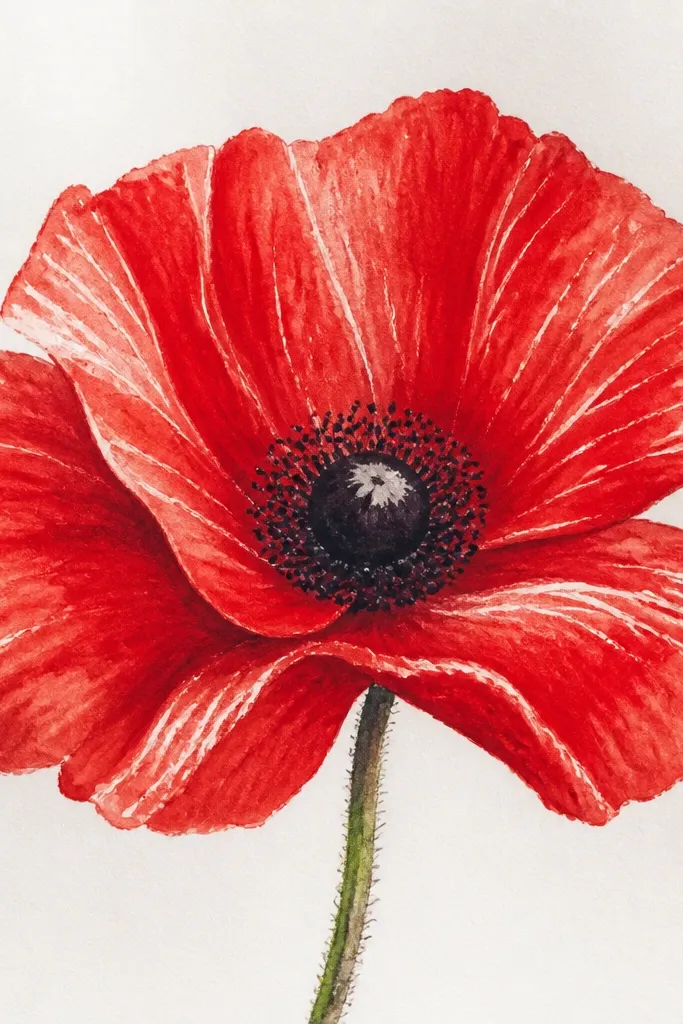
Crayon resist is the fastest way I know to make petals look glossy without spending time blending. You draw your petal highlights with white or very light crayon, then paint over them with red watercolor or red paint. The resisted lines stay bright, so the petals look like they have light catching on them. This is perfect for kids because it feels like a magic trick and the result is reliable. It also makes your poppy look more polished than plain marker shading.
Step 1: Sketch the poppy head with pencil, then outline five teardrop petals. Step 2: Use a white crayon to draw 1-2 curved highlight streaks on each petal, following the petal curve from top toward the outer edge. Step 3: Color the center with dark crayon or marker dots, then paint over the petals using diluted red paint. Step 4: Add a darker red wash near the bottom half of each petal once the first layer dries. Step 5: When everything is dry, go back and dot the center again with a dark marker for crisp texture.
Let the first wash dry fully before adding darker red so the colors don’t muddy.
Don’t paint too thickly over crayon; thick paint can crack and look streaky.
10. Poppy with Torn Paper Petals Look (Cut-Glue Style)
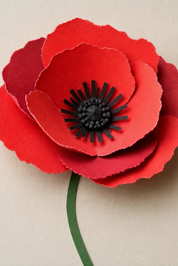
This is the “draw it and it looks artsy” option when you’re doing budget kids crafts. You don’t need perfect lines because torn paper edges hide unevenness. The darker red behind the front petals creates depth instantly. I’ve made this for classroom projects and it always looks more finished than a flat drawing because the paper texture shows up even from a distance. It also flatters kids who like cutting and gluing — they get control over the shape without worrying about shading.
Step 1: Cut five teardrop petals from bright red paper, then tear the edges slightly so they look organic. Step 2: Cut five matching smaller teardrops from darker red paper and place them behind the bright petals, offset by about 1/8 inch. Step 3: Make the center from black paper or black marker-filled circle, then glue tiny paper dots or punch holes to create a dotted texture. Step 4: Add thin paper strips or thin marker lines as stamens. Step 5: Glue the petals to a white background, then draw a simple green stem and one leaf with a marker.
Offset the darker petals consistently to one side; it makes the flower look lit from the same direction.
Don’t use too many different reds; two shades of red looks clean.
11. Poppy Flower Sticker Style with Thick Outline

Sticker-style poppies work when you want the drawing to pop on a card, notebook cover, or kid craft label. Thick outline hides wobbles and makes the flower readable fast. I like using flat marker fill because it’s quick and doesn’t require blending. The center texture still matters — dots and stamens keep it from looking like a generic flower. This style looks good on darker paper too if you keep the outline black and the petals bright.
Step 1: Draw an oval head lightly, then outline five teardrop petals with a thick black marker. Step 2: Fill each petal with bright red, leaving no white gaps. Step 3: Add darker red shadow on the lower left portion of each petal using a second red marker. Step 4: Color the center solid dark, then add 12-15 small dots on top and leave one tiny off-white highlight. Step 5: Add stamens as short thin lines rising from the center, then optionally draw a thin yellow or light orange halo line just outside the petals.
Good to knowPress the marker tip firmly for the outline, then lighten up for shadows so the contrast looks intentional.
Common mistakeDon’t over-shade the petals with scribbles; flat fill plus one shadow patch looks best.
12. Poppy in a Small Circle Frame (Button Look)
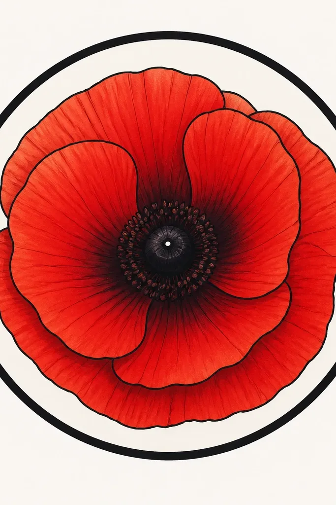
A circle frame turns your poppy into a mini design you can repeat across a page. It also forces you to keep the petals sized correctly, which makes beginners' results look better. The circle border gives a finished feel even if the petals are simple. I’ve used this for kids who like making sets — three or four circle poppies on one sheet look like a sticker sheet. Keep the center small and crisp so the flower doesn’t get crowded inside the circle.
Step 1: Draw a circle about 3 inches wide, then draw a smaller oval head inside it. Step 2: Add five teardrop petals around the oval, keeping the widest petal edges near the circle boundary. Step 3: Color petals bright red, then add darker red shading along the inner edge of each petal. Step 4: Dot the center with dark brown and add a tiny pale highlight. Step 5: Trace the circle border with a thicker pen or marker, then add short stamens as thin lines only in the top half of the center.
If you want it extra neat, draw the circle first with a coin and then sketch the flower inside lightly.
Don’t let the petals cross outside the circle border — that’s what makes it look messy.
13. Poppy with Wavy Petal Edges (Windy Look)
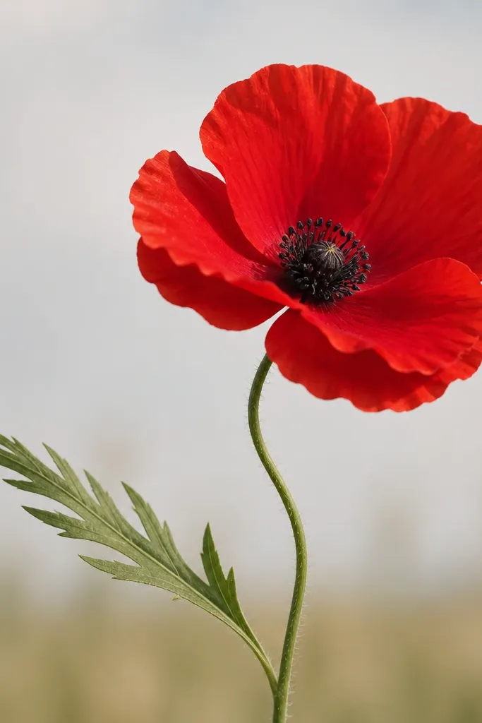
Wavy edges give poppies movement without changing your basic drawing steps. It’s the same teardrop placement, but you draw the outline with a soft wave instead of a smooth line. This makes the flower look like it’s responding to a breeze, which kids love because it feels alive. The shading still works with simple two-tone red: darker red goes under the wave dips. This style also looks great when you’re using colored pencils because the uneven edges catch color differently.
Step 1: Sketch an oval head and place five teardrop guides around it. Step 2: Trace each petal outline with a slight wave, so the edges look irregular and natural. Step 3: Color the petals bright red, then shade the underside of each petal with darker red following the lower curve. Step 4: Add a dark dotted center and short stamens, keeping the stamens thin. Step 5: Draw a gently curved stem and one leaf with a wavy outline that matches the petal style.
Good to knowMake the wave bigger on the two side petals and smoother on the top petal for a natural look.
Common mistakeDon’t add scallops all over the petals; subtle waves look intentional.
14. Poppy Bouquet Border Along the Page Edge
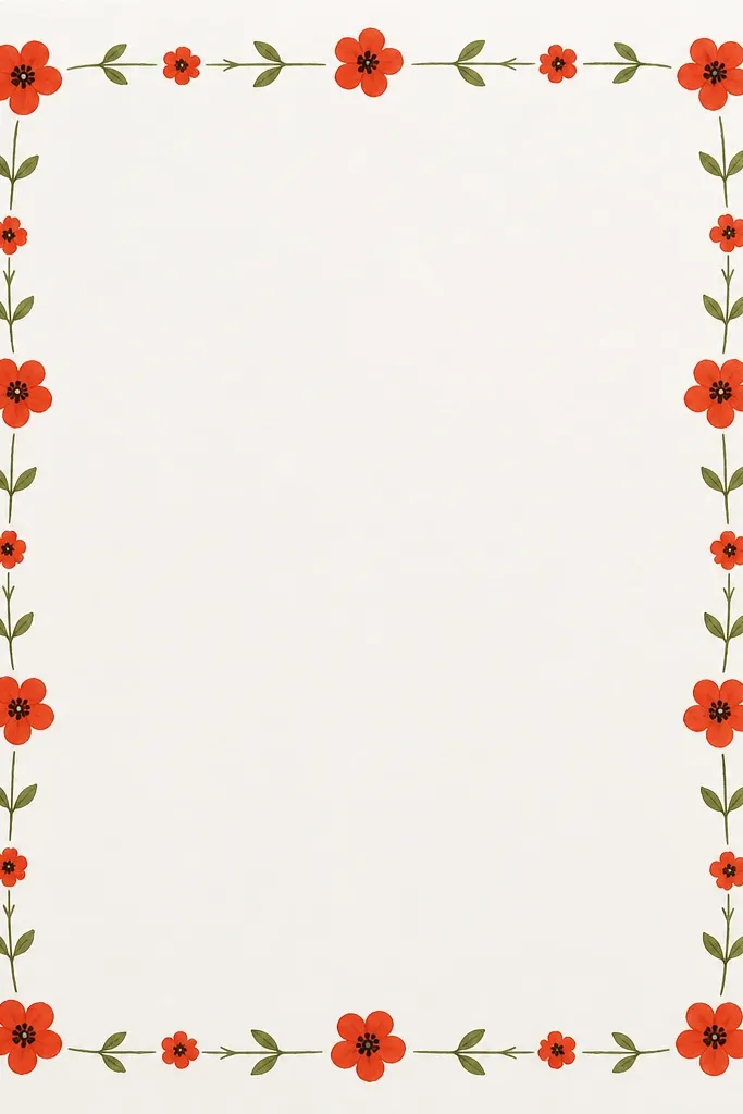
A border makes your whole page feel like a craft, not a single drawing. This works especially well for kids' art because they can keep repeating a small unit: one poppy head plus one leaf. It also hides mistakes because the repetition blends small unevenness. For a clean look, alternate a full open poppy with a smaller bud poppy so the border has rhythm. Use one green shade for leaves and one red shade for petals so it doesn’t turn into a color mess.
Step 1: Decide your border width, then lightly draw a guideline about 1 inch from the page edge. Step 2: Along the top and side edges, repeat a unit: small poppy head (about 1.5 inches wide) plus a leaf on the outer side. Step 3: Alternate sizes — every other unit is a smaller bud with two folded petals. Step 4: Color petals bright red and add darker red shadow on the lower half, then dot centers with dark brown. Step 5: Finish by tracing the stems and leaf veins with a thin black or dark green marker for crispness.
Keep your flowers all facing the same direction around the border; it looks cleaner than random angles.
Don’t cram too many units into one corner; corners need breathing space.
15. Poppy Coloring Page Style Outline Only
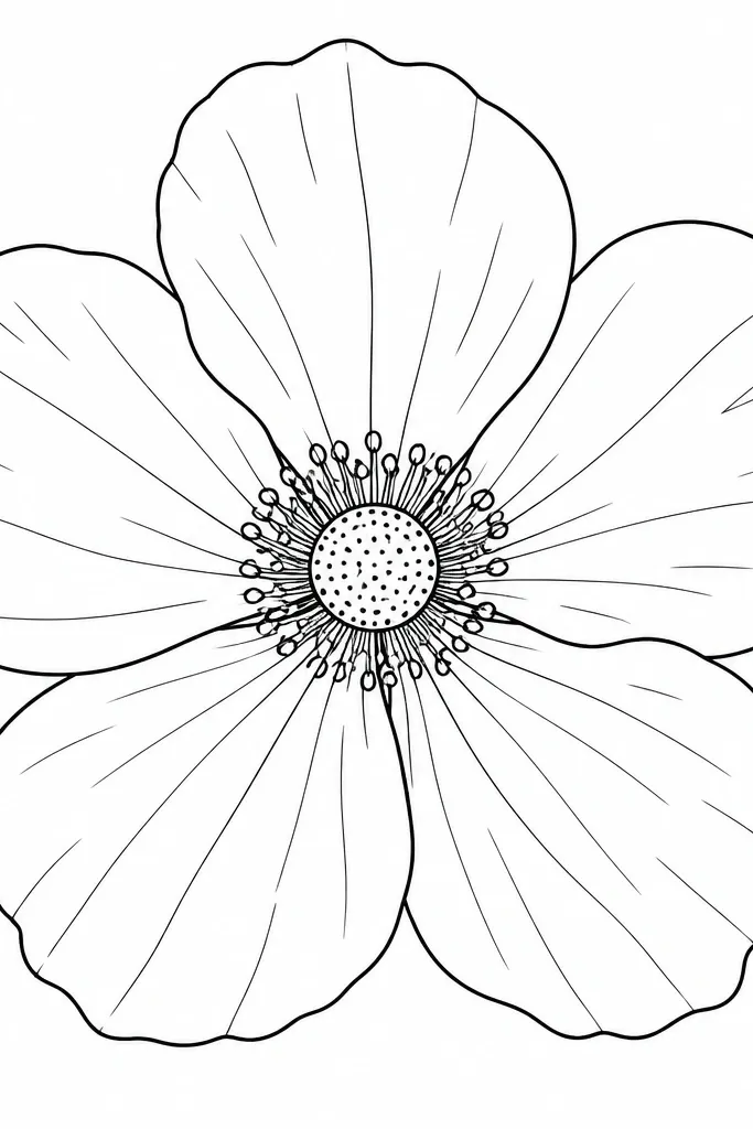
Outline-only drawings are a lifesaver for kids who want to color but can’t handle complex shading. This style makes the poppy look complete because the center details are still there — dots and stamens. Add a few petal vein lines and the flower looks more interesting without coloring. It’s also great for adults who want to copy the design into mixed media later. Keep the lines consistent in thickness so it doesn’t look like multiple markers were used.
Step 1: Draw an oval head lightly, then outline five teardrop petals with a fine black pen. Step 2: In the center, draw a small circle and fill it with dots (12-20 dots) using the pen tip. Step 3: Add short stamens as thin lines rising from the top of the center. Step 4: Draw 2-3 simple curved vein lines on each petal, starting near the center and ending toward the outer edge. Step 5: Add a thin stem line with one leaf teardrop and a center vein line.
If your pen skips, switch to a darker fine liner; dashed outlines look cheap.
Don’t over-detail the petals with lots of micro-lines; it crowds the coloring space.
16. Poppy with Pencil Shading and Soft Edges
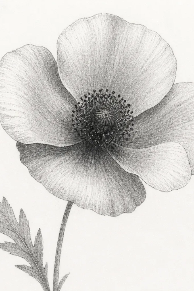
Pencil shading gives you a realistic look without paint or markers. The trick is using two pressure levels: light for the base petal and heavier graphite along one side for volume. When you keep the highlight area clean (no shading), the flower looks rounded. This style flatters anyone who likes quiet, calm art, and it works for kids who are patient with slow shading. The center becomes the star — darker dots and a slightly darker ring make it pop.
Step 1: Sketch the oval head and five teardrop petals with a light HB pencil. Step 2: Shade the underside of each petal with a 2B pencil, focusing on the lower half and one side only. Step 3: Use a blending stump or folded paper to soften the graphite at the edge of the shadow, leaving the highlight edge lighter. Step 4: Darken the center with a tight ring of darker graphite, then add dot texture with the pencil tip. Step 5: Add thin stamens as light pencil lines and shade the stem and leaf with a gentle gradient.
Good to knowKeep the highlight line as a deliberate blank strip — even a tiny one makes a big difference.
Common mistakeDon’t shade the entire petal evenly; flat graphite makes it look like a gray blob.
17. Poppy with Mixed Red Crayon + Yellow Center Glow
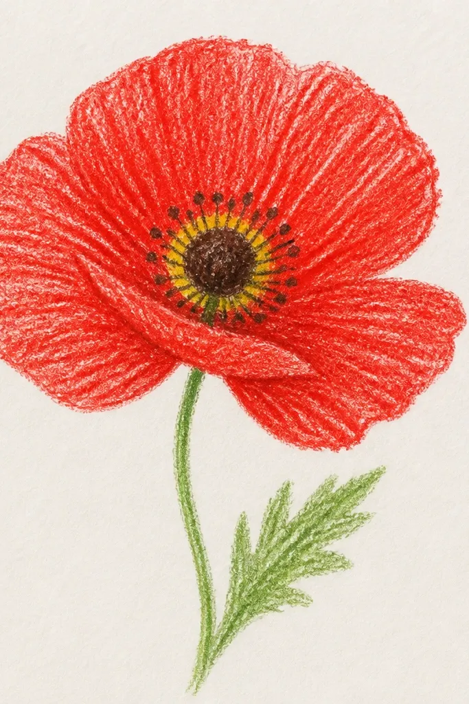
Crayon texture looks great on poppies because petal edges naturally look speckled and organic. Adding a yellow glow around the dark center makes the flower feel warm and sunny, even if the drawing is simple. I like this for kids because crayon is forgiving and they can see the shapes immediately. It also looks good on colored paper, especially light beige or cream. Keep the yellow ring tight so it doesn’t turn into a halo that steals attention from the center.
Step 1: Outline the poppy head with a light pencil, then trace five teardrop petals with red crayon. Step 2: Fill petals with red crayon, then press a second lighter red layer on the top third of each petal to create natural highlight streaks. Step 3: Color the center base dark brown or black, then add a thin yellow ring around the outside of the dark area. Step 4: Draw short stamens as dark lines or dark crayon strokes. Step 5: Color a thin green stem and one leaf teardrop with a light green crayon and a darker green vein line.
Good to knowUse a sharpener that still leaves a point — a blunt crayon makes petal edges look rounded and sloppy.
Common mistakeDon’t let yellow spill onto the petals; keep it only around the center.
18. Poppy with Fabric-Like Petal Pattern (Marker Dots)
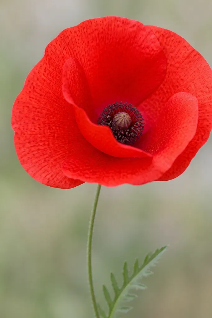
This one looks fancy because you’re adding texture without complicated blending. Tiny darker red dots on each petal mimic the way some petals have speckled shading. It flatters the final drawing because it hides uneven marker fill — the texture makes it look intentional. Kids like it because it turns “coloring” into a pattern game. Adults get a more illustration-like result without needing watercolor skills.
Step 1: Sketch the oval head and five teardrop petals, then outline them with a fine black marker. Step 2: Fill petals bright red with marker or coloring pencil, keeping the fill mostly even. Step 3: Add a pattern: place small darker red dots in a loose diagonal band from the top center of each petal toward the outer edge. Step 4: Dot the center with dark brown and add a small pale highlight, then add short stamens as tiny lines. Step 5: Draw a thin stem and one leaf, then lightly add a few dots on the leaf too so it matches the petal texture.
Good to knowKeep the dot size small (about 1-2 millimeters) so it reads as texture, not confetti.
Common mistakeDon’t cover the whole petal with dots; leave some plain red areas.
19. Poppy with Simple Leaf Cluster and Two Stems
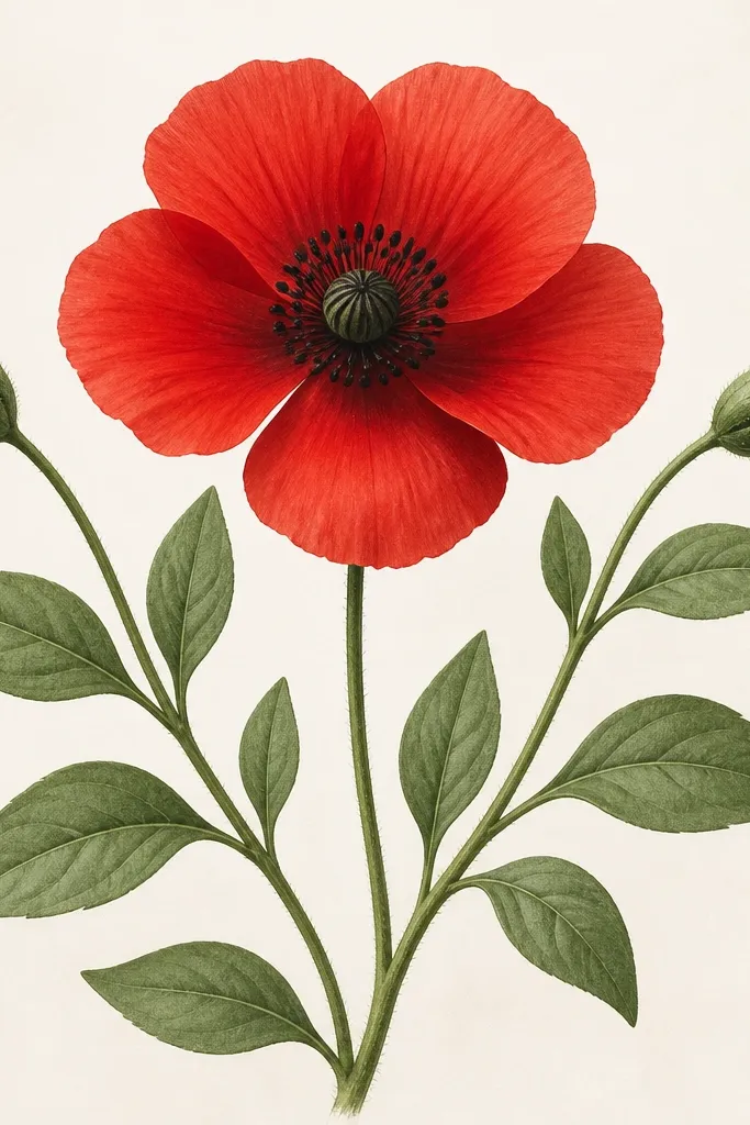
A poppy looks more “real plant” when you give it a leaf cluster and more than one stem line. Two stems make the drawing feel grounded instead of floating, and the leaves add extra shapes for kids to practice. The style is also flattering on bigger paper because it uses negative space well — the poppy head becomes the focal point. Keep leaves simple teardrops with a single vein line so the drawing stays beginner-friendly. The shading plan stays consistent: two reds and a dark dotted center.
Step 1: Draw the poppy head first — oval head plus five teardrop petals, then center dots and stamens. Step 2: From under the center, draw two stems branching slightly outward, like a V shape. Step 3: Add three leaves: one on the left stem, one on the right stem, and one small leaf near the base. Step 4: Color petals bright red with darker red shading along the underside. Step 5: Color leaves green, then draw a darker green vein line through each leaf teardrop. Finish by tracing the strongest stem line with a dark marker.
Make the leaf closest to the flower the biggest; it frames the poppy nicely.
Don’t add too many leaves; five shapes total looks organized, more than that gets busy.