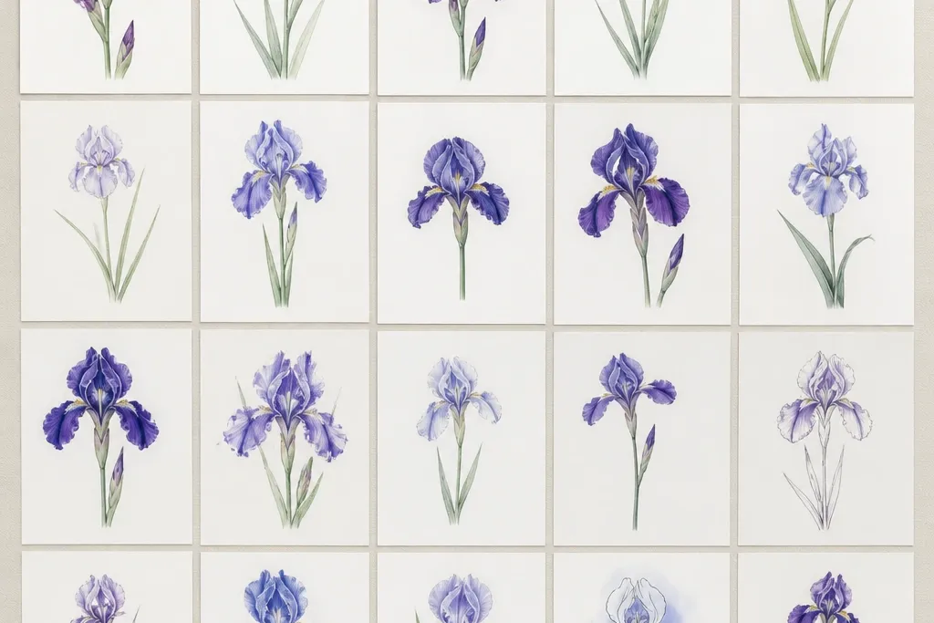
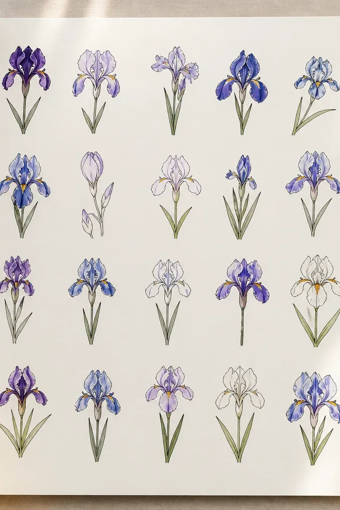
1. One-Leaf Iris with a Center Dot
This is the iris I use when someone needs a “finished-looking” sketch fast. The small center dot anchors the whole flower so kids don’t overwork the middle. Keep the upright petals tall and narrow, and let the lower petals be wider with a slight curl at the tips. I like it in purple with a warm beige center because it reads clearly even when the coloring is light. It also flatters smaller pages since the flower stays compact and the single leaf adds height without clutter.
Step 1: Draw a vertical guide line, then sketch three upright petals around it — each petal is a teardrop with a slightly pointed top. Step 2: Add three lower petals that start from the same base point and fan downward, letting the middle one overlap the others. Step 3: Place a tiny filled circle at the center, then draw one leaf as a long curved blade coming from the base. Step 4: Outline lightly with a black pen if you want it crisp, then color the petals with light purple first and deepen only the petal edges.
Color the center dot with a darker violet ring around it so the middle looks intentional, not accidental.
Avoid coloring the whole petal dark — irises look best when the center stays lighter.
2. Blue Iris with Two Center Stripes
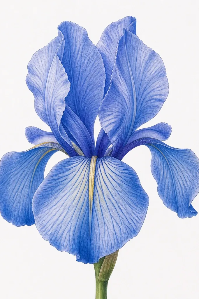
Two center stripes make the iris look patterned without adding a lot of tiny details. I’ve used this one on plain printer paper because the stripe placement gives structure even if your shading is beginner-level. Choose a cool blue for the petals and keep the stripes slightly lighter than the surrounding blue so they stand out. This style looks great for kids because it turns “coloring” into following lines. Adults like it too when they want a graphic look for cards.
Step 1: Draw the 3-up, 3-down petal layout, but make the lower petals slightly wider than the upright ones. Step 2: Add two thin curved stripes on the lower petals that start near the center and taper as they go outward. Step 3: Shade the petal folds where the petals overlap — use a darker blue along the inner edges only. Step 4: Color the background lightly or leave it blank for a crisp, sticker-ready finish.
Use a white gel pen to add a tiny highlight on the stripe edges so they look glossy.
Don’t place stripes across all six petals — keep them on the lower three so the iris reads clearly.
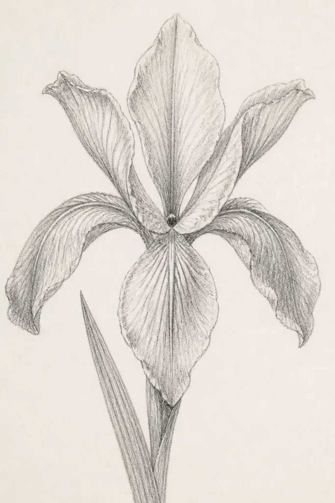
3. Pencil-Only Iris with Feathered Edges
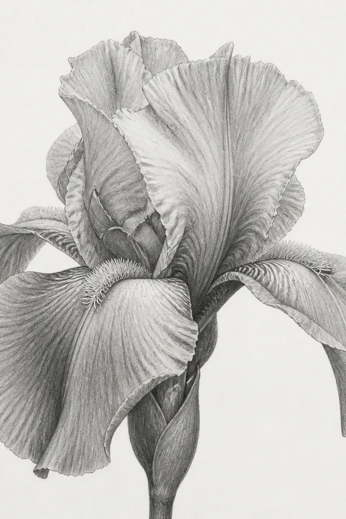
This one is for when you only have a pencil and you still want it to look “done.” Feathered edges mimic the natural texture of iris petals without drawing every tiny vein. I like this for sketchbooks because it holds up under any lighting — no bright marker bleed needed. The center can stay mostly light with a darker graphite core, which gives contrast without heavy coloring. It flatters smaller hands too because it’s mostly shading, not drawing lots of shapes.
Step 1: Sketch the six petals lightly with a 2B pencil, using a central guide line to keep symmetry. Step 2: Darken the inner overlaps between petals — those small pockets create the iris depth. Step 3: Use short, light strokes at the outer petal edges so the boundary looks softer than the center. Step 4: Build up contrast gradually: one light pass, then a second only where petals overlap.
Press harder only in the petal overlap pockets, not along the outer rim, or the iris will look heavy.
Avoid smudging the whole drawing — the sharp petal outline is what keeps it crisp.
4. Mini Iris in a Circle Frame
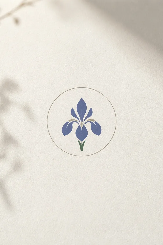
Step 1: Draw a circle about 2.5 to 3 inches wide, then lightly sketch the iris inside using the same 3-up, 3-down layout. Step 2: Make the upright petals shorter and thicker, like rounded teardrops. Step 3: Add a small “notch” notch at the center by drawing a tiny inward curve where petals meet. Step 4: Color the petals with one light layer, then darken just the lower petal bases.
A circle frame is the easiest way to make a simple iris look intentional. When the iris is small, details get messy fast, so this version uses clean shapes and a tight center. I’ve used it for kids' sticker designs and for adult label tags because the circle makes the composition feel finished even with minimal coloring. Pick one color family — lavender and pale yellow works great — and keep the rest of the page blank. This style looks good on any skin tone or age group because it’s all about shape and contrast, not realism.
Common mistakeDon’t add extra leaves in this one — the circle already does the composition work.
Good to knowTrace the circle with a template (like a cup rim) if your circles wobble.
5. Iris with a Long Curved Stem Banner
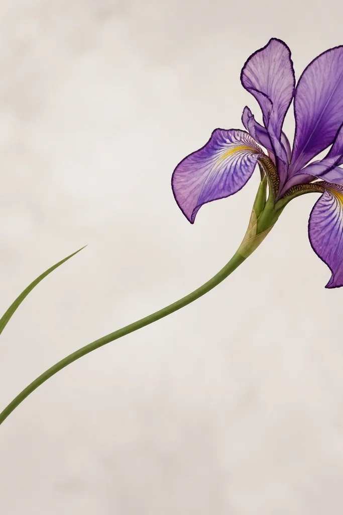
Step 1: Draw the stem first — a smooth curve starting near the bottom and rising to meet the center of the iris. Step 2: Add two leaves as narrow blades that follow the stem curve, one on each side. Step 3: At the top, draw the 3-up, 3-down petals with the lower petals slightly larger. Step 4: Outline the petals with a thicker pen (0.8) and keep the stem line thinner (0.5) so the flower pops.
This iris looks more “designed” because the stem movement gives it a story. The curved banner stem creates a flow that makes the flower feel alive even if the petals are simple. I like it for greeting cards because it gives you an obvious place to write a short message on the blank curve. Color the petals in soft purple and the stem leaves in muted green so nothing fights for attention. It flatters wider paper layouts because the curve spreads the drawing out.
Common mistakeAvoid thickening every line — if the stem looks as heavy as the petals, the drawing loses focus.
Good to knowAdd one tiny highlight line on the stem leaf to keep it from looking flat.
6. Front-Facing Iris with a Bold Center Fan
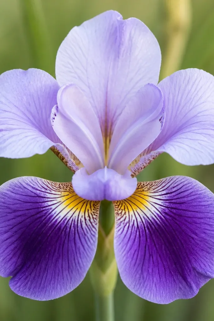
Step 1: Draw a centered iris with a clear vertical guide line and equal spacing for all six petals. Step 2: Shape the center as a small semicircle, then add 5 to 7 short wedge lines radiating outward like a fan. Step 3: Color the lower petals with a darker violet at the base, fading to lighter purple toward the tips. Step 4: Add a thin darker outline along the inner edges of the petals to sharpen the overlap.
A bold center fan turns a simple iris into something you’d see on a printed pattern. This works because the center is where the eye lands; giving it a clear shape makes the whole flower feel crisp. I use deep purple in the center fan and then fade outward to lighter lavender on the petals. It’s great for kids because the fan wedges are easy to repeat. Adults can use it for fabric transfer sketches or sticker designs because it reads from far away.
Common mistakeDon’t leave the center blank — the whole point is the fan shape.
Good to knowUse a darker pencil or pen just for the center fan wedges — that contrast makes the iris look finished.
7. Side-View Iris with One Petal Overlapping
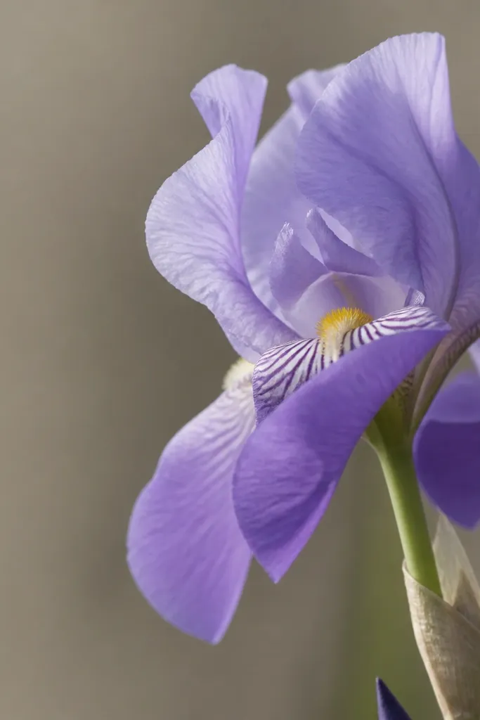
Side view is how you make simple drawings look more advanced without actually drawing more pieces. One petal overlap creates depth instantly, and it helps kids learn that objects block each other. Choose one main purple tone and one accent (like a pale gold center) so the overlap stands out. I like this for bookmarks because the side angle fits vertical formats well. It also hides shaky symmetry since the iris is not perfectly front-on.
Step 1: Draw a curved center line that tilts slightly, then sketch only three petals that “face” the viewer. Step 2: Add one lower petal that sits in front of another, with an overlap line where they meet. Step 3: Keep the far petals lighter in pencil so the front petal reads as the top layer. Step 4: Color the visible petal edges darker to show the overlap and keep the hidden petals lighter.
Draw the overlap edge darker first, then fill the petal — it prevents the overlap from looking muddy.
Avoid drawing every petal as if it’s fully visible — side view needs hidden parts.
8. Iris Bud with Three Peeking Petals
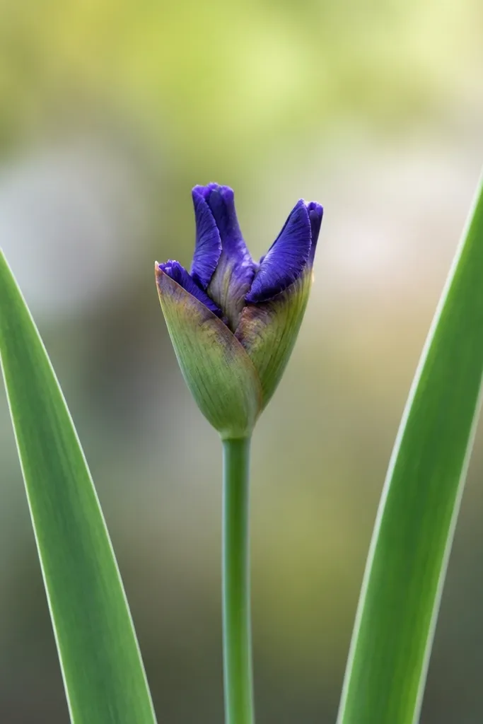
Buds are the easiest way to practice iris shapes without committing to full petal anatomy. This bud version uses the same 3-up feel, but the petals are tucked so you only draw what’s peeking. I like it for busy kids because they can finish quickly and still feel proud. Use soft greens and muted purples so it looks like a real plant in the early stage. It also works for repeating patterns — you can line up several buds along a border.
Step 1: Draw a stem and one leaf, then place a small oval at the top for the bud. Step 2: From the top of the oval, draw three small petal teardrops that open slightly upward. Step 3: Add a tiny center line where the petals meet, then shade the bud base with darker purple. Step 4: Color the bud with a light violet and the leaves with a muted green, then darken only the underside of the bud for depth.
Make the bud oval slightly narrower than the leaf width so the plant looks proportional.
Don’t add full-size petals — keep this one small and tucked.
9. Two Irises Crossing Like a Bookmark
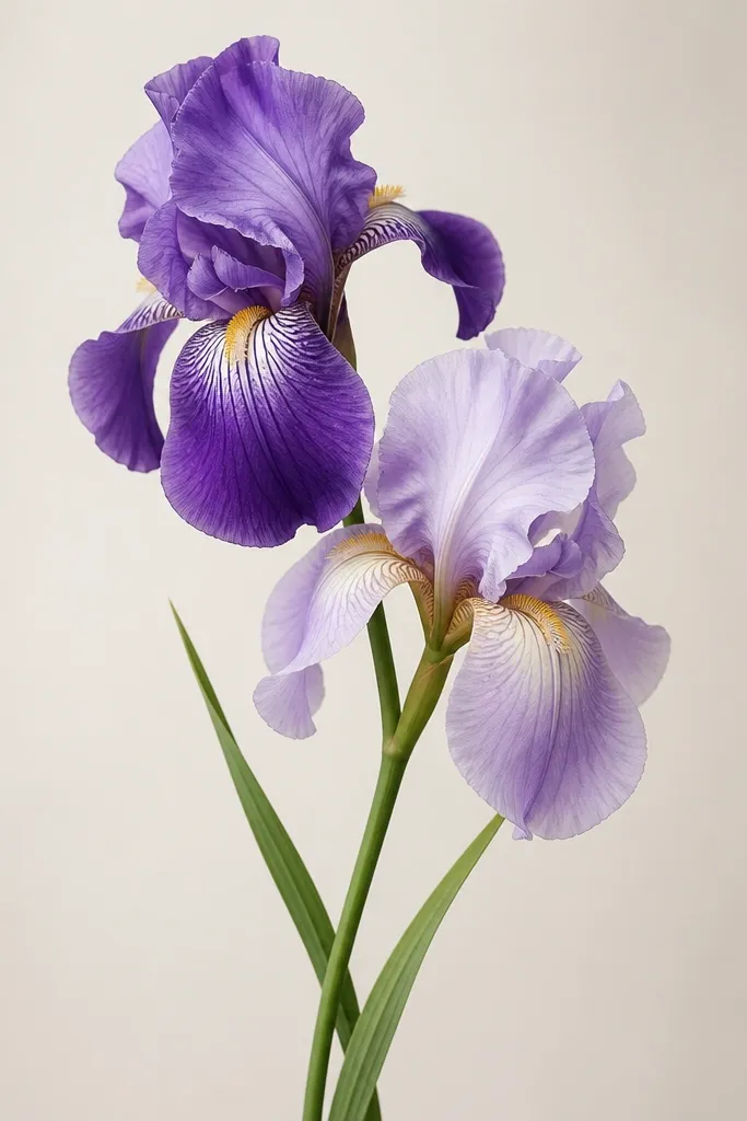
Crossing flowers add energy without adding complexity. You’re still drawing simple petals, but the overlap gives you that “illustration” look. I use this when a kid or beginner wants more than one flower but can’t handle a bouquet. Pick two different purples (like periwinkle and deep violet) and keep the centers consistent with a pale gold. The crossing layout looks great on tall paper, especially bookmark strips, because it fills the vertical space.
Step 1: Draw two stems that meet at different heights, crossing slightly in the middle. Step 2: On each stem, draw a simple iris with 3-up, 3-down petals. Step 3: Make the lower petals overlap — draw one iris’s lower petal in front and add a darker line where it crosses. Step 4: Color one iris with lighter purple and the other with deeper violet, then add a pale center on both.
Keep one iris simpler than the other by skipping stripes on one center — it prevents the drawing from getting cluttered.
Avoid making both irises identical and perfectly centered — overlap needs a clear front/back.
10. Iris with a Speckled Center (Ink Dot Texture)
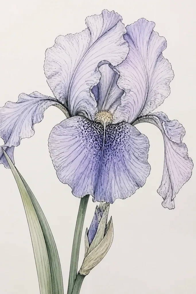
A speckled center is the fastest way to make a simple iris look textured and real. Instead of drawing veins, you add dot clusters in the middle and along the lower petal base. I’ve done this with gel pens and it holds up well on cheap paper, as long as you keep the dots small. Use a dark purple or near-black for the speckles, then fade the surrounding petals in lighter lavender. This style looks good for kids because the dots are repeatable and forgiving.
Step 1: Draw the standard 3-up, 3-down iris with a central guide line. Step 2: Color the petals lightly first so the speckles land on a stable background. Step 3: Add a small speckled patch in the center and a thinner band of speckles at the base of the lower petals. Step 4: Use a black gel pen to tap dots quickly — keep them clustered so the center looks dense.
Practice the dot size on scrap paper. If your dots are too big, the iris looks cartoonish instead of detailed.
Avoid speckling the entire petals — it makes the drawing look noisy.
11. Rainbow Iris Gradient Fade
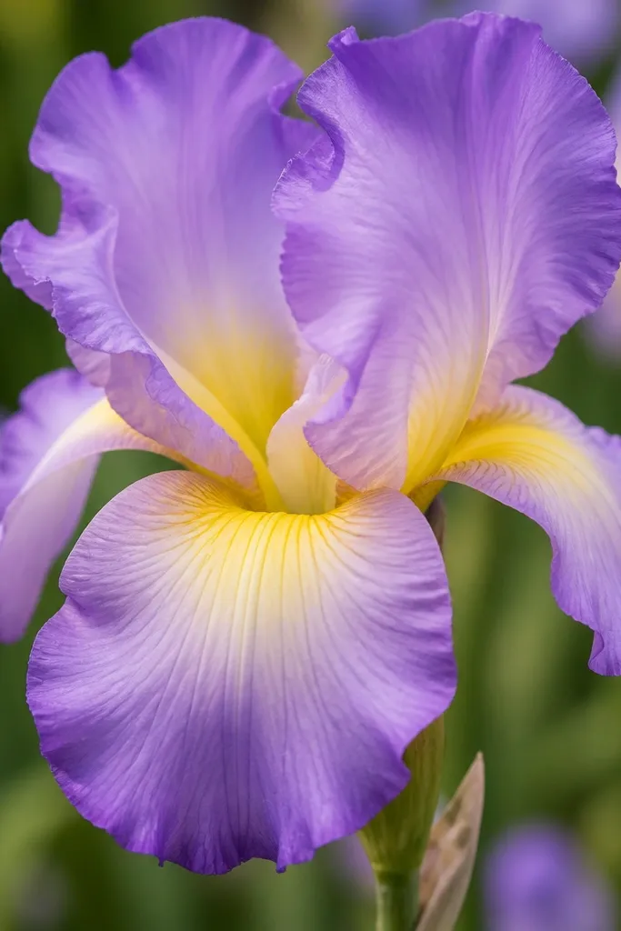
This is the iris that makes plain sketches look “painted” without real painting. The secret is the fade order: light near the center, medium mid-petal, dark at the edges. I like it because it looks good on both paper and cardstock, and it stays pretty even if your blending is rough. Choose three colors: pale yellow, lavender, and deep violet. It flatters any art skill level because the gradient does the heavy lifting.
Step 1: Draw your 3-up, 3-down petals with a clean outline in pencil or fineliner. Step 2: Color the center area with pale yellow, then drag that color outward lightly into the petal base. Step 3: Layer lavender across the middle of the petals, leaving the very center slightly lighter. Step 4: Finally, add deep violet just along the petal edges and overlap pockets.
Use a light hand for the first two layers — the gradient only looks smooth when you build it slowly.
Avoid coloring the edges first. Dark first makes gradients look like hard blocks.
12. Warm-Toned Iris with Peach Highlights
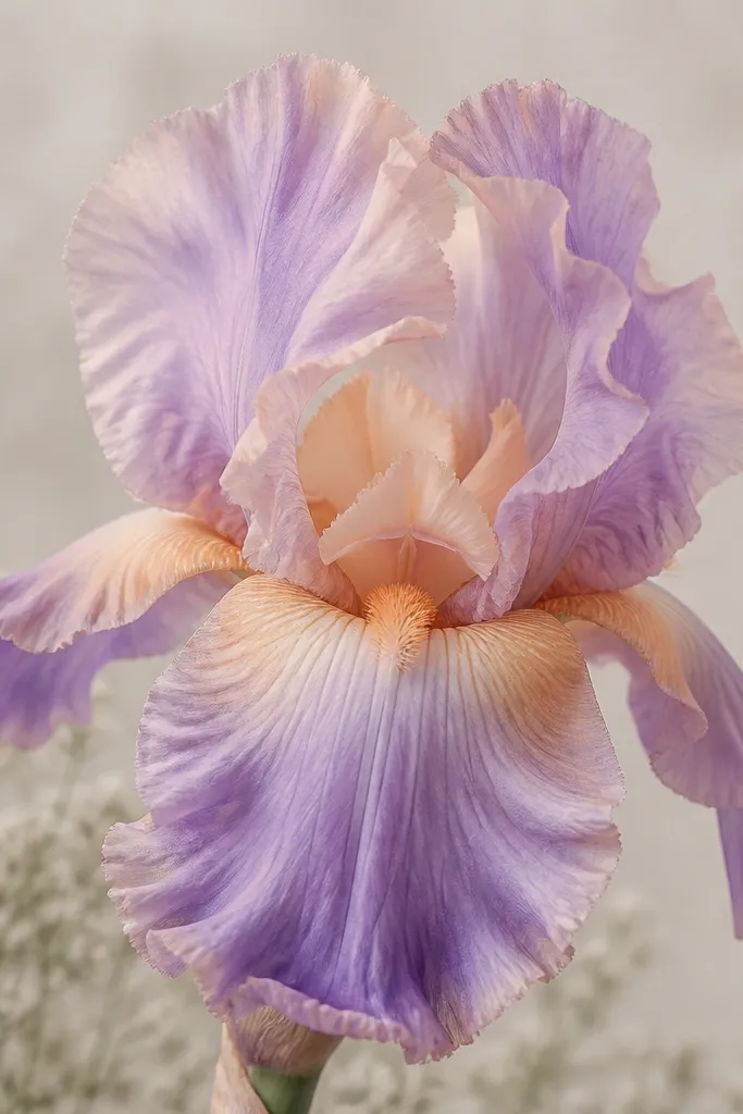
Most iris drawings go straight purple, purple, purple. This version adds peach highlights so the petals look lit from above. I tested this with watercolor pencils and it gives a soft, friendly look that kids love and adults find flattering for cards. Keep the base color lavender, then add peach only on the outer top surfaces where the light would hit. The center stays creamy so the warm highlight doesn’t overpower the flower.
Step 1: Sketch petals with a light outline and mark the overlap pockets with a slightly darker pencil line. Step 2: Color the petals lavender, leaving small curved blanks where highlights should go. Step 3: Add peach along those blanks, following the petal curve — do not spread it across the whole petal. Step 4: Color the center with creamy beige, then deepen the center core with a muted peach-brown.
If your peach is too orange, soften it by layering a light lavender glaze over it.
Avoid using peach as the main petal color. It should read as light, not as the whole flower.
13. Iris Outline Only with Patterned Background
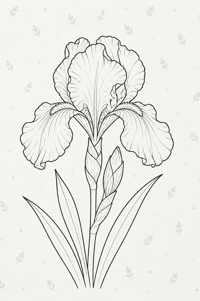
Step 1: Draw the iris outline with a fineliner, keeping the petal edges smooth and symmetrical. Step 2: Leave the petals uncolored. Step 3: Add a background pattern: small dots in one corner and tiny leaf shapes scattered around the rest. Step 4: Use one light color for the pattern only, then add a few darker dots to create depth behind the lower petals.
Outline-only irises look sharp and modern, especially when the background carries the color. I’ve used this for kids because it keeps drawing simple: they focus on the petal silhouette, then color a background pattern instead of trying to blend. The iris stays clean and the background makes it lively. Use pale gray or light blue dots so the background doesn’t compete with the black lines. This works well for anyone making stationery or classroom art where you want it to look organized.
Common mistakeAvoid coloring inside the petals and the background at the same intensity — the iris will lose its shape.
Good to knowKeep the pattern at least one “petal width” away from the iris outline so it never looks messy.
14. Iris with Vein Lines on the Lower Petals
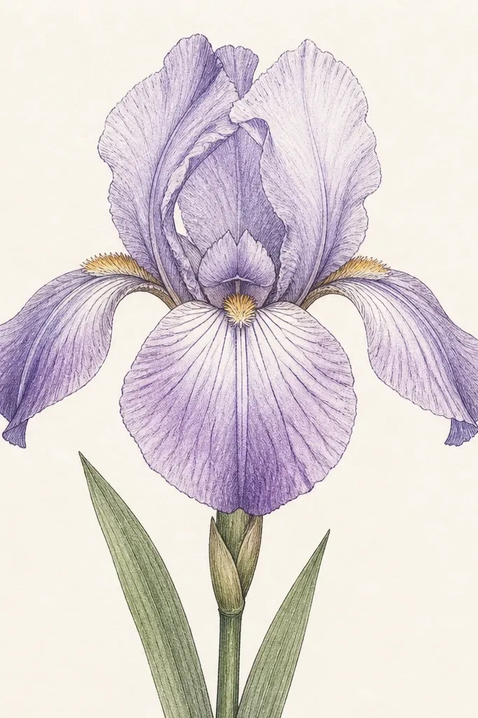
Vein lines make the iris look real even when the rest is simple. I focus the veins on the lower petals because that’s where the texture reads best in a sketch. Use thin lines that taper — they should look like they’re spreading from the center. This style looks especially good in black-and-white with light gray shading around the veins. It’s great for adults who want detail without full coloring time, and it’s also doable for kids who can follow a “start at the center, draw outward” rule.
Step 1: Draw the iris outline with the 3-up, 3-down petal layout. Step 2: On each of the lower three petals, draw 4 to 6 thin vein lines starting near the center and fanning outward. Step 3: Shade lightly under the veins with a pencil so the lines have depth. Step 4: Color the petals with one light violet layer and deepen only the base of the lower petals.
If your lines look shaky, draw the first vein lightly, then trace over it once with a darker pen.
Avoid adding vein lines to the upright petals. It makes the iris look busy and flat.
15. Iris in a Square Frame for Kids
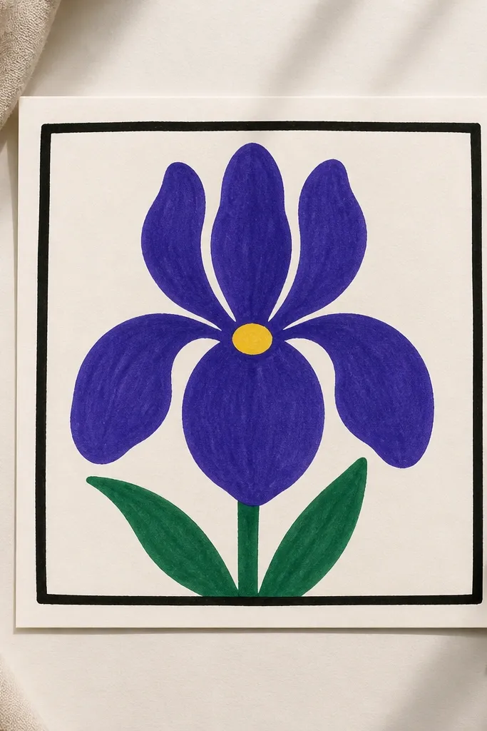
Step 1: Draw a square border around your paper area, leaving a margin of about 1/2 inch. Step 2: Inside, draw the iris with thick teardrop petals and a small center circle. Step 3: Color the upright petals first, then the lower petals, using the same purple shade. Step 4: Fill the center with yellow and add a thin darker outline around the center so it pops.
A square frame gives kids clear boundaries and makes the iris feel like a finished poster. This style uses thicker petal shapes and bold fills, so it survives marker pressure and uneven coloring. I like it for classroom settings because the drawing stays readable from a distance. Pick two marker shades: one purple for petals and one yellow for the center. Keep the leaves green and simple, with just one or two leaf shapes.
Common mistakeAvoid over-swirling the center. A tiny neat circle reads better than a messy scribble.
Good to knowUse a thicker marker for outlines only, then switch to a lighter marker for filling to keep edges clean.
16. Iris Bouquet Trio with Three Stems
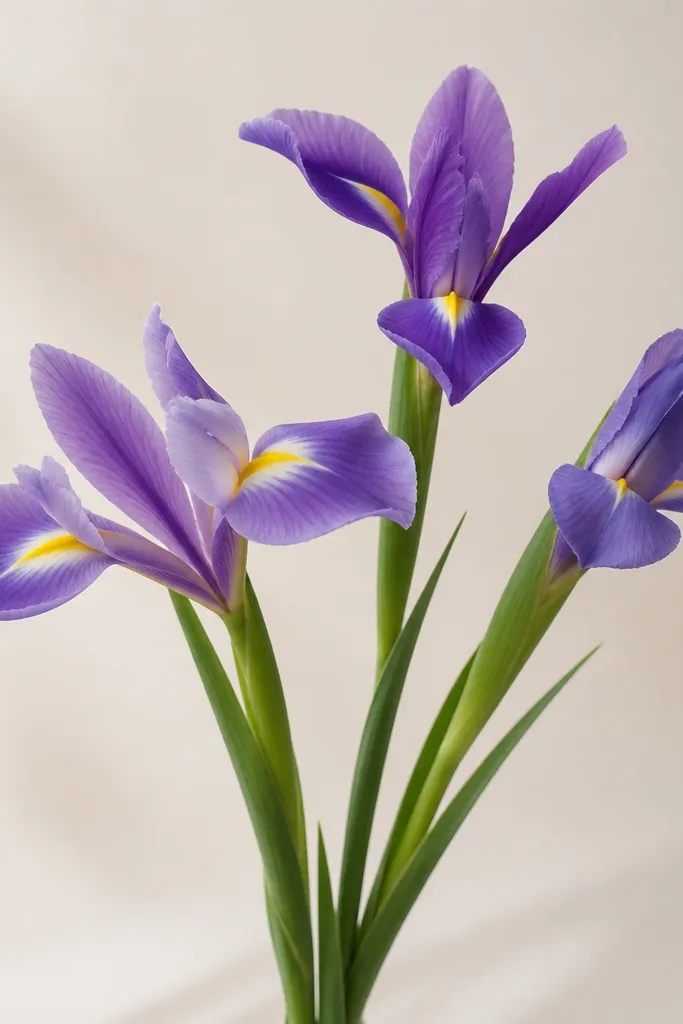
Step 1: Draw three stems from the bottom area, fanning them slightly apart. Step 2: On each stem, draw one simplified iris — keep the same 3-up, 3-down layout but vary the petal height by about 1/4 of the flower size. Step 3: Add two leaves between stems, one per gap, and keep them narrow so they don’t crowd the flowers. Step 4: Color each iris with a different purple tone and add a consistent pale yellow center on all three.
A trio bouquet is the best way to practice variation without making a full bouquet scene. You keep the iris structure the same, but you change angle and petal size on each flower. I’ve used this for kids who want “more flowers” but still need simple rules. For adults, it’s a clean layout for printable cards — you can color each iris with a different purple shade and still keep it cohesive. The leaves act like connectors so the whole drawing feels grouped.
Common mistakeAvoid drawing all three at the same exact size. Variation is what makes it look like a real bouquet.
Good to knowMake one iris slightly turned away by shortening its visible upright petals. That angle keeps the trio from looking identical.
17. Iris with White Gel Highlight Stripe
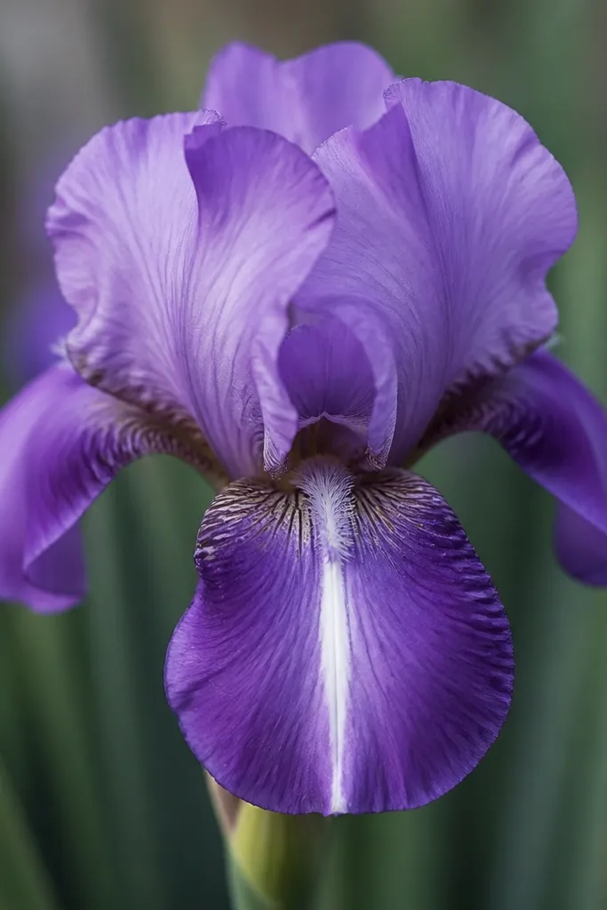
Step 1: Draw the iris outline and color the petals with a light violet base. Step 2: Shade the overlap pockets and petal edges with a deeper purple so the shape has depth. Step 3: Choose one lower petal and draw a curved highlight stripe lightly in pencil first so you place it correctly. Step 4: Go over that pencil line with a white gel pen, then add one tiny dot highlight near the center.
A white highlight stripe makes a simple iris look glossy. I’ve used a white gel pen over colored pencil and marker, and it instantly raises the quality without adding more lines. The stripe should curve with the petal and sit slightly off-center on the lower petals. Use lighter purple overall so the white stripe has room to show. This style is great for anyone who wants a neat, finished look for stickers or card fronts.
Common mistakeAvoid adding multiple thick white stripes. One thin stripe reads best.
Good to knowWait for marker ink to dry fully before adding gel highlights or the pen can smear.
18. Iris with a Soft Watercolor Wash Look
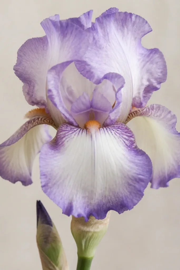
This look is forgiving and it hides shaky coloring. Watercolor-style washes make the iris feel airy, which is why it’s great for kids who are still learning how to stay inside lines. Use light purple and ultralight blue mixes so it doesn’t go muddy. The center should stay lighter and a touch creamy so the iris looks fresh. This also flatters small art spaces because the wash texture creates interest without needing lots of detail lines.
Step 1: Lightly sketch the iris petals with pencil — keep lines faint so they don’t show through the wash. Step 2: Wet the petal areas with clean water using a brush, then drop in light purple at the petal edges. Step 3: Let the color fade toward the center — do not try to fill every spot evenly. Step 4: Add a tiny darker violet at the base of the lower petals and leave the center mostly pale.
If your wash dries too hard-edged, soften the boundary with a damp brush once before it fully sets.
Avoid overworking the wet paint. Re-brushing makes muddy patches.
19. Iris Pattern Repeat for Borders
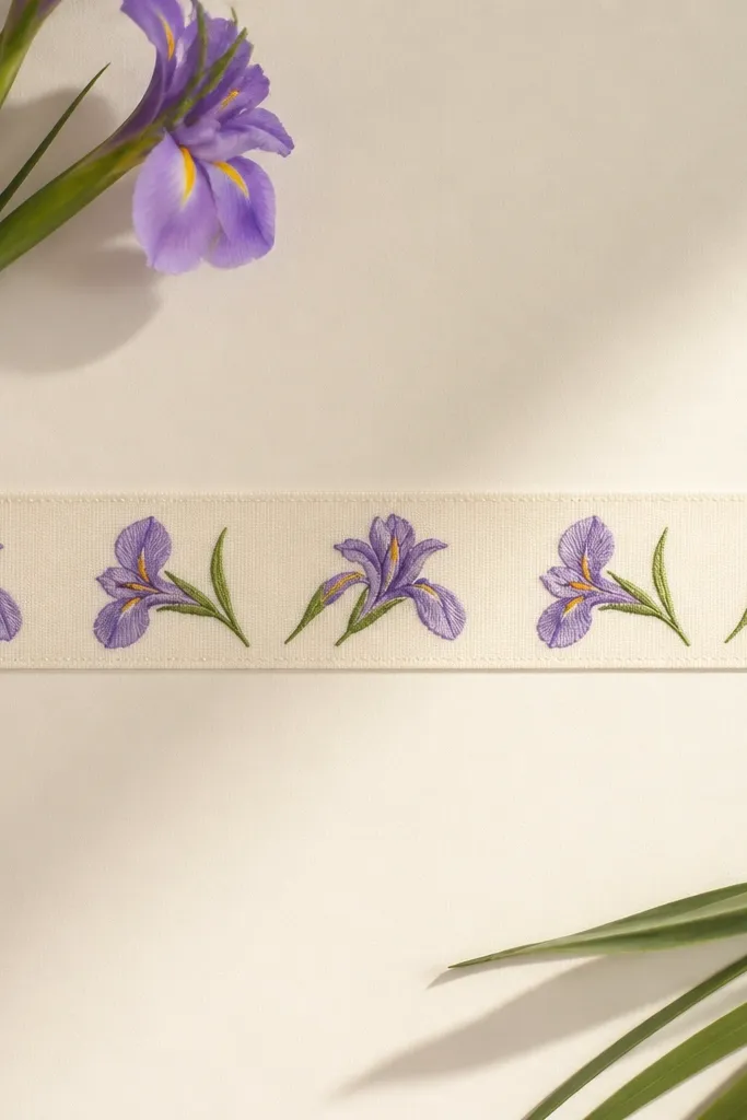
Pattern repeats turn one iris drawing into an entire decorative band. This is practical because you can use it for wrapping paper, classroom displays, or a long card fold. The key is consistency: same petal angles, same center placement, just alternating orientation. I like using two shades of purple and one yellow center so the pattern looks intentional instead of random. It’s great for kids because they can focus on repeating a single template.
Step 1: Draw one small iris template first — about 1.5 inches tall — with 3-up, 3-down petals and a simple center dot. Step 2: Repeat it across the border, alternating direction every other iris so the composition breathes. Step 3: Keep the lower petals aligned to the same “baseline” so the pattern feels tidy. Step 4: Color petals with a medium purple, then add darker purple only to the petal bases and keep the centers yellow.
Mark a light guideline for the top and bottom of each iris so repeats stay aligned even when kids rush.
Avoid changing the center position each time — that’s what makes repeating borders look messy.
20. Iris on a Dark Paper with Silver Gel Lines
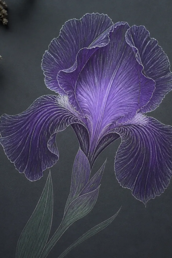
Dark paper makes the iris look dramatic without needing heavy shading. Silver gel lines look like light catching the petal edges, which is why this style always gets compliments. I’ve done it with craft paper and it holds up even with simple marker fills. Use light lavender and pale yellow for the petals so they contrast strongly against the dark background. This style is great for older kids and adults who want a bold, finished look quickly.
Step 1: Sketch the iris outline lightly in pencil so you can place everything, then erase if needed. Step 2: Outline the petals with a silver gel pen, tracing over your pencil lines carefully. Step 3: Fill the upright petals with light lavender and the lower petals with a slightly deeper violet at the bases. Step 4: Color the center with pale yellow and add a few tiny silver dots around the center for sparkle.
Press gel pen lightly at first, then go back once. Too much pressure makes silver lines look dull.
Avoid using black marker on dark paper. It disappears where you want contrast.